
Do you have a wide selection of light blue paint colors and are stuck on which to choose we have all been there, especially with so many beautiful shades and brands on the market. However, it does not have to be difficult if you can narrow your choices to a few brands.
We have taken the liberty to select 31 light blue paint colors from Sherwin Williams and Benjamin Moore to review and inspire you. Go on this journey with us to find the light blues that work with your new or existing decor.
Table of Contents
What Is a Light Blue Paint Color
Light blue paint color is a soft shade of blue. It can take many forms, sometimes looking greenish or grayish. Although it sounds pretty straightforward, light blue color can take many shades. That is why Sherwin Williams and Benjamin Moore have many of them, and no two are the same.
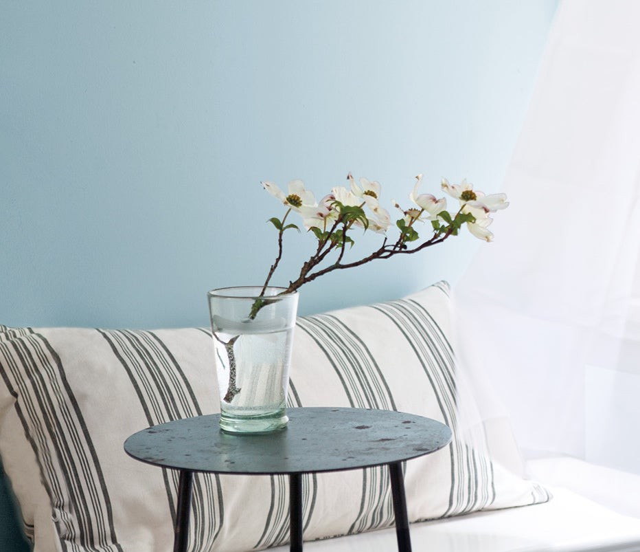
Light blue is the farthest thing from bland if you know how to use it. It reminds you of calmness, peace, and tranquility. The beautiful waves of the ocean and the wide expanse of the sky all tell of the beauty and popularity of the color blue.
The same applies to the light blue paint. We have heard people say they cannot go for this shade of paint because it typically has no character. But they could not be farther from the truth.
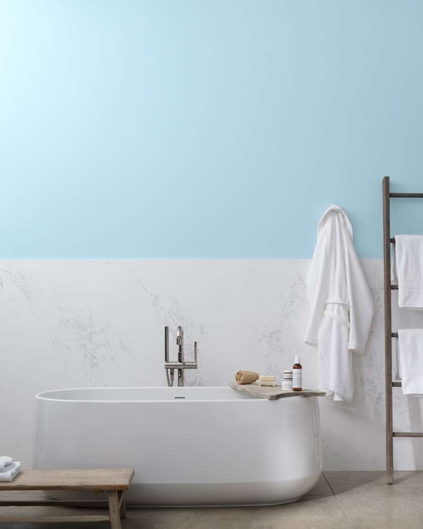
Look around you, whether inside or outside, and you will notice at least two shades of light blue. That color is a soothing balm to weary eyes and is uplifting. If you paint a room a shade of light blue and throw in shades of orange or peach and white, the transformation will be nothing short of jaw-dropping.
What Are the Undertones in a Light Blue Paint?
Light blue paint has several undertones depending on the shade. There is no general undertone rule; you must have a keen eye for these colors to tell their undertones. A light blue paint color may have gray, green, or purple undertones.
In some cases, the undertones can be a combination of two colors. For example, the Palladian Blue from Benjamin Moore has blue-green undertones. And what you see will depend on the surrounding colors. Also, undertones determine what the shade of blue is; that is, it can be warm, cool, or neutral. In addition, the paint may appear icy, especially if it has gray undertones.
Is Light Blue Paint Color Warm or Cool?
The answer to this question depends on the shade of light blue paint. With gray undertones, light blue paint is said to be cool, sometimes icy. But with purple undertones, the color may tend more toward warm than cool because of the extra red in it.
Purple undertones may make the paint cool, but mixed with blue or gray, the undertones may change. Sometimes, gray undertones keep light blue paint neutral. Before deciding whether or not any paint color is warm, cool, or neutral, consider the balance of red, green, and blue (RGB) in it.
The more red color there is in the paint, the warmer it becomes. If the blue content is high, the color is likely to be more cool than warm. A high amount of green maintains the balance; that may be why you see some paint colors leaning toward warm and cool in specific lighting.
What Colors Pair Well with Light Blue Paint?
The seeming neutrality and many shades of light blue make it compatible with almost every color. Some decorators use light blue in place of light gray if they do not want the flat look and feel that gray presents.
However, certain colors look more spectacular than others when paired with light blue paint. Darker shades of blue bring out the beauty of this pastel color. Also, other light colors such as lavender and lilac can be combined with it to create a pastel palette.
For vibrant colors, consider peach, dusty rose, orange, and coral. Yellow is also a popular choice when using light blue, especially for nurseries and children’s rooms. Additionally, light blu pairs well with cream or white if you want that airy and refreshing feel in a room.
Note that some shades of light blue paint colors are more tolerant of various colors than others. So, consider the shade and undertones when blending these colors with your decor.
Where Can You Use Light Blue Paint Colors?
Because of its lightness and resulting versatility, you can use light blue paint in any room. It is popularly used in bedrooms, bathrooms, living spaces, or playrooms for kids. You will also find it in daycares or wherever children gather because of its lightness and airiness.
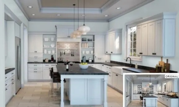
Some people use light blue paint in their kitchen, although this is not a widely popular trend. However, it comes out beautifully, especially if you pair it with darker grays and splashes of peach, brown, and white. Light blue paint also works on trimmings, although white or gray is usually the go-to color for them.
What Is the Most Popular Light Blue Paint Color?
Sherwin Williams’ Misty is a popular light blue paint color because of its balance between blue and gray. It gives you to explore and select more colors to match it. Benjamin Moore’s Breath of Fresh Air and Palladian Blue are still popular, although there are many other similar shades.
The popularity of light blue paint color depends on the brand. The number of people using and talking about their positive experiences is vital to the paint’s popularity. Since we have two brands under review and many options, your favorite will depend on your decor and preferences.
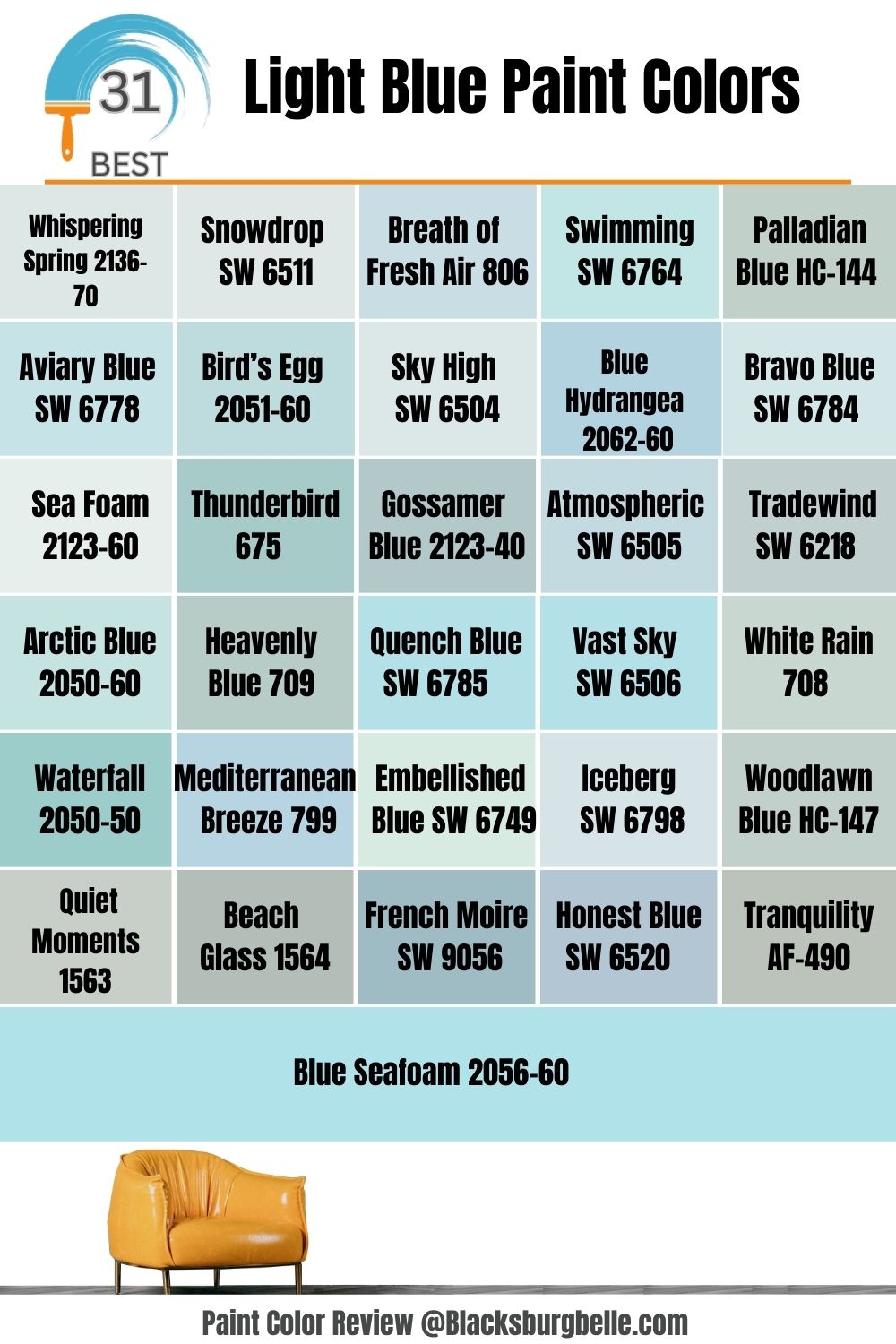
31 Best Light Blue Paint Colors to Inspire Your Decor
The following are the best light blue colors from Sherwin Williams and Benjamin Moore to inspire you:
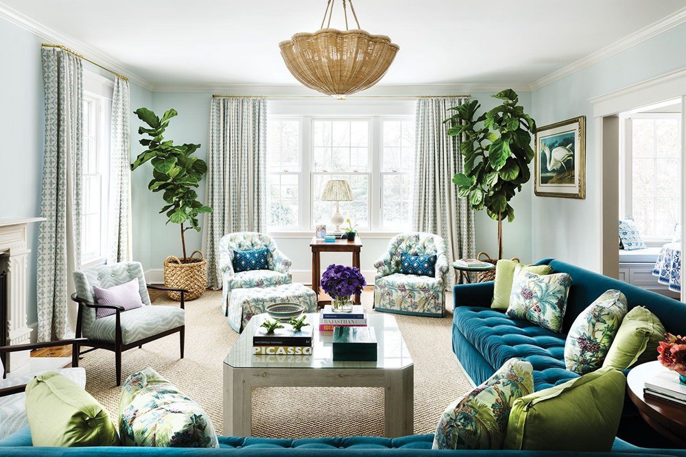
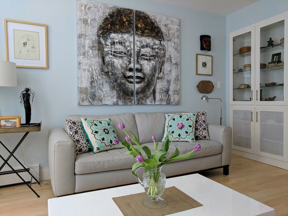
1. Benjamin Moore’s Whispering Spring 2136-70
Cool blue with gray undertones
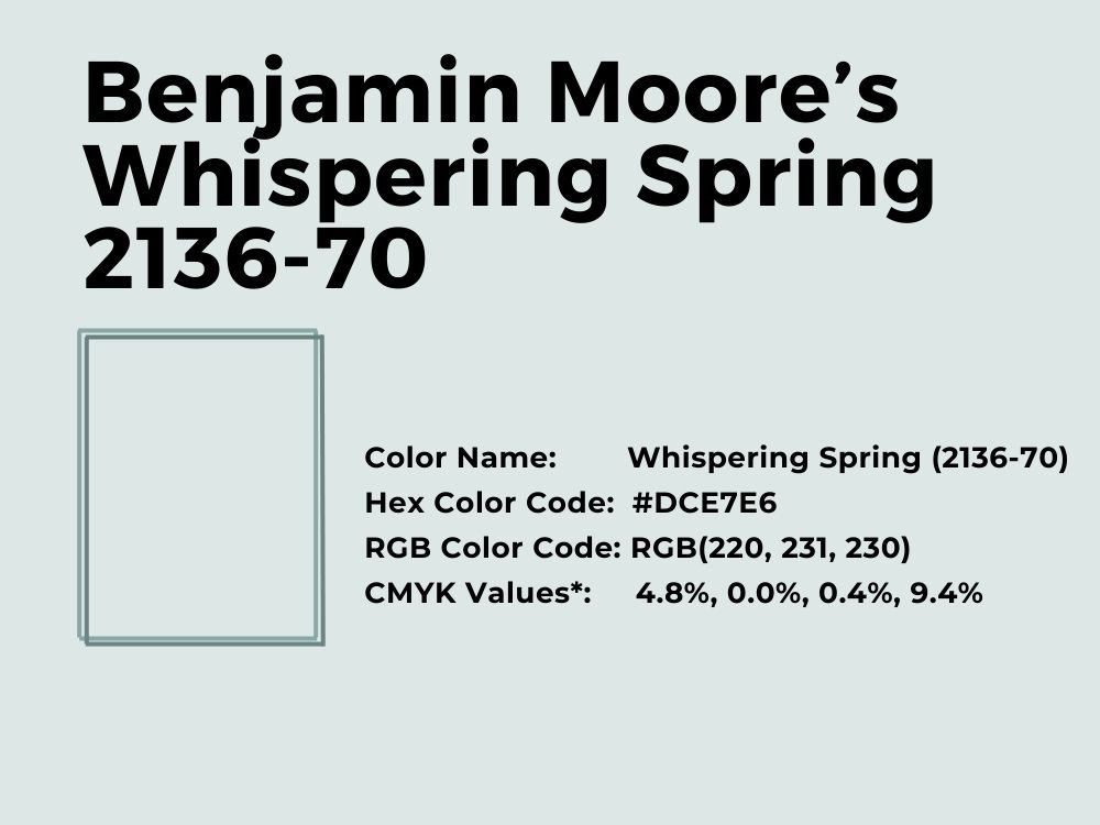
Most light blue paint colors are cool because blue is typically cool. The same is true for the Whispering Spring paint color by Benjamin Moore. It has a breezy feel and combines well with red hues.
With an LRV of 77.79 and an RGB of 221, 231, and 229, Whispering Spring is light enough to mimic white. But it also has some color to remove the starkness typically associated with white or gray. Its coordinating colors include Old Claret, Grant Beige, and White Heron.
This living room with blues, purples, and greens accentuates the true beauty of this shade of light blue:
Need more inspiration? Check out this small sitting room decor from Benjamin Moore with touches of brown, white, and other shades of blue against a backdrop of Whispering Spring:
2. Sherwin Williams’ Snowdrop SW 6511
Cool blue with purple undertones
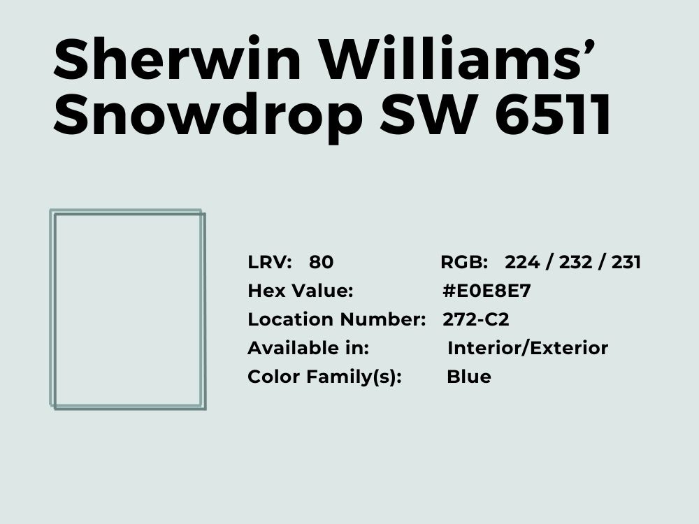
If you are in the market for a light blue paint that mimics white, you do not have to look further than Sherwin Williams’ Snowdrop. It is similar to Benjamin Moore’s Whispering Spring but has a higher LRV, which is 79.55. Because it is closer to the white end of the spectrum, this color has a brightness that adds a cheer to any room.
With an RGB color balance of 234, 232, and 231 respectively, Snowdrop is clearly on the cool end of the spectrum. However, its slightly purple undertones mean it has a bit of red. So, it can also mimic warm light blue in some lights. Its coordinating colors include Pussywillow, Extra White, and Pure White.
If you are wondering how to combine the color with bolder tones, check out this small decor for some inspiration:
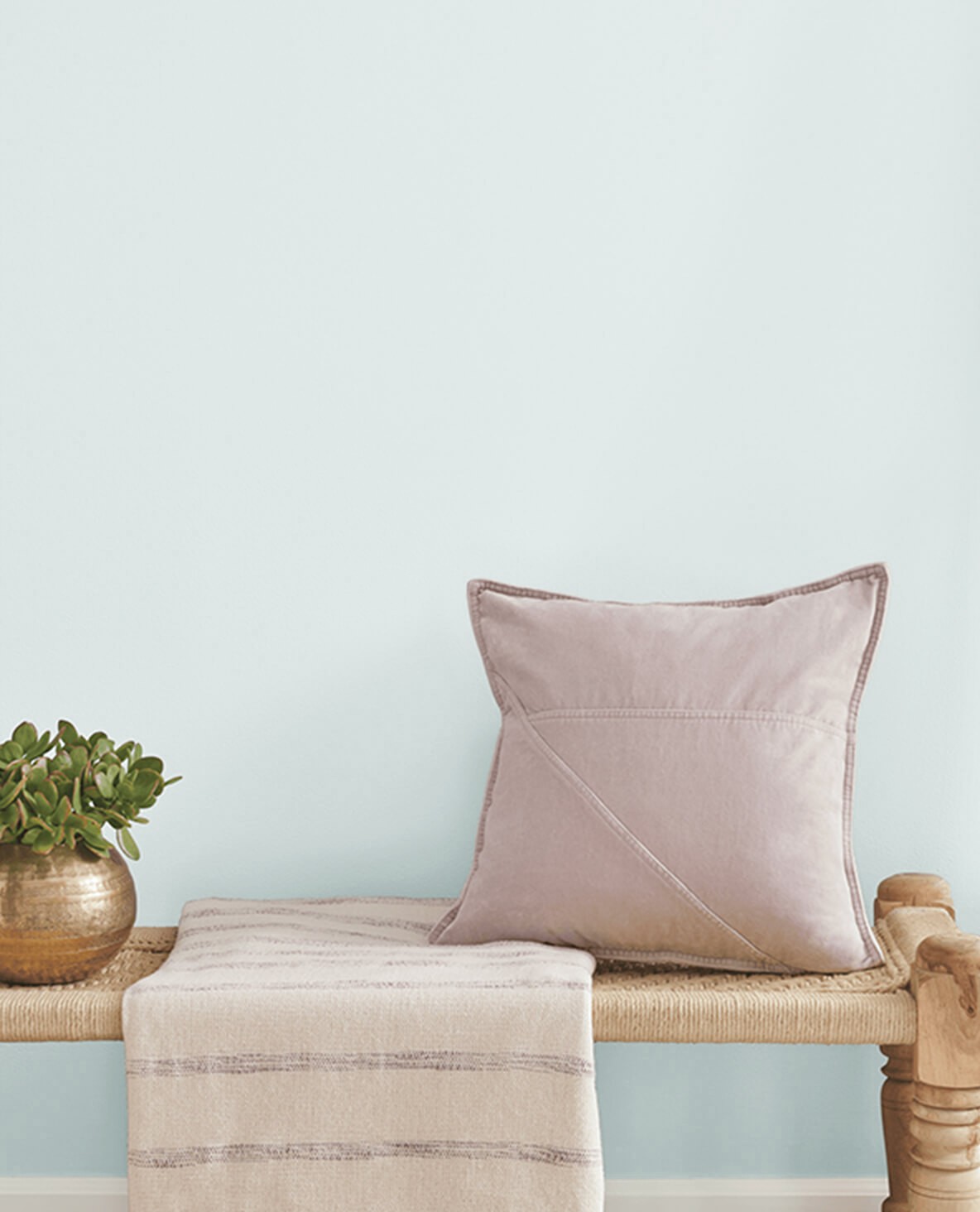
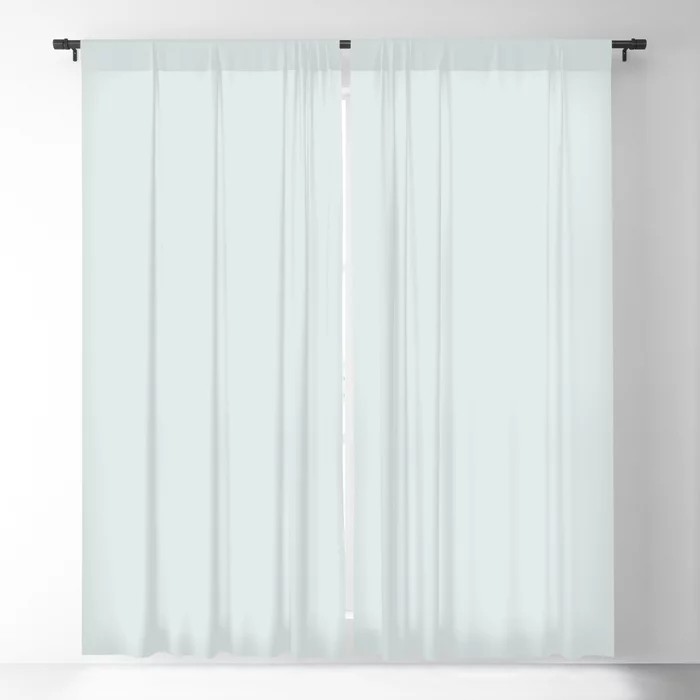
Or consider this blind against a backdrop of a different color to get an idea of how to use Snowdrop in a similar space:
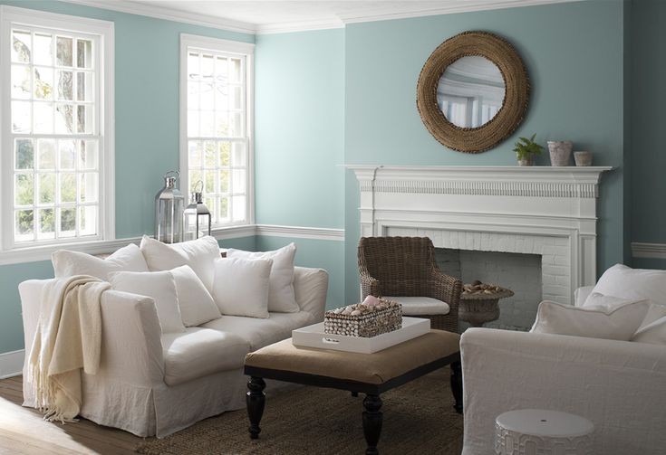
3. Benjamin Moore’s Breath of Fresh Air 806
Neutral blue color with touches of gray
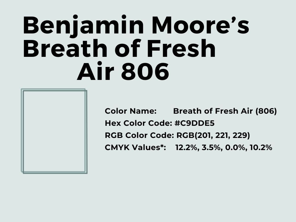
Get a breath of fresh air with one of the most popular Benjamin Moore light blue paint colors. While it was the color of the year for 2014, quite a while back, Breath of Fresh Air is still a much sought-after paint color.
It has an RGB of 210, 221, and 229 respectively, and an LRV of 69.09. It is not one of the brightest blues on the block, but it has an appeal that serves you blue and gray in one paint color. Its matching colors are Violetta, Frostine, Rock Gray, and Paper White.
What you combine Breath of Fresh Air with will depend on where you want to use it. Fortunately, the paint color is suitable for any room in the interior of your house, whether it is the kitchen, bedroom, or bathroom, as you can see in this beautifully decorated space:
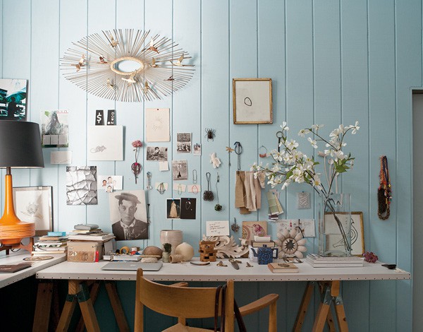
Or this workspace with a nice clutter of browns and blacks to complement the backdrop of Breath of Fresh Air:
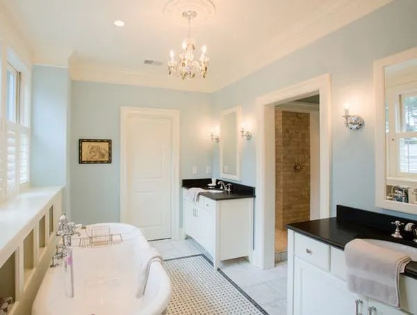
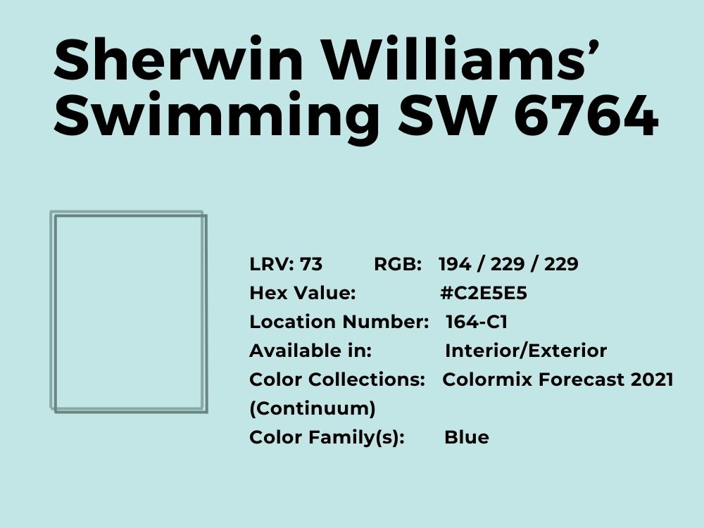
4. Sherwin Williams’ Swimming SW 6764
Cool blue with green undertones
We love how unabashed this color from Sherwin Williams is about its tilt to the green side of the spectrum. Yet, you can clearly tell it is a light blue paint color. With it, you know where it works best according to your decor.
Swimming is a beautiful blast of freshness and lightness in one paint color. It is a balance between keeping it light and having a splash of color. Because of this, Swimming is available for both interior and exterior painting; you can use a white trim if used on the exterior.
And while the color may look a little different in real life, the color is still solid it has an RGB color balance of 194, 229, and 229 respectively, with an LRV of 73. Its coordinating colors include Roman Column, Glimmer, and Blithe Blue.
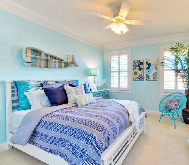
Check out its contrast against some splashes of color in this bedroom decor:
And this bedroom with a lot of pastels and a backdrop of Swimming:
5. Benjamin Moore’s Palladian Blue HC-144
Cool blue with green undertones
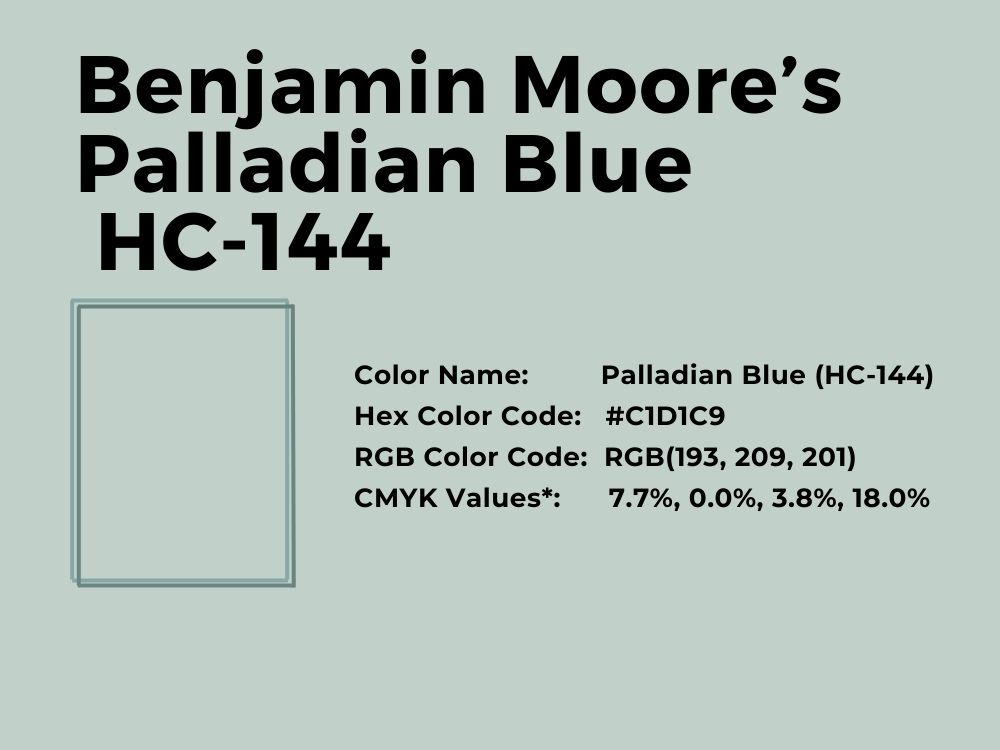
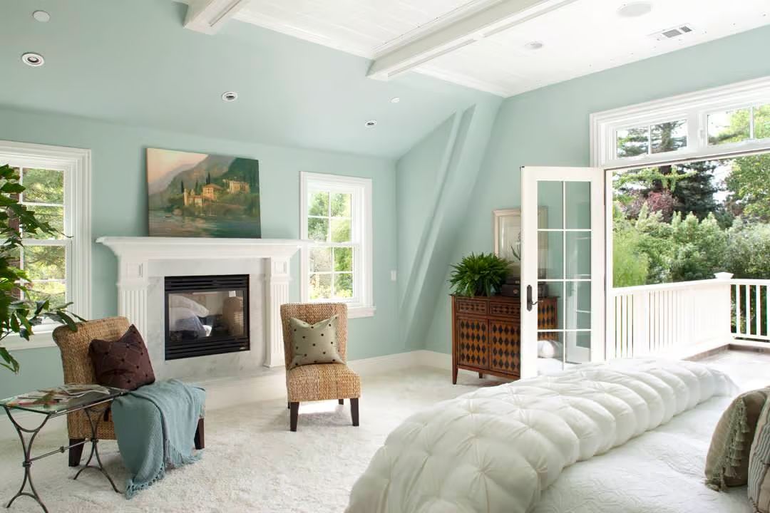
Looking for a less-obvious light blue-green paint color? Check out the Palladian Blue from Benjamin Moore and compare it to Swimming from Sherwin Williams. It reminds you of Mother of Pearl wrapped in the clear and breezy blue of the ocean.
Palladian Blue has an LRV of 60.4 and an RGB color balance of 193, 209, and 201 respectively. Its coordinating or matching colors include Persimmon, Wood Grain Brown, Willow Creek, and Elmira White.
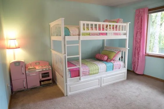
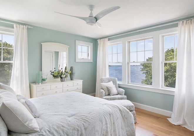
This bedroom decor inspiration from Pinterest gives you a picture of what the light blue paint color looks like against white:
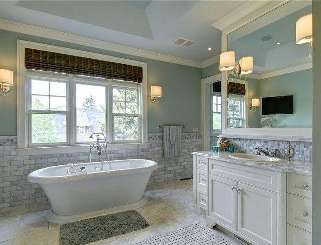
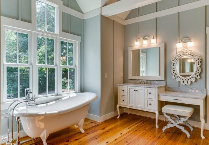
And see how it compliments light grays in the bathroom decor inspiration from Pinterest:
6. Sherwin Williams’ Aviary Blue SW 6778
Blue with slight green undertones
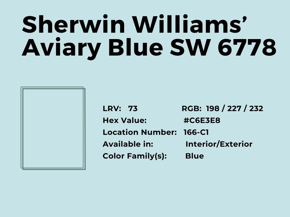
Aviary Blue is bright enough to draw attention when blended with the right colors. Yet, it is muted enough not to be overwhelming. It is one of those light blue paint colors that lean toward the cool end of the spectrum because of the higher amount of green and blue in it.
This light blue paint color is suitable for and available in interiors and exteriors. With an LRV of 73 and an RGB color balance of 198, 227, and 232 respectively, Aviary Blue is a go-to for many occasions. Paint your kid’s room or powder with this uplifting color, and you change the face of the room.
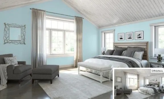
Its coordinating colors are Sky High, Surfin’, and Dover White. Home Stratosphere created a perfect combination of Aviary Blue and grays in this bedroom decor:
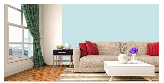
Here is a sitting room with a backdrop of Aviary Blue to complement cream and red:
7. Benjamin Moore’s Bird’s Egg 2051-60
Cool blue paint color with gray undertones
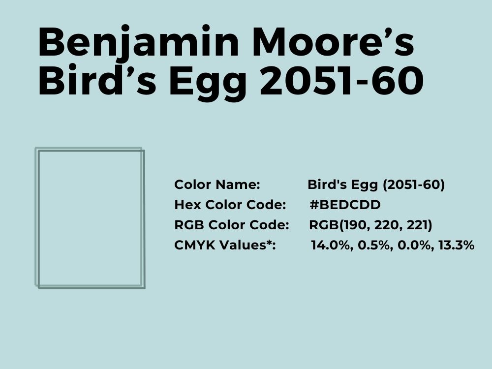
Bird’s Egg is such a cool shade of light blue, almost like a robin’s egg. It can fit any room or even the exterior of your house because of how versatile it is. The hint of gray you see under the surface creates a neutral balance when necessary.
Also, you may notice a hint of green. With an RGB color balance of 190, 220, and 221 respectively, you can see why green tends to peek through under certain types of light. The green color balance is almost the same as the blue. Bird’s Egg has an LRV of 66.84 and its coordinating colors are Venezuelan Sea, Wythe Blue, Chalk White, and Ice Mist.
This contrast against white and black in the sparsely decorated room shows how well it works:
Or this bright bedroom with whites and browns from Benjamin Moore Edmonton:
8. Sherwin Williams’ Sky High SW 6504
Light blue paint color with slight yellow undertones
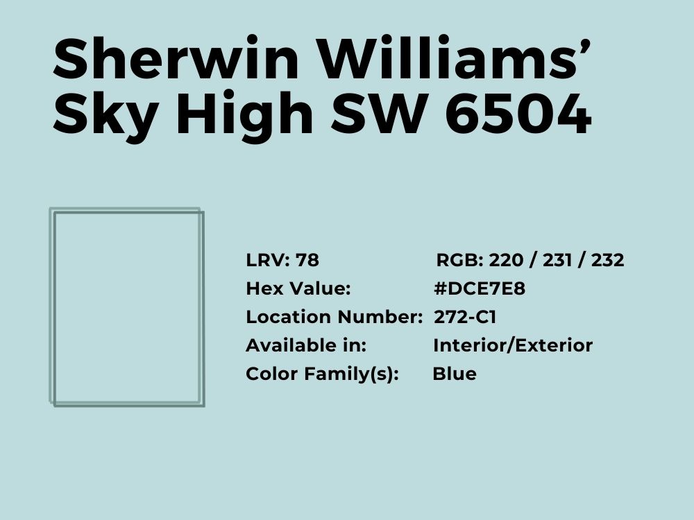
This light blue hue is a delight because of the slight yellow color peeking through to the surface. While it is a cool color, Sky High presents a cheeriness that other similar blues do not have. This is why it is perfect for your kid’s bedroom, bathroom, or kitchen.
With an LRV of 78 and an RGB color balance of 220, 231, and 232 respectively, Sky High also works for the exterior of a house. However, ensure you use other matching or coordinating colors, such as Sherwin Williams’ Pure White, Aquitaine, and Atmospheric.
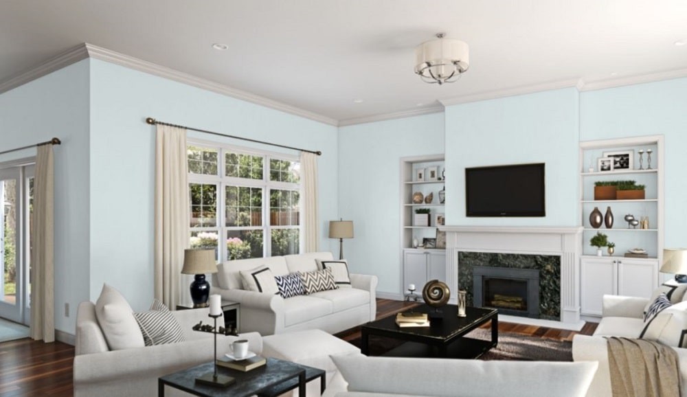
Because of its lightness, Sky High can blend with almost any color while adding a splash of color, as you can see in this sitting room setting.
You can also similar shades of blue together with Sky High to brighten your kitchen:
9. Benjamin Moore’s Blue Hydrangea 2062-60
Cool blue with slight green undertones
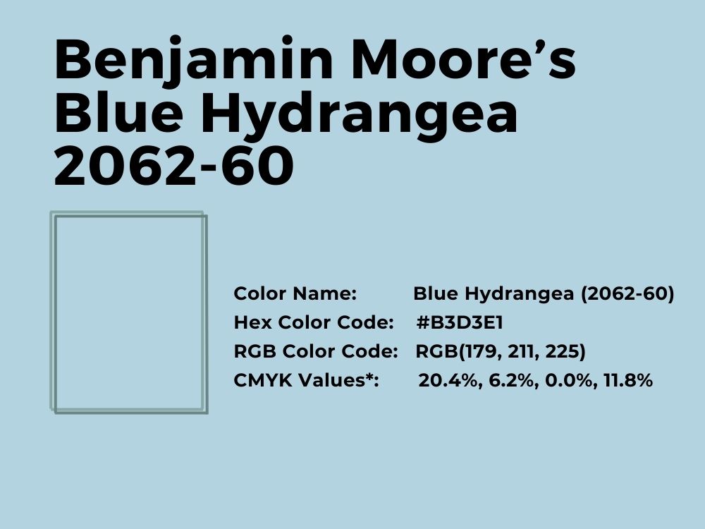
There’s blue and there’s powder blue. Blue Hydrangea is one of the best light blue paint colors from the brand because of its softness and airiness. It is almost as if you can touch it. It is a true blue paint color because of its RGB color balance of 179, 211, and 225 respectively. In other words, it leans more toward blue than any other color.
With an LRV of 61.76, this color does not have a high light reflectivity value. However, it more than makes up for it in its blueness, like the first signs of spring.

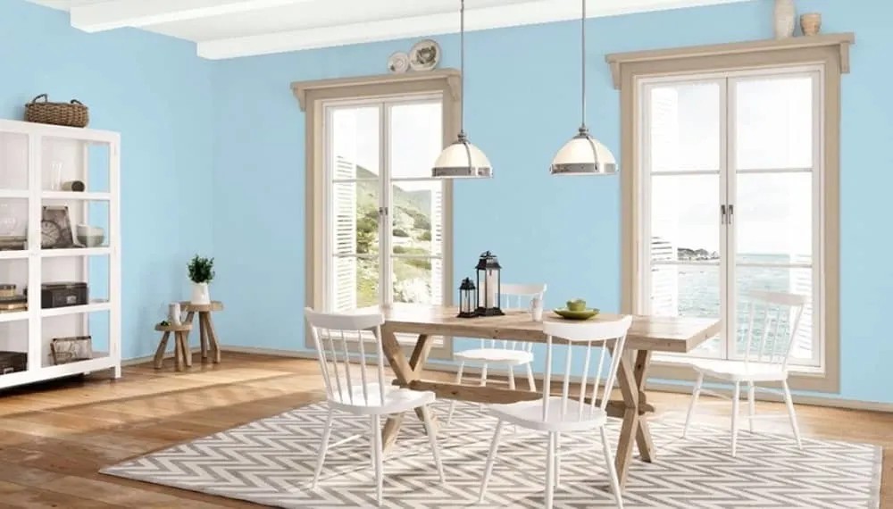
Its coordinating colors are Cream Yellow, Mountain Peak White, Star Dust, and Wedding Veil. Check out how beautifully it is combined in this dining area:
10. Sherwin Williams’ Bravo Blue SW 6784
Cool blue paint color with hints of green
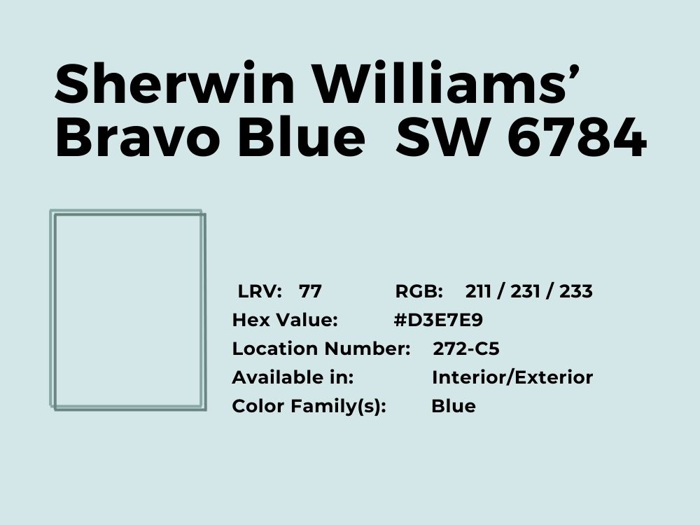
This color is light yet bold. It can get confusing if you find that it is heavier than you expected, as many clients have been after seeing it in reality. However, Bravo Blue is light enough to be a light blue, yet too heavy to fit a small room because it will make it dark.
Bravo Blue has a light reflectance value of 77 and an RGB color balance of 211, 231, and 233 respectively. This explains its tilt toward the blue and green end of the spectrum. Here is a Bravo Blue decor in a kid’s bedroom:
And the contrast of a Bravo Blue-colored rug against a gray-colored floor:
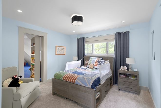
11. Benjamin Moore’s Sea Foam (2123-60)
Cool blue paint color with hints of green
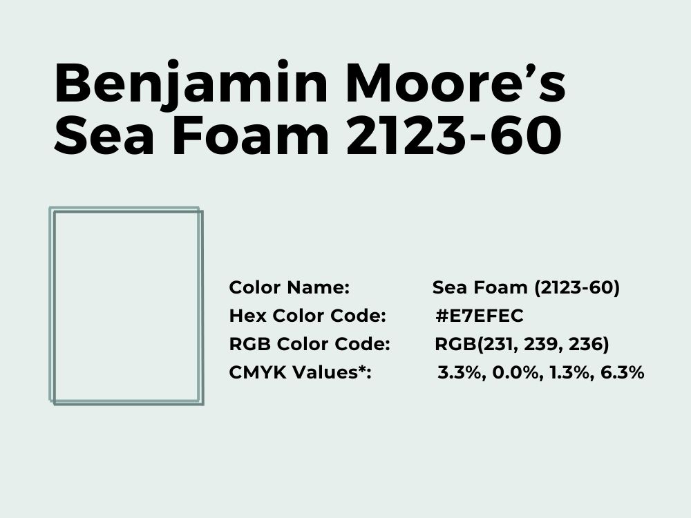
At first glance, this paint seems white except that it has small hints of green showing through the surface. You can tell it it not white when you place a piece of copy paper beside it. However, Sea Foam is such a gentle and mild color that it can mimic white and blend with any color.
Its LRV of 82.71 explains its brightness, and its RGB color balance of 231, 239, and 236 respectively shows that it leans more toward the blue-green end than the red end. Saratoga Springs, Gray Owl, Sidewalk Gray, and Ice Mist are its coordinating colors.
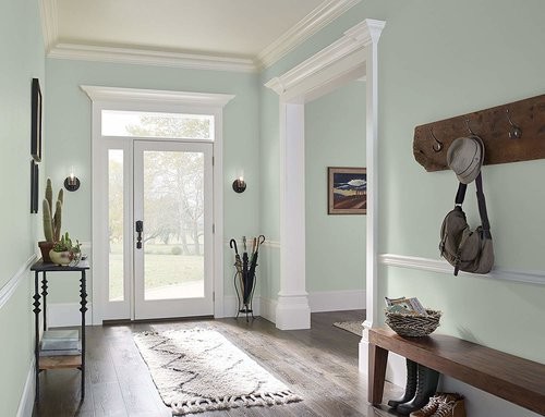
12. Benjamin Moore’s Thunderbird 675
Blue with small hints of gray-green
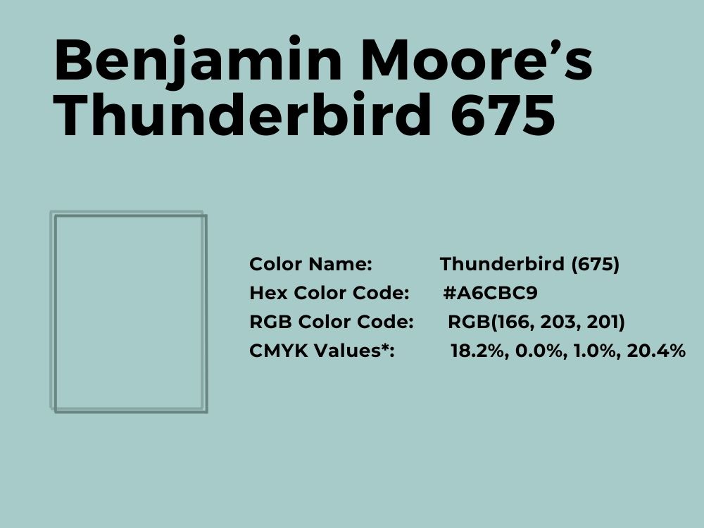
With an LRV of 55, Thunderbird is one of those light blue paint colors that sit in the middle of the color spectrum. That means its light reflectance value is not enough for the color to throw off enough light. But it is a great light blue shade to consider if you want a bit of gray mixed in with it.
Its RGB color code is 163, 203, and 201, which means it has more green in it than any of the other primary colors. And its coordinating colors include Salamander, White Ice, Pearl Gray, and Frostine.
13. Benjamin Moore’s Gossamer Blue 2123-40
Cool blue with mid-tones of blue, gray, and green
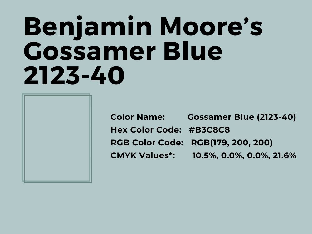
Gossamer Blue has an equal amount of blue and green and a smaller amount of red; its RGB color balance is 179, 200, and 200 respectively. This means the light blue paint color has an equal tone of blue and green, tilting toward the cool end of the spectrum.
With an LRV of 55.04, Gossamer Blue is not too reflective but perfect for bedrooms and restrooms. You can even use it for your kid’s room or the exterior of the house if it works for you. It shines best when combined or complemented by coordinated colors including Rainforest Dew, Titanium, Ice Mist, and White Heron.
14. Sherwin Williams’ Atmospheric SW 6505
Cool mid-tone blue with hints of gray
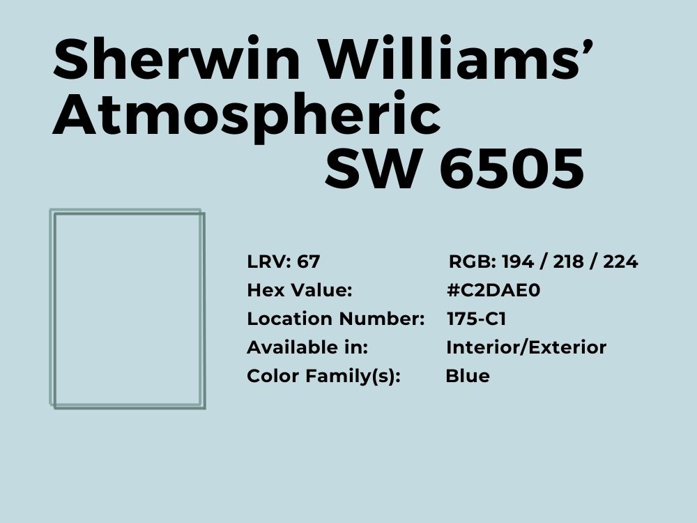
Perfect for the interior and exterior, Atmospheric is a popular choice for interior designers and decorators. It has a perfect balance between green and blue, which gives it a unique hue. Its RGB of 194, 218, and 224 respectively explain the tone and why it turns out so well.
Consider painting the kitchen, nursery, or children’s room with a blend of this light blue and a few other vibrant colors, such as dusty rose or a darker blue. But you can also opt for some of the coordinating colors that include They Call It Mellow, African Gray, and Sy High.
15. Sherwin Williams’ Tradewind SW 6218
Clear light blue paint with green and gray undertones
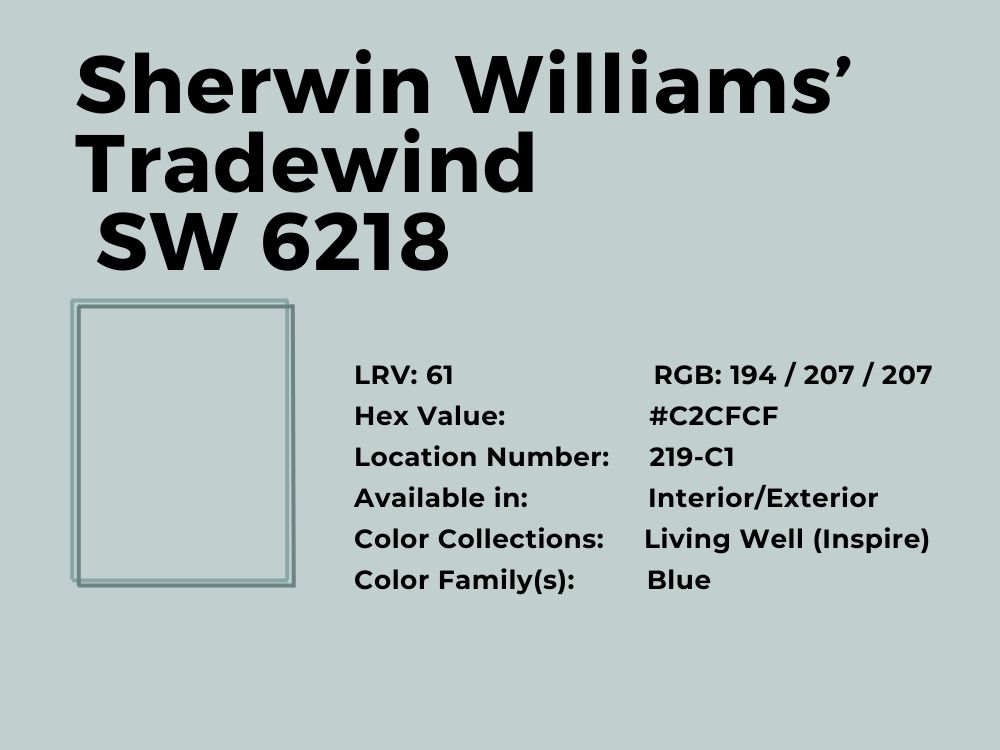
If you find the right colors to pair with Tradewind, you will be amazed at the results you will get. This powder room by Knock Off Decor perfectly displays what colors work with the shade of light blue paint if you want a pristine look.
It has an RGB color balance of 194, 207, and 207 respectively, and an LRV of 61. You can use coordinating colors such as Shell White, Whirlpool, and Topsail to complement the color. It is also available for use inside and outside your house, as Seas Your Day displays in this bedroom decor:
16. Benjamin Moore’s Arctic Blue 2050-60
A blend of light blue touched with green undertones
It is clear that Arctic Blue is not your run-of-the-mill light blue. In some settings, the paint color appears more green than blue, and the RGB of 196, 224, and 227 explain this. It has a higher amount of green than blue, and the amount of red is low.
However, with an LRV of 70.86, Arctic Blue is bright and can serve as a replacement for white or gray if you want a hint of color. You can also match it with Teal, White Wisp, White Ice, or White Heron. Other neutrals apart from white work well with it, so consider adding brown to the decor, as Benjamin Moore does in this decor:
17. Benjamin Moore’s Heavenly Blue 709
Cool blue paint with gray undertones
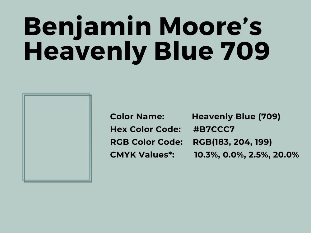
Get a feel of the heavenly with the Heavenly Blue paint color from Benjamin Moore. With an LRV of 56.47 and an RGB value of 183, 204, and 199 respectively, you can see why it is such a cool color. Besides, the gray undertones expand its versatility because of the hint of neutrality.
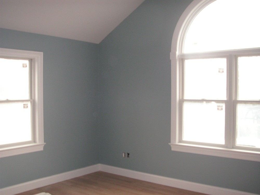
Use coordinating colors such as Rock Gray, White Swan, Emerald Vapor, and Chantilly Lace to complement this light blue color. If unsure, mix in a bit of brown, as Benjamin Moore does in this sample decor:
18. Sherwin Williams’ Quench Blue SW 6785
True blue paint color with turquoise undertones
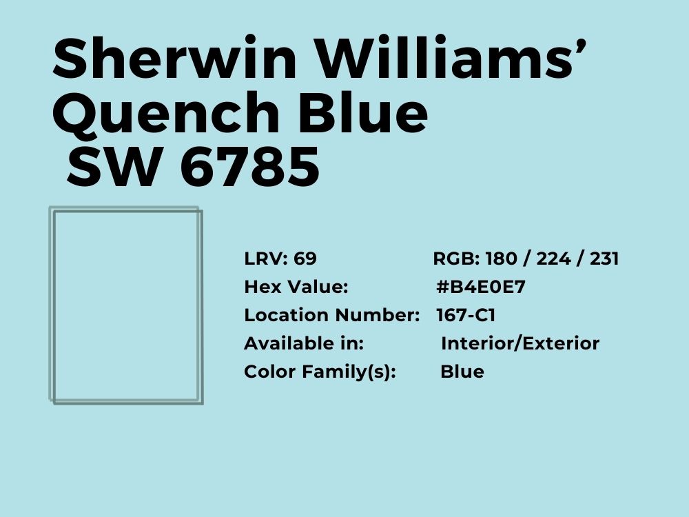
Quench Blue is such an exciting color because of the undertones of turquoise you can clearly see. While it is not overwhelmingly blue, it still presents a hint of full color, just enough to change the look of any room. This may have something to do with its RGB color balance of 180, 224, and 231 respectively.
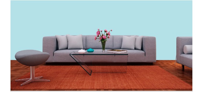
Quench Blue has an LRV of 69, is suitable for interiors and exteriors, and has coordinating colors that include Bravo Blue, Silken Peacock, and Extra White. Check out the color blast that thoroughly complements this light shade of blue in this sample decor:
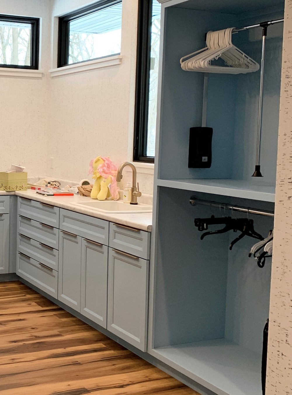
19. Sherwin Williams’ Vast Sky SW 6506
Cool blue with gray undertones
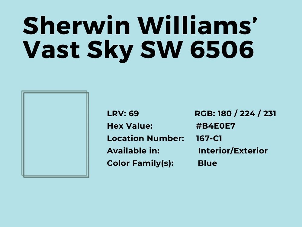
Talk about a shade of blue that is truly blue and you cannot skip Vast Sky. It is a clear and soft light blue that fits with most other colors, especially if they are darker or more vibrant. It can fit your kitchen, bedroom, bathroom, or even your closet from this minimalist decor from Houzz:
Vast Sky is not in your face, although it may be too weak to fit as living room colors. But combine it with its coordinating colors which include White Raisin, Dover White, and Sky High, and you change the look of the room. This light blue paint color has an RGB color balance of 169, 201, and 215 respectively, and an LRV of 55.
See how the color changes under different lighting and color bend choices in this decor from Houzz:
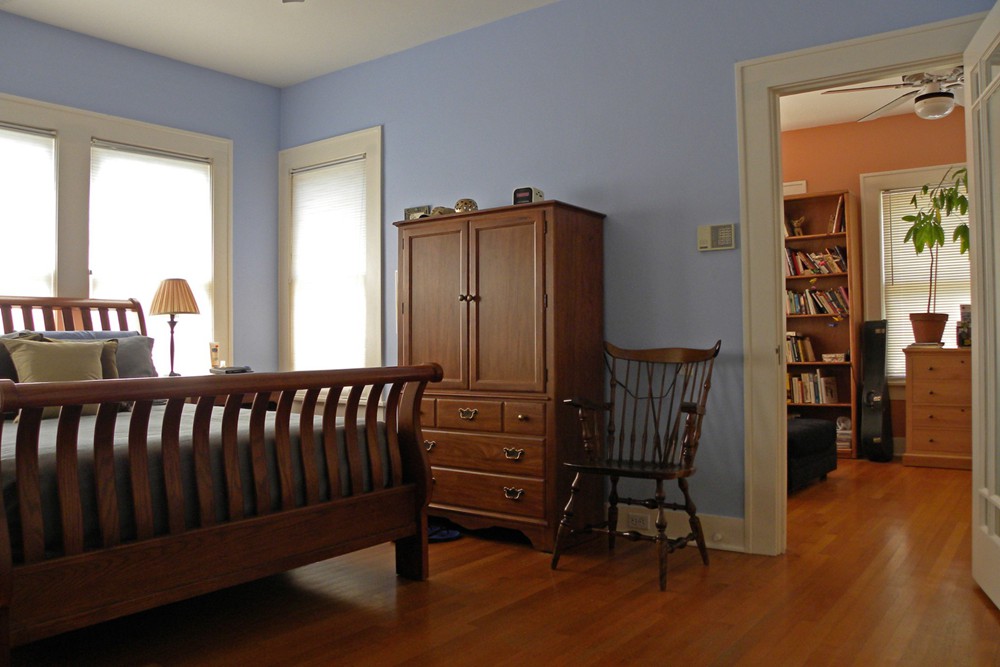
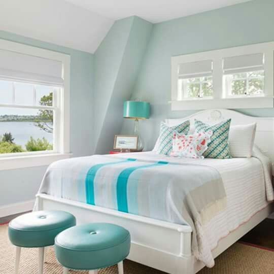
20. Benjamin Moore’s White Rain 708
Cool blue paint color with gray undertones
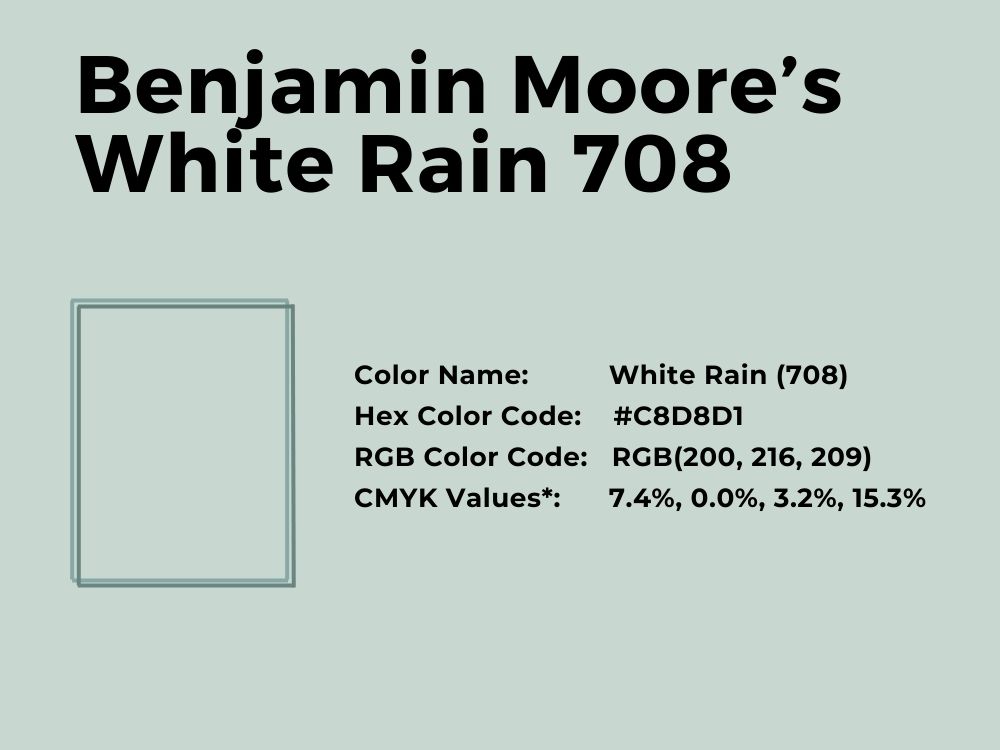
White Rain looks like a dull color, but when paired with its coordinating colors that include Gargoyle, Brushed Aluminum, and Distant Gray, the true beauty emerges. It has an LRV of 65.2 and an RGB value of 200, 216, and 209 respectively. That means hints of green peek out under the right lighting.
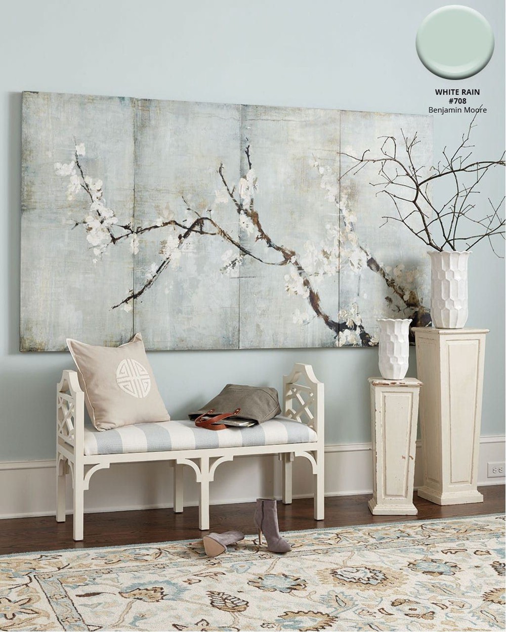
Turquoise is also an excellent color to pair with it, as you can see in this lovely bedroom decor from Pinterest. However, you can consider colors that lean toward red, such as coral, peach, and orange. Yellow also works well with it.
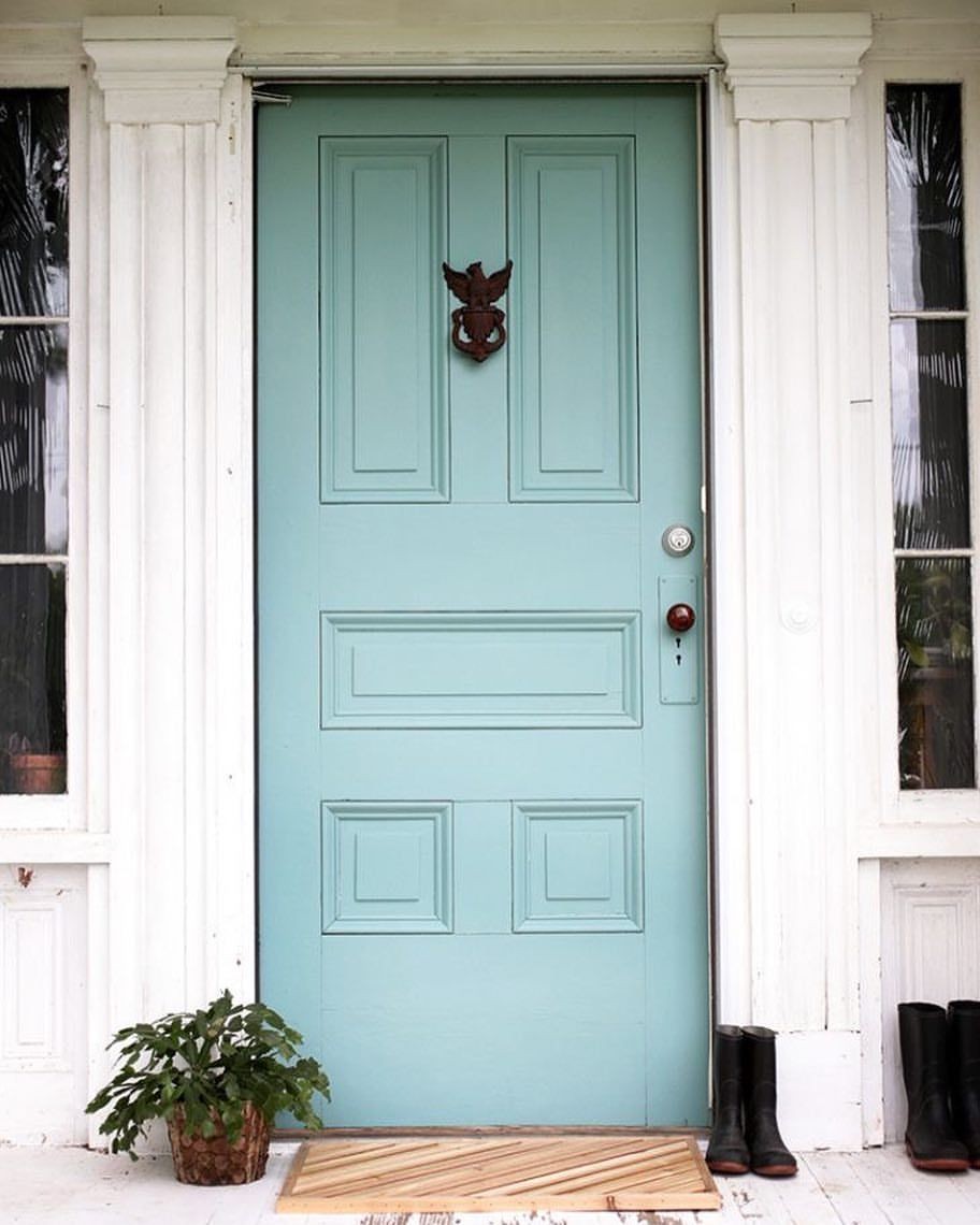
21. Benjamin Moore’s Waterfall 2050-50
Cool blue-green with gray undertones
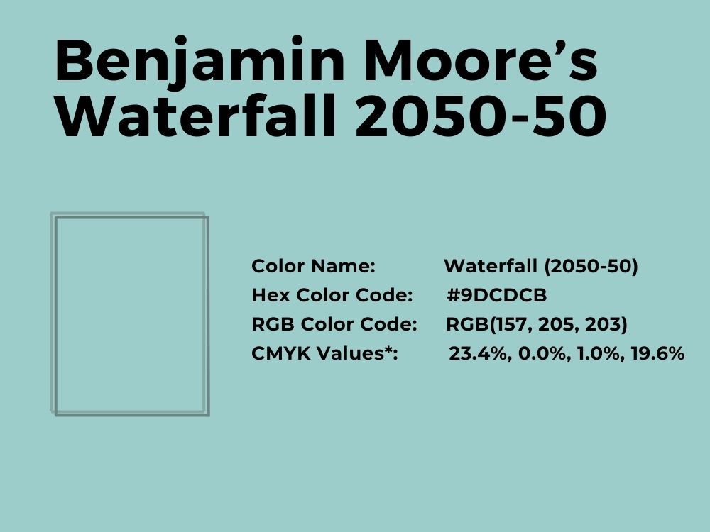
Waterfall is a refreshing light blue color that can lighten or slightly darken depending on the lighting. With an LRV of 55 and gray undertones, it is a muted tone that speaks of sophistication. You can use it on trimmings, as the color of your front door, or on accent walls.
If you want to make a statement, use Waterfall as the color of your house’s exterior. This color is sure to hold up and stand out in your neighborhood or within your home. It has an RGB value of 157, 205, and 203 respectively. Its coordinating colors include Wind’s Breath, White Dove, Icing on the Cake, and Snow White.
22. Benjamin Moore’s Mediterranean Breeze 799
True blue paint color with neutral undertones
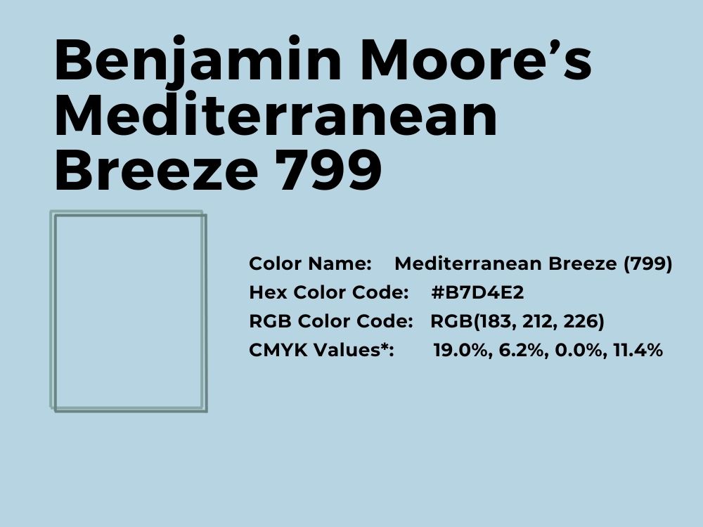
This powder color is a breath of fresh air because of how clear and truly blue it is. There are no obvious tones trying to overshadow it; its undertones are neutral. If you want a light blue paint color that delivers what it says, consider Mediterranean Breeze.
As the name suggests, it brings with it the feeling of a fresh breeze from the Mediterranean. This paint color has an LRV of 62.31 and an RGB value of 183, 212, and 226 respectively. Use Sequoia, Pale Celery, Distant Gray, and White Heron as its coordinating colors.
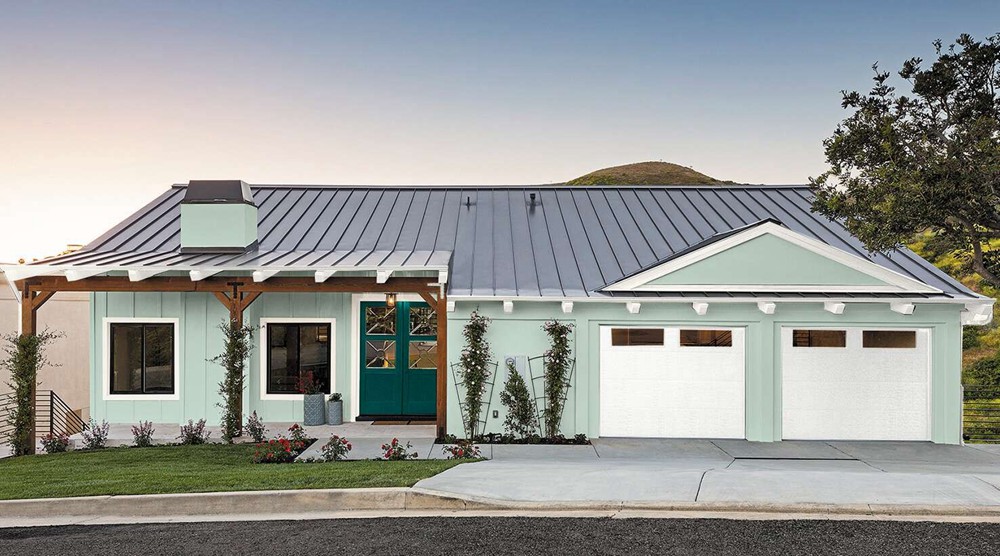
23. Sherwin Williams’ Embellished Blue SW 6749
Bright blue with a hint of mint
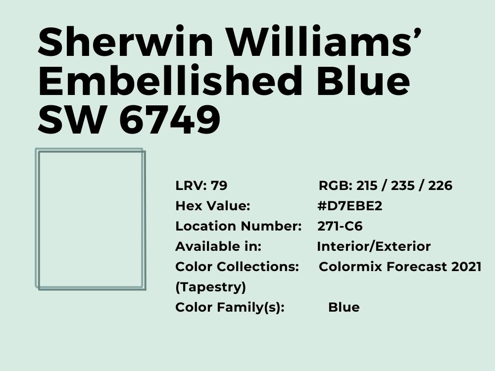
If you need a light blue paint color that gives a hint of green or mint, check out Embellished Blue from Sherwin Williams. It is a beautiful color that makes a room look cool and calm. It works best when paired with Cooled Blue or used as a trim or decor color because of its mildness.
The paint color has an RGB of 215, 235, and 226 respectively, which explains the green hue that is so obvious. With an LRV of 79, the color is close to the white end of the color spectrum. This explains why it is excellent as a trim paint color, although it also works as an exterior house paint color.
24. Sherwin Williams’ Iceberg SW 6798
Warm blue with purple-gray undertones
An obvious light blue paint color with purple undertones suggests that there is a bit more red and green in it than usual. This amazing color is muted and understated until you match it with a color like Pure White from Sherwin Williams. Then, you see how much purple comes to the surface.

With an LRV of 76 and an RGB color balance of 214, 228, and 231 respectively, Iceberg works well inside and outside your home. Because it is light, it may be best to use as a trim color on the exterior and pair it with bright colors inside the house. Its coordinating colors include Something Blue and Malabar.
25. Benjamin Moore’s Woodlawn Blue HC-147
Delicate blue paint color with green undertones
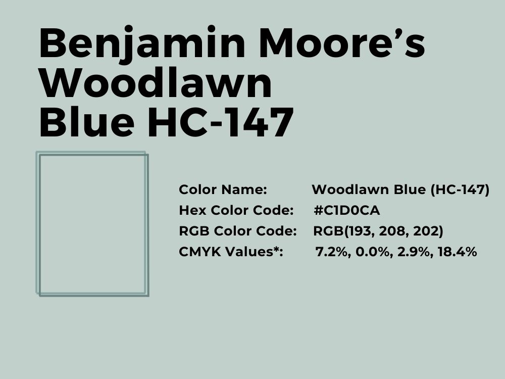
Whether it is in a sitting room, bedroom, or bathroom, Woodlawn Blue performs exceptionally because of its delicate coolness. It brings a splash of color to any room because of its seeming neutrality and closeness to white, with an LRV of 60.65.

It has an RGB of 193, 208, and 202 respectively. This explains the green color clearly visible under all that blue. Nevertheless, the perfect blend complements the paint color, and you can work it into any decor. Its coordinating colors include Tawny Port, Chelsea Gray, Cloud White, and White.
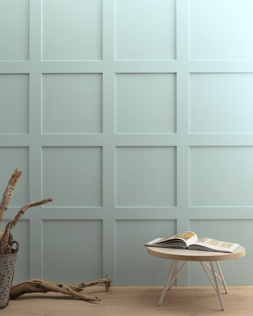
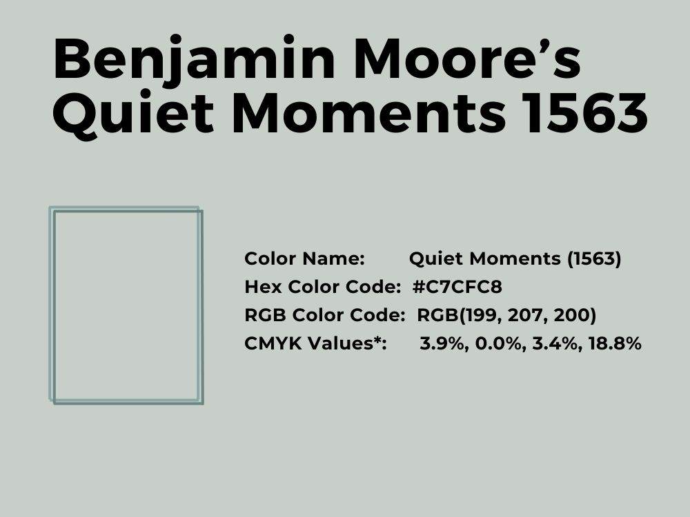
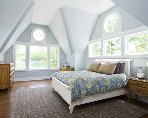
26. Benjamin Moore’s Quiet Moments 1563
Light blue-gray paint color with green undertones
You get the feeling of calmness and peace with this soothing color. It has blue-gray undertones that sway a little toward a warm green. Looking at the color, it is not immediately obvious that it has all these tones, but under certain lighting, the colors are more apparent.
Look at this bedroom decor by Knock Off Decor to get a feel of all the colors combined in one:
Quiet Moments has an RGB color balance of 199, 207, and 200 respectively. And with an LRV of 60.73, the color is a muted hue that brightens with the right color blend. Its coordinating colors include Mysterious, Gray Mountain, Cloud Cover, and White Heron.
Consider using this color in your bedroom or bathroom with a white ceiling or trims to get the best out of it:
27. Benjamin Moore’s Beach Glass 1564
Cool blue paint color with gray undertones
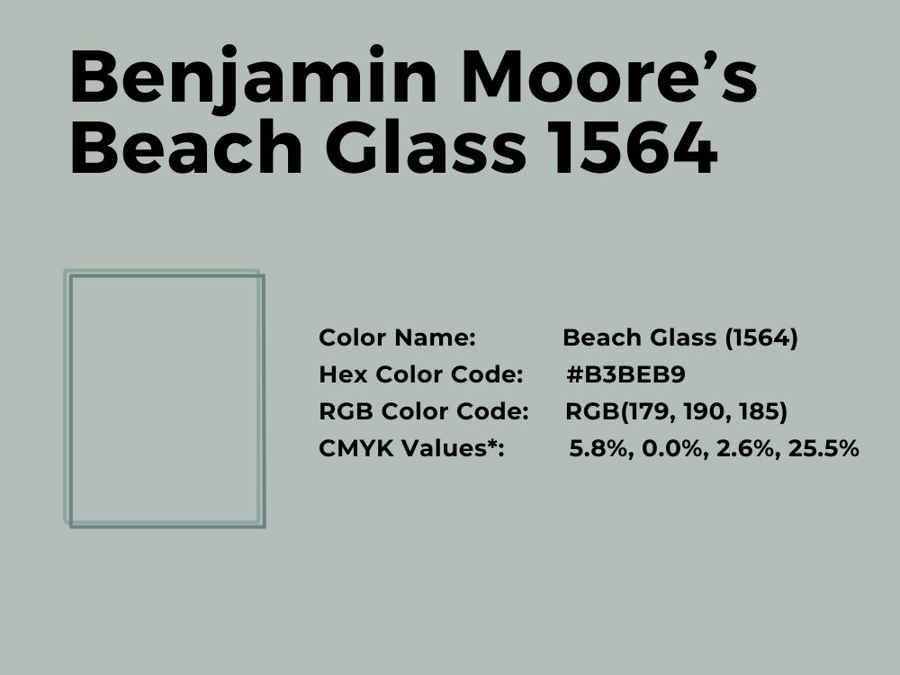
Etting the right light blue paint color with just a hint of another color can be tedious. This is because light blue has several possible undertones. But Beach Glass is a light blue color with a clear gray hue. The gray undertone gives it an almost neutral tone, making it suitable for most surfaces.
With an LRV of 49.7, this color is closer to the black end of the spectrum than the white. However, the RGB color balance of 179, 190, and 185 respectively makes Beach Glass the perfect choice for your galley kitchen and cabinets.
28. Sherwin Williams’ French Moire SW 9056
Cool mid-tone light blue color
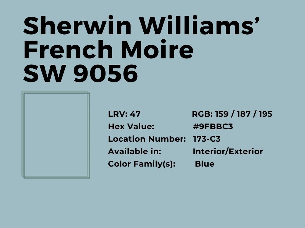
Call it a cornflower blue or cool blue, and you will not be far from the truth. This is a light blue shade that fits well with walls, powder rooms, bathrooms, or even your vanity or cabinets. It adds a sparkle to your kitchen or bathroom if you have neutral tones around it.
You cannot go wrong with French Moire if you know what colors to use. Consider its coordinating colors that include Natural Linen, Mountain Air, and Half-Caff. Mountain Air is a soft violet, so both colors blend beautifully. French Moire has an LRV of 47 and an RGB of 159, 187, and 195 respectively.
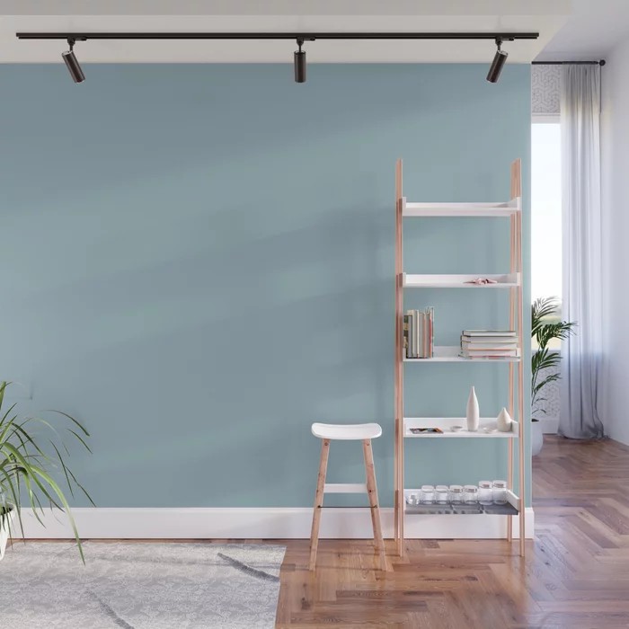
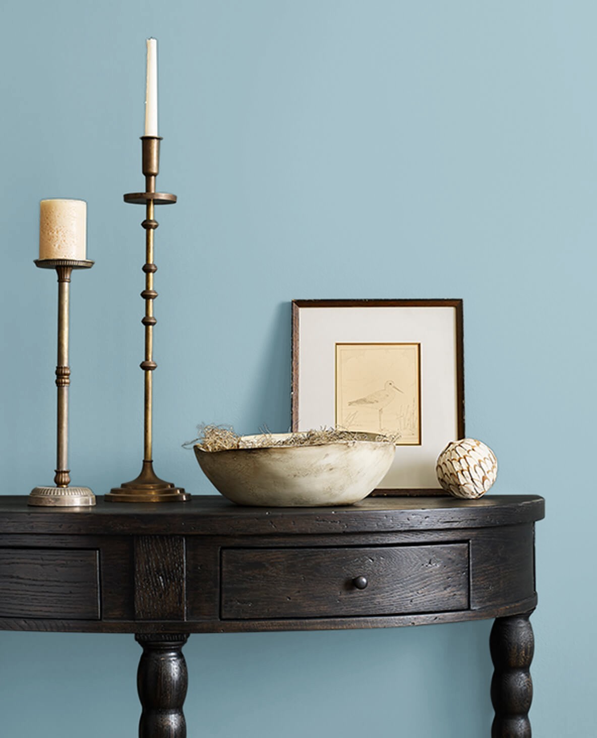
29. Sherwin Williams’ Honest Blue SW 6520
Clear light blue paint color with gray undertones
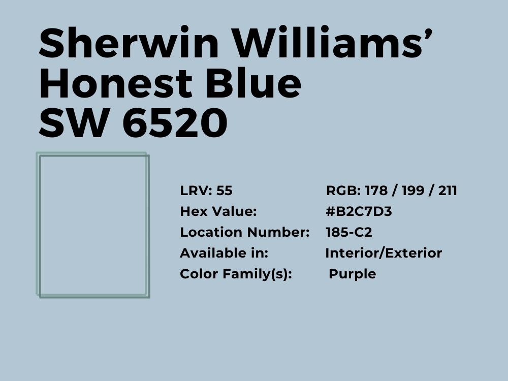
With an LRV of 55 and an RGB color balance of 178, 199, and 211 respectively, Honest Blue is the perfect color for your bedroom. It can also fit your house exterior because the brand makes this shade for interior and exterior use.
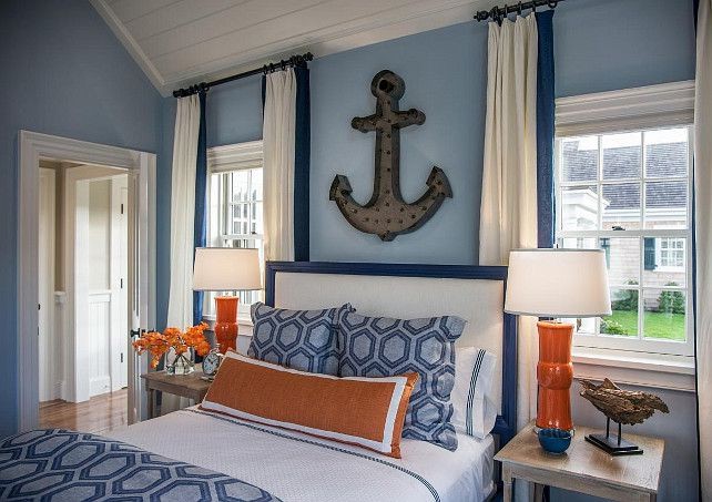
Although it has a clear gray undertone, Honest Blue easily fits into the purple family. So, soft pastels also work with it or choose brighter blues to pair with it. The paint color’s coordinated colors include Gauntlet Gray, Extra White, and Rarified Air.
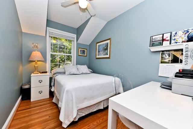
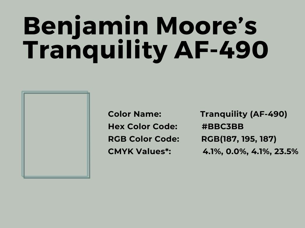
30. Benjamin Moore’s Tranquility AF-490
Light blue paint color with sage and gray undertones
Tranquility is one of those light blue paint colors that change their appearance with different lights. At first, it appears gray, but with the right lighting, you can see the true pale blue with hints of sage.
With an LRV of 53.31 and an RGB color balance of 187, 195, and 187 respectively, the color presents some green hints. One thing is certain: Tranquility is not boring. You can use it in several places in the interior and exterior. Its coordinating colors include White Diamond, Head Over Heels, Purple Lotus, and Fondant.
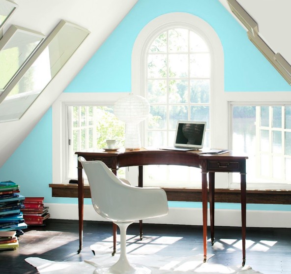
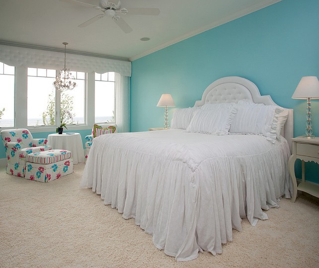
31. Benjamin Moore’s Blue Seafoam 2056-60
Light aqua with green undertones
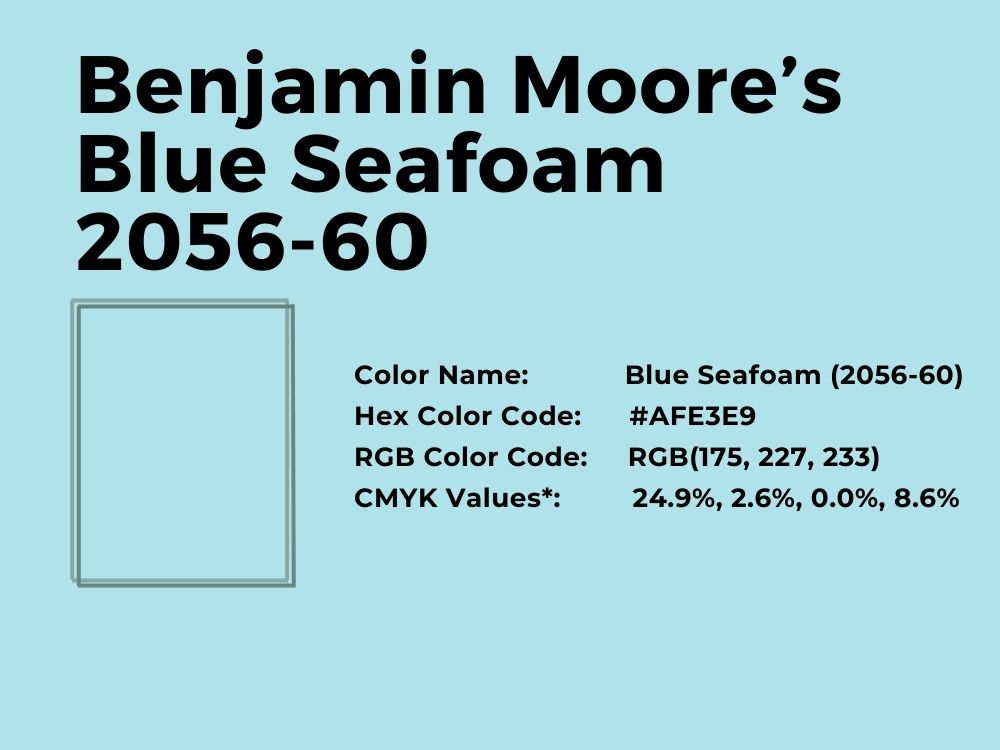
Add some sharpness to the light blue paint color of choice when you use Blue Seafoam in any room. It is bright because of the aqua color and green tone, but it is soft enough to escape being overwhelming. See how it fits with vibrant colors in this bedroom decor:
It has an RGB color balance of 175, 227, and 233 respectively, and an LRV of 69.48. This beautiful color has coordinating colors that include Sandy White, Sterling, Mountain Peak White, and White. Consider painting a room with this color and trimming it with white to see a spectacular result.
Conclusion
There are many light blue paint colors available from Benjamin Moore and Sherwin Williams. But we have narrowed the choices to the best ones, such as Palladian Blue, Swimming, Bravo Blue, and Tranquility.
However, ensure you consider other decor before choosing a blue for your home. This is especially true for blues with sharp undertones. These will determine how well the colors work out at the end of the day.
If you have any experience using one or more of these light blue paint colors, let us know your thoughts in the comments section.
 10 Best Sherwin Williams Tan Paint Colors (Trend 2023)
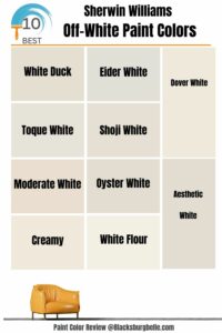 10 Best Sherwin Williams Off-White Paint Colors (Trend 2023)
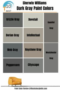 10 Best Sherwin Williams Dark Gray Paint Colors (Trend 2023)
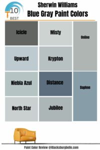 10 Perfect Sherwin Williams Blue Gray Paint Colors (Trend 2023)
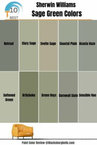 10 Best Sherwin Williams Sage Green Colors
 17 Best Sherwin-Williams Green Gray Paints (Trend 2023)
