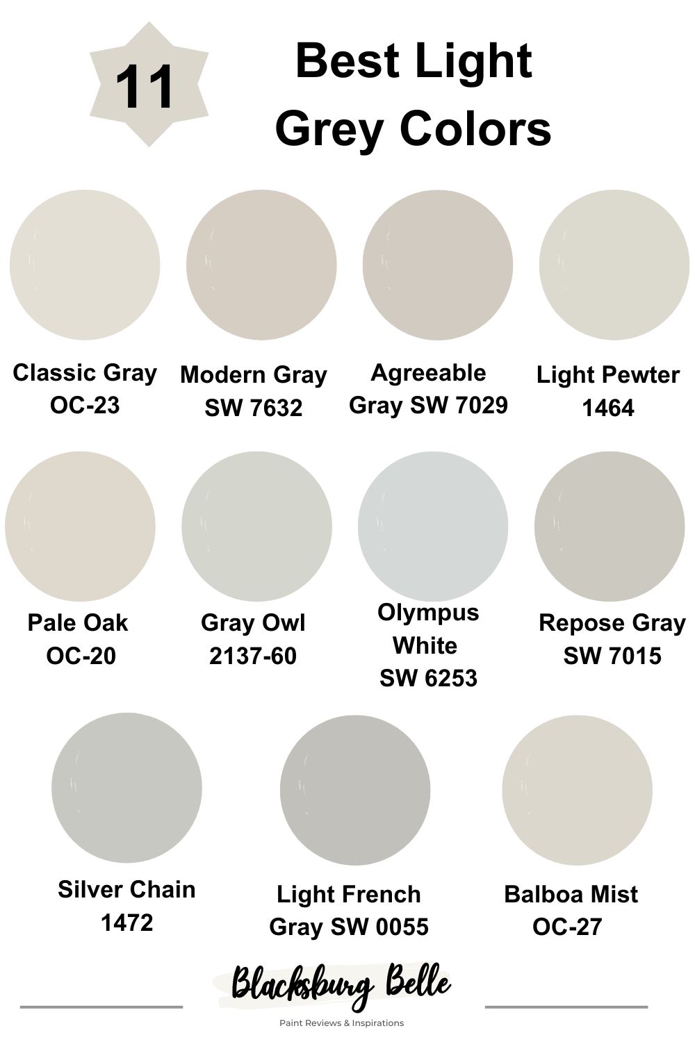
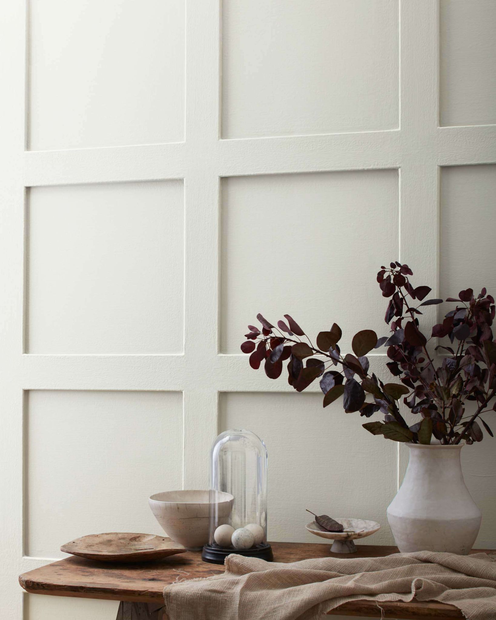
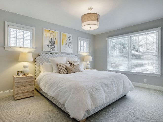
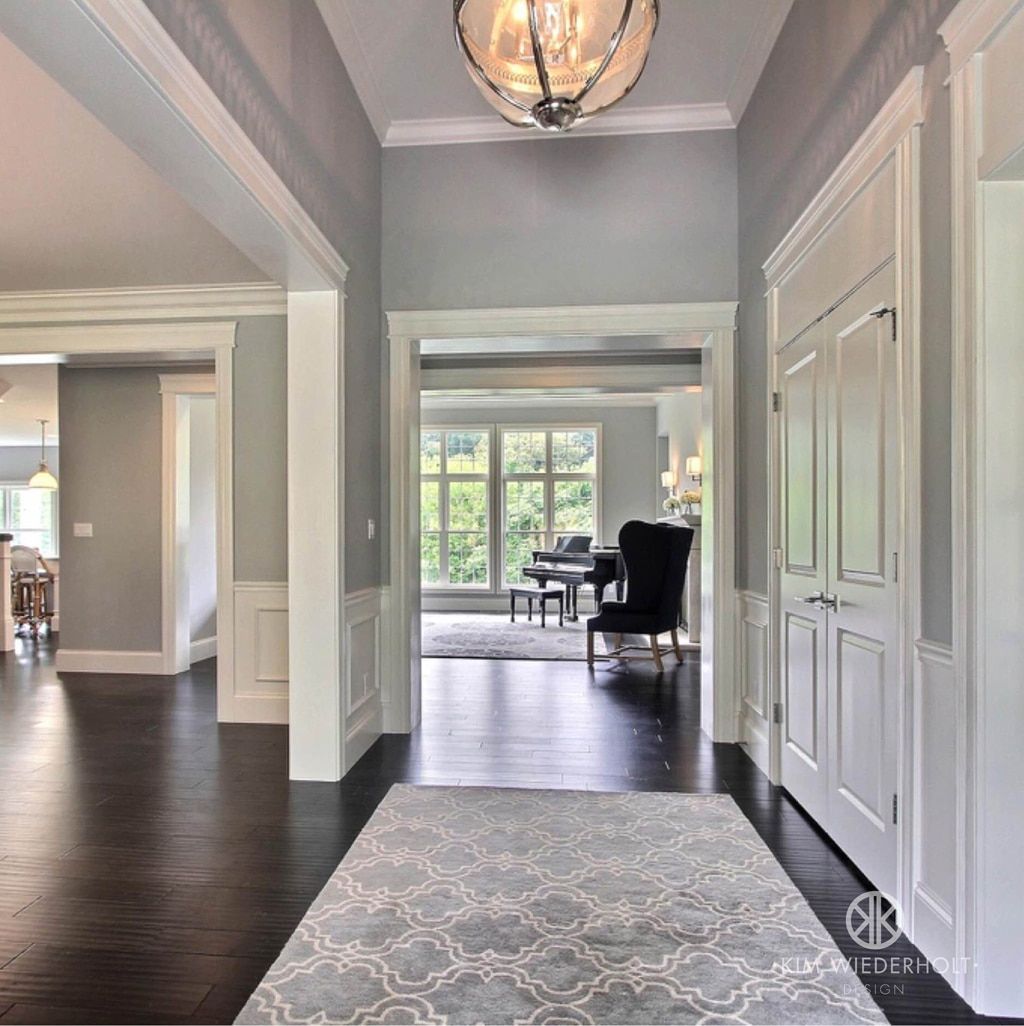
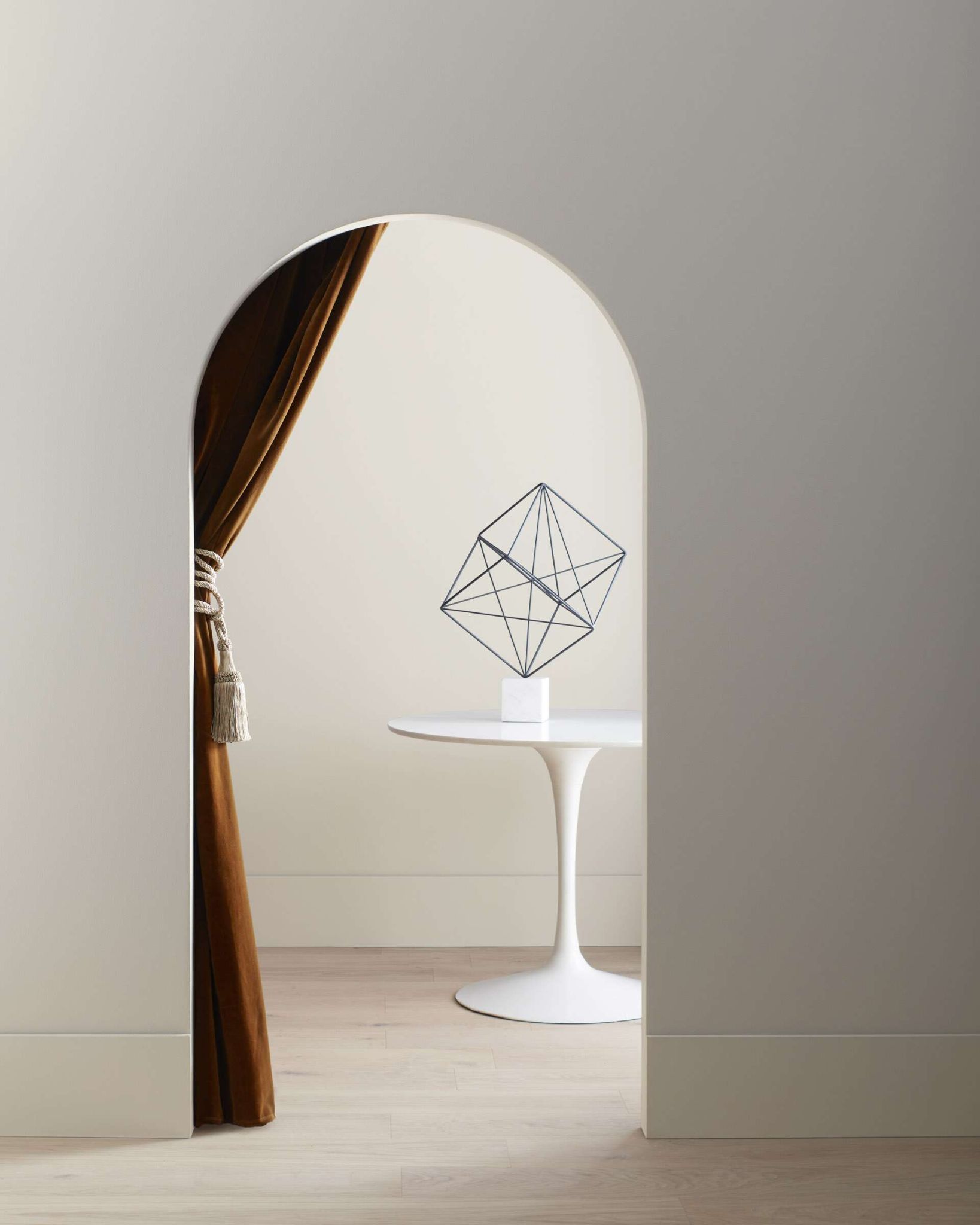
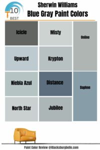
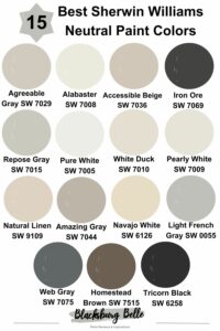
What’s one easy way to give your room some attitude, pizzazz, and its own special mood? You guessed right if your answer is painting. Painting your walls can go a long way in making your home look new, more airy, and refreshing.
Undoubtedly one of the most versatile colors to exist, gray continues to top the charts of colors that may never go out of style. Trends may come and go, but Grays (especially the ones on this list), have managed to stay in style for the longest time.
Despite that many color trends may seem to suggest that the glory days of the gray colors are over, lots of interior designers still swear by it. Gray is largely considered to be a fairly neutral color, and yet gray colors continue to dominate the decor space due to the gentle, warm, and inviting feel they give to a space, or the cool, sophisticated feel (depending on whatever suits your fancy).
If done rightly, they will definitely produce a succinct blend of elegance, warmth, and tranquility.
Table of Contents
What Is LRV?
Throughout this article, you would notice LRV mentioned, so let’s get to know what it is. LRV being Light Reflectance Value is simply a form of measurement that calculates how well a color can reflect light.
With 0 being pure black on the scale, and 100 being pure white. Most colors range between 3-93 as almost no color will turn out extremely black or white. The colors on this list have an LRV(Light Reflectance Value) above 50, making them lighter colors on the spectrum.
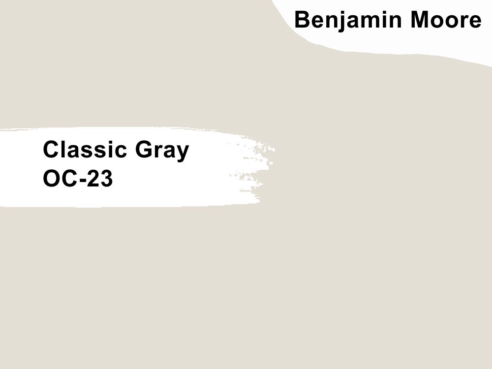
1. Benjamin Moore’s Classic Gray OC-23
| RGB | 227 223 213 |
| LRV | 73.67 |
| Undertones | Warm green, violet, and Purple |
| Matching colors | Stone Brown, Stone Harbor, Indian River |
As an indelible legend in the painting world, Benjamin Moore’s colors have continued to be an evergreen classic. A part of Benjamin Moore’s Off-white collection, the classic gray is no exception. Off-white lovers looking to get more warmth may be partial to this color.
This versatile color works perfectly where white doesn’t quite fit the bill. It’s a sure winner as it subtly offers the room a lift by accentuating the beauty of the room, not just the wall surface itself. It lets every other furniture or wall piece come to life.
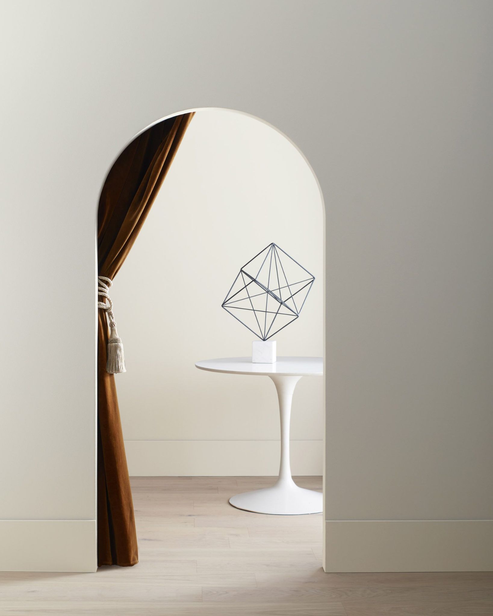
Thinking of what rooms this color will be the bang for? Try rooms with average lighting that are neither too bright nor dark. If you have a north-facing room and would like to try the classic gray color, go for it! The warm, airy feeling it gives in the evening light is definitely something to look forward to, as you can see in the image below.
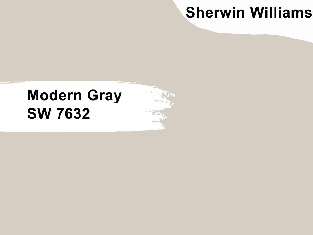
2. Sherwin Williams Modern Gray SW7632
| RGB | 218 209 198 |
| LRV | 62 |
| Undertones | Brown, taupe(pink) |
| Matching colors | SW Pure White, SW Alabaster, Greek Vanilla, |
Though most Grays are very versatile, SW’s Modern Gray comes in handy when you’re looking for a gray color that looks great in various lighting conditions and would also look nice in both the interior and exterior parts of your home.
A part of the Color Mix Forecast 2021 collection, it’s not hard to see why it’s loved by most designers. Its superb ability to transform in different shades across the house based on the lighting in different parts of the room makes it a beautiful color to use as whole-house paint.
However, if you decide to do this, it’s advisable to sample the Color under different lights to be sure you like how it turns out in each scenario. Not sure how it looks warm enough in some rooms with natural lighting? Artificial lighting can be a great way to accentuate the beauty of this color in such a situation.
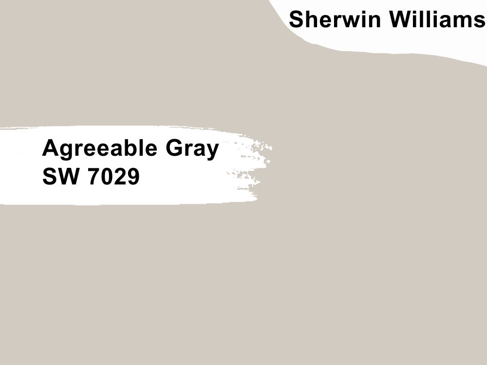
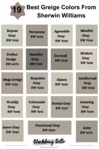
3. Sherwin Williams Agreeable Gray SW 7029
| RGB | 209 202 192 |
| LRV | 60 |
| Undertones | Green, Purple |
| Matching colors | Snowbound SW 7004, Dark Brown |
This Gray really lives up to its name! Designers and builders often refer to it as the perfect greige (Colors between gray and beige) and it’s definitely not difficult to see why. This Gray is a great complement to its environment as it’s just the right blend of warm and cool.
Like any other color, how it turns out in space largely depends on the amount of natural lighting and the function to be used for. However, its light and neutral touch makes it a go-to color for many purposes.
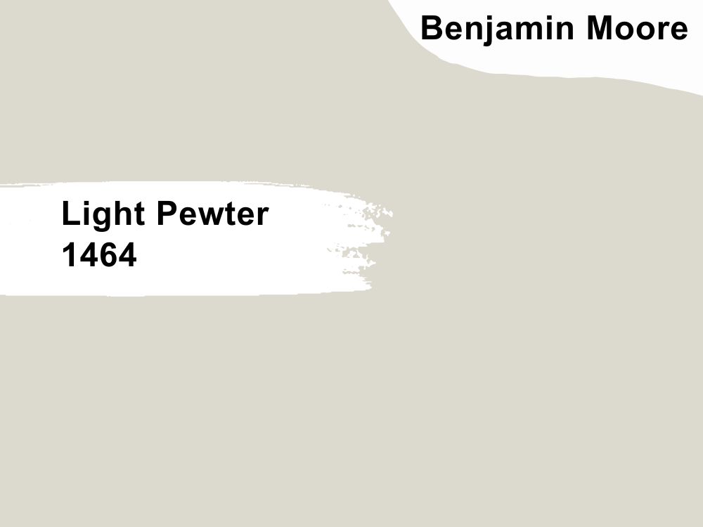
4. Benjamin Moore Light Pewter 1464
| LRV | 67.52 |
| RGB | 219 215 205 |
| Undertones | Mild beige soft blue |
| Matching colors | Chantilly Lace, Oxford White, Sage Mountain |
Looking for a color that hangs in the balance of warm and cool, then this Benjamin Classic color is just what you need. Decorating should make your space feel comfortable, gentle, and inviting and that’s what you get when you decide to go with the Light Pewter. It easily invokes an ambient atmosphere that feels cool and homey at the same time.
This greige color is loved for a lot of reasons, but one sure reason is its ability to look both rich and cool at the same time. If you’re looking to ditch gray colors with blue, and purple undertones, then add these to your list of color choices.
The cool, neutral, and light tone of this Gray gives your room an airy and relaxing feel. It’s also safe to say that this color may never go out of style, this makes it an excellent choice for your transitional style decor.
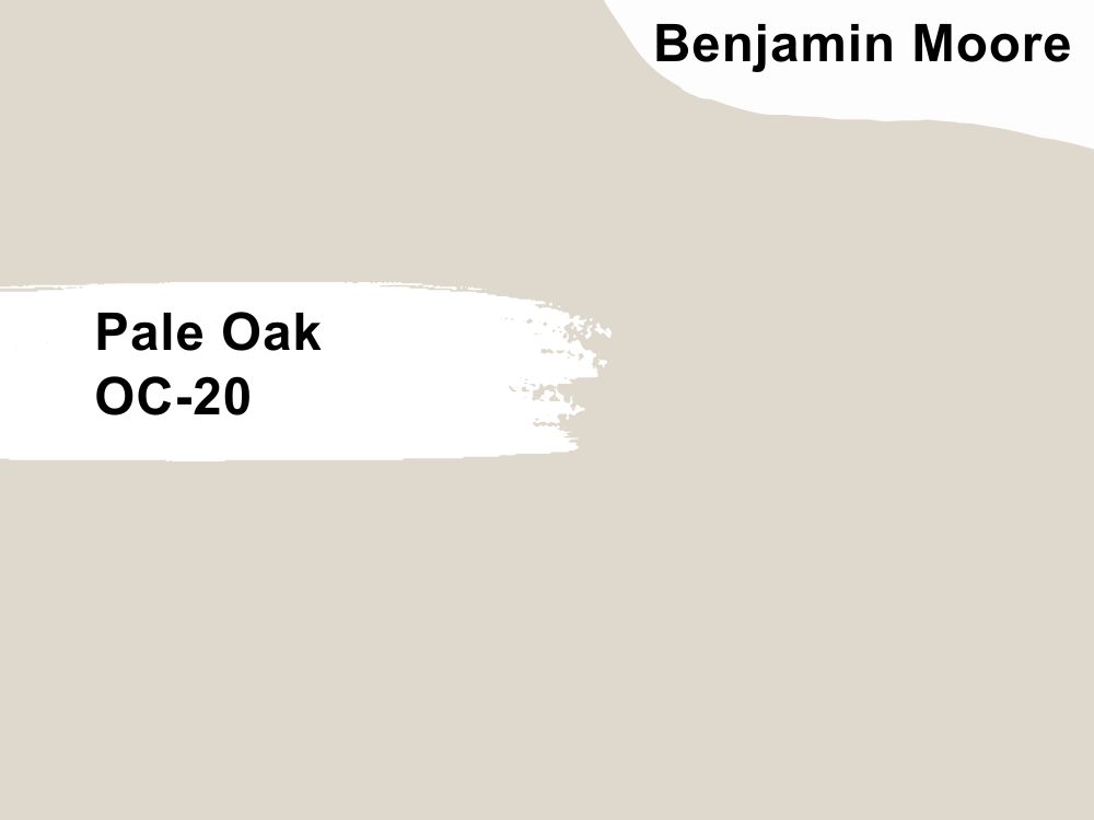
5. Benjamin Moore’s Pale Oak OC-20
| RGB | 222 216 205 |
| LRV | 68.84 |
| Undertones | Mild beige soft blue, taupe |
| Matching colors | Chantilly Lace, Dinner Party, Timber Wolf |
Say hello to quiet elegance and warmth with this delightful gray from Benjamin Moore’s Off-White Collection. It’s lovely greige makes it a top choice for bright and dark rooms. In rooms with North-Facing Lights, it can turn out to be quite warm.
You want to be careful with using the PO in a very bright room as it’s likely to appear washed out. While you may feel free to use pale oak for your cabinets and exteriors as the results are often pleasant, it does exceptionally well as a wall color.
Pale oak is a light color and so may show dirt more easily than darker shades of gray will, however, this can be easily rectified by washing. Also, if you are averse to pink and purple overtones, you may want to try out this color under different lighting conditions before applying it on intended surfaces as it tends to have these undertones in some lighting conditions.
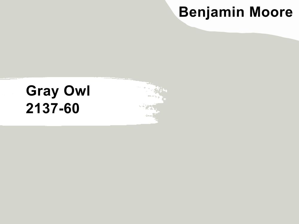
6. Benjamin Moore Gray Owl 2137-60
| RGB | 212 210 203 |
| LRV | 64.64 |
| Undertones | Gray-green, Blue |
| Matching colors | Taos Taupe, Midsummer Night, Paradiso |
This cool, crisp, and easy-to-use gray is just what you need if you’re looking for a safe light gray color. Its versatility and ability to look great across different spaces make it one of the most popular BM gray colors. If you have a room with north facing light, this color will read as cool.
It looks especially splendid in bathrooms and can be a really nice color for your cabinet surface as well. It equally settles beautifully in farm-style houses and looks nice with wooden tops as well.
If you’re not too keen on white, you can pair Gray Owl with other creamier white colors so it appears creamier. Like other light colors, be careful around highly lit or overly bright rooms, so it doesn’t wash out. Amazingly, gray owl pairs quite well with the colors listed below.
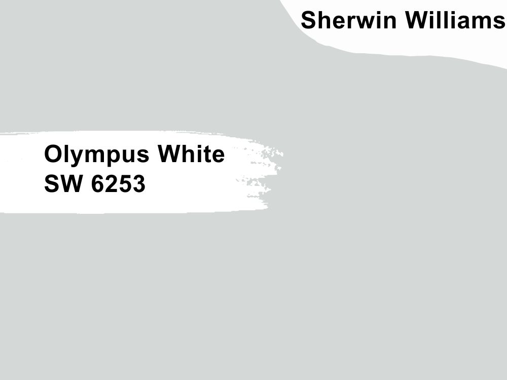
7. Sherwin Williams Olympus White SW 6253
| RGB | 217, 219, 217 |
| LRV | 68 |
| Undertones | Blue-Gray |
| Matching colors | Extra White, Accessible Beige, Virtual Taupe |
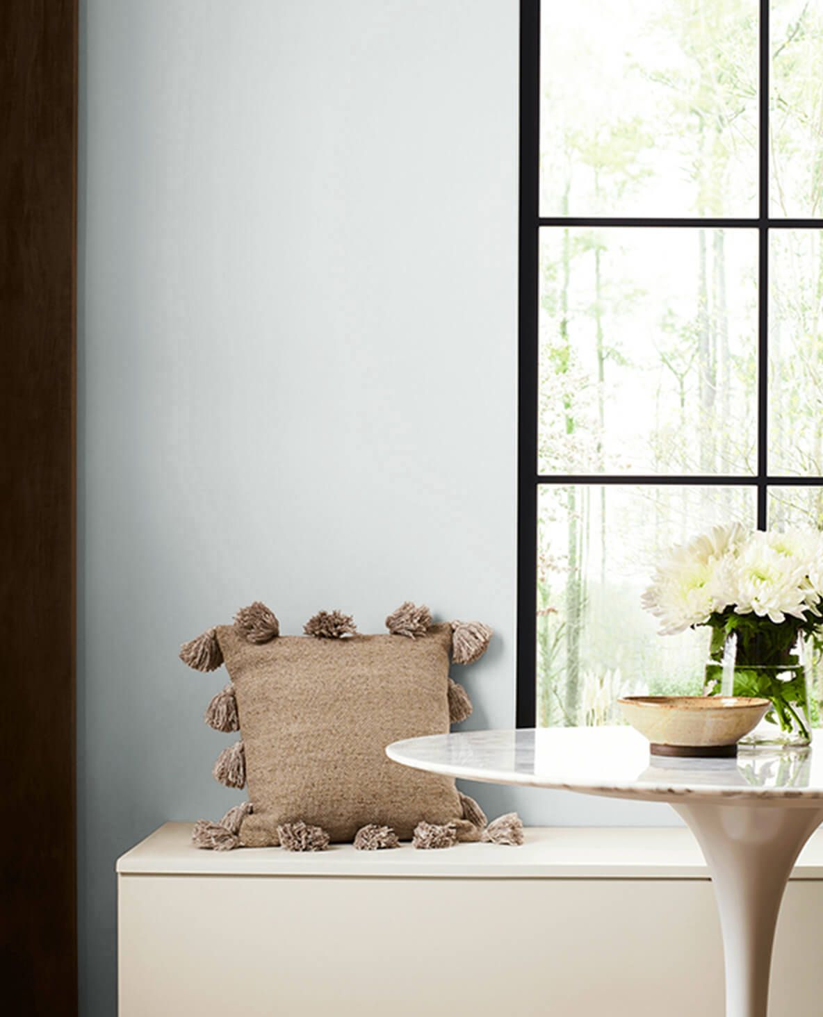
This is a neutral, gray color that does well in a lot of settings. If you are looking for a cool-toned gray color that reflects light really well, then try this ambient gray color. In a dark room, it settles quite nicely even with low natural light. In a room with North-Facing Light, the cooler natural lighting will cause the blue undertones of this color to come out a little more.
In South-facing light, which tends to be sunnier, Olympus White tends to be more neutral and gray. Under East-facing light, Olympus White reads as neutral gray, especially in the mornings, later in the day, they may change to a cooler gray, letting subtle blue undertones shine through.
Olympus White can be used for several species in your home. It looks good in bathrooms, living rooms, hallways, laundry rooms, and even basements.
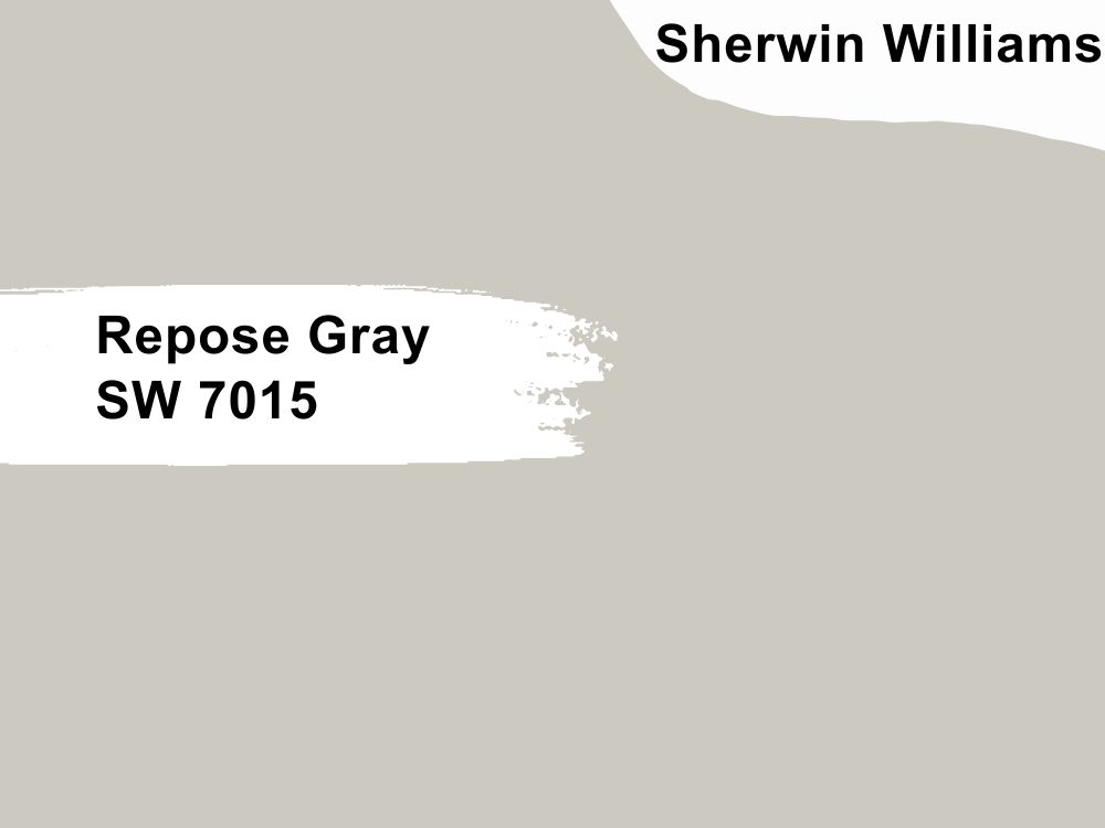
8. Sherwin Williams Repose Gray 7015
| RGB | 204 201 192 |
| LRV | 58 |
| Undertones | Blue-Gray, brown, purple |
| Matching colors | Eider white, Pavestone, Coral Clay |
Another Sherwin Williams Gray stunner is here! The Repose Gray color is popular among designers and builders for a lot of right reasons. For one thing, its warm tone gives off an ambient and tranquil feel. In fact, many designers and realtors recommend that people looking to sell their houses paint with this color.
This is probably because when done right, it comes out really well as a whole house color. Although it’s a warm gray, its blue undertones help to make it a more cool-warm gray than other kinds of gray colors.
This Gray is easily a favorite because it matches tons of decor styles and works as a perfect backdrop against almost all kinds of surroundings. If you live in a house with lots of North-facing rooms, you may want to be careful about using it as your whole house paint. In South-Facing rooms, the natural lighting accentuates the beauty of the Repose Gray so well.
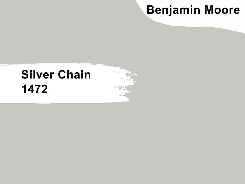
9. Benjamin Moore Silver Chain 1472
| RGB | 199 199 194 |
| LRV | 56.79 |
| Undertones | Green-yellow, Blue. |
| Matching colors | White Dove, Delmar Blue, White Heron |
Give this gray a chance if you’re on the lookout for something that’s sophisticated and cool. Silver chain is a balanced gray that’s neither too warm nor too cool. Despite being around for quite some time, this gray continues to hold its own as a timeless BM piece. Another member of the Classic collection, the vibrance, and beauty of this color makes it an easy and elegant color for your use.
With the Silver Chain, there are practically no chances of things looking boring with this bold gray as it stands out beautifully, and gives your room a little bit of personality. One of the best things about the gray is that even with shifting light conditions, it manages to mostly stay true to its actual color. If you’re looking to evoke feelings of calmness and warmth, then try out this elegant BM classic color.
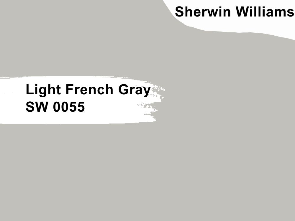
10. Sherwin Williams Light French Gray SW 0055
| RGB | 194 192 187 |
| LRV | 53 |
| Undertones | Blue tones, purple |
| Matching colors | Origami White, Gentle Grape |
This light, neutral gray is one color to love. Its robust gray undertones leave your room feeling warm and larger, especially for smaller rooms. LFG is one of the truest Grays you can find. In North-facing rooms, because of the cooler lighting, you may notice the blue undertones. In South-facing rooms, due to more warm natural lighting, this light gray appears even lighter.
Feel free to use the light French gray for interior areas of your home, be sure to sample across different lighting conditions before using it for exteriors. However, if you get quite a bit of sunlight, LFG will look fantastic for your exteriors as it brightens up under sunlight.
Another great place to use this? Your kitchen cabinets, the neutral muted tones of this Gray make it look wonderful. Some similar colors to look out for are Big Chill, On the Rocks, and Knitted Needles.
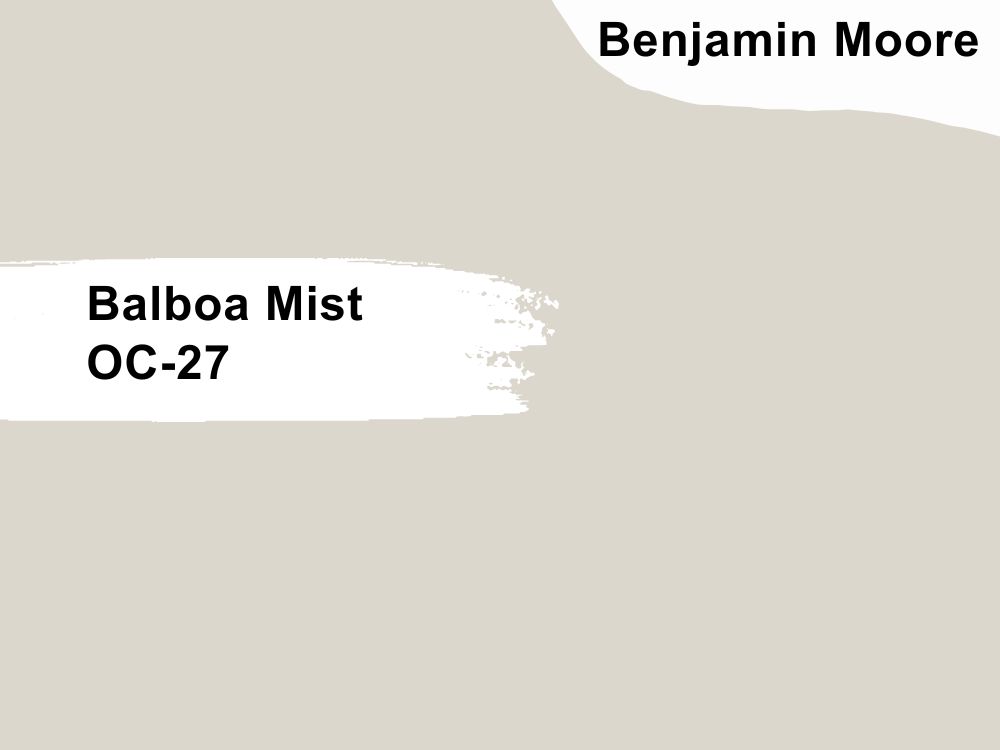
11. Benjamin Moore Balboa Mist OC-27
| RGB | 218 213 204 |
| LRV | 65.53 |
| Undertones | Violet, taupe. |
| Matching colors | Cloud Cover, Rock Gray, Flint, Barista |
Also known as 1549, this Classic pale gray color from the famous Off-white collections is well known for its versatility and subtle warmth. North-facing light will help bring out the cool grayness of this color while South-facing light tends to bring out the warmness of this color. From its LRV, you can see that it reflects light quite well.
Also, don’t worry about this color having green undertones because it RARELY does. This lovely wall color looks great in lots of spaces. The Balboa mist is a better choice for your interiors than your exteriors. If you’re looking for a nice contrast, you may pair this lovely gray with white trimmings in a well-lit room.
You can use this color for your kitchen, home office, basement, and playrooms. In rooms with Northern light exposure, expect to see some purple undertones due to the low light.
Overview
While painting sounds good and can help to give your home a fresh look and feel, it’s not one of the easiest things to pull off, so don’t feel too bad if you have to experiment quite a bit before you find what you’re looking for.
Every painting project should be fun, and adventurous but worthwhile, which is why it’s important to get the tricky parts right. We also don’t want you to waste your precious paint and so will continue to emphasize how important it is to sample before painting.
Before applying any color to intend surfaces, be sure to sample across different lighting conditions and be sure you love what you see. There’s no rush, so be sure to take things easy and get as much information as you can.

