
Blue paint colors always appeal to homeowners, and gray paint colors can never go out of style. However, what do you get when you combine these two together? You get the calming blue gray that works wonders in any living or working space.
From adding a cool and soothing vibe to spaces to making spaces feel airier and welcoming, blue grays rock. The paint colors are also blessed with healthy versatility. But it is quite easy to feel overwhelmed when you need to make a choice from the several options out there.
What if you had a comprehensive guide that covers excellent blue grays and every important detail about them? Well, read on to explore the 10 Best Sherwin Williams Blue gray Paint Colors in 2023.
Table of Contents
Blue Gray Paint Colors
When it comes to relaxing and calm vibes, blue grays remain one of the best. These cool paint colors combine the timelessness, versatility, and neutrality of gray with the peaceful energy of blue to give something even better.
Do you know that blue gray paint colors take on the role of neutrals when paired with other brighter colors? Thanks to the gray, you can flex the paint color as a neutral in any interior space in your home. All you have to do is pair it with a brighter and more colorful partner.
With the blue part of the color, it is no surprise that blue grays read cool in any setting. However, some people confuse them with green grays or even gray blue paint colors. While they can look similar on walls because of lighting and other factors, these paint colors differ.
Blue gray paint colors come from a blend of blue and gray, while green grays blend green and gray. This means that the former will always look blue because of its components, and the latter will look more green instead.
Types of Blue Gray Paint Colors
You can separate Sherwin Williams blue gray paint colors based on two factors: composition and LRV. Since they all read cool, you can’t make groups based on their temperature, making them a little easier to understand and use.
Furthermore, some of them pair nicely with warm paint colors too, allowing you to switch things up in your space.
Color Composition
Depending on the volume of blue and gray in each of the paint colors, they can come off as the following:
Blue gray
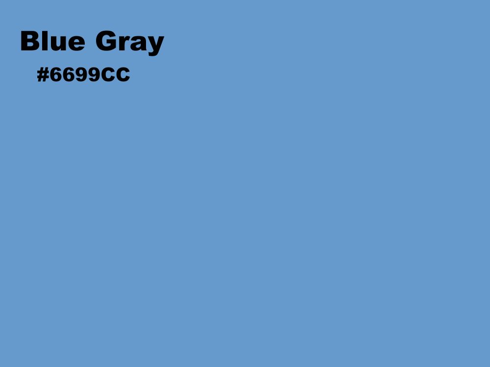
This type has more blue in them than gray, which gives them more vibrancy and energy. Also, they appear cooler than the other type and don’t have to function as neutral, even though they can do so.
Also, blue gray paint colors have more popularity since most homeowners primarily want blue but don’t trust how it might look on walls. Having the gray makes it a safe bet and generally gives the paint color more tolerance and versatility than pure blue.
| Pros | More Colorful: The higher percentage of blue in this type make them more colorful, giving them more depth. Also, depending on their LRV, they generally will not wash out in bright light.
Cooler Vibes: Even though they look cooler on walls, blue gray paint colors also appear more vibrant. They can help switch up the overall energy in a dull and moody space. |
Gray Blue
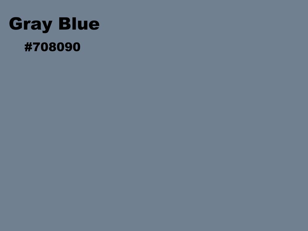
With a higher percentage of gray in them, gray blue paint colors take on a more neutral look. This increases their versatility because gray pairs nicely with a wide variety of colors. However, they can come off as lazy or less colorful than blue grays.
Although they lack the energy that comes with more blue, this type can look amazing on walls. You just have to get the right setting.
| Pros | Higher Versatility: Grays generally have high versatility because of their neutrality. This boosts the tolerance of gray blues, making them pair well with more paint colors.
Also, they look less cool and can work wonders in spaces where you don’t want an icy or cold vibe. |
Based on LRV
A paint color’s LRV stands for its Light Reflectance Value, an important attribute. Every paint color reflects light, and its LRV represents how strongly it does it on a scale of 0 – 100. Dark paint colors reflect little light, hence the reason for a low LRV, while brighter colors reflect more light.
Depending on the numerical value, you can group blue gray paint colors into dark and light ones. However, that doesn’t mean you won’t find some that fall in the medium range of the LRV scale.
Paint colors with high LRVs can work in both dark and well-lit spaces because they naturally brighten up anywhere you use them. However, less colorful ones have more tendency to wash out in bright light.
On the other hand, paint colors with lower light reflectance values perform worse in dark spaces. The reason is that they naturally absorb more light than they reflect, making them reduce the amount of light in a space. Using them in dimly lit areas will darken it further, creating a gloomy look.
However, darker paint colors tend to have more depth and stability than the ones with high LRVs. They also don’t get influenced by strong and more colorful partners.
Picking the Right Blue Gray Paint Color
Several factors contribute to picking the right blue gray paint color for your space or room. Even though they can look amazing in any area, these paint colors differ from each other and can yield different results.
While the process of selecting can look challenging, considering the following factors help to make it easier.
Room Size
Considering the size of the space or room you want to paint plays an important role in picking the right blue gray color. Generally, paint colors can make a room look larger or smaller than usual. Most of the time, warmer paint colors can make your space appear smaller, making them suitable for large spaces.
On the other hand, blue gray paint colors read cool and generally have an airy vibe. This attribute makes them give the impression of a larger space. Pick the light and cool neutral if you want a breezy and spacious feel in your room.
Some paint colors pair well regardless of whether they read warm or cool. This opens up an avenue to set a balanced visual perception if you don’t want to shrink or open up your space.
Theme
Do you want a cool and breezy theme for your space? Or a sophisticated one with aquatic vibes? Whichever theme you choose to adopt for your room or workspace also determines the paint colors you will use.
Fortunately, blue grays have a higher versatility than pure blues, making them suitable for multiple decor ideas. You can choose to use them as neutrals by pairing them with brighter colors. They also fit naturally into sky-themed decor or breezy and sophisticated themes.
Lighting
Light is one of the major factors that decide how a paint color will look in any space. It interacts with colors based on their reflectivity and even undertones. Remember the Light Reflectance Value (LRV)? This is where it comes into play.
Dark paint colors have low LRVs that indicate their weak strength when it comes to reflecting light. Instead, they absorb it more, reducing the brightness of any space you use them. If your room has limited access to light, or is generally dim, you should avoid using dark paint colors there.
Bright paint colors have high LRVs and reflect more light while absorbing little. This makes them brighten any space and allows them to function well in both dark and bright spaces. They make the safest bet for any space based on lighting.
If you want to use a dark blue gray paint color in dim spaces, you should pair them with brighter colors. This will balance out the light interaction and prevent the space from looking totally moody or broody.
Room Orientation/Location
This factor comes into play because of natural lighting (the Sun). Depending on the room’s location, natural lighting can appear warm or cool, affecting the overall look of the paint color. For a blue gray, you must remain mindful of its interaction with natural light in various settings to avoid unwanted results.
South-facing rooms generally look warmer and, as such, make the paint color appear less cool than usual. This is fine for blue grays because of their natural cool look and airy vibe. You can expect similar results in East-facing rooms that also have warmer lighting.
In North-facing rooms, natural light is usually cooler than usual, making it less pleasant for bright blue grays. The reason is that these paint colors read cool normally and in such settings, they can come off as icy or even cold. Coupled with their airy vibe, the room can feel crisp and unwelcoming.
Room Function
On a normal day, you will want a different paint color for a workspace than you would for a bedroom. It all lies in the sort of vibe you get from each color. Blue grays generally exude calm and also help with focus. What does this mean?
It means that they are one of the color types that can go well in both work and living spaces. Research has proven that the blue color helps the mind relax, allowing it to eliminate unnecessary distractions. This effect looks great for a study and also feels desirable in bedrooms.
Coupled with gray, workspaces can easily look sophisticated, business-like, and yet welcoming. In a home, blue gray paint colors can add elegance to living rooms and a hygienic vibe to kitchens, bathrooms, and washrooms.
Swatch Tests
I always advise performing a swatch test before using any paint color in your home or workspace. The reason is that the test helps to familiarize you with the paint color’s look. It also reveals undertones and how the paint color will interact with natural light if you use it on walls.
One of the reasons why several homeowners remain hesitant to blue paint colors is because of the tendency to look different on walls than in catalogues. While it is safer to go with a blue gray, you should still make sure to do a swatch test before use.
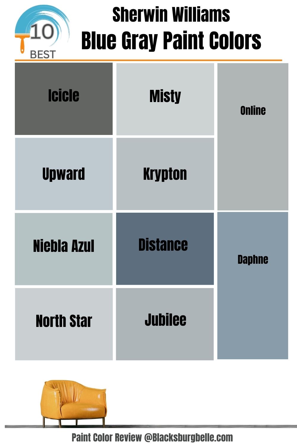
10 Best Sherwin Williams Blue Gray Paint Colors (Trend 2023)
1. Sherwin Williams Icicle (SW 6238)
While some blue gray paint colors have subtle and silent undertones, Sherwin Williams Icicle has a cheerful violet. This makes it a bit more energetic than other colors in the same category. An LRV of 73 indicates its brightness and suitability for both light and dark spaces, allowing more versatility.
Sherwin Williams Icicle brings positive vibes to any space but works exceptionally well in bathrooms. However, it can sometimes come off as a light shade of violet with blue and gray undertones. This is mostly the case in warmer lighting and South-facing rooms.
| Paint Color | LRV | RGB Value | Undertones | Reading |
| Icicle | 73 | R: 219 G:223 B: 224 | Subtle Violet | Cool |
Sherwin Williams Icicle on the walls pairs nicely with the brighter paint color on the cabinets. It gives the kitchen a clinical yet homely and welcoming look.
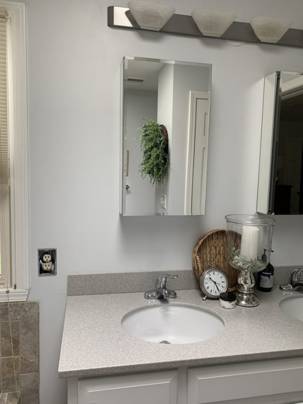
Sherwin Williams Icicle maintains its cool and clean look in this bathroom. One can easily discern a majestic vibe from how the paint color agrees with every other color in the picture.
2. Sherwin Williams Misty (SW 6232)
Sherwin Williams Misty is a light shade of blue with gray undertones. It has an LRV of 64, making it suitable for both bright and dark spaces. Although it reads cool, SW Misty pairs nicely with several warm paint colors in any area or room.
It has an airy vibe and a soft look that feels relaxing and welcoming in both work and living spaces. With SW Misty, you get a blue gray paint color that fits into any aquatic-inspired theme or decor.
However, the paint color might wash out in bright light, but not often.
| Paint Color | LRV | RGB Value | Undertones | Reading |
| Misty | 64 | R: 205 G:210 B: 210 | Slate Gray | Cool |
Sherwin Williams Misty on the walls adds a cool and calm energy to the room.
Sherwin Williams Misty maintains a cool atmosphere despite the warm sunlight.
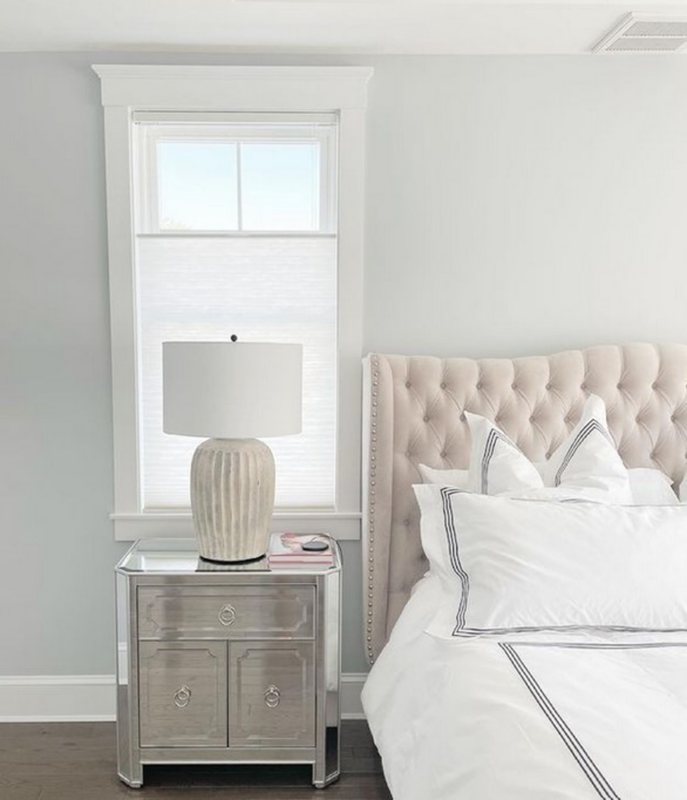
3. Sherwin Williams Online (SW 7072)
With an LRV of 45, Sherwin Williams Online falls in the medium range of the scale. It works best as a neutral because of a high percentage of gray. However, the paint color also has enough blue undertones to retain the calm vibe associated with blue grays.
SW Online generally has more versatility and stability than similar colors with more blue than gray. Despite its cool look, it can pair well with warm colors too. Fortunately, Sherwin Williams Online will rarely look icy or cold, even in North-facing rooms or cool lighting.
| Paint Color | LRV | RGB Value | Undertones | Reading |
| Online | 45 | R: 176 G:181 B: 181 | Blue and Gray | Cool |
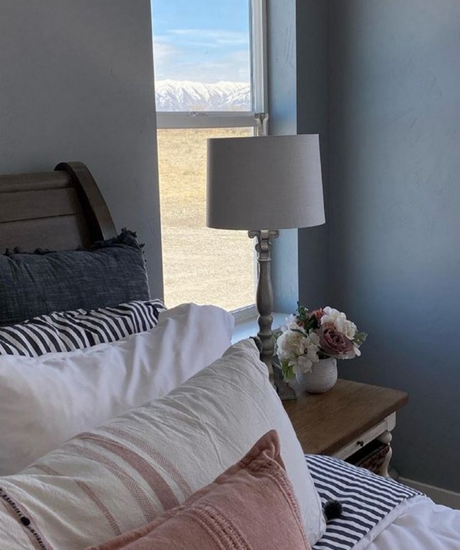
Sherwin Williams Online contributes to the overall coziness of this room.
Sherwin Williams Online pairs nicely with the white sheets and door for a cozy feel in the bedroom. The lighting does little to dampen its cool vibe.
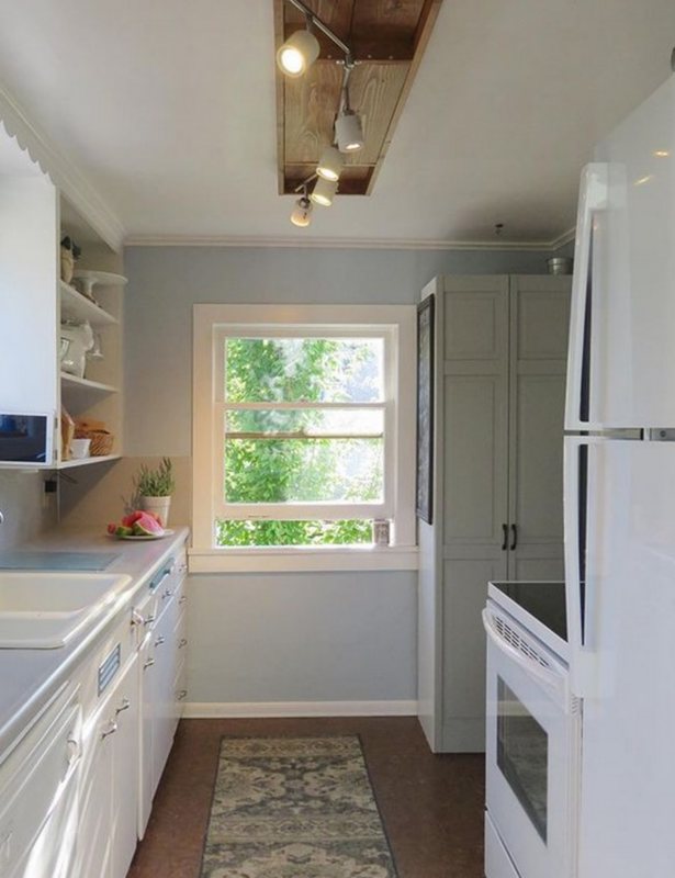
4. Sherwin Williams Upward (SW 6239)
If you want a medium to light shade of blue with dreamy vibes and healthy versatility, Sherwin Williams Upward works great! The paint color has gray undertones that comes out more in warmer lights or settings.
Also, the gray does little to dampen the cleanliness of this majestic blue. This means that Sherwin Williams Upward will always maintain its whimsical look regardless of lightings.
| Paint Color | LRV | RGB Value | Undertones | Reading |
| Upward | 57 | R:191 G:201 B: 208 | Gray | Cool |
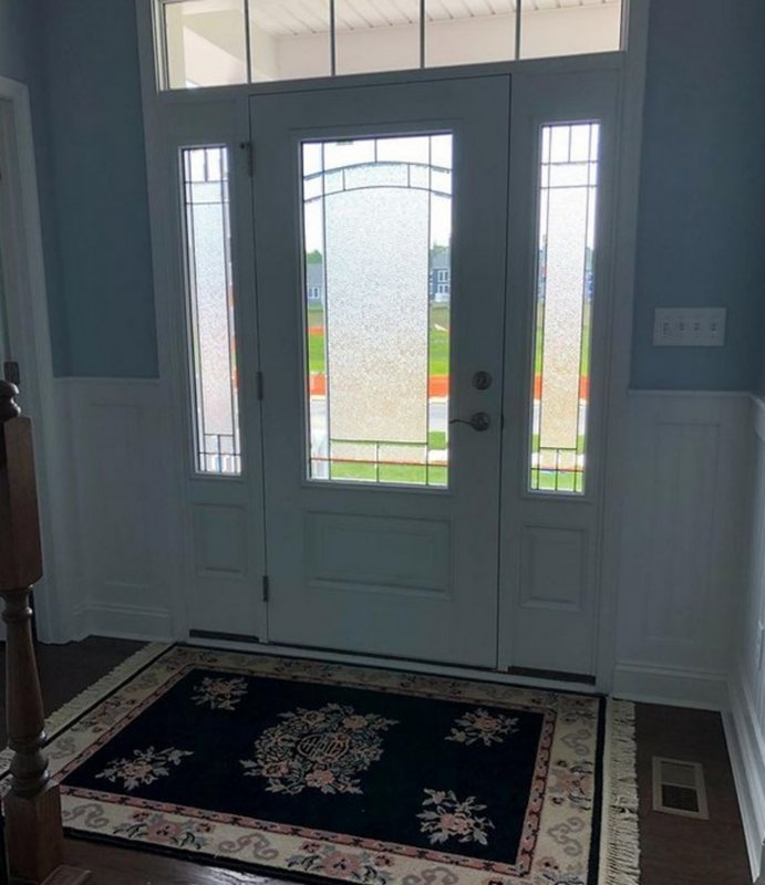
Sherwin Williams Upward pairs nicely with the brighter white to give a welcoming vibe befitting an entrance.
Although the lights temporarily alter its look, Sherwin Williams Upward still contributes a cool feel to the room.
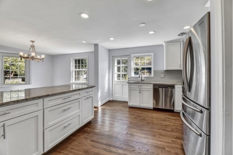
5. Sherwin Williams Krypton (SW 6247)
Sherwin Williams Krypton is a light to medium shade of atmospheric blue with an LRV of 52. The paint color has an airy feel that not only freshens up any space, but also makes it feel soothing.
Slate gray undertones help it pair with a wide variety of paint colors. You will encounter this paint color more in bedrooms because of its calm vibe and breezy shade. It works well in both bright and dark spaces, and will not wash out in bright light.
| Paint Color | LRV | RGB Value | Undertones | Reading |
| Krypton | 52 | R:184 G:192 B: 195 | Slate Gray | Cool |
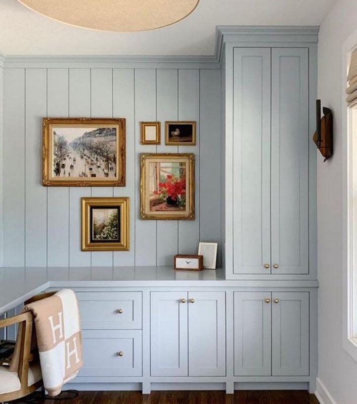
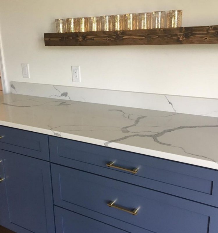
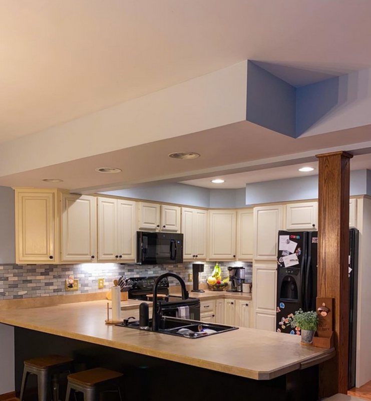
Sherwin Williams Krypton on the cabinets make a lovely accent and pairs well with the white.
Sherwin Williams Krypton adds some extra color to complement the brightness of the kitchen.
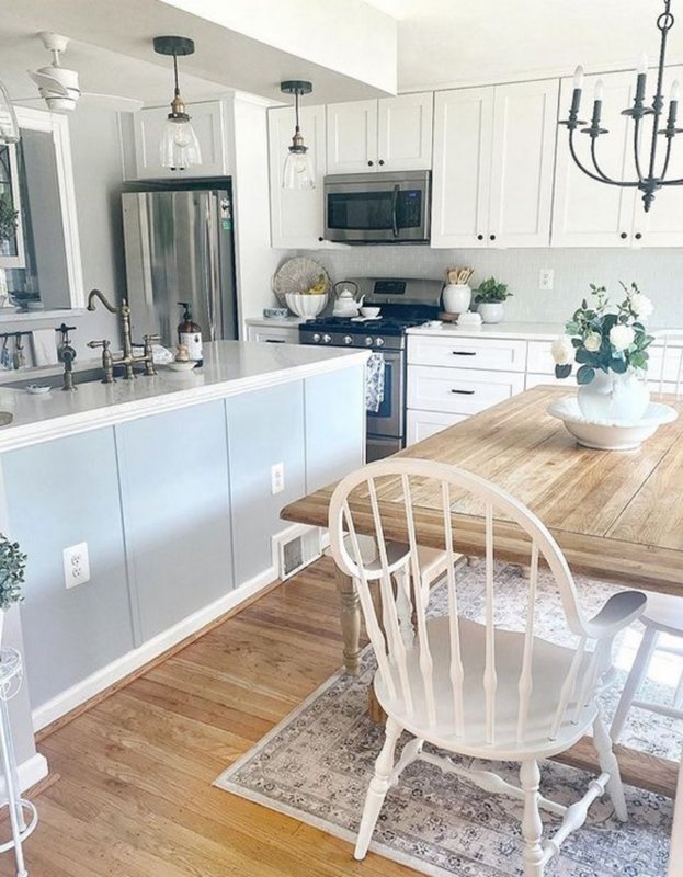
6. Sherwin Williams Niebla Azul (SW 9137)
With a name that translates into ‘misty blue’, Sherwin Williams Niebla Azul lives up to expectations. The light shade of slate blue adds extra color to the definition of a blue gray and exude cheerful vibes.
While it pairs mostly with cool neutrals, SW Niebla Azul goes great in both dark and bright spaces. It has a relaxing and calm feel you can easily fall in love with in any room or area. It has subtle gray undertones that you will sometimes notice in warm light.
| Paint Color | LRV | RGB Value | Undertones | Reading |
| Niebla Azul | 53 | R:182 G:195 B: 196 | Gray | Cool |
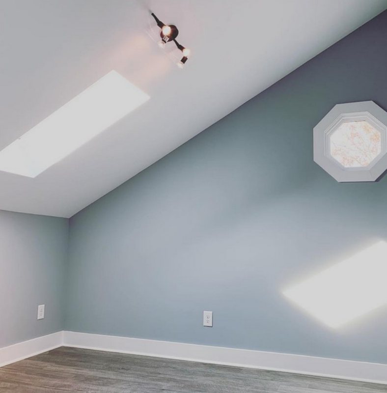
Sherwin Williams Niebla Azul maintains a cool look in this kitchen despite the sunlight.
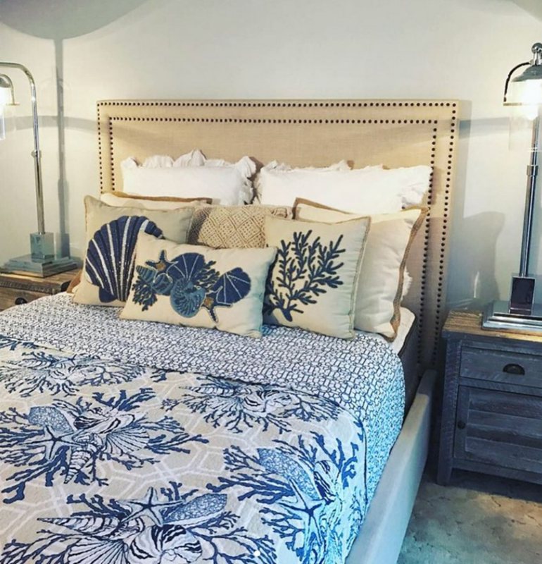
This picture captures the soothing and welcoming effect of Sherwin Williams Niebla Azul in this bedroom.
7. Sherwin Williams Distance (SW 6243)
Sherwin Williams Distance is a beautiful blue paint color with deep but welcoming vibes. With an LRV of 15, the paint color is the first dark shade on this list and has more depth than the aforementioned ones.
Homeowners love SW Distance because of its comforting feel and playful gray undertones. Don’t let the undertones fool you, this paint color will maintain its deep blue look regardless of lighting and room location.
| Paint Color | LRV | RGB Value | Undertones | Reading |
| Distance | 15 | R:93 G:111 B: 127 | Playful Gray | Cool |
Sherwin Williams Distance has enough depth to go on this cabinet.
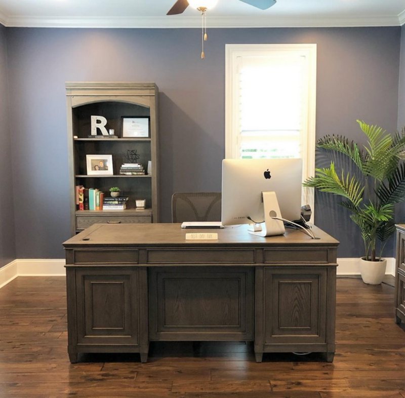
Sherwin Williams adds a business-like, focused, and welcoming vibe to this workspace.
8. Sherwin Williams Daphne (SW 9151)
With an LRV of 32, Sherwin Williams Daphne falls in the medium to dark range of the spectrum. However the paint color has an enticing feel that befits just about any area or space in your home. Whether you want a welcoming vibe of a majestic shade of blue, the paint color has it all.
SW Daphne has gray undertones that only add to its versatility and calm vibe. The blue paint color performs exceptionally in bedrooms and nurseries, thanks to its relaxing and soft look. Its depth allows its to maintain its look, even in bright light.
| Paint Color | LRV | RGB Value | Undertones | Reading |
| Daphne | 32 | R:137 G:156 B: 170 | Denim Gray | Cool |
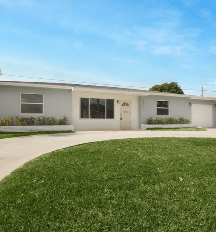
Sherwin Williams Daphne gives a quiet, welcoming vibe to this exterior.
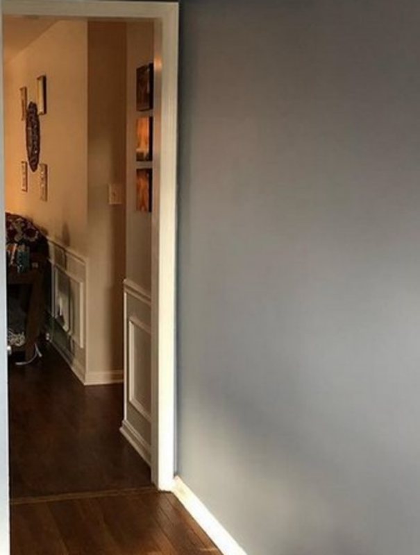
Sherwin Williams Daphne keeps the corridor cool despite the sunlight.
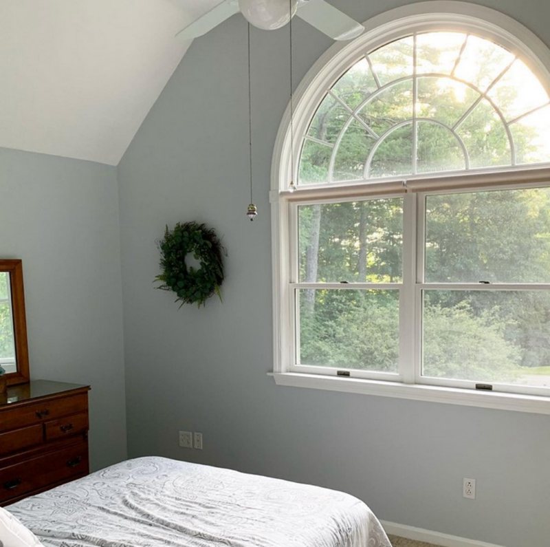
9. Sherwin Williams North Star (SW 6246)
Do you want a light shade of blue with a calm vibe that suits bedrooms and bathrooms? Check out Sherwin Williams North Star. With an LRV of 62, the paint color can function in any space in your home, regardless of lighting and brightness.
It has slate gray undertones that combine with its airy blue to give a breezy and welcoming vibe. Sherwin Williams North Star also adds a clean feel to spaces, making it suitable for kitchens if you run out of options.
While warmer lights strengthen its gray undertones, the paint color retains its blue look.
| Paint Color | LRV | RGB Value | Undertones | Reading |
| North Star | 62 | R:202 G:208 B: 210 | Slate Gray | Cool |
Sherwin Williams North Star not only makes this kitchen feel welcoming, but it also makes it beautiful.
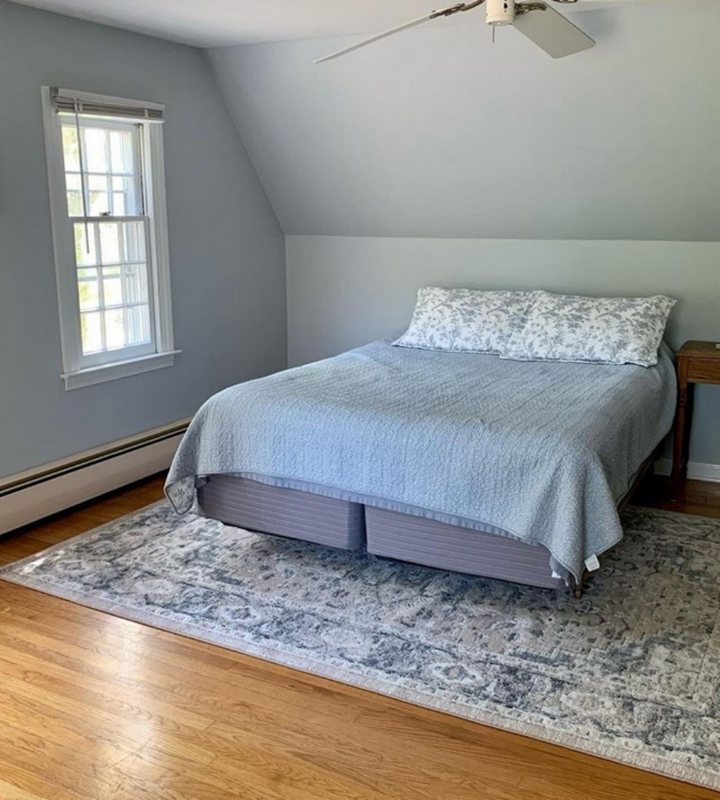
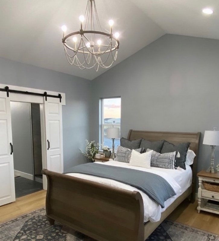
Sherwin Williams North Star adds an airy and relaxing vibe to this bedroom.
10. Sherwin Williams Jubilee (SW 6248)
Although this paint color has more gray in it than blue, it made this list because of its tendency to flash blue often. Sherwin Williams Jubilee is a medium-toned gray blue paint color with an LRV of 45.
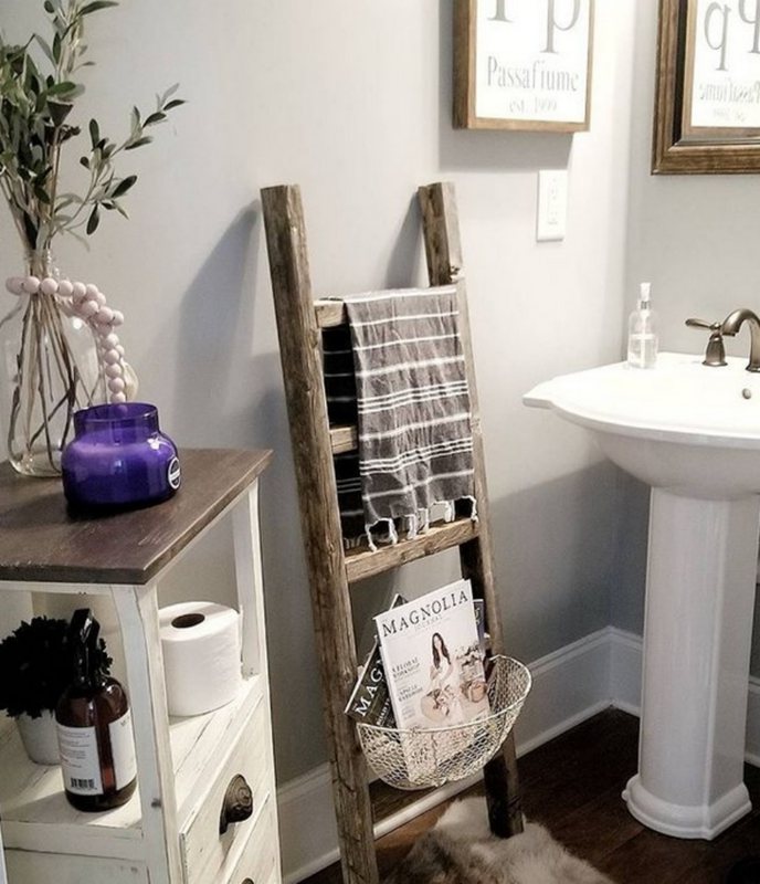
The neutral pairs nicely with a wide variety of colors and also has the calm and welcoming vibe associated with blue grays. It works well in interior and exterior spaces but does exceptionally well in bedrooms and bathrooms.
Sherwin Williams Jubillee has a elegant look that can easily contribute to making your space appear majestic and sophisticated.
| Paint Color | LRV | RGB Value | Undertones | Reading |
| Jubilee | 45 | R:173 G:181 B: 185 | Slate Gray and Blue | Cool |
Sherwin Williams Jubilee pairs nicely with the white to give this space an elegant and welcoming look.
Sherwin Williams Jubilee cools down this space.
Conclusion
Even though they don’t have as much popularity as grays and white paint colors, blue grays aren’t going out of style anytime soon. The soothing and calm feel they add to any space can easily become irreplaceable in certain decor or setting.
Whether you decide to work with a blue gray or opt for a gray blue, you home stands to benefit from these paint colors. Like other neutrals, you can pair them with white paint colors or even use the same as trims.
Asides from working as neutrals, blue grays can pair up with other paint colors in interior and exterior spaces. They mostly look natural in aquatic-themed decor but can fit into almost any theme that needs a calm look.
If you want to use Sherwin Williams Blue Gray paint colors on interior or exterior walls, don’t forget to perform a swatch test. The importance of these tests can’t be stressed enough.
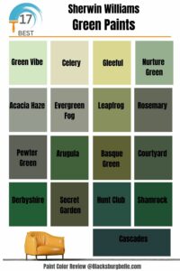 17 Best Sherwin Williams Green Paints (Trend 2023)
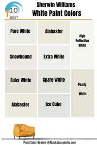 10 Best Sherwin Williams White Paint Colors (Trend 2023)
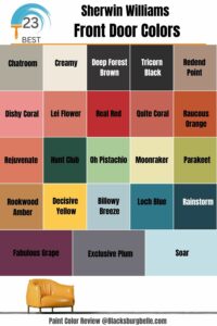 23 Perfect Sherwin-Williams Front Door Colors (2023 Trends)
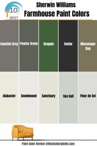 10 Best Sherwin Williams Farmhouse Paint Colors (Trend 2023)
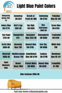 31 Best Light Blue Paint Colors: Review and Inspiration
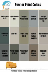 15 Best Pewter Paint Colors: Comparisons and Suggestions
