Are you looking for a Sherwin-Williams blue paint to suit your mood and vibe but can’t decide from the many available options? No need to worry anymore, as you’ve come to the right place for answers.
Sherwin-Williams, as the topmost paint producer in America, offers a wide range of blue shades from the lightest to the darkest. Due to the existence of undertones, blue paints produce different auras from the typical coolness.
Table of Contents
Steps for Choosing the Best Sherwin-Williams Blue Paint
Choosing the best Sherwin-Williams blue paint requires careful thought from the space to the lighting, room position, time factor, and purpose. You don’t want to buy a shade only to get home and regret your decision or decide to change it within a short period of usage.
Follow these six steps for the best result.
Step 1: Analyze The Space and Lighting
Before putting paint on your wall, you need to do some recon on the space and lighting situation. “How much paint would you require?” “Is it a wide or small room?” “Does it receive enough light?” and more should be your first questions.
The responses to those questions determine the type of Sherwin-Williams blue paint you’ll use. Certain shades of blue look better in confined spaces, while others blossom in the open air.
Also, lightning becomes relevant when you realize it can transform a color beyond your expectations. Scroll down to learn more about sizing and position.
Step 2: Measure The Room Size And Position
To start this step, you need an industrial measuring tape, compass, pencil, and paper. Use the compass to identify your room’s direction — North, West, South, East — including the door and windows, then mark it with your pencil.
Next, measure the room’s size to decide the shade of blue you’ll use for the walls and furniture. Note that light blue paints create an airy and bright vibe, while darker tones give the illusion of a smaller space.
Using position to create the Best Palette
Once you’ve narrowed your room size and marked its key positions, the next step is studying the sun’s direction.
South-facing windows receive the highest amount of sunlight from mid-morning until early noon. Hence it’s the best spot for highlighting the deepest blue shades, yet be wary of using it against a high LRV blue paint as it’ll become more blinding.
If you need sunlight for morning work, East-facing windows reflect the best natural glow until noon. However, the opposite is the case with West-facing windows which get light from noon until sunset.
With North-facing windows, you’ll get the most consistent sunlight, albeit the dimmest glow. So, this position isn’t the best for colors with multiple nuances, as it won’t tease out their undertones. However, if you want your blue paint to stay unchanged, then it’s the best.
Step 3: Evaluate Your Lighting Options
Adding artificial light in a room or on an exterior wall isn’t difficult, but it requires planning, like choosing the best Sherwin-Williams blue paint. What color of light would you like in the room? Do you need the illumination for function or aesthetics?
Lighting comes in as many colors as it exists worldwide, but you can group them into two broad categories — warm or cool. Warm lights are fiery-colored (red, yellow, and orange) bulbs, while cool lights have calming hues (blue, green, and purple.)
Although it’s standard procedure to match each light color to the walls, you can use contrasting tones depending on your palette. Whatever you choose, note that warm lighting is the best way to brighten your colors while cool lighting tones down its outlook.
Step 4: Conduct Sample Area Testing
Once you’re ready to paint your surface, whether a wall or furniture, ensure you sample your preferred color. Paint shades often appear different in real life than digital copies, but you can get an almost perfect replica from samples.
Sherwin-Williams has three sampling options for customers: color chips, color strips, and realistic Color-to-Go lightweight paints. Test the sample underneath morning and night lights to see if you need extra lighting.
Step 5: Analyze the Long-Term Value of a Paint Color
How long do you intend to have the color on your chosen surface? That’ll determine whether a bright or dark shade would be the best choice of blue for you. Light blue paints are the hardest to maintain as they’re susceptible to external factors.
If you don’t have time to maintain your blue paint, choose a medium to dark tone, as it’ll stand the test of time with minimal upkeep.
Step 6: Apply Finishing Touches
The final step to choosing the perfect blue paint is the finish. Every paint comes in a different texture ranging from a basic flat liquid to glossy, silky, and eggshell sheens. These finishes determine the outcome of your paint apart from the expected shade.
“How does that work?”
For instance, glossy paints are best used as accents and highlights because they shine and absorb heat. Hence if you use this texture as your overall paint, get ready for heat and a more intense overtone. Instead, use matte finishes as your standard wall painting.
Understanding Blue Paints
Let’s get to the creative part of choosing a blue paint from Sherwin-William (or any other brand). You need to understand the undertones and RGB components, as those are the key scientific factors that make up each unique paint.
What Are The Undertones?
Undertones are the colors existing beneath the layers of your chosen paint and shine under certain light conditions. Some call them tints, hints, or nuances, but you’d recognize them as the secondary tone playing mind tricks on you after buying a new paint.
That’s the benefit of sampling, as it allows you to explore the many or non-existent undertones in your preferred shade.
These tints are due to the RGB value of the pigment, which is the amount of red, green, and blue paint mixed into absolutely black paint to create a unique shade.
You’d find that the dominant undertone in your blue paint is always the highest between the red and green content in the mix. Secondary undertones are the mixtures’ variations that occur from blending the RGB into a true black pigment.
See the blue paint types to understand undertones and RGB values.
Types of Blue Paints
Paints can convey emotions, especially when you alter shadows and brightness. Although the general mood of blue is coolness, you can get different variations of that feeling from the multiple types of blue paint.
- Cool Blue
- Warm Blue
- Soft / Light Blue
- Dark Blue
Cool Blue Paints
When you envision the color blue, the typical picture in a layman’s mind is the easy breezy classic cool tone.
Cool blue paints stay true to the color as they scarcely have undertones, and when they do, it doesn’t veer from the other cool colors on the wheel — green and purple. They’re soothing pigments with diverse overtones ranging from neutral white and gray to green and blue.
Use cool blues to mimic the ocean and its related elements, such as clouds and rainfall, in your space. It’s best for bathrooms, spas, and pool areas.
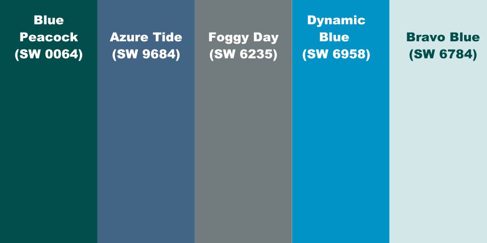
Some popular Sherwin-Williams cool blue paints include Blue Peacock (SW 0064), Azure Tide (SW 9684), Foggy Day (SW 6235), Dynamic Blue (SW 6958), and Bravo Blue (SW 6784).
Warm Blue Paints
The opposite of cool blue is warm blue paint which is any shade with a strong fiery undertone. Fiery colors, including yellow, red, and orange, are taken from heat. Due to their vibrance, they add grit to the otherwise mellow primary color, blue.
Hence, warm blue paints are great for livening up a space without being overwhelming, like the undertones in their natural state. Although the tints are often faint and unrecognizable due to the strength of the blue overtone, warm blues pair well with hot colors.
Use this shade for living rooms, bedrooms, and front porches on the door or walls.
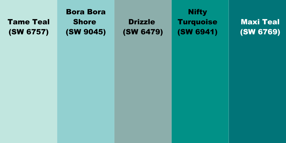
Some beautiful Sherwin-Williams warm blue paints include Tame Teal (SW 6757), Bora Bora Shore (SW 9045), Drizzle (SW 6479), Nifty Turquoise (SW 6941), and Maxi Teal (SW 6769).
Soft/Light Blue Paints
Soft blue paints are light shades because of their subtle overtone, typically with medium to high light reflectance value (LRV). They’re often white-passing with the blue tone glimmering underneath as tints.
This shade of blue is non-intrusive and very endearing; hence it’s great for trims, full wall coverings, and baby nurseries. Soft blue paint has the highest soothing and relaxing appeal of all the possible shades.
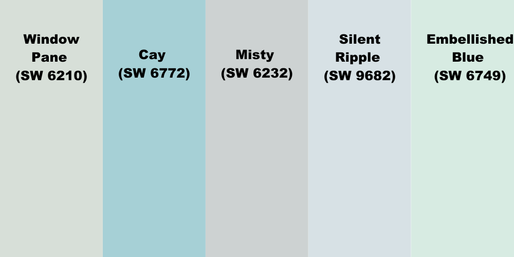
Choose it if you’re battling anxiety and need a break in your home. Some calming Sherwin-Williams soft blue paints include Window Pane (SW 6210), Cay (SW 6772), Misty (SW 6232), Silent Ripple (SW 9682), and Embellished Blue (SW 6749).
Dark Blue Paints
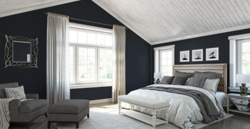
The most elegant shade of blue ever is the dark tone blue paints, which are the pinnacle of taste. Dark blues often range from deep two-toned blue-greens to almost black blue-grays and navies. Medium-dark blues also fall into this category for people with milder tastes.
You’d find dark blue on an accent wall highlighting a light-toned room, a full-wall coloring for a study or game room, standout furniture, or a welcoming front door. Wherever this shade finds itself, it’s sure to steal all the attention; hence, it’s best to use it sparingly.
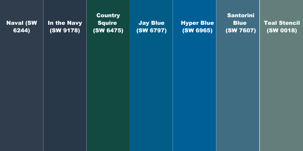
Popular Sherwin-Williams dark blue paints include Naval (SW 6244), In the Navy (SW 9178), Country Squire (SW 6475), Jay Blue (SW 6797), Hyper Blue (SW 6965), Santorini Blue (SW 7607) and Teal Stencil (SW 0018).
13 Best Sherwin-Williams Blue Paint Colors (2023 Trends)
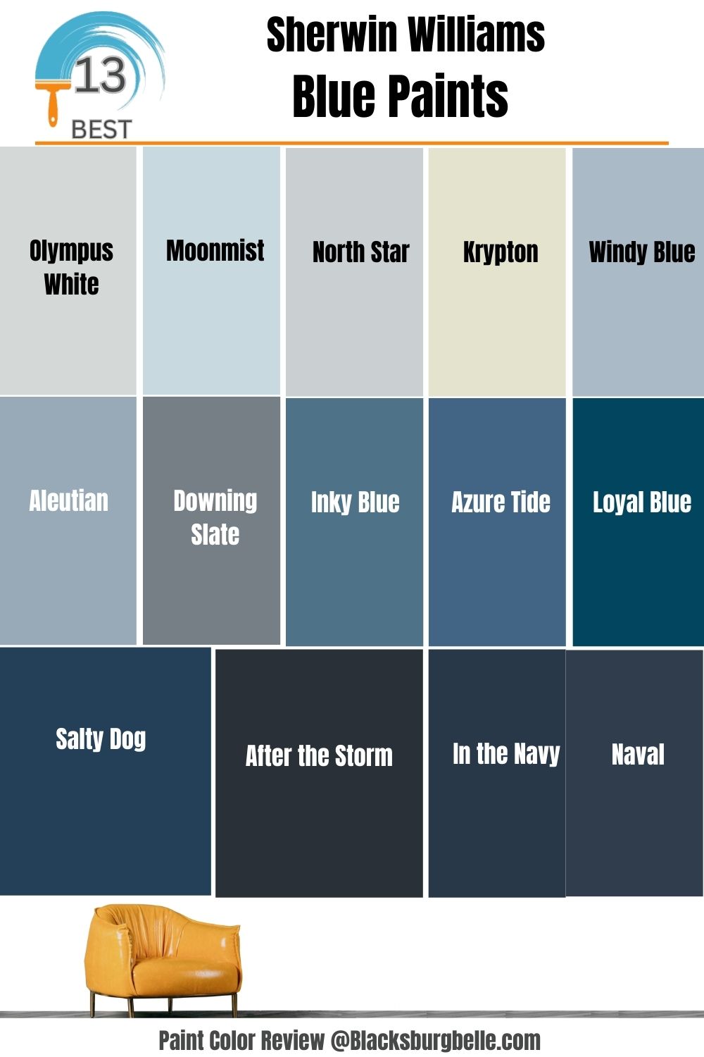
Of the hundreds of Sherwin-Williams blue paints available, we’ve curated a short list of the 13 best shades trending this year, ranging from the softest blues to the darkest two-toned delights.
| Color Name | LRV | Image | |
| 1 | Olympus White | 68 |  |
| 2 | Moonmist | 68 |  |
| 3 | North Star | 62 |  |
| 4 | Krypton | 52 |  |
| 5 | Windy Blue | 48 |  |
| 6 | Aleutian | 39 |  |
| 7 | Downing Slate | 21 |  |
| 8 | Inky Blue | 15 |  |
| 9 | Azure Tide | 12 |  |
| 10 | Loyal Blue | 5 |  |
| 11 | Salty Dog | 5 |  |
| 12 | In the Navy/Naval | 4 | 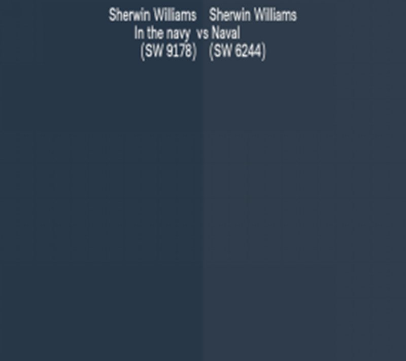 |
| 13 | After The Storm | 3 |  |
All pictures are from Sherwin-Williams
1. Olympus White (SW 6253)
When you want white paint with slight blue undertones to pair with your blue walls, look no further than Olympus White (SW 6253). The 68 LRV overtone makes this color’s blue tint seem non-existent until nighttime when the moon turns it into a cool blue-gray color.
This neutral blue paint is so versatile it works as an accent and full wall coloring anywhere. Depending on your chosen palette, you can pair it with any color.
2. Moonmist (SW 9144)
Unlike its counterpart North Star, Moonmist (SW 9144) is blue despite sharing the same LRV of 68. This color embeds a unique blend of yellow and gray in its undertone, making it a warm blue paint.
Pair this beautiful airy color with golden wood floorings and furniture to elevate its warmth. Also, add more beauty with warm cream paint like Alabaster (SW 7008) or a neutral gray like Rare Gray (SW 6199).
3. North Star (SW 6246)
Open up your home and cleanse your aura with the airy, soft, blue-gray goodness that is North Star (SW 6246). Its subtle shade is like a homing beacon reminding you to stay centered amid chaos and stress.
With an LRV of 62, this medium-light paint soothes your senses without blinding you to the sun’s reflection. Use it in your bedroom for a peaceful rest daily and in your bathrooms to create a spa-like aura.
North Star pairs excellently with white, cream, and gray — all neutrals to complete the focus theme.
4. Krypton (SW 6427)
Non-designers often look at blue paints with a one-track mind but rarely consider neutrals like Krypton (SW 6247) — you should. Its medium-toned blue-gray overtone creates a light atmospheric aura to nurture your solitude.
Use Krypton inside your bedroom, bathroom, or living room for a minimalist look, and add texture with golden brown wood and complementary paint colors like Tarnished Trumpet (SW 9026) and Quicksilver (SW 6245).
5. Windy Blue (SW 6240)
Strike a balance between fun and subtle with this mid-toned blue-gray paint, Windy Blue (SW 6240). Its soft 48 LRV overtone helps you unwind after a stressful day at work — if you work outside.
However, Windy Blue isn’t recommended as a full wall painting if you work from home, as it’ll leave you too relaxed from morning to night. Add warmth with Compatible Cream (SW 6367) or a tamer off-white like Dover White (SW 6385).
6. Aleutian (SW 6241)
February 2022 Color of the Month, Aleutian (SW 6241), is a classic example of a medium-dark blue paint. It sits at an LRV of 39, meaning it’s not quite neutral, but it’s not dark.
However, this slate gray-blue color produces a calming vibe that makes your space perpetually an evening on the oceanside. You’d love Aleutian in your bedroom or bathroom but not in the living room, as it can become depressing.
Pair this blue-gray paint with dark brown wood for a vintage theme, or highlight its gray element with tiles for a contemporary look.
7. Downing Slate (SW 2819)
Historic blue paints like Downing Slate (SW 2819) are great for curating classic palettes. The color has an LRV of 21, making it appear grayer than blue, hence its categorization as a neutral paint.
Pair Downing Slate with lighter blue paints and white to create a contemporary vibe but stick to dark wood to maintain the classic aura. You can use it on furniture or as an accent wall.
8. Inky Blue (SW 9149)
When you want an agreeable blue paint that can adapt to any theme and coordinating color, Inky Blue (SW 9149) is the way to go. It’s a soft dark shade with an LRV of 15, meaning it’s not solid enough to swallow every ray that hits its surface.
As a dark blue paint, Inky Blue works excellently for full exterior coloring and as an accent on half-walls and furniture.
Elevate this shade with sandy, tan (Cocoa Whip, Natural Linen), or white paints like Icicle (SW 6238) with crisp or blue undertones to match Inky Blue’s yellow tint.
9. Azure Tide (SW 9684)
Azure Tide (SW 9684) is a darker alternative to Inky Blue, but they have similar components on the surface. With an LRV of 12, this color is suitable for exterior and interior coloring, but it’s better than the latter.
Azure Tide is part of Sherwin-Williams’ Emerald Designer Edition (Classic + Collected) and an expert pick for its unique tone. You can pair this paint with gold accessories and lighter tan colors, including yellow or orange variants.
10. Loyal Blue (SW 6510)
Dive into the deep with the saturated medium-dark shade of Loyal Blue (SW 6510). This 5 LRV color is ideal for a true blue paint without a black or green tint to turn it moody. Instead, Loyal Blue presents a sophisticated soothing aura.
Use this shade in your bathroom, bedroom or living room with enough artificial lighting to accentuate the natural light.
Loyal blue looks beautiful with dark brown wood, tan, and lighter blue paints. Coordinate the color with Grecian Ivory (SW 7541), Fenland (SW 7544), and Sky High (SW 6504).
11. Salty Dog (SW 9177)
Let’s delve into the classic and elegant world of navy blues, starting with this deep-toned shade — Salty Dog (SW 9177). The color has an LRV of 5 with an invisible undertone, making it a suitable neutral alternative to classic tones like White, Cream, or Black.
Pair this solid dark paint with glass accessories for a contemporary look, or keep it classy using leather furniture. You can coordinate with a light monochrome theme or contrasting warm tones like yellow and brown.
12. In the Navy (SW 9178) / Naval (SW 6244)
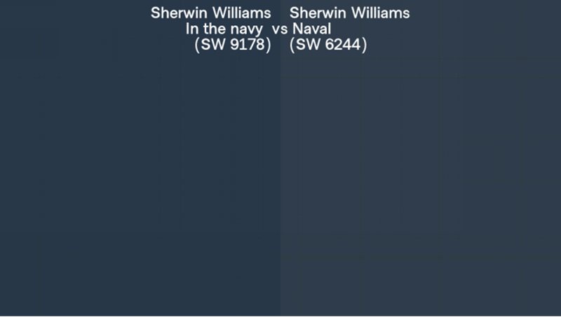
Navy blue is a popular dark shade and can pose a dilemma when you have multiple options. Should you go for the Navy (SW 9178) or the Naval (SW 6244)? They have the same LRV of 4, so how can you distinguish them?
Choose Naval if you’d prefer a charcoal gray undertone in your navy blue but stick to In the Navy for a tintless tone. Due to their varying nuances, the former works better with warm colors, while the latter shines with cool coordinating colors.
Use In the Navy for your studies and leisure dens and liven it up with cream paints but use Naval for your office. It’s come alive with indoor plants due to the green-gray tint.
13. After the Storm (SW 9685)
We climax this list with the inevitable blue-black 3 LRV After the Storm (SW 9685), known for its two-toned beauty. Choose this color when you need a near-perfect black paint but with an interesting blue undertone to add pizzazz to your room.
Note that it’s the ultimate dark blue shade that would swallow every light that hits its surface. Fun Fact: American high fashion designer Christian Siriano selected After the Storm as a top pick in his color palette.
Conclusion
Light, dark, soft, cool, or warm — you can experience blue in any unique form for a calming and relaxing aura. It’s one of the most versatile primary colors on the wheel, making it a suitable pair for other colors.
Use blue in a triad with yellow and red variants such as tan and orange, or create an analogous theme with equally cool colors, green and purple. Pairing diverse LRV shades in one space creates better harmony than sticking to one tone.

