
So many opinions trail the appearance of pink paint colors in space. It’s a wide notion that this color is feminine and, therefore, should be restricted to only a few places in the home. However, pink paint colors are one of the most versatile hues around, and we’ll show you how.
These 10 best Sherwin Williams pink paint colors will turn your space into the cynosure of all eyes and mood boards for many.
Table of Contents
What Color is Pink?
Pink is for the bold, the daring, the feisty, and the artistic. Looks like we just described you. This color is also widely associated with love, kindness, and feminine energy.
They’re versatile and work perfectly on both interior and exterior parts of homes. Another good part of pink is its range, especially with other colors that are not closely related to them by undertones or color setup.
Things to Consider Before you go Pink
Like every professional or anyone who takes their aesthetics seriously, the following steps are highly important to ensure you execute a tasteful and solid paint job.
Consider Existing Décor
The existing decoration in the space intended to be worked on is a priority on this list. This has become a great point in the whole step because we clearly understand that only some are interested in turning their entire home around due to one reason or the other.
Therefore, before you decide on a hue, ask yourself the question of the possibility of complimenting or drastically going against your standing decoration. Once that is established, you can move to the next step, which is the issue of lighting.
Lighting
The overall performance of color(s) depends on the lighting conditions in that place. Natural and artificial light have different effects on your pink color, and you can see this in the next section, where we’ve added enough picture inspirations.
A large dose of natural light will make your pink space appear lighter and washed out, while a warm light from the bulb may cause your pink to lean into its red-orange side, which is still very impressive either way.
What are the Undertones
Undertones are important factors in any paint job. These background colors influence the appearance of your paint color- they work hand in hand with lighting to give a particular result. For better understanding, you may come across red or yellow whispers in your pink wall, which leaves you wondering how they came to be.
It’s simple, during the creation of that color, many hues were mixed together to arrive at your desired color, but their remains still linger and will often show. Bear this in mind and accessorize accordingly.
Don’t Forget the Space
How small or large your home is can also play a huge role in the execution of your paint job. If your space is very expansive, then do the low and high LRVs; there’s no limit for you. However, if you’re in the minority, avoid colors with low LRV, as the only thing they’ll do is limit your creativity and make your space appear smaller, which isn’t what we want at all.
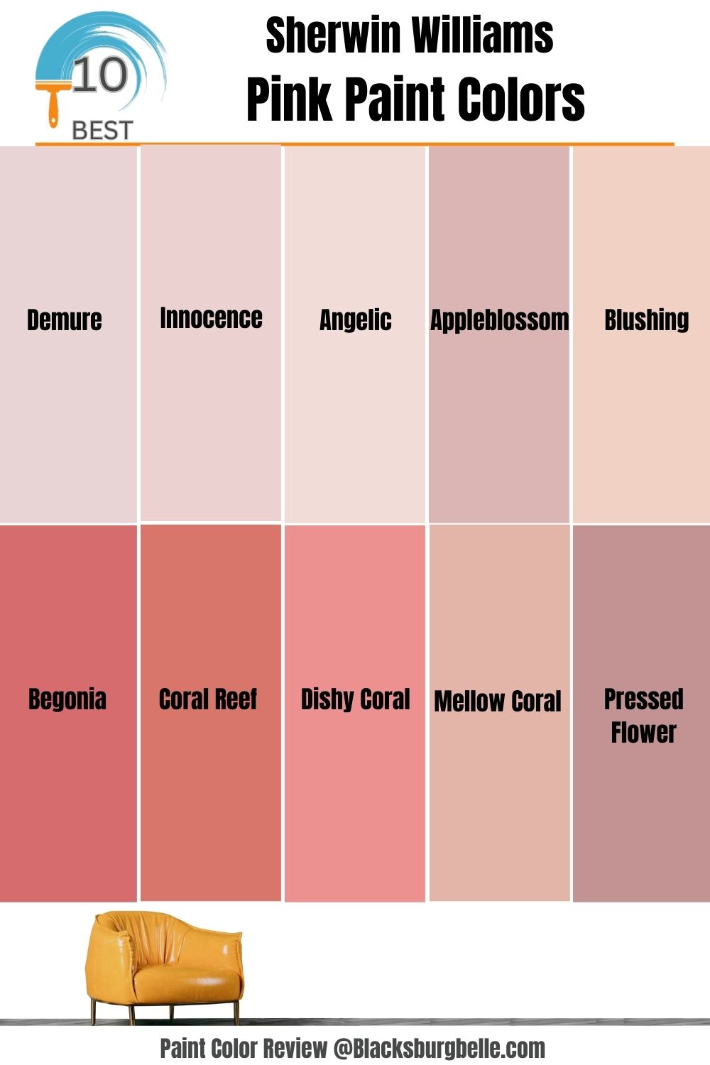
10 Best Sherwin Williams Pink Paint
You’ve been waiting for this, and now it’s here. These 10 Sherwin Williams Pink Paints have changed the entire interior decoration game over the years, and we’re intimating you with them. The statistics of your paint are very important in its final executions in relation to lighting, as earlier discussed in this read, so ensure to pay attention to the stats in this section.
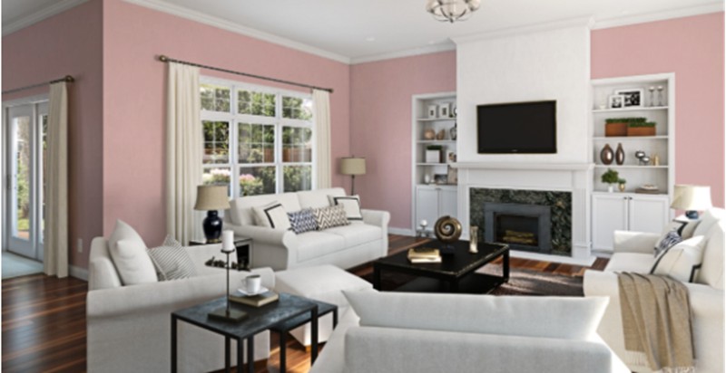
Sherwin Williams Demure
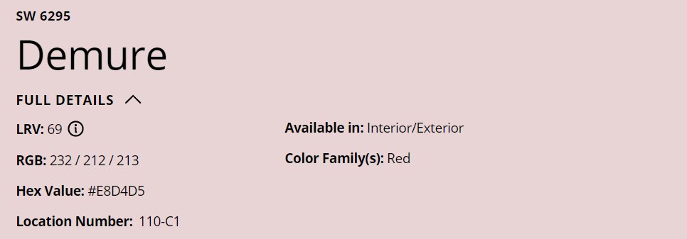
Demure is a bright blush pink that makes it the perfect light pink that won’t overwhelm your space any time of the day. This shade has an LRV of 69, which means it’ll do wonders in small spaces and the face of little to no light.
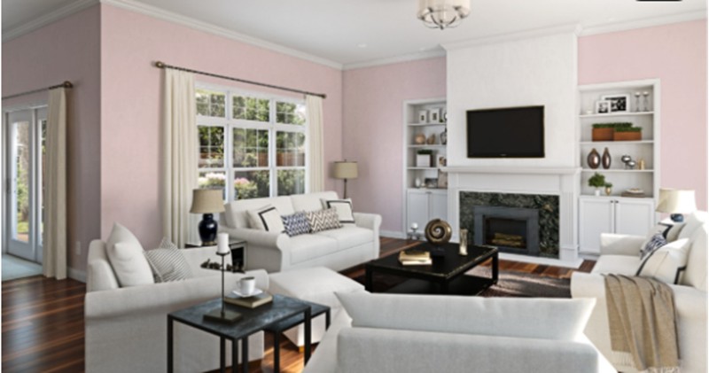
Demure has an RGB of 232/212/213, which falls into the warm category. This color shows off its blush side in this living room due to the intense touch of incoming natural light and bright white couches, which create a sharp contrast. You can switch up your décor by pairing your paint color with wooden floors.
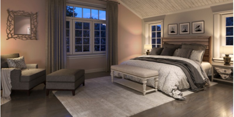
Pink belongs in the bedroom, and it performs better than projected. Infuse cool lighting into the mix, and you’ll get a great night’s sleep. The second image proves that gray and other neutral tones are good friends of pink.
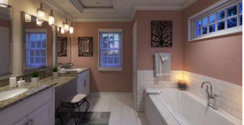
Sherwin Williams Begonia

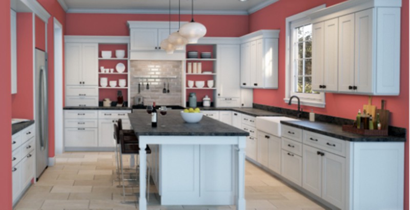
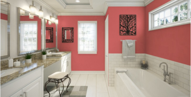
Begonia is a much darker and more concentrated pink with an LRV of 26. It has strong red undertones, which you can see from the RGB 215/108/110. This color has so much depth; hence we suggest you avoid it if you have a small space to work with.
Spice up your kitchen with Begonia and watch the deep pink hues add a bit of mystery and elegance to your kitchen when you combine it with sharp white cabinetry and black backsplash marble tops. You can add wooden textures for a more minimalistic design and a bit of reality to the fanfare of pink.
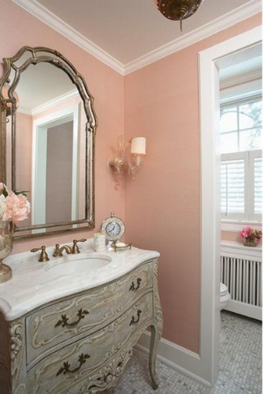
Begonia is a superb hue in the bathroom. Throw in sharp white accessories and a bit of black to bring an edgy twist. Think of the refreshing and fun bath in a Begonia bathroom.
Sherwin Williams Innocence
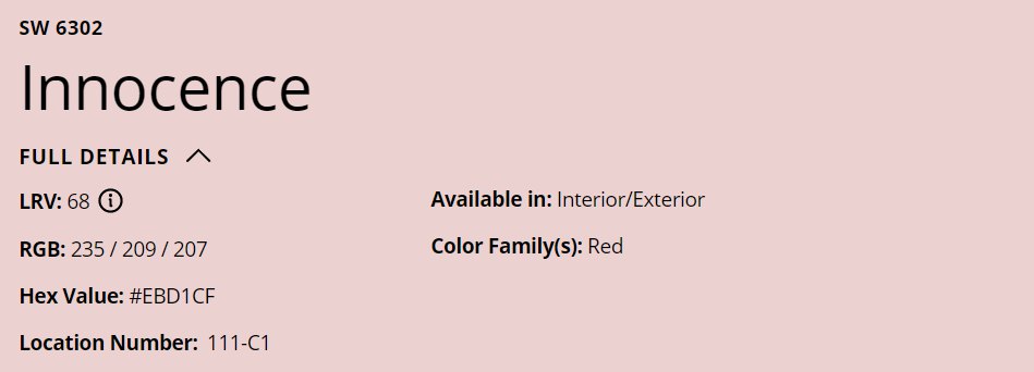

Sherwin Williams’s Innocence is far from its name because this painting serves the main character’s energy at any time of the day. Innocence has an LRV of 68, which means it’s one of the brightest pinks from the house of Sherwin Williams.
The first example of Innocence application is the exterior of this house, where you see soft hints of purple undertones and the strong impact the black roof has on this shade. Purple works well with other elements of nature (greens) surrounding the building, so this is a good idea.
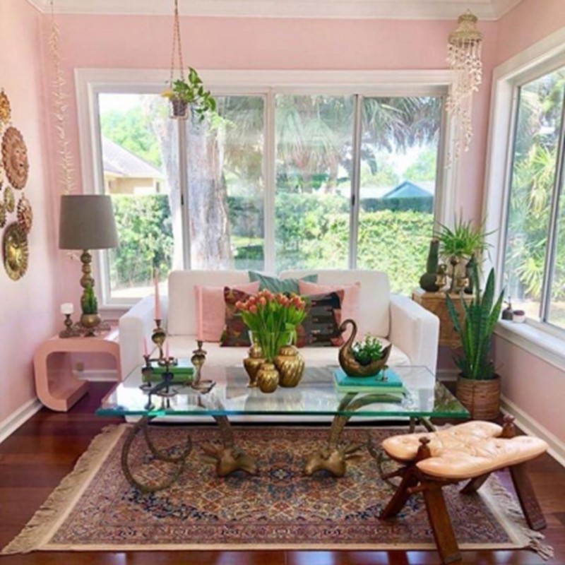
Take your house back to the Victorian era by adding a touch of innocence in your living room, like the second image. The white trims on the windows ease the dominating effect innocence has in the room. We love the gold and wooden pieces adding glitz and glamor to this color.
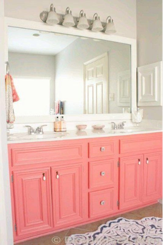
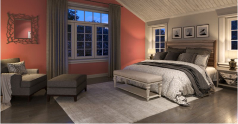
Sherwin Williams Coral Reef

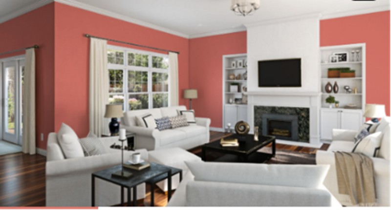
Yes, this will instantly remind you of the popular coral color that warms any space in a home. This loud, intimidating hue is the perfect coalition of orange, pink, and red which also means you get to see hints of orange in this one.
Coral Reef works great in a light and dark room, either as a main wall color or an accent wall. This color works great with neutral paints as it’ll make that bold statement and garner all the attention.
Beautify your cabinetry by covering it in coral reef. Complete this adorable project by throwing silver handles on the doors and drawers. Go white with the marble top and surrounding walls.
Sherwin Williams Angelic

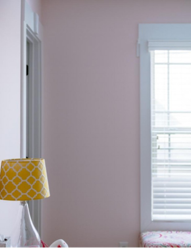
This one has an LRV of 75, so what you’re getting is a bright pastel pink in your space that’s so feminine yet strong enough to dominate in your space. While this color can work in a small space, we recommend choosing it for a room with plenty of natural light for that classic pink pastel touch.
No, that’s not pink in the first frame; it’s just the lighting having a field day on this lovely blush color. Due to the limited supply of natural light, this color connects with the darker and cooler side, hence the ensuing result.
It’s a different ball game for the second image as Sherwin Williams Angelic sticks to its blush side due to the intense supply of sunlight. Some colors look better no matter how washed out they become, which is why we adore Angelic.
Sherwin Williams Dishy Coral


The coral undertone in dishy coral leaves a lasting impression on the walls of your home with its LRV of 40, making a medium-toned pink with bright red undertones. This color has an RGB of 237/145/144 and performs great in the kitchen, bathrooms, and home exterior.
You can see the orange undertones in this warm color peeking through, usually in the evenings when artificial light comes on. Sherwin Williams’ dishy coral is a perfect choice as an accent wall in a bedroom, combine it with warm white walls and light or dark gray characters, and you’re good to go.
For your home exterior, dishy coral works great when paired with blacks and white. Every color looks washed out in the sun, so prepare to get almost blush feedback from this one.
Sherwin Williams Appleblossom

This soft, warm color is a unique blush hue from Sherwin Williams with an LRV of 51. While it won’t reflect much light, this color keeps your space cozy and warm. This rich hue has enough touch of orange undertones that adds a completely different personality and extends its range.
Appleblossom is more in tune with its blush side during the day, especially with the influx of sunlight. You can replicate the same move in the image by cooling it down with white, black, and brown accessories.
It’s a different scenario in the second image, thanks to the soft, warm light in the bathroom that showcases the beauty of Appleblossom, especially with its unique orange undertones that instantly match the yellow tones from the light.
Sherwin Williams Mellow Coral

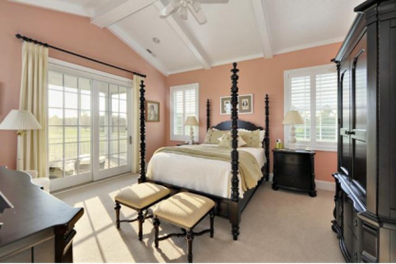
Sherwin Williams Mellow Coral is less of a pinky blush and more of coral with peach and blush undertones but not to any degree short of a knockout. Mellow Coral is a top member of the yellow-red family, meaning there are also orange hints in it to which we can attribute the coral appearance.
Create the master bedroom of your dream with Mellow Coral walls. The spindled post bed and big French doors in fancy dark brown and white colors add life and style to this color and take you back to the Victorian era (but who’s complaining).
We love the yellow curtains and stool drawing out the orange in this color. If you’re wondering why this color works in such a bright room, well, that’s due to its LRV of 52, putting it in the medium category.
The second image is the perfect traditional bathroom, which you’ll see in historical and traditional spaces. They’re the textbook representation of the Victorian-era mood board. The gold detailing on the furniture in this space makes this memorable color burst with a strong personality.
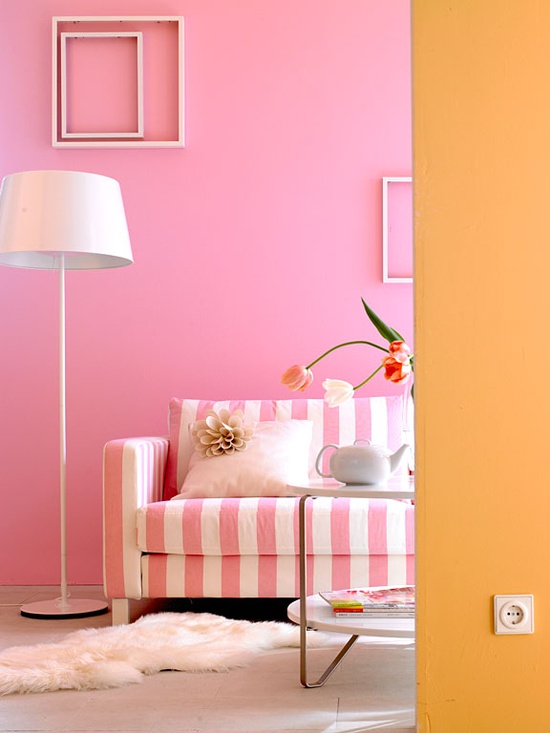
Sherwin Williams Blushing

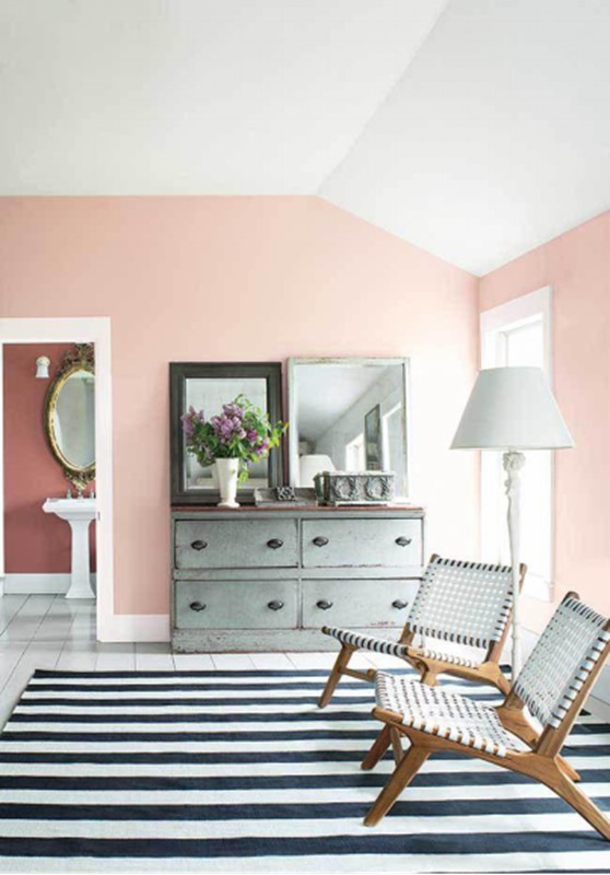
This one is out of the 3 neutral pink categories and leans more towards red and orange, which are very strong in their undertones. Sherwin Williams Blushing is one of our all-time favorite pinks because it’s so subtle and lets other colors come on it in the nicest way possible.
The first image showcases the fun and outspoken side of blushing courtesy of its orange undertones that match beautifully with the monochrome couch and soft pink throw pillows. Incorporate whites into your painting work for more dimension and artistic presence.
Add life to your Sherwin Williams Blushing living room by creating a mini vacation with those woven chairs and the striped monochrome rug. The gray drawer and white standing lamp are everything in this space, and those flowers remind us of the fun days of summer.
Sherwin Williams Pressed Flower

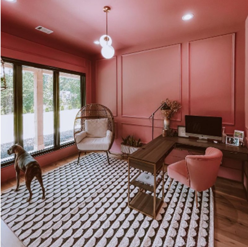
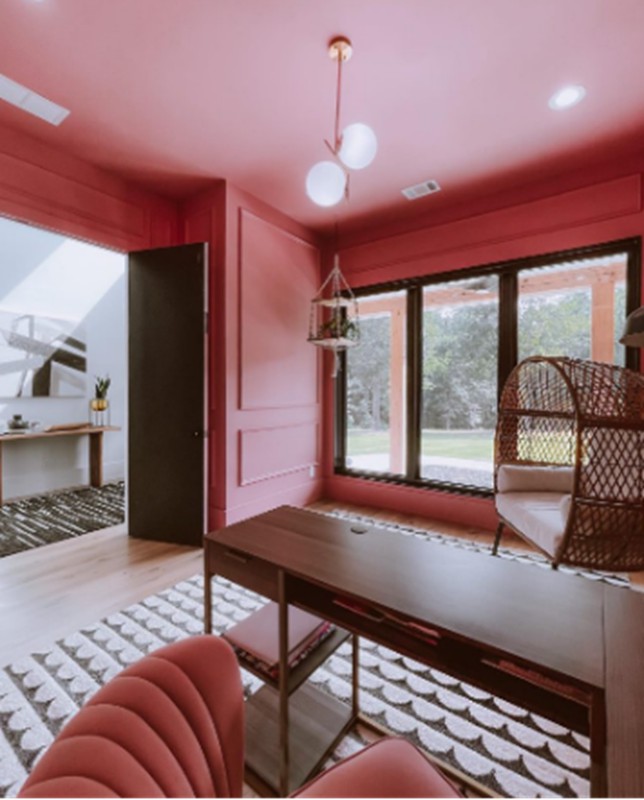
Pressed Flower is a sophisticated pink color perfect for modern spaces- for people who don’t do too much but still pass strong statements. This deep salmon pink makes a room look glam and luxurious, especially with different trims.
One of the most effective ways to tone the intensity of the pink color and, in turn, increase its versatility is paired with rich wooden tones and whites; that way, you get a balanced space that is easy to relate with and yet leaves a trail of mystery.
We love the fun chair at the corner of the workspace and the structured light that gives Pressed Flower that edginess.
What Colors go With Pink
Pink pairs well with many other bright hues, so you can introduce it to existing decors and colors in a room while avoiding chaos. The most popular shades that go with pink include blue, brown, gray, and green.
Yellow
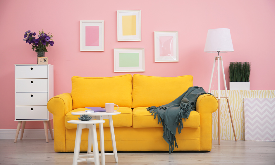
Introduce yellow into your pink space if you want a big boost throughout the day. This can come in the form of a big yellow bean bag, a duvet cover, or a big yellow couch in the corner of the room.
Gold
Pink and Gold are a match made in heaven. Use gold accents for your pink room and watch it light up. Naturally these gold accents take center stage and draw attention away from the sharpness of your pink. This also means your visitors will pay more attention to your unique gold details.
Green
Emerald green is a lovely combination with pink. It adds instant sophistication and moodiness in a good way to your pink color. We recommend this combo to older people who naturally gravitate towards traditional décor and busy indoor spaces.
Sage green is also a perfect pair for pink as it takes the back seat and provides a calm backdrop for its accompanying pink color. This combo works great in bedrooms and bathrooms- add a pink blanket or wallpaper design in your room for that pop.
Orange
This is probably the most unusual combination on the list, but it produces extremely impressive results you’d wonder how possible. The trick to making the most of combinations like this is to limit the distribution of the brightest of the pair- so you may want to combine orange and a darker pink while restricting the use of the orange to one or two statement pieces.
This combo is especially good for the kids’ room, nursery, or playroom, as it also positively affects the user’s overall mood.
Turquoise
Go bold with touches of turquoise and white in your pink room. This artistic combination makes your room appear wider and adds vibrancy and sharpness to it. It’s perfect for the kids bedroom, and you can add other accessories and effects.
Sampling Your Sherwin Williams Pink Color
This important step must not be missed in the scheme of things. Use SAMPLIZE strips to test out your pink color by using them at different times of the day in varying rooms to check the effect of light on the outcome of your color.
Sampling technology has advanced so much that you don’t need to paint your entire wall in your desired color just to check how it’ll fare. These strips are removable and reusable, and they’re also super affordable, so you can get as much as you like.
Final Thoughts
If you want a bit of razzle dazzle in your space, get familiar with any of the 10 Sherwin Williams pink paints we picked for you. These colors range from warm to cool tones and promise a refreshing feeling from the moment you use them on your wall to the rest of your journey.
One pro tip we give our readers is to wait at least three days with the sampling strip in each room to get familiar with the activity and movement of the color in your house.
 10 Perfect Sherwin Williams Blue Gray Paint Colors (Trend 2023)
 10 Best Sherwin Williams Coastal Paint Colors
 20 Warm Gray Paint Colors to Elevate Your Space in 2023
 22 Most Popular Behr Paint Colors
 11 Best Dark Sage Green Paint Colors for Interiors and Exteriors
 15 Best Black Paint for Furniture For 2023
