Are you designing or redecorating a new room and wondering about the best white paint colors to use as trims? Then you’ve come to the right place. White colors as trims are a classic choice making them the most common option for every designer.
They’re neutral shades, making them versatile and suitable for every other color. However, there’s more to white than being a versatile neutral hue. Each white paint has a unique undertone(s) that changes the overtone when interacting with natural or artificial lighting.
All those elements factor into your eventual choice of white paint for trims.
Table of Contents
Steps for Choosing the Right White Paint Colors for Trims
Understanding the color white’s complexities would help you choose the best shade for your home theme. I’ll take you through three primary steps to help you make an informed decision.
Step 1: Analyze The Space and Lighting
Size and lighting matter when choosing any paint color, including White, even when used sparsely as trims because they create an impression of your space.
Some spaces require enough lighting for the paints to stand out, while others need little lighting to mellow the vibe.
Consider your room’s purpose, then measure the sq ft. to determine its size. Is it big enough? Do you want it to look smaller? Answering these questions will direct you to manipulate the color to suit your purpose.
This will direct you to choose the right wall paint to create an airy or moody vibe and, by extension, the proper white trim.
Step 2: Measure The Room Size And Position
As a standard rule – bright colors make small spaces appear larger while dark give the illusion of smaller spaces. However, your white trim must complement your wall paint to avoid clashing undertones.
Use a compass to determine your room’s position based on the direction of the sunlight and sunset. Stand by the window, position your compass due north, and watch its needle move.
Get a pen and paper tape to mark the four directions of the room from North to South, West, and East. That’ll tell you the origin of the light’s reflection so that you can decorate your room accordingly.
What Should I Know About the Room’s Position?
North-facing windows receive steady sunlight, which ensures paints remain neutral despite their interaction with light. It’s a calm and constant reflection that brings out the softest parts of your white paint to give your room a relaxing vibe.
To highlight the undertones in your white paint, ensure it’s painted in a South-facing room.
Southern windows give you the brightest hue from mid-morning till early noon. Hence, it’s best to paint rooms in that position with soft whites (you’ll learn more about this below.)
If you work in the afternoon and need the brightest light possible, use your white paint in a West-facing room. It attracts the brightest noon lighting, which lasts until evening and permeates even the darkest colors.
Despite being the least light receptor, East-facing rooms get the best morning light, with soft shadows which take over as the day disintegrates into the night. Hence, it’s an excellent position for morning work.
East-facing rooms and West-facing rooms provide opposite effects, as you’ve seen.
Observe the room’s shape to determine whether it’s round or squared. After that, map out its outlay (as it’s better to paint before furniture and accessory placement) and ensure the trims are in the right position.
That means whichever suits your taste based on the explanation above.
Step 3: Evaluate Your Lighting Options
After examining your room’s position and size, choosing the proper lighting is the next step.
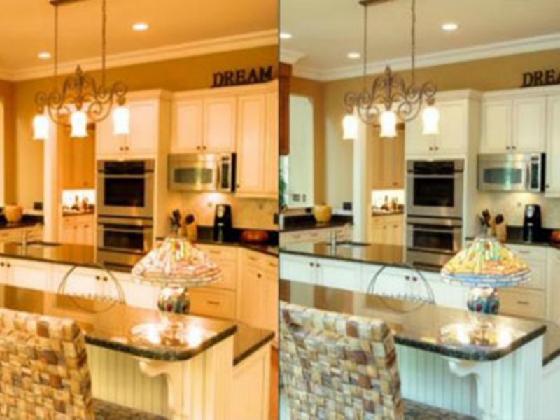
Natural light gives you the most original iteration of the white color, while artificial light adds a little more effect.
According to Lights.com, artificial light intensifies warm colors and dims cool hues. Warm colors resemble fire – red, yellow, and orange while cool colors reflect the ocean – blue, purple, and green.
Knowing what each room position offers should inform your artificial lighting decision since you already know the natural lighting intensity. Match the light to the white trim and the white paint to the wall paint.
Well done on coming this far. You’ll learn how to pick the best white paint for your room.
Step 4: Get Familiar with The Color Palette
In a prior subheading, we addressed the issue of lighting, so let’s move on to the color palette. Color combination and coordination in a space result from a curated palette, and with over 100 possible hue variations, you can imagine the vast options.
This guide will focus on three standard palettes – monochrome, contrast, and triad. Knowing your color palette would inform your choice of white paint for trims to avoid clashing undertones.
Monochrome Palette
Monochrome palettes combine multiple shades of one color in one space, which can be tricky with whites. However, when you put the different kinds of white paints into perspective, you’ll realize that the possibilities are endless.
For a monochrome palette, choose white paint with undertones matching the dominant color. Hence blue whites for blue palettes, warm whites for yellow, red, and cream palettes, and soft White for neutrals like gray, charcoal, and black.
Complementary Palette
Contrasting colors form a complementary palette; you can find them on the color wheel. Complementary colors are Yellow = Purple, Red = Green, and Blue = Orange. So, warm white paints compliment purple and green walls, while cool whites work with orange walls.
Triadic Palette
Three equally spaced colors form a triad; you can use any white paint with any combination in its undertone as a trim.
Triad combos include Red = Blue = Yellow (Warm White, Cool White, and Bright White paints) and Purple = Green = Orange (Cool White, Soft White, and Crisp White).
Step 5: Conduct Sample Area Testing
Sample, Sample, Sample, we can’t overemphasize the importance of sampling a variety of white paints before choosing one for use. It’ll save you stress from remodeling to repainting and spending unnecessary money.
Several paint brands offer multiple sampling options, like Sherwin-Williams, which has Color Chips (small coin-like chips painted in the sampled color,) Paint Strips (peel and stick materials in your preferred color,) and Color-to-Go Sample paints (easy-to-wash.)
Clean the wall or use a virgin wall, then test your best three to five options for a side-by-side comparison. Leave the samples in the space from morning to night or vice versa to get the real-time reaction of light with it.
Observe the undertones and reflections, then choose your favorite.
Step 6: Analyze the Long-Term Value of a Paint Color
Once you pick your favorite white paint, consider the long-term value depending on how long it takes to change your interior decor.
If you repaint your wall trims within short periods (six months to three years), go for any white you like.
However, if it’ll take longer to repaint and you have heavy traffic within your space (children or workers), avoid bright whites. They get dirty the fastest despite their beauty. Instead, use warm whites leaning towards cream or off-white.
Step 7: Apply Finishing Touches
Now that you know the white paint shade to use in your space, the last step of choosing the perfect white trim is choosing the sheen. Every paint appears differently based on its unique sheen, and several types exist.
Sheen also contributes to the paint’s durability as some attract dirt more than others.
Some popular sheens include Eggshell, Flat, and Gloss.
Gloss paints reflect the brightest light while Flat finish, a.k.a. Matte colors reflect the least. Eggshell provides the balance between gloss and Matte. Hence, to highlight a soft white paint, use a gloss finish. The beauty of sheens is that you can use them to create monochromatic themes, like placing a glossy white trim on a Matte white wall.
Understanding White Paints
Let’s get into the nitty gritty of the white paint color and why picking the first one you find might not always be the best decision.. Elementary school taught you that there are four neutral colors – white, black, brown, and gray – but interior decoration would expose you to the endless possibilities of each hue.
Firstly, you must understand that every paint is a mixture of two or more colors which means it’s never a single shade. Saturations, shadows, and tints come out underneath the right lighting conditions. This will have you questioning your choice if you don’t do due diligence.
However,we’re here to break it down for you, so you don’t leave the paint store with regrets. I’ll start by explaining the concept of undertones and how they factor into choosing the right white paint for your wall trims, then close with the long-term value.
What Are The Undertones?
Have you ever bought a paint only to get home and discover it’s different from the sample promised? If yes, then you’ve experienced a live reaction of undertones. They’re secondary colors in every paint and can exist in multiples or a single dominant tint.
Undertones are common elements in white paints because of the color development process. This is why some White colors appear blue while others turn cream, violet, orange, or even yellow.
In varying quantities, red, green, and Blue (RGB) mixed into absolutely black paint create each color. Hence, white paint with the highest Blue content would likely have a cool undertone. You can decipher the primary undertone of a white paint based on its RGB value.
You’ll be surprised at how different two white paints can appear side-by-side. Check out the different types of white paints below.
Types of White Paints
White paints come in over a hundred shades from brands, including top-quality companies like Sherwin-Williams and Benjamin Moore. However, you can narrow all these shades into broad categories defined by their undertones.
- Crisp White
- Cool White
- Warm White
- Soft White
Crisp White Paints
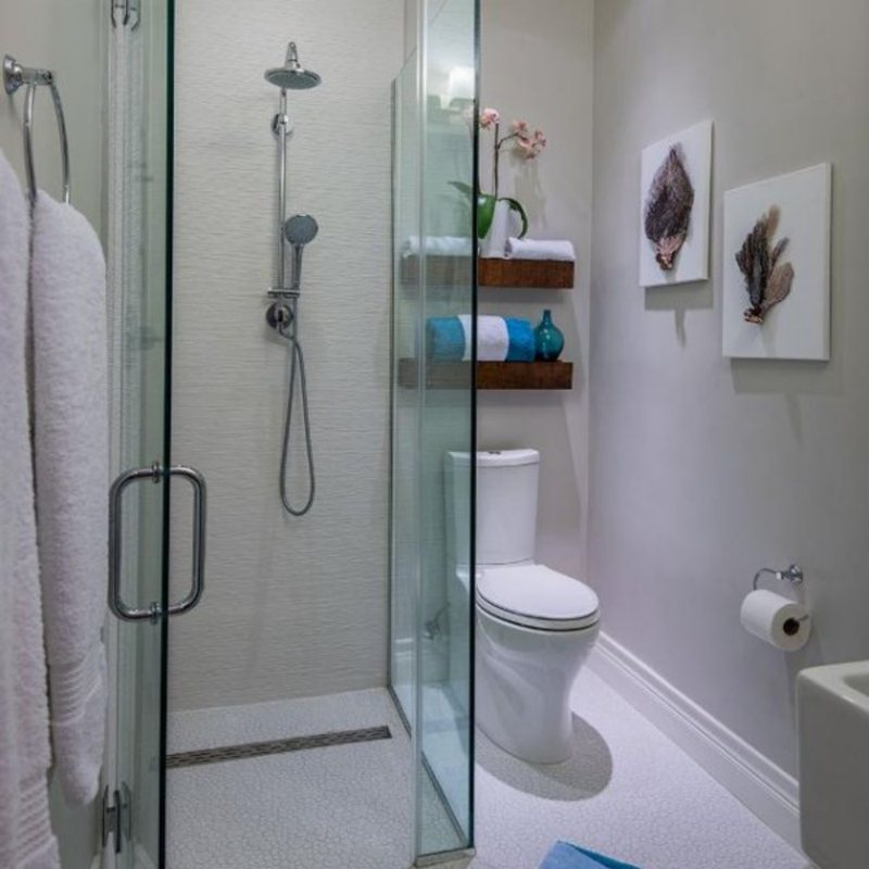
When most people hear “White,” they think of clinical crisp white paints without undertones. However, they couldn’t be more wrong. Although Crisp white paints have undertones, they often go undetected due to the bright overtones with high Light Reflectance Value.
Crisp white paints, a.k.a. True White paints are ideal trims on neutral paints like Black and Gray with equally undetectable undertones.
Use crisp white trims in clinical spaces like hospitals, modern and professional kitchens, hotel bathrooms and hallways, and office spaces. Avoid this type of White in fun and vibrant themes, especially with warm colors.
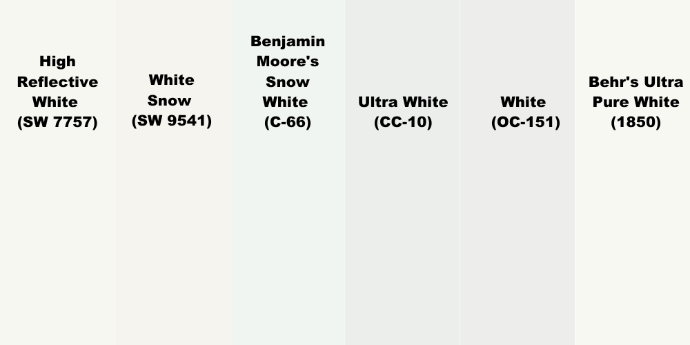
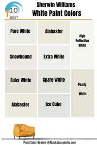
Famous examples include Sherwin-Williams High Reflective White (SW 7757) | LRV 93, White Snow (SW 9541) | LRV 90, Benjamin Moore’s Snow White (C-66) | LRV 87.47, Ultra White (CC-10) | LRV 83.46 and White (OC-151) | LRV 83.56.
Honorable mention – Behr’s Ultra Pure White (1850) | LRV 94. It was the color of the year in 2016, its crisp overtone always stays in style.
Cool White Paints
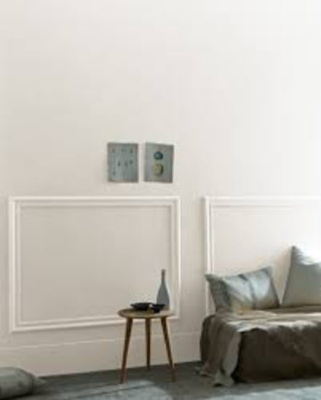
Whoever said white can’t be mellow and relaxing must have not had the opportunity of relishing in a cool white paint color. Any white hue with purple, blue, or green undertones falls under this category. However, one of these undertones is always dominant when two or more cool tones exist in the undertone.
Blue undertones often stand out because of its primary color affiliation. Meaning other secondary cool colors carry their elements in their formation. Hence, cool whites often look like pastel versions of their undertones underneath bright lights.
Use cool white paint trims against cool wall colors or palettes depending on your chosen theme (you’ll learn more below). Don’t use a cool white trim against a warm wall or floor unless the paint is dual-toned.
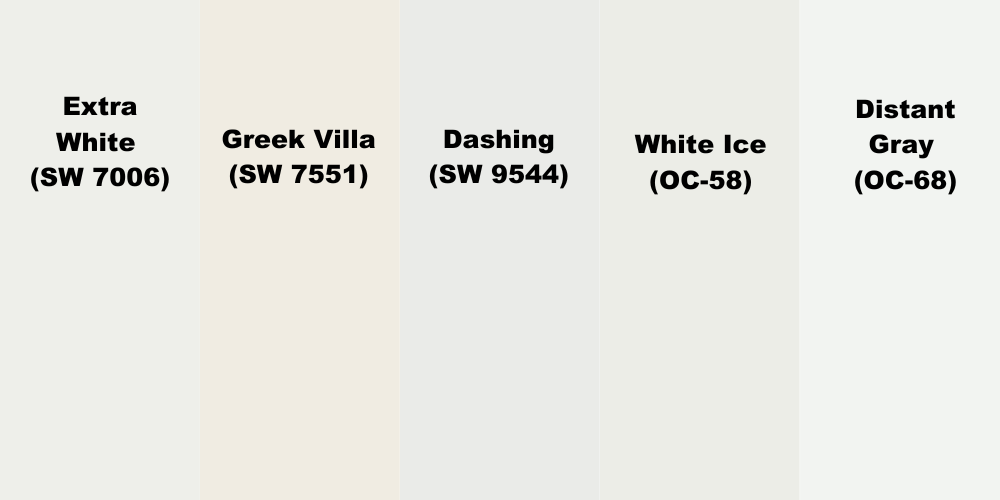
Popular cool white paints with blue undertones include Sherwin-Williams Extra White (SW 7006) | LRV 86, Greek Villa (SW 7551) | LRV 84, and Dashing (SW 9544) | LRV 83. White Ice (OC-58) | LRV 83.79 and Distant Gray (OC-68) | LRV 88.14.
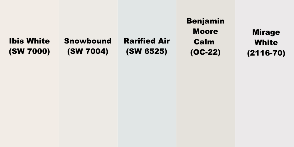
Purple undertone whites include – Ibis White (SW 7000) | LRV 84, Snowbound (SW 7004) | LRV 83, and Rarified Air (SW 6525) | LRV 78. Benjamin Moore Calm (OC-22) | LRV 75.83 and Mirage White (2116-70) | LRV 80.69.
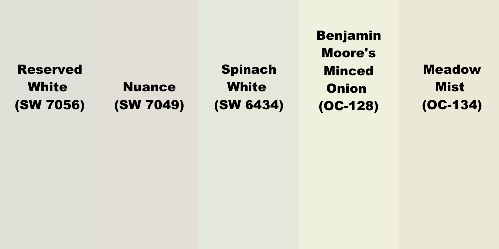
Green Undertone whites include – Reserved White (SW 7056) | LRV 74, Nuance (SW 7049) | LRV 74, Spinach White (SW 6434) | LRV 79. Benjamin Moore’s Minced Onion (OC-128) | LRV 83.9, and Meadow Mist (OC-134) | LRV 78.42.
Warm White Paints
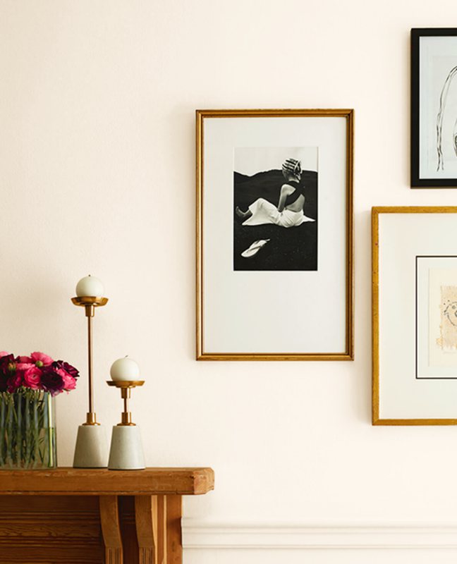
These are the inverse of Cool white paints. Warm whites contain fiery colors in their undertones. These colors include red and yellow, and their secondary creations – are orange and pink. The ranges of these colors create different types of warm whites – bright and soft warm White.
Bright Warm white paints are those with fiery undertones like bright yellow, red, and orange, while Soft, Warm whites are those with subtle heat hues like variations of the last three colors – yellow = beige, red = pink, and orange = peach.
Other soft, warm white paints have warm undertones fused with cool colors like reddish-purple, which makes violet, and lemon, which is a marriage of yellow and green.
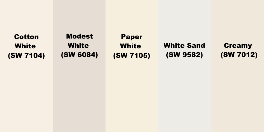
Popular Warm White paints are Cotton White (SW 7104), Modest White (SW 6084), Paper White (SW 7105), White Sand (SW 9582), and Creamy (SW 7012).
Use Soft warm white paints to balance cool colors, whether White or another.
Soft White Paints
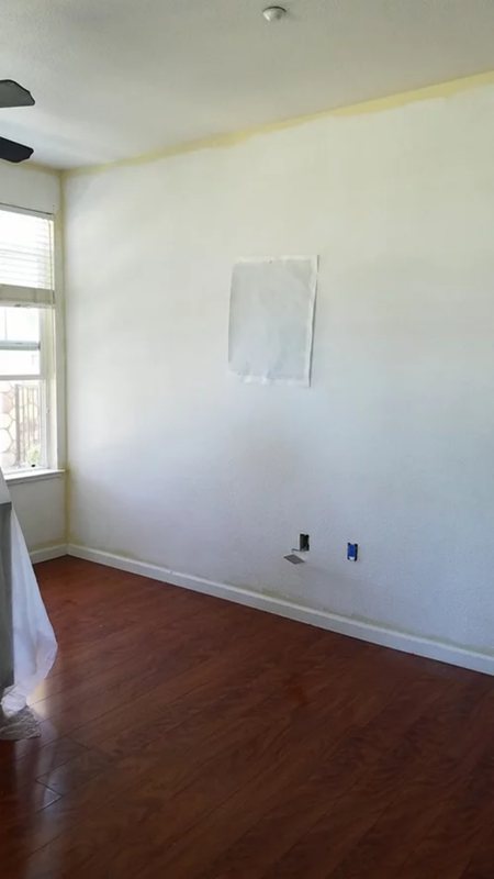
Soft White Paints are neutral white paints with subtle undertones such as pastel yellow, lilac, sage Green, and peach, which makes them lean towards off-white. Unlike Bright White paints, Soft, Warm Whites sit in the middle of the LRV scale from 70 – 80.
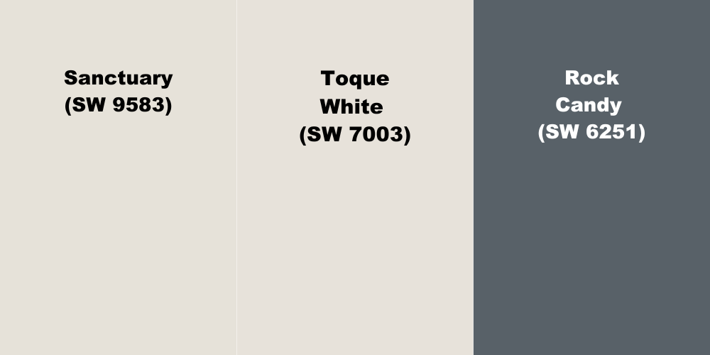
Some of the common soft white paints include Sherwin-Williams Sanctuary (SW 9583) | LRV 76, Toque White (SW 7003) | LRV 76, and Rock Candy (SW 6251) | LRV 75.
Use Soft White paints in bathrooms and bedrooms and as an accent in living rooms. This shade of White thrives underneath West-facing and South-facing lights as they reflect the brightest in the mornings and early afternoons.
Soft white stays subtle regardless of the undertone, but they’re challenging to pair with other white paints. Don’t use it with creamy whites or bright warm white paints, as the overtones will clash.
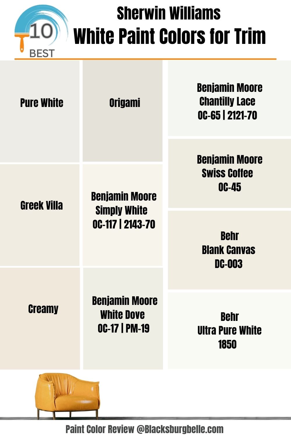
10 Best White Paint Colors for Wall Trims (2023 Trends)
To come up with this list of the best white paint colors for wall trims, we selected white paints from Sherwin-Williams, Benjamin Moore, and Behr, the best brands based on other interior designers’ reviews. Each white paint per brand represents a type of white – cool, crisp, warm, and soft.
Sherwin-Williams Pure White (SW 7005)

Sherwin-Williams Pure White (SW 7005) is the best if you want a Bright White trim with minimal undertones. Despite its 84 LRV, this color doesn’t blind you underneath direct sunlight or in dim-lit rooms.
Pure White blends seamlessly against other colors due to its mellow yellow undertone. It’s part of Sherwin-Williams’ most popular color collections, from its Top 50 Colors to Seasonals like Fall/Winter and the creative Trendsetter Color ID.
Its RGB value is Red 237 | Green 236 | Blue 230, which amounts to #EDECE6.
Sherwin-Williams Greek Villa (SW 7551)

Create a harmonious sunny aesthetic in your home with Sherwin-Williams Greek Villa (SW 7551) warm white trim. It has a solid yellow undertone that comes alive underneath direct sunlight.
This color has a high LRV of 84 and is made of RGB values – Red 240 | Green 236 | Blue 226. You’ll love Greek Villa trims on yellow, deep Blue, sage Green, or tan walls. Its versatility earned this color a spot on the Top 50 Colors of Sherwin-Williams.
Sherwin-Williams Creamy (SW 7012)

For a warmer soft white accent, use Sherwin-Williams Creamy (SW 7012), which has a faint yellow undertone. The yellow content makes the overtone appear off-white underneath a natural morning light.
This paint’s RGB value is Red 239 | Green 232 | Blue 219, 81 LRV. You’ll get flashes of pink due to the high red content in this soft, warm white paint, so consider that before choosing your coordinating hues.
Pair Creamy with other warm white paints, neutrals (beige, tan, gray), and eclectic navy blue or army green.
Sherwin-Williams Origami (SW 7636)

Sherwin-Williams Origami (SW 7636) is a cool white paint with subtle violet undertones. Due to its cool overtone, this color blends well with grays and monochrome palettes. It’s made of Red 229 | Green 226, | Blue 218 with a 76 LRV and a Hex Code of #E5E2DA.
Origami holds a subtle greige tint that comes out underneath bright white lights. Some people consider this shade of white too dark to be a neutral tone due to the violet flashes. However, it’s an excellent neutral paint for harmonizing colors in your room.
Benjamin Moore Simply White (OC-117 | 2143-70)

Benjamin Moore Simply White stands out as a crisp shade in a sea of white paints, making it a universally accepted neutral color. Its undertone shows a slight warmth but is mostly clean, making it a versatile trim.
This 89.52 LRV white paint is one of the brand’s best-selling white shades despite being an off-white hue. Use this color with reddish-tan paints like Somerville Red (HC-62) or teal Green like Casco Bay (2051-30).
Benjamin Moore White Dove (OC-17 | PM-19)
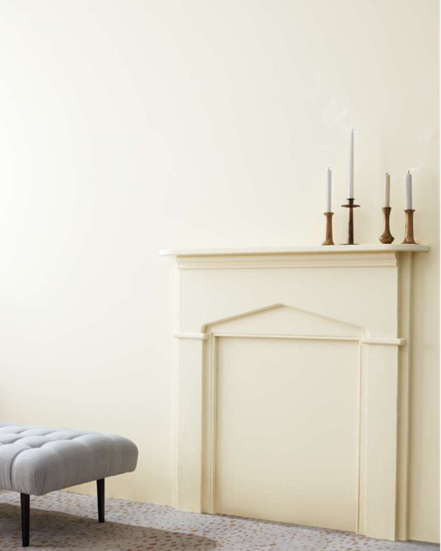
When you want a classic warm white paint with the traditional yellow undertone, choose Benjamin Moore White Dove (OC-17 | PM-19). It’s a soft white paint and top-selling Benjamin Moore white trim due to its ability to illuminate a room without lighting.
White Dove has an LRV of 85.38, while its overtone matches any color you use on your walls. The palette is your oyster with this paint.
Chantilly Lace (OC-65 | 2121-70)
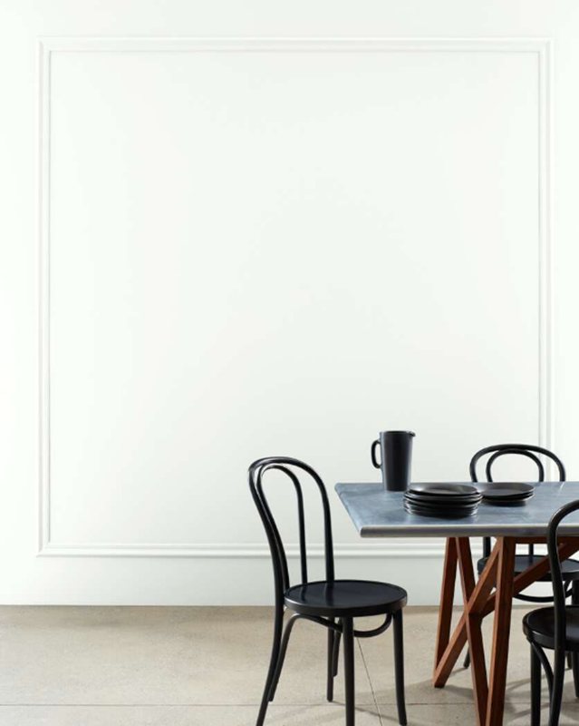
At 90.04, Benjamin Moore’s Chantilly Lace (OC-65 | 2121-70) has a High Reflective Value, yet its appeal goes beyond its brightness.
The color is reminiscent of a white bridal dress hence its name. This white paint color embeds a subtle beige undertone qualifying it as an off-white paint.
Pair Chantilly Lace with other neutrals like darker white paints, beige and greige. Try Benjamin Moore Edgecomb Gray (HC-173) or Seapearl (OC-173).
Benjamin Moore Swiss Coffee (OC-45)
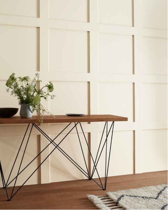
Most warm white paints have yellow undertones, often turning the color into beige, but you’d get the best neutral representation with Benjamin Moore Swiss Coffee (OC-45).
Its undertone is a sage gray-green which rarely pops up unless paired with other green or gray paints.
You’d appreciate Swiss Coffee best with brown, earth-toned Green, and reddish-brown paints. Try Benjamin Moore Newburg Green (HC-158), Terra Cotta Tile (2090-30), or Lush (AF-475).
Behr Blank Canvas (DC-003)
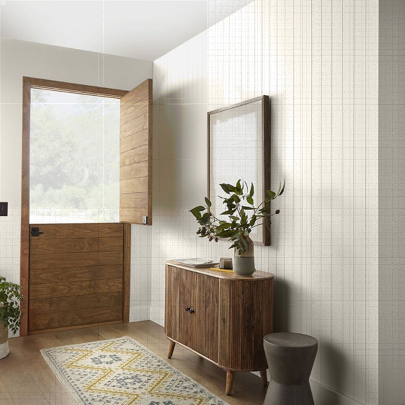
Get into Behr’s color of 2023, Blank Canvas (DC-003), a warm white with an LRV of 84. It pairs excellently with dark neutrals from army green to charcoal gray and navy. Feel free to get creative and use any color that catches your fancy.
Behr Ultra Pure White (1850)
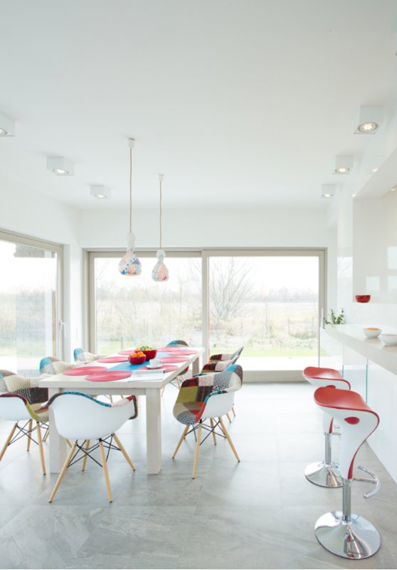
If you want a white trim with faint undertones, use Behr’s Ultra Pure White (1850). It’s the closest to perfection you’ll get from white paint. It has a blinding LRV of 94 which is the highest possible for any paint.
Ultra Pure White has a faint green undertone which you can highlight with other earthy wall paints.
Conclusion
You’ve seen that choosing white paint goes beyond picking out any shade you see on the counter. It requires careful thought and planning for the best possible outcome, and you can achieve that.

