
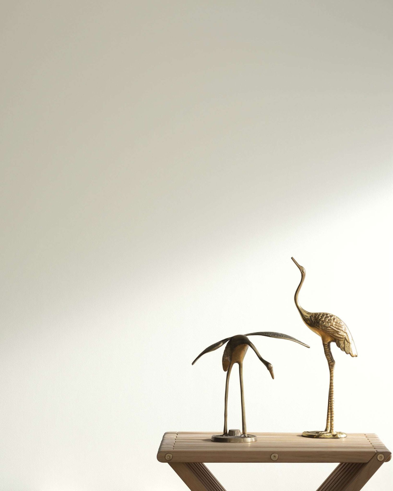
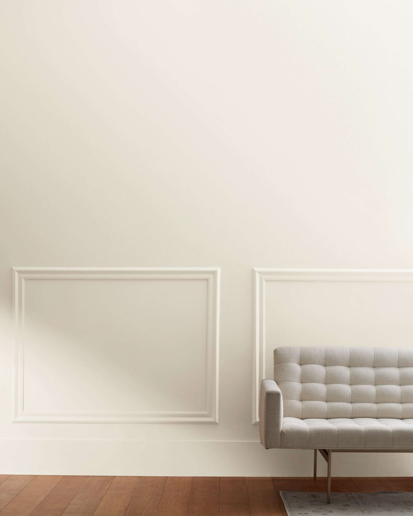
Hey there, are you a lover of white and looking for the best white paint colors for Interior walls? Well, what’s there not to love about white, while some might say the color is boring, I would beg to differ, and so would you, right?
Moving on,
There is an aura around white color that screams luxury, beauty and finesse. White isn’t just a plain color, white is ageless, white is timeless, white is not boring and a touch of white on your walls might just be what transforms your space to the perfect abode.
Table of Contents
Why Should You Choose White Paint Colors?
Here are the reasons why you must try out these varieties of white paints that I have carefully selected just for you.
Calmness
There is a serenity white color comes with, an intense calmness that no other color gives. Who doesn’t want to come home to a calm, peaceful looking environment after a long day at work? Everybody sure does.
Surprisingly, white color helps in maintaining orderliness which in turn helps to create space to allow proper ventilation unlike other bulky colors that choke up the room. In addition, proper ventilation is good for your health. This means, white paint in your house is good for your health.
Lively Space
White also helps to brighten up the room without stealing the place of your favorite art piece or overwhelming the space. White painted walls help to increase the amount of light entering the room while still keeping the room stylish and modern.
Below are some carefully selected pieces to match your taste and bring your perfect imagination to life.
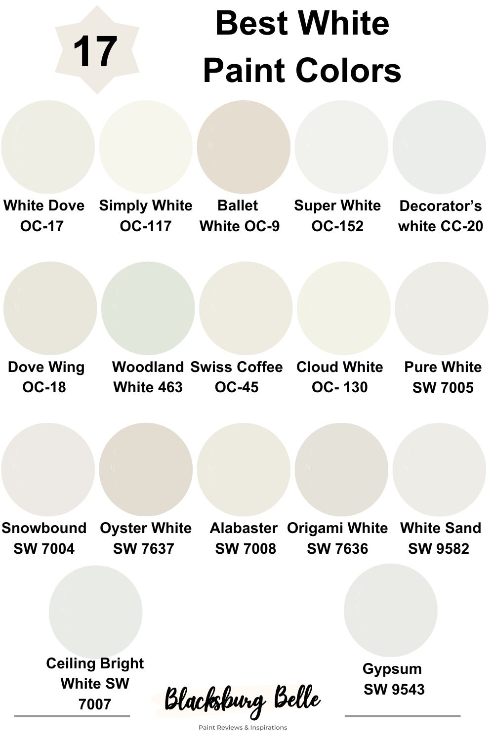
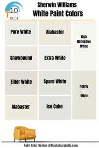
List: 17 Best White Paint Colors For Interior Walls
1. Benjamin Moore White Dove OC-17
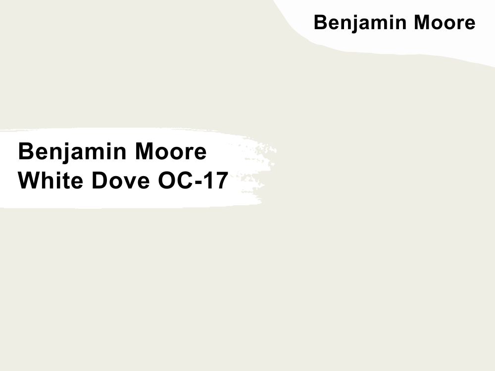
| RGB | 240 237 228 |
| LRV | 85 |
| Matching colors | Kendall Charcoal, Country redwood |
| Undertones | Creamy yellow, gray |
I will say this is the most loved white paint of all time. While most people consider white a boring color, white dove has proven to be everything entertaining, welcoming, intriguing and pleasant. With a LRV(Light Refraction Value) of 85 telling us that it is a light color, it still finds a way to be unapologetically soft and warm gives out a tiny bit of the off -white feeling.
It has gray undertones that help in keeping the warmness down so it does not appear too yellow. It works beautifully on both walls and trims of any type of home.
With it comes an aura that is a fascinating mixture of coolness and warmth which makes it an unarguably suitable color for every part of your interior decoration. White dove pairs so well
with Kendall charcoal and balboa mist to give the most appealing appearance.
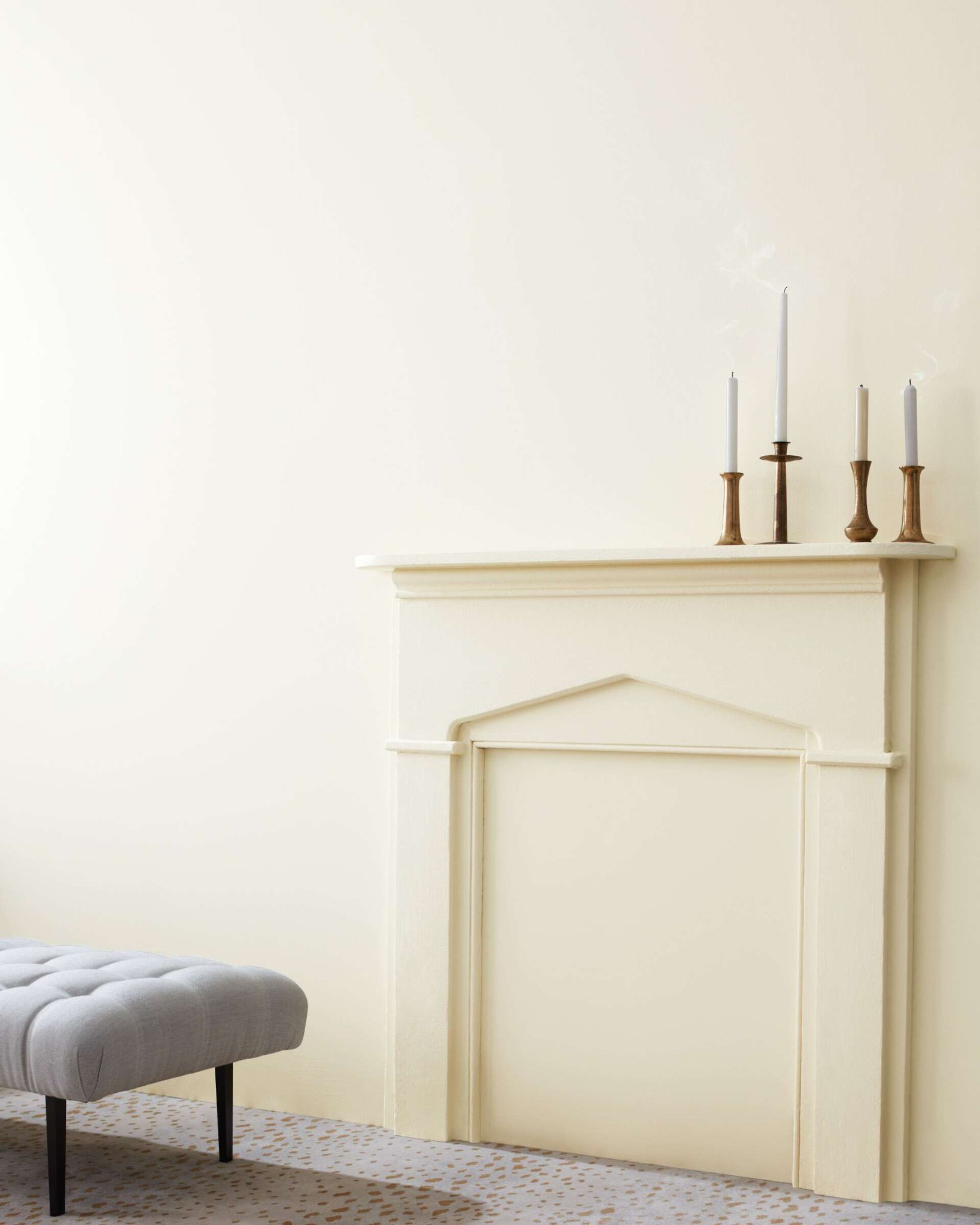
2. Benjamin Moore Simply White OC-117
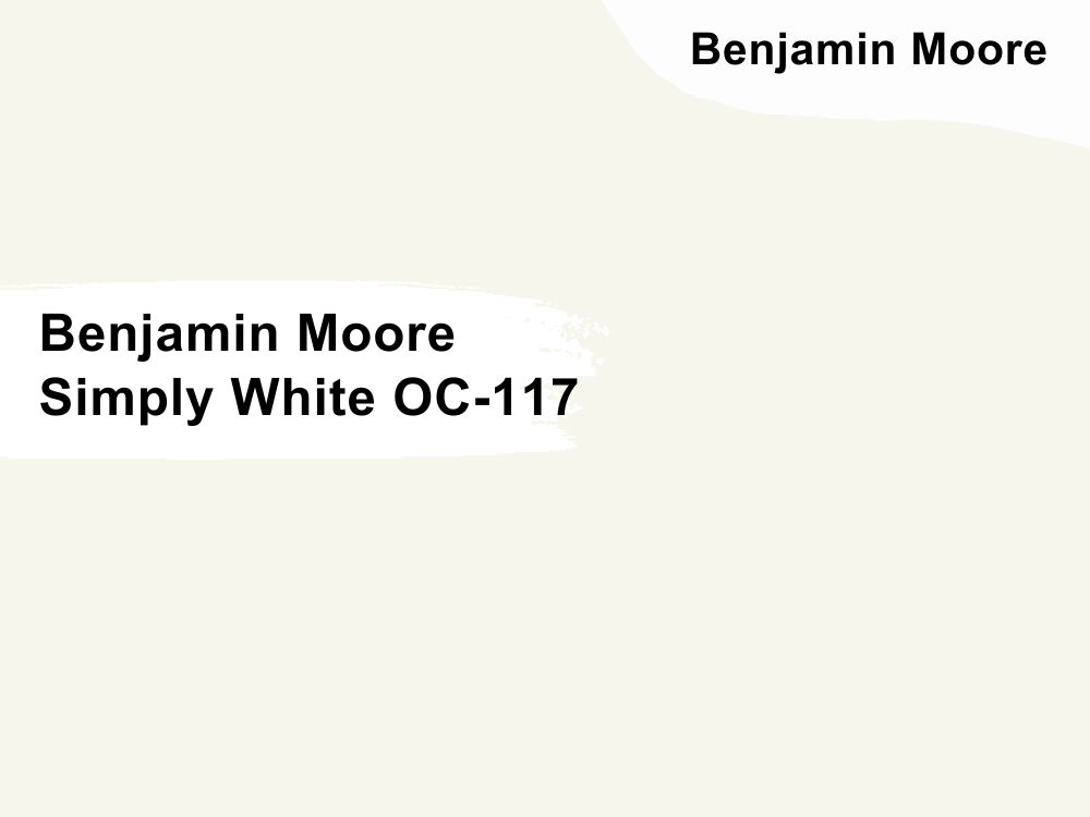
| RGB | 247 244 235 |
| LRV | 89.52 |
| Matching colors | Somerville red , silver satin, casco bay |
| Undertones | Yellow |
This is an all time beautiful color. This shade is a classic giving a beautiful, clean, bright, fresh and crisp white with a sense of warmth. The yellow undertones become more visible depending on the lightning in the room.
In bright natural light, the yellow undertones are completely invisible and become more visible in darker lights. This shade of white paint works for both spaces with lots of natural lights as well as darker rooms and spaces.
For darker rooms and spaces, it lights up the space bringing in life, vibe and warmth without making it look too yellow. Simply White blends perfectly when in coordination with colors like Somerville red and silver satin.
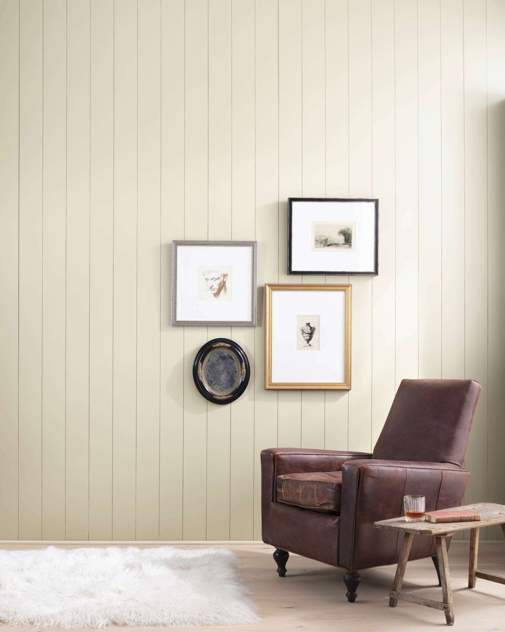
3. Benjamin Moore Ballet White OC-9
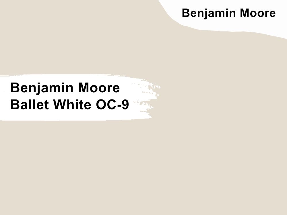
| RGB | 299 222 208 |
| LRV | 71.97 |
| Matching colors | Pashina, white dove, kendall charcoal |
| Undertones | Greige , cream |
Equilibrium and balance is all this color talks about. Ballet white is an exciting shade of paint that strikes a balance between neutral colors and white. This releases an eye catchy, calm and warm paint color, having just the right amount of white and the perfect amount of neutral colors.
Unlike other blends of colors, this shade remains neutral no matter how it is used. Ballet white comes with its own special kind of softness and blends beautifully with your interior designs. This color is perfectly on walls and trims, especially in spaces with access to lots of natural light.
Let us look at ballet white’s reaction to light from different directions; In north facing light, the cool blue tinted light or exposure will cause ballet whites greige to be bolder ( greige is the combination of gray and beige).
4. Benjamin Moore Super White OC-152
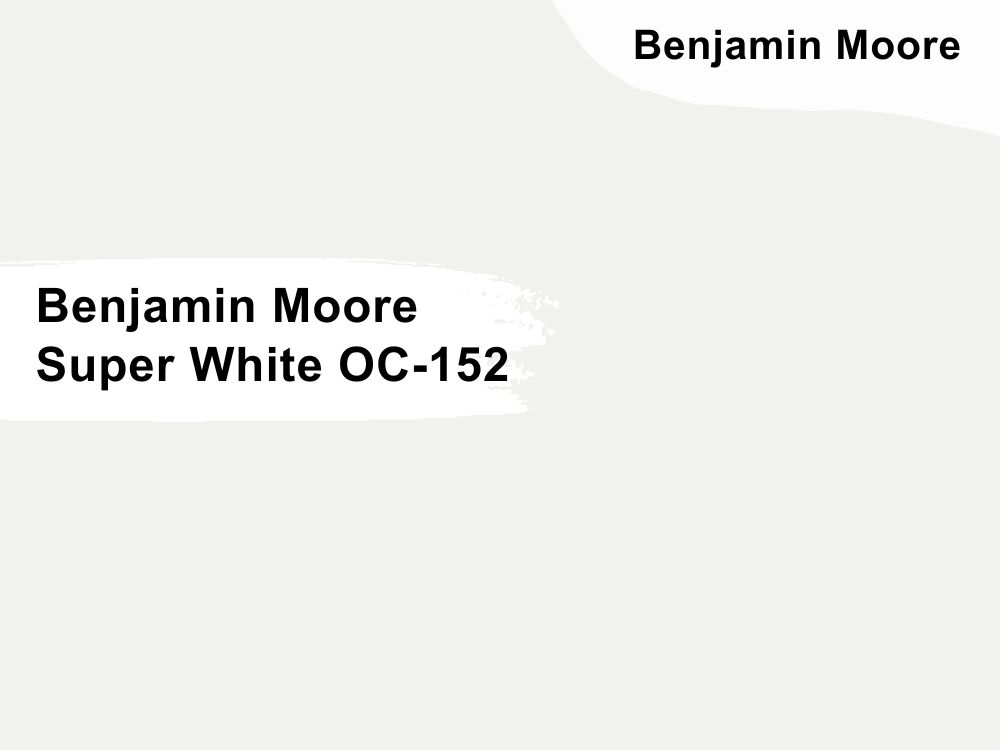
| RGB | 241 242 238 |
| LRV | 87.36 |
| Matching colors | Pure white, horizon ,hale navy |
| Undertones | Yellow, green |
Super white is a color that carries clarity and simplicity in a majestic way. It has a LRV of 87.36. This is a very fine white that carries a cool vibe, and a gentility that is so contagious. Super white is best combined with colors like hale navy and horizon.
This is the color for that relaxation spot in your house or that place you go to meditate. This shade of white allows for maximum illumination to take place and it gives a feeling of the room being spacious even when no furniture or items were removed. Super white is the ideal color for your home gym, your personal library and the wall of the walkways at home.
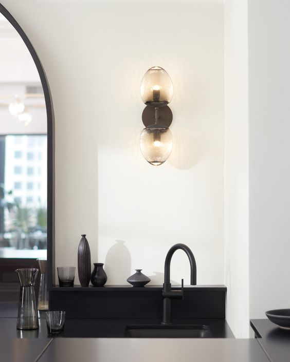
5. Benjamin Moore Decorator’s white CC-20
| RGB | 236 237 234 |
| LRV | 82.68 |
| Matching colors | Oxford white, rain dance, blue note |
| Undertones | Gray ,blue |
This can also be considered as stylish white, it is a pretty white color excellent for walls and trims. While on the surface this might look like just a regular clear bright white, it is far from that and way more unique. The blue undertone gives it a feeling of freshness, softness and coolness.
While the beautiful gray undertone blends in perfectly creating a soft gray background that fits effortlessly anywhere. Light and position also determines how the color presents itself. If your room faces the north, cool colors will be more visible but if your room is facing the west / south or in the presence of warm light, decorators white will be visible as an authentic white.
6. Benjamin Moore Dove Wing OC-18
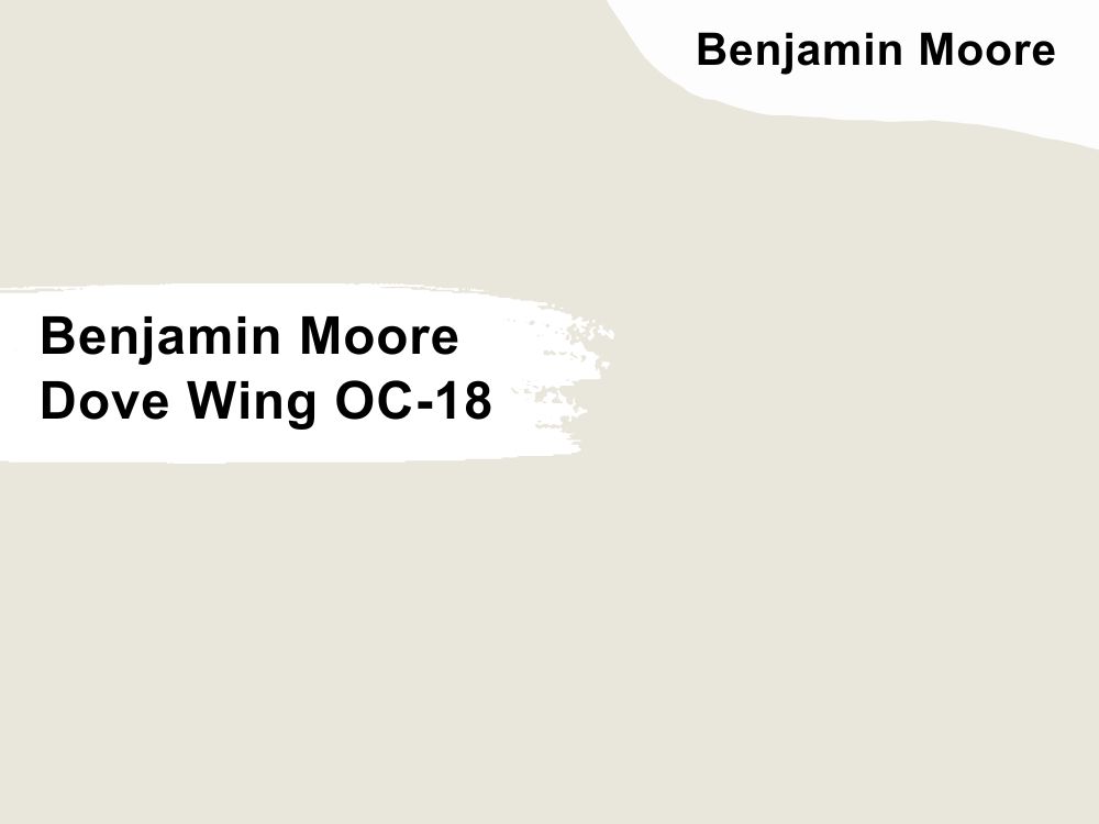
| RGB | 233 229 218 |
| LRV | 77.52 |
| Matching colors | Wish, tarrytown green, cinder |
| Undertones | Silver, gray, yellow |
I will say this color is vintage, timeless and naturally sophisticated. It falls under the category of the warm shades of white and is said to be the darkest out of all the selection of whites. It is undoubtedly one of the best colors to use on walls.
This color gives an overall look of natural and casual, serene and tranquil as well as dynamic and luxurious. It is one of the colors that most definitely give out the relaxing and soothing feeling. To conclude here, I must say this color is a “you will never regret you picked me color”. Its versatile nature makes it easy for the color to fit with and blend with all the other colors around it.
7. Benjamin Moore Woodland White 463
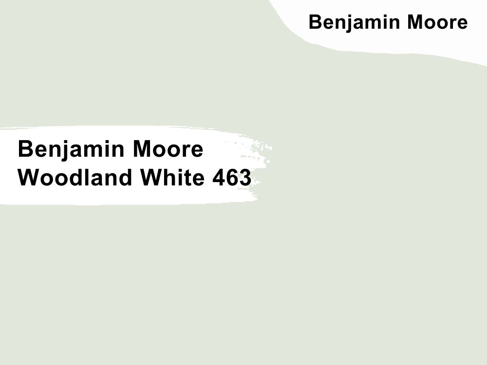
| RGB | 219 209 193 |
| LRV | 76.93 |
| Matching colors | Ocean city blue, frostine , flora |
| Undertones | Green |
This is another timeless color that has an undertone of minty green, and it emits a feeling of freshness and morning mist. You can never wake up on the wrong side of the bed in a room painted in with this beauty.
Woodland white has the perfect mixture of nature and heaven all in itself, the green undertone blends perfectly to an addictive shade.
8. Benjamin Moore Swiss Coffee OC-45
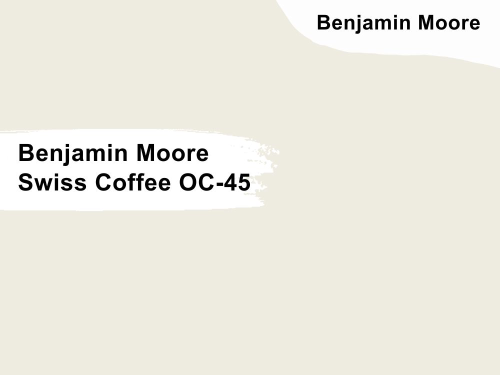
| RGB | 237 243 224 |
| LRV | 81.91 |
| Matching colors | White drifts, lush, fossil |
| Undertones | Gray, Green and Yellow |
Swiss coffee is a soft casual yet surprisingly versatile paint color, this beautiful neutral color has the right amount of warmth and strikes a balance between glamor and elegance. The yellow undertone gives the color its welcoming softness and warmth while the gray undertone simultaneously helps to tame down the warmth so that it doesn’t appear too yellow.
This is the perfect color if you are looking towards getting the traditional aesthetic feeling. In addition, though this shade doesn’t reflect or shine sharply, it substitutes for that with a perfect blend of airiness and warmth.
Let’s see how cardinal direction and lighting works on Swiss coffee. In north facing rooms, the gray undertones appear almost perfectly. In south facing rooms, warm yellow southern light will make warm colors appear a bit warmer. In an east facing room, the warm yellow eastern light will cause warm colors to appear as warmer in the morning and then have a cooler shade of gray towards afternoon.
In west facing light circumstances, because of cooler lights in the morning and intense warm toned light within the day; Swiss coffee will appear gray in the mornings and move towards the soft warmness by afternoon.
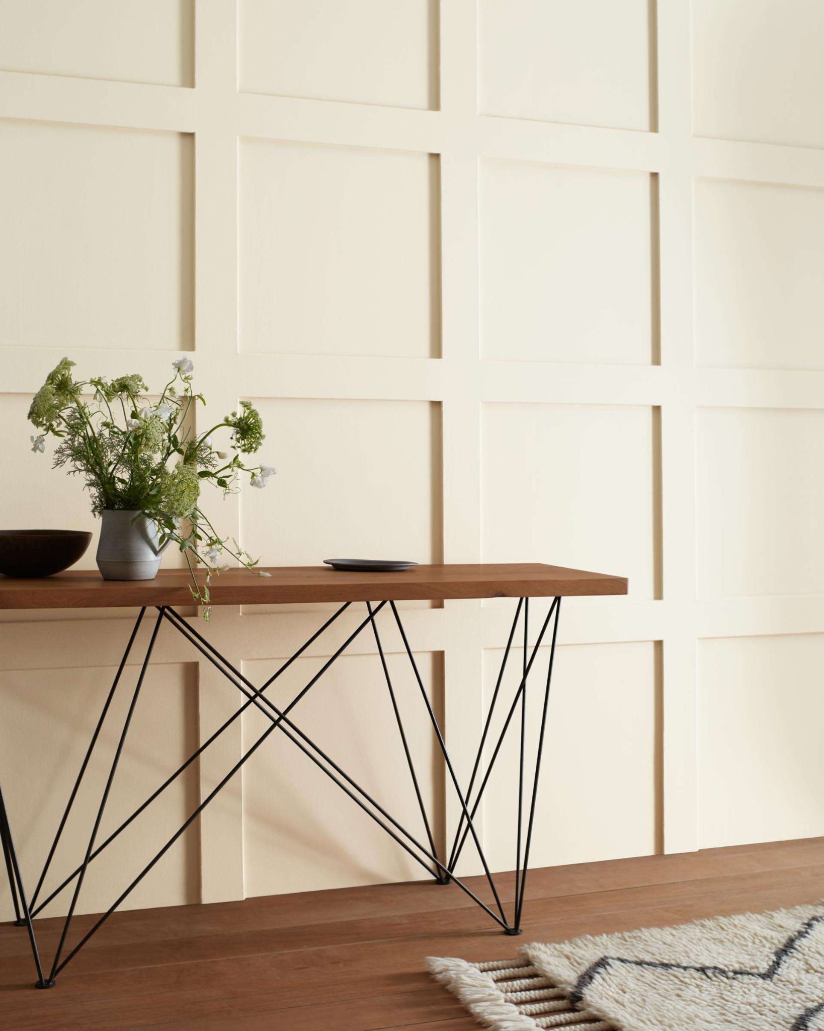
9. Benjamin Moore Cloud White OC- 130
| RGB | 237 234 224 |
| LRV | 85.05 |
| Matching colors | Pale oak, white down, Yosemite yellow |
| Undertones | Taupe |
This is a soft and warm shade of white with an invisible taupe undertone. This color has an LVR of 85.05 meaning it is a bright off white color. This is a paint color that is very light but still possesses lots of depth and warmth (it sits between the two warm and too crisp whites) that gives it a uniqueness and not a boring, stark look when applied on the wall.
Cloud white responds to light and direction in certain ways;
If your room faces the north or you receive light from the east in the afternoon, cloud white will find a way to balance that flat light. And also, if your room receives light from the west during the afternoon or is facing the south, cloud light will look a bit warmer.
This shade blends perfectly when paired with or is around pale oak, white down and Yosemite yellow.
10. Sherwin Williams Pure White SW 7005
| RGB | 237 236 230 |
| LRV | 84 |
| Matching colors | March wind, perle noir, extra white |
| Undertones | Yellow, black |
Pure white is a warm, soft, clean and gorgeous flexible white paint. Having an LRV of 84 proves that this paint reflects a good amount of light. The exciting thing about this color is that although it has an undertone of yellow, it is not too glaring; the base it gives is mainly a neutral natural base. The yellow undertone gives it a faint warmth and the black is what keeps it from being too warm or too yellow.
If your room is facing the north, pure white will look very close to a true white. For rooms facing the south, because there tends to be consistent bright light for most the day in this position and warm and cool colors work with south facing light; this light intensifies the color making them appear brighter. So in south facing rooms, pure light will look warmer.
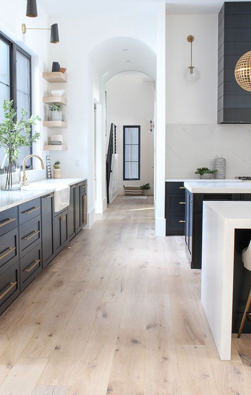
11. Sherwin Williams Snowbound SW 7004
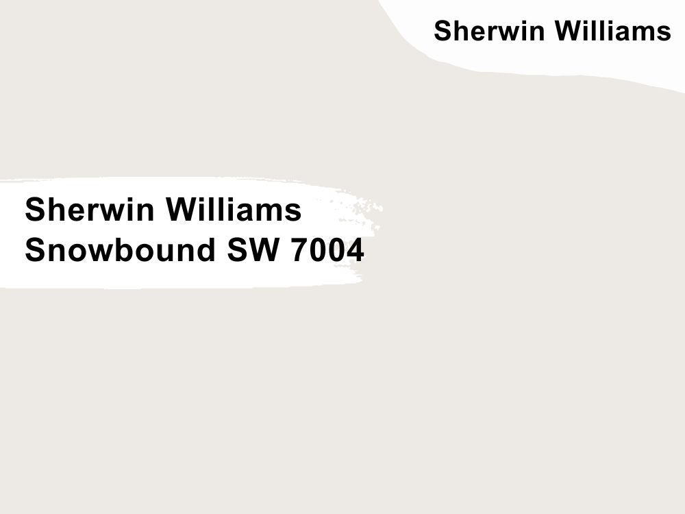
| RGB | 237 234 229 |
| LRV | 83 |
| Matching colors | Colonnade gray, autumn orchid, army green |
| Undertones | Gray , pink , purple, beige |
Snow bound is a versatile soft white color with a light reflectance value of 83, meaning it will reflect a lot of light back into the room. This shade can be easily classified as a blend of warm and cool undertones. It is a very light shade of white but equally very, crisps and welcoming.
Show bound has an undertone of gray, some pink and purple undertones and a slight hint of beige. This paint color blends beautifully with gray associated colors like colonnade gray
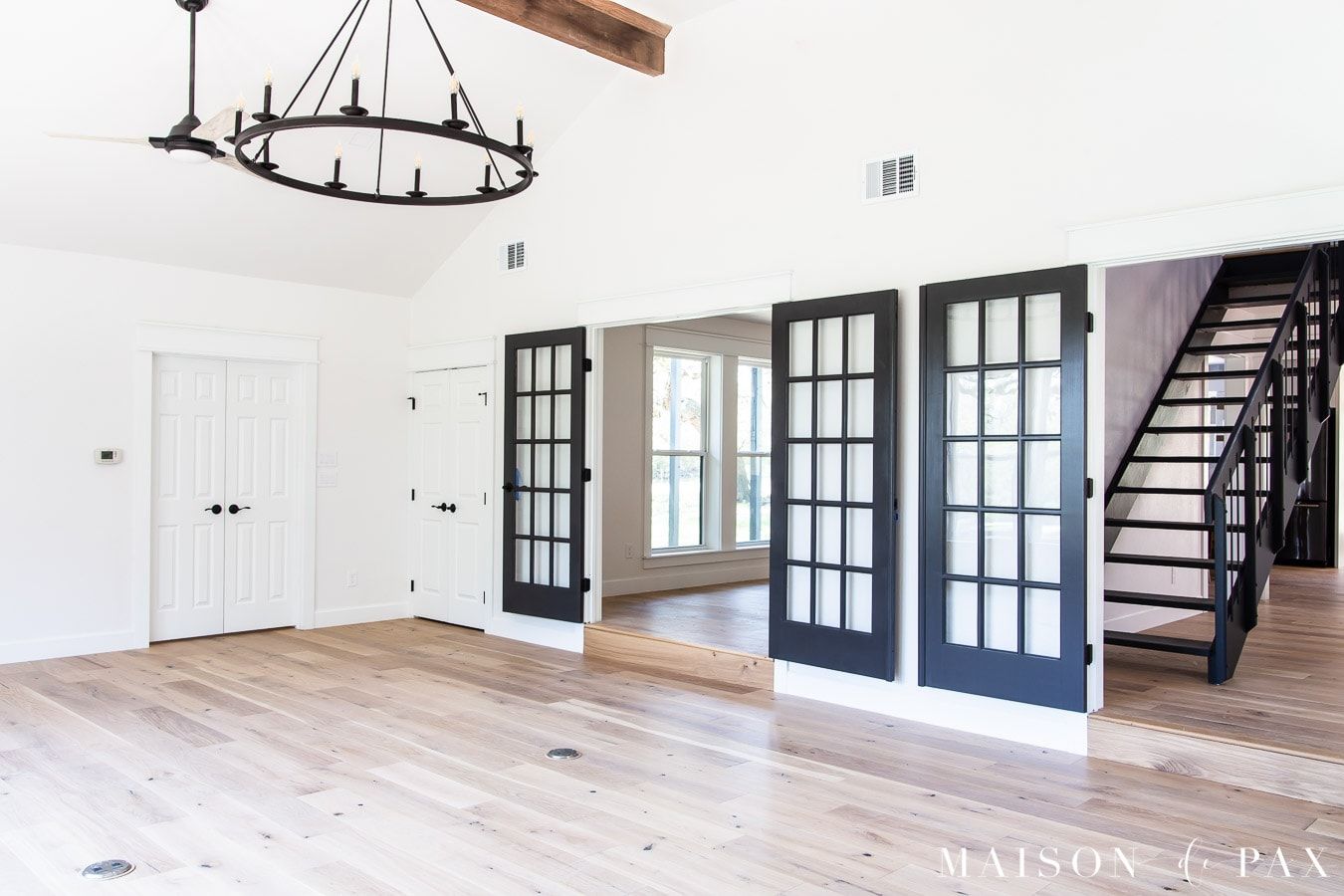
12. Sherwin Williams Oyster White SW 7637
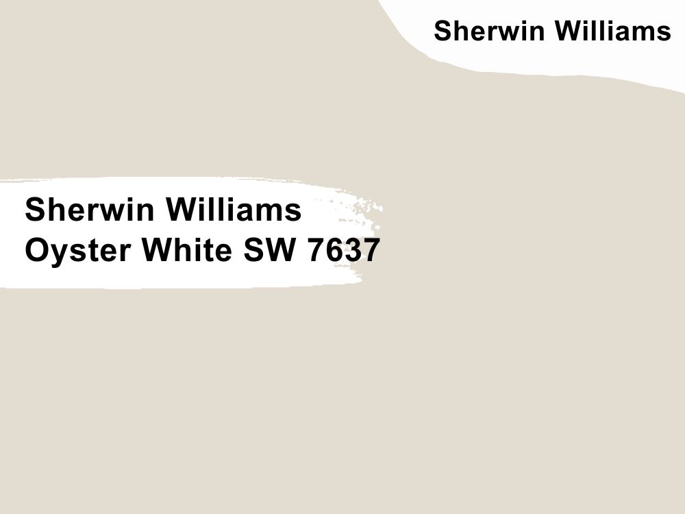
| RGB | 226 221 208 |
| LRV | 72 |
| Matching colors | Analytical gray, brassy |
| Undertones | Green ,gray, beige. |
This is a hue that is both stylish and calming; it has LRV (Light Reflectance Value ) of 72 making it a light color for interior walls. It is crisps and gives that cool reserved look for people looking towards creating a serene themed environment.
This paint is a beautiful soft greige that can dramatically change its appearance. It can switch between gray and beige but is balanced enough to be seen as neutral. Oyster white has a characteristic of being versatile and flexible, so while oyster white fits well with modern houses, traditional, contemporary and even farmhouses, they can be used in any part of your interior decoration.
Let us take a look at oyster white’s reaction to light; Natural light shifts throughout the day as the sun moves from east to west. Oyster white with its chameleon-like characteristic, displays major changes in its appearance.
13. Sherwin Williams Alabaster SW 7008
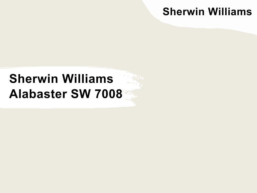
| RGB | 237 234 224 |
| LRV | 82 |
| Matching colors | Townhall tan, Dakota wheat, creamy |
| Undertones | Greige |
This is one of Sherwin Williams most loved shades of white paint. This Color comfortably finds a balance between warm and white without losing its coziness or softness. Alabaster is a warm shade of white with beige and gray undertones.
It is accompanied with an alluring creaminess, but the undertones tame it down. Not completely for the creaminess to be lost but enough to stop it from getting too yellow.
14. Sherwin Williams Origami White SW 7636
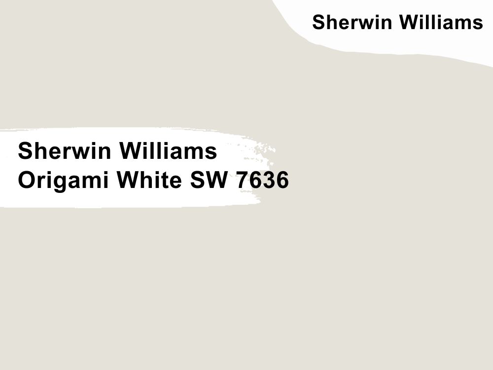
| RGB | 229 226 218 |
| LRV | 76 |
| Matching colors | Anew gray, Spalding gray, little blue box |
| Undertones | Violet |
This is a soft warm delicate shade of white with undertones of violet; it is a versatile color with a LRV of 76 meaning it is quite a light shade. Origami white’s versatile nature makes it able to blend easily into every interior design aspect in the house.
It can also work for house designs ranging from traditional to contemporary. Its violet undertone creates a very subtle base that tends to appear under low light as a pleasant faint lilac. It works well with colors like Spalding gray, and Anew gray.
15. Sherwin Williams White Sand SW 9582
| RGB | 237 236 231 |
| LRV | 84 |
| Matching colors | Pale bud, harwood putty, blanched pine |
| Undertones | Beige |
White sand is a smooth intriguing color that is not too warm and it is still not too cool. It has a LRV of 84, telling us that it is a light color.
This one of the most selective colors, but when blended with the right shade, it brings out the most beautiful creation. White sand color doesn’t like cool colors because they don’t blend well with its muted approach, it works better with earth and woody toned colors. It also works well with cool grays
16. Sherwin Williams Ceiling Bright White SW 7007
| RGB | 233 235 231 |
| LRV | 83 |
| Matching colors | Ellie gray, blustery sky |
| Undertones | Blue |
This is a neutral color that is neither cool nor warm. It has a LRV of 83 indicating that it is a light color. Ignore the name that says ceiling, this shade works just beautifully for your walls as it would for your ceiling.
Its blue undertone helps to blend in the brightness perfectly. Ceiling bright white color is ideal for an every house and everyplace appearance. This hue is a cool color that gives off a very clean and crisp vibe. It works best in coordination with paint colors like Ellie gray and blustery sky.
17. Sherwin Williams Gypsum SW 9543
| RGB | 234 235 231 |
| LRV | 82 |
| Matching colors | Chalk dust, white violet, wevet |
| Undertones | Cream |
Gypsum is a very beautiful shade of white among Sherwin Williams paints; it is a very versatile shade of white with an envious cream undertone, these two blend together to give a hypnotic shade of white that can keep you dumb founded with its softness and smoothness.
This shade of white because of its versatile characteristic can be used in any wall in the house including the bathroom. It is one of the easiest colors to match and it always makes a statement wherever it appears.
One special feature of this color is that though it is a neutral color and doesn’t belong to either the warm or cool side, it still carries a very cool warmth as part of itself, making it a very pleasant color to look at. It is best matched with colors like chalk dust, white violet and wevet for maximum results.
Conclusion
White is and will remain the purest of colors out there, while choosing the perfect color ideal for you might seem like a difficult task, remember to follow your heart because at the end, the color must be pleasing to you. The first step to choosing the ideal paint is to consider buying from a reputable brand, Sherwin Williams and Benjamin Moore are some of the best and they both have a variety of options to choose from.
Tell us, have you been able to pick your preferred White paint color? Which did you choose and why? We would love to hear from you in the comment section below. Thanks for stopping by.
 10 Best Sherwin Williams White Paint Colors (Trend 2023)
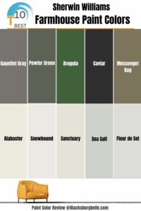 10 Best Sherwin Williams Farmhouse Paint Colors (Trend 2023)
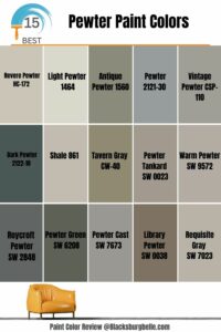 15 Best Pewter Paint Colors: Comparisons and Suggestions
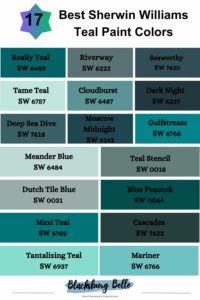 17 Best Sherwin Williams Teal Paint Colors (Trend 2023)
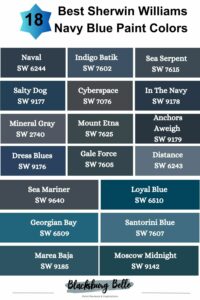 18 Best Sherwin Williams Navy Blue Paint Colors (Trend 2023)
 25 Best Blue Gray Paint Colors for Your Home Interiors
