
Benjamin Moore produces some of the finest paints on the market, but have you tried out the brand’s dark gray paint? It has a wide array of gray paint colors, including dark gray or charcoal, and it can get confusing to choose the perfect one.
Gray is such a beautiful and cool color if you know how to combine it with complementary paint colors. And if you know how to combine dark gray with other shades of gray, your home decor will get a new look. But what are the most popular Benjamin Moore dark gray paint colors? This article lists and explains 15 of them.
Table of Contents
First Things First – Undertones
Did you know that gray has undertones? We all assume that it is a neutral color, and it is, but gray also has subtle undertones. That is why some shades of gray clash with other colors, leaving you wondering how that is possible with a neutral color.
This is not exclusive to paints; every gray surface, furniture, or upholstery has an undertone. It can have a warm undertone or a cool undertone, as with other vibrant colors. On the one hand, cool gray has an undertone of blue, green, violet, or a combination of all.
On the other hand, warm gray has a green or violet undertone. So, you may want to keep this in mind when choosing a dark gray paint from Benjamin Moore. Another reason we talk about the undertones is that dark gray throws up undertones more fiercely than light gray.
You can get away with subtle shades of the undertones in light gray paint showing through. The undertone typically does not clash with other colors because of its subtlety. However, the same is not the case with dark gray paint. It does not produce the same neutrality as light gray colors.
With this in mind, let’s look at the 15 most popular Benjamin Moore dark gray paint colors. These colors are exquisite and will fit any decor as long as you keep the undertones in mind when combining them with other gray shades or completely different colors.
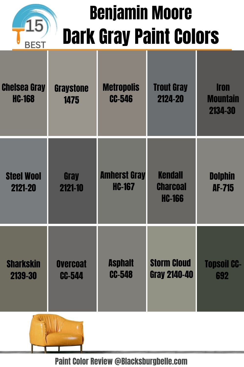
15 Benjamin Moore’s Most Popular Gray Paint Colors
The following are the top ones to consider if you are in the market for dark gray paint:
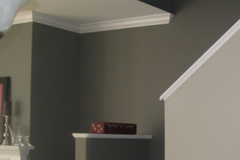
1. Chelsea Gray HC-168
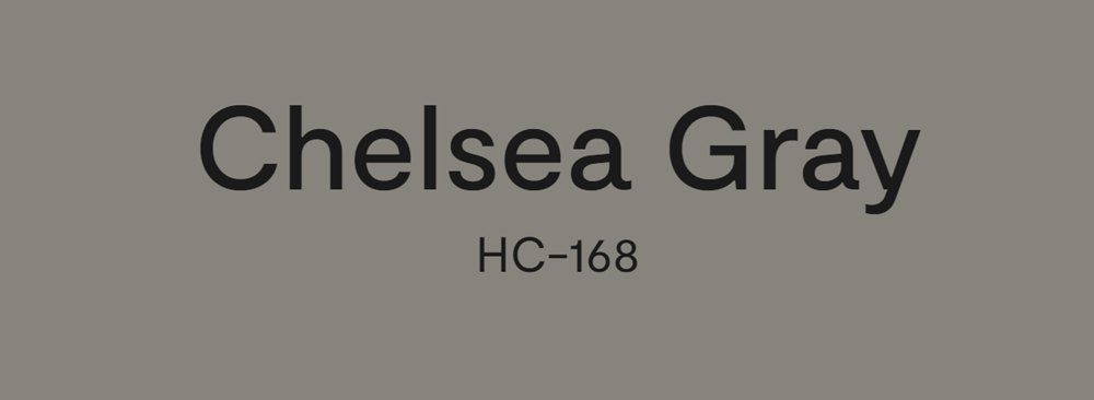
There are a few reasons this option tops our list of the most popular dark gray paint colors from Benjamin Moore. The first reason is the light reflectance value (LRV). This paint’s LRV is 22, low enough to fit different surfaces. Yet, it is high enough to keep within the dark gray spectrum.
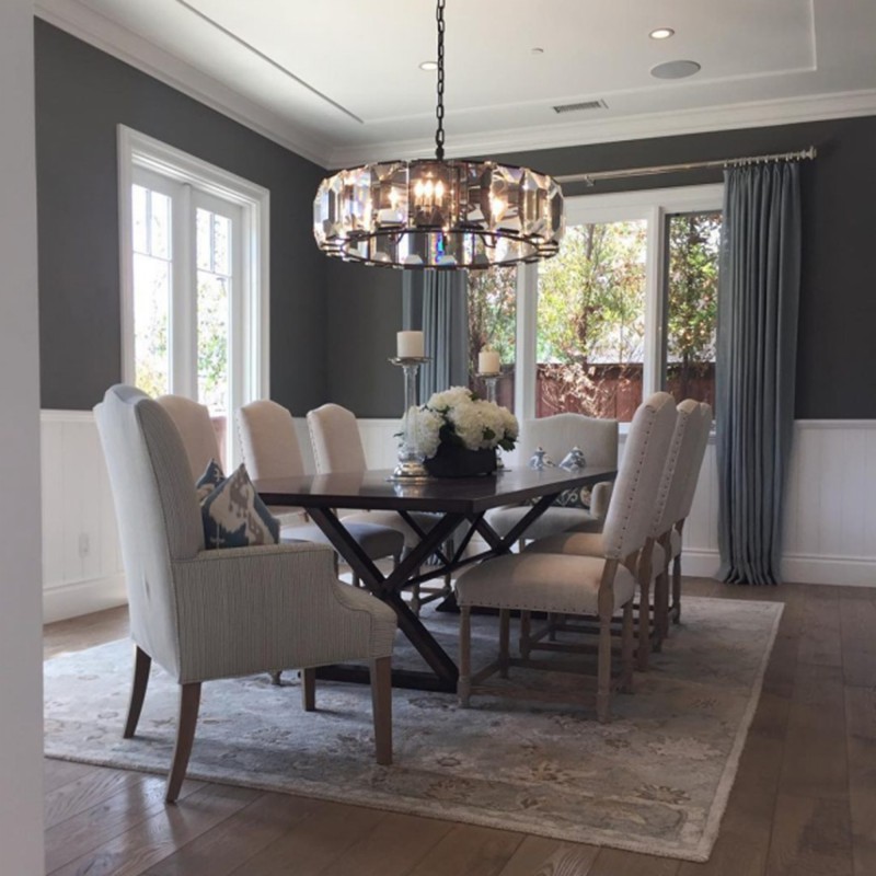
Another reason is that Chelsea Gray fits walls, cabinets, and even the exteriors, adding drama without looking gloomy or dour. With a warm undertone of gray-green, the color works well with white or any other light color without a warm undertone as you can see in this gray-white-themed dining room below:
2. Graystone 1475

The second on our list is the Graystone 1475. It is a warm gray color with a subtle green undertone. With an LRV close to 30, the Graystone is lighter than the Chelsea Gray; the closer the LRV is to 0, the darker it becomes.
However, it is still low enough to command attention because of its warmth and subtle darkness. The green undertone does not distract from its overall look. If it were just a little warmer the undertone would have taken away from its appearance and made it clash with other colors. Check out the contrast against the pewter and different shades of green in this sparse decoration:
This dark gray paint shade also works well with white trimmings and other white combinations. But you must also note that the lighting in the room, both artificial and natural, plays a vital role in how the paint color appears. Perfect lighting exposes the paint’s true color with its undertone.
3. Metropolis CC-546

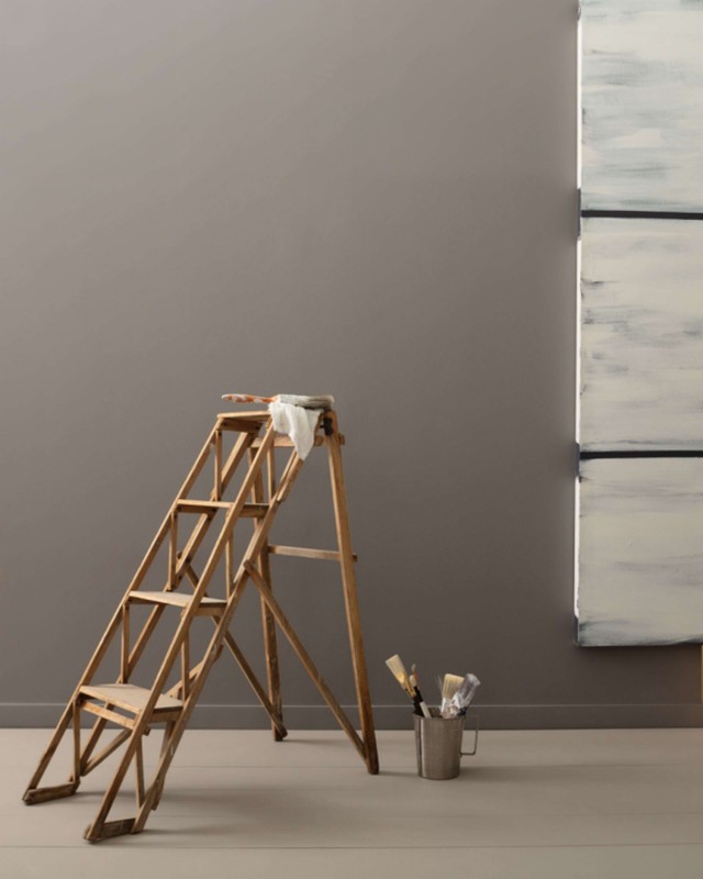
This dark gray paint color from Benjamin Moore is also warm, but it has a violet undertone in this case. The combination of the violet undertone with the overlaying gray color gives the paint a wonderful look. It is, perhaps, the most popular color on the market, even if you do not know it.
Some warm gray paint colors are so warm that you may mistake them for another shade like taupe. On the other end of the spectrum, the color may have so subtle an undertone that it has little or no warmth.
These extremes remove the beauty from dark gray paint colors, but the Metropolis CC-546 sits perfectly in the middle of these extremes, which makes it a much-loved shade. This painter’s setup contrasts off-whites and browns against this shade of dark gray in this picture:
4. Trout Gray 2124-20

Did you know that gray can be a vibrant color? We know it is one of those colors that look dull and uninteresting, but when you combine it with the right colors or shades, it can bring out its true beauty. The Trout Gray shade is one of such colors, especially if you understand how to recognize undertones.
The Trout Gray has a bluish-violet undertone, which gives the paint its vibrance. In other words, the combination of these two colors as an undertone gives life to the overlying gray color. When combined with subtle browns and a little black trimming, you can see the difference between the Trout Gray and other dark gray shades.
This kitchen setup uses Trout Gray for the cabinets, contrasting it against lighter shades and a few vibrant colors:
Moreover, the color has an LRV of 15, close enough to the dark end of the spectrum without looking gloomy. Another upside is that it works as a color that fits an entire room.
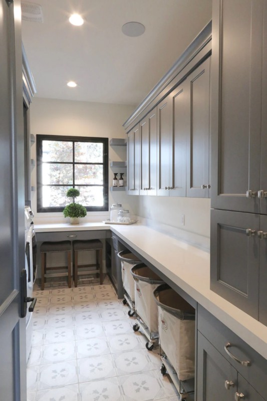
5. Iron Mountain 2134-30

This color is a solid gray, no doubt about it. But it is not readily used, although it is popular, because of its unique shade. Because of its heavy warm gray color with subtle but indecipherable undertones, we tend to see it more in exteriors and door trimmings.
It is almost like charcoal because it is LRV 9, so many people are unsure what colors work best with it apart from white. In some environments, the color gives off a cool feeling, while in others, it exudes warmth. Since it creates this confusion, it is pushed to the background.
However, in the right environment and with the right colors around it, Iron Mountain is such a beautiful dark gray paint color. See how well it works on kitchen cabinets and island in this kitchen with muted tones:
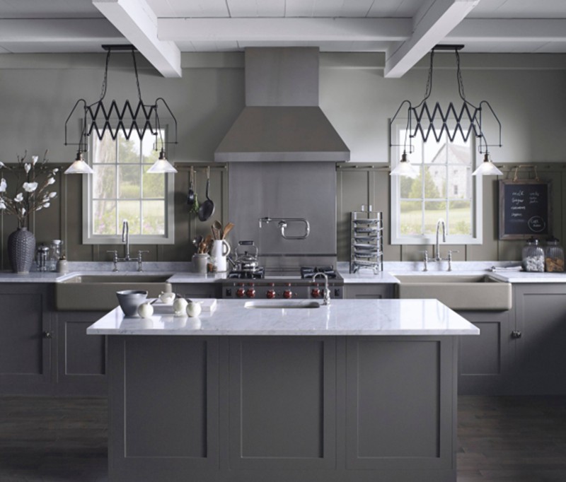
It does not have to be combined with white all the time; lighter shades of gray or off-white also work with it.
6. Steel Wool 2121-20

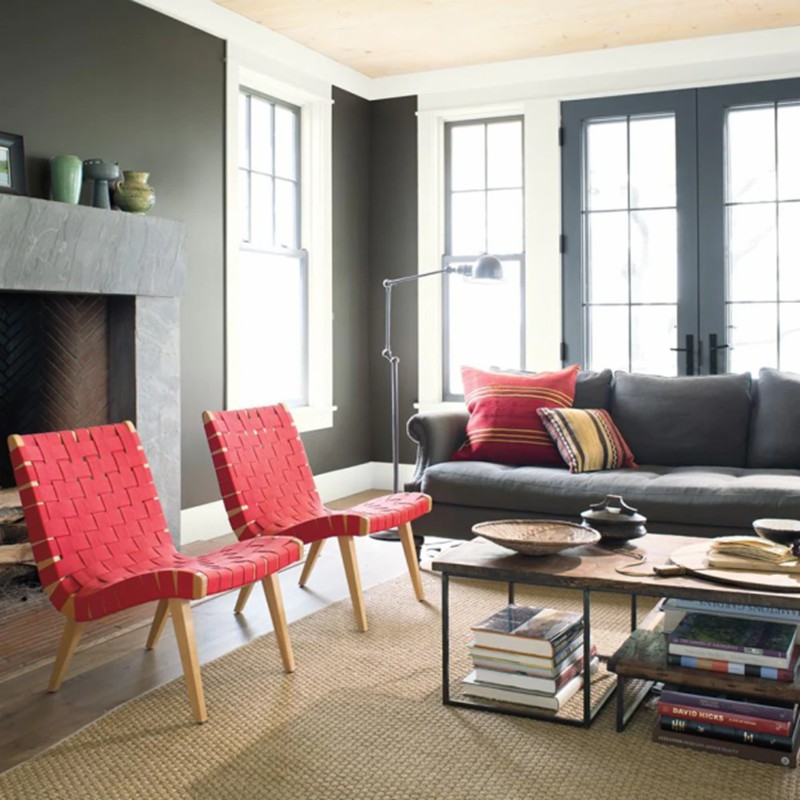
As its name suggests, Steel Wool mimics the color of steel with all its coolness. In other words, the gray shade leans toward the cool end of the line than toward the warm. It has a violet-blue undertone, which gives a balance between the two colors.
While this may be confusing, it has an upside. Steel Wool does not completely lean toward blue and does not completely lean toward violet. That balance in the middle makes it perfect for different decors without removing anything from its beauty.
Colors with a subtle warm undertone should fit this dark gray shade. Warm colors will work well with its cool undertone, complementing and strengthening its appearance without any dullness. This dining with shades of black and brown paints a clear picture of what you can combine with the Steel Wool gray:
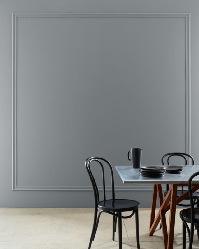
7. Gray 2121-10

To you, all grays may look the same, but to us, that is not the case. Where would we be in the color world without different shades, even for seemingly neutral colors? This dark gray shade may look like it is not different from the rest. But when placed side by side with the others, its strong blue-violet undertone almost screams at you.
As a cool gray color, the Gray 2121-10 has an LRV close to 10. Surprising, right? It is a truly dark shade of gray but is far from looking gloomy or dark. This is particularly true when it is combined with lighter colors like white and cream.
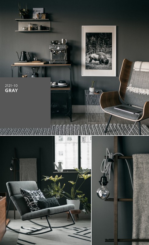
In some natural lighting, Gray looks lighter than usual, as you can see from the rooms displaying different shades of gray paint color. In such a case, it comes down to the finish of the paint. If it has a gloss or semi-gloss finish, the light can reflect off of it and make the paint look light.
8. Amherst Gray HC-167
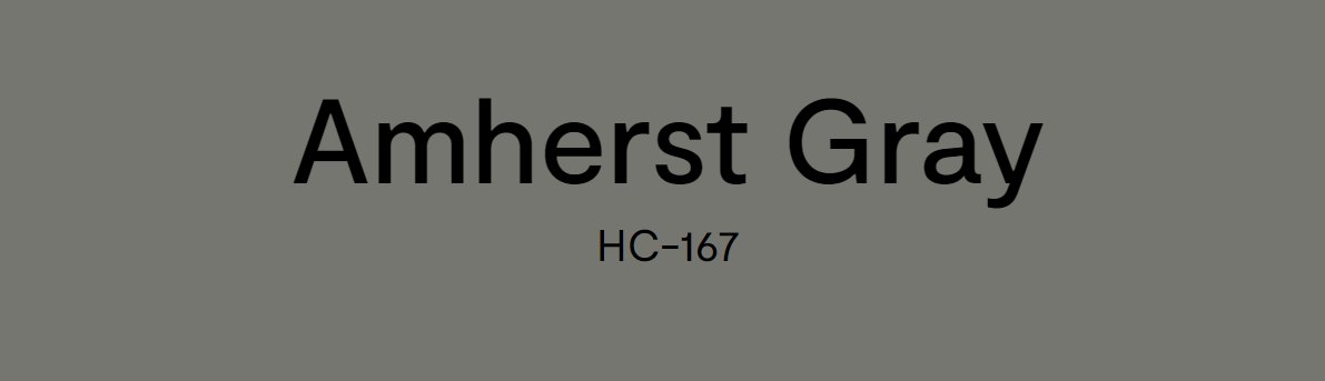
The Amherst is another popular dark gray paint color choice, almost as popular as the Chelsea Gray. It can hold up its own in a room without needing help because of its green undertone. Simply put, the paint is a warm gray color without being too dark to detract from its beauty.
It has an LRV of 17, high enough to give it some lightness, but low enough to add some darkness to it. While the undertone is a very warm green, it can become subtle depending on the colors around it. In some places, the color is vibrant, while in others, it is toned down.
If you use it in the exterior of a house, the color appears slightly different from when it is used indoors. See the lighter grays, browns, blues, and greens that bring out the true color of Amherst? You just have to know how to use it well.
9. Kendall Charcoal HC-166

Kendall Charcoal is your go-to option if you want a dark gray color for any part of your house. It is noticeably darker than Chelsea Gray but maintains its beauty and wholesomeness. With an LRV of 12.96, it is lighter than the Gray and darker than our most popular choice.
In a room with dark tones, the Kendall Charcoal gray looks like it is black against the contrast. Check out this room with shades of brown, black, and white but with perfect lighting to see how it works:
But if the room is light-toned, the color brightens and appears lighter than it is. This is especially true if you use a white trim around it.
This dark gray shade has a subtle green undertone, which can appear loud in some environments. In others, the color appears muted and works well with colors that have a cool undertone. Beige, greige, and lighter gray shades combine well with the Kendall Charcoal gray color.
10. Dolphin AF-715

The Dolphin gray paint color is similar to the Chelsea Gray; in some lighting, you cannot tell them apart. This color has an LRV of 23.71 but has a cool undertone. It works well with Benjamin Moore’s Polaris Blue, Jute, Collector’s Item, and Gray Owl.
It is a sleek and sophisticated shade that draws your attention without being overwhelming. The color allows other shades to shine and accentuates their strong areas. It also looks spectacular in all lighting, whether day or night. This decor gives you an idea of what colors to combine with Dolphin gray, even if the room is sparsely furnished:
11. Sharkskin 2139-30

With an LRV of 16.17, the Sharkskin gray is clearly nearer the black end of the color spectrum than the white. However, it has a really strong green undertone that distracts from its true color. Nevertheless, it will give a room the same look and feel that charcoal gray gives.
You can even combine it with other colors and change the vibe of the room as you can see in this living room with splashes of bright colors:
Light Khaki is one color that brings out the undertone without making it too loud. Benjamin Moore’s Wolf Gray, White Opulence, and Simply White also complement this rare shade of dark gray. The right combination gives any decor a unique look.
12. Overcoat CC-544

The Overcoat gray shade is a pretty dark option with an LRV of 13.47. But while it is dark, it can get lighter with the right colors and lighting around it. The color produces a powerful feel in any room and works well with lighter shades of gray and other light colors.
Its strong violet undertone makes it perfect for outdoor painting. Roofs and exit doors look pretty cool with this color, but you can also opt to use it in a room if you are inclined to muted tones.
13. Asphalt CC-548

The Asphalt ray has a subtle violet undertone and an LRV of 19.71. This makes the paint color dark, but not so dark as to give a room the feeling of gloom. It is lighter than other dark gray shades on our list but darker than the Chelsea Gray.
The gray shade fits well with browns and blacks, as this small decor displays. However, the color does not have much meat on it, so it may work better outside than inside the house. Alternatively, use it as a cabinet paint, especially if you are not looking for too much color.
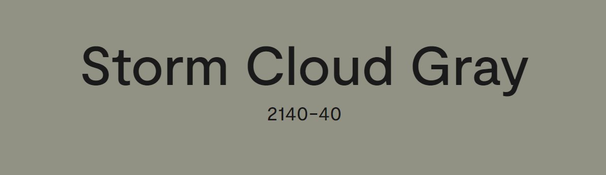
14. Storm Cloud Gray 2140-40
While this gray shade looks light, it gives off dark tones when used in a dark-themed room. The Strom Cloud Gray is subtle yet powerful, with an LRV of 28.88. It has hazy green undertones, lending an enigmatic and sophisticated look to it, clearly seen in this dining and living room decor:
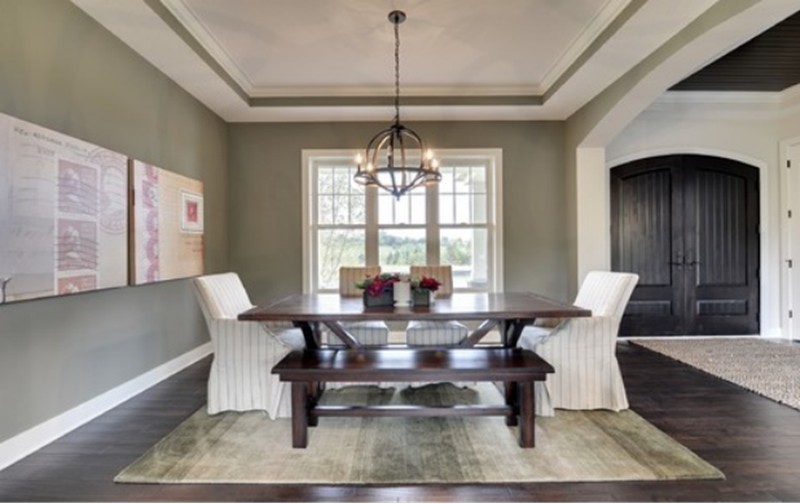
It may have the sharpest look to it, but it obviously fits well with different colors, including darker and lighter grays. This dark brown table, white chairs, and white trimmings all blend with this gray color.
15. Topsoil CC-692

Your first impression, when you see this dark gray paint color, is that it is black. But the color is one of the darkest grays on the market with an LRV of 7.56. Its forest-green tone lends it a unique look that works with different colors, including Pashmina, Blue Grass, Swiss Coffee, and Simply White from Benjamin Moore.
Conclusion
When it comes to selecting the right dark gray paint color for any decor, you must consider other colors to use with it. Fortunately, our list contains 15 of the best dark gray paint colors from Benjamin Moore, and they work with any decor.
From Chelsea Gray and Amherst Gray to Iron Mountain and Dolphin, the options are numerous. Check out how these colors work with others or your already-existing decor before making any commitment.
Let us know your thoughts in the comment section.
 10 Best Sherwin Williams Tan Paint Colors (Trend 2023)
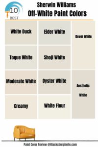 10 Best Sherwin Williams Off-White Paint Colors (Trend 2023)
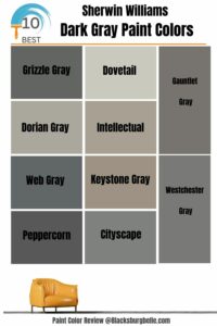 10 Best Sherwin Williams Dark Gray Paint Colors (Trend 2023)
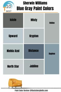 10 Perfect Sherwin Williams Blue Gray Paint Colors (Trend 2023)
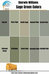 10 Best Sherwin Williams Sage Green Colors
 17 Best Sherwin-Williams Green Gray Paints (Trend 2023)
