
Two-toned walls have fast become a popular trending interior decor style. From the early 60s, two-toned walls started to make an appearance in the world of decor. It however faded in its popularity soon but came back stronger in 2019.
This year 2023, we are seeing a resurgence of the two-toned painted walls phenomenon. People are beginning to grow daring and take creative risks in their paint color choice.
Why choose boring plainness if you can opt for interesting wall art with two-toned paint colors? People have realized that introducing a second paint color on their previously monochrome-painted walls succeeds in creating an artistic environment where imagination can thrive.
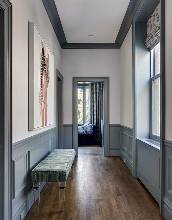
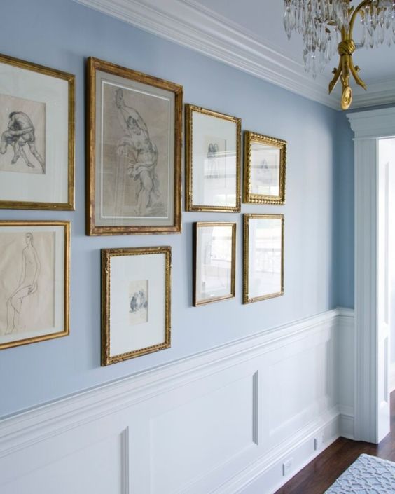
Now let’s talk about chair rails. Chair rails traditionally have been defined as trims that prevent chairs from rubbing against the wall. In more recent times, this meaning has lost its value, as chair rails now hold a more decorative purpose than their original concept.
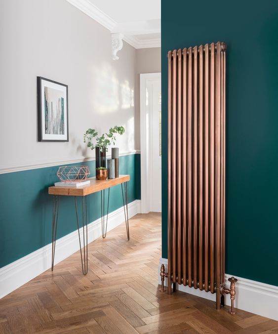
Two-toned paint colors on walls with chair rails create a striking visual for your home. The bulging square or rectangle trims and dual paint color make for an interesting and intriguing appearance.
Table of Contents
Frequently Asked Questions
Contrasting Or Complementary Paint Colors, Which Do I Pick?
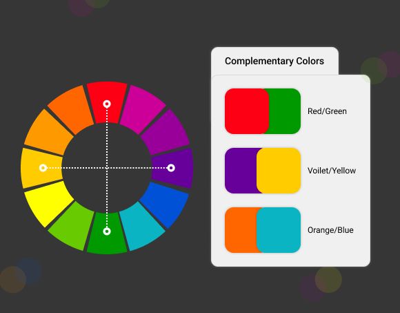
Contrasting colors are defined as two colors that appear opposite each other on the color wheel. These colors can be highly contrasting or have a low contrast index based on their proximity to each other on the color wheel.
Colors directly opposite each other have the highest contrasting index. An example of such highly contrasting colors is black and white, orange and blue, red and green, etc.
Complimentary colors on the other hand are colors that appear very close to one another on the color wheel. Colors like green and yellow, blue and purple, black and brown, pink and red, etc are all complementary pairs.
A rule you can note to help identify high-contrast colors is that the farther away colors are from each other on the color wheel, the higher their contrast index will be. And the closer they are to each other the better their complementary effect increases.
Choosing a contrasting or complementary color pair all depends on the aesthetics and vibe you want your space to hold. If you are going for a minimalist decor style, choosing complementary color pairs would be your best bet. However, if you want a modern and expressive space, we would advise you to go with a contrasting paint color pair.
Should I Pick Two Shades Of The Same Color Or Two Paint Colors From Different Families?
If you have made a decision to go with complimentary colors for your paint color pair, the next thing to choose is if you want to have an extra complimentary feel that two colors from the same color family but with different shades afford.
An example of this is using a lighter shade of gray above the chair rail trim of your wall, and then using a slightly or more darker shade of the same gray paint on and below the trim. This paint choice depends on the option that the theme you are trying to create for your home is simple, minimalist, and modern.
However, if you want to add creative spice to your home wall painting, we would advise you to choose your paint color pair from different color families. Examples you could pick from are blue and white, yellow and orange, purple and violet, etc. That being said, let us dive into our 17 two-toned color choice for walls with chair rails.
17 Paint Colors for Two-Toned Walls With Chair Rail
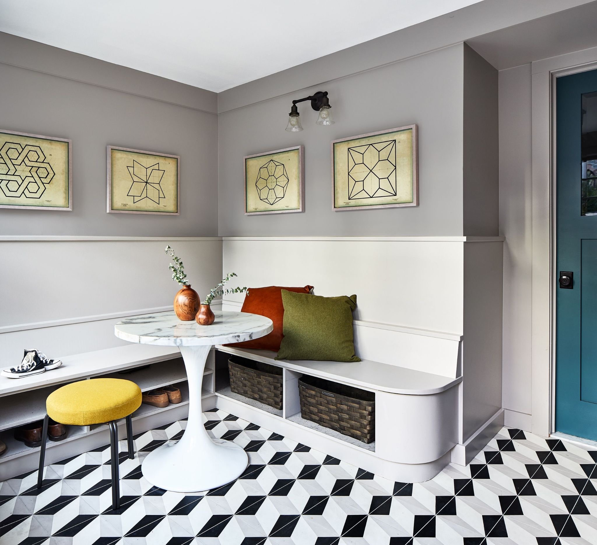
1. White and Beige
Having a clean modern minimalist home decor style has been in vogue for a hot minute. In the world of interior decor, simple designs, and light-toned paint colors have been trending. Going with a white and beige two-toned wall color creates the simple elegant style minimalist themes are known for. You can paint below the chair rail, trim a warm-toned white paint color, and cover the upper part with cream beige paint.
Spaces coated in these colors have a way of birthing a warm embracing atmosphere. We think that the beige color plays a stronger role in this. To complete the modern homey vibe and effect, use brown wood flooring. This flooring choice will create a soft complimentary feel to the beige paint. You can also decide to go with bronze or gold decor pieces for frames, chandeliers, and artwork.
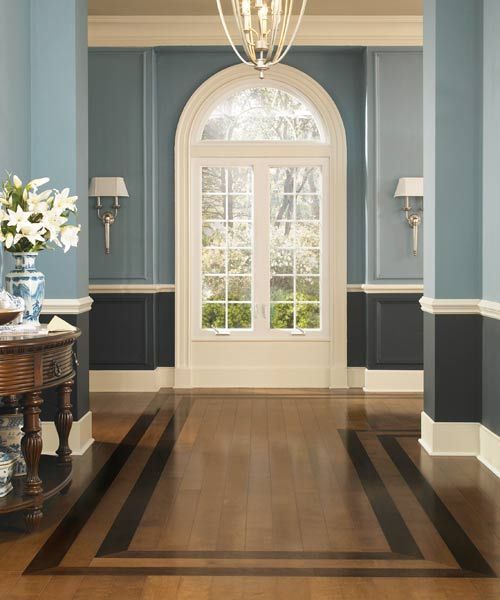
2. Dark Navy Blue And White
Deep colors will always hold a strong interesting effect in any space they are used. The same goes for this deep dark navy blue paint color that has been used to paint the lower part of the wall. This particular shade of blue looks modern, imposing, and classical.
If you would like to create a cool and engaging space, mixing white and deep navy blue paint colors will help you achieve that. Combining both colors creates a striking balance that is hard to forget.
Unlike pairing two warm light paint colors that may project bland boringness, going with a deeply saturated cool dark color and a warm light color will create a strong contrast that can never be described as uninteresting. If you do not want to have an overwhelmingly cool sober look, then painting below the railings blue and painting the larger space above, white, will help balance the open interesting feel.
3. White and off-white
This paint color combo choice speaks for itself. They say we are brilliant, airy, minimalist, and elegant. White and off-white hues are highly complementary and provide a canvas of modern classiness. We have just one thought to share on this two-toned paint color choice. “Go with it, if all you want is simple elegance with a high minimal energy”.
4. Dark Blue And Mid-Toned Blue
Looking for a two-toned paint color that says brooding, masculine, and regal sophistication? Look no further! This two-toned mix of blue paint colors from different shades projects the perfect front of masculine sophistication. This two-toned color match looks just right for a rich and modern bachelor’s pad. It’s giving influential and opulent vibes. Using the darker blue shade beneath the chair rail section with black or deep brown colored furniture perfectly balances the lighter blue paint covering the upper expanse.
If what you are looking for is a modern space with mysterious regal opulence, then start out by painting your room this dark blue and mid-toned blue paint color. Don’t forget to match other decorations by using black and dark gray decor pieces. And you must also note, you will need to have adequate lighting to illuminate this space. However, if you want to retain a more mysterious feel, a low-toned lighting fix can be maintained.
5. Dark Gray And Lighter Shade Of Dark Gray
This two-toned paint color match seems a lot like a monochromatic look. However, if you observe more closely, the wall space above the chair rails is a lighter shade of dark gray. This color mix of dark gray but different shades mutters calm reassuring elegance and style. It says wealthy, unbothered, and relaxed, very loudly and clearly. Because of the saturation of this dark gray two-toned paint color shade, there must be adequate lighting to maintain its clean elegant look.
To complete its modern minimalist theme, using woodwork in furniture and decor will elevate the classiness of the room or space. Having light floor coloring, however, introduces a needed warmth into this cool modern space. Dark gray and it’s lighter shade should be a two-toned paint color choice you definitely want to add to your consideration list of paint colors to try out.
6. Sea Green And Off White
Airy, calming, and refreshing, this sea green and white paint color combo is sure to spruce up your empty space. The sea green color with a bluish undertone brings a jolly freshness that nature’s essence imbues into a space. When paired with the warm toned off-white paint color that has been used above the trim, it creates a soothing environment for everyone in the family.
This paint color combo is quite versatile. It can be used in a minimalist-themed home or an ultra-modern space, or even rustic-themed home-like cottage. If you want to introduce more light and create an illusion of enlarged space, having a light-colored flooring will help accomplish that. However, if you want to maintain a cozy homey vibe, going with wooden floorboards or brown tiles should work. Using lots of wood work will complete the homey and cozy family house feel.
7. Dark Gray And Light Blue
This combo of two-toned paints is quite unconventional. The lower half of the walls have been painted a dark gray color, the trim is painted white, and the upper two-thirds of the walls have been painted a light blue color. The floors have brown wood-colored boards, and darker boards are used as flooring design.
This paint combo of dark gray and light blue with white trimming gives off an older-generation vibe. It looks like a two-toned paint combo from the 1800’s to 1900’s. This paint combo choice evokes a nostalgic feel that the more traditional homes always seem to carry. Try out this two-toned paint combo if you are looking to create a traditional vintage aesthetic.
8. Mid-Toned Gray And Cool Off White
Mid-toned gray and cool off-white paint when used as a two-toned paint color inspiration provides an ultra-modern feel with a dash of old-world essence and tradition. This cool white paint creates a calming effect that is loved by everyone who sets eyes on the space it coats. When paired with the assuring calmness of gray, this paint combo gives the ultimate aura of “relaxed with little or no worries”.
If you want gray flooring to give this dual paint color a complimentary look, then go right ahead to create the perfect safe haven for your home. But, if you want to form a more contrasting look, then we advise that you use brown or wooden floorboards.
9. Chocolate brown And white
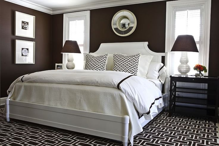
Chocolate brown, black and white, these three colors are capable of creating an elegant masculine haven. This two-toned wall color divides the wall into two equal halves; with the lower half having chocolate brown paint color, the trim and doors wearing a black paint coat, and the upper half of the wall showcasing a brilliant neutral white paint color.
This paint color match gives off a rich solitary vibe. You would agree with me that this two-toned paint color suggestion would look great in a hotel lobby because of the reclusive aura that it emits. If you are looking to improve its mysterious recluse environment, we would advise you to go with a black or chocolate brown rug. However, an off-white or gray rug color will add a touch of urban simplicity.
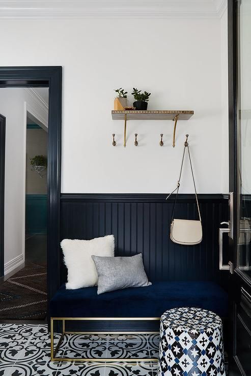
10. Midnight Black And White
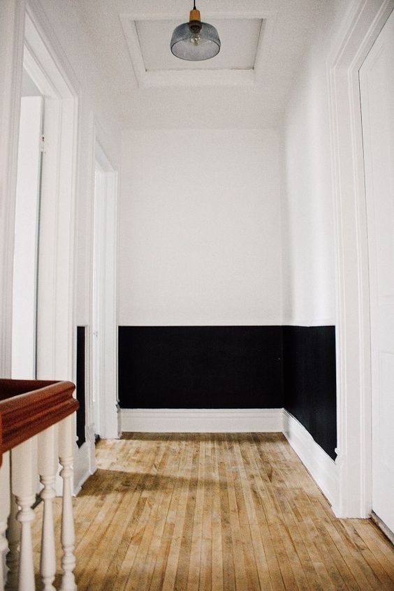
It is not often you see two stark contrasting colors being used as paint on the same wall in a home. White is an excellent color that brings elegance and timeless classiness to any space. It also has the ability to create an illusion of expanded space, making everywhere seem larger than it actually is.
Black paint color on the other hand bears some similarities with white. It offers a rich elegant atmosphere and crafts an opulence presence that never goes out of style. But with this, all of the similarities black and white paint seem to share ends.
Black in its ability to create an illusion of added space is poor. Black is a deep dark color that is highly light absorbent, hence, it has the opposite effect by creating the illusion of a smaller cozier space. However, for a more illuminating effect, painting two-thirds of the walls above the chair rail trims white will work wonders.
11. Baby Blue And White
As complimentary colors go, this baby blue and white two-toned room paint has got to be amongst our favorites. It has a soft, beautiful aesthetic that offers a happy, joyful, imaginative, and calming effect. Although having a higher reflective paint color on the bottom tends to give a disproportionate feel, this white and baby blue paint color seems to have the right balance.
This two-toned paint color evokes a happy atmosphere with childlike innocence. Using this baby blue and white paint color mix infuses a cool airy aura that has an irresistible appeal. This color is mostly used for urban homes and cottages. Using this color combo in a minimalist-type home might be a stretch because baby blue holds a charming character that neutral colors seem to lack.
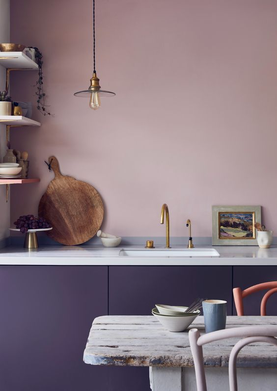
12. Red And Cream
If you are looking for an old-world aesthetic from the 1800s, this burgundy red and cream paint color mix fills the role perfectly. This shade of red has an interesting look reminiscent of a sage secret keeper. Interior decor pieces you can use to complement this vintage theme should be made with bronze, iron, or even steel.
You can also throw in one or two color splashes in the furniture choice you decide to go with. This will introduce an artistic contrast to elevate the appearance of your room from a moody vintage vibe hovering on dull boredom to a vintage vibe with a touch of interesting modernness.
13. Green And Sky Blue
This high-contrast paint color is all shades of lively, fun, and creative. Starting out with the saturated leaf green hue on the bottom of the kitchen coating the cabinets, this paint color says fun and engaging like no other. It holds a calming effect that helps energies stay grounded and stable. The light blue paint color used for the upper wall possesses a trustful and refreshing aura. It seems to reinforce that reassurance of an easy calm life.
You may have thought that these two major colors with such strong qualities will create a clashing color scheme. But, the reverse is the case. The beautiful pastel blue and mellow leaf green paint color form a beautiful, vibrant color clash that gives vitality and the joys of living life. You can use this paint combo if you have an urban-themed home.
14. Purple and Lilac
Going the complementary route with a light and darker shade of the same color is one way to play it safe. But, with this unconventional purple color, can we really say this paint color choice is safe? This amazing match of purple and lilac holds a regal femininity wrapped in a soft beauty.
With this gorgeous shade of purple coating your walls, you are sure to always have an inviting and beautiful home that will always draw family, friends, and visitors. But watch though, you may need to get yourself ready for the constant visitors this paint color choice of your home will attract.
15. Light Gray And White
Light gray and cool white paint colors are the ultimate clean and minimal paint color choice; especially for a simple modern background. The high light reflective value makes sure your room always looks bright and airy. If you are going for a sober mood, this should not be your two-toned color pick.
This paint color combination is neutral and bright enough to be in your living rooms, bedrooms, kitchens, and even your children’s rooms and nursery. The white color paint compliments the beautiful shade of gray that is used in this two-toned paint color match.
16. White And Yellow
In our two-toned paint color suggestions so far, we have always placed the deeper and less reflective paint color below the chair rail trim. This is because having less reflective colors below seems to present a steady and stable appearance.
But in this two-toned paint color suggestion, we went the other route. Here, we are telling you to use the highly reflective white paint for the lower third of your walls and go with this muted yellow color for the remaining two-thirds of the wall expanse.
This muted paint is not as vibrant as other shades of yellow, but it still brings a touch of resolved joy. It has that peaceful quality older happy couples who are still in love possess. To complete the reassuring effect the mix of these two colors provides, make sure to use brown wooden furniture, as brown compliments the muted yellow color.
17. White And Tea Beige
This two-toned mix appears to be predominantly tea Beige color with the white paint occupying less than a third of the available wall expanse. Beige paint color looks similar to a cup of coffee with lots of cream, hence, we named it Tea Beige.
Tea Beige and White has a big quiet luxury energy that we absolutely adore. If you want to add an elegant aura to your space, this pretty Beige and white combo seals the deal. A dark brown wood flooring will complete this simple elegant look for your home or office space.
This two-toned paint color can be used in any housing theme or style because of its versatile neutrality. Spot a beige and white paint color pair in restaurants, government offices, cottages, and even in houses built centuries back.
Conclusion
Chair rails and two toned paint colors are making a comeback in 2023. So join the bandwagon and enjoy. Having two paint colors in your room gives it an engaging feel. It is hard to create a bland uninteresting room that is coated in two toned paint colors. So what are you waiting for? Go ahead and create that two toned color goodness in your space.

