
 Sherwin-Williams Anonymous is one of those colors that leave a lasting impression on you from the first encounter. It’s an unusual shade that inspires your creative juices due to its neutral element.
In some cases, Anonymous presents as brown, while at other times, it shows as green, but its overlaying hue is gray. Its chameleon nature makes it a versatile tone suitable for various colors. This guide breaks down every detail of this dark neutral tone.
You’ll learn how to form the color in case of shortage on Sherwin-Williams, identify its hue without the package, decorate a space using Anonymous, and find alternative shades similar to the hue with pictorial references.
Let’s start with understanding the color.
Table of Contents
What Color is Sherwin-Williams Anonymous
| Manufacturer | Sherwin Williams |
| LRV | 20 |
| RGB | R 1290 | G 122 | B 110 |
| Hex Value | #817a6e |
| Color Collections | Creative |
RGB of Sherwin-Williams Anonymous
The RGB of color denotes the content of Red, Green, and Blue mixed into a true black paint to create its hue. Based on a scale of 0 – 225, Sherwin-Williams Anonymous contains 129 Red, 122 green, and 110 blue bringing its hex value to #817a6e.
Light Reflective Value (LRV) Of Sherwin-Williams Anonymous
Every paint color can reflect or retain a light, and Sherwin-Williams Anonymous veers on the latter end. The general rule is that bright hues reflect while dark tones retain light.
Based on that, the darker the color, the more it’ll retain a light, and Sherwin-Williams Anonymous has a Light Reflective Value of 20. Although percentages run from 0 – 100, paint colors are restricted to 3 – 93 because there’s no pure white or true black.
Even the purest neutral shades have undertones of other colors waiting for the right light to bloom.
Is it a Warm or Cool Color?
Anonymous is a warm color because its base tones, like yellow and green, reflect underneath the sunlight based on the reception angle. Thanks to its warmth, Anonymous evokes high energy, optimism, and positivity in its surrounding.
If you’re looking for a neutral gray color to relax and provide a cool aura, then Sherwin-Williams Anonymous isn’t for you. Learn more about its undertones below.
What are the Undertones?
Undertones are the secondary colors that reflect from a paint based on the light reception, and Sherwin-Williams Anonymous has four. The strongest tinges are yellow and green, with a faint hint of brown.
Which undertone shines brightest? That depends on the room’s position and the light’s angle.
Check out the different colors for the undertones. All pictures are from Sherwin-Williams.
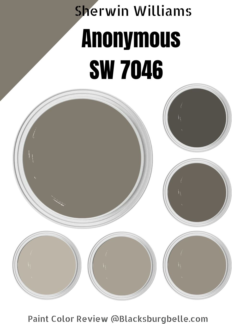
Sherwin-Williams Anonymous Color Strip
A Color strip is a combination of similar colors graded based on different LRVs and comes in handy during monochrome decoration.
| Color Code | Color Name | Location Number | LRV | Color Tone |
| SW 7044 | Amazing Gray | 245-C2 | 47 |  |
| SW 7045 | Intellectual Gray | 245-C3 | 36 |  |
| SW 9171 | Felted Wool | 245-C4 | 28 |  |
| SW 7046 | Anonymous | 245-C5 | 20 |  |
| SW 7047 | Porpoise | 245-C6 | 13 |  |
| SW 7048 | Urbane Bronze | 245-C7 | 8 |  |
Sherwin-Williams Intellectual Gray (SW 7045)
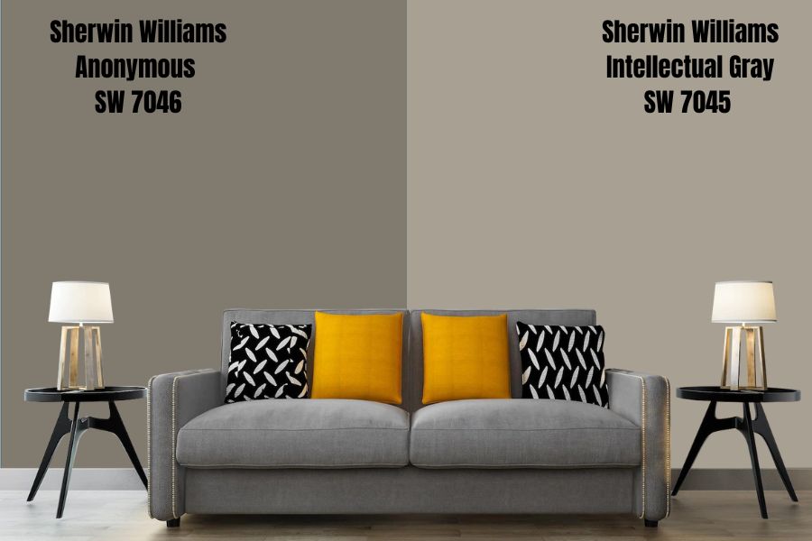
Sherwin-Williams Intellectual Gray is a neutral medium-dark gray with minimal brown and green undertones. The mixture gives the paint a taupe vibe making it one of the best greige shades for whole-house coloring.
Intellectual Gray is for you if you like your paints with minimal undertones that blend with nature underneath the brightest light. Its Hex Value is #a8a093, and the LRV is 36.
Sherwin-Williams Amazing Gray (SW 7044)
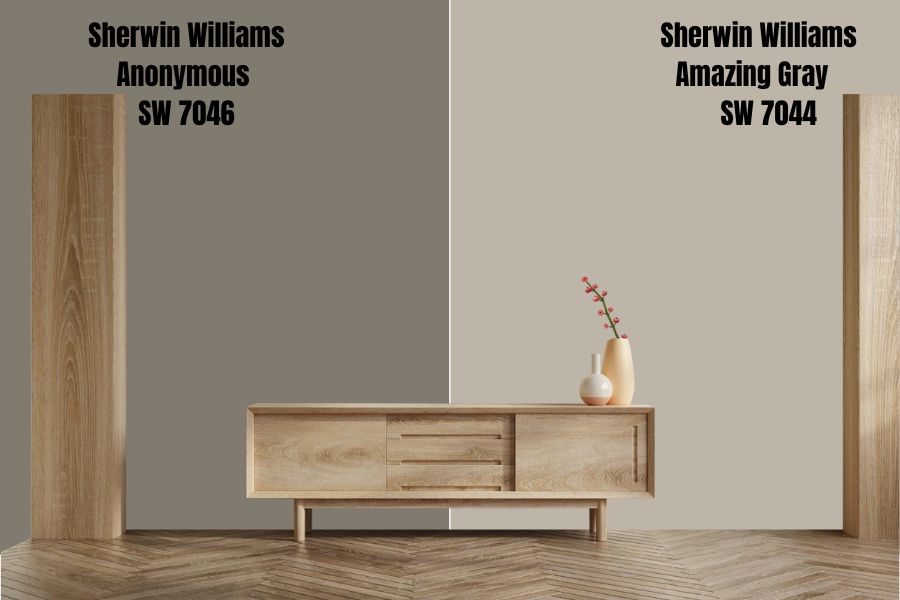
Amazing Gray is a dusty gray color with a medium-dark LRV, making it a neutral tone. It’s a soft hue that works well with other tones but is best with lighter neutrals and dusky pinks such as mauve and rose. It’s truly amazing.
Sherwin-Williams Amazing Gray is good enough for an entire coloring without feeling too much for your space. Try it out for a relaxing aesthetic – its Hex Value is beb5a9.
Sherwin-Williams Felted Wool (SW 9171)
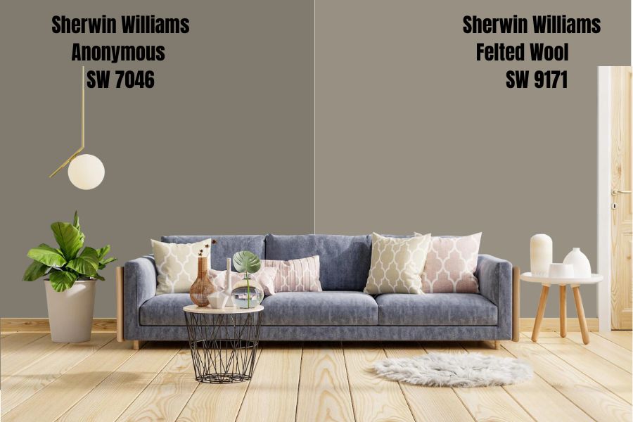
Sherwin-Williams brought back Felted Wool from 2019 after it made waves as a naturalist gray shade. The color is similar to Intellectual Gray but with a darker resolution thanks to its 28 LRV. It’s a dusky greige tone that works seamlessly with other neutrals.
Most people pair it with lighter pastel neutrals like Shoji White (company-recommended), but you can get more out of this color by playing on its shadowy undertones. Choose a good dark neutral green like Foxhall Green or a greenish-brown like Urbane Bronze for a unique look.
Its Hex Value is 979083 if you’re feeling adventurous. Felted Wool made a comeback in this year’s Dreamland collection due to its soothing vibe. What are you waiting for?
Sherwin-Williams Porpoise (SW 7047)
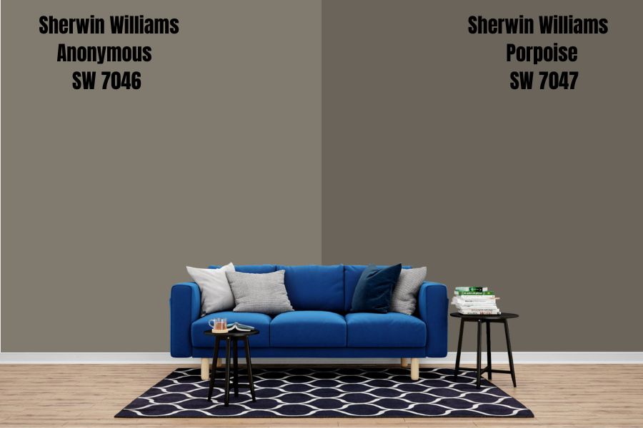
Porpoise surprised me when I first encountered it; the feeling hasn’t changed for months. Although it’s not a trending Sherwin-Williams gray color (its glory days were in 2019), it’s an evergreen neutral tone (no pun intended.)
This color is a warm mix of brown and gray; you never really know which end would shine. That’s what endears it to me. With Porpoise, I don’t have to choose between gray and brown for my neutral coloring.
Pair it with a really bright warm color to tease its undertones since the gray is its overlay. Sherwin-Williams recommends Limón Fresco, Eider White, and Shoji White as the best coordinators, and I approve, especially the yellow (Limón Fresco).
Its Hex Value is 6b645b while its LRV is 13. Now you see why the brighter pairings are necessary to highlight the color.
Sherwin-Williams Urbane Bronze (SW 7048)
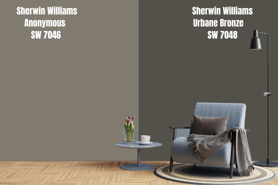
Remember how I said Porpoise surprised me? Sherwin-Williams Urbane Bronze has me spellbound. The color is brown with undertones of gray, a unique mix of neutrals. Think of it as a reverse Porpoise shade.
Urbane Bronze is always trending, and for good reasons too. There’s no question of pairing this color with another dark shade except a medium-dark tone leaning toward the middle of the spectrum because it has an LRV of 8.
The color collection for Urbane Bronze is wide from the 2016 Pura Vida (which means pure life, loosely translated or simple life) to the 2022 Spring/Summer top color and Fall/Winter Rejuvenation shade.
If you want earthy paint with tinges of gray highlighted underneath a cool, cloudy night sky, Urbane Bronze is calling you. The Hex Value is 54504a and has one of the most minimal RGB values at 74 – 84 each.
Sherwin-Williams Anonymous
Let’s dig more into Sherwin-Williams Anonymous now that you know more about its color strip, LRV, and other intricacies. It’s time for the creative aspect, the best part of exploring paints.
This part teaches you the best way to decorate an Anonymous painting with picture references. There’s also a short bit on alternative paints from Benjamin Moore and comparisons with similar neutral Sherwin-Williams hues.
Why should you buy Anonymous or not?
Sherwin-Williams Anonymous Color Palette
Color palettes are important when decorating a space, whether interior or exterior. It helps you coordinate your main paint, the anchor, without making it look like a failed preschool art project.
What should you use? What must you avoid? How would it look?
Keep reading for all the answers.
Coordinating Colors for Anonymous
Coordinating colors for Anonymous is easy when you use the color strip because it guards you within a set of shades proven to work seamlessly together. Alternatively, you can employ the old-fashioned complementary style or contrasting designs.
Scroll down to see the difference between all three styles.
Monochrome Decoration with Anonymous
One color. Gray. The monochrome decoration is a great way to introduce color by playing with fluctuating undertones, shadows, and highlights. You can marry warm and cool tones by using one anchor color.
Using the color strip, introduce a dark shadowy vibe with Urbane Bronze or Porpoise. Use the former for a daring mix but stick to the softer Porpoise to play it safe.
For an airy aura, lean towards lighter dark tones like Amazing Gray and Intellectual Gray. If you’d like white, choose shades with sage green undertones.
This color grading extends to your furniture, flooring, bedding, and other home accessories including curtains. You can choose a multicolored carpet using these shades of green.
The monochrome decoration is best when customizing every piece in your home. That way, you can choose the shade and color you want on your items.
Contrasting Decoration for Anonymous
Do you like vintage designs? Then, contrasting decorations are best-suited to you. With antique and vintage items, you can never truly tell when, where and what you’ll find – it’s always a game of chance and luck.
However, you can look for specific contrasting tones based on the undertones in Anonymous. Since the color has three undertones – yellow, green, and brown – your options are broader.
Contrasting colors are shades sitting opposite each other on the color wheel, and I’ve provided a reference below.
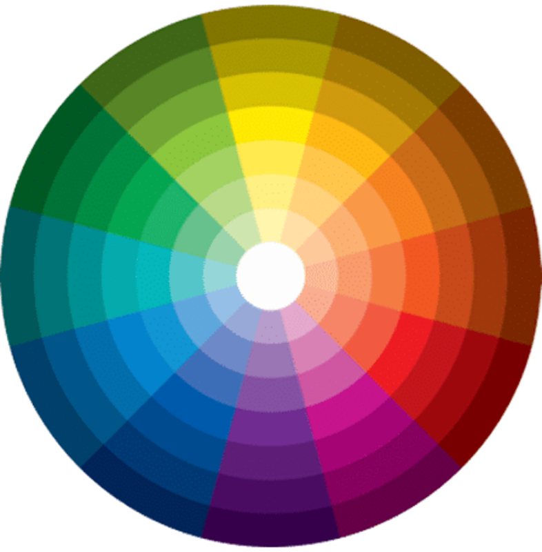
You can see that yellow’s Contrast is purple, green’s is red, and brown, which is between red and orange, is also green. Another good news is that you don’t have to use those exact colors but shades of them or hues with their undertones.
Isn’t this fun?
Some Sherwin-Williams colors you can explore are Shoji White, Polvo de Oro, and Muslin which all have yellow undertones. While Shoji White is a pastel neutral tone, Polvo de Oro is a pastel golden tone, and Muslin is a nude shade.
Anonymous Complementary Colors
Close to contrasting design, we have complementary décor, which mixes colors beside each other on the wheel. The shades closest to Anonymous – remember we’re using its undertones since it’s not a primary color – are red, pink, and brown.
Complement an Anonymous wall with medium-dark gray tones tinged with blue, green, or both bases. It also comes alive with beige, creamy white, light greige, and tan hues.
What Trim Colors Go With Sherwin-Williams Anonymous?
Spruce up your Sherwin-Williams Anonymous exterior walls with red bricks or stones. For your interior coordination, look no further than light neutrals with any undertones present in color. For the earthy feel, use green or brown tinges; for a warm vibe, choose yellow.
Your choice also depends on your coordinating style – monochrome, Contrast, or Complementary. Refer back to the Color Palette for inspiration.
Sherwin-Williams Anonymous Color Comparisons
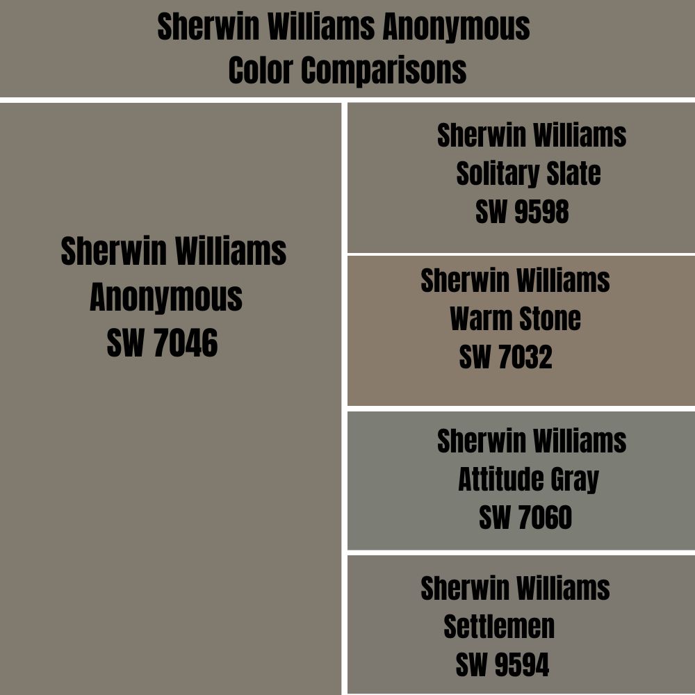
What do you do when you can’t get Sherwin-Williams Anonymous? Give up? No, that’s not even an option. You can use the information in the table above to create your custom color. However, here’s a list of interesting alternatives that aren’t on the color strip.
These are colors that can pass for Anonymous upon a fleeting glance.
Sherwin-Williams Anonymous vs. Sherwin-Williams Solitary Slate (SW 9598)
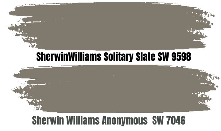
As an Emerald Designer Edition paint, Solitary Slate is a unique color and is only available in limited quantities. It’s not exterior paint, as the warm brown tone works best in enclosed spaces. It has an inviting vibe with a low LRV of 19 percent.
Despite having similar LRVs (Anonymous is 20,) Solitary Slate is warmer and brighter than its counterpart. This color is a great juxtaposition for Anonymous as a side-by-side comparison would highlight its brown tone.
The comparison also puts Anonymous’ higher gray saturation into perspective. Use them as alternatives and not coordinated colors, as that’ll be a paint waste.
Sherwin-Williams Anonymous vs. Sherwin-Williams Settlement (SW 9594)
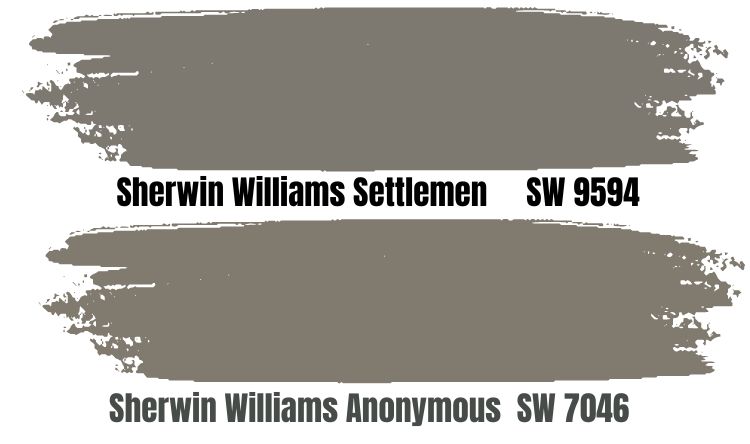
Sherwin-Williams Settlement is a taupe brown designed for interior and exterior coloring. It’s part of the unique Emerald Designer Edition Paint and has a lower LRV than Anonymous, even though it’s just by one percent.
Settlement is similar to Solitary Slate but has a strong green undertone that the other color lacks.
Sherwin-Williams Anonymous vs. Sherwin-Williams Warm Stone (SW 7032)
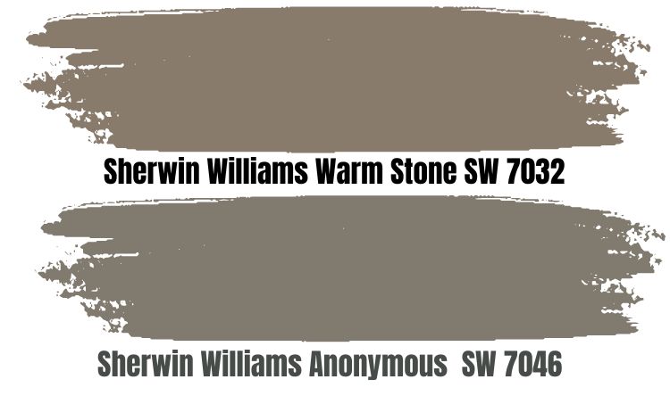
The brown in Warm Stone is so prominent you’d wonder why Sherwin-Williams named it so. The color is great for interior and exterior coloring and has the same LRV as Anonymous. However, as earlier stated, it’s browner with a slight greige undertone.
About its name, the similarities to a creek bed earned it the moniker. Like Anonymous, the first sighting of Warm Stone and your second encounter would confuse you because of the change in dominant hues.
However, once you understand the principle of lighting, you’ll get over it.
Sherwin-Williams Anonymous vs. Sherwin-Williams Attitude Gray (SW 7060)
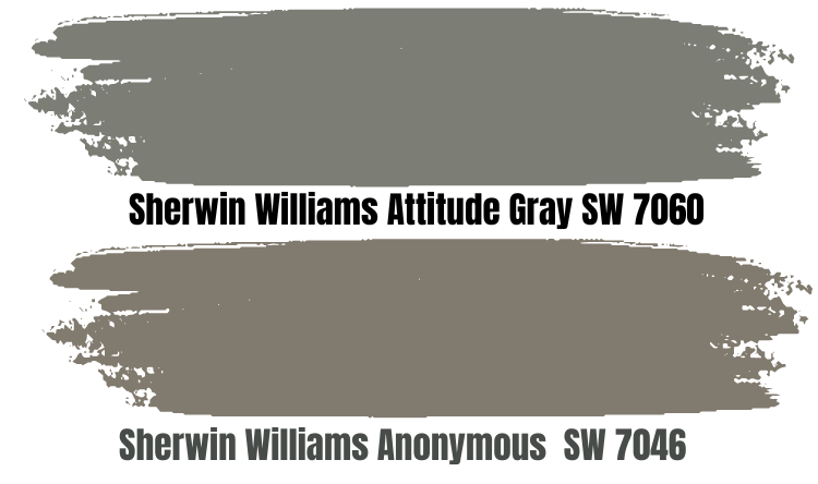
Is it Green, Brown, or Gray? Why be one when you can be all? That’s the case of Attitude Gray, as it has strong green and brown undertones that make it stand out anywhere you place it. The color has the same LRV as Anonymous but makes a louder statement.
It’s not a popular Sherwin-Williams shade and doesn’t fit in any of its special collections. However, one look at this color would have it embedded in your mind for the longest time. It pairs well with light blue grays, yellowish whites, and tan tones.
Anonymous Benjamin Moore Color Comparison
So we’ve established that Benjamin Moore doesn’t have any paint called Anonymous, but that doesn’t mean there aren’t any similar shades to the Sherwin-Williams neutral. Here’s a short list of similar top tones below.
All pictures are sourced from Benjamin Moore.
Gargoyle (1546)
Gargoyle is a Benjamin Moore classic, and it’s more like Sherwin-Williams Attitude Gray and Warm Stone due to its warm brown notes. It surely has the LRV to match Anonymous as it retains light at an 18.89 percent rate.
It pairs best with pastels, especially those with blue and green undertones.
Iron Gate (1545 | CC-572)
With an LRV of 23.1, Benjamin Moore’s Iron Gate is a solid taupe color. This unique shade is one of the few warm browns with a sharp violet undertone, unlike the typical green and greige. It’s another BM classic, and you’d love it if you want a warm and inviting space.
Smokey Taupe (983 |CC460)
Benjamin Moore’s Smokey Taupe is a warm greige (gray + beige) color with strong yellow undertones giving it a medium-dark LRV – 54.53. It’s a beautiful shade if you’re looking to open up your space and works as a great trim for Anonymous.
Graystone (1475 | AC-27)
As a medium-dark taupe color with an LRV of 30.5, Graystone is a neutral tone capable of softening darker colors like Anonymous. The shade has strong yellow and brown undertones, which soak every ray of sunlight they catch and brighten your space.
Anonymous Benjamin Moore Version
Benjamin Moore doesn’t have any paint named Anonymous, but Behr does, and it’s a good alternative brand to the top two frontrunners. Behr Anonymous (780F-5) is similar to Sherwin-Williams’ version of the color.
It has an LRV of 29, 9 percent more than its counterpart, making it a brighter shade. The RGB value is 148 Red, 148 Green, and 146 Blue producing a gray color with a warm green undertone. Check it out with the Hex Value – 949492.
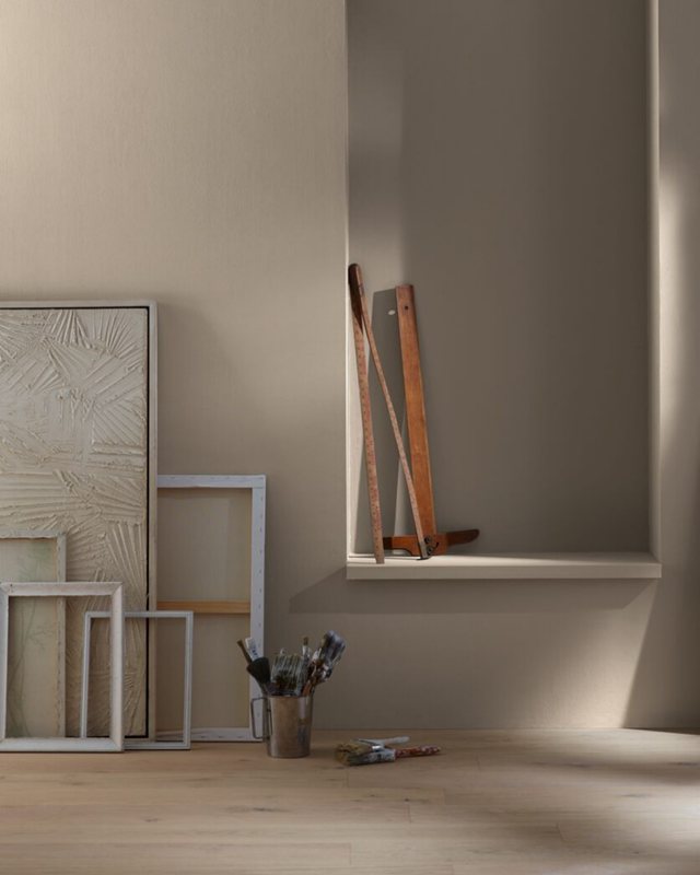
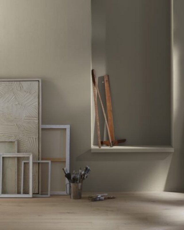
How Does Light Affect the Color?
The first time I saw Anonymous, it presented as a greenish-brown, but the second time I looked at it, the color appeared gray. I did a double-take to ensure it was the same paint I saw a few weeks ago and confirmed its authenticity.
What was different? The lighting. The second time I saw the color was underneath a bright white fluorescent light.
South-facing rooms get the most light bringing out the faintest undertone from the paint, and in Anonymous’ case, that’s brown. North-facing lights get the most consistent but weakest light giving Anonymous a shadowy tone.
Use this position if you want its “cool” sage green undertone. For the yellow hints, your best bet is a West-facing light in the afternoon. You can swatch it or use a Samplize Stick-and-Peel strip to gauge its different resolutions.
Best Rooms To Paint Anonymous
I don’t recommend using Anonymous for your entire coloring, as its dark tone can be overpowering. The best place to use the color is on an exterior wall, an accent, a trim, or a highlighting wall.
See the portion below for more ideas and explanations on decorating with Anonymous paint.
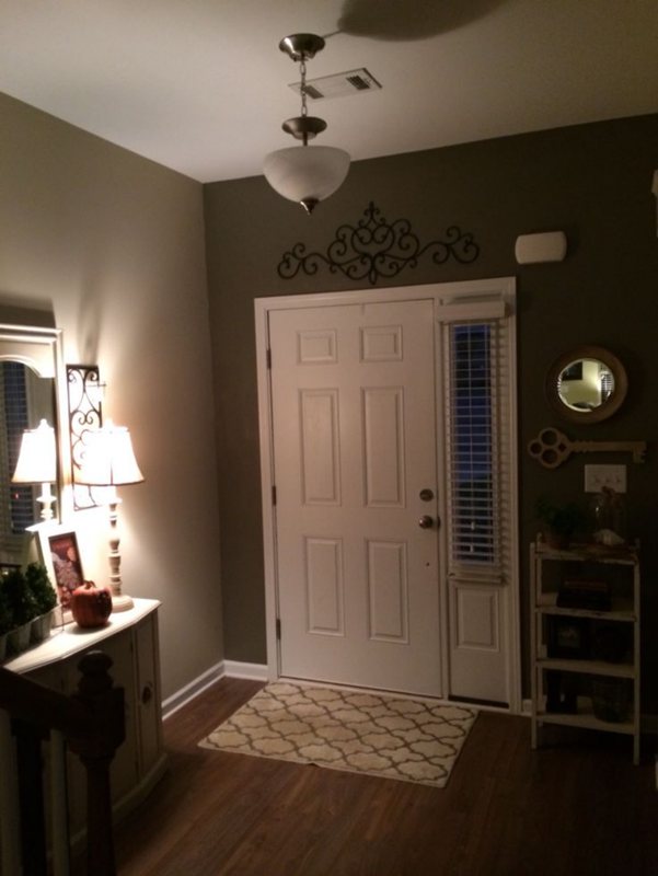
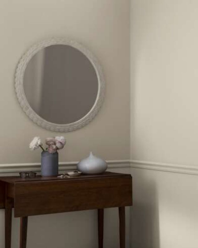
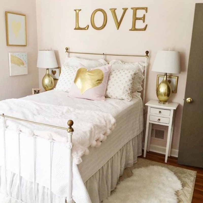
Anonymous Bedroom
Sherwin-Williams Anonymous can work inside your bedroom, but I don’t recommend it as a full-coverage color. Instead, introduce a soothing pastel tone to tamper with its moody overlay and tease out the warm undertones.
You can coordinate these colors as an accent wall, a trim, or the bedroom beddings and other accessories – curtains, floorings, and artwork.
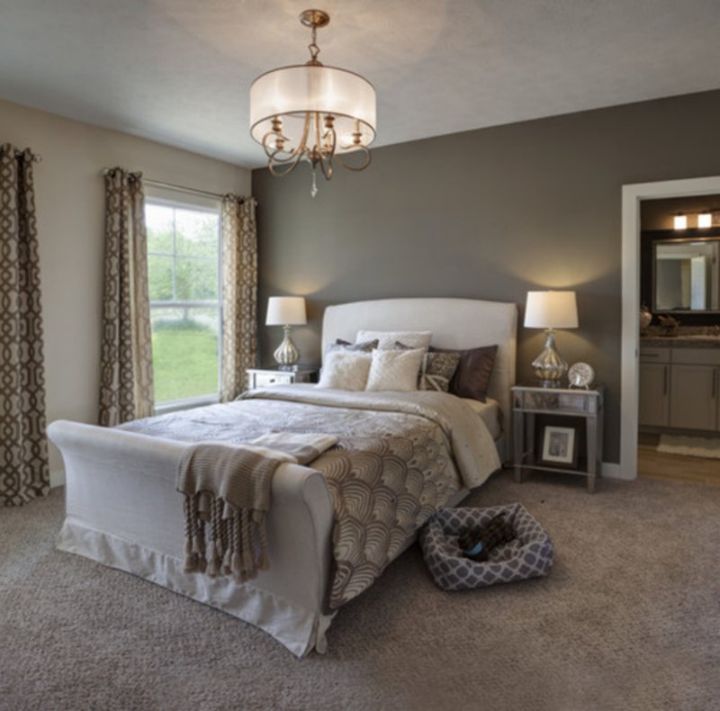
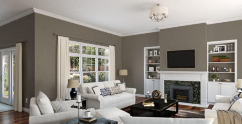
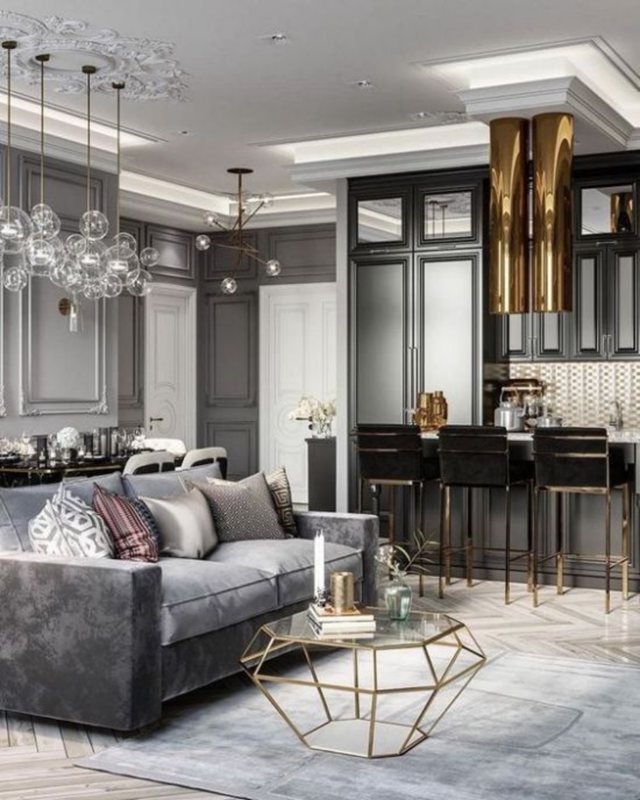
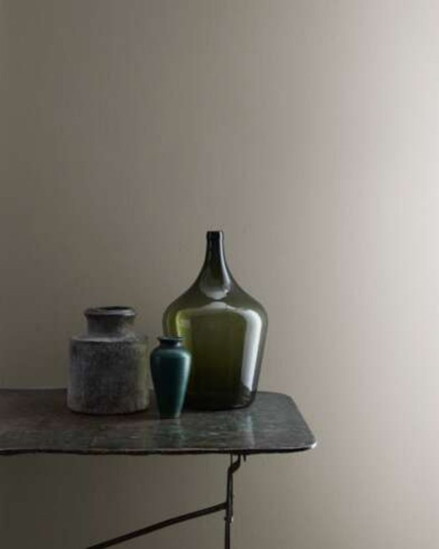
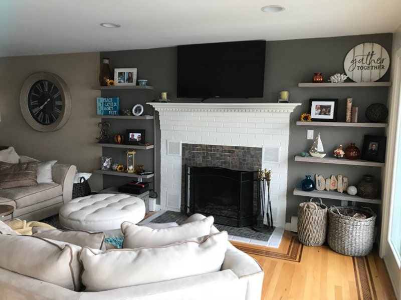
Anonymous Living Room
You want your living room to be an inviting space, especially if you’re one to welcome guests often. Like the bedroom tip, mix your Anonymous walls with bright pastels and neutrals for a welcoming aura. Don’t leave out your ceilings and paneling when doing that.
If pastels are too bright for you, explore Anonymous’ brown undertones and make them monochrome coordination. You can also complement the tone with soft TaupeTaupe and mauve tones.
View this post on Instagram
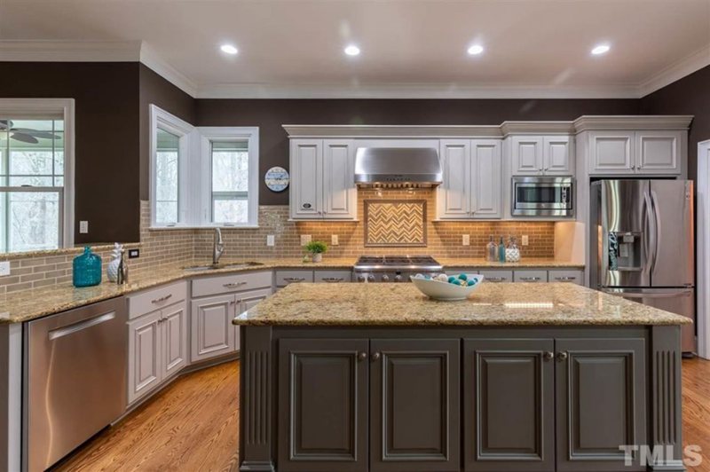
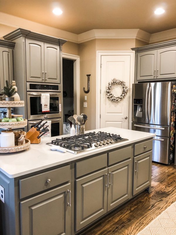
Anonymous in the Kitchen
I love decorating kitchens because the paint doesn’t have to go on the walls. Use it on the cabinets, drawers, and Islands instead, and you won’t regret it.
Choose white or creamy nudes for the walls and contrast them with wooden flooring or complement them with marbled tiles.
View this post on Instagram
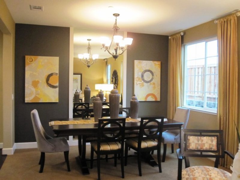
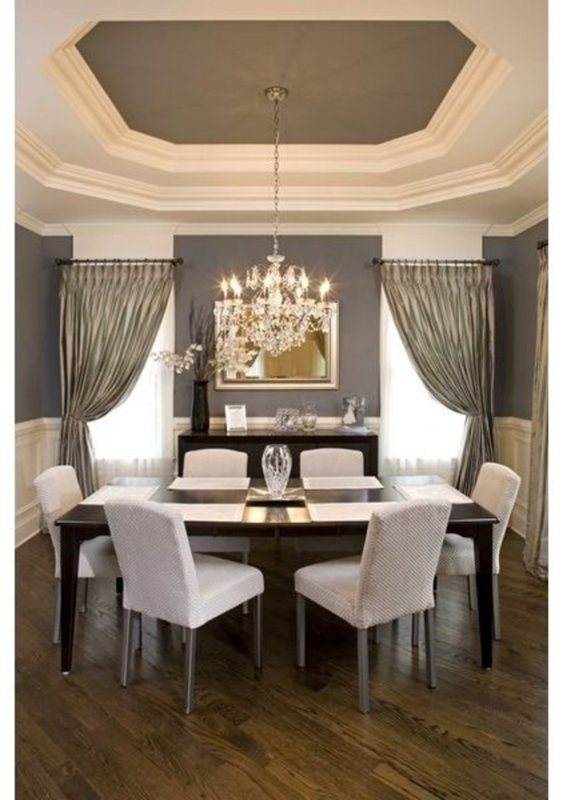
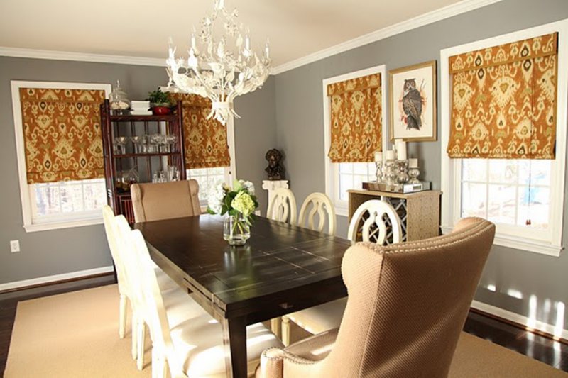
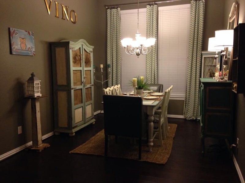
Anonymous Dining Room
Tan is the way to go for an Anonymous-walled dining room. The color is already dull, so the warmth from the tan furniture and artwork would inspire feelings of hunger for your feeding time.
Soften the tan with sheer pastel curtains to allow light to enter the room and draw out the brown within the Anonymous paint.
View this post on Instagram
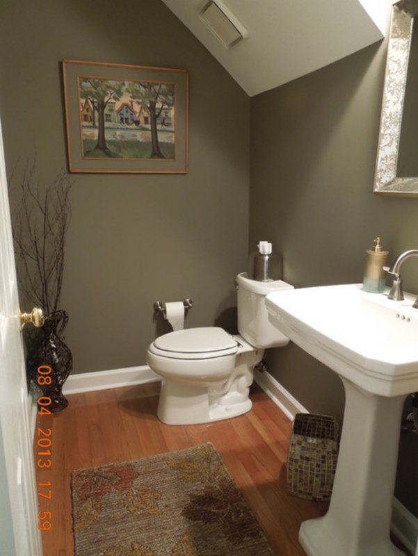
Anonymous Bathrooms
Like the kitchen trick, you can save the Anonymous paint for your cabinets and bathroom décor. Use bright pastel hues for the remaining coloring to bring a relaxed spa-like aura into the space.
View this post on Instagram
View this post on Instagram
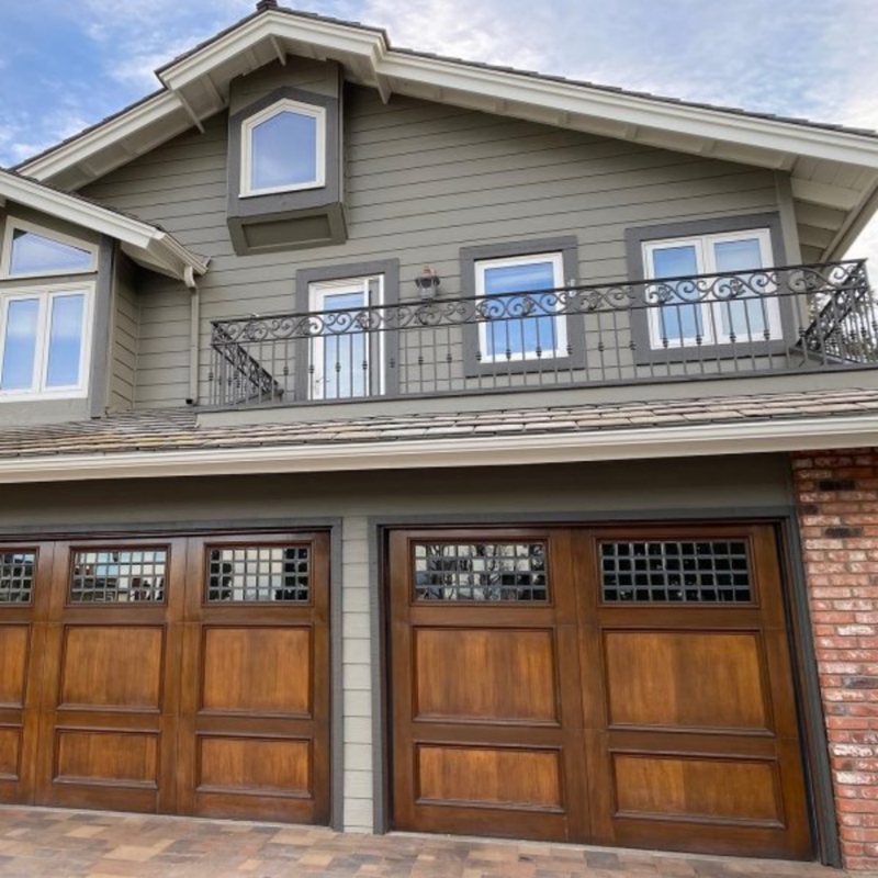
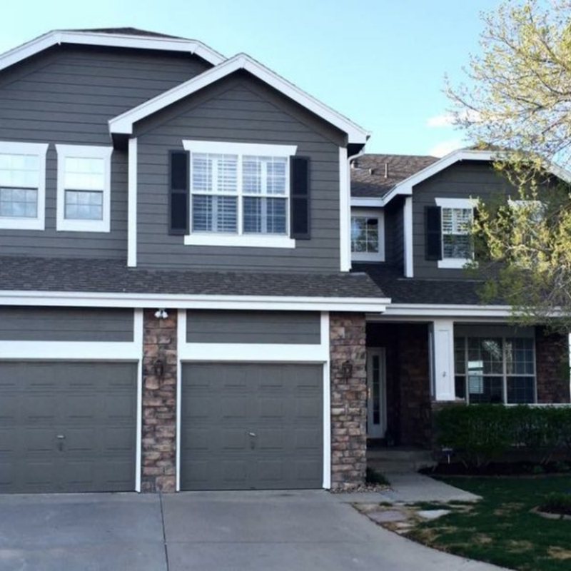
Anonymous Exteriors
Perfection. Anonymous was made for exteriors, and I can’t emphasize this enough. Spruce the outer walls with texture from stone, brick, or wood paneling. The natural light would give the neutral tone all the ingredients to shine its unique undertones into your surroundings.
The icing on the cake would be planting a garden outside the house to give it a perfectly natural look.
Sampling Anonymous
There are four options for sampling a Sherwin-Williams paint, from getting a color chip to a peel-and-stick strip, color-to-go, or a Samplize peel-and-stick patch. They give accurate depictions of the color, but color-to-go is the most realistic.
Final Thoughts
When I started reviewing Sherwin-Williams Anonymous, I thought it was another boring color, but getting to the creative part changed my mind. That’s not to say the technical aspects didn’t pique my curiosity and arrest my attention.
Anonymous is not a boring color, but it’s not for apathetic designers. To get the best from this shade, you must commit 100 percent to the decoration process.
 Sherwin Williams Mega Greige (Palette, Coordinating & Inspirations)
 Sherwin Williams Steamed Milk (Palette, Coordinating & Inspirations)
 Sherwin Williams Toque White (Palette, Coordinating & Inspirations)
 Sherwin Williams Anew Gray (Palette, Coordinating & Inspirations)
 Sherwin Williams Ice Cube (Palette, Coordinating & Inspirations)
 Sherwin Williams Pearly White (Palette, Coordinating & Inspirations)
