
Opting for the Sherwin Williams Clary Sage paint for your space depicts bravery and shows that painting to you is more than simply splashing color on walls. A lot of factors go into ensuring that the color perfectly expresses your mood as you consider the lighting conditions in the room in question and general aesthetics from a third-person perspective.
I understand that it can get a bit confusing, and your decision may get heavily compromised due to the numerous reviews out there. But don’t fret; here, I’ll provide a comprehensive review of the Clary Sage from Sherwin Williams.
Table of Contents
What Color Is Sherwin-Williams Clary Sage (SW 6178)
It’s not a lie that sage green is slowly becoming a favorite among new homeowners and interior decorators due to its calming abilities and closeness to elements of mother nature. The subtle green hue of this color unconsciously relaxes those hard nerves and rids you of anxiety.
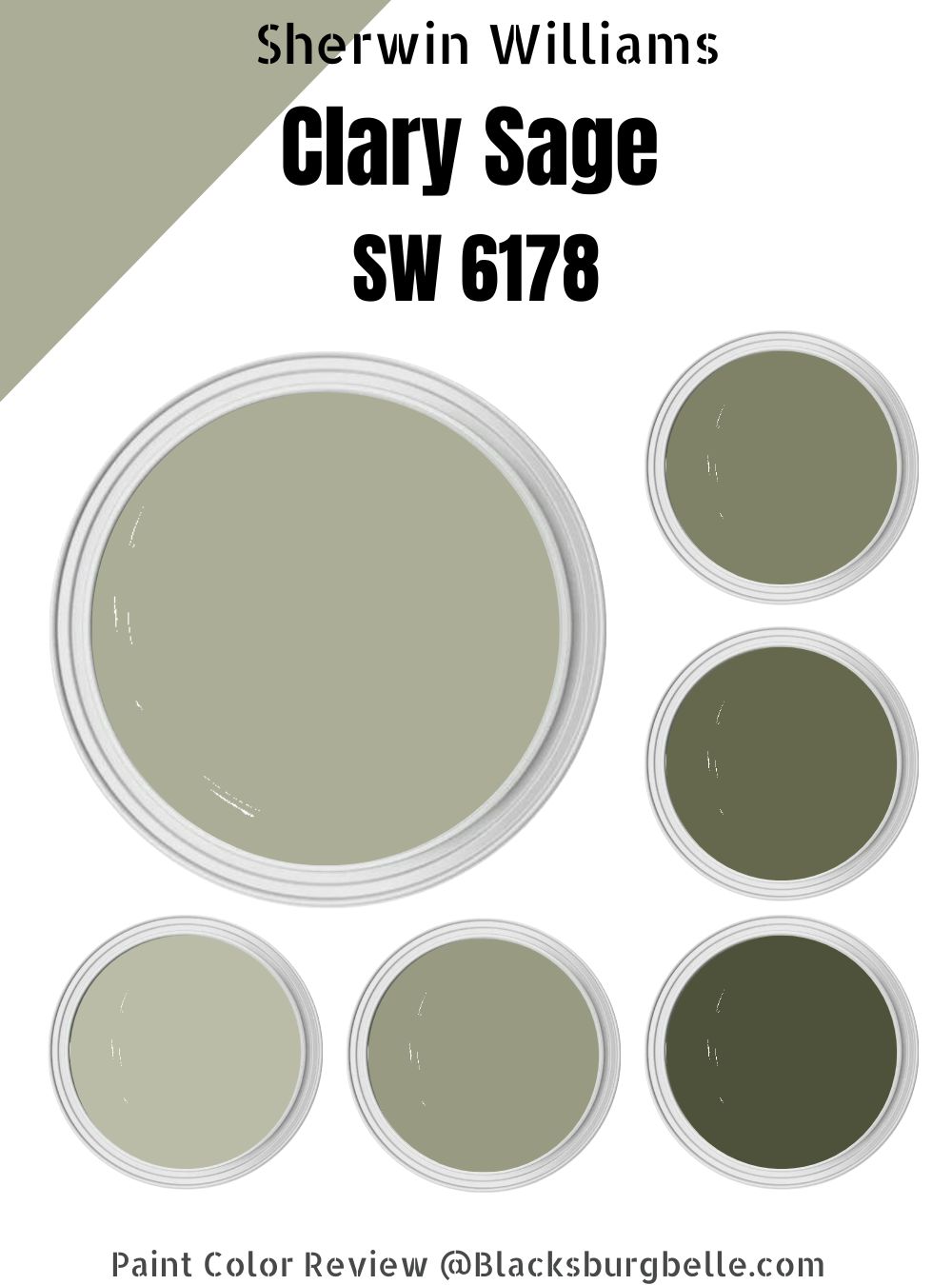
The Sherwin-Williams Clary Sage is a true sage green paint that is very mute and feels soft, calm, and chill. It has a rich depth that instantly adds personality, warmth, and peace to your space. You definitely want this calming, muted color on your list of favorite hues.
| Manufacturer | Sherwin Williams |
| LRV | 41 |
| RGB | 172, 173,151 |
| Hex Value | #acad97 |
| Color Collections | Independence |
RGB of Sherwin-Williams Clary Sage
Another important part of the paint color review is determining the RGB, which will, in turn, help you analyze any and every paint. Sherwin Williams Clary Sage RGB content is Red 172, Green 173, and Blue 151 with a HEX value of #acad97.
Light Reflective Value (LRV) Of Sherwin-Williams Clary Sage
The light reflective value of any color usually stands on a scale of 0-100, with the purest white being 100 and the truest black being 0. HoIver, when it comes to paint, I understand that no color is purely black or white; hence, I put it on a range of 3-93 to create a more realistic yardstick.
Clary Sage has an LRV of 41, which puts it in the category of an absorber rather than a reflector. The number may appear very dark to you, hoIver, you should know that truly dark colors have a LRV that lies betIen 3-10, which means that Clary Sage is a medium color.
Is It A Warm Or Cool Color?
Deciding if your paint color is warm or cool can help with accessorizing. Clary Sage is technically regarded as a warm color due to its great yellow undertones, but it can also blend into a neutral or cool tone.
Next to actual cool colors, Clary Sage will appear warm, which means you shouldn’t be too quick to match it with cool grays or tones. To make sense of it all, I’ll leave the Clary Sage right in the middle, just like it’s LRV.
Depending on the lighting and time, Clary Sage will appear warmer in a south-facing room and cooler in a north-facing room.
What Are The Undertones?
Sherwin-Williams Clary Sage has undertones of yellow and gray-green making it a warm choice for your space (if that’s what you desire). It may come in a muted olive color, but you cannot decipher this thanks to a reasonable amount of gray.
From when colors Ire first discovered, the smooth relationship betIen yellow and some shades of green has remained undeniable. This means you can throw in a yellow couch, centerpiece, or a beige couch in your living room, and it’ll fit like a glove.
Sherwin-Williams Clary Sage Color Strip
The color strip is an alien term to a layman, but I’ll explain it practically and as simply as I possibly can. This strip contains four color gradations which you get by adding white and black to the main hue.
For the Clary Sage strip, you’ll typically get sage green-gray tones, which I’ll help you discover through a special Sherwin-Williams code.
So, have Clary Sage with code SW 6178 to decipher lighter shades and go three figures loIr. I.e., SW 6175-SW 6177, and for darker tones, go three shades higher, i.e., SW 6179-SW 6181
Light Color Strip
| Color Code | Color Name | Location Number | Color Tones |
| SW 6176 | Liveable Green | 213-C1 |  |
| SW 6177 | Softened Green | 213 C-2 |  |
| SW 9128 | Green Onyx | 213 C-4 |  |
Dark Color Strip
| Color Code | Color Name | Location Number | Color Tones |
| SW 6179 | Artichoke | 213-C5 |  |
| SW 6180 | Oakmoss | 213-C6 |  |
| SW 6181 | Secret Garden | 213-C7 |  |
Sherwin Williams Liveable Green (SW 6176)
Liveable green is everyone’s favorite color for many reasons; one of them being that it is a neutral color that’s different from the typical beige or gray you see around. It goes perfectly with different wood stain colors and accents.
It’s a light green shade with subtle sage undertones; this is why it sits comfortably in a light strip with an LRV of 61.28 with an RGB of 207, 207, and 188. Pair it with white trims for even better and more artistic results.
Sherwin-Williams Softened Green (SW 6177)
Softened green is more a rich green than liveable green with hints of yellow and gray in the undertones. The more natural light you feed this paint, the more beauty it brings, which means it’s perfect for large spaces like your living room and dining room.
Colors that go with this shade include neutral whites, dark blue (yes, think of a large softened green dining table with dark blue chairs), light Yellow (careful not to use too much of this, so you don’t overwhelm your space), light gray, and taupe.
Sherwin-Williams Green Onyx (SW 9128)
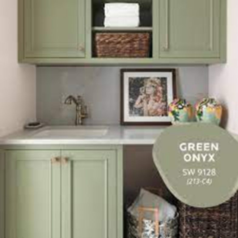
When you enter a room painted Green Onyx, it mentally feels like you’re walking through deeply shaded woods. This is a warm medium to deep-toned sage green with an LRV of 31, which is dark enough to create a fine contrast with lighter earthy tones and light enough to pair with dark hues of green, brown, and even black.
Sherwin-Williams Artichoke (SW 6179)
Sherwin Williams Artichoke is a great green color with brown undertones that lean towards the warm category, and when it leans toward blue, you get a cool, crisp tone. It’s a medium green paint with an LRV of 21 and an excellent indoor fireplace. Combine it with white and cream trims to get a fine finish.
Sherwin-Williams Oakmoss (SW 6180)
Oakmoss stands tall in the warm green category and is even regarded as the perfect warm olive green with an LRV of 15. Like Clary Sage, this color is great for your kitchen cabinets, bathrooms, and literally everywhere else in the house. It goes perfectly with warm tones like gold, warm beige, marigold, yellow and woody colors.
Sherwin-Williams Secret Garden (SW 6181)
The Secret Garden has an LRV of 8, putting it in the deep category. It’s a deep olive-toned green that works Ill with taupe, off-white, cream, warm brown, and light green tones. It’s excellent for kitchen areas by incorporating outdoor vibes into your homes. It’s a dark and serene color.
Sherwin-Williams Clary Sage Color Palette
Probably the most fun part of painting your space is creating color palettes; not only are they useful now, but you can also always keep them for later. So for clary sage, the first thing I urge you to do when curating a palette is to be realistic.
Go out, feel nature and use it as an inspiration moving forward.You’ll realize that the brown earth blends perfectly with any shade of green, so if this is the first thing that comes to mind, you’re on the right track.
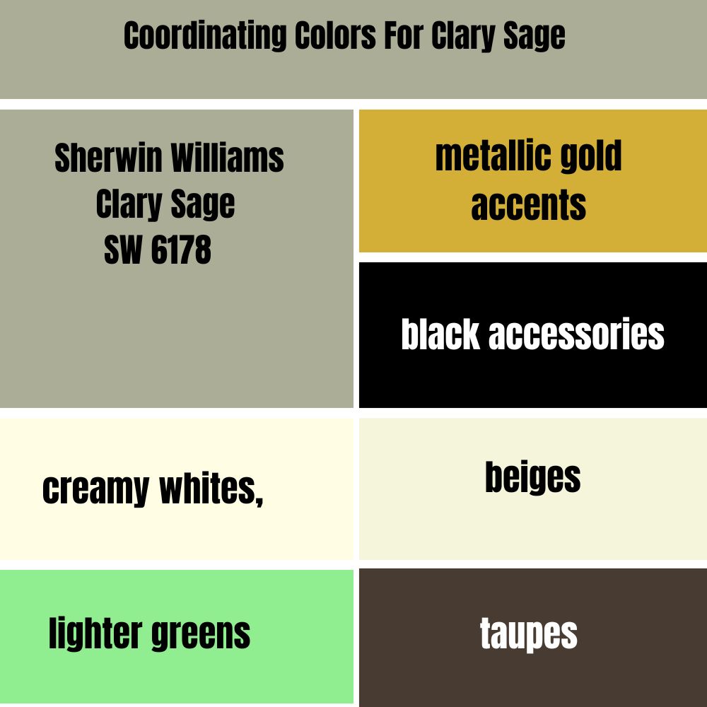
Coordinating Colors For Clary Sage
Before I proceed, I want to reiterate the importance of sampling your colors before making a final decision. HoIver, I’ll help with the bulk of the work by dividing the best marrying colors into two categories so they can appeal to both modern and traditional homeowners.
I suggest you pair your clary sage with taupes, metallic gold accents, black accessories, lighter and softer beiges, creamy whites, and lighter greens. These colors help your space look in place and appropriate.
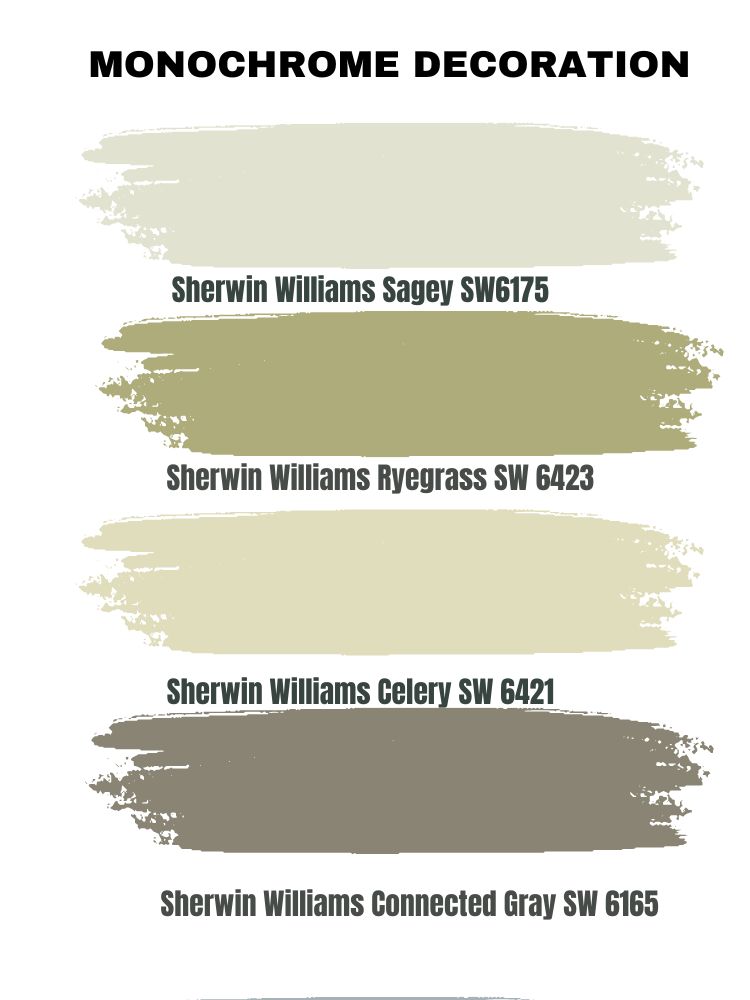
Monochrome Decoration
For your monochromatic palettes, I’ll recommend these four colors. Sagey SW6175, Ryegrass SW 6423, Celery SW 6421, Connected Gray SW 6165. Monochromes are now a thing, especially in modern houses and contemporary times, but it honestly boils down to your personal preference- it’s your space, do you!
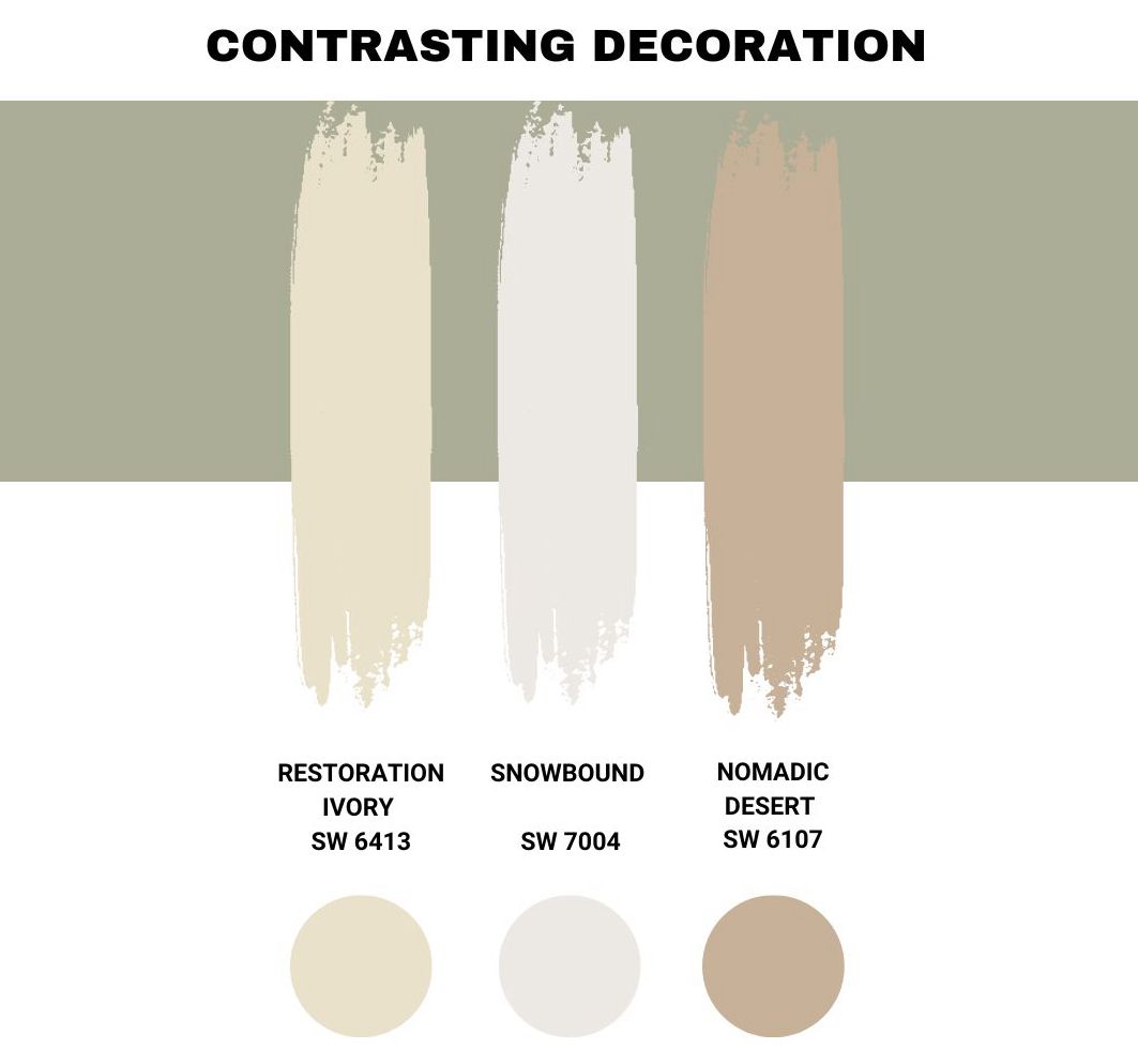
Contrasting Decoration
For a contrasting color palette, you should look into SW 6413 Restoration Ivory, SW 7004 Snowbound, and SW 6107 Nomadic desert.
Combine this with Clary Sage, and you get the most natural-looking shade in perfect unison with the most versatile neutral from the brand. It just makes all the sense.
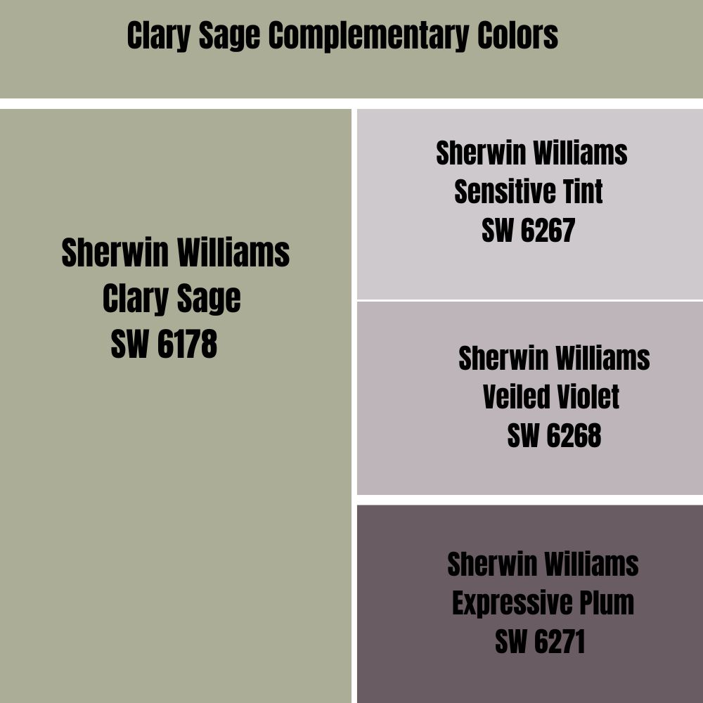
Clary Sage Complementary Colors
Finding the best complementary colors to execute your interior dreams properly is very important.
While I think a smoky purple would be the perfect complementary color for Clary Sage, it’s not as popular among household and interior designers. I recommend Sensitive Tint SW 6267, Veiled Violet SW 6268, Expressive Plum SW 6271
What Trim Colors Go With Sherwin-Williams Clary Sage
Trim colors can make or break your entire painting effort, and while most people treat it with levity, it’s one of the most important aspects of your painting- think the little cherry on top of the cake.
With that being said, I have compiled a few options that’ll make excellent trims for your Clary Sage space. SW Extra White or SW Pure white are great choices for any space.
Sherwin- Williams Clary Sage Color Comparisons
There are other ranges of colors that resemble Clary Sage closely, and just in case you don’t see the latter on sale. You can settle for one of the two I’m about to show you. They both go with white trims and will invite nature into your home.
Clary Sage Vs Evergreen Fog
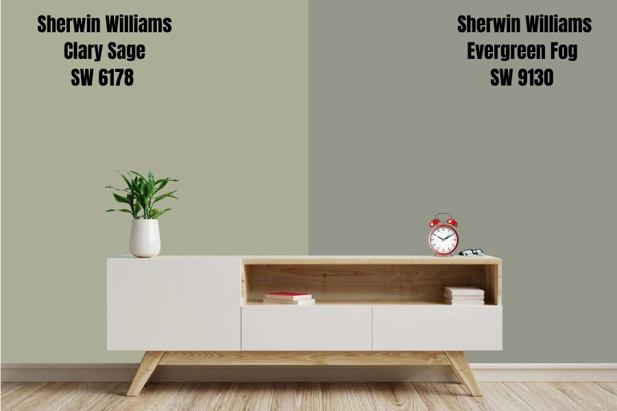
Evergreen fog is one of the most popular paints from the stables of Sherwin Williams in 2022, all thanks to the intensified awareness of the Ill-being of planet earth and the pandemic. This shade is at the top of my list for many reasons. It closely embraces the color of nature (a medium-toned gray-green paint) and resembles Sage Green.
The color is soothing for homeowners and designers who constantly create unique palettes and homes. It has gray undertones that you actually barely notice unless you’re so observant.
Evergreen fog can feel lighter when painted on actual walls and cabinets than your initial try with a swatch, so always keep an open mind with this one.
The LRV is 30, which places it in a dark- medium range, darker than sage green, and you can use it to add more depth to your space. It’ll create the illusion of a cozy space bringing the walls closer. I recommend this to owners of large spaces, and you won’t hear those reverberating echoes anymore.
The more light you feed this color, the more you enhance it, and the good part is no amount of lighting conditions will lighten its appearance other than the undertones. You’ll see more blues and grays in a north-facing room, while yellow and cream come to play in the south- or west-facing spaces.
Sherwin Williams Clary Sage Vs Svelte Sage
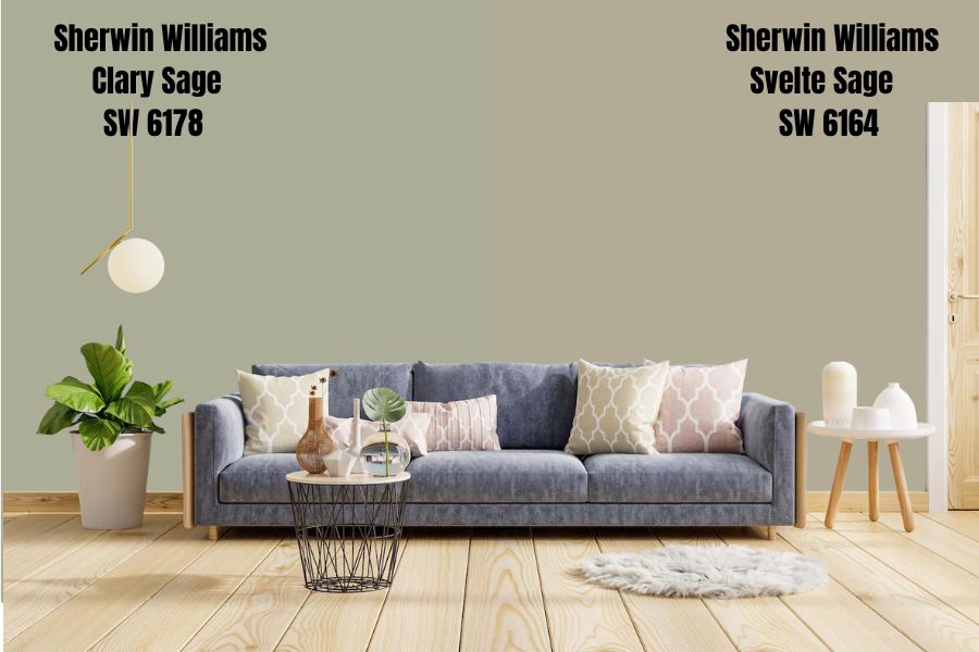
While this is one of the most random coincidences as regards the LRV issue, I’ll still try to make you see the difference in these shades. Svelte Sage has an LRV of 41, just like the former, but they draw the lines at undertones.
Svelte Sage is a yellow-brown hue, making it a perfect accessory for an oak floor or wooden floor house and excellent for areas where you need a neutral backdrop with a very gentle feel.
The complementary colors for Svelte sage include Clary Sage, Exclusive Plum, Mysterious Mauve, and Unique Gray.
How Does Light Affect The Clary Sage Paint Color
Lucky for you, natural light is Clary Sage’s best friend, and they bounce off each other beautifully (yes, this is your cue to open all the blinds in the room and let the lights in). The refreshing feeling you get when the natural light hits this color is unmatched due to its medium reflectivity value.
If enough light doesn’t enter the room, the room will feel dull, so if your room is not big, I advise not to paint the entire room in this shade; you can sprinkle it lightly on the wall and mix it with other colors.
In north-facing spaces, this color will help neutralize the incoming air with the warm texture of the paint. In the absence of natural light, you can add artificial light from chandeliers, light bulbs, wall sconces, and floor lamps.
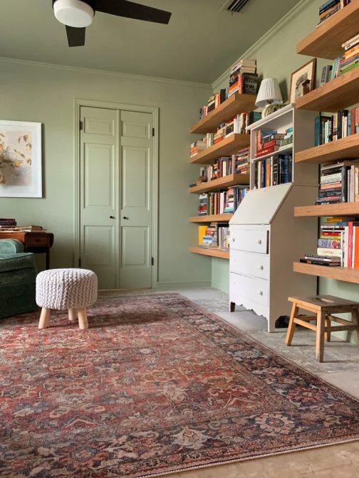
Best Rooms To Paint Clary Sage
Clary Sage looks catchy on any wall, and the best part is your lighting affects a slight change in the tone which means you’re getting two for the price of one (that’s what I like to think). Let’s check spaces where sage green can look its best.
The Bedroom
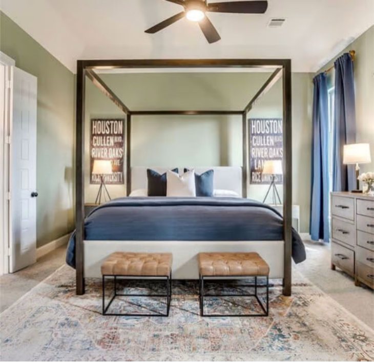
Perhaps you have a newborn or are setting up a nursery for your toddler; Clary Sage is an excellent color. Its resemblance to natural tones can help soothe your kids’ nerves and make them feel like they’re in a garden.
Pair it with faux plants, wooden toys, cribs, and white extra detailing; think of a big couch, white center rug, and beige curtains to make the most of this versatile color. You can incorporate burnt orange and light green details for an extra pop of color and serious contrast.
The Kitchen
Clary Sage is a big yes for kitchen cabinets and drawers. You want to cook in a serene atmosphere, and this color ensures that. This color’s light and airy tone brighten up your kitchen, bringing modern quality to the space.
Add creamy whites as the backdrop wall and white backsplash tile or Yellow with wooden textures for your shelves and furniture.
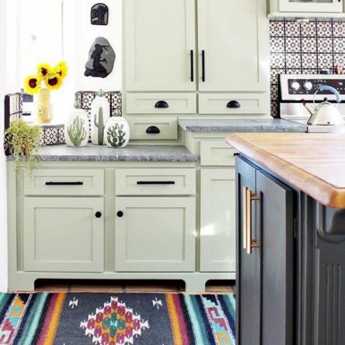
You can even get extra creative and paint your actual cabinets this shade, leaving your walls pure white or creamy white. Its hue, tones, and undertones allow it to sit perfectly, even in the most unusual setting.
If you do not feel like you need Clary Sage all over your kitchen walls, you can play safe by creating a Clary Sage island right in the middle of your kitchen. Combine it with wooden chairs, copper sinks, and black accents.
Golden handles on your drawers and shelves are the perfect highlight you need. Black details go effortlessly with this color and add a modern touch to your kitchen. Get those green plants in and watch your kitchen literally become a walk-in Kaleidoscope.
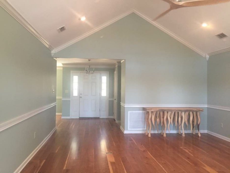
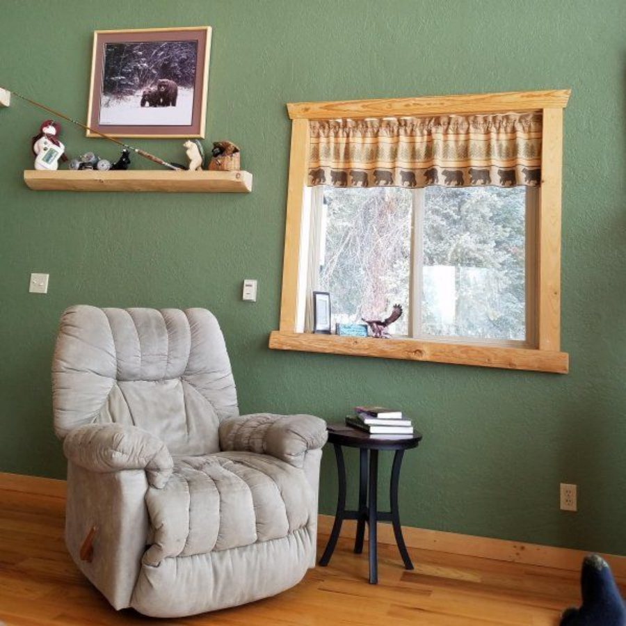
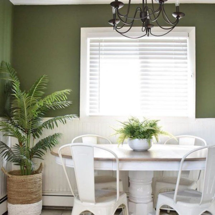
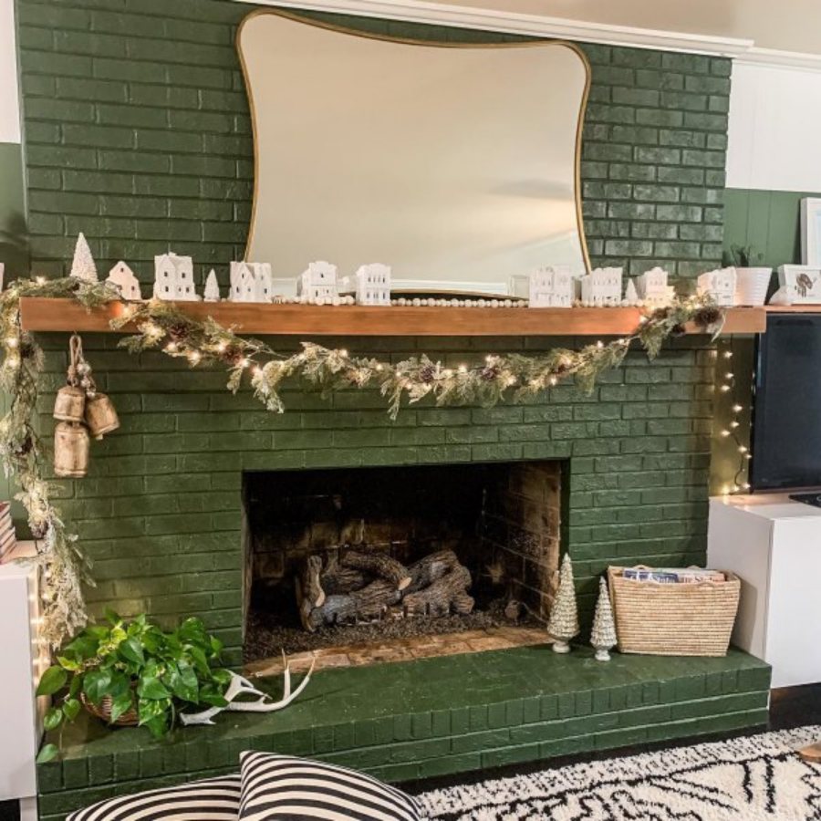
Living Rooms
While this is an unconventional choice for a living room among modern homeowners, it can be a great fit because I think it adds that retro vibe to your space, especially when you pair it with wooden details and brown interior pieces like your couch and pillows.
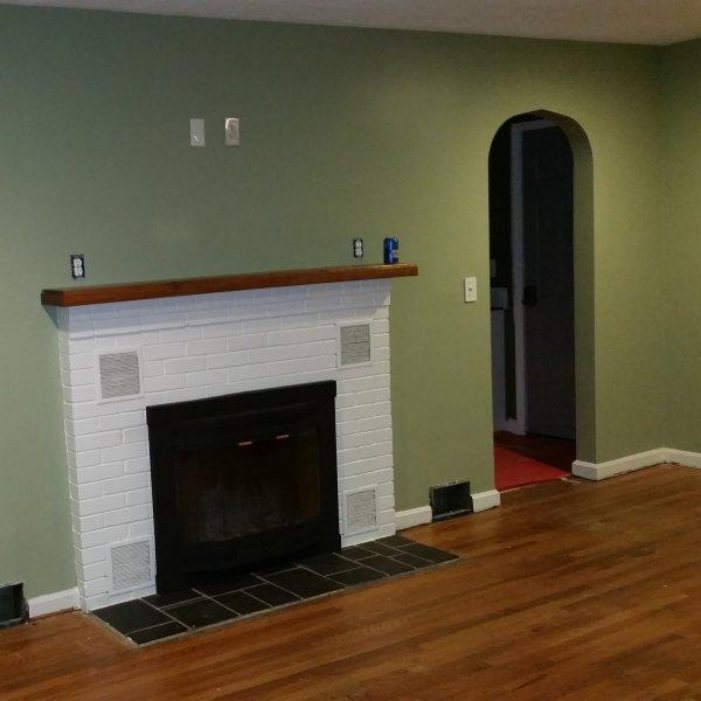
Opt for a creamy white for your pillars and trims. You can make your fireplace stand out with this mix. SW Alabaster is also an excellent choice for trims and moldings.
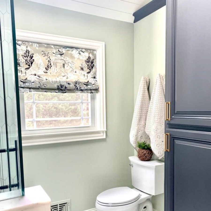
Clary Sage Bathrooms
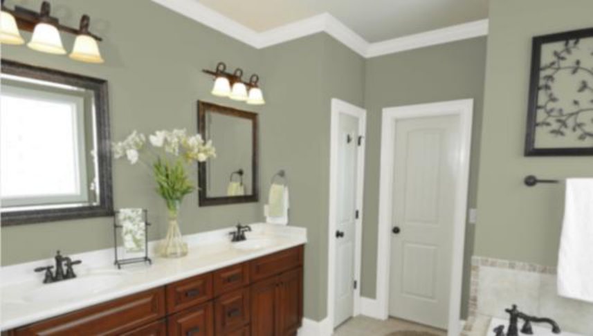
Oh yes, that special room you have your daily bath, and other stuff can also receive the immaculate touch of clary sage. In this era of trending bathroom selfies, you can throw in a few woody details like doors, mirrors, and vases to further lift the aesthetics of your bathing area.
The range of Clary Sage also allows it to exist beautifully in small spaces like this; you only have to invest in some sources of white lighting to explore the possibilities of this feel-good shade. (Throw in some floral wallpaper just because you can).
I have also seen some homeowners or interior decorators boldly paint their ceilings, Clary Sage, leaving the walls white and chipping in black accents. The options are limitless with this color.
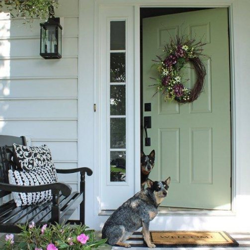
Clary Sage Exterior
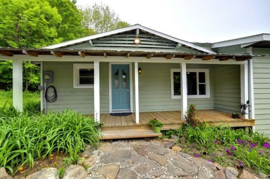
Want your home to look like something out of a Caribbean movie set in the 50s? or some music video props? Clary Sage is your preferred partner for achieving that. But one of the problems you may likely face with this shade is that it can get washed out by the sun.
Most homeowners also make the mistake of combining this paint with red bricks. I’ll prefer a darker-colored brick just for contrast’s sake. Honestly, the choice to use sage green for your exterior is based on preference.
You can still incorporate it into your exterior aesthetics by adding a pop to your front door with other white trims.
The choice of Clary Sage helps add some personality to your doorstep and gives your boring porch a major facelift. If your entire building is painted in Clary Sage, you can add a twist to your front doors by painting them in mustard yellow or bold red- the same goes for your window frames.
Sampling Clary Sage
Bid the days of spending unnecessary cash to purchase small cans of paint fareIll. With Samplize, you can get a stick on with your intended paint and try it on your walls to see how it’ll look. The best part about these stick-on is that you can remove them, which means you can move them around in different locations and under different lighting situations.
So is it outside or inside your house you want to use it? That’s your choice; I just help you make sampling an easy task.
Parting Words
Now that I’ve let you in on the secret that’s Clary Sage, it’s time to get to work and set up your space to look and feel like nature. As I stated earlier, you can switch things up by adding nature-themed props (whatever’s worth doing is worth doing Ill), go beige for that beachy feel and let all the lights in with this one.
 Sherwin Williams Iron Ore (Palette, Coordinating & Inspirations)
 Sherwin Williams Tradewind (Palette, Coordinating & Inspirations)
 Sherwin Williams Caviar (Palette, Coordinating & Inspirations)
 Sherwin-Williams Anonymous (Palette, Coordinating & Inspirations)
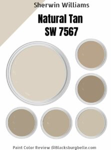 Sherwin Williams Natural Tan (Palette, Coordinating & Inspirations)
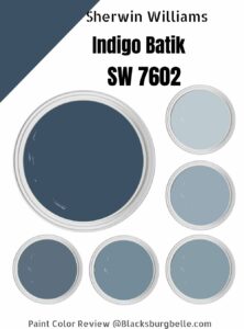 Sherwin Williams Indigo Batik (Palette, Coordinating & Inspirations)
