
While most of us love the blue paint color, very few people will prefer a blue that shouts too much. This leaves most new interior designers with one central question: Which blue paint color can I use to create a sophisticated look and add an air of classic charm to my room without dealing with a shouting shade?
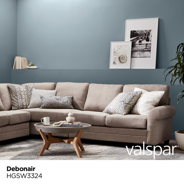
Well, consider trying Sherwin Williams Debonair. This paint color features a slate of gray that softens it, allowing you to enjoy a subtle hue that does not get too much in your face. Sherwin Williams Debonair has a calm relaxing look that creates a stand-out environment for letting go of stress and worries.
However, do not worry that you can’t use this paint color outdoors. Debonair handles both interior and exterior conditions. It is deep enough to maintain its character even in the brightest outdoor spaces.
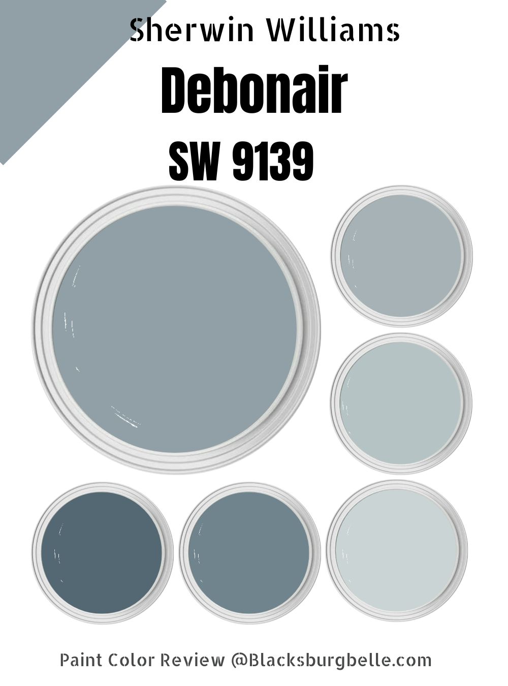
In this detailed guide, I will explain everything there is to know about Sherwin Williams Debonair SW 9139. From showing you the color’s LRV and RGB to offering you the best coordinating colors, you will learn how to create impressive interior designs with Debonair.
Let’s get started.
Table of Contents
What Color is Sherwin Williams Debonair?
| Manufacturer | Sherwin Williams |
| LRV | 34 |
| RGB | R: 144 G: 160 B: 166 |
| Hex Value | #90A0A6 |
| Color Collections | ottery Barn Teen (Fall/Winter) |
Sherwin Williams Debonair is a blue color at heart. However, the blue color is not so in your face that it stings your eyes. The paint color has a gray shade that balances the blue tone, keeping it in check.
RGB of Sherwin Williams Debonair
The RGB scale runs from 0 to 255. It is a unique scale that interior designers use to determine the amount of red, green, and blue in a specific paint color. Sherwin Williams Debonair combines red: 144, green: 160, and blue: 166. As you would expect with a blue paint color, the blue shade leads on the RGB scale.
LRV of Sherwin Williams Debonair
LRV stands for Light Reflectivity Value. It is a scale running from 0 to 100. At 0, you will have pure black, which absorbs all the light and reflects 0 percent light. At 100, you will have pure white, absorbing 0% light and reflecting 100% light.
It is, however, worth noting that the paint industry has not managed to create pure white and pure black. Therefore, the color that absorbs the most light has an LRV of 3; the color that reflects the most color has an LRV of 93.
Sherwin Williams Debonair is more of a dark paint color. Debonair SW 9139 boasts an LRV of 34—it absorbs 66% of light and reflects the remaining 34%.
Is Sherwin Williams Debonair a Warm or Cool Color?
Sherwin Williams Debonair is a cool paint color. At heart, Debonair is a blue paint color—blue is one of the coolest shades. The gray slate that balances the blue in Debonair falls in the neutral category, with its coolness or warmth depending on the undertones and primary tones. For this reason, Debonair maintains a cool appeal despite having a gray shade.
Sherwin Williams Debonair Undertones
Sherwin Williams Debonair has one primary undertone visible in most lighting conditions—the gray undertone. However, the paint color also features a green undertone. The green undertone, however, only shows up in very few lighting conditions.
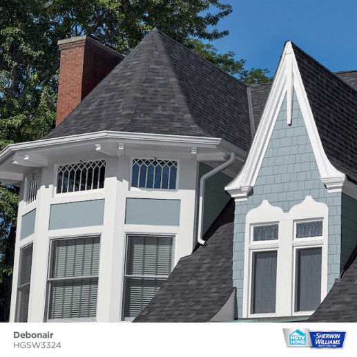
Sherwin Williams Debonair Color Strip: Sherwin Williams Debonair Color Comparisons
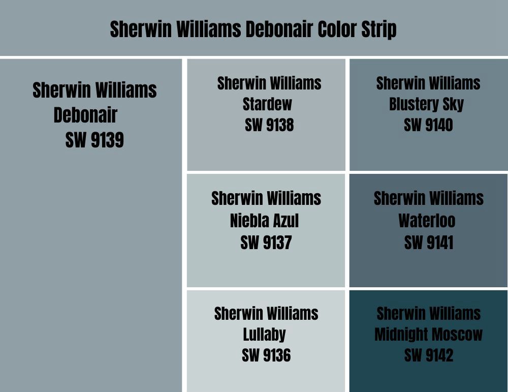
Sherwin Williams Debonair vs. Stardew (SW 9138)
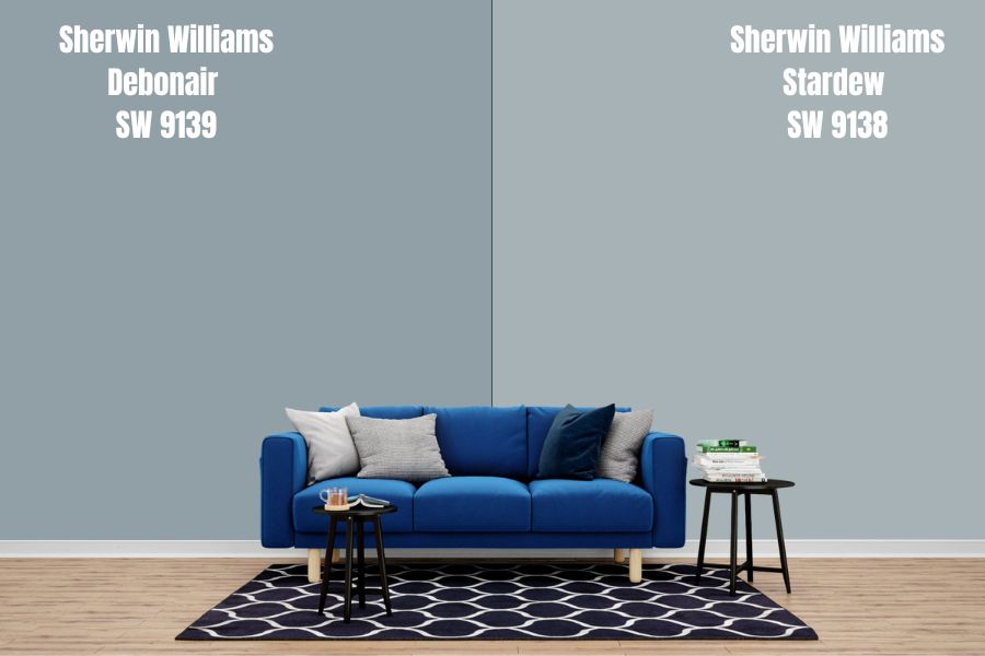
Sherwin Williams Stardew and Debonair share the same tones. The two colors have blue as the main shade and gray and green as undertones. The main difference between the two is that Sherwin Williams Debonair is slightly darker than Stardew.
While Debonair boasts an LRV of 34, the lighter Stardew reflects 9% more light with its LRV of 43. These two colors, however, will only display their whole personality in rooms with enough light. Putting the two in a room with little light will create a situation where they lose their hues and become dull.
Sherwin Williams Stardew is a cool paint color like Sherwin Williams Debonair. However, the Debonair is a cooler option as it carries more blue shade than Stardew. The two colors, however, can balance the warmth in a south-facing room. In a north-facing room, the two can make the room feel icy.
Sherwin Williams Debonair vs. Niebla Azul (SW 9137)
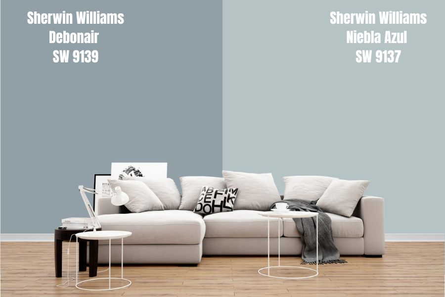
Sherwin Williams Niebla Azul is a shade of blue that brings a cheerful calm into your room. The paint color, like Debonair, has blue as its primary shade. Niebla Azul also has a slate of gray that balances the blue in it, keeping it from shouting.
As you would expect, with two blue colors, Niebla Azul and Debonair are both cool paint colors. However, you can expect Debonair to be cooler than Niebla Azul. The two paint colors work well in a south-facing room where the warm southern light balances their cool natures, keeping them from making the room icy.
Niebla Azul is much lighter than Sherwin Williams Debonair. While Debonair reflects 34% of light, Niebla Azul reflects 53%. Niebla Azul is a medium-light color that could work well in a slightly dim room. These two colors, however, will always work better in a room with enough light.
Sherwin Williams Debonair vs. Lullaby (SW 9136)
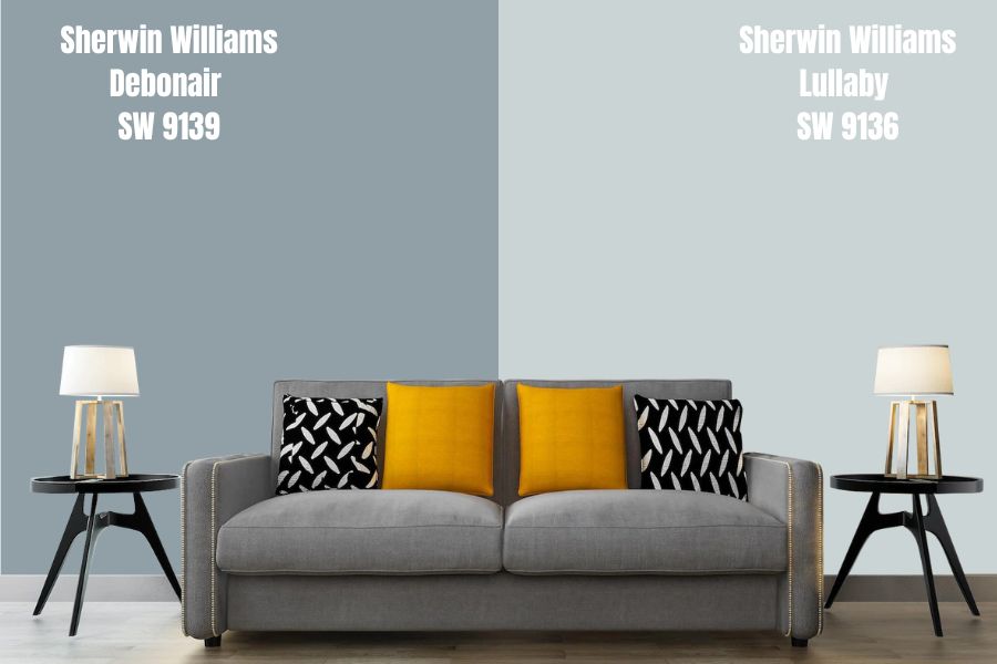
As its name suggests, Sherwin Williams Lullaby is a perfect paint color for a bedroom. Like Sherwin Williams Debonair, Lullaby creates a relaxing and peaceful environment that lets you slide into sweet dreams quickly.
However, do not assume that Sherwin Williams Lullaby is good for only adding tranquility to your bedroom. The paint color also works in other rooms, just like Debonair does.
Lullaby boasts a much higher reflective ability—it has an LRV of 65, reflecting nearly twice the light reflected by Debonair. The paint color is light enough to create interest in a room with dim lights. Debonair, on the other hand, works well in rooms when the light is enough—it looks bland when the lights are too low.
Sherwin Williams Debonair vs. Blustery Sky (SW 9140)
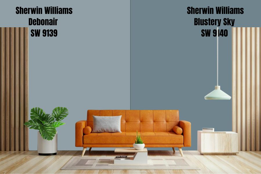
Unlike Debonair, a blue paint color with a gray slate, Blustery Sky is more stormy, boasting blue-gray undertones. Blustery Sky and Debonair are two very similar colors in how they make rooms feel—they are perfect for adding a chill tone to gathering rooms and bedrooms.
Sherwin Williams Blustery Sky and Debonair are on the LRV scale’s darker end. However, Blustery Sky is slightly darker, boasting an LRV of 22 and reflecting 12% less light than Debonair. Regardless, these two colors will work well in a room with bright light. Otherwise, the two paint colors will often look bland in dim rooms.
Like Debonair, Blustery Sky is also a cool paint color. These colors will work well in a room with enough warmth—one welcoming warm southern light. However, you can always keep the colors from making your north-facing rooms icy by pairing them with a warm color.
Sherwin Williams Debonair vs. Waterloo (SW 9141)
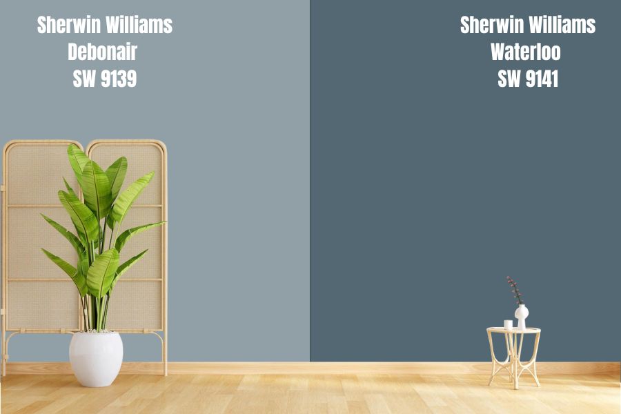
Sherwin Williams Waterloo is a paint color that mimics the deep oceans. Like Sherwin Williams Debonair, Waterloo is a mesmerizing and enchanting paint color that boasts blue as the primary shade. Like in Debonair, Waterloo’s gray undertone keeps the blue from shouting.
Sherwin Williams Waterloo is on the darker end of the LRV scale. Waterloo has an LRV of 13, reflecting 21% less light than Debonair. Waterloo, like Debonair, is a color that depends on the light in the room to display its full character. Sherwin Williams Waterloo will look dull and bland in a dimly lit room.
Waterloo is a bold, aquatic color that adds depth and character to the walls. However, like Sherwin Williams Debonair, Waterloo is a cool color. Therefore, these two colors will work well when used in a room with enough warmth. Otherwise, you must pair them with a warm color to balance their coolness and keep them from making your room icy.
Sherwin Williams Debonair vs. Midnight Moscow (SW 9142)
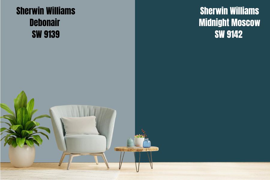
Midnight Moscow is the last paint color on the Sherwin-Williams Debonair color strip. Sherwin Williams Midnight Moscow is an exciting paint color in its own right.
Midnight Moscow is a dark-toned blue paint color boasting the same undertones as Debonair—green and gray undertones. It is symbolic of beckoning intensity, elegance, and sophistication.
While Midnight Moscow does grab the attention of anyone looking at it, it is worth noting that the paint color has an LRV of 5. Therefore, for it to catch attention, it needs to be in a well-lit room, just like Debonair—otherwise, Midnight Moscow will lose its hue in dim light, becoming bland.
Midnight Moscow and Debonair are both cool colors. They work well in a room with warmth. However, you can get them to play nice in a cold room by adding a warm color to balance their coolness.
Sherwin Williams Debonair Palette
Sherwin Williams Debonair Coordinating Colors
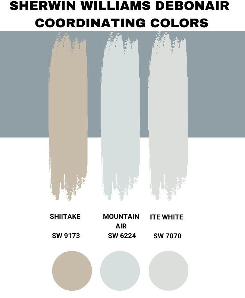
Blue-gray colors are always an excellent interior design option because when you pair them with brighter colors, they often act as neutrals. On the other hand, the paint colors still hold their own when you pair them with white, black, and even wood tones. Below, I will show you some coordinating paint colors you can use when working with Sherwin Williams Debonair.
Sherwin Williams Shiitake (SW 9173)
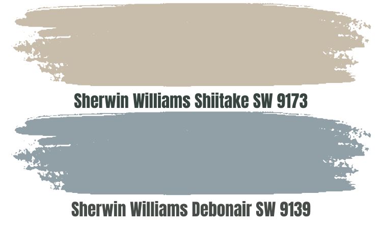
If you are going after a contrasting look that is not too obvious, you may want to take advantage of Sherwin Williams Shiitake. The paint color does not just look different from Debonair; it is also a warm paint color that will allow you to balance the coolness in Debonair.
At heart, Shiitake is a gray paint color. This makes it a perfect match to the gray shade in Sherwin Williams Debonair. The difference comes in when you bring in the yellow undertone in Shiitake—this gives Shiitake a creamy appearance.
However, that is not all with Shiitake—the paint color evokes a sense of comfort in your space. When paired with Debonair, it will add a sense of elegance. Combining Shiitake and Debonair means keeping your south-facing room from becoming too cold or icy.
Sherwin Williams Mountain Air (SW 6224)
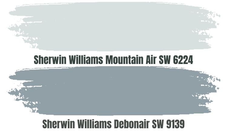
At first glance, Sherwin Williams Mountain Air resembles a deep, minty blue paint color. However, in reality, this is a white, pastel color. It is a cool, comforting, soothing, and crisp white color that works exceptionally well next to Sherwin Williams Debonair.
While Debonair makes rooms seem smaller than they are in real life, Mountain Air is the opposite. Mountain Air makes the room feel extra spacious and airy, countering Debonair’s effect.
In addition to adding a relaxing vibe to any room, Mountain Air can make Debonair interesting in dim rooms. Mountain Air absorbs just 27% of light and reflects the rest onto Debonair, giving Debonair the attention it needs and keeping it from becoming bland.
It is, however, worth noting that Sherwin Williams Mountain Air leans on the cool side. Therefore, it will not help you balance Debonair’s coolness; instead, it will add to it. Therefore, a combination of Debonair and Mountain Air will work in a warm room—for example, a south-facing room.
Sherwin Williams Site White (SW 7070)
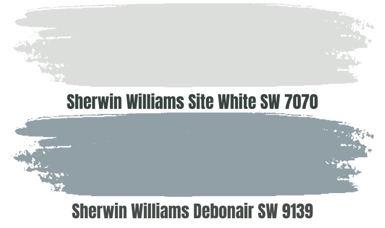
Site White is a cool white paint color that boasts a blue undertone. The paint color also does come with a gray undertone—the blue-gray undertones are more balanced, with none showing up more often than the other.
When you pair Site White with Sherwin Williams Debonair, you will add a sense of calm to your space. Moreover, Site White brings brightness into the room. Sherwin Williams Site White has an LRV of 73—all 73% of the light it reflects ends up on Debonair, allowing the paint color to display its character in slightly dim lighting conditions.
When combining Site White and Debonair, remember that you bring two cool paint colors together. For this reason, putting them in a cool, north-facing room may not be the best idea. It would be better to use the two in a room with enough warmth, say, a south-facing room. Otherwise, a cold, north-facing room may become icy when you add Debonair and Site White.
Sherwin Williams Debonair Complementary Color
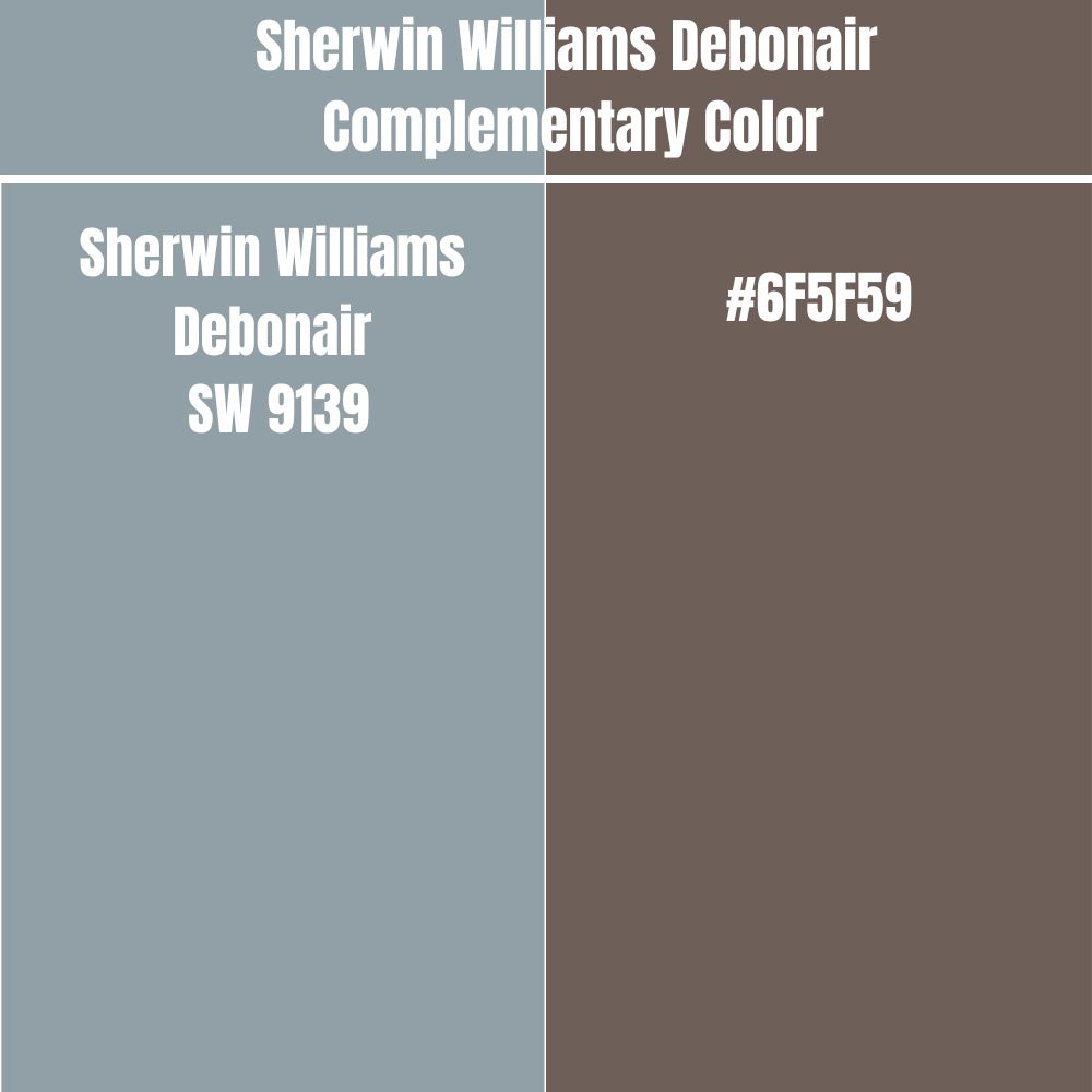
You may want to create a look championing two completely opposite paint colors when creating your interior design plan. In this case, you may want to pair Sherwin Williams Debonair with its complementary paint color.
Sherwin Williams Debonair will sit opposite its complementary color on the color wheel. The two will display the most significant difference if you paint the complementary color next to Debonair.
Sherwin Williams Debonair’s complementary color has a hex value of #6F5F59. This hex value identifies a paint color that is primarily made of red. However, currently, there is no official paint color name for #6F5F59.
What Colors Go with Sherwin Williams Debonair on Trims?
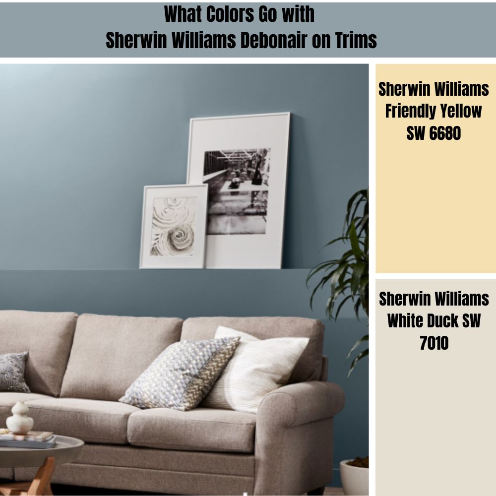
When trimming your Sherwin Williams Debonair, I always prefer warm colors. After all, Sherwin Williams Debonair is a cool color that needs a warm color to add a balancing effect. Below are some of my popular trimming colors when working with Sherwin Williams Debonair.
Sherwin Williams Friendly Yellow (SW 6680)
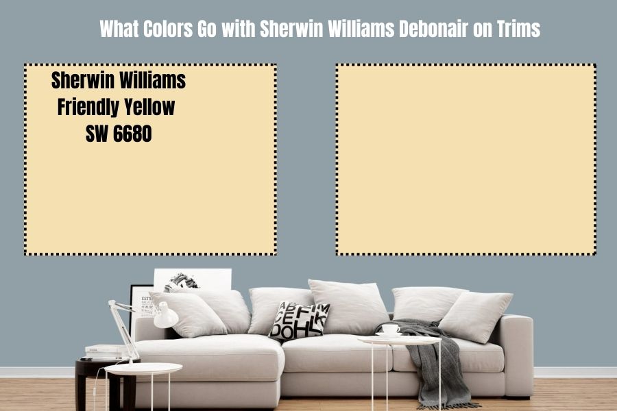
Yellow is one of the warmest paint colors. Well, in the case of Friendly Yellow, you get more than just warmth. Friendly Yellow also brings friendliness and happiness into your room. It also adds the utmost energy, delight, and charm to your space.
Sherwin Williams Friendly Yellow will transform your space magically, giving you a more sophisticated and calm feel. When you have Friendly Yellow on your trims, you won’t have to worry about low light—the paint color reflects 76% of the light. The color will redirect enough light onto Debonair, allowing it to display its full character.
Sherwin Williams White Duck (SW 7010)
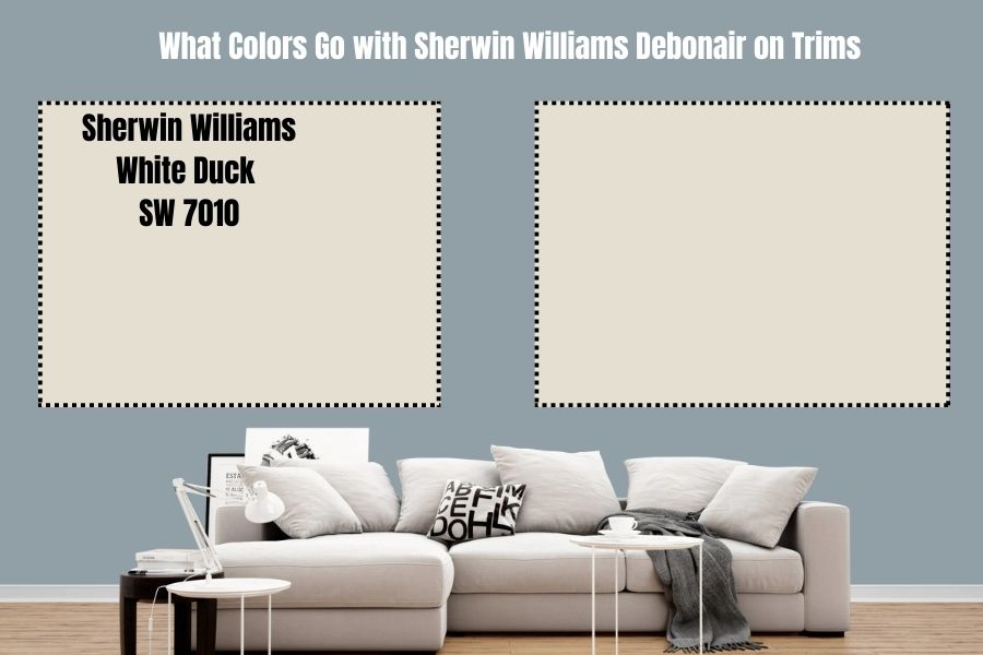
Sherwin Williams White Duck is my favorite color when I need neutral off-whites. White duck is a warm neutral paint color that is more of a hybrid of greige and cream. The paint color leans more into the greige side (a combination of beige and gray) while holding onto the cream base.
Sherwin Williams White Duck will add warmth to your north-facing space, reducing the cold in the room. However, you have to note White Duck is not warm enough, and the cold in northern light may overwhelm it, forcing it to return to its neutral base.
However, one thing that makes the paint color stand out is its high LRV. The paint color boasts an LRV of 74. The high LRV makes it a perfect option as it does reflect enough light onto Debonair, keeping it from becoming bland in dim rooms.
What Is Sherwin Williams Debonair in Benjamin Moore?
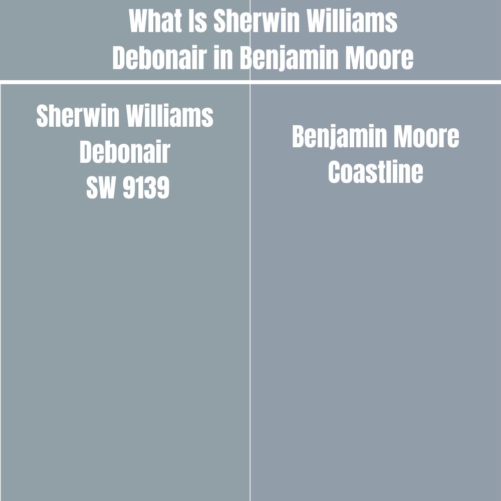
If you plan to use the Benjamin Moore brand to achieve the same look provided by Sherwin Williams Debonair, you should know that this is entirely doable. The color that matches Sherwin Williams Debonair is Benjamin Moore Coastline.
Benjamin More Coastline boasts a combination of red: 145, green: 157, and blue: 168 on the RGB scale. This is close to the RGB combination for Sherwin Williams Debonair—red: 144, green: 160, and blue: 166.
The dusty medium blue from Benjamin Moore also boasts a gray undertone, just like Debonair. Moreover, Debonair and Coastline have an almost similar LRV—while Debonair reflects 34% of light, Coastline reflects 33.93% of light.
How Does Light Affect Sherwin Williams Debonair?
Sherwin Williams Debonair is a cool color. Therefore, the color looks even cooler in a room welcoming cool light. In north-facing rooms, for example, the paint color can look extra cold, bordering on the side of iciness in some cases.
In a room welcoming warm southern light, Debonair looks more balanced. The warmth in a south-facing room balances Debonair, keeping it from overwhelming the space with its cool character.
It is also worth noting that Sherwin Williams Debonair does feature a low LRV. With an LRV of 34, the paint color requires enough light to display its full character. The color may lose its personality and appear bland in a room with minimal light.
Best Rooms to Paint Sherwin Williams Debonair
Sherwin Williams Debonair is one of the most versatile paint colors. As long as the room has enough light, Sherwin Williams Debonair will work in it. Moreover, the paint color is deep enough to hold its ground in rooms with extreme light—so the paint color can work on the exterior walls. Below are authentic life images of Sherwin Williams Debonair in action:
Sherwin Williams Debonair Kitchen
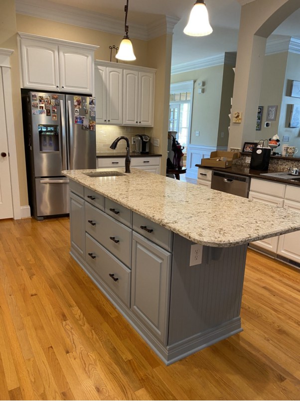
Sherwin Williams Debonair makes the island stand out in the above kitchen. It is perfectly paired with a brownish top and has contrasting black handles on the cabinets.
While this kitchen has Sherwin Williams Debonair cabinets, it has a creamy color on the walls that balances the coolness created by Debonair. The white Cabinets and the wooden floor finish the look impressively.
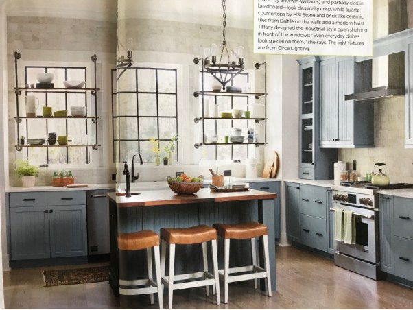
This picture is another excellent example of Sherwin Williams Debonair cabinets. The paint color pairs nicely with the off-white on the walls. The light coming through the kitchen windows seems warm. For this reason, the light and the warm, slightly creamy off-white on the walls balance the coolness in Debonair.
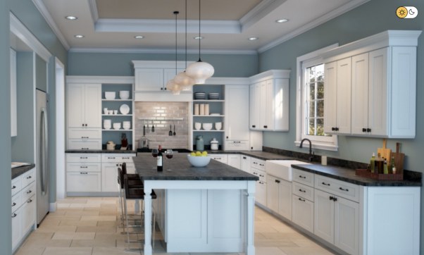
The above picture is another excellent example of Sherwin Williams Debonair kitchen. In this case, Debonair sits on the walls. The paint color pairs nicely with the white, creating an environment anyone would enjoy.
Sherwin Williams Debonair Exterior
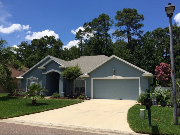
Debonair is a deep paint color, making it excellent for the great outdoors. The above house is a great example of the look created by Debonair on the exterior walls. The paint color stands out well, with the Sherwin Williams Pure White on the trims creating additional interest.
This is another exciting example of how Sherwin Williams Debonair creates an impressive look on the exterior walls. In the above walls, Sherwin Williams Debonair has access to enough light to display its personality and character. What’s more impressive is that the paint color does not lose its hue despite the bright light. The white trims make the entire design stand out.
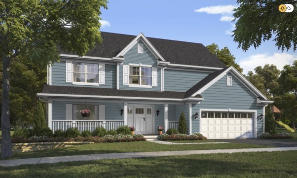
The above exterior walls feature an impressive view created by combining Sherwin Williams Debonair and white paint on the trims. The roof features a charcoal color. The combination comes together to create a picture that attracts attention in a very positive way.
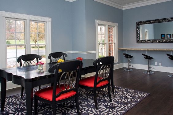
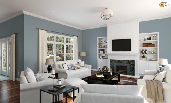
Sherwin Williams Debonair Living Room
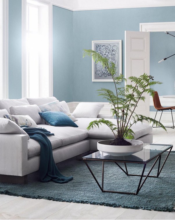
The above image depicts a living room with a combination of Debonair on the walls, light gray on the couch, and white on the trims. The space welcomes enough light, allowing Sherwin Williams Debonair to display its full character. The combination of these colors creates a serene feeling in the living room.
This is another excellent way of pairing Sherwin Williams Debonair with light gray to create an impressive living room. The above living room looks calm and relaxing. It has a brown-gray color adding life and balancing the coolness created by Debonair.
The light coming through the window seems to be natural southern light. The warmth in the southern light balances the coolness in Debonair, creating a welcoming vibe in the room. The white colors in the room pair well with Debonair to finish the impressive look.
Sherwin Williams Debonair Bedroom
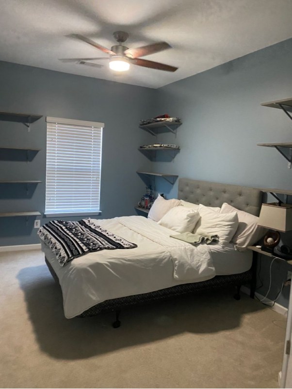
Sherwin Williams Debonair performs exceptionally well in bedrooms. The above bedroom is a perfect example. Debonair is paired nicely with the off-white colors on the bedroom and the ceiling, creating a relaxing vibe that sends you to sleep, allowing you to enjoy a restful night.
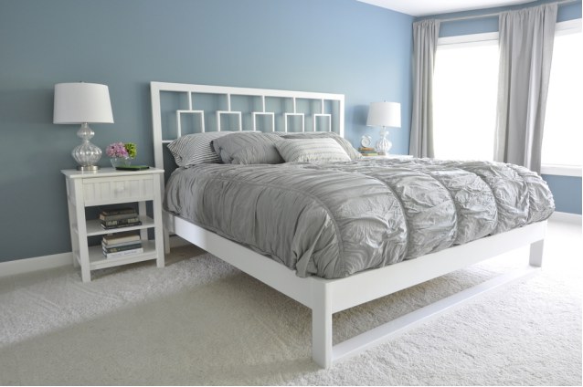
The above bedroom has a nice amount of light to showcase how Sherwin Williams Debonair looks in the daytime in a bedroom. It is paired nicely with white and gray colors. The entire look comes together to create a relaxing vibe.
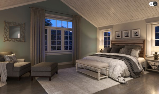
Since I have not shown you how debonair behaves at night, the above bedroom is a perfect example. In this bedroom, debonair still maintains most of its character—this, however, is due to having access to enough artificial light. The room, regardless, looks excellent with the pairing of the gray-blue Debonair with the gray chairs and the off-white colors.
Overview
Sherwin Williams Debonair is an exciting paint color that combines blue and gray in almost equal proportions. Hidden under blue and gray is a green shade that does not always come into view.
Sherwin Williams Debonair is a dark paint color. However, it is not too dark that it automatically becomes black in dim light. However, to keep this color interesting, you will want to use it in a room with enough light.
Sherwin Williams Debonair pairs nicely with different colors to create an impressive look. However, in my experience, I see it working better with whites, off-whites, and gray colors. But you can always experiment more to determine what works for your space.
I hope I have answered all your questions about Sherwin Williams Debonair. Please let me know in the comments if you have any additional questions.
 Sherwin Williams North Star (Palette, Coordinating & Inspirations)
 Sherwin Williams Cascades (Palette, Coordinating & Inspirations)
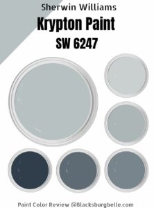 Sherwin-Williams Krypton (Palette, Coordinating & Inspirations)
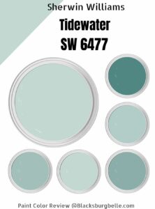 Sherwin-Williams Tidewater (Palette, Coordinating & Inspirations)
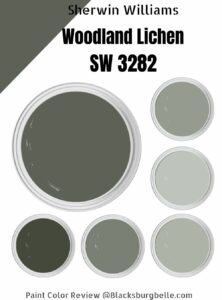 Sherwin Williams Woodland Lichen (Palette, Coordinating & Inspirations)
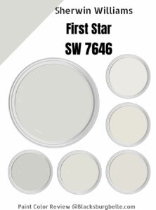 Sherwin Williams First Star ((Palette, Coordinating & Inspirations)
