
 Are you moving into a new house or thinking about revamping your space and don’t know if the Sherwin Williams Dorian Gray will do justice to your walls? If this sounds like you then you are in luck. In this review, you’ll explore with us the endless possibilities the Dorian Gray paint color from the Sherwin Williams collection provides.
We’ll showcase different spaces where they’ve been used, colors to pair the Dorian Gray with and also see how it compares to several paint colors out there.
Table of Contents
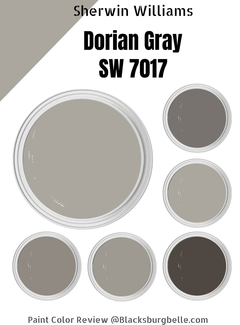
What Color Is Sherwin Williams Dorian Gray
| Manufacturer | Sherwin Williams |
| LRV | 39 |
| RGB | 172, 167, 158 |
| Hex Code | #aca79e |
| Color Collections | Senior Living Cool Foundations, Acute Care Cool Foundations, Living Well-Renew, Top 50 Colors |
The gray color is generally considered neutral, however, it comes in different shades which are formulated differently. With the Sherwin Williams Dorian Gray paint, you get a neutral color that seeks to offer any and every room bold, warm feel.
This color has the ability to make a small space feel more intimate and personal. In larger rooms, you get a full display of its depth, chameleonic undertone, and the strength it possesses that delivers serenity and normalcy to any setting instantly.
Without a doubt, when you choose the Dorian Gray paint on walls, ceiling or trims on pillars, you’ll surely experience that intense coziness you crave.
RGB of Sherwin Williams Dorian Gray
A basic fact about every hue you ever created is that they all come from a perfect blend of primary colors Red, Green, and Blue, which brings me to analyzing the importance of RGB in any color I decide to review.
The RGB of Sherwin Williams Dorian Gray is Red- 172, Green- 167, and Blue-158.
Another essential feature in any paint history is the HEX-code which describes how graphics designers represent color. This is usually a six-digit code and some form of shortened reference to RGB actual color values. The HEX code of Sherwin Williams Dorian Gray is #aca79e.
LRV of Sherwin Williams Dorian Gray
Don’t know what the LRV of a paint means? Well not to worry. The LRV of a paint refers to the amount of light a paint can absorb and how light or dark your anchor paint is when placed on a scale of 0-100 (for LRV, the preferred scale is 3-97, as there’s no true black or white.)
This means, the higher the LRV number is, the lighter the color and the lower the LRV number is, the darker the color. This variation in LRV significantly affects the appearance of your anchor color in a space depending on how much natural or artificial light it gets.
The less light you have in a space, the less light will be available for your anchor color to bounce off, so even if you opt for a light color with a high LRV, if there’s no light source for it to reflect, it won’t happen.
With the light reflective value of Sherwin Williams Dorian gray sitting at the 39th position, this means it belongs in the medium-toned category. Despite this depth, it still appear as a soft gray.
Is it a Warm or a Cool Color
Sherwin Williams Dorian Gray is a warm color with zero traces of cool undertones, all thanks to the heavy brown undertones that bring out the warmness in any space. No wonder, this color is referred to as “greige” (brown + Gray).
Hence, you can be assured that this color will deliver the job perfectly if you want to create a warm feeling in your space.
What Are The Undertones
Once you unravel the secret behind undertones in paints, your interior design game will see a total transformation. These undertones are strictly perspective based, meaning two people may see completely different colors simultaneously, which is perfectly okay.
As expected, gray never comes as just gray;There are a handful of undertones to think of when picking a gray anchor paint. On its own, this paint color possesses traces of purple undertones, and when you examine it closer, you may also notice hints of brown.
However, it still remains a true gray, which may sometimes make the undertones less obvious. Under certain light situations, the color may also give off subtle green undertones.
Sherwin Williams Dorian Gray Color Strip
To arrive at a definite color strip for Sherwin Williams Dorian Gray, you must measure equal amounts of black and white to your anchor color. Always remember that all colors vary in intensity regardless of the similarities they possess on the color strip.
There are two known kinds of color strips for painters and interior decorators—the light and dark color strips. The former is brought to life by moving two to three shades up from your primary color, and to arrive at the latter, all you need to do is go two to three shades lower.
Light Color Strip
| Name | Color Code | Location Number | Tone |
| Sherwin Williams Repose Gray | SW 7015 |
244-C1 |
 |
| Sherwin Williams Mindful Gray | SW 7016 | 244-C2 |  |
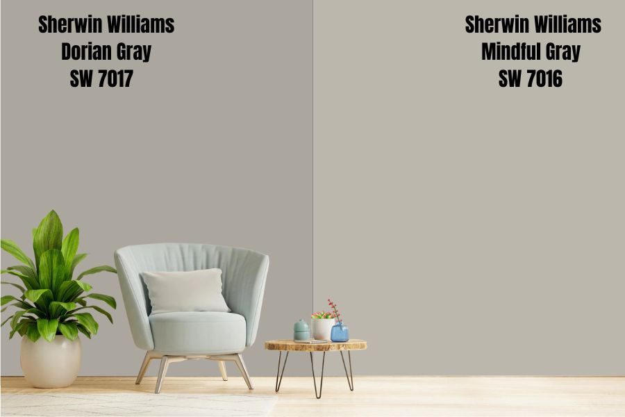
Sherwin Williams Repose Gray
The Repose Gray is Sherwin Williams’ most popular color, and why wouldn’t it be? It is one of the few paint colors that pairs perfectly with different other hues. In addition to this, it comes with an LRV of 58, which means it’s a more reflective tone than the average mid-range paint color.
Furthermore, this paint color features purple undertones that you can see at a glance, not to mention that the green and blue hints have the ability to shine through in particular light situations. In bright spaces, homeowners have attested to the shade bearing a striking resemblance to blue.
There’re also winks of browns in its undertone, hence the GREIGE nickname for this color.
Sherwin Williams Mindful Gray
Sherwin William Mindful Gray sits next to Dorian Gray on the color strip, but do not make the mistake of thinking there will be any other similarity between them. d. The Mindful Gray has lovely blue undertones that put it in the cool category.
Dark Color Strip
| Name | Color Code | Location Number |
Tone |
| Sherwin Williams Acier | SW 9170 | 244-C4 |  |
| Sherwin Williams Dovetail | SW 7018 | 244-C5 |  |
| Sherwin Williams Gauntlet Gray | SW 7019 | 244-C6 |  |
| Sherwin Williams Black Fox | SW 7020 | 244-C7 |  |
Sherwin Williams Acier
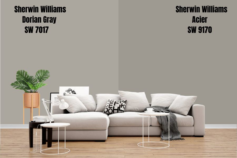
The Sherwin Williams Acier is a mid-toned taupe that resembles gray but with a smooth feel. It’s LRV us 32 which places it right in the middle, and comes with undertones of violet and purple. On the color wheel, this color is classified as warm due to the orange-beige with a touch of gray in it, but because of its purple undertones, Acier can come off as cool.
Sherwin Williams Dovetail
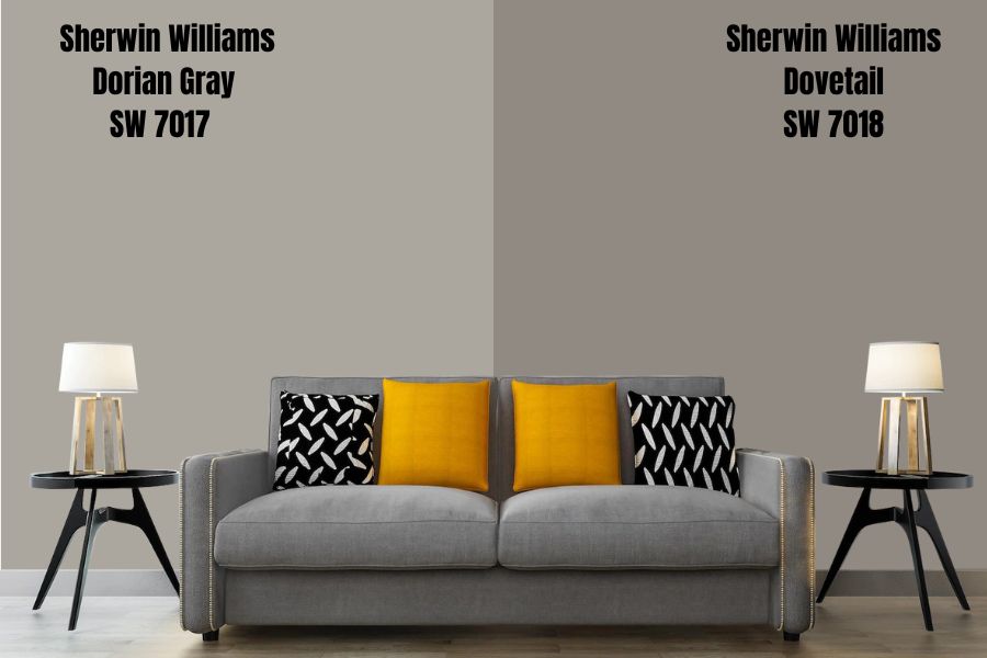
This paint color is only two spots away from the Sherwin Williams Dorian Gray on the color strip, possessing more brown undertones than Dorian Gray. The Sherwin Williams Dovetail has an LRV of 26, which means it sits tightly in the dark category.
It’s a warm gray that pairs excellently with other colors. i.e., You can use it as an accent to other anchor colors in a space or let it express itself freely on its own.
Sherwin Williams Gauntlet Gray
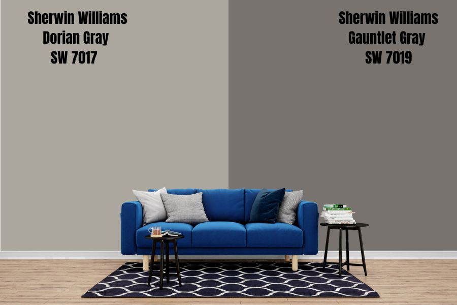
The Gauntlet Gray from Sherwin Williams collection is another member of the gray family with an LRV of 17, which puts it in the dark category. However, it can also fit in the medium category because it’s not particularly dense or too soft. When you use this color in your space, you will discover a very laid-back violet undertone; in some rooms, you may find green undertones.
Sherwin Williams Black Fox
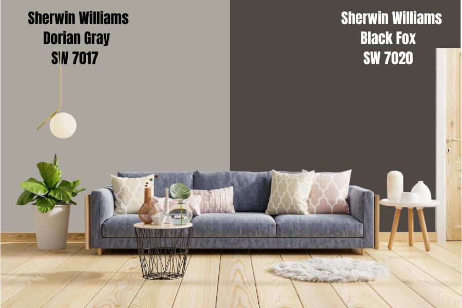
When you talk about a powerful light-absorbing gray with the richest brown undertone ever, this is the one. Like its name suggests, the Black Fox from Sherwin Williams has an LRV of 7, which means it absorbs more light than it reflects.
When you use it in a space with little to no lighting, prepare to enjoy the solidarity darkness provides.To counteract this effect, it’s essential to balance the amount of light in a room and ensure there’s enough natural and artificial light.This Sherwin Williams color is warm, bold, modern. It offers a great accent to much lighter anchor colors, so if you’re not a fan of bold colors, you may want to avoid this one.
Sherwin Williams Dorian Gray Color Palette
Your color palette is key to setting up a friendly, inviting, and color-appropriate space. Mix and match tones that work smoothly with your anchor color and appeal to anybody’s artistic side.
Coordinating Colors For Dorian Gray
The coordinating color palettes for Dorian Gray include two variations- monochromatic and contrasting decorations. Understanding these decorations is essential to ease the process of setting a theme for your space.
Monochromatic Color Palette
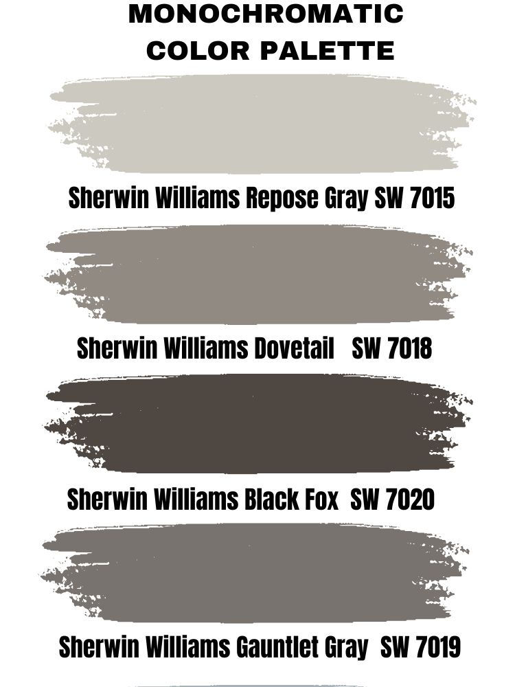
Repose Gray, Dovetail, Black fox, and Gauntlet Gray are excellent choices for the monochromatic color palette. Don’t stress too much about the term monochromatic in a house setting. It’s a language people prefer to be on the minimalist side when it comes to house décor use.
On a monochromatic decoration, you get similar hues but with varying undertones. So, think of a Gray palette, but when you apply them side by side, they look nothing alike.
Contrasting Color Palette Contrast is really the spice of life and the grand connoisseSur of adding that memorable touch to any space. In a contrasting setting, the anchor color takes all the shine in the room because the colors you’re pairing it with are significantly different from the rest.
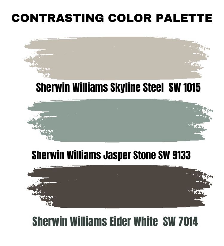 Contrast is really the spice of life and the grand connoisseSur of adding that memorable touch to any space. In a contrasting setting, the anchor color takes all the shine in the room because the colors you’re pairing it with are significantly different from the rest.
Consider hues like Sherwin Williams Skyline Steel, Jasper Stone, and Eider White for a great contrast in your space.
Sherwin Williams Complementary Colors
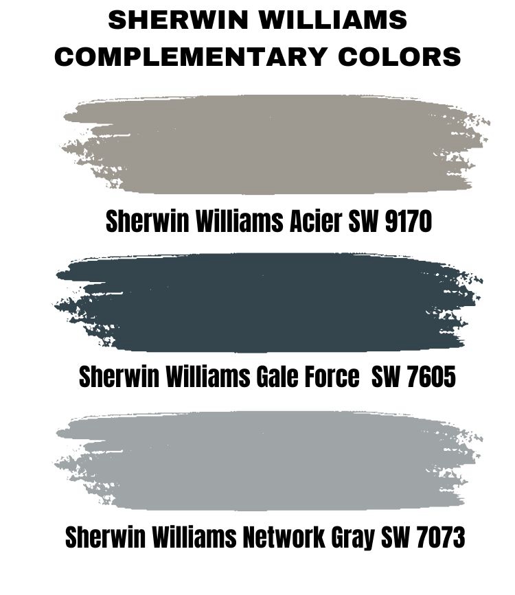
Complementary colors are created by using two colors facing each other on the opposite end of the color wheel so that when you mix them, you get a grayscale tone like black or white. You get a fantastic play of contrasting colors when you put them beside each other. Sherwin Williams Acier, Gale Force, and Network Gray.
What Trim Colors Go With Sherwin Williams Dorian Gray
I usually suggest that homeowners use white colors for trims because it sharply contrasts with the anchor color, no matter the shade. Sherwin Williams High Reflective White and Sherwin William Pure White are two excellent options for this color.
The former provides a cleaner and sharper contrast between the wall and the trim, while the latter gives a slightly subtle approach that’s not all in your face, but you’ll surely notice its presence in the room.
Sherwin Williams Alabaster is also an excellent trim color option that goes well with warm tones. If you desire something from the stables of Benjamin Moore, then consider Chantilly Lace.
Sherwin Williams Dorian Gray Color Comparison
Let’s check out some colors that bear a resemblance to Sherwin Williams Dorian Gray. This section is essential to help you find your way around options of color.
Sherwin Williams Dorian Gray Vs. Dovetail
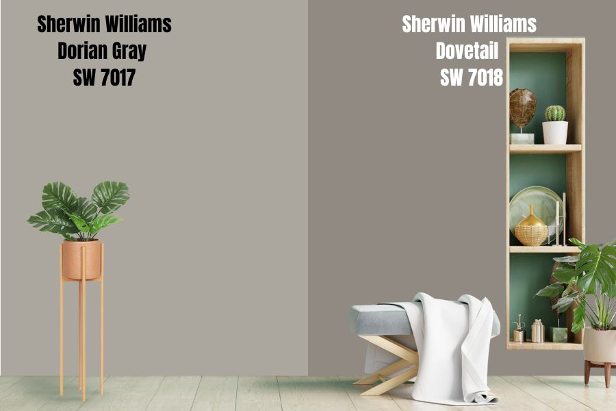
If there is one thing the Sherwin Williams Dorian Gray and Dovetail have in common, then that would be brown undertones! . The latter has more brown in it than the former and a much darker LRV of 26, making it an excellent choice for ample space due to its ability to add depth and intimacy to a room instantly.
Sherwin Williams Dorian Gray Vs. Mindful Gray
If you’re considering another light-to-medium alternative to Dorian Gray, then Mindful Gray is the paint color for the job. These colors are side by side on the Sherwin-Williams Color strip with so much similarity.
While Mindful Gray is lighter and brighter than Dorian Gray, especially with just 9-point differences in their LRV, it doesn’t stay that way when used on exterior walls as the sunlight washes away most of the color.
Mindful Gray, with its much brighter LRV, might be the one for you if you’ve got a room with insufficient natural daylight and a low reflectance rate.
Sherwin Williams Dorian Gray Vs. Pavestone
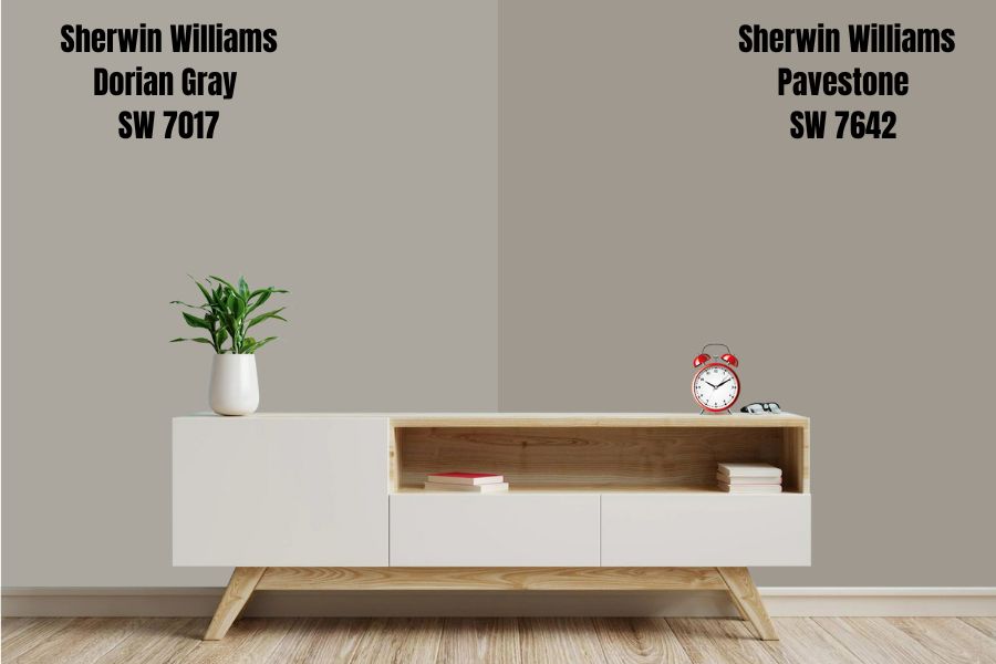
Pavestone instantly awakens a strong, bold, and inviting aura in your living space. It’s a warm gray (more like greige) paint color with soft brown undertones and an LRV of 32. Pair it with off-white blends, gray-blue colors, and not-too-creamy paint colors to get an excellent result from it.
When used alongside Dorian Gray in a space, you’ll notice the soft difference in light reflection. I don’t recommend using them side by side in a small space. However, if your room is large enough to handle the depth of these colors, feel free to explore and throw in some white trims for definition.
Sherwin Williams Dorian Gray Vs. Repose Gray
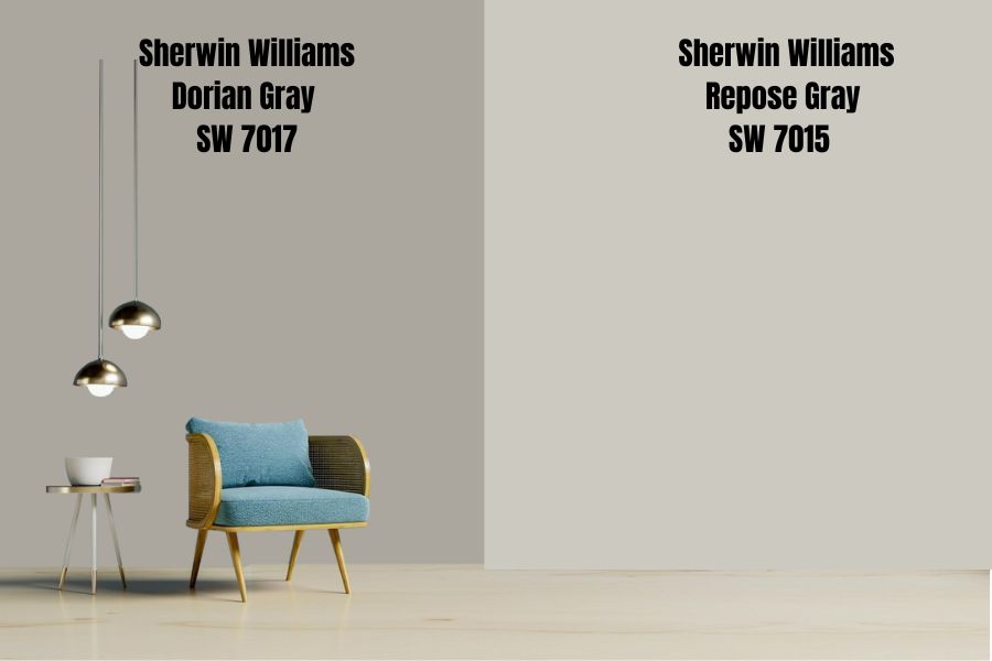
The Repose Gray from Sherwin Williams is a trendy light gray with an LRV of 58, which is almost 20 points more than Dorian Gray. It has undertones of blue and subtle violet hues that have a high chance of bursting forth in a room receiving a lot of natural light.
It’s a cool color that’s instantly inviting in any space and would be an excellent choice for your living space, nursery, and bedroom. Dorian Gray works perfectly as an accent on Repose Gray walls.
Sherwin Williams Dorian Gray Vs. Software Gray
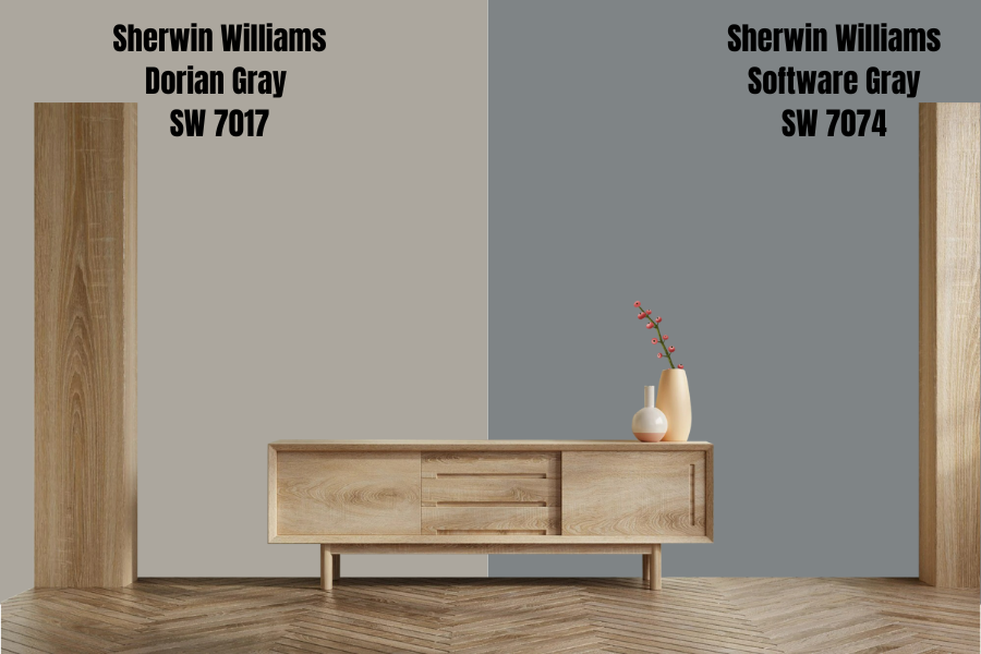
Its soft, deep, charcoal gray tone that easily matches with bright, warm colors makes Software Gray an exceptional choice for indoor use, especially in your bathroom and bedroom. With an LRV of 23, the rich neutral will make your space more welcoming, calming to the eyes, and the practical definition of serenity.
The undertones between these two hues are very different which may cause them to clash when you use them together.
Dorian Gray Benjamin Moore Version
Before I dive into this, I must reiterate that no two colors are entirely the same, especially from different brands, as you’ll likely see significant shifts in undertones, depths, and temperatures. Benjamin Moore has lived up to the expectations of being a worthy alternative to Sherwin Williams’s range of colors over the years.
Here are a few colors from the inventory that I consider a close replica of Sherwin Williams Dorian Gray.
Benjamin Moore Cape May Cobblestone

Benjamin Moore Cape May Cobblestone is a warm gray hue, also widely considered greige. It’s from the Benjamin Moore Classics collection with an LRV of 40.14 and a more decadent alternative to Dorian Gray. Its undertones, however subtle, can come off as green or blue.
Benjamin Moore Rockport Gray
This is one alternative you should consider, with an LRV of 36.61 , which is sure to give your home a warm, intimate feeling due to its depth. This color is also fantastic as an option for your exterior design.
Benjamin Moore Sea Gull Gray
A color with a medium-light LRV of 39.75, like Sea Gull Gray, will create a neutral and balanced look in a space while still providing an ambiance and a serene feeling as it’s a cool-toned gray with a slight hint of blue undertone.
This color can be a great choice to create a neutral backdrop for any space and allows you to combine it with a variety of accents, colors, patterns, and textures.
How Does Light Affect the Color
No matter how you see or interpret this section, any color you choose to work with is at the mercy of the light surrounding it (natural or artificial). This section will help you understand the importance of lighting when you’re finding a color and how to use your color under appropriate lighting conditions.
Sherwin Williams Dorian Gray In South Facing Rooms
You’ll surely get a steady warmth during the day with this color as southern light mainly intensifies colors, so dark colors will look a tad lighter while soft colors will muster up the courage to shine too.
Sherwin Williams Dorian Gray in West Facing Rooms
This one is for the early evenings, and this is usually when west-facing rooms get the most light, and I must warn you that you’ll likely be overwhelmed by the intensity of the warmth due to the red-orange tone the light emits.
Dorian Gray In Eastern Light
If your room is facing the east, you’ll get cooler lights in the afternoon/evenings and bright lights in the mornings. The yellow-orange tone you’ll get in the mornings goes well with Dorian Gray’s warmth and also makes up for the lack of natural light at night.
Dorian Gray In North Facing Rooms
This location has a blue tint to its already cool light, and any bright color you use around it will appear a bit muted and more toned down. Bolder and darker colors won’t have this issue. Instead, they’ll blossom and absorb all of the cool light.
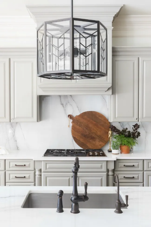
Best Rooms To Paint Dorian Gray
Dorian Gray (SW 7017) by Sherwin Williams is a classic and timeless color that can work well in various rooms throughout your home. Its balanced gray undertone and ability to complement different styles and color schemes make it a versatile choice for any space.
Whether you’re looking to create a soothing and inviting living room, a peaceful and calming bedroom, or a sophisticated and professional home office, Dorian Gray can be a great choice.
With its neutral undertone, it can easily blend in with various other colors, patterns, and textures to create a cohesive look. It’s an excellent choice for any room, giving the space a timeless and elegant look.
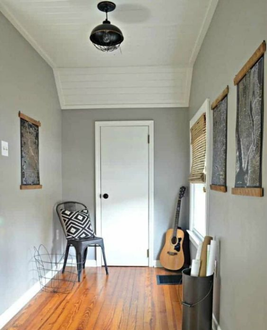
Sherwin Williams Dorian Gray Living Room
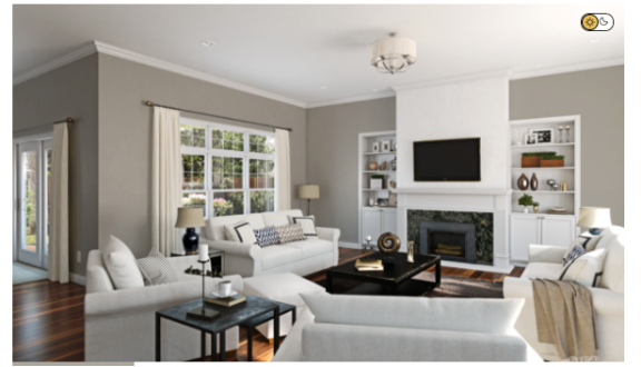
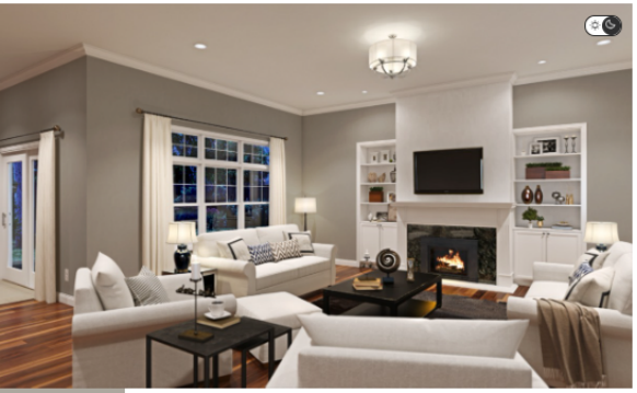
One of the best rooms to paint Dorian Gray would be the living room or family room. The balanced gray tone of Dorian Gray can create a soothing and inviting atmosphere, making it perfect for a space where people gather to relax and spend time with family and friends.
Pair with matching neutrals in shades of beige and cream to give off a minimalist space, or throw in a few greens for that pop of color.
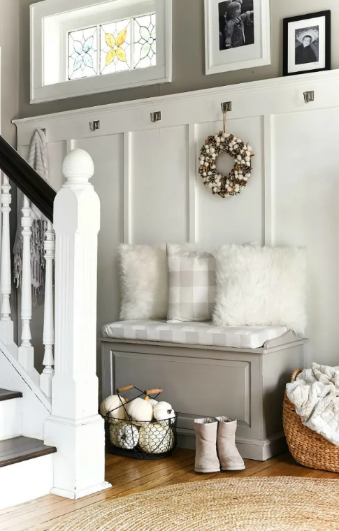
Dorian Gray Bathroom
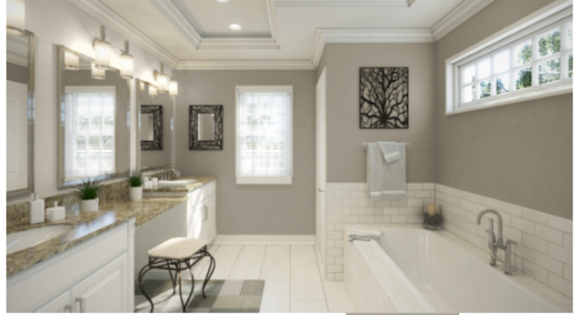
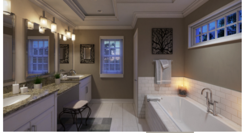
Dorian Gray comes out in a space with little natural light and surprisingly works okay for small spaces as it helps the wall pop. Pair it with some warm whites, black floor tiles, and navy blue towels, which draw out the deep brown undertone of this color.
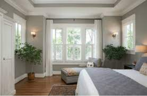
Dorian Gray Bedroom
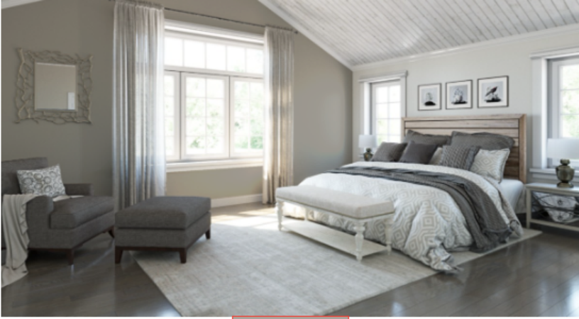
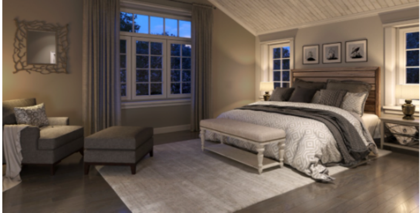
Everyone desires calmness and serenity when it comes to sleeping, and that’s what using a color like Dorian Gray in your bedroom affords you. This rich gray color is a superb choice for your primary bedroom color.
Pair it with white bedding, touches of black pieces, brown carpets, and white curtains to really create that monochrome look. During the day and with natural light, the true gray shows out; by night, it shifts to the warmer side, giving it depth.
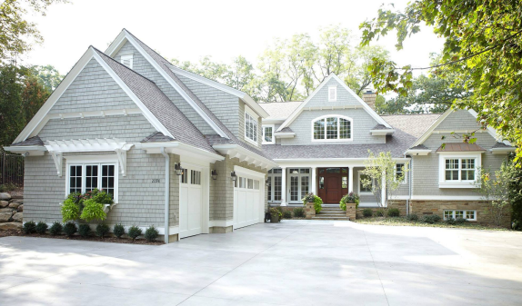
Sherwin Williams Dorian Gray Exterior
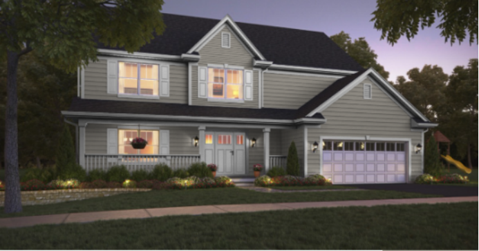
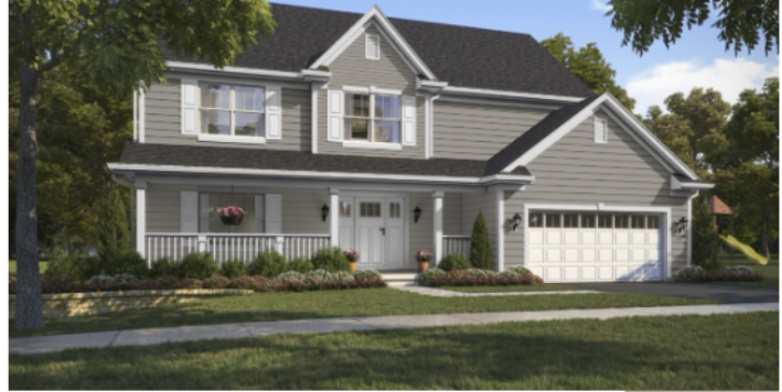
This color is an amazing choice for your home’s outer walls as it perfectly matches a few stones, brick colors, and even the roofs. Outside is where the green undertones really shine, matching perfectly with your rich green surroundings.
This gray color can be a great backdrop for your landscape and outdoor living space, giving it a modern and refined look and complementing various architectural styles. Pair it with a clean white trim, or throw in a darker accent color to make it pop.
Sampling Dorian Gray
It’s important to sample your paint color before taking the big, bold step of painting your entire room that hue. Thanks to SAMPLIZE, the process is now easier and faster than ever. With their peel-and-stick paint sample, you can move quickly around the room and test your desired paint under varying light conditions to get an idea of what you’ll most likely see.
Once you have applied the SAMPLIZE samples to your wall, you should live with them for a few days to see how the color will look in your space. Observe the color in different lighting conditions and consider how it will look next to your other finishes and furnishings.
If you decide you like the color, you can purchase a gallon of paint to complete the project. If you decide that the color is not right, try a different color with a new SAMPLIZE sample. This process allows you to try out different colors in your own space and make an informed decision about your final color selection.
They’re cheaper and environmentally friendly as you can use them repeatedly and you don’t have to endure the stress of washing walls.
Parting Words
Some colors will make you stand and stare, yet they’re not too imposing to the point where the user feels overwhelmed. Sherwin Williams Dorian Gray has mastered the art of softness and sophistication.
It’s a warm gray paint color due to the brown in it and the lack of any cool solid undertone. You can pair this color with navy blue, bright whites, and medium-dark metals.
 Sherwin Williams Mega Greige (Palette, Coordinating & Inspirations)
 Sherwin Williams Steamed Milk (Palette, Coordinating & Inspirations)
 Sherwin Williams Toque White (Palette, Coordinating & Inspirations)
 Sherwin Williams Anew Gray (Palette, Coordinating & Inspirations)
 Sherwin Williams On The Rocks (Palette, Coordinating & Inspirations)
 Sherwin Williams Cityscape (Palette, Coordinating & Inspirations)
