
Need a white color that is not entirely white? Want white paint that boasts softer tones and leans towards the warmer side of authentic whites? I get it; there are too many off-whites in the market—making your decision may not be easy.
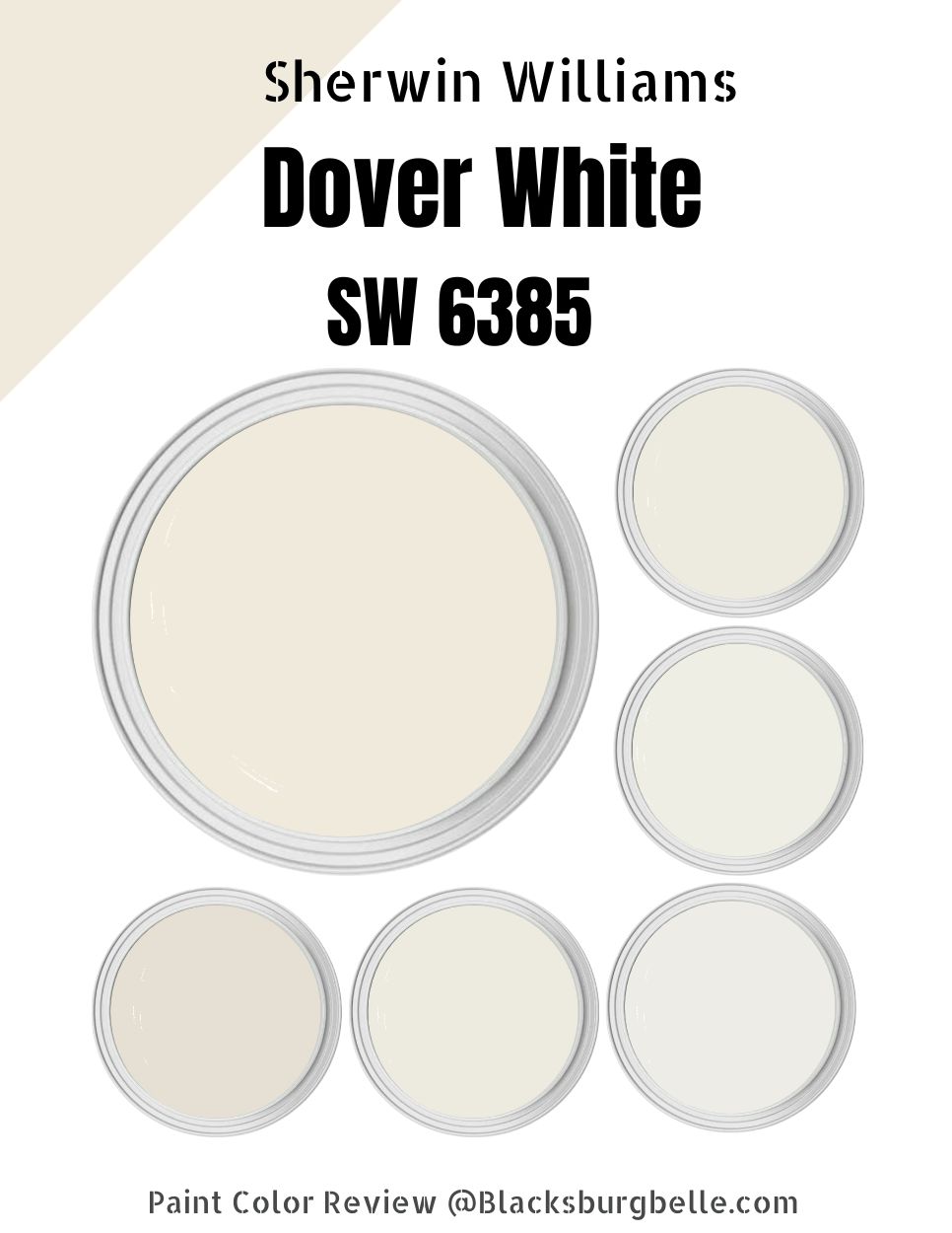
But have you heard about Sherwin Williams Dover White? It could be what you’ve been looking for all this time.
Dover White SW 6385 is an exciting color fitting perfectly in the creamy whites category. The creaminess in Dover White gives my rooms an excellent, warm appeal that turns them into cozy spaces. I prefer using Dover White in my north-facing rooms to balance their coolness with the paint’s warmth.
However, which colors are ideal for pairing with Dover White? Which color complements Dover White? Which color do you use on the trims? This detailed guide will answer all these questions.
Table of Contents
What Color is Sherwin Williams Dover White (SW 6385)?
| Manufacturer | Sherwin Williams |
| LRV | 83 |
| RGB | R: 240 G: 234 B: 220 |
| Hex Value | #f0eadc |
| Color Collections | Finest Whites, Warm White, Top 50 Colors, Living Well – Balance, Teen Space, Precious Baby, ABC’s and 123’s, Acute Care Warm Foundations |
Dover White is a considerably soft, creamy white verging on the edge of Beige. Therefore, it is not uncommon for interior designers to consider Dover White a Beige or Cream color.
Dover White boasts a similar shade to the Sherwin Williams Creamy paint color—Creamy is another favorite off-white color in the Sherwin Williams palette. However, Dover White tends to carry a more unmistakable yellow, while SW Creamy is a more neutral creamy paint color.
RGB of Sherwin Williams Dover White
The RGB shows the amount of red, green, and blue that goes into making a specific paint color. The RGB runs from zero to 255. Sherwin Williams Dover White combines red: 240, green: 234, and blue: 220.
LRV of Sherwin Williams Dover White
LRV is an abbreviation standing for Light Reflectance Value. It is a scale from 0 to 100 and shows the degree of reflectivity displayed by a specific color.
You will have pure black at zero on this scale because it reflects 0% light. You will have pure White at 100 because it reflects 100% light.
Dover White has an LRV of 82.
Is Sherwin Williams Dover White a Warm or Cool Color?
Dover White is a warm color. Because of its warmth, Dover White gives rooms a comfortable and comfy feel.
However, this warmth can make the color less suitable—primarily if you use it alone—in south-facing rooms. In these rooms, you would want to use it with a cooler color to keep the room from getting too warm.
However, Dover White works best when used in cool north-facing rooms. In the cool north-facing rooms, Dover White creates a serene and energetic vibe that makes rooms look more spacious than they are.
What Are the Sherwin Williams Dover White Undertones?
Dover White boasts a creamy-yellow undertone. This base becomes even more visible when you pair Dover White with cool tones. The yellow undertone gives the paint color its warm appearance.
Sherwin Williams Dover White Color Strip: Sherwin Williams Dover White Color Comparisons
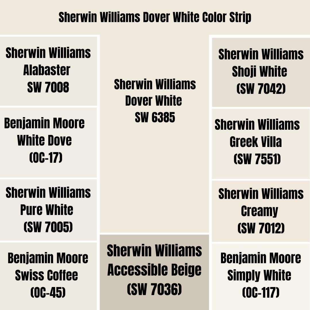
When I am out shopping for paint colors, I am constantly thinking about the color I want to take home, although I may want to know more about colors close to it in terms of appearance. I often wonder how the colors on the same color strip—or those similar to—my chosen color look. I know you may have similar thoughts. To help you out, I will compare Sherwin Williams Dover White to colors most identical in appearance.
Sherwin Williams Dover White vs. Alabaster (SW 7008)
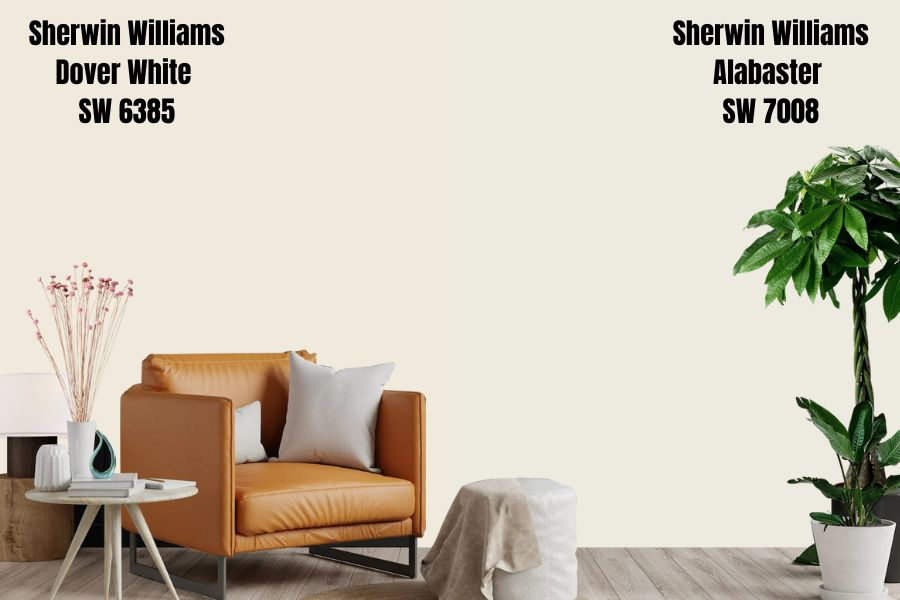
While Dover White SW 6385 boasts a yellow-cream undertone, Alabaster boasts a nice beige undertone. Both paint colors, however, give off that cream appearance.
Alabaster SW 7008 and Dover White 6385 reflect the same amount of light—both have an LRV of 82. The paint colors are also pretty close on the RGB scale. Alabaster, for example, combines red: 237, green: 234, and blue: 224. On the other hand, Dover White combines red: 240, green: 234, and blue: 220.
However, Alabaster seems to balance its warmth much better than Dover White. While Dover White is a very warm white color, Alabaster boasts a more neutral feel, with its neutral base balancing its warmth and keeping it from looking yellow or too warm.
Sherwin Williams Dover White vs. White Dove (OC-17)
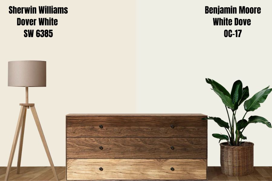
Interestingly, White Dove is a production by Benjamin Moore. The color reflects 3.38% more light than Dover White, with an LRV of 85.38%.
Like Sherwin Williams Dover White, White Dove is also an off-white, creamy, and soft paint color. It is a relatively neutral color that is neither super cool nor super warm—it sits right in the middle.
Unlike Dover White which has yellow as the only undertone, White Dove combines gray and yellow as its undertones. White Dove, therefore, looks less yellow than Dover White.
Sherwin Williams Dover White vs. Pure White (SW 7005)
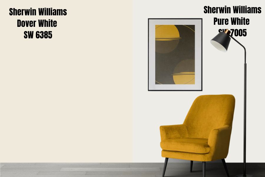
The first thing you might think when you see “Pure White” is that this is the True White color with an LRV of 100%. This is not the case—Sherwin Williams Pure White SW 7005 has undertones that lower its LRV to 84%.
Pure White features a soft warmth to it, in the form of a drop of yellow and a wink of black. Unlike Dover White which has yellow as its only undertone, Pure White boasts two undertones.
While Pure White does lean on the side of warm whites, it is more of a neutral color. Unlike Dover White which has just enough yellow to cement it on the warm side, Pure White is not too yellow and features a balanced cool, and warm feel.
Sherwin Williams Dover White Vs. Swiss Coffee (OC-45)
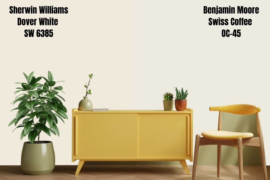
Benjamin Moore Swiss Coffee boasts a creamy white appearance like Sherwin Williams Dover White. It has a welcoming softness that pairs nicely with its low-key elegance.
Like Dover White, Swiss Coffee also boasts warm undertones. However, unlike Dover White which has only one yellow undertone, Benjamin Swiss Coffee combines three undertones—yellow, gray, and green undertones. The yellow color tends to pop when you place Swiss Coffee next to a cool color—like a solid blue color—unlike Dover White which carries its yellow color in almost all rooms.
Benjamin Moore Swiss Coffee reflects more light than Dover White. Swiss coffee has an LRV of 83.93%, while Dover White reflects 82% light.
Sherwin Williams Dover White vs. Shoji White (SW 7042)
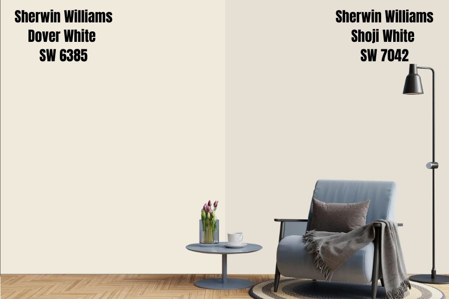
Like Sherwin Williams Dover White, Shoji White SW 7042 is an off-white paint color that boasts deep warm undertones. Shoji White is a clean, creamy paint color that does not incline pink, red, green, or blue. It tends to make a space look lively, homely, composed, and warm.
Sherwin Williams Shoji White SW 7042 boasts an LRV of 74%, reflecting 8% less light than Dover White. Shoji falls on the lower end of the off-whites, while Dover White is on the higher end.
Unlike Dover White which boasts yellow undertones, Shoji White boasts greige undertones—combining gray and beige undertones. The color has some creaminess, although the greige undertones ensure it is not getting too yellow. The color balances warmth and coolness, sitting in an almost neutral position.
Sherwin Williams Dover White vs. Greek Villa (SW 7551)
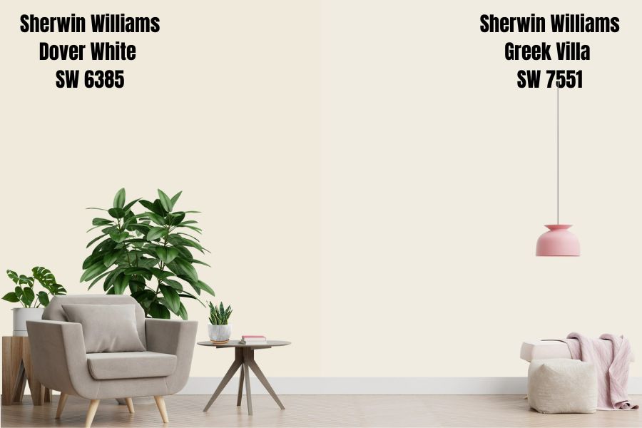
Sherwin Williams Greek Villa is a neutral paint color that also boasts versatility. The Greek Villa reflects 2% more light than Dover White, boasting an LRV of 84%. Both colors sit in the upper end of the off-white range.
Unlike Dover White which has a strong undertone, Greek Villa boasts yellowish-beige undertones. In some types of lighting, the undertones may come off as beige-ish. The undertones, however, are subtle and quite soft, giving this paint color a gorgeous delicate warmth.
Sherwin Williams Dover White and Greek Villa may not work outdoors or in a room with excessive light. The two colors have a very high LRV, which creates a situation where they may end up washed out.
Sherwin Williams Dover White vs. Creamy (SW 7012)
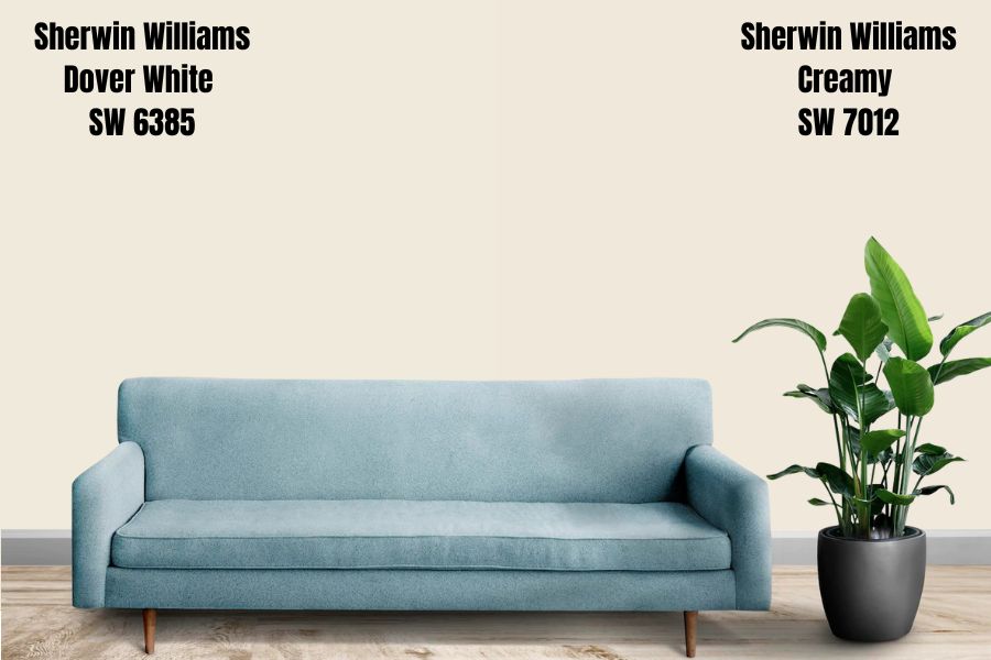
Like Dover White, Sherwin Williams Creamy is also an off-white color that boasts a creamy appearance like its name suggests. Creamy is not light enough for me to consider it white. However, some people may consider it a white color.
Creamy reflects 1% less light than Dover White, with an LRV of 81%. This puts creamy and Dover White on the higher end of the off-whites, making them ideal for darker rooms. The two colors, however, may appear too washed out if they end up in a highly bright space—or the outdoors.
Creamy and Dover White have a yellow undertone. However, Creamy has a neutral undertone that calms the yellow undertone, keeping the paint in a more centered position regarding warmth and coolness. However, the color is still warmer than it is cool.
Sherwin Williams Dover White vs. Simply White (OC-117)
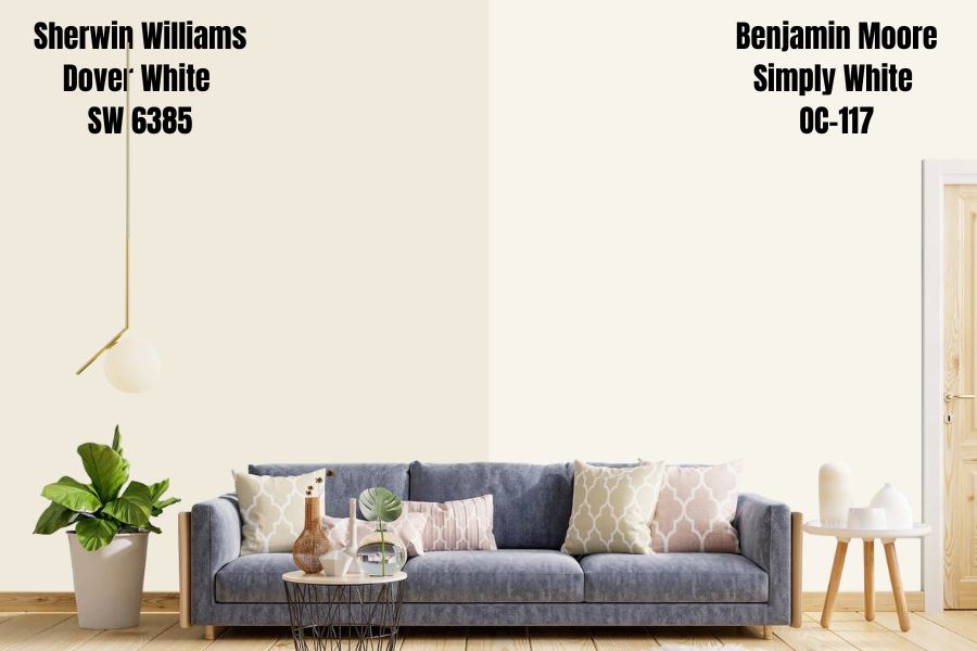
Like Sherwin Williams Dover White, Benjamin Moore Simply White is a warm white color. However, unlike Dover White which only boasts one undertone—the yellow undertone—Simply White boasts green and yellow undertones.
Simply White reflects 7.52% more light than Dover White. Simply White has an LRV of 89.52, while Dover White boasts an LRV of 82%.
One thing that makes Simply White stand out for interior designers is that it neither looks sterile nor stark. It is a versatile color that looks good in almost every space. Its brightness also tends to attract people who want to have brighter rooms.
Sherwin Williams Dover White vs. Accessible Beige (SW 7036)
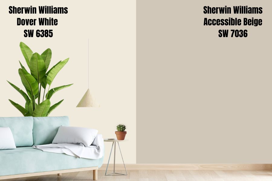
Accessible Beige is in the beige paint color category, making it a warm paint color like Dover White. However, with an LRV of just 58%, it falls far below the off-white range—it reflects 24% less light than Dover White.
Accessible Beige is more neutral, subtle, and soft. The paint color boasts a grayer undertone, differentiating it from Dover White, whose primary undertone is yellow. However, in some cases, Accessible Beige has been known to display some green undertones.
The unique blend of undertones and LRV that make up Accessible Beige makes this one of the most versatile beige colors. However, it tends to work well in well-lit rooms since it has medium brightness.
Sherwin Williams Dover White Palette
Coordinating Colors for Dover White
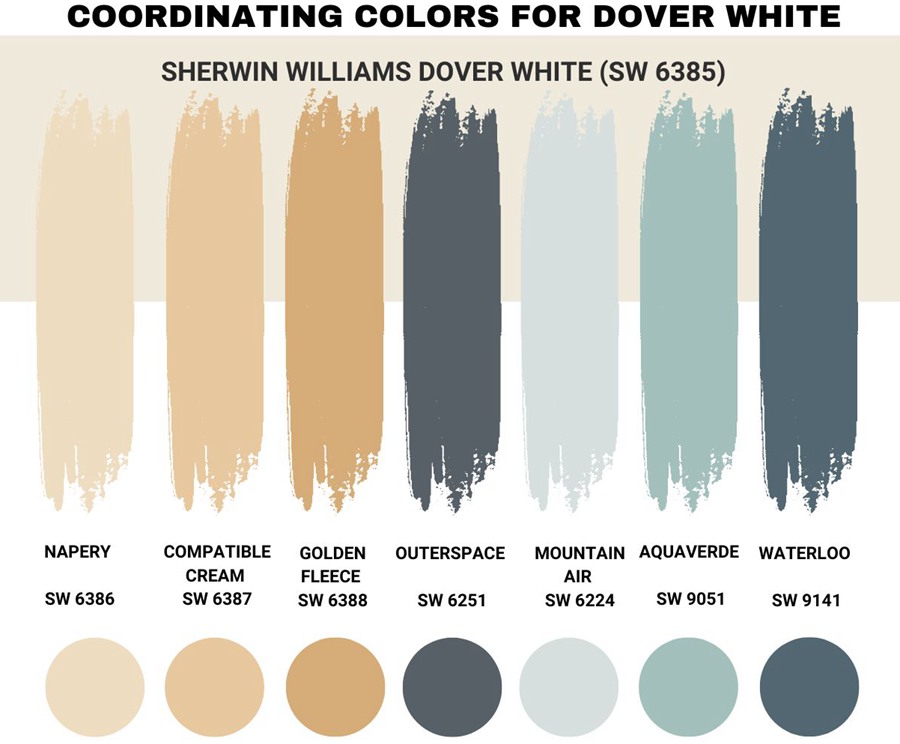
Sherwin Williams Dover White is just as versatile as paint colors come. It pairs nicely with many colors. However, the colors that make it stand out positively include:
Sherwin Williams Napery SW 6386
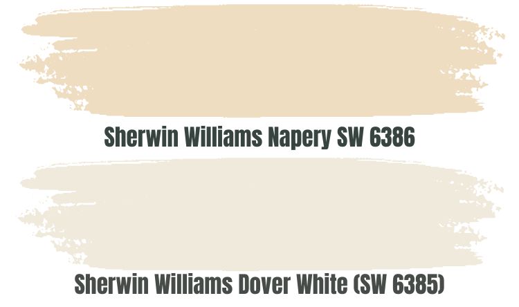
Sherwin Williams Napery is a perfect color if you are going for a monochromatic appearance. On the Sherwin Williams Palette, Napery SW 6386 is one shade darker than Dover White, explaining why it reflects 8% less light than Dover White, with an LRV of 74.
Dover White and Napery are incredibly similar in their undertones, with both boasting yellow as their primary undertones. Both colors sit on the warmer side of the colors in the off-white range.
Therefore, it would be ideal to use them in a cool room that needs warmth to create a balance. Napery and Dover White may be too warm for a south-facing room—however, they can work if you use them with a cool color.
Sherwin Williams Compatible Cream SW 6387
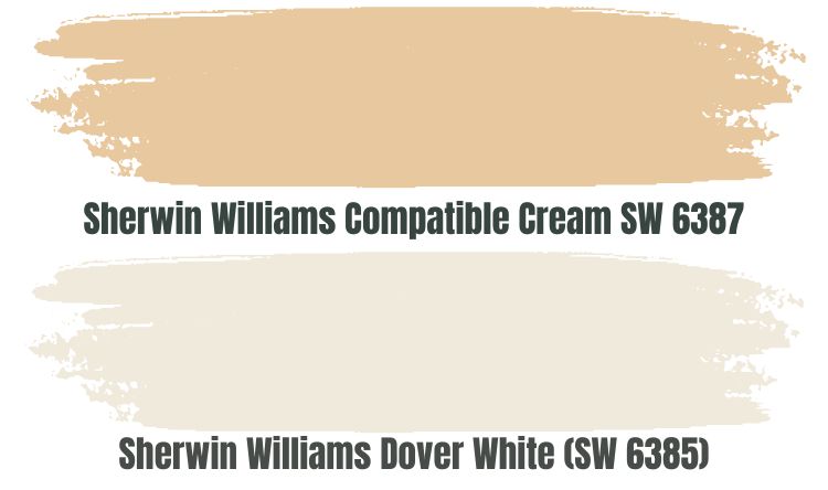
Compatible Cream is another excellent color for when you are going for a monochromatic look. However, unlike Dover White, with an LRV of 82, Compatible Cream reflects 21% less light, with an LRV of 61.
When combined with Dover White in a room with extreme light, Compatible Cream will add character to the room, keeping Dover White from getting washed out. Dover White will add interest in a dark-lit room since it absorbs just 18% of the light, keeping Compatible Cream from becoming too dull.
I would advise combining these two colors in a north-facing room leaning on the cooler side. Since the colors are both warm, they can make a south-facing room too warm, giving it a less-than-appealing feel.
Sherwin Williams Golden Fleece SW 6388
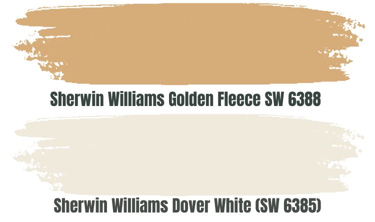
Golden Fleece is very far from the off-white range where Dover White sits—it reflects only 46% of the light, which is extremely low compared to the 82% reflected by Dover White.
However, the fact that the two colors are very far from each other yet have some similarities in their tones makes them ideal pairing colors. Golden Fleece keeps Dover White from getting washed out in a bright room. Dover White adds character in a dark room, ensuring the color reflecting less light (Golden Fleece) does not get incredibly dull.
Since both colors have a shade of yellow, you will not want to use them in a room with extreme warmth. Therefore, instead of using them in a south-facing room, balance the cold in north-facing rooms with these paint colors.
Sherwin Williams Outerspace SW 6251
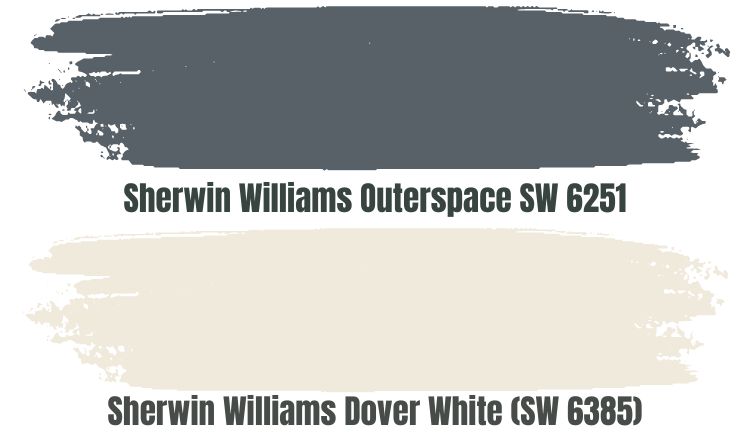
If you incline to timeless, steely, and classic blues, you may want to pair your Sherwin Williams Dover White with Outerspace. SW 6251 is a gray-blue paint color that exhibits a cool, crisp, sleek vibe.
Outerspace SW 6251 is ideal as it brings coolness into the room, balancing the warmth in Sherwin Williams Dover White. Outerspace features an LRV of 12, reflecting just 12% of the light hitting its surface—this makes it a perfect color for balancing the reflective abilities in Dover White.
Outerspace works well in huge spaces, making the walls seem closer together, creating a smaller space illusion. On the other hand, Dover White makes areas look bigger with its yellow undertones—combining the two paint colors can give your rooms a medium-size, not too big nor too small.
Sherwin Williams Mountain Air SW 6224
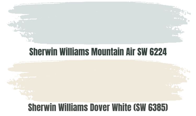
Whites fall into two categories—there are warm whites and cool whites. In this case, Dover White is warm white, while Mountain Air is cool white. Combining these two colors allows you to balance the warmth in Dover White paint, creating neutrality in the room.
Sherwin Williams Mountain Air is a comfortable, soothing, and crisp color that works well with the relaxing vibe of Dover White. The main difference between the two colors is in their undertones—while Mountain Air brings blue and gray undertones to the room, you will get yellow undertones in Dover White.
You can pair the two colors in dark rooms. Dover White has an LRV of 82%. And while Mountain Air reflects 9% less light with an LRV of 73, the two colors will add character to dark-lit rooms.
Sherwin Williams Aquaverde SW 9051
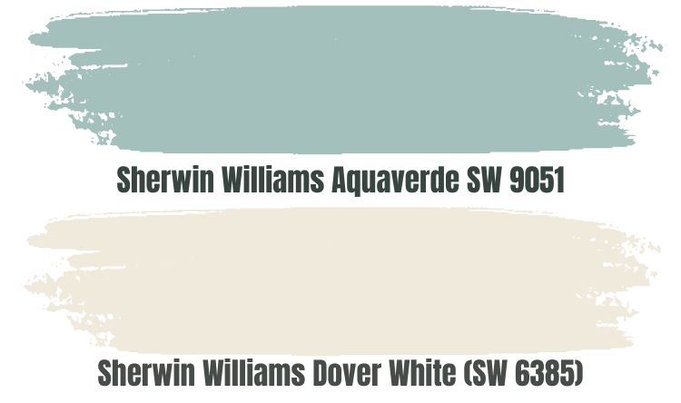
Aquaverde SW 9051 is a cool, blue-green color that may also display a dose of gray in some lighting conditions. It is a perfect paint color for use with Sherwin Williams Dover White SW 6385, as it will balance out its warmth with its cool undertones.
Aquaverde is 1% below the medium light range, reflecting 49% of the light. Pairing it with Dover White will create a balancing effect as it will keep Dover White from getting washed out in a bright room. On the other hand, Dover White will keep Aquaverde from becoming monotonous in a dark room.
Sherwin Williams Waterloo (SW 9141)
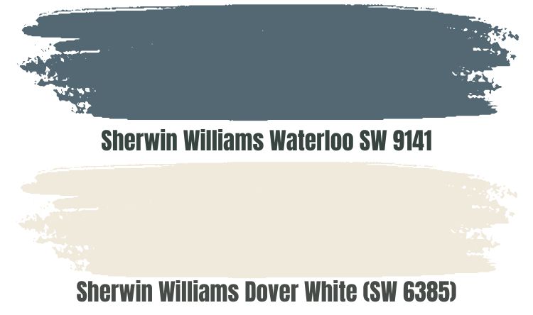
Waterloo SW 9141 is a bold blue paint color, perfect for balancing the warmth in Dover White. A versatile paint color, Waterloo works with a contemporary home appearance and does just as well when used in a classic traditional interior.
While there is no doubt that Waterloo commands a lot of attention, Sherwin Williams Dover White can still make its statement. These two colors will work in a room with or without light.
Sherwin Williams Waterloo SW 9141, with its LRV of 13, will keep Dover White from getting washed out in a room with a lot of light. Dover White will add character in a dark room with its LRV of 82.
Sherwin Williams Dover White Complementary Color
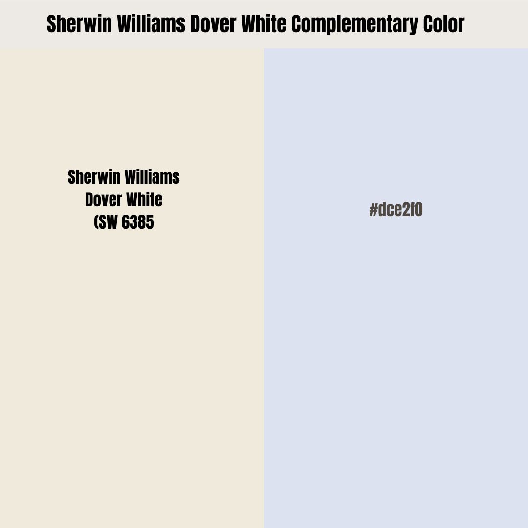
A complementary color is a color that sits on the opposite side of Dover White on the color wheel. When you mix Dover White with its complementary color, both paint colors lose their hue, turning black or White.
The best complementary color for Dover White has a hex code value of #dce2f0. As of now, #dce2f0 still does not have an official name. However, I would describe it as a very light blue shade. On the RGB scale, #dce2f0 combines red: 220, green: 226, and blue: 240.
What Trim Colors Go with Sherwin Williams Dover White SW 6385?
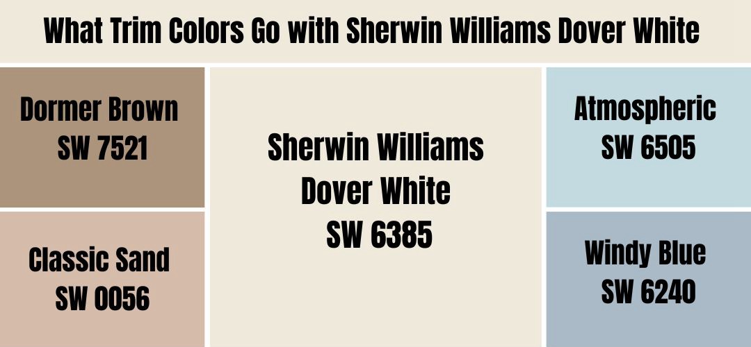
Dover White is a perfect creamy neutral white that creates a cozy, soft atmosphere. The paint color works well with trim colors of soft browns and muted blues. Below, we will look at some of the best trim colors for your Dover White covered space:
Sherwin Williams Dormer Brown SW 7521
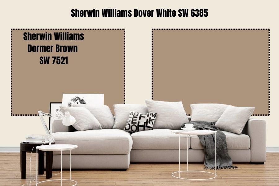
Dormer Brown is a soft brown that goes well when used on trims in a room, with Dover White as the primary color. Dormer Brown combines red: 173, green: 148, and blue: 124.
With a hex value of #ad947c, Dormer Brown has a light reflective weight of 32. Absorbing about 68% of the light thrown on it, you can be sure Dormer Brown will add some character to a room with Dover White on the walls.
Featuring an orange-yellow base, Dormer Brown is a warm color. Therefore, you may want to combine it with the warm Dover White in a room that needs warmth. For this reason, I suggest using this color in a north-facing room.
Sherwin Williams Classic Sand SW 0056
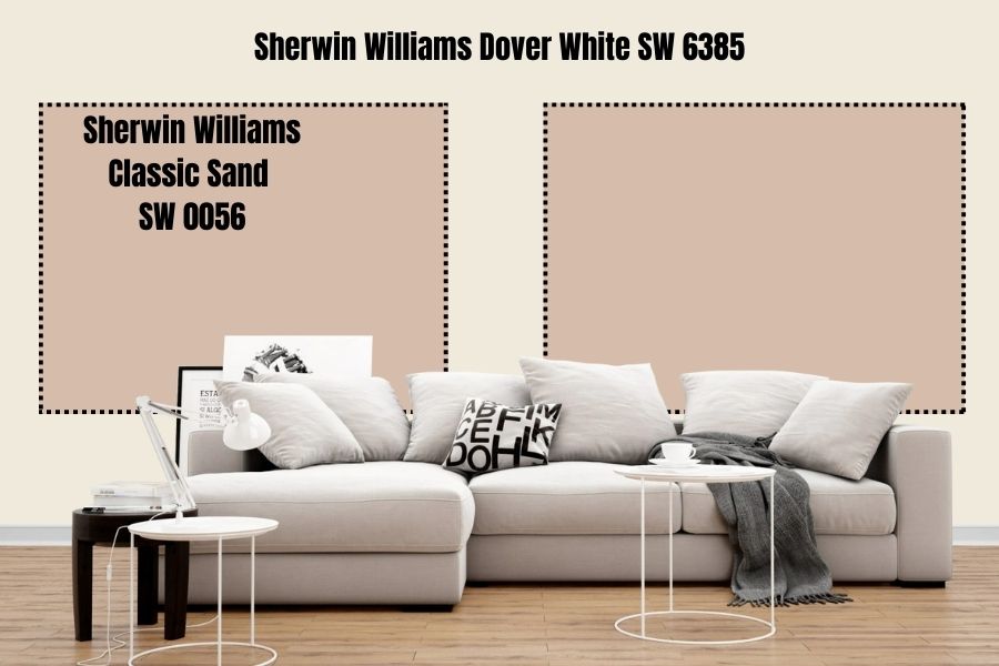
This is another excellent soft brown that adds the look of natural Sand to your trims. Classic Sand boasts an LRV of 53, meaning it can make a better statement than Dormer Brown would in a less-lit room.
Classic Sand combines red: 214, green: 188, and blue: 170. The color boasts dominating warm undertones—that is, yellow and orange. Therefore, it will perform exceptionally well if you pair it with Dover White in a room with coolness and needs some warmth to make it comfier and more relaxing.
Sherwin Williams Atmospheric SW 6505
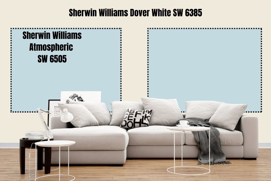
Maybe you are already wondering which muted blues to use on your trims in a Dover White painted room. If your goal is to balance the warmth in Dover White, you can do that using Atmospheric SW 6505, a top-rated muted blue.
Atmospheric is an airy, light paint color with a true tinge of blue. The paint color boasts green and gray undertones that cement its coolness.
While it is not in the off-white range, Atmospheric is very reflective, reflecting 67% of the light. Therefore, it is a perfect color for use in a room with dim light—when you combine it with Dover White, with an LRV of 82, the two colors will make a statement.
Sherwin Williams Windy Blue SW 6240
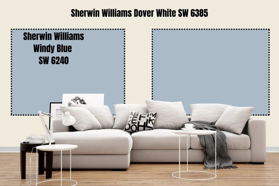
Windy Blue SW 6240 is another muted blue that works well with Dover White. Windy Blue leans slightly gray, although its leading tone is blue.
Combining cool color shades, Windy Blue is a perfect color for balancing the warmth in Dover White. The paint has an LRV of 48, meaning it reflects almost half of the light. When you pair it with Dover White, the two colors will balance each other as the lighting in the room changes.
Dover White will provide character in a dark room. On the other hand, Sherwin Williams Windy Blue will ensure Dover White does not get washed out in bright light.
Sherwin Williams Dover White Benjamin Moore Version
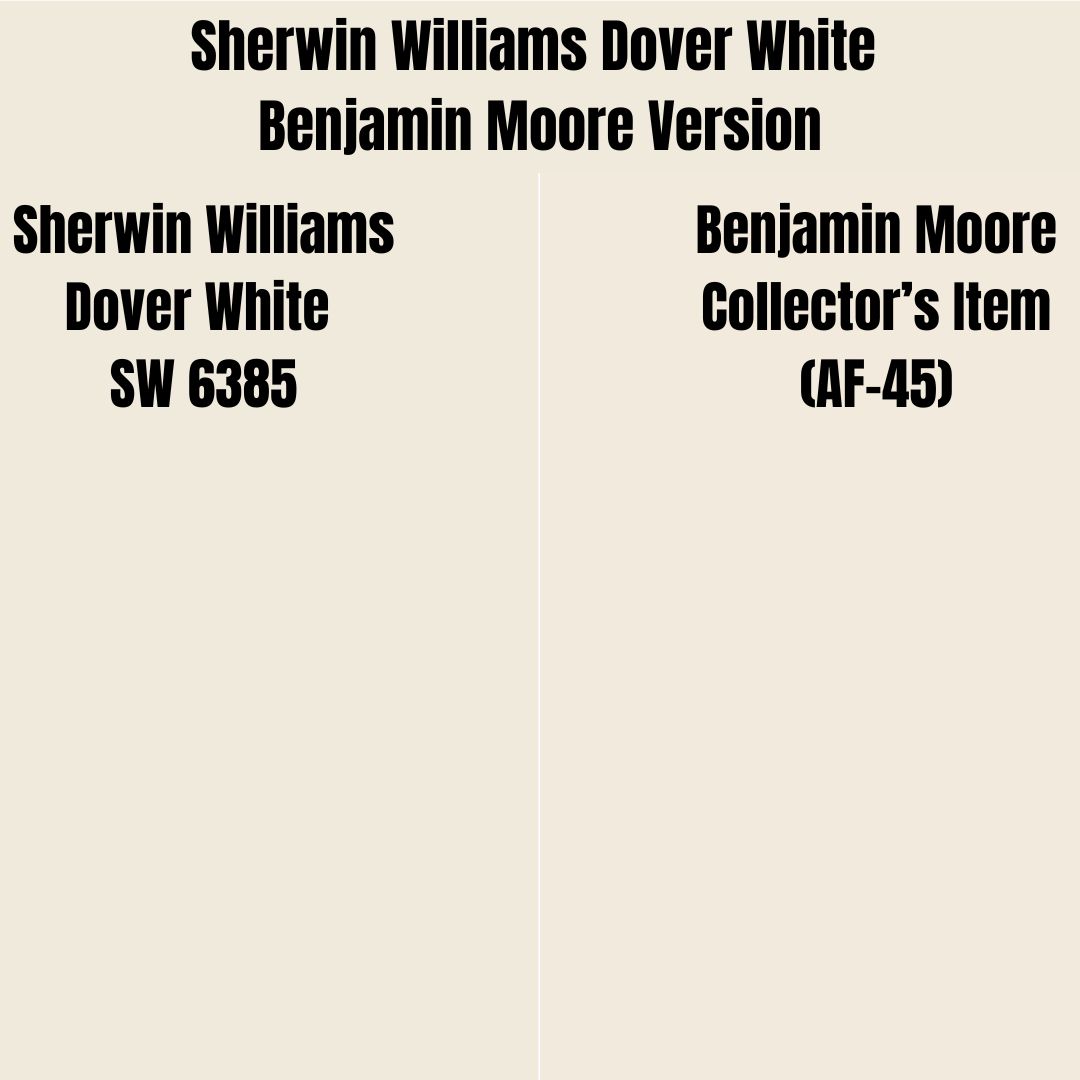
If you would like to use the Benjamin Moore products to give your space an appearance similar to the one produced by Dover White, the best color I recommend is Benjamin Moore Collector’s Item (AF-45).
On the RGB scale, BM Collector’s Item AF-45 boasts red: 241, green: 234, and blue: 220. Dover White and Collector’s Item are incredibly close on the LRV scale. While Dover White reflects 82% of the right, Collector’s Item reflects 82.22%.
How Does Light Affect Sherwin Williams Dover White?
Dover White becomes more vibrant in a room with a lot of light, with its yellow undertone becoming more saturated, making the paint color look warmer. In a room with reduced light, the color will appear slightly darker and its warmth less vibrant.
Bright and warm lights like orange, yellow, or red make Dover White appear more intense. However, if you use cooler lights—like greens or blues—you can easily dull Dover White and reduce its intensity and warmth.
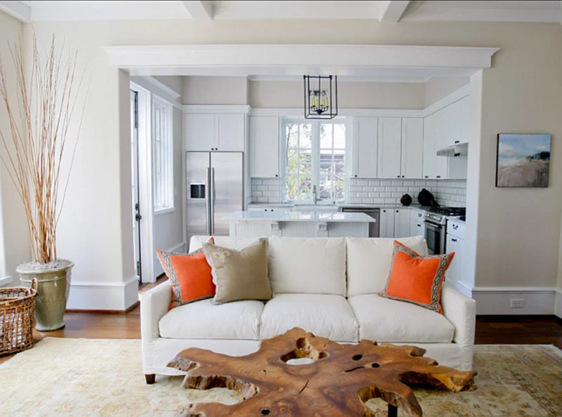
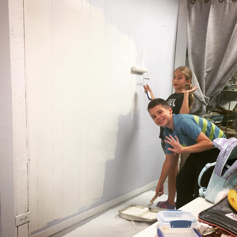
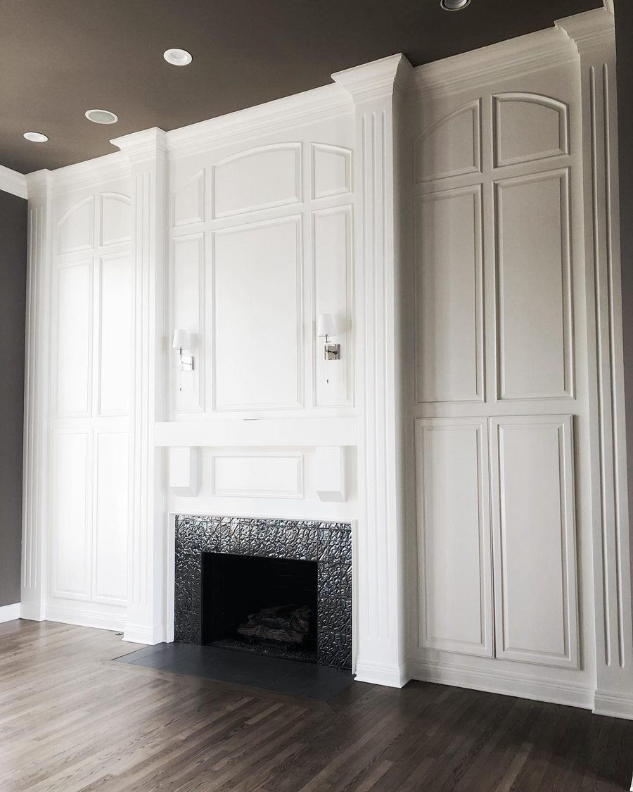
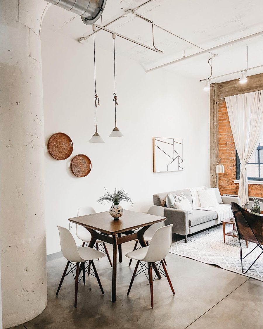
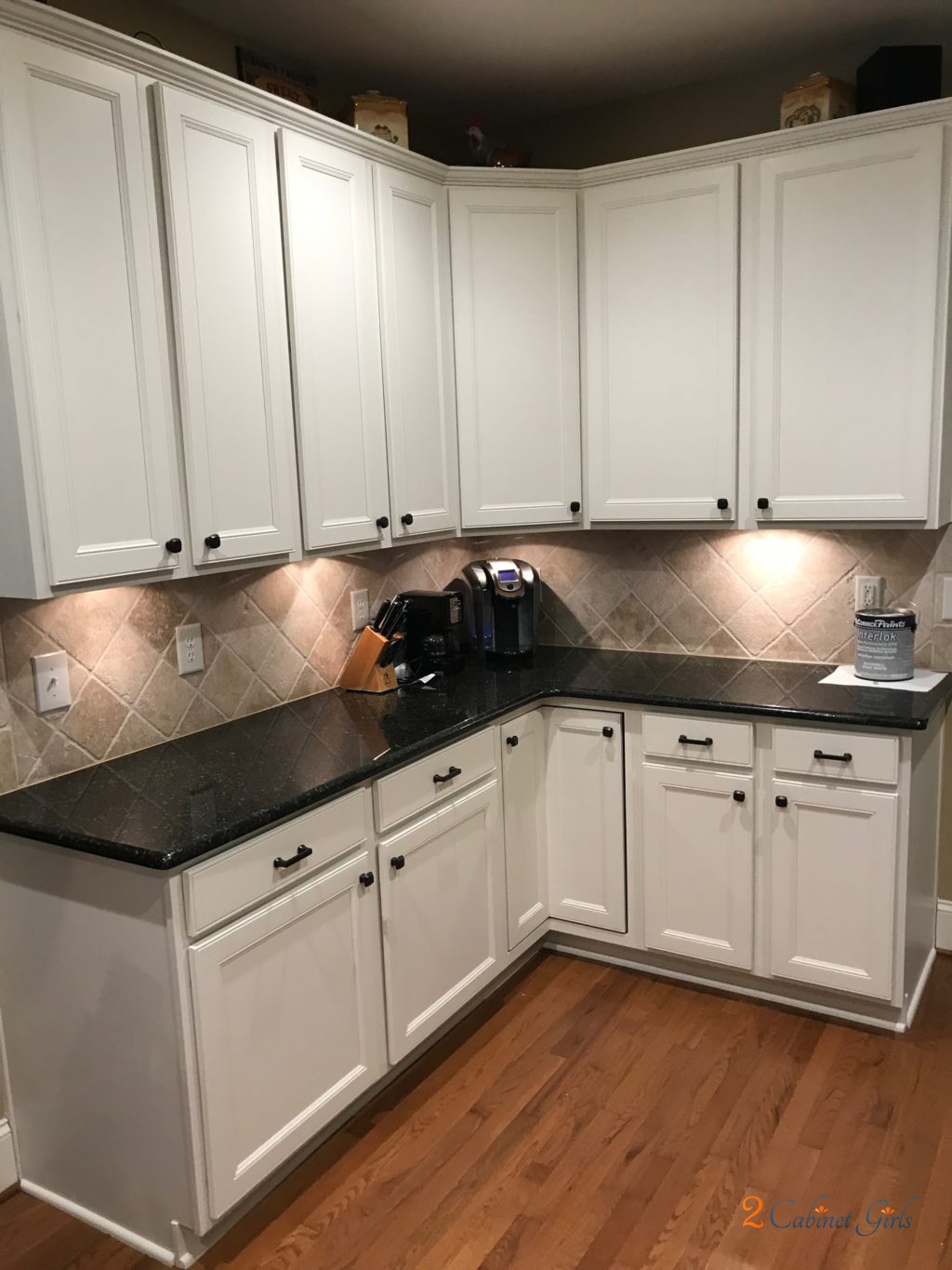
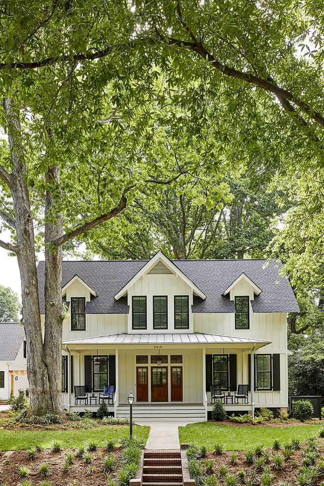
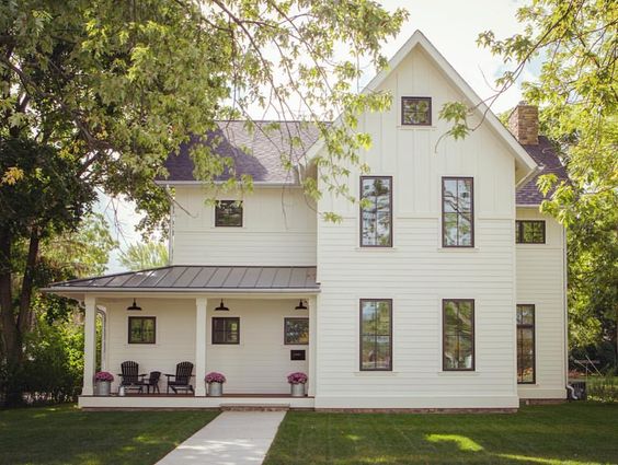
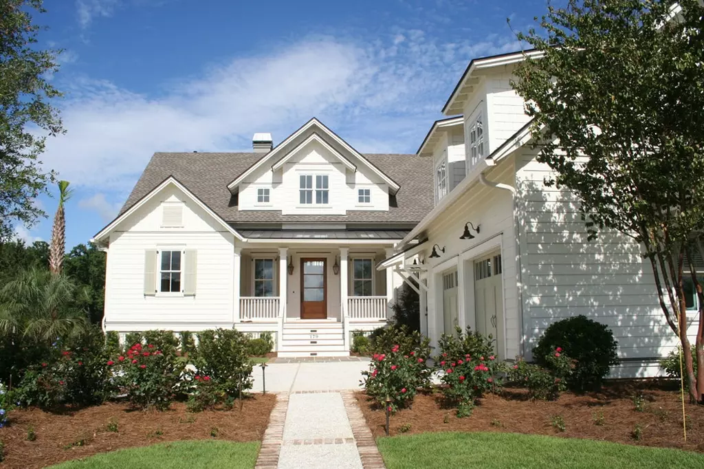
Best Rooms to Paint Sherwin Williams Dover White SW 6246
Sherwin Williams Dover White in Living Room
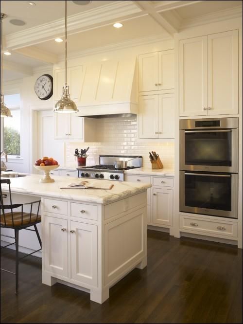
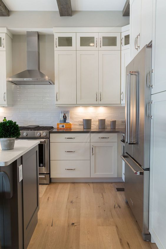
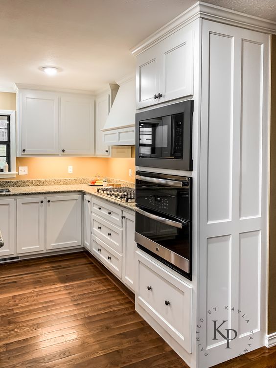
Sherwin Williams Dover White in Kitchen
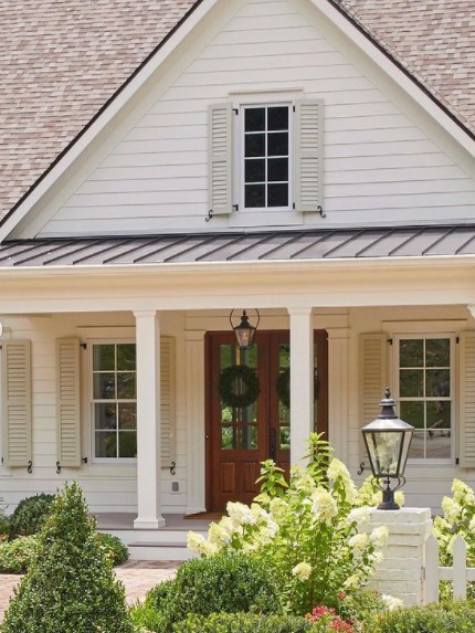
Sherwin Williams Dover White Outdoors
Overview
Sherwin Williams Dover White is not a True White. It is a unique color that boasts yellow and creamy undertones that add warmth. Under certain lighting conditions, the yellow undertone dominates, making the paint color look more yellow than White.
As a warm-toned color, I wouldn’t recommend using the color in an already warm room—for example, a south-facing room. However, the paint color works well in a cooler north-facing room.
Dover White is a highly versatile paint color. It pairs nicely with different trimming and coordinating colors, guaranteeing that you will never run out of options when using it in your house.
Did we answer all your questions about Dover White? If we didn’t, leave a comment with additional questions. We will answer these as soon as possible.
 Sherwin Williams Tradewind (Palette, Coordinating & Inspirations)
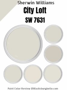 Sherwin Williams City Loft (Palette, Coordinating & Inspirations)
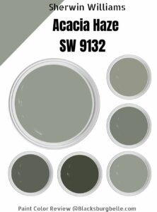 Sherwin Williams Acacia Haze (Palette, Coordinating & Inspirations)
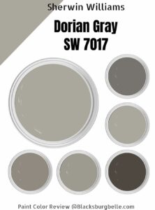 Sherwin Williams Dorian Gray (Palette, Coordinating & Inspirations)
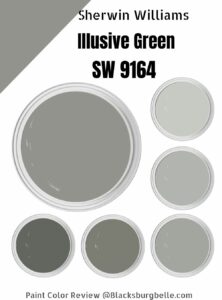 Sherwin Williams Illusive Green (Palette, Coordinating & Inspirations)
 Sherwin Williams White Heron (Palette, Coordinating & Inspirations)
