
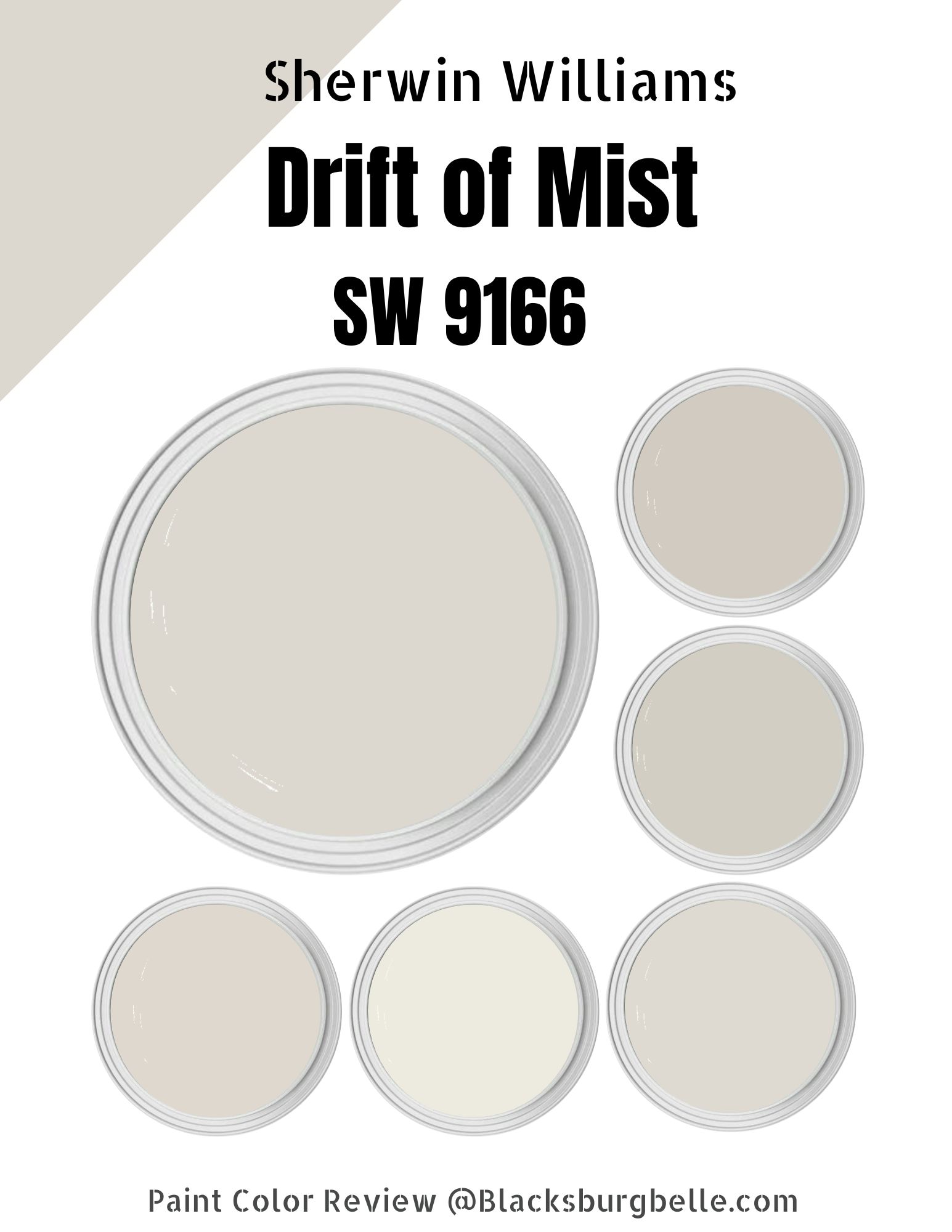
Are you on the market for a soft paint color with gentle undertone whispers? One that blends the neutral and off-white appearance and gives you a limitless look? If this is the case, you may want to look into Sherwin Williams Drift of Mist.
The Drift of Mist is a flexible off-white that sits in the pastel category. The Drift of Mist SW 9166 comes with some magic to it—to begin with, the paint color is timeless, and secondly, it boasts a combo of warm- and cool-toned hues.
If you want to implement a timeless look in your home, adding Sherwin Williams Drift of Mist SW 9166 to your shopping list might be a good idea. However, before you do that, read on to understand this paint color better.
Table of Contents
What Color is Sherwin Williams Drift of Mist (SW 9166)?
| Manufacturer | Sherwin Williams |
| LRV | 69 |
| RGB | R: 220 G: 216 B: 208 |
| Hex Value | #dcd8d0 |
| Color Collections | Finest Whites, Cool White, Top 50 Colors, Living Well—Renew, Creative |
At heart, Drift of Mist is a warm gray paint color. However, it can appear cool when viewed in north-facing light, losing much of its warmth. However, in rooms with access to western afternoon sunshine and southern light, the warmth returns and makes the paint look almost greige.
RGB of Sherwin Williams Drift of Mist
The RGB scale helps interior designers understand the amount of red, green, and blue in a paint color. The scale starts at zero and tops out at 255. Sherwin Williams Drift of Mist combines red: 220, green: 216, and blue: 208.
LRV of Sherwin Williams Drift of Mist
Interestingly, the amount of light a specific color can reflect affects its appearance in different lighting conditions. The LRV scale helps interior designers classify different paint colors in terms of their ability to reflect light.
The LRV scale runs from 0 to 100, with pure black sitting at 0, reflecting 0 percent light. Pure white sits at 100, reflecting 100% of the light. The Drift of Mist is shy of the off-white range, with an LRV of 69.
Is Sherwin Williams Drift of Mist a Warm or Cool Color?
Sherwin Williams Drift of Mist SW 9166 leans on the neutral side of the scale. It combines both cool-toned and warm-toned hues. However, in most circumstances, the Sherwin-Williams Drift of Mist will lean toward the warmer side.
Sherwin Williams Drift of Mist Undertones
At heart, Drift of Mist is a neutral color. The paint color will not display any undertones in most lighting conditions. However, Drift of Mist does feature a green undertone. While the green undertone does fall back at times, it might be a little bit much for people sensitive to green-colored paints.
Sherwin Williams Drift of Mist Color Strip: Sherwin Williams Drift of Mist Color Comparisons
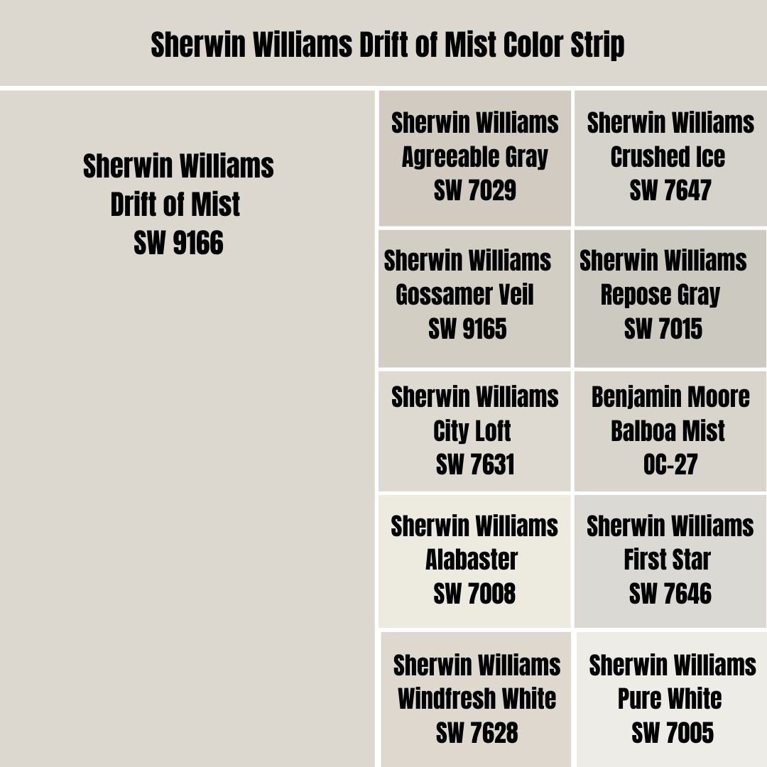
Sherwin Williams Drift of Mist vs. Agreeable Gray (SW 7029)
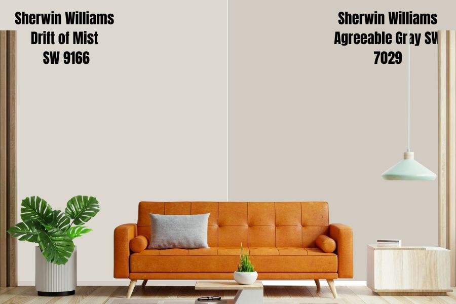
The first difference between Drift of Mist and Agreeable Gray shows in their LRV—while Drift of Mist reflects 69% of light, Agreeable Gray has an LRV of 60, reflecting 9% less light. Agreeable Gray is light at LRV of 60, but it does not border on off-white like Drift of Mist.
Both paint colors, however, have matching undertones. Like Drift of Mist, Agreeable Gray has subtle Greige and green undertones. However, Agreeable Gray, unlike Drift of Mist, is not committed to the green undertone—Agreeable Gray boasts other undertones like a flash of blue and violet.
Both paint colors have balanced cool and warm tones. In the north-facing rooms, Drift of Mist and Agreeable Gray will lean toward the cool side, while in south-facing rooms, the two colors will look warmer.
Sherwin Williams Drift of Mist vs. Gossamer Veil (SW 9165)
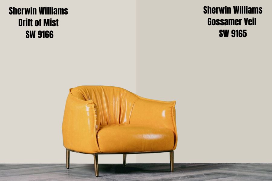
Like Drift of Mist SW 9166, Sherwin Williams Gossamer Veil is a warm gray color that leans toward the greige side in some lighting conditions.
Sherwin Williams Gossamer Veil SW 9165 displays the same behavior as Drift of Mist in varying lighting conditions. For example, both colors will lean into their warmth when placed in West-facing or south-facing light. However, expect the two colors to embrace their cool gray roots in eastern or northern light.
Gossamer Veil is one shade lighter than Drift of Mist on the color swatch. For this reason, you should expect the paint color to reflect less light than Drift of Mist—this is reflected by the Gossamer Veil’s LRV of 62, reflecting 7% less light than Drift of Mist.
Sherwin Williams Drift of Mist vs. City Loft (SW 7631)
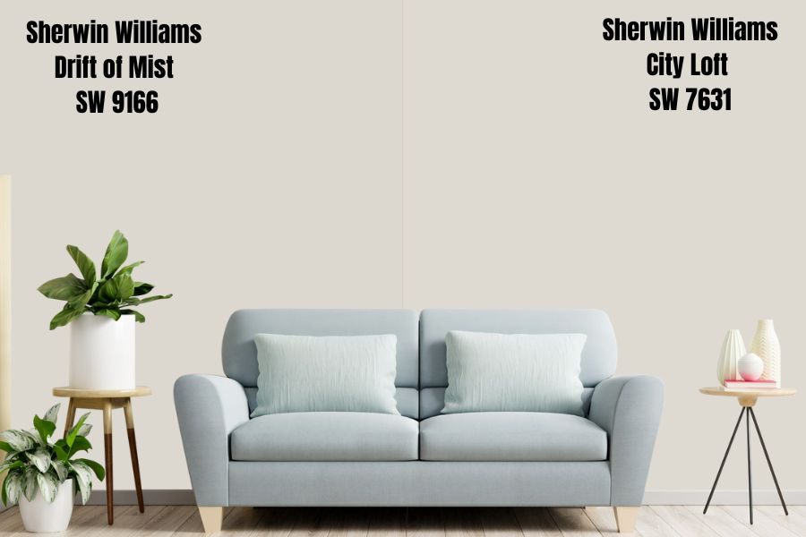
Sherwin Williams City Loft SW 7631 is an excellent option to implement a modern yet delicate neutral appearance. Like Drift of Mist, City Loft is a soft gray/beige paint color that can lean toward the greige side in some lighting conditions.
City Loft is lighter than Drift of Mist and reflects slightly more light. On the LRV scale, City Loft has an LRV of 70, reflecting 1 percent more light than Sherwin Williams Drift of Mist.
Both colors are extremely close to the off-white range—painting them in a bright room could mean risking washing out as the colors do not absorb sufficient light. The colors, however, will work in a dimly lit room, reflecting enough light to ensure their character is evident.
Sherwin Williams Drift of Mist vs. Alabaster (SW 7008)
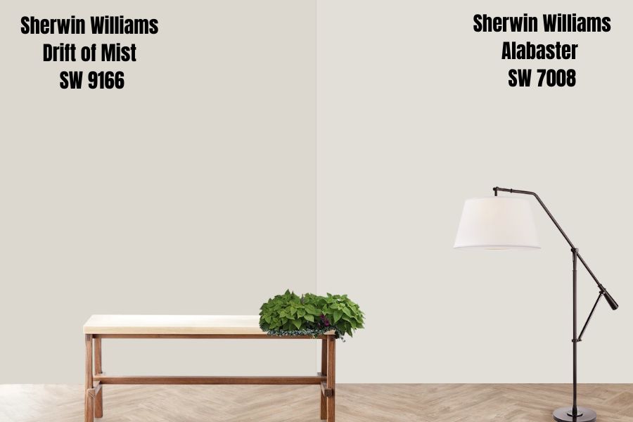
Alabaster is a soft, warm white paint color that boasts more undertones than some of the cleaner, simpler whites. Alabaster differs from Drift of Mist in its undertones—Alabaster is a creamy, soft paint color with a dominant yellow undertone that gives it its warmth. This is different from Drift of Mist which only has a green undertone.
Alabaster sits in the high end of the off-white range, with an LRV of 82. The paint color reflects 13% more light than Drift of Mist, meaning it can hold its character in dimmer rooms.
Lighting conditions have a similar effect on both Alabaster and the Drift of Mist. Both colors will display a cooler feel in north-facing rooms, while in the south-facing room, they will lean on their warmer tones.
Sherwin Williams Drift of Mist vs. Windfresh White (SW 7628)
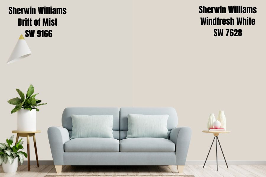
If you do not like green in your off-whites but prefer the warmth that comes with yellow undertones, Windfresh White might be a suitable replacement for Drift of Mist. The two colors, however, are very similar in various measures.
Both colors have an LRV of 69. They are just 4% below the off-white range. They, however, reflect enough light to make them a potential risk for washing out in rooms with extreme amounts of light.
The green undertone dominates in the Drift of Mist. On Windfresh White, you will come across a yellow undertone that may have a sprinkle of gray that balances out the warmth.
Sherwin Williams Drift of Mist vs. Crushed Ice (SW 7647)
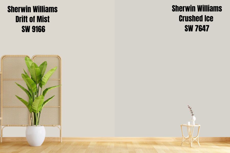
Sherwin Williams Crushed Ice SW 7647 always works for interior designers looking for a versatile warm gray paint color. Unlike Drift of Mist which has an LRV of 69, Crushed Ice reflects 3% less light with its LRV of 66.
Just as you would expect, Crushed Ice does have some undertones. However, unlike other gray paint colors—including Drift of Mist—Crushed Ice is less committed to its undertones.
Like Drift of Mist, Crushed Ice favors a green undertone. However, Crushed Ice may display a flash of violet and blue undertones in the right lighting conditions.
Sherwin Williams Drift of Mist vs. Repose Gray (SW 7015)
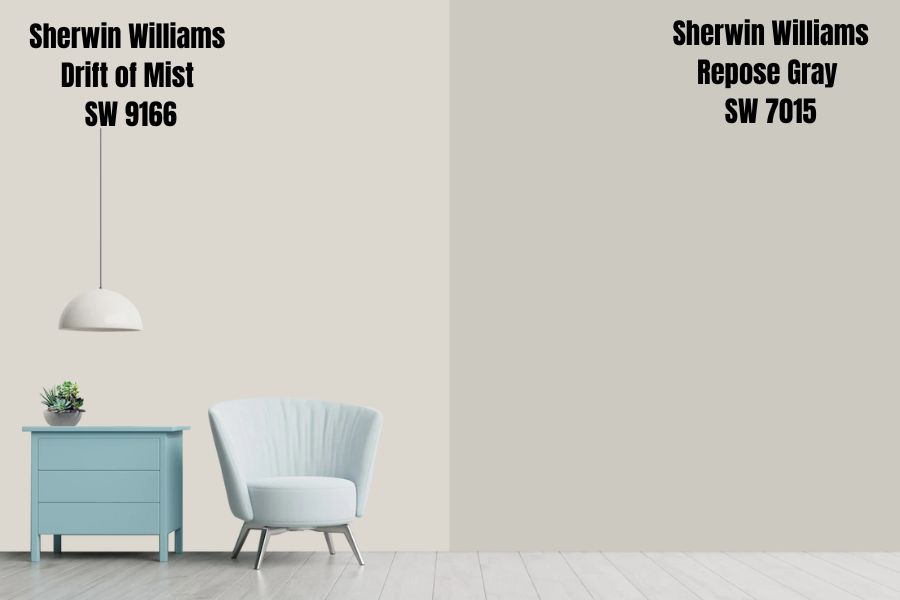
While Repose Gray is a gray color like its name suggests, it is not an actual gray paint as it does carry some undertones. Like Drift of Mist, Repose Gray comes with a green undertone—the only difference is that the green in Drift of Mist is more dominant than in Repose Gray. In some lighting conditions, Repose Green may go beyond green to display extra undertones like soft violet and a touch of blue.
Repose Gray is slightly darker than Drift of Mist, explaining why Repose Gray reflects 9% less light. On the LRV scale, Repose Gray has a value of 60.
Both Repose Gray and Drift of Mist are warm by default. However, they can adopt a cool feel depending on the lighting conditions. For example, in a north-facing room, the colors will default to their cool gray, while their warmer side shows more in the south-facing rooms.
Sherwin Williams Drift of Mist vs. Balboa Mist (OC-27)
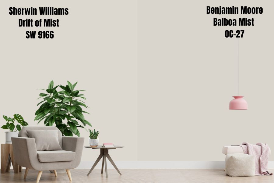
A product from Benjamin Moore’s factories, Balboa Mist is one of the best-selling neutral paint colors in the company’s catalog. It is a paint color that is pretty close to Drift of Mist on the LRV scale, reflecting 67.37% of light, which is just about 1.63% less than Drift of Mist which has an LRV of 69.
Balboa Mist is a neutral Gray paint color. However, it does have a greige tone, like Drift of Mist. Balboa Mist is what you would call a chameleon color, switching appearance depending on the room’s lighting.
Unlike Drift of Mist which only has green as its primary undertone, Balboa Mist has purple and brown undertones. Balboa Mist may display a dose of lavender and violet undertones in some lighting. However, like Drift of Mist, Balboa Mist is a warm color, which may lean on the cooler side in north-facing rooms and warmer side in south-facing rooms.
Sherwin Williams Drift of Mist vs. First Star (SW 7646)
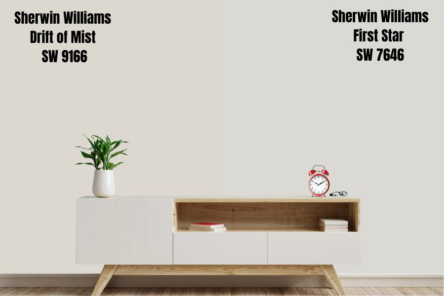
The Drift of Mist and First Star primarily differ in their undertones, with First Star boasting some deep cool undertones that tend to take a crispier tone. Unlike Drift of Mist which boasts a green undertone, First Star boasts deep cool blue undertones.
First Star and Drift of Mist sit in the same position on the LRV scale, reflecting 69% of light. The two colors will produce similar effects in different lighting conditions.
While Drift of Mist is warm by default, First Star is a cool color by default—the coolness in First Star results from the cool gray and blue tones. Both First Star and Drift of Mist add a sense of calmness and tranquility to a space.
Sherwin Williams Drift of Mist vs. Pure White (SW 7005)
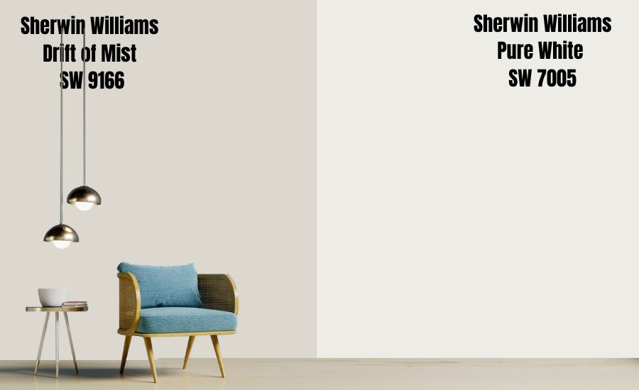
Because of its name, most people mistake Sherwin Williams Pure White for an actual white color with an LRV of 100. However, Pure White sits in the off-white range with an LRV of 84, reflecting 16% less light than true white.
Regardless, Pure White still reflects more light than Drift of Mist, which has an LRV of 69. Like Drift of Mist SW 9166, Sherwin Williams Pure White SW 7005 boasts soft, passive warmth. In a north-facing room, Pure White feels cooler, while in a south-facing room, Pure White will feel warmer—like Drift of Mist.
Pure White and Drift of Mist differ in their undertones. While you will have green as the dominating undertone in Drift of Mist, Pure White has a wink of black and a drop of yellow as its undertones. While the yellow undertone makes Pure White slightly warm, the black undertone softens it.
Sherwin Williams Drift of Mist Color Palette
Coordinating Colors for Drift of Mist SW 9166
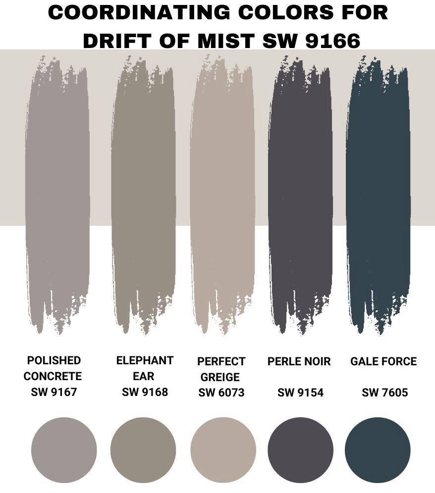
The Drift of Mist is quite flexible—it works with many paint colors. However, in the years I have used Sherwin Williams Drift of Mist SW 9166, I have found the following colors to work better than any others I have tried:
Sherwin Williams Polished Concrete (SW 9167)
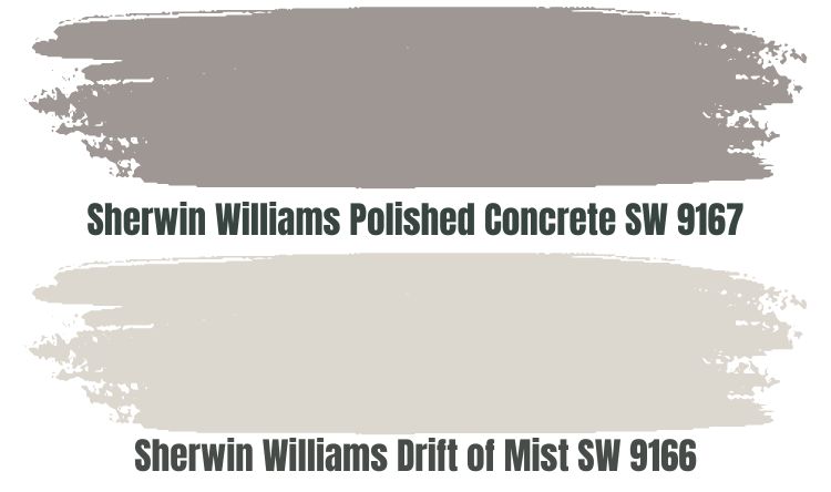
Polished Concrete is a personal favorite when I am going after a monochromatic appearance. SW 9167 Polished Concrete is one shade darker than Drift of Mist on the color swatch—this explains why it has a lower LRV, reflecting 32% of light.
One of the reasons I pair Polished Concrete with Drift of Mist is that the low LRV in Drift of Mist helps me balance out a bright room. Polished Concrete absorbs 68% light, almost as much as Drift of Mist reflects, keeping SW 9166 from getting washed out.
It is, however, worth noting that Drift of Mist and Polished Concrete lean on the warmer side of the scale. Therefore, while north-facing light may balance their warmth, a south-facing room may amplify their warmth.
Sherwin Williams Elephant Ear (SW 9168)
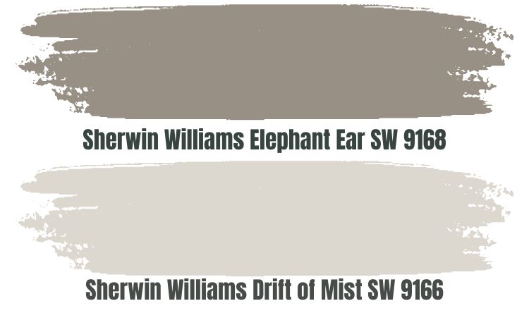
In most cases, I gravitate toward a monochromatic palette when working with Sherwin Williams Drift of Mist simply because it is serene, calm, and warm. The good thing is that you cannot run out of colors to use with Drift of Mist when implementing the monochromatic view—an additional paint color you may want to use is Elephant Ear (SW 9168).
Elephant Ear is a warm gray paint color that can lean toward taupe in some light conditions. The paint color has muted violet undertones that blend well with the green undertones in Drift of Mist.
Elephant Ear has an incredibly low LRV of 28. Elephant Ear absorbs enough light to keep Sherwin Williams Drift of Mist from getting washed out by excess light.
Sherwin Williams Perfect Greige (SW 6073)
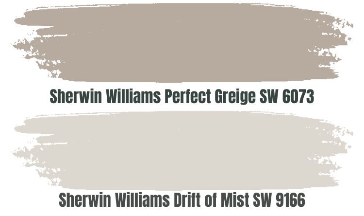
If you want to use Drift of Mist in a cool north-facing room, you may want to use a warm pairing color. In this case, Sherwin Williams Perfect Greige might be a good option.
Perfect Greige stands out for its attractive and timeless look that favors all interior designs. It combines warm red and pink undertones that throw out the extreme cold in the north-facing rooms. However, you may not want to use it in a south-facing room as the warmth created by combining Drift of Mist, and Perfect Greige might be too much.
If you use Perfect Greige and Drift of Mist, combine the two in a room with enough light. A room without light may not be a good idea since Perfect Greige has an LRV of 42, so it may become dull in a dim room. In a bright room, the color will ensure Drift of Mist does not get washed out.
Sherwin Williams Perle Noir (SW 9154)
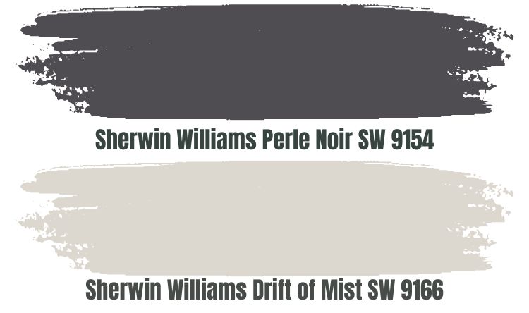
Perle Noir is a rich charcoal color that can add drama and sophistication to any space. The paint color carries some warm tones, although it may appear cool in northern light.
Perle Noir SW 9154 is close to Pure Black—with an LRV of 8, the paint color absorbs 92% of the light. While you may not want to use this color in a dim room as it may lose its character and appear too dull, you may want to combine it with Drift of Mist in bright light.
The Drift of Mist is notorious for becoming washed out in extreme light. However, Perle Noir will absorb all the excess light, allowing Drift of Mist to retain its character and appeal.
Sherwin Williams Gale Force (SW 7605)
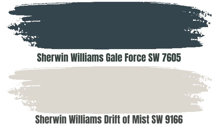
Instead of maintaining a monochromatic view, you may want to implement a contrasting color palette. You can always start with Sherwin Williams Gale Force in such a case. Gale Force is a dark-blue color that allows you to use Drift of Mist in a south-facing room without worrying about extreme warmth.
Gale Force is a cool color that will balance the warmth in Drift of Mist and the southern-facing light. Gale Force has an LRV of 6. Therefore, using it in a room with extremely light is a good idea to keep the paint color from looking bland. The low LRV, however, works as an additional benefit as Gale Force absorbs enough light, ensuring Drift of Mist does not get washed out.
Sherwin Williams Drift of Mist Complementary Color
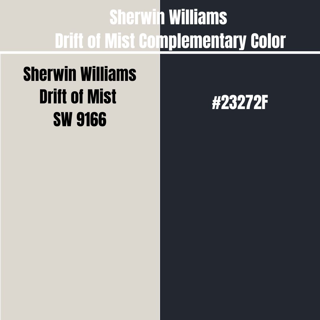
You need a complementary color when your design requires a pairing color that is 100% opposite to your primary color. The complementary color for Drift of Mist has a hex code #23272F.
Currently, this paint color does not have an official name. However, the closest color to this hex code carries the name Squid Ink and combines red: 35, green: 39, and blue: 47.
What Trim Colors Go with Sherwin Williams Drift of Mist SW 9166?
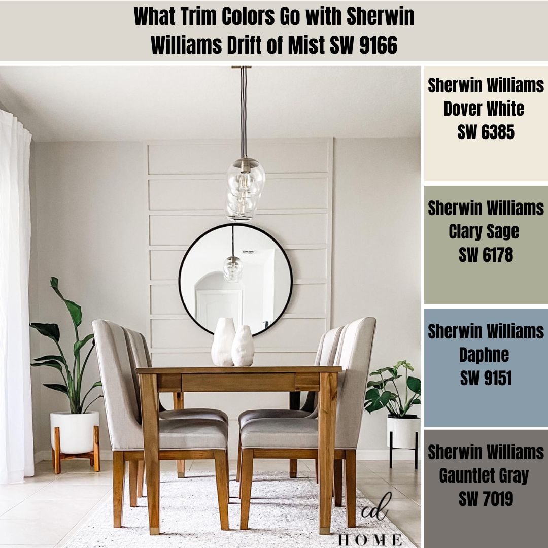
When trimming Sherwin Williams Drift of Mist walls, my number one option has always been white colors. However, you do not have to limit yourself to the white colors—below, I have outlined a range of options that have always worked great for me.
Sherwin Williams Dover White (SW 6385)
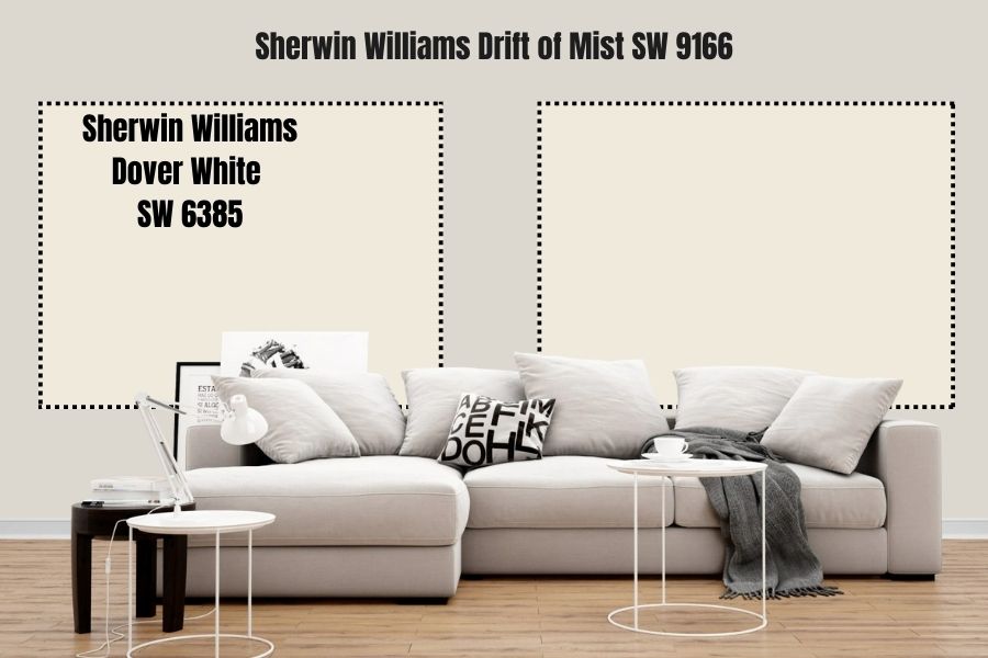
Undoubtedly, white is one of the best trim colors for gray walls. It blends well with different gray shades, from dark to light gray—in this case, we are using Drift of Mist which is more of a light gray shade.
Dover White is not a true white—it sits in the off-white range with an LRV of 82. However, its LRV is high enough to stand out in a space with Drift of Mist. Dover White will highlight any features on your wall, from door frames to windows, in a simple yet attractive way.
Sherwin Williams Clary Sage (SW 6178)
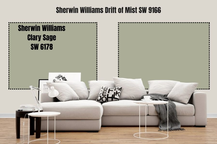
Sage green and a gray color like Drift of Mist boast similar characteristics. The two shades will offer a calming and soft vibe in attractive yet muted looks. Combining Clary Sage with Drift of Mist can be a beautiful way of keeping your entire space soothing and calm while maintaining natural and fresh richness.
Moreover, Clary Sage adds some gorgeous hues that make the boring parts of the Sherwin-Williams Drift of Mist come alive with appealing interest. Moreover, Clary Sage has an LRV of 41—therefore, it will not compete for interest with your Drift of Mist. Moreover, the lower LRV will keep your Drift of Mist from getting washed out in bright light.
Sherwin Williams Daphne (SW 9151)
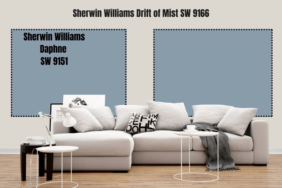
A dusty blue—or pale blue—paint color like Sherwin Williams Daphne will always bring some strong gray undertones to the table. It is for this reason Daphne SW 9151 compliments Sherwin Williams Drift of Mist perfectly.
Daphne SW 9151 painted on the trims brings a different elegance layer to your Drift of Mist walls. While Daphne will stand out, it will not become a distraction, thanks to its subtle and soft appearance. Better yet, its LRV of 32 means that Daphne absorbs almost as much light as Drift of Mist reflects—therefore, the color will keep Drift of Mist from getting washed out in a bright room.
Sherwin Williams Gauntlet Gray (SW 7019)
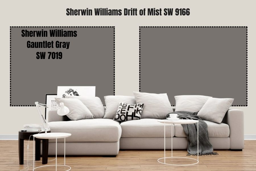
The Drift of Mist falls on a light shade of gray side. Therefore, a darker gray coloring on the trims could create an exciting look. Interestingly, Gauntlet Gray is one of the stand-out darker gray shades.
This trimming approach allows you to create a monochromatic look that boasts an impressive dose of elegance. Consider incorporating several metallic, gold, or brass accessories throughout your walls for an even more appealing result.
Sherwin Williams Drift of Mist Benjamin Moore Version
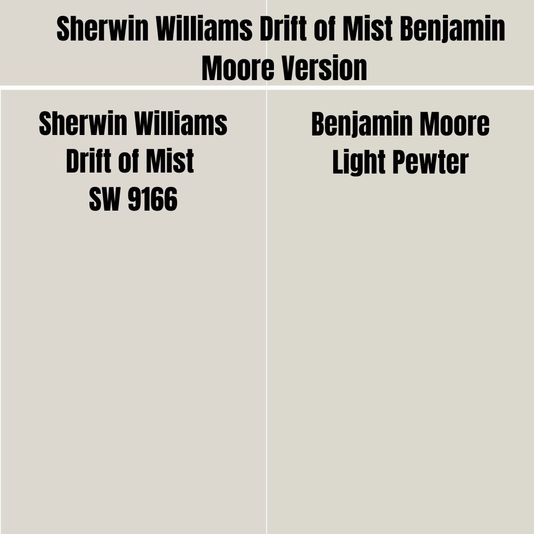
Sherwin Williams does not always serve everyone. Therefore, if your paint color preference falls on the Benjamin Moore side, you may want a color that closely resembles Sherwin Williams Drift of Mist.
Benjamin Moore Light Pewter is the closest color to Sherwin Williams’s Drift of Mist. BM Light Pewter combines red: 219, green: 216, and blue: 206 on the RGB scale. Light Pewter differs very slightly from Drift of Mist on the LRV scale—While Drift of Mist has an LRV of 69, Light Pewter has an LRV of 68.
How Does Light Affect Sherwin Williams Drift of Mist?
The Drift of Mist is warm at heart. However, it tends to swing between warmth and coolness based on the light in the room.
When placed in a room with southern-facing light, you can be sure that its warmer shades will be extra strong. However, when you paint the color in a northern-facing room, the light will bring out the cool gray appearance in Drift of Mist.
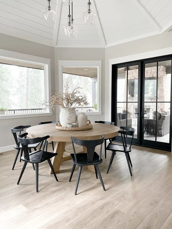
Best Rooms to Paint Sherwin Williams Drift of Mist SW 7022
Sherwin Williams Drift of Mist in Living Room
View this post on Instagram
View this post on Instagram
View this post on Instagram
Sherwin Williams Drift of Mist in Kitchen
View this post on Instagram
View this post on Instagram
View this post on Instagram
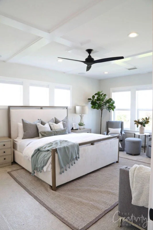
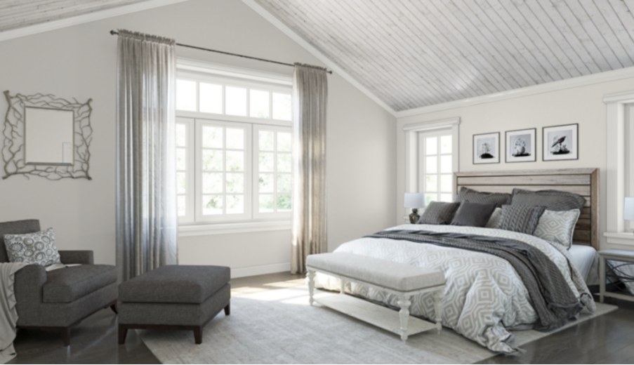
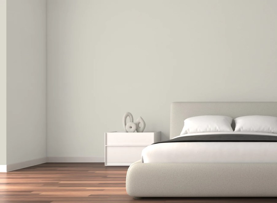
Sherwin Williams Drift of Mist Bedroom
View this post on Instagram
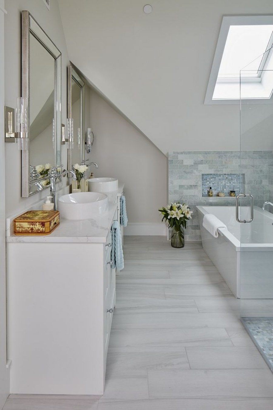
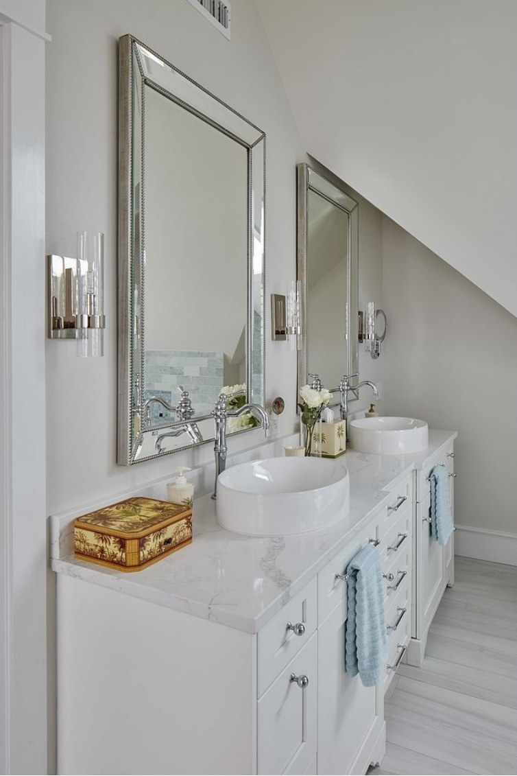
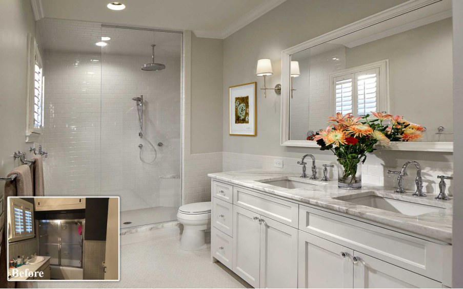
Sherwin Williams Drift of Mist Bathroom
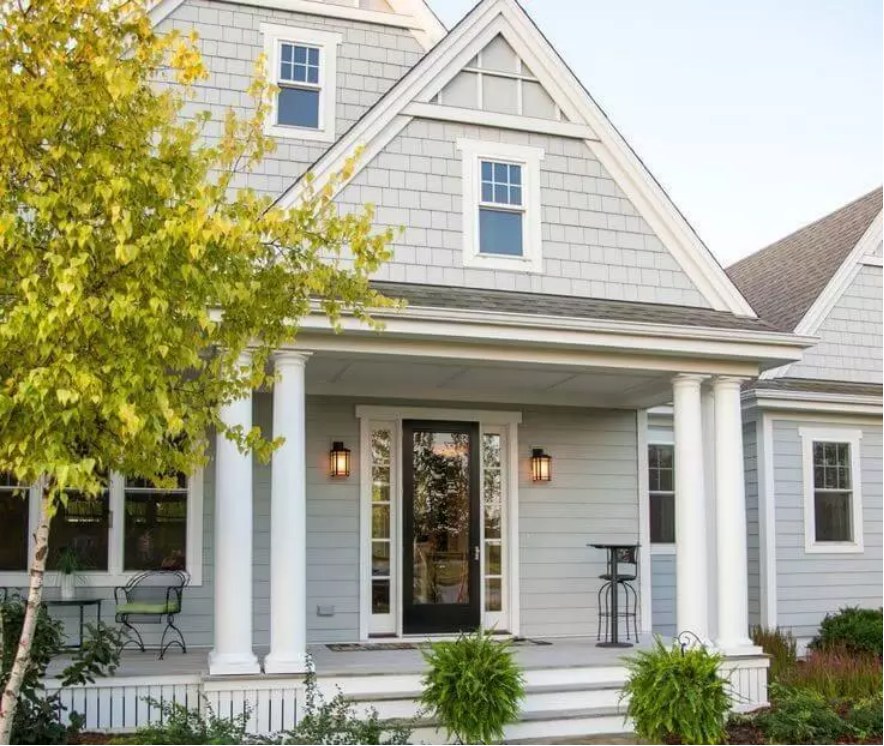
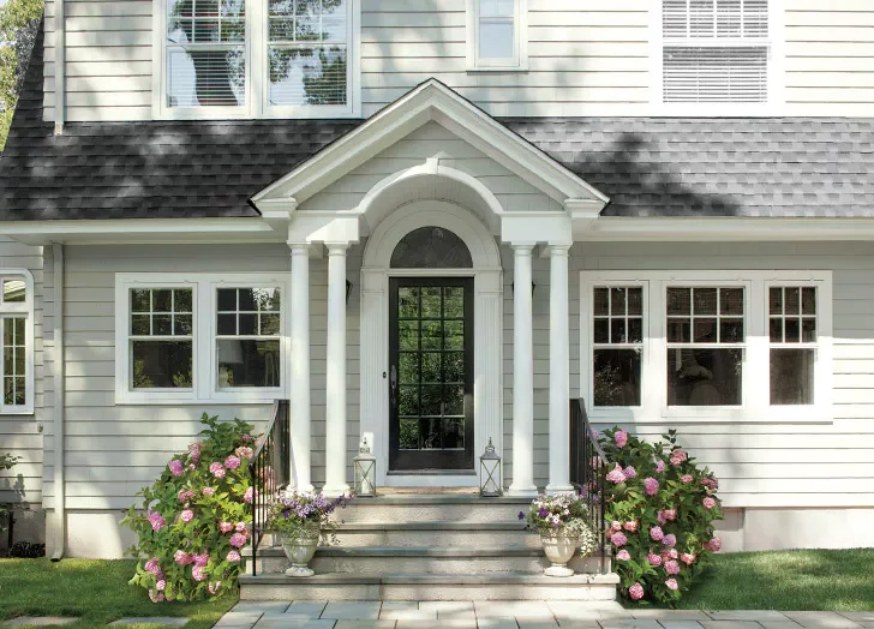
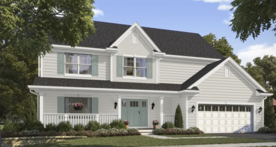
Sherwin Williams Drift of Mist Outdoors
Source: https://bit.ly/3VvxIOy
Overview
Sherwin Williams Drift of Mist is a versatile paint color that works in all types of rooms. The only caution you may need to exercise is balancing out the light in your rooms—If your rooms are too bright, Drift of Mist SW 9166 may become washed out, losing its characteristics.
The Drift of Mist works with a wide variety of paint colors. Therefore, if you are worried about finding something worthy of pairing with Drift of Mist, you shouldn’t be—the paint color allows you to implement both monochromatic and contrasting palettes.
Additionally, the paint color does not limit you in trim color options. You can choose different-looking options or trim your Drift of Mist walls with darker grays to create an attractive look.
We hope this guide has answered your questions about Sherwin Williams Drift of Mist. If we missed a question, let us know in the comment section—we will respond with a detailed answer.
 Sherwin Williams Incredible White (Palette, Coordinating & Inspirations)
 Sherwin Williams Black Fox (Palette, Coordinating & Inspirations)
 Sherwin Williams Pewter Green (Palette, Coordinating & Inspirations)
 Sherwin Williams Stardew (Palette, Coordinating & Inspirations)
 Sherwin Williams Tricorn Black (Palette, Coordinating & Inspirations)
 Sherwin Williams Silvermist (Palette, Coordinating & Inspirations)
