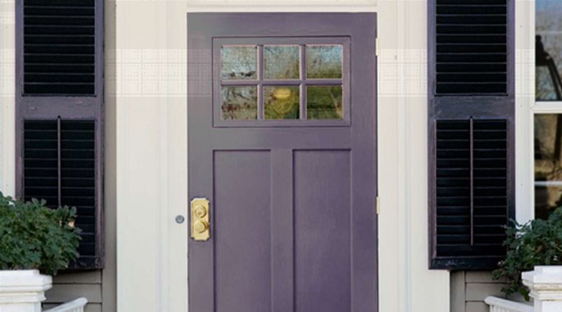
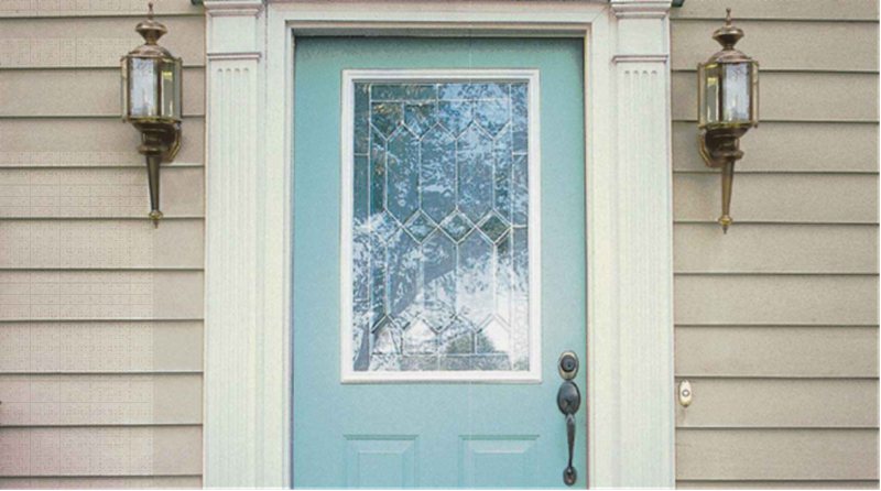
Have you ever thought of painting your front door? Do you prefer to stick to the traditional neutral colors, or are you bold enough to get creative? Whichever color you choose, you don’t want to be off-trend.
This year, when creating a color palette for your home’s exterior, bright colors should be within arm’s length.
A unique front door would arrest attention and remind your guests that they’re welcome into your home. The best part about this is that you can use two colors, outside and indoors, depending on your overall theme.
As the leading paint brand in the US, this review focuses on colors from Sherwin-Williams. From lighting to building’s size and position, here’s everything you need to know about choosing colors for your front door in 2023.
Before we begin, let’s analyze the basics — space and lighting, the building’s size and position, and lighting options.
Table of Contents
Steps for Choosing the Right Front Door Color
“Why is choosing a front door color a big deal?”
The popular saying, “First impressions last longer,” should be your motto for choosing a front door color.
First impressions start from the outdoors, although many people focus on their space’s interior, whether home or office.
Your exterior’s impression on strangers makes the difference between feeling anxious, nervous, apprehensive, relaxed, happy, and optimistic. Follow these first three steps before choosing your Front Door Paint.
Analyze the Space and Lighting
People often assume exteriors are spacious, but you’ll do your decor a great injustice without analyzing the space. What kind of building do you have, and what’s the exterior like? Is there a porch? What’s the door’s size and design?
Once you’ve answered those questions, you can examine the door’s size and position.
Examine the Exterior Size and Position
Sunlight affects the color of your home’s exterior because of the paint’s undertones. Some positions reflect more light than others and can potentially transform the front door’s color completely or partially.
Knowing the best position for your front door helps you decide if retaining its natural color or using another hue is the right choice. Use a compass to determine your building’s coordinates and mark the front door’s position.
A south-facing door would receive the brightest morning light, lasting until the early afternoon. Using bright colors on front doors in this position would highlight the deepest undertones, especially if the surrounding walls are equally bright-hued.
If your door faces North, you’ll get a consistent sunray throughout the day. This will retain the front door’s natural color and highlight its soft undertones.
Paint your front door with dark colors if it faces the west, as this position receives the brightest afternoon light until sunset. West-facing light solves the problem of dark hues being light-absorbent as it penetrates the darkest colors and reflects the latent undertones.
Evaluate your Options — Natural and Artificial Lighting
The final step in the preliminary phase of painting a front door is evaluating your lighting options. Knowing what natural light can do based on your assessment, choose your preferred lighting option. Would you use artificial light or stick to natural sunlight, or both?
Since we’ve cleared up the dynamics of natural lighting, let’s have an overview of artificial lighting. Even if your exterior light is for aesthetics, ensure it fits the front porch’s theme from the door to the patio walls. So, “what color of light works best outside the house?”
As many colors exist in the world, there’s an equal possibility of artificial lighting, but the basic ones are white and yellow.
White light contains a wide spectrum of rainbow colors (red, orange, yellow, green, blue, indigo, and violet) – hence, it has the highest potential of highlighting your front door’s undertone.
The light absorbs all other colors in the spectrum while reflecting the similar colors it can read from your front door’s paint. Meanwhile, note that these reflections shine in varying degrees apart from the Light Reflectance Value of the paint.
Reserve yellow lighting for warm colors (red, orange, and yellow) to intensify the reflection. If you’re getting creative with other bright or dark colors on the wheel, match them to similar paints to avoid clashing reflections.
Finally, note that artificial lighting makes cool colors appear dull while it brightens warm colors.
Understanding Front Door Colors
Enough with the technicalities — it’s time to get creative. What mood do you want your visitors to have when they enter your space? For instance, the vibe given off when entering a home should differ from that of walking into a lawyer’s or a psychologist’s office.
Once you’ve sorted the mood on the exterior, ensure it matches the interior theme. Create a harmonious blend using the color palette — you don’t want your visitors’ emotions to fluctuate from outside to inside.
Warm colors that bring cheerfulness and positivity include Red, Yellow, and Orange (including all their variants), while Cool colors — Green, Blue, and Purple (in all variations) provide tranquility, groundedness, and fruitfulness.
What Are The Undertones?
Choosing a front door color goes beyond picking one hue from the color wheel because it appeals to your mood. If you’ve ever bought paint in one color only to get home, use it on your walls and see another shade, then undertones are at work.
Undertones are secondary hues embedded in every paint due to their RGB value. A paint’s RGB value is the quantity of red, green, and blue paint mixed into an absolute black color to create a unique shade.
These secondary colors shine under certain light conditions and interact with other colors. Undertones are typical with tertiary, neutral, and pastel colors because they’re faint and built on other primary/secondary colors.
Once you’ve assessed the undertones in your chosen front door color, the next step is considering the type of front door. Would the paint cover its entirety, or would you use it sparing as an accent?
Types of Front Doors
Front doors come in different shapes and sizes depending on the overall design of the building.
We have contemporary entry doors made of glass and steel panels, traditional wooden doors made in double-dutch and single doors, and blended glass and wood doors. Although this guide focuses on wooden doors, you can use these tips for modern entry doors incorporating glass into their designs.
Wooden Doors
Wooden Doors have existed since immemorial and remain the go-to for many designers. Besides the different door designs and sizes, there are also multiple wood types with different finishes.
Popular wooden exterior door types.
Difference Between French Doors & Double Doors
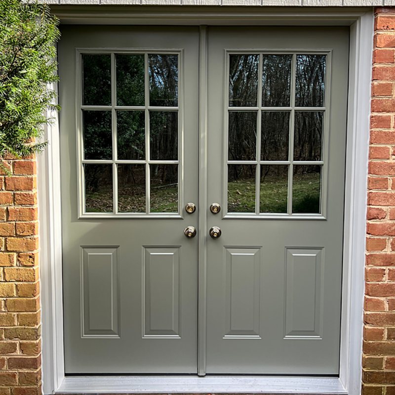
French Doors are double doors that incorporate paneled glass into their designs. Each door has two columns by four rows (or more, depending on the size) of glass divided by wood. Meanwhile, Double Doors are traditionally wood-only entryways.
French Doors attract natural light through their glass panes, so the wood colors must complement the interior painting.
Meanwhile, you can choose one color outside and another inside with Double Doors. It’s also good to coordinate the exterior and interior but not compulsory.
Battened and Ledged Doors
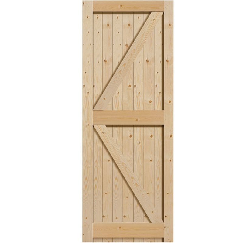
Battened and Ledged Doors are narrow entryways made of wooden boards. The name comes from the unique design with a double horizontal “Z” on the single door.
Dutch Doors
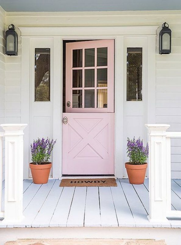
Half doors with a division that allows the lower bottom to stay shut while the upper part opens are Dutch Doors. Typically, the upper part borrows from the French door’s glass paneling design, but this doesn’t happen often.
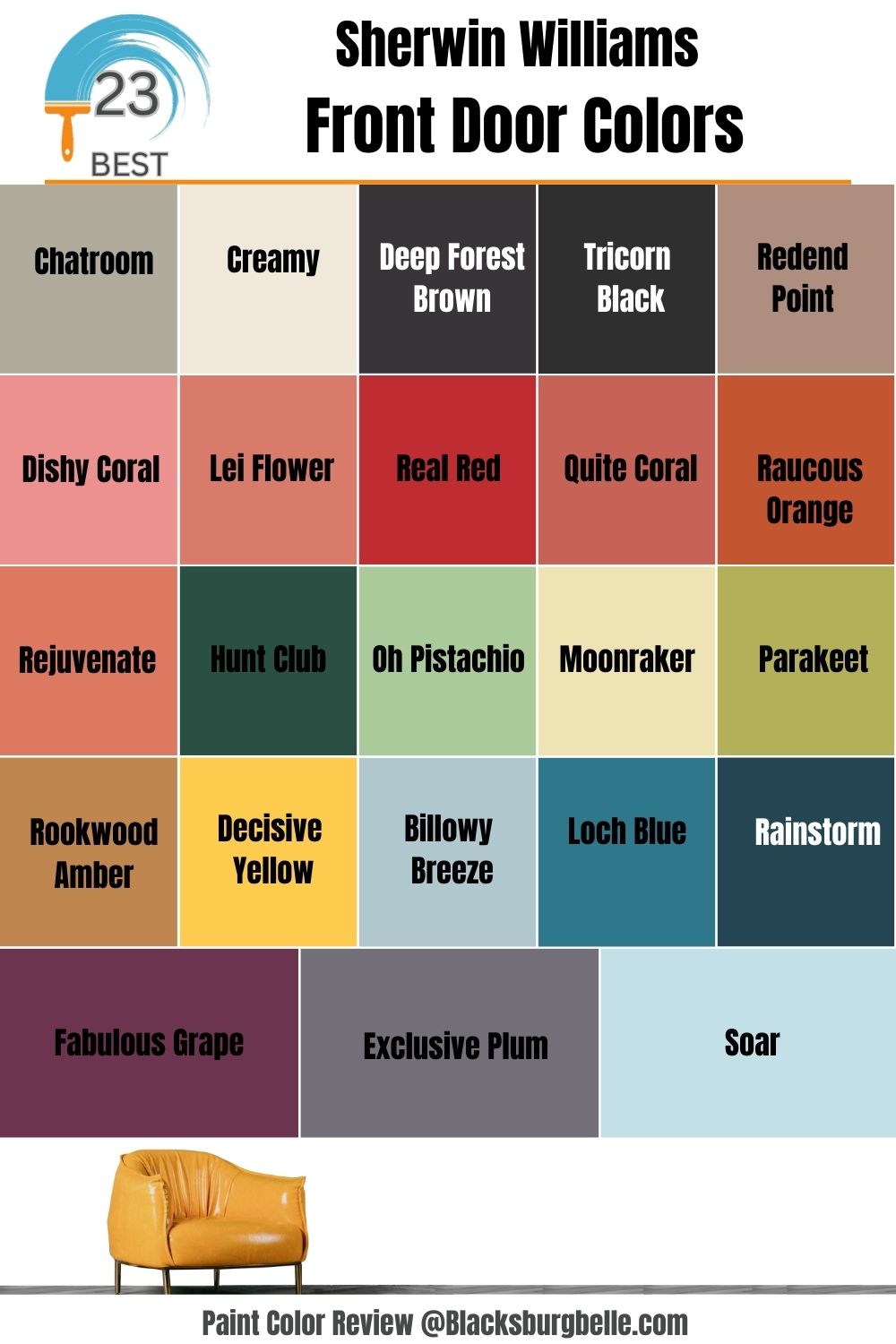
23 Sherwin-Williams Front Door Colors Trending In 2023
This year, the two dominant colors trending for front doors are red (warm) and blue (cool.) However, they aren’t the only top colors for decorating entryways.
We’ve sorted the 23 trending front door Sherwin-Williams colors of 2023 into seven categories based on the color wheel, including neutrals.
| Neutral | Red | Orange | Green | Yellow | Blue | Purple |
| Chatroom | Redend Point | Quite Coral | Hunt Club | Rookwood Amber | Billowy Breeze | Fabulous Grape |
| Creamy | Dishy Coral | Raucous Orange | Oh Pistachio | Decisive Yellow | Loch Blue | Exclusive Plum |
| Deep Forest Brown | Lei Flower | Rejuvenate | Moonraker | Rainstorm | Soar | |
| Tricorn Black | Real Red | Parakeet |
1. Chatroom (SW 6171)
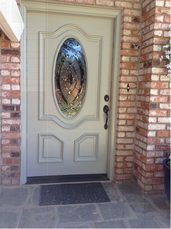
Chatroom (SW 6171) is a soft greige paint that works as a better alternative to traditional charcoal gray. This neutral paint blends green and yellow seamlessly — separating both undertones is almost impossible.
However, Chatroom’s overtone is a soft gray one which appears more cool than warm due to its faint yellow content. You can use this versatile neutral front door paint with white or stone walls from red brick like Cajun Red (SW 0008) to other grays.
2. Creamy (SW 7012)
Although white isn’t in season for front door coloring in 2023, we can excuse Creamy (SW 7012) for its beautiful beige undertone. It’s a perfect neutral paint against a crisp white wall in a minimalist and monochrome palette.
Creamy has a tinge of pink which flashes underneath natural sunlight, allowing you to beautify your front porch with pink flowers like Bougainvillea. Also, note that this color is a warm off-white paint, so consider that when curating your palette.
Pair Creamy with Reynard (SW 6348), a rich orange paint, or Studio Taupe (SW 7549), a soft gray paint with a yellow undertone.
3. Deep Forest Brown (SW 9175)
Use Deep Forest Brown (SW 9175) to contrast off-white and beige walls. It’s suitable for classic Double Doors made of cool wood tones.
You can easily match Deep Forest Brown to red and orange walls and decor or muted tan tones like Natural Linen (SW 9109) and Cocoa Whip (SW 9084).
This paint has a low LRV of 4, meaning it’s not designed to reflect light, but a West-facing light would bring out its brown hue.
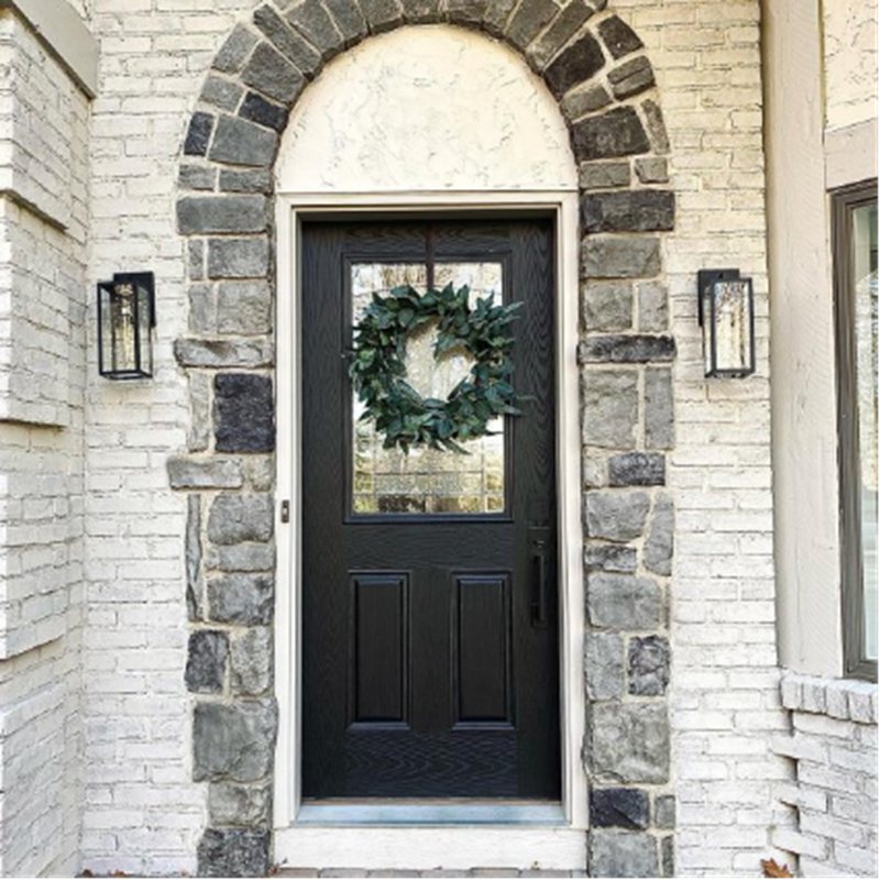
4. Tricorn Black (SW 6258)
Another dark LRV paint trending in 2023 is Tricorn Black (SW 6258) which has a reflection of 3 out of 100. Black paints would never go out of trend because of their versatility, making them blend into any theme or palette.
Sherwin-Williams Tricorn Black is part of its Trendsetter and Top 50 Colors.
5. Redend Point (SW 9081)
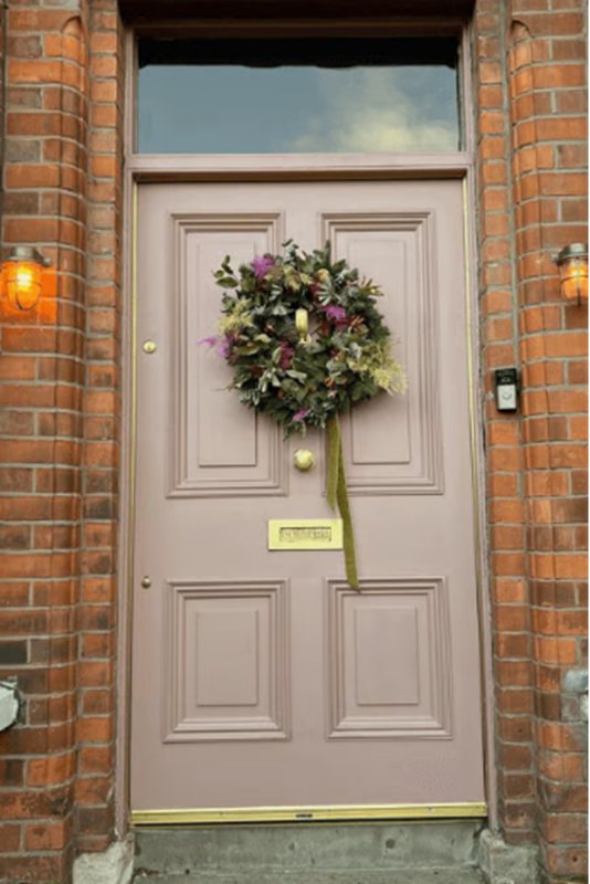
Sherwin-Williams Redend Point (SW 9081) is the color of the year 2023. A close look at this blush red paint, and you’ll understand why it’s the belle of the ball for the brand. It’s a soft dark shade with an LRV of 30, yet it has a warm overlay.
Pair Redend Point with white or beige walls and brown wooden floorings for the best combination.
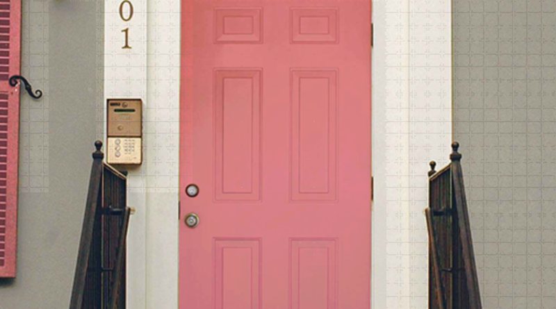
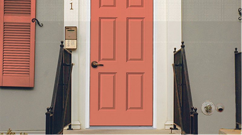
6. Dishy Coral (SW 6598)
Dishy Coral (SW 6598) is a rosy pink paint that works wonders against off-white walls. This medium-dark tone paint color coordinates seamlessly with Shell White (SW 8917) and Intimate White (SW 6322).
This color stands out with gold accessories on the knob, hinges, and sconces. You can also add more beauty with warm tan paints as accents.
7. Lei Flower (SW 6613)
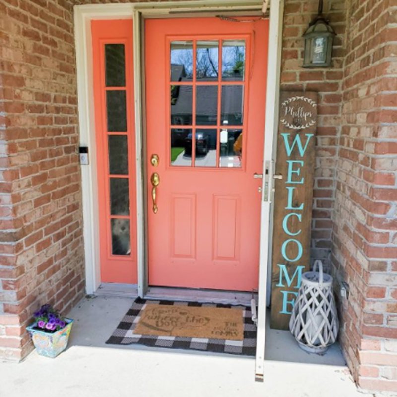
A mere look at Lei Flower (SW 6613) wouldn’t give you a clue that it could be an exterior paint, but it’s one of the best Front Door colors you’ll ever explore. It’s a peach-toned medium-dark color with an LRV of 30.
Lei Flower pairs well with multiple exteriors, from reddish-brown brick walls to light teal, white, and yellow. Notice that the coordinating colors all have higher LRVs to complement the rich dark tone on Lei Flower.
8. Real Red (SW 6868)
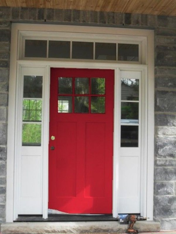
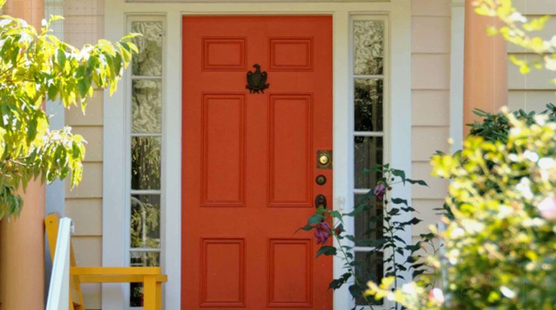
Can you design a classic American home without a big red door using Real Red (SW 6868)? This color holds a promise of optimism with its vibrant tone and suits any paintable door design, whether it’s a single door, double door, or French door.
Use Real Red against a crisp white trim and black accent, then add warmth with a yellow light. For more muted themes, use Real Red against a gray wall,
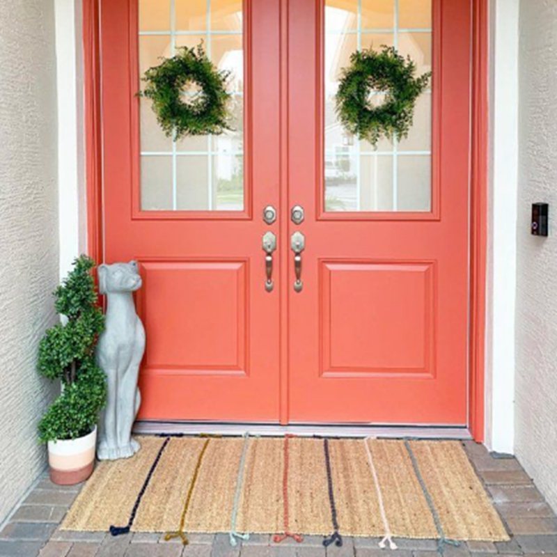
9. Quite Coral (SW 6614)
Quite Coral (SW 6614) is a darker alternative to Lei Flower, which has a red base, unlike its orange-based 22 LRV dark tone. Its color collection, Latin Zest, gives you an idea of the exterior themes that use this as the Front Door color.
You can paint Quite Coral on a French or single door and use white paint as the outer trim. This color works well against neutral paints like Extra White and Sticks & Stones and does well with a pinkish-white like Faint Coral.
10. Raucous Orange (SW 6883)
Keep your home in a forever Fall/Autumn state with this rich orange paint — Raucous Orange (SW 6883). Pairing this color with white is a no-brainer, but choosing the right white paint is tricky.
Use a pastel white like Nearly Peach, which has a 77 LRV, for a sharp contrast, or tone the color down with another medium-dark neutral like Web Gray (SW 7075) and Gray Matters (SW 7066). If you dare, pair Raucous Orange with a deep navy blue.
11. Rejuvenate (SW 6620)
Sherwin-Williams made Rejuvenate (SW 6620) as interior paint, but that doesn’t mean you can’t use it as an accent on your Front Door. Pair this color with crisp white paint for a seamless contrast.
12. Hunt Club (SW 6468)
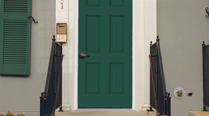
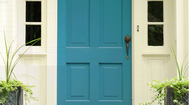
Hunt Club (SW 6468) is a classic green paint for nature-inspired exteriors. You can pair it with white trims and walls and beautify the space with potted, garden, and wall plants. It’s a great color to tell visitors they’re entering a centered space.
Hunt Club is a front door against a stone building with wooden floorboards and staircases.
13. Oh Pistachio (SW 9033)
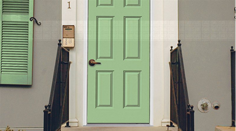
You wouldn’t expect a medium green paint like Oh Pistachio (SW 9033) can work as a front door color. Pair this with creamy white paint tinged with green undertones for a nature-themed exterior.
If you’re feeling creative, pair Oh Pistachio with golden accessories and a pastel yellow wall.
14. Moonraker (SW 6701)
Moonraker (SW 6701) is a very light green paint (76 LRV) that often appears yellow due to its undertone. Hence, this color works as a neutral regardless of the lighting condition. Pair it with brownstone buildings or white walls.
15. Parakeet (SW 6711)
Unlike Moonraker, which appears yellow, Parakeet (SW 6711) is an obvious green paint from the Bold Invention Color Collection. Its olive overtone and medium-dark LRV of 41 make it appear cool underneath cool lighting.
Pair this Parakeet with gray or purple sidings like Dried Lavender (SW 9072) for a bold exterior, or keep it muted using a complementary white paint like Shell White (SW 8917) and Roman Column (SW 7562).
16. Rookwood Amber (SW 2817)
Dark yellow paints like Rookwood Amber (SW 2817) with a strong brown overtone work well as a neutral front door. This color has an LRV of 29 due to its high content of red making it a warm paint.
Rookwood Amber pairs well with white, beige, blue, and yellow walls. Improve its aesthetic value with golden lights and greenery.
17. Decisive Yellow (SW 6902)
Use Decisive Yellow (SW 6902) for a more traditional approach to yellow front doors. Despite being a vibrant yellow paint, its 65 LRV means it’s closer to the median than the white end of the scale.
This color thrives best against an off-white paint like Creamy (SW 7012), crisp white like Pure White (SW 7005), or dark gray like African Gray (SW 9162). You can also add navy blue or black siding with white trims to your exterior.
18. Billowy Breeze (SW 9055)
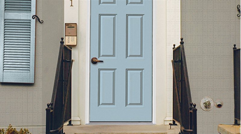
A soft blue paint like Billowy Breeze (SW 9055) is a safe choice as a front door color instead of classic white. It blends seamlessly into neutral walls and sidings from white to gray, tan, and even blue paints.
Billowy Breeze can work as a neutral paint due to its 55 LRV and is a great way to say, “You’re welcome into a centered home.”
19. Loch Blue (SW 6502)
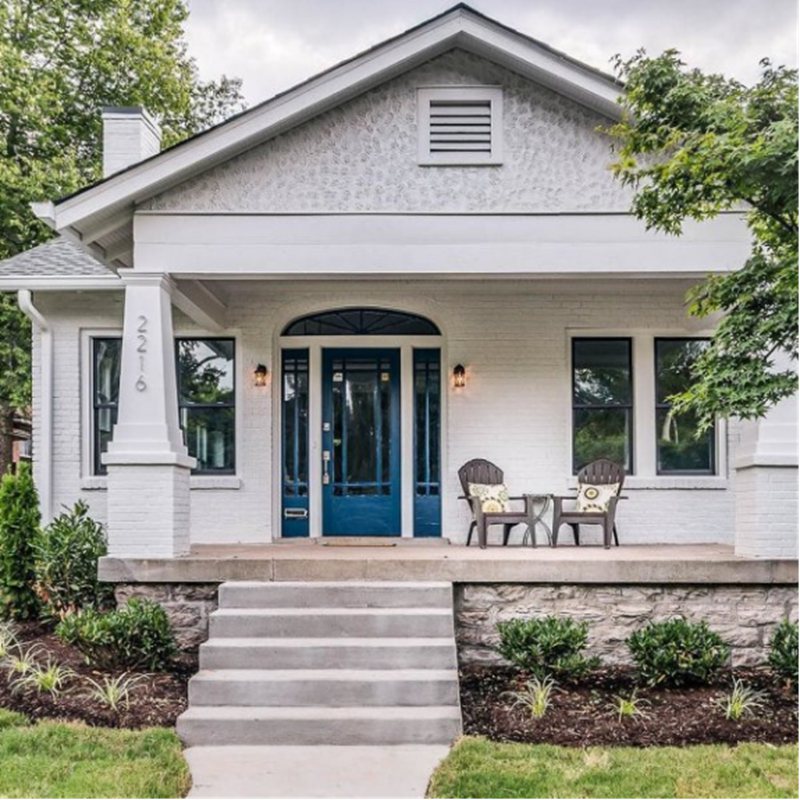
French doors look more beautiful when painted in Loch Blue (SW 6502), giving the building a beachside aesthetic. This dark blue paint with its 16 LRV appeals to children, so you can use it for their clinic, schools, or games room entryways.
Pair Loch Blue with white trims, golden tan, or faint blue like Blue Horizon (SW 6497) walls.
20. Rainstorm (SW 6230)
You’re used to using navy blue paints like Rainstorm (SW 6230) as wall paint, but you can also use it as a front door color. Its cool and confident aura makes the exterior appear cozy to visitors.
Rainstorm has a slate gray undertone, which makes it a good pair for gray walls and stone buildings. Pair Rainstorm walls with light gray trims and add style with sage green accents like Frosted Emerald (SW 9035).
21. Fabulous Grape (SW 6293)
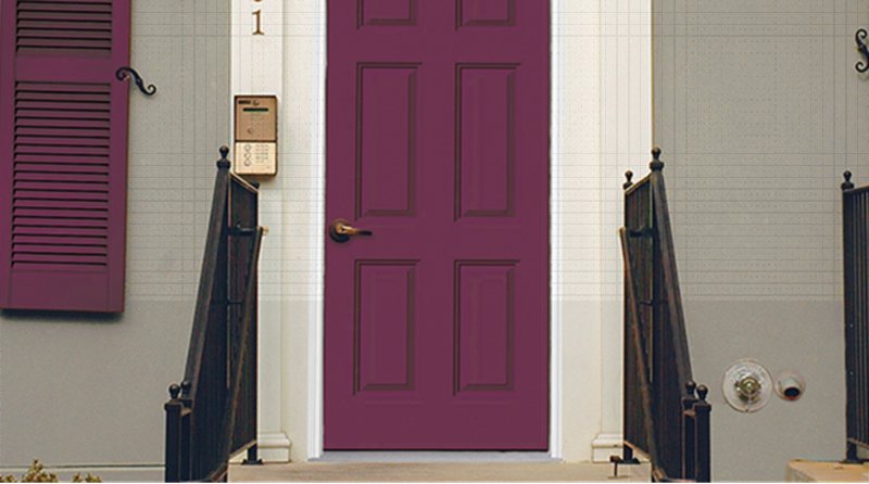
Get into avant-garde decor with Fabulous Grape (SW 6293) paint on your front door. This color has a strong red undertone, making it a good pair for red-based colors.
You can use Fabulous Grape against gray paints like Touch of Sand (SW 9085) and Moth Wing (SW 9174).
22. Exclusive Plum (SW 6263)
Exclusive Plum (SW 6263) isn’t as vibrant as Fabulous Grape, which makes this unique purple color a cool front door paint. It’s a soft lavender tone with a tinge of blue-gray that makes it a suitable pair for other soft tans and white paints.
Exclusive Plum has an LRV of 16, which makes it light-absorbent. It also appears charcoal under dim lighting. Highlight its soft features with high LRV paints like Spatial White (SW 6259), Dreamy White (SW 6021), and Emerging Taupe (SW 6045.)
23. Soar (SW 6799)
Soar (SW 6799) is a pastel purple paint that sometimes appears blue due to its high content in the RGB value. This color has a high LRV of 70, which can brighten up a space without natural or artificial lighting.
Pair Soar with a crisp white paint like Extra White (SW 7006), a neutral yellow paint like Napery (SW 6386), and other blue paint like Iceberg (SW 6798).
Choosing the Right Front Door Color
Choosing the right front door color shouldn’t be a problem anymore with your newly acquired knowledge. However, here are a few more tips to ensure you make the best exterior decision.
Match The Front Door Color To The Walls
Your front door must match the exterior walls to avoid a clash in undertones and overtones. As a standard rule, match warm walls to warm doors and cool walls to cool doors. However, professional designers can pair contrasting colors based on their knowledge of color theory.
Sample Area Testing
Always test your chosen color with samples — Color-to-Go paints, Color Chips, or Color Strips — before buying. Once you place the sample on a small part of the door, leave it from morning till night or vice versa to observe its reaction with natural and artificial light.
Refer to the Steps for Choosing Front Door Colors for a recap on pre-painting evaluation.
Long-Term Value of Front Door Colors
Are you a volatile designer? How often do you change your front door color? If you’re into seasonal decor and don’t mind repainting quarterly, then feel free to use bright colors like Raucous Orange during Halloween and Billowy Breeze for winter.
Note, however, that constant color changes are expensive because you’ll need to clean the current paint before using the new hue to avoid transference.
If you’re painting on a budget and unlikely to change your front door color soon, stick to neutrals. They’re longer lasting and more versatile to suit a dynamic exterior.
Finishing Touches
Some of the paints on this list come in unique finishes, like the Sherwin-Williams Emerald Designer Edition, which comes in a gloss sheen. Gloss sheens are shiny and bright, unlike matte sheens which are soft and light-absorbent.
Since a colored front door is meant to attract attention and be the centerpiece of your building’s exterior, it’s best to paint it in a glossy sheen. You can use matte sheen paints as bordering trims and accents.
Conclusion
Follow all the steps in this guide and watch your exterior transform from a basic outdoor space into a beautiful masterpiece.
Once you’ve chosen the right front door color, coordinate your accessories and themes to match. 2023 is the year to get creative and bold – have fun with your design.

