
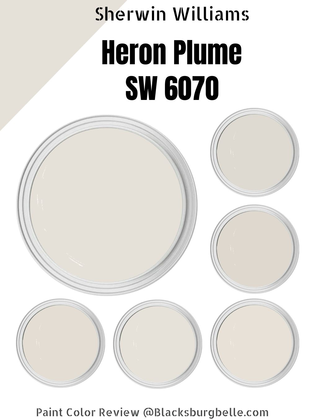
“Pretty” Is the perfect way to describe Sherwin Williams Heron Plume. With subtle purple pink undertones, SW Heron Plume is a must-try color for anyone who isn’t scared or bothered by a more stereotypically “feminine” color.
If you’re looking for the perfect warm, bright color that will bring your bedrooms or living area to life, then the SW Heron Plume is worth considering as an accent color or as a color for your walls.
For a thorough rundown of this pretty off-white paint color, check out this Sherwin Williams Heron Plume Paint Color Review.
Table of Contents
What Color is Sherwin Williams Heron Plume (SW 6070)?
Sherwin Williams Heron Plume is a greige gray paint color that falls under the White and Pastel group. Do not confuse it with Sherwin Williams White Heron, as Heron Plume is actually an off-white with subtle undertones.
Although its greige consists of beige and gray, it has some pink and purple undertones, which tends to throw off some people who are searching for a more neutral color choice. The reason is that the paint color does a good job of hiding its undertones most of the time.
Regardless, this soft color with warm undertones is still beloved by many customers and homeowners.
| Manufacturer | Sherwin Williams |
| Paint Color | Heron Plume |
| LRV | 75 |
| RGB | R: 229 G: 225 B: 216 |
| Hex Value | #e5e1d8 |
| Color collections | Living Well – Center, Cool White, Finest Whites |
RGB of Sherwin Williams Heron Plume
According to Encycolorpedia, Sherwin Williams Heron Plume has a hexadecimal code of #e5e1d8. Other properties are as follows.
Red: 229(89.8%) Green: 225(88.24%) Blue: 216(84.71%).
SW Heron Plume has a saturation of 20% and a lightness of 87%.
LRV of Sherwin Williams Heron Plume
Sherwin Williams Heron Plume has an LRV of 75.
The LRV of a paint color refers to its Light Reflective Value. It simply implies or describes how strongly a color will reflect natural or artificial light.
SW Heron Plume’s high LRV shows that it tends towards white, but it’s not entirely a white color, hence, its off-white status.
Light Reflective Value runs on a scale of 0 – 100, with 0 indicating true black that reflect little to no light. On the other hand, 100 indicates true white that reflects the most light.
Since Sherwin Williams Heron Plume has an LRV of 75, it’s closer to being classified as a white paint color. This also shows in its bright appearance.
That being said, SW Heron Plume will reflect more light than darker colors and brighten up your living spaces as a soft taupe.
Is It a Warm or Cool Color?
Sherwin Williams Heron Plume is a warm bright off-white paint color. Its beige component, together with its undertones, pulls it in the warm direction, with the gray doing little to dampen the warmth.
Using the paint color in a south-facing room will bring out more of its warmth. In such rooms or in the western afternoon sunlight, it will lean more into its slightly dominant warm base.
On the other hand, a north or east-facing room will give it a more passive warmth, but it won’t fall all the way to cold gray.
What Are The Undertones?
Sherwin Williams Heron Plume has muted purple and pink undertones. This is one of the reasons why it is said to take people by surprise. Most customers don’t expect such a bright soft paint color to have these undertones.
However, Heron Plume is a sure choice if you don’t mind a slight feminine touch in your decor.
Remember to do a swatch test before purchasing it. This will help you determine whether or not SW Heron Plume is for you and to avoid any hidden surprises.
Sherwin Williams Heron Plume Color Strip
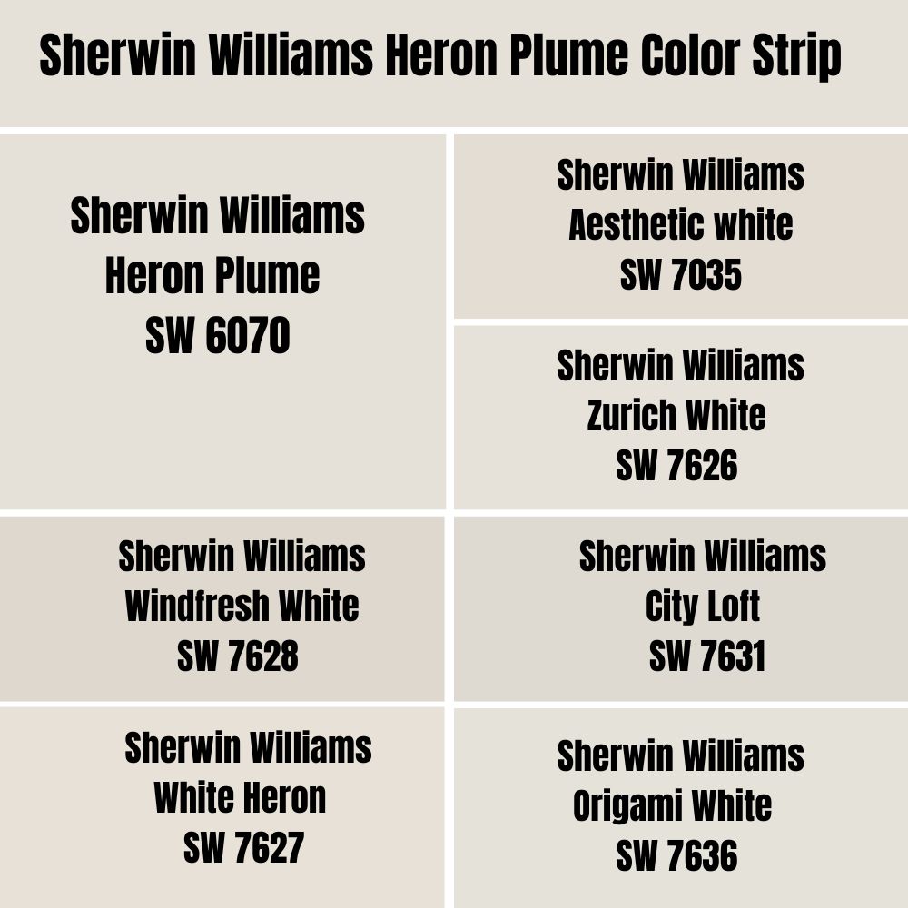
A color strip is used to display colors that share a similar formula or composition but with entirely different variations. While they might look similar at first glance, their LRV and saturation will always defer.
Colors on the same color strip can be described as being both synonyms and antonyms of one another. Furthermore, some members of the same strip can complement one another to form a monochromatic palette.
Sherwin Williams Aesthetic white
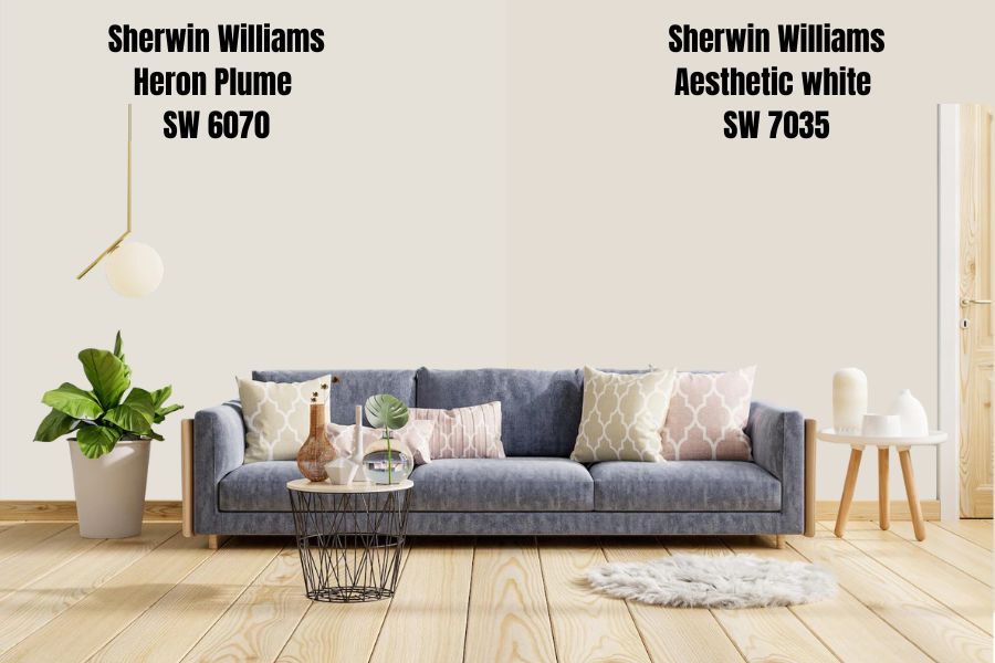
Sherwin Williams Aesthetic white is a warm shade of white that really brings out the earthy tones in a wooden decor. It doesn’t grab any obvious undertones, although it has been known to pick up on some earthy greens and some pinks.
It’s a few shades darker than Heron Plume, with an LRV of 73, while that of Heron Plume is 75.
SW Aesthetic White has an RGB value of R: 227 G: 221 B: 211, a saturation of 22%, and a lightness of 82%.
Sherwin Williams Zurich Whit
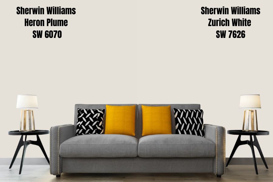
With undertones of both yellow and gray, Sherwin Williams Zurich White is a warm, bright off-white. However, depending on the lighting, the paint color can read either warm or a little cool.
Sherwin Williams Zurich white is just a shade lighter than SW Heron Plume, with an LRV of 76.
It has an RGB value of R: 230, G: 225, and B: 217, a saturation of 21%, and a lightness of 88%.
Sherwin Williams White Heron
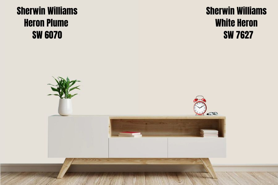
Sherwin Williams White Heron is a “clean white” with warm undertones. It’s usually used with a ceiling and trim color and works really well with marble and colors that give off a gray finish.
When used in a room that gives off enough light, SW White Heron can brighten up the room, making it look like it just had a nice warm bath as the undertones come into play.
However, be careful of using this color in a dark room, as this might make it appear dull and dingy.
SW White heron has an LRV of 76 and an RGB value of R: 231, G: 225, and B: 215. It has a saturation of 25%, and a lightness of 87%.
Sherwin Williams Windfresh White
Sherwin Williams Windfresh White is a greige off-white with gray and beige undertones. It has an LRV of 69, making it slightly darker than Sherwin Williams Heron Plume.
The paint color also has less versatility but can work as a good neutral. In case you are wondering, Sherwin Williams Windfresh White reads warm.
It has an RGB value of R: 222, G: 216, and B: 207, a saturation of 19%, and a lightness 84%.
Sherwin Williams City Loft
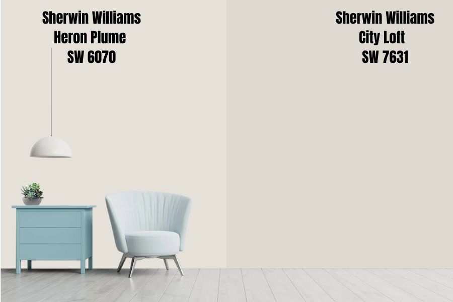
Sherwin Williams City Loft is a light greige that can double as an excellent neutral. SW City Loft is a rather popular paint color because of how it plays off with other colors and gives living spaces a nice cozy feeling.
SW City Loft has gray, beige, and pink-red undertones, but people tend to read the color as purple or pink, similar to Sherwin Williams Heron Plume.
It has an LRV of 70. And an RGB of R: 223, G: 218, and B: 209, a saturation of 18%, and a lightness of 85%.
Sherwin Williams Origami White
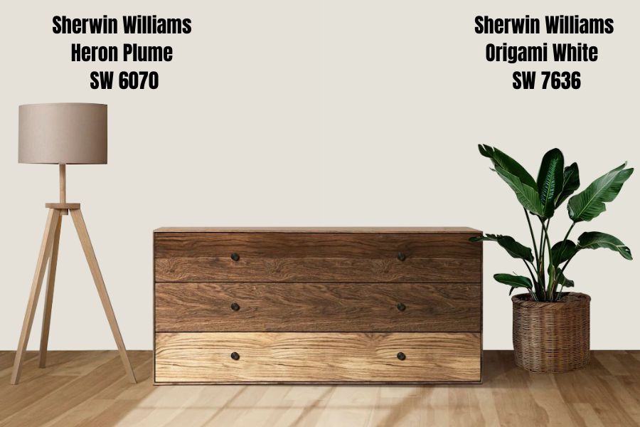
Sherwin Williams Origami White is a bright off-white paint color. It has a tan and grayish undertone and goes well with other gray colors like Sherwin Williams Anew Gray, and SW Spalding Gray.
The paint color makes for an excellent interior color because of its muted undertones. It also pairs well with other accent colors and can also be a trim color for Sherwin Williams Heron Plume.
Sherwin Williams Origami white has an LRV of 76 and an RGB value of R: 229, G 226, and B: 218. It has a saturation of 17%, and a lightness of 88%.
Sherwin Williams Heron Plume Color Palette
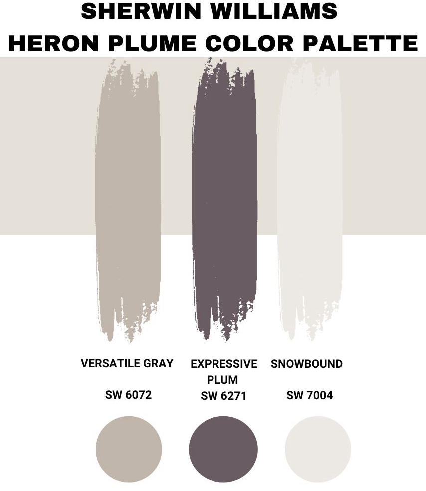
Coordinating Colors for Sherwin Williams Heron Plume
Decor aside, the one trick you can do to elevate your entire home completely is to choose the right paint color and what better way to do that than to pair coordinating colors to make your home look more cohesive and perfectly balanced.
Sherwin Williams Versatile Gray
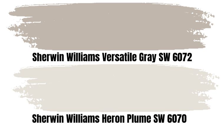
As its name implies, Sherwin Williams Versatile Gray is a paint color that looks good almost anywhere and with almost anything. Similar to SW Heron Plume, it’s a warm taupe color and can look warm without flashing into cool gray.
SW Versatile gray also has some pink and purple undertones that, while noticeable, they’re not so overwhelming to take away from the room.
In a north-facing room, it can look more like a warm gray without looking too cool. However, in a south-facing room, SW Versatile Gray doesn’t lean so warm that it visually overheats a room as some warm paint colors do.
That’s why most homeowners tend to use it as a finisher color.
It has an LRV of 48, making it medium to dark-toned.
Sherwin Williams Expressive Plum
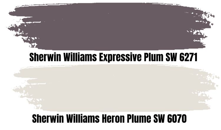
SW Expressive Plum has been described as the perfect color for the bedroom. It’s no wonder it got the 2014 Color of the Year award by Sherwin Williams. This “expressive” paint color is an extremely versatile color that works in every room.
It’s dark and muted enough to make the perfect accent wall for a man cave. Add it to a corner in your study, and you’ve got yourself a cozy reading nook, then when paired with metallic decor, it makes a very sophisticated living space.
Sherwin Williams Exclusive Plum is a perfect blend of smokey blue with a vivid violet undertone, which seamlessly unites it with other colors to give living spaces some character.
It has an LRV of 12, which means it’s on the darker end of the spectrum compared to SW Heron Plume.
Sherwin Williams Snowbound
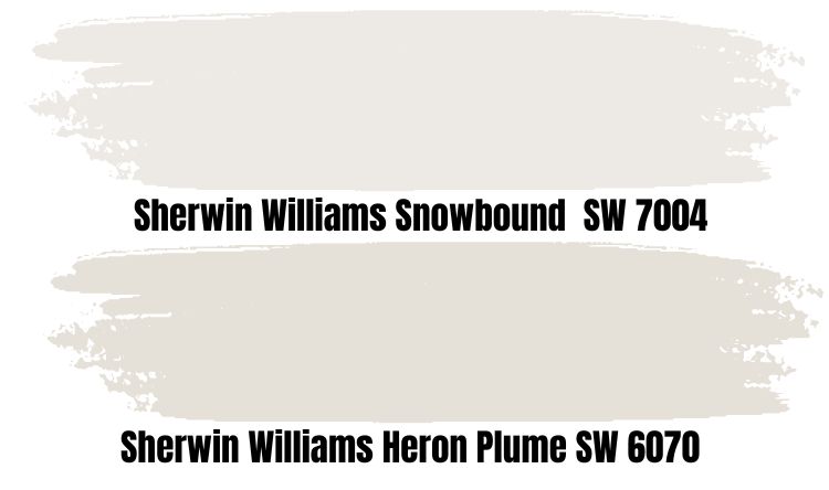
SW Snowbound belongs to the Collections; minimalist, Pottery Barn, Living Well – Reflect, Timeless White. It’s a warm soft white color, similar to sw Heron Plume.
If you want to emphasize its warmth, then you can use it in south-facing rooms. In such spaces, you may find it looking warmer than usual.
On the other hand, north-facing rooms will bring out a more muted version of the paint color. Such spaces will mute it a bit without making it look totally icy cold or stark.
Sherwin Williams Snowbound has an LRV of 83, and it tends towards the lighter end of the spectrum, looking even lighter than Sherwin Williams Heron Plume.
Sherwin Williams Heron Plume Complementary Colors
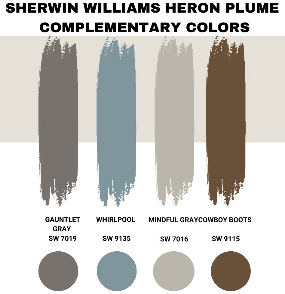
Complementary colors fall on either side of the color opposite any color of your choice on a color wheel. They generally help whichever color you pick appear better when paired correctly.
It’s like on a color wheel where opposite colors tend to complement one another, e.g. red and green.
A similar thing also happens with paint colors. Two colors on opposite sides of each other will pair a lot better with one another than with any other color. People use this neat trick to match what other colors go well with their color of choice.
It could be for an accent wall or a trim color etc. In fact, SW Heron Plume can as well serve as either an accent color or a trim color when paired with its complementary colors. They pair well with each other to give splendid results.
Examples of Sherwin Williams paint colors that complement SW Heron Plume include the following.
- Sherwin Williams Gauntlet Gray
- Sherwin Williams Whirlpool
- Sherwin Williams Mindful Gray
- Sherwin Williams Cowboy Boots
What Trim Colors Go With Sherwin Williams Heron Plume?
Without a doubt, adding a trim color to your decor brings the entire look together. It is important to note that your choice of trim colors is just as vital as choosing the wall paint color.
To find the perfect trim for Sherwin Williams Heron Plume, you can choose a white or dark trim to perfect your desired look.
White Trims
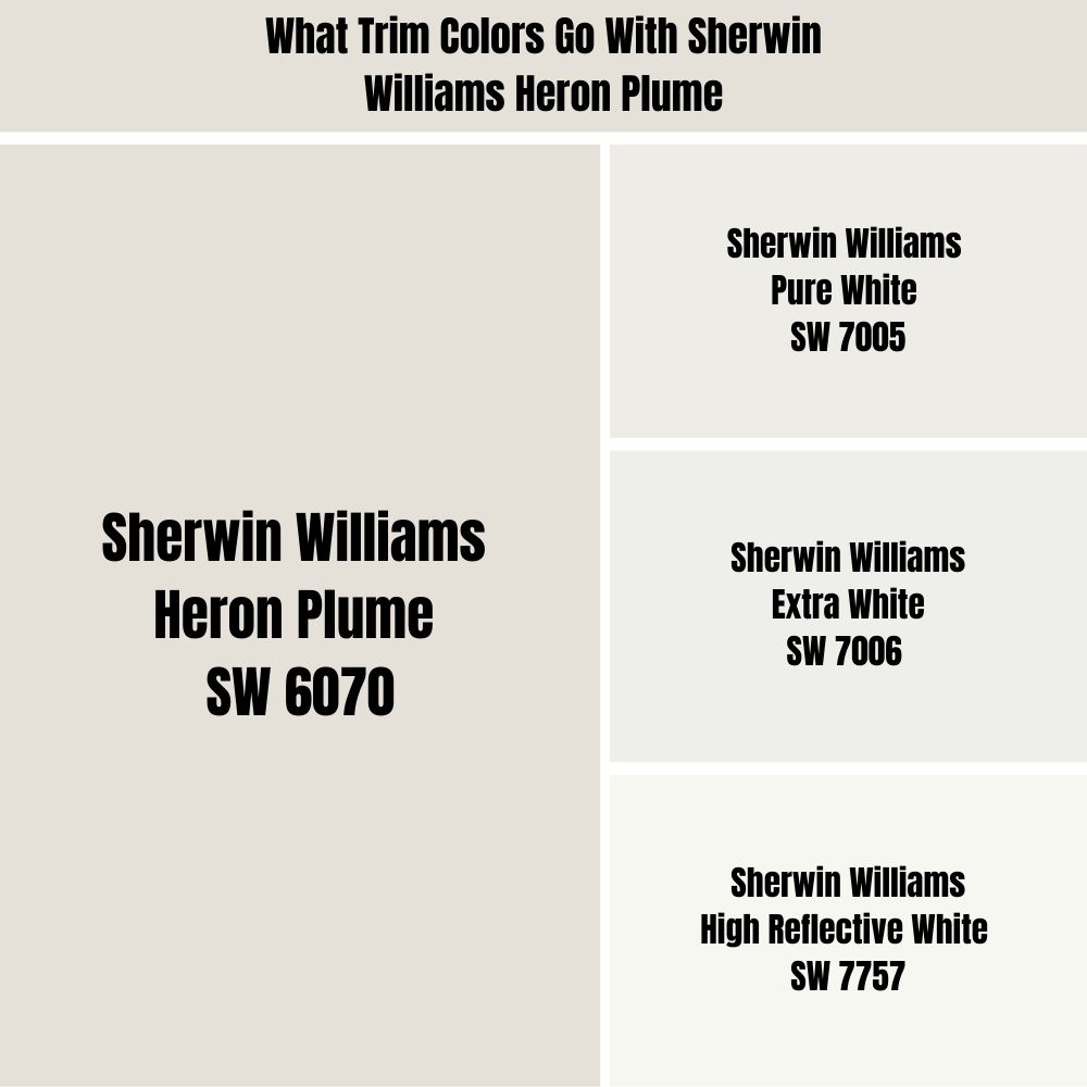
Sherwin Williams Snowbound is a complementary color to SW Heron Plume, and it can also double as a trim color for it.
It also belongs to the taupe family like Heron Plume, and since they’re both soft and warm colors, they can pair up nicely with one another. Picking this trim color will give your space or room a creamy finish.
If you would prefer a crispy finish you can consider the following paint colors as trims.
- Sherwin Williams Pure White
- Sherwin Williams Extra White
- Sherwin Williams High Reflective White.
Dark trims
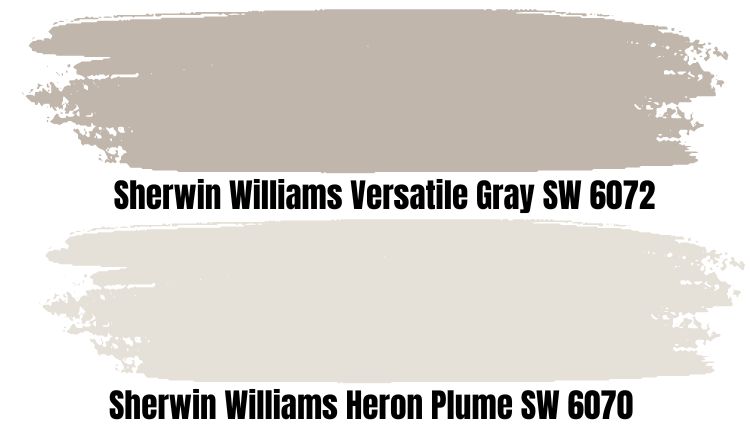
If you want to go for a more dark trim, then consider using Sherwin Williams Versatile Gray.
The multipurpose dark paint color works well as a trim for Sherwin Williams Heron Plume. It has a significantly lower LRV than SW Heron Plume.
However, you have to take care with the undertones of other elements in your decor to ensure they don’t clash with your trim.
Sherwin Williams Heron Plume Color Comparisons
In this section, we’ll compare Sherwin Williams Heron Plume with some other selected paint colors.
Alabaster vs. Heron Plume
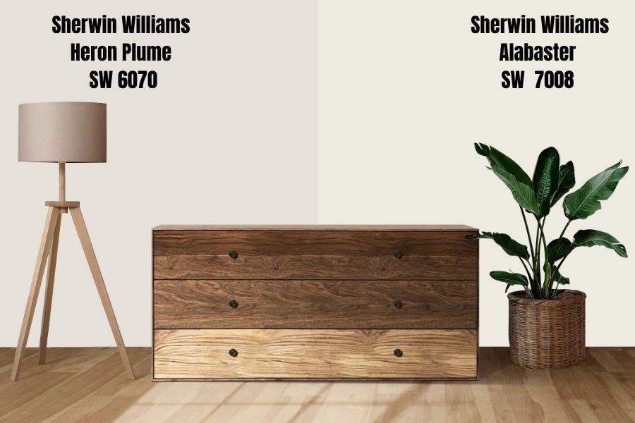
SW Alabaster is a creamy off-white color that people often mistake for yellow because of its texture. It has a neutral base that balances it out and prevents it from getting too warm or looking yellow.
The creamy paint color has some yellow and greige undertones to it. The undertones are why many people often mistake it for being a yellow greige paint.
SW Alabaster has an LRV of 82
| Sherwin Williams Color | LRV | RGB | Hex Value |
| Heron Plume | 75 | R: 229 G: 225 B: 216 | #e5e1d8 |
| Alabaster | 82 | R: 237 G: 234 B:224 | #edeae0 |
Winds Breath vs. Heron Plume
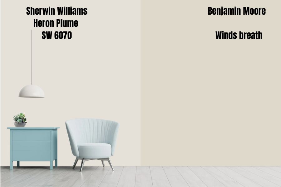
Benjamin Moore Winds Breath is a warm neutral paint color that bothers between the two worlds of beige and warm taupe.
Although it’s a neutral color, it can also pick up on some subtle hints of pinks and violets.
Benjamin Moore Winds Breath has an LRV of 70, which makes it slightly darker than Sherwin Williams Heron Plume, which has an LRV of 75.
| Paint Color | LRV | RGB | Hex Value |
| Sherwin Williams Heron Plume | 75 | R: 229 G: 225 B: 216 | #e5e1d8 |
| Benjamin Moore Winds breath | 69.6 | R: 224 G: 225 B: 21 | #GR-W06 |
White Heron vs. Heron Plume
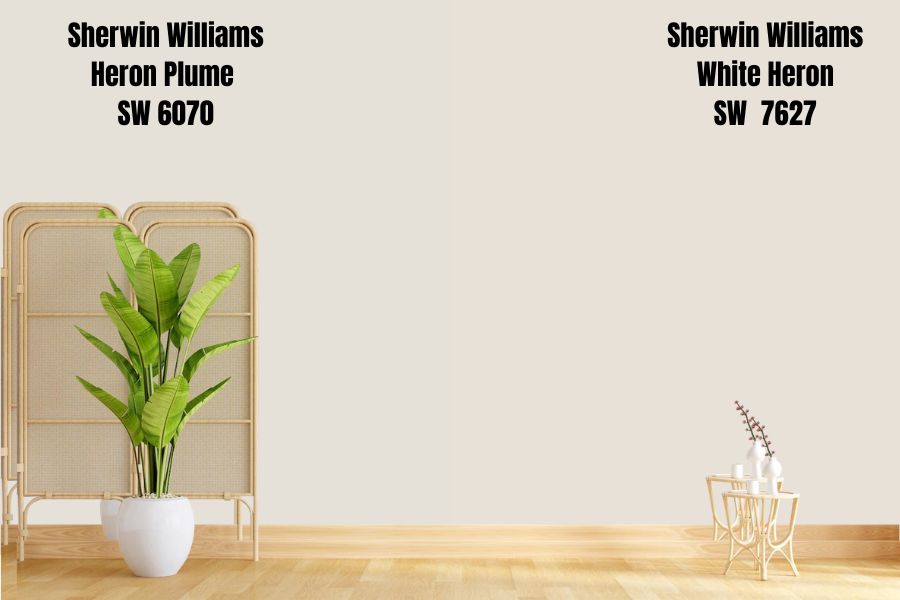
As I mentioned earlier, Sherwin Williams White Heron is a clean white with a slightly warm undertone. The best place to place this beautiful white color is in a room that gets enough lighting.
However, using it in dark rooms is less optimal for decor as the lack of light doesn’t do justice to the whiteness of the paint.
Although SW White Heron is also a greige color, it has some pink and violet undertones as well that fortunately do not overwhelm its brightness.
White Heron has an LRV of 76.
| Sherwin Williams paint color | LRV | RGB | Hex Value |
| Heron Plume | 75 | R: 229 G: 225 B: 216 | #e5e1d8 |
| White Heron | 76 | R: 231 G: 225 B: 215 | #e7e1d7 |
Heron Plume Benjamin Moore Version
Benjamin Moore doesn’t have a color known as Heron Plume. What they do have however is something very similar to the SW Heron Plume in terms of characteristics and properties. This color is known as Dove Wing.
Benjamin Moore Dove Wing
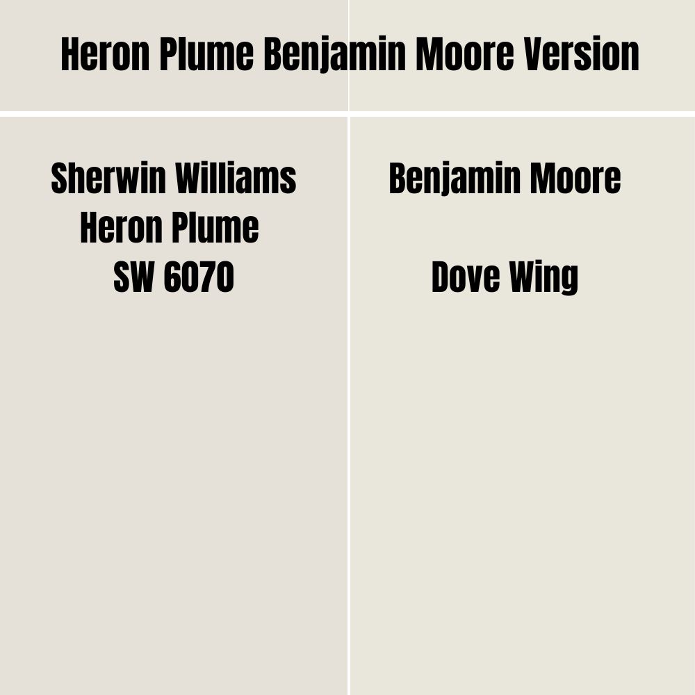
Benjamin Moore Dove Wing is an all time creamy textured paint color. It’s an off-white neutral similar to SW Heron Plume.
This warm toned color feels light and feathery just like the name and it pairs beautifully with wooden or natural decor.
BM Dove Wing is several shades lighter than Sherwin Williams Heron Plume with an LRV of 79.2. It has an RGB value of Red = 233, Green = 230 and Blue = 219 with a HEX Value = #e9e6db.
It’s worth noting that just like most neutral colors,the undertones of the Benjamin Moore Dove Wing can easily get washed out in the presence of bright light.
How Does Light Affect the Color?
Sherwin Williams Heron Plume is often described as having sneaky undertones. This means that although it’s a soft taupe belonging to the neutral beige-gray family, it has some pink and purple undertones that tend to put people off the color.
In a south-facing room or in the western afternoon sunlight, Sherwin Williams Heron Plume will lean more into its slightly dominant warm base, which will brighten up your space and make it feel lovely and cozy.
That being said, it will look just as fine in a north or east-facing room. For example, it will have a more passive warmth but look completely cool in such rooms. This can mellow down the unique undertones a little bit and bring out more of its greige side.
Best Rooms to Paint Heron Plume
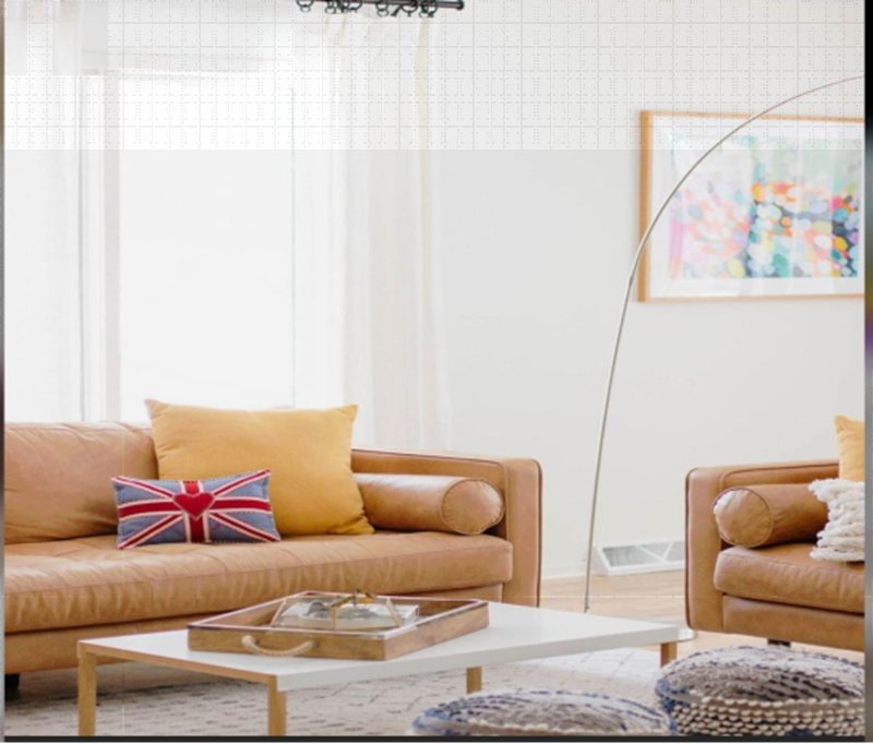
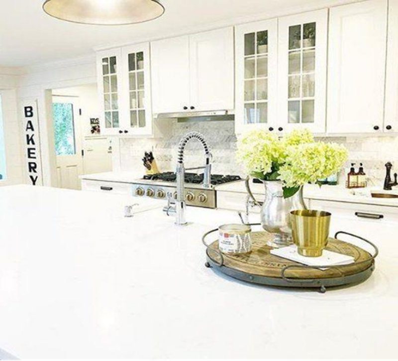
Sherwin Williams Heron Plume, when used correctly goes well in most living spaces, and with the right lighting, it can brighten up the space. Here are a few spaces where the Sherwin Williams Heron Plume has been used:
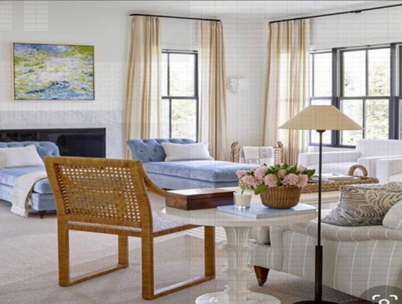
Sherwin Williams Heron Plume Living Room

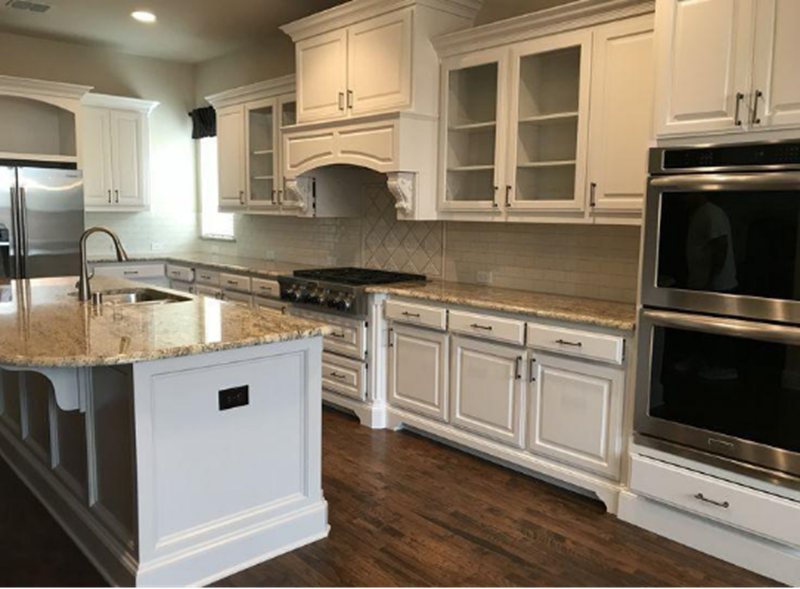
Sherwin Williams Heron Plume Kitchen
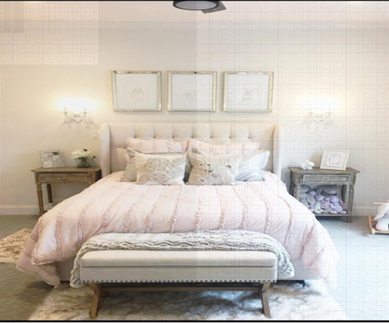
Sherwin Williams Heron Plume Bedroom
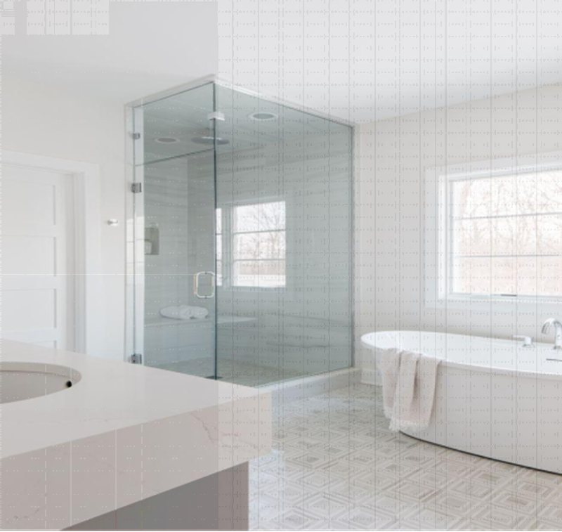
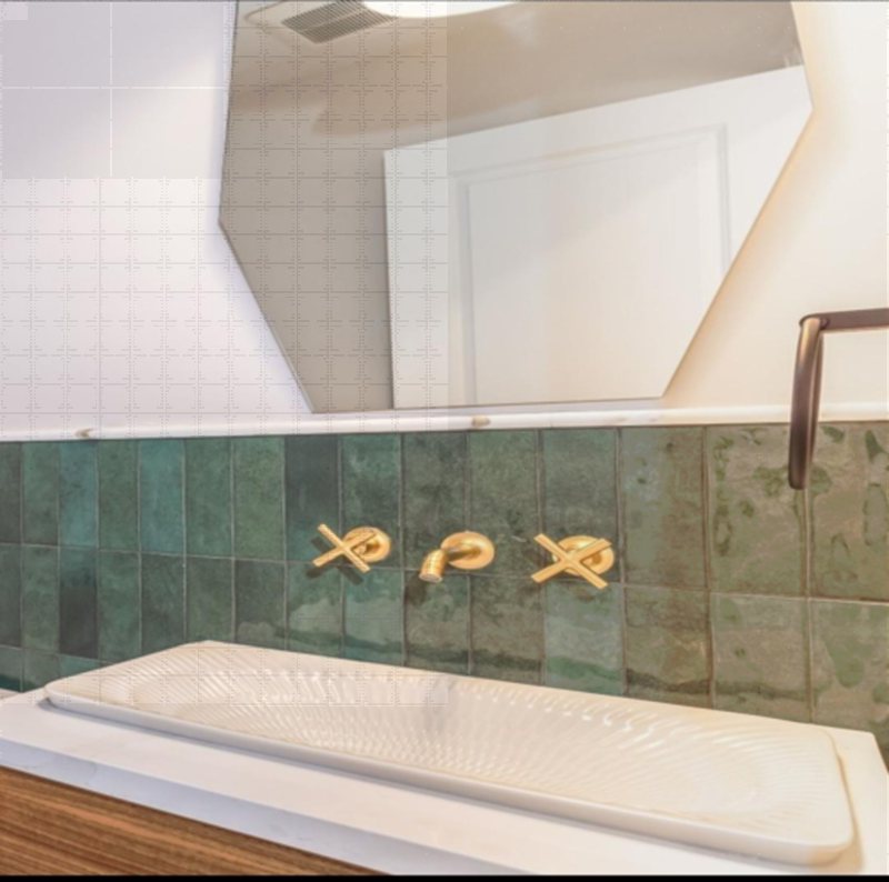
Sherwin Williams Heron Plume Bathroom
Final Thoughts
Sherwin Williams Heron Plume doesn’t get enough credit as it deserves. Probably because many people tend to shy away from it due to its unique and surprising undertones.
However, this soft taupe color still falls within the neutral family and if you don’t mind some pinks and purples being reflected in your living space, then you should definitely try it out.
Whether in your bathrooms or your bedrooms or living rooms, Sherwin Williams Heron Plume will brighten up your living space.
Cozy, bright, and easy to pair with are just some of the reasons why Sherwin Williams Heron Plume makes such a great paint color.
 Sherwin Williams White Duck (Palette, Coordinating & Inspirations)
 Sherwin Williams Sensible Hue (Palette, Coordinating & Inspirations)
 Sherwin-Williams Pussywillow (Palette, Coordinating & Inspirations)
 Sherwin-Williams Gossamer Veil (Palette, Coordinating & Inspirations)
 Sherwin Williams Dark Night (Palette, Coordinating & Inspirations)
 Sherwin Williams Oyster Bay (Palette, Coordinating & Inspirations)
