
Are you finding it hard to choose between dark and bright color shades? Well, it happens to a lot of us. However, for people well versed in the paint color world, choosing between the dark and white shades is unnecessary when you can go for the Sherwin Williams Incredible White.
One of the reasons the Incredible White has featured in several of my rooms is that it allows me to mix classic and modern interior designs. Moreover, this paint color gives my rooms a sophisticated yet innovative appearance.
So, how about we discuss the Sherwin Williams Incredible White paint color in detail? Read on because we are about to spill the beans on this unique paint color and compare it to its closest cousins, like Alabaster and Eider White.
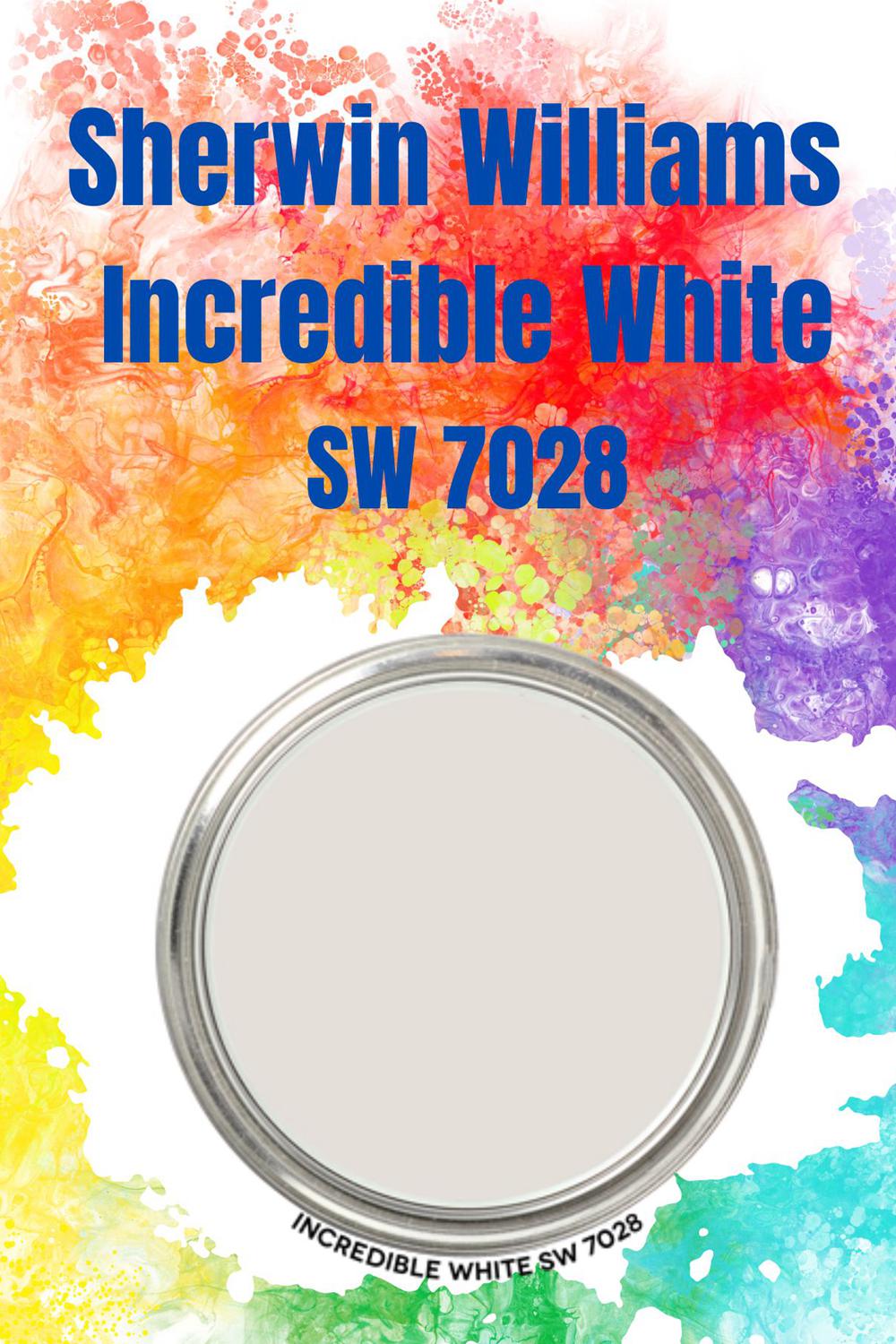
Table of Contents
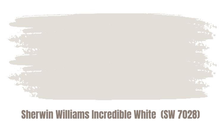
What Color is Sherwin Williams Incredible White (SW 7028)?
| Manufacturer | Sherwin Williams |
| LRV | 74 |
| RGB | R: 227 G: 222 B: 215 |
| Hex Value | #e3ded7 |
| Color Collections | Top 50 colors, Living Well, Finest Whites, Cool White |
Is the Incredible White beige, taupe, greige, or taupe? Well, the exciting thing is that the Incredible White blends them all to produce a stand-out paint color. However, when you narrow it down, the Sherwin Williams Incredible White (SW 7028) is more of a blend between greige and taupe.
In a room with balanced light quality, the Incredible White will resemble a near-neutral off-white, although when some people view it, they often notice some moments of peachy-pinkish overtones.
Some who have used this color do not hesitate to insist that it doesn’t have any undertones and it is just greige. Some will also note that it appears completely purple. However, these appearances have a lot to do with the color’s hue family—the Sherwin Williams Incredible White is a low chroma color. Therefore, how (or if) it shows or shifts to show moments of undertones and overtones depends on the room’s light.
RGB of Sherwin Williams Incredible White
RGB is a common abbreviation that describes the amount of each color—red, green & blue—present in a paint color. RGB runs on a scale of 0 to 255 and shows the color mix that produces the paint color under review.
Incredible White paint combines Red 227, Green 222, and Blue 215.
LRV of Sherwin Williams Incredible White
The abbreviation LRV stands for Light Reflective Value—it measures the amount of light the color can bounce around. LRV has a scale running from 0 to 100. Colors bounce off more light as they move towards 100, where 0 indicates pure black, which has zero ability to reflect light, while 100 is pure white, which reflects the most light.
The light reflectance value of Incredible White is 74. An LRV between 73 and 82 is considered an “off-white.” This shows that Incredible white SW 7028 sits on the darker end of the off-white range.
Is Sherwin Williams Incredible White A Warm Or Cool Color?
The Incredible White SW 7028 is a warm color. There is no doubt that the paint will leave more greige when you put it in a room with afternoon eastern light or north-facing light. However, the Incredible White features an appealing soft warmth when placed in an afternoon/morning western or south-facing light.
What Are the Sherwin Williams Incredible White Undertones?
The Incredible white paint color sits perfectly between beige and gray. This would then suggest that it would appear beiger, right? Interestingly, not quite.
The color features typical taupe undertones, specifically purple and pink. However, the undertones disappear when moving down one color strip toward the Agreeable Gray color (we will compare this color to Incredible White in the next section).
In a room with south-facing light, you will notice pinker undertones. On the other hand, in a room with northern-facing light, the purple color falls back.
Sherwin Williams Incredible White Color Strip: Sherwin Williams Incredible White Color Comparisons
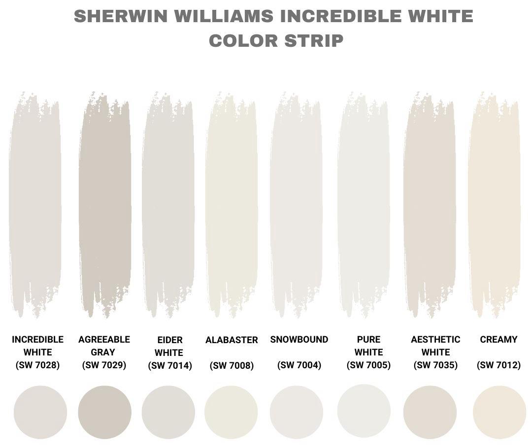
The Incredible White color has a series of paint colors that are highly similar to its appearance. This section will show how these colors compare and contrast with Incredible White.
Sherwin Williams Incredible White Vs Agreeable Gray (SW 7029)
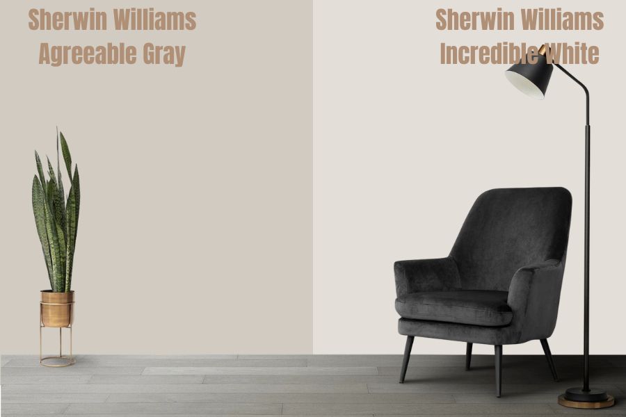
Agreeable gray is one shade darker than Incredible White on the same color strip. The Sherwin Williams Agreeable Gray SW 7029 is a warm, soft gray paint color that tends to be a crowd-pleaser—this has made it one of the #1 selling Sherwin Williams paints.
The Agreeable Gray is relatively neutral—it has brown/taupe, which gives it warmth and carries a dab of violet. As a result, agreeable Gray SW 7029 balances the cool and warm tones, which is why color experts often call it the ideal neutral gray.
Sherwin Williams Incredible White Vs Eider White (SW 7014)
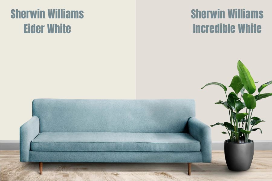
Incredible White and Eider White are very close in the LRV scale—Eider White comes in first at 73, followed by Incredible White at 74. This shows that the two paint colors have substantial similarities.
The difference between the two colors is in terms of their undertones. Unlike Incredible White, with pink and purple as its dominant undertones, Eider White (SW 7014) boasts blue-purple in cool shades and brown/red in warmer hues. In addition, while Eider White may show a pink undertone, this is usually very subtle, unlike Incredible White.
Another thing that separates Eider White and Incredible White is that the latter is warmer than the former.
Sherwin Williams Incredible White vs Alabaster (SW 7008)
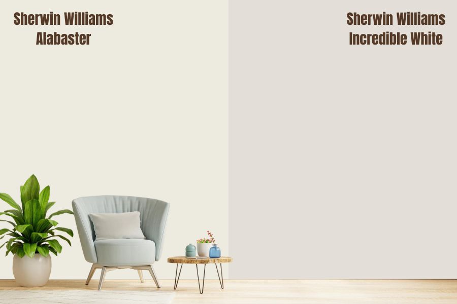
Compared to Sherwin Williams Incredible White Paint Color, Alabaster is a little more versatile. It boasts a warm, creamy white that does not feature undertones as tricky as those in Incredible White.
Alabaster is not yellow—its neutral base tends to ground its colors, preventing it from becoming too warm or looking yellow. This means that Incredible White is warmer than Alabaster.
Alabaster boasts subtle beige undertones that create a perfect balance of cool and warm. This explains why Alabaster is so popular among many interior designers.
With an LRV of 82, you can expect Alabaster to be much brighter than Incredible White with an LRV of 74. This translates into Alabaster being much more reflective.
Sherwin Williams Incredible White vs Snowbound (SW 7004)
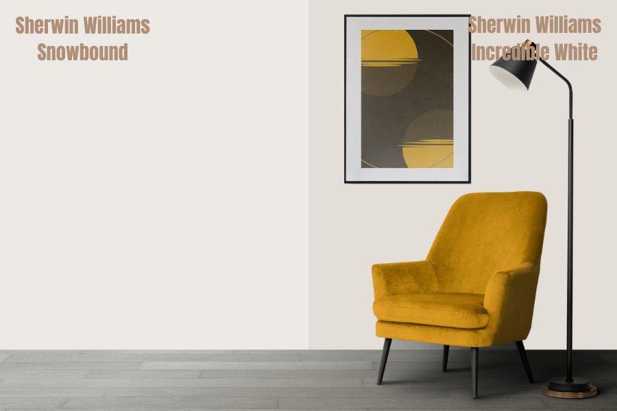
With an LRV of 83, Snowbound is much more reflective than Incredible White. The two colors also feature some differences in terms of their undertones. Snowbound boasts an attractive, slightly taupe appearance that features violet and pink as the undertone colors. This is somewhat different from Incredible White SW 7028, which features purple and pink shades.
While snowbound may not be as warm as the Incredible White, it is a soft, warm white paint color. If you have south-facing light or you look at the color with the western afternoon sun illuminating the room, the color becomes warmer than usual.
In the right environment, Snowbound can pick up a faint cream hint beyond passive warmth. In addition, some people note that they have seen Snowbound take a touch of a green undertone in the proper lighting—while this is very rare, it further shows how different the color is from Incredible White.
Sherwin Williams Incredible White Vs Pure White (SW 7005)
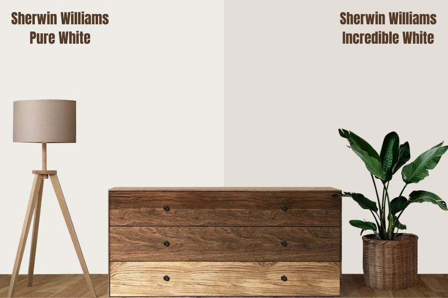
Unlike Incredible White, which clearly shows its pink and purple undertones, Pure White SW 7005 is a versatile and gorgeous white paint color with no glaring or apparent undertones.
The LRV of pure White is 10 points higher than that of Incredible White—while Incredible White has an LRV of 74, Pure White’s LRV is 84. So comparing the two on their reflective abilities, Pure White will reflect much more light.
Unlike Incredible White, which shows its warmth in almost all settings, Pure White sits in the middle. As a result, Pure White is neither warm & Creamy nor icy & cold. In south-facing rooms, the Pure White tends to be warm and becomes cooler in north-facing rooms.
Sherwin Williams Incredible White vs Aesthetic White (SW 7035)
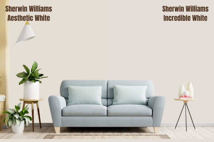
Incredible White and Aesthetic White are pretty close in terms of their appearance. Much like Incredible White, Aesthetic White is an off-white color boasting a beige paint leaning towards gray.
However, unlike Incredible White, which picks prominent purple and pink undertones, Aesthetic White does not grab apparent undertones. While I have seen some people note that it is slightly green or pink, this can be a result of the color’s environment—Aesthetic White is very susceptible to picking the colors surrounding it, which could easily deceive you that what you are looking at is an undertone.
Incredible White and Aesthetic White have an LRV of 74 and 73 (almost), respectively. This means that the two are very close regarding their ability to reflect light. As a result, the Aesthetic White will resemble a bright off-white in a bright room. However, in a darker room, it looks dingy and flat.
Sherwin Williams Incredible White vs Creamy (SW 7012)
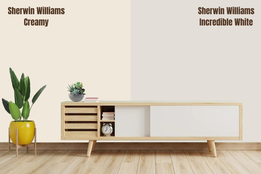
Creamy boasts an LRV of 81, which puts it in the off-white range, but not as far as Incredible White, which features an LRV of 74. Unlike Incredible White, which shows purple and pink undertones, you will be surprised to realize that Creamy (SW 7012) boasts a neutral undertone that balances exceptionally well with its yellow color.
Its attractive neutral base makes Creamy softer than other slightly yellow paint colors. Both the Incredible White and Creamy paint colors are warm.
Using creamy in a room with south-facing light produces a warm, yellow appearance that highlights other warm colors in the building, creating an extremely warm environment. You may notice the same appearance in the afternoon when you have Creamy in a west-facing room.
In a north-facing room, Creamy blends in well with the northern light, which boasts gray in terms of light and has a blue cast. In addition, the cool natural light in a northern room calms Creamy, giving it a subtle, soft, warm appearance.
Sherwin Williams Incredible White vs BM Swiss Coffee (OC-45)
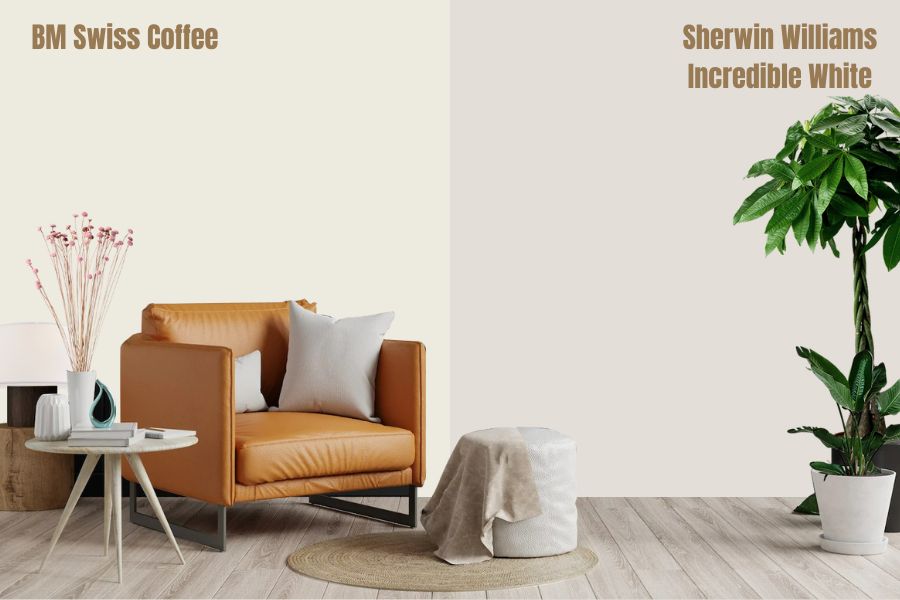
Unlike Incredible White, which has an LRV of 74, Benjamin Moore (BM) Swiss coffee has an LRV of 83.93, putting it in the sweet spot for some of the brighter white colors. Although both the Incredible White and the BM Swiss Coffee are in the off-white category, BM Swiss Coffee is brighter than the Incredible White.
However, the BM Swiss Coffee is just bright enough to make the room feel airy, and light but not so bright your walls appear sterile and boring. Both the Incredible White and BM Swiss Coffee are warm. The BM Swiss Coffee boasts mildly warm undertones that create a comfortable and inviting feel.
Unlike Incredible White, which boasts purple and pink undertones, you will find gray-green undertones on the Benjamin Moore Swiss Coffee. In addition, the yellow undertones in Benjamin Moore’s Swiss Coffee may also show in some lighting.
Sherwin Williams Incredible White vs BM White Dove (OC-17)
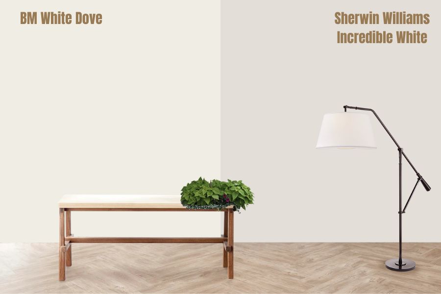
The Benjamin Moore White Dove sits on the higher end of the LRV Scale, rating 85.38. Unlike Incredible White, which sits on the lower end of the off-whites with a rating of 74, BM White dove is outside this range, which makes it both highly reflective and very close to pure White.
The BM White Dove is soft and creamy and tends to be very neutral, unlike Incredible White, which is super warm. However, White Dove is not super warm and not super cool—it sits right in the middle.
Unlike Incredible White, which boasts purple and pink undertones, BM White features greige undertones. White Dove has a yellow color, which balances well with a tiny bit of gray undertone.
Sherwin Williams Incredible White Color Palette
Coordinating Colors for Incredible White
Incredible White SW 7028 pairs exceptionally well with navy blue, bright white, and greige colors. However, you must avoid anything with a hint of yellow as it can bring out the pink undertones of the Sherwin Williams Incredible White and damage the appearance.
Below, we will discuss the coordinating colors for Incredible White in detail:
Blue Colors
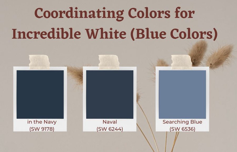
Sherwin Williams in the Navy (SW 9178)
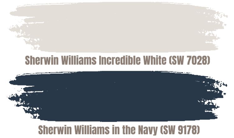
In the Navy (SW 9178) is a dark shade of cyan blue. In the Red Green Blue (RGB) color model, the In the Navy color features Red 40, Green 73, and Blue 73. With an LRV of 4, the color does not reflect much light.
In the HSL color space, the In the Navy color paint features a hue of 211 degrees and boasts a 29% saturation with 22% lightness. Whenever I have seen the Incredible White combined with the “in the Navy,” results have always been exceptional.
Sherwin Williams Naval (SW 6244)
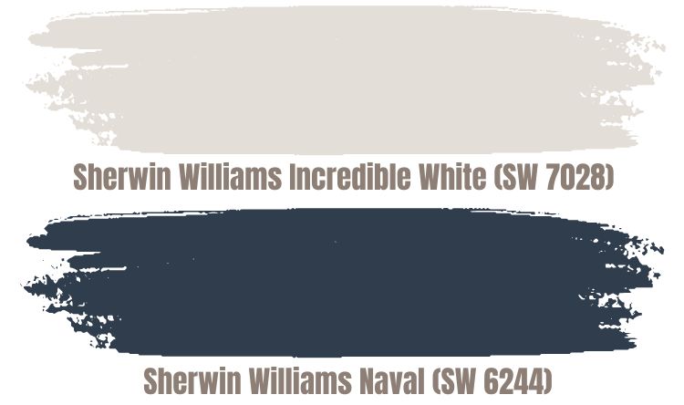
This rich, sophisticated navy blue color is reminiscent of the midnight sky. Combined with Incredible White, it adds a dramatic, neutral color pop without taking away from the rest of the décor in a room.
The Naval color is pretty dark, boasting an LRV of 4. Like “In the Navy,” this color will also not reflect light. On the RGB scale, the Naval paint color is made of Red 47, Green 61, and Blue 76.
Combining Naval with Incredible White will add a bold, royal, refined, and luxurious feel to any interior room. While Naval does not have any undertone, it balances well with Incredible White, which adds a hint of warmth to the more neutral color.
Sherwin Williams Searching Blue (SW 6536)
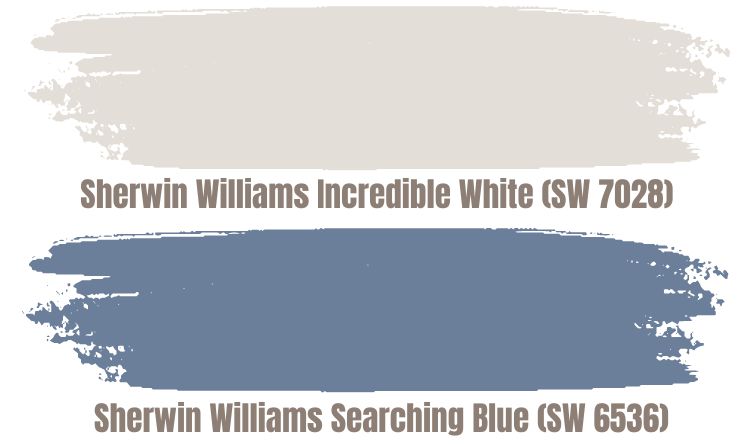
Searching Blue is slightly brighter than the first two blue colors, with an LRV of 21. On the RGB scale, this paint color boasts Red 108, Green 127, and Blue 154.
Coordinating Incredible White with Searching Blue brings together two colors almost the same from both ends of the LRV scale. However, at 74, the LRV of Incredible White makes the paint color slightly off-white, while at an LRV of 21, Searching Blue is just somewhat off-pure black.
Coordinating the two colors eliminates the bland appearance, giving the interior rooms a dramatic yet calm appeal.
Bright White Colors
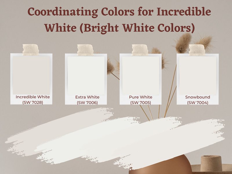
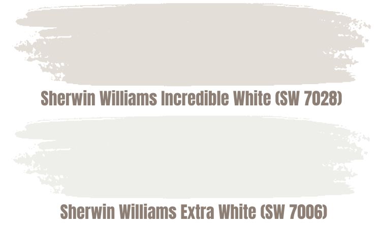
Sherwin Williams Extra White (SW 7006)
Extra White is bright white and stark, although it does pull a little cool. The color’s undertones include blue, purple, and gray. With some of the undertones matching and contrasting with those offered by Incredible White, you can easily create a contrasting view in your home using the two colors.
Extra White has an LRV of 86. With an LRV of 74, Incredible White is a little bit warmer. Therefore, coordinating these two colors creates a unique look that balances warmness and coolness.
Sherwin Williams Pure White (SW 7005) and Snowbound (SW 7004)
Other Bright White colors you may want to coordinate with Incredible White include:
- Sherwin Williams Pure White
- Sherwin Williams Snowbound
We have compared these two colors with Incredible White. For more details on these two paints, scroll up into the comparisons section.
Darker Greige Colors
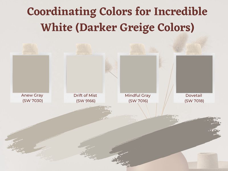
Sherwin Williams Anew Gray (SW 7030)
This saturated yet soft greige color perfectly balances warmness and coolness. Its beige tones provide warmth, while the gray tones create a hint of coolness.
The color boasts an LRV of 47, making it a light-medium of a gray color. The most prominent undertones in this color paint are gray and beige. You will rarely find any different undertones. However, in some light conditions, the purple tones—which match one of the undertones in incredible White—may appear.
Sherwin Williams Drift of Mist (SW 9166) Vs Incredible White (SW 7028)
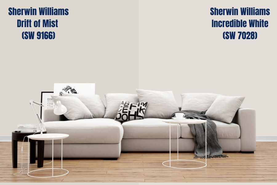
If coordinating your Incredible White with a soft paint color boasting a gentle undertone sounds like a good idea, you cannot go wrong with the Drift of Mist. At heart, the Drift of Mist tends to be soft, warm gray.
However, it looks cooler in a room with north-facing light, tending to lose most of the warmth. Its warmth comes back with a south-facing room or when the afternoon sun shines through.
The Drift of Mist features an LRV of 69, quickly putting in the light end and moving it closer to the off-white range. The Drift of Mist is close to Incredible White, which sits inside the off-white field with an LRV of 74.
Sherwin Williams Mindful Gray (SW 7016) Vs Incredible White (SW 7028)

If you want to add a warm exposure by coordinating your Incredible White with another color, consider using Mindful gray. Mindful Gray is a warm gray paint, just like its name suggests.
The color has an LRV of 48. The fact that it does not reflect much light makes Mindful Gray a tough sell for darker rooms. On the other hand, its additional depth makes it stand out in rooms featuring intense sunshine since it does not wash out much.
Mindful Gray boasts Mild green and Mild violet undertones, between which it switches quickly and easily. In addition, mindful gray makes any room look alive when coordinated with Incredible White with pink and purple undertones.
Sherwin Williams Dovetail (SW 7018) Vs Incredible White (SW 7028)
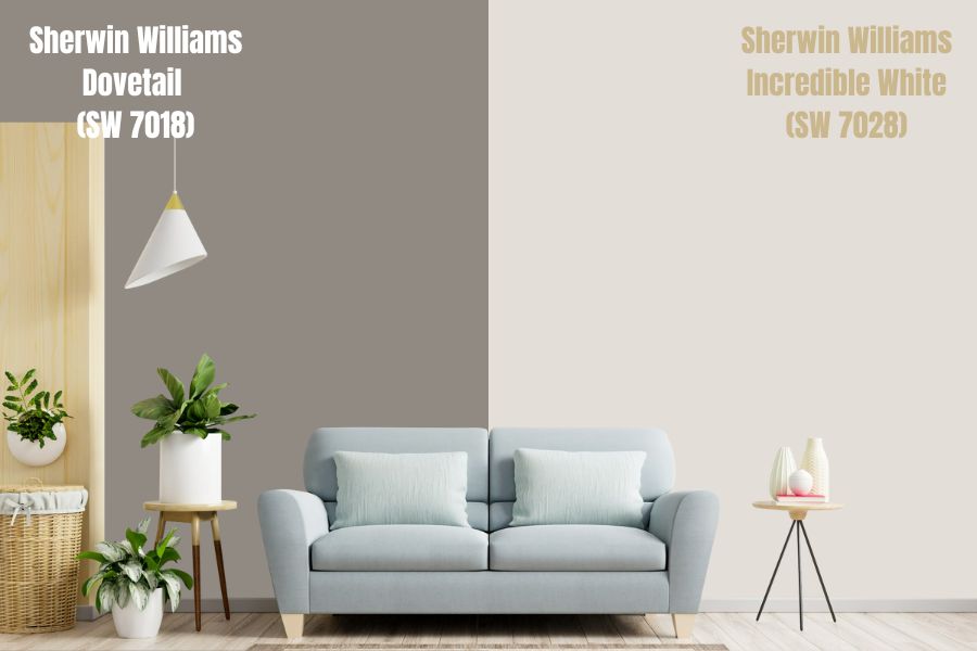
Dovetail happens to be a warm gray paint color featuring a softer appearance. In addition, Dovetail features an LRV of 26, which puts Incredible White and Dovetail right at the opposite ends of the middle section of the LRV scale—Dovetail is 26 points higher than pure black. In comparison, Incredible White is 26 points lower than pure White.
Dovetail has a minor purple undertone and may sometimes feature a flash of green. Coordinating the Dovetail with Incredible White with a pink and purple undertone means that you bring together two colors with one common undertone.
Incredible White Complementary Color
The term “complementary colors” refers to 2 colors, which, when you combine—or mix—them, cancel each other out, losing their hue and producing a grayscale color like black or White. However, placing the two colors next to each other creates the most substantial contrast. Complementary colors are made up of 2 opposite colors on the color wheel.
Regarding Incredible White (SW 7028), which boasts an RGB of (227, 222, 215) and a HEX code of #E3DED7, the complementary color is a version of the Eigengrau. This version of Eigengrau boasts an RGB of (28, 33, 40) and has a HEX code of #1C2128.
This version of Eigengrau has an LRV of 1.9%. Unfortunately, too close to the pure black, which has zero reflective ability, #1C2128 also offers virtually zero reflection.
What Trim Colors Go with Sherwin Williams Incredible White?
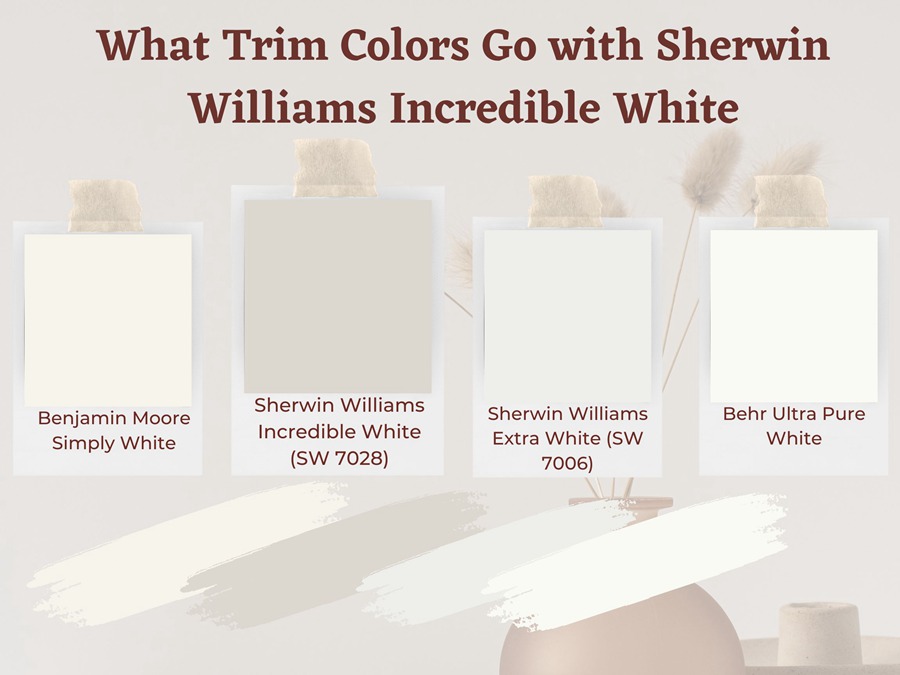
When it comes to trims, my first option is to paint the trim using the same color as the walls—in this case, I would use Incredible White—and give the trim a semi-gloss finish. This provides a delicate and soft tone-on-tone appearance.
You may want to pair the Sherwin Williams Incredible White color with any other bright white crisp trim color to achieve a much higher contrast. However, avoid anything creamy as it may look dirty next to your Incredible White Color.
Some of the trim colors you may want to try include:
Benjamin Moore Simply White (OC-117)
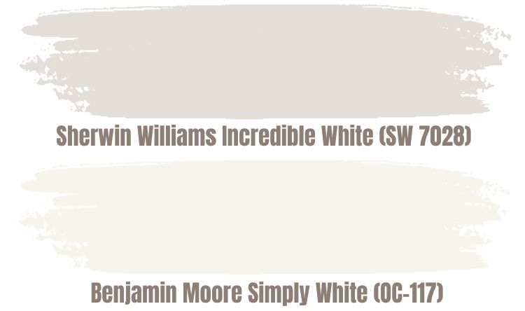
Benjamin Moore’s Simply White has one of the highest LRVs—with an LRV of 91.7%, this paint color is very close to pure white. The color is both bright and reflective.
If your trim is in bright natural lighting conditions, the BM Simply White will give off a bright white appearance without much of its yellow undertone. However, the yellow undertones appear more prominent under warm lighting, although they are not too exaggerated.
Sherwin Williams Extra White
One of the most popular white colors, Extra White, does not just work on trims—it is also a favorite color for cabinetry and ceilings. In addition, extra White boasts some cool undertones that range from hints of blue to gray.
The Extra White LRV is just 4 points above the off-white range. The Extra White has an LRV of 86. This makes it an actual bright white color, although it is not the brightest. The Extra White Color works when used on trims next to Incredible White.
Behr Ultra Pure White
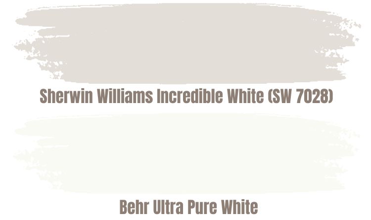
This unique color works perfectly on moldings and ceilings in addition to trims. The color boasts green, blue, and gray undertones, making it pair perfectly with Incredible White.
This color has an LRV of 94, making it the closest color to pure white we have in this article. With a reflective value as high as 94, the color will be extremely bright and highlights other shades in the room. The color has an RGB of Red 248, Green 248, and Blue 243.
The fact that this color is cool makes it contrast nicely with Incredible White, a warm color. The Behr Ultra Pure White makes any space appear crisp, airy, and clean.
Sherwin Williams Incredible White Benjamin Moore Version
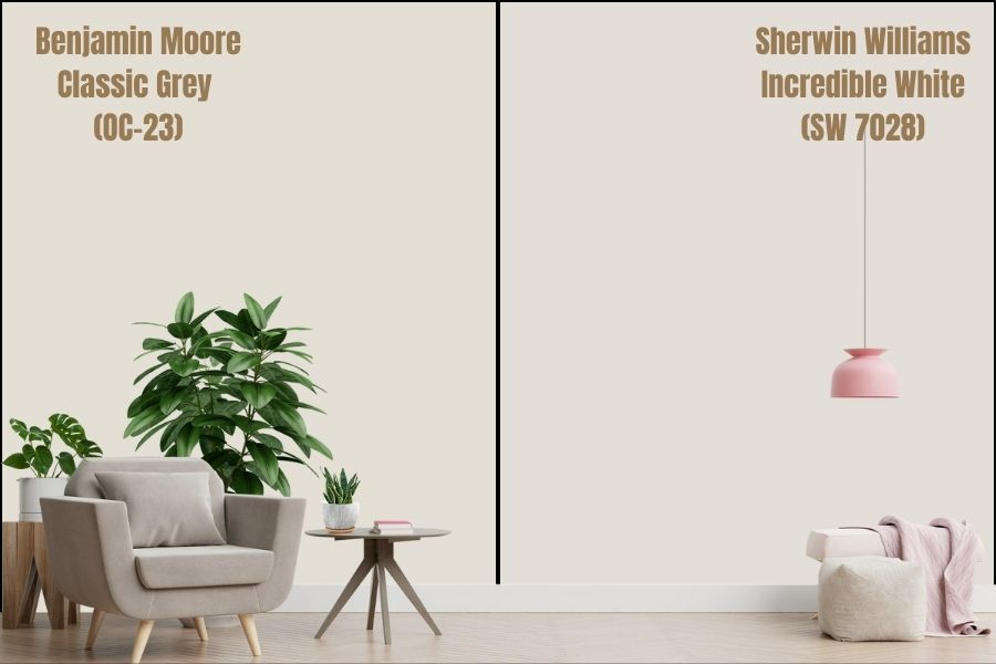
If you are looking for a Benjamin Moore version of Sherwin Williams Incredible White, chances are you need the Benjamin Moore Classic Gray (OC-23).
The Benjamin Moore Classic Gray has an LRV of 74.78. This Light Reflectance Value is close to that of Incredible White, 74. In addition, classic Gray boasts an RGB of Red 228, Green 225, and Blue 216. This is extremely close to the RGB for Incredible White: Red: 227 Green: 222 Blue: 215.
Incredible White boasts pink and purple as its undertones. Interestingly, the closest color in the Benjamin More Franchise also has a purple undertone.
Just like Incredible White, Classic Gray is warm—mainly, south-facing light tends to enhance the soft warmth tucked in Classic Gray slightly.
How Does Light Affect Sherwin Williams Incredible White Color?
The warmth of Incredible White is often affected by the lighting. Also, lighting may affect the undertones that become visible.
For example, Incredible White will feel more neutral and less warm in a north-facing room. However, when you use the paint in a south-facing room, the color’s warmth increases, making it feel warmer.
The undertones of Incredible White are pink and purple. These tend to show differently depending on the lighting. For example, in a room with balanced light, the Incredible White paint color will resemble near-neutral off-white, with some moments of peachy-pinkish overtones, although these are rare.
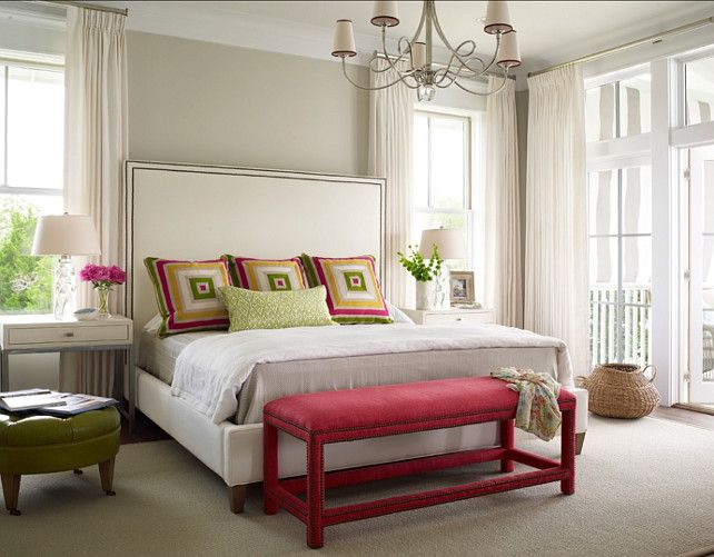
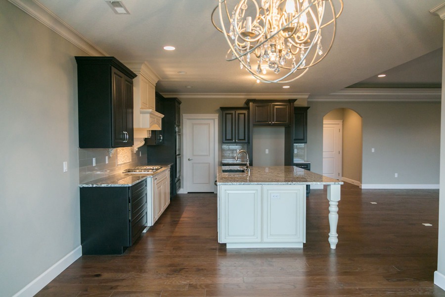
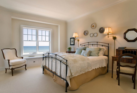
Best Rooms to Paint Incredible White (SW 7028)
You can use the Incredible White color in many rooms. Some of the most popular rooms include the bedroom, the living room, and the kitchen. Below, we will show you the appearance of this color in the different rooms.
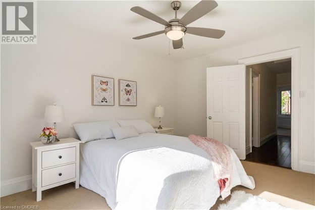
Sherwin Williams Incredible White Bedroom

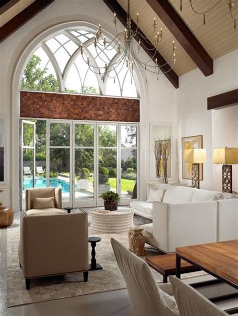
Sherwin Williams Incredible White Living Room
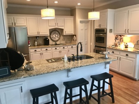
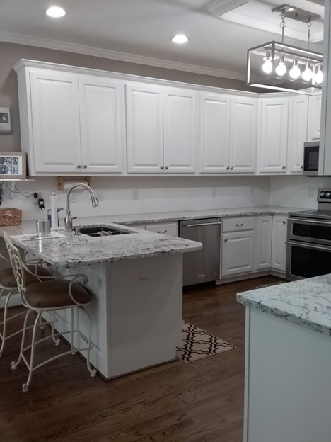
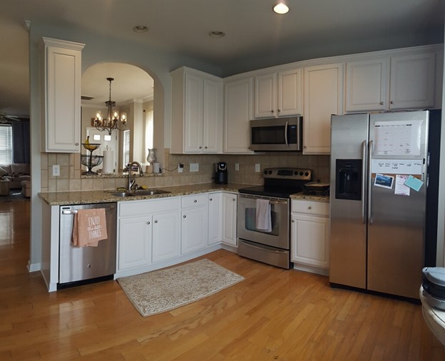
Sherwin Williams Incredible White Kitchen
Final Thoughts
Picking paint colors can be challenging—especially if you are not well-versed in interior design. When you aim to implement a bright color featuring some pigment—meaning it is not just plain white—you will probably look at a ton of off-white colors.
While off-whites perform exceptionally well in adding depth to your interior and maintaining a bright and clean appearance, you still have to pick the right paint color to enjoy your favorite undertones. This article discusses one of the most popular off-whites—the Sherwin-Williams Incredible White (SW 7028).
Incredible White is a popular choice for interior designs—for a good reason. The color blends taupe, beige, greige, and gray colors to give you a paint color that transforms any room you use it on. What’s better, this color works perfectly with many colors.
Coordinating this color with other attractive colors you find on the market (we have shown you some of the best in this guide) will allow the pink and purple undertones in Incredible White to shine, giving your room more vibrance.
We hope we have answered all your questions about Sherwin Williams Incredible White SW 7028. If there are questions we missed, please let us know in the comments.
 Sherwin Williams Worldly Gray (Palette, Coordinating & Inspirations)
 Sherwin Williams Debonair (Palette, Coordinating & Inspirations)
 Sherwin-Williams Krypton (Palette, Coordinating & Inspirations)
 Sherwin-Williams Tidewater (Palette, Coordinating & Inspirations)
 Sherwin Williams Woodland Lichen (Palette, Coordinating & Inspirations)
 Sherwin Williams First Star ((Palette, Coordinating & Inspirations)
