
Does your house feel cold or uninviting? Do you crave a cozier touch on your walls? Well, you can achieve that with an ideal off-white that borders on the side of creamy. However, which color should you use?
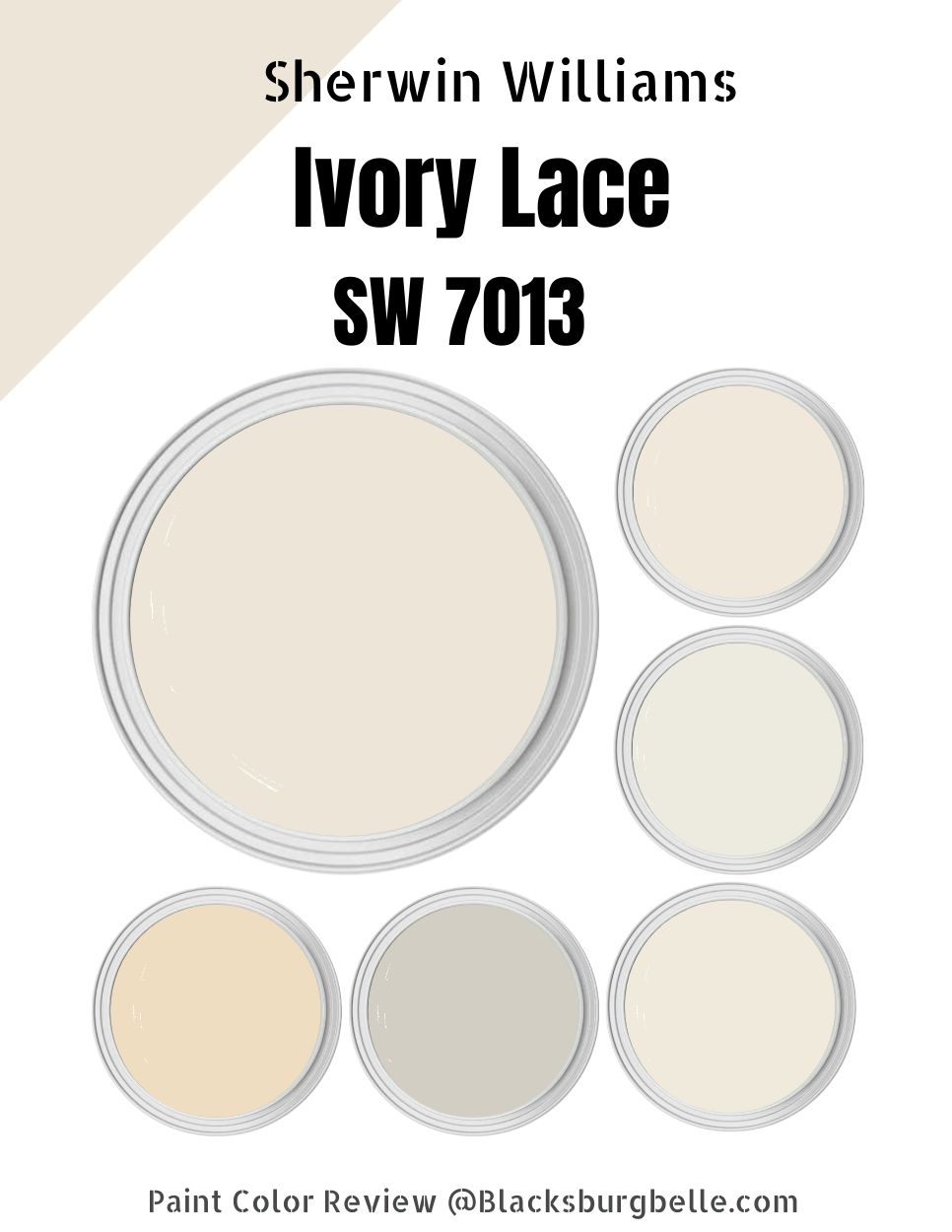
You can’t go wrong when choosing Sherwin Williams Ivory Lace. Ivory Lace SW 7013 is a light-toned, neutral paint color that creates the perfect warm backdrop for any home.
When applied to the walls, the paint color boasts a creamy-like texture, with a subtle focus on ensuring the home appears more spacious. This color goes beyond appealing to function as an adorable space-saving hack.
However, how do you approach creating the perfect look with Sherwin Williams Ivory Lace? The sole purpose of this detailed guide is to answer this question. I will help you discover the colors you can pair with Ivory Lace to ensure your home has a look that catches everyone’s attention.
Are you ready? Let’s get into it!
Table of Contents
What Color is Sherwin Williams Ivory Lace?
| Manufacturer | Sherwin Williams |
| LRV | 79 |
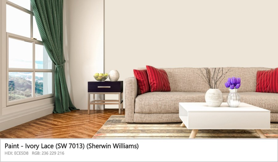
| RGB | R: 236 G: 229 B: 216 |
| Hex Value | #ECE5D8 |
| Color Collections | Finest Whites & Neutrals (Finest Whites), Pottery Barn Teen (Fall/Winter), Pottery Barn Kids (Fall/Winter) |
Sherwin Williams Ivory Lace is a creamy white paint color. Sherwin Williams Ivory Lace is one of the few timeless beauties on the Sherwin Williams palette. Its creaminess and white tones allow it to work in almost all rooms and with numerous colors (don’t worry, more on this later).
RGB of Sherwin Williams Ivory Lace
The RGB scale helps interior designers figure out the amount of red, green, and blue in a specific paint color. This scale runs from 0 to 255 for each of these shades. On the RGB scale, Sherwin Williams Ivory Lace combines red: 236, green: 229, and blue: 216.
LRV of Sherwin Williams Ivory Lace
LRV stands for Light Reflectance Value. It is a scale running from 0 to 100 and shows how much light a specific paint color can reflect. At 0, we have pure black, which reflects 0% light. At 100, we have pure white, which reflects 100% light.
On the LRV scale, the off-white category runs from 73 to about 84. Sherwin Williams Ivory Lace sits in the middle of the off-white range with an LRV of 79.
Is Sherwin Williams Ivory Lace a Warm or Cool Color?
Sherwin Williams Ivory Lace is a warm paint color. The creamy tones in the paint color add distinct warmth, making it a perfect option for cozying up any space. The paint color also features a hint of yellow, which adds to its warmth.
Sherwin Williams Ivory Lace Undertones
Sherwin Williams Ivory Lace combines two primary undertones—yellow and pink. While the yellow undertone gives the off-white color its warmth, the pink undertone adds a sense of coolness to the paint. For this reason, Sherwin Williams Ivory Lace can feel more balanced in the proper lighting conditions, although it still leans on the warm side of the color spectrum.
Sherwin Williams Ivory Lace Color Strip: Sherwin Williams Ivory Lace Color Comparisons
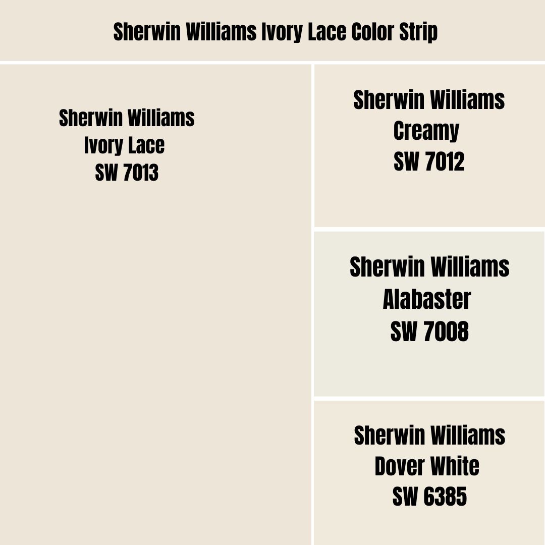
Sherwin Williams Ivory Lace vs. Creamy (SW 7012)
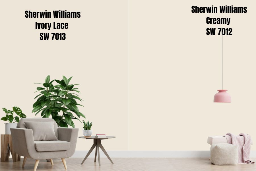
Ivory Lace and Creamy are light-toned paint colors that create appealing backdrops for any home. Both colors have a yellow undertone that gives them warmth and a creamy appearance. However, Unlike Creamy, which only displays the yellow undertone, Ivory Lace has an additional undertone—the cool pink undertone that makes it slightly less warm than Creamy SW 7012.
Sherwin Williams Creamy is one tone lighter than Ivory Lace. Therefore, you would expect Creamy SW 7012 to reflect slightly more light than Ivory Lace. While Creamy reflects 81% of light, Ivory Lace reflects 79%. However, both colors still sit in the off-white range.
Creamy and Sherwin Williams Ivory Lace add a similar feeling to spaces. They add a warm, inviting, and cozy feel. Moreover, they are often preferred by homeowners with smaller rooms as they often make the spaces look bigger than they are.
However, it is worth noting that these two paint colors will deliver the best results in a room with some coolness. The warmth in southern-facing rooms can be compounded by Creamy and Ivory Lace, creating a less-than-comfortable feel. However, place any of these colors in an icy north-facing room, and you will enjoy a balanced coziness.
Sherwin Williams Ivory Lace vs. Alabaster (SW 7008)
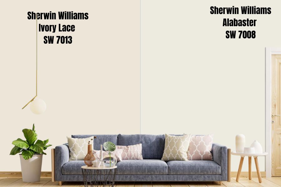
Sherwin Williams Alabaster was the year’s color in 2016, suggesting that this unique paint color has much to offer. Sherwin Williams Alabaster is lighter than Sherwin Williams Ivory Lace. Sitting about five shades below Ivory Lace, you would expect Alabaster to be more reflective. On the LRV scale, Sherwin Williams Alabaster has an LRV of 82, reflecting 3% more light than Sherwin Williams Ivory Lace.
In the Sherwin-Williams palette, Alabaster and Ivory Lace seem to fit in utterly opposite color collections. While Ivory Lace belongs to the Pottery Barn (Fall/Winter), Alabaster is in Pottery Barn (Spring/Summer). The two colors have varying warmth, meaning that Ivory Lace is warm enough to keep the winters from getting too cold while Alabaster is not too warm that it can make the summers uncomfortable.
Alabaster and Sherwin Williams Ivory Lace do differ in their undertones. While Ivory Lace boasts yellow and pink undertones, Alabaster has a neutral base, giving it its creamy, almost off-white appearance. The neutral base keeps Alabaster from looking yellow or becoming too warm. In some lights, however, you may see some neutral beige undertones in Alabaster.
Sherwin Williams Ivory Lace vs. Dover White (SW 6385)
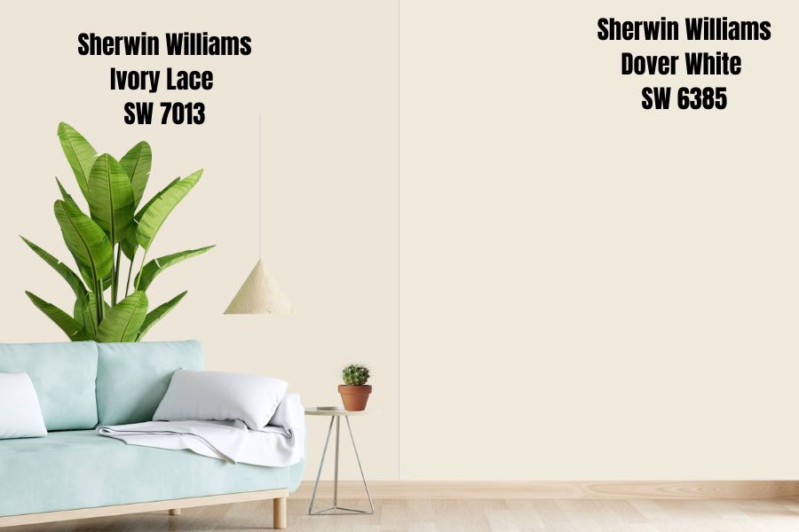
Sherwin Williams Dover White is brighter and creamier than Sherwin Williams Ivory Lace. Moreover, Dover White is also warmer than Ivory Lace—probably because it is creamier and carries more of the yellow undertone that gives it more warmth.
Sherwin Williams Dover White has an LRV of 83, compared to Ivory Lace which has an LRV of 79. Both paint colors sit in the off-white range of the LRV scale.
It is, however, worth noting that Dover White and Ivory Lace bring a similar feel to your space. The two colors boast the ability to make any room cozier. Moreover, the colors have the potential to make your space appear bright and light and may also work as an ideal hack for making smaller rooms appear more spacious.
Sherwin Williams Ivory Lace Palette
Sherwin Williams Ivory Lace Coordinating Colors
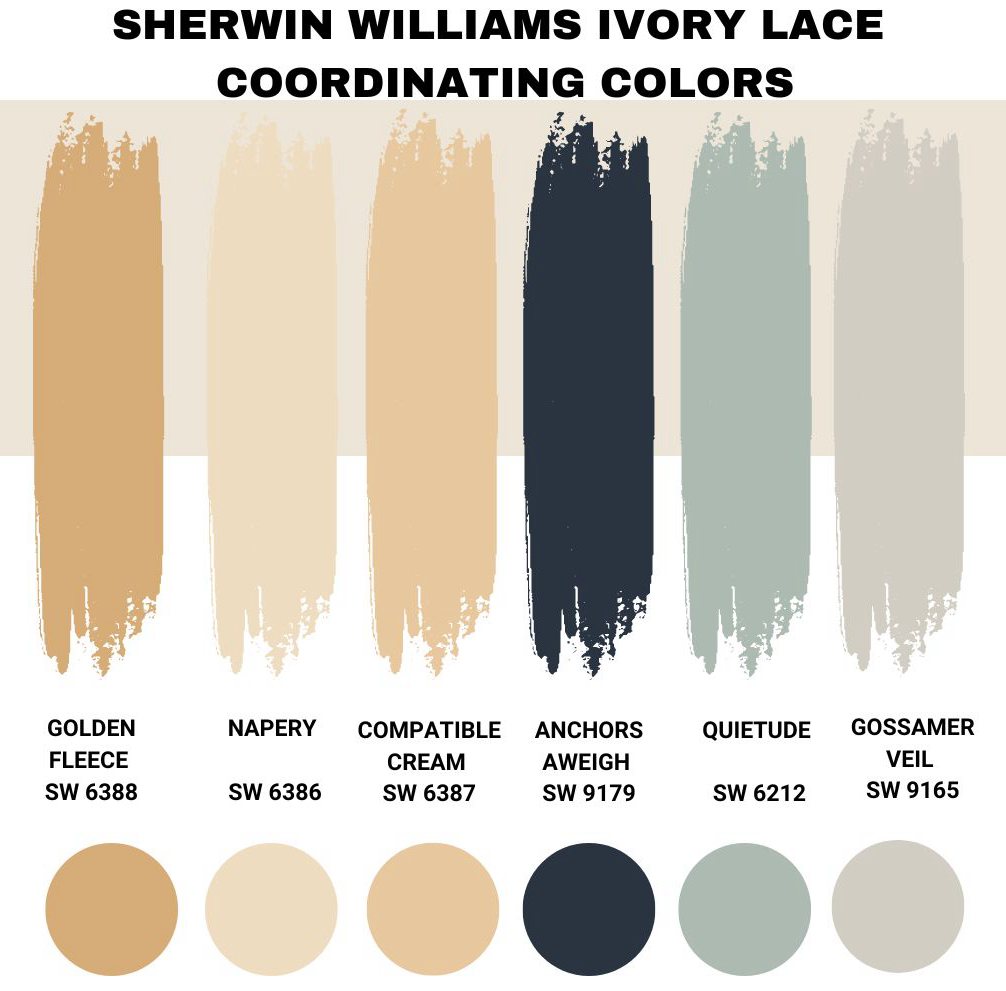
As noted earlier, Sherwin Williams Ivory Lace does not have numerous restrictions in the colors you can pair it with to make your interior design pop. Below, I will show you some of the best colors you can pair with Ivory Lace to create a look that makes your home stand out. To make things easier, I have included color palettes that help you achieve both monochromatic and contrasting looks.
Sherwin Williams Golden Fleece (SW 6388)
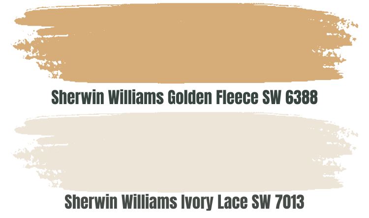
Sherwin Williams Golden Fleece (SW 6388) is a perfect paint color for those going after the monochromatic look. Golden Fleece is a Golden Tan color that boasts orange and yellow undertones, sharing some similarities in its appearance with Sherwin Williams Ivory Lace.
Golden Fleece, however, has a much lower LRV, reflecting 33% less light with its LRV of 46. However, the two colors in a room will help each other maintain their personality. For example, while Golden Fleece may look too dull in a dimly lit room, considering its low reflective abilities, Sherwin Williams Ivory Lace will reflect enough light onto it, ensuring it doesn’t get bland.
Moreover, in a bright room, Ivory Lace may look washed out in most cases. However, when you use it with Golden Fleece, SW 6388 will absorb the excess light, allowing Ivory Lace to maintain its personality.
Golden Fleece and Ivory Lace are both warm colors. Therefore, for homeowners who want to avoid overwhelming their spaces with extreme warmth, the best thing to do is use them in a cool room—for example, in a north-facing room.
Sherwin Williams Napery (SW 6386)
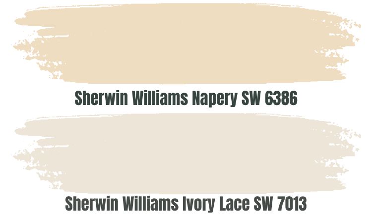
Sherwin Williams Napery is a light, golden yellow option that also pairs nicely with Sherwin Williams Ivory Lace. The paint color sits in the off-white range with Ivory Lace—therefore, you do not have to worry about dim light when using these two paint colors. With Ivory Lace boasting an LRV of 79 and Napery with its LRV of 74, the two colors are reflective enough to maintain their appeal in dim rooms.
Napery is a perfect option for homeowners who want to brighten their space without overwhelming it with saturated color. Unlike Sherwin Williams Golden Fleece, Napery is a much lighter option.
Remember that Napery is also a warm color because of its yellow undertones. Therefore, combining Napery and Ivory Lace in a warm room—for example, a south-facing room—could create a situation where the warmth overwhelms the space. For this reason, when working with these two colors, the best idea is to use them in a room with natural coolness.
Sherwin Williams Compatible Cream (SW 6387)
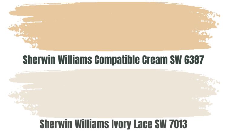
Sherwin Williams Compatible Cream (SW 6387) is another perfect color for creating a monochromatic appearance with Sherwin Williams Ivory Lace. This pair color belongs to the yellow family, meaning that it will bring some warmth into the house, creating that special cozy feeling.
The color sits near the middle in the LRV scale—with an LRV of 61, the paint color absorbs 18% more light than Sherwin Williams Ivory Lace. Compatible Cream will absorb the excess light that could wash out Ivory Lace in a bright room.
When you pair Compatible Cream with Sherwin Williams Ivory Lace in a dull room where Compatible Cream is supposed to look bland, the color will look lively. In a dim room, Ivory Lace will reflect enough light onto Compatible Cream, keeping the color from looking dull.
Sherwin Williams Anchors Aweigh (SW 9179)
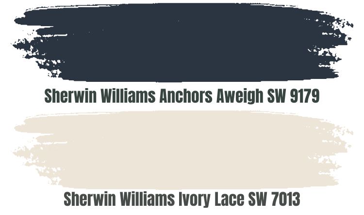
Above, we have focused on colors that allow you to create a warm, monochromatic look. However, you may want to know which colors you can use to create a cool, contrasting look. You can always start with Sherwin Williams Anchors Aweigh (SW 9179).
Anchors Aweigh is one of the most admired paint colors in the Colonial and Victorian style designs—this should tell you that it has much to bring to the table. It is the navy blue shade you will not regret having in your home.
The deep blue color brings a sense of cool, balancing out the warmth of Ivory Lace. It is a perfect color for using with Ivory Lace in a warm, south-facing room.
Sherwin Williams Anchor Aweigh is relatively low on the LRV scale, reflecting just 3% of the light you shine on it. However, do not worry—remember you are pairing it with Ivory Lace which has an LRV of 79. Ivory Lace will always ensure Anchors Aweigh receives the attention it deserves.
Sherwin Williams Quietude (SW 6212)
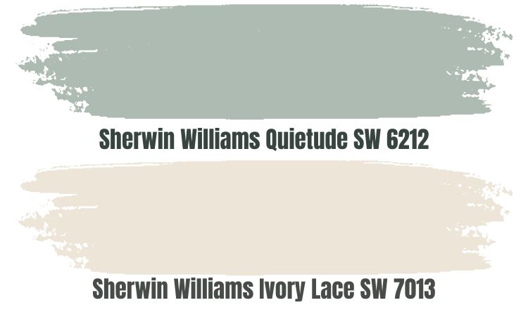
A perfect blend of blue and green has always appealed to many homeowners. If you are wondering which option to use when facing the numerous market options, you can always go after Sherwin Williams Quietude (SW 6212).
At heart, Quietude is blue, explaining why it is a cool paint. However, you cannot ignore the domineering green undertone that shines through, creating additional interest. Combining Ivory Lace and Quietude creates an ideal situation where the two colors balance each other. The warmth in Ivory Lace balances with the cool in Quietude.
Quietude has an LRV of 48, meaning it is a light-medium depth color. Ivory Lace, however, will reflect enough light onto this paint color, ensuring it is visible enough even in dim rooms.
Sherwin Williams Gossamer Veil (SW 9165)
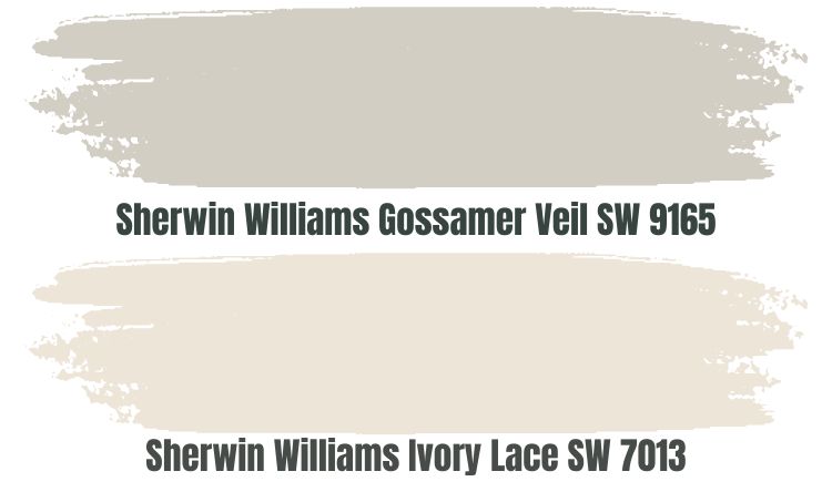
Gossamer Veil SW 9165 is a warm grayish paint color that flourishes in every space with the utmost sophistication and timelessness. Like Ivory Lace, Sherwin Williams Gossamer Veil boasts a warm, creamy touch that can make your room more welcoming and inviting.
Gossamer Veil, however, is more of a chameleon paint color. Do not expect it always to look gray—the paint color will appear beige and greige in some cases. However, that only adds more interest into the rooms where you combine it with Ivory Lace.
Gossamer Veil is quite reflective, with an LRV of 62. The color will be visible in dim rooms. However, since you pair it with Ivory Lace, which has an LRV of 79, Ivory Lace will reflect enough light to ensure Gossamer Veil is always interesting.
Sherwin Williams Ivory Lace Complementary Color
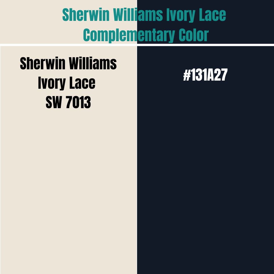
To take your contrasting look to the next level, you may want to use a color 100% opposite of Sherwin Williams Ivory Lace. In this case, you will be looking for a complementary color for Ivory Lace—that is, a color that sits on the opposite side of the color wheel.
The complementary color for Sherwin Williams Ivory Lace has a hex value of #131A27. This paint color does not have an official name right now. However, the closest color carries the name Eigengrau.
What Trim Colors Go with Sherwin Williams Ivory Lace?
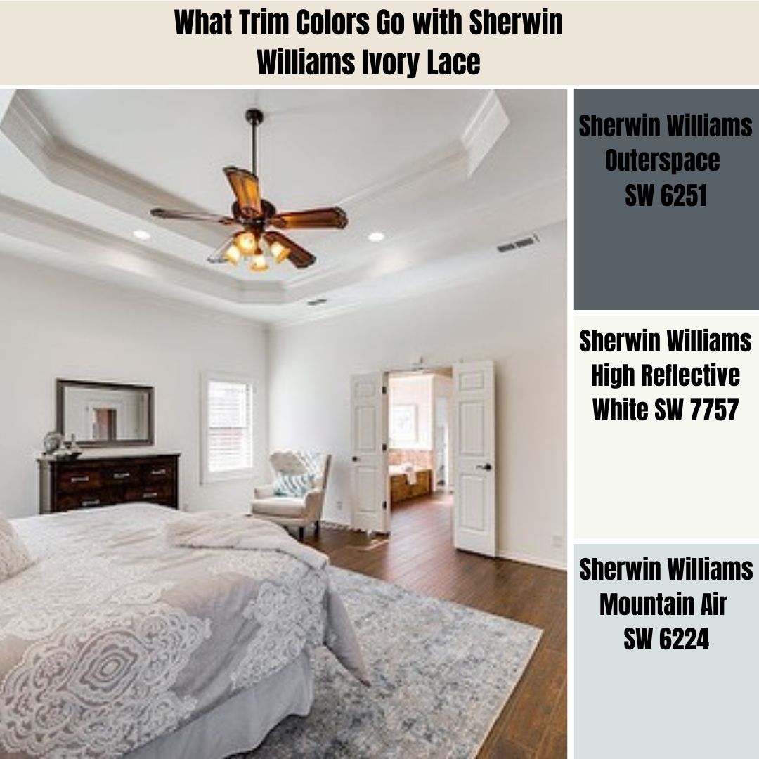
Sherwin Williams Ivory Lace is a very flexible paint color that works with a wide variety of options for trimming. However, to create a refined look with trims, I always use colors that are either more reflective or less than Ivory Lace. Below, I will outline some of my favorite options.
Sherwin Williams Outerspace (SW 6251)
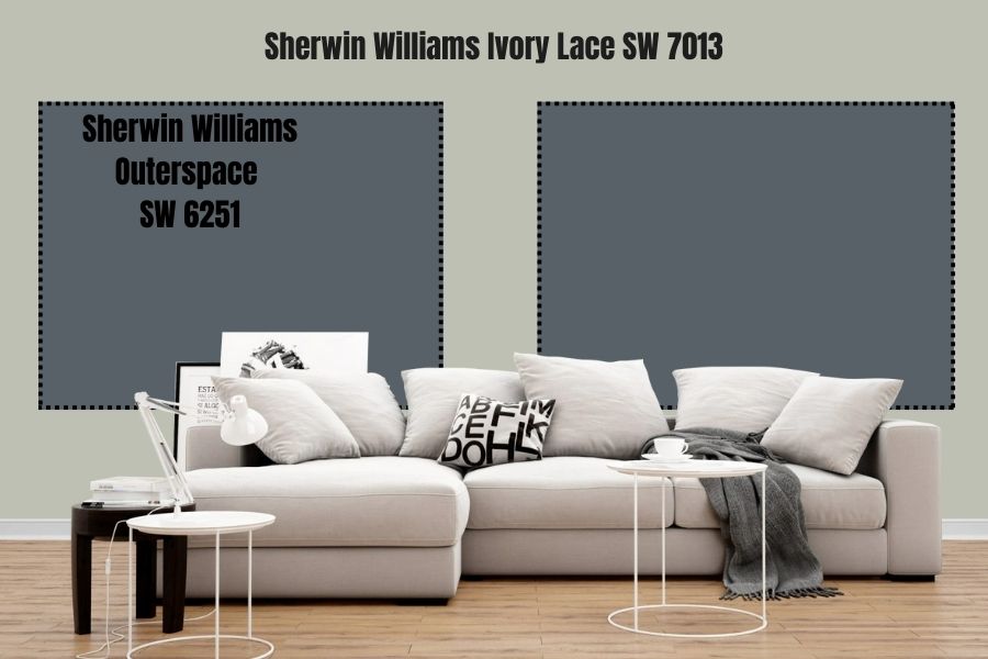
Sherwin Williams Outerspace is a timeless, steely, classic blue that works well with Ivory Lace. Place this color on your trims, and you can be sure you are taking the first step towards balancing the warmth that Ivory Lace puts in a room.
Outerspace is a gray-blue color that exhibits a cool, crisp, and sleepy vibe. It is not exactly a blue color, as it carries some trendy and neutral appeal from a tinge of gray.
Outerspace is a dark color with an LRV of 12. However, you do not have to worry about losing its character in a dim room. Ivory Lace will reflect enough light on this color, ensuring it stands out.
Sherwin Williams High Reflective White (SW 7757)
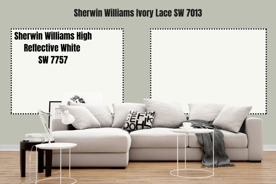
Sherwin Williams High Reflective White is more like the exact opposite of Outerspace. Instead of sitting on the lower end of the LRV scale, it sits on the top—the highest color on the LRV scale, reflecting 93% of light.
With this high LRV, Sherwin Williams High Reflective White guarantees that your trims will pop and stand out. High Reflective White is just as close as you can get to true white—therefore, Sherwin Williams High Reflective White does not affect the feel of your room as it does not carry any undertones.
Sherwin Williams High Reflective White will make your trims noticeable. Reflecting 14% more light than Sherwin Williams Ivory, you can be sure that High Reflective White won’t look the same as Ivory Lace.
Sherwin Williams Mountain Air (SW 6224)
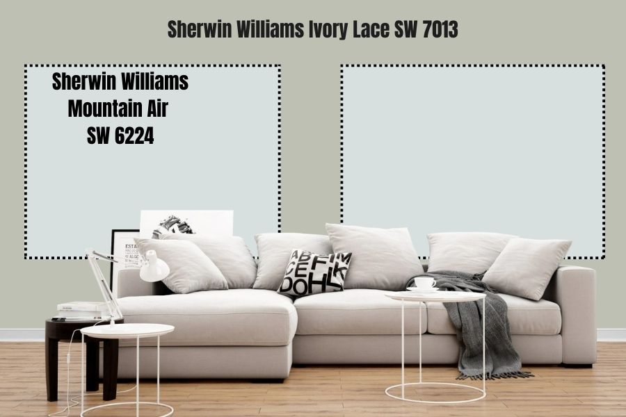
Although Sherwin Williams Mountain Air looks more like a deep minty blue paint, it is a pastel white paint. It is the opposite of Ivory Lace which is a creamy white. Using Mountain Air will ensure that those trims pop out and are visible.
Sherwin Williams Mountain Air is not just any white—it is a white that boasts comforting, soothing, crips, and cool qualities. It adds a clean and crisp feel to your trims with deep blue and gray undertones.
The color is pretty light, with an LRV of 73. Therefore, it could be a nice hack for making your rooms look airy and bigger. Moreover, Sherwin Williams Mountain Air is a pastel that positively plays with your mind while adding relaxing and motivating vibes to your trims.
Sherwin Williams Ivory Lace Benjamin Moore Version
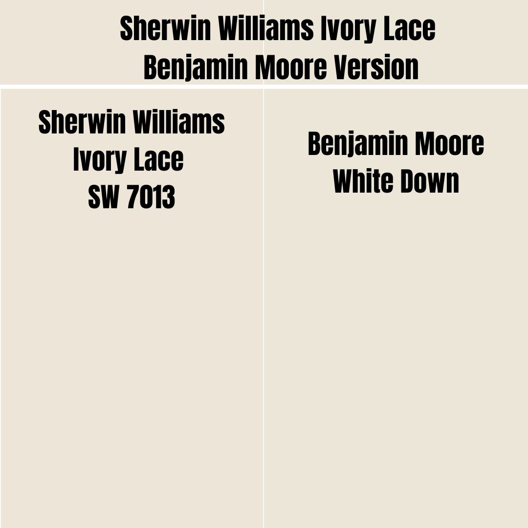
Benjamin Moore is another famous brand known for producing unique paint colors. If you want to try this brand while maintaining the look provided by Sherwin Williams Ivory Lace, you should consider using Benjamin Moore White Down.
On the RGB scale, Benjamin Moore White Down boasts a combination of red: 235, green: 230, and blue: 215. This is close to Sherwin Williams Ivory Lace, combining red: 236, green: 229, and blue: 216. On the LRV scale, Benjamin Moore White Down and Sherwin Williams Ivory Lace are incredibly close—Ivory Lace boasts an LRV of 79, while White Down has an LRV of 78.25.
How Does Light Affect Sherwin Williams Ivory Lace?
Sherwin Williams Ivory Lace is a warm paint color. The light coming through into south-facing rooms is also warm. For this reason, Sherwin Williams Ivory Lace tends to lean more into its yellow, creamy base in a south-facing room, making it look warmer.
Sherwin Williams Ivory Lace encounters a soft, cool light in north-facing rooms. The soft cool light makes the color lean more into its cooler undertone—remember that Ivory Lace has a cool, pink undertone. For this reason, northern light can make Sherwin Williams Ivory Lace look less warm than it is.
Sherwin Williams Ivory Lace does not always like highly bright light. Remember, it sits on the higher end of the off-whites on the LRV scale. Its high LRV makes it more likely to lose its appearance and wash out in extreme light. In dimly lit rooms, the paint color is more comfortable and displays its full character.
Best Rooms for Sherwin Williams Ivory Lace (SW 7013)
Sherwin Williams Ivory Lace does not feature many restrictions regarding where you can or cannot use it. Your creativity is all you need when choosing where to use Ivory Lace. Below are some real-life pictures showing how Ivory Lace works in all principal rooms.
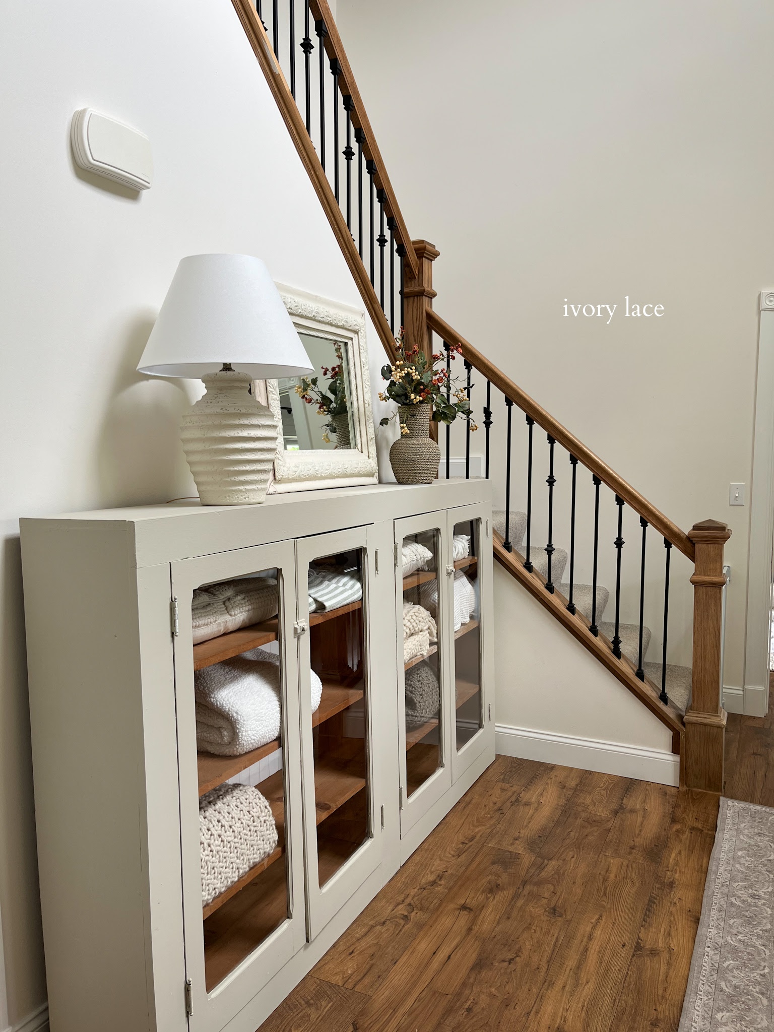
Sherwin Williams Ivory Lace Living Room
At heart, Sherwin Williams Ivory Lace is white. However, you only get to see the white color in a room with enough light. The above image is a perfect image of Ivory Lace in a well-lit room—the white shines, but you can still see some cream in color. Moreover, if you compare it to the coffee table, you can see that one is whiter than the other.
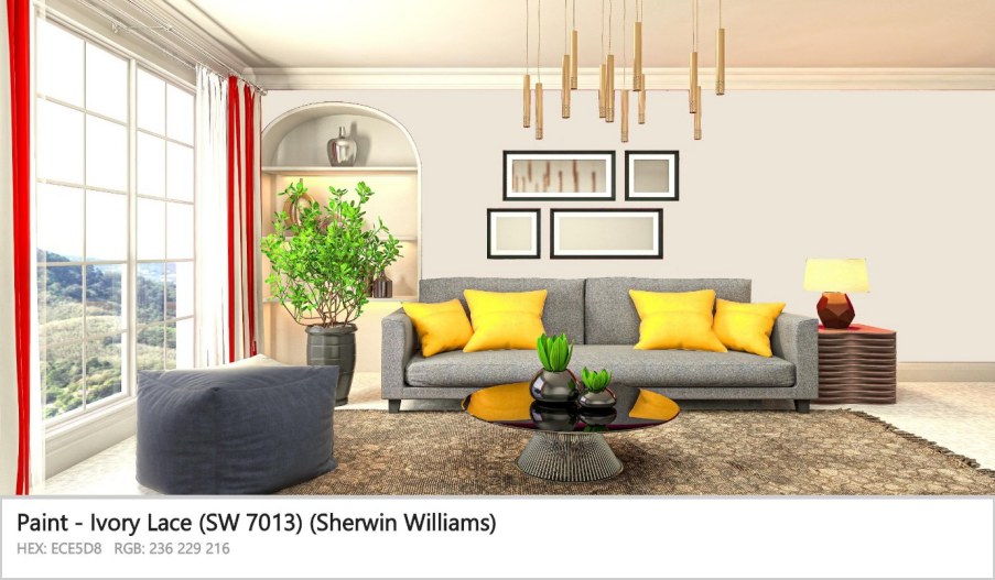
This is another impressive use of Sherwin Williams Ivory Lace in the living room. The paint color in the above living room has been trimmed nicely with yellows, grays, reds, and some nice golden colors. Looking closely, you can see the pink undertone.
The above picture is another example of Sherwin Williams Ivory Lace displaying its creamy base. In this case, the paint color has been paired with grays. The Ivory Lace on the walls looks more like a backdrop color that lets the grays shine.
Sherwin Williams Ivory Lace Bedroom
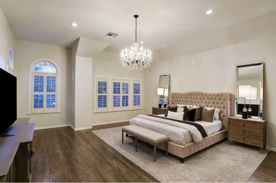
While it is easy to assume that Sherwin Williams Ivory Lace is not a good option for a bedroom, the above image proves otherwise. It is perfectly paired with whiter decorations, putting it into its place as a backdrop.
I love Sherwin Williams Ivory Lace because it works well in both natural and artificial light. In the case of the above bedroom, it is at night, but Ivory Lace maintains its appealing look. The color, however, seems to be looking more white than creamy. This clearly shows that the artificial light is not warm, making Ivory Lace lean more towards its cooler side.
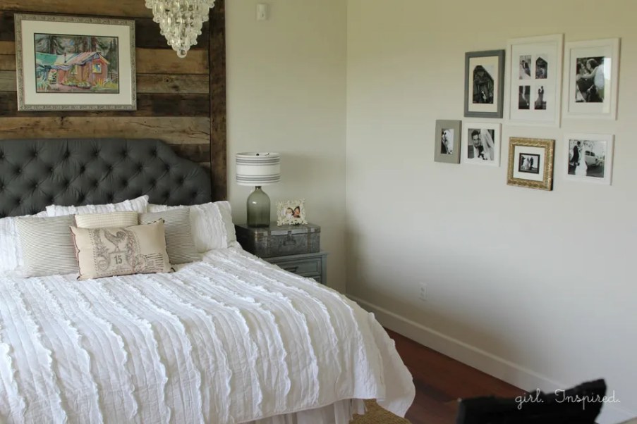
In this bedroom, Sherwin Williams Ivory Lace seems to be encountering a colder light. While the yellow in it is showing, it looks whitish with a hint of pink in the background. Interestingly, the bedroom owner has paired it perfectly with pure white and charcoal gray.
Sherwin Williams Ivory Lace Kitchen Cabinets
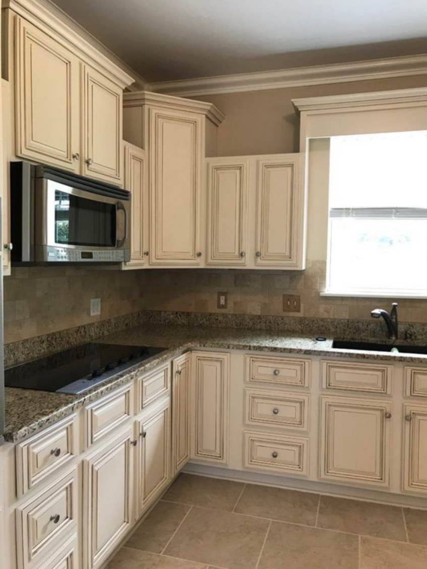
Sherwin Williams Ivory Race is an exciting color when used on kitchen cabinets. In the above example, Ivory Lace sits on the cabinets and is surrounded by White tiles and a white countertop. Collectively, these colors create a site that does not get boring.
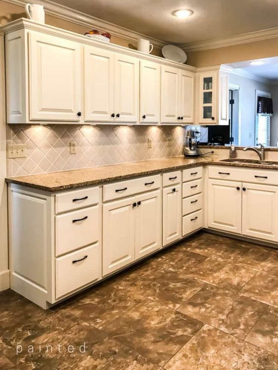
If you use paint colors to create a brighter kitchen, you may want to start the process by painting Sherwin Williams Ivory Lace on your cabinets. In this kitchen, Ivory Lace looks more white with the yellow undertone taking a backseat—this indicates that the kitchen’s light is cool, allowing Ivory Race to return to its cooler tones.
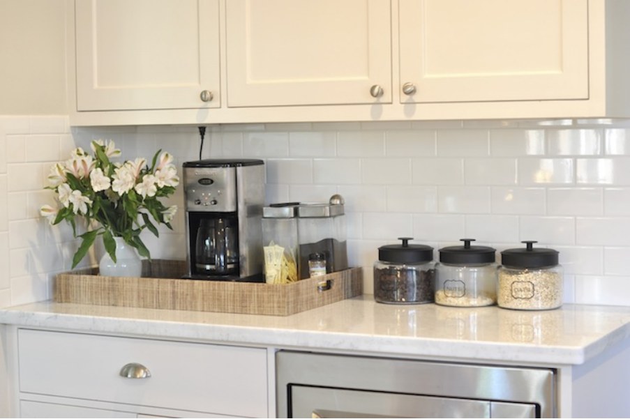
This kitchen seems to be welcoming more warm light. The color Ivory Lace displays its creamy side. However, it still brightens the kitchen, ensuring it does not look bland.
Overview
Sherwin Williams Ivory Lace is an exciting paint color with much to offer. It’s a color that works best in rooms with balanced light—when rooms are too bright, the paint color often gets washed out because of its high LRV. However, you can always pair Ivory Lace with darker shades if you have a bright room. The darker shades will absorb the excess light, keeping Ivory Lace from washing out.
By default, Sherwin Williams Ivory Lace is a warm color. However, it does have a cool pink undertone that balances its warmth, keeping it from looking too hot. Regardless, however, this paint color performs best in cool rooms. Alternatively, you can pair it with other cool colors in warm rooms.
I hope this article has answered your questions about Sherwin Williams Ivory Lace. Please let me know if I missed some questions.
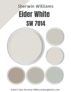 Sherwin Williams Eider White (Palette, Coordinating & Inspirations)
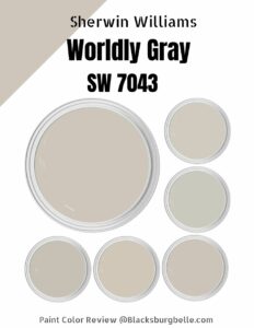 Sherwin Williams Worldly Gray (Palette, Coordinating & Inspirations)
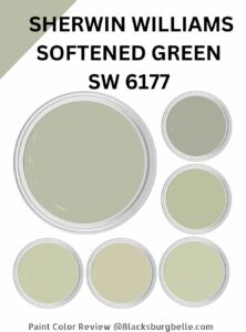 Sherwin Williams Softened Green (Palette, Coordinating & Inspirations)
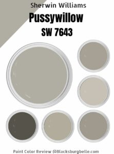 Sherwin-Williams Pussywillow (Palette, Coordinating & Inspirations)
 Sherwin-Williams Natural Choice (Palette, Coordinating & Inspirations)
 Sherwin Williams Coastal Plain (Palette, Coordinating & Inspirations)
