
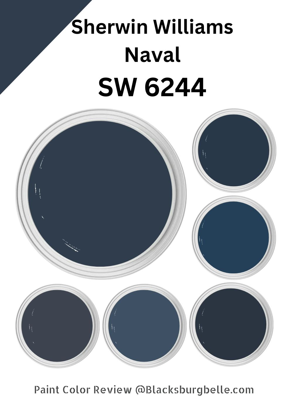
 Are you looking for a beautiful blue paint color that blends luxury and richness? One that is not just luxe but also full of splendor? Well, look no more—Sherwin Williams Naval is the paint color you’ve been trying to locate.
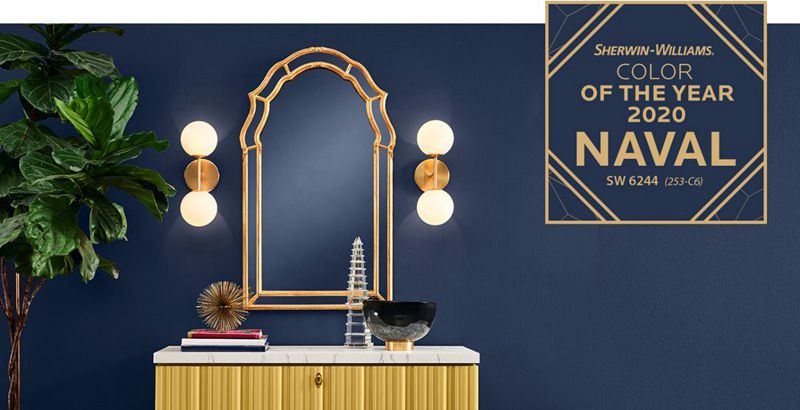
Bold in appearance and darker in tone, Naval is a cool-hued paint color that adds an artistic and authentic touch to your walls. It is no mistake Sherwin Williams labeled Naval the color of the year in 2020.
The paint color adds a standout, bold, deep, eye-catching backdrop that seamlessly enriches your space. The paint color brings a positive vibe into your room while adding an unignorable depth.
In this detailed Sherwin Williams Naval guide, I will answer all your questions about SW 6244. I will let you in on the excellent color schemes you can use with Naval to create a look that leaves you relaxing in a comfortable and aesthetically appealing room. Read on—this paint color has a lot to offer.
Table of Contents
What Color is Sherwin Williams Naval?
| Manufacturer | Sherwin Williams |
| LRV | 4 |
| RGB | R: 47 G: 61 B: 20976 |
| Hex Value | #2F3D4C |
| Color Collections | Colormix Forecast 2022 (Opus), Pottery Barn Kids (Fall/Winter), Pottery Barn (Fall/Winter), Colormix Forecast 2021 (Encounter), Colormix Forecast 2020 (Alive) |
Sherwin Williams Naval is a deep blue paint color. Sherwin Williams Naval’s deep blue appeal brings meditative serenity to any space, allowing you to feel more relaxed as you concentrate on your tasks. It is a perfect paint color that works in offices and study rooms because of its ability to calm down the room, making all the noise go away.
RGB of Sherwin Williams Naval
RGB is a scale that runs from 0 to 255 and shows the amount of red, green, and blue in a specific paint color. Sherwin Williams Naval combines red: 47, green: 61, and blue: 76.
LRV of Sherwin Williams Naval
Sherwin Williams Naval has an LRV of 4. LRV stands for light reflectivity value and shows the amount of light a paint color can reflect.
The scale runs from 0 to 100. You will have pure black at zero, reflecting 0 percent light, while pure white is at 100, reflecting 100% white. Naval is very close to pure black, reflecting only 4% light.
Is Sherwin Williams Naval a Cool or Warm Paint Color?
Sherwin Williams Naval is a cool paint color. Naval boasts deep blue as its primary tone. Blue lies on the cool side of the color scale—this essentially makes Naval a cool paint color.
What Are Sherwin Williams Naval Undertones?
Sherwin Williams Naval combines two undertones to keep things interesting—gray and green undertones. Gray, however, is more dominant than the green undertone.
Sherwin Williams Naval Color Strip: Sherwin Williams Naval Color Comparisons
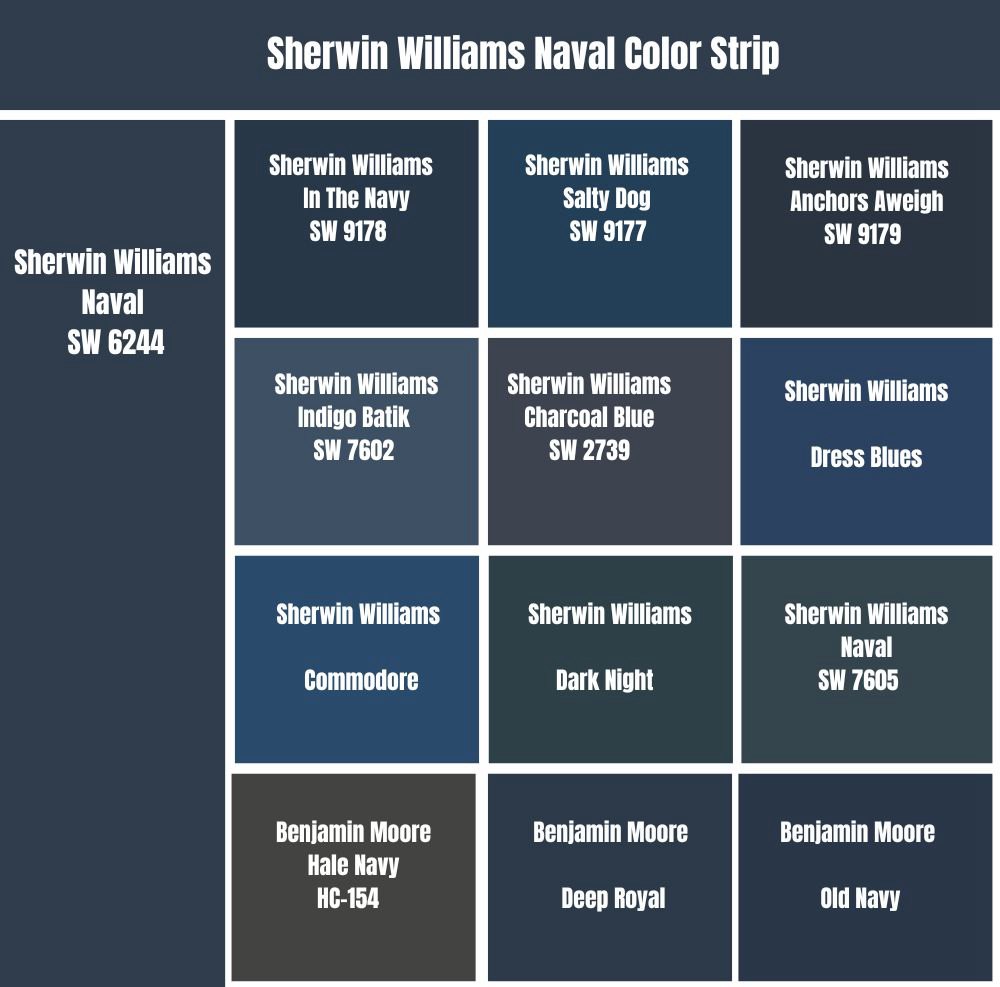
Sherwin Williams Naval vs. In The Navy (SW 9178)
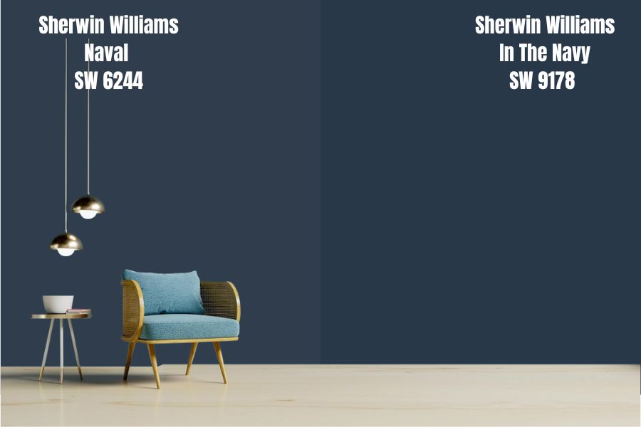
Sherwin Williams In The Navy and Naval are pretty close in appearance. For starters, the two paint colors have a matching LRV—both colors reflect 4% of light. For these two colors to retain their personality, you must ensure they are painted in a room with enough light. Naval and In The Naval will absorb all the light in a dim room, leaving them looking black and bland.
On the RGB scale, Sherwin Williams Naval combines red: 47, green: 61, and blue: 76. On the other hand, Sherwin Williams In The Navy combines red: 40, green: 56, and blue: 73. Looking at the saturation of each shade, Naval seems to have more of each shade, making it more saturated than In The Navy.
These two colors have the same undertones—the two combine gray and green undertones that keep the blue base from getting loud. However, unlike Naval, where the gray shade leads while green follows, green is the leading undertone for In The Navy.
Sherwin Williams In The Navy and Naval are both cool colors that work great in a room with enough warmth—for example, a room welcoming warm southern light.
Sherwin Williams Naval vs. Salty Dog (SW 9177)
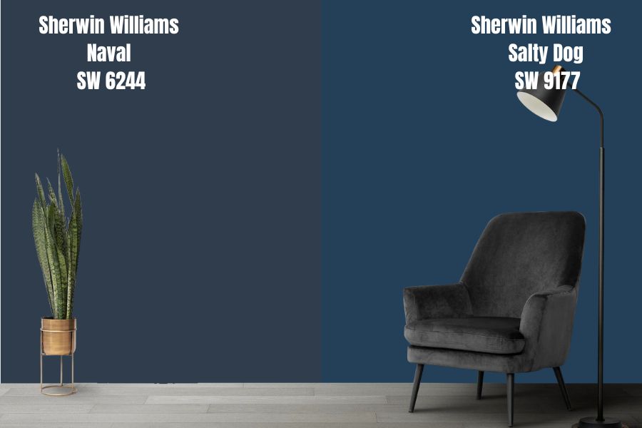
Sherwin Williams Salty Dog and Naval are trendsetting blues that are eye-catching. The two paint colors are deep blues that border on the side of highly dark—the two fall on the lower end of the LRV scale. While Naval has an LRV of 4, Salty Dog reflects 1% more light with an LRV of 5.
Sherwin Williams Naval and Salty Dog add a feeling of luxe to any space. Both colors, however, will work well in a room with enough light—with their low LRVs, the paint colors can look bland in a dim room.
Compared to Naval, Sherwin Williams Salty Dog has more blue shade. While Naval will look slightly dark—because of the gray undertone—Salty Dog looks bluer. The two colors, however, share the same undertones—green and gray undertones. In Salty Dog, however, the green undertone is more dominant than the gray undertone, unlike in Naval, where gray is the more dominant undertone.
Salty Dog and Naval are two cool paint colors. For this reason, you will want to use them in a warm space. When using them in a cool room, you may need to pair them with a warmer shade.
Sherwin Williams Naval vs. Anchors Aweigh (SW 9179)
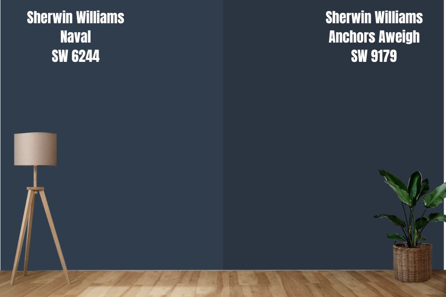
Sherwin Williams Anchors Aweigh is a dominant and bold navy blue color. When you compare Anchors Aweigh and Sherwin Williams Naval side by side, Anchors Aweigh feels deeper, sometimes looking more blue-black.
Sherwin Williams Naval is more reflective than Anchors Aweigh. On the LRV scale, Sherwin Williams Naval reflects 4% light, while Anchors Aweigh reflects 3% light. The two colors will lose their interesting character in a dim room, looking almost black.
Sherwin Williams Naval and Anchors Aweigh are different in their undertones. While Naval features a gray-green undertone, Anchors Aweigh boasts a black-green undertone.
Naval and Anchors Aweigh are both cool paint colors. Cool and deeply saturated, they are perfect for interior spaces welcoming warm light. While you can use them in a room receiving cool light, pair them with warm paint.
Sherwin Williams Naval vs. Indigo Batik (SW 7602)
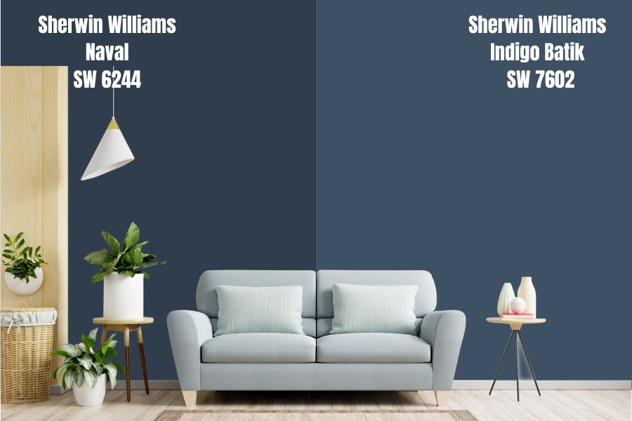
Sherwin Williams Indigo Batik and Naval are timeless, deep blues that make spaces look magnificent. However, compared to Sherwin Williams Naval, Indigo Batik is a much lighter deep blue color. While Naval has an LRV of 4, Sherwin Williams Indigo Batik has an LRV of 8.
These two paint colors have a similar effect on the space where you use them. Due to their low LRV, the paint colors make the area look more enclosed, creating an impression that the space is smaller—this makes the two paint colors ideal for rooms that are too big.
Indigo Batik and Naval are affected similarly by the lighting conditions. For instance, a room with enough light lets you view the paint colors’ blue shade and complete character. However, in a dim room, the paint colors lose their personality, looking bland.
While Indigo Batik and Naval share the same undertones, green and gray, the green in Indigo Batik is more visible than the gray tone. On the other hand, the gray undertone is more visible in Naval.
Sherwin Williams Naval vs. Charcoal Blue (SW 2739)
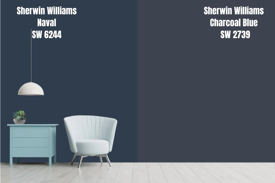
Sherwin Williams Charcoal Blue is a dark—almost black—shade of navy blue. Compared to Sherwin Williams Naval, Charcoal Blue carries a much more gray shade on top of the blue. Sherwin Williams Naval will always look more navy blue than Charcoal Blue.
However, Sherwin Williams Charcoal Blue and Naval are incredibly close on the LRV scale. While Naval reflects 4% light, Charcoal Blue is slightly lighter and reflects 2% more light with its LRV of 6.
The two colors will add a dramatic side to your room, creating an elegant backdrop. However, you will only get to view their full character if your room is well-lit. In a dim room, the two colors will look black and dull.
These two paint colors share green and gray undertones. However, the gray is much more in Charcoal Blue than in Naval. Both colors, however, are cool and will create a balancing effect in your warm southern-facing room. The two paint colors in an already cool room can create an icy feeling.
Sherwin Williams Dress Blues vs. Naval (SW 6244)
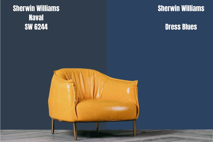
Unlike in Sherwin Williams Naval, where the gray undertone is more dominant, Sherwin Williams Dress Blues has a more dominant blue shade. Dress Blues will always look bluer than Naval.
Sherwin Williams Dress Blues is more of a neutral paint color. However, the blue tone in Dress Blues puts the paint color on the cool side. Dress Blues, like Naval, will work best in a warm room.
Naval and Sherwin Williams Dress Blues are on the lower end of the LRV scale. Naval has an LRV of 4, while Dress Blues reflects 1% more light with its LRV of 5. The two colors will need enough light to display their entire personality. However, since Naval has more gray that makes it darker, it tends to lose its character faster in a dim room than Dress Blues.
Sherwin Williams Commodore vs. Naval (SW 6244)
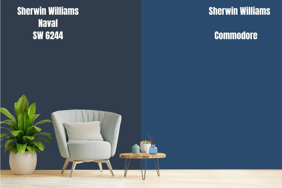
While Sherwin Williams Naval has blue as its primary tone, Sherwin Williams Commodore is more of a profoundly saturated violet that boasts blue undertones. Naval and Commodore differ on more than just their primary tones.
While Commodore boasts the blue undertones, Sherwin Williams Naval has green and gray undertones. It is, however, worth noting that the blue undertones in Commodore are so saturated that they often make Commodore look like an actual blue paint color. However, Commodore belongs to the Sherwin-Williams Purple color family.
Naval and Commodore are on the lower end of the LRV scale. For this reason, you will need enough light in your room to ensure these two colors maintain their personality. Naval has an LRV of 4, while Commodore reflects 2% more light with its LRV of 6.
Sherwin Williams Dark Night vs. Naval (SW 6244)
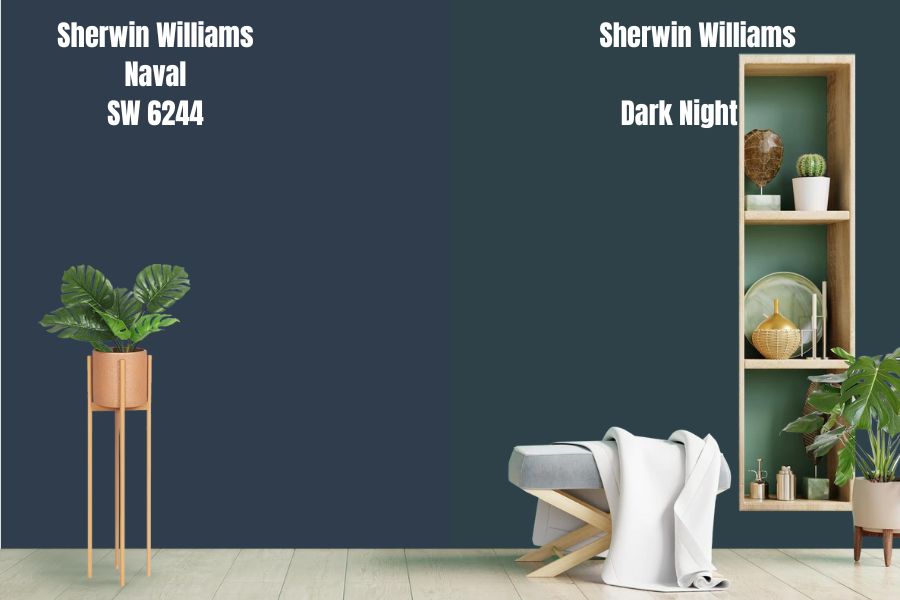
Like Sherwin Williams Naval, Sherwin Williams Dark Night is a bold, dark blue color. These two colors share some undertones—they both have a green undertone. However, Unlike Naval, which has gray as the dominating undertone, Dark Night has green as the dominating undertone—Dark Night has a green undertone so deep that it is visible in most lighting conditions.
The two colors have the same LRV—they both reflect 4% of light. Moreover, the two colors are cool.
Because of their characteristics, Dark Night and Naval will deliver the best results if you use them in a bright room with enough warmth. The colors may look too bland in a dim room, losing their personality. In a cold room, they can make your space feel icy.
Sherwin Williams Naval vs. Gale Force (SW 7605)
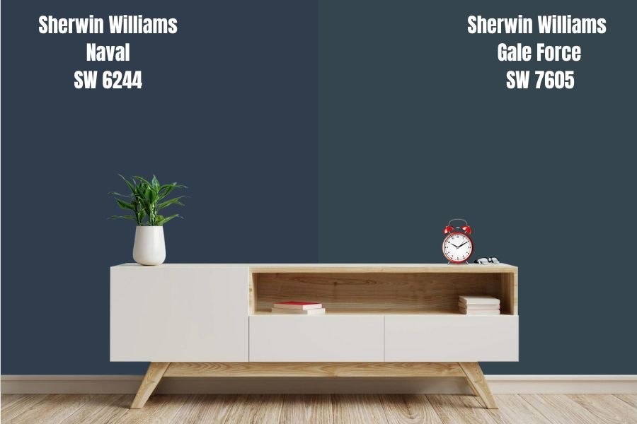
Sherwin Williams Gale Force and Naval are dark blue paint colors. The two colors have green and gray undertones. However, one difference between the two paint colors is that Gale Force has a deep green undertone that rarely allows gray to see the light. In Naval, the gray undertone dominates.
Sherwin Williams Naval reflects 4% of light, while Gale Force reflects 6% of light. Because of their low LRV, you will want to use both paint colors in a room with enough natural light to avoid creating a bland look.
Both Gale Force and Naval are cool paint colors. They will work exceptionally well when you use them in a space with enough warmth. Otherwise, their coolness can make an already cool room feel too cold.
Sherwin Williams Naval vs. Benjamin Moore Hale Navy (HC-154)
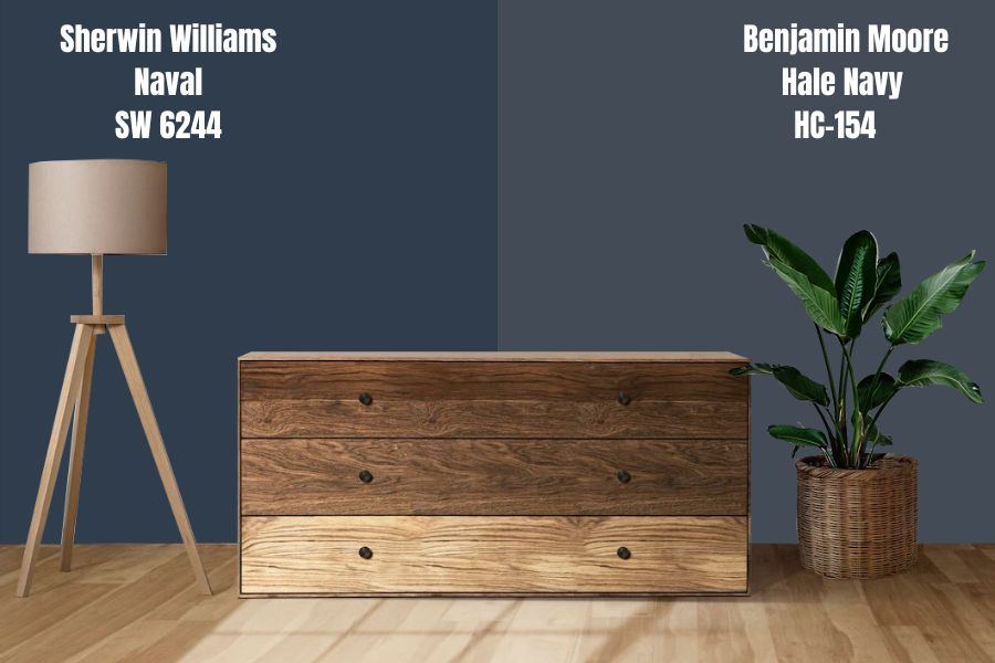
Benjamin Moore Hale Navy is what most interior designers consider the epitome of “navy blue.” The paint color is similar to Naval, which is the closest to navy blue from Sherwin Williams.
Benjamin Moore Hale Navy is a cool paint color—you won’t find a hint of warmth in Hale Navy, just like you won’t find warmth in Sherwin Williams Naval. The two paint colors will work well in a room with warmth. In a cold room, the paint colors can create an icy feeling.
While the Naval and Hale Navy share the green undertone, Naval has gray as an additional undertone, and Hale Navy has violet as another undertone. Benjamin Moore Hale Navy, however, is a lighter paint color with an LRV of 8, reflecting twice the amount of light reflected by Naval.
Benjamin Moore Deep Royal vs. Sherwin Williams Naval (SW 6244)
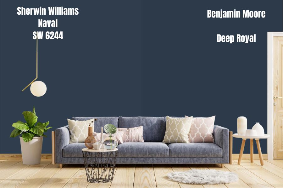
Benjamin Moore Deep Royal is another paint color with many characteristics that match those in Sherwin Williams Naval. Both colors have a close resemblance to true blue navy.
However, Benjamin Moore Deep Royal is closer to true blue navy because it is more of a neutral color with no discernable undertones. On the other hand, Sherwin Williams Naval has green and gray undertones.
On the LRV scale, Sherwin Williams Naval reflects 4% light, while Benjamin Moore Deep Royal reflects 5.36% light. The two colors will only maintain their true character in a room with enough light. Dim rooms will make the Naval and Deep Royal lose their personality to look bland.
Benjamin Moore Old Navy vs. Sherwin Williams Naval (SW 6244)
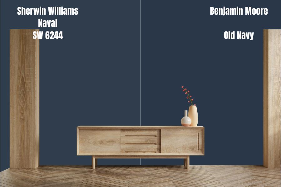
Like Sherwin Williams Naval, Benjamin Moore Old Navy is a dark navy blue paint color. However, despite being very dark, both Benjamin Moore Old Navy and Naval retain their blue appearance.
Naval and Benjamin Moore Old Navy do differ in their undertones. While Sherwin Williams Naval has blue and green undertones, Benjamin Moore Old Navy has a purplish undertone rare in most lighting conditions.
While Sherwin Williams Naval has an LRV of 4, Benjamin Moore Old Navy has an LRV of 5.13. Both colors are so dark that they need bright light to display their whole character.
Sherwin Williams Naval Color Palette: Colors That Go with Sherwin Williams Naval
Sherwin Williams Naval is a flexible color that allows you to choose between a monochromatic and contrasting color palette. When going after a contrasting Sherwin Williams Naval color palette, you can pair Naval with cool neutrals, light grays, creamy whites, Sakura pinks, off-whites, yellows, and mustards.
The following section will give you the best Sherwin Williams Naval coordinating colors. In the next section, I will show you the trim colors that go with Sherwin Williams Naval.
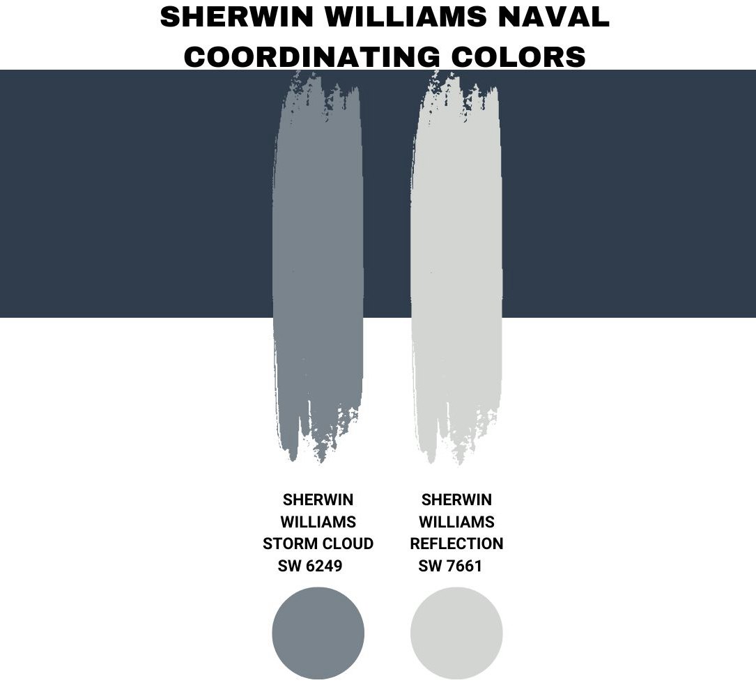
Sherwin Williams Naval Coordinating Colors
Sherwin Williams Storm Cloud (SW 6249)
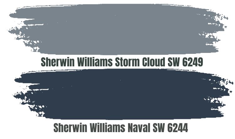
Sherwin Williams Storm Cloud is a perfect option for a monochromatic look with Sherwin Williams Naval. Storm Cloud is a blue paint color with deep gray undertones.
When paired with Naval, Sherwin Williams Storm Cloud adds an authentic and bold touch that ensures the entire room is more appealing and attractive. Sherwin Williams Storm Cloud has an LRV of 23. When you combine it with Naval, which has an LRV of 4, you will want the room to be bright enough to avoid creating a bland look.
Moreover, Sherwin Williams Storm Cloud is a cool paint color like Naval. Therefore, pair these two colors in a room with some warmth to avoid making your space icy.
Sherwin Williams Reflection (SW 7661)
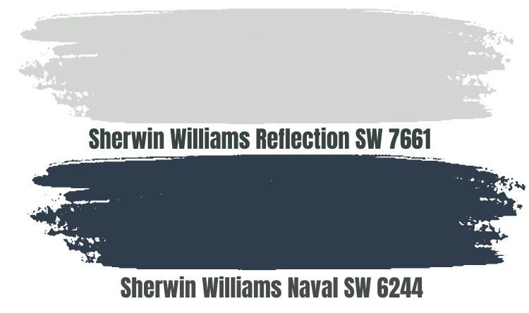
Sherwin Williams Reflection is a cool neutral that brings a slight spark into your room, making it homey and delightful. It is perfect to create a contrasting look with Naval on your walls.
Sherwin Williams Reflection is a gray paint color boasting cool blue undertones. Reflection has an LRV of 66. A medium-light color, Reflection is a perfect pairing color as it does not get washed out in the bright light or lose personality in dim rooms.
Sherwin Williams Naval Complementary Colors
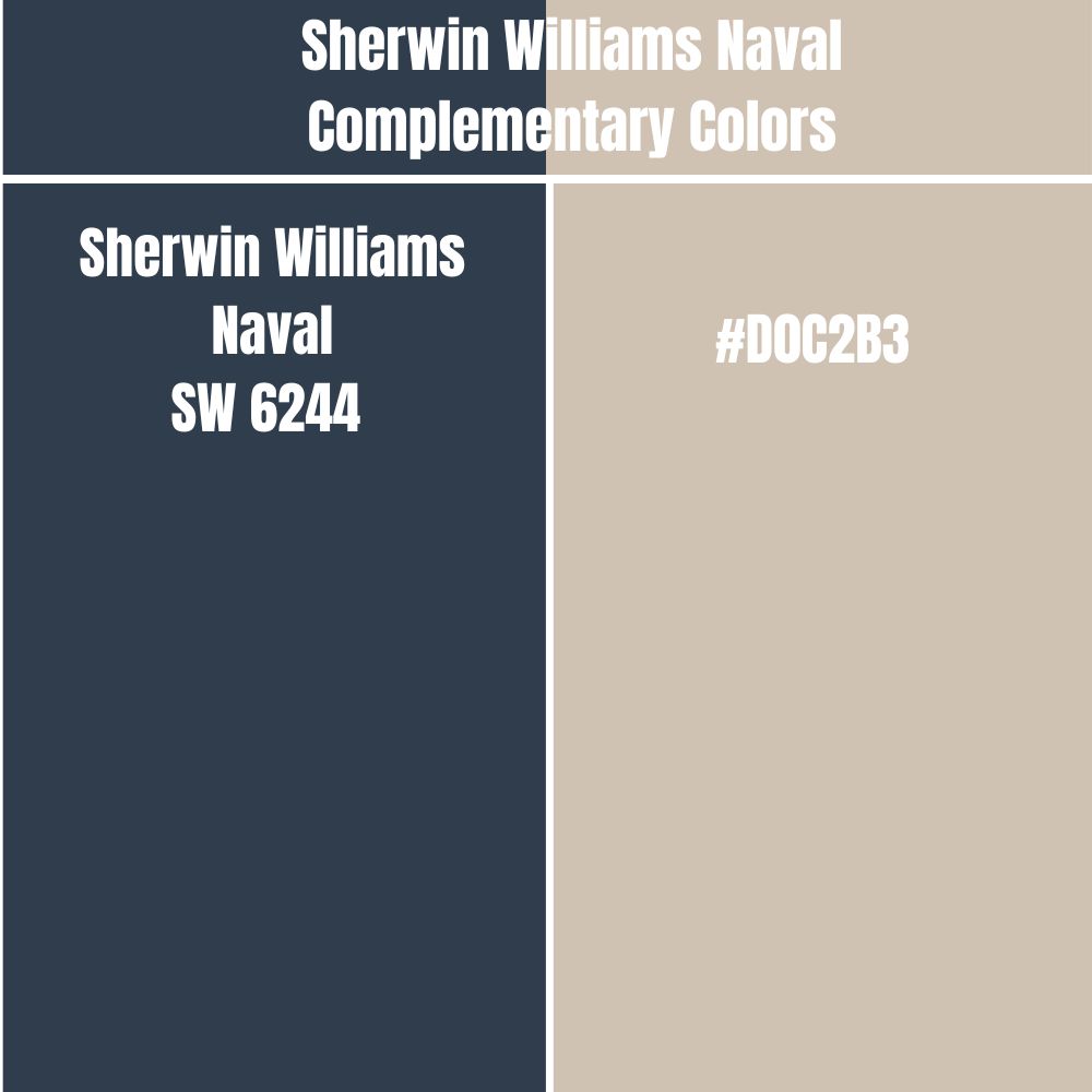
If you want to take your contrasting look to the next level, you may want to take advantage of Naval’s complementary color. Naval and its complementary color display the most significant contrast when painted next to each other. These two colors sit on opposite sides of the color wheel.
The complementary color for Sherwin Williams Naval has a hex value of #D0C2B3. There is no official paint color name for #D0C2B3. However, the closest name is Pale Silver.
Trim Colors That Go With Sherwin Williams Naval

Sherwin Williams Pure White (SW 7005)
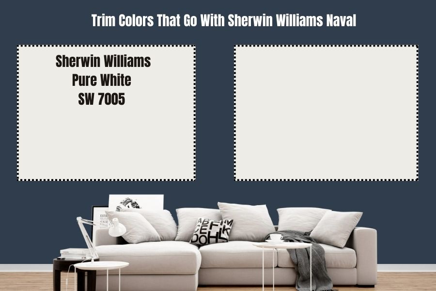
Trims painted with Pure White will always pop for a paint color as dark as Naval. Sherwin Williams Pure White is a timeless paint color that neither leans too creamy nor cool. It acts as a neutral option that makes your trims stand out.
Sherwin Williams Pure White has an LRV of 84. The paint color will reflect enough light onto Naval, adding some interest.
Benjamin Moore White Dove (OC-17)
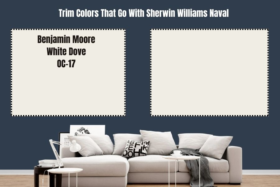
White Dove is a more reflective option from the Benjamin Moore brand. The paint color features an LRV of 85.38—it will reflect a lot of light onto Naval, creating more interest. White Dove will also ensure your trims are visible and eye-catching.
Benjamin Moore White Dove does add some warmth to any space. The warmth from White Dove helps balance the coolness in Naval.
Sherwin Williams Naval Benjamin Moore Version
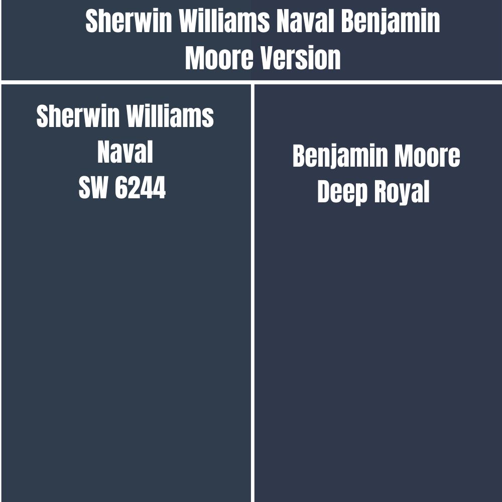
If you plan to use Benjamin Moore while maintaining the look offered by Sherwin Williams Naval, Benjamin Moore Deep Royal is the color you need.
On the RGB scale, Sherwin Williams Naval combines red: 47, green: 61, and blue: 76, while Benjamin Moore Deep Royal Combines red: 47, green: 57, and blue: 75. Deep Royal has an LRV of 5.36 while Naval has an LRV of 4.
How Does Light Affect Sherwin Williams Naval?
Sherwin Williams Naval is a cool color by default. However, in a room welcoming warm southern-facing light, Naval leans more on its gray shade, looking more neutral. In a room receiving cool northern light, the paint color leans more into its cool blue tone, looking much cooler.
Sherwin Williams Naval has a low LRV. Therefore, the paint color loses its character and looks bland in a dimly lit room. The paint color requires sufficient light to display its whole personality.
Best Rooms to paint Sherwin Williams Naval
Sherwin Williams Naval Exterior
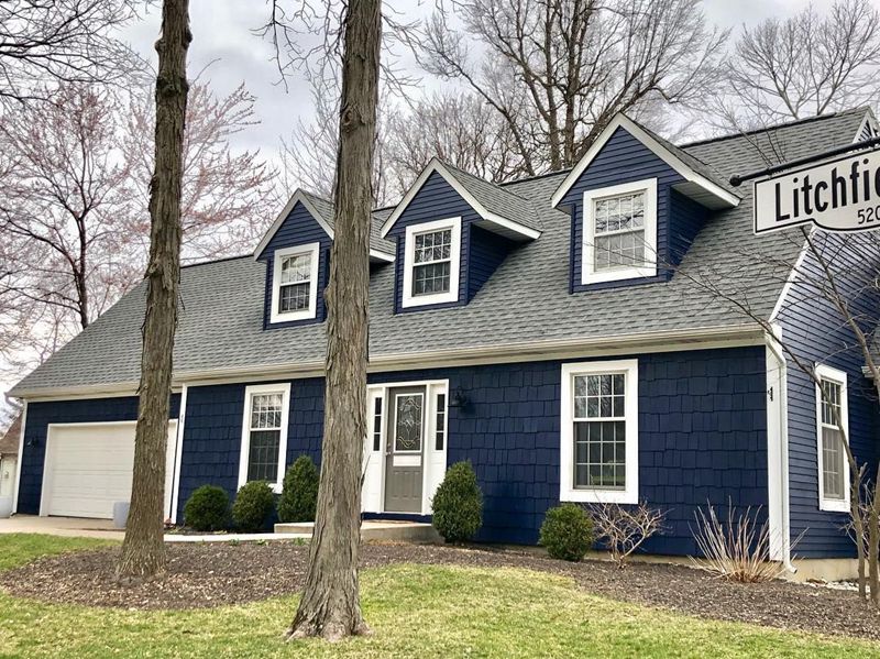
Sherwin Williams Naval is paired nicely with white trims in the above outdoor space, a creamy off-white on the garage door, and a gray roof. The exterior walls look luxe and engaging, while the white trims make the house more attractive.
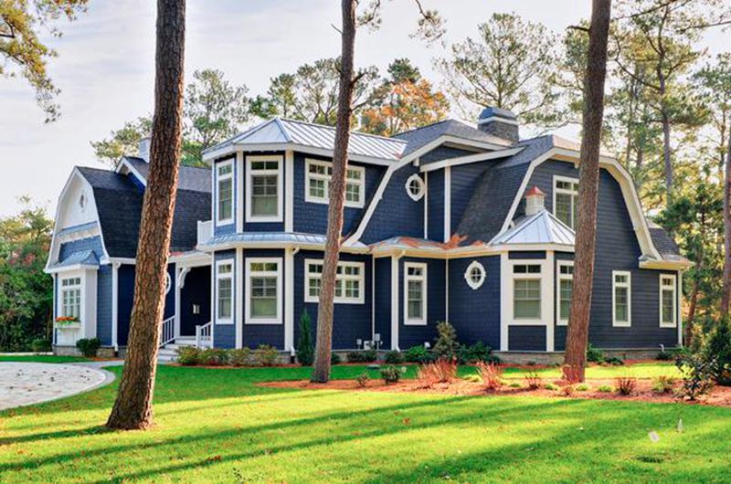
The above exterior combines white trims and Naval walls and roof. The bold and deep Naval displays its full character since it has access to enough light.
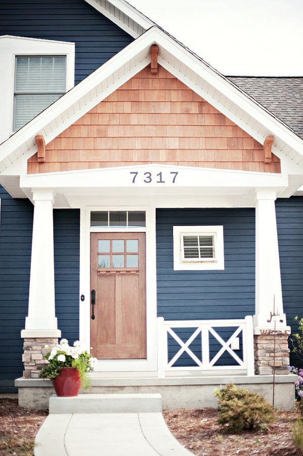
Sherwin Williams Naval is trimmed nicely in the above house with white paint. The homeowner has made the entire look pop with a vibrant wood-colored front door.
Sherwin Williams Naval Bedroom
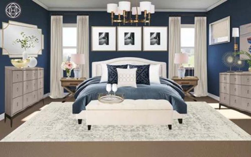
The above bedroom combines Sherwin Williams Naval with whites and off-whites perfectly. On the middle wall, Sherwin Williams Naval looks grayer than on the side walls, indicating the presence of cool light on the side walls. Naval seems to be bringing the walls together, making the vast bedroom look more intimate.
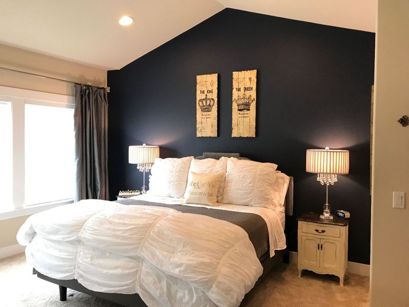
Sherwin Williams Naval is used on the accent wall in the above bedroom. The paint color makes the off-whites and whites in the bedroom pop. Moreover, Naval adds a serene, meditative vibe to the bedroom.
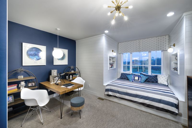
In the above bedroom, Sherwin Williams Naval sits only on one wall. It is, however, paired nicely with an off-white that boasts a hint of gray to create an exciting yet cozy sleeping room.
Sherwin Williams Naval Living Room
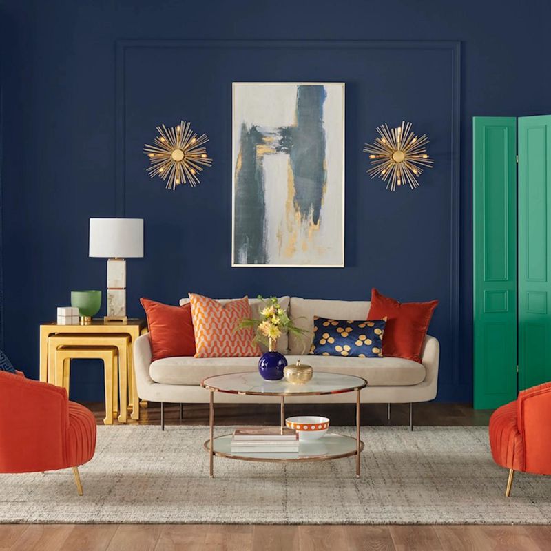
The above living room looks somehow busy. However, the designer carefully used Sherwin Williams Naval as a backdrop that stays in the background allowing other colors to shine. The orange pillows and chairs, golden stools, and creamy couches add some warmth to the space, balancing the coolness provided by Sherwin Williams Naval.
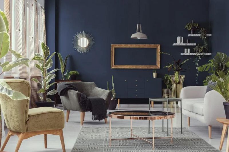
In the above living room, Sherwin Williams Naval also plays the role of a backdrop. It stands in the background while allowing every other paint color to shine. The room’s whites, off-whites, greens, and grays contrast and complement Naval to create an exciting view.
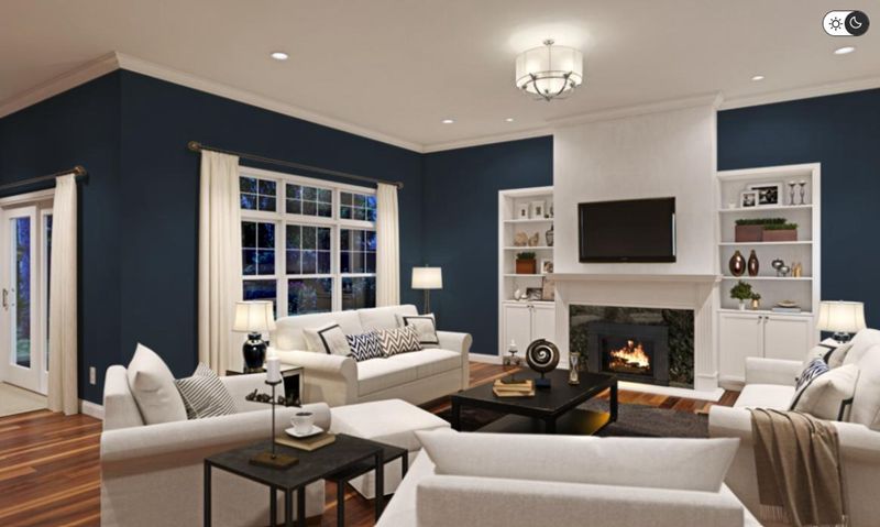
Maybe you have wondered what Sherwin Williams Naval would look like in a living room after dark. As you would expect, with a paint color with an LRV as low as that of Naval, the paint color looks slightly dark. However, the white paint color in the room reflects enough light on Naval, allowing it to maintain interest.
Overview
Sherwin Williams Naval is a rich, sophisticated paint color that brings a sense of timelessness and elegance to any space. The paint color boasts a touch of luxury and utmost eccentricity, making your room more attractive and appealing.
The dark navy blue paint color carries some green and gray undertones that often show in different lighting conditions. When used correctly in a room, the moody, dark blue paint color adds a sense of drama and depth without becoming too overwhelming. The paint color projects a sense of restfulness, serenity, and tranquility.
This detailed guide answers all questions about Sherwin Williams Naval. I have also shown you the pairing colors you can use to create an exciting look with Naval. If there is a question I did not address, please let me know in the comments.
 Sherwin Williams Mega Greige (Palette, Coordinating & Inspirations)
 Sherwin Williams Steamed Milk (Palette, Coordinating & Inspirations)
 Sherwin Williams Caviar (Palette, Coordinating & Inspirations)
 Sherwin Williams Dorian Gray (Palette, Coordinating & Inspirations)
 Sherwin Williams Natural Tan (Palette, Coordinating & Inspirations)
 Sherwin Williams White Heron (Palette, Coordinating & Inspirations)
