
Are you remodeling your home and unsure which paint color from the Sherwin Williams Palette will be perfect for your walls? Well, look no further; the Sherwin Williams Olympus White may be the color shade you need to give your home the wow effect.
Although we understand it’s easy to think that because this shade tilts towards the neutral category, it may be too boring, this isn’t true. Instead, its versatility guarantees an elevation in the overall aesthetics of your home.
We understand how difficult it can be to choose one color from the vast Sherwin Williams paint color collection; hence, we’ve taken it upon ourselves to review the Olympus White from Sherwin Williams thoroughly.
Table of Contents
What Color Is Sherwin Williams Olympus White
Although many people categorize the Olympus White as a white color (no thanks to the name), this paint is gray and falls under the light shade category.
The Olympus White, although gray, possesses the right amount of saturation to prevent it from coming off as off-white in rooms with an ample supply of light. Additionally, it blends flawlessly with white trims.
| Manufacturer | Sherwin Williams |
| LRV | 68 |
| RGB | 212, 216, 215 |
| Hex Value | #d4d8d7 |
| Color Collections | Living Well-Focus |
RGB Of Sherwin Williams Olympus White
The RGB of any color represents the amounts of Red, Green and Blue added into black paint to create Olympus White, and it’s represented on a scale of 0-225. So for the Sherwin Williams Olympus White, its RGB is 212 Red, 216 Green, and 215 Blue.
Light Reflective Value Of Sherwin Williams Olympus White
So many external factors influence the outcome of paint color, from undertones to lighting, which has now made it important to discuss the importance of your paint’s LRV.
A paint color’s Light Reflective Value (LRV) refers to how much light a color reflects. A color with a high LRV reflects more light, while a color with a low LRV reflects less light. This can be an important consideration when choosing a paint color, as it can affect a space’s overall ambiance and feel.
The Sherwin-Williams Olympus White has a relatively high LRV of 68. This means that it reflects a significant amount of light and can help to brighten and open a space. This makes it a great choice for smaller or darker rooms that need extra light. It can also be a good choice for spaces with limited natural light, as it can help reflect the available light.
Is It A Warm Or Cool Color?
Sherwin Williams Olympus White is generally considered a cool-toned color in the gray family. However, this color has a stunning blue undertone that gives off chameleonic characters under varying light conditions, which is why it’s a favorite for many.
Its coolness will help soften a warmly lit room, adding a neutral touch and not clashing with your other home décor. So, you can pair this color with bright and bold as much as possible.
Ultimately, It’s smart to test out your paint under different light conditions using Samplize strips to give a feel of what the results will be and aid your decision process.
What are the Undertones?
Undertones are a crucial part of paint makeup. They result from the artistic process of blending colors in various amounts to create a new hue. You must know that every color ever made has an undertone(s).
Now that you understand how the concept of undertone works let’s take a deeper look into the setup of Sherwin Williams Olympus White.
When you take a closer look at Sherwin Williams Olympus White in your space, it may give off an instant blue undertone even though it’s an active member of the gray family. The intensity of this blue often depends on the light conditions, which may make you think your wall is painted light blue instead of light gray.
Despite this, nothing changes the fact that Olympus White is a light, neutral gray, but you will likely get more than a dash of blue from time to time, and that’s perfectly okay.
When considering the direction of the light source in the room, under North facing light, the blue undertones in the Olympus White paint will shine more due to the complimenting blue color of the northern light, thus making it the coolest natural source of light.
However, if your room faces the south, expect the Olympus white to be toned by the warm lights to make it a mix of neutral and gray.
For East facing rooms, the warm yellow light in the morning gives your room a more neutral feel, shifting to a cooler grayish blue later in the day because of the cool light. Finally, when the light source is from the west, you naturally get a warm hue, especially during the late hours of the day, but it appears cool gray.
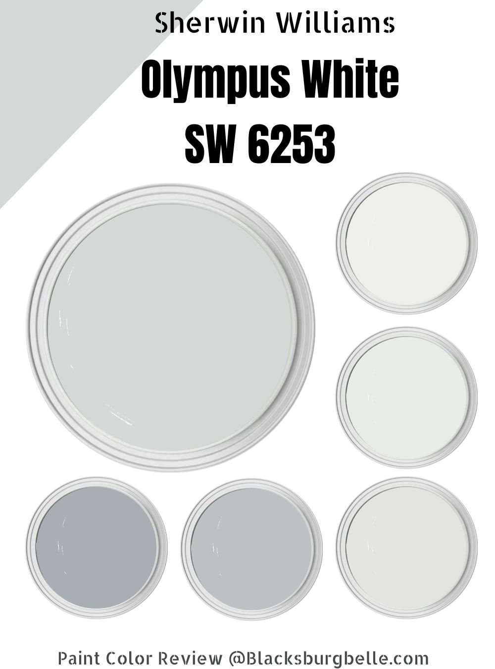
Sherwin Williams Olympus White Color Strip
All colors vary in intensity regardless of their similarities on the color strips. The colors you’ll see in this section are variations of gray with blue undertones achieved by adding equal amounts of black and white to Olympus White.
For the light color strip, we go three shades up, and to get a decent dark color strip, we take it three shades down.
Light Color Strip
| Color Code | Color Name | Location Number | Color Tone |
| SW 7006 | Extra White | 257-C3 |  |
| SW 7007 | Ceiling Bright White | 257-C2 |  |
| SW 6252 | Ice Cube | 257-C3 |  |
Sherwin Williams Extra White
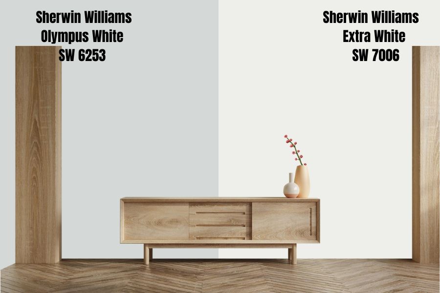
Often compared to Sherwin Williams Pure White, this color has an LRV of 86, giving it a high reflectivity and making it an excellent choice for trims. In addition, this paint shade is a cool, slightly gray color suitable for kitchens, bathrooms, and living rooms as it delivers a cooling effect.
The Extra White from the Sherwin Williams collection is unique if we say so ourselves and for reasons far from what you’d imagine. One such reason is that while its base suggests it flashes a subtle and muted blue undertone, it quickly levels out to become a true white with a barely noticeable undertone.
It’s also a considerable choice for the exterior of your home, especially if you don’t fancy a warm Sherwin-Williams color at all.
Sherwin Williams Ceiling Bright White
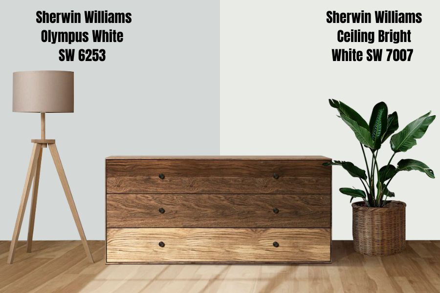
Ceiling Bright White has an LRV of 83 with clean, blue undertones that pair well with fellow cool grays and are excellent for outdoor and indoor use. However, due to its nuance, this color may look bluish-gray.
Sherwin Willaims Ice Cube
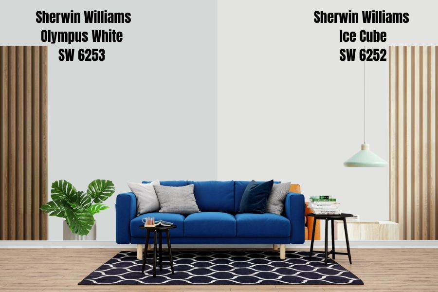
This shade is from the Sherwin Williams Finest Whites & Neutral collections and packs an LRV of 77, strong enough to cool down any surface with its crisp, bright white. In addition, the blue undertones of this color make it pair well with other cool colors.
Dark Color Strip
| Color Code | Color Name | Location Number | Color Tone |
| SW 6254 | Lazy Gray | 234-C2 |  |
| SW 6255 | Morning Fog | 234-C3 |  |
| SW 9161 | Dustblu | 234-C4 |  |
Sherwin Williams Lazy Gray
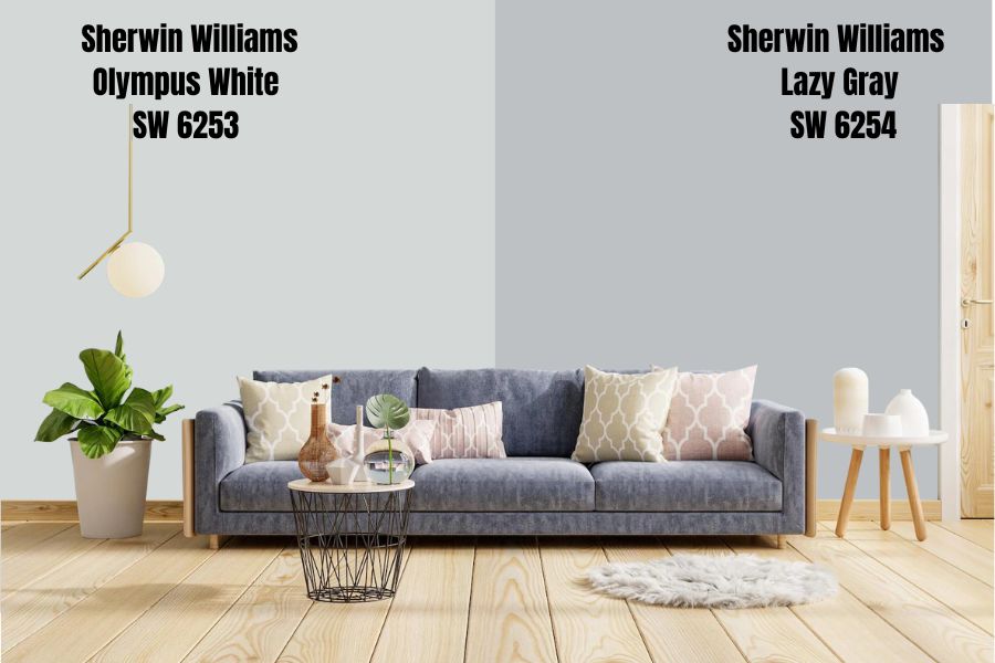
Lazy Gray is the perfect complement to your space if you’re looking for a neutral color with a cool gray tinge. With an LRV of 53, it is bright enough to fit all over your wall. Note, however, that this color might come off too dark for rooms needing more light.
Additionally, the Lazy Gray has a strong blue undertone, just like Olympus White, and it’s an excellent choice for your kitchen, office space, and bedroom.
Sherwin Williams Morning Fog
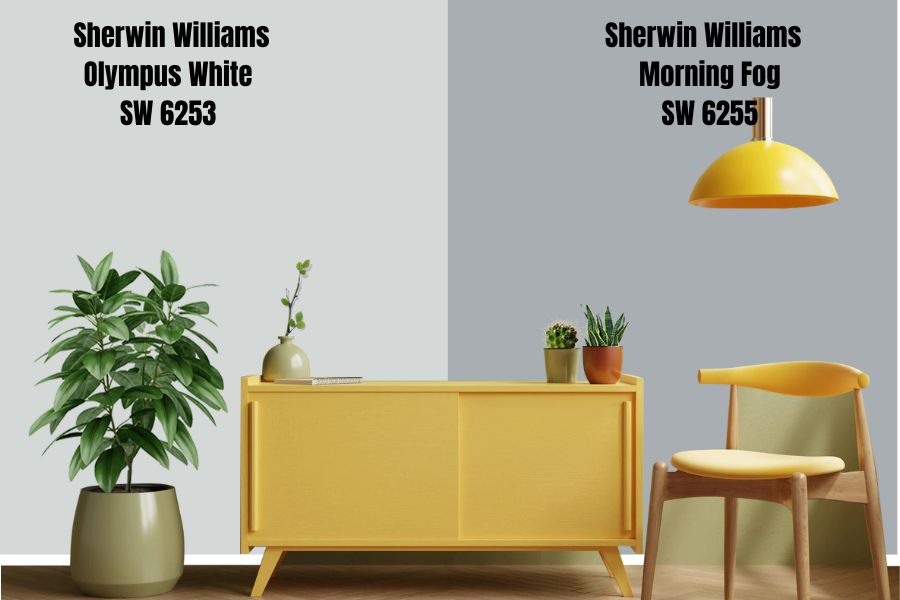
Like the Olympus White, Morning Fog is one versatile color that gives off a calming effect when used in a space. In addition, this color has an LRV of 42, which puts it in the dark category and is perfect for rooms with lots of natural light. It also makes an excellent choice for Lofts, Ecofriendly, and Scandinavian interior designs.
So, combine it with other shades of cool grays and whites for your home’s sophisticated, minimalist, and simple decoration.
Sherwin Williams Dustblu
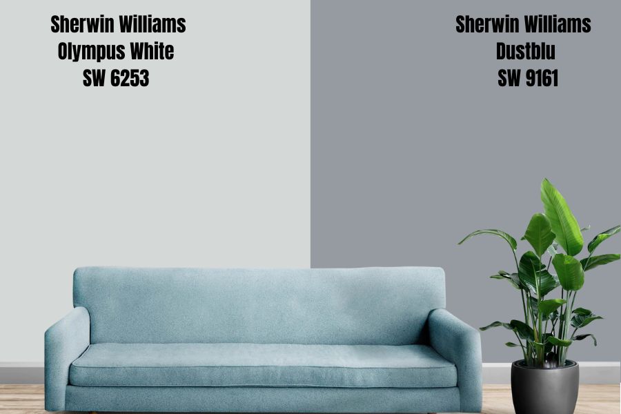
Sherwin Williams Dustblu is a generic gray color with a blue undertone. It’s a medium gray color with a light reflective value of 33.12, which gives your space a feeling of simplicity and modernity.
This color in a kitchen gives off a cozy finish and goes well with light tan, browns, and colors very close to beige.
Sherwin Williams Olympus White Color Palette
While planning on painting your space, familiarizing yourself with color palettes is essential to the decision-making process. Knowledge of the different palettes available help you marry your anchor paint perfectly with other shades without producing mediocre results.
Need to know how to go about it? Please keep reading.
Sherwin Williams Coordinating Colors
Coordinating colors come in two categories, monochromatic and contrasting decorations. For a modern and minimalist setting, I recommend monochromatic decoration; however, for those who wish to tilt towards a more traditional vibe in your home, the contrasting palette is perfect for you.
Monochrome Decoration
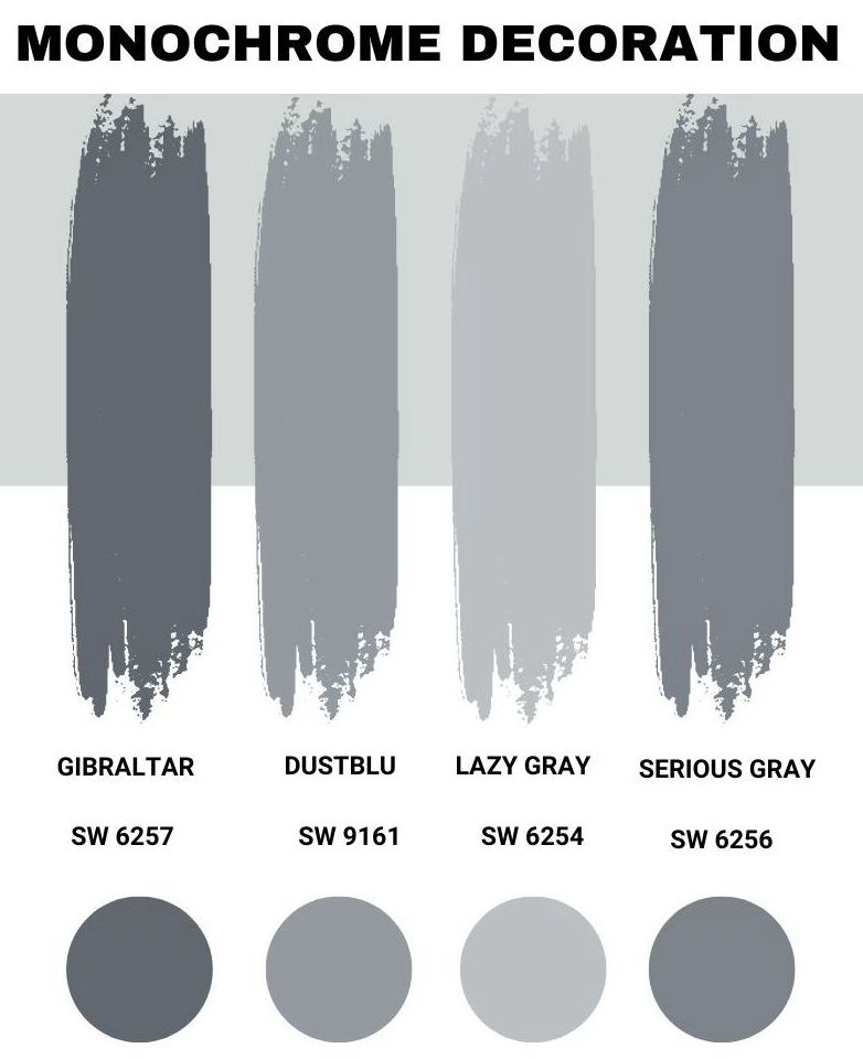
To achieve a monochrome palette, you need to decorate the painted Olympus White room with varying shades of gray-blue, ranging from the lightest to the darkest shade, and an overall change in saturation and lightness.
You’d spot the striking difference if you pick hues like Gibraltar, Dustblu, Lazy Gray, and Serious Gray, all from Sherwin Williams. You can also widen your options by opting for more distinction by picking gray shades with blue undertones 2-3 times higher than the LRV of the Olympic White.
Contrasting Decoration
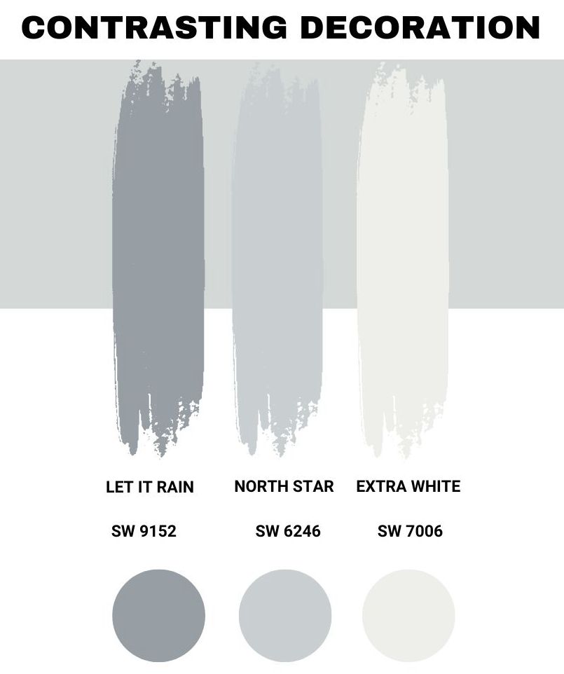
If you desire more play with colors, a contrasting color palette is the way to go. However, before opting for this, it’s important to understand that every color you pick must work with your anchor shade. Additionally, color blocking is possible.
Some favorite contrasting colors you can try include Let It Rain, Extra White, and North Star. Although these colors are very different from the Olympus White, their union with the Olympus White is beyond remarkable.
Sherwin Williams Complementary colors
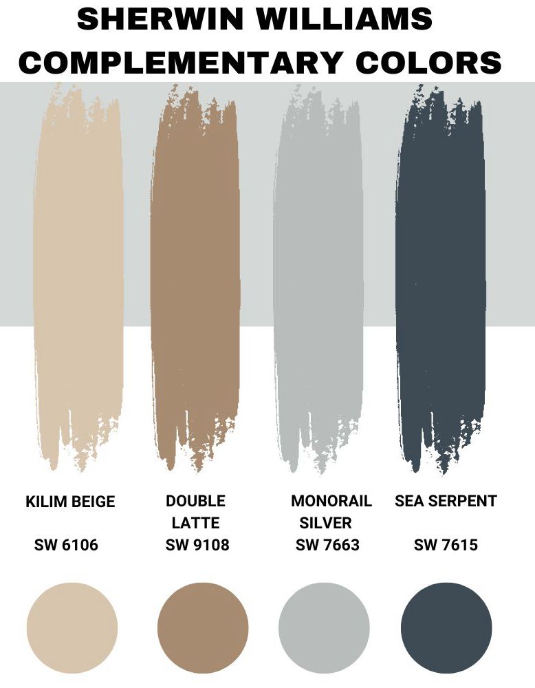
Complementary colors are opposite or across from each other on the color wheel. You can use these colors to create a bold and vibrant look in your home. When used together, complementary colors can create a strong visual contrast and help to highlight and accentuate features in a space.
Some suitable complementary color options that combine perfectly with the Sherwin Williams Olympus White include the Monorail Silver, Double Latte, Sea Serpent, and Kilim Beige.
You can take it up a notch by pairing it with cool blues, off-whites, and much darker grays for astounding contrasts.
What Trim Colors Go With Olympus White
The go-to options for trim colors in painting your space are usually white. For more understanding of what trim colors are, they’re the whites that help define your style and make your room feel bigger by pronouncing the shape.
In any case, you find yourself white is always going to be a good idea, and with SW Olympus White, this rule also applies. For trim colors, use either SW High Reflectance White or SW Pure White, as it’ll help you reveal the true shade of your neutral SW Olympus White to life.
Sherwin Williams Olympus White Comparison
Sherwin Williams Olympus White is a complicated color owing to its chameleonic characteristics, making it hard to pair colors with it.
Additionally, you’ll enjoy how the Sherwin Williams Olympus White picks up surrounding colors and evens them out, creating less chaos. Making it quite easy for homeowners to throw in accessories they love,
Sherwin Williams Olympus White Vs. Reflection
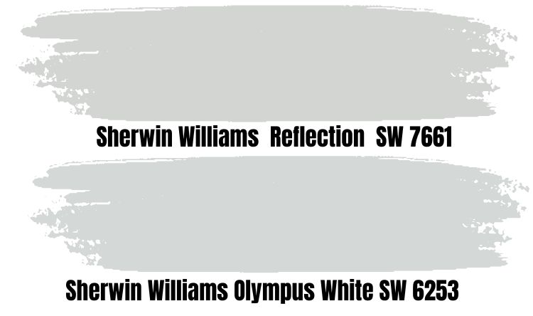
Sherwin Williams Reflection is just 2 LRVs lower than Olympus White. This is an indication that these two conveniently sit in the white category. The Reflection from Sherwin Williams is identical to the Olympus White because it also possesses gray and blue undertones. However, the Reflection comes with a hint of purple that surfaces occasionally.
Sherwin Williams Olympus White Vs. Icicle
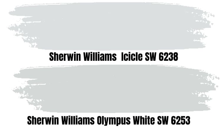
The Icicle is a cooler and more subtle light violet with a dash of blue, making it sophisticated and very calming in any space. It has an LRV of 73, which means it is possible to make small spaces appear larger than they are.
This color is bound to make you feel calm and address those stress hormones; it’s an excellent choice for your living room if you want a cozy vibe. You’d also enjoy pairing it with warm details like yellow and brown to create contrast.
Sherwin Williams Olympus White Vs. Morning Fog
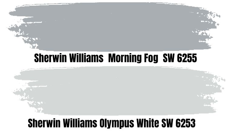
Like the Olympus White, the Morning Fog is another popular paint color from the Sherwin-Williams collection. These two colors are many times compared due to their similar color families. Both are shades of white, with Olympus White as a bright and crisp white and Morning Fog as a softer and muted white with blue undertones.
With an LRV of 42, the Morning Fog shade falls on the darker side of the spectrum. This means you can use it to make a large and mid-sized room appear brighter. It’s an excellent choice for your bathrooms, doorways, and bedrooms.
If you use this shade in a tiny space, you may end up giving more depth, and that’s not what you need; in any case, you can combine it with extra bright lights to soften it up, and during the day, enough natural light will do the job.
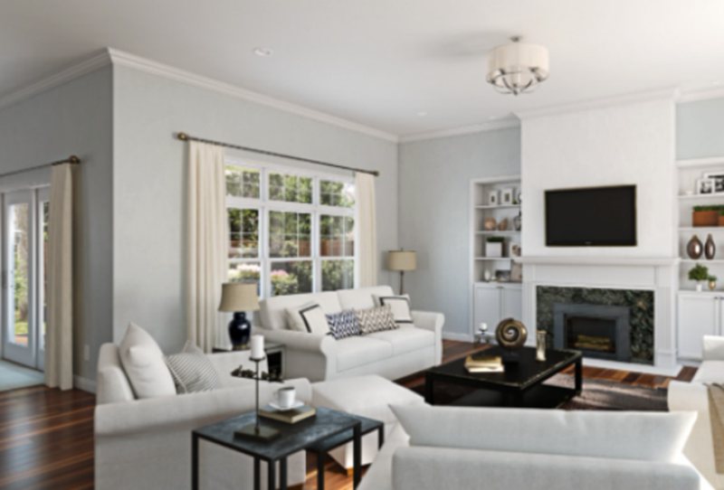
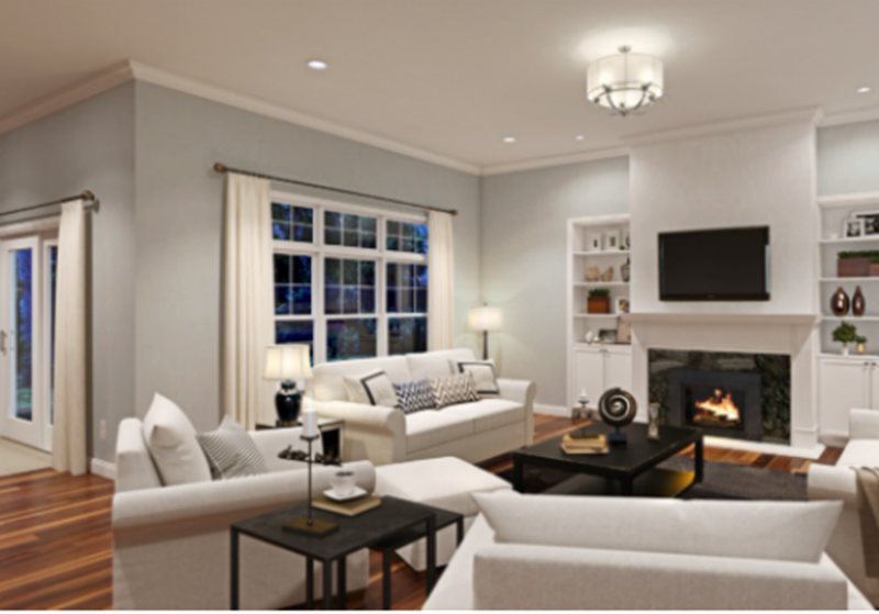
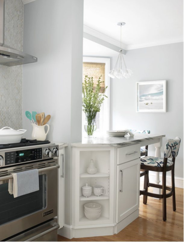
Sherwin Williams Olympus White In Spaces
Olympus White is an amazing color that instantly gives your space more space and brightness. In addition, it comes with a cool blue touch, offering calmness and tranquility the moment you enter your home.
So, if your space is not so big and you’re looking for how to make the most of it without tearing down walls, Olympus White is the best for you.
Scandinavian, traditional, modern, and contemporary styled homes can also take a leaf off our pages and incorporate Olympus White into the interior décor. However, be careful not to pair this color with warm beige, brown furniture pieces and golden oak cabinets.
Sherwin Williams Olympus White Kitchen
Don’t be shocked to see this in our options; even though gray kitchens are not popular with many homeowners, the Olympus White is great when paired with white countertops, off-white cupboards, almost black cabinets, and a glossy, patterned backsplash.
Incorporate some beige highlights, and you’ll have a very lively kitchen perfect for the entire family to spend time in.
Sherwin Williams Olympus White Bathroom
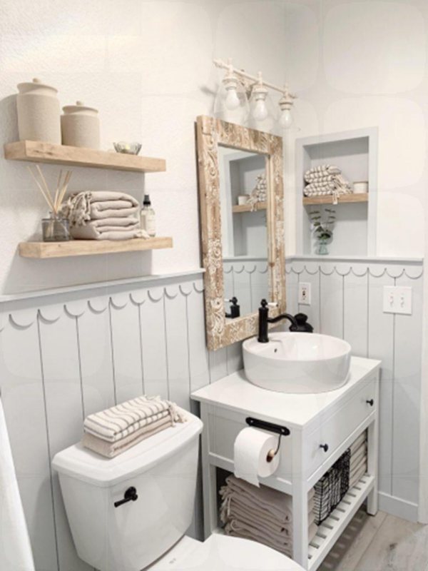
If you desire a coastal touch in your bathroom, the Olympus White is the one for you. Its subtle, natural tones pair well with sand-toned hues giving you beachy vibes on a fine Saturday morning. Insert a touch or two of blue into the décor, and you’ll have a tastefully furnished bathroom.
Sherwin Williams Olympus White Exterior
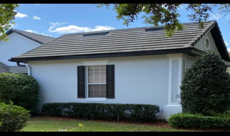
While this color isn’t our first choice or go-to for exteriors, it works amazingly for people who want a coastal-themed appearance for their homes. This is largely due to its cool blue undertones and how the washed-out feel it delivers under the bright sun, which gives it an ocean feel.
Pair it with white window frames, a dark gray door, or white roof tiles to give it that classic and timeless feel.
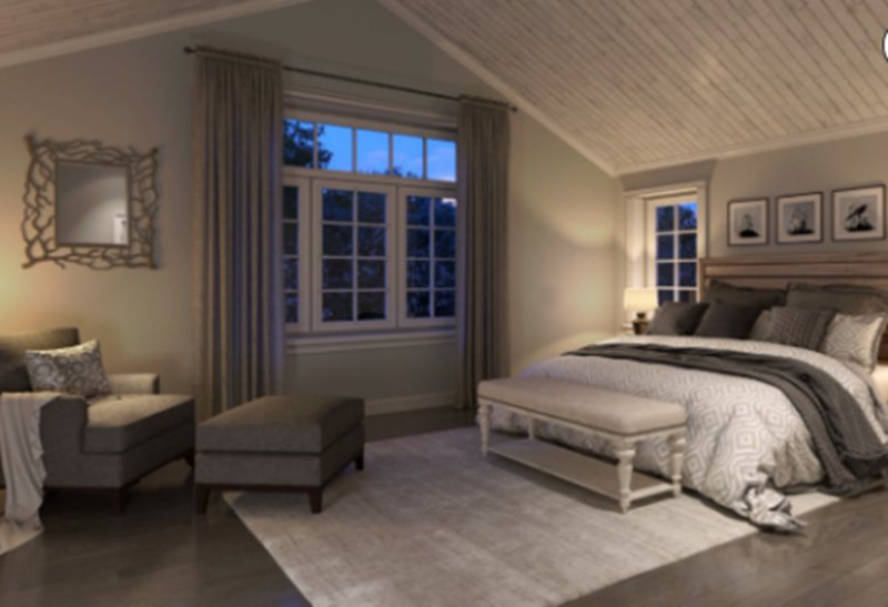
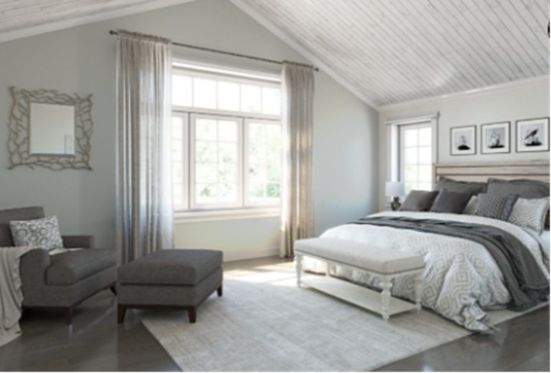
Sherwin Williams Olympus White Bedroom
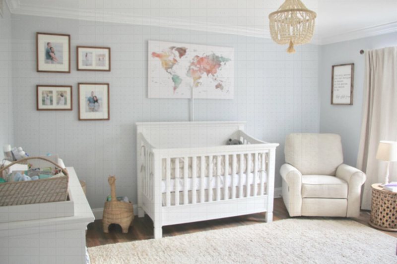
This is a great choice for you if; you need more bedroom space available or your bedroom looks quite basic, especially if you pair it with a monochromatic color scheme and lots of woody texture. The light blue undertone in this color helps you relax and calm those tensed nerves as you’re out and about during the day.
You can paint all your walls the Olympus White color and add a bright accent to switch it up. Pair it with wooden textures and silver or gold tints for the accents, and throw in a patterned or sheepskin pure white center rug.
Benjamin Moore Olympus White comparison
If our darling Sherwin Williams is nowhere to be found on the shelf, Benjamin Moore is a worthy replacement and has a few colors that match Olympus White. While they aren’t twins, they could pass off as sisters.
Benjamin Moore Graytint
The Gray tint from Benjamin Moore resembles Olympus White because it’s a slightly cool-toned gray with subtle blue undertones and will read as under certain light conditions. However, compared to the brand’s other pale gray paint colors, this one has a bit more pigment.
Benjamin Moore Silvery Moon
With an LRV of 63.66, the Silvery Moon has a blue cast that immediately gives off a calming effect in any space. This color performs excellently in interior and exterior settings, especially when you pair it with
Benjamin Moore Misty
Misty is on the list of everyone’s favorite cool gray with blue undertones that give your home a completely different experience when you walk in. This neutral color works excellently with brown to almost beige details. In addition, it blends well with pure white decor without looking too bright.
Benjamin Moore outdid themselves with this paint color. The fun part is that you can use it anywhere in the house, including the exterior. In addition, it has an LRV of 80.58, which means it’ll open up your space to so much air and lets you work with as much lighting as you desire.
Match it with other colors from the brand, like Midnight, Montpelier, and Gray Owl, for a more artistic effect.
Benjamin Moore Stonington Gray
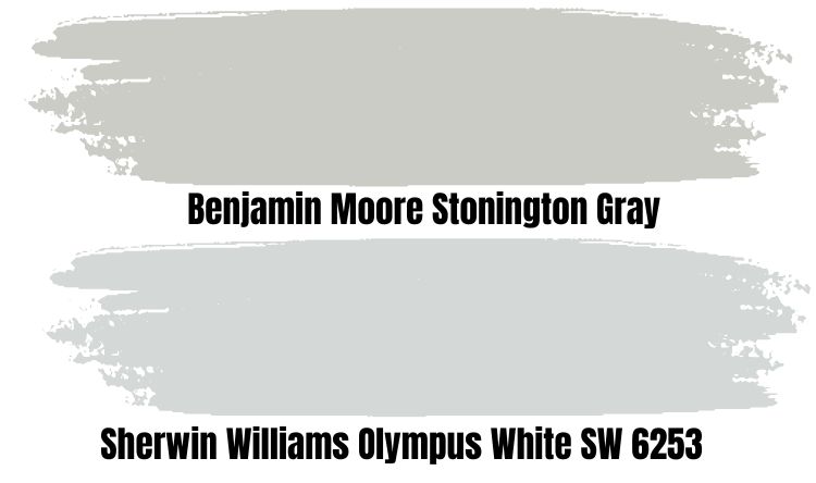
Stonington Gray, like the name, is gray with a bluish undertone and surely on the cool side. It has an LRV of 59.75, which puts it in the medium category and makes it a good choice for your kitchen, cabinets, and bedroom.
Make sure to pair it with good lighting to see the true beauty and ability to switch tones based on your personality and location of space.
It is always a good idea to test a paint color before making a final decision, as the appearance of color can vary depending on the lighting and other factors in a space. Benjamin Moore and Sherwin Williams offer paint samples that can be applied to a small area to see how a color looks in a specific space. This can help ensure that you choose a color you are happy with that will work well in your home.
Sampling Sherwin Williams Olympus White
Sampling a paint color is an important step in selecting a paint color for your home, as it can help ensure that you choose a color that you are happy with and that will work well in your space.
They’re also cost-effective as you can use them more than once. Peel and stick samples are so easy to use and move around from one spot in the house to the other. You can get one from Samplize to begin your journey toward turning your space around today.
Parting Words
In conclusion, Sherwin Williams Olympus White is a stunning paint color that brings a clean and fresh feel to any space. It is a crisp gray with a hint of blue, making it perfect for creating a modern and welcoming atmosphere. So whether you want to refresh your walls, cabinetry, or furniture, Sherwin Williams Olympus White is an excellent choice.
 Sherwin Williams Sea Salt (Palette, Coordinating & Inspirations)
 Sherwin Williams Agreeable Gray (Palette, Coordinating & Inspirations)
 Sherwin Williams City Loft (Palette, Coordinating & Inspirations)
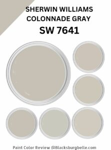 Sherwin Williams Colonnade Gray (Palette, Coordinating & Inspirations)
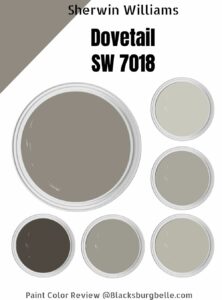 Sherwin-Williams Dovetail (Palette, Coordinating & Inspirations)
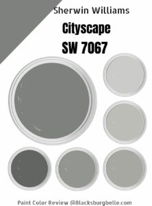 Sherwin Williams Cityscape (Palette, Coordinating & Inspirations)
