Sherwin-Williams Oyster White isn’t among the brand’s famous Top 50 colors, “so why bother reviewing it?” you wonder. It’s a hidden gem worth exploring, as you won’t regret it.
This color embodies elegance and style that is suitable for old souls in love with vintage and mid-Nineties décor. It’s not too white that your space feels clinical but retains a creamy white overlay, sure to bring warmth into your surroundings.
Oyster White’s beauty is in its changing hue such that a bright morning light highlights its white features with hints of green. How does this work? What other surprises are in stock with this paint? Keep reading to find out.
I’ll start with the scientific aspects for people deep into interior decoration, then move into the creative application of that knowledge. Consider your creative horizon about to expand.
Table of Contents
What Color is Sherwin-Williams Oyster White?
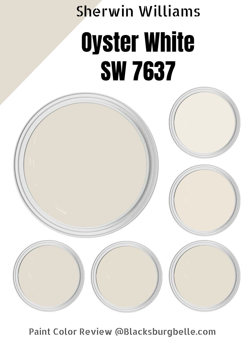
Oyster White is a calming warm off-white paint with a rich beige-green undertone. It has an LRV of 72, making it a medium-light hue. Sherwin-Williams categorizes it under its finest white paints.
| Manufacturer | Sherwin Williams |
| LRV | 72 |
| RGB | Red 226 | Green 221 | Blue 208 |
| Hex Value | #E2DDD0 |
| Color Collections | Color ID (Nurturer), Living Well (Unplug), Finest Whites & Neutrals (Finest Whites) |
RGB of Sherwin-Williams Oyster White
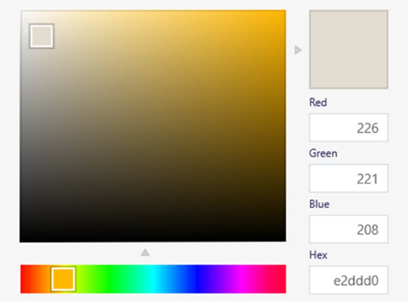
Creating Sherwin-Williams Oyster White requires 226 red, 221 green, and 208 blue mixed into absolutely black paint. The Hex Value comes to E2DDD0 with the color lying in the neutral zone of an orange hue.
Remember, orange is a secondary color formed by mixing red and yellow. You’ll learn more about the significance of this information soon. Keep reading.
Light Reflective Value (LRV) Of Sherwin-Williams Oyster White
Don’t expect a crisp white paint that brightens a space without light from Oyster White. That’s not to say the color would absorb every ray of light that hits its surface. Instead, this creamy white paint is a sweet spot between both extremes with an LRV of 72.
You can measure every paint’s ability to illuminate or absorb light on a scale of 0 – 100, with zero being absolute black (absorbent) and a hundred being pure white (reflective). Note that there’s no paint without undertones, so the scale is 3 – 99.9.
Is Oyster White a Warm or Cool Color?
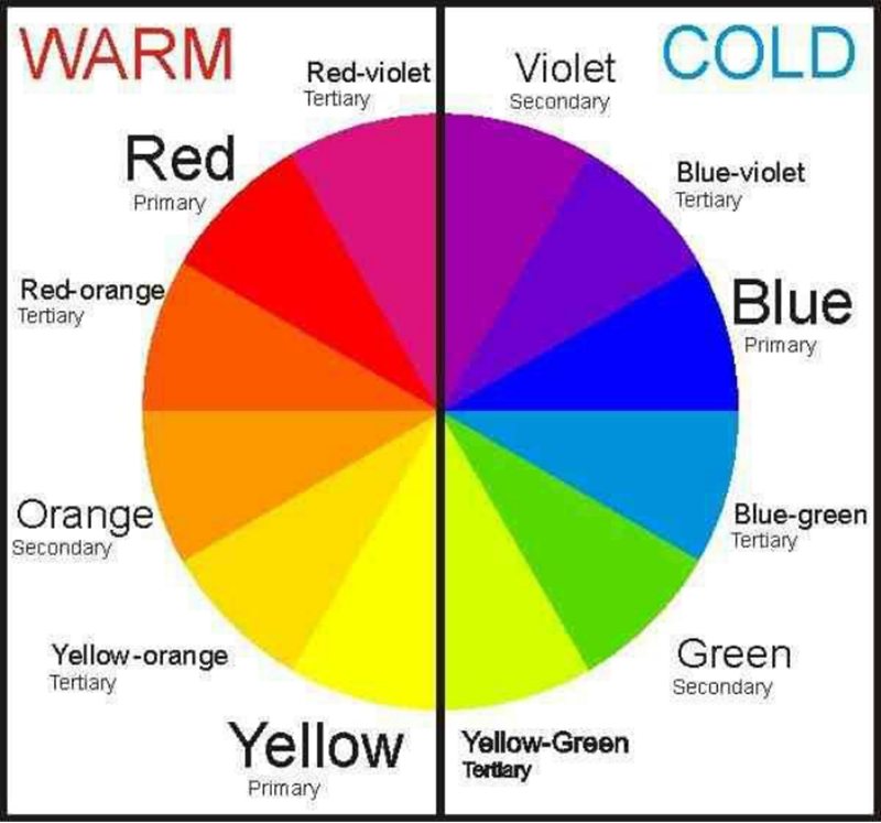
As seen in the RGB representation above, Oyster White is a shade of orange making it a warm color. Each color falls into one of two categories – warm or cool – that dictates its personality and aura.
Warm colors remind you of heat and fire, a.k.a. red, yellow, and orange, while Cool colors represent the ocean, so picture blue, green, and purple.
What are the Undertones in Oyster White?
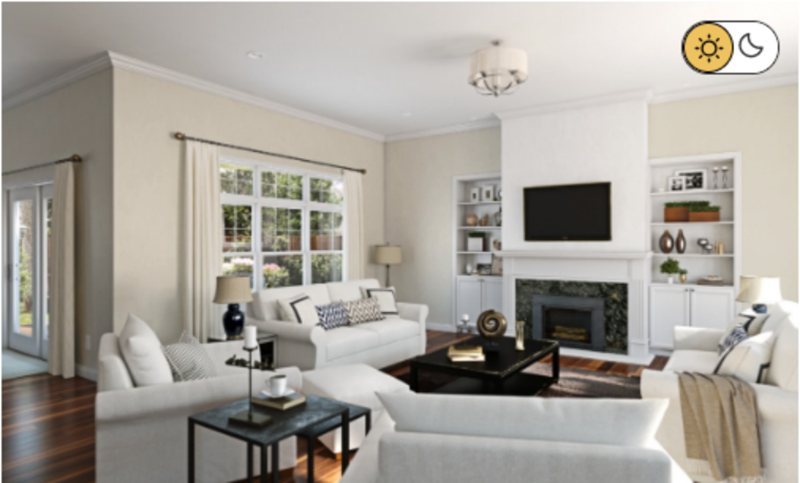
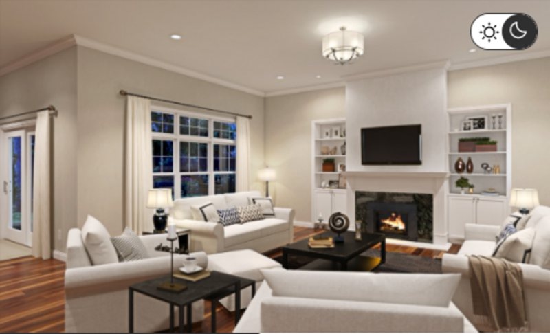
Sherwin-Williams Oyster White is white with gray, beige, and slight orange undertones. The tone you get depends on your lighting condition, as bright lights emphasize the white overlay and dim lighting teases out the interesting base notes.
The color’s nuances produce different vibes, although the overall aura is warmth by its RGB value. The white part illuminates your room, while the beige note introduces warmth.
Scroll down to see how lighting works with Oyster White but first, see some pictorial examples.
All pictures are courtesy of Sherwin-Williams

Sherwin-Williams Oyster White Color Strip
When you decorate a space with a monochrome theme, you need all the different shades to complement each other, and that’s where the color strip comes in. It’s a group of colors (3 – 7) generated from one paint and altered based on shading and saturation.
You’ll notice that Oyster White’s strip colors are all high LRV hues, as medium or dark paints would clash with its medium-light note.
| Color Code | Color Name | Location Number | LRV | Color Tone |
| SW 7551 | Greek Villa | 254-C1 | 84 |  |
| SW 7013 | Ivory Lace | 254-C2 | 79 |  |
| SW 7009 | Pearly White | 254-C3 | 77 |  |
| SW 7042 | Shoji White | 254-C4 | 74 |  |
| SW 7010 | White Duck | 254-C5 | 74 |  |
| SW 7011 | Natural Choice | 254-C6 | 73 |  |
| SW 7637 | Oyster White | 254-C7 | 72 |  |
Sherwin-Williams Greek Villa
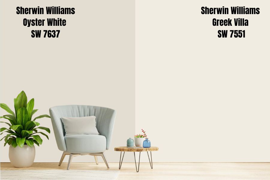
As the color with the highest LRV in the strip, Greek Villa’s undertone is a deep greige note embedded in a white overlay. You’ll enjoy this paint best under the brightest natural light, which comes from a South-facing light/window.
You can use Greek Villa anywhere from interiors on the wall to ceilings, accents, trims, and exteriors (paneling and walls.) It’s way brighter than Oyster White, so Greek Villa is suitable as a monochromatic pair.
Sherwin-Williams Ivory Lace
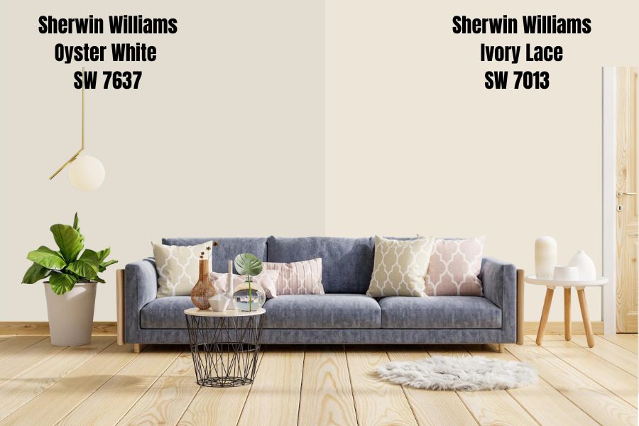
Unlike its counterpart Oyster White, Sherwin-Williams Ivory Lace has a mellow yellow undertone tinged with pastel pink. The multiple nuances produce a golden sheen that makes the color appear creamy regardless of lighting and timing.
Ivory Lace has an LRV of 79 and goes well with warm wood trims and accents to pair it with Oyster White.
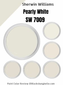
Sherwin-Williams Pearly White
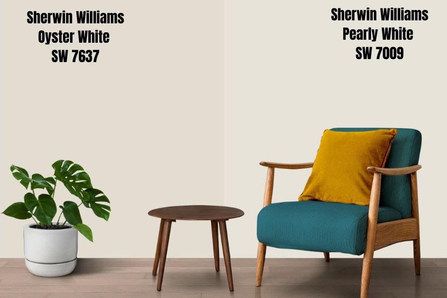
Sherwin-Williams Pearly White is a great choice if you want a two-toned neutral paint. Most off-white paints have yellow bases like Oyster White but if you want a hue with a cool cast, choose Pearly White.
Due to its undertones, pairing Pearly White with neutral shades of gray would make the color pop.
Sherwin-Williams Shoji White
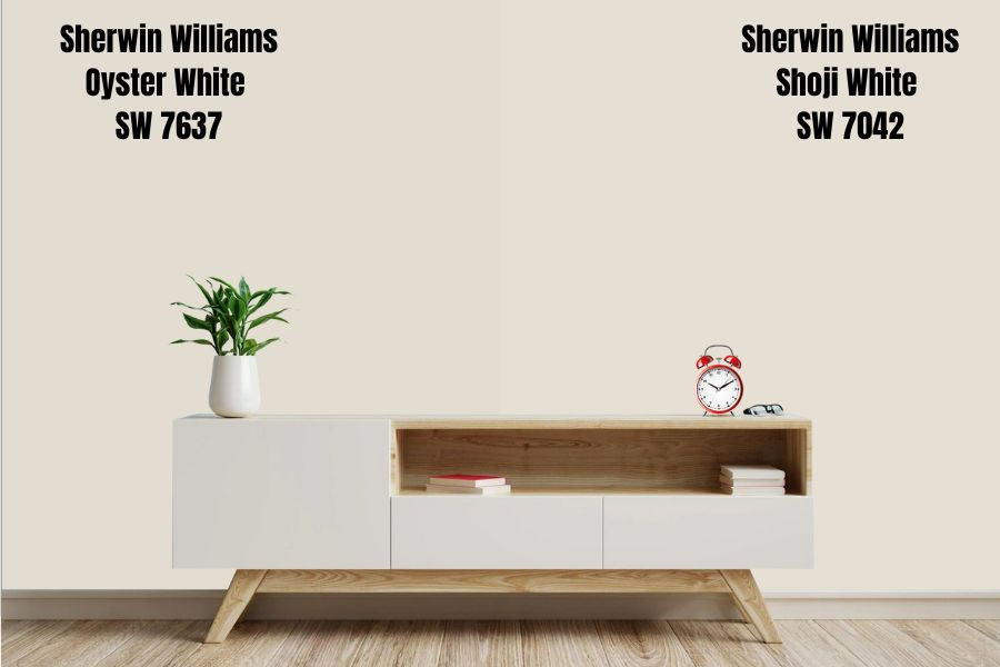
Sometimes you want a paint that is neither cool nor warm, and that’s the vibe Shoji White gives you. It’s a pretty white paint with a greige undertone that presents a cozy vibe.
Sherwin-Williams Shoji White is a summery paint that became the color of the month for August 2022. It has an LRV of 74, so it’s a medium-light shade that comes alive with dark and tan wood.
You can also pair Shoji White with the basic crisp white trims and accents.
Sherwin-Williams White Duck
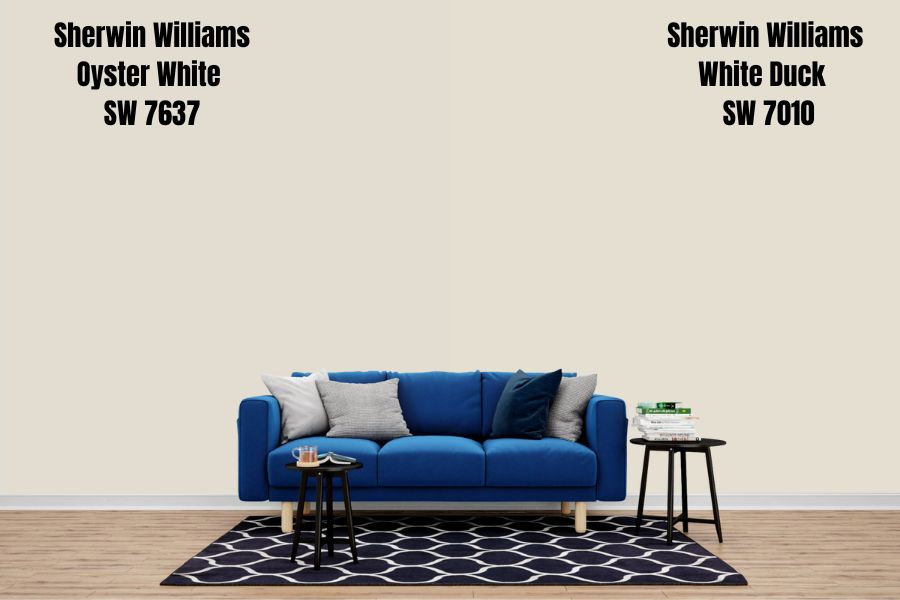
What’s the difference between White Duck, Shoji White, and Oyster White? It’s all in the undertones and shading. On the surface, they look like the same colors, especially with White Duck and Shoji White having the same LRV – 74.
White Duck has a muted yellow cast due to its subtle greige undertone; hence it won’t appear too yellow in your space. Meanwhile, Oyster White’s beige undertone is strong and makes the yellowish-orange undertone shine at the faintest hint of light.
All three colors are warm hues, but some are brighter than others.
Sherwin-Williams Natural Choice
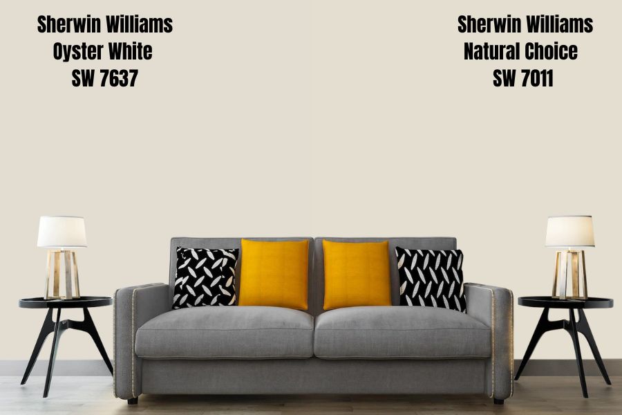
If you ever need an alternative to Oyster White, Natural Choice is your best bet. They have similar LRVs and the same muted beige overlay, making your space look welcoming.
Natural Choice is darker than White Duck but brighter than Oyster White. The three hues have prominent yellow undertones waiting to be unleashed with lighting.
Sherwin-Williams Oyster White Color Palette
It’s time to combine the colors in the strip into one harmonious theme that works with a palette. A color palette mixes different paint shades to create a coordinated theme.
Coordinating Colors for Oyster White
Your space should convey your personality, and that’s where color coordination becomes relevant. As a warm hue, Oyster White tends to convey feelings of positivity especially when paired with other vibrant shades. However, you can tame its fiery undertones with a cool accent.
There are several themes to explore, but the top three include monochrome, triad, and contrast. Check them out and choose the one that suits your personality best.
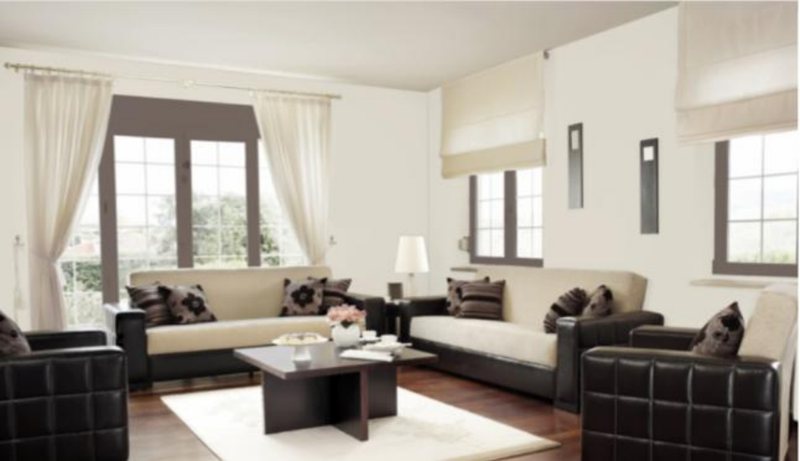
Monochrome Decoration with Oyster White
This design is for the elite and classic individual who hates clutter as it consists of one color in different shades. Unlike other designs that incorporate other colors into a space that could look chaotic (organized chaos exists), monochrome harmonizes.
The consistent flow of Oyster White into different shades and saturations, from Greek Villa for the trims to Ivory Lace and Pearly White as accents, creates a soothing warm aura. Using the color strip, choose your preferred alternate shades to highlight an Oyster White wall.
You can do that by mixing textures from the flooring (carpets, rugs, tiles) to the tapestry (curtains and blinds) and accessories (wall art, pottery, and furniture). See the example below.

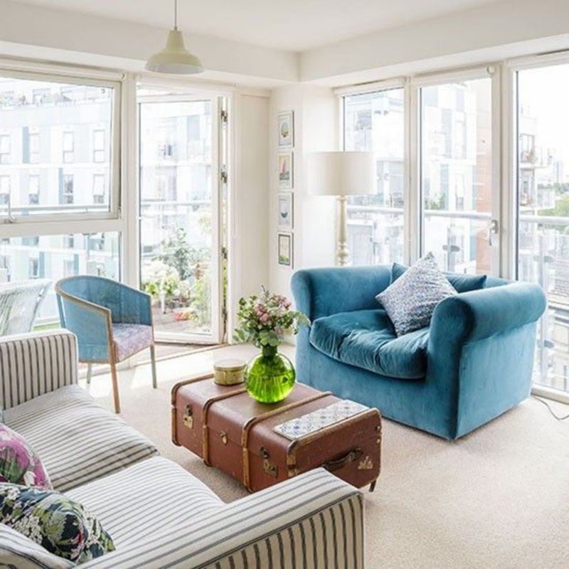
Triadic Decoration for Oyster White
A triadic palette is one of the most creative themes for interior design because it includes three otherwise unrelated colors fused into one spot. It’s a palette curated with three equally spaced colors on the color wheel.
As a neutral tertiary paint with orange at its base, Oyster White’s triad consists of purple and green. You could also highlight the faint yellow hint using red and blue-tinged paints.
To get the best triad, combine reddish-purple and bluish-green, a.k.a. cyan or teal. Start with Oyster White as the anchor, then build the rest of your decoration around it using the other two tones in the triad.
Contrasting Oyster White with Complementary Colors
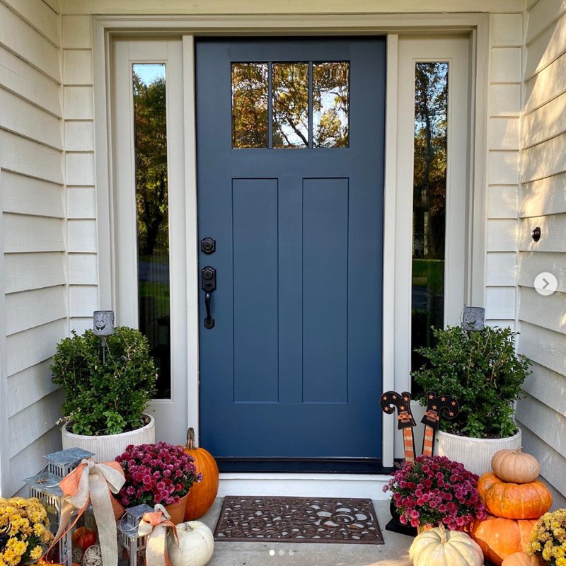
When your creativity isn’t as daring as mixing three colors into one space, you can dial it back with the trusted contrast. All you need is Oyster White (tinged with orange and yellow) and its opposing color on the color wheel.
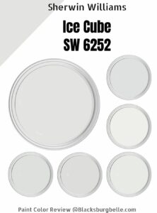
Using orange, the opposite tone is a deep violet, unlike yellow, which contrasts with a subtle blue. If you want to make the space strictly neutral, choose other pastel paints with blue or violet tinges like Sherwin-Williams Ice Cube, White Lilac, White Iris, and Minuet White.


What Trim Colors Go With Sherwin-Williams Oyster White?
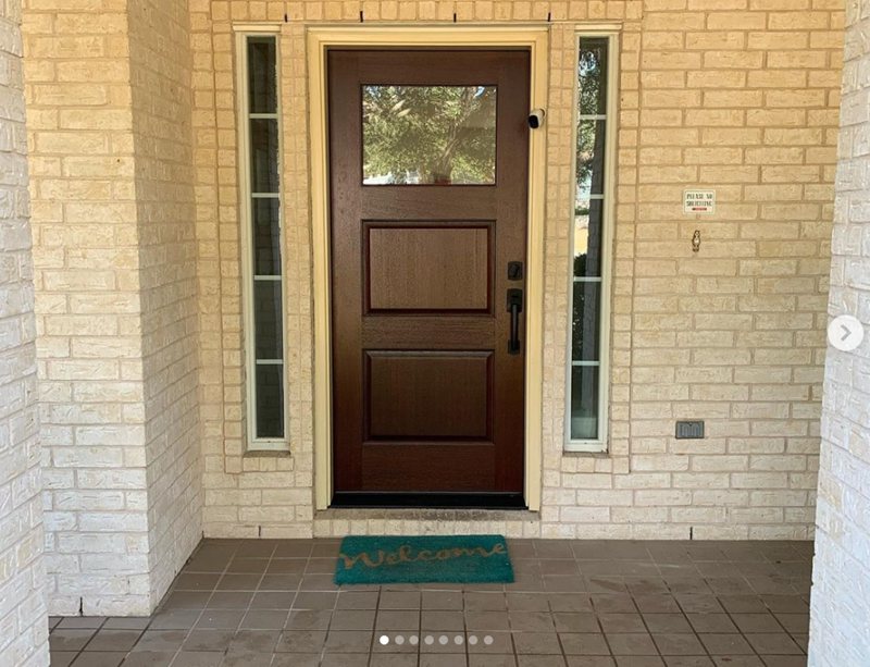
You can go strictly neutral with white trims or introduce color using wood from honey to golden brown and dark tans.
If you must use a dark shade, stick to chocolate browns like mahogany or chestnut and not black unless it’s laced with strong brown, purple or blue undertones like Black Bean, Caviar, Bohemian Black, Rockweed, and Black Swan.
Oyster White walled bathrooms look beautiful with white and greige marble tiles on the floor.
Sherwin-Williams Oyster White Color Comparisons
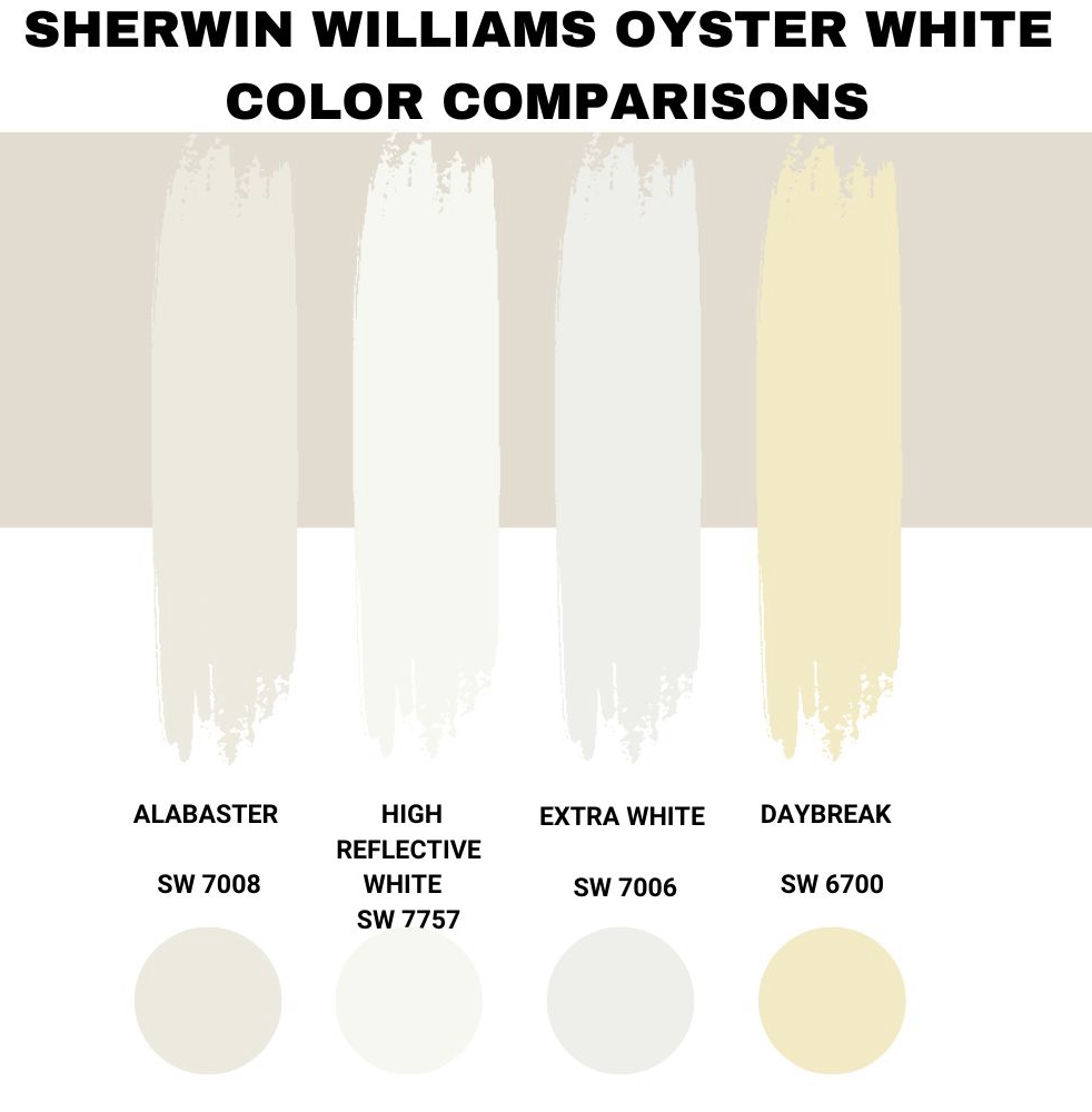
Is Sherwin-Williams Oyster White too bright or not bright enough? Do you have reservations about the undertones? Would you prefer it to be less yellowish, or you’d like a golden-yellow tinge?
Here’s a list of alternatives from the brand compared to Oyster White.
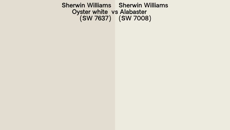
Sherwin-Williams Oyster White vs. Sherwin-Williams Alabaster (SW 7008)
Alabaster is one of the most popular white paints by Sherwin-Williams due to its neutral greige undertone. It’s a creamy hue with limited tints so, you can always count on it to remain its true shade in any condition.
Compared to Oyster White, Alabaster has a higher LRV at 82 and became April 2022’s color of the month. Many people favor the tone in Fall although it fits any season. You can get creative with Alabaster due to its versatile neutrality.
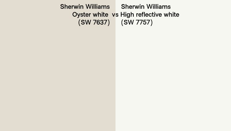
Sherwin-Williams Oyster White vs. Sherwin-Williams High Reflective White (SW 7757)
Sometimes you want a white paint without a pushy undertone and that’s what you get from High Reflective White. It’s a strictly interior paint from Sherwin-Williams with a blinding LRV of 93.
You can get as creative as you want with High Reflective White (HRW) as your canvas.
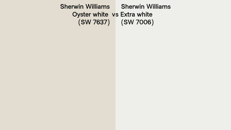
Sherwin-Williams Oyster White vs. Sherwin-Williams Extra White (SW 7006)
So you want a paint that’s not as bright and clean as High Reflective White but don’t want to deal with the yellow tints in Oyster White. What do you do? Get Extra White by Sherwin-Williams.
The color serves both interior and exterior coloring which is a plus unlike HRW which covers only indoor spaces. You can use Extra White anywhere from the ceiling to the trims and full coverage on the walls.
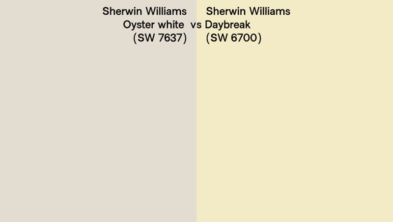
Sherwin-Williams Oyster White vs. Sherwin-Williams Daybreak (SW 6700)
With Daybreak you’d get a pastel yellow color unlike Oyster White’s off-white which is a creamy tone. It’s suited for interior painting as putting it outside (except as an accent) is off. The high LRV color (82) is a good harmonizer inside especially with darker paints like navy.
Benjamin Moore Color Comparison
Besides Sherwin-Williams, Benjamin Moore is another high-quality paint brand. It is a perfect alternative to the former brand and provides equally versatile coloring, including neutral whites with yellow undertones.
Chantilly Lace (2121-70/nOC-65)
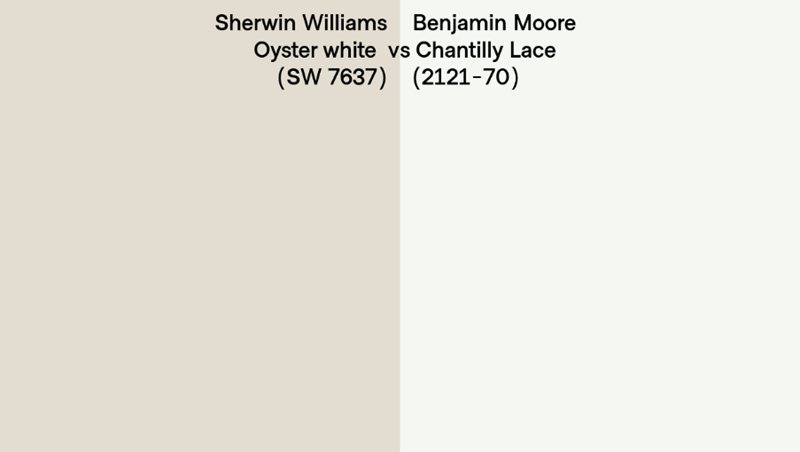
Benjamin Moore’s Chantilly Lace is a crisp white paint with a dusky gray undertone that pops under direct sunlight. It’s a pure white color that often remains true to itself hence its popularity as a neutral hue, unlike Oyster White which has several nuances.
As a true white paint, Chantilly White by Benjamin Moore isn’t as picky as its Sherwin-Williams counterpart, Oyster White. With an LRV of 90.04, it’s easy to see why it’s a bestselling hue.
White Dove (PM-19/OC-17)
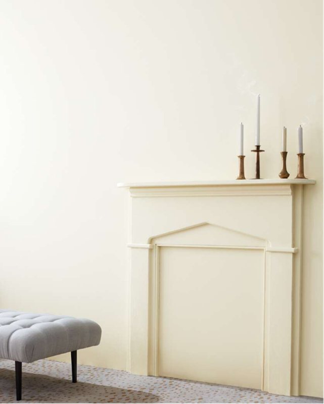
Sometimes plain white paint doesn’t cut it because it brings no intrigue into space, creating nuanced whites like White Dove. This warm color has an interesting greige undertone like Oyster White.
However, unlike the Sherwin-Williams paint, White Dove doesn’t have a yellowish or orangish base note. So, it appears fainter than a crisp white like Chantilly White but brighter than Oyster White. It has an LRV of 85.38.
Natural Cream (OC-14)
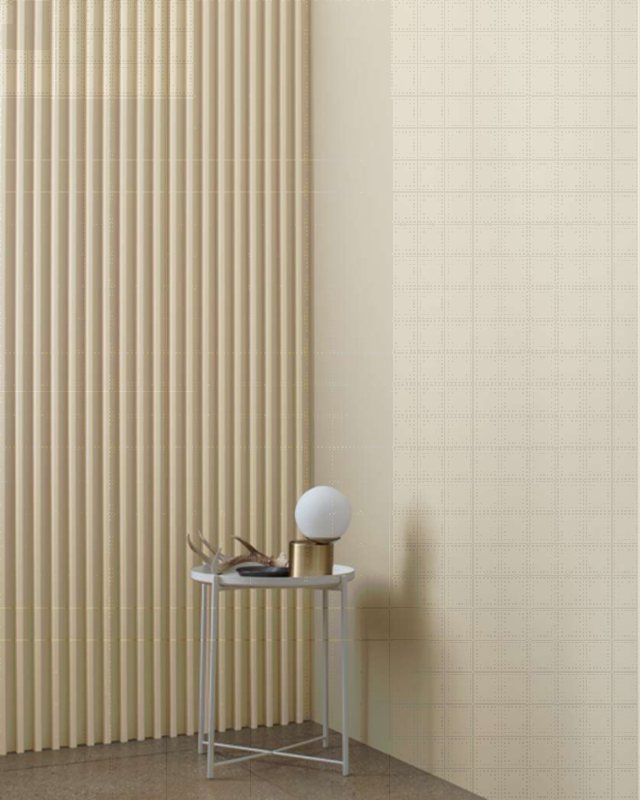
While Oyster White is strictly warm, you’ll get a little bit of both – warm and cool – with Natural Cream. It’s a medium-light greige paint that creates a flawless off-white hue with an LRV of 64.78.
Natural Cream works best in living rooms and kitchens because your mood in those two places fluctuates. Start your morning with a warm aura as the sunlight teases out the creamy white note, and end it with a cool grayish-white hue once the sun goes to sleep.
Pompeii (OC-82)
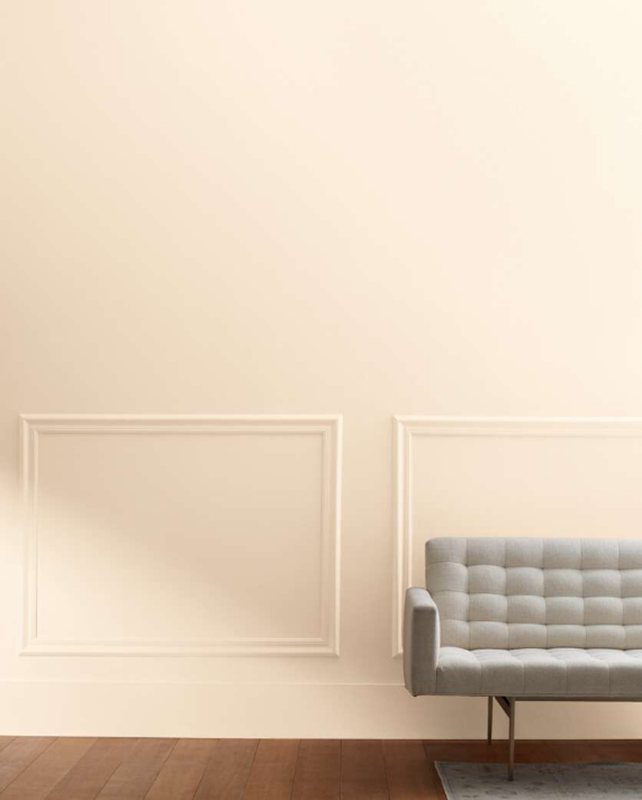
Most off-white paints hide their undertones, but with Pompeii, you’ll get a golden orange sheen over a soft white paint. It appears more peach (or pastel orange) than white, making for an interesting backdrop and anchor color.
You can do so much with this peach hue, from using Pompeii as an accent wall to making it trim on a solid tan or orange paint.
Benjamin Moore Oyster White Version
There’s no Benjamin Moore paint that’s Oyster White, but some other brands with Oyster White paints include RAL and PPG.
Oyster White by RAL (1013/1013-P)
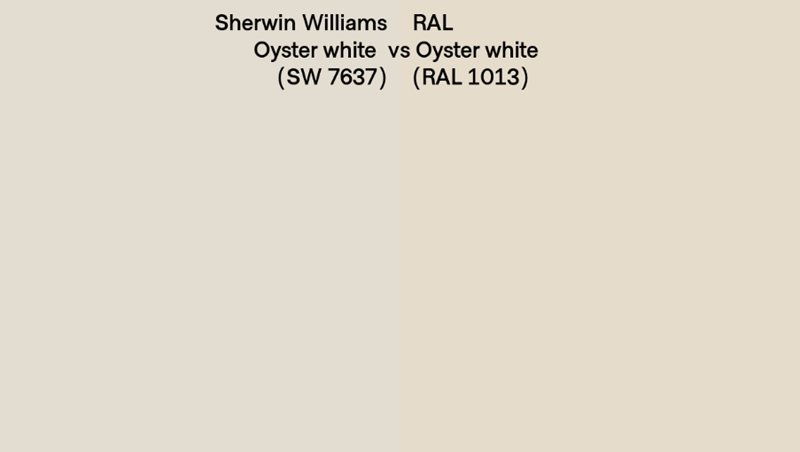
RAL’s Oyster White is close in shading with Sherwin-Williams’ version of the pastel white paint. The first obvious difference is that Sherwin-Williams’ version is greige than RAL’s, which has more beige tints.
Get this version for a more golden glow underneath natural lighting. Its RGB code is (Red 227 | Green 217 | Blue 198) showing the highest red content. However, to understand its yellow content, check out the CMYK code below;
Cyan 5 | Magenta 10 | Yellow 20 makes a hex code #e3d9c6.
Oyster White by PPG Paint (10-05)
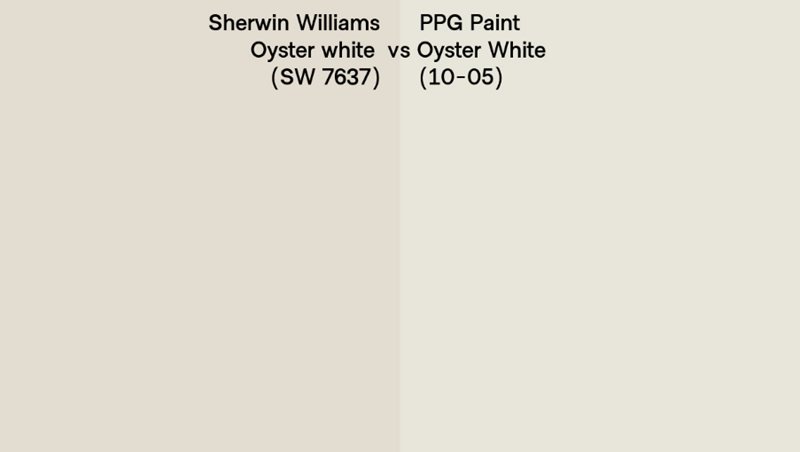
PPG Paint’s Oyster White is brighter than Sherwin-Williams’ version and appears whiter. The biggest difference between both brands is that PPG’s version has a sage green undertone absent in Sherwin-Williams’ iteration.
This version has an LRV of 78, with an RGB value of (red 232 | green 219 | blue 219), and you can use it as an accent or trim on a darker neutral paint.
How Does Light Affect the Color?
As a nuanced color, Oyster White can transform into about three other tones, including beige, gray, and a faint yellowish-orange. The part of color you get depends on the lighting brightness and its position.
Natural bright light highlights the deepest undertone, yellowish-orange, and you’d get that from a South-facing window. However, to enjoy the color in its most natural state, use it underneath a North-facing light. It produces a consistent dim glow at every time.
Best Rooms To Paint Oyster White
Now that you understand how lighting works and the technical aspects of Sherwin-Williams Oyster White, it’s time to simulate its use in real-life scenarios. Despite being a neutral and versatile color, the paint works better in some spaces and quantities than others.
Oyster White for Interior
You won’t ever regret using Oyster White indoors because enclosed spaces create cozy vibes. Using it on the wall or furniture questions the room’s space and available quantity.
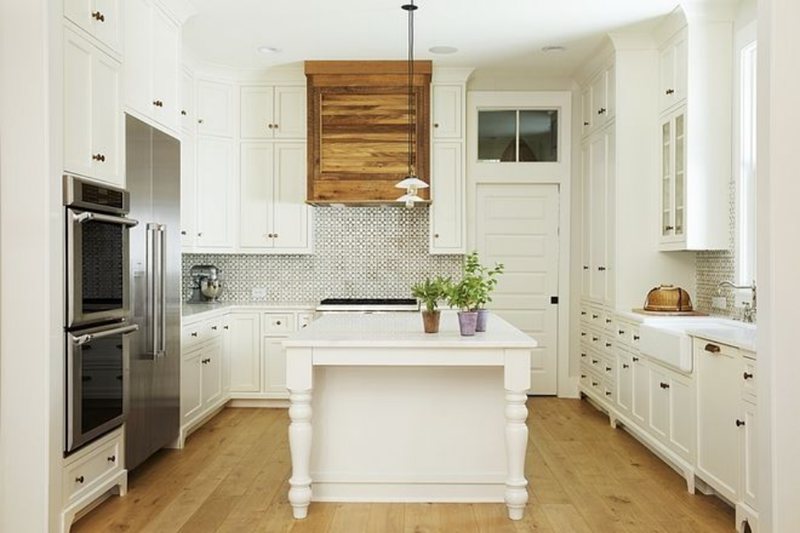
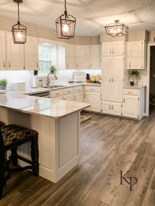
Oyster White for Cabinets
When the room is already small and doesn’t need paint to make it look smaller, use Oyster White on the cabinets. Depending on your chosen wall theme, you can choose a brighter neutral paint or any coordinating color.
This combination works in any room from the bedroom to the bathroom, living room, kitchen, garage, laundry room, or shed.
Oyster White Bedroom
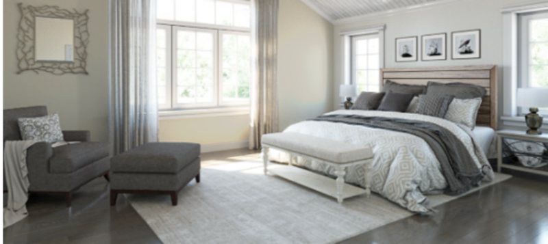
Bedrooms are typically covered in cool paints but using a warm shade like Oyster White is next level. It transforms your space into a retro-chic sleeping area as you channel your inner royalty.
The color would come alive with warmer accessories like honey floorboards and beds. If Oyster White is on your walls in a large room, close the space using darker hues like tan and navy.
However, if the room is small, and you want Oyster White on the walls (not advisable), open it up with brighter accessories like curtains, blinds, furniture, wall art, lighting, and bedding.
Oyster White Bathrooms
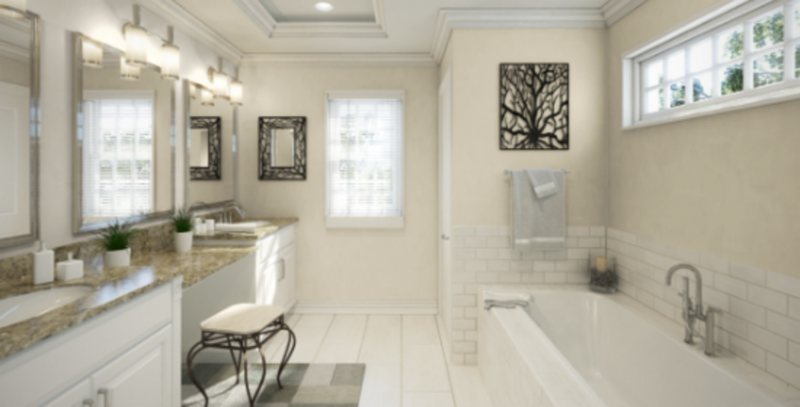
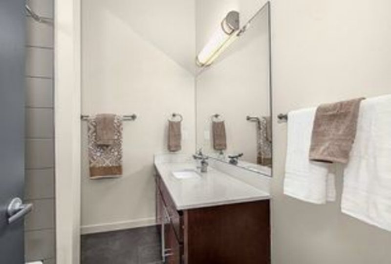
Who wouldn’t like a romantic vibe in their bathroom, especially one with a bathtub instead of a shower? Treat your bathroom to a vintage theme by painting the walls Oyster White then introduce color with brass or gold accents.
Alternatively, like Greek Villa, you can make the walls brighter and introduce Oyster White through the cabinets. Add a beautiful marble countertop if you’re willing to splurge or use a conservative wooden accent when designing on a budget.
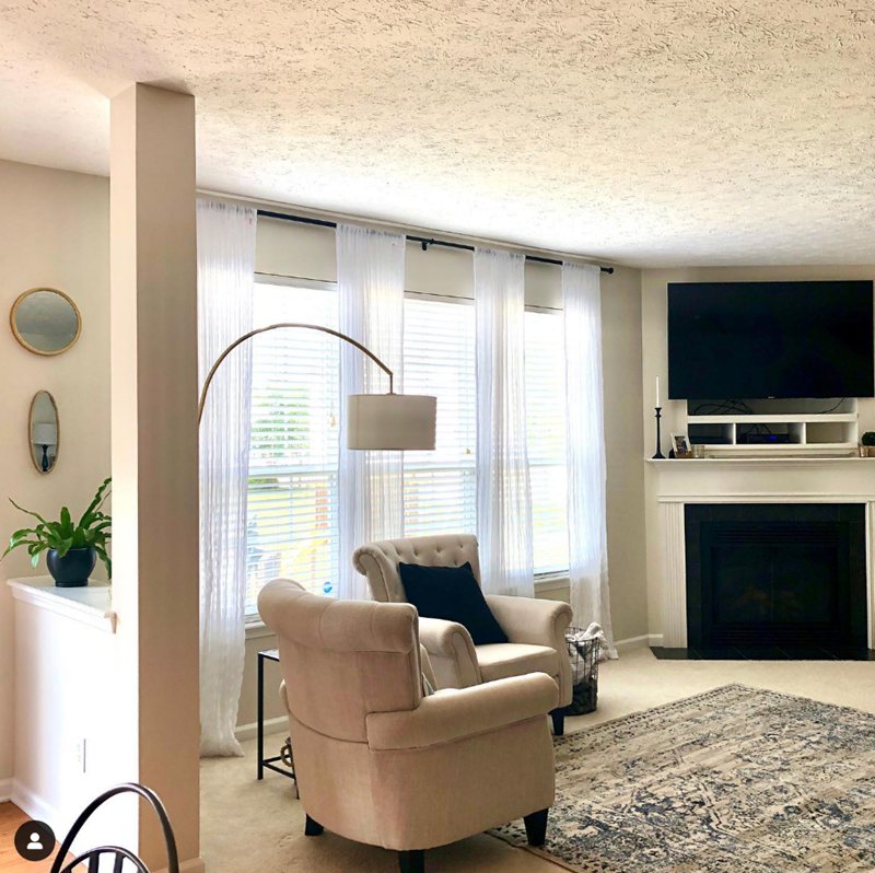
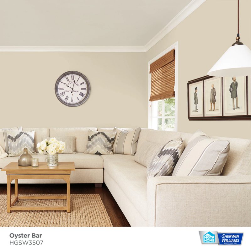
Oyster White Living Room
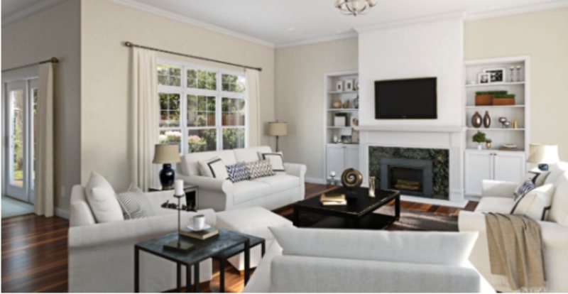
Cozy in the living room is always a hit. You want guests to feel welcome when they step into your home, and that’s what Oyster White walls would do to the ambiance.
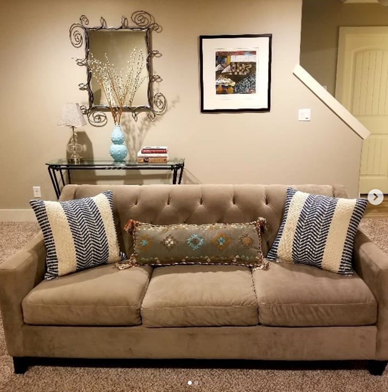
Remember, size matters, so if your living room is “too small,” don’t worry, splash the color onto your furniture instead. It’ll do well against a whiter wall as an accent, or use a white trim to brighten it up if it’s your only wall option.
Oyster White in the Kitchen
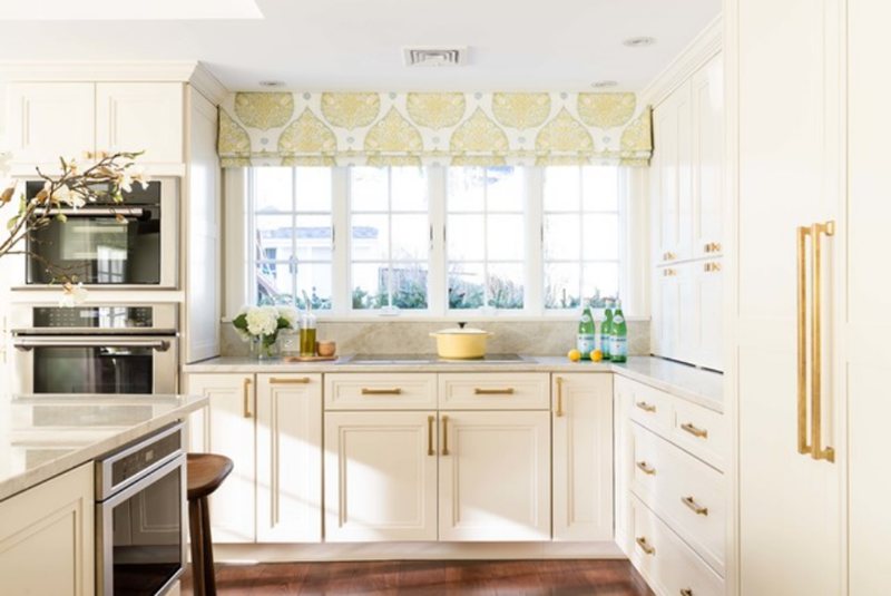
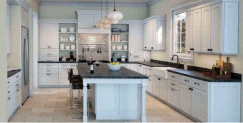
Kitchens need warm colors like Oyster White to inspire feelings of hunger. It can be on the wall or the furniture depending on the rest of the house’s décor.
If your living room connects to the kitchen, you can extend the Oyster White paint to its walls to create a synthesized look. You can also use the off-white paint on the kitchen furniture from the islands to the cabinet and the doors (backyard and pantry.)
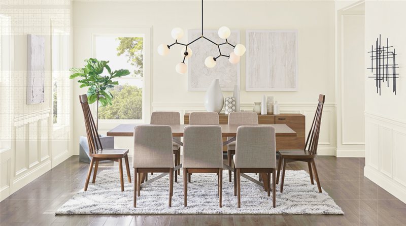
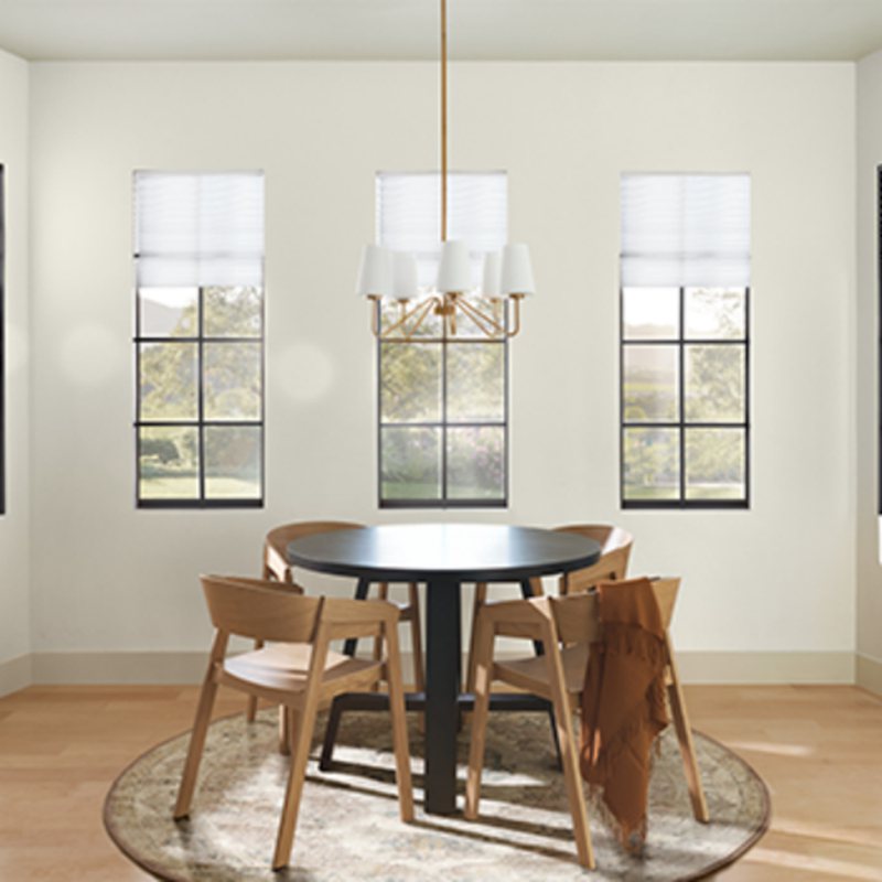
Oyster White Dining Room
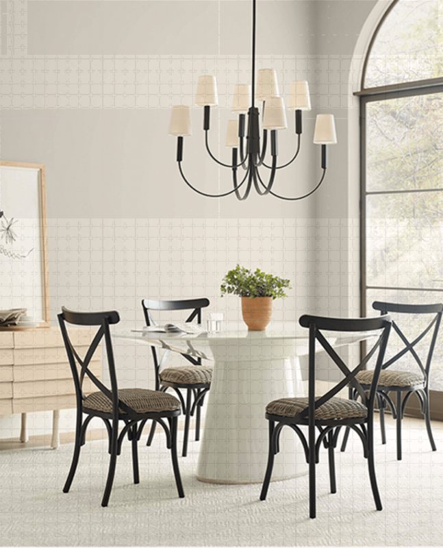
The same Oyster White wall as the kitchen in the Dining Room wouldn’t work as it does in the living room. Instead, create a contrast by flipping the use – paint the walls Oyster White only if the kitchen has a different wall coloring.
However, Oyster White-walled kitchens blend with Oyster White trims or furniture in the dining room. That way, you’ll distinguish between the two rooms instead of making it look like you crammed your dining table and chairs into your kitchen.
Oyster White as an Accent Wall or Full Wall?
Whether it’s an accent wall or a full wall, Oyster White shines. As you’ve learned earlier, using it as an accent works best in small spaces, while it’ll thrive as a full wall in a wide space.
Oyster White Exteriors
The American dream of getting a white picket-fenced house comes to life with white exteriors. It doesn’t have to be pure white paint, as tinged colors can also prove dramatic and elegant.



Sampling Oyster White
Ensure you see the color underneath a natural light in the morning and later at night to watch it transform. It’ll help you avoid getting catfished and hating your Choice when it’s too late or expensive to change your mind.
Sherwin-Williams offers multiple sampling options from Color Chips to Color to Go paint and Peel & Stick Strips. As realistic as they are, the colors on the screen or paper always differ slightly from the real deal except for the Color to Go paint.
Final Thoughts
It’s time to give off-whites like Oyster White the recognition they deserve in interior decoration. We all need some warmth in our lives, and that’s what this chameleon paint will give you.
You can create a retro or modern home depending on how you highlight or hide the multiple undertones in Oyster White. Don’t forget to share your designs. Happy Styling.

