
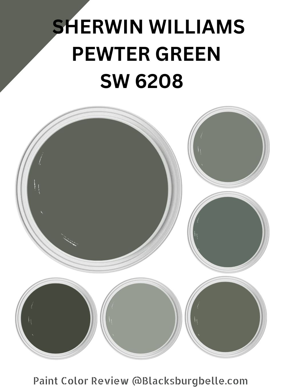
Are you on the market for a deep green color that perfectly blends moodiness and aesthetic appeal? Would you like a dark green that plays nicely with a wide range of other paint colors, allowing you to create a truly unique space? Sherwin Williams Pewter Green might be what you need.
Pewter Green is a sage-like shade that is inviting and evokes a cool essence. It has some gray tones that make the green shade feel muted, giving your room a calm effect. The paint color boasts a nature connection that evokes growth, balance, stability, and rest. Sherwin Williams Pewter Green brings a piney look to your space, giving you festive and wintery vibes.
If you have landed on this article, you are indeed interested in Pewter Green SW 6208 and would like to know what it offers. I will show you everything you need to know about Pewter Green in this guide.
Moreover, I will show you the best Sherwin Williams Pewter Green coordinating colors. By the time you reach the end of this guide, you will know how to make your rooms stand out with Pewter Green.
Table of Contents
What Color is Sherwin Williams Pewter Green?
| Manufacturer | Sherwin Williams |
| LRV | 12 |
| RGB | R: 94 G: 98 B: 89 |
| Hex Value | #5E6259 |
| Color Collections | Colormix Forecast 2020 (Haven), Color ID (Naturalist) |
Sherwin Williams Pewter Green is a dark, muted green paint color. It is more of a sage green that reveals a hidden olive side in certain lighting conditions. Sherwin Williams Pewter Green is dark, yet not too dark, and boasts a soft quality that most dark paint colors do not possess.
Visually, the paint color is more of what interior designers call a chameleon or transitional—the paint color does not look the same every time you come across it. The surrounding décor and lighting conditions often influence how it looks.
RGB of Sherwin Williams Pewter Green
RGB indicates the amount of red, green, and blue in a specific paint color. It is a scale that runs from 0 to 255.
Sherwin Williams Pewter Green combines red: 94, green: 98, and blue: 89. As you would expect with a green paint color, the green shade dominates on the RGB scale.
LRV of Sherwin Williams Pewter Green
LRV—Light Reflectivity Value—indicates the amount of light a specific paint color can reflect. LRV runs from 0 to 100—you will have Pure Black at 0 as it reflects 0% light, while Pure White sits at 100, reflecting 100% light.
Sherwin Williams Pewter Green has an LRV of 12. The paint color reflects 12% of light and absorbs the remaining 88%.
Is Sherwin Williams Pewter Green a Cool or Warm Paint Color?
Sherwin Williams Pewter Green is a cool-leaning paint color. The paint color features cool gray tones, often making it look almost blueish in some lighting conditions.
What Are Sherwin Williams Pewter Green Undertones?
Sherwin Williams Pewter Green boasts some moderate undertones. It carries gray undertones that turn the dark green into an unexpected neutral. However, it is essential to remember that the appearance of the paint color is often influenced by the lighting in the room (more on this later).
Sherwin Williams Pewter Green Color Strip: Sherwin Williams Pewter Green Color Comparisons
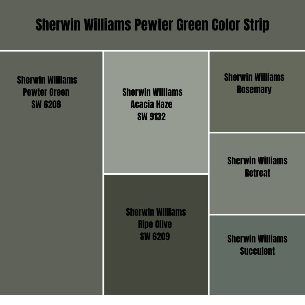
Sherwin Williams Retreat vs. Pewter Green (SW 6208) 
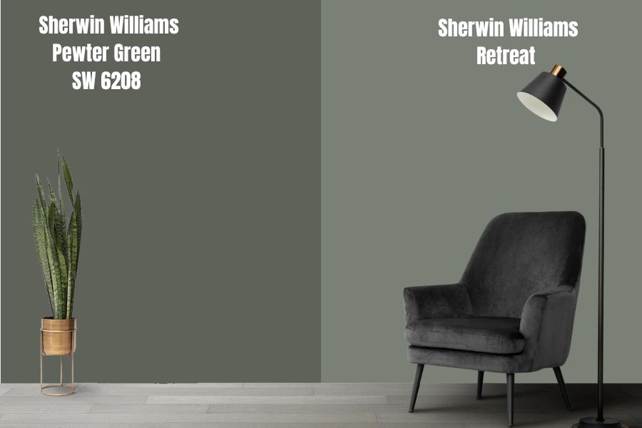
Sherwin Williams Retreat (SW 6207) sits on the Sherwin Williams Pewter Green color strip—for this reason, these two colors share some similarities.
To begin with, like Pewter Green, Sherwin Williams Retreat is also a muted green. However, the two colors do differ in the undertones. While Pewter Green boasts plain gray undertones, Sherwin Williams Retreat has blue and gray undertones. In a room, however, the two colors add a fresh feeling of mountain air—they are uplifting paint colors that work in any room.
Retreat SW 6207, however, is one shade lighter than Sherwin Williams Pewter Green. For this reason, Retreat reflects 9% more light than Pewter Green. Retreat SW 6207 has an LRV of 21, while Pewter green boasts an LRV of 12.
Pewter Green and Retreat are both cool colors. They work best in a warm room where they balance the warmth. However, you can keep the two from making your cool space icy by combining them with a warm paint color.
Sherwin Williams Succulent vs. Pewter Green (SW 6208)
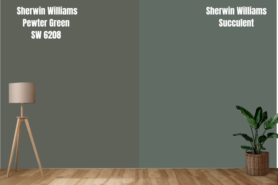
Like Pewter Green, Sherwin Williams Succulent is a dusty green. The two colors share a gray undertone that makes them lean more on the neutral side of the color wheel. When used in a room, the paint colors create a natural connection, giving your walls an earthy pop.
Sherwin Williams Pewter Green and Succulent are close on the LRV scale. While Pewter Green is less reflective, it is only 2% behind Succulent, which boasts an LRV of 14. The two colors, however, will display their whole personality in a room with enough light. In a dim room, both colors may become bland.
Pewter Green and Succulent are cool greens. Therefore, for the best effect, use the two in a warm room—preferably a southern-facing space that welcomes warm southern light. However, do not forego the colors if you have a cool northern-facing room—when you pair them with a warm color, you can balance their coolness, keeping them from making your space too icy.
Sherwin Williams Rosemary vs. Pewter Green (SW 6208)
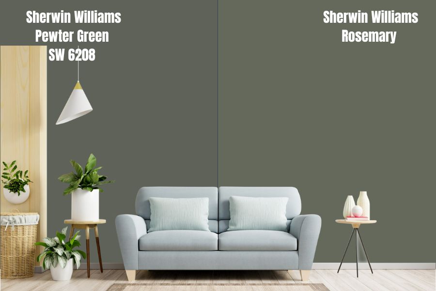
Like Pewter Green, Sherwin Williams Rosemary is a sage green paint color. The two colors are neither bright nor stark like generic greens—they carry a gray undertone that mutes them, giving them a more appealing look and feel.
The two colors sit almost next to each other on the LRV scale. While you will have Sherwin Williams Peter Green sitting at an LRV of 12, you will have Sherwin Williams Rosemary at 2% above with an LRV of 14. The colors are pretty dark and will demand bright light in a room to display their whole character, keeping them from looking bland.
Sherwin Williams Pewter Green and Rosemary are both cool paint colors. They are ideal for bringing a sense of cool if you have a room facing south, welcoming warm light. The two can add an icy feeling to a room with cool light. However, if you pair them with warm colors, you can quickly balance their coolness.
Sherwin Williams Pewter Green vs. Acacia Haze (SW 9132)
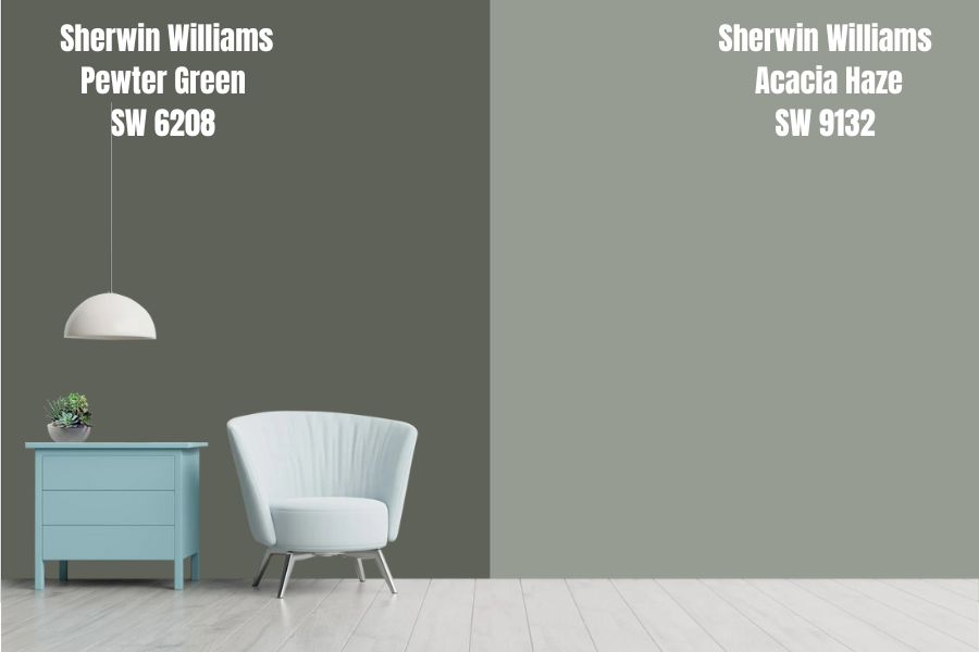
Sherwin Williams Acacia Haze and Pewter Green are both green paint colors. The two, however, are more muted and do not shout. The difference between Pewter Green and Acacia Haze is in their undertones—while a gray undertone softens Pewter Green, a slate of blue undertones mutes Acacia Haze.
While these two colors are cool, Acacia Haze is the cooler option. Unlike Sherwin Williams Pewter Green which has gray undertones, Acacia Haze has cool blue undertones. Blue is cooler than gray on the color wheel, making Acacia Haze much cooler. However, the two colors will generate the best results if you use them in a warm room. In a cool room, you must pair them with a warm color to balance their coolness.
Sherwin Williams Acacia Haze is lighter than Sherwin Williams Pewter Green. Sherwin Williams Acacia Haze reflects 20% more light with its LRV of 32. The two colors, however, will always perform well in a bright space where they can display their whole personality.
Sherwin Williams Pewter Green vs. Ripe Olive (SW 6209)
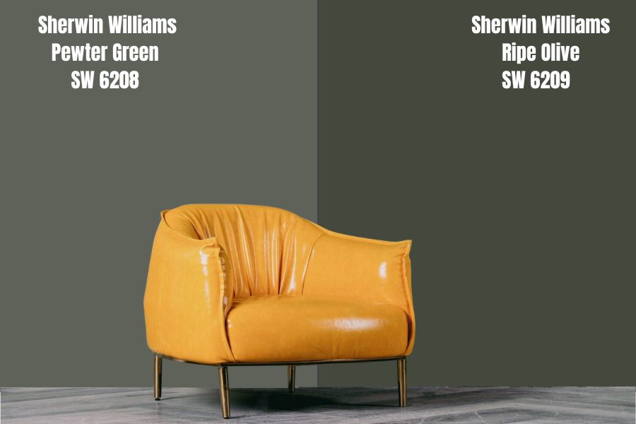
Sherwin Williams Ripe Olive is a green paint color, just like Pewter Green. The two colors share a sage-like olive appearance, although Ripe Olive is a deeper green that is one shade darker than Pewter Green.
Sherwin Williams Pewter Green reflects twice the amount of light Ripe Olive reflects. While Ripe Olive has an LRV of 6, Sherwin Williams Pewter Green has an LRV of 12. Both colors, however, still sit on the dark end of the LRV scale. Therefore, they will work best in a bright room.
While Pewter Green has only one primary undertone—the gray undertone—Sherwin Williams Ripe Olive combines blue and gray undertones. Irrespective of their undertones, the two options add a colorful and bold statement with their deep green. The two colors are also cool, meaning you will want to use them in a room that balances their cool.
Sherwin Williams Pewter Green Color Palette: Colors That Go with Sherwin Williams Pewter Green
Creating Sherwin Williams Pewter Green color palettes has always been a fun thing for me to do. I often find greens easier to deal with, although I must exercise caution to ensure I achieve the vibe I am going after in my room.
Generally, I find Sherwin Williams Pewter Green works exceptionally well with blue-grays, taupe, mustard, bronze, browns, darker beiges, tans, and creamy or crisp whites. The paint color, however, does not limit you—it allows you to create both monochromatic and contrasting looks.
Below, I will share my favorite trimming and coordinating paint colors for Pewter Green.
Sherwin Williams Pewter Green Coordinating Colors
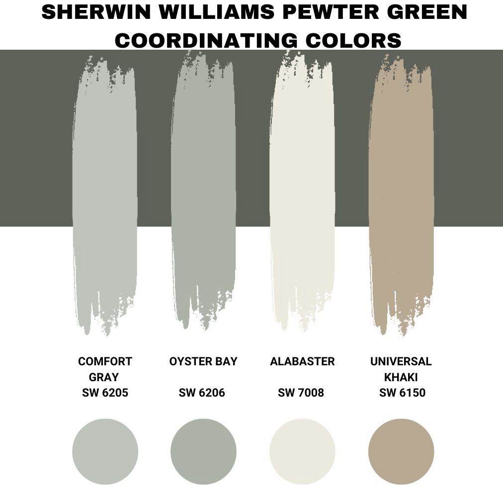
Sherwin Williams Comfort Gray (SW 6205)
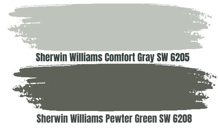
When creating a monochromatic look with Sherwin Williams Pewter Green, Sherwin Williams Comfort Gray is one of my favorite options. Comfort Gray is a soothing pastel that carries muted tones. The paint color is bold but not too aggressive that it gets in your face. Instead, it boasts a relaxing and charming feel that helps you get rid of stress.
Like Sherwin Williams Pewter Green, Comfort Gray combines green and gray to create something that resembles sage green. However, unlike the Pewter Green, which is pretty dark, Comfort Gray is medium-light with an LRV of 54. With both colors carrying the same shades—green and gray—you can be sure they will blend in well to create an exciting look in your house.
However, you must remember that Comfort Gray and Pewter Green are cool paint colors. Therefore, you will want to ensure they are in a warm room to avoid creating an icy feeling in your space.
Sherwin Williams Oyster Bay (SW 6206)
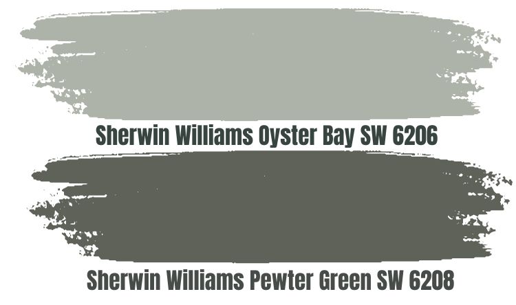
Sherwin Williams Oyster Bay is another stand-out paint color that allows you to create a monochromatic look with Pewter Green. Like Sherwin Williams Pewter Green, Oyster Bay combines gray and green shades to create a classic, timeless green much lighter than Pewter Green.
Sherwin Williams Oyster Bay has an LRV of 44, reflecting 32% more light. However, Oyster Bay still reflects less light than it absorbs. Therefore, when planning your look with Pewter Green and Oyster Bay, ensure the two paint colors have access to enough light to avoid creating a bland look.
Sherwin Williams Oyster Bay and Pewter Green are cool paint colors. They are ideal for adding a sense of cool in a room welcoming warm southern light. The paint colors, however, can make your space feel too cold if it’s receiving cool, northern light.
Sherwin Williams Alabaster (SW 7008)
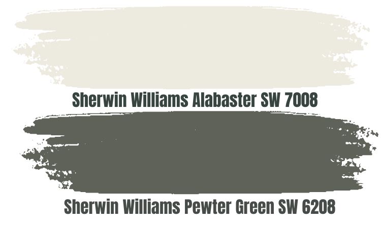
Sherwin Williams Alabaster is one of my favorite colors when I need to create a contrasting look with Sherwin Williams Pewter Green. Alabaster is charming, warm, cozy, stunning, and light.
When used in a space with Sherwin Williams Pewter Green, Alabaster adds a sober background, allowing the more eye-catching Pewter Green to shine. Alabaster boasts some warm undertones that bring enough heat to your room, balancing the cool in Sherwin Williams Pewter Green and keeping rooms welcoming cool, north-facing light from feeling icy.
It is also worth noting that Sherwin Williams Alabaster sits in the off-white category. The paint color has an LRV of 82, reflecting 82% of the light onto Pewter Green. For this reason, in a room with slightly lower lighting, Alabaster can reflect enough light onto Pewter Green, ensuring the paint color does not look too bland.
Sherwin Williams Universal Khaki (SW 6150)
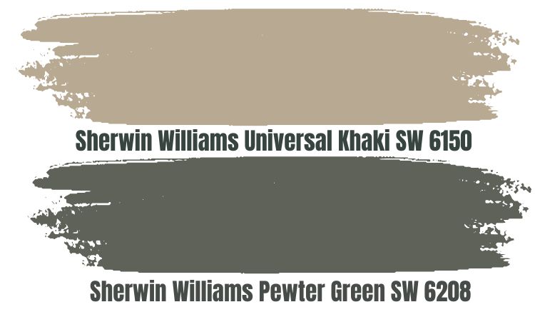
Sherwin Williams Universal Khaki is another excellent paint color that you can leverage to create a contrasting look with Sherwin Williams Pewter Green. Universal Khaki is a mid-toned paint color that is neither too light nor too dark.
Carrying a slightly creamier texture, Sherwin Williams Khaki defines true beige that looks more taupe. The paint color features red and deep brown undertones, making it extra warm. The paint color, therefore, is an ideal option when you need to balance the coolness that comes with Pewter Green.
Sherwin Williams Universal Khaki has an LRV of 40. Therefore, when pairing Universal Khaki and Pewter Green, ensure your space has enough light.
Sherwin Williams Pewter Green Complementary Colors
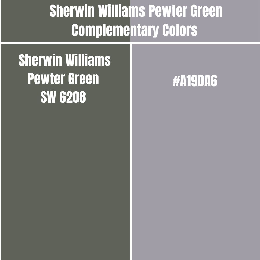
If you plan to take your Pewter Green contrasting look to the next level, you may want to work with Pewter Green’s complementary color. Pewter Green and its complementary color will have the most significant difference when you paint them side by side. These two paint colors sit on opposite sides of the color wheel.
The complementary color for Sherwin Williams Pewter Green has a hex value #A19DA6. #A19DA6 does not have an official paint color name currently. However, the closest color is Quick Silver.
Trim Colors That Go With Sherwin Williams Pewter Green
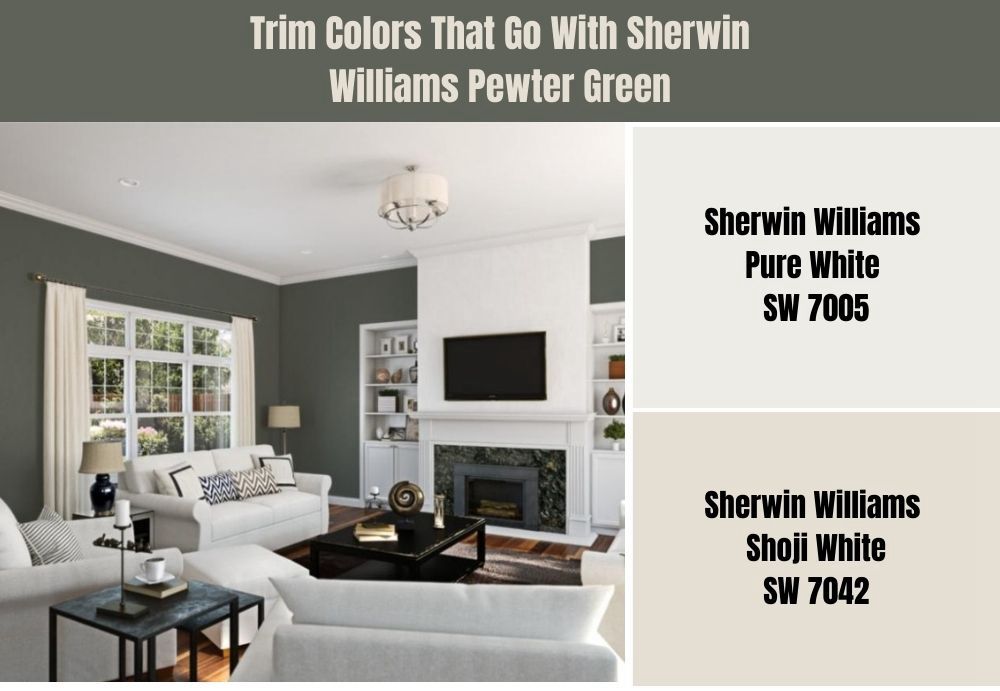
When working with Pewter Green, I have noticed that whites and off-whites tend to perform exceptionally well on the trims. Below are my favorite trim colors for Sherwin Williams Pewter Green.
Sherwin Williams Pure White (SW 7005)
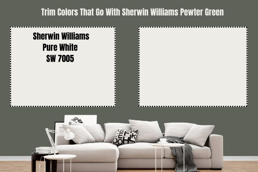
Symbolic of innocence and purity, white will give your Pewter Green trims a grounded feel while letting the aesthetics in Pewter Green shine. Sherwin Williams Pure White is one of the most neutral whites—it adds depth and character to your room while making you feel relaxed and calm.
You can be sure that this paint color will allow your trims to stand out. The paint color reflects 84% light. The paint color will ensure your trims are visible while reflecting enough light onto Sherwin Williams Pewter Green to keep it from looking bland in slightly dim rooms.
Sherwin Williams Shoji White (SW 7042)
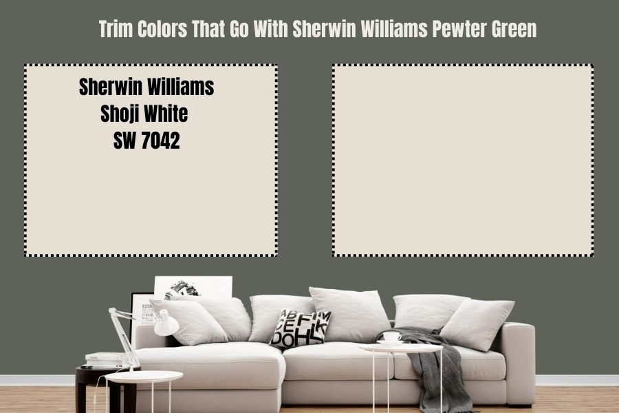
While the name may suggest that this paint color is white, Sherwin Williams Shoji White is a blend of greige and cream. The paint color sits in the off-white range on the LRV scale. Sherwin Williams Shoji White reflects 74% light, ensuring your trims are exciting.
Sherwin Williams Shoji White is a warm paint color. Therefore, using it on your trims can help you balance the coolness associated with Pewter Green.
Sherwin Williams Pewter Green Benjamin Moore Version

If you want a Benjamin Moore paint color that creates the same look as Sherwin Williams Pewter Green, consider Benjamin Moore Dark Olive. Sherwin Williams Pewter Green and Benjamin Moore Dark Olive are not 100% similar. However, they do share many similarities.
On the RGB scale, Sherwin Williams Pewter Green combines red: 94, green: 98, and blue: 89, while Benjamin Moore Dark Olive combines red: 97, green: 98, and blue 83. On the RGB scale, both colors have the same amount of green.
The two paint colors are also extremely close on the LRV scale. While Sherwin Williams Pewter Green has an LRV of 12, Benjamin Moore Dark Olive has an LRV of 13.52.
How Does Light Affect Sherwin Williams Pewter Green?
Sherwin Williams Pewter Green’s appearance changes depending on the room’s lighting. Below, I will discuss the four most common room orientations and how their lighting affects Pewter Green.
Southern Rooms
South-facing rooms are filled with warm southern light all day. Pewter Green in these rooms has a muddy appearance with a hint of gray undertones. The paint color, however, will leave its cool base, feeling much more neutral in warm light.
North Rooms
Northern-facing rooms welcome a cool light all day. In these rooms, you will view more crispness in Sherwin Williams Pewter Green. The paint color may also feel cooler in north-facing rooms.
East-Facing Rooms
In an East-Facing room, Sherwin Williams Pewter Green will display its warmer shades early morning—during sunrise. Later in the day, the light in your room will cool down and you will start seeing more cool gray undertones.
West-Facing Rooms
In your west-facing rooms, you will notice some muddiness in Pewter Green. However, as the sun sets in the late afternoon, you may see some warm tones.
Best Rooms to Paint Sherwin Williams Pewter Green
Sherwin Williams Pewter Green is a flexible paint color that works in all rooms. If the room is well-lit and you have used the right coordinating color, Pewter Green will always give you an impressive look. Here are examples of Sherwin Williams Pewter Green in different rooms:
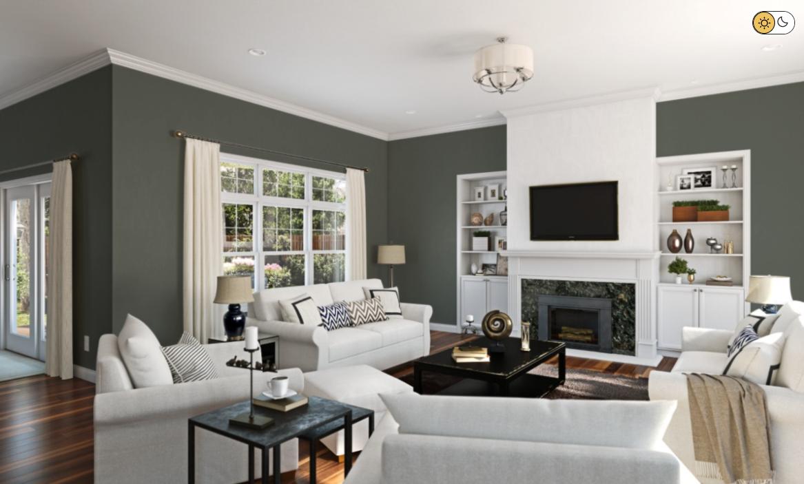
Sherwin Williams Pewter Green Living Room
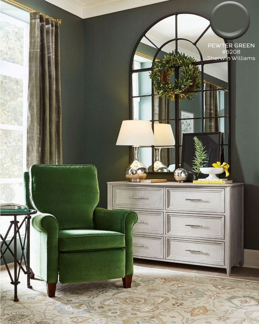
The above room welcomes a cool light, making Sherwin Williams Pewter Green look slightly muddy. The cool gray undertones shine more than they would if the room received a warm light. However, the interior designer has paired this paint color perfectly with an off-white on the cabinets and a green chair, simultaneously creating a matching and contrasting look.
The above room has paired Sherwin Williams Pewter Green nicely with wood-colored accessories. The living room has a light gray couch that matches the gray undertones in Pewter Green. Moreover, the creamy and green pillows add more decoration to the space, while the off-white on the bulbs creates a contrasting appeal. In the above living room, Pewter Green looks a bit muddy—the room welcomes cool light, allowing the cool gray undertones to shine.
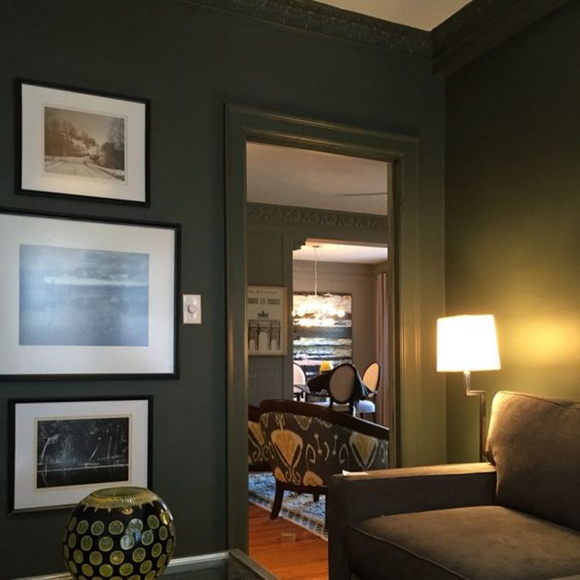
The above living room seems to be welcoming meager amounts of light. For this reason, Pewter Green looks darker than it would be if the room had enough light. The pictures hanging on the walls, however, create an exciting look.
Sherwin Williams Pewter Green Kitchen
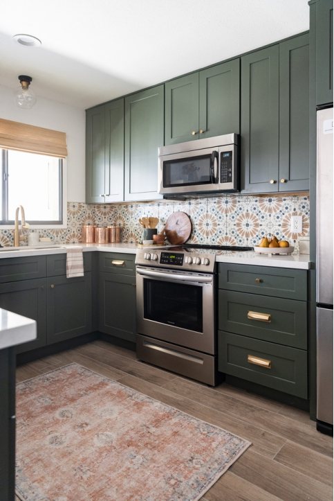
In the kitchen, Sherwin Williams Pewter Green always delivers impressive results when you use it on the kitchen cabinets. Pewter Green looks crisp in the above kitchen, suggesting that the space is welcoming enough warm light. Moreover, Pewter Green is paired nicely with white color, allowing the cabinets to pop.
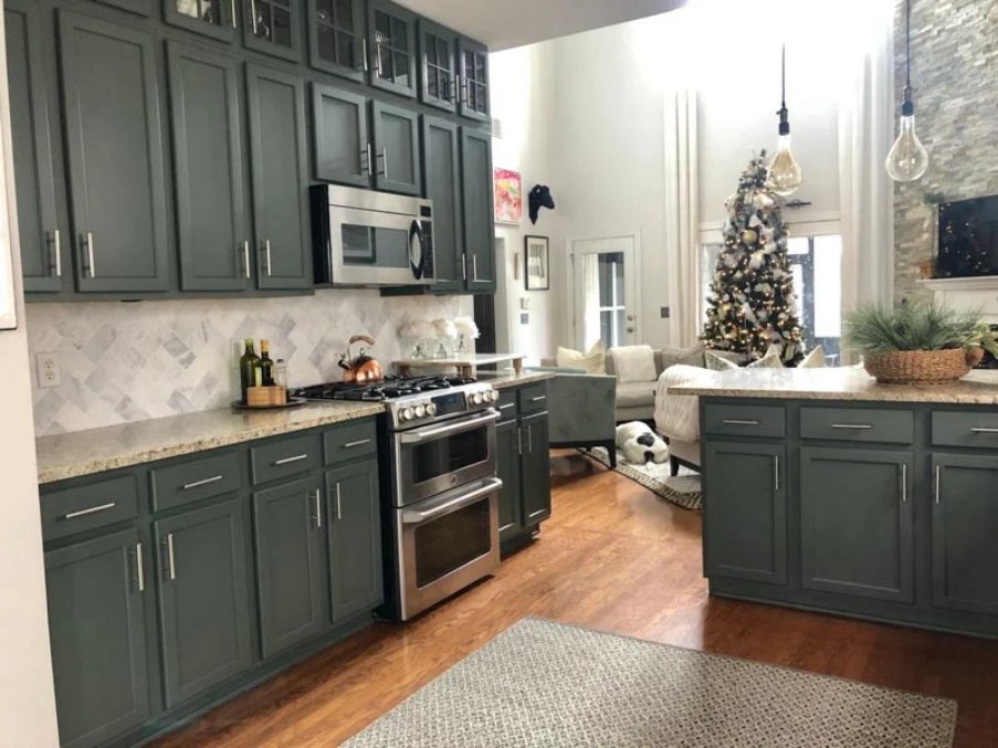
The above image depicts another fascinating look of Sherwin Williams Pewter Green kitchen cabinets. Pewter Green looks muddier in this kitchen, meaning the room has cooler light. However, the white around the cabinets still gives Pewter the attention it deserves.
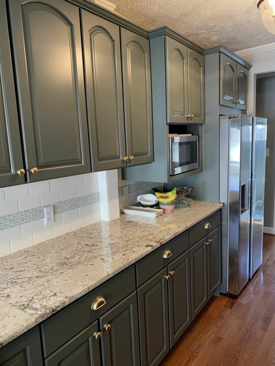
In the above kitchen, Sherwin Williams Pewter Green seems to be leaning more on its cool gray shade, making it look muddy. This is a clear indicator that the above kitchen is welcoming cool light. Regardless, the Sherwin Williams Pewter Green Cabinets are perfectly paired with a white color that ensures they shine.
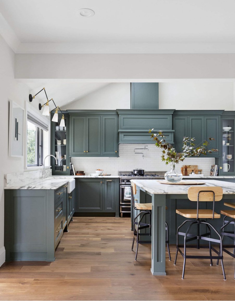
The above kitchen shows what Sherwin Williams Pewter Green cabinets would look like in a balanced-light kitchen. The green and gray shades are perfectly balanced. The paint color no longer seems too cool—it looks more neutral.
Sherwin Williams Pewter Green Exterior
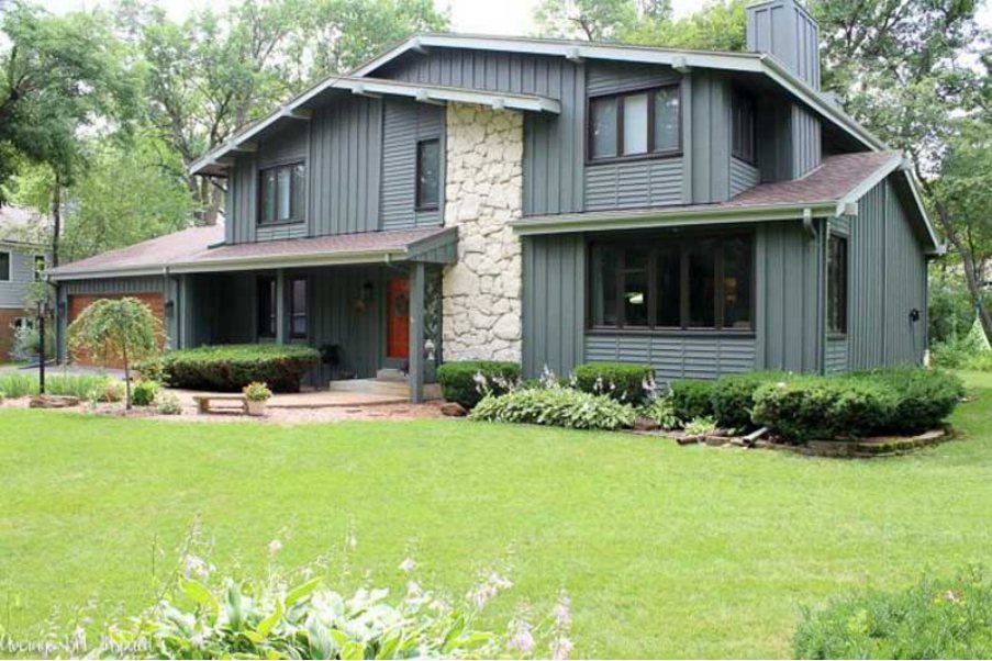
Sherwin Williams Pewter Green is deep enough and can withstand the light outdoors. The above house clearly indicates the look you should expect when using Sherwin Williams Pewter Green exterior. On the exterior walls above, Pewter Green looks a bit muddy—this could result from the cool light in the surrounding. The paint color connects the entire house with the green nature surrounding it. The trims on the house match Pewter Green, indicating the owner was going after a monochromatic look.
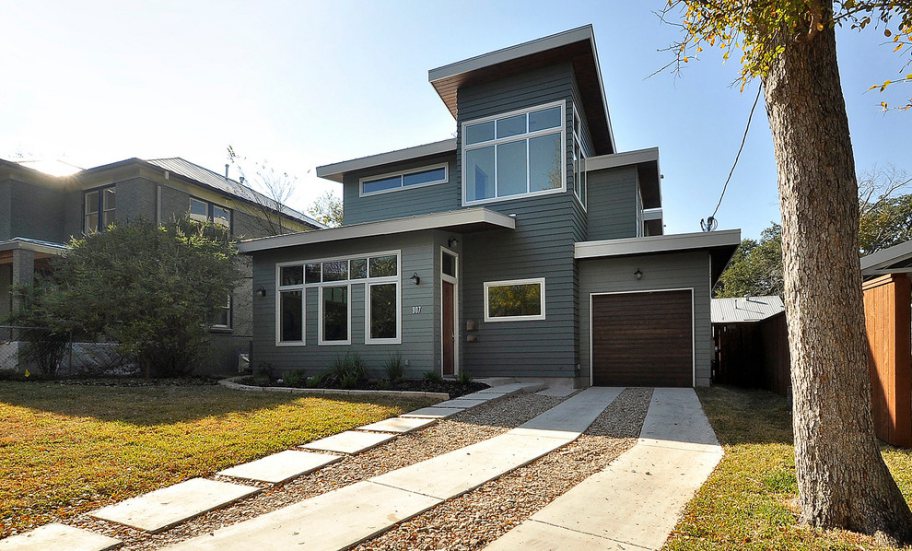
Above, the middle section uses Sherwin Williams Pewter Green. The other areas use a lighter green shade. The darker Pewter Green and the lighter shades combine to create an interesting monochromatic view. The off-whites on the trims make things more interesting while the green paint colors connect the house to the green nature.
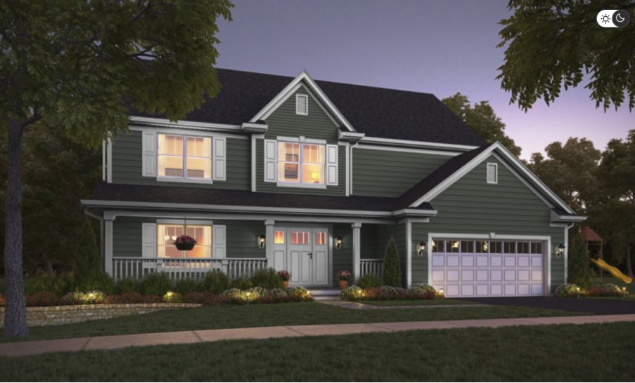
Maybe you are wondering how Sherwin Williams Pewter Green will look after dark. The above picture shows Pewter Green’s exterior at night. The environment welcomes enough light, keeping Pewter Green from getting bland. Moreover, the house has paired Pewter green nicely with white paint on the trims and a gray roof to create a stand-out look that makes you want to check out the house more than once. Moreover, Pewter Green connects this house with the green nature around it.
Overview
Undoubtedly, Sherwin Williams Pewter Green is an aesthetically appealing dark green color. In cool light, the paint color does look a tad gray, giving it a muddy look. However, that changes when you introduce warm light in the room, which makes the paint color look livelier.
The deep green and attractive muted tones allow Pewter Green to work in all spaces. You can use it as an accent wall in your living room, kitchen cabinets, exterior walls, and other areas. Pairing it with attractive matching colors will create an appealing monochromatic look. Pairing the paint color with warm, contrasting options creates an exciting look that never gets boring.
This detailed guide answers questions about Sherwin Williams Pewter Green. I have also shown you some real homes using the paint color. However, if there is something you would like me to expound on, let me know in the comments below.
 Sherwin Williams Mega Greige (Palette, Coordinating & Inspirations)
 Sherwin Williams Steamed Milk (Palette, Coordinating & Inspirations)
 Sherwin Williams Caviar (Palette, Coordinating & Inspirations)
 Sherwin Williams Anew Gray (Palette, Coordinating & Inspirations)
 Sherwin Williams Ice Cube (Palette, Coordinating & Inspirations)
 Sherwin Williams Pearly White (Palette, Coordinating & Inspirations)
