
 For most people, nothing feels better than coming home to a calm environment. However, what color can you use to implement a relaxing feel in your room?
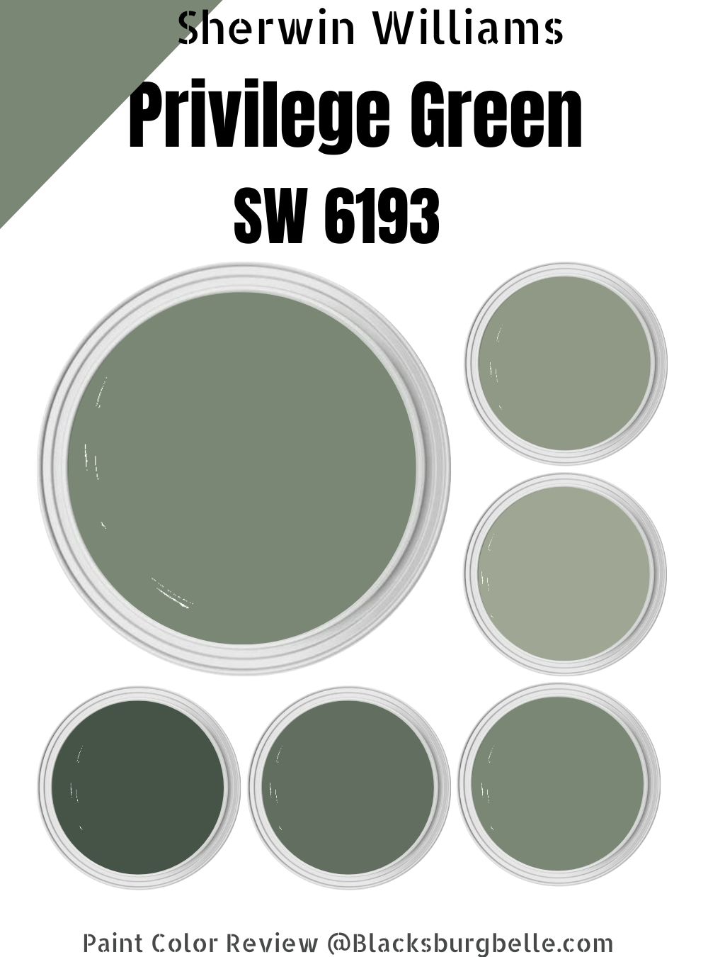
In my experience with paint colors, I haven’t found a homeowner who has gone wrong with Sherwin Williams Privilege Green. This paint color allows you to swim in layered depths of calm, deep green, taking you back to nature.
While Sherwin Williams Privilege Green is a deep green color, it doesn’t create a sense of gloom in your interior. Instead, it brings the natural world to mind every time you return home.
This detailed guide will explore Privilege Green SW 6193 on a deeper level. I will help you pair this paint color with nice coordinating colors to create a room that stands out from what you’ve seen in your neighborhood. Read on to learn more.
Table of Contents
What Color is Sherwin Williams Privilege Green?
| Manufacturer | Sherwin Williams |
| LRV | 23 |
| RGB | R: 122 G: 135 B: 117 |
| Hex Value | #7A8775 |
| Color Collections | Urban Organic |
Sherwin Williams Privilege Green is a deep green paint color. However, as you would expect with most paint colors, Privilege Green SW 6193 is not neutral. Therefore, you may view a dose of blue or gray in some rare lighting orientations. However, green dominates in all lighting conditions.
RGB of Sherwin Williams Privilege Green
The RGB scale shows the amount of red, green, and blue that goes into making a specific paint color. The scale starts at 0 and reaches a maximum of 255. As the number for each shade increases, there is more of that shade in the specific paint color.
Sherwin Williams Privilege Green combines red: 122, green: 135, and blue: 117. As you would expect, Privilege Green, a green paint color, has the green shade leading on the RGB scale.
LRV of Sherwin Williams Privilege Green
LRV stands for Light Reflectivity Value. It is a scale from 0 to 100 and shows how light or dark a color is. At 0, we have the darkest shade—pure black—which reflects 0 percent light. At 100, we have pure white, the lightest color reflecting 100% of light.
Privilege Green is on the dark side of the LRV scale. The paint color has an LRV of 23—Privilege green reflects 23% of light and absorbs 77%.
Is Sherwin Williams Privilege Green a Warm or Cool Color?
Sherwin Williams Privilege Green is a cool color. The color’s cool feeling is enhanced by two cool shades—blue and gray.
Privilege Green’s total coolness comes into view when you put it in a north-facing room where the light coming through is already cool. Sometimes, a north-facing room can make Privilege Green feel a bit icy. In a south-facing room, the warm light, however, balances the cool in Privilege Green, keeping it from making the space feel too cold.
Sherwin Williams Privilege Green Undertones
Sherwin Williams Privilege Green boasts two prominent undertones—blue and gray. These undertones show depending on the light in the room. In balanced light, however, the two undertones will remain in the background, and you rarely see them.
Sherwin Williams Privilege Green Color Strip: Sherwin Williams Privilege Green Color Comparisons
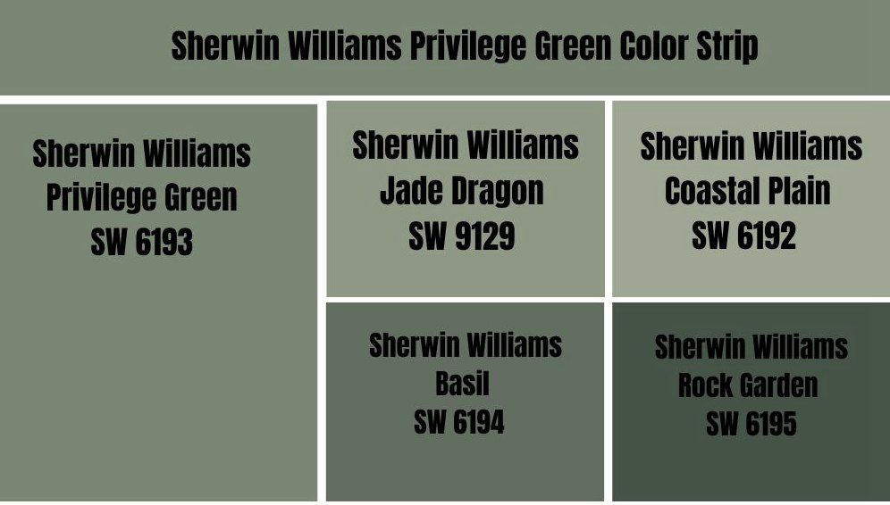
Sherwin Williams Privilege Green vs. Jade Dragon (SW 9129) 
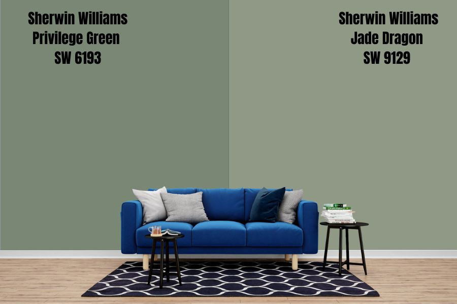
Privilege Green and Jade Dragon share many similarities; however, they still feature some differences that distinguish them from one another. To begin with, for instance, Jade Dragon boasts the same blue-gray undertones as Privilege Green. However, the gray undertone is more visible in Jade Dragon.
The two paint colors bring a nature-inspired mood to any room. However, Jade Dragon goes one step further, adding a romantic feel to the space. Both colors will also coordinate well with other natural-feeling neutrals.
Jade Dragon SW 9129 and Sherwin Williams Privilege Green SW 6193 are cool paint colors. However, Privilege Green is cooler than Jade Dragon.
These two colors do differ in their light reflectivity abilities. While both colors fall on the darker side of the LRV scale, Jade Dragon is a little bit lighter, reflecting 7% more light than Privilege Green. Jade Dragon has an LRV of 30, while Privilege Green has an LRV of 23.
Sherwin Williams Privilege Green vs. Coastal Plain (SW 6192)
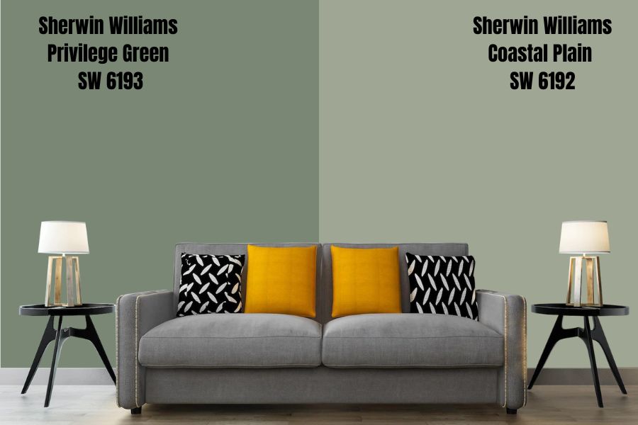
Sherwin Williams Coastal Plain is another lighter option for those looking for a cool green color. The paint color reflects 14% more light than Privilege Green, boasting an LRV of 37. While The two colors will still look dull in a room with minimal light, Coastal Plain’s ability to reflect more light makes it stand out more.
Coastal Plain and Privilege Green create the same feeling in a room. Both colors can add a relaxed elegance—this often makes them perfect for bedrooms where you need maximum relaxation for a deep sleep.
Both colors boast the same undertones. You will expect to see some blue and gray undertones in Coastal Plain and Privilege Green. However, the undertones are more laid back in Coastal Plain than they are in Privilege Green.
Privilege Green and Coastal Plain fall on the cool side of the warm-cool scale. For this reason, the two paint colors work better in warm rooms where they balance the heat. In colder rooms, for example, south-facing rooms, the two colors may feel too cold and may even lean on the side of icy.
Sherwin Williams Privilege Green vs. Basil (SW 6194)
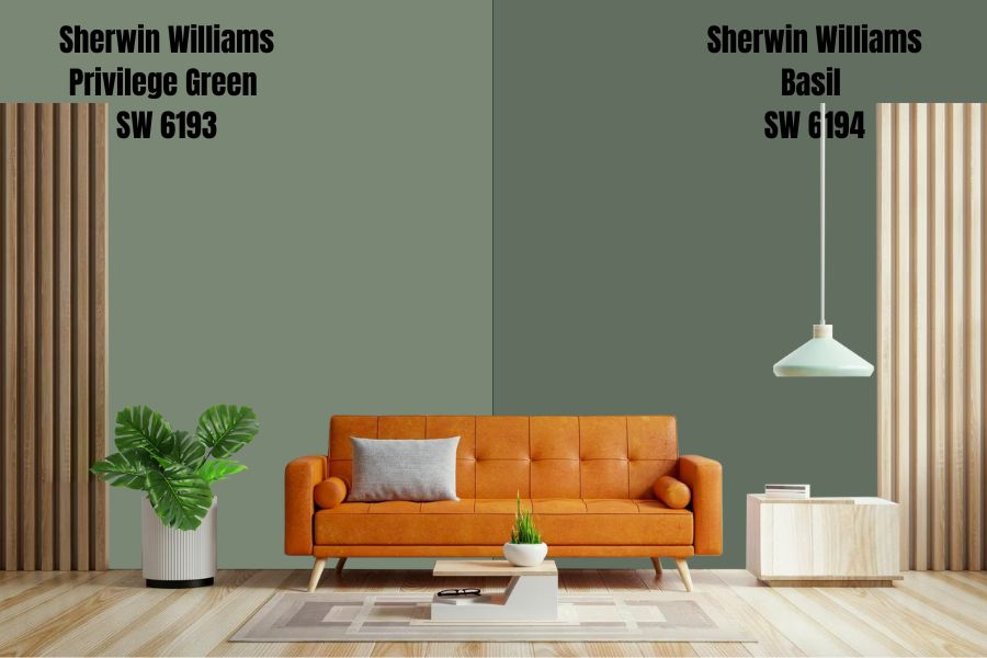
Sherwin Williams Basil is one shade darker than Privilege Green. As you would expect with a darker shade of Green, Sherwin Williams Basil reflects less light than Privilege Green, boasting an LRV of 15.
These two colors, however, are highly similar in their appearances. Sherwin Williams Privilege Green and Basil both boast gray and blue undertones. However, since the Green in Basil is more profound than in Privilege Green, Basil tends to mask the undertones better, although they shine in some lighting conditions.
The two colors work for spaces that need a dose of a nature-inspired, serene vibe. They are also both cool colors, meaning that they can make your north-facing room feel extra cold. However, the colors play nice in a southern-facing room, balancing the warmth in the southern light and bringing a calm, misty aura into the space.
Sherwin Williams Privilege Green vs. Rock Garden (SW 6195)
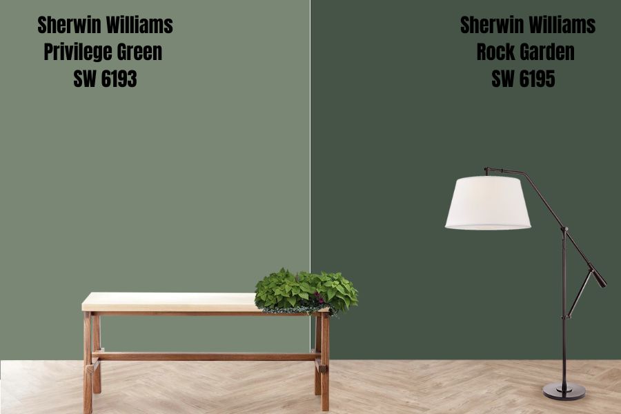
Sherwin Williams Rock Garden is a dark, saturated green. Much darker than Sherwin Williams Privilege Green, Rock Garden has much lower light reflective abilities. While Privilege Green reflects 23% of light, Rock Garden reflects 15% lower light, with an LRV of 8.
The two colors boast blue and gray undertones. However, the undertones are more visible in Privilege Green than in Rock Garden. However, ignoring the depth of Green in the two colors, they pair nicely with cool gray neutrals, creating a calm, relaxing aura.
Both Sherwin Williams Rock Garden and Privilege Green are cool colors. They both boast the ability to balance the warmth in south-facing rooms. However, the colors can make the room too cold or even icy when left in a north-facing room. However, pair them with a warm color; you can eliminate the iciness in a north-facing room.
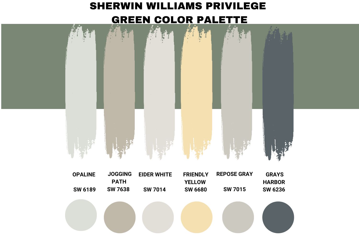
Sherwin Williams Privilege Green Color Palette
Coordinating Colors for Privilege Green SW 6193
I am a fan of verdant hues, and one thing I have noticed is that there are lots of colors that go with green to create a scheme that stands out for any home. Irrespective of the feel or look, there is always a combination that brings the necessary energy to the space.
What makes green such an impressive pairing color is that it sits in the center of the color wheel, allowing me to pair it with cool and warm hues. Privilege Green has a blue-gray base, making it impactful.
Therefore, introducing soft tones of clay white and some chalky gray brings a calming feel into the room. Introducing yellows into a room with Privilege Green allows me to balance the cool in this paint color, primarily when I use the paint in north-facing rooms.
Below is a list of some of my favorite coordinating colors for Privilege Green:
Sherwin Williams Opaline (SW 6189)
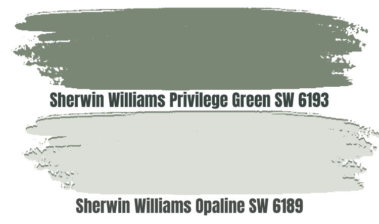
When working in a south-facing room, I aim to balance the warmth in the southern light; I will always go after a cool coordinating color for Privilege Green. In this case, Sherwin Williams Opaline is an ideal cool green that brings light into the room.
Sherwin Williams Opaline SW 6189 sits in the off-white range with an LRV of 73. Reflecting 73% of the light that drops on its surface, the paint color will ensure Privilege Green does not create a bland look when the light is slightly dim.
Opaline boasts a blue undertone, making it an extremely cool color. For this reason, when your room is too hot, you can be sure warmth will be balanced when you bring Opaline into the picture. Moreover, Opaline adds a playful vibe to the room.
Sherwin Williams Jogging Path (SW 7638)
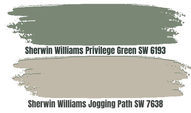
As I had noted earlier, gray goes well with Sherwin Williams Privilege Green. Sherwin Williams Jogging Path is a muted gray that boasts a graceful green undertone. This paint color brings nature-inspired tranquility into the room, blending in well with the natural feeling of Privilege Green.
Jogging Path is a warm neutral color. While it is not the warmest paint color you can pair with Privilege Green, it does bring some warmth into your room, balancing out the cool in Privilege Green. Therefore, if you use these two colors in the north-facing room, you can be sure they won’t create an icy environment.
Jogging Path reflects nearly half of the light that lands on it—that is, 49% of the light. An LRV of 49 means that Jogging Path is neither too light nor too dark—while the paint color will hold its ground in a bright room next to Privilege Green, it won’t help the situation if the room is too dark. Therefore, the best way to use the two colors is to ensure they are in a room with enough light.
Sherwin Williams Eider White (SW 7014)
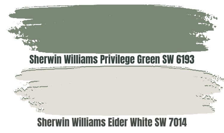
Another ideal way to balance the cold in Privilege Green is to use a warm gray color. While Sherwin Williams Eider White is not the warmest paint color you will ever come across, it is a perfect pair color that keeps Privilege Green from turning north-facing rooms icy.
The paint color comes with an LRV of 73. Reflecting 73% of the light, Eider White is an exciting color that ensures Privilege Green gets the attention it deserves in dim rooms.
However, despite reflecting a lot of light, Eider White looks dingy in dark rooms. For this reason, use this paint color in a space that is at least medium light.
Sherwin Williams Friendly Yellow (SW 6680)
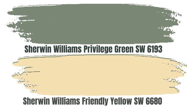
As noted earlier, Eider does not carry much warmth. For this reason, you may opt for a hot yellow color when you need something that warms a north-facing room. In this case, Friendly Yellow is a good option.
The main shade in Friendly Yellow is the yellow shade itself. It also acts as a symbol of sunshine—the paint color brings a lot of warmth.
Pairing Sherwin Williams Friendly Yellow SW 6680 with Privilege Green, however, gives you all the freedom you need to use the paint color in any room—in a south-facing room, Privilege Green will balance the warmth in Friendly Yellow and the room. In a north-facing room, Friendly Yellow will balance the cool in Privilege Green.
Friendly Yellow brings happiness and friendliness to any room. When paired with a paint color as calm and soothing as Privilege Green, Friendly Yellow transforms the room, making it even more relaxing. Its LRV of 76 helps, too—the color ensures Privilege Green does not become dull when the light in the room reduces.
Sherwin Williams Repose Gray (SW 7015)
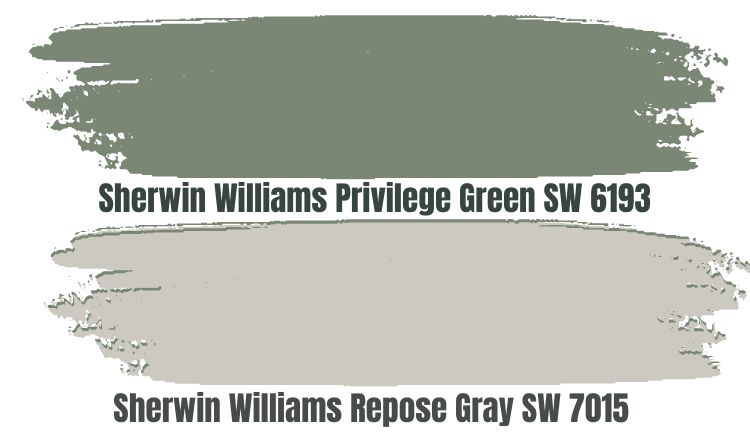
Maybe you would like to pair Privilege Green with a gray paint color that matches the shades in privilege green—that is, gray, green, and blue. In that case, you may want to try Sherwin Williams Repose Gray.
Repose Gray features a tiny bit of brown undertone that turns it into a warm gray. Therefore, by pairing Repose Gray with Privilege Green, you will bring warmth into the room, keeping Privilege Green from turning your room icy.
I have also seen Repose Green take a soft violet undertone with a bit of Green. Also, in some cases, Repose Gray may flash some blue. These undertones make Repose Gray a chameleon, creating an exciting look in your room.
Repose Gray is not high in its ability to reflect light. However, the paint color boasts an LRV of 60, much higher than Privilege Green’s. Both colors will be attractive enough in a room with at least medium light.
Sherwin Williams Grays Harbor (SW 6236)
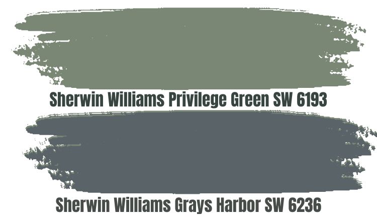
If you use Privilege Green in a hot southern-facing room, you may want to pair it with a different paint cool paint color. In this case, you can consider using Sherwin-Williams Grays Harbor. Grays Harbor is an attractive, bold, and beautiful blue-gray paint color that brings a feel of midnight beauty into your room.
Grays Harbor boasts some cool undertones that feel magical when you use this paint color on the walls. SW Grays Harbor will transform the vibe of any room, adding a timeless, dramatic feel to the calm and relaxing feeling of Privilege Green.
However, you will want to ensure you combine Grays Harbor and Privilege Green in a room with enough light. The two colors are on the darker side of the LRV scale, with Grays Harbor boasting an LRV of 12 while Privilege Green has an LRV of 23. Using the two colors in a dim room could create a situation where the colors end up boring.
Sherwin Williams Privilege Green Complementary Color

If you plan to implement a contrasting look with Sherwin Williams Privilege Green, you may want to pair it with a paint color that is the opposite. The perfect complementary color for Privilege Green will sit on the opposite side of the color wheel. If the two colors are painted next to each other, they will display the most significant difference in appearance.
The paint color that best contrasts Sherwin Williams Privilege Green has a hex value #85788A. This paint color does not have an official name right now. However, the closest paint color is Rocket Metallic.
What Trim Colors Go with Sherwin Williams Privilege Green SW 6193?
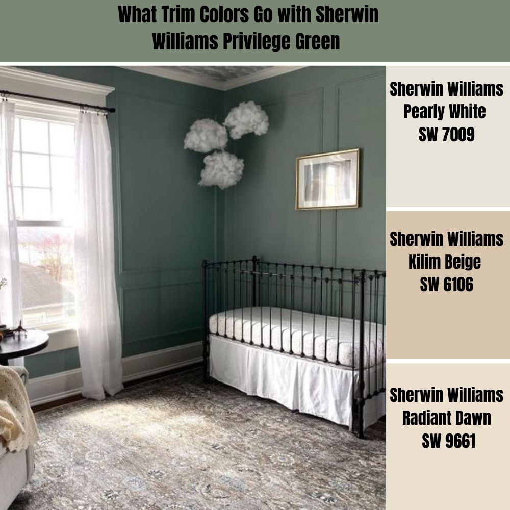
Dark greens like Privilege Green are versatile paint colors that work well with different trim colors. For this reason, most new interior designers—and homeowners—get lost in the options and make a mess when choosing a trim color.
To make the selection process more manageable, I will share my favorite trim colors when working with Sherwin Williams Privilege Green.
Sherwin Williams Pearly White (SW 7009)
Sherwin-Williams has an endless list of whites on its palette. However, Sherwin Williams Pearly White is one striking white paint color that works well.
This paint color is neither too cool nor too warm. It aligns with the peach and pink colors, adding a fascinating look when used on trims in a room.
Moreover, Sherwin Williams Pearly White sits in the off-white range, with an LRV of 77. The paint color will, therefore, be evident on your trims. Moreover, the paint color will reflect enough light onto your Privilege Green walls, ensuring they are visible and exciting even in dimmer lights.
Sherwin Williams Kilim Beige (SW 6106)
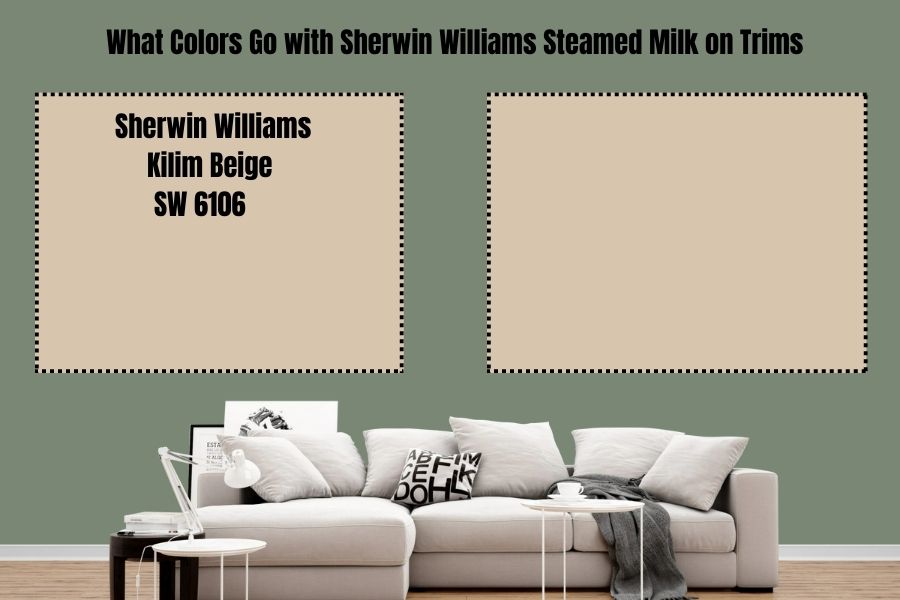
Sherwin Williams Kilim Beige SW 6106 brings warmth to your room without fully committing to yellow, pink, or orange. Kilim Beige is a perfect option for when you feel the cool in Privilege Green is overwhelming your rooms.
However, unlike the first trim color—Pearly White—Kilim Beige is slightly less reflective. The paint color boasts an LRV of 57. Therefore, you may want to ensure the room where you use Privilege Green and Kilim Beige is well-lit to avoid creating a bland look.
The fact that Kilim Beige is not too reflective is a good thing. The paint color ensures your trims are interesting enough without lowering the beauty and appealing look created by your Privilege Green.
Sherwin Williams Radiant Dawn (SW 9661)
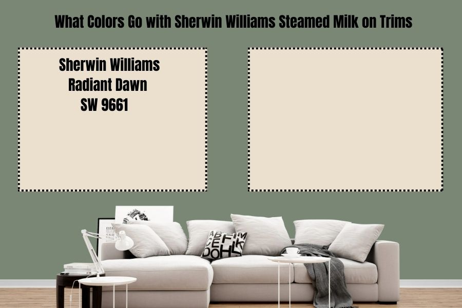
Rich and deep colors, such as yellows, work with the Green on your walls to create a sheltered and warm atmosphere resembling a sanctuary. Radiant Dawn SW 9661 is warm, which will balance the cool in Privilege Green and create a balanced feel in your room.
Moreover, Radiant Dawn is not too warm that it will end up overwhelming your room with warmth. It has a cool gray that calms it down. Bringing an LRV of 75 to your room, Radiant Dawn ensures Privilege Green remains attractive and visible even in slightly dim rooms.
Sherwin Williams Privilege Green Benjamin Moore Version
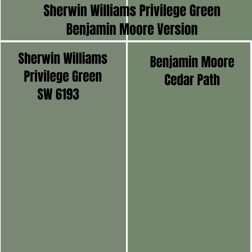
If you are planning to try Benjamin Moore paints while maintaining the appearance offered by Privilege Green, the paint color you will need to look for is the Benjamin Moore Cedar Path.
On the RGB scale, Benjamin Moore Cedar Path boasts a combination of red: 117, green: 134, and blue: 110 on the RGB scale. This is close to Sherwin Williams Privilege Green which combines red: 122, green: 135, and blue: 117.
Additionally, while Sherwin Williams Privilege Green boasts an LRV of 23, Benjamin Moore Cedar Path has an LRV of 22.95.
How Does Light Affect Sherwin Williams Privilege Green?
Sherwin Williams Privilege Green is a cool green color. However, when painted in a space with northern light, it can get extra cold, bordering on the side of iciness.
However, the paint color works exceptionally well when you use it in a room welcoming southern light. It will balance out the warmth in the light, ensuring the room does not get too hot.
Best Rooms to Paint Sherwin Williams Privilege Green SW 6193
Sherwin Williams Privilege Green Cabinets
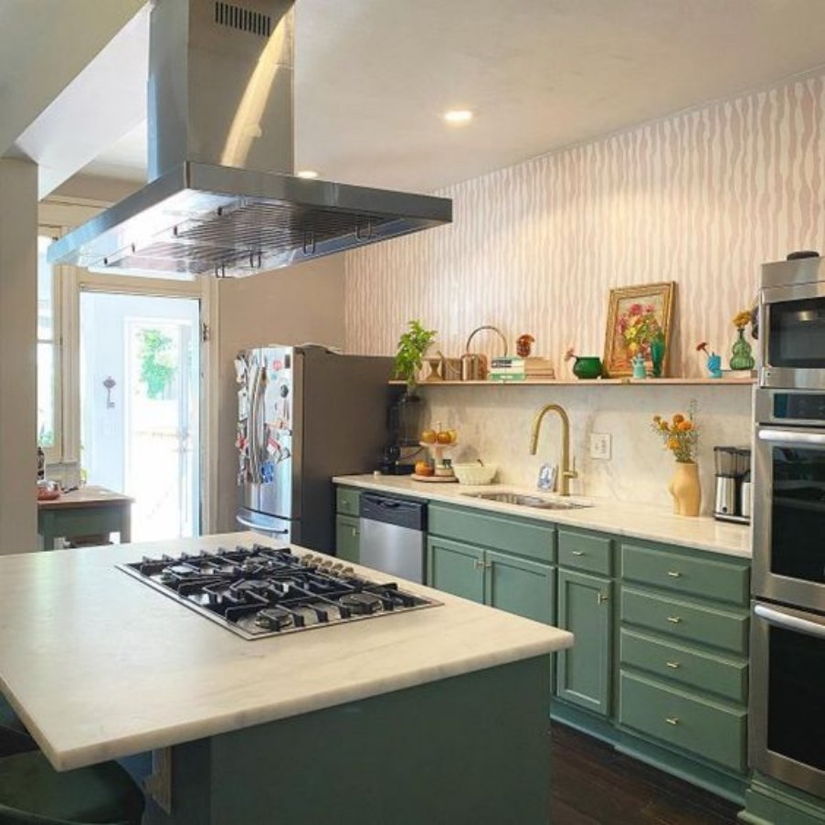
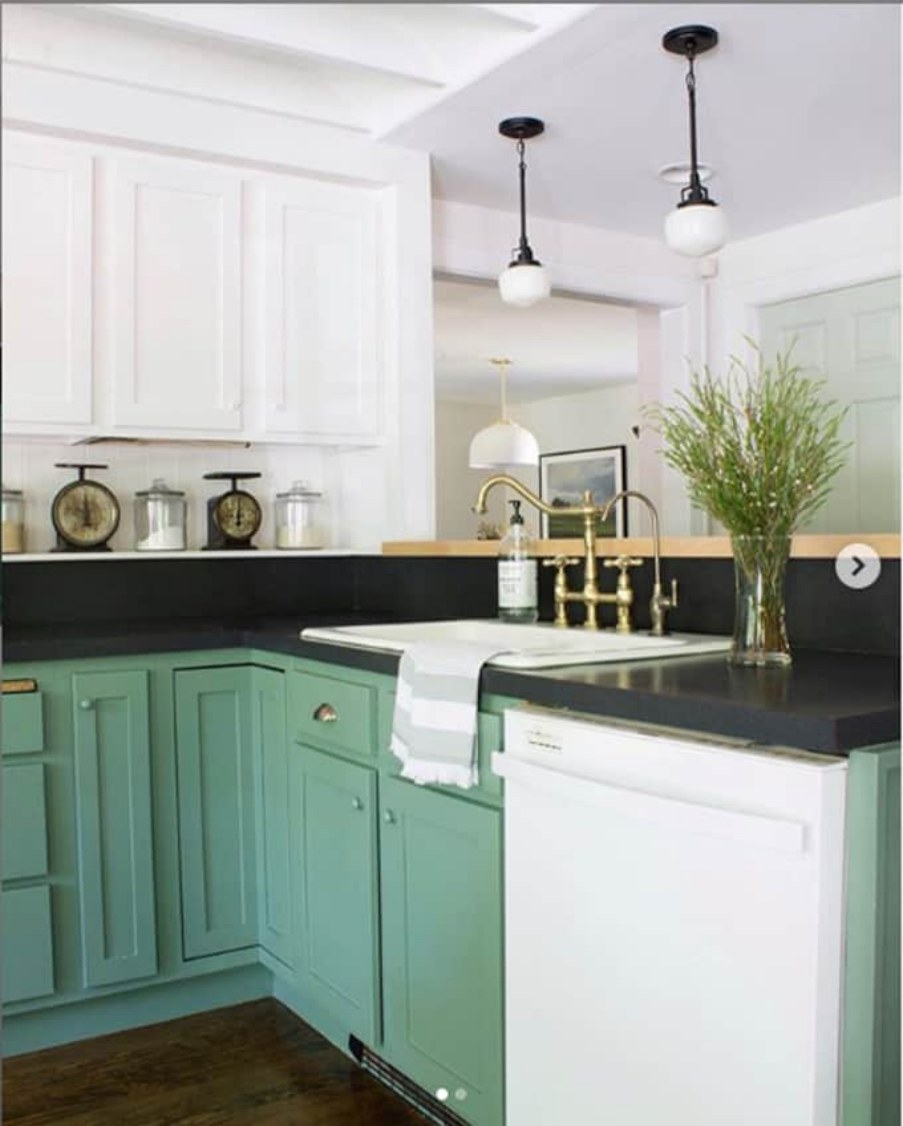
Privilege Green performs well on kitchen cabinets, especially when you pair it with whites and off-whites. Privilege Green is perfectly paired in the above kitchen with warm whites bordering on the creamy side.
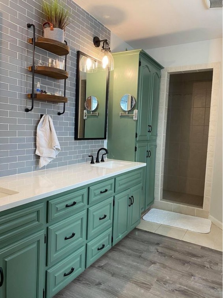
This is another excellent use of Sherwin Williams Privilege Green on cabinets. In this case, the paint color has been used in the bathroom. It pairs nicely with a white cabinet top and gray tiles.
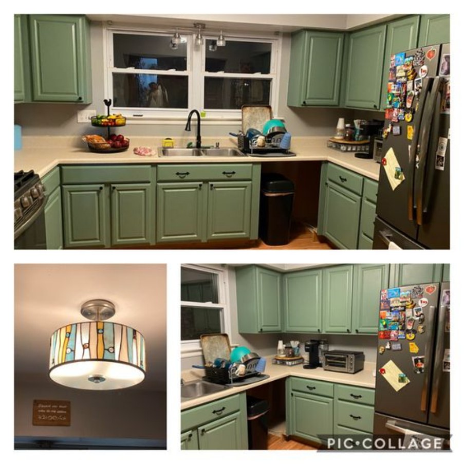
In this case, Privilege Green has been used on kitchen cabinets. The homeowner has paired the paint color perfectly with creamy off-whites. The off-whites help balance the coolness created by Privilege Green.
Privilege Green Sherwin Williams Kitchen
When used in most kitchens, homeowners prefer to have Privilege Green on their cabinets. In the above case, the paint color gets enough light to display its full character. It is also surrounded by white paint colors, ensuring it is getting enough light.
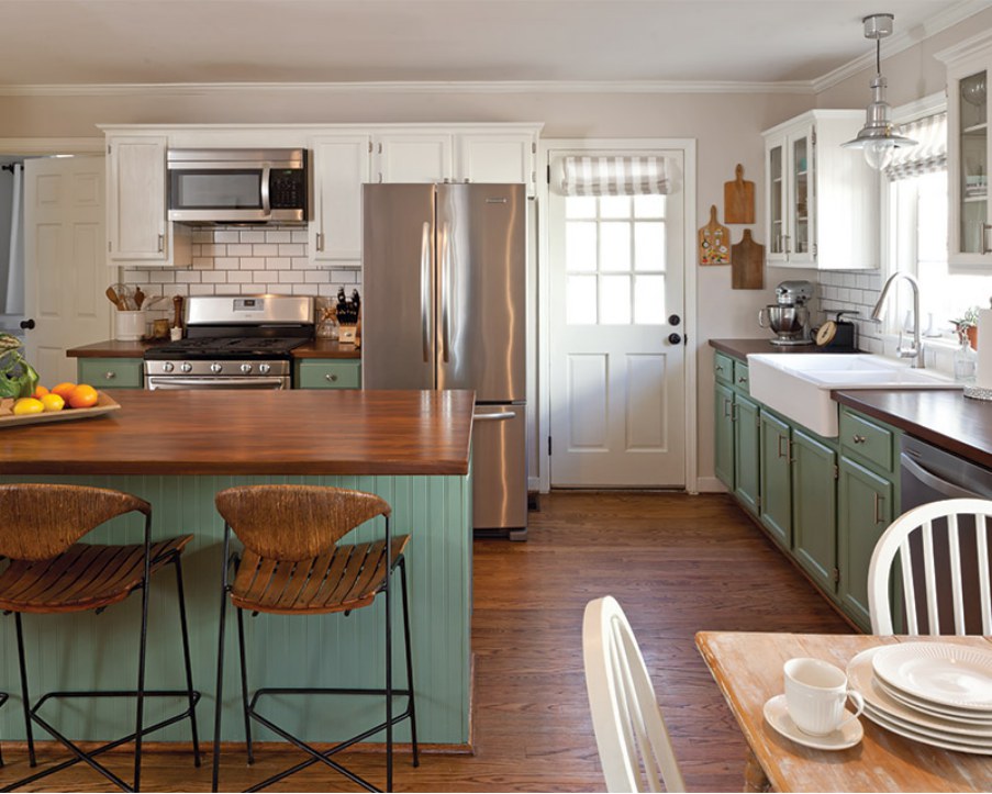
Sherwin Williams Privilege Green is also paired nicely with whites and off-whites in this kitchen. Interestingly, the paint color has been used on the cabinets just like in the other cases. The woody color and the off-whites in the kitchen pair nicely with Privilege Green to create an exciting look.
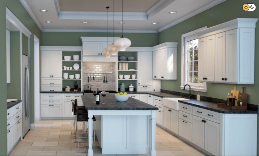
The above kitchen is an excellent display of what Privilege Green would look like on walls. The paint color pops, creating a unique, relaxing cooking environment. The white cabinets stand out distinctly without taking away from the beauty offered by Privilege Green.
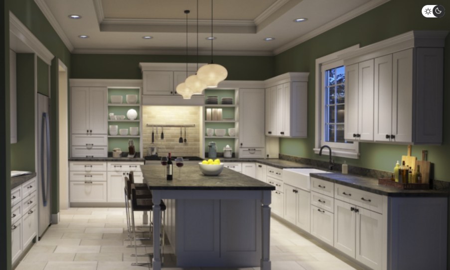
The above kitchen showcases the appearance of Privilege Green in a room without enough light. As noted earlier in the article, Sherwin Williams can become tedious without enough light—this can be seen in the above kitchen.
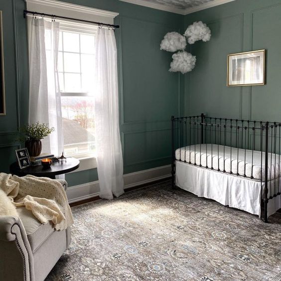
Privilege Green Bedroom
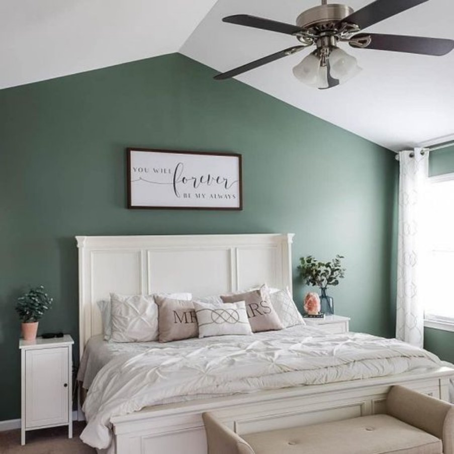
Sherwin Williams Privilege Green is an attractive color when used in bedrooms. It brings a sense of calm and relaxation to a room where you most need it. Privilege Green has paired nicely with whites and off-whites in the above bedroom to create a stand-out bedroom.
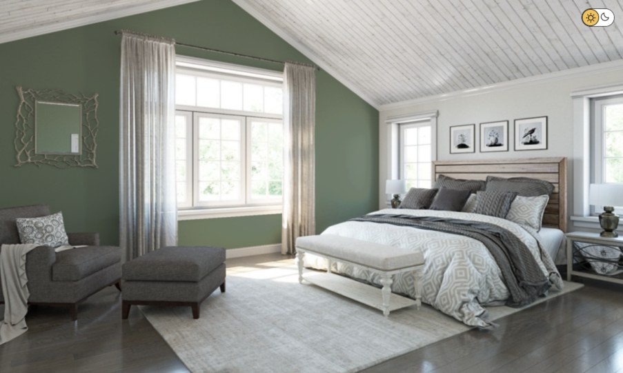
Sherwin Williams Privilege Green is used ideally in this bedroom. The owner has coordinated it with whites and grays to create a relaxing yet attractive vibe.
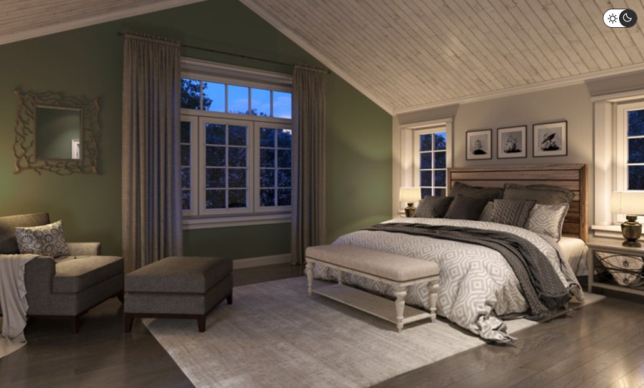
At night, Privilege Green does display its full character. However, you have to ensure the room has access to enough light. The above bedroom shows the changes to the bedroom appearance at night, with artificial lighting.
Overview
Sherwin Williams Privilege Green is an attractive deep green color that creates an exciting look. The paint color, however, is a deep green paint color that leans on the darker side of the LRV scale. Therefore, to experience its full character, use it in a room with enough light.
Privilege Green pairs nicely with a wide range of colors. Therefore, you do not have to worry about running out of coordinating or trim colors. This article shows you unique options for decorating and pairing with Privilege Green. However, if you have some interior design experience, experiment to find something that makes your home stand out.
I hope this article has answered your questions about Sherwin Williams Privilege Green. If you have some additional questions, let me know in the comments.
 Sherwin Williams Rock Bottom (Palette, Coordinating & Inspirations)
 Sherwin Williams Alpaca (Palette, Coordinating & Inspirations)
 Sherwin Williams Toque White (Palette, Coordinating & Inspirations)
 Sherwin Williams Storm Cloud (Palette, Coordinating & Inspirations)
 Sherwin Williams Amazing Gray (Palette, Coordinating & Inspirations)
 Sherwin Williams Dried Thyme (Palette, Coordinating & Inspirations)
