
The Sherwin-Williams palette seems to have an endless list of blues—so which one do you choose?
Sherwin Williams boasts coastal, electric, charcoal, and navy blues. There is no doubt that all of these blues are exotic and beautiful. However, one enchanting option that has always worked for my rooms is Sherwin Williams Rain SW 6219.
I love Sherwin Williams Rain SW 6219 for various reasons. It symbolizes nature and strength through its deeply rooted serene feel and impressive lighter-toned appearance.
It introduces an organic vibe into my home while maintaining the look of nature. In my rooms, the paint color makes the entire scene symbolic of Rain and ocean.
I have used Sherwin Williams Rain before, which is why I understand. If you haven’t used it before, this detailed guide will answer all your questions about the paint color. Let’s get started.
Table of Contents
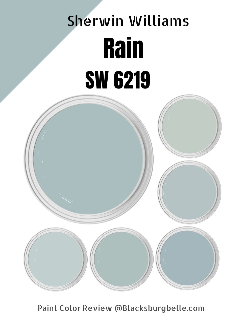
What Color is Sherwin Williams Rain?
| Manufacturer | Sherwin Williams |
| LRV | 49 |
| RGB | R: 171 G: 190 B: 191 |
| Hex Value | #ABBEBF |
| Color Collections | Living Well (Recharge) |
Sherwin Williams Rain is a blue paint color. However, as we noted earlier, it is reminiscent of nature—therefore, you would expect it to have some green. The green is usually very muted; therefore, do not expect to see the green in most lighting conditions.
RGB of Sherwin Williams Rain
The RGB scale helps interior designers determine the amount of red, green, and blue that go into a specific paint color. This scale runs from 0 to 255.
In the case of Sherwin Williams Rain, the color combines red: 171, green: 190, and blue: 191. Interestingly, the Sherwin Williams Rain RGB shows that the paint color almost balances the green and blue tones, with the blue slightly more than the green.
LRV of Sherwin Williams Rain
The Light Reflectance Value—LRV—helps interior designers determine how dark or light a paint color is. This scale runs from 0 to 100, with pure black sitting at 0 because it reflects zero percent light, while pure White sits at 100, reflecting 100% light.
Sherwin Williams Rain has an LRV of 49. The paint color is neither too dark (although it falls on the dark side of the scale) nor too light. The paint color absorbs more light than it reflects. Therefore, I recommend using Sherwin Williams Rain in a room with enough light for the best results.
Is Sherwin Williams Rain a Warm or Cool Color?
Sherwin Williams Rain is a cool paint color. I recommend this paint color for warm and tropical regions—incorporating the cool-toned shade in your home will help you balance out the warmth, keeping it from becoming overwhelming.
Sherwin Williams Rain Undertones
Sherwin Williams Rain comes with two prominent undertones—green and gray. The gray undertone is, however, more muted and does not always show up. However, in some lighting conditions, Sherwin Williams Rain does take a greenish appearance.
Sherwin Williams Rain Color Strip: Sherwin Williams Rain Color Comparisons
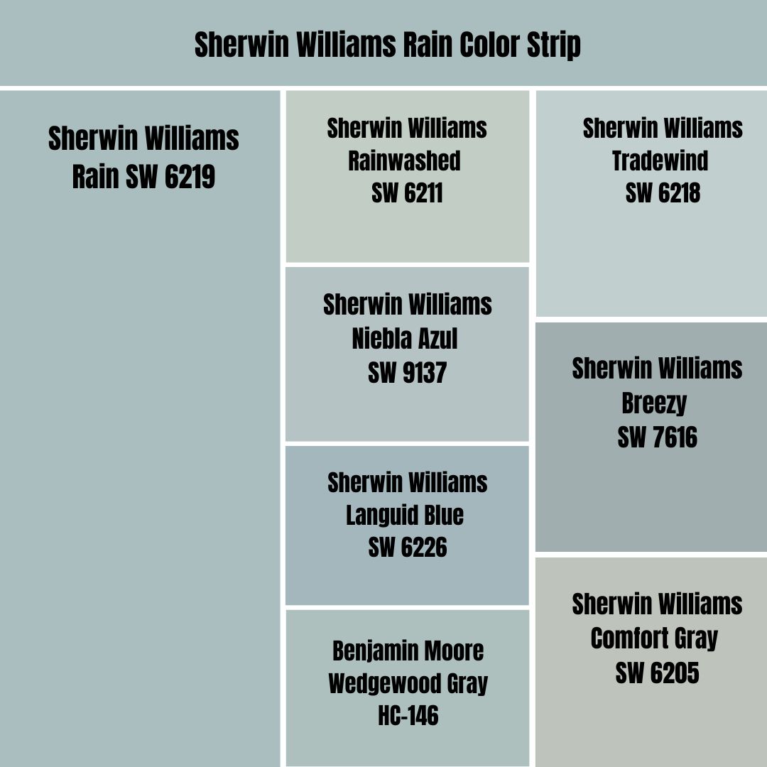
Sherwin Williams Rain vs. Rainwashed (SW 6211)
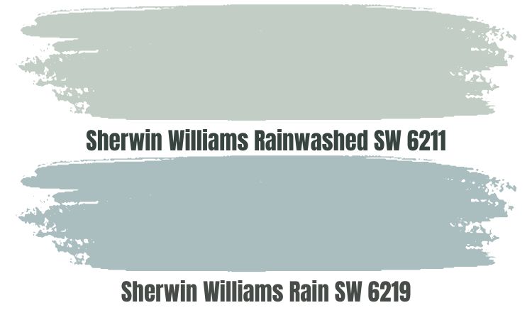
Sherwin Williams Rainwashed and Rain are two very close paint colors in their appearance—their names suggest this. Like Sherwin Williams Rain, Rainwashed features blue and green as its primary tones, with a gray undertone taking a step back to allow blue and green to make their statement on your walls.
Both paint colors swing on the cool side of the color scale. They perform well in south-facing walls, where they help balance out the warmth from the southern light. They, however, can make your north-facing rooms slightly icy.
Interestingly, Rainwashed reflects more light than Sherwin Williams Rain. The paint color has an LRV of 59. While it is above average in its reflective abilities, Rainwashed, like Rain, works well in rooms with enough light.
Sherwin Williams Rain vs. Niebla Azul (SW 9137)
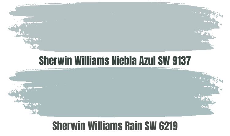
Sherwin Williams Niebla Azul is a light slate blue that brings cheerful calm to any space. The paint color boasts a combination of green and blue, with gray taking a step back—exactly like Sherwin Williams Rain.
Although Sherwin Williams Niebla Azul is lighter, it is not that much lighter than Rain. This can be seen in the paint colors LRV—while Rain reflects less light with an LRV of 49, Niebla Azul reflects just 4% more light with an LRV of 53. Both paint colors will always work well in bright rooms.
Both colors are cool. They will work in a room with extreme warmth—for instance, south-facing rooms. In north-facing rooms, you may want to pair the two with a warmer color to keep your space from becoming icy.
Sherwin Williams Rain vs. Languid Blue (SW 6226)
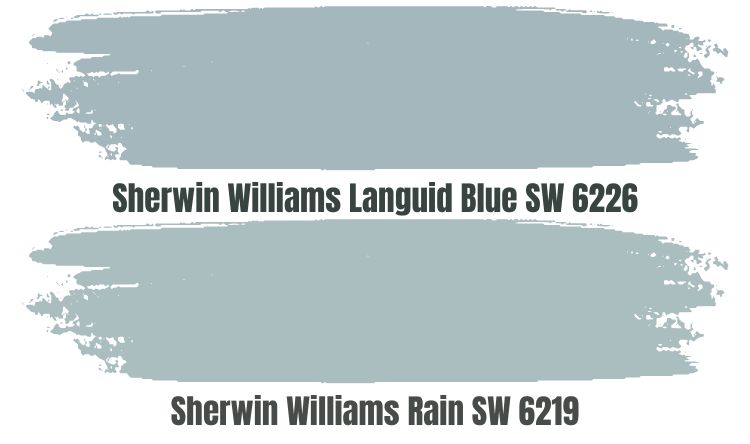
Sherwin Williams Languid Blue is a slightly deeper blue color that resembles Rain. For starters, both colors carry the same shades—green and blue as the leading shades, while the gray shade takes a step back.
Languid blue is slightly darker than Sherwin Williams Rain. This can be seen in the paint color LRV—it reflects 46% of light, about 3% less light than Rain. Languid blue will work well as a perfect backdrop for those lazy Sundays with your friends and family—however, given its low LRV, you have to ensure the room is well-lit to keep Languid Blue from becoming bland.
Both colors are cool. They can work well in a hot room, using their cool nature to balance the room. If you use one of these colors in a cool room, balance the room with a warmer shade to keep your space from becoming too icy.
Sherwin Williams Rain vs. Benjamin Moore Wedgewood Gray (HC-146)
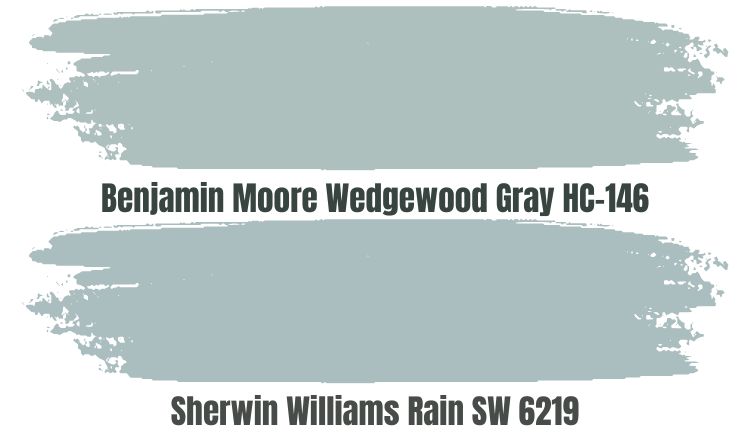
Though from a different brand, Benjamin Moore Wedgewood Gray does share various similarities with Sherwin Williams Rain. Like Rain, Wedgewood Gray also balances the attractive fine line of blue, green, and gray. Much like Rain SW 6219, Wedgewood Gray will behave like a chameleon on your walls, taking the green or blue appearances and sometimes gray, depending on the lighting conditions in the room.
Wedgewood Gray is a cool paint color, just like Sherwin Williams Rain. Wedgewood Gray will make your room feel balanced in cases where the room is too hot. However, While Wedgewood Gray is not as cold as Sherwin Williams Rain, it can make your space feel slightly icy if it is cold by default.
Wedgewood Gray and Rain are very close on the LRV scale. Rain reflects 49% of the light, while Wedgewood Gray reflects slightly more with its LRV of 49.66.
Sherwin Williams Rain vs. Tradewind (SW 6218)
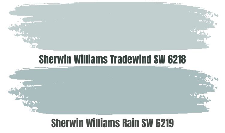
Sherwin Williams Tradewind is a cool blue paint color like Sherwin Williams Rain. These two colors, however, differ significantly in their ability to reflect light—while Rain will reflect 49% of light, Tradewind reflects 13% more with its LRV of 62. Both colors, however, are not light enough to perform in a dimly lit room—for maximum results with the two colors, you will want to put them in a room with enough light.
While Sherwin Williams Rain boasts a unique blend of green and blue that is almost balanced and a drop of gray in the back, Sherwin Williams Tradewind is slightly different. Tradewind has blue and gray as the primary shades, with green taking a step back to let the two shine.
Both Sherwin Williams Rain and Tradewind can work outdoors. Unlike highly reflective paint colors that wash out in extreme light, Tradewind and Rain add some personality to the brightest spaces.
Sherwin Williams Rain vs. Breezy (SW 7616)
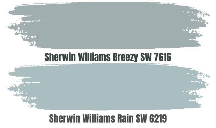
Sherwin Williams Breezy is a slightly darker version of Sherwin Williams Rain. While Sherwin Williams Rain reflects 49% of light, Sherwin William Breezy reflects 8% less with an LRV of 41. Both colors will, therefore, work well in a room with enough light—if your room is too dark, you can expect the two paint colors to look bland.
The two combine green, blue, and gray shades. Like in Sherwin Williams Rain, green and blue shine more in Breezy. However, it is also worth noting that gray in Breezy is more dominant than gray in Rain.
Breezy and Rain are cool colors that bring a cooling effect to any space. They also boast a relaxed vibe that works wonderfully in hallways, living rooms, and even bedrooms.
Sherwin Williams Rain vs. Comfort Gray (SW 6205)
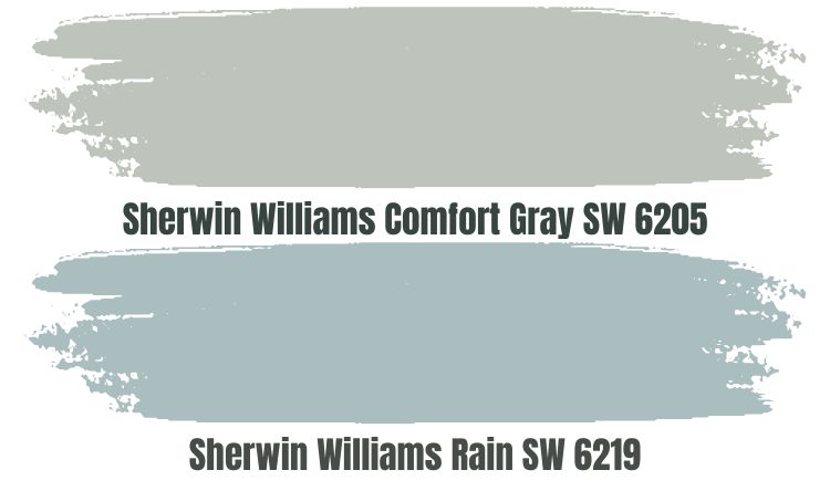 Sherwin Williams Comfort Gray, like Sherwin Williams Rain, combines green, blue, and gray. The only difference is that in Comfort Gray, the green is more dominant than the blue—in Sherwin Williams Rain, Blue is more prevalent.
Both colors, however, are cool and will work well in south-facing rooms, where they will help you balance out the warmth. In a north-facing room, you may want to pair these colors with a warmer shade to keep the room from becoming too cold.
Comfort Gray is slightly more reflective than Sherwin Williams Rain. Comfort Gray comes with an LRV of 54, while Sherwin Williams Rain will bring an LRV of 49. However, both colors work well in rooms with enough light—dim rooms make them bland.
Sherwin Williams Rain Palette
Sherwin Williams Rain Coordinating Colors
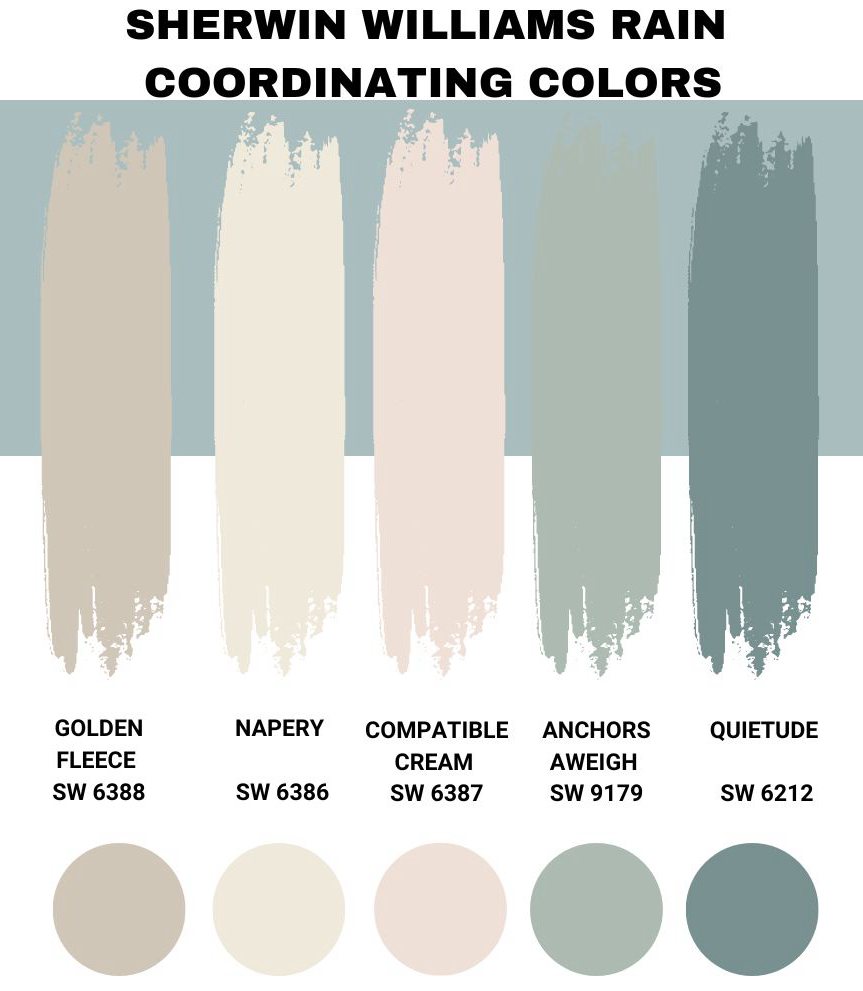
Sherwin Williams Rain works with many paint colors. It makes the interior design process so much easier—you do not even need prior experience with the paint color to create a distinctive look. Based on personal experience, I have listed some colors that go well with Sherwin Williams Rain below.
Sherwin Williams Accessible Beige (SW 7036)
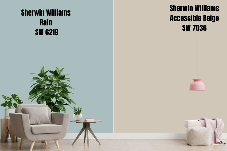
Sherwin Williams Rain is a cool color. And in some cases, you may want to use this paint color in a north-facing, cool room. In such a case, pairing it with a warm color always produces impressive results.
As the name suggests, Accessible Beige is a Beige Color, making it a warm paint color. In addition to balancing the coolness in Sherwin Williams Rain, Accessible Beige has a grayish undertone that makes it blend well with Rain which also has a similar undertone. Moreover, in some lighting conditions, Accessible Beige can pick a wee of green, another shade in Sherwin Williams Rain.
Accessible Beige, however, does fall short in its LRV, reflecting only 58% of light. While it’s more reflective than Rain, it is not so reflective that it can allow you to use the two colors in a dim room. Therefore, when pairing these two colors, your best bet will be to do so in a well-lit room. And don’t worry—the two colors are dark enough that they will not get washed out.
Sherwin Williams Dover White (SW 6385)
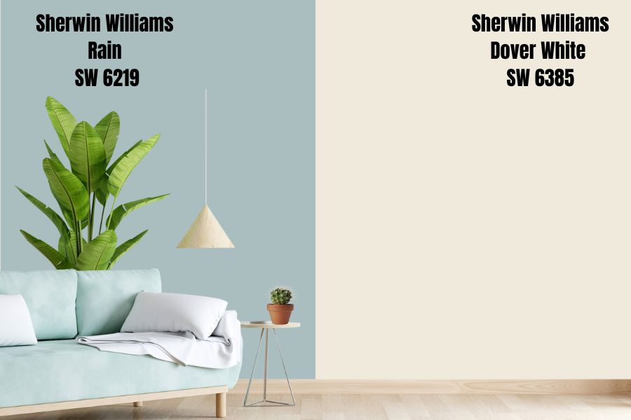
If you have a dimly lit room where you would like to use Sherwin Williams Rain, your best option is to use a high-reflective paint color. In this case, off-whites like Sherwin Williams Dover White are always an excellent choice. Dover White boasts an LRV of 82, meaning that it will reflect enough light onto Sherwin Williams Rain, giving it enough interest.
Dover White boasts a yellow undertone, giving it a creamy appearance. Therefore, Dover White is a warm paint color, one more thing that makes it a perfect pair for cool rooms. Dover White will balance the coolness in the rooms, ensuring that Sherwin Williams Rain does not make these rooms icy.
Sherwin Williams Intimate White (SW 6322)
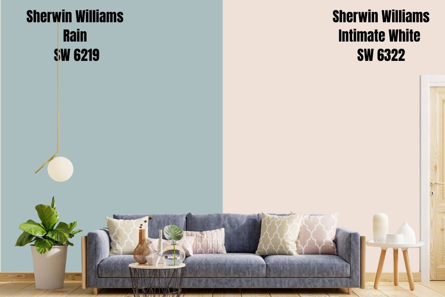
Maybe you want to give your room a cool, relaxed feeling and add a charming and romantic appeal to that space. In that case, go for Sherwin Williams Intimate White.
Intimate White is impressive because it is not mainstream pink—it does not look too loud or bold. Instead, it is a perfect blend of pink sitting on a white base that gives off a pastel-like and neutral feel.
The paint color boasts an LRV of 77, meaning it can reflect enough light onto Sherwin Williams Rain, keeping the paint color from becoming bland in dim rooms. While Intimate White is not the hallmark of warmth on the Sherwin Williams color palette, it still does bring warmth into a room, ensuring Sherwin Williams Rain does not make your space too cold.
Sherwin Williams Quietude (SW 6212)
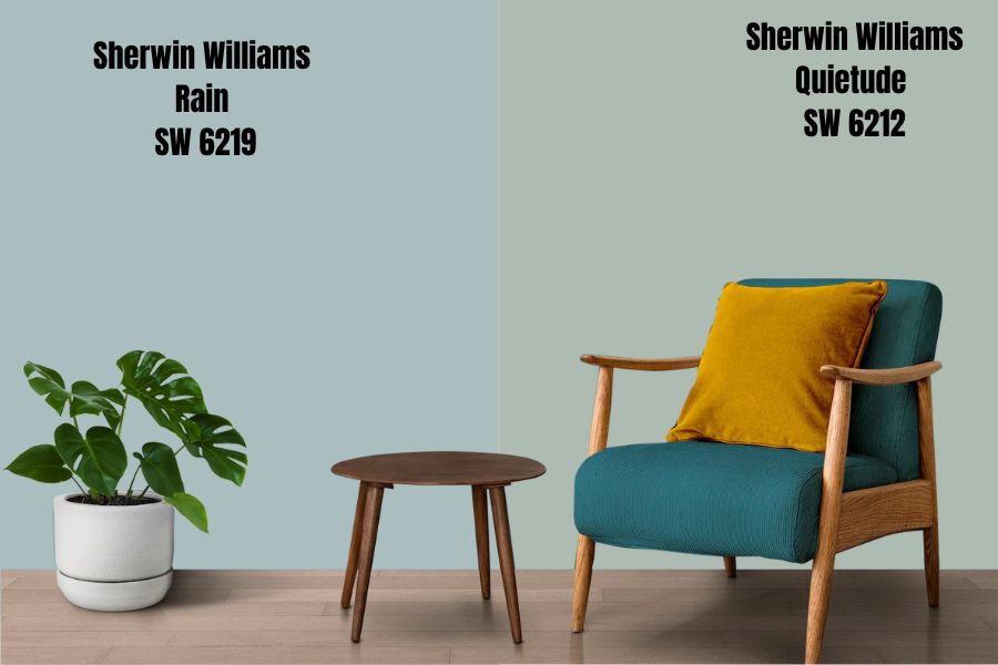
Sometimes you may want to implement a monochromatic design in your home. In that case, working with a color resembling Sherwin Williams Rain could be a good idea. In this case, Sherwin Williams Quietude could be a good option.
Sherwin Williams Quietude is a soothing, peaceful, serene color that is also calm, quiet, and gentle. It combines blue and green shades, much like Sherwin Williams Rain. Like Sherwin Williams Rain, Quietude also features a gray tone that takes a step back to let blue and green shades shine.
The two colors have an almost similar LRV. While Rain reflects 49% of light, Quietude reflects 48% of light. For this reason, when pairing the two colors, ensure the room is bright enough. Moreover, ensure the colors in a warm room—since the two are cold, they can make an already cold room feel icy.
Sherwin Williams Moody Blue (SW 6221)
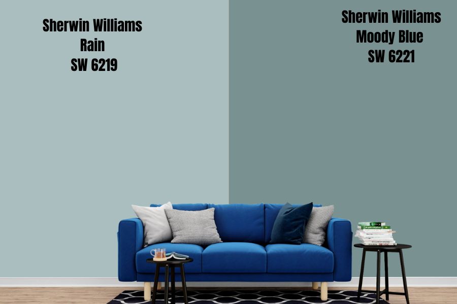
Another paint color you can use to implement a monochromatic look is Sherwin Williams Moody Blue. Moody Blue is a perfect blue paint color that boasts green and blue undertones. Like Sherwin Williams Rain, blue is dominant in Moody blue.
Moody Blue adds a crisp feel to walls, with its dark to mid-toned appearance making it stand out even in areas with bright light. The color has an LRV of 27, reflecting 22% less light than Sherwin Williams Rain—the paint color will add some personality to your bright room.
The color is cool, like Sherwin Williams Rain. Therefore, when combining these two colors, be sure your room is warm enough to avoid creating an icy feel.
Sherwin Williams Rain Complementary Color
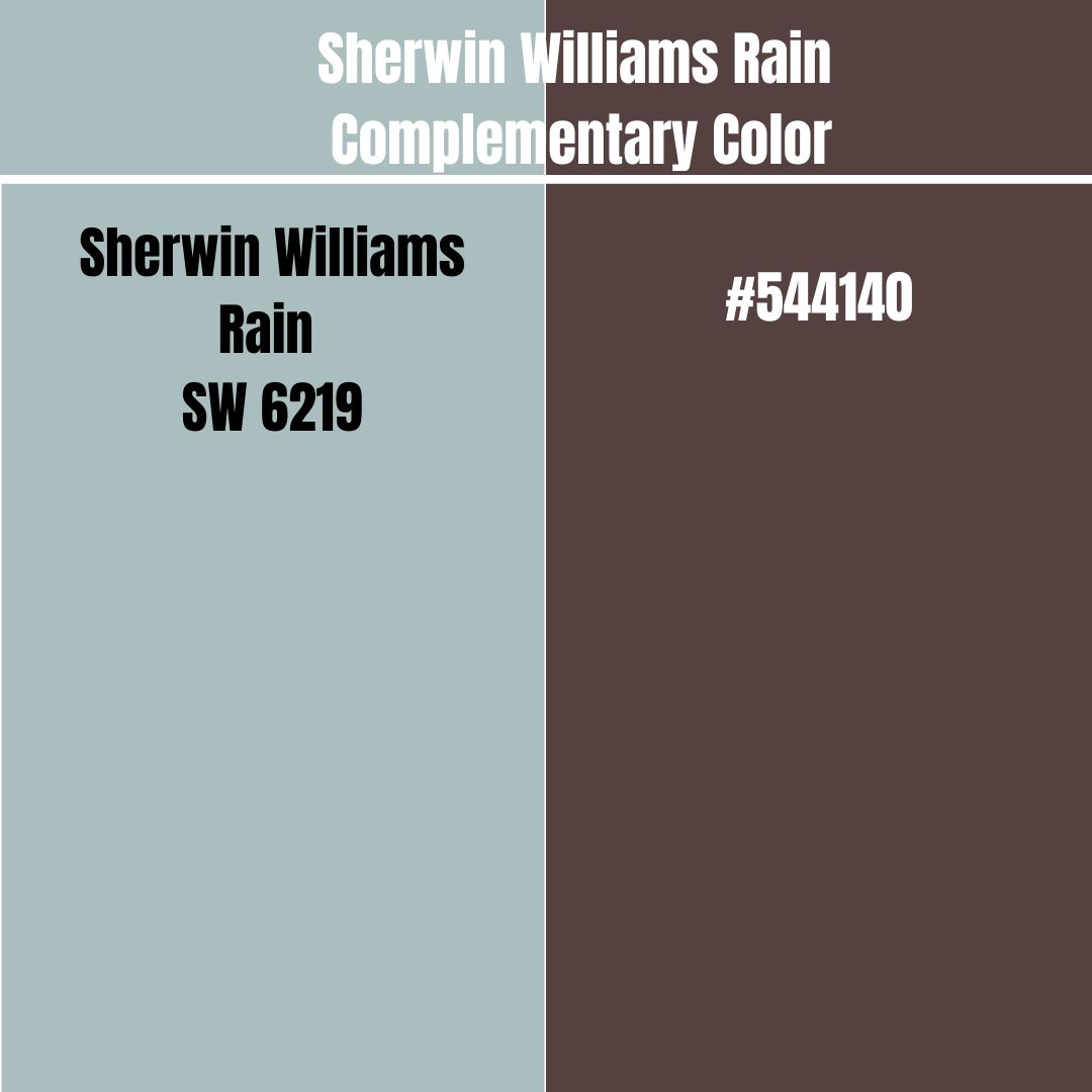
If your goal is to implement a contrasting look in your house, you may want a Sherwin Williams Rain complementary color. Sherwin Williams Rain and its complementary color will feature the most significant contrast when painted side-by-side. For this reason, when looking for Rain’s complementary color, you are searching for a paint color sitting on the opposite side of the color wheel.
The Sherwin Williams Rain complementary color has a hex value of #544140 and an RGB (84, 65, 64). The nearest name to this complementary color is Liver Chestnut.
What Trim Colors Go with Sherwin Williams Rain?
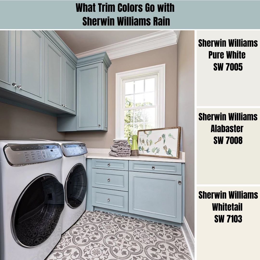
Regarding trim colors, Sherwin Williams Rain is quite versatile. However, in my interior design projects, I always go for options that are visible and gain enough attention—I always go for colors in the off-white range. Here are some of my favorite options:
Sherwin Williams Pure White (SW 7005)
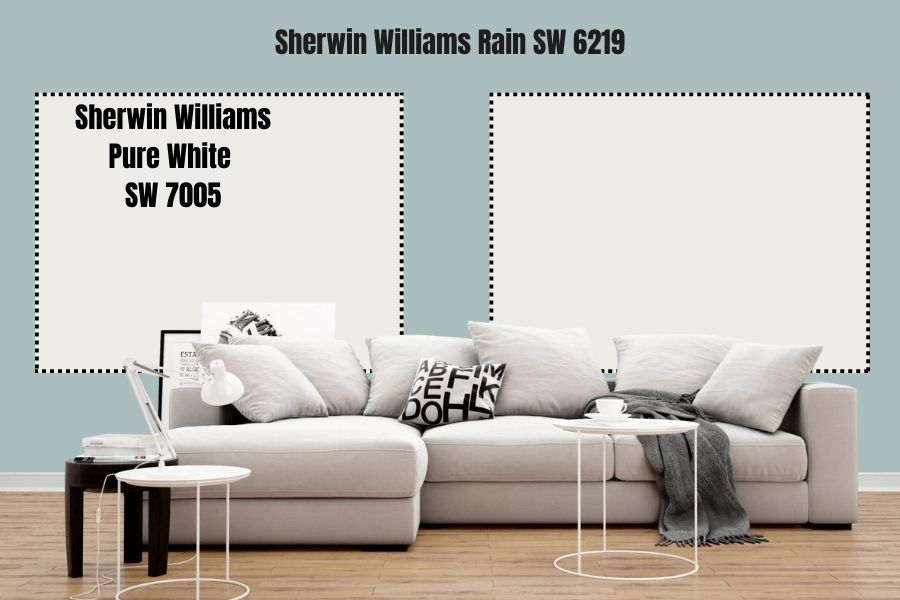
Sherwin Williams Pure White is a versatile and gorgeous paint color that leans more on the neutral side of the color scale. While Pure White is not True White, it is as neutral as most whites get.
One thing I love about Pure White is that it boasts an LRV of 84. Therefore, Pure White will get attention even in a dim room with its high reflective ability.
Pure White has a yellow undertone that can give it a creamy appearance. It is a warm color that balances the coolness in Sherwin Williams Rain.
Sherwin Williams Alabaster (SW 7008)
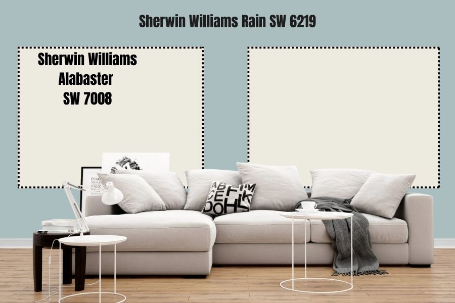
Sherwin Williams Alabaster is yet another interesting neutral off-white you can use. Alabaster was honored as the year’s color in 2016, which tells you that it has a lot to offer.
In a world where everyone deals with too much commotion, Alabaster on your trims will add a sense of personal solace with a dose of revival for your weary mind. The paint color has an LRV of 82, making it an excellent color that reflects enough light to keep Rain from becoming boring in dim rooms.
Alabaster boasts some creaminess and greige tones. The color is warm, balancing the cool in your Sherwin Williams Rain.
Sherwin Williams Whitetail (SW 7103)

Whitetail is a cream-white paint color that gives warmth to your trims, keeping Sherwin Williams Rain from getting too cold. Moreover, with its LRV of 86, Whitetail is highly reflective and will ensure your room does not become bland when the light dims.
The paint color comes with a yellowy-beige undertone that softens it. This addition is perfect as it gives Whitetail its warmth. The paint color can keep your rooms from getting too icy, especially when the room welcomes northern light.
Sherwin Williams Rain Benjamin Moore Version
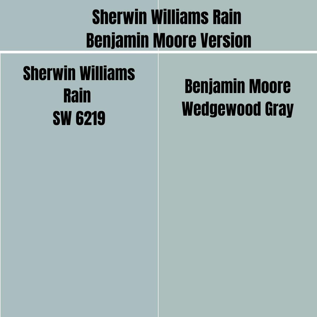
If you wonder whether Benjamin Moore produces a paint color with the same characteristics as Sherwin Williams Rain, wonder no more. Benjamin Moore Wedgewood Gray displays the same characteristics as Sherwin Williams Rain.
Wedgewood Gray combines blue, green, and gray. Rain has an LRV of 49, while Wedgewood Gray has an LRV of 49.66. On the RGB scale, Wedgewood Gray combines red: 172, green: 191, and blue: 189.
How Does Light Affect Sherwin Williams Rain
Sherwin Williams Rain is relatively low on its reflective abilities. Therefore, the color tends to lose its personality in dim light, becoming bland. However, bright light brings out the color’s whole personality.
Sherwin Williams Rain is also a cool color. Therefore, the color tends to be even cooler in north-facing light. However, Sherwin Williams Rain is comfier in southern light as the warmth balances its cool, keeping it from getting icy.
Best Rooms for Sherwin Williams Rain SW 6219
Sherwin Williams Rain in Bathroom
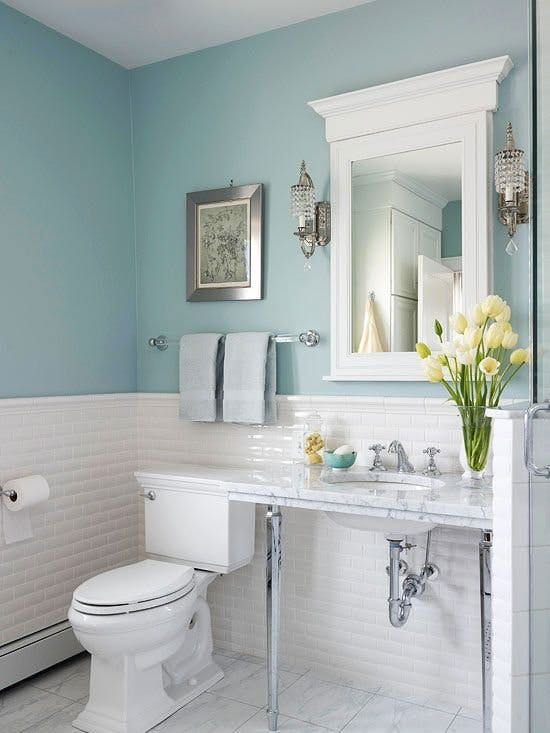
Sherwin Williams always works in bathrooms, especially when you pair it with an off-white or white paint color. In the above bathroom, Sherwin Williams occupies the upper half of the walls, perfectly connecting with the off-white tiles and the white ceiling. Sherwin Williams Rain creates a relaxing feeling in the bathroom, allowing users to forget their worries.
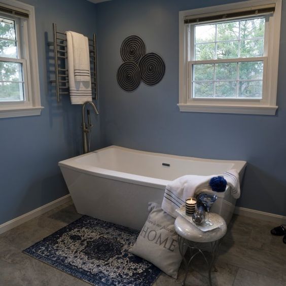
The appearance of Sherwin Williams Rain depends on the lighting conditions. In this case, Sherwin Williams Rain is sitting in a dimly lit room—the room is probably welcoming northern-facing light. For this reason, Rain leans more into its cooler blue shade.
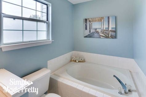
This is another impressive combination of Sherwin Williams Rain, cream tiles, and off-white color. The bathroom looks relaxing and calm, with the creamy and off-whites balancing the coolness in Sherwin Williams Rain.
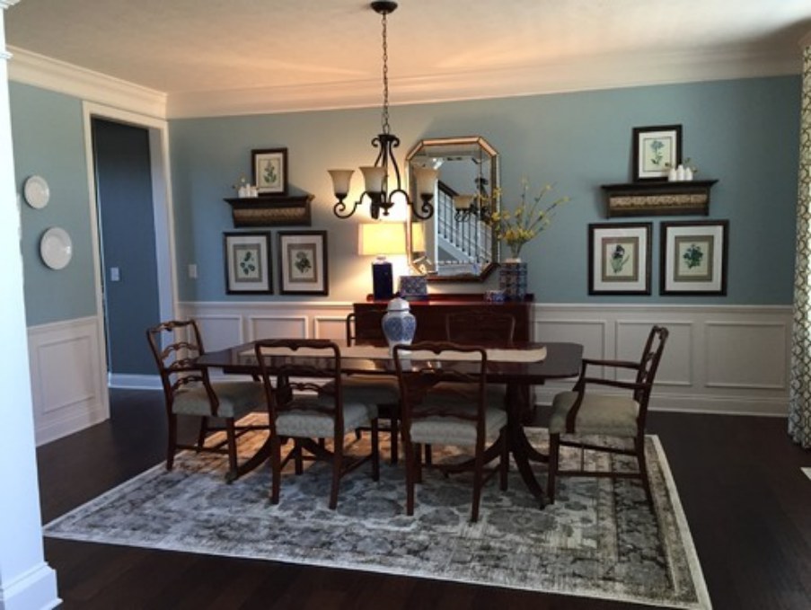
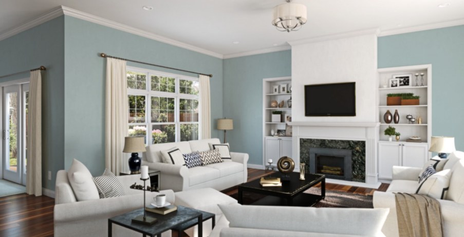
Sherwin Williams Rain Living Room
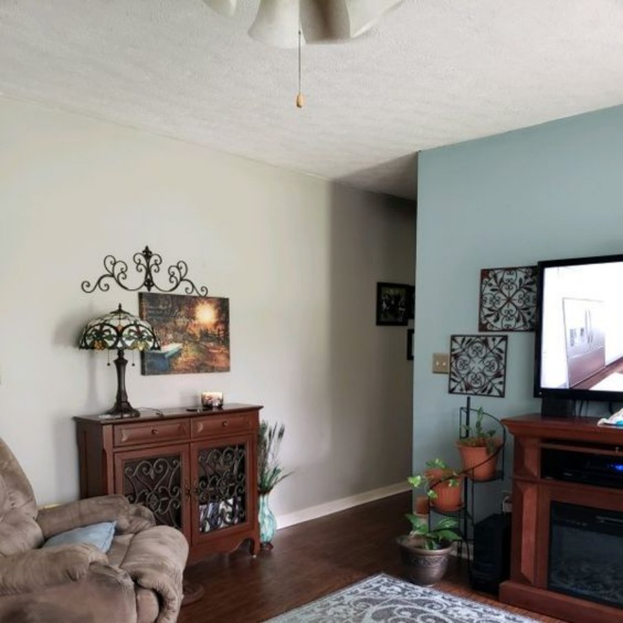
This living room is an excellent example of how to pair Sherwin Williams Rain with a creamy color. The blue in Sherwin Williams Rain brings cool to the room while the creamy color brings some warmth. This results in a balanced feel in the entire room.
This is another excellent use of Sherwin Williams Rain on the walls with white on the trims. The living room, however, seems slightly dim. For this reason, viewing Rain’s full character may be impossible—a little bit of additional light could make Rain stand out more.
This living room is an excellent display of what Sherwin Williams Rain is supposed to look like in a room with balanced light. In this case, it is paired nicely with white trims. Enough light brings out the balanced blue and green tones, making the room look relaxing.
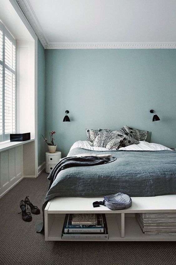
Sherwin Williams Rain in Bedroom
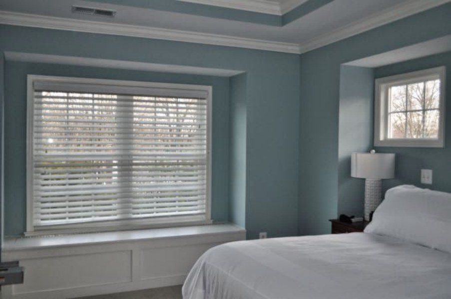
One of the reasons Sherwin Williams Rain works in bedrooms is that it makes bedrooms feel comfy and relaxing. We can see this in the above bedroom where Sherwin Williams Rain pairs perfectly with the white color. In the dark of the night, the paint color gets boring—but that is what you need in a bedroom to enjoy a restful sleep.
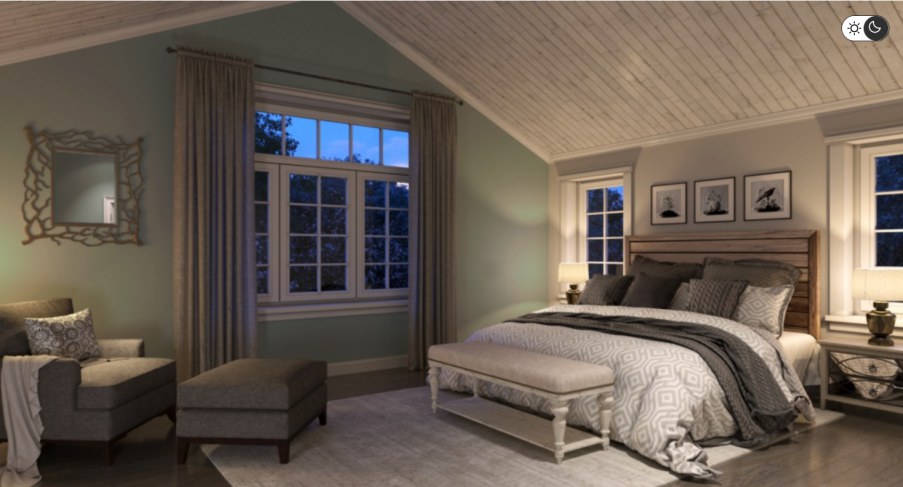
This bedroom is an excellent example of Sherwin Williams Rain at night. There is no doubt that it does look slightly bland. However, the off-white shades in the room do add some interest. Still, the color does add some comfort and coolness anyone would need for relaxing sleep.
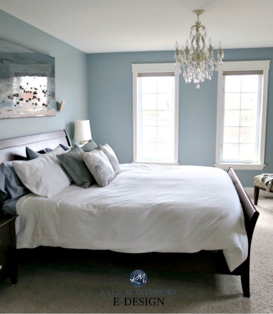
Well-lit bedrooms—like the one above—bring out the whole character of Rain SW 6219. In this bedroom, the paint color is paired nicely with off-white and white paint colors, adding even more personality to the bedroom.
Overview
Sherwin Williams Rain is an exciting color that combines three primary shades—blue, green, and gray. Blue and green dominate, while gray takes a step back, letting the two shine.
Since Rain is a cool color, putting it in an already cool room could create an icy feeling. However, the paint color in a warm room will balance the warmth, making the space comfier. Rain works well in bright rooms. It does not wash out since it is dark enough. In dim rooms, the color, however, may lose its character and become bland.
I hope this detailed guide has addressed your questions about Sherwin Williams Rain. If you do have additional questions, be sure to leave them in the comment section.
 Sherwin Williams North Star (Palette, Coordinating & Inspirations)
 Sherwin Williams Debonair (Palette, Coordinating & Inspirations)
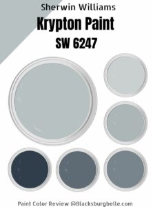 Sherwin-Williams Krypton (Palette, Coordinating & Inspirations)
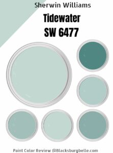 Sherwin-Williams Tidewater (Palette, Coordinating & Inspirations)
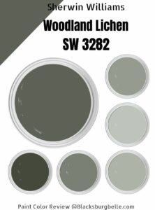 Sherwin Williams Woodland Lichen (Palette, Coordinating & Inspirations)
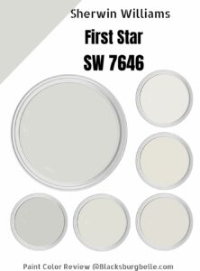 Sherwin Williams First Star ((Palette, Coordinating & Inspirations)
