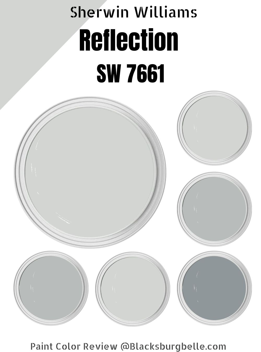
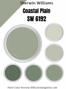
Tagged the neutralist and cool neutral, the Sherwin Williams Reflection paint shade is up for review in this article.
Here we discuss everything there is to know about this color shade. You’ll learn how to combine colors and tell-signs on whether the Reflection (SW 7661) is the right paint shade for that room you want to work on.
Table of Contents
What Color is Sherwin-Williams Reflection (SW 7661)
First, you need to understand that Sherwin Williams Reflection’s most distinctive feature is its cool-toned gray color, which is then embellished with its blue undertones.
Also, because of this color’s extreme lightness, it can be effectively utilized to design a typical space in a way that makes it appear larger than it actually is. Additionally, it keeps its deep color, regardless of how directly the sunlight shines on it.
| Manufacturer | Sherwin Williams |
| LRV | 66 |
| RGB | Red 211 | Green 213 | Blue 211 |
| Hex Value | #d3d5d3 |
| Color Collections | Minimalist, Living Well, Top 50 Colors |
RGB of Sherwin Williams Reflection (SW 7661)
Every color, which is the strength of the red, green, and blue colors in the color shade, may be examined using the RGB color format. According to this method, each color begins as black and develops a different hue when drops of red, green, and blue are combined with it.
Sherwin Williams Reflection (SW 7661) values are Red 211, Green 213, and Blue 211. The HEX value is #d3d5d3.
Light Reflective Value (LRV) Of Sherwin Williams Reflection (SW 7661)
The SW 7661 by Sherwin Williams has an LRV of 66, indicating that it is on the lighter side of the spectrum. A paint color’s LRV indicates how well it will perform both with and without light. True black is at zero on the scale, which goes from 0 to 100, while the brightest value is 100, which is pure white. though, paint
No matter how “black” or “white,” it is, there are always conflicting undertones; therefore, colors exist between 3 and 93. LRV also determines the number of undertones that would reflect under ideal conditions.
Is SW 7661 Either a Warm or Cool Color?
According to the color wheel, colors are typically classified as warm or cool. The Red, Yellow, and Orange colors are categorized as warmer colors because of how shiny they look; Hence, they brighten the rooms. While the Blue, Green, and Purple colors are cooler as they tend to be relaxing, thereby keeping a room super comfortable.
Sherwin-Williams Reflection is defined as an all-encompassing cool color that reflects a lot of cool in your room. Though much of this color may be uncomfortable due to its tendency to make one feel cold, a touch of warmer tones is required and critical in equating the look.
This color is refined by its deep blue undertones, hence coming out in a beautiful manner. This color does not just make your house seem spacious but also subtly plays with the mind.
What are the Undertones?
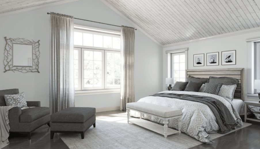
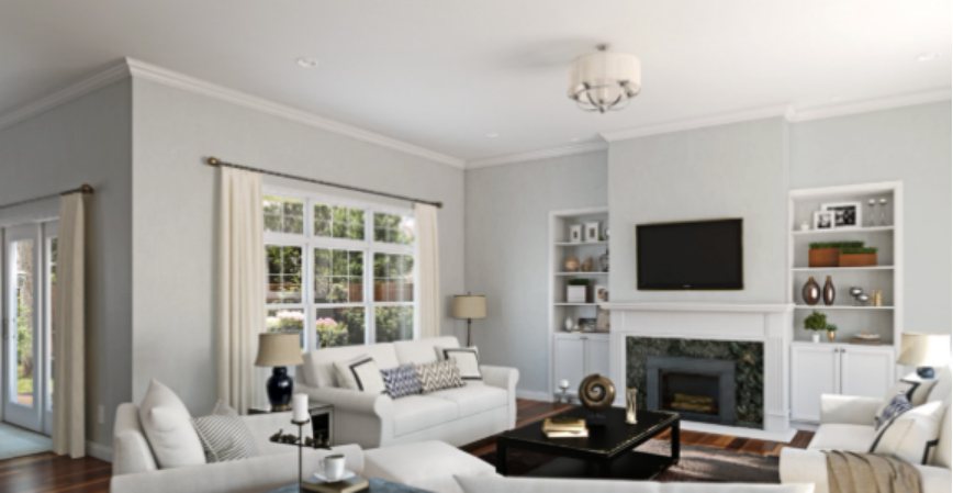
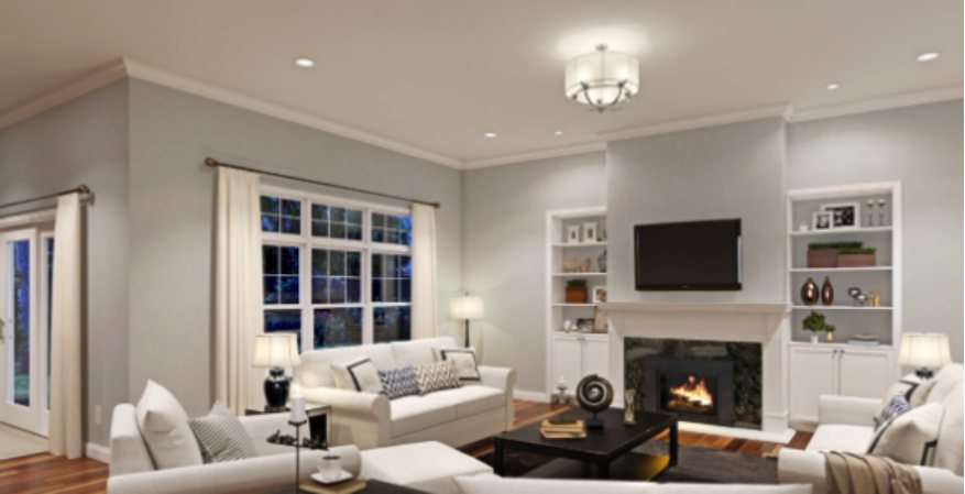
Sherwin-Williams Reflection is a true-gray paint, but it has mostly a blue undertone. This gives the hue a blue-gray tone because it makes it appear blue in low light. This simply makes Sherwin-Williams Reflection your best choice if you want both hues on your wall.
See the images below for several lighting-based Sherwin-Williams Reflection colors;

Sherwin-Williams Reflection Color Strip
The color strip can sync four-color gradations by mixing white and black with an anchoring shade. By using the special Sherwin-Williams code, you may determine the various shades of gray-blue that the Sherwin-Williams Reflection strip generally produces.
The remaining shades range from SW 7658 to SW 7660 for lighter tones on the strip to SW 7662 to 7664 for deeper tones because Sherwin-Williams Reflection is SW 7661. For their names and hues, refer to the table below.
Light Color Strip
| Color Code | Color Name | Location Number | Color Tone |
| SW 7658 | Gray Clouds | 238-C3 |  |
| SW 7659 | Gris | 238-C5 |  |
| SW 7660 | Earl Gray | 280-C3 |  |
Dark Color Strip
| Color Code | Color Name | Location Number | Color Tone |
| SW 7662 | Evening Shadow | 233-C2 |  |
| SW 7663 | Monorail Silver | 233-C3 |  |
| SW 7664 | Steely Gray | 233-C4 |  |
Sherwin-Williams Gray Clouds (SW 7658)
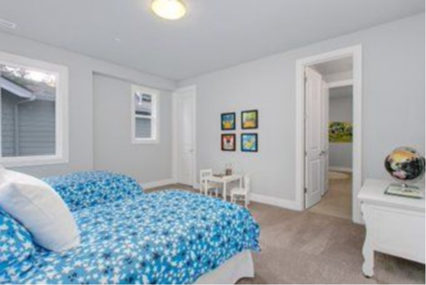
Gray Clouds is about three shades lighter than Sherwin-Williams Reflection, so its blue undertone is less prominent than the former’s. Compared to its counterpart, it has more RGB decimals and appears as a light, floaty gray that is brightened with a touch of blue.
It’s a cool tone, hence its cloud-inspired name, “Gray Clouds.” This color is a fantastic choice for an indoor design because it tends to gravitate more toward the light side of the spectrum. When used as an accent on Sherwin-Williams Reflection, it has more character than plain white, so give it a shot today.
Gris by Sherwin-Williams (SW 7659)
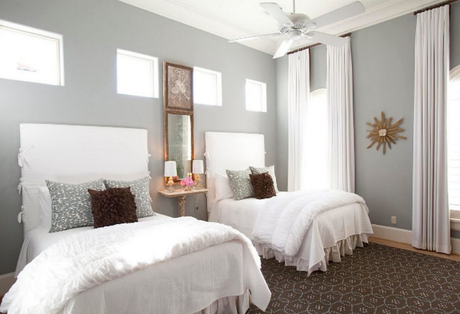
The Gris color is two shades darker than Sherwin-Williams Reflection, which automatically makes it the shade one should choose if a defined undertone blue in your gray is preferred. It has a lower LRV and less possibility of reflecting its undertone because its RGB digits are smaller than the former.
When it comes to beautifully blending other tones, this color is comparable to Sherwin-Williams Reflection.
The Gris hue became popular in the last decade for its sumptuous versatility and ability to blend with numerous colors and materials. Gris is the ideal color for any space, including nurseries, as it blends so well with pink, yellow, mint, and blue.
Sherwin-Williams Earl Gray (SW 7660)
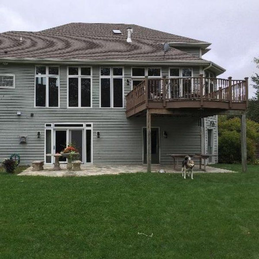
The Earl Gray paint is a shade lighter than Sherwin-Williams Reflection with strong RGB decimals at 150|154|150. It’s a gray color with pronounced blue undertones. When embracing the calming psychology of blue, this is the hue you opt for.
Also, due to its similarities with the Sherwins Williams Reflection paint, the Earl Grey isn’t the ideal complement for Sherwin-Williams Reflection paint. Nonetheless, it is effective as an accent when creating indoor designs. The shade can be used as décor and furniture.
Evening Shadow by Sherwin-Williams (SW 7662)
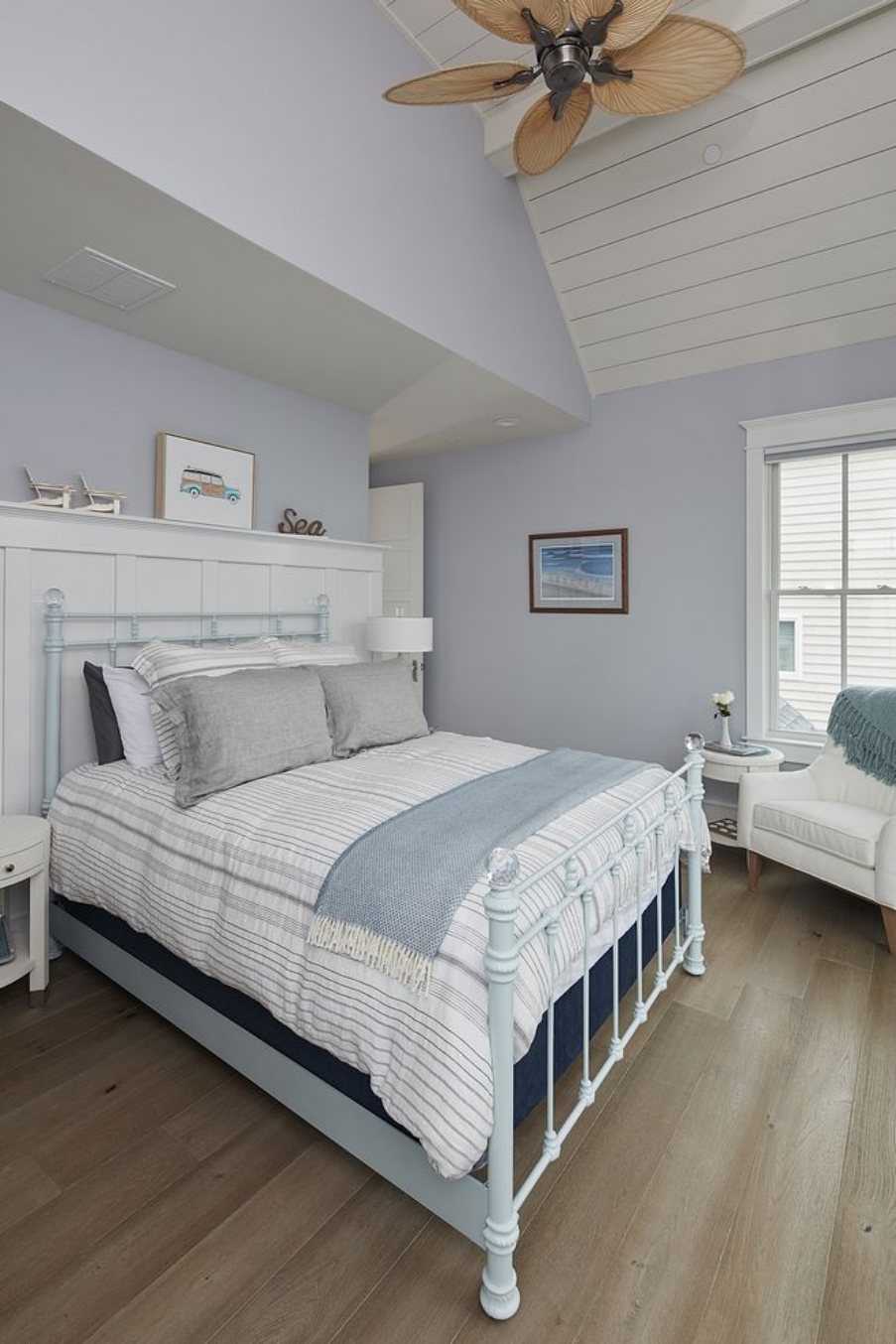
Sherwin-Williams Evening Shadow paint is a shade darker than Sherwin-Williams Reflection with strong undertones of blue. This blue undertone makes Evening Shadow best suited for indoors.
Evening shadow blends well with textural metals in home interiors. This gray-blue paint is ideal if you want to create a cool or cold environment. Mix this color with walnut, pine wood, and even glass to get the best outcome.
Sherwin-Williams Monorail Silver (SW 7663)
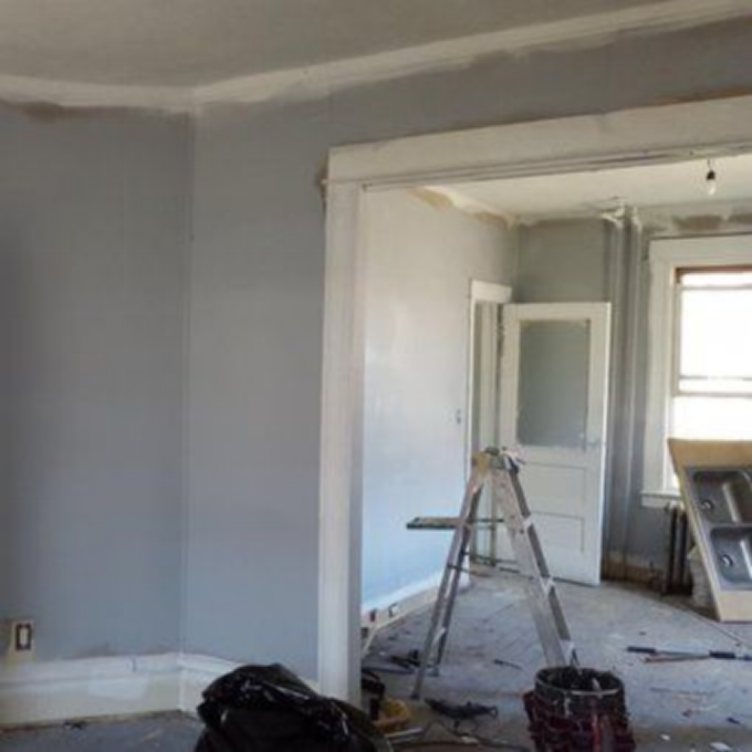
Sherwin-Williams Monorail Silver is three shades lighter than Sherwin-Williams Reflection, with the gray outweighing the blue undertone. Monorail Silver is a cool gray with subtle blue undertones.
This shade of gray looks stunning with navy blue, black, and white. Its cool tones go well with both rustic and modern exteriors since they help to make a room appear longer than it is. If you’re painting a little room, it’s a terrific alternative. Use Monorail Silver to create the ideal effect on the large expanses of walls so as to get the value of your money.
Sherwin-Williams Steely Gray (SW 7664)
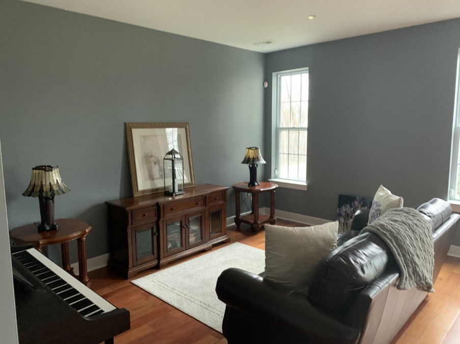
Sherwin-Williams Steely Gray has a more pronounced blue undertone despite being two shades lighter than Sherwin-Williams Reflection, which keeps its gray hue. It has an LRV of 30, making it physically appear darker than it does on screen.
Steely Gray is far more gray-blue than blue-gray, hence making it the perfect fit if you want to mimic an indoor design on the exterior of your home. It shines best in the bedroom and living room.
Sherwin-Williams Reflection Color Palette
Creating color palettes is quite enjoyable; hence, it’s imperative that you pick the greatest complementing hues to create a palette that looks understated and alluring.
Sherwin-Williams Reflection can be used for a variety of purposes, and if you don’t use it to its full potential, it won’t be valuable. Fortunately, using this as a guide will enable you to design an ideal space. Find out how to match colors in the Sherwin-Williams Reflection color scheme.
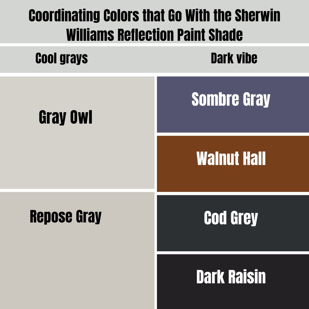
Coordinating Colors that Go With the Sherwin Williams Reflection Paint Shade
Choosing complimentary colors for your Sherwin-Williams Reflection room depends on your preferences and what you’ll be looking for in your space. Designing your space can either be in monochrome or in contrasting shades. I hope I’m not confusing you. Don’t worry; I’ll cover everything right now.
Monochrome Decoration
Monochrome design dictates the usage of one color as the anchor and choosing colors of that same shade as a supplement. In this case, it means using several hues of gray, from lightest to darkest, to decorate your Sherwin-Williams Reflection room.
It’s ideal to stay within the LRV range you have available by combining colors that are no more than three shades lighter or darker, because it’s not as easy as it looks. Many decorating designs still clash because of the wrong color combination.
If you are quite conversant with colors closer on the spectrum to Sherwin-Williams Reflection, such as Evening Shadow, Steely Gray, and Monorail Silver, you’d notice the difference. Find gray hues between two and three times its LRV for a distinctive look.
In general, modern, minimalist, seaside, and contemporary design setbacks look well in monochromes.
Pro Tip: Use the Color Strip.
Try other cool grays like Gray Owl,y Repose Gra, and Analytical Gray to open up the space. To maintain a dark vibe, use dark grays like Sombre Gray, Walnut Hall, Cod Grey, and Dark Raisin.
Contrasting Decoration
Coordinating contrasting colors is your best option if you choose to use diverse hues in your room. Your Sherwin-Williams Reflection paint serves as the anchor hue when styling in contrast. This means that any additional pigment you add to your room must match the tone, unless you’re into color blocking.
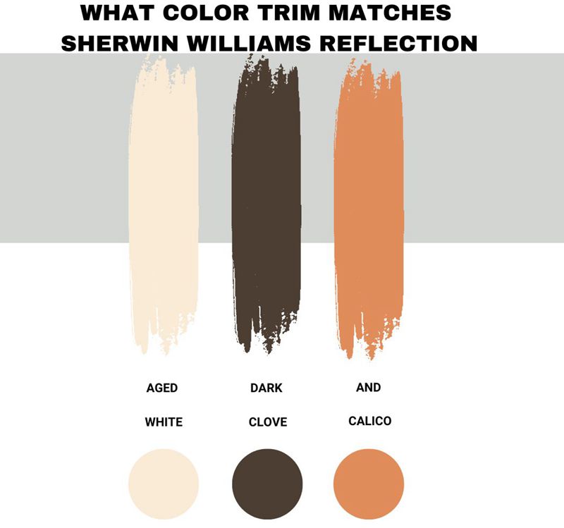
You need LRVs that are either darker or lighter than your anchor color, Sherwin-Williams Reflection, to generate contrast. The operation of monochromatic decorating is analogous to this. and that is the only factor common between them. Aged White, Dark Clove, and Calico are the most complementary colors, according to Sherwin-Williams.
All three of the hues have a common feature, which is their brilliance. As was previously said, colors with high LRVs would create a Sherwin-Williams Reflection environment since they would reflect light rather than absorb it.
Reflection by Sherwin-Williams Complementary Colors
Complementary colors are those that are on the opposite side of the anchor color on the color wheel. The complementary hues are tones of orange with a tone resembling gray-blue, a gray tint with a blue undertone.
SW Reflection looks great with darker grays like Dustblue and navy blues like In The Navy, as well as light grays and whites.
Since Sherwin-Williams Reflection is already on the drab spectrum, you’ll find that they blend well together, especially in blue tones. You won’t be sorry if you combine Sherwin-Williams Reflection with Gibraltar, Lazy Gray, Song Thrush, and Malabar to create a complementary color scheme.
What Color Trim Matches Sherwin-Williams Reflection?
The three complementary hues Sherwin-Williams recommend, Aged White, Dark Clove, and Calico, work well as trims for Sherwin-Williams Reflection walls. They offer a nice highlight to the highlights and create the ideal contrast with the gray tone.
Sherwin-Williams Reflection Color Comparisons
Reflection by Sherwin-Williams is one of the brand’s best-selling cool, medium-dark gray tones due to its versatility. There are various options to try if it’s not available and you’re short on time (I’d rather wait as long as required).
You can select other Sherwin-Williams gray hues in the same medium-dark range, such as Steely Gray, Evening Shadow, and Monorail Silver.
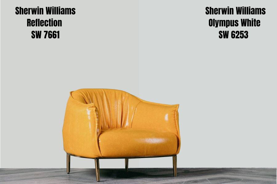
Sherwin-Williams Reflection vs. Sherwin-Williams Olympus White
These two colors appear identical at first glance, but when you view them through a larger lens, the undertones differ significantly.
This hue, Sherwin-Williams Olympus White LRV of 68, is quite light and can be used to create a serene, quiet atmosphere in your home. It is identical to Sherwin-Williams Reflection in that it is 212 Red, 216 Green, and 215 Blue with a Hex Value of #d4d8d7.
Sherwin-Williams Reflection, which has an LRV of 66, is a flawless neutral with a few blue and gray undertones. Although it appears more brownish than blue in the daylight.
The undertones make a big difference; the Sherwin-Williams Olympus has a lot of gray while the Sherwin-Williams Reflection has a lot of blue.
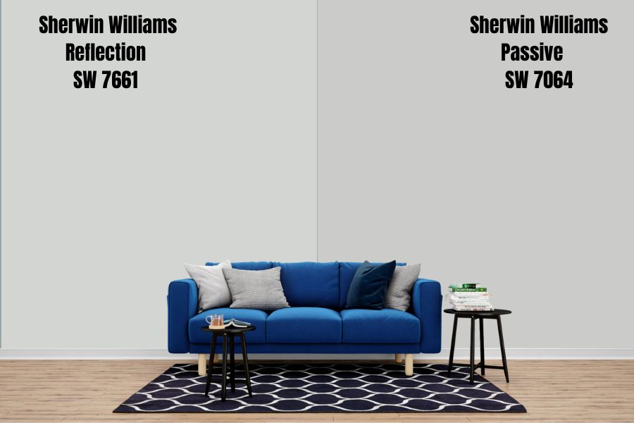
Sherwin-Williams Reflection Vs. Sherwin-Williams Passive
Two colors from the same color collection are used in this color comparison. The first one is called Reflection and has been given the designation SW 7661. The second, dubbed passive, has SW 7064 as its code.
Sherwin-Williams Passive LRV of 60, a shade that is deeper than Reflection, can be applied to give your home a cool, collected feel. It has the same colors as Sherwin-Williams Reflection: 203 Red, 204 Green, and 201 Blue. Its hexadecimal code is #CBCCC9.
The neutral hue Sherwin-Williams Reflection, which has an LRV of 66, has a few blue and gray undertones. Even though in the sunlight it looks more brownish than blue.
A cool paint color is passive. It is a calm gray that isn’t very chilly or frigid. It’s breezier and lighter than anything. The incorrect shade of gray for you is definitely passive if your gray vibes lean more toward the warm and fuzzy side.
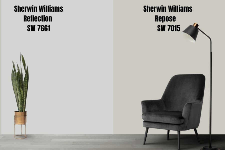
Sherwin-Williams Reflection Vs. Sherwin-Williams Repose
Both hues come from the same color family. The first one is called Reflection and has been given the designation SW 7661. The second, with the code SW 7015 and the name Repose,
Sherwin-Williams Repose LRV of 58 is the color. Although warm, there are very slight hints of cool tones. It’s a little darker than Reflection and works perfectly to make the room feel more cozy. With a hex value of #CCC9C0 and the colors 204 Red, 201 Green, and 192 Blue, it is the same as Sherwin-Williams Reflection.
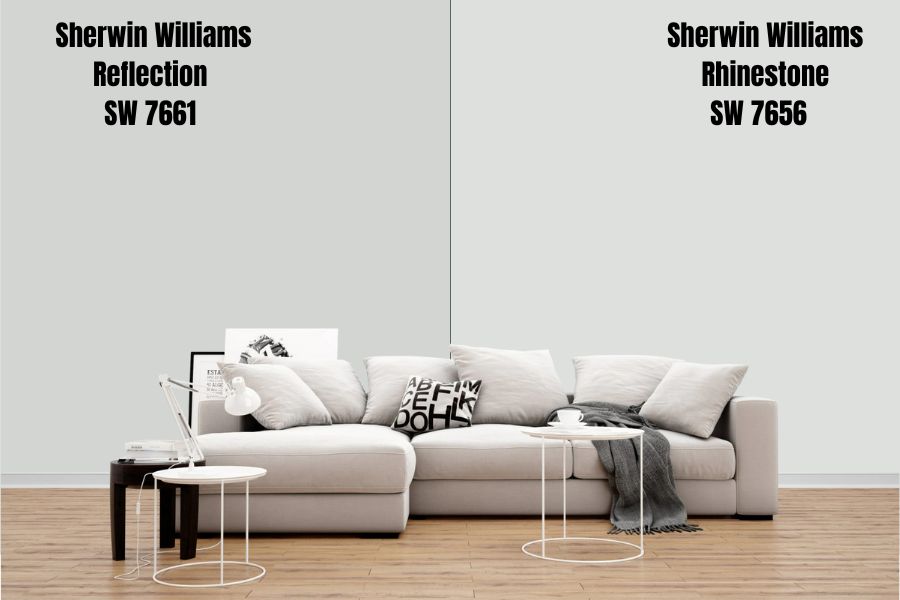
Sherwin-Williams Reflection Vs. Sherwin-Williams Rhinestone
Rhinestone has a color name of Gray Nurse and a code of SW 7656. This hue, Sherwin-Williams Rhinestone, has an LRV of 58. This color is both warm and cool. It is significantly darker than Reflection and works well to create a cozy mood in your home. It is Sherwin-Williams Reflection in that it is 222 Red, 224 Green, and 222 Blue with a Hex Value of #DEE0DE.
Sherwin-Williams Reflection Benjamin Moore Color Comparison
Gray-blue Sherwin-Williams Reflection is the color. When attempting to compare colors to those of Benjamin Moore, this is helpful. Here are some of the best gray-blue tones offered by the competing brand, though you might not find an exact substitute.
Stonington Gray (HC-170)
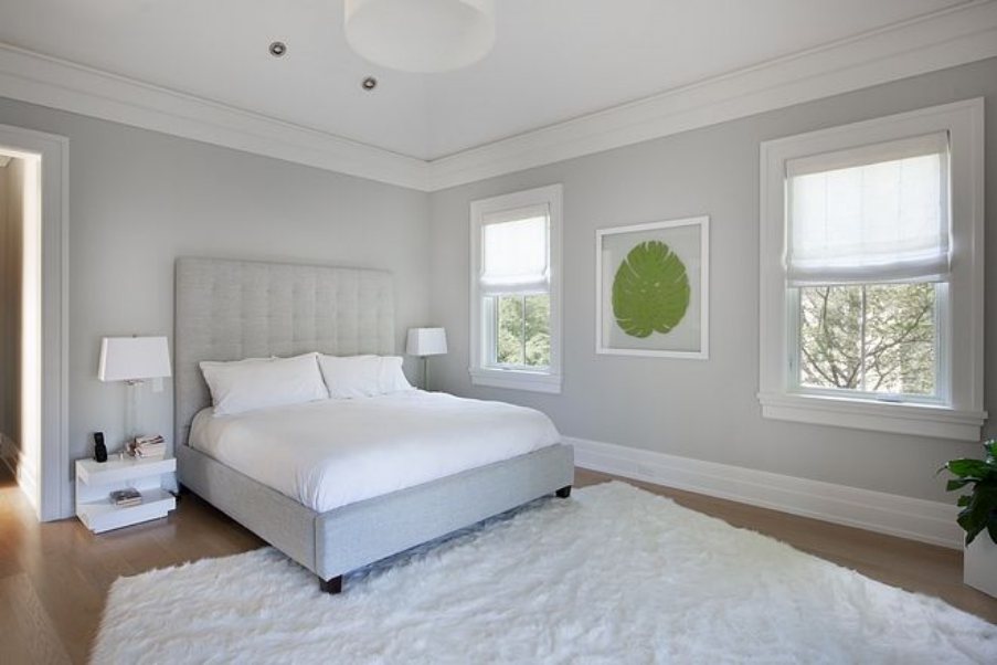
This shade of gray paint exudes refinement and elegance. It is a delicate gray paint hue that adds refinement to any space in which it is used. It clearly has a blue undertone. It exudes a cool aura, which is soothing. A cool-toned medium gray is Stonington Gray. Instead of being an icy, chilly gray, it is a soft, polished gray.
Coventry Gray (HC169)
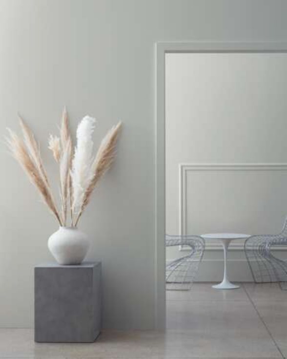
Coventry Gray is a gray paint color made by Benjamin Moore. This gray is neither icy cold nor warm. It’s what I’d describe as a stormy or soft gray. When lit from the north, it will appear much colder and more like a classic cold gray; yet, when lit from the south or from the west in the afternoon, it will appear much softer.
Gray Owl (2137-60)
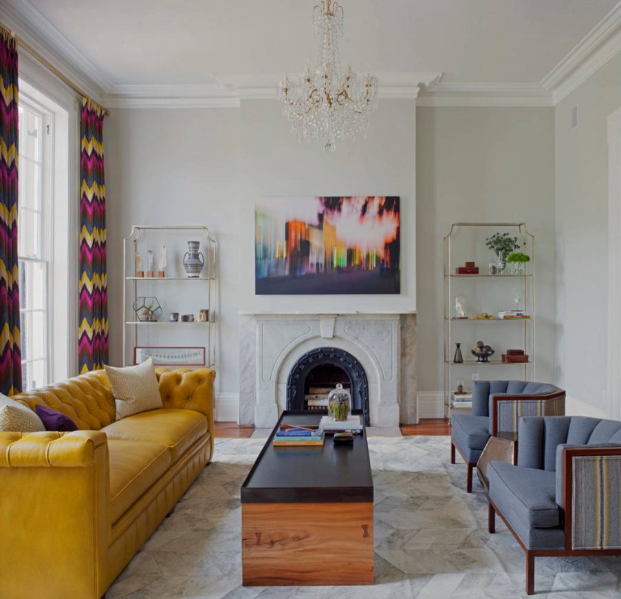
One of Benjamin Moore’s most well-known gray paint colors is called Gray Owl. Gray Owl seeks more acceptance from the majority; hence, it makes sure its priority is to please the crowd rather than improve its features. It simply needs widespread acceptance. Gray Owl is a medium- to light-neutral gray.
The paint’s hue is similar to the owl’s actual coloration. In the Benjamin Moore Paint Deck, Gray Owl seems to be a neutral gray with the perfect blend of warm and cool tones. It’s crucial to keep in mind that paint colors appear very differently on your room’s walls after being applied.
Sherwin-Williams Reflection Benjamin Moore Version
Although Benjamin Moore doesn’t carry Sherwin-Williams Reflection, you can still buy painted products with a comparable tone, such as Stoning Gray and Coventry Gray Owl.
How Does Light Affect the Color?
Light does not affect Sherwin-Williams Reflection whether it is natural or artificial. The light has an ineffective stance as regards this color. Hence, it is fundamental to first analyze the amount of natural light. No matter how much light your space receives, Sherwin-Williams Reflection will always have a tendency to brighten the appearance.
Since Sherwin-Williams Reflection is a gray-blue tone with a 66 LRV, it reflects light rather than absorbing it. So, in direct sunlight, you’d typically get a light tone with blue undertones. But this color appears very differently in various settings facing various compass directions.
Since the blue undertone is so faint, the color tends to lean more toward its gray side, earning it the designation of “true gray” paint.
Best Rooms to Paint Sherwin-Williams Reflection
The best thing about Sherwin-Williams Reflection is that it blends in with any interior home design. Due to its blue undertone, it functions as gray tones. It can be used in all areas of your house, including the living room, kitchen, bedroom, bathroom, laundry room, garage, and movie room.
Sherwin-Williams Reflection Bedroom
Sherwin-Williams Reflection paint has a light and cool quality that is sufficient to pique interest while being bright enough to keep things interesting, making it ideal for fans of light, cool spaces. Gray replicates the skies, which psychologically induce a sense of peace, coolness, and relaxation in its surroundings.
After a long day at work, where better to paint gray than your sleeping quarters? Despite the color’s intrinsic lightness, the right-facing light will reflect its cool blue undertone in a light enough manner.
The pigment also serves as a fantastic anchor for other coordinating or complementary tones. You are aware of the miracles this hue can perform in your environment because you have seen the color schemes above
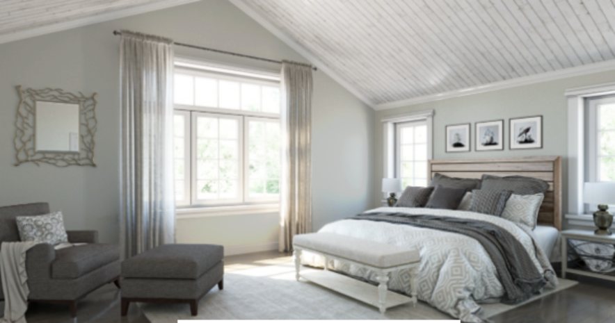
Light, cool colors are frequently used in living rooms. There is no concern that the bright undertones will suddenly emerge because the shade keeps its color. This style works best in a man cave, game room, or bachelor pad.
While there is an incoming flow of lightning, the Sherwin-Williams Reflection paint has a subtle personality without being understated in your space. A brighter color scheme must be used to design the room if you want to make it feel lighter.

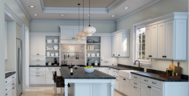
Sherwin-Williams Reflection Kitchen
Paint your kitchen with Sherwin-Williams Reflection, especially if you love cooking. It is a cool, warm, and light-toned gray that gives shiny arrays to the kitchen.
Cool colors evoke hunger in people; hence Sherwin-Williams Perfection colors make one want to eat more.
Use of Sherwin-Williams Reflection should be used in large quantities in your kitchen.
Sherwin-Williams Reflection Bathrooms
Visiting a spa is not always possible in one’s life, but creating an environment, especially in one’s own home, to look like one can be fulfilling because you will always have a place to relax after a long day.
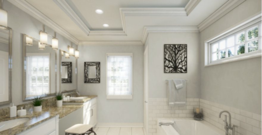
Using Sherwin-Williams Reflection, you can achieve the tranquility of a spa in your bathroom without being clinical. It’s advantageous that this color complements gray or blue undertones, depending on the mood you want to create.
Sherwin-Williams Reflection Exteriors
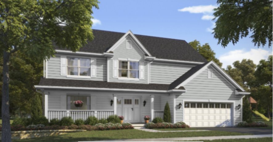
A dull exterior is not appealing to anyone except those who do not value color. Sherwin-Williams Reflection helps your home’s façade have a magnificent sense of tranquility, and the blue-gray color gives it life.
Sampling Sherwin-Williams Reflection
Purchase sample strips and color chips from Sherwin-Williams or use Samplize. The reusable adhesives would spare you the hassle and expense of purchasing a color you wouldn’t like. They are all packaged exactly the same way as liquid paint.
Final Thoughts
As a lover of interior design, the Sherwin-Williams Reflection is one interesting paint shade we know you will have fun experimenting with. It is the ideal gray-blue because it complements a wide range of colors without being stark or sterile like white or black.

