
Sherwin-Williams Rosemary is the company’s color of the month November, and for a good reason. It’s not your typical green that’s bright, bubbly, and in your face. Rather it is one of those shades that sneak up on you. I would know because I’ve experienced the same.
The Rosemary is a subtle medium-dark tone that works as well as any traditional neutral paint. Its gray undertone ensures that, and we’ll tell you how. So, keep reading for more tips on the best way to use Sherwin-Williams Rosemary.
Table of Contents
What Color is Sherwin-Williams Rosemary
| Manufacturer | Sherwin Williams |
| LRV | 14 |
| RGB | R 100 | G 105 | B 92 |
| Hex Value | #64695C |
| Color Collections | 2022 Dreamland, 2021 Encounter |
RGB of Sherwin-Williams Rosemary
Sherwin-Williams Rosemary contains Red 100, Green 105, and Blue 92 on a scale of 0 – 255. This RGB Value indicates the degree to which these three colors are mixed into a true black paint to create the Rosemary paint.
This information is helpful when searching for alternatives from other brands, as you’ll learn later. Keep reading.
Light Reflective Value (LRV) Of Sherwin-Williams Rosemary
This paint color has a LRV of 14. The Sherwin-Williams Rosemary is a medium-dark color, meaning it’s not quite pitch black but not bright. It sits between the middle and dark ends of the scale, making it a light-absorbing paint.
How does that work?
Light Reflective Value tells you the extent to which your paint would absorb light (natural and artificial) or mirror it back into its surrounding.
Is it a Warm or Cool Color?
The Rosemary paint is a cool color due to its position on the color wheel. However, this spot also puts it on the brink of warm colors. It produces feelings of calmness and soothing energy in its surroundings. So, with this shade, you get the best of both worlds.
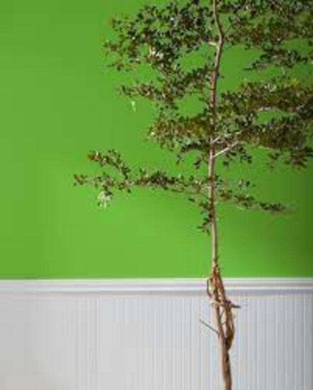
Being a cool color makes it one of the best shades for mixing other colors, and it’s best for houseplant lovers. Check out the undertones below.
What are the Undertones?
On first glance, the Sherwin-Williams Rosemary appears gray because its natural state under dim lights is dull. However, its sage green tone enlivens the room once the light hits it – that’s a timeless color.
Check out the different colors for the undertones.

All pictures sourced from Sherwin-Williams.
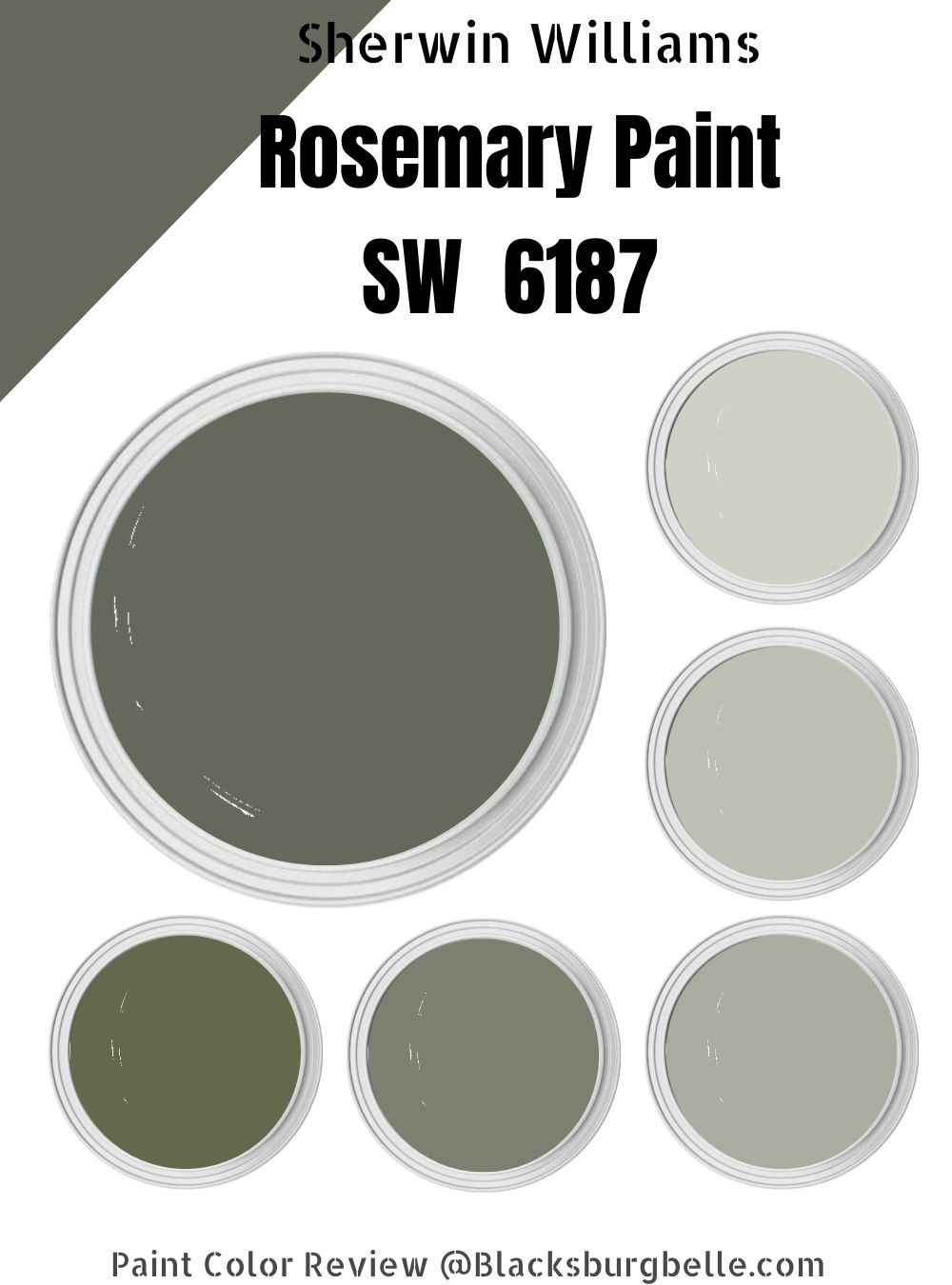
Sherwin-Williams Rosemary Color Strip
The color strip is a group of four to five Colors including the anchor paint ranging from lighter to darker shades. You may choose a strip of darker or lighter colors depending on the vibe you’re going for. See the tables below for Rosemary strips.
Light Color Strip
| Color Code | Color Name | Location Number | Color Tone |
| SW 6183 | Conservative Gray | 215-C1 |  |
| SW 6184 | Austere Gray | 215-C2 |  |
| SW 6185 | Escape Gray |  |
Dark Color Strip
| Color Code | Color Name | Location Number | Color Tone |
| SW 6186 | Dried Thyme | 215-C5 |  |
| SW 6179 | Artichoke | 213-C5 |  |
| SW 6180 | Oakmoss | 213-C6 |  |
Sherwin-Williams Conservative Gray (SW 6183)
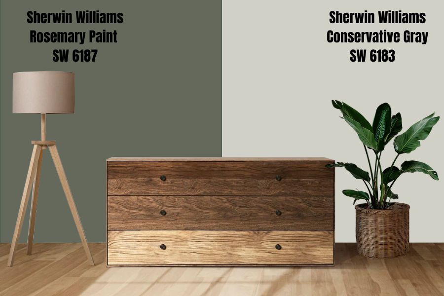
The Conservative Gray is a bright gray color with green undertones; hence it’s considered a gray-green. It has a 63% LRV and is excellent for indoor and outdoor painting. When you think of this color, imagine a resort meant for recharging.
Sherwin-Williams made it so that its primary shade is gray, but under the suitable lighting condition, you’d get a subtle green peeking out. It’s not your everyday gray with white undertones, which makes it unique because who wants dull wall paint?
Sherwin-Williams Austere Gray (SW 6184)
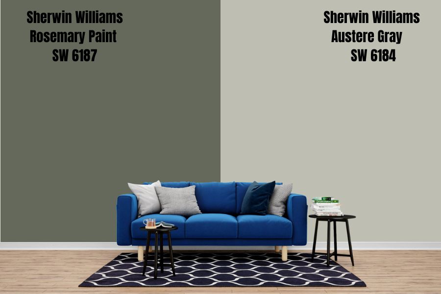
With Sherwin-Williams Austere Gray, the green undertone is more visible than in the Conservative Gray. Like the latter’s name suggests, it’s subtle and meant for people with reserved taste in decoration.
On the flip side, Austere Gray is a severely neutral tone sitting in the center of the LRV scale at 51. This color is a top choice for spaces with a stern vibe since it has no glaring undertones. You can pair it with shades of white, bronze, brown, and other neutrals.
You can trust it to stay the same shade in light and dim surroundings.
Sherwin-Williams Escape Gray (SW 6185)
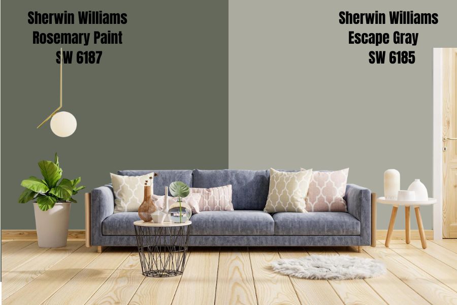
Sherwin-Williams Escape Gray is the color you choose when you’re undecided between two neutrals. It’s a medium-dark tone whose sage green only occasionally comes out.
It’s lighter than Rosemary but with less green content. Light other shades in this strip, Escape Gray pairs well with variations of white, darker grays, and different bright colors within its coordination.
Sherwin-Williams Dried Thyme (SW 6186)
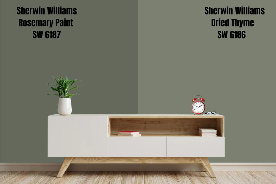
Although it doesn’t look like it, Dried Thyme is green, well, green-gray. The leans towards dark at 21% LRV, but it’s not one to overwhelm your space.
This green does well with other colors like pastel tones and whites because its high percentage LRV would complement its porous nature.
Sherwin-Williams Artichoke (SW 6179)
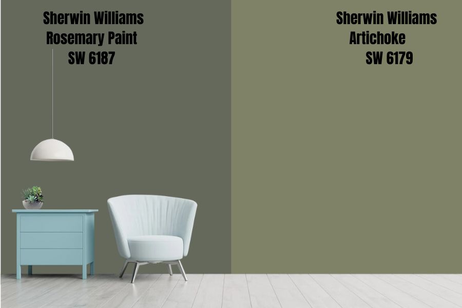
Artichoke is a dusty gray-green shade with a dominant green tone than gray. This color is overpowering, so think deeply before settling on it. It looks like the plant that inspired its name.
That’s saying Artichoke is a biased neutral that selects the colors you mix it with if you don’t want your home to look like a circus.
Sherwin-Williams Oakmoss (SW 6180)
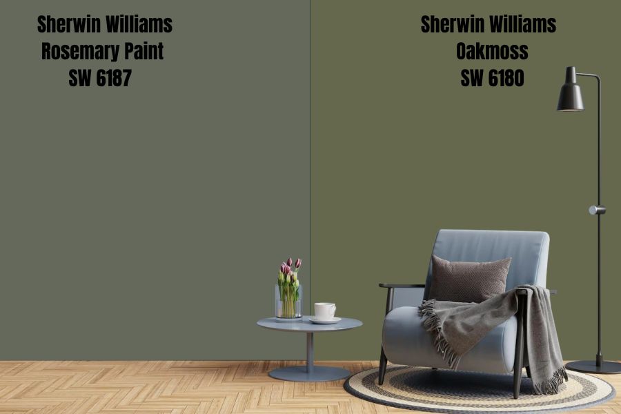
Sherwin-Williams Oakmoss is a solid green paint with a 13% LRV, meaning it’s highly light-absorbent. However, it still has tinges of gray that seep out underneath a bright light.
Oakmoss gives a military vibe, so it’s not the best for your interior walls unless you don’t mind dark tones. The color works best as an accent or highlight, and it stands out when you use it in bits rather than on a large expanse.
If you must use Oakmoss in bulk, it’s best outdoors or anywhere you’d love to retain heat.
Sherwin-Williams Rosemary
This color is versatile because of its character making it an excellent choice for all types of painting, from furniture to walls, accents, trims, and highlights. It’s the tone you choose when you want something historic and modern.
Sherwin-Williams Rosemary Color Palette
There’s a reason Rosemary is Sherwin-Williams’ color for November 2022, and you’re about to find out. This color is an adventurous neutral, meaning you can play with it and explore your creativity to its fullest extent.
Coordinating Colors for Rosemary
The next most important decision to make after choosing your primary paint is the secondary colors to pair with it. You have three main options – Monochrome, Contrast, or Complementary colors. Here’s the exciting part of decorating – coordination.
It’s okay if you don’t know what those mean. That’s why you’re here.
Monochrome Decoration
One color for everything in the house is better than it sounds, and here’s how – gradients. Yes, monochrome decoration is beautiful, but it only works when you know how to use shades. This means you shouldn’t buy everything, Rosemary because that’s your anchor color.
Instead, learn the art of gradation by adding white or black in measured bits to see other shades of green related to Rosemary. Again, it’s not about mashing up all shades of green you find but the right ones.
Pro Tip: Use the Color Strip.
What you’re doing here is to find colors within Rosemary’s range, and with the table already provided above, you have a cheat code. Here’s a quick recap of green hues that work with Sherwin-Williams Rosemary;
- Austere Gray
- Escape Gray
- Conservative Gray
- Dried Thyme
- Oakwood
- Artichoke
Other shades of green that work with Rosemary include Cast Iron, Pewter, Basil, Succulent, and Thunderous. You’ll learn more about these below. Stick around.
Contrasting Decoration
Remember how I said you should avoid throwing colors together and turning your space into a circus? Well, Contrast Décor is about using the right opposite hues to create a sane yet creative space.
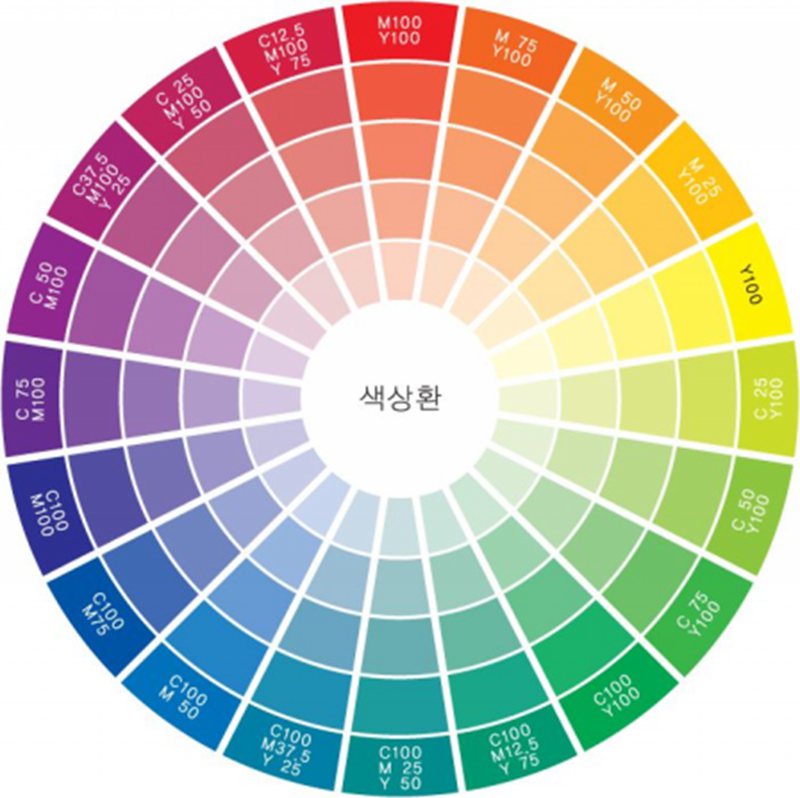
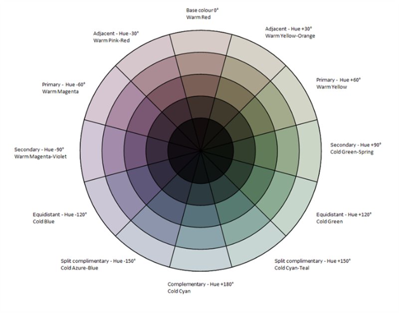
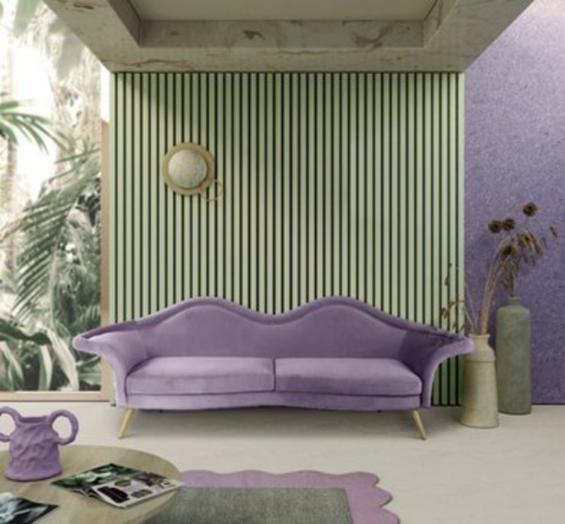
Contrasting works for people who believe variety is the spice of life. For this bit, you need a color wheel. It’ll help you find the colors opposite Rosemary or, in this case, green, and the answer is purple.
Because Rosemary is a unique shade of green, you have to find shades of purple with high LRVs for balance. Look out for Sherwin-Williams Spangle, Polite White, Elation, Inspired Lilac, Dreamy White, Lite Lavender, Gorgeous White, and Wallflower.
Rosemary Complementary Colors
Complementary colors produce a grayscale (Black or White) tone when mixed. For green, that tone is Red and, in this case, a subtle red leaning towards orange.
Pro Tip: Choose Rust or Brown Undertone Reds and Oranges.
Ensure you get the right Reds to avoid forever making your space look like Christmas. Here’s some inspiration for you – Pink Shadow, Crystalline, Nearly Peach, Unfussy Beige, Rosebud, Romance, and Simplify Beige.
For orange, my top picks are – Blushing, Lightweight Beige, Touch of Sand, Inviting Ivory, Townhouse Tan, Creamery, and Pueblo.
When you browse Rosemary décor inspirations, you’ll notice most people used it with brownish orange woods and shades of white, and for a good reason. Scroll down for pictorial references.
What Trim Colors Go With Sherwin-Williams Rosemary?
Choosing your desired trim color depends on your color scheme based on the coordination tips above. Of all the colors given, here are the top choices with reason;
Monochrome Trims
Use light tones like Austere Gray and Conservative Gray because the lightness would ensure the trim stands out against the dark Rosemary hue.
Contrasting Trims
Dreamy White, without question, would highlight your Rosemary wall. It’s a subtle color, so there’s no case of competing with your primary hue for presence.
Yes, that’s a thing. The tone would also tamper with the authoritative aura of Rosemary.
Complementary Trims
Find colors that highlight Rosemary’s hues without fading into its aura or overshadowing it. Go for Townhouse Tan if you have wooden floorboards, and Simplify Beige if you’re working with tiled floors.
Sherwin-Williams Rosemary Color Comparisons
As unique as Rosemary by Sherwin-Williams, there are similar colors that can either throw you for a loop or serve as the best alternatives in emergencies. This section will help you decide whether to keep them or skip them. Let’s Go.
Sherwin-Williams Rosemary vs. Sherwin-Williams Pewter Green (SW 6208)
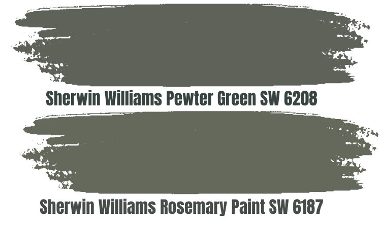
Pewter Green is one of the closest alternatives to the Rosemary you’ll get from Sherwin-Williams, although it has a deeper hue. The color has an overbearing gray undertone but is excellent in the Winter.
It does great with shades of white and lighter grays, but not with Rosemary. If you ask me, you’ll get a case of similar-looking “siblings” if you do – a waste of double paints. For Pewter Green, it’s strictly either or none.
Sherwin-Williams Rosemary vs. Sherwin-Williams Basil (SW 6194)
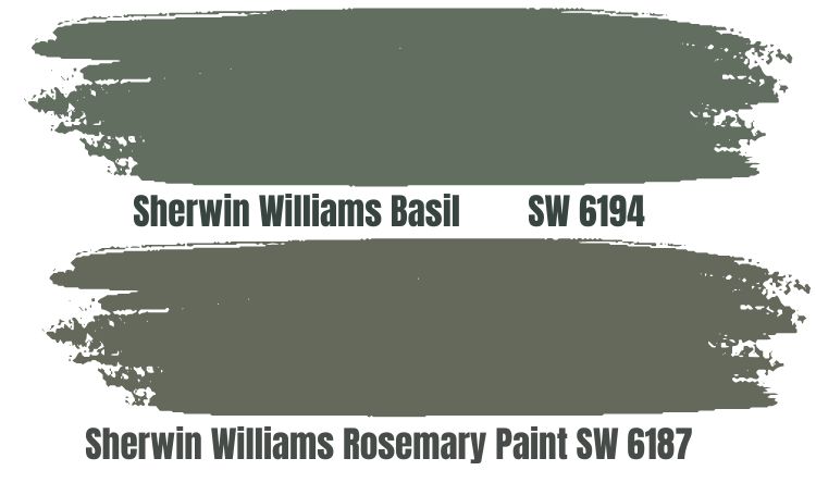
Basil is another very close alternative to Rosemary, with a dominant green tone. It gives you a military vibe and blends with brown hues and undertones. It’s an equally dark color, so using them together is a no. Again, that’s a waste of variety.
It’s only one percent darker than Rosemary by LRV but, in reality, shines brighter than it.
Sherwin-Williams Rosemary vs. Sherwin-Williams Cast Iron (SW 6202)
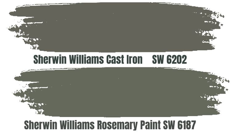
With Cast Iron, we’re still on the subject of worthy alternatives, and it fits the bill. The appearance is duskier than Rosemary, thus giving more prominence to its gray than green. It’s an excellent interior wall paint if you balance it with bright furniture.
Otherwise, use Cast Iron for your exteriors to avoid ruining the mood and casting a permanent gloom in your space. You can use it as an accent wall against a brighter hue like Smoky Salmon (red undertones), Frosty White (violet undertones), and Champagne (yellow undertones.)
Sherwin-Williams Rosemary vs. Sherwin-Williams Succulent (SW 9650)
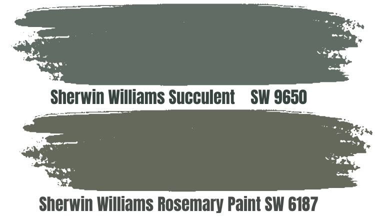
Succulent gives your space a rustic and refined look, and it’s a special paint from the Emerald collection by Sherwin-Williams. It’s a silver gray with green undertones and a low LRV at 14%, like Rosemary.
Its dominant gray tone brings a dusky starless sky into a confined space, and with the right complementary colors in furniture, you’re in for a surprise. Pair it with lighter tones, double its LRV percentage, and above to thrive like Egret White.
Rosemary Benjamin Moore Color Comparison
So, you’ve searched the web and stores near you only to discover there’s no Sherwin-Williams Rosemary or any of the above alternatives. Do you give up on your dream of a gray-green color scheme? No. You will find similar colors from Benjamin Moore.
Why Benjamin Moore? Because it’s the closest brand with the same high-quality paints in America. You don’t have to settle for less. Check out these BM hues.
Misted Green (2138-50)
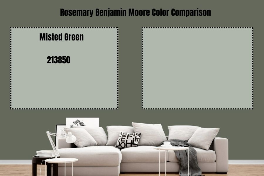
Misted Green by Benjamin Moore knocks gray-green out of the ballpark because it’s a light-toned gray with hints of mint green underneath its surface, begging for release.
It works as a trim or accent wall for Rosemary if you want to coordinate monochrome tones. Otherwise, the bright sage green hue is a great option to brighten your space and invite a relaxing aura.
Rushing River (1574)
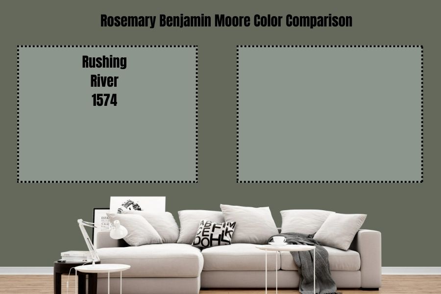
Rushing River is the traditional green-gray with a predominant green hue and shadowy gray undertone. Use this color to bring a constant natural aura into your space and spruce it up with wood containing yellow or red undertones.
Carolina Gull (2138-40)
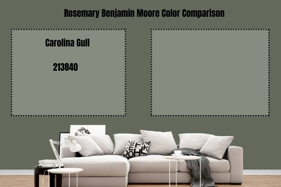
Carolina Gull gives you a warm green tone with a matching gray undertone, and it’s a suitable medium-dark option.
It sits conveniently between 2 and 50 at 27.41% LRV, so you’re guaranteed a shade dark enough to stay subtle and light enough not to ruin the vibe.
Rainy Afternoon (1575)
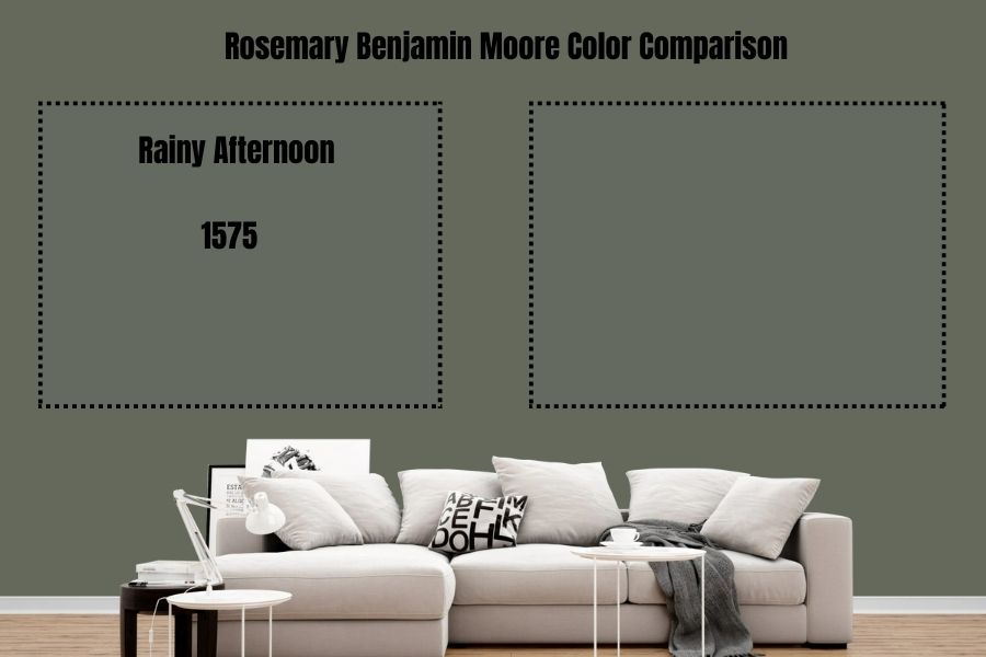
Who thinks of these names? Whoever chose Rainy Afternoon for this green-gray color was spot on because it mimics the vibe of a rainy sky in the early evening and later noon.
The green is as transparent as that of Rosemary’s yet blends seamlessly with its gray component. It’s a relaxing shade guaranteed to bring a calm vibe into your space. Try it out.
Rosemary Benjamin Moore Version
Benjamin Moore has two Rosemary shades, one closer to Sherwin-Williams’ design and the other veering away from gray-green towards the common forest green. Check them out below.
Rosemary Sprig (2144-30)

Rosemary Sprig by Benjamin Moore is close to Sherwin-Williams’ version but leans more into its warmth than coolness. It has a higher percentage of LRV – 34.83, almost triple its counterpart’s reflective value.
Only choose this color if you want more of its green tone than the dusky gray undertone.
Rosemary Green (2029-30)
Rosemary Green is worlds apart from the cool, calm, and collected sage shade as it embraces the traditional bright tone of the forest green we all know. It’s a warm tone thanks to its yellow undertone giving it the appearance of a healthy herb garden.
If you’re into nature aesthetics, then go for it; otherwise, stick with Sherwin-Williams’ Rosemary version.
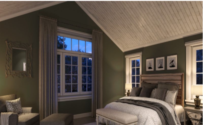
How Does Light Affect the Rosemary (SW 6187) Color?
Your LRV knowledge is handy here because the proper placement gives the best version of your paint. Use a compass for this part as you decide what energy you want from Rosemary.
Use Rosemary under a West-facing light for a warm tone (the small part on the brink of the color wheel). If you want its brooding gray undertone to thrive, use the paint in a north-facing light.
Don’t fret if your home already has the “wrong” natural light; you can create your chosen vibe with LEDs or bulb lights.
Best Rooms To Paint Rosemary
You’ve learned so much about Rosemary; it’s time to put it into action but before doing that, check out these pictorial references to know where and where not to use this color. Before you continue, remember the vibe it brings is vintage reimagination and charm.
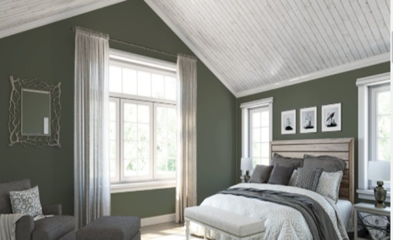
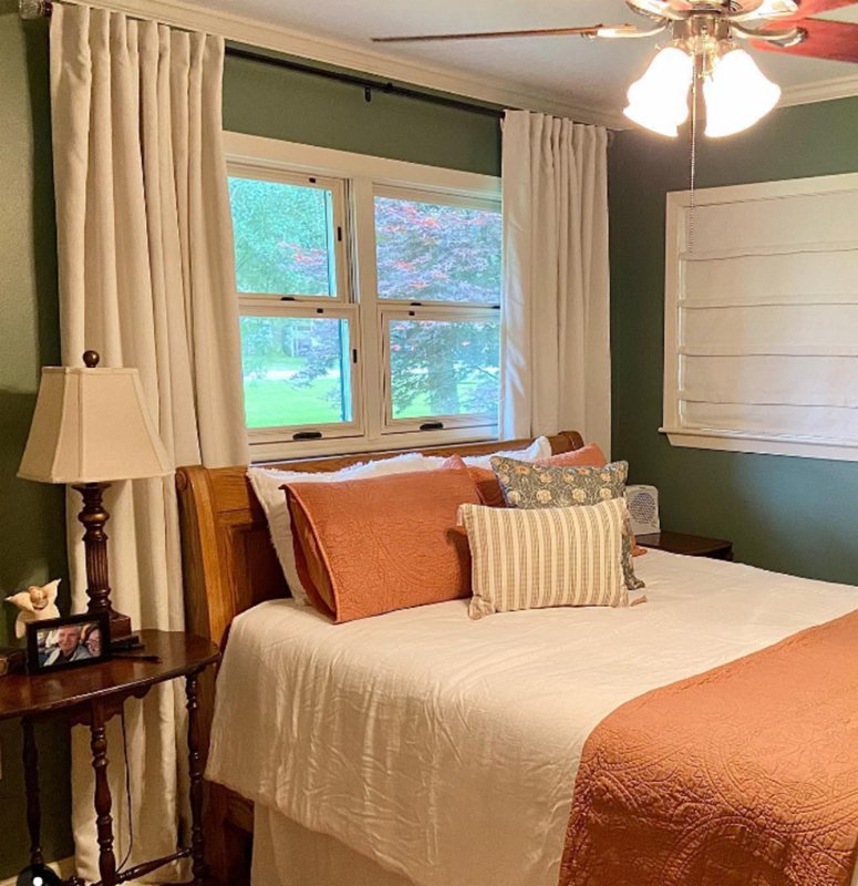
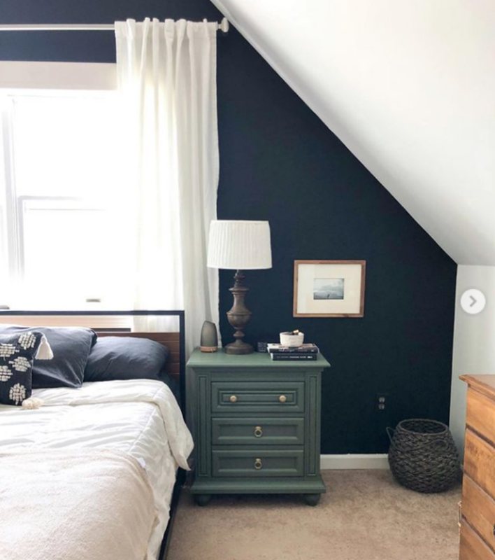
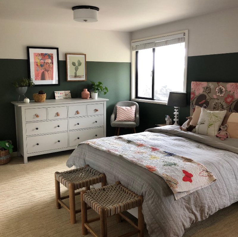
Rosemary Bedroom
Walls, dressing tables, credenzas, wardrobes, and any other bedroom furniture look good in Rosemary. Your sleeping area should be your sanctuary since you lay your head at the end of a filled day.
Using it as wall paint is also a good idea since other furniture materials will blend seamlessly with the tone giving your room a modern retro vibe.
Paneled Bedroom Walls Painted Rosemary

Rosemary Painted Wall with Contrasting Tones
Rosemary Side Cabinet Against a Naval Wall
Rosemary Wall Paired with a White Highlight
Nursery with Rosemary-Painted Paneled Walls

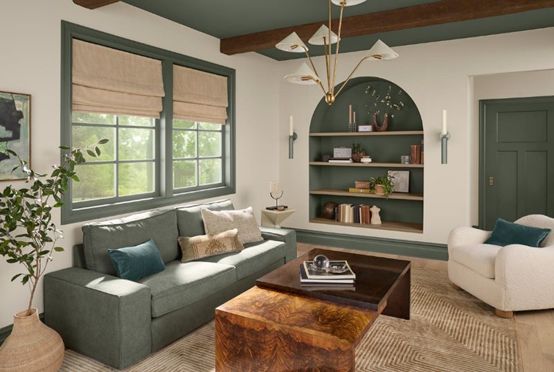
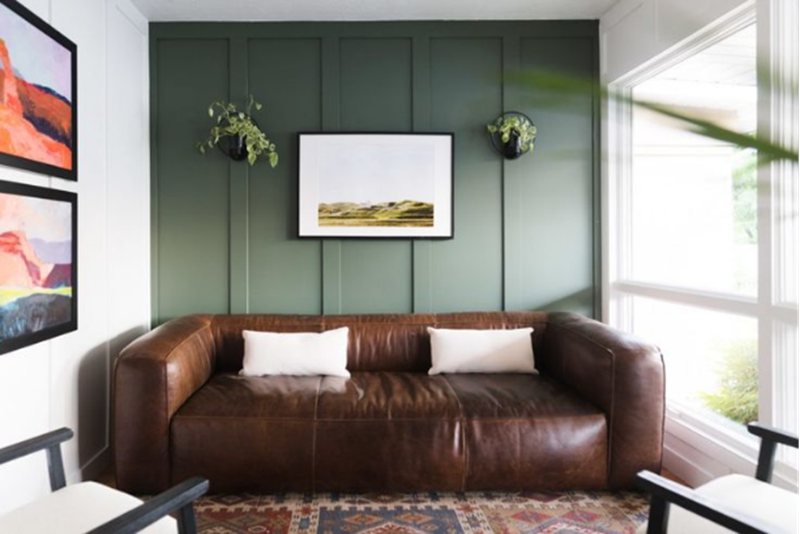
Rosemary Living Room
Peace, Tranquility, Soothe, and a balance between retro and modern décor are a few words to describe Rosemary in a living room. However, it works best with natural light, so you’d get both tones depending on the time of the day.
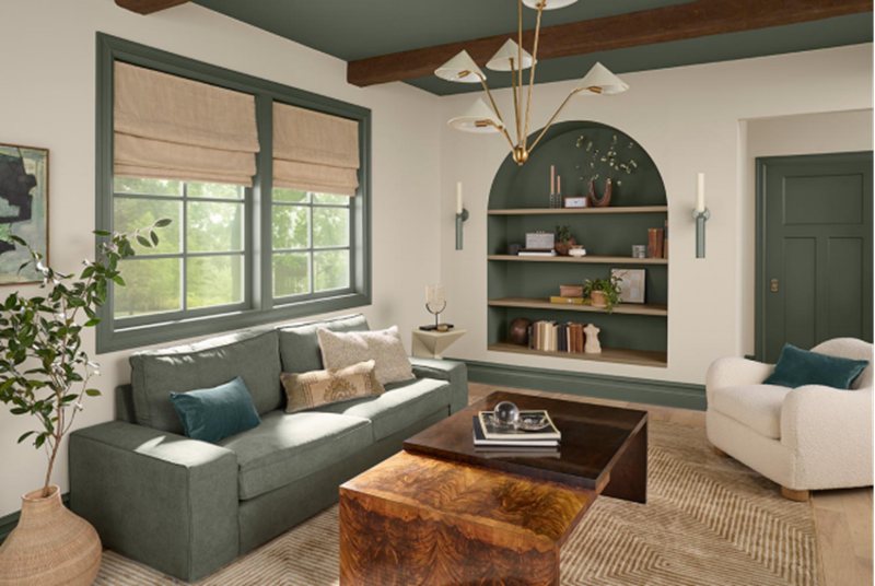
Rosemary and White Living Room
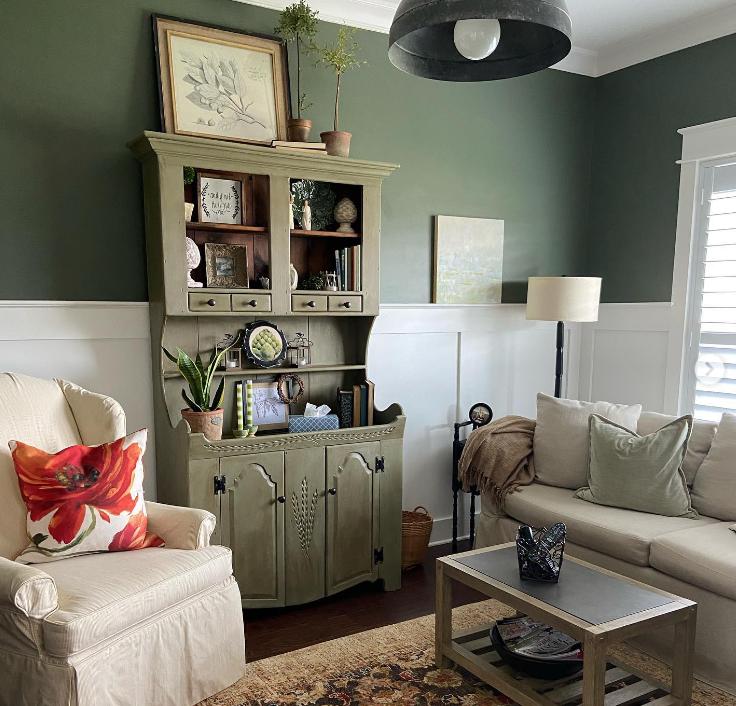
Rosemary Walls with Gray and Wooden Furniture
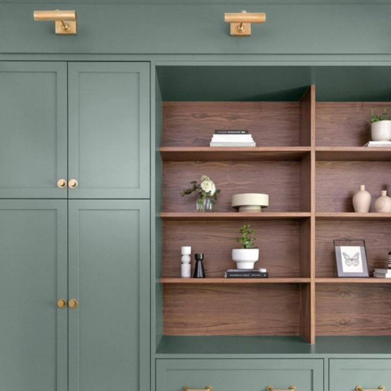
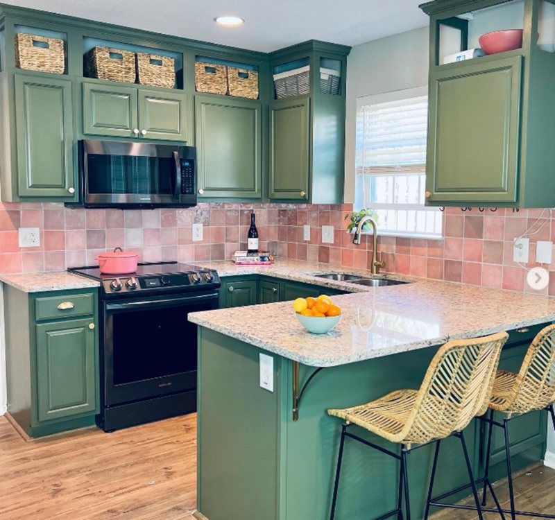
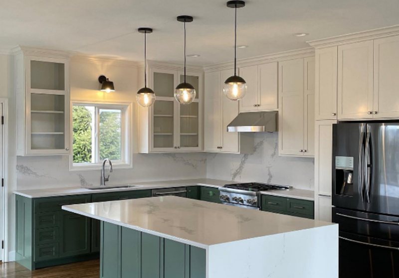
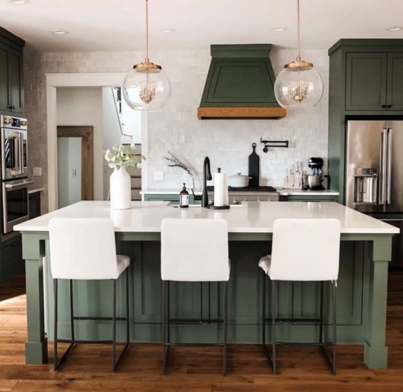
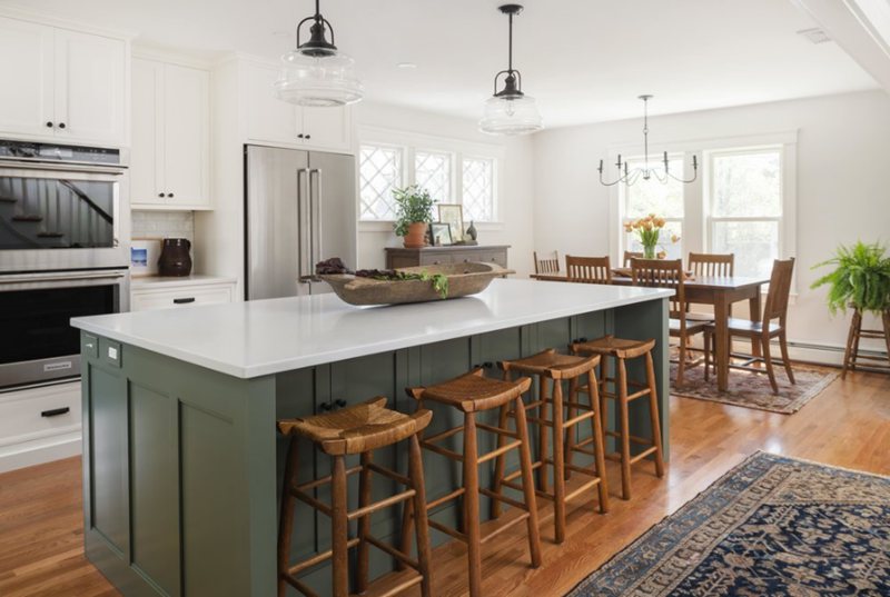
Rosemary Kitchen
Rosemary does very well on cabinets because it blends with typical kitchen materials like marble, wood, brass, gold, and silver. You can also paint your pantry door with this earthy tone and spruce up your kitchen.
Kitchen Island and Cabinets Painted Rosemary
Island and Floor Cabinets Mixed with White Wall Cabinets
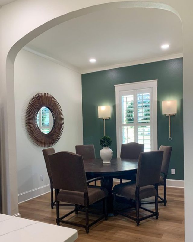
Rosemary Dining Room
The dining room is more than an eating space as it often sets the tone for the rest of the day in the morning, so say yes to using Rosemary in the area. You may paint your dining table, chairs, or both with the color of the walls and fit in wooden furniture.
Half-Wall Painted Rosemary as a Highlight
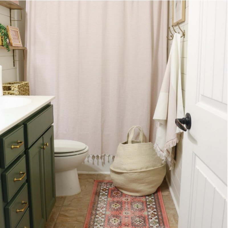
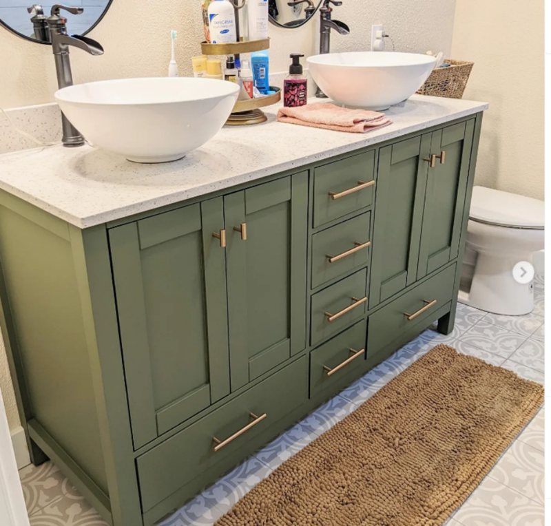
Rosemary Bathrooms
Bathrooms and laundry rooms come alive with Rosemary walls or furniture, depending on the aura you want. Use it on the walls if you want a relaxed vibe in the space, or reserve it as an accent if you’re only interested in highlighting a bright color like white.
A Bathroom Cabinet Painted Rosemary
Bathroom Cabinets Painted Rosemary with Brass/Gold Accessories
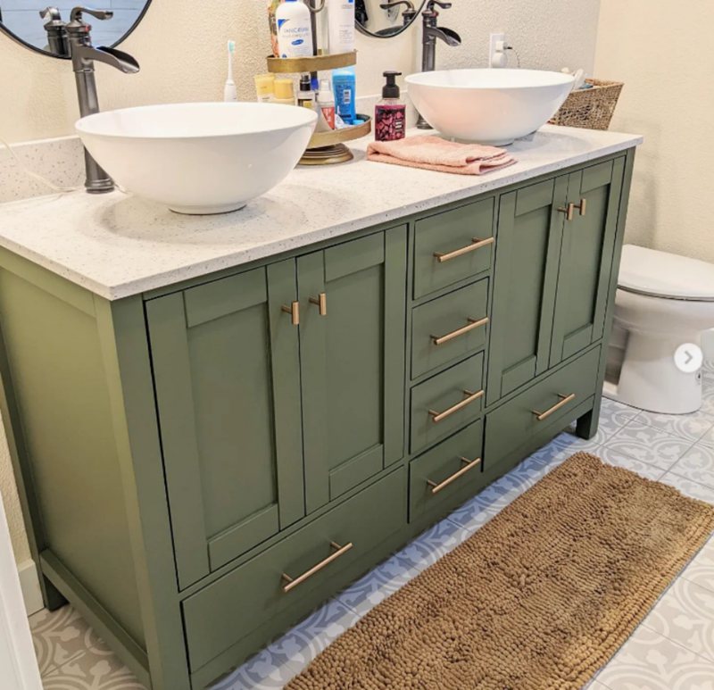
Bathroom wall-painted Rosemary with wooden cabinets, a white sink, and gold accessories
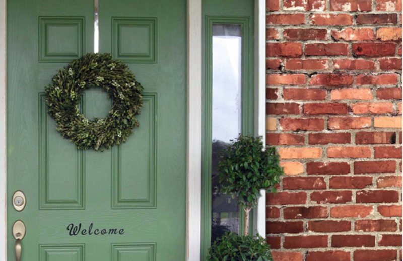
Rosemary Exteriors
Merge a brick wall with Rosemary wall paint and you won’t regret it. If you’re into greenery, using this color is a bonus because it is a good backdrop for the flora of all kinds. You’d never worry about the flower colors disturbing the aesthetic.
Under a dusky light, the color’s gray undertone overcomes its sage green. You can also use Rosemary for paneled walls if you prefer a modern vibe for your exterior.
Paneled Walls Painted Rosemary

Masoned wall paired with Rosemary accents and wooden door

Sampling Rosemary
Get Color chips or Peel & Stick strips from Sherwin-Williams for a visual representation of your paint before committing to it. I’ll warn you for free that it’s never the same on paper as in real life despite what the company says – it’s a close match, though.
The closest you can come to the exact thing is using a Color-to-Go pant sample. It’s liquid, so that you can have a real-time effect on your desired surface.
Final Thoughts
Get the certified color of the month, Rosemary to create a modernized vintage aura in your space be it interior or exterior. You won’t regret the choice. Don’t forget to use the tips in this guide to create the perfect blend.
Remember coordination is as important as choosing the anchor color. Your three options remain, Contrasting, Monochrome, and Complementary Designs. Share your pictures once you’re done.
 Sherwin Williams Sea Salt (Palette, Coordinating & Inspirations)
 Sherwin Williams Agreeable Gray (Palette, Coordinating & Inspirations)
 Sherwin Williams City Loft (Palette, Coordinating & Inspirations)
 Sherwin Williams Colonnade Gray (Palette, Coordinating & Inspirations)
 Sherwin-Williams Retreat (Palette, Coordinating & Inspirations)
 Sherwin Williams Greenblack (Palette, Coordinating & Inspirations)
