
Noisy spaces can be off-putting when you need to relax after a tough day. However, did you know you can make your room more relaxing by choosing the right paint color?
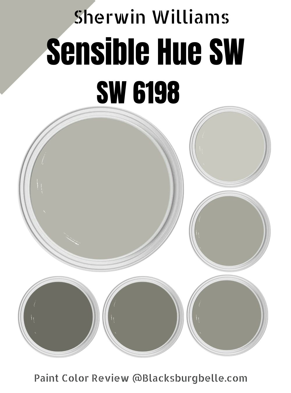
Sherwin Williams Sensible Hue is a paint color that brings quiet energy to your space. This rich gray hums with life, while the hints of green offer a vitality uncommon to most neutral paint colors. Moreover, natural, earthy Sensible Hue SW 6198 fits in easily with other paint colors, allowing you to create a look that stands out.
If you have landed on this page, you are probably new to Sherwin Williams Sensible Hue. Therefore, my focus in this detailed guide will be on helping you understand this beautiful shade of gray that brings a cool sense of calm to your room. Let’s dive in!
Table of Contents
What Color is Sherwin Williams Sensible Hue?
| Manufacturer | Sherwin Williams |
| LRV | 46 |
| RGB | R: 182 G: 181 B: 171 |
| Hex Value | #B6B5AB |
| Color Collections | Finest Whites & Neutrals (Cool Neutrals), Living Well (Unplug), Color ID (Nurturer) |
Sherwin Williams Sensible Hue is a gray paint color. The gray, however, is more balanced by a slate of green. In most lighting conditions, you will view Sherwin Williams Sensible Hue as a rich combination of gray and green.
RGB of Sherwin Williams Sensible Hue
The RGB scale runs from 0 to 255 and shows the amount of red, green, and blue that goes into making a specific paint color. Sherwin Williams Sensible Hue combines red: 182, green: 181, and blue: 171.
LRV of Sherwin Williams Sensible Hue
The LRV scale helps interior designers determine the effect different lighting conditions will have on a specific paint color. The scale runs from 0 to 100.
At 0, you will have the purest black shade, reflecting 0% light. At 100, you will have the purest white shade reflecting 100% of light.
Sherwin Williams Sensible Hue lies near the middle on the LRV scale—it is neither too dark nor too light. Sensible Hue SW 6198 boasts an LRV of 46.
Is Sherwin Williams Sensible Hue a Cool or Warm Paint Color?
Sherwin Williams Sensible Hue is a cool paint color. The paint color combines two primary hues—gray and green hues. While gray is a neutral hue, green, on the other hand, is more of a cool paint color. For this reason, the green shade turns Sensible Hue into a cool paint color.
Sherwin Williams Sensible Hue Undertones
Sherwin Williams Sensible Hue has a green undertone. However, the gray and green shades are more balanced in most lighting conditions.
Sherwin Williams Sensible Hue Color Strip: Sherwin Williams Sensible Hue Color Comparisons
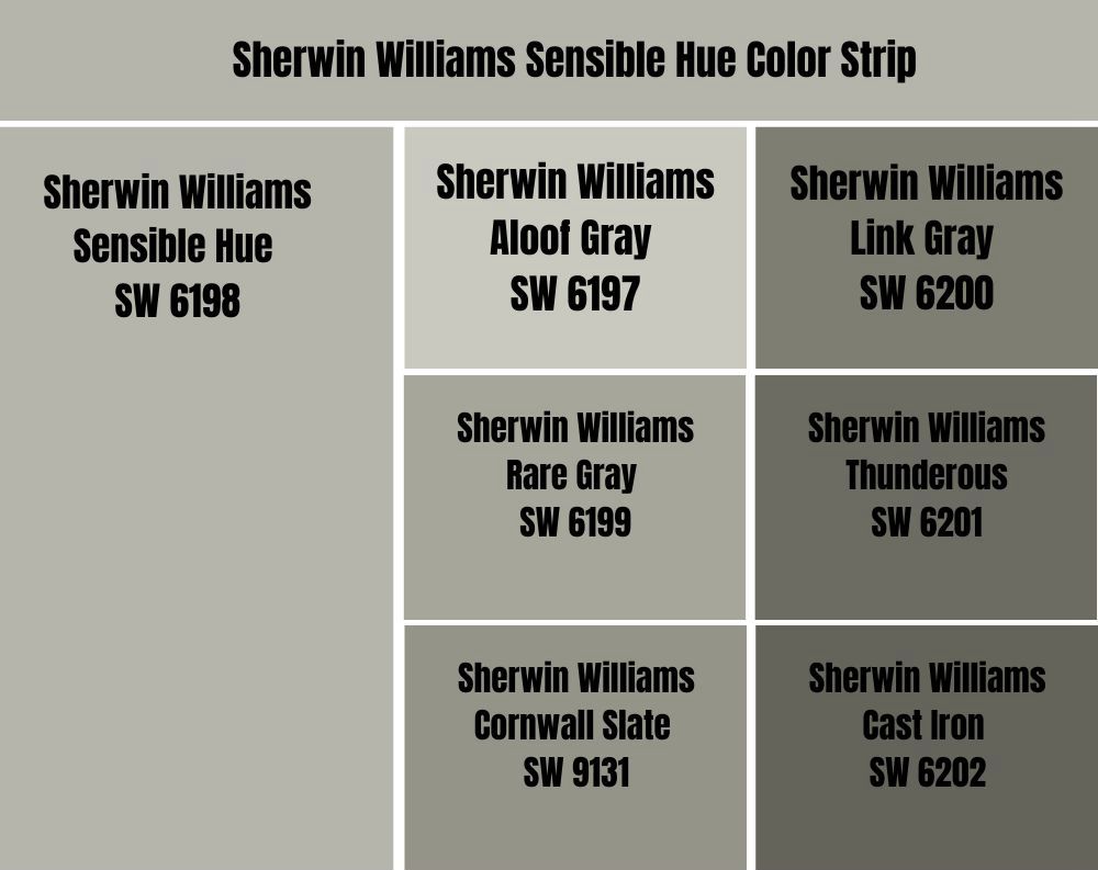
Sherwin Williams Sensible Hue and Aloof Gray (SW 6197)
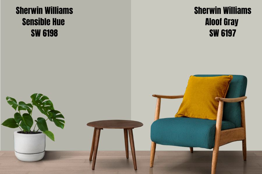
Sherwin Williams Aloof Gray and Sensible Hue match each other in their appearances. Both paint colors boast a combination of green and gray. The two paint colors are on the same color palette—Aloof Gray is a lighter version of Sherwin Williams Sensible Hue.
On the LRV scale, Aloof Gray reflects 58 percent of light. Compared to Sensible Hue, Aloof Gray reflects 12% more light. The two colors, however, are both medium light, meaning they are deep enough to maintain their character and personality in a space with extreme light. However, they may become slightly bland if not in a dim room.
Sensible Hue and Aloof Gray will balance the warmth in your south-facing room. Aloof Gray and Sensible Hue are both cool paint colors. The two colors bring a refreshing, calm mood to any room. They are the perfect paint colors for creating a relaxing environment.
Sherwin Williams Sensible Hue vs. Rare Gray (SW 6199)
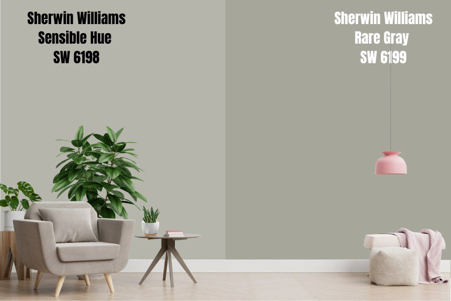
Sherwin Williams Rare Gray and Sensible Hue share the same color shades. Both paint colors boast a blend of green and gray that combines nicely to create comfort. However, Sherwin Williams Rare Gray is one shade darker than Sensible Hue. For this reason, Rare Gray reflects 8% less light, with its LRV of 38.
Sherwin Williams Sensible Hue and Rare Gray are both cool paint colors. This cool feeling results from the green undertone, which balances nicely with the gray shade. Therefore, the two colors will not be the ideal option for a cool room. Rare Gray and Sensible Hue can easily make the room feel icy if it welcomes cool northern light.
However, Sensible Hue and Rare Gray will work well in a room with enough light. Also, the two colors will not shy away from bright light as they are deep enough and do not get washed out. The colors need enough light to avoid losing their character and looking bland.
Sherwin Williams Sensible Hue vs. Cornwall Slate (SW 9131)
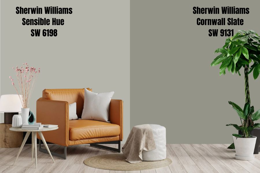
Sherwin Williams Cornwall Slate and Sensible Hue sit on the same color strip. Therefore, the two colors boast similar characteristics.
For starters, these two colors combine green and gray in a more balanced way. However, Cornwall Slate is two shades darker than Sensible Hue. For this reason, Cornwall Slate reflects 17% less light, featuring an LRV of 29.
Both Cornwall Slate and Sensible Hue are both cool colors. They are perfect for making your warm southern-facing room seem more balanced, keeping the warm southern light from making the room uncomfortable.
However, while Sensible Hue brings subtle energy into your room, Cornwall Slate inspires visions of wind-swept, rugged places. Moreover, Cool Slate is more notorious for bringing a nature-inspired and soft vibe—Cornwall Slate is more nature-looking than Sensible Hue.
Sherwin Williams Sensible Hue vs. Link Gray (SW 6200)
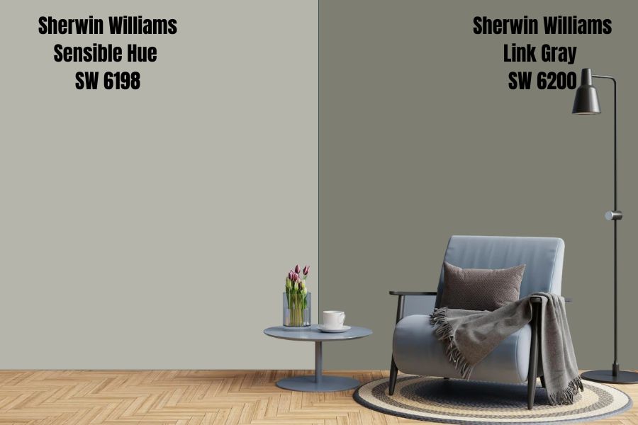
While Sensible Hue has gray as the leading shade, Sherwin Williams Link Gray is the opposite. Link Gray has a deep green color with a heavy slate of gray; green is the primary shade in Link Gray.
The deep green color in Link Gray gives it a natural-inspired look, adding a serene vibe to the room. However, to experience the nature-like feeling in Sherwin Williams Link Gray, you must ensure the room is well-lit. Link Gray has an LRV of 21—the paint color reflects 25% less light than Sherwin Williams Sensible Hue. In a dim room, Link Gray assumes a bland look.
Sherwin Williams Link Gray, like Sensible Hue, has a cool vibe that makes it ideal for south-facing rooms. The cool vibe in these two colors will help you cool down the heat in the southern light.
In northern-facing light, the two paint colors may feel out of place—their cool nature may combine with the cool northern light, making the room feel icy. However, in a north-facing room, you can always reduce the risk of iciness by combining these colors with a warmer option.
Sherwin Williams Sensible Hue vs. Thunderous (SW 6201)
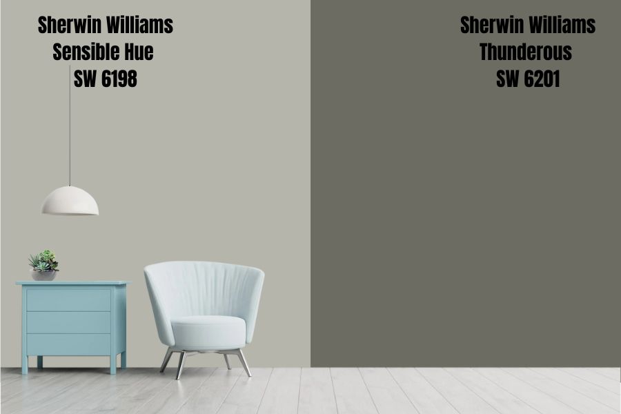
Sherwin Williams Thunderous is another impressive paint color that combines gray and green to create a unique look reminiscent of nature’s depths. Unlike Sensible Hue, which has gray as the leading shade, Thunderous has comforting and deep green as the primary color, with gray serving as the undertone.
Sherwin Williams Thunderous is four shades darker than Sherwin Williams Sensible Hue. Thunderous is a darker gray-green shade with an LRV of 15—the paint color absorbs 85% of light. For this reason, you will want to use Sherwin Williams Thunderous in a room with enough light. Otherwise, using the paint color in a dim room could make Thunderous lose its hue, turning black.
Like Sherwin Williams Sensible Hue, Thunderous combines two cool shades. Therefore, Thunderous is also an excellent option when you need to balance the heat in a warm room. Thunderous will need a warm pairing color in a cool room to keep it from making the room too cold or icy.
Sherwin Williams Sensible Hue vs. Cast Iron (SW 6202)
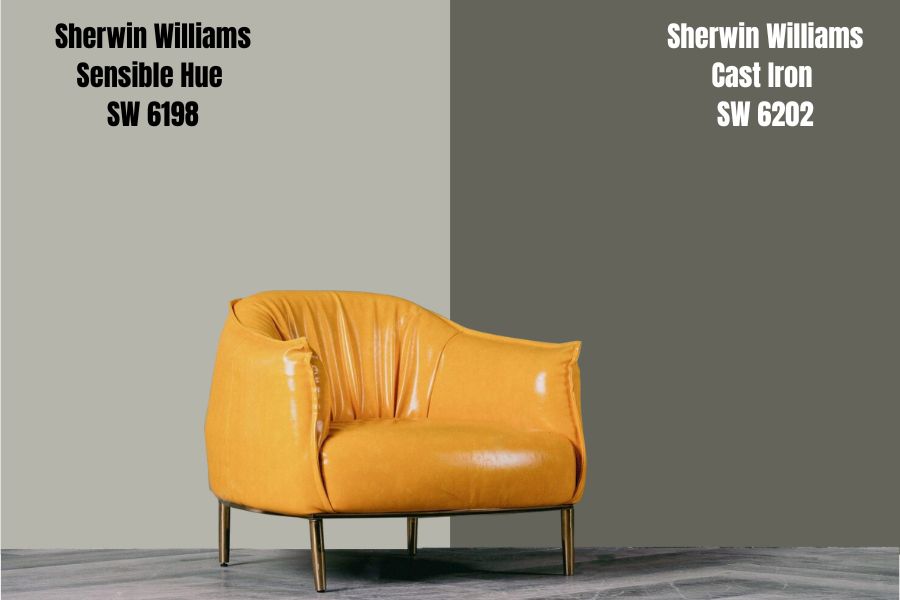
Sherwin Williams Cast Iron is a cool dark green paint color heavily seasoned with a gray slate. While Cast Iron and Sensible Hue share the same color shades, Cast Iron is a darker option that adds rich, saturated flavor to your spaces.
On the LRV scale, Cast Iron boasts 12, reflecting 34% less light than Sherwin Williams Sensible Hue. The lesser LRV is understandable, considering Cast Iron is five shades darker than Sensible Hue. While the darker shade makes Cast Iron a perfect option for rooms with bright light, it could take a darker appearance if your space does not have enough light.
Sherwin Williams Cast Iron is a perfect paint color for warm spaces. The paint color will balance the warmth in southern light, ensuring it is not overwhelming the room. In a north-facing room, you will want to pair Sherwin Williams Cast Iron with a warm color to ensure it does not make your room icy.
Sensible Hue Color Scheme: Sherwin Williams Sensible Hue Palette
Sherwin Williams Sensible Hue is one of the most versatile paint colors. It is one of the easiest paint colors to work with—whether your goal is to create a contrasting or monochromatic look, it is easy to find Sherwin Williams Sensible Hue great accent colors and matching colors.
Below I will show you stand-out coordinating and trimming colors. Moreover, I will go a step further to show you Sherwin Williams Sensible Hue complementary colors. Keep reading to see how you can create an impressive look with Sensible Hue.
Sherwin Williams Sensible Hue Coordinating Colors
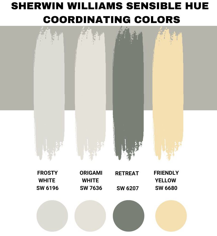
Sherwin Williams Frosty White (SW 6196)
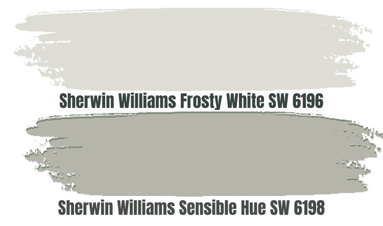
When creating an interior design with Sherwin Williams Sensible Hue, one of the main concerns is the amount of light in the room. Using Sensible Hue in a dim room increases the risk of making the paint color bland. However, combining Sensible Hue and Sherwin Williams Frosty White reduces the risk of creating a bland look with Sensible Hue.
Sherwin Williams Frosty White boasts an LRV of 72. In any room, Frosty White will always reflect 72% of the light on Sensible Hue, ensuring the paint color does not look bland when the light reduces.
It is, however, worth noting that Frosty White and Sensible Hue are not too different. The two colors have a gray undertone that softens them and adds a cool feel. For this reason, these colors will offer the best results if you use them in a warm room. The two colors could make an already cold room feel icy.
Sherwin Williams Origami White (SW 7636)
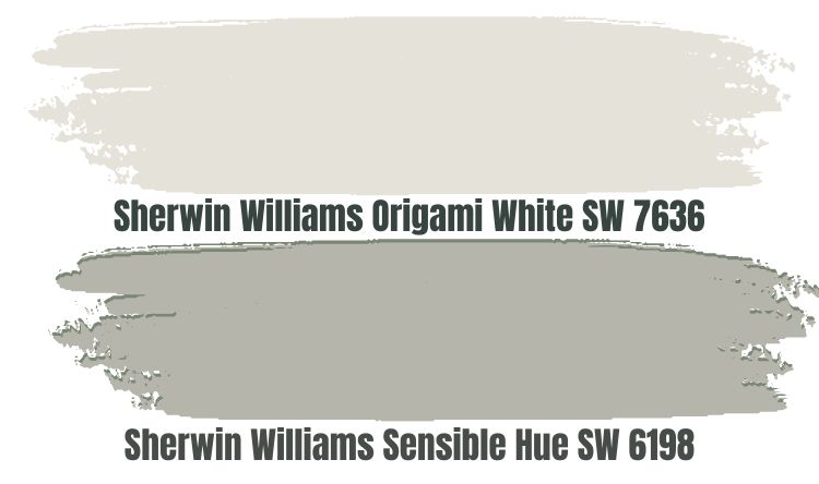
Sherwin Williams Origami White is an excellent option for creating a slightly contrasting look with Sensible Hue. Origami White is a white paint color at heart, as its name suggests. However, it is not 100% white; the paint color has cool violet undertones that add to its contrasting look. Origami White adds a crisp contrast when used in the same room with Sherwin Williams Sensible Hue.
Remember, when you pair Origami White with Sherwin Williams Sensible Hue, you bring two cools together. Therefore, it is advisable to do this in a warm room—for example, a southern-facing room. When combined with the coolness in Origami White and Sensible Hue, the cool light in the north-facing room will make your space feel too cold.
If your room is dim and you are worried Sensible Hue will look bland, pair it with Origami White. Origami White brings an LRV of 76 into your space, reflecting enough light onto Sensible Hue and allowing it to maintain its character and personality.
Sherwin Williams Retreat (SW 6207)

Sherwin Williams Retreat (SW 6207) is an ideal option for interior designers going after a monochromatic look. Like Sherwin Williams Sensible Hue, Sherwin Williams Retreat has green and gray shades. However, Sherwin Williams Retreat is not 100% similar to Sensible Hue—Retreat has a muted green as the primary tone and blue-gray undertones.
Retreat fills your room with a unique feeling of fresh mountain air. It is an uplifting paint color that works nicely in kitchens, bedrooms, and more. When you combine Sherwin Williams Retreat with Sensible Hue, you can be sure of enjoying style, practicality, comfort, and style. The two colors are calm and relaxing, allowing you to introduce nature into your indoor spaces.
However, Sherwin Williams Retreat boasts an LRV of 21. Therefore, when pairing it with Sensible Hue with its LRV of 46, ensure the room has enough light. Otherwise, you may end up creating a bland look unintentionally.
Also, it is essential to note that these two colors are cool. Therefore, use them in a room with enough warmth—this will help you avoid creating an icy feeling.
Sherwin Williams Friendly Yellow (SW 6680)
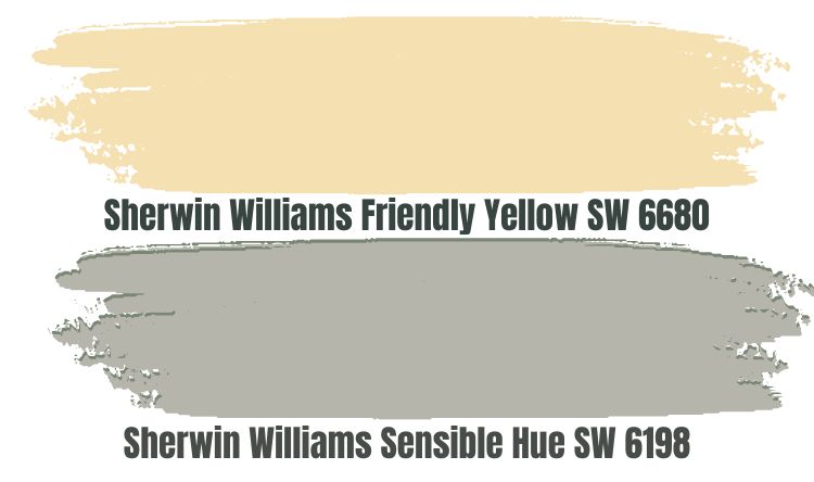
All the Sherwin Williams Sensible Hue coordinating colors we have discussed so far are cool colors that allow you to create a monochromatic look. Right now, you may be wondering whether there are options that let you create a contrasting look while adding some warmth to balance the cool in Sherwin Williams Sensible Hue.
Well, have you tried Sherwin-Williams Friendly Yellow? Friendly Yellow is a warm yellow paint color, just like its name suggests. The paint color goes beyond adding warmth, sunshine, and friendliness to create a happy environment.
One of the reasons I love using muted yellows like Friendly Yellow with gray greens like Sensible Hue is that the yellows bring a cozier feel into the room. Friendly Yellow also features an LRV of 76. The paint color ensures your Sensible Hue always has access to enough light to keep it interesting, even in dim lights.
Sherwin Williams Sensible Hue Complementary Colors
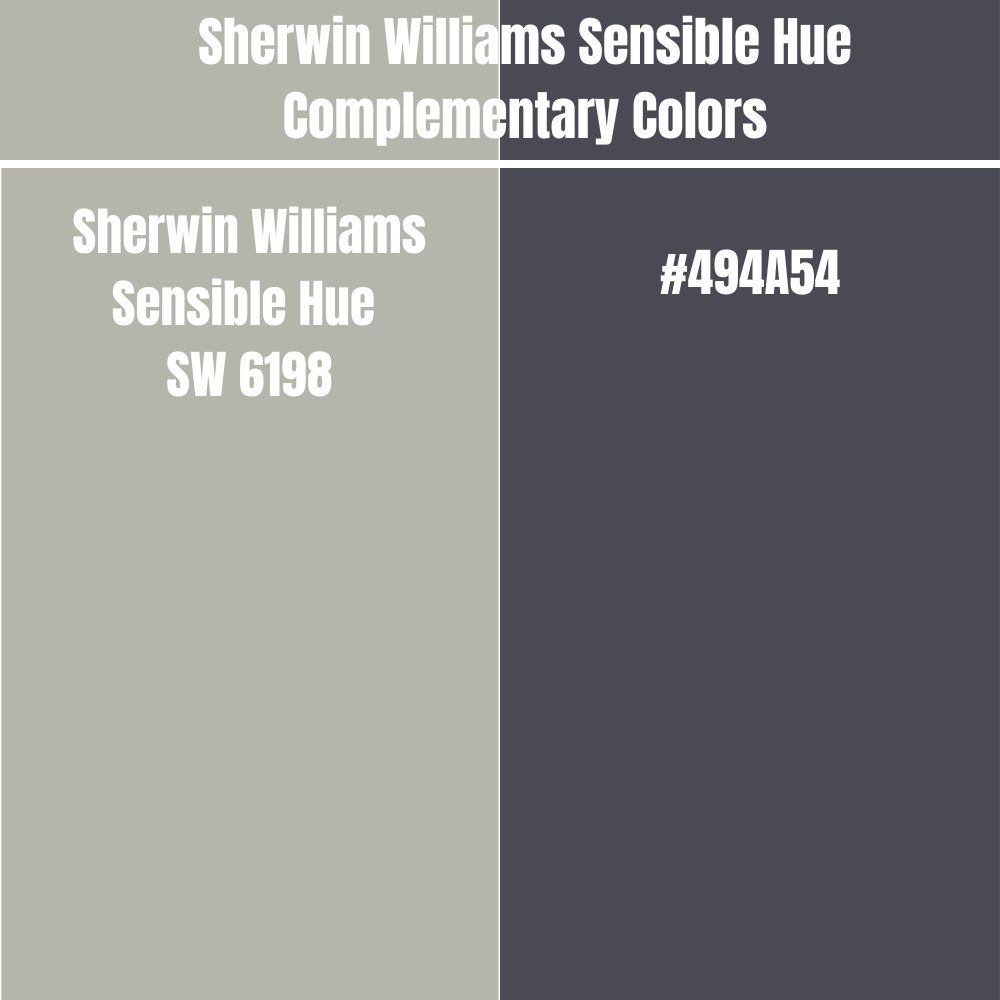
Sherwin Williams Sensible Hue complementary colors are good options if you want to create the most significant contrasting look in your room. The complementary color will sit on the opposite side of the color wheel. Side by side, Sherwin Williams Sensible Hue and its complementary color will have the most significant contrast in appearance.
The Sherwin Williams Sensible Hue Complementary Color has a hex value of #494A54. Currently, no paint color has a hex value of #494A54. However, the closest matching color for this hex value is Quartz Gray.
What Colors Go with Sherwin Williams Sensible Hue on Trims?
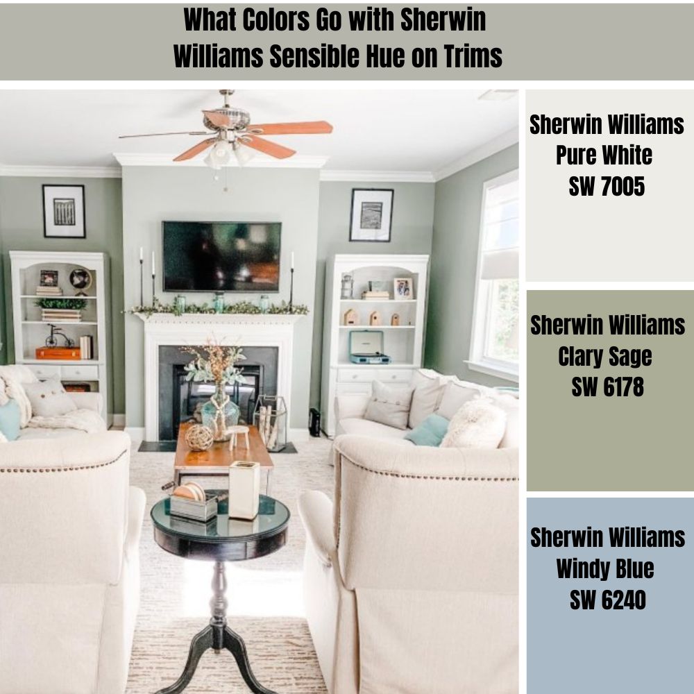
Selecting a nice trimming color for Sherwin Williams Sensible Hue will add depth and character, revamping your interior. Below, I will show you my favorite trimming colors when working with Sensible Hue in a room.
Sherwin Williams Pure White (SW 7005)
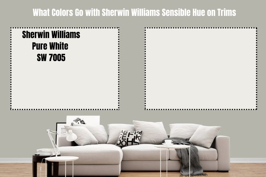
Undoubtedly, Sherwin Williams Pure White is one of the best trim colors for gray-green walls. This paint color blends well with Sensible Hue while highlighting any wall feature, like door frames and windows, in a simple yet attractive way.
Pure White boasts an LRV of 84. Therefore, using Pure White against gray-green walls allows you to create a light and bright illusion. It is a perfect choice for trimming rooms that do not have plenty of light—it reflects enough light ensuring Sensible Hue does not have an annoying, bland appearance.
Moreover, Pure White features a slight yellow undertone that gives it warmth. This makes the paint color perfect for balancing the coolness in Sensible Hue.
Sherwin Williams Clary Sage (SW 6178)
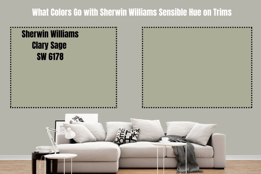
Clary Sage and Sensible Hue feature gray and green shades. Moreover, Clary Sage and Sensible Hue provide a calming, soft vibe that creates a pleasing, muted appearance.
For this reason, you can implement a soothing vibe while maintaining a natural and fresh richness when you have Sensible Hue on the walls and Sherwin Williams Clary Sage on your trims. Clary Sage also adds gorgeous hues that ensure Sensible Hue does not become monotonous.
It is, however, worth noting that these paint colors have a low LRV. While Sherwin Williams Sensible Hue has an LRV of 46, Clary Sage has an LRV of 41. For this reason, the two paint colors may make your space boring if you do not have enough light.
Sherwin Williams Windy Blue (SW 6240)
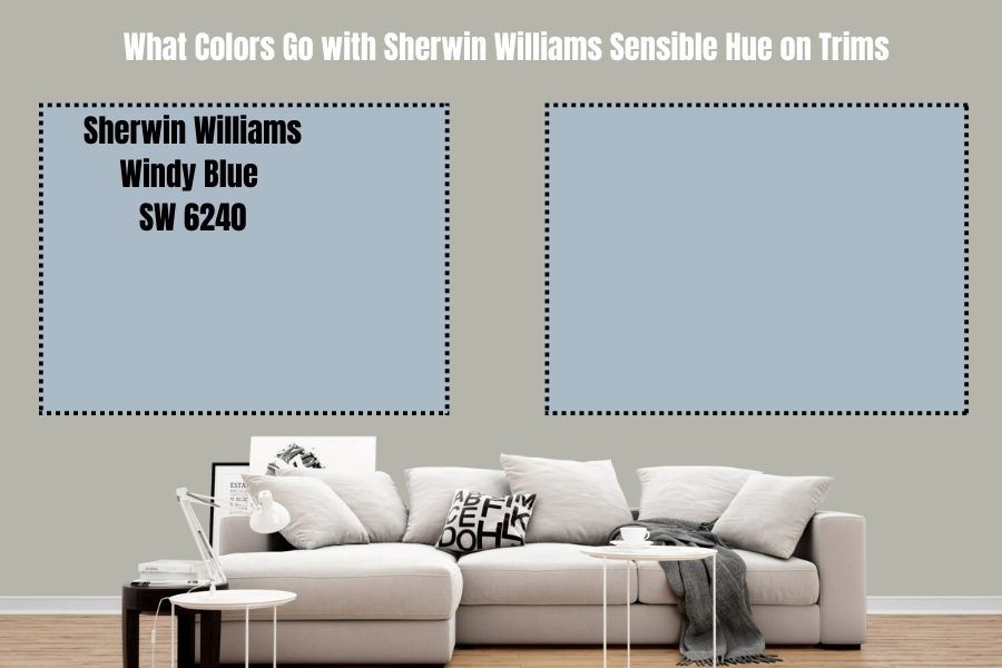
Sherwin Williams Windy Blue boasts strong gray undertones, complimenting Sensible Hue’s gray-green. Windy Blue brings an additional layer of elegance on the Sensible Hue walls when painted on the trims.
While Windy Blue trims will stand out, they won’t distract the eyes from the impressive look created by Sensible Hue on your walls. The paint color has a subtle and soft appearance that allows your Sensible Hue to shine.
Windy Blue and Sensible Hue will work in a room with enough light. The two paint colors have a low LRV—Sensible Hue reflects 46% of light, while Windy Blue reflects 41%. A dim room can make the two colors look bland. However, a well-lit room allows the two colors to display their entire personality.
What Is Sherwin Williams Sensible Hue in Benjamin Moore?
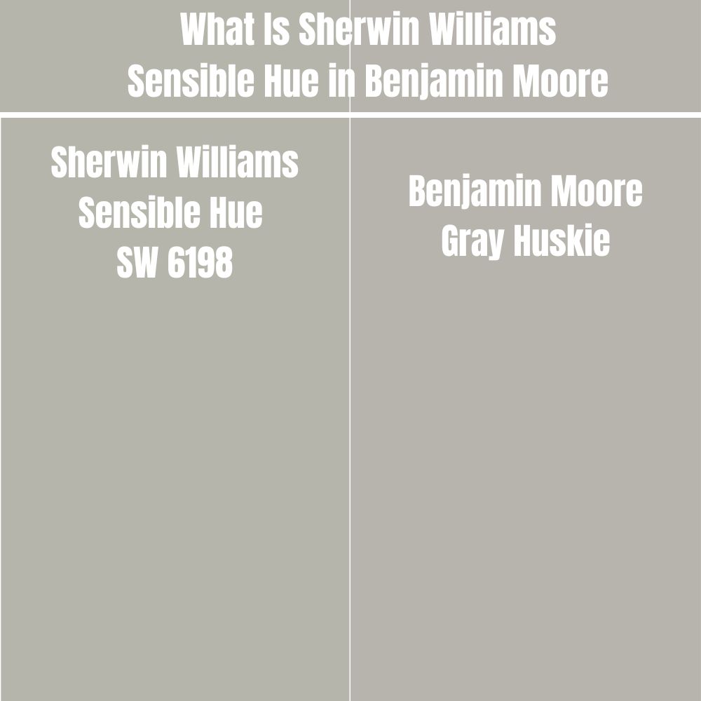
Sherwin Williams Sensible Hue matches Benjamin Moore Gray Huskie. Gray Huskie combines red: 182, green: 180, and blue: 172. This is extremely close to Sherwin Williams Sensible Hue, which combines red: 182, green: 181, and blue: 171.
The two colors are also very close on the LRV scale. While Sherwin Williams Sensible Hue has an LRV of 46, Gray Huskie has an LRV of 45.51.
How Does Light Affect Sherwin Williams Sensible Hue?
By default, Sherwin Williams Sensible Hue is a cool color. However, when it encounters warm southern light, the paint color tends to balance out—the warm light in a south-facing room makes the paint color lean less on its cooler shades.
In a north-facing room, Sherwin Williams Sensible Hue encounters a cool light. The cool northern light compounds its coolness, making Sensible Hue feel colder.
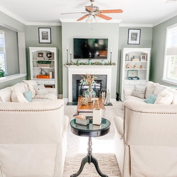
Best Rooms to Paint Sherwin Williams Sensible Hue (SW 6198)
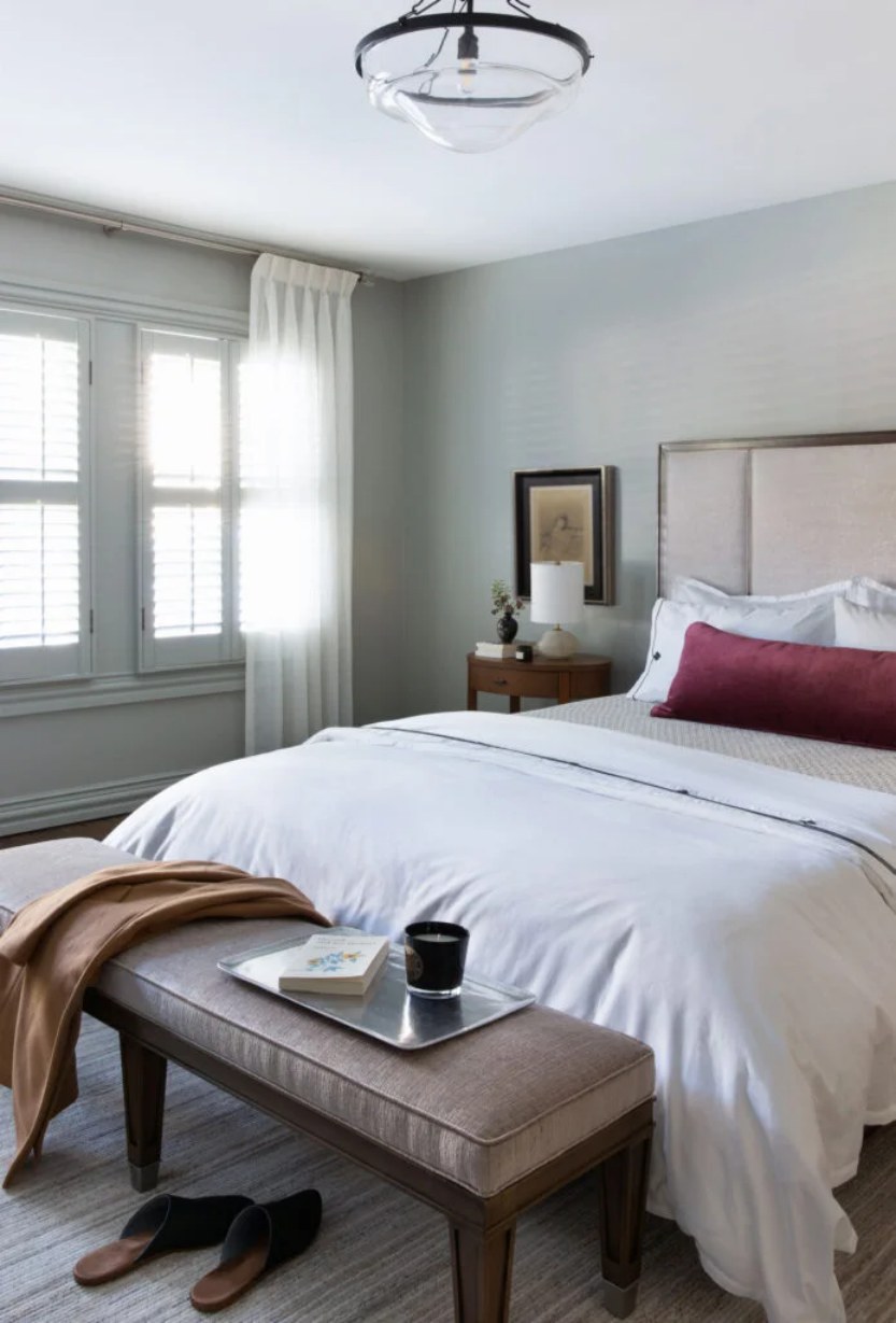
Sherwin Williams Sensible Hue Bedroom
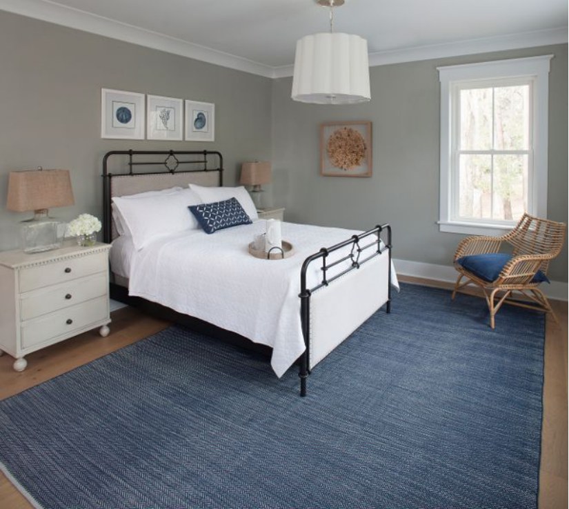
In the above bedroom, Sherwin Williams Sensible Hue pairs nicely with white trim and woody decorations to create a calm and relaxing look. Moreover, the blue mat on the floor finishes the look with a cool feeling. The above bedroom welcomes a warm southern light that keeps it from getting too cold.
This is another impressive bedroom look created by combining Sherwin Williams Sensible Hue with White trims. In the above bedroom, the paint color displays a green undertone, adding interest to the entire space.
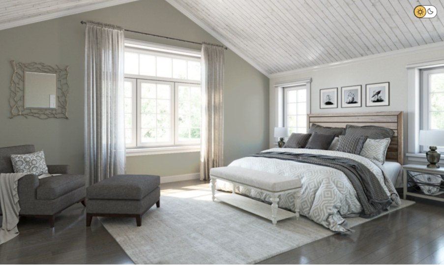
Sherwin Williams Sensible Hue has paired nicely in the above bedroom with off-white paint. The interior designer used charcoal gray on the furniture to add to the look. The room welcomes a soft light, allowing Sensible Hue to look more green than gray. However, the entire look is relaxing and appealing to the eyes.
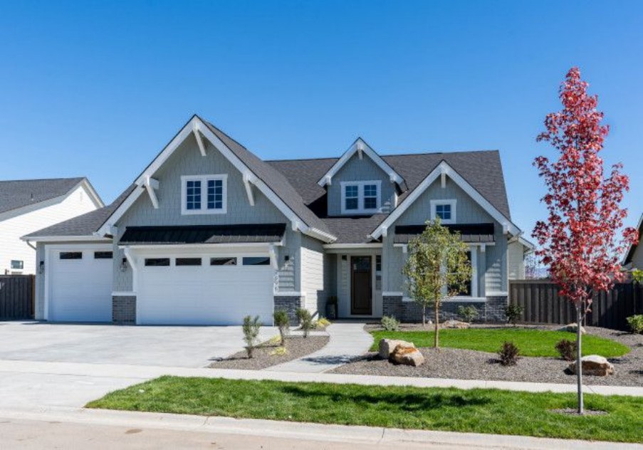
Sherwin Williams Sensible Hue Exterior
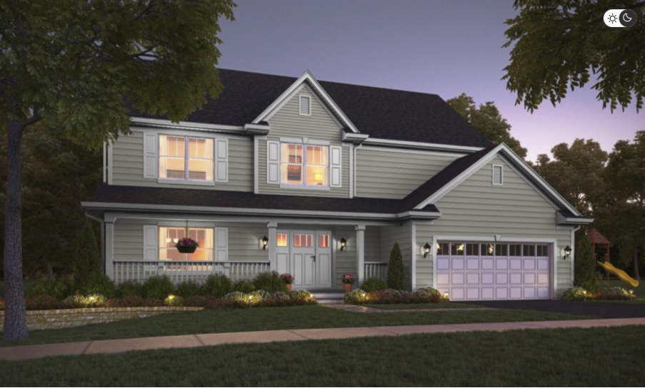
The above exterior combines Sherwin Williams Sensible Hue on the walls and trim of Sherwin Williams Snowbound. The outdoor light balances this look, creating an excellent monochromatic view that stands out to the eye. The house has a charcoal gray color on the roof to finish the outdoor look.
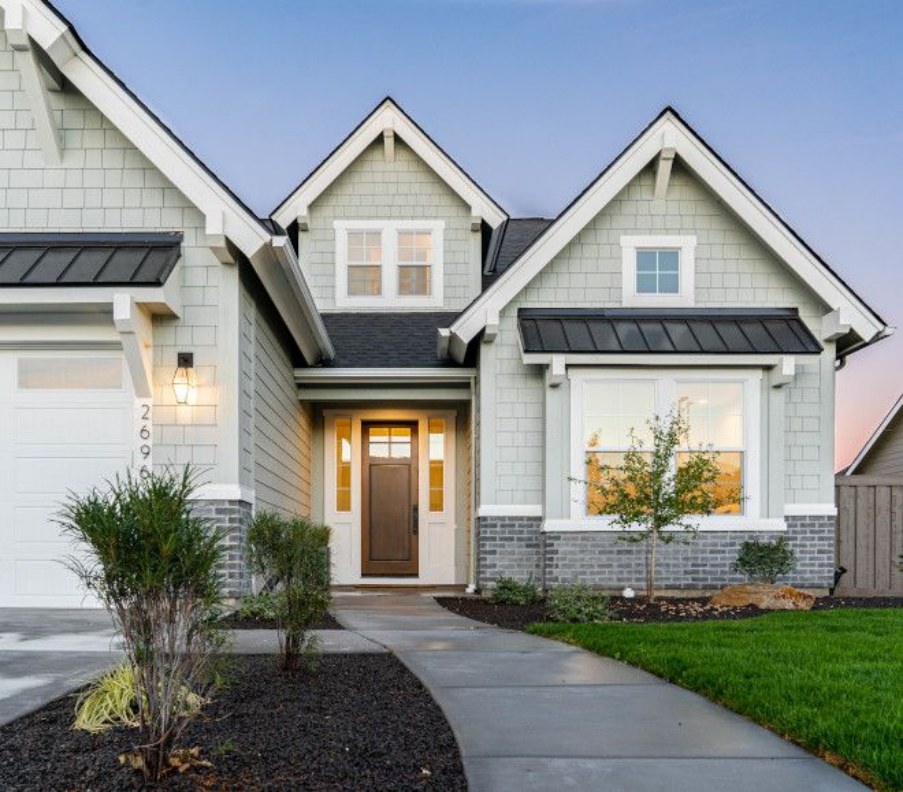
This is another excellent example of using Sherwin Williams Sensible Hue outdoors. In the above exterior, the paint color seems to have met a soft, cool northern light—this gives it a cooler feel. Moreover, the off-white paint color on the trims and the doors creates a more appealing look that allows the entire home to stand out.
The above picture perfectly displays Sherwin William Sensible Hue in the evening. As a medium-light paint color, it does not look boring as long as the light outside is enough. Moreover, it is paired nicely with off-whites, adding interest to the entire look.
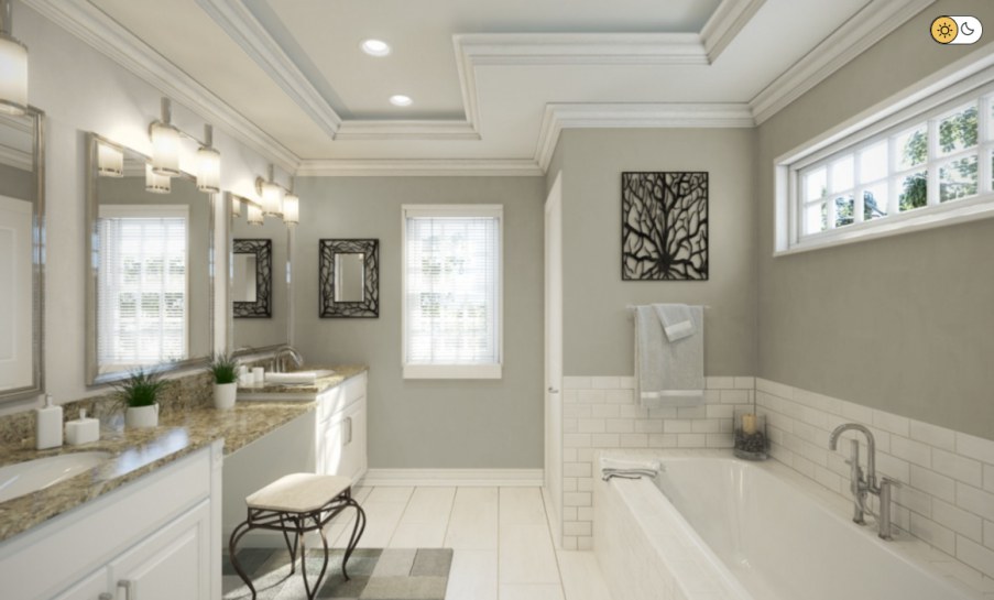
Sherwin Williams Sensible Hue Bathroom
The above bedroom pairs Sherwin Williams Sensible Hue with white color to create an exciting look. The Sensible Hue in this bathroom leans more on its green tone. However, it is still possible to view the gray shade. The woody cabinet and decorations give the bathroom more life while maintaining a calm look.
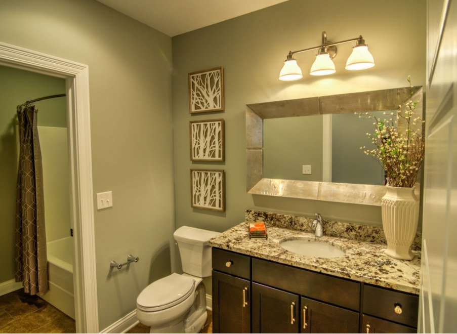
In this bathroom, Sherwin Williams Sensible Hue is paired nicely with a more reflective off-white paint color. The off-white paint color carries a creamy base that provides warmth in the bathroom. It is worth noting that the Sensible Hue leans more into its green undertone, adding some lively look to the bathroom.
The above bathroom pairs Sherwin Williams Sensible Hue with a white paint color. Everything comes together well, with the white blending well with the gray-green Sensible Hue to create a stand-out look.
Overview
Sherwin Williams Sensible Hue is an impressive paint color for creating a cool, calm look with a splash of nature. The paint color is medium light, making it an ideal option for exterior and interior walls.
However, Sherwin Williams Sensible Hue needs enough light to keep it interesting. Outdoors, however, Sensible Hue will absorb enough light to avoid getting washed out.
By default, Sherwin Williams Sensible Hue is a cool paint color. Therefore, the paint color generates the most impressive results when you use it in a warm southern-facing room. If you want to use the paint color in a cool, north-facing room, combine it with a warm color to balance its warmth—this will help you avoid creating an icy feel in the room.
I hope this detailed article has answered all your questions about Sensible Hue. If you have additional questions, leave them in the comment section below.
 Sherwin Williams Copen Blue (Palette, Coordinating & Inspirations)
 Sherwin Williams Rain (Palette, Coordinating & Inspirations)
 Sherwin Williams Watery (Palette, Coordinating & Inspirations)
 Sherwin Williams Greek Villa (Palette, Coordinating & Inspirations)
 Sherwin Williams Olympus White (Palette, Coordinating & Inspirations)
 Sherwin-Williams Tidewater (Palette, Coordinating & Inspirations)
