
Is the Sherwin-Williams Silverpointe paint silver or gray? Here is one question that must have crossed your mind on your first encounter with the Silverpointe paint from Sherwin-Williams.
Well, it will interest you to know that the Silverpointe is actually a cool gray tone with green undertones. It merges well with any decoration theme, from modern to retro. Therefore, minimalists who love cool tones would love this color because it’s close to white without being too clinical. The silver-gray tone adds character to your neutral décor and works with other shades.
Keep reading to see how you can bring Silverpointe to life in your space, including interesting alternatives when you can’t find a Sherwin-Williams brand. This guide also includes tips on decoration and maximizing lighting. Let’s start with the things that make Silverpointe.
Table of Contents
What Color is Sherwin-Williams Silverpointe
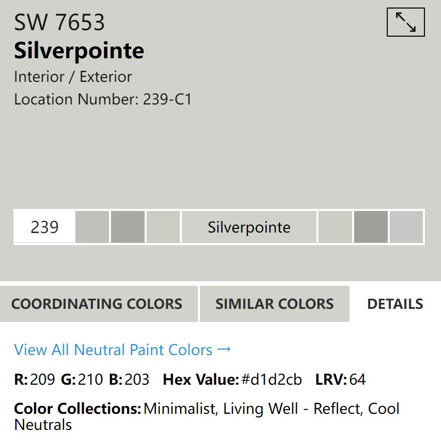
| Manufacturer | Sherwin Williams |
| LRV | 64 |
| RGB | Red 209 | Green 210 | Blue 203 |
| Hex Value | #d1d2cb |
| Color Collections | Minimalist, Living Well – Reflect, Cool Neutrals |
RGB of Sherwin-Williams Silverpointe
Silverpointe’s RGB Value is 209 Red, 210 Green, and 203 Blue. This numbers signifies the amount of red, green, and blue paints added to a true black paint to create the color. Why is it important information?
You can use the RGB value to customize the exact color of Silverpointe when Sherwin-Williams runs out of supply.
Light Reflective Value (LRV) Of Sherwin-Williams Silverpointe
Like the RGB value, the Light Reflective Value of a paint tells you its degree of light retention. The Silverpointe has a low threshold and this makes it a great neutral to choose if you want something that reflects bright light into your environment.
This paint color has a 64 LRV, meaning you’d never feel smothered inside a room painted in its shade. There’s no pure white or true black color in the interior designing world, so the LRV scale starts at 3 and ends at 93.
Is it a Warm or Cool Color?
Sherwin-Williams Silverpointe is for cool kids, mamas, men, and anybody who loves a soothing aura. The color is part of the brand’s Living Well – Reflect collection meaning it’s suitable for relaxing spaces.
Think of a spa, resort, rejuvenation center, and every other place that screams “Recharge,” then you’ve got Silverpointe. This unique silver-gray tone has other colors lurking beneath its surface, and it’s time to meet them.
What are the Undertones?
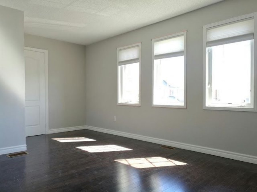
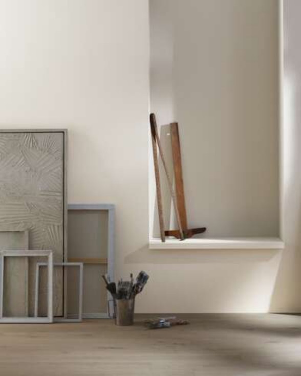
With Sherwin-Williams Silverpointe, you’ll get a bit of beige and green depending on the lighting condition. Silverpointe presents as a light gray in its truest form, but under direct light (natural or artificial), you’ll get tinges of sage green and sometimes beige.
These are some of its features that make it an interesting gray paint. After all, who wants a boring plain color? You can leverage this undertone by using it to anchor your interior décor. Check out some ideas below and see how light interacts with the undertones.
All images are from Sherwin-Williams
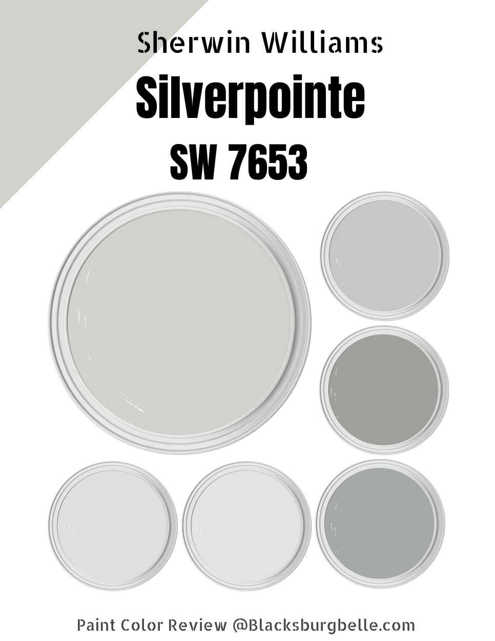
Sherwin-Williams Silverpointe Color Strip
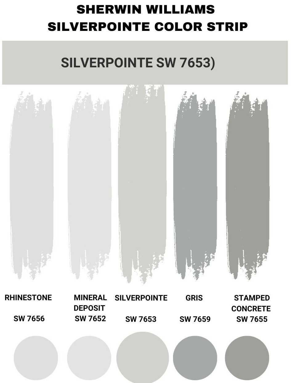
A color strip is a group of similar colors to help you during monochromatic decoration. These colors are the same base hue with different gradients changing their tones. When you add the right amount of RGB into the mix, you’d get the same hue across board.
Check out the Silverpointe’s color strip below.
| Color Code | Color Name | Location Number | LRV | Color Tone |
| SW 7656 | Rhinestone | 257-C4 | 74 |  |
| SW 7653 | Silverpointe | 239-C1 | 64 |  |
| SW 7652 | Mineral Deposit | 238-C4 | 43 |  |
| SW 7659 | Gris | 238-C5 | 39 |  |
| SW 7655 | Stamped Concrete | 239-C7 | 35 |  |
Sherwin-Williams Rhinestone
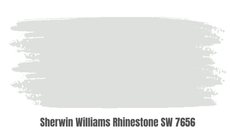
Rhinestone by Sherwin-Williams is a bright gray with icy blue and mauve undertones. You can use it as a trim or the main paint, giving the same chilled air in its environment.
This color pairs best with March Wind, which has a stronger mauve undertone, and Daphne, which has a deeper grayish-blue tone.
Sherwin-Williams Mineral Deposit
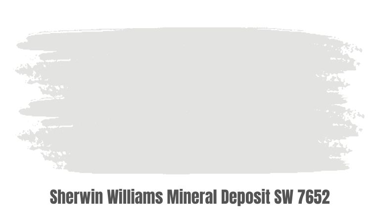
Sherwin-Williams Mineral Deposit reminds you of a quarry with its dusky bluish-gray tone. It’s a medium-dark color with an LRV of 43; however, it shines when featured in centered and calm themed spaces.
Sherwin-Williams Gris
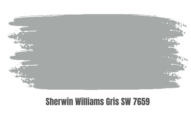
Gris is a dark gray paint, however unlike several other colors, it does not belong completely on the deep end. It has an LRV of 39, making it a light-absorbent tone. Choose Gris for serenity and calmness if you don’t want a color that’s too bright.
The Sherwin-Williams Gris suits both interior and exterior walls and spaces.
Sherwin-Williams Stamped Concrete
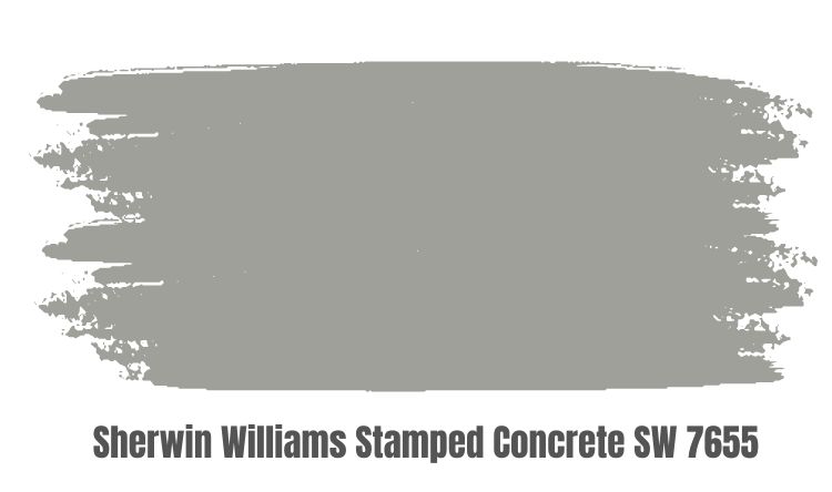
Stamped Concrete is basically a cement paste color hence its name. It’s another low LRV gray paint making it an ideal neutral color. It works best when used sparsely, like on half or exterior walls, so you can use a brighter tone to elevate its shine.
Sherwin-Williams Silverpointe
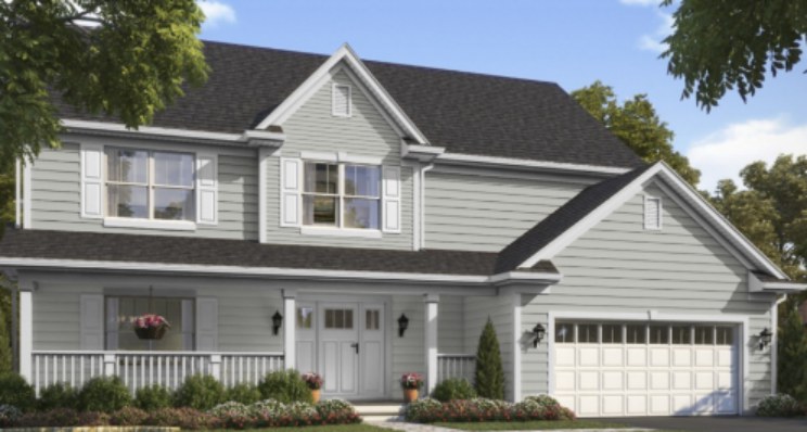
Silverpointe by Sherwin-Williams is a cool icy gray that gives you the neutrality of silver paint without its festive shine. It’s not quite the dark classic gray that leans towards black but it does well in reflecting light without posing as white paint.
Sherwin-Williams Silverpointe Color Palette
The SIlverpointe from Sherwin-Williams really shines when it’s time to decorate because your furniture and interior décor do much in elevating its undertones. You’ll have so much fun designing your space with this color as an anchor, and I’ll show you how.
Coordinating Colors for Silverpointe
Color coordination comes in different forms, from the classic monochrome design to the modern complementary tones and retro contrast. What do these big words mean? Well, every space needs a theme which is the story you want to tell with your paint and décor.
The Silverpointe is a cool tone with an airy feel that opens up its surroundings thanks to its medium-brightness. You can use your décor to accentuate its light by adding complementary tones, diming it with contrasting tones, or highlighting its undertones with similar colors.
Read the bits below for more;
Monochrome Decoration
Monochrome decoration entails using the same color in different shades around your space. With Silverpointe, you can explore deeper and lighter gray tones depending on your desired vibe.
If you want to embrace its soothing, airy feel, use lighter grays like Sweater Weather, Front Porch, Eider White, or Pure White. Alternatively, you can close its inviting aura with darker grays like Peppercorn, Grizzle Gray, Mink, or Iron Ore.
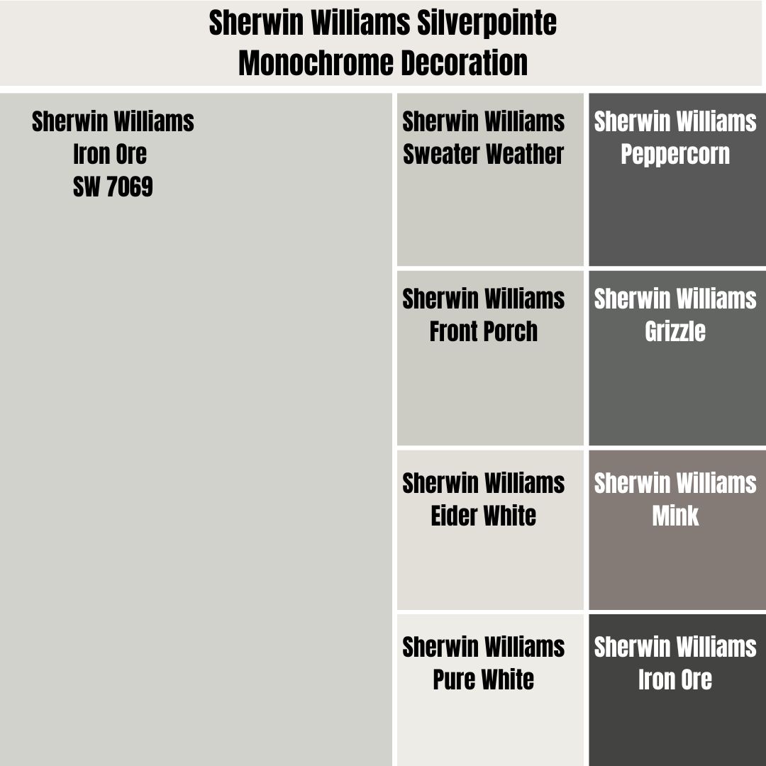
Pro Tip: Use the Color Strip.
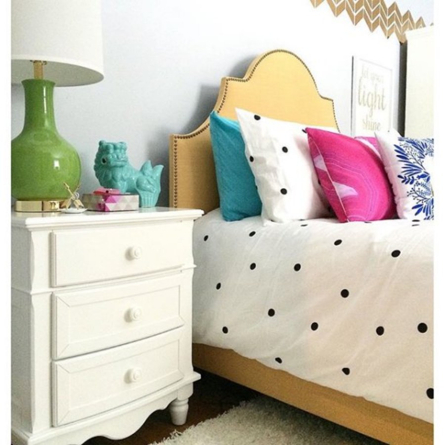
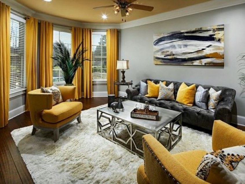
Contrasting Decoration
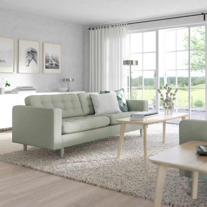
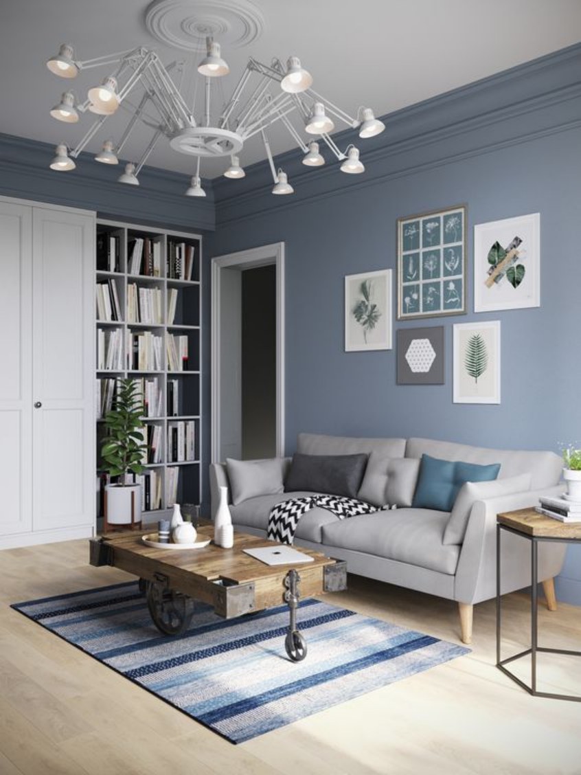
The contrasting decoration is the most fun when designing interiors because you can mix the most unlikely tones and get them to work. For Silverpointe, use its green, blue, and deep gray undertones.
This will spruce the environment by adding more color to the cool Silverpointe gray. You can go the extra grand by using all the undertone colors rather than choosing one. There are several ways this can go but let’s try out some combinations below.
– A green sofa with blue throw pillows and a combination color for the rugs
– A blue and green sofa with monochromatic gray throw pillows and mixed carpets.
You can also use the curtains to add more color or tame the bright contrasting furniture. See some inspirational visuals below.
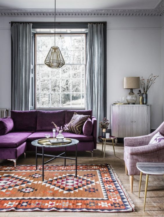
Silverpointe Complementary Colors
Complementary colors are the shades that produce a grayscale when mixed. Since Silverpointe is already a grayscale shade, use the undertones as your anchor, and in this case, green is for purple, as blue is for yellow.
Using any of those colors or the tones within their gradients will surely bring your Silverpointe walls to life. Alternatively, you can use the Sherwin-Williams paint as an accent against walls painted in complementary colors.
Seriously, coordinating colors is so fun and as interesting as contrasting tones. Check out some designs below.
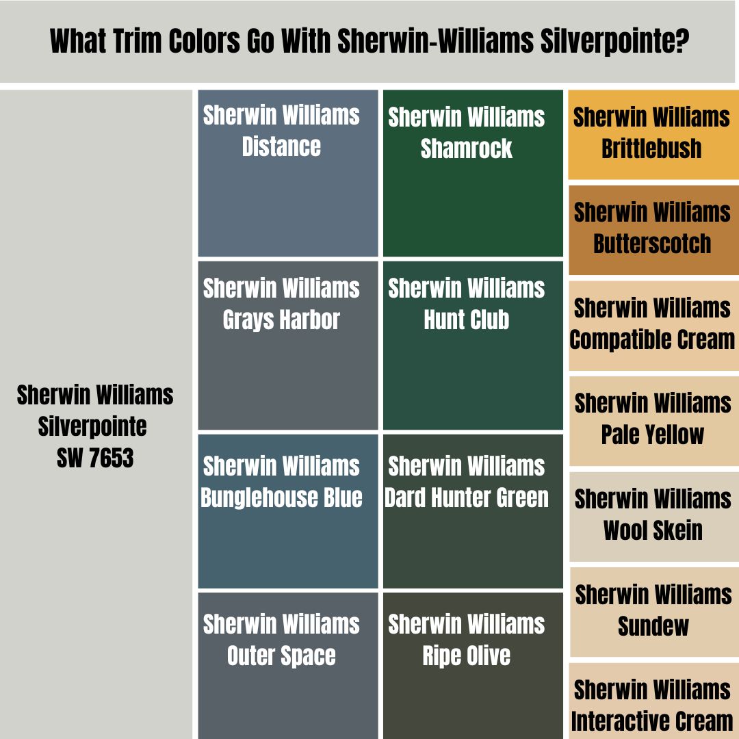
What Trim Colors Go With Sherwin-Williams Silverpointe?
Don’t think too far about trim colors, as the color strip and palette are there to guide you. Use lighter tones like Pure White, Eider White, and Magnetic Gray to bring a monochromatic theme to life.
For contrast designs, darker LRV gray blues like Distance, Grays Harbor, Bunglehouse Blue, and Outer Space. You may also explore darker greens like Adiron, Shamrock, Hunt Club, Dard Hunter Green, or Ripe Olive.
Suppose you’d rather complement the space and use warm colors like Yellow and Purple. Some Sherwin-Williams paints to explore include, Brittlebush, Butterscotch, Compatible Cream, Pale Yellow, Wool Skein, Sundew, and Interactive Cream.
The last four colors are perfect blends of purple and yellow, so you’d get a two-in-one deal.
Sherwin-Williams Silverpointe Color Comparisons
“What if I can’t find Sherwin-Williams Silverpointe?” The good news is that you can use over a dozen similar tones as an alternative. Also, this section helps you narrow down your choice even with access to Silverpointe.
Sherwin-Williams Silverpointe vs. Sherwin-Williams Moorstone (SW 9630)
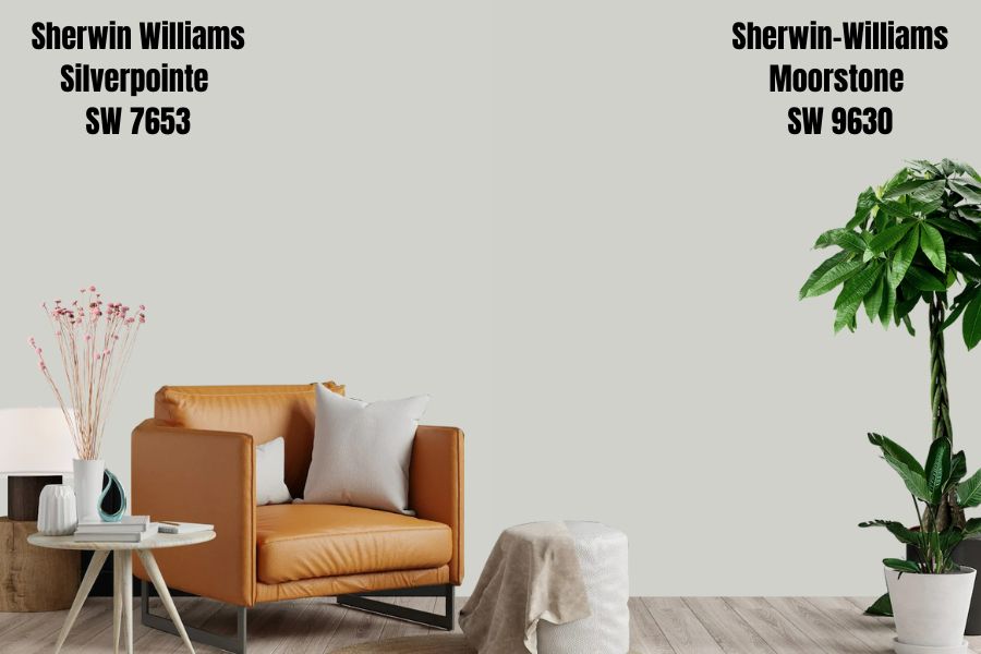
Sherwin-Williams Moorstone is one of its unique shades designed under its exclusive Emerald Edition. It’s a gray paint with strong blue undertones, giving it the resemblance of a stone or pebble found on the beach.
In addition to this, it’s a medium-light tone with an LRV of 63, and you can create your own using its Hex Value – #cfd1ca. Get Moorstone for a rustic and refined look in your space with the added advantage of its cool soothing tone calming your nerves.
Sherwin-Williams Silverpointe vs. Sherwin-Williams Agreeable Gray (SW 7092)
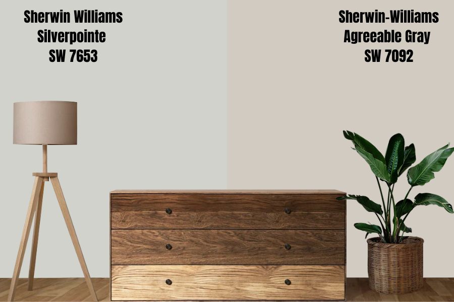
Agreeable Gray is Sherwin-Williams’ most popular neutral gray paint, and for a good reason. It sits at 60 on the LRV scale and has a hex value of #d1cbc1. This tone will renew your energy every time you step into a room covered in it.
It’s on Sherwin-Williams’ Top 50 colors and has been a top greige tone in the brand for several years. There’s no surprise that Agreeable Gray still tops the list of North America’s best and most popular grays.
The color has a green undertone that appeals to nature lovers, but what’s even more interesting are its violet and pink undertones. Put this shade underneath the right light and perfect contrasting or complementary paint, and you’ll see its pink/violet tones shine.
Sherwin-Williams Silverpointe vs. Sherwin-Williams Big Chill (SW 7648)
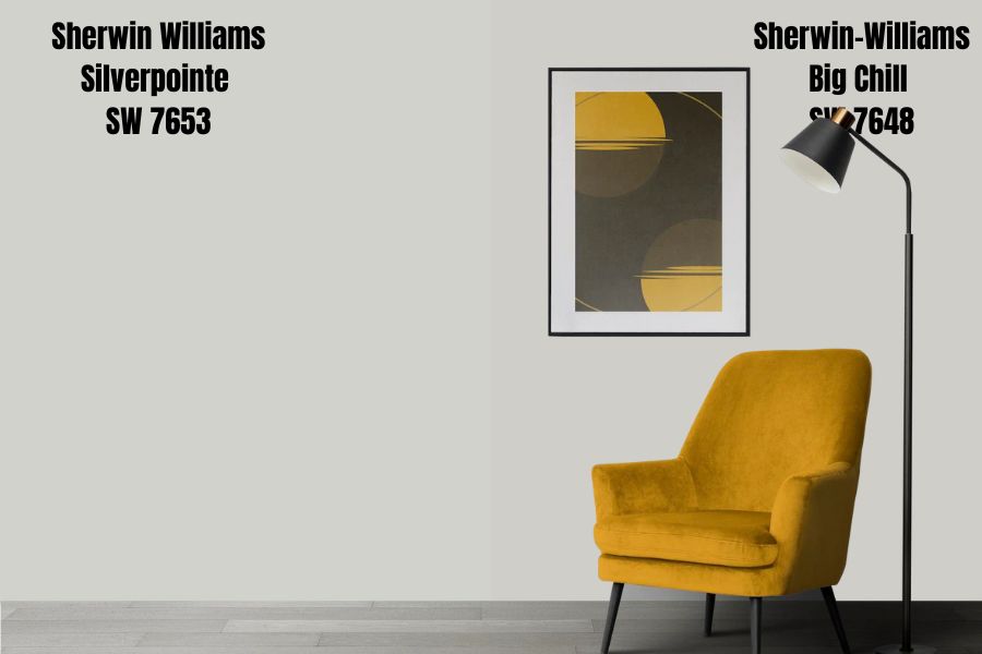
Big Chill is a pastel white paint with an LRV of 62, making it medium-light. It’s way brighter than Silverpointe but has similar gray undertones with hints of blue. That explains its name – Big Chill.
It has a silver feel and is Sherwin-Williams Rejuvenation – Fall/Winter 2022 shade. Get this paint if you want a relaxed vibe that feels like you’re at sea. Its Hex Value is #d0cec9.
Sherwin-Williams Silverpointe vs. Sherwin-Williams Rhinestone (SW 7656)
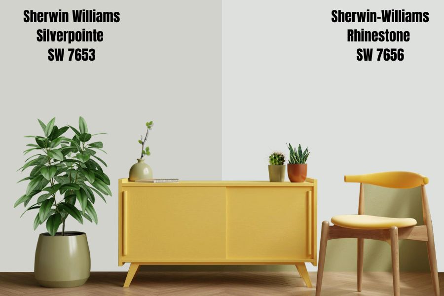
With Sherwin-Williams Rhinestone (LRV 74) you have a brighter pastel white paint. It’s a great color for spa-like décor and portrays a good living and centered life vibe. This paint color has blue undertones with hints of purple based on the lighting condition.
You’ll also find this paint to be way brighter than Silverpointe but a good option for monochromatic décor as it makes a good accent or trim. Recreate it using the hex value – #dee0de.
Sherwin-Williams Silverpointe vs. Sherwin-Williams Lattice (SW 7654)
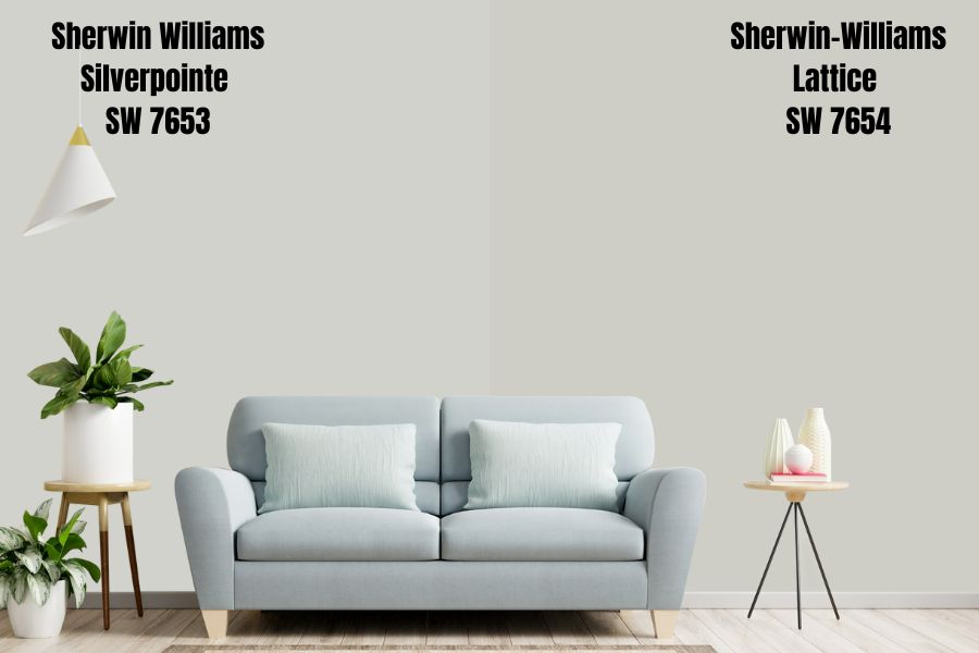
Lattice by Sherwin-Williams is another medium-light tone as it barely veers off the median end of the LRV spectrum at 61. Its hex value is #cecec6. The color is a light gray with blue and green undertones like Silverpointe.
The similar undertones make Lattice a suitable companion for Silverpointe when searching for a monochromatic pair. You may also choose it alternatively if the former is too dark for your taste as they give the same vibe – relaxed and living well.
Sherwin-Williams Silverpointe vs. Sherwin-Williams Light French Gray (SW 0055)
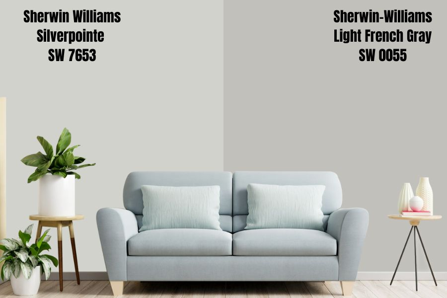
Sherwin-Williams Light French Gray is a neutral shade that’s been in existence since the 19th century. This is the paint for you if you ever want a color to inspire historic, classic, and retro vibes. Get this shade with #c2c0bb.
It’s a minimalist dream with an LRV of 53, making it neither light nor dark hence neutral. These characteristics make Light French Gray blend with any color you’d like, whether warm or cool. Get it for your teenager’s room and watch them transform it into their safe haven.
Sherwin-Williams Silverpointe vs. Sherwin-Williams Front Porch (SW 7651)
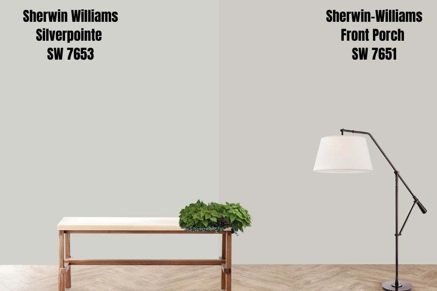
Let’s dial it up with Front Porch which has an LRV of 60 making a medium-light tone. It’s an obvious gray tone like Silverpointe and has blue, pink, and purple undertones. This color is under the Living Well collection because it gives a relaxing aura like its counterpart.
Upon first look, Front Porch and Silverpointe look like the same colors, but a closer look shows you the differences, like how the former is brighter than the latter.
Silverpointe Benjamin Moore Color Comparison
Before exploring this option, please note that there’s never an exact match across brands. The best you would get is a similar tone with a slight difference in undertones and LRV. Some Benjamin Moore paints similar to Sherwin-Williams Silverpointe include –
Abalone 2108-60
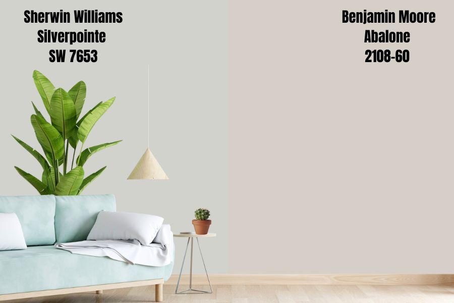
Abalone is as close as you’ll get to Silverpointe due to its similar LRV, although it’s short by one percent (61.99.) It’s a soft gray tone with hints of mauve (purple) beneath its layers and comes in vinyl texture. Abalone pairs well with rose pink and mauve (no-brainer.)
Barren Plain (2111-60)
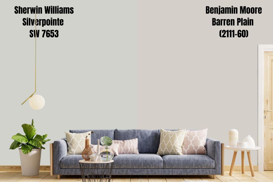
Barren Plain is another mauve-leaning gray from Benjamin Moore with an LRV of 62.12. It doesn’t come in vinyl texture, but its matte finish would do well to portray a rejuvenating air in your space.
Apparition (860)
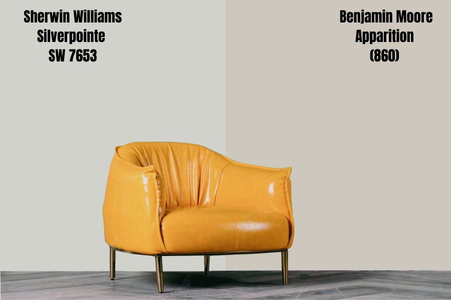
Benjamin Moore’s Apparition’s undertone is more Violet than mauve making it a darker gray than the last two. However, it’s still on the medium-dark lane with an LRV of 57.29, making it a classic decoration.
Think of it as a romantic color due to its soft yet neutral tones. It’ll come alive with bright violets and pastel purples.
London Fog 1541
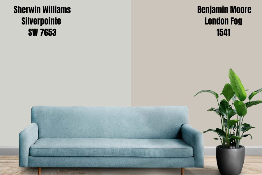
If you’ve ever been to Europe, you’d understand why Benjamin Moore named this shade London Fog. Any Londoner far from home can bring a foggy English evening into their space with this tone.
It has an LRV of 56.44, so it’s not too bright that it’ll ruin the vibe or too dark to encourage a chilled aura in its surroundings.
Silverpointe Benjamin Moore Version
Benjamin Moore doesn’t have a paint called Silverpointe but a diverse range of silvers from Silver Spring to Silver Cloud, Silver Bells, Silver Lake, Silver Chain, and more. The closest tone it has to Sherwin-Williams Silverpointe is Gray Owl OC-52 or 2137-60.
P.S.: They mean the same color.
Gray Owl OC-52 | 2137-60
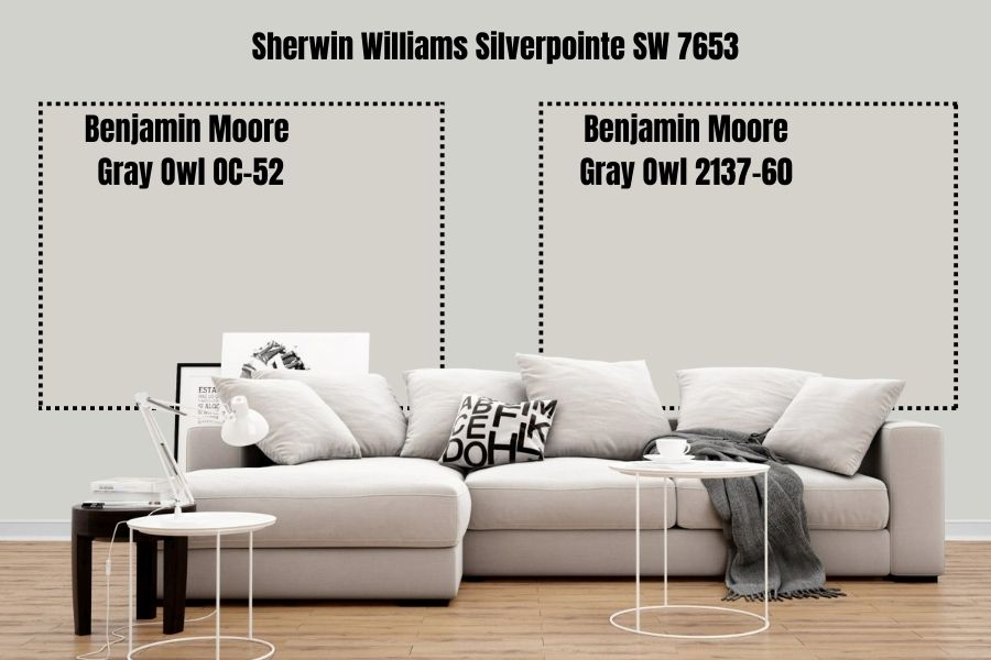
Gray Owl by Benjamin Moore has an LRV of 64.51, making it slightly brighter than Sherwin-Williams Silverpointe. It’s a cool and crisp color suitable for minimalist and neutral décor. Benjamin Moore categorizes it as an off-white shade due to its bright tone.
Regardless of that grouping, you should know there’s nothing white about Gray Owl as its shadowy tone is obvious, and its blue/violet undertone is even more profound than typical off-whites.
How Does Light Affect the Color?
Light makes Silverpointe appear differently from its unaffected shade, but that also depends on other interacting factors. Firstly, you have to consider the natural light’s position in the room.
South-facing rooms make Silverpointe appear white with warm tones, but North-facing light highlights its blue undertone due to its limited light reception.
Then account for the other things in its surrounding, from the other wall paints in the room to the greenery, decoration, and accessory colors like curtains, furniture, and appliances.
Check out the resolutions under LRV.
Best Rooms To Paint Silverpointe
Having established the different tones of Silverpointe based on lighting, the next hurdle to jump is choosing the right rooms and quantity for the paint. Where’s the best place to paint Sherwin-Williams Silverpointe?
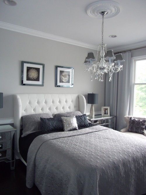
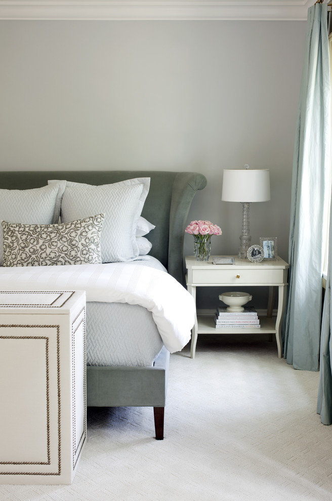
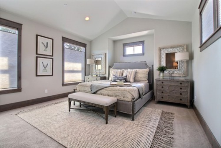
Silverpointe Bedroom
Your bedroom should be your sanctuary since it’s the most private space in the entire home, so why not paint it Silverpointe? The color is a good relaxant and guarantees a good night’s rest if you pair it with the right accessories.
Embrace the cool tone by using a monochromatic décor but if you like vibrant colors, use complementary tones. Save the contrasting tones for rooms requiring high activities.
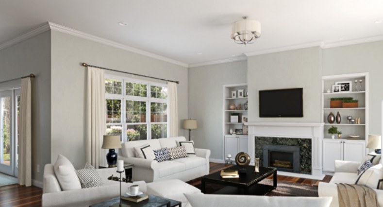
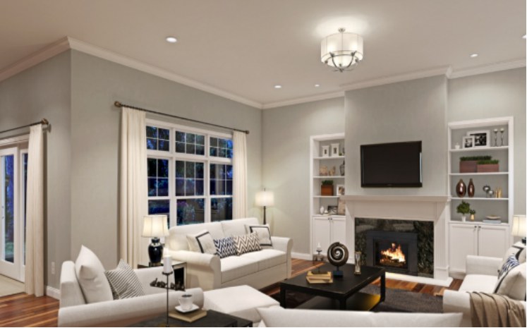
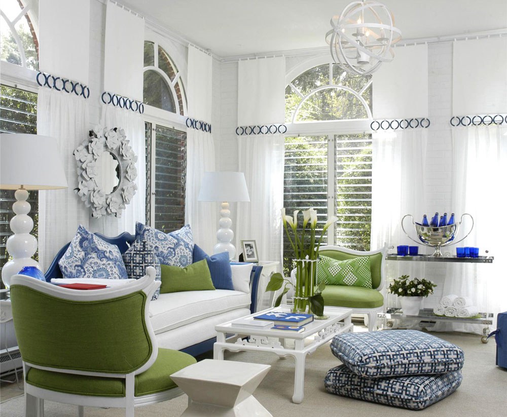
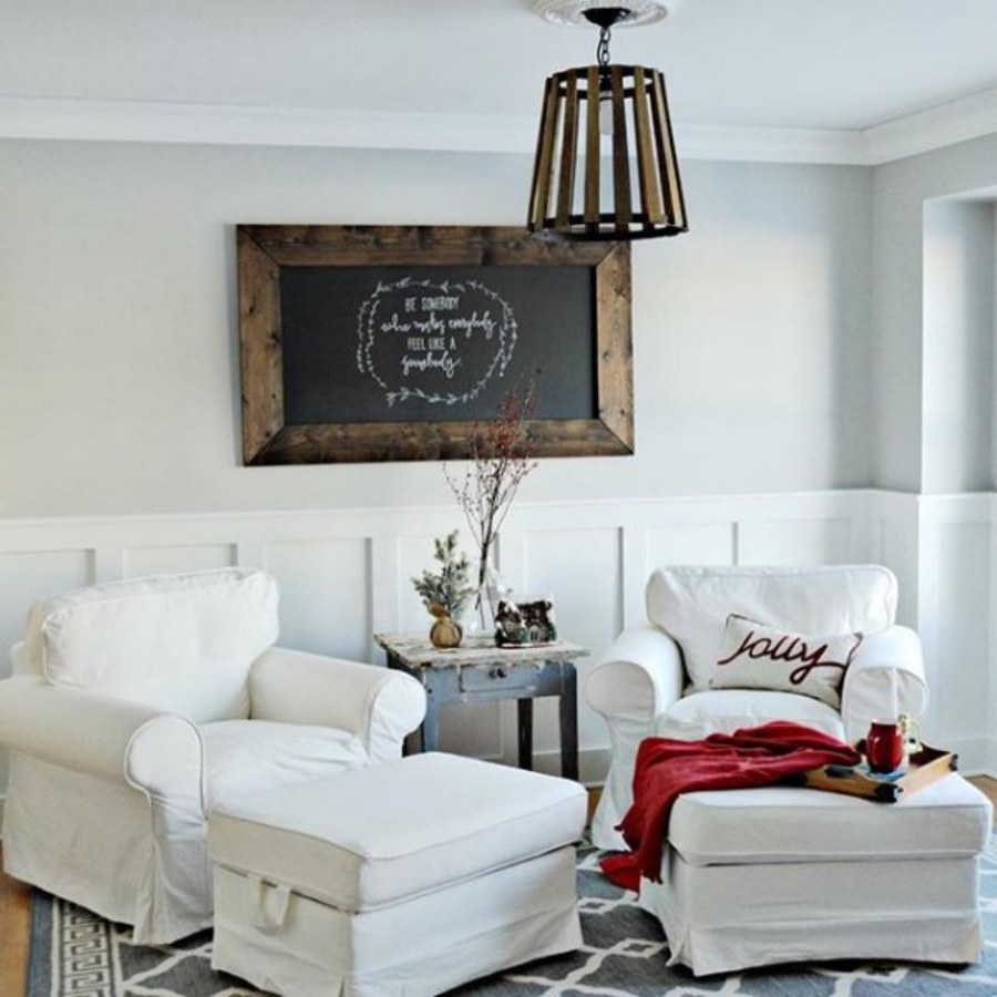
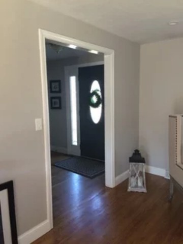
Silverpointe Living Room
Remember those high activities I mentioned earlier? The living room is the place to use contrasting tones if you must. It’s a good way to show guests that your home is inviting despite its cool walls.
You can mix the paint with other colors based on the palette or strip by using them on your décor, flooring, and furniture.
See some examples below.
View this post on Instagram
Silverpointe in the Kitchen
Using Silverpointe in the kitchen gives more room for creativity than in the living room. You can use it on your kitchen furniture, from cabinets to islands, instead of the walls. As explained above, you may also use it on the walls but accent the tone with other coordinating colors.
This color would pop when mixed with white trims or the other way around and marbled tiles. You may stick to light neutrals for the tiling or contrast the tone with dark neutrals such as black or shadowy grays.
See some examples below.
View this post on Instagram
Silverpointe Dining Room
Even though this is typically an extension of the kitchen, some homes have separate dining rooms and Silverpointe walls would look good here. It’s a great way to make a cohesive decoration especially if you went with painted furniture for the kitchen.
Use the Silverpointe walls to highlight the island and cabinets. If your walls are already Silverpointe in the kitchen, use the cabinet’s color for your dining room furniture to highlight it. Remember to coordinate using the color palette to avoid wasting good paint.
View this post on Instagram
View this post on Instagram
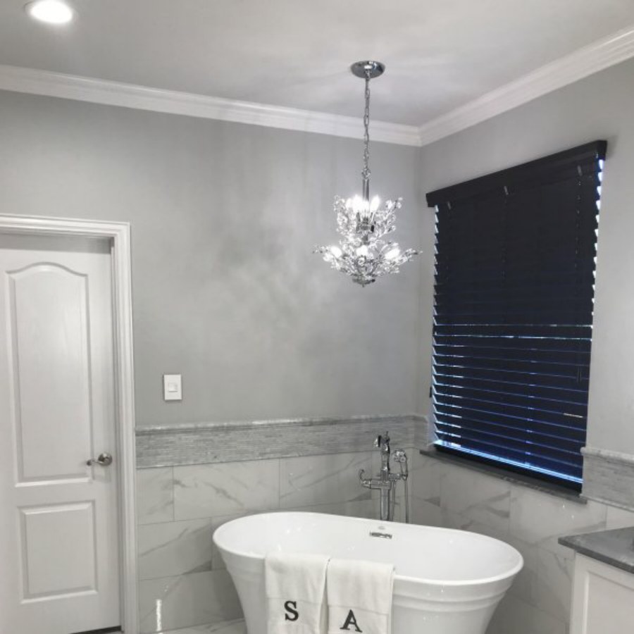
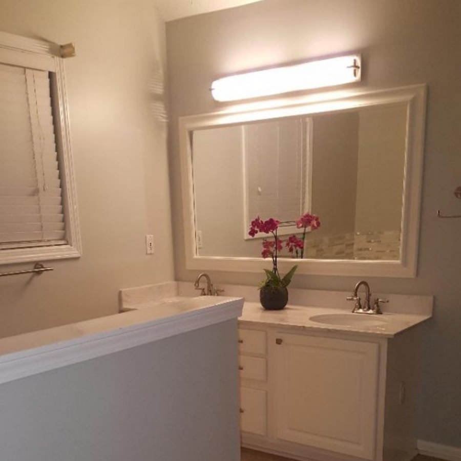
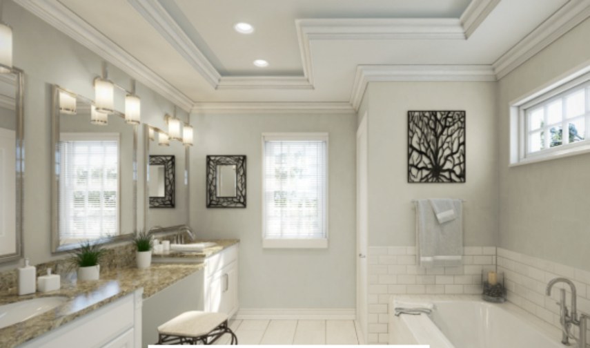
Silverpointe Bathrooms
This is my second favorite place to decorate because of the endless options. If you chose Silverpointe, you’re into minimalist décor, and there’s no better place for this theme to thrive than a bathroom.
The best you’d get out of Silverpointe in a bathroom is pairing it with white and pastels (for more adventurous decorators.) Whether installing a shower or bathtub, invest in white marble and glass to give your bathroom a spa-like feel.
View this post on Instagram
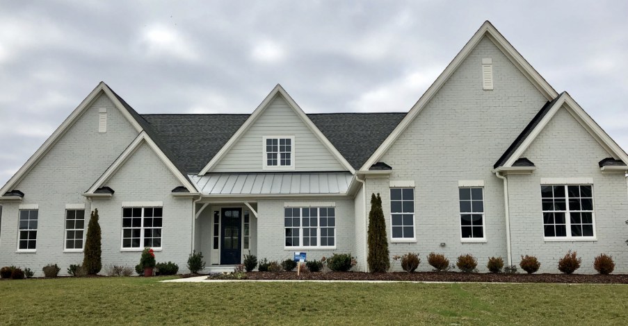
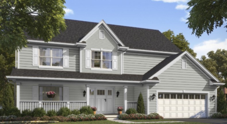
Silverpointe Exteriors
Silverpointe outdoors isn’t bad, especially if you’re shying away from bright white pastels. The color is good with nature since it’s neutral, so there’s no fear of it clashing with other tones unless the other tone is a brick red. In that case, please abort the mission.
Sampling Silverpointe
Sherwin-Williams offers three sampling options for Silverpointe: the basic Peel-and-Stick strips, Color Chips, and the innovative Color-To-Go paint. You may explore any of those options before making up your mind.
Final Thoughts
Silverpointe is the paint to use when you want a relaxed environment and is suitable for simple décor. Honestly, the best theme for gray paints is monochromatic decoration because of the color’s wide range.
However, there’s nothing wrong with wanting more color in the space. Always remember to use this guide and design Silverpointe with the right paints to avoid ruining its natural calming sensation.
 Sherwin Williams Mega Greige (Palette, Coordinating & Inspirations)
 Sherwin Williams Privilege Green (Palette, Coordinating & Inspirations)
 Sherwin Williams Caviar (Palette, Coordinating & Inspirations)
 Sherwin Williams Anew Gray (Palette, Coordinating & Inspirations)
 Sherwin Williams Ice Cube (Palette, Coordinating & Inspirations)
 Sherwin Williams Pearly White (Palette, Coordinating & Inspirations)
