
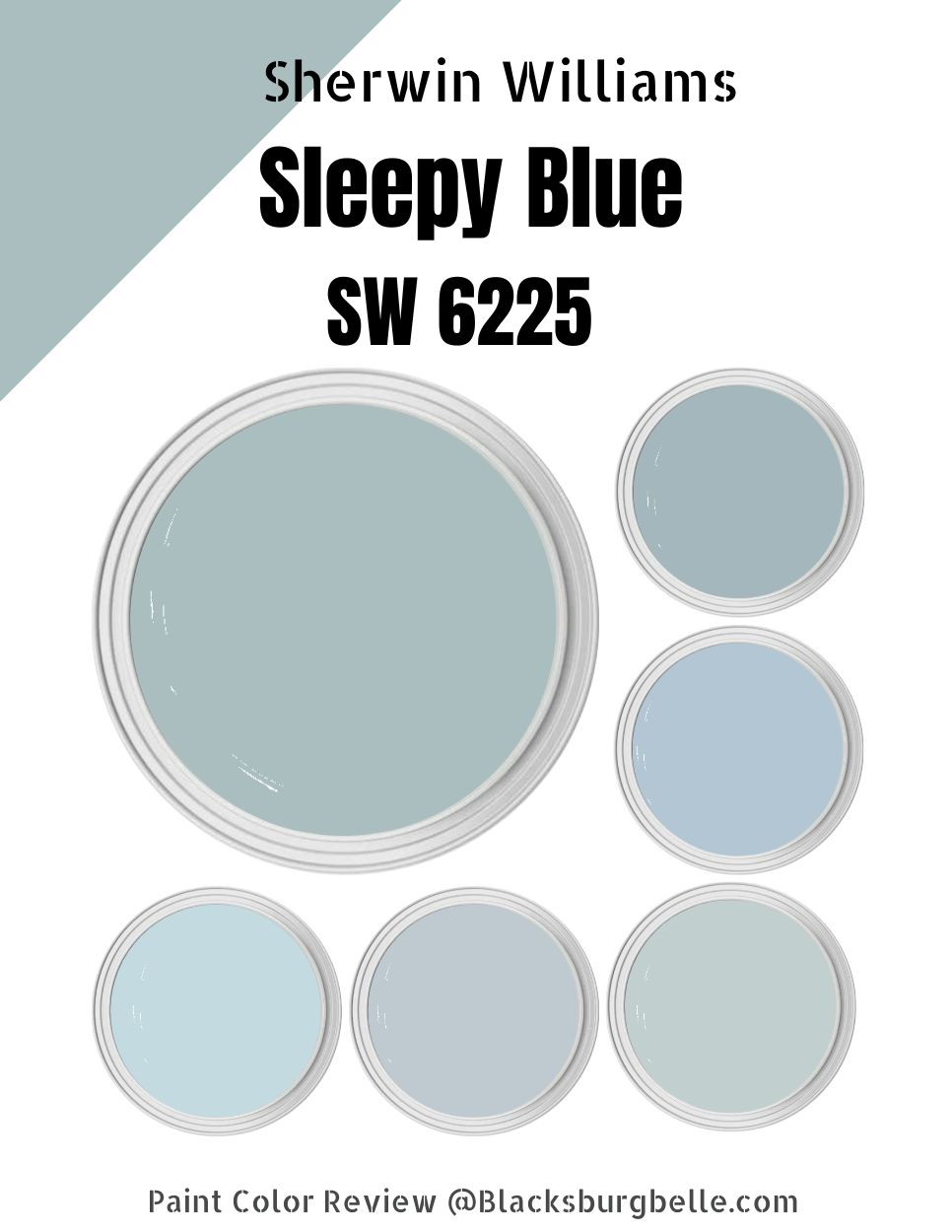
Do you have a room that feels chaotic? Would you like to introduce some calm and quiet? You can achieve this with Sherwin Williams Sleepy Blue.
Sleepy Blue SW 6225 embodies what the calm waters in the Pacific Ocean would feel. The color is exactly as its name sounds—quiet, slow, and sleepy. The color boasts a humble feel and a relaxed look.
Sleepy Blue SW 6225 is ideal for anyone craving a tinge of relaxation while living in the busy streets of a major city. The color will create a space you can return to and relax after a day of hard work outside.
In this detailed guide, I will lay out all the deepest secrets about Sherwin Williams Sleepy Blue in the open. I will help you understand this paint color and even show you the paints you can pair it with to create an appealing look.
Read on to learn more.
Table of Contents
What Color is Sherwin Williams Sleepy Blue?
| Manufacturer | Sherwin Williams |
| LRV | 58 |
| RGB | R: 188 G: 203 B: 206 |
| Hex Value | #ECE5D8 |
| Color Collections | Colormix Forecast 2020 (Alive) |
Sherwin Williams Sleepy Blue is a soft blue paint color. It is a light and soothing paint color with a hue that feels heavenly in nurseries and bedrooms. However, it is a paint color you can use in any room.
RGB of Sherwin Williams Sleepy Blue
The RGB scale shows the amount of red, green, and Blue that goes into making a specific paint color. The scale starts at 0 and stops at 255.
On the RGB scale, Sleepy Blue combines red: 188, green; 203, and blue: 206. As you would expect with a blue paint color, Sleepy Blue SW 6625 carries a more blue tone than any other RGB shade.
LRV of Sherwin Williams Sleepy Blue
A paint color’s ability to reflect light is crucial in its characteristics. For this reason, interior designers use the LRV—Light Reflectance Value—scale to measure the reflective abilities of a specific paint color.
The LRV scale starts at 0 and ends at 100. Pure black reflects 0 percent light and therefore sits at 0. On the other hand, True White reflects 100% light and sits at 100. Sleepy Blue is a mid-toned color that sits close to the middle of the LRV scale with a value of 58.
Is Sherwin Williams Sleepy Blue A Warm or Cool Color?
Sherwin Williams Sleepy Blue is a cool paint color. The paint color, therefore, performs exceptionally well in tropical and warmer climates. Its cool tones help balance the higher temperatures in these regions.
Sherwin Williams Sleepy Blue Undertones
Sherwin Williams Sleepy Blue is a true blue with minimal inclinations to other colors. For this reason, it will be pretty hard to notice undertones in this paint color in most lighting conditions. However, on some rare occasions, you may be able to view a tiny splash of green or gray.
Sherwin Williams Sleepy Blue Color Strip: Sherwin Williams Sleepy Blue Color Comparisons
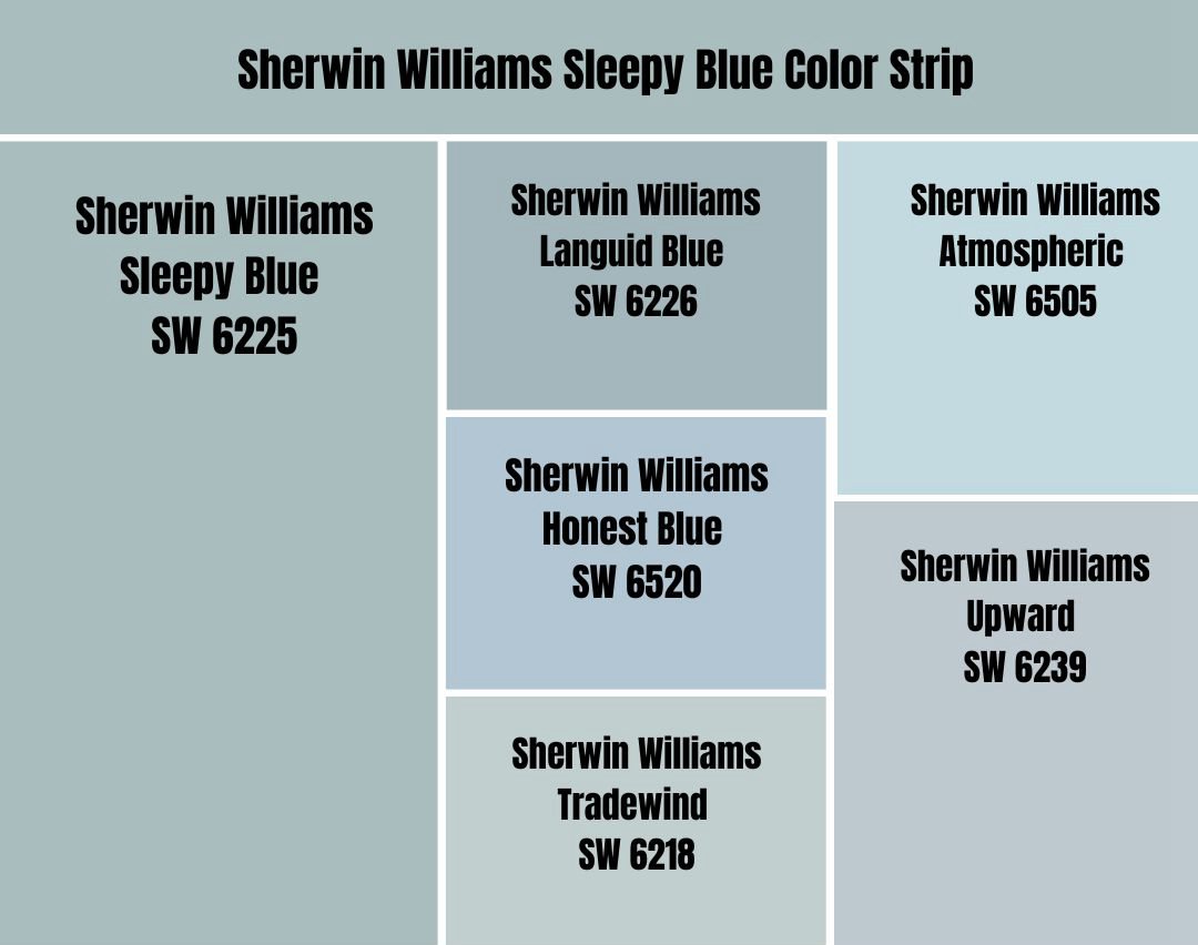
Sherwin Williams Sleepy Blue vs. Languid Blue (SW 6226)
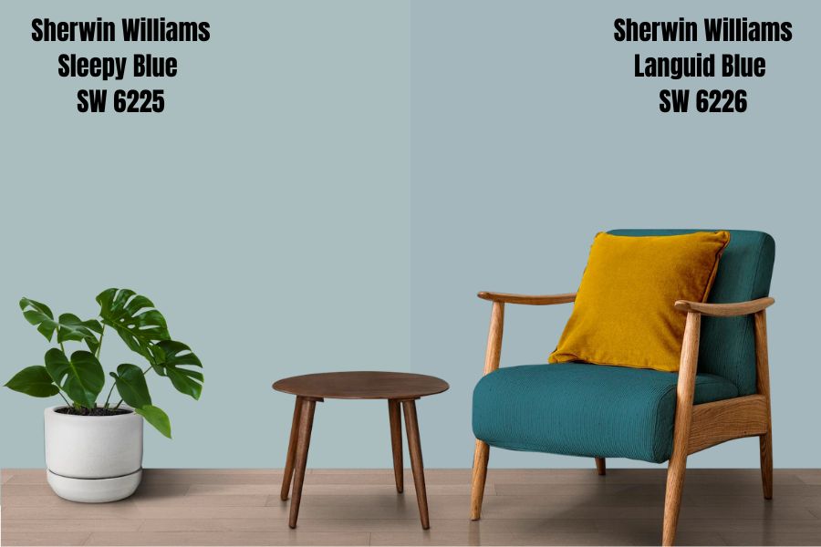
Sherwin Williams Languid Blue is a deeper version of Sherwin Williams Sleepy Blue. Languid Blue reflects 12% less light with its LRV of 46.
Sleepy Blue is close to true Blue and neutral in most lighting conditions. On the other hand, Languid Blue has some visible undertones—the gray undertone leads with a tiny splash of green undertone following.
The two colors, however, are cool shades. They will work well in a southern-facing room, balancing the warmth. The colors, however, could make a north-facing room feel slightly ice when their coolness meets the cold in northern light.
Languid Blue and Sleepy Blue slow down life in a room. They make the perfect backdrop when you are enjoying a lazy Sunday.
Sherwin Williams Sleepy Blue vs. Honest Blue (SW 6520)
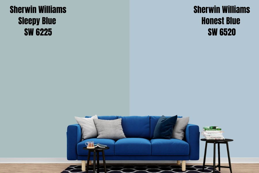
Sleepy Blue and Honest Blue are very close on the LRV scale. Sleepy Blue reflects just 3% more light with its LRV of 58, while Honest Blue follows it closely with its LRV of 55. Both colors, therefore, boast plenty of brightness to cheer any room.
The main difference is that Sleepy Blue is more of a neutral color, while Sherwin Williams Honest Blue has an undertone. The gray undertone in Sherwin Williams Honest Blue lends a beautiful calm to it.
Sleepy Blue and Honest Blue are both cool colors. However, being a more neutral color that does not have visible undertones, Sleepy Blue is cooler than Honest Blue. However, both colors effectively cool down the temperature in tropical and warmer climates.
Sherwin Williams Sleepy Blue vs. Tradewind (SW 6218)
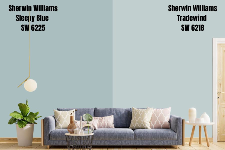
Tradewind boasts a particular blend of colors, making it a force to reckon with. Unlike Sherwin Williams Sleepy Blue, which is more neutral, Sherwin Williams Tradewind brings undertones to the show—Tradewind has gray to calm it down and a tiny amount of green tucked inside.
The two colors are close in their ability to reflect light. Sherwin Williams Tradewind is slightly more reflective with its LRV of 61. Sleep Blue, however, falls behind a mere 3% with its LRV of 58.
Both colors are cool. However, you will be surprised to realize that Sleepy Blue might be cooler than Tradewind—this is a result of Sleepy Blue being more of a neutral blue and primarily carrying the primary tone known for making colors cool.
Sherwin Williams Sleepy Blue vs. Upward (SW 6239)
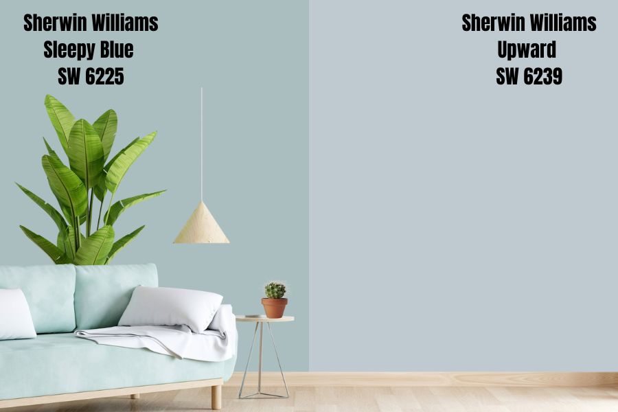
Sleepy Blue and Sherwin Williams Upward have some significant and noticeable differences. For starters, Upward happens to be cooler than Sleepy Blue.
Upward also happens to be slightly bold and more authentic. However, on the LRV scale, these two colors are on the same level—while Sleepy Blue boasts an LRV of 58, Upward shows up with an LRV of 57.
Both colors boast an almost similar feeling when used in a room. They are bound to add a chill effect to your home while making your space feel bright and lively. Both colors are always timeless—their usability in a room does not run out.
Sherwin Williams Sleepy Blue vs. Atmospheric (SW 6505)
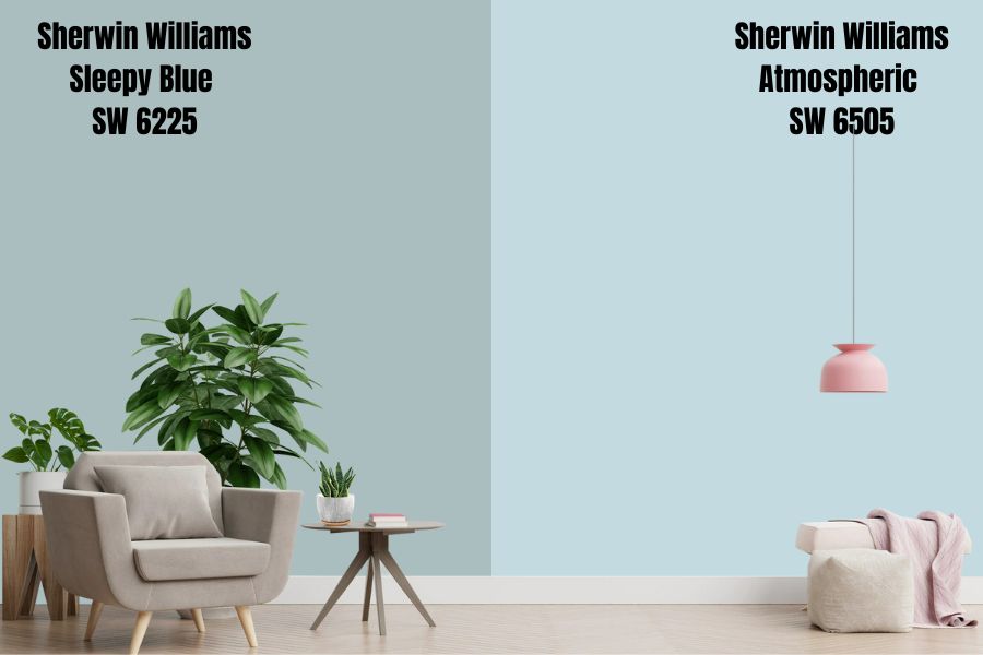
Sherwin Williams Atmospheric is a soft blue paint color slightly softer than Sleepy Blue. However, like Sleepy Blue, Atmospheric is more of a neutral paint color—it has a true tinge of blue but does not feature any undertones.
However, Sherwin Williams Atmospheric has some starkness, unlike Sleepy Blue, which is more welcoming irrespective of the amount. Using too much Atmospheric can make the color prick your eyes, creating an uncomfortable aura. However, Atmospheric is an impressive paint color when used in controlled doses.
Atmospheric is lighter than Sherwin Williams Sleepy Blue. Atmospheric has an LRV of 67, reflecting 9% more light than Sleep Blue. These two colors, however, boast the same level of coolness and tend to generate impressive results when used in rooms with extreme warmth.
Sherwin Williams Sleepy Blue Palette
Coordinating Colors for Sherwin Williams Sleepy Blue Color
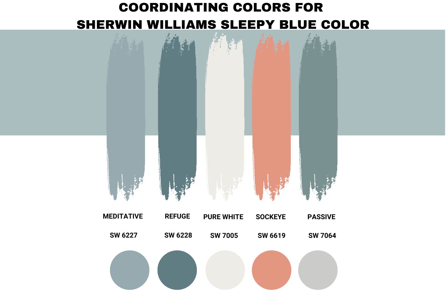
Depending on your interior design preference and style, you can choose a contrasting and monochromatic color palette when working with Sleepy Blue. With such a subtle and soothing blue, you can use a Sherwin Williams Sleepy Blue palette that includes lighter or darker greys, crisp or creamy whites, greiges, burnt oranges, brighter or lighter yellows, Sakura pinks, and black.
Below, I will outline some of the best contrasting and monochromatic Sherwin Williams Sleepy Blue palettes.
Sherwin Williams Meditative (SW 6227)
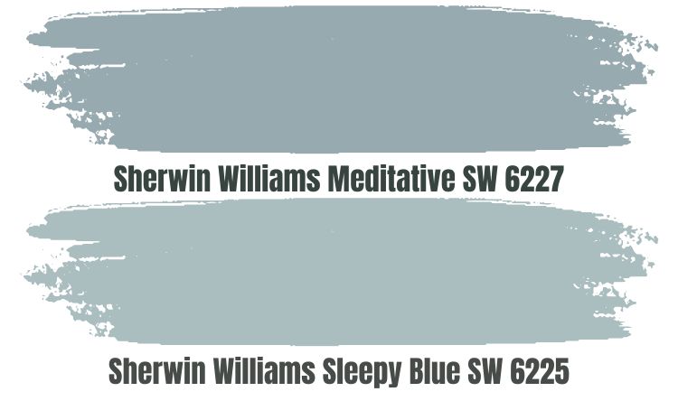
Meditative brings a contemplative and relaxed vibe to your room. The paint color boasts a cool blue and a slate of gray that calms down the Blue keeping it from becoming too loud.
However, Sherwin Williams Meditative (SW 6227) absorbs more light than it reflects. For this reason, you will want to pair it with Sleepy Blue in a room with enough light. Otherwise, you may end up creating a bland look.
Note that Sherwin Williams Sleepy Blue and Meditative are both cool colors. Therefore, you must consider the room temperature at which you plan to use the two. Ideally, these colors perform well when used in a room with higher warmth—for example, a south-facing room. The two colors could make a north-facing room feel icy.
Sherwin Williams Refuge (SW 6228)
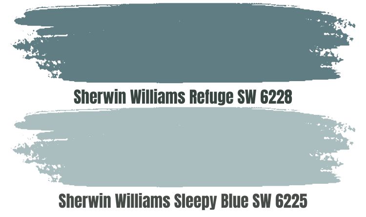
Sherwin Williams Refuge is another excellent option for homeowners planning to create a monochromatic view with Sleepy Blue. Refuge is a darker version of Meditative—in fact, Refuge reflects half the light that Meditative.
The cool gray undertone in this tranquil and deep blue color makes it more interesting. The color, like Sleepy Blue, boasts a self-assured and welcoming vibe.
The two colors fall on the cooler side of the warm-cool color scale. Therefore, the temperature in your room will play a key role when determining whether to use the two.
If you have a north-facing room, you may want to skip Refuge and replace it with a warmer version to avoid creating an icy environment. However, these paint colors will work exceptionally well in a south-facing room.
Remember that the two colors have a low combined LRV—Sleepy Blue has an LRV of 58, while Refuge has an LRV of 19. Therefore, combining these two paint colors in a dim space could result in a bland appearance. The two colors, however, showcase optimal performance in bright rooms.
Sherwin Williams Pure White (SW 7005)
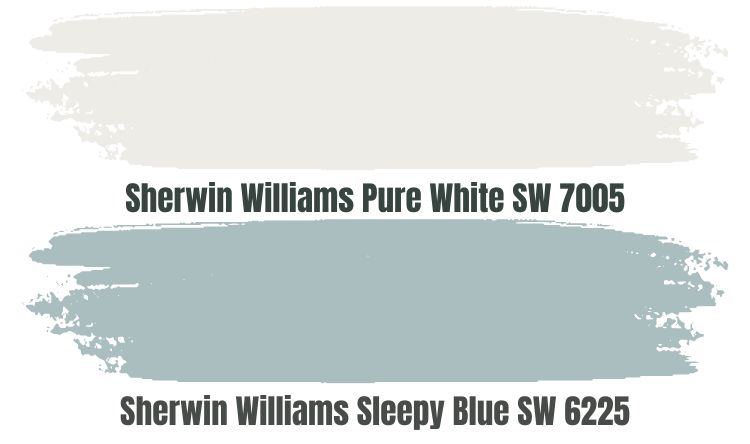
We have mentioned the colors you can use when creating a monochromatic look—this could have you asking yourself, “what colors do I use for a contrasting Sherwin Williams Sleepy Blue color palette?” Well, you can start with Sherwin-Williams Pure White.
Pure White is not a true white; instead of having an LRV of 100, it has an LRV of 84. Pure White is a whitish color that boasts soft, passive warmth without looking as creamy as other white colors. The warmth in this color balances the coolness of Sleepy Blue—this makes Pure White a perfect option when using Sleepy Blue in a cold, north-facing room.
Pure White’s high LRV makes this paint color perfect for a dimly lit room. Pure White will reflect enough light onto Sleepy Blue, keeping it from becoming boring.
Sherwin Williams Sockeye (SW 6619)
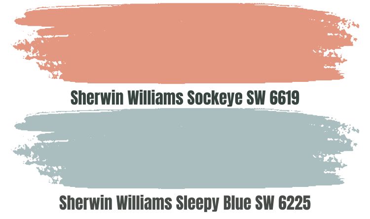
If you need to bring more heat into a room where you are using Sleepy Blue, you can go orange. Orange boasts a degree of warmth that will ensure your room does not end up icy after using Sleepy Blue in a room welcoming northern light.
Sherwin Williams Sockeye is one of the best orange colors you can use. This color, however, delivers the best results when used in a room with enough room. Sockeye has an LRV of 40, meaning it absorbs more light than it reflects.
Pairing Sleepy Blue and Sockeye in a dimly lit room may not be the best idea as the color may absorb so much light creating a bland look. In a bright room, however, the two colors put their character on full display, creating a fascinating, contrasting look.
Sherwin Williams Passive (SW 7064)
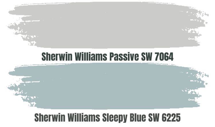
Passive SW 7064 is a cool-toned gray color that pairs nicely with blue paints like Sherwin Williams Sleepy Blue. The color adds a calm feel to any room, joining hands with Sleepy Blue to create a more relaxing, inviting, and serene appeal.
Sherwin Williams Passive and Sleepy Blue are incredibly close on the LRV scale. Passive has an LRV of 60, while Sleepy Blue has an LRV of 58—the two colors are medium-light and may not tolerate extremely dim rooms. However, the two colors will hold their ground in bright light—they won’t get washed out.
Sherwin Williams passive is a cool paint color. Since you are combining it with Sleepy Blue, another cool color, you may want to use the two in a room that is more warm than cool. In a cool room, the colors may turn the entire environment icy.
Sherwin Williams Sleepy Blue Complementary Color

If your goal is to take the contrasting look a notch higher, you may want to look for Sleepy Blue’s complementary color. Sleepy Blue and its complementary color sit opposite sides of the color wheel.
The complementary color for Sherwin Williams Sleepy Blue has a hex value of #433431. Currently, this paint color does not have an official name.
What Trim Colors Go With Sherwin Williams Sleepy Blue?
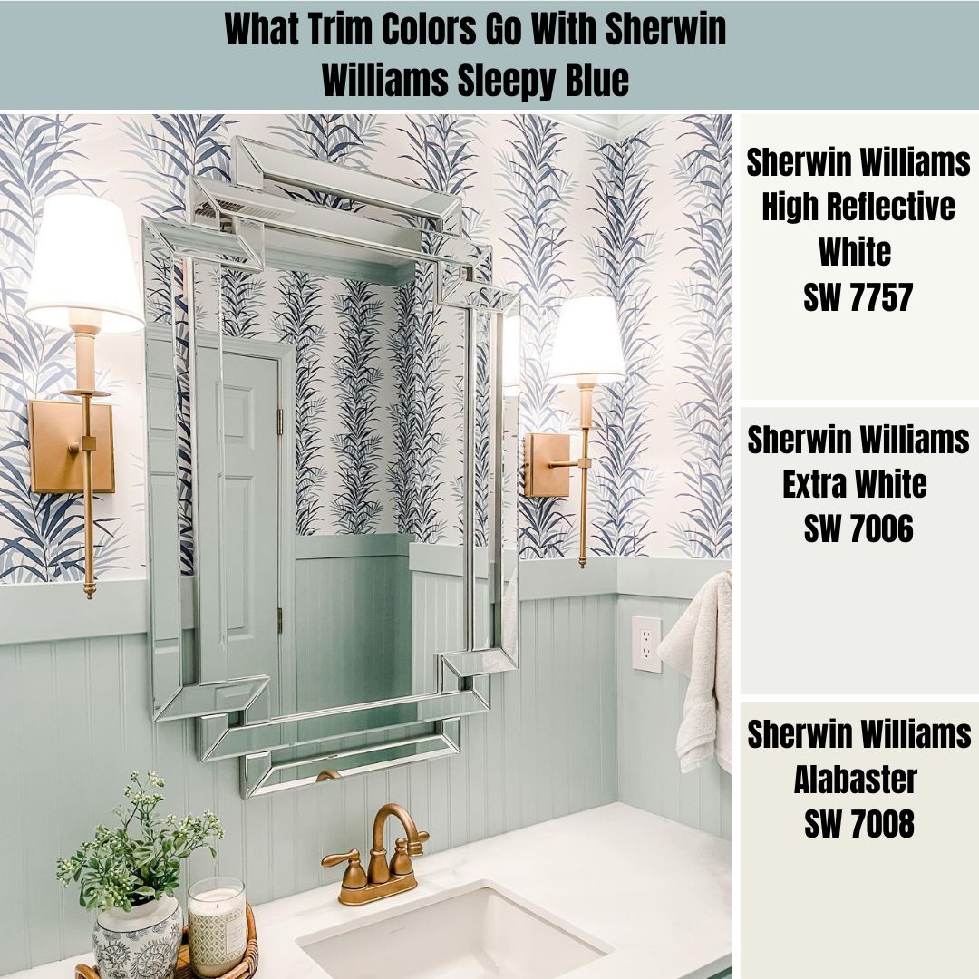
Sherwin Williams Sleepy Blue works with numerous trim colors—the paint color is highly flexible. However, in most cases, when working with Sherwin Williams Sleepy Blue, I will either go after a crispy or creamy look—to achieve these two looks, you can use the following paint colors:
Sherwin Williams High Reflective White (SW 7757)
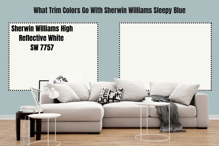
High Reflective White is one of the whitest white paint colors you will ever come across. For this simple reason, it is my go-to color when implementing a crispy look on my trims.
High Reflective White boasts an LRV of 93, which is extremely high, considering that it absorbs a mere 7% of light and reflects 93%. Using High Reflective White with Sleepy Blue creates a scenario where Sleepy Blue gets enough light reflected on it and hence maintains its character and personality.
However, High Reflective White is a pretty neutral paint color on the warmth-coolness scale. For this reason, it will not bring warmth like the creamier whites. Therefore, if you are using High Reflective White on Sleepy Blue trims, you may still need a warmer color, especially in a cold room.
Sherwin Williams Extra White (SW 7006)
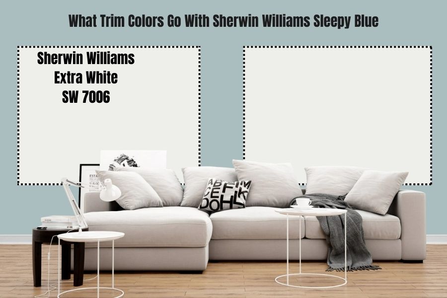
Sherwin Williams Extra White is another stark white paint that implements a crisp look on Sleepy Blue’s trims. It is one of the most recommended colors for ceilings and decorations, even when working with other paint colors.
Extra White has some creaminess that makes it slightly soft and warm. However, the creaminess is so low that it is usually tough to notice. Moreover, the paint color does not add that much warmth to any room—therefore, it may not be the perfect color to rely on for balancing the cool in Sleepy Blue.
Sherwin Williams Alabaster (SW 7008)
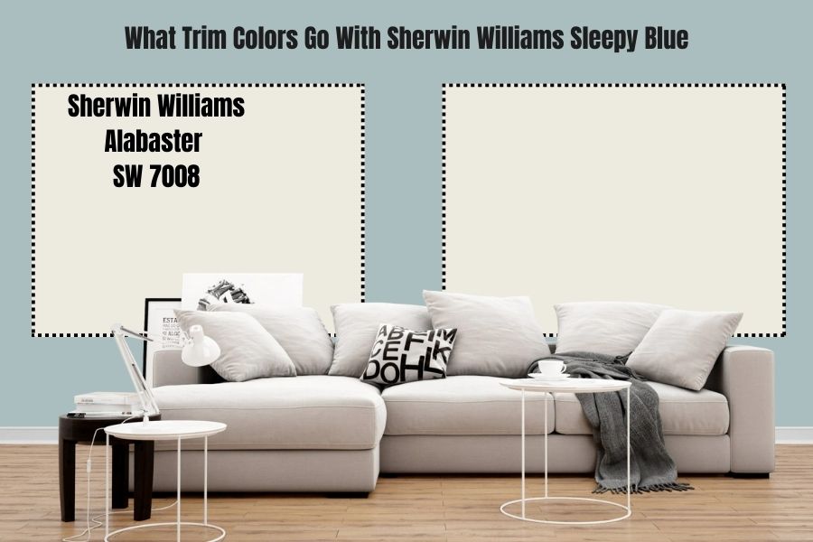
If your goal is to put a creamy appearance on your trims, neither Extra White nor High Reflective White will help you achieve your desired goal. However, you can always turn to Sherwin Williams Alabaster.
Alabaster is not yellow, meaning you do not have to worry about the color bringing too much heat into your space. However, this paint color boasts a neutral base, giving it a creamy, almost off-white appearance. The color features an LRV of 82, meaning it will stand out and reflect enough light to make Sleepy Blue interesting.
Sherwin Williams Sleepy Blue Benjamin Moore Version
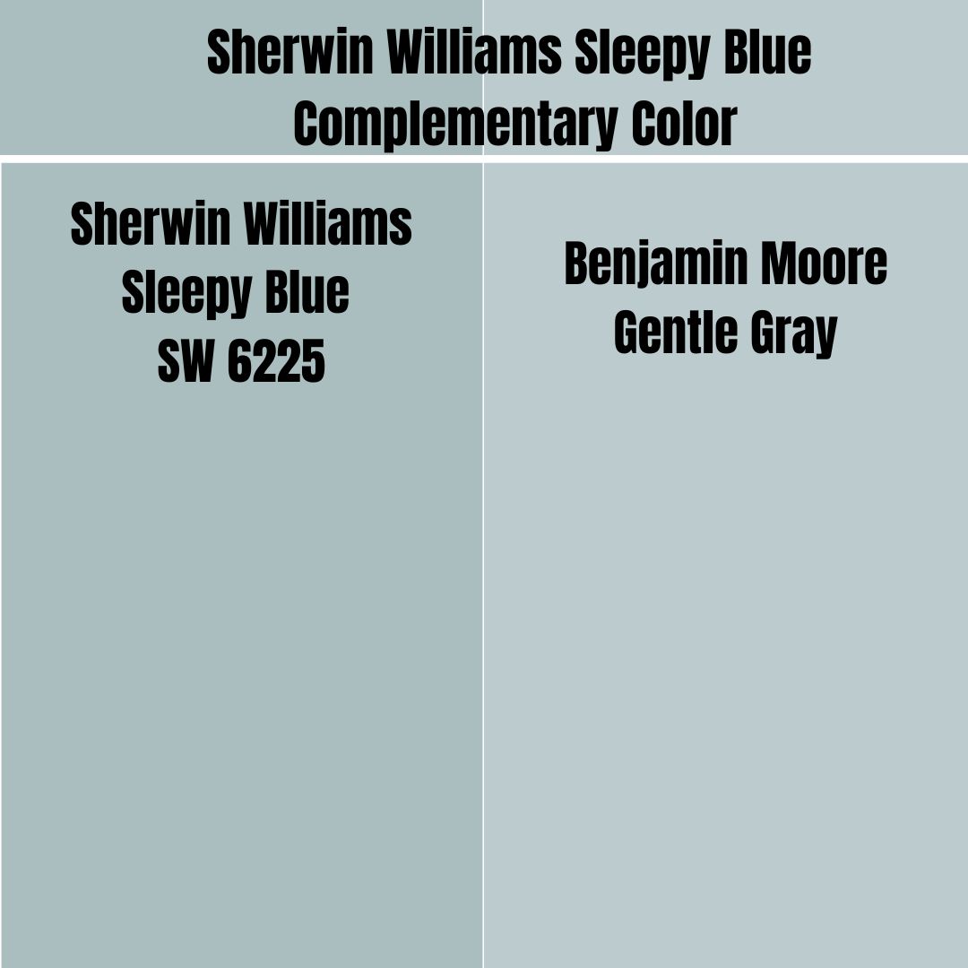
If you plan to replace Sleepy Blue with an alternative from Benjamin Moore while maintaining the same look, the color you are looking for will be Benjamin Moore Gentle Gray. On the RGB scale, Benjamin Moore Gentle Gray combines red: 192, green: 202, and blue: 205. This is close to Sleepy Blue, which combines red: 188, green; 203, and blue: 206.
Benjamin Moore Gentle Gray and Sleepy Blue boast an almost similar LRV. While Sleepy Blue reflects 58% of light, Gentle Gray reflects 57.2%.
How Does Light Affect Sherwin Williams Sleepy Blue?
Sleepy Blue is a medium-light paint color that works well in different light settings. The paint color will hold its ground in slightly dim rooms. However, when the brightness in a room gets too low, the color may lose appeal and become too dull.
Moreover, Sleepy Blue is a cool paint color. Therefore, in warm southern light, the color feels more balanced. However, in cool northern light, the color may feel extra cold and even lean on the icy side as the cold increases.
Best Rooms for Sherwin Williams Sleepy Blue
Sherwin Williams Sleepy Blue is a very flexible paint color. You can use it in almost any room. Below, I have several options to show how to use this paint color, ideally in different areas in your house.
Sherwin Williams Sleepy Blue Bathroom
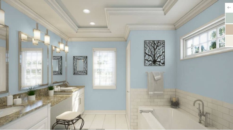
One thing that makes Sherwin Williams Sleepy Blue a perfect paint for bathrooms is the relaxing vibe it adds to the space. It works even better when paired with creamy whites—for example, what they have done with the above bathroom.
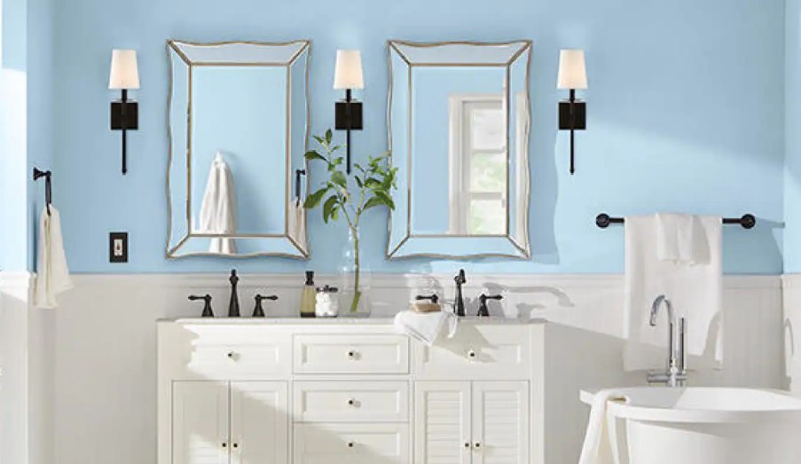
This bathroom is another exceptional case of ideally using Sherwin Williams Sleepy Blue. The owner has created a nice contrasting look in the bathroom, pairing Sleepy Blue with White. Careful enough when choosing the white paints in this bathroom, the owner has used creamy off-whites to balance the coolness in Sleepy Blue, keeping the bathroom from looking or feeling icy.
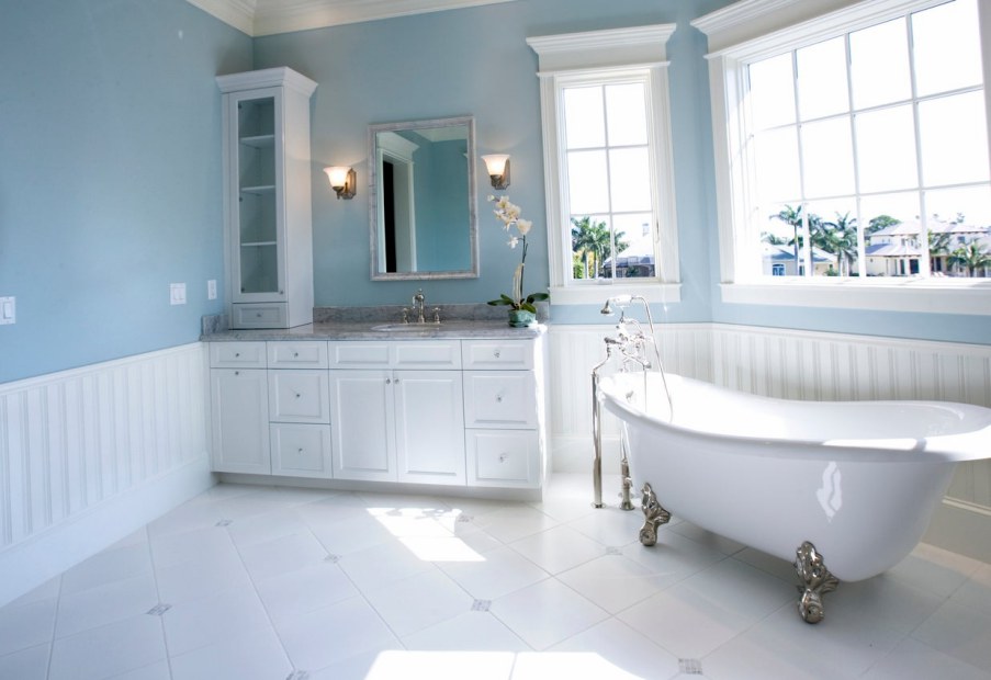
The above bathroom perfectly depicts the clean look you get when you pair your Sleepy Blue with White color. The white paint on the cabinets looks more like Extra White and does not feature much creaminess. While Extra White does not increase warmth in the room, it does not matter since this bathroom seems to be welcoming warm southern light—this balances the coolness in Sleepy Blue on the walls.
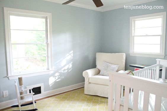
Sherwin Williams Sleepy Blue Bedroom
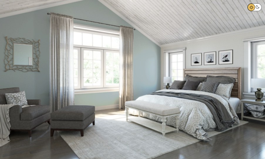
Sherwin Williams Sleepy Blue works in bedrooms too. In the above bedroom, the paint color brings a sense of calmness and relaxation, the kind of vibe you need to relax or sleep after a long tiring day.
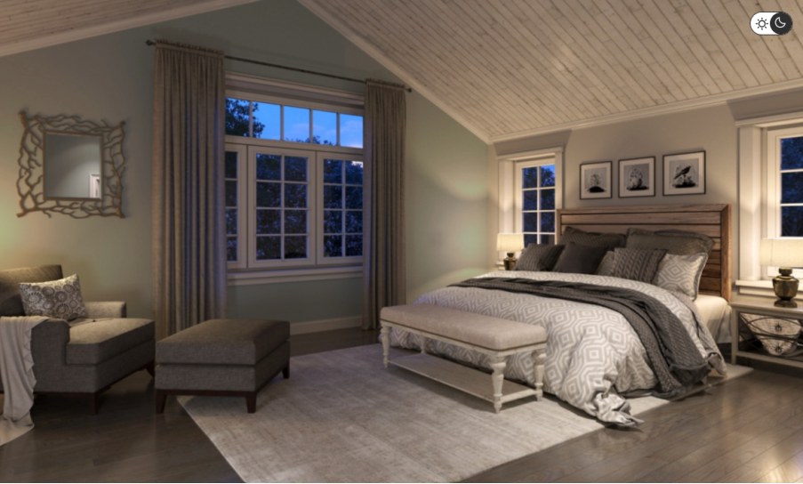
This image of the same bedroom shows how Sherwin Williams Sleepy Blue behaves when light reduces. In this case, it is at night, and Sherwin Williams Sleepy Blue is in a room with artificial light. The artificial light makes the rare gray and green undertones show up. In the previous image, you couldn’t view gray or green on the wall.
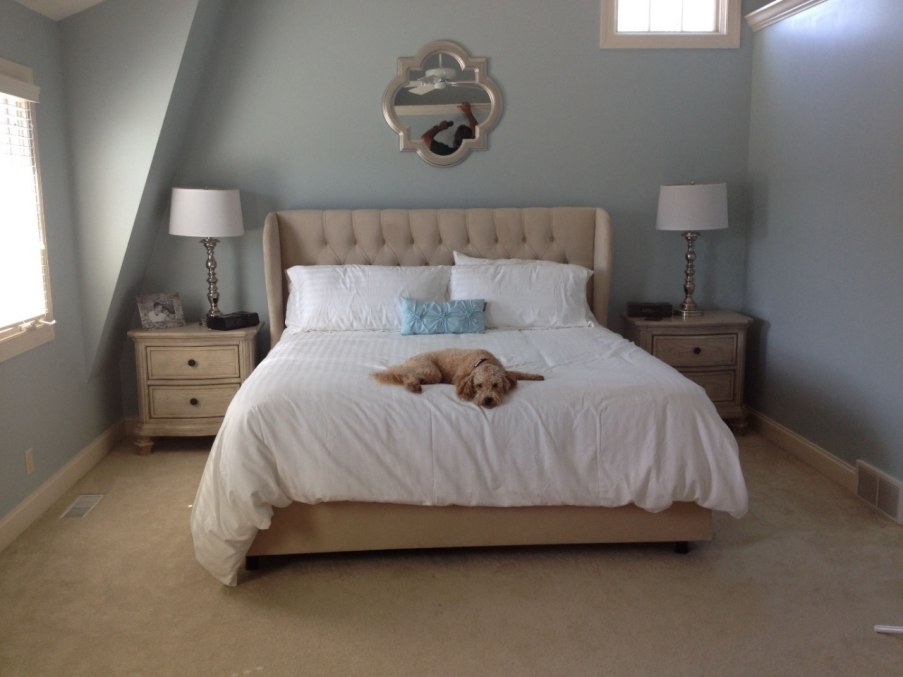
This image clearly displays what Sherwin Williams Sleepy Blue looks like in a bedroom—calm and relaxing. The light seems insufficient and appears to be forcing Sleepy Blue to show some gray undertone. Regardless, the color creates a chilling vibe in this bedroom.
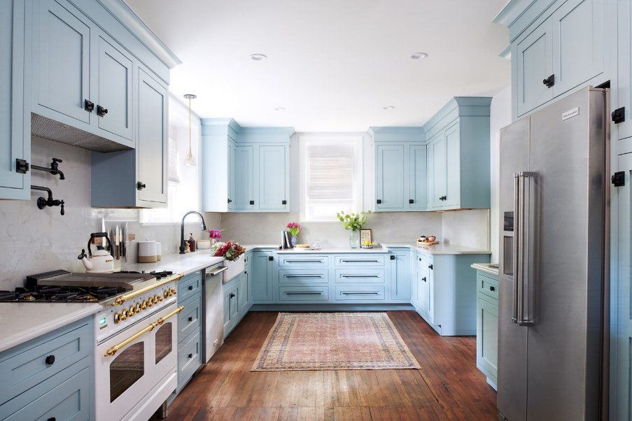
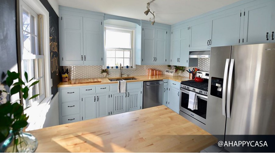
Sherwin Williams Sleepy Blue Kitchen
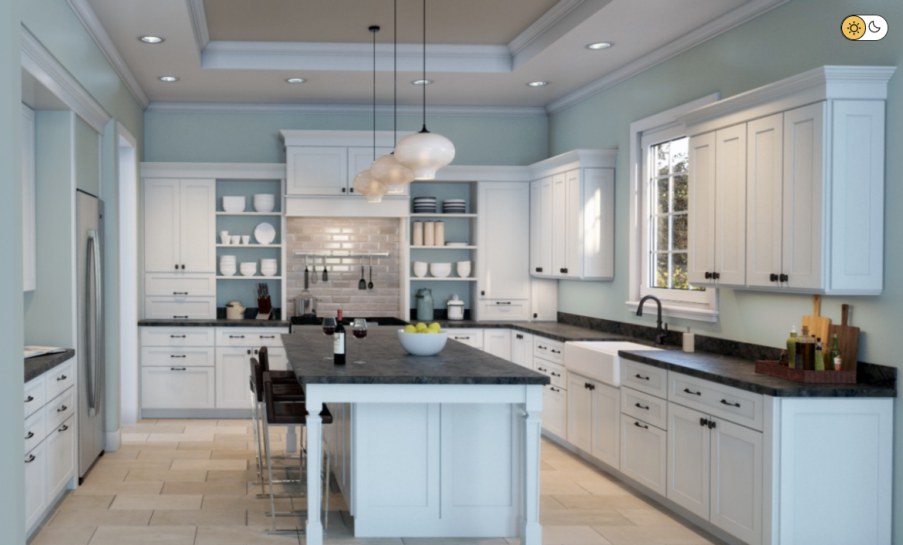
Who doesn’t want to be in a relaxing environment while preparing a meal? I bet everyone does. This case showcases the impressive appeal of Sherwin Williams Sleepy Blue when used in a kitchen. The paint color blends well with the woody color on the countertop and the kitchen table. Enough light in the above kitchen brings out the true personality of Sleepy Blue.
This kitchen nicely pairs Sherwin Williams Sleepy Blue with White trim and ceiling. The kitchen is well-lit, allowing Sleepy Blue to showcase its cool, relaxing appearance. Moreover, the white decors in the room reflect even more light onto Sleepy Blue, allowing it to stand out even more.
In the previous images, Sherwin Williams Sleepy Blue seems to be sitting on the cabinets alone. This picture shows how a kitchen looks when you have Sleepy Blue on the walls. The Whites on the trims and cabinets seem to be acquiring some of the Blue in Sleepy Blue, creating a more uniform look throughout the kitchen.
Sherwin Williams Sleepy Blue Living Room
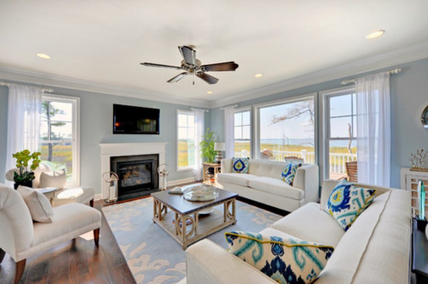
We spend most of our time in the living room. Therefore, there is a high likelihood that we would all want the living room to be as relaxing as possible. Well, you can achieve this with a cool Sleepy Blue on your walls, like shown in the above living room. You can pair the sleepy Blue with interesting off-whites to ensure the coolness in Sleepy Blue does not overwhelm the living room.
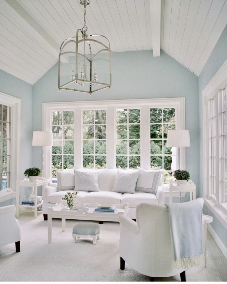
This is another attractive interior design for a living room. The design combines Sleep Blue with whites on the trims. The end goal is a look that is so calm anyone would want to spend more time in the environment.
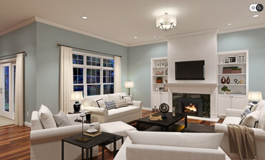
Maybe you have wondered, “I come home at night; what will Sherwin Williams Sleepy Blue look like after dark?” Well, the above image should answer this question for you. As long as you have enough light in the room, your Sleepy Blue will look as good at night as it does during the daytime. You may also want to pair the color with whites to ensure more light is reflected onto the walls to create the exciting look you see above.
Overview
Sherwin Williams Sleepy Blue is an exciting color that adds a laid-back, relaxed, calm, airy, and quiet feel to any room. The color creates this vibe throughout the day and at night—however, you have to ensure you have enough light at night to keep the paint from looking bland.
The color leans on the cooler side of the scale. For this reason, it is a perfect color for tropical and warmer tropical climates. The color is, however, open to pairing with warmer colors. Therefore, you can use it in cooler temperatures if you pair it with a warmer shade to keep the room from getting icy.
I hope this article has answered your questions about Sherwin Williams Sleepy Blue. If you need more information, please leave your questions in the comments below.
 Sherwin Williams Silverpointe (Palette, Coordinating & Inspirations)
 Sherwin Williams Ivory Lace (Palette, Coordinating & Inspirations)
 Sherwin Williams Shiitake (Palette, Coordinating & Inspirations)
 Sherwin Williams Magnetic Gray (Palette, Coordinating & Inspirations)
 Sherwin Williams Ivoire (Palette, Coordinating & Inspirations)
 Sherwin Williams Peppercorn (Palette, Coordinating & Inspirations)
