
Choosing a paint shade for your new space or repainting an old shade is often tasking. Dealing with colors dictating how you decorate the rest of your area is a lot of pressure. Is Sherwin-Williams Smoky Blue (SW 7604) a true blue?
It gets worse when you’re into interior decoration and have endless options. Having been through similar stress while redecorating my room, I understand your frustration, especially when repainting or dealing with unknown undertones.
That’s why I’m here to help you through this decision and answer all the key questions to avoid regrets once you start painting.
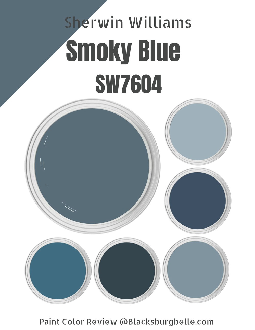
Table of Contents
What Color is Sherwin-Williams Smoky Blue (SW 7604)
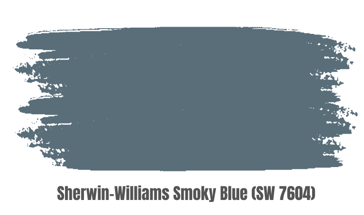
Sherwin-Williams Smoky Blue is a blue-gray color that hints at blue and gray. One tone dominates the other under the right lighting conditions; hence it’s a two-toned hue. Technical descriptions always translate differently in real life so pay attention.
Mostly, the blue side of the Smoky Blue tone is prominent, but underneath dim lights, it presents as a fading smoke (gray.)
| Manufacturer | Sherwin Williams |
| LRV | 15 |
| RGB | Red 89 | Green 110 | Blue 121 |
| Hex Value | #596e79 |
| Color Collections | Treasured, Independence, Nurturer |
RGB of Sherwin-Williams Smoky Blue
You can analyze every Paint using the RGB color format, which is the intensity of red, green, and blue hues in your shade. This format says every color starts as Black, and drops of red, green, and blue mixed into that black shade provide a unique color.
Sherwin-Williams Smoky Blue RGB content is Red 89, Green 110, and Blue 121. The HEX Value is #596e79.
Light Reflective Value (LRV) Of Sherwin-Williams Smoky Blue
Sherwin-Williams Smoky Blue has an LRV of 15, meaning it leans toward the dark side of the spectrum. The LRV of a paint color tells you how well it’ll do underneath the light and without it.
The scale ranges from zero to a hundred, with true black being the least at 0 and pure white being the brightest at 100. However, paint colors exist between 3 and 93 because no matter how “black” or “white” they are, there are always compromising undertones.
Also, LRV determines how much the undertones would reflect under the right conditions.
Is it a Warm or Cool Color?
Colors are either warm or cool based on the color wheel. Red, Yellow, and Orange are warm because they brighten rooms, while Blue, Green, and Purple are cool because they relax. Sherwin-Williams Smoky Blue is a cool neutral color that works well with other tones.
Think of it as warm colors representing heat and sunrise while cool colors representing the earth and water bodies.
Smoky Blue has a strong presence without overwhelming your space, making it a unique neutral shade. The Smoky Blue color by Sherwin-Williams is considered a true-blue shade because of that feature.
What are the Undertones?
Sherwin-Williams Smoky Blue is a true-blue paint, but it has mostly a Gray undertone. That means the color appears gray in dim light, making it a blue-gray tone. So, if you want both colors on your wall, the Sherwin-Williams Smoky Blue is your best option.
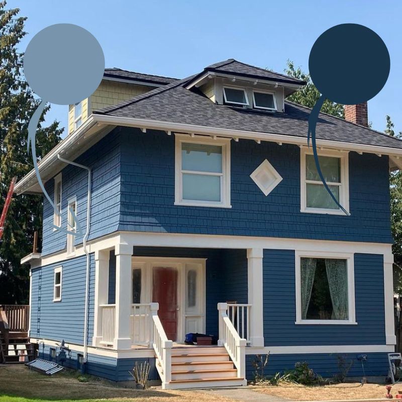
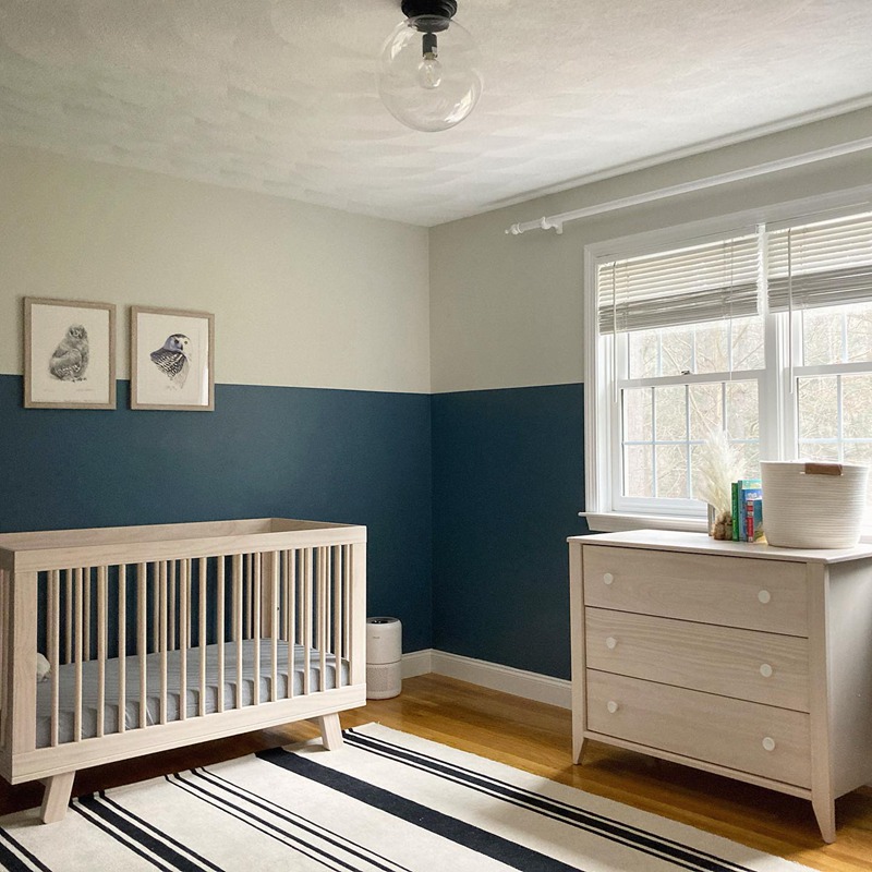
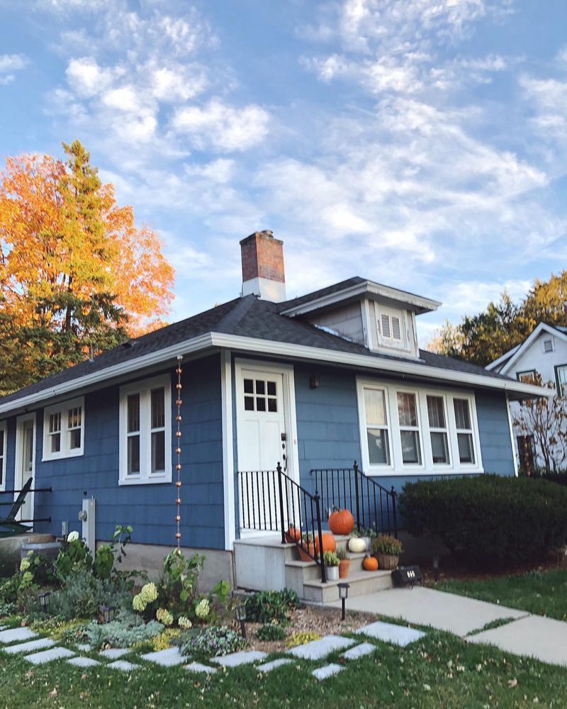
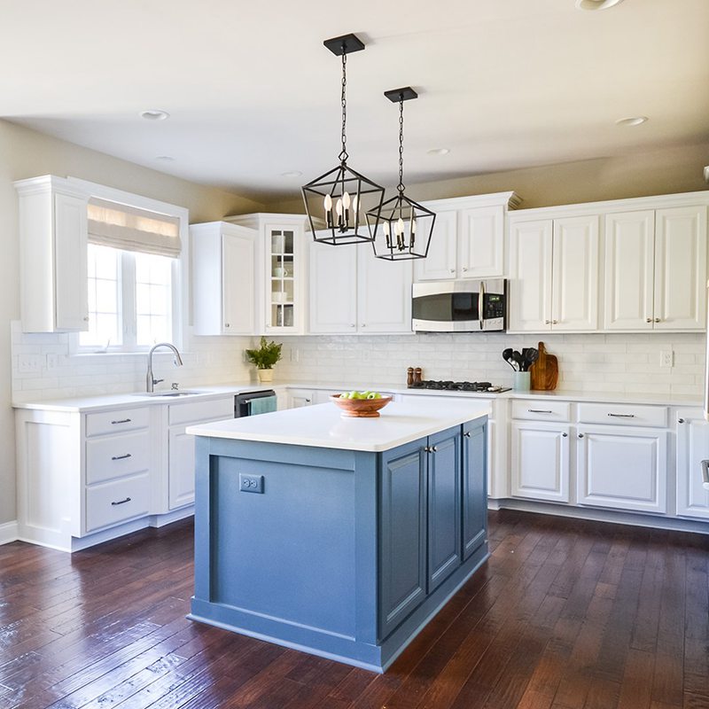
Check out the pictures below for different shades of Smoky Blue based on lighting.
A lit room with Smoky Blue Walls
Home exterior painted with Smoky Blue (Swipe to see unlit reflection)
Smoky Blue used as an Island Accent
Sherwin-Williams Smoky Blue Color Strip
The color strip coordinates four-color gradations by adding white and black to an anchoring shade. The Smoky Blue strip typically gives variations of blue-gray, which you can decipher through the unique Sherwin-Williams code.
Since Smoky Blue is SW 7604, the other shades are SW 7601 – SW 7603 for lighter tones on the strip to SW 7605 – 7607 for darker tones. See the table below for their names and shades.
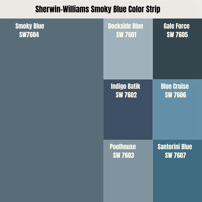
Light Color Strip
| Color Code | Color Name | Location Number |
| SW 7601 | Dockside Blue | 280-C1 |
| SW 7602 | Indigo Batik | 224-C7 |
| SW 7603 | Poolhouse | 280-C3 |
Dark Color Strip
| Color Code | Color Name | Location Number |
| SW 7605 | Gale Force | 279-C3 |
| SW 7606 | Blue Cruise | 280-C4 |
| SW 7607 | Santorini Blue | 279-C6 |
Sherwin-Williams Dockside Blue (SW 7601)
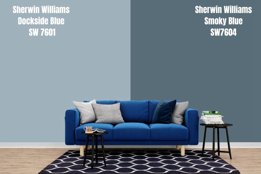
Dockside Blue is about three shades lighter than Smoky Blue, so its blue hue is more prominent than the former’s. It has more RGB decimals than its counterpart and presents as muddy gray underneath bright lights.
It’s a teal tone hence its oceanic-inspired name, “Dockside Blue.” The color leans towards the light side of the spectrum, so it’s a great choice for monochromatic decoration. It has more personality than plain white when used as an accent on Smoky Blue, so try it today.
Sherwin-Williams Indigo Batik (SW 7602)
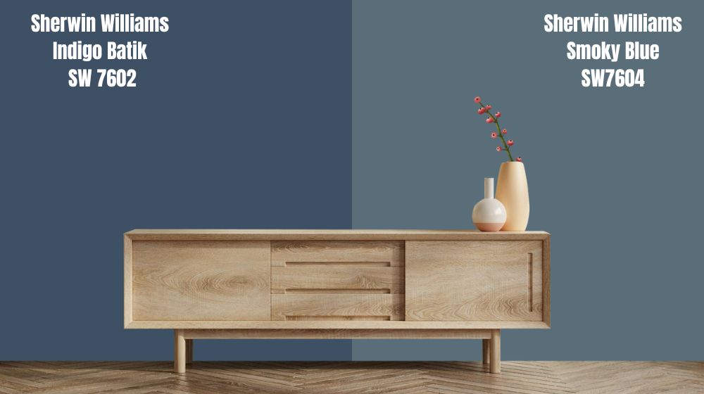
Indigo Batik is two shades darker than Smoky Blue and is the shade you should go for if you want a more defined gray in your blue. Its RGB decimals are lower than the former, meaning it has a low LRV and less chance of reflecting its undertone.
This shade is as good as Smoky Blue in marrying other tones flawlessly. It gained popularity two years ago due to its regality and distinct aura. Indigo Batik painted on a wall or Island accent presents as Navy Blue, and it’ll swallow your entire space.
If you don’t want an overpowering color, avoid this paint.
Sherwin-Williams Poolhouse (SW 7603)
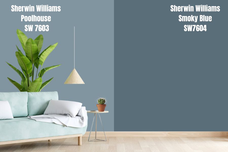
Poolhouse is a shade lighter than Smoky Blue with strong RGB decimals at 128|149|160. It’s a shade of Cyan with strong hints of gray. This is the color you choose when leaning into the relaxing psychology of blue.
Sherwin-Williams Poolhouse isn’t the best coordinator for Smoky Blue because of their similarities, but it works well as an accent. You can use the shade on furniture and décor when doing monochrome designs.
Sherwin-Williams Gale Force (SW 7605)
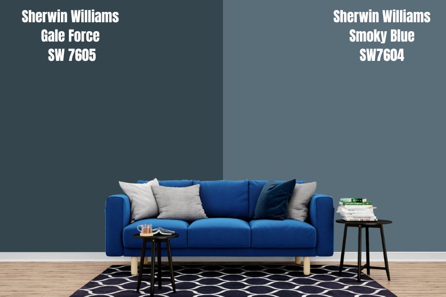
Sherwin-Williams Gale Force is a shade darker than Smoky Blue with strong undertones of green and gray. This Green undertone makes Gale Force best suited for the outdoors, although it works fine indoors.
Gale Force blends on home exteriors because it presents as an extension of their natural shades. If you want to create a natural ambiance, this is the blue-gray paint for you. Mix it with stone or brick to get the best outcome.
Sherwin-Williams Blue Cruise (SW 7606)
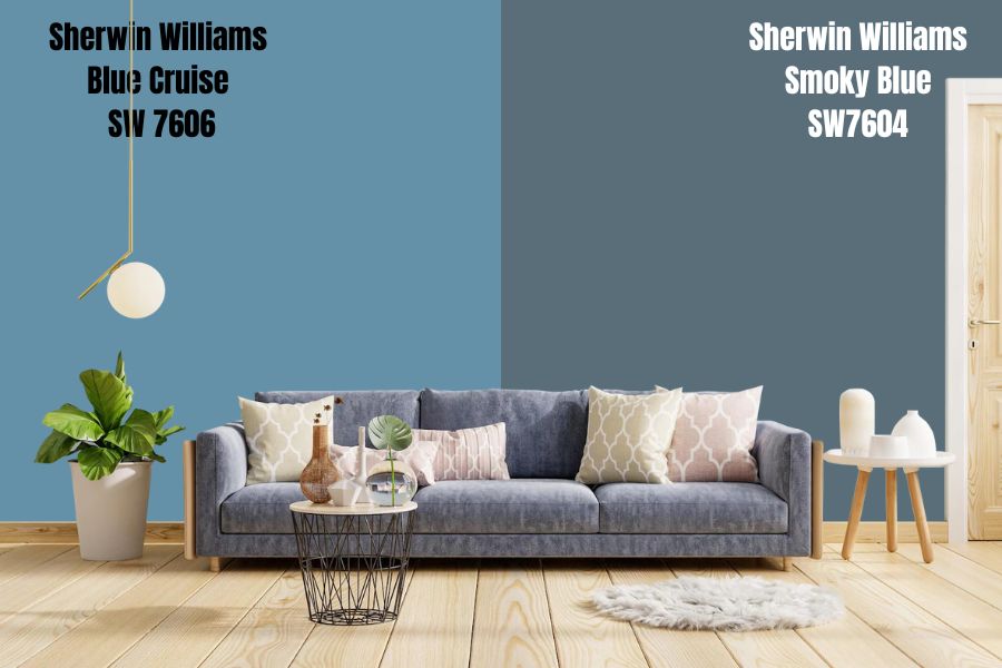
Blue Cruise is three shades lighter than Smoky Blue, with the blue outweighing its gray components. This color presents softer North-facing lights and gives an outlook of powder blue.
This color does well with white and other bright colors as they work together to make a space appear wider. It’s a great option if you’re painting a small room. Use Blue Cruise on the wide expanse of walls to get your money’s worth, as it’ll be lost on trimmings and accents.
Sherwin-Williams Santorini Blue (SW 7607)
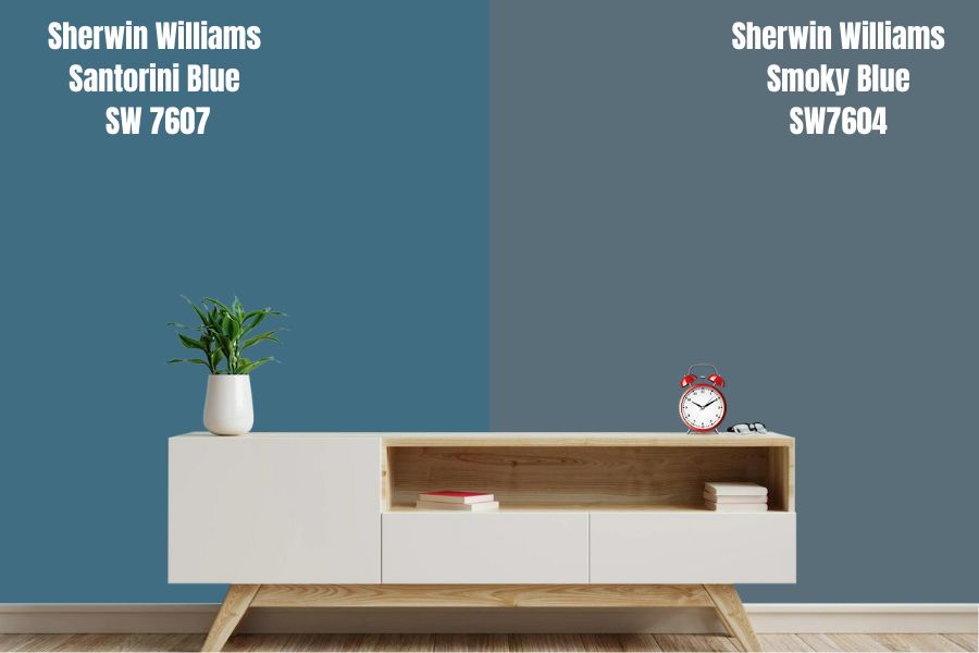
Santorini Blue is two shades lighter than Smoky Blue, so it retains its gray hue but has a more dominant green undertone. It has an LRV of 44.11, making it appear lighter in real life than it presents on screen.
This color is more blue-green than blue-gray, and that’s okay if you want to mimic a tropical vacation in your home. It shines best in bathrooms, laundry rooms, and any green space.
An aquarium, fish tank, and house plant placed against a Santorini Blue wall is the perfect finish.
Sherwin-Williams Smoky Blue
Sherwin-Williams Smoky Blue is a unique shade of blue because even though it falls in the cool spectrum, it still casts a shadow wherever it’s painted. It’s not dull and has a strong presence but wouldn’t swallow up any other color you coordinate, making it perfect.
Sherwin-Williams Smoky Blue Color Palette
Smoky Blue has a wide range of use, and it’ll be a shame if you don’t realize its full potential. Luckily for you, I’m here to guide you and help you create an optimal space. Learn how to coordinate with a Smoky Blue color palette.
Coordinating Colors for Smoky Blue
Choosing complimentary colors for your smoky blue room depends on the vibe you’re going for in your space. You may decide to decorate in monochrome or contrasting shades. Still confused? Don’t worry; I’ll explain it all now.
Monochrome Decoration
Monochrome design involves using one color as your anchor and choosing colors of that shade. In this case, it means decorating your smoky blue room with other shades of blue, from the lightest to the darkest shade.
Like many decoration tricks, it’s not cut and dry, as there’s such a thing as the wrong shades clashing. It’s always best to be within the LRV spectrum you have by choosing colors no more than three shades lighter or darker to get a beautiful combination.
If you stick with colors closer on the spectrum to smoky blue such as Stargazer, Wall Street, or Before the Storm, you’d better see the difference. For a distinct décor, find blue shades between two to three times its LRV.
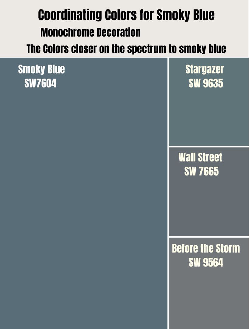
Pro Tip: Use the Color Strip.
Try other cool blues like Embellished Blue, Snowdrop, Bathe Blue, and Upward to open up the space. To maintain a dark vibe, use dark blues like In the Navy, Loyal Blue, Country Squire (which leans towards green), and Rainstorm.
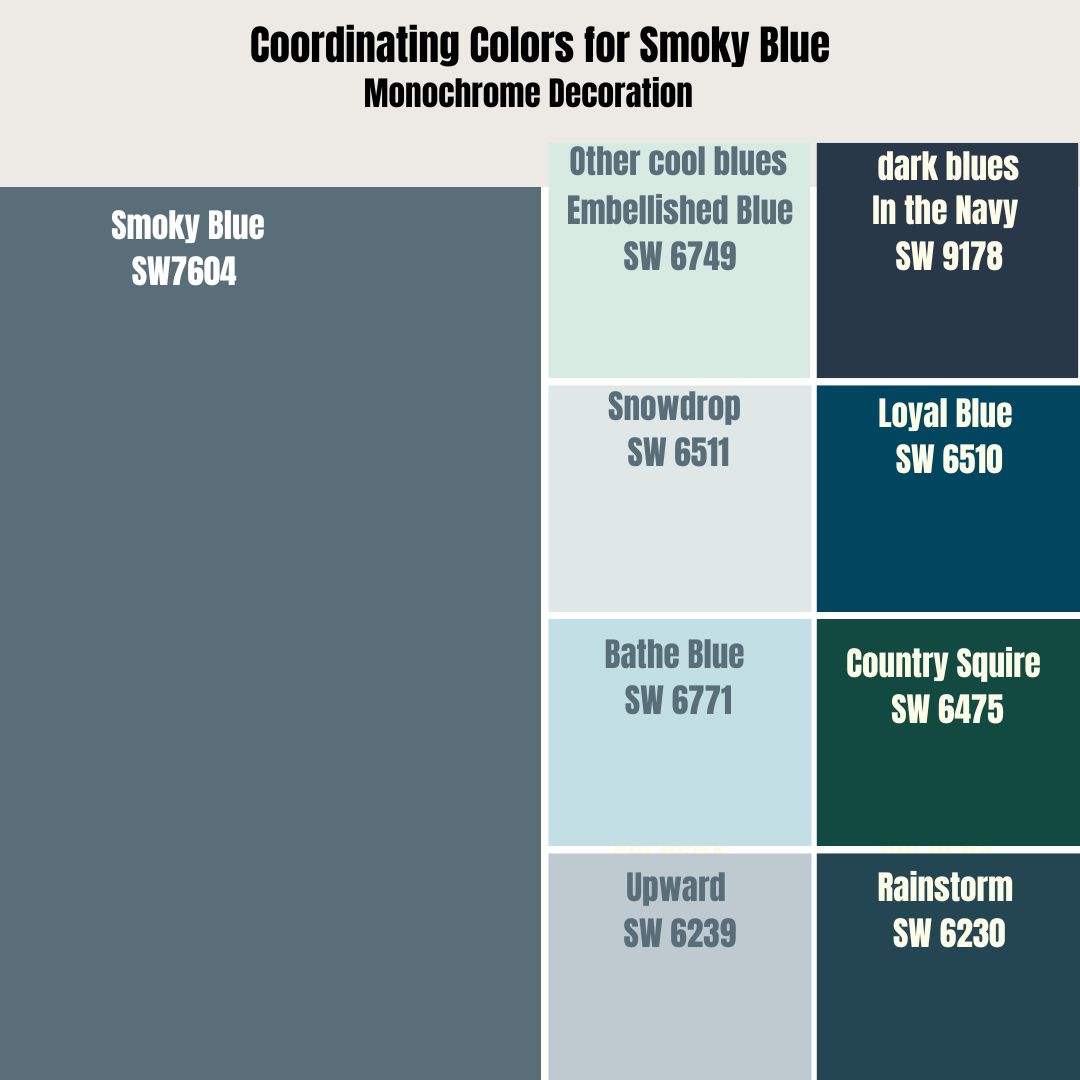
Coordinating monochromatic tones is fun because it allows you to play with the anchor color and explore its possibilities beyond your chosen wall paint.
Contrasting Decoration
If you’d rather have different colors in your space, then coordinating contrasting colors is your best bet. When styling in contrast, your Smoky Blue paint is the anchor color. That means every other pigment you add to your space must fit the tone unless you’re into color blocking.
Contrasts work like the monochromatic decoration in that you need darker or lighter LRVs than your anchor color – Smoky Blue. However, that’s where the similarities end. Sherwin-Williams suggests Egret White, yellow Bird, and Ice Cube as the best coordinating hues.
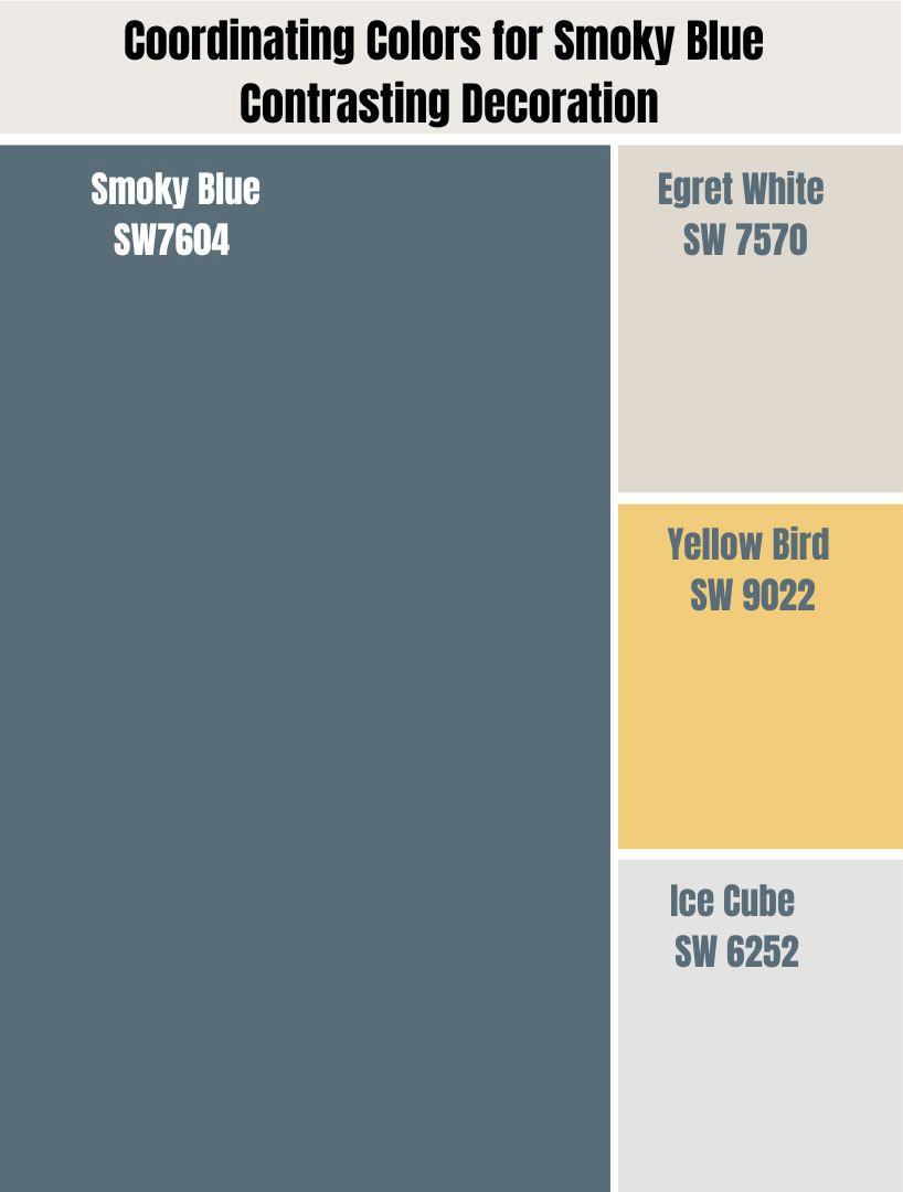
One thing those three colors have in common is that they’re all bright. As earlier explained, colors with high LRVs would open up a Smoky Blue space as they’ll bounce off light instead of absorbing it.
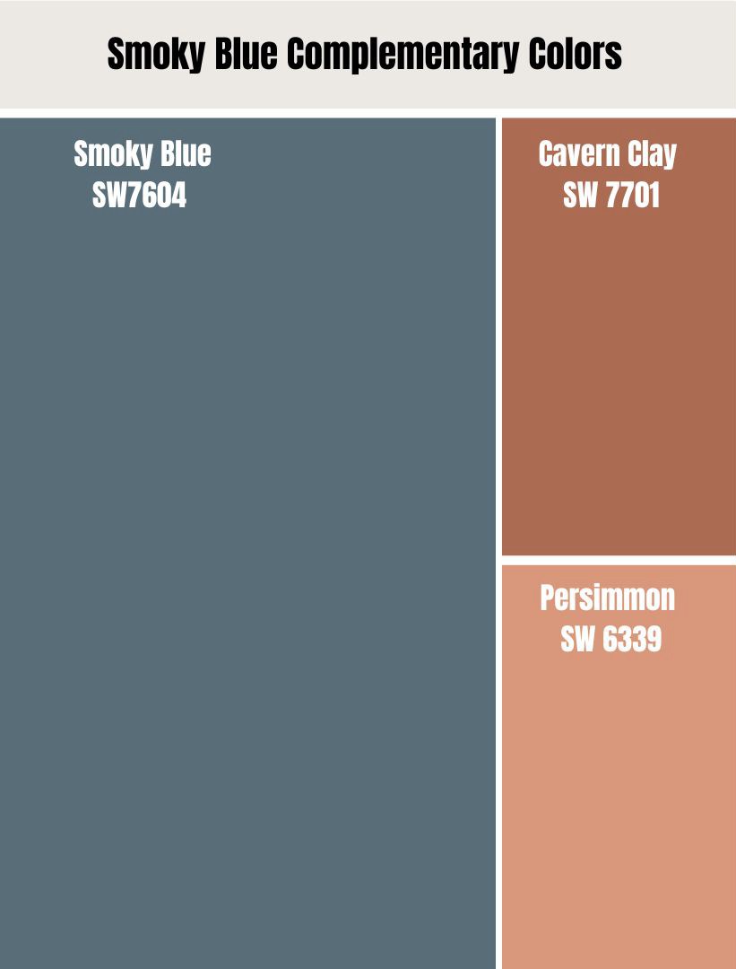
Smoky Blue Complementary Colors
Complementary Colors are hues found on the opposite side of the anchor color on the color wheel. With a tone like Smoky Blue, a shade of dark blue, the complementary colors are tones of orange.
Also, try tones of Brown made by mixing orange (or red, its primary color) with black. You’ll find that they work when paired together, especially in shades of orange, since Smoky Blue is already on the dull spectrum.
Mix Cavern Clay, Persimmon, and other woody tones with Smoky Blue for a complementary color scheme, and you won’t regret it.
What Trim Colors Go With Sherwin-Williams Smoky Blue?
The best trims for Smoky Blue walls are the three coordinating colors suggested by Sherwin-Williams, Egret White, Yellow Bird, and Ice Cube. They contrast perfectly with the gray tone and add a good highlight on accents.
Sherwin-Williams Smoky Blue Color Comparisons
Sherwin-Williams Smoky Blue, as a versatile shade, makes it one of the brand’s fastest-selling cool, medium-dark tones. In case it’s not available, and you’re hard-pressed for time (I’d rather wait for as long as necessary), there are some alternatives to try.
You may choose other blue colors by Sherwin-Williams along the same medium-dark spectrum, like Distance, Bunglehouse Blue, Labradorite, and Refuge.
Sherwin-Williams Smoky Blue vs. Sherwin-Williams Stargazer (SW 9635)
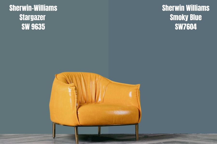
Bring a starless night into your space with Stargazer as it leans more into its gray shade than its blue. Buy the Emerald Designer Collection and pair it with light accents to get the best out of this paint.
It has 96 Red, 117 Green, 112 Blue, a Hex Value off #60757a, and 17 LRV making it similar to Smoky Blue. The latter color is, however, darker than it on the Color Strip by 2%. It only comes in the designer collection, so; Stargazer is a big deal.
Let’s call it the expensive alternative to Smoky Blue.
Sherwin-Williams Smoky Blue vs. Dutch Boy Smoky Blue (V-33-2)
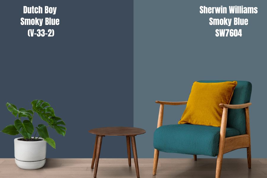
Dutch Boy is cheaper than Sherwin-Williams, although I can’t vouch for the quality compared to SW’s paints. You won’t find its V-33-2 paint anywhere as it’s discontinued, but My Perfect Color mixed a similar shade using 60 Red, 74 Green, and 89 Blue.
You can track it down with its Hex Code #3C4A59. It’s not Smoky Blue, as it casts a darker gray shadow, but it does the job nicely.
Smoky Blue vs. Sherwin-Williams Distance (SW 6243)
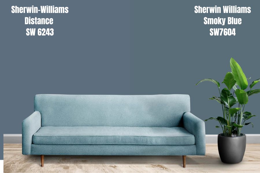
If you ever need a perfect alternative from Sherwin-Williams, this is it. Distance has the same LRV as Smoky Blue and is also a Blue-Gray shade. Placed side-by-side, you can almost not tell the difference, but it’s there as Smoky Blue is slightly darker than Distance.
Sherwin-Williams Smoky Blue vs. Benjamin Moore’s Classic Gray (1548)
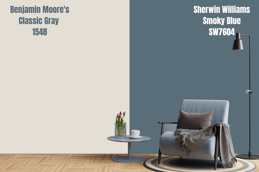
You won’t ever mix up Sherwin-Williams Smoky Blue and Benjamin Moore’s Classic Gray because they’re widely different.
Smoky Blue Benjamin Moore Color Comparison
Sherwin-Williams Smoky Blue is a blue-gray shade, so use that as your starting point when searching for comparisons in Benjamin Moore. You won’t ever find an exact alternative from the competing brand, but here are some of its best blue-gray tones.
Fair Isle Blue (CSP-715)
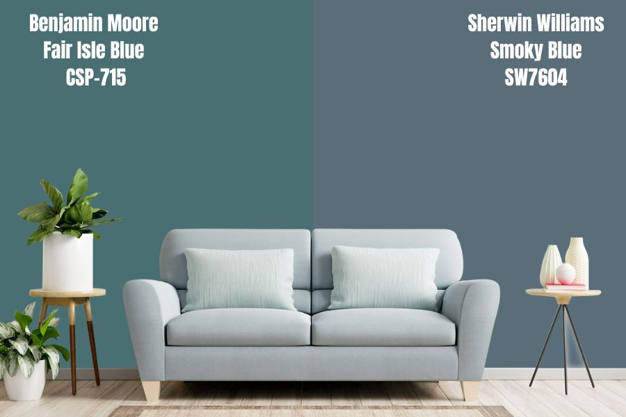
Fair Isle Blue by Benjamin Moore leans heavily towards teal, meaning it has a pronounced green undertone. It gives the aura of being out at sea, and that’s calming. Think of the color of the ocean when you go on a deep dive into the coral reefs; then you have Fair Isle Blue.
Providence Blue (1636)
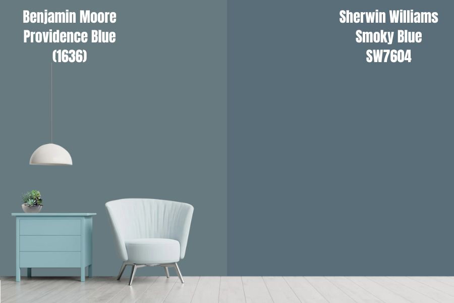
With Providence Blue, you have a truly blue-gray hue with more gray than blue. You can use this pigment anywhere from your living area to the bedroom. It’ll come alive when paired with a creamy tone like warm yellow or ivory white, be it paint or décor.
Van Deusen Blue
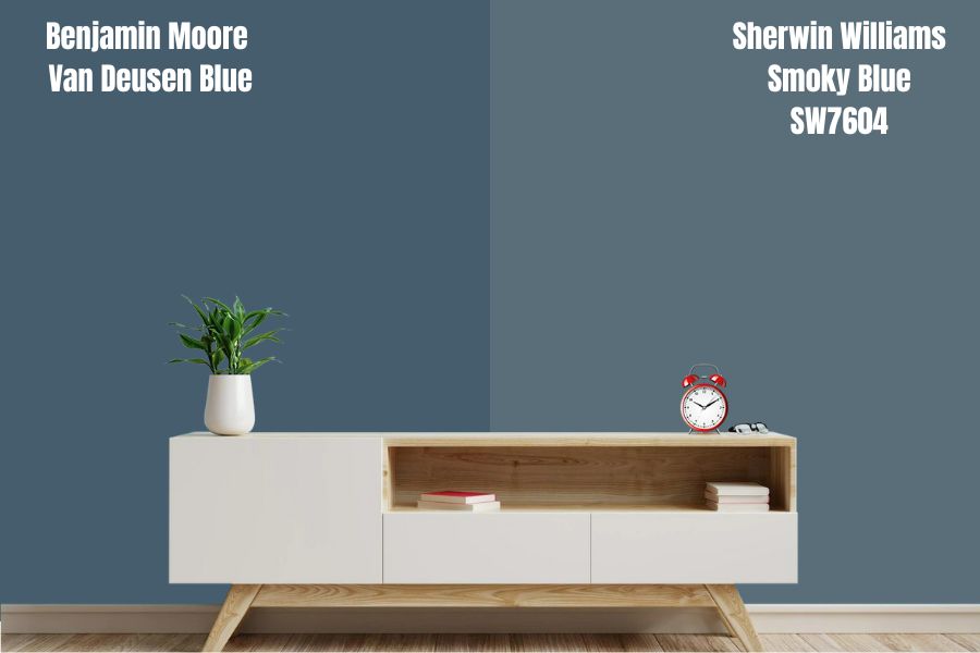
Van Deusen Blue is a cool navy-blue variant with purple and gray undertones. You may only pair it with lighter blues or darker blues in highlights and furniture.
For instance, if your entire bedroom is Van Deusen Blue, add a darker shade like Salty Dog or a lighter blue like Windy Blue to make the space pop. Then decorate that spot with coordinating colors be they complementary or monochromatic.
Smoky Blue Benjamin Moore Version
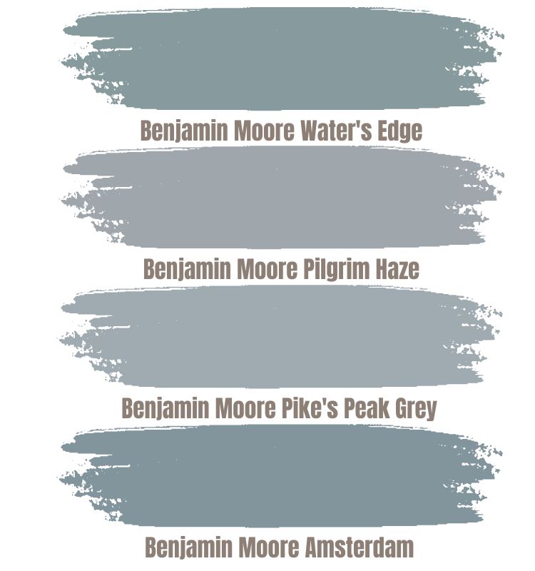
Benjamin Moore doesn’t have a Smoky Blue shade, but you can buy similar-toned paints, from Van Deusen Blue to Fair Isle Blue. Try Water’s Edge, Pilgrim Haze, Pike’s Peak Gray, or Amsterdam. Check out their uses below.
How Does Light Affect the Color?
Since Smoky Blue is a medium-dark tone with a 15 LRV, it absorbs light instead of reflecting it. So, you’d typically get the same dark style under sunlight with shades of gray. The gray tone is so faint that the color leans more into its blue side hence its categorization as a true-blue paint.
Best Rooms To Paint Smoky Blue
The best part about using Smoky Blue by Sherwin-Williams is that it fits anywhere. It acts as neutral tones thanks to its gray undertone. You can use it in your home, from the living room to the kitchen, bedroom, toilets, laundry, garage, and movie room.
All you need to do for extra pizzazz is add the right coordinating color, and you’re good to go. Check out these real-life uses below.
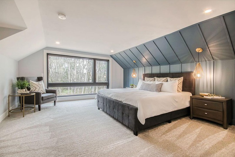
Smoky Blue Bedroom
Lovers of dark rooms would love the Smoky Blue paint because it’s dull enough to satisfy their interest yet, bright enough to keep things interesting. Psychologically, blue evokes calmness and relaxation in its surroundings because it mimics the seas and skies.
What better place to paint blue than the room where you rest your head after a stressful day’s work? Never mind that the hue is inherently dark; with the right-facing light, you’ll get a light enough reflection of its cool gray undertone.
The pigment is also a great anchor for other complementary or coordinated tones. You’ve seen the color schemes above, so you know the wonders this shade can do to your space.

Smoky Blue Living Room
It’s common to see medium-dark tones in living rooms, especially in homes without children. The shade retains its color, so there’s no fear of the bright undertones jumping out. This tone is best for a bachelor’s pad, game room, or man cave.
The Smoky Blue paint has a strong personality without engulfing your space in darkness. It’s easier to darken an area than lighten it once you’ve goofed on the basics. Moreso, if you want to darken the space, you must decorate with darker palettes.
View this post on Instagram
Smoky Blue Kitchen
Don’t paint your whole kitchen Smoky Blue unless you don’t want to eat. You must’ve heard the adage about feasting with your eyes before your mouth.
There’s a reason fast-food sellers don’t paint their building blue or shades of it. Warm colors evoke hunger in people, while Cool colors like Smoky Blue douse that hunger. Even Dominos, which uses blue in its logo, pairs it with a fiery red.
If you must use Smoky Blue in your kitchen, use it sparingly – as an accent, an Island, or Cabinets, or mix the walls with bright-colored accents like white to open up the space and sharply contrast its dull tone.
View this post on Instagram
View this post on Instagram
View this post on Instagram
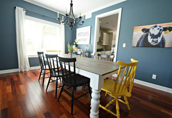
Smoky Blue Dining Room
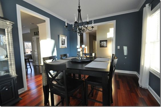
If Smoky Blue isn’t good overall for the kitchen, why should you use it in your dining room? You can use it as an accent if the living area is a bright tone. The same rule applies to dining areas since that is where you eat after toiling in the kitchen.
However, if it’s a lone room with doors, highlight the dining area with light tones on the furniture, floorboards, and décor. Mix it with complementary or coordinating light hues like Egret White. It’ll add much-needed ambiance to the room.
Smoky Blue Bathrooms
You won’t always get the chance to visit a spa, but you can recreate its serenity in your bathroom with Sherwin-Williams Smoky Blue without it being clinical. It’s good that this color works well with lighter blues or earth-toned neutrals, depending on your desired vibe.
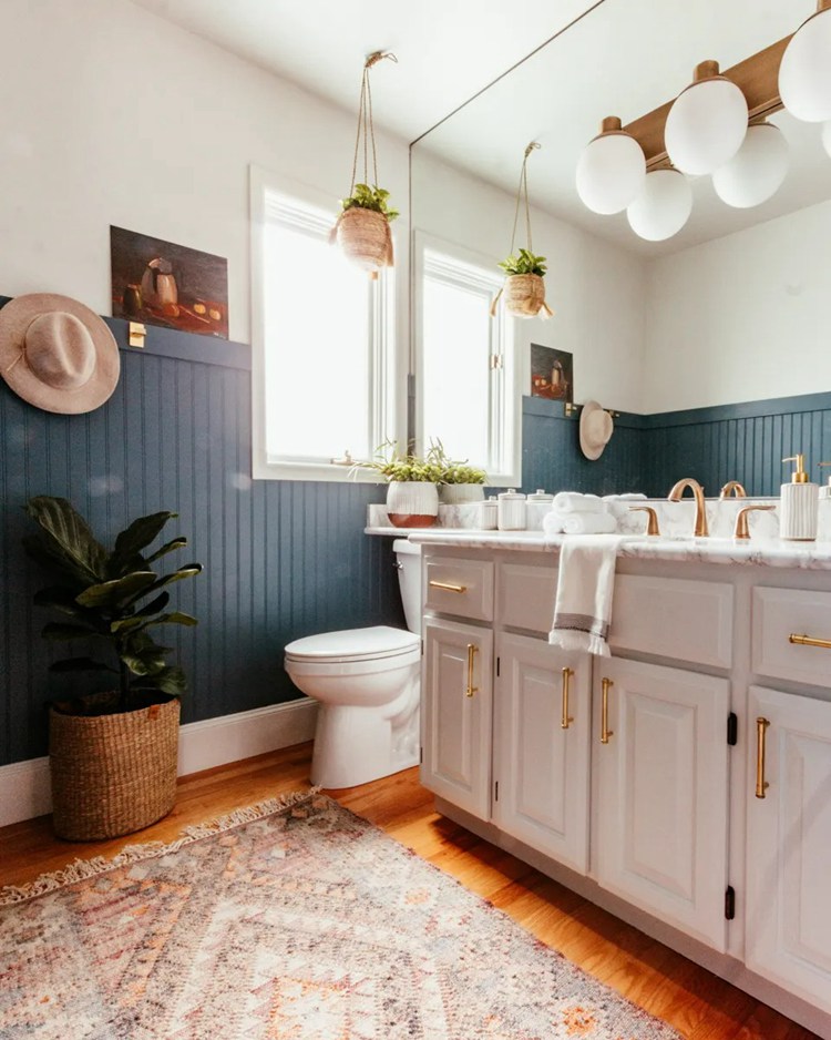
Decorate your bathroom with white and brown accents and accessories, and enjoy baths or showers like never before.

Smoky Blue Exteriors
Nobody likes a boring exterior except you couldn’t be bothered about painting and decorating, and that’s where Smoky Blue comes in. The blue-gray shade livens your home’s exterior without sticking out like a sore thumb.
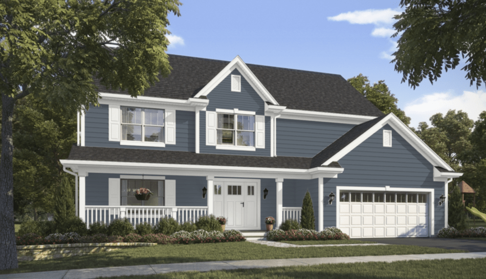
The color also does well with just about any other complementary shade based on the color schemes outlined above. It’ll blend well with other neutrals like white, black, and woody tones on the accent and trimmings.
View this post on Instagram
View this post on Instagram
Sampling Smoky Blue
Use Samplize or buy sample strips and color chips from Sherwin-Williams. The reusable adhesives would save you the stress and cost of buying a shade you’d hate. They all come in exact presentations as liquid paint.
Final Thoughts
Discovering Smoky blue is the best thing to happen to me as an interior decoration enthusiast this year. I consider it the perfect neutral because it’s not stoic like black or super bright like white, yet, it accommodates a vast color palette.
Whether you’re decorating your space in monochrome, coordinates, or compliments, Smoky Blue stands out and will make you say thank you once you’re done. Surely the pictures convinced you, and all left is choosing your theme.
Practice all you learned here, and home décor would be fun.
 Sherwin Williams Sea Salt (Palette, Coordinating & Inspirations)
 Sherwin Williams Silverpointe (Palette, Coordinating & Inspirations)
 Sherwin Williams Urbane Bronze (Palette, Coordinating & Inspirations)
 Sherwin Williams Rock Candy (Palette, Coordinating & Inspirations)
 Sherwin-Williams Retreat (Palette, Coordinating & Inspirations)
 Sherwin Williams Greenblack (Palette, Coordinating & Inspirations)
