
It takes some time to get used to the differences between similar white paint colors. So, I would not be surprised if you are torn between Sherwin Williams Snowbound vs Pure White.
If you can tell the difference, you can decide which is better for your decor. The primary difference between them is in their undertones. While Snowbound SW 7004 has slightly gray undertones, Pure White SW 7005 has slightly yellow undertones. As a result, one leans cool, while the other leans warm.
Of course, there are variables in these differences when it comes to the undertones. And since the undertones usually determine the tone of any paint color, I know you can agree with how important they are. Let’s get right to it to explain all the details.
Table of Contents
When to Use Sherwin Williams Snowbound vs Pure White
You are not alone if you are wondering when it is best to use Snowbound or Pure White. Since they are very close in appearance and makeup, I totally understand if you get confused about which is better. So, let me make your job easier in this aspect.
Use SW Snowbound if:
- You want a versatile white that is slightly cool or warm in specific settings
- You want a neutral that does not sacrifice color
- You are not a fan of stark whites, even when paired with other colors
Use SW Pure White if:
- A hint of yellow in white paint does not bother you
- Warmth is a priority for you
- You already have a warm color scheme to match it
These uses can vary, especially with Snowbound. This is because this particular paint color can show warm tones, although it is typically a cool color. Sometimes and in certain lighting conditions, you may find Snowbound looking slightly warm.
On the other hand, Pure White is a genuinely warm white that reads cream sometimes. This is because of the slight yellow hue showing through the color. This hue keeps the paint color from looking too whitey-white or stark. But because it is only a little warm, you can easily work in other colors.
Bear in mind that yellow tends to become obvious in a south-facing room. The same is true about Pure White. I will explain more about this later. For now, let me show you more details about these paint colors in pictures.
A Visual Comparison of Sherwin Williams Snowbound vs Pure White
As I mentioned, you may confuse one white paint color with the other if you are unfamiliar with their peculiar shades. Here, I want you to see how different they can appear in different rooms.
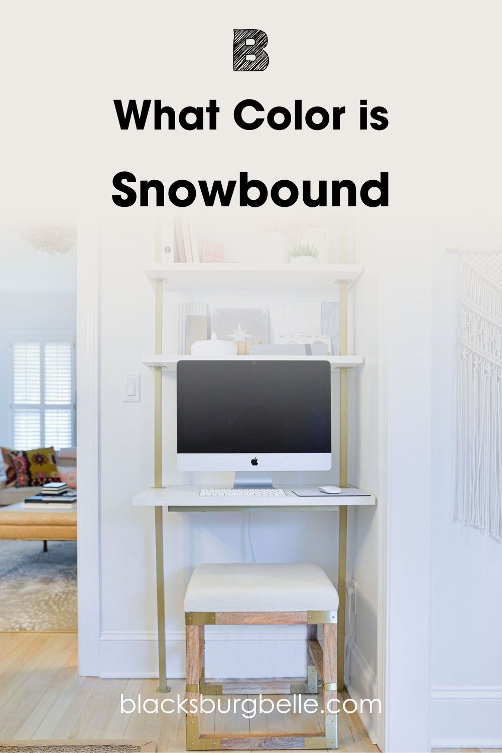
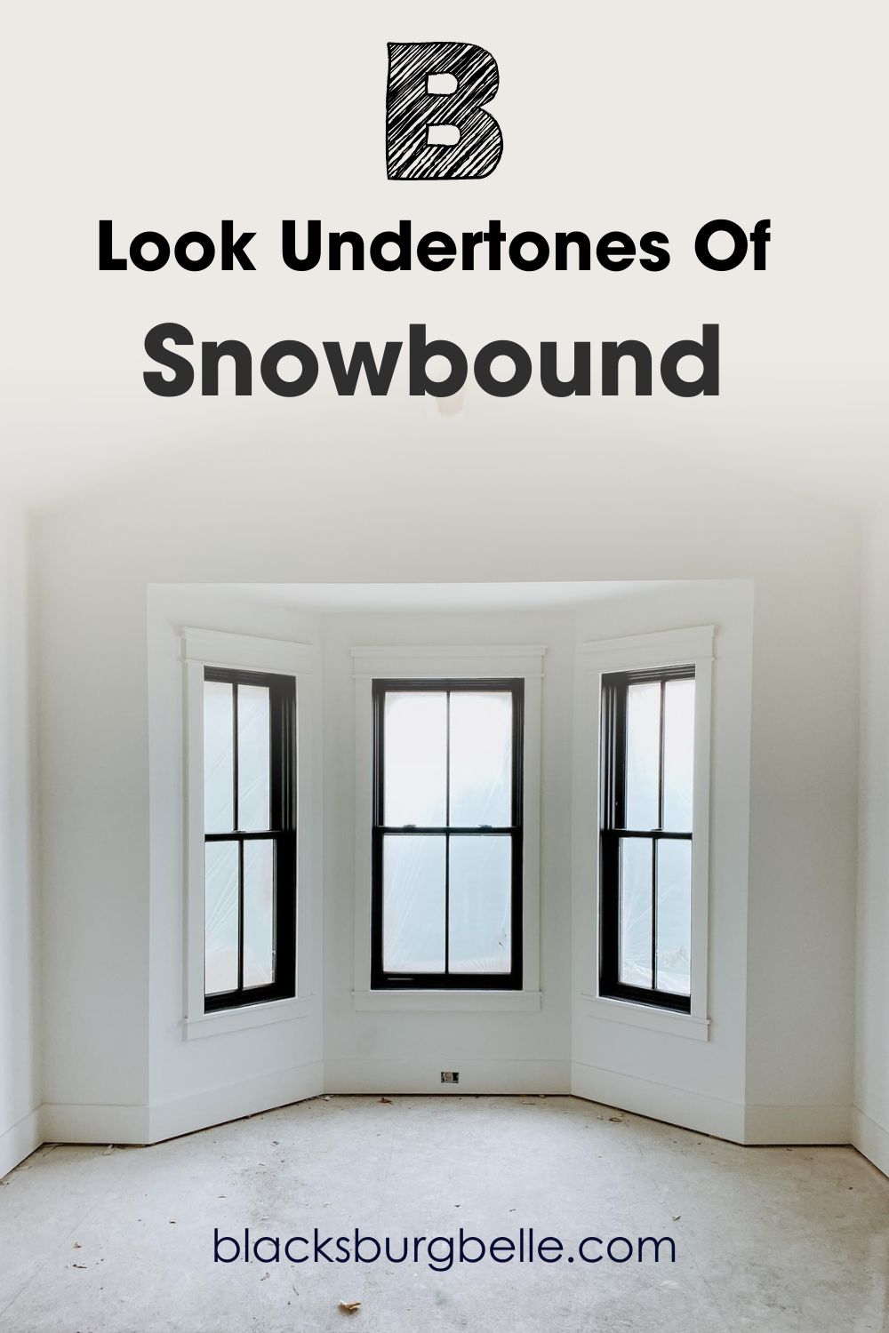
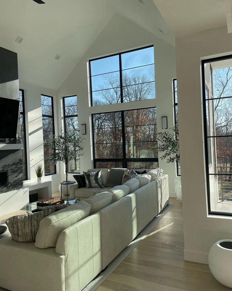
This first picture is Snowbound in this workstation:
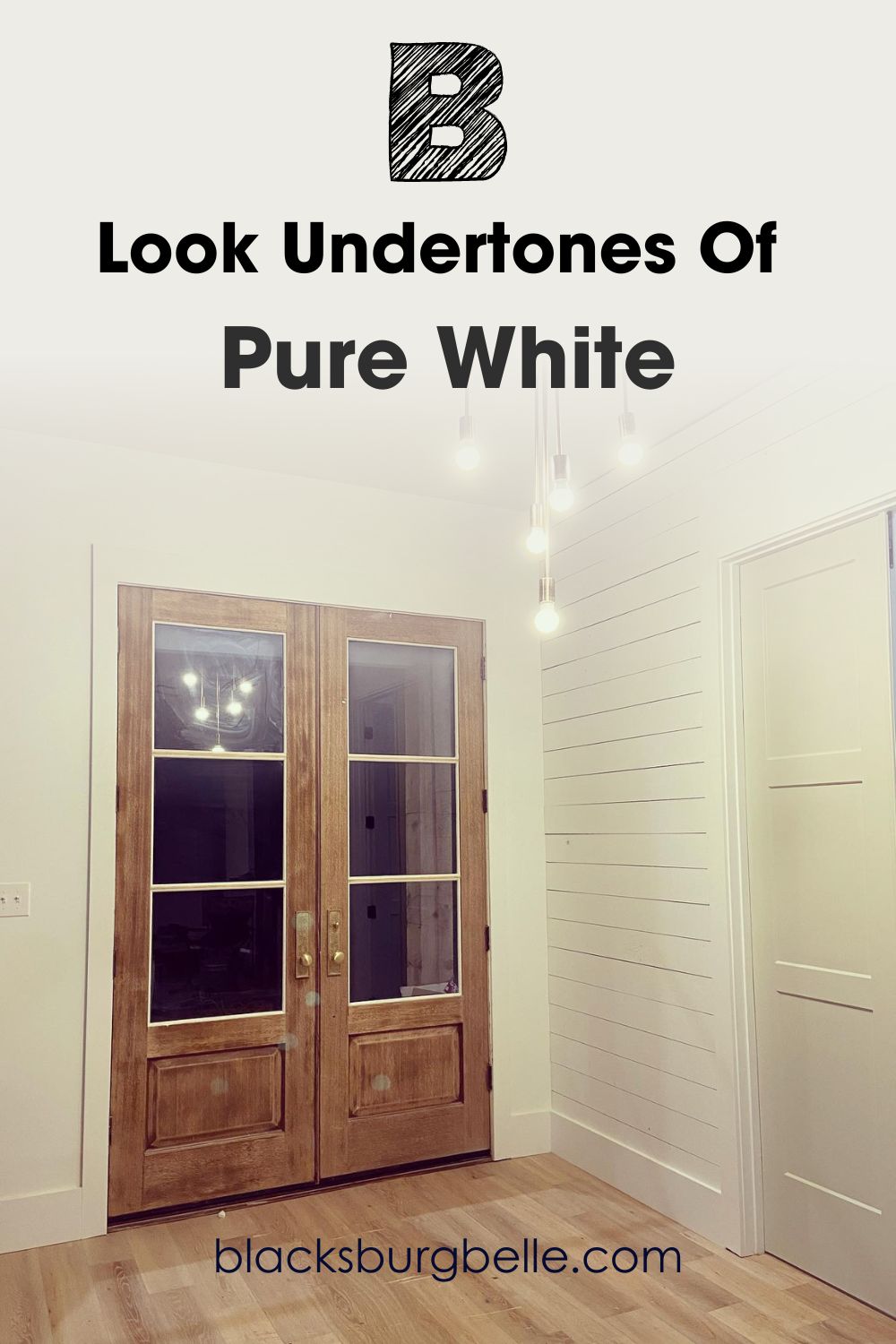
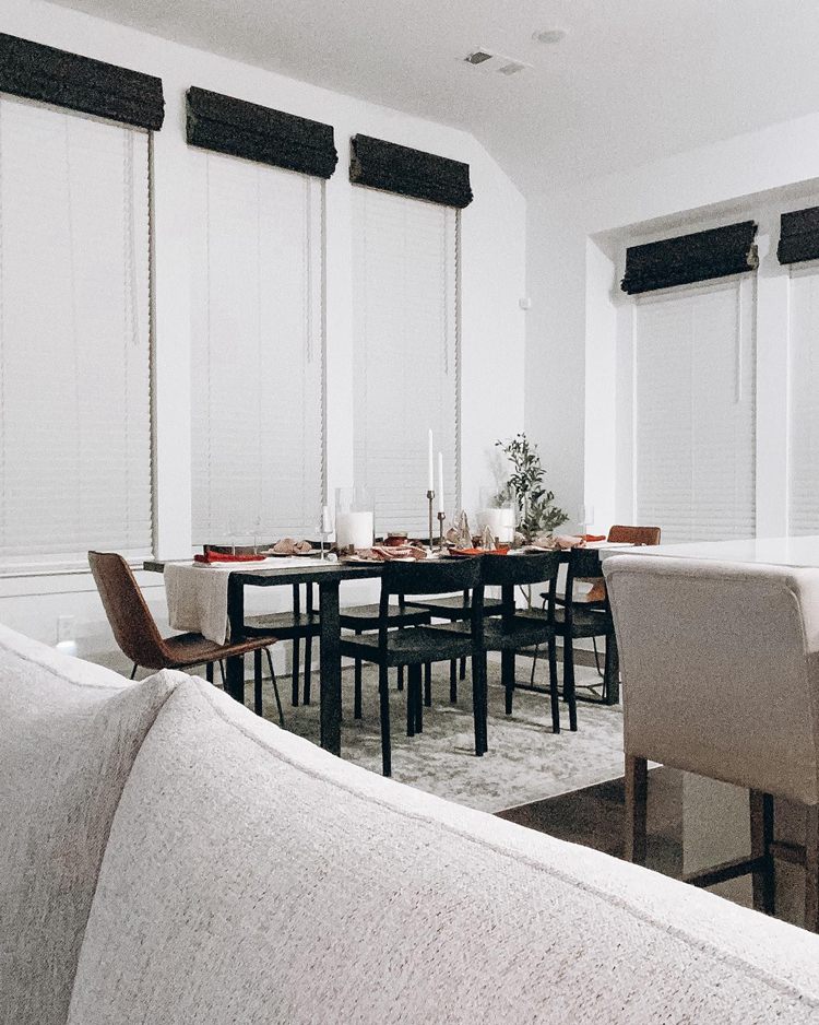
And this is Pure White on the door and wainscoting, looking warm and slightly pink:
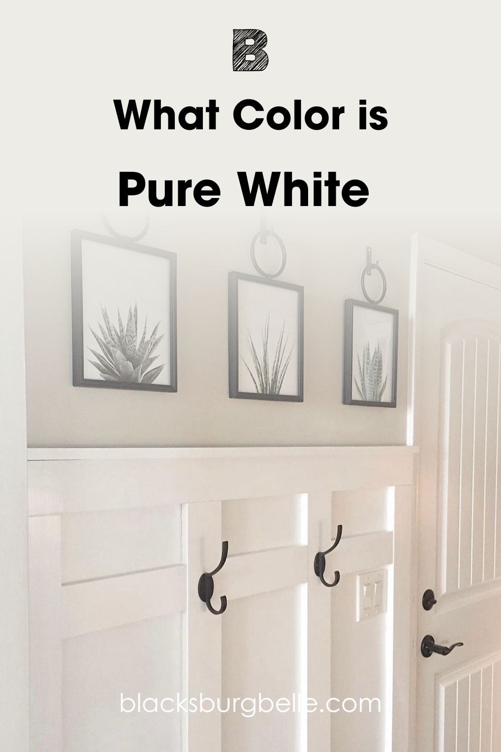
Snowbound looks like a whitey-white without any hint of warmth. If anything, it looks to have a bit of gray showing through, and this may have something to do with the lighting in that room. On the other hand, Pure White looks warm and a little pink. Again, this may have something t do with the lighting.
These pictures are real-life representations of how these colors may perform in different rooms. They should go a long way in helping you decide which is better. However, I would like to show you more about these white paint colors and explain other aspects for better understanding.
Quick Comparison Guide: Sherwin Williams Snowbound vs Pure White
The following chart details key aspects of these paint colors and further guides you to see which performs better. This includes the area of lighting reflectivity and undertones. I will explain the important ones later in this guide.
| Snowbound | Pure White | |
| RGB | 237, 234, 229 | 237, 236, 230 |
| LRV | 83 | 84 |
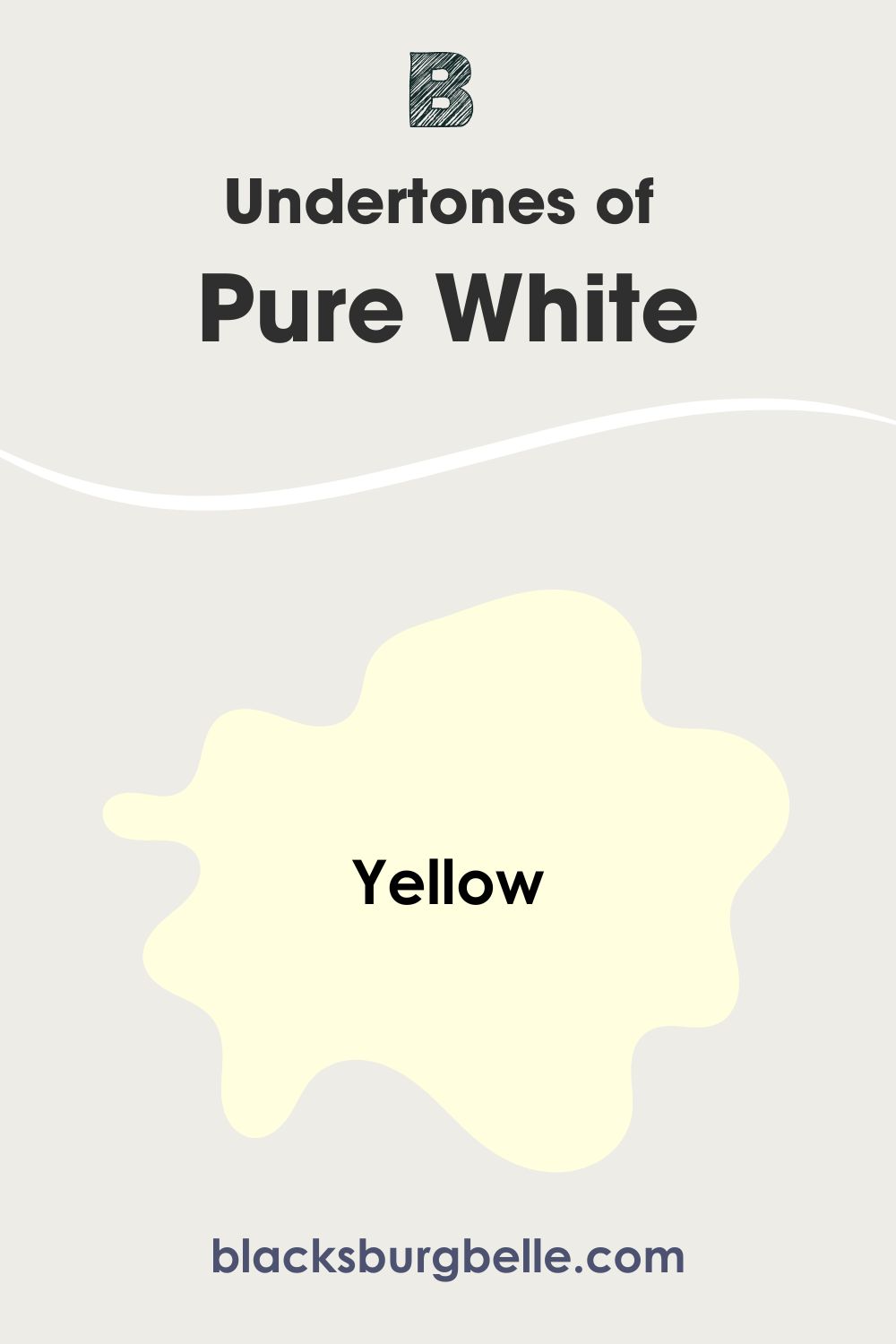
| Undertones | Gray | Yellow |
| HEX Value | #EDEAE5 | #EDECE6 |
Emotional Effects: Sherwin Wiliams Snowbound vs Pure White
You may not know it, but colors have a crucial part to play in how you relate to any environment. This includes your home, and the paint color you use may make the home a more welcoming and peaceful place than before.
SW Snowbound is a versatile white. I have talked about how lighting can change how you see it. There is also the fact that we all see colors differently. So, the white paint can look cool or warm, depending on the lighting each time. Besides, the surrounding elements can rub off on it and change its hue.
Cool colors tend to create a serene and crisp look. If you want a room that refreshes and calms you, Snowbound is the better option of the two. That peaceful feeling releases the tension of the day and helps you feel better.
SW Pure White is slightly warm, so it presents a different face. Warm colors are cozy and inviting. Since it is not a strongly warm color, it creates pure and fresh air in the room, especially with its brighter white hue. It may be the better fit if you want a relaxing and fresh look from your white paint color.
Sherwin Williams Snowbound vs Pure White: Comparing LRVs
LRV means light reflectance value and is a term coined by experts and interior designers over the years. It refers to the amount of light, on a scale of 0 to 100, that a color can reflect or fail to reflect. A true black color has an LRV of 0, while a pure white has an LRV of 100.
When it comes to paint colors, the range is from 2.5 to 94. There are no absolute blacks or whites. With this in mind, let’s compare the LRVs of Snowbound and Pure White.
Snowbound has an LRV of 83. It is a pretty high value, closer to the brightest end of the scale.
On the other hand, Pure White has an LRV of 84, just one number higher than that of Snowbound. But that single digit can make all the difference in certain situations.
In simple terms, Pure White is slightly brighter than Snowbound and reflects more light. They may look the same when it comes to reflecting light because of the tiny difference. But when push comes to shove, Pure White may look slightly brighter beside Snowbound.
Sherwin Williams Snowbound vs Pure White: Are the Undertones the Same?
This is where you can see the true difference between Snowbound and Pure White. The undertones are different and can determine where you use them.
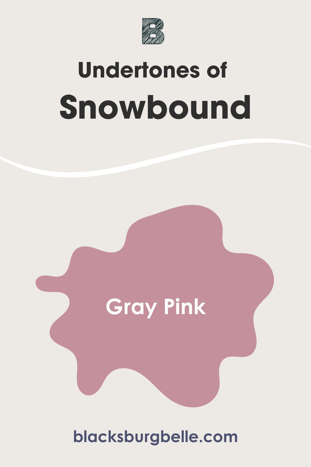
Snowbound has gray-pink undertones, looking more like a cool white paint color. Although some people say it is a warm color, it only leans toward warmth in south-facing rooms. In other words, it typically has a balance between cool and warm, most times showing a cool face.
Pure White has slightly yellow undertones, which makes it look a little warm. Many times, you may read it as a cream instead of white. However, this does not stop it from reading as a classic white paint color.
When used alone, the colors may look the same to the untrained eye. However, when used side by side, Pure White looks obviously yellow and warm. Snowbound will look cooler beside it, although the LRVs are slightly different.
A Closer Look at the Undertones of Snowbound
Let me show you a picture of how the undertones of Snowbound appear:
A Closer Look at the Undertones of Pure White
In contrast, here is Pure White with obvious yellow undertones, especially with the light:
Where Snowbound looks cool and crisp, Pure White looks warm and cozy. However, this may have a lot to do with the lighting conditions in each room. The room where Snowbound is used looks cool, without enough lighting, both artificial and natural.
This significantly affects how the color appears. But the room where Pure White is used has ample lighting, albeit artificial.
Sherwin Williams Snowbound vs Pure White: Are They Warm or Cool?
Pure White is a warm white, but Snowbound is more cool than warm. But I will not fail to tell you that Snowbound can also read a little warm, depending on how you use it.
The hint of yellow in Pure White clearly makes it a warm paint color. That means it works best with warm color schemes. But because the yellow is barely there, you can try it with a variety of colors. Bear in mind that stark whites may reveal yellow in it more than other colors.
Snowbound will perform better as a true and versatile white because the gray undertone hardly ever appears. And because gray is a neutral color, it can also pair well with other colors. You will have an easier time finding colors to blend with Snowbound than with Pure White when it comes to the nitty-gritty of decor.
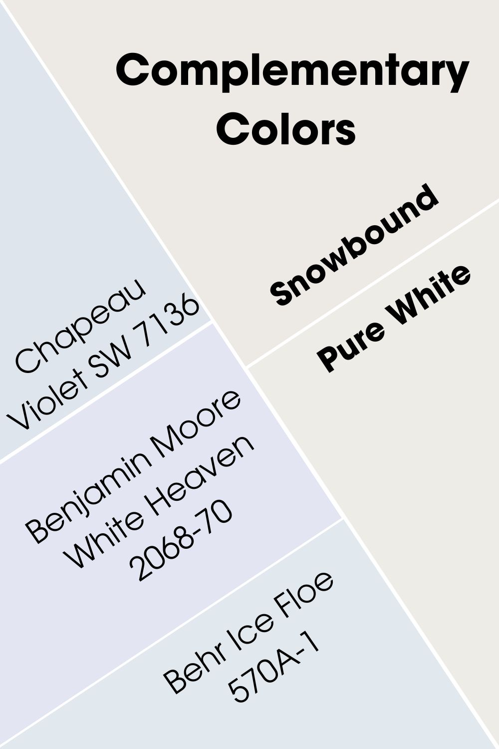
Sherwin Williams Snowbound vs Pure White Complementary Colors
Let’s discuss complementary colors for each paint color. Complementary colors are directly opposite the main color on the color wheel. So, I will show you colors that should be opposite Snowbound and Pure White if they appear in a color wheel.
The best complementary color for Snowbound is Sherwin Williams Chapeau Violet SW 7136. This is an archived paint color, but it fits perfectly with Snowbound. And because they are pretty similar, it is also an ideal complementary color for Pure White. Another complementary color to try is Benjamin Moore White Heaven 2068-70 or Behr Ice Floe 570A-1.
Sherwin Williams Snowbound vs Pure White Color Palettes
You don’t have to worry about creating a color palette from scratch for any of these white paint colors. I have compiled some colors that work well in their palettes to guide you toward choosing other colors. Let’s get right to it to see what I have for you.
Color Palette for SW Snowbound
Because color palettes can include coordinating, complementary, and contrasting colors for some diversity, I have picked some bold and subtle colors to match with Snowbound. They include In the Navy, Stardew, and Passive.
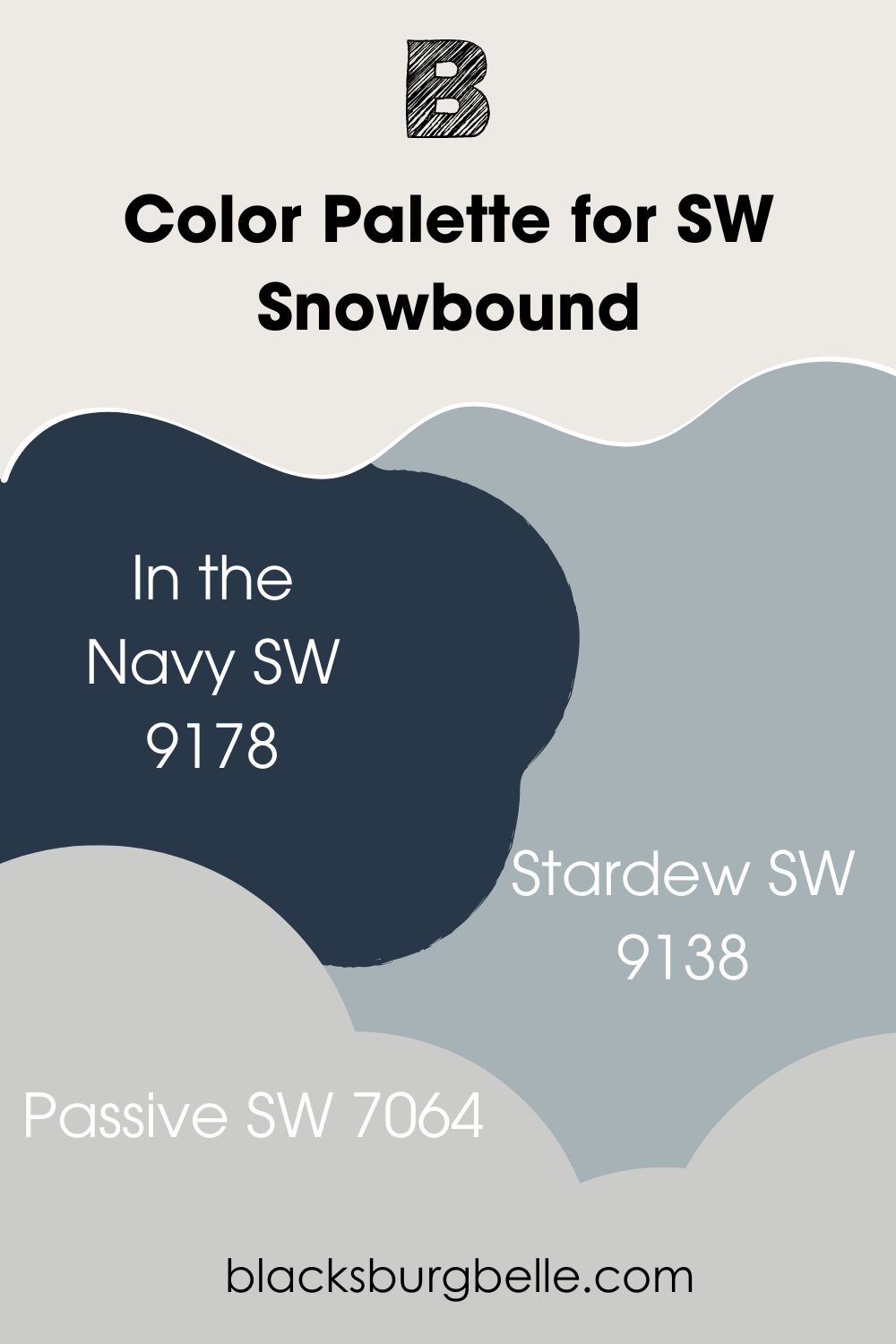
- In the Navy SW 9178: A deep blue that deeply contrasts the white of Snowbound without clashing
- Stardew SW 9138: A slate blue paint color whose warm and cool undertones balance well with those of Snowbound
- Passive SW 7064: A light gray that shows a hint of blue and perfectly blends with the gray undertones of Snowbound
Color Palette for SW Pure White
Waterloo, Audrey’s Blush, and March Wind are some of the best colors to add to this color palette. They include contrasting and matching colors, but you can also find analogous and coordinating colors to make a perfect palette.
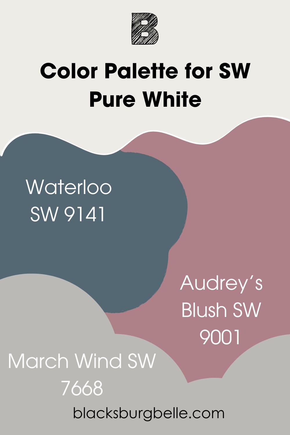
- Waterloo SW 9141: A warm and deep blue paint color that highly contrasts with Pure White’s brightness
- Audrey’s Blush SW 9001: This is a deep blush paint color with red hues that also contrast with the bright white of Pure White
- March Wind SW 7668: A cool gray with purple undertones that create a calming balance with the warm white
Sherwin Williams Snowbound vs Pure White on Cabinets
What looks better than white cabinets? It does not matter whether it is a warm or cool white, the result is usually beautiful. This is especially true when paired with dark colors that have a matching tone.
SW Snowbound on Cabinets
Snowbound looks great and striking because it is paired with Tricorn Black in this next picture.
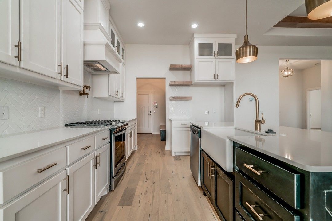
SW Pure White on Cabinets
And Pure White looks warm and classic with the artificial lighting in this kitchen decor:
Sherwin Williams Snowbound vs Pure White on Interior Walls
These white paint colors look amazing on interior walls, which may be the first place you want to use them. Which looks better? Let’s find out!
SW Snowbound on Interior Walls
In the fading light, Snowbound appears to have a warm and slightly green cast to it. But it still looks regal and stately in this monochromatic decor:
SW Pure White on Interior Walls
It is as if the roles were flipped. Pure White looks pristine and more of a bright white than Snowbound in the next picture:
Sherwin Williams Snowbound vs Pure White on Exterior Walls
In this section, I want to show you what these bright whites look like on exterior walls. They may not be your first choice for exterior paint colors, but you may never go back after trying them.
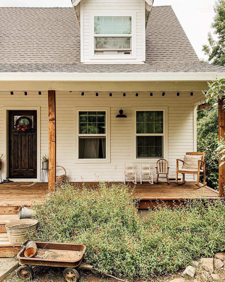
SW Snowbound on Exterior Walls
With the warm sunlight hitting it, Snowbound looks warm and creamy on this house. The wood tones may contribute to this beautiful hue.
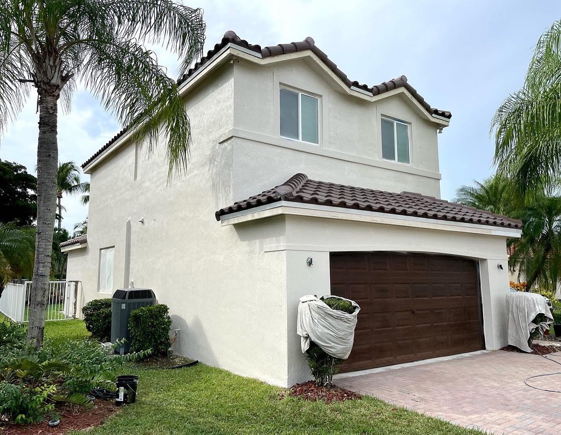
SW Pure White on Exterior Walls
Here, Pure White again looks like the slightly cooler white color of the two. But I can tell you that it is because of exposure without shadows or anything hanging over the sides of the house. In other words, you can see it clearly.
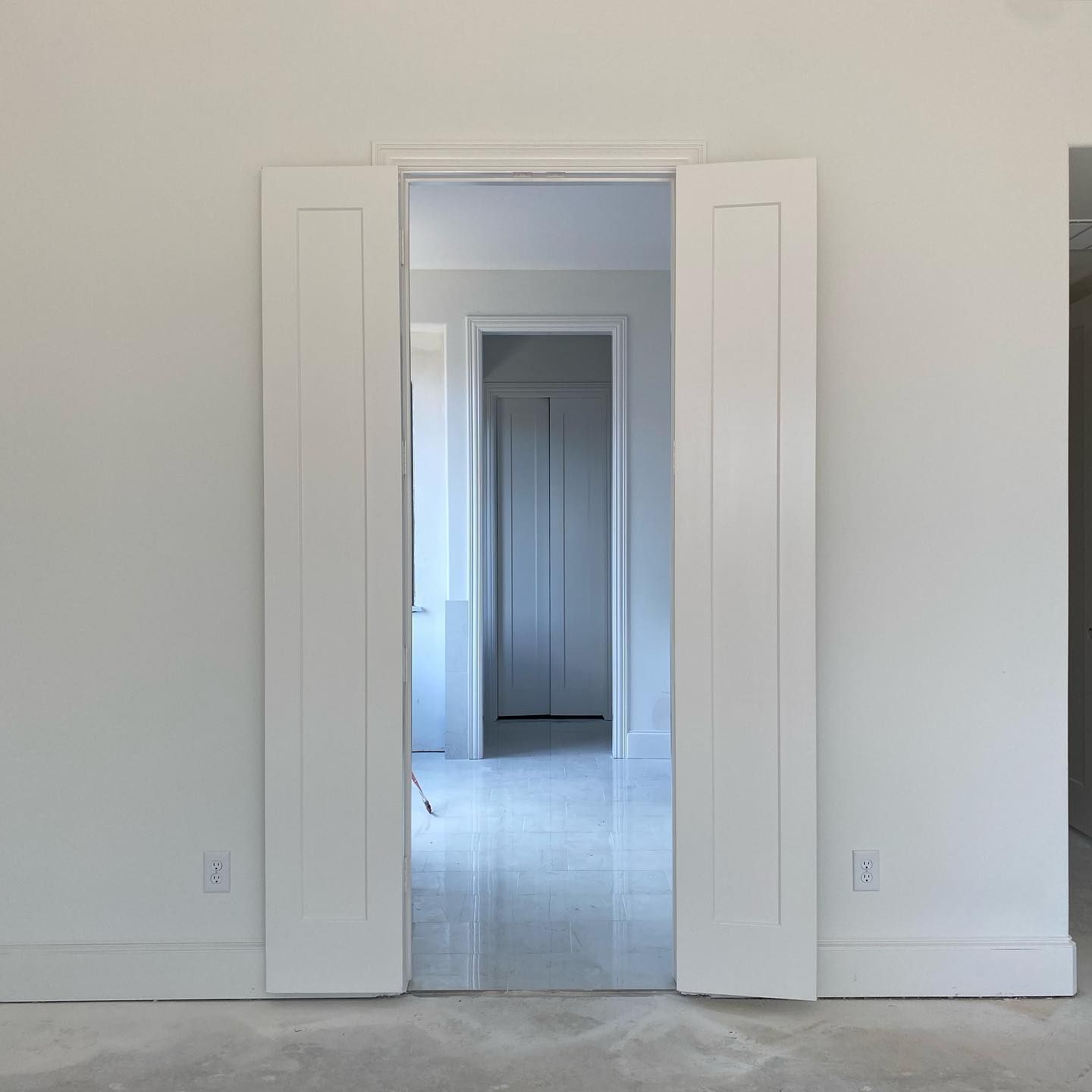
Sherwin Williams Snowbound vs Pure White on Doors
As with everything, white looks good on doors. There are many white paint colors to try on doors, and Snowbound and Pure White are great places to start.
SW Snowbound on Doors
Whether you use it as an entire color for doors and trims or pair it with another color, Snowbound is one of the best white paint colors for doors.
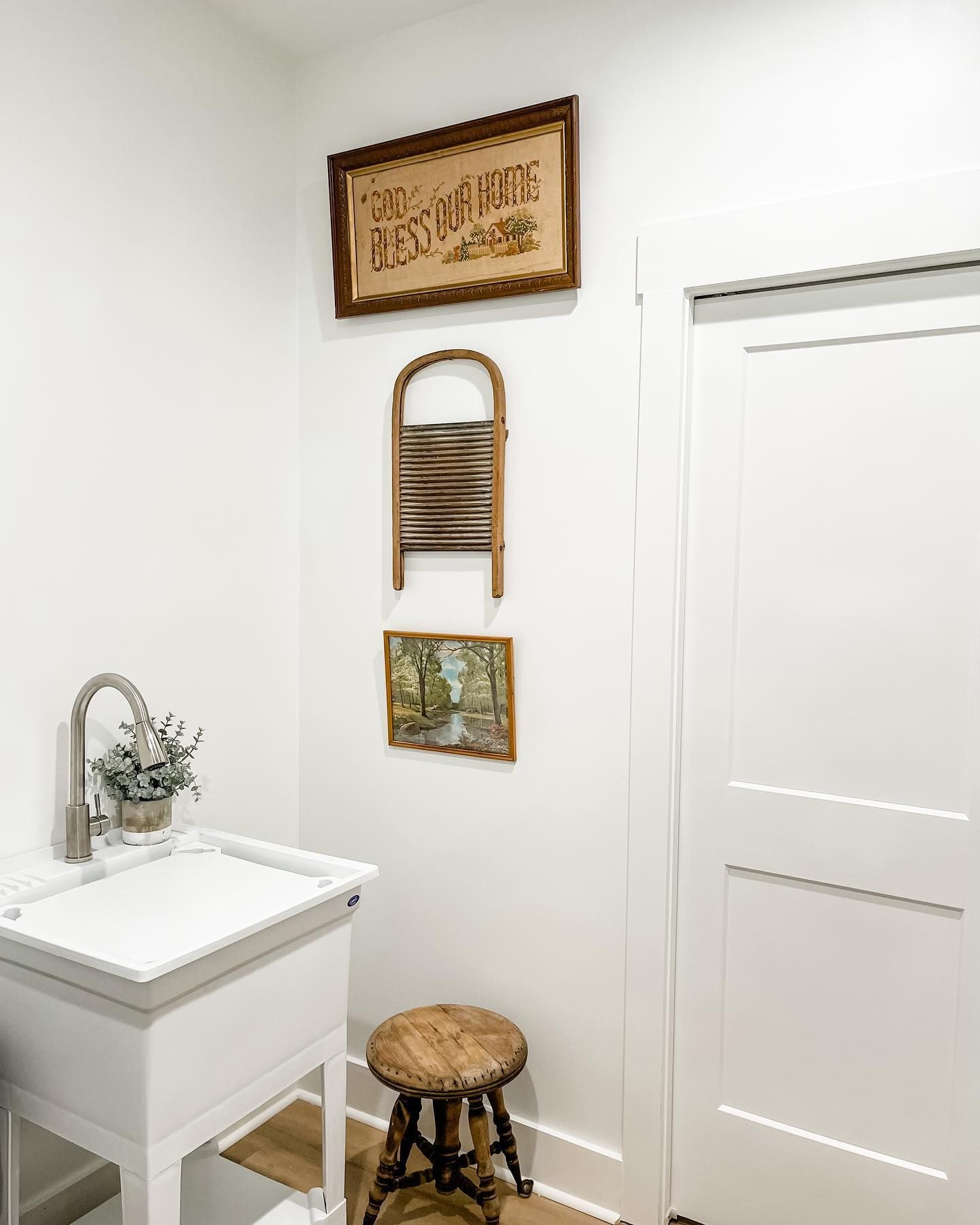
SW Pure White on Doors
This laundry is done all in Pure White, and we can agree that it is classic. The wood tones remove the starkness from the color and add a bit of a rustic look to it.
Sherwin Williams Snowbound vs Pure White on Trim
White is usually the best color for trim, whether the main wall color is another white or a darker shade. So, let’s look at Snowbound and Pure White on the trim.
SW Snowbound on Trim
Although this hallway is done mostly in white, there is a slight difference between the wall color and the trim color. The trim is done in Snowbound.
SW Pure White on Trim
The door and trim are done in Pure White, while the wall is a slightly darker shade. It doesn’t matter whether you want to use it entirely in a room; it will still turn out beautifully.
Jenna Shaughnessy
Sherwin Williams Snowbound vs Pure White Paired with Different Colors
I mentioned that different elements can affect how we see the colors around our home. This is especially true of white paint colors that can reflect deeper and more saturated hues. Because this is important, I want to show you how these colors perform when paired with different colors.
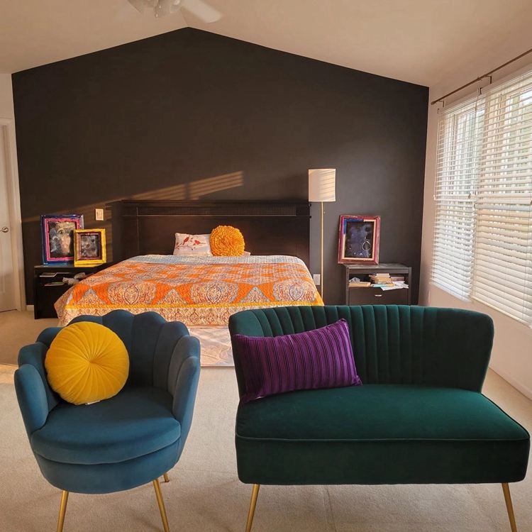
SW Snowbound Paired with Different Colors
I love this bedroom decor with all the seemingly contrasting colors. Because of the neutrals SW Iron Ore used on the accent and Snowbound used on other walls, everything comes together beautifully.
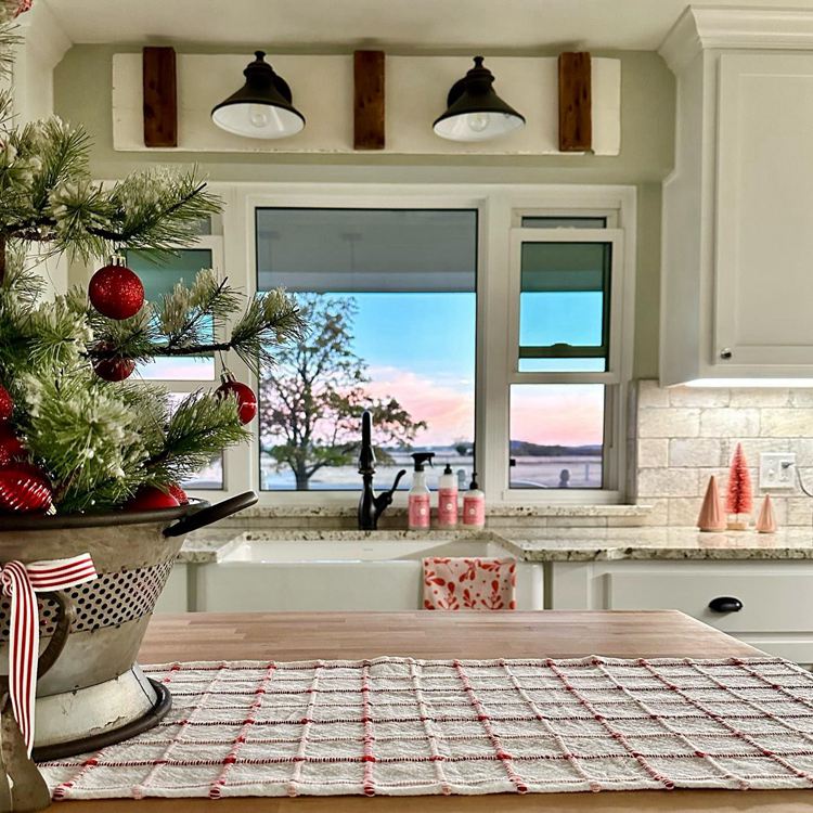
SW Pure White Paired with Different Colors
This beautiful kitchen has shades of red, pink, peach, and green used in varying degrees. Everything blends because Pure White is used in different places. Peep the sunset outside the window!
Sherwin Williams Snowbound vs Pure White Under Artificial Lighting
Seeing these colors in natural light may be common, but they tend to change hues with artificial lighting. I have picked some pictures to prove that.
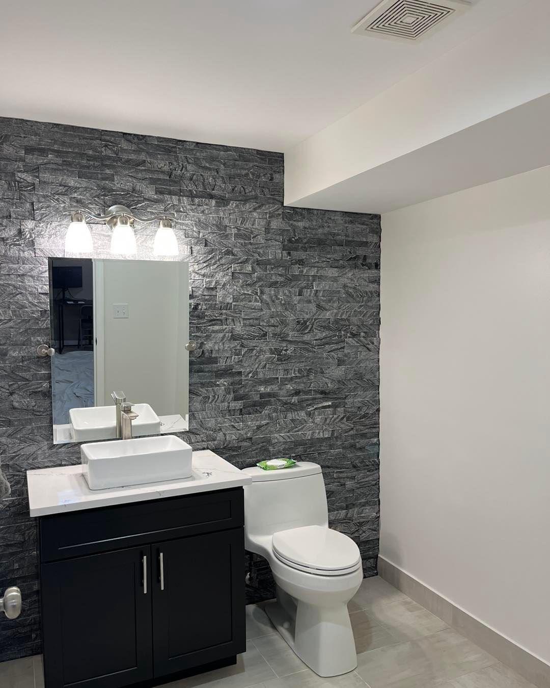
SW Snowbound Under Artificial Lighting
This monochromatic bathroom decor has a spectacular light fixture, and the light throws a slightly warm glow into the room.
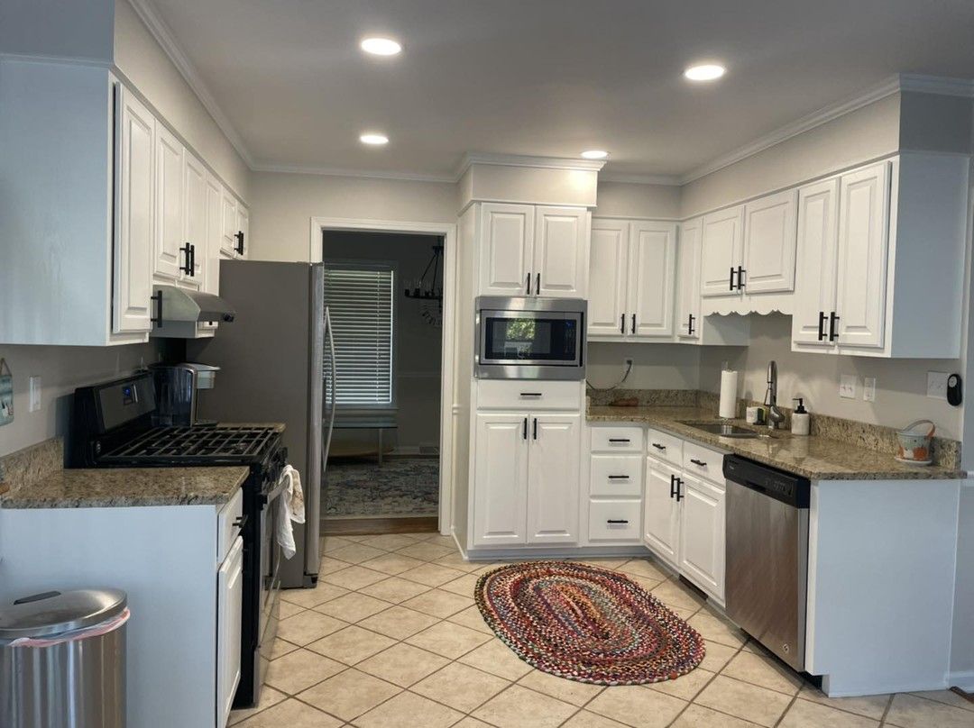
SW Pure White Under Artificial Lighting
Who wouldn’t want to cook in such a state-of-the-art kitchen? The warm artificial lighting gives a welcoming glow and makes the kitchen more homely.
Lighting Conditions
Pay attention to the lighting you use for any of the paint colors you pick. The last two pictures show that artificial light can significantly alter colors, especially white colors. The same can be said for natural light, and this will depend on the exposure of the room where the paint color is used.
Conclusion
I love how colors work on walls and other surfaces. If they are white paint colors, you are more likely to get it right than with other colors. However, white is not always as stark as you think, and that is why there are warm and cool whites.
I have explained many aspects of Snowbound and Pure White to help you decide which is better. Snowbound has a lower LRV but gray undertones, while Pure White has a higher LRV with yellow undertones.
Snowbound works best if you want a cool and bright white that can also read a little warm in certain lighting. Pure White is better for warm color schemes because of its yellow undertones. But feel free to add other colors and create a unique color palette for each paint color.
 Accessible Beige Vs Agreeable Gray: Which is Good?
 Greek Villa vs Alabaster: How to Choose
 Sherwin Williams Tricorn Black vs Iron Ore: How to Choose?
 Modern Gray vs Agreeable Gray: How to Choose?
 Benjamin Moore Ballet White vs Swiss Coffee: How to Choose
 Benjamin Moore Cloud White vs. White Dove: How to Choose?
