
 Still pondering on whether the Sherwin Williams Storm Cloud is the right color for your home or space? Maybe you’re unsure if this color can pass as blue or gray or maybe you are stuck and don’t know whether to classify it as a warm or cool color? Well, if this sounds like you, then you’re in the right place.
Here we’ll save you the hassle and help you make a timely decision on whether the Sherwin Williams Storm Cloud is the right color shade for that wall you intend to paint.
Table of Contents
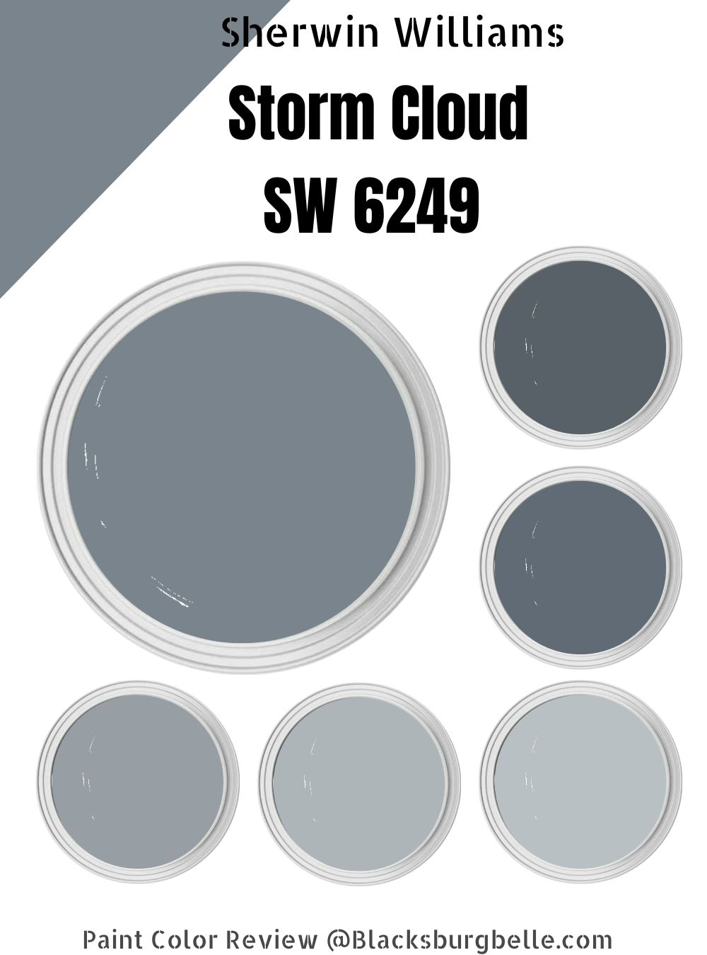
What Color Is Sherwin Williams Storm Cloud
Sherwin Williams finds the catchiest nature names to give their paints, and Storm Cloud is no different. This color is a blue paint with deep gray undertones, so if you use it in your space, chances are high that you’ll see a play between gray and blue depending on their lighting condition.
It’s a part of the Retro Revival and Pottery Barn Teen color collections and you’d be pleased to know that all thanks to the Storm Cloud’s low reflectivity that absorbs incoming natural light that instantly adds a bold and intimate feel to your home, your walls look closer, leading to the illusion of an enclosed space.
So, if you’re looking for that unique blue shade with a twist, then Storm Cloud from Sherwin Williams is the paint color for the job. You can also use it as an accent wall for small spaces-accent walls give a moderate dose of color without necessarily crowding the whole room.
| Manufacturer | Sherwin Williams |
| LRV | 23 |
| RGB | 122, 132, 141 |
| HEX | #7a848D |
| Color Collections | Retro Revival |
RGB Of Sherwin Williams Storm Cloud
Each color tells a different story, and you must bear that In mind when choosing your Sherwin-Williams Storm Cloud. The RGB of Storm Cloud goes thus Red= 122, Green=132, Blue=141.
The name RGB wasn’t cooked up; it’s derived from how these three shades are added to create a color. You begin with black (darkness), then gradually add red, green, and blue until you get the preferred pigment.
HEX code is a six-digit code used as a shorthand reference to RGB color values and the one for Stormy Cloud is #7a848d
Note: When red, green, and blue are mixed at equal intensity, you get pure white.
Light Reflective Value (LRV) Of Sherwin Williams Storm Cloud
The most crucial information about your paint is the light reflective value. They’re usually on a scale of 0-100, but we use 3-97 because there’s no true light or dark. The lower a paint color is on the LRV scale, the darker it’s considered to be, and the higher the number, the lighter.
The light reflective value indicates how much light is reflected; the lighter the color, the more light will bounce off it. The LRV of Storm Cloud is 23, which puts it at the darker end of the line but not too dark. It also means less light will be reflected and won’t do well in dark spaces- your whole space will get moody without natural light.
Is It a Warm or Cool Color
Sherwin Williams Storm Cloud is a cool color, especially with those blue undertones. For cool colors, they may appear more blue or purple under given light conditions. If you have a North-facing window as the major source of light in your room, Storm Cloud may appear cooler and tilt toward the purple category.
I implore you to test out your paint during different hours of the day to get the exact idea of how it’ll appear in different spaces in your home. You want to avoid feeling like you’ve made an unwise decision after the painting is done.
What are the Undertones
Before I go into it, you must understand the concept of undertones. Undertones are perspective and mostly angle based. So, it’s perfectly normal that what A sees slightly differs from what B sees. However, there’s a dominant tone that people see at first glance.
Storm Cloud is a blue-gray paint color with blue undertones, and some people have considered it gray with a blue undertone-if this should tell you anything, it simply means Storm Cloud is a tricky color in some spaces.
There’s the purple undertone, too, and this pops under specific light conditions. If you have an east-facing window, its undertone can come off as green. Hence you have a blue paint color with green undertones.
Sherwin Williams Storm Cloud Color Strip
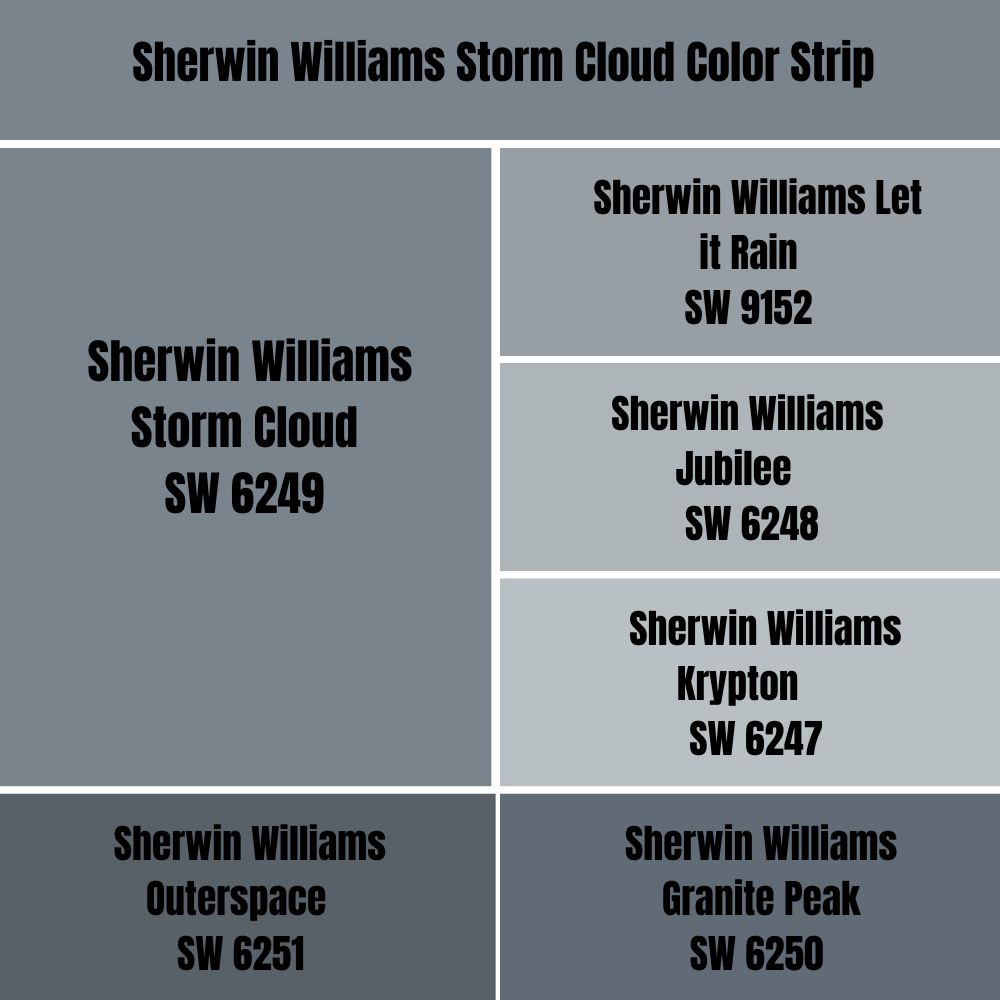
On a paint strip, all colors are of the same formula and may share the same undertone but maintain different intensities. The colors you see here are variations of blue-gray gotten by adding white and black to Storm Cloud.
So, for the Storm Cloud light color strip, we go three shades lower, I.e., SW 9152, SW 6248, and SW 6247. For the dark color strip, we go two shades up SW 6250, SW 6251,
Light Color Strip
| Color Code | Color Name | Location Number | Color Tone |
| SW 9152 | Let It Rain | 225-C4 |  |
| SW 6248 | Jubilee | 225-C3 |  |
| SW 6247 | Krypton | 225-C2 |  |
Sherwin Williams Let It Rain (SW 9152)
Let it rain finely combine elements of rich blue with a calm gray undertone to create a relaxing energy like the color of the ocean with an LRV of 34, making it a lighter variation of Storm Cloud. This color is a great fit for cooking spaces and living rooms. Combine it with white cabinetry and pine flooring to create a beautiful contrast and accents.
Sherwin Williams Jubilee
The LRV of Jubilee is 45, which means it is a light color and would work great in large spaces. The cool tone of this color creates a form of tranquility, so much so that when you enter the room, it feels like you’re in a whole new world.
The good thing about jubilee is its ability to absorb light and may appear warm in south-facing rooms, but in north-facing rooms, this color can also appear washed out due to the excessive natural light- so much personality in color.
Sherwin Williams Krypton

Sherwin Williams Krypton is a blue-gray paint with an LRV of 52. It’s a popular blue shade with strong gray undertones that brings a calm vibe to your space (think ocean, but moderate and mild).
It feels light, airy, and soothing when used in a room and is a perfect option to save space (it creates an illusion that pulls your interior wall backward). So, this color is great for you if your room gets normal to moderate light. Excessive light makes it appear faded.
Dark Color Strip
| Color Code | Color Name | Location Number | Color Tone |
| SW 6250 | Granite Park | 225-C6 |  |
| W 6251 | Outer Space | 225-C7 |  |
Sherwin Williams Granite Peak (SW 6250)
Granite Peak is a dark and rich muted blue paint color with a silk finish. It is great for an indoor accent wall, bedroom accent, and outdoors. It has an LRV of 14 with the softest green undertones and is considered a slate color.
Pair it with a wooden finish and lots of white to make a great living space and explore the beauty and lengths of this color. My preferred paint for white trim is Sherwin Williams Extra White.
Sherwin Williams Outer Space
With an LRV of 12, this color fits perfectly into the dark blue-gray section and can be used in your home, especially in north-facing rooms, as accent walls. If you use it in rooms facing other directions (south and west), it may look lighter and washed away due to the intensity of natural light.
Sherwin Williams Storm Cloud Color Palette
The next major step when considering the option of Storm Cloud for your space is picking a color palette. The importance of color schemes and palettes cannot be over-emphasized, as they’ll help you figure out the best colors to pair your anchor hue.
Coordinating Colors For Storm Cloud
For coordinating colors, you can go monochromatic to fit into a minimalist and modern setting that’s highly sought after these days, or choose contrasting decoration as seen in traditional homes and farmhouses.
Monochrome Decoration
The monochrome decoration process is straightforward. So, you have your anchor color ready; you must choose colors of the same shade to complete the process. I.e., You decorate your Storm Cloud room with other shades of blue-gray ranging from the lightest to the darkest shade; change the saturation and lightness.
You’d see the difference if you picked colors like Let It Rain, Jubilee, and Krypton. However, if you desire more distinction, find blue-gray shades between two to three times Storm Cloud’s LRV. Other blue grays you can use in a monochromatic decoration include bracing blue, daphne,
Contrasting Decoration
The contrasting color palette is your go-to if you’re a fan of playing with colors. Always remember that all other colors must work with your anchor hue unless you want to color block which is also totally fine.
Like monochromatic decoration, you also have darker or light LRVs than your main color-Storm Cloud, but that’s where the similarities peak. Use colors like Emerging Taupe, Snowbound, and Zircon to get the desired effect.
Storm Cloud Complementary Colors
Complementary colors fall on both sides of the color opposite your anchor color on a color wheel, and when paired correctly, you’ll get an excellent play of colors in whatever space you apply them.
You should consider beiges, golden browns, yellow, cool whites, and warm grays. These colors have warm undertones, so they’ll work together smoothly with the Storm Cloud to produce a great result. Throw in white trims for more defined results and professionalism.
Sherwin Williams Storm Cloud Color Comparisons
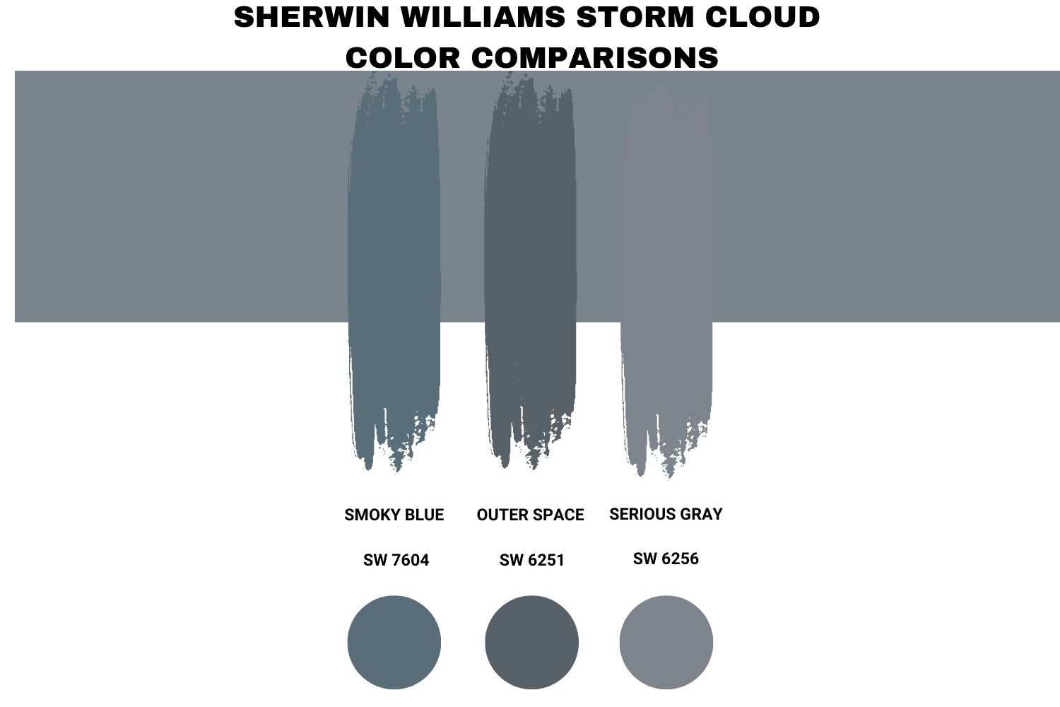
Several other colors from Sherwin Williams have the same tone as Smoky Cloud, but it’s important to inform you that two colors cannot look the same, but if Storm Cloud is off the shelf, these will perfectly suffice.
Sherwin Williams Storm Cloud vs. Smoky Blue
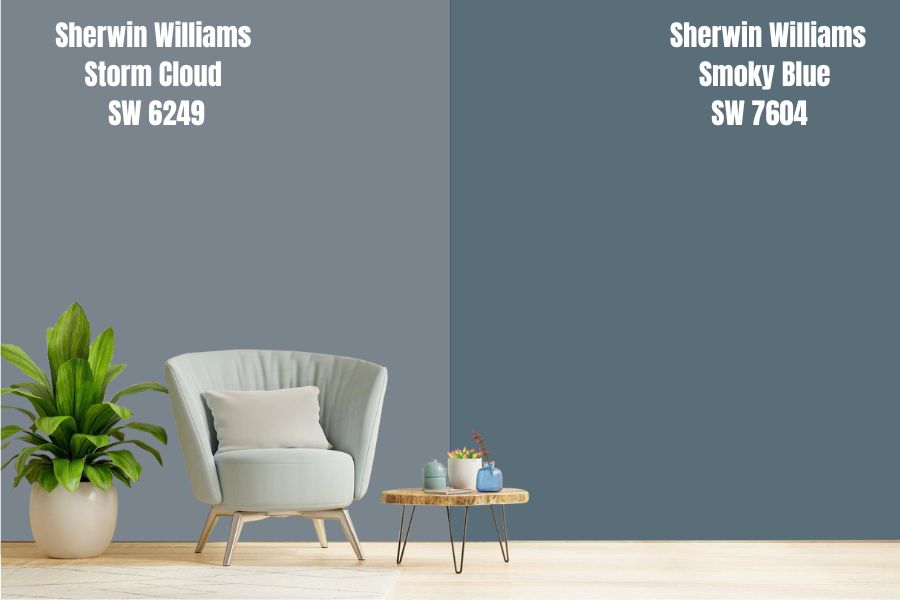
Smoky Blue is also a blue-gray color with a low LRV of 15, which means it’s darker than Storm Cloud in any space, doesn’t also reflect much light, and can make a great accent wall. These two colors are similar in purpose (making your space appear closer), and if you decide to use it for your entire house, that’s what you’ll likely see.
Sherwin Williams Storm Cloud vs. Outer Space
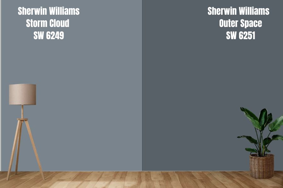
Sherwin Williams Outer Space, commonly called the midnight beauty by admirers and homeowners, is a stunning gray color with blue undertones that gives your home a sleek, fresh, and cool feel.
It has an LRV of 21 and can be used in any home space as an anchor color in large spaces and accents in smaller spaces. Like Storm Cloud, the striking blue tone can make your space appear smaller than normal.
Sherwin Williams Storm Cloud Vs. Serious Gray
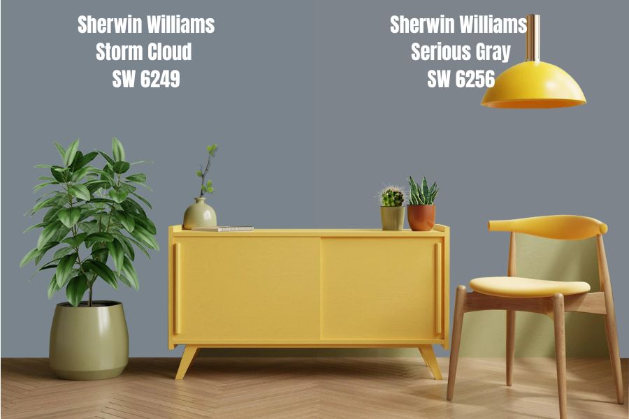
Serious Gray falls in the neutral category and surprisingly has an LRV of 23, oh yeah, literally Storm Cloud’s twin. This tone inclines towards grays, and the paint is cool and crisp with a striking blue undertone. It has a striking resemblance to a Storm Cloud- a gorgeous gray-blue color with a little bit more gray.
It’s a cool dark gray perfect for creating accent walls or your kitchen cabinet for a bold statement; combine it with warm whites, beige for trims, or add gold accessories into your space to give it that extra color. Due to its LRV value, it will reflect a little light, so you may not want to use it in small spaces.
Storm Cloud Benjamin Moore Color Comparison
No brand has the exact shade of the same color. Benjamin Moore doesn’t have a Storm Cloud shade, but you can buy closely toned hues from Bachelor Blue, Smoke, and a few others we’ll be checking in this section.
Benjamin Moore is my trusted alternative, as they have the most colors close to Sherwin Williams tones.
Benjamin Moore Englewood Cliffs
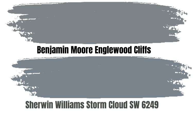
Benjamin Moore Englewood Cliff is a medium-toned gray with lots of purple undertones and will instantly remind you of a lonely hike along rocky cliffs overlooking a large ocean. It has an LRV of 22.54, which makes it a dark color, but still medium enough to be used indoors.
While some are bold enough to use this color for their entire space, others will use it as accents and pair it with whites, beige, and another earthy tone. The depth of this color makes it excellent for outdoor use.
Benjamin Moore Bachelor Blue
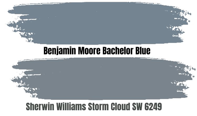
Bachelor Blue is probably Benjamin Moore’s closest shade to Storm Cloud. It’s a saturated blue with rich gray undertones that makes your space feel intimate and cool. It has an LRV of 23.52, putting it on the dark end of the line.
While most people consider this shade masculine, it can also work in a feminine space when you add earthy tones like muted yellow and white trims.
Benjamin Moore Black Pepper
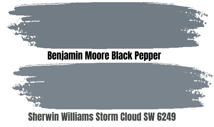
This hue is best for contemporary spaces by adding a touch of old school and instantly elevating the space. It’s a sophisticated color with an LRV of 21.12 and lots of navy undertones and looks a bit more faded, so expect the dark tones to only come through, especially in places with plenty of natural light.
Benjamin Moore Wolf Gray
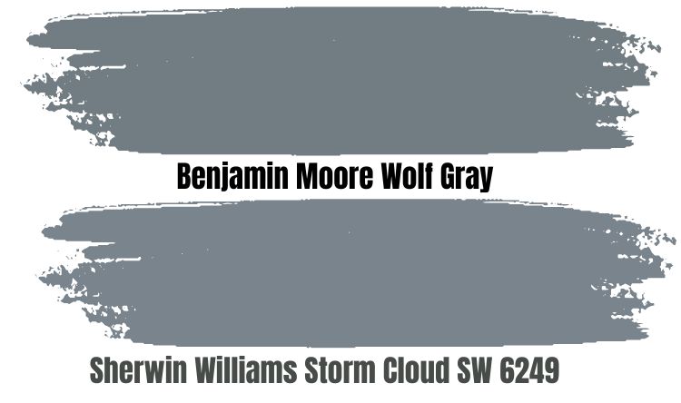
Wolf Gray is rich and dark with an LRV of 21.19 and you can’t deny the commanding presence of the gray in this color. It has strong blue undertones, making it an excellent choice for kitchen cabinets, shelves, and even walls.
Like Storm Cloud, combine this cool color with earthy neutrals like muted yellow and green, or go bold with cobalt and indigo to create a beautiful contrast.
How Does Light Affect The Color
Love or hate it; lighting has a lot to do with how your paints turn out, especially if that light is in the darker spectrum. Since the Sherwin-William Storm Cloud has relatively low reflectivity, I encourage you to use this color in a large space with a large supply of natural lighting to truly understand its beauty and make the most out of it.
If that isn’t the case for your room, consider your decision and be ready to use this color sparingly if you insist on it as your choice.
With bright and excess light, you get a lighter variant of this color and in the absence, Storm Clouds appear like a dark blue with lots of grays. Therefore, you should analyze the ratio of sunlight received in a room before opting for a dark color.
Best Rooms To Paint Storm Cloud
As stated earlier, this color is unique and versatile, which makes it suitable for traditional, modern, and transitional spaces. Let’s look at the color in real spaces, and feel free to use this as your mood board should you make a big paint decision or passively consider it.
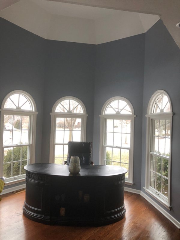
Sherwin Williams Storm Cloud Exterior
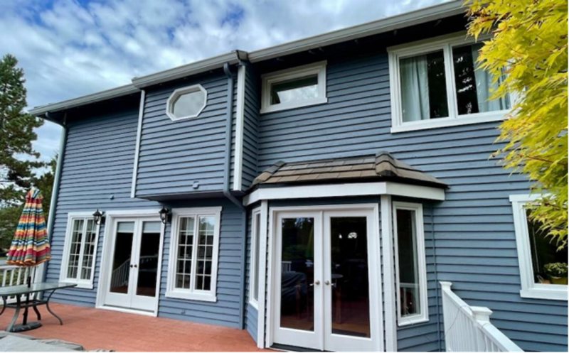
You can paint Storm Cloud on your doors and your house’s outer walls. While they look different under sunlight, they still give you the effect you want, especially early in the morning and sunset (picture the golden tone of the evening sun shining bright against your Storm Cloud wall, super pretty!)
Not only will it make your outdoor stand, but it’ll also give it that classical, victorian, and mid-century feel.
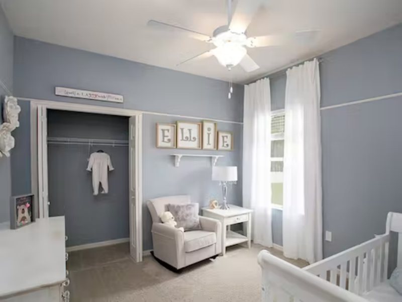
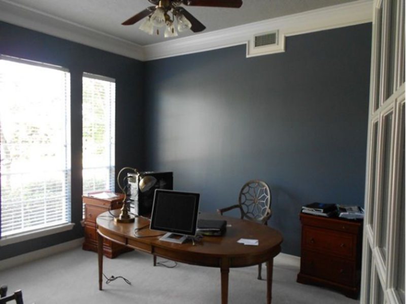
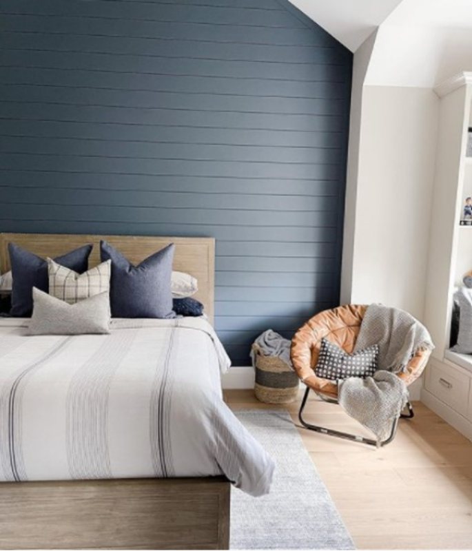
Sherwin William Storm Cloud Bedroom
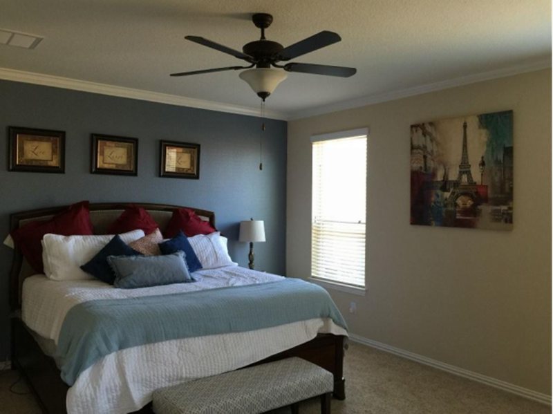
Do you have enough supply of natural light in your large bedroom? Then this color is perfect for you. The light will help brighten the color during the day, and when night falls, you get the coolest color aiding a good night’s sleep.
If your room doesn’t fit the description above, I’ll recommend you use this color only as an accent, as you don’t want the depth to make your bedroom feel like the walls are caving in, add geometric angles and shapes on the walls to add depth to your bedroom and pair the paint with whites and off-white decorative accents.
Sherwin Williams Storm Cloud Bathroom
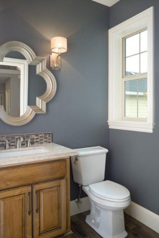
The bathroom is another space you want to have a quiet feel; when you’re in that bath or the shower, your mind, soul, and body must be completely relaxed. Storm Cloud is the perfect fit for this job, as its blue-gray color adds softness and serenity to the room.
If your bathroom is not big, you can use it to accent the walls or combine it with other shades of blue to get your desired effect.
Sherwin William Storm Cloud Kitchen
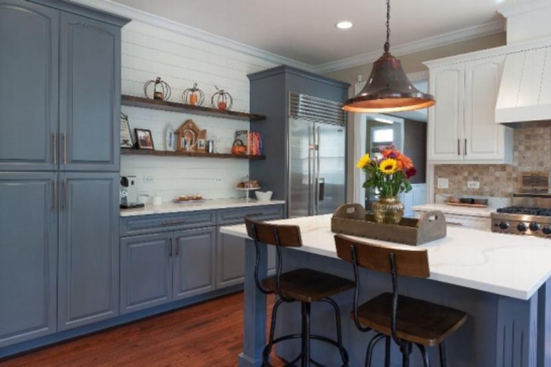
Kitchens are one of the most important spots in the house and where most of the magic happens, which is why you need to pay extra attention to details, and things like wall painting can influence your mood during cooking.
So, for a Sherwin Williams Storm Cloud kitchen, I recommend using them on your cabinets. The result is a luxurious and majestic look that’s very modern, especially since you pair it with golden-tinted handles and locks to get that perfect contrast.
However, you can make the most of this color by pairing it with white or off-white backdrop walls, white or gray marble on your kitchen tops (they can be plain or come with veins), or white backsplash tiles. If it’s white, it’s good.
Storm Cloud Living Room
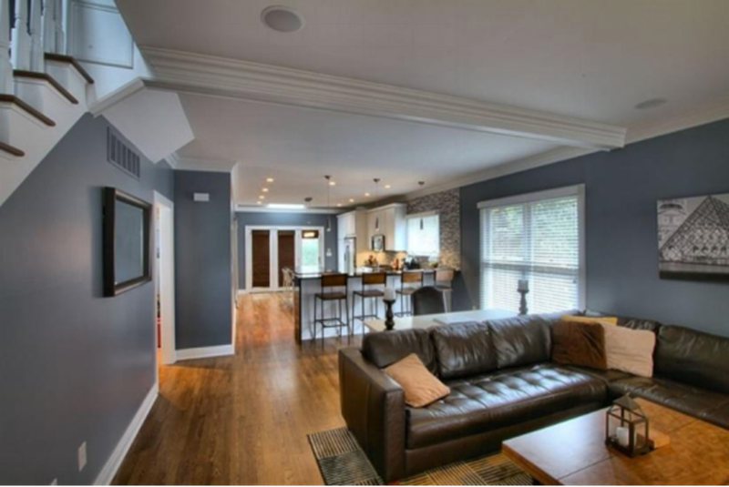
Storm Cloud looks exceptional in the living room, especially if it’s large enough with plenty of natural light for the hue to absorb. It instantly gives your room an intimate vibe, and what’s better than a living room that feels like home?
Pick up a can of Storm Cloud now and get to work immediately; you can add stints of color to decorative moldings or fireplace mantels to add a little personality.
Throw a few warm brown pieces of furniture into your space and cream pillows to help create a balance. Pairing cool tones with warmer colors is important to prevent a space from feeling uninviting and bland.
Sampling Storm Cloud
Say goodbye to the old days of picking up small cans or unnecessary containers to test out colors. These 12″ by 12″ sticks on squares are all you need to try out any new paint color in your home.
They’re affordable and highly functional to help you get a firsthand look and experience at how Storm Clouds would look and feel in your home and workspace under different lights and shadows. So, whether you want it inside your home or out on the porch, you now have the perfect tool to test it out with Samplize peel and stick.
The good thing about Samplize is that it’s Reusable, saving you the cost of purchasing new strips now and then. It’s also mess-free, made with real manufacturer paint, and environmentally friendly.
Best Trims For Storm Cloud
As always, white is usually the most preferred color option for trims, and why not? Whether your color has cool or warm undertones, white is neutral enough to marry it and still stand out. However, ensure these whites don’t have a cool undertone as it may clash with the undertones of Storm Cloud.
Now you’ve used Storm Cloud for your space, don’t stress about finding the right trims; walk up to the store and pick up white and off-white shades from Sherwin Williams and use them on decorative moldings, doors and window frames to get that vibe.
I recommend Sherwin Williams pure white and its Benjamin alternative Chantilly Lace as they’re great trim colors that go well with cool tones, and if you want to go bold, you can paint the whole room this shade.
If Storm Cloud is on your exterior and you’re a fan of stonework details, opt for a gray-tinted or travertine-shaded stone style.
Final Thoughts
Sherwin Williams Storm Cloud is an excellent color to use for large space owners and even small-spaced owners. This color’s intimate nature sets it apart from the rest, bringing everything closer in the house.
If your home is transitional, contemporary, or tilts towards a coastal and modern interior design style, Storm Cloud will look great in any of them.
So, if you’ve been thinking of making that big switch, you should go for it. Pair it with golden accents and white trims to add different dimensions to your home and space. Storm Cloud looks great on the exterior of homes.
 Sherwin Williams Mega Greige (Palette, Coordinating & Inspirations)
 Sherwin Williams Steamed Milk (Palette, Coordinating & Inspirations)
 Sherwin Williams Toque White (Palette, Coordinating & Inspirations)
 Sherwin Williams Anew Gray (Palette, Coordinating & Inspirations)
 Sherwin Williams Ice Cube (Palette, Coordinating & Inspirations)
 Sherwin Williams Pearly White (Palette, Coordinating & Inspirations)
