
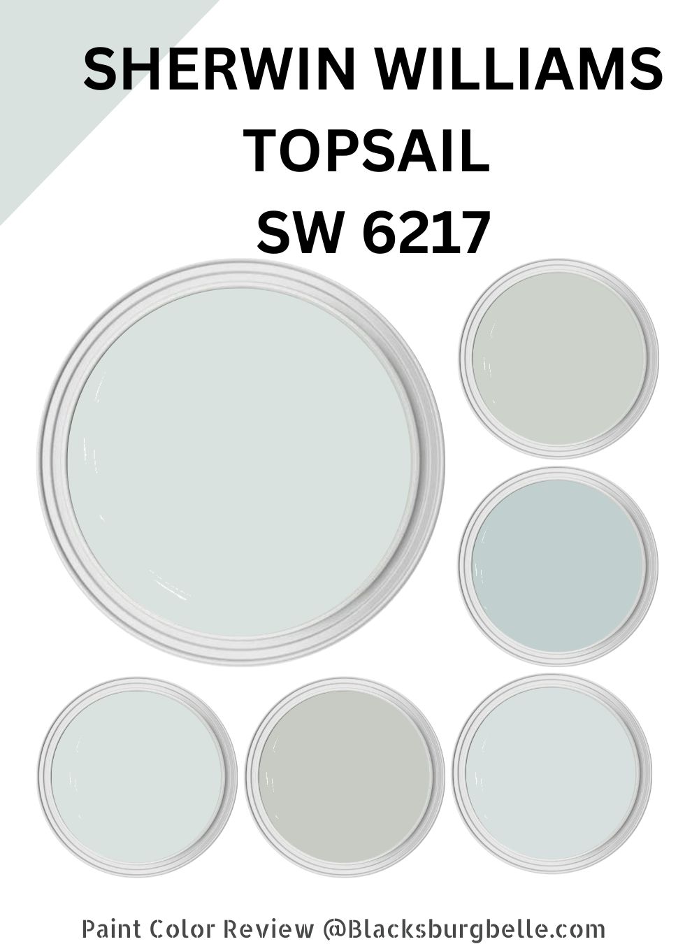
Do you often come home exhausted? Would you like to return to a space that promotes relaxation and tranquility? Having calming paint colors on your walls can help—and Sherwin Williams Topsail is one of the most relaxing paint colors you can find on the market.
Topsail (SW 6217) is a light, medium-toned blue-gray paint color that is both calming and sophisticated. It is inspired by the peaceful waters of the beach and has a nautical vibe, making it a popular choice for coastal-themed spaces.
Topsail is also a versatile color that works in various settings, including residential and commercial spaces. It has a classic and timeless look—because of this unique appeal, I have seen this paint color work exceptionally well in offices, hospitals, and hotels.
One of the reasons I like Topsail is its ability to hold up well over time. It is a high-quality paint color resistant to fading and chipping, making it a smart choice for most of my high-traffic areas, including hallways and staircases.
In this review, I will provide detailed information about the characteristics of Topsail and offer some design inspiration and tips on how to use it in your own space. Let’s get started!
Table of Contents
What Color is Sherwin Williams Topsail?
| Manufacturer | Sherwin Williams |
| LRV | 75 |
| RGB | R: 218 G: 226 B: 224 |
| Hex Value | #DAE2E0 |
| Color Collections | Living Well (Create) |
Sherwin Williams Topsail (SW 6217) is a light, medium-toned blue-gray paint color. One thing I have noticed about Topsail SW 6217 is that its perfect combination of blue and gray allows my mood to soar gently. The bright sky blue paint color lends an elegant lightness to my spaces while providing a calming effect.
RGB of Sherwin Williams Topsail
RGB stands for Red, Green, and Blue and is a color model used in digital color representation. The RGB color model creates colors by mixing different red, green, and blue light intensities.
Each color is represented by a combination of values ranging from 0 to 255, corresponding to the intensity of red, green, and blue components. For example, the RGB values for the color white are (255, 255, 255), which means it has full-intensity red, green, and blue light.
Sherwin Williams Topsail combines red: 218, green: 226, and blue: 224.
LRV of Sherwin Williams Topsail
LRV, or Light Reflectance Value, measures how much light a paint color reflects. It is expressed as a percentage, with 100% being the maximum amount of light a color can reflect and 0% being the least amount of light a color can reflect. In general, lighter shades have a higher LRV, while darker colors have a lower LRV.
The LRV affects how a color appears in a room and interacts with other colors. For example, a paint color with a high LRV will reflect more light and make a room feel brighter and more open. On the other hand, a paint color with a low LRV will absorb more light and make a room feel darker and more intimate.
LRV is often used by interior designers and architects when selecting paint colors for a space, as it can help them to create the desired atmosphere and balance the amount of light in a room. It is also a valuable tool for homeowners who want to make small spaces feel larger or add warmth to a room with low natural light.
Sherwin Williams Topsail has an LRV of 75. The paint color, therefore, reflects more light, making rooms feel more open.
Is Sherwin Williams Topsail a Cool or Warm Paint Color?
Sherwin Williams Topsail (SW 6217) is a cool paint color. It has a blue-gray hue with cool, calming energy. The paint color’s calmness and tranquility make it a popular choice for bedrooms, living rooms, and other spaces where you want to create a relaxing atmosphere.
What Are Sherwin Williams Topsail Undertones?
Undertones are the shades in a paint color that are not immediately apparent. They can affect how a color appears and interacts with other colors in different lighting conditions.
Sherwin Williams Topsail (SW 6217) has a blue-gray hue with cool blue and slight green undertones. The cool blue undertone gives Topsail its calming, serene energy, while the slight green undertone adds depth and complexity to the color.
Sherwin Williams Topsail Color Strip: Sherwin Williams Topsail Color Comparisons
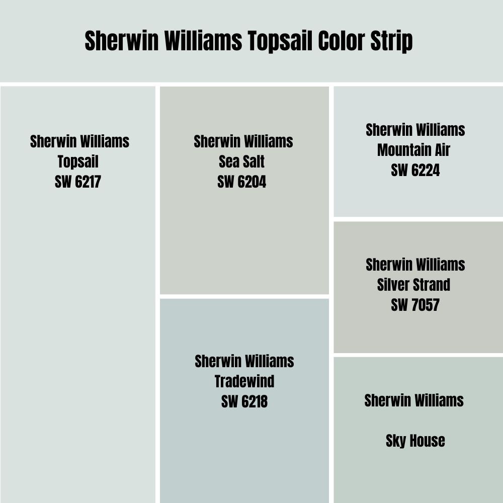
Sherwin Williams Topsail vs. Sea Salt (SW 6204)
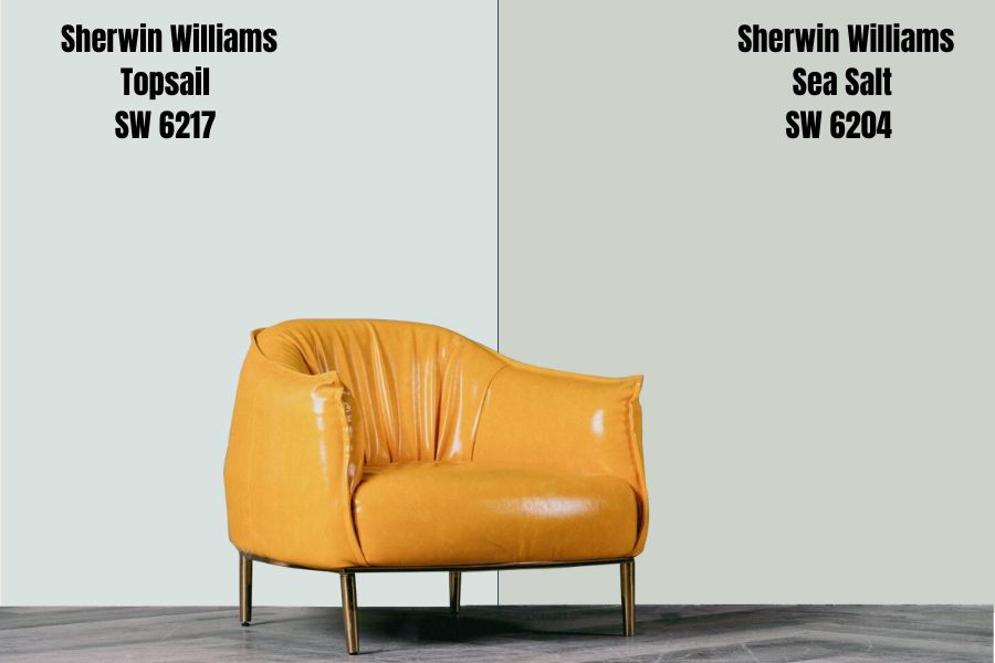
Sherwin Williams Topsail (SW 6217) and Sea Salt (SW 6204) are both popular gray-base paint colors with cool, calming energies. However, they have some differences in their primary shades and overall appearance.
Topsail is a light, medium-toned blue-gray with cool blue and slight green undertones. It has a versatile, classic, timeless look that pairs well with various other colors. Topsail is known for its calming, beachy vibe and is often used in coastal-themed spaces.
Sea Salt, on the other hand, is a light, pale green-gray color with undertones of green and blue. It has a softer, more muted appearance than Topsail and is often described as having a spa-like energy. Sea Salt pairs well with light, neutral colors and has a fresh and airy feel.
In terms of overall appearance, Topsail is a bit darker and more vibrant than Sea Salt, while Sea Salt is softer and more muted. These characteristics result from their LRVs—Topsail has an LRV of 75, while Sea Salt has an LRV of 63.
Sherwin Williams Topsail vs. Tradewind (SW 6218)
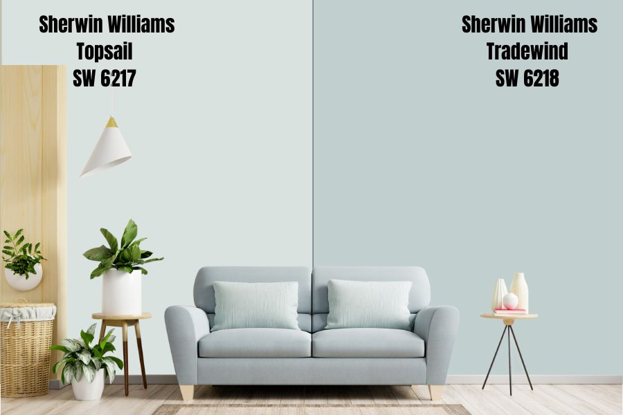
Topsail sits in the off-white LRV range, with a value of 75—it is neither too light nor too dark. Sherwin Williams Tradewind combines blue and green shades in a more balanced way. Tradewind has an LRV of 61, making it slightly darker than Topsail and putting it outside the off-white range.
Topsail and Tradewind are well-suited for use in various spaces, including bedrooms, bathrooms, and living areas. They are both calming and serene colors that can help to create a relaxing atmosphere.
Topsail and Tradewind are versatile colors that work with many accent colors. Both colors pair well with white, light wood tones, and other shades of blue and gray. You can use them in various coastal, traditional, and modern styles.
The main difference between Topsail and Tradewind is the color itself. Topsail is a light blue-gray color, while Tradewind is a pale blue-green color. Both colors are neutral and calming and can create a relaxing atmosphere.
Sherwin Williams Topsail vs. Mountain Air (SW 6224)
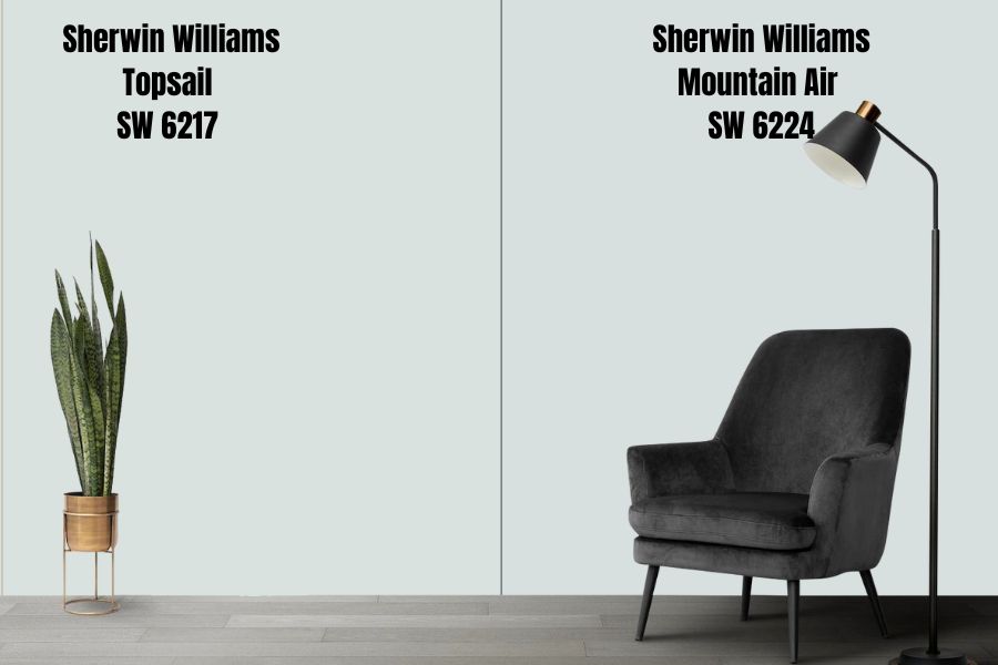
Sherwin Williams Topsail is a light blue-gray color boasting a coastal or nautical feel. It is a popular color for homes, particularly beachy or coastal-themed spaces.
Sherwin Williams Mountain Air, on the other hand, is a pale blue-green color with cool undertones. It is a light and airy color often associated with the outdoors and has a refreshing and invigorating feel. It is well-suited for use in various spaces, including bedrooms, bathrooms, and living areas.
Topsail and Mountain Air are light and neutral colors that work well with various design styles and color schemes. They are both calming and serene colors that can help create a relaxing home atmosphere.
However, Topsail has a more coastal or nautical feel, while Mountain Air has a more outdoor or natural feel. Both paint colors pair well with white, light wood tones, and other shades of blue, gray, and green.
Sherwin Williams Mountain Air has an LRV of 73, while Sherwin Williams Topsail has an LRV of 75. The two colors sit in the off-white range and have the potential to make rooms seem brighter and bigger. They are perfect for small urban spaces where owners want to create an illusion of a bigger room.
Sherwin Williams Topsail vs. Silver Strand (SW 7057)
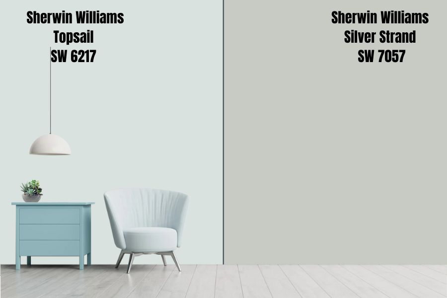
Sherwin Williams Topsail is a calming and sophisticated blue-gray paint color. It is a medium-light shade with a slight green undertone, and it is a trendy choice for living rooms, bedrooms, and other spaces that need a relaxing atmosphere.
Topsail pairs well with white trim but works with other colors, such as light wood tones or pale pastels. It is a versatile color that works well in modern and traditional interiors.
Silver Strand is a light, cool-toned gray paint color with a blue-green undertone. It is a popular choice for modern and contemporary interiors, and it works in living rooms, dining rooms, and other spaces, creating a sleek, sophisticated look.
Silver Strand pairs well with white trim but works with other colors, such as black or deep blue. It is a versatile color that can work well in both small and large spaces, and it is a good choice for people who want a light, neutral color but do not want to go with a traditional beige or white.
Sherwin Williams Silver Strand is darker than Sherwin Williams Topsail. While Sherwin Williams Topsail reflects 75% light, Silver Strand reflects 59%. Therefore, while Topsail can make your room much bigger and brighter, Silver Strand may have the opposite effect, especially in cases where the lighting in the room is too low.
Sherwin Williams Sky House vs. Topsail (SW 6217)
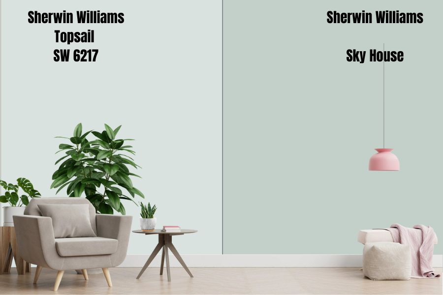
Sherwin Williams Sky House is a medium-light blue-green color with cool undertones. Sky House boasts an LRV of 61.13. It has a soft and subtle appearance, making it a popular choice for creating a calming and relaxing atmosphere in spaces such as bedrooms and living rooms.
Sky House can be paired with white, light gray, or pale neutral colors to create a clean and modern look, or it can add a pop of color to a neutral color scheme. It can also bring a touch of the outdoors inside, making it a versatile choice for many types of decor.
Sherwin Williams Topsail is a lighter blue-gray paint color sitting in the off-white range with an LRV of 75. Like Sky House, Topsail also has cool undertones. Topsail has a classic and traditional appearance, making it a popular choice for creating a formal or sophisticated atmosphere in dining rooms and offices.
You can pair Topsail with white, gray, or neutral colors for a timeless and elegant look or use it to create a bold and statement-making feature in a room with darker or richer colors such as navy or plum.
Sherwin Williams Topsail Color Palette: Colors That Go with Sherwin Williams Topsail
You can pair Sherwin Williams Topsail with various colors to create a cohesive and stylish look in any space. Here are some color combinations that work well with Topsail:
- White:A crisp white is always a classic choice when pairing with Topsail. This combination creates a clean and fresh look that is perfect for a beachy or coastal-inspired space.
- Pale Pink:Soft shades of pink, such as pale pink or ballet slipper pink, create a beautiful contrast to Topsail’s cool blue-gray tones. This combination is perfect for a feminine and romantic look.
- Black:Black is a bold choice when paired with Topsail, but it creates a striking and sophisticated look. This combination is perfect for a modern and stylish space.
- Light Yellow:Light shades of yellow, such as butter yellow or lemon chiffon, provide a cheerful and sunny contrast to Topsail’s cool tones. This combination is perfect for a happy and welcoming space.
- Beige:Beige or neutral tones can provide a warm and understated contrast to Topsail’s cool tones. This combination is perfect for a calming and neutral space.
- Soft Green:Soft shades of green, such as mint or pale green, provide a refreshing and natural contrast to Topsail’s cool tones. This combination is perfect for a serene and natural space.
Let’s dig deeper into specific paint colors that work well with Sherwin Williams Topsail.
Sherwin Williams Topsail Coordinating Colors
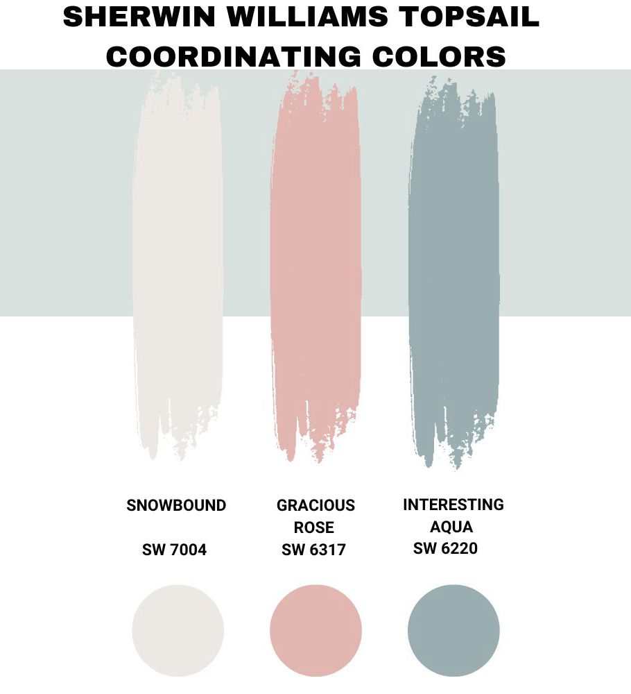
Sherwin Williams Snowbound (SW 7004)
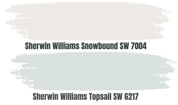
Sherwin Williams Snowbound (SW 7004) and Topsail are both beautiful and versatile colors that work in various interior design styles. Topsail’s blue-gray color creates a beachy or coastal-inspired look, and pairing it with Snowbound can create a clean and fresh look.
Snowbound’s crisp white color works for a modern and minimalist look, and using it with Topsail can add a touch of sophistication and style. Topsail’s soft blue-gray color is ideal for creating a feminine and romantic look, and Snowbound brings a touch of sophistication and elegance.
Topsail’s earthy blue-gray color creates a rustic and natural look, and combining it with Snowbound can add a touch of brightness and freshness.
Sherwin Williams Gracious Rose (SW 6317)
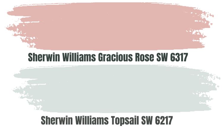
Sherwin Williams Gracious Rose (SW 6317) is a beautiful pink color that pairs well with Sherwin Williams Topsail to create a cohesive and stylish look in any space.
You can pair Topsail and Gracious Rose to create a feminine and romantic look. This combination is perfect for a bedroom or a bathroom and works well as an all-over color scheme or as an accent wall paired with white or light grey walls.
You can add accents of soft colors such as light purple, light blue, or pale pink in your Topsail and Gracious Rose room. This design gives you a cohesive and romantic look.
Topsail and Gracious Rose also work well with accents of bright colors such as yellow, orange, or green to create a vibrant and energetic look. This combination is perfect for a living room or a kitchen.
Sherwin Williams Interesting Aqua (SW 6220)
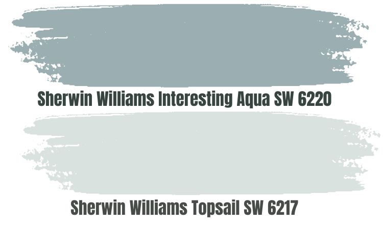
Sherwin Williams Interesting Aqua (SW 6220) is a beautiful blue color that works well as a coordinating color for Sherwin Williams Topsail. The two paint colors work well to create an appealing monochromatic design.
You can use Topsail as the primary color on walls and Interesting Aqua as a coordinating color on accents such as pillows, curtains, and rugs. This design creates a cohesive and harmonious look throughout the space.
To make things more interesting, use Topsail as the primary color on walls. At the same time, Interesting Aqua can work as your accent color on a single wall or more minor elements such as built-in shelves or a fireplace surround. This interior design will create a bold and eye-catching look.
Finally, keep Topsail as your primary color on walls, while Interesting Aqua sits on furniture and accents such as a sofa, chairs, or throw pillows. This design creates a cohesive and harmonious look while adding a pop of color to the space.
Sherwin Williams Topsail Complementary Colors
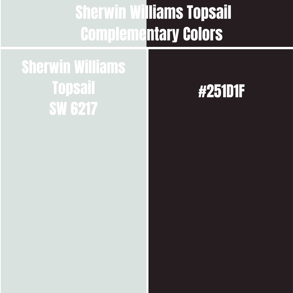
Complementary colors are pairs of colors that sit opposite each other on the color wheel. When you combine them, complementary colors create a strong visual contrast and can enhance the vibrancy of each other.
The complementary color for Sherwin Williams Topsail has a hex value of #251D1F. #251D1F is a dark and rich color that is similar to the color of deep, dark plums or aubergines. This paint color does not have an official name—however, the closest name is Raisin Black.
Trim Colors That Go with Sherwin Williams Topsail
Sherwin Williams Topsail works well with a variety of trim colors. Here are a few options that have worked well for me in the past:
- White:White is a classic choice for trim that works well with almost any wall color. It creates a crisp, clean look and helps to highlight the color of the walls.
- Light Gray:A light gray trim color can help soften Topsail’s look and create a cohesive look throughout the space.
- Cream:Cream is a warm neutral that can add a touch of softness to the space. It works particularly well with Topsail in areas with a lot of natural light.
- Black:Black trim can create a bold contrast with Topsail and add a modern edge to the space.
- Deep Blue:If you want to create a more cohesive look, a deep blue trim color similar to Topsail can be a beautiful choice. Just be sure to choose a shade slightly lighter than Topsail to avoid a too-matchy look.
Ultimately, the best trim color for you will depend on your personal style and the space’s overall aesthetic. Experiment with different options to find the one that works best for you.
How Does Light Affect Sherwin Williams Topsail?
Light can have a significant impact on Sherwin Williams Topsail’s appearance. Topsail changes dramatically depending on the lighting conditions:
- Natural Light:Topsail can appear softer and more muted in natural light, especially when it is diffused by clouds or filtered through sheer curtains.
- Artificial Light:Artificial light can bring out the blue undertones in Topsail and make it appear more vibrant and intense.
- Different Times of Day:The light’s angle and intensity can also affect how Topsail appears. For example, the color may appear more muted in the morning and evening when the light is softer and more vibrant during the afternoon when the light is at its strongest.
Sherwin Williams Topsail Benjamin Moore Version
The Benjamin Moore paint color that closely matches Topsail is the Benjamin Moore Lookout Point. Sherwin Williams Topsail and Benjamin Moore Lookout Point are both blue-gray colors that can work well in various settings. They both have a calming, neutral quality that creates a peaceful atmosphere in a space.
Topsail and Lookout Point are relatively light colors that work well in spaces with limited natural light. They reflect light and make a room feel brighter and more open. Overall, Topsail and Lookout Point are similar colors that can work well as alternatives to each other.
Best Rooms to Use Sherwin Williams Topsail
Sherwin Williams Topsail Kitchen
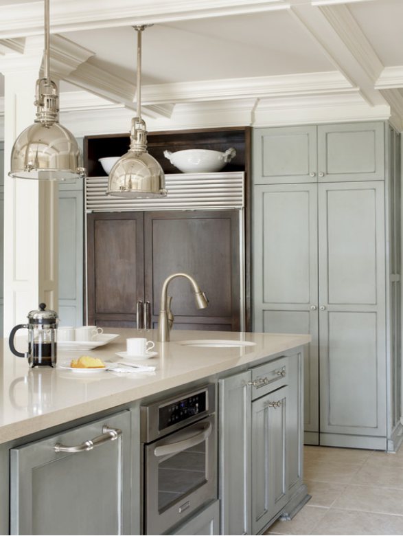
In the above kitchen, Sherwin Williams Topsail sits on the cabinets, creating an impressively appealing look. It is paired nicely with a white color, giving the room a nice airy appearance.
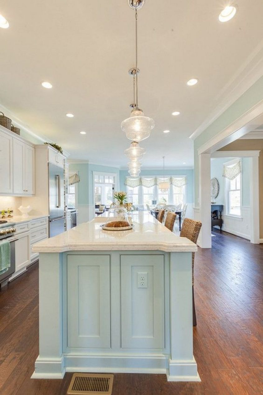
Sherwin Williams Topsail sits on the kitchen island and the walls in the above kitchen. On the cabinets, the owner has opted for a white paint color. The combination of white and blue-gray in Topsail creates a cohesive look that is both calm and airy.
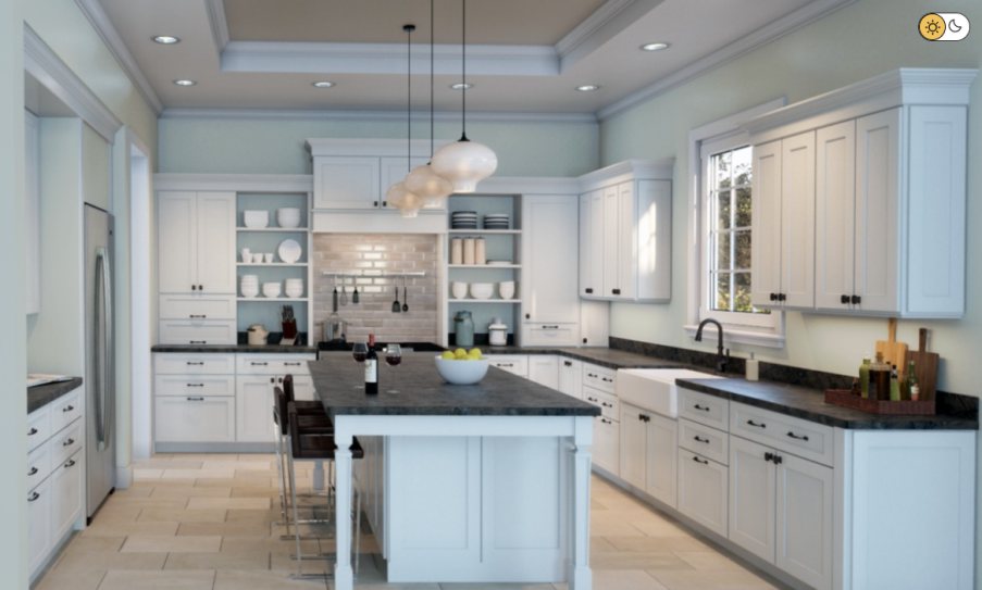
Sherwin Williams Topsail is paired nicely with white paint in the above kitchen. Topsail sits cool and calm on the walls while the white sits on the cabinets, adding brightness to the space. The combination makes the kitchen look big and airy.
Sherwin Williams Topsail Bedroom
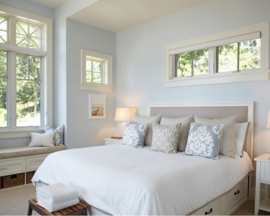
In the above bedroom, Sherwin Williams Topsail is paired nicely with whites to create a cool, relaxing feel. More of the blue tone seems to be showing in Topsail, indicating that the bedroom is receiving more cool light.
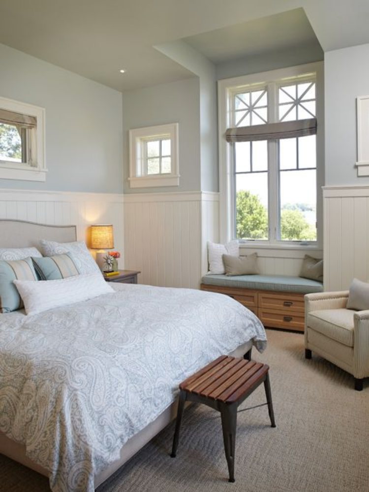
The above bedroom is an impressive combination of Sherwin Williams Topsail and whites on the wall. The bedroom adds a natural rustic look with its wooden furniture paired with the blue-gray pillows and the grayish blanket. Overall, the space looks calm and highly relaxing.
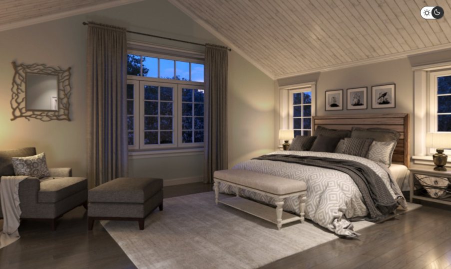
Maybe you’ve been wondering about the look Topsail creates when there is no natural light in a room. The above bedroom shows Sherwin Williams Topsail in artificial light. The paint color leans more on its neutral shade—the gray shade—while the cool blue takes a step back to allow the gray to shine.
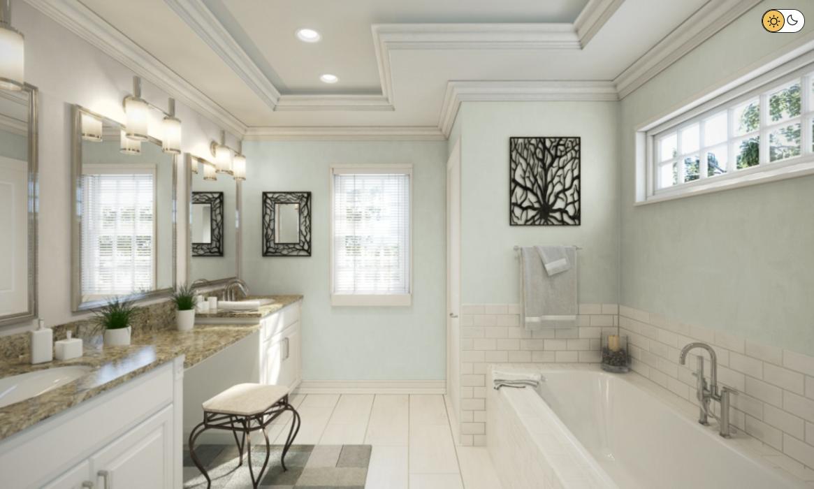
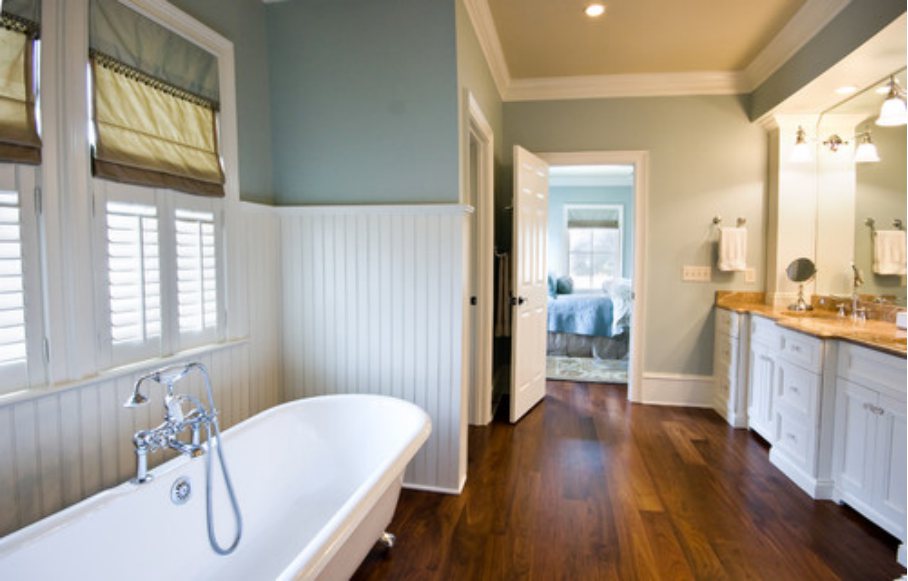
Sherwin Williams Topsail Bathroom
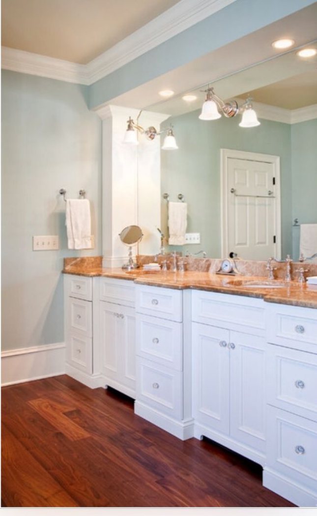
In this bathroom, Sherwin Williams Topsail is paired with a bright white paint color, creating a light yet calm feeling. The wooden paint color adds a rustic, natural texture to the bathroom, making it even more relaxing.
The above bathroom is another interesting combination of Topsail and white paint colors. However, in this bathroom, Topsail looks bluer. This suggests that the bathroom welcomes cool, natural light—it could be north-facing—hence bringing out the cool blue in Topsail.
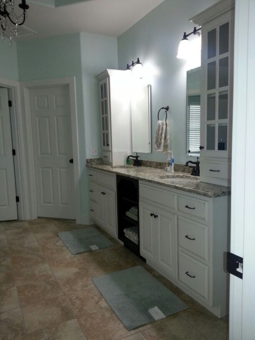
The above bathroom has white paint on the door and the cabinets, while Sherwin Williams Topsail sits on the walls. The mats match the topsail color, although the blue is much deeper, while the wooden color on the tiles creates a more rustic look.
Overview
Sherwin Williams Topsail is a stunning blue-gray paint color that can add a touch of sophistication and calm to any space. This versatile color can work well in various settings, from traditional to modern, and you can use it on walls, trim, and cabinetry.
One of the standout features of Topsail is its subtle green undertone, which adds depth and interest to the color. This undertone brings out the color’s blue tones and makes it appear more vibrant in different lighting conditions. Topsail reflects light and makes a space feel brighter and more open, especially in rooms with little natural light.
In terms of trim color, Topsail pairs well with various options, including white, light gray, cream, and black. White is a classic choice that creates a crisp, clean look and helps to highlight the color of the walls. Light gray can soften the look of Topsail and create a cohesive look throughout the space. Cream is a warm neutral that can add a touch of softness to the room, while black can make a bold contrast and add a modern edge.
Overall, Sherwin Williams Topsail is a highly recommendable paint color for those looking for a calming and cohesive color that will work well in various settings.
I hope this detailed guide has answered your questions about Sherwin Williams Topsail. If you do have additional questions, let me know in the comments section.
 Sherwin Williams Sea Salt (Palette, Coordinating & Inspirations)
 Sherwin Williams Agreeable Gray (Palette, Coordinating & Inspirations)
 Sherwin Williams City Loft (Palette, Coordinating & Inspirations)
 Sherwin Williams Rock Candy (Palette, Coordinating & Inspirations)
 Sherwin-Williams Dovetail (Palette, Coordinating & Inspirations)
 Sherwin Williams Cityscape (Palette, Coordinating & Inspirations)
