
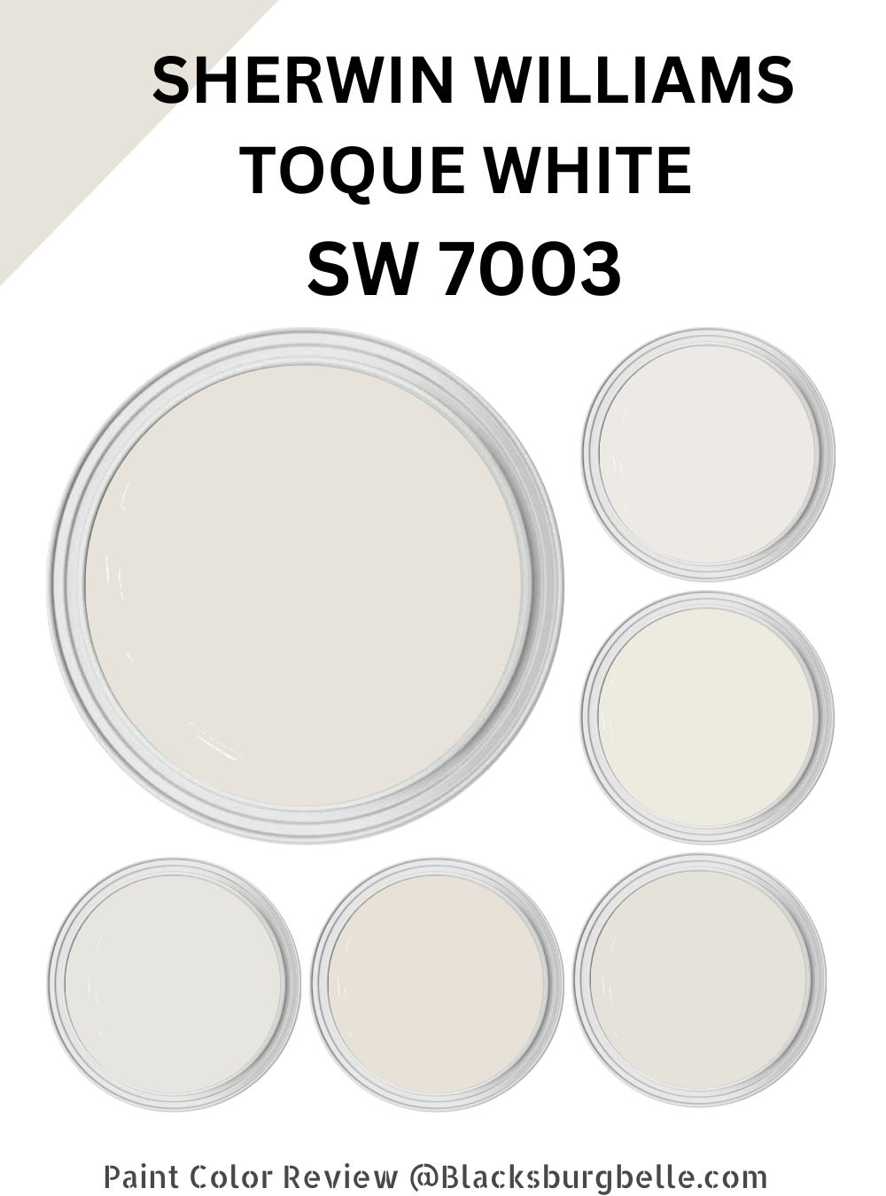
Would you like to make your room cozier and more comfortable? Do you fancy a paint color that sits on the neutral side and allows you to pair it with numerous shades to bring out your vision? Consider Sherwin Williams Toque White.
Sherwin Williams Toque White (SW 7003) is a beautiful, warm white perfect for adding comfort and coziness to any space. It has a soft, creamy undertone that softens and warms up the overall look of a room, creating a welcoming and inviting vibe.
Toque White is a neutral color that pairs well with many colors and finishes. For example, I have created a modern and minimalistic look by pairing Toque White with clean lines and sleek, metallic finishes. For a more traditional and classic look, I pair Toque White with warm wood tones and antique finishes, creating a timeless and sophisticated look.
Undoubtedly, Sherwin Williams Toque White (SW 7003) is a fantastic choice to add warmth, comfort, and style to any space. However, what is its defining characteristics? How do you use Toque White?
Read On! This detailed guide will answer all the questions you have about Toque White.
Table of Contents
What Color is Sherwin Williams Toque White?
| Manufacturer | Sherwin Williams |
| LRV | 76 |
| RGB | R: 231 G: 226 B: 218 |
| Hex Value | #E7E2DA |
| Color Collections | Living Well |
Sherwin Williams Toque White is a warm, creamy white color. It is a soft white with a hint of yellow or beige, giving it a warm, cozy feel.
RGB of Sherwin Williams Toque White
The RGB color model represents colors using a combination of the primary shades of red, green, and blue. Each shade is assigned a value between 0 and 255, indicating its intensity.
For example, pure red is represented as (255, 0, 0) because it has a high intensity of red and no green or blue. The values for red, green, and blue are mixed in different proportions to create other colors. For example, to create a color halfway between red and green, you would use an RGB value of (128, 128, 0), which has equal amounts of red and green, but no blue. The resulting color would be a shade of yellow.
Sherwin Williams Toque White combines red: 231, green: 226, and blue: 218.
LRV of Sherwin Williams Toque White
The Light Reflectance Value (LRV) measures how much light a particular color reflects. It is expressed as a percentage. The LRV of paint color affects a space’s overall look and feel and how the human eye perceives it.
For example, a paint color with a high LRV will reflect a lot of light, making it appear lighter and brighter in a space. This can be especially useful in small or dark rooms, as it can help make the area more open and airier.
On the other hand, a paint color with a low LRV will absorb more light, making it appear darker and more muted. This can be desirable in larger or well-lit rooms, as it can help to create a cozy, intimate atmosphere.
Sherwin Williams Toque White sits in the off-white range, boasting an LRV of 76. Toque White (SW 7003) reflects enough light to make a space look airy and more open.
Is Sherwin Williams Toque White a Cool or Warm Paint Color?
Sherwin Williams Toque White is a warm white color. Warm whites typically have undertones of yellow, beige, or pink, which give them a warm, cozy feel. In contrast, cool whites have undertones of blue or green, which give them a crisp, clean feel.
Toque White is a soft, creamy white color with a hint of yellow or beige. This gives it a warm, welcoming feel.
What Are Sherwin Williams Toque White Undertones?
Sherwin Williams Toque White has yellow and beige as its primary undertones and a tiny splash of purple that is rarely visible. The yellow/beige undertones create a cozy, inviting atmosphere. On the other hand, the purple undertone balances the warmth in Toque White, keeping the paint color from getting too hot.
Sherwin Williams Toque White Color Strip: Sherwin Williams Toque White Color Comparisons
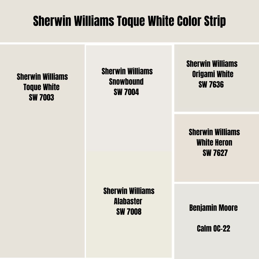
Sherwin Williams Torque White vs. Snowbound (SW 7004)
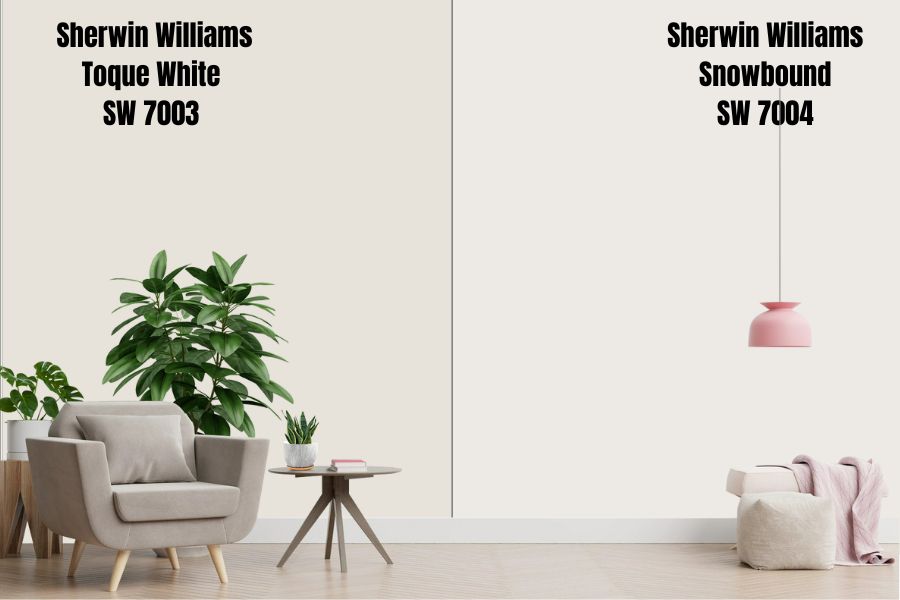
Sherwin Williams Torque White (SW 7003) and Snowbound (SW 7004) are light and neutral. Torque White (SW 7003) is a warm white with a hint of yellow and slight purple undertones, making it a versatile color that can work well in both traditional and modern spaces. Toque White is a good choice for walls, trim, and cabinetry and reflects a lot of light with its LRV of 76.
Snowbound (SW 7004) is a warm white with a hint of taupe (violet-pink) and gray undertones. It is a crisp and clean color that works well in modern and contemporary spaces. Like Toque White, Snowbound is also a good choice for walls, trim, and cabinetry. Snowbound, however, reflects 7% more light than Torque White—Snowbound has an LRV of 83.
Torque White (SW 7003) and Snowbound (SW 7004) can pair well with a variety of colors, including both warm and cool tones. Both colors are light and airy, and they can help to create a bright and welcoming atmosphere.
Sherwin Williams Toque White vs. Alabaster (SW 7008)
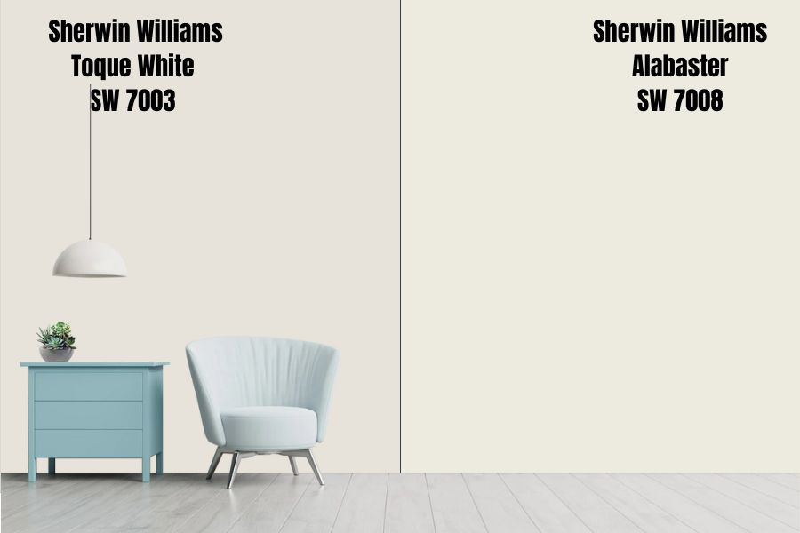
Toque White is a warm, creamy white with a slight yellow undertone balanced by a slight purple undertone. Toque White may appear more yellow or creamy in certain lights, but it is generally a consistent color that works well in various lighting conditions.
Toque White is an excellent choice for rooms with a lot of natural light, as it helps to reflect and enhance the light in the space. Toque White is also a good choice for smaller rooms, as it can help to make the area feel brighter and more open.
Sherwin Williams Alabaster is also a warm paint color. However, it boasts a hint of gray undertone, making it different from Toque White which has yellow-purple undertones. It is an excellent choice for walls and ceilings, adding a subtle and sophisticated touch. In certain lights, Alabaster may appear more gray or pale. However. Alabaster, like Toque White, is generally a consistent color that works well in different lighting conditions.
Alabaster is a good choice for larger rooms, as it creates a sense of openness and continuity. However, Toque White and Alabaster are ideal for making smaller spaces appear bigger.
Sherwin Williams Toque White vs. Origami White (SW 7636)
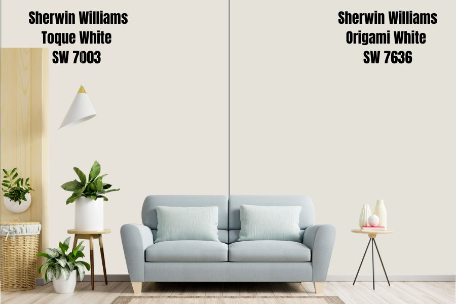
Sherwin Williams Toque White and Origami White are popular paint colors that can add a fresh and modern touch to any space. Toque White is a warm, creamy white with a hint of yellow. It works well in both modern and traditional rooms.
Origami White is a crisp, clean white with a slight violet undertone. It is an excellent choice for walls and ceilings and works well in formal and casual spaces.
One of the main differences between Toque White and Origami White is their undertones. Toque White has a slight yellow undertone, which gives it a warm and cozy feel. On the other hand, Origami White has a slight violet undertone, giving it a cool and crisp feel. This means that Toque White may be a better choice for spaces that need a warm and welcoming touch, while Origami White may be a better choice for rooms that need a cool and refreshing touch.
Toque White and Sherwin Williams Origami White may look slightly different in different lighting conditions. Toque White may appear more yellow or creamy in certain lights, while Origami White may appear more violet or pale in certain lights.
Toque White is an excellent choice for trim, doors, and cabinetry, adding a warm and welcoming touch. It is also a good choice for smaller rooms, as it can help to make the space feel brighter and more open.
On the other hand, Origami White is an excellent choice for walls and ceilings, adding a crisp and clean feel. It is also a good choice for larger rooms, as it can help to create a sense of openness and continuity.
Sherwin Williams Toque White vs. White Heron (SW 7627)
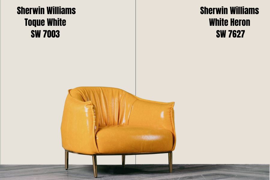
Sherwin Williams Toque White is a light, warm white with a hint of cream. It has a soft, welcoming feel and works well in various spaces. In natural light, Toque White can appear slightly warmer and creamier, while in artificial light, it may take on more of a white appearance.
Toque White has a warm, neutral undertone, meaning it works well with various other colors and materials. It could be a good choice for living rooms, bedrooms, or other spaces where you want to create a cozy, welcoming atmosphere.
White Heron (SW 7627) is also a light white, but it has more of a cool, crisp feel. It is a true white with a slight greige undertone, which gives it a cooler, more crisp appearance. In natural light, White Heron may appear slightly cooler, while in artificial light, it may take on more of a neutral feel and appearance.
Like Toque White, White Heron has a cool, neutral undertone, making it very versatile. It could be a good choice for kitchens, bathrooms, or other spaces where you want to create a fresh look.
These colors are light whites with an LRV of 76, so they can work well in spaces with a lot of natural light. However, Toque White may be a better choice for rooms with a warm color scheme, while White Heron may be a better choice for spaces with a cool color scheme.
Sherwin Williams Toque White vs. Benjamin Moore Calm (OC-22)
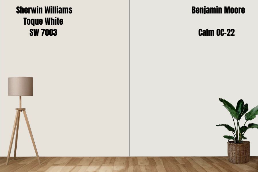
Sherwin Williams Toque White is a light, warm white with a hint of cream. It has a soft, welcoming feel, and it can work well in a variety of spaces. In natural light, Toque White can appear slightly warmer and creamier, while in artificial light, it may take on more of a white appearance.
Toque White has a warm, neutral undertone, meaning it can work well with various other colors and materials. It could be a good choice for living rooms, bedrooms, or other spaces where you want to create a cozy, welcoming atmosphere. Toque White might also work well in areas with warm-toned wood finishes or other warm-toned materials.
Benjamin Moore Calm (OC-22) is also a light, warm white but has a more neutral undertone. In natural light, Calm may appear slightly warmer and creamier, while artificial light may take on a more neutral appearance.
These colors are light whites, so they work well in spaces with a lot of natural light. However, Toque White may be a better choice for warm rooms, while Calm may be better for areas with a more neutral color scheme.
Sherwin Williams Toque White Color Palette: Colors That Go with Sherwin Williams Toque White
Sherwin Williams Toque White pairs well with other warm and neutral colors and pops of brighter shades. Some great pairing colors for Toque White include:
- Neutrals:Toque White pairs well with neutral shades like beige, taupe, and gray. These colors create a cohesive and calming look in a space.
- Warm shades:Toque White is a warm color. You can pair it with other warm hues like yellow, orange, and red. These shades can add energy and vibrancy to a space.
- Cool shades:You can pair Toque White with cool hues like blue, green, and purple. These shades can help to create a calming and relaxing atmosphere.
- Brights:You can use Toque White as a backdrop for pops of brighter shades like pink, turquoise, or lime green. These colors can add interest and personality to a space.
Below I will take a deeper look at specific paint colors you can use to create exciting designs with Sherwin Williams Toque White.
Coordinating Colors for Sherwin Williams Toque White
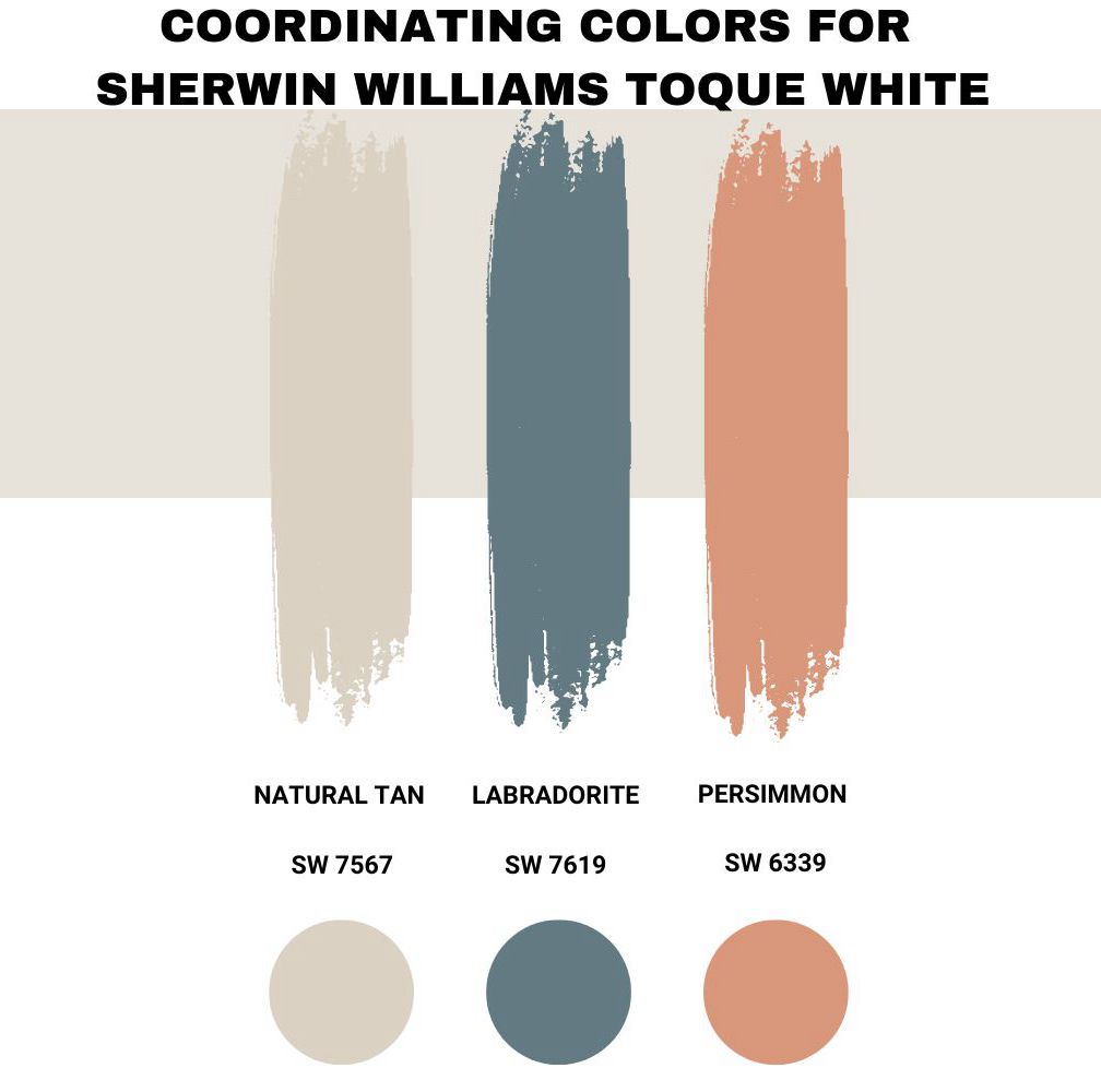
Sherwin Williams Natural Tan (SW 7567)
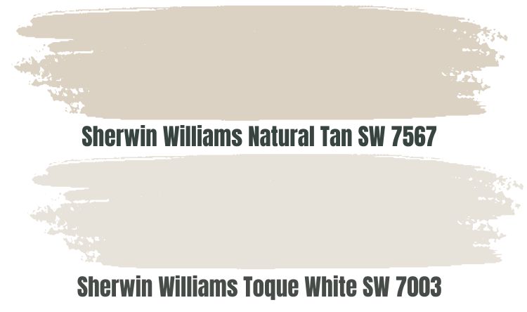
Sherwin Williams Natural Tan is a warm, sandy beige color that brings a calm and relaxed atmosphere to a room.
Natural Tan has a green-gray undertone that keeps it from looking overly warm. It is a versatile color that works well in various spaces and styles, from traditional to modern.
On the other hand, Toque White is a warm, creamy white color that adds a touch of warmth and richness to a space. It pairs well with different warm and neutral colors and pops of brighter shades.
When you combine the two paint colors, they provide an excellent, more balanced warmth, with the purple in Toque white and the gray-green in Natural turn, keeping the room from looking overheated. Natural Tan is slightly darker and cooler than Toque White, which can add depth and interest.
They are neutral shades that work well as a base for the rest of the room’s color scheme. Whether you use them as the main colors in a room or as accents, they can help create a cohesive and calming look.
Sherwin Williams Labradorite (SW 7619)
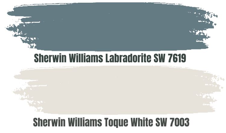
You can combine Sherwin Williams Labradorite (SW 7619) and Toque White (SW 7003) to create a cohesive and stylish space. Labradorite is a cool, muted blue-gray color that brings a sense of calm and sophistication. Toque White is a warm, creamy white color that adds a touch of warmth and richness. Together, these two colors provide a nice balance of cool and warm tones.
While these two colors are neutral, they provide enough contrast to make a statement. Labradorite is a cool, muted shade, while Toque White is a warm, creamy white. This contrast can add depth and interest to a space.
Pairing these two colors can help to create a cohesive look in a space. They are neutral shades and work well together as a base for the room’s color scheme.
Both colors are versatile and can work well in various spaces and styles. You can use them as the primary color in a room or as an accent, and they pair well with other neutral and vibrant shades.
Sherwin Williams Persimmon (SW 6339)
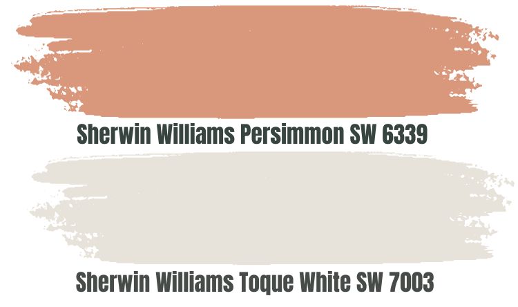
You can combine Sherwin Williams Persimmon (SW 6339) and Sherwin Williams Toque White (SW 7003) to create a bold and stylish look.
Persimmon is a bold, warm orange color that adds energy and vibrancy to a space. Toque White is a warm, creamy white color that adds a touch of warmth and richness. Together, these two colors provide a nice contrast that can make a statement.
While these two colors are very different in terms of hue and saturation, they are both warm shades that can work well together to create a cohesive look. Persimmon is a bold, energetic color, while Toque White is a more subtle, calming color. Together, they can provide a nice balance of energy and relaxation.
Sherwin Williams Toque White Complementary Colors
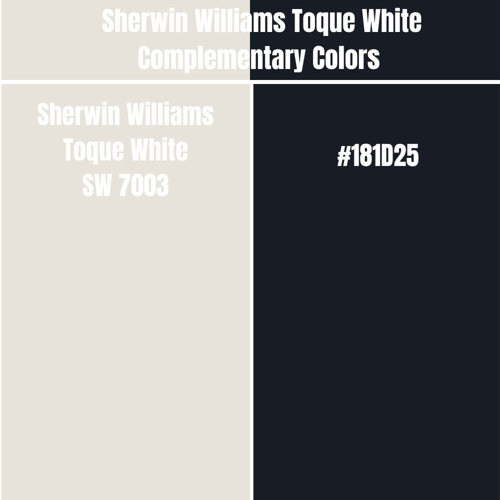
Complementary colors are opposite each other on the color wheel. They enhance and intensify each other when used together.
The combination of a complementary pair of colors can create a vibrant and dynamic look, as well as a strong visual contrast. They make a bold and striking look in a room.
The complementary color for Toque White has a hex value of #181D25. #181D25 is a dark, rich color that could be described as a deep blue-gray or a subdued navy. The closest color name to #181D25 is Eigengrau.
Trim Colors That Go with Sherwin Williams Toque White
Sherwin Williams Toque White is a versatile paint color that will work with various trim colors. However, in my years working with Toque White, the options that have produced stand-out results for me include the following:
- Sherwin Williams Alabaster– This warm, creamy white could add a touch of warmth.
- Sherwin Williams Pure White– This bright, crisp white could create a clean and modern look.
- Sherwin Williams Gossamer Veil– This light, airy gray with cool undertones adds sophistication and depth.
- Sherwin Williams Keystone Gray– This is a medium-toned gray with a balanced mix of warm and cool undertones. It adds a touch of drama.
- Sherwin Williams Mindful Gray– This soft, muted gray with a warm undertone adds a sense of calm and tranquility.
How Does Light Affect Sherwin Williams Toque White?
Different lighting conditions will often change the appearance of Sherwin Williams Toque White:
- Natural sunlight: Toque White may appear warmer and creamier in natural sunlight. The color may also appear more vibrant and crisper.
- Incandescent light:Incandescent light, a warm, yellowish light often used in homes, can give Toque White a warmer, more yellowish appearance.
- Fluorescent light:Fluorescent light is a cool, bluish light often used in offices and other commercial settings. Under fluorescent light, Toque White may lean more on the neutral side, losing much of its warmth.
- Low light:Toque White may appear darker and less vibrant in low light conditions. Shadows and highlights may be more pronounced, giving the color more depth and texture.
- Bright light:In very bright light, Toque White may appear brighter and more vibrant. The color may also appear crisper and sharper.
Sherwin Williams Toque White Benjamin Moore Version
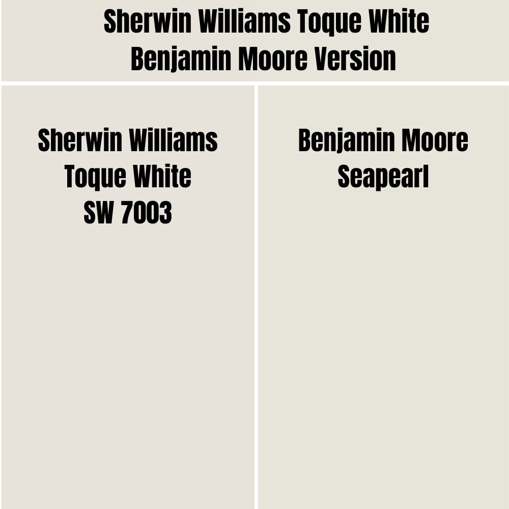
Benjamin Moore Seapearl and Sherwin Williams Toque White are very similar-looking paint colors. While Benjamin Moore Seapearl combines red: 231, green: 228, and blue: 217, Sherwin Williams Toque White combines red: 231, green: 226, and blue: 218. While Sherwin Williams Toque White has an LRV of 76, Benjamin Moore Seapearl has an LRV of 76.43.
Best Rooms for Painting Sherwin Williams Toque White
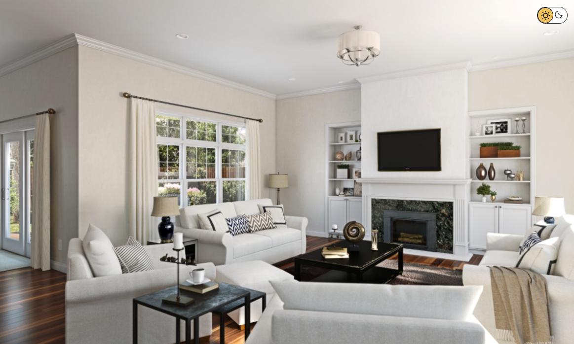
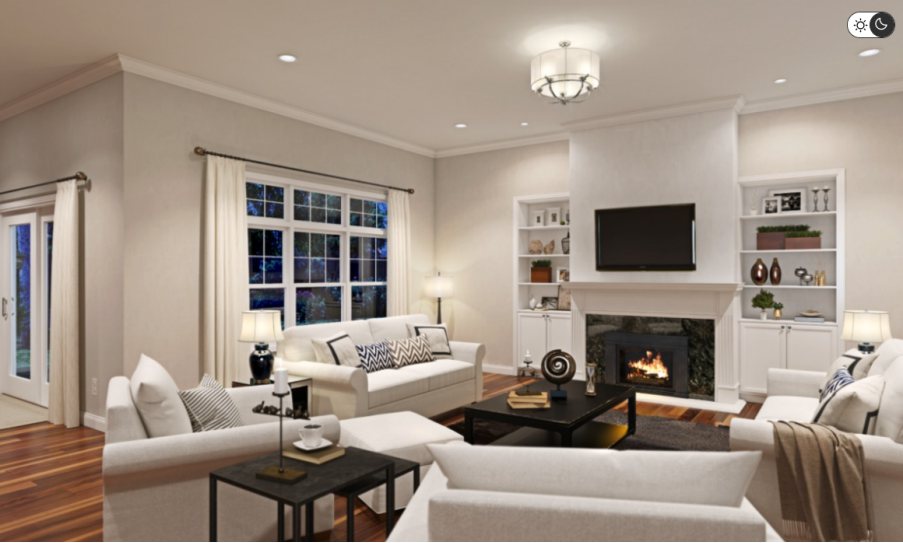
Sherwin Williams Toque White Living Room
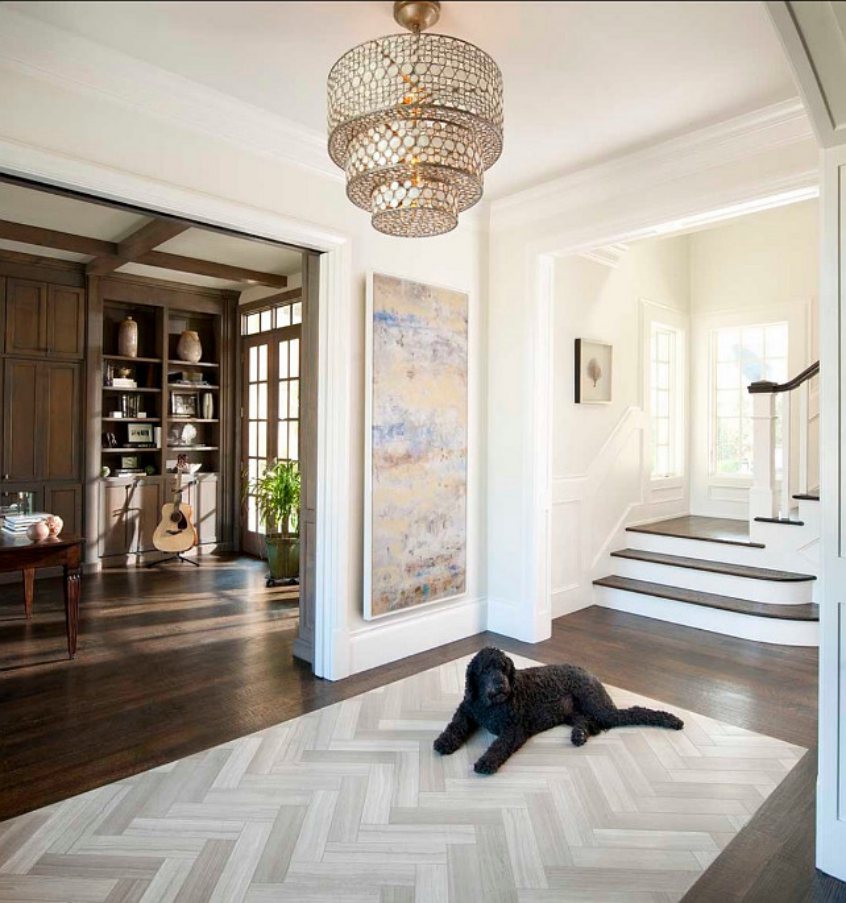
The above house combines two primary colors: Toque White sits on the walls, and Sherwin Williams Snowfall sits on the trims. However, in the above room’s bright, cool light, it is not easy to distinguish these paint colors that have an almost similar look.

The above living room shows off the slightly creamy side of Sherwin Williams Toque White. However, the light entering the room is still cool, and Toque White looks more like neutral white paint than a warmer shade. The gray matt and chairs plus the wooden floor incorporate a rustic feel.
The above picture is a good representation of Toque White in artificial fluorescent light. The shadows created by the artificial light give the paint color more depth in some areas while it looks much whiter in others. The fluorescent lights provide a cooler light, making Toque White look more neutral.
Sherwin Williams Toque White Bedroom
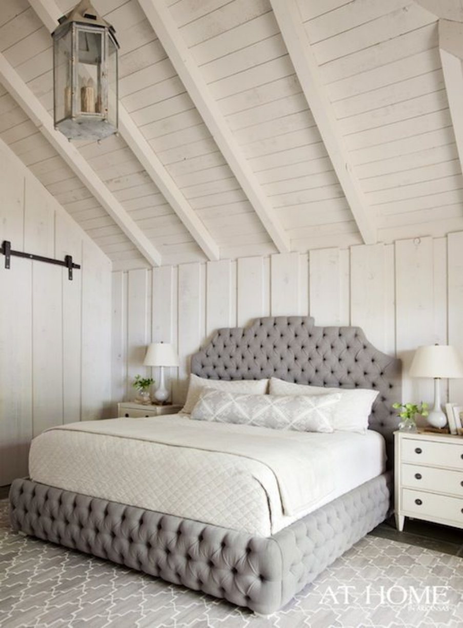
Sherwin Williams Toque White is paired nicely with a gray bed and carpet in the above bedroom. The off-white mattress and the toque white cabinet and ceiling create an impressive matching look. The creamy side of Toque White shows, suggesting that the space welcomes warm light.
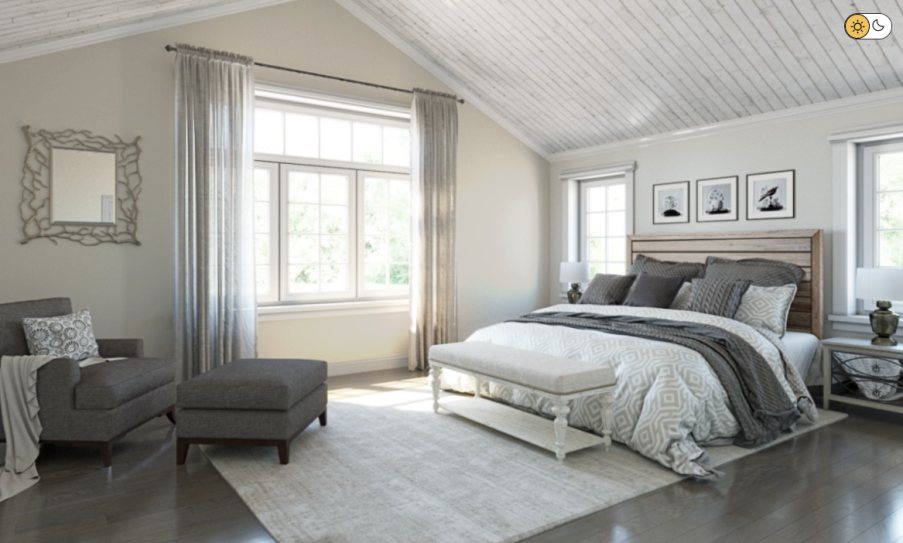
One wall in the above bedroom shows more depth than the other. This could result from the shadows created by the lighting, giving Toque White additional depth. The wall on the right-hand side looks whiter with a less creamy look, indicating that it has access to more light.
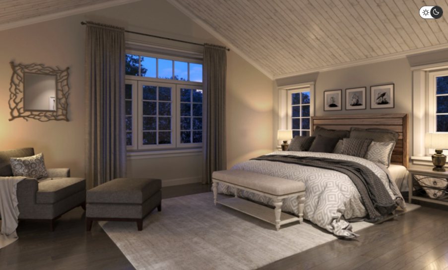
When natural light disappears and gets replaced by artificial light, all walls in the bedroom get shadows. The shadows give the walls more depth. These shadows make the walls move away from the white appearance.
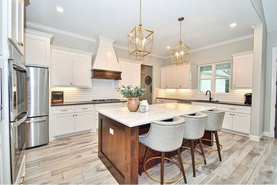
Sherwin Williams Toque White Kitchen
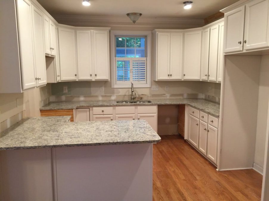
The above kitchen features an excellent interior design with the Sherwin Williams Toque White on the cabinets. The fluorescent lights in the kitchen emit cool light, forcing Toque White to look more neutral. The wooden floor and the gray countertops create a more rustic look.
The above kitchen showcases another impressive use of Sherwin Williams Toque White on kitchen cabinets. The owner went after a monochromatic look, using white almost everywhere. The dark wooden kitchen table, however, creates a much-needed difference.
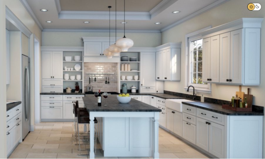
Sherwin Williams Toque White displays its full creamy appearance in the above kitchen. Toque White sits on the walls and looks yellow, indicating the kitchen is welcoming warm light. The white paint color on the kitchen cabinets creates a nice monochromatic view.
Overview
Sherwin Williams Toque White is a warm, neutral white paint that works for residential and commercial spaces. Toque White has a soft, creamy undertone that adds a touch of warmth to a room and pairs well with both cool and warm accents. It is a versatile choice for creating a cozy, welcoming atmosphere in any space.
Toque White is available in various finishes, including flat, eggshell, satin, and semi-gloss. The finish you choose will depend on the look and feel you want to achieve, as well as the practical needs of the space.
For example, a flat finish is a good choice for low-traffic areas or a more modern, matte look. In contrast, a semi-gloss finish is more durable and easier to clean, making it a good choice for high-traffic areas or a more traditional, polished look.
Sherwin Williams Toque White’s warm, neutral tone makes it easy to pair with many colors and styles, and its durability and easy maintenance make it a practical choice for high-traffic areas. Toque White is an excellent choice if you’re looking to create a warm and welcoming atmosphere in your home or office.
I hope this article has answered all your questions about Toque White. If you want to know more about the paint color, let me know in the comments below.
 Sherwin Williams Eider White (Palette, Coordinating & Inspirations)
 Sherwin Williams Worldly Gray (Palette, Coordinating & Inspirations)
 Sherwin Williams Greek Villa (Palette, Coordinating & Inspirations)
 Sherwin-Williams Pussywillow (Palette, Coordinating & Inspirations)
 Sherwin-Williams Natural Choice (Palette, Coordinating & Inspirations)
 Sherwin Williams Coastal Plain (Palette, Coordinating & Inspirations)
