
Are you looking for a paint color that could allow you to implement the coastal feel in your house? A color that reminds you of the sand, the water, and the sun every time you get back home?
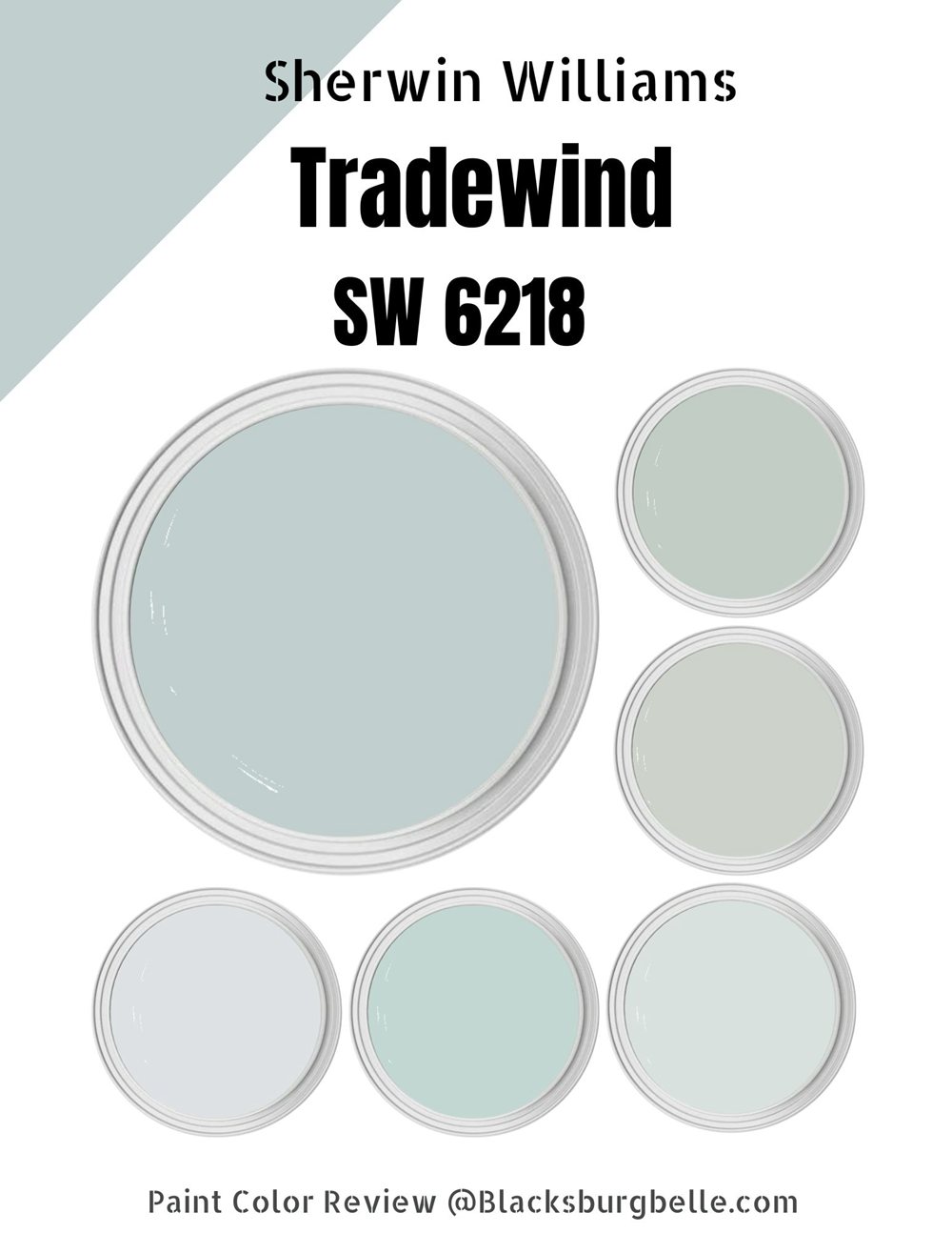
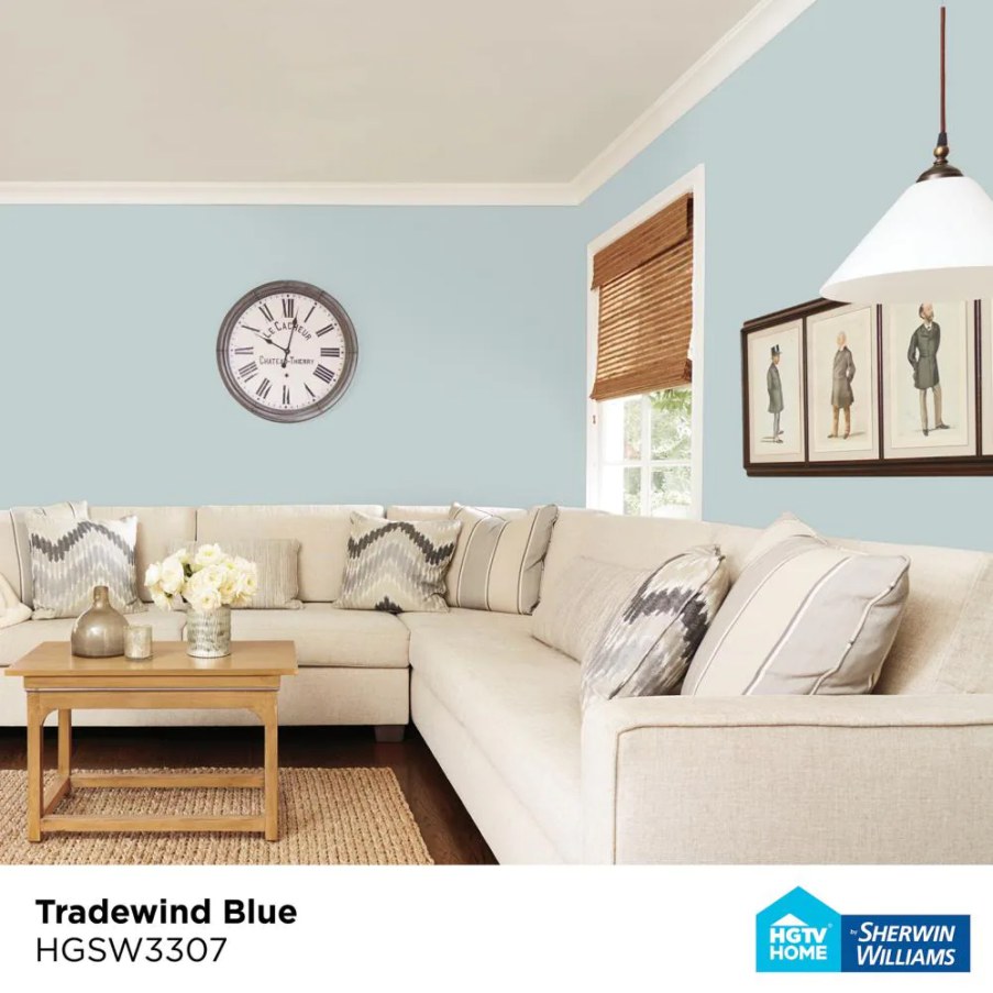
Sherwin Williams Tradewind is a beautiful, jaw-dropping blue color that gives off a beach vibe. Timeless and classic, the Sherwin Williams Tradewind SW 6218 is also highly flexible—you can pair it with a wide range of paint colors.
If Tradewind is new to you, don’t worry! I have used it in several of my rooms and have put together tips and tricks on taking full advantage of this paint color. To help you understand Tradewind SW 6218, I will show you its LRV, RGB, and undertones and then show you the paint colors you can pair it with to create the peacefulness and serenity your home deserves.
Are you ready? Let’s dive in!
Table of Contents
What Color is Sherwin Williams Tradewind (SW 6218)?
| Manufacturer | Sherwin Williams |
| LRV | 61 |
| RGB | R: 194 G: 207 B: 207 |
| Hex Value | #C2CFCF |
| Color Collections | Living Well—Inspire |
Sherwin Williams Tradewind is a cool blue paint color. It is so cool that most interior designers associate it with the ability to add that refreshing vibe to any space. The blue paint is pretty laid back and reminiscent of the beach, often making Sherwin Williams Tradewind SW 6218 a perfect option for coastal homes.
RGB of Sherwin Williams Tradewind
The RGB scale helps interior designers determine the amount of red, green, and Blue that goes into making a specific paint color. The scale starts at zero and tops out at 255. Sherwin Williams Tradewind combines red: 194, green: 207, and blue: 207.
LRV of Sherwin Williams Tradewind
The abbreviation LRV stands for light reflectance value—this scale shows the amount of light a specific color can reflect and runs from 0 to 100. At 0, you will have Pure Black, which reflects 0 percent light, while Pure White sits at 100, reflecting 100% light. Sherwin Williams Tradewind has an LRV of 61, absorbing 39% light and reflecting 61% light.
Is Sherwin Williams Tradewind a Warm or Cool Color?
Sherwin Williams Tradewind is a cool paint color. The dominating color in Tradewind SW 6218 is the blue tone—on the color scale, blue sits squarely on the cool side.
In north-facing rooms, Sherwin Williams Tradewind looks much cooler, adding some exciting personality to the space. If you have a south-facing room—or afternoon western sunshine—the coolness in Sherwin Williams Tradewind will help you balance the extreme warmth.
Sherwin Williams Tradewind Undertones
Tradewind SW 6218 has a dose of gray that calms it down and a tiny splash of green. However, these undertones do not always show up—for them to show up, you will need the proper light orientation in a room.
Sherwin Williams Tradewind Color Strip: Sherwin Williams Tradewind Color Comparisons
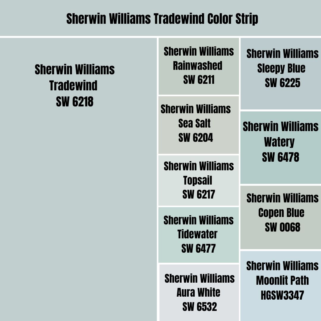
Sherwin Williams Tradewind vs. Rainwashed (SW 6211)
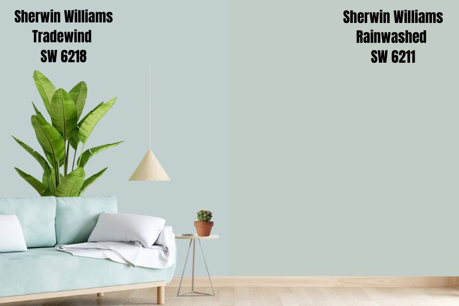
Tradewind and Rainwashed are primarily similar in their primary tones and undertones. Tradewind has blue as its natural tone with gray and green undertones. The same applies to Rainwashed, which boasts blue as the leading tone, with green and gray undertones.
Tradewind and Rainwashed fall in the mid-range on the LRV scale—Rainwashed reflects 2% less light with an LRV of 59, while Tradewind has an LRV of 61. Both paints can hold their color even in a super bright room.
Tradewind and Rainwashed are cool colors. You should expect them to appear way cooler in north-facing rooms, while they will help you balance out the warmth in south-facing rooms.
Sherwin Williams Tradewind vs. Sea Salt (SW 6204)
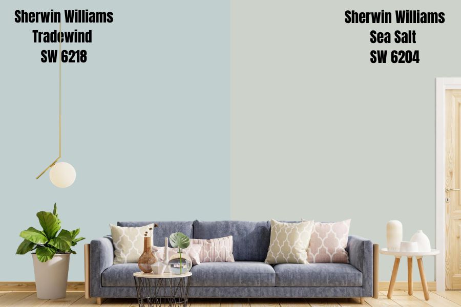
Like Tradewind, Sherwin Williams Sea Salt is also a beachy-themed paint color that is quite popular among homeowners. Sea Salt SW 6204 is a sift, pale blue color that boasts green and gray undertones that make it quite similar to Sherwin Williams Tradewind. Like Tradewind, the blue-green shade takes the primary spot in Sea Salt, while the gray color leans back.
Sea Salt reflects 3% more light than Tradewind—while Tradewind has an LRV of 61, Sherwin Williams Sea Salt reflects 64% of light. Both colors can help your room feel brighter and lighter as they reflect natural and artificial light into your space. However, they will maintain their color even in bright rooms—they won’t get washed out.
Both Sea Salt and Tradewind have cool shades dominating. They are cool colors that can balance out the warmth in south-facing rooms.
Sherwin Williams Tradewind vs. Topsail (SW 6217)
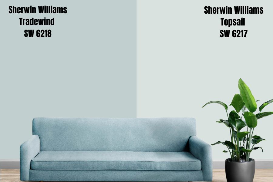
Sherwin Williams Topsail and Tradewind boast the same tones—deep blue and green undertones and a splash of gray in the background. They are both crisp and cool paint colors that are soothing and relaxing.
On the color swatch, Topsail SW 6217 is one shade lighter than Tradewind SW 6218—this explains the differences in their LRV. While Tradewind reflects 61% of light, Topsail sits on the lower end of the off-white range with an LRV of 75.
While Tradewind can hold out in a bright room without losing its appearance and becoming too washed out, Topsail may become washed out in a bright room. However, Topsail will stand out in a dim room, while Tradewind may appear dull and bland. Both colors are cool and work well to balance out the warmth in south-facing rooms.
Sherwin Williams Tradewind vs. Tidewater (SW 6477)
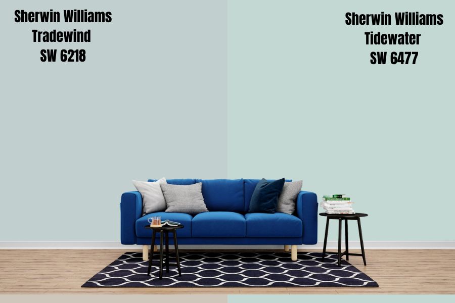
Like Tradewind, Tidewater is a blue paint color that boasts gray and green undertones. Tidewater belongs in the aqua family of blues and gives the coastal vibe like Tradewind.
Tidewater reflects 4% more light than Tradewind—Tidewater has an LRV of 65, while Tradewind boasts an LRV of 61. Both colors are light enough to reflect a lot of light into your space but aren’t light that they will brighten a dark room. Therefore, for the best results, use either color in a room with enough light.
Both Tradewind and Tidewater are cool colors. In a north-facing room, the two paint colors give off the appearance of a light saturation, with the cool Blue becoming more dominant and making the colors look much cooler. In a south-facing room, the bright sunlight can wash out their blue, giving the colors the appearance of a near-perfect light aqua blue, reducing their coolness.
Sherwin Williams Tradewind vs. Aura White (SW 6532)
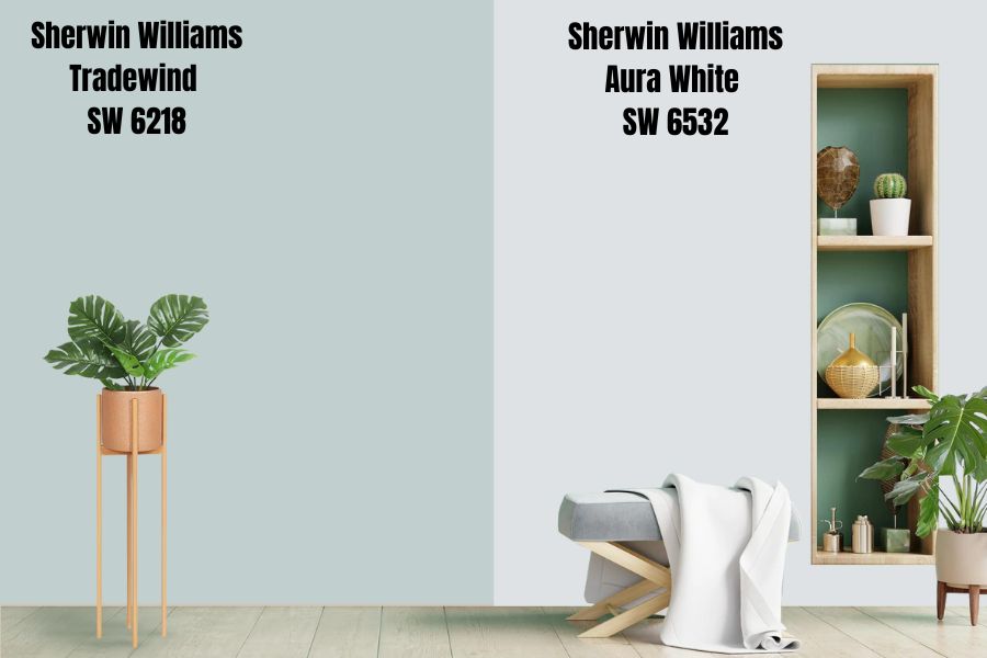
While the name could suggest that Aura White is a white color, it is not. The paint color boasts the same shades as those in Sherwin Williams Tradewind SW 6218—Aura White has gray, blue, and green undertones. However, while Blue and green take the lead in Tradewind and gray takes a backseat, the arrangement is reversed in Aura White, with gray leading while the blue-green are undertones.
Aura White is a cool color. However, compared to Tradewind, Aura White is less cool, considering that the cooler tones take a backseat while the gray takes the lead. Both colors will look incredibly cool in a north-facing room, while their coolness reduces in a warm south-facing room.
Aura White sits in the off-white range with an LRV of 76. Reflecting 15% more light than Tradewind, Aura White is more likely to become washed out in a bright room—the same risk is much lower in Tradewind, which absorbs more light. Aura White will maintain its character in a dull room, while Tradewind may look bland in the same room.
Sherwin Williams Tradewind vs. Sleepy Blue (SW 6225)
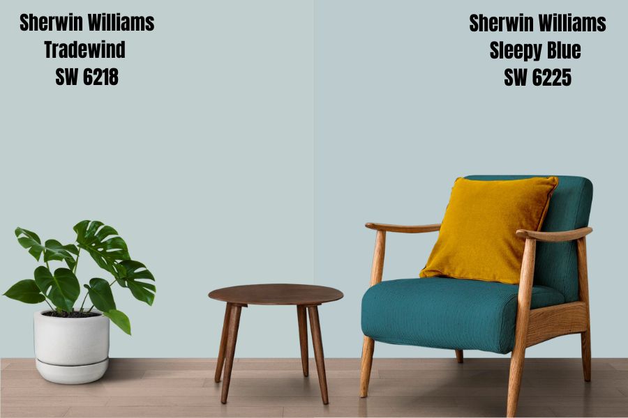
Sleepy Blue is another cool blue paint color that brings out the beach vibe, creating a tranquil, serene, and calm feel in any room—like Tradewind. Sherwin Williams Sleepy Blue and Tradewind SW 6218 are in the same range on the LRV scale—while Tradewind reflects 61% of light, Sleep Blue boasts an LRV of 58, reflecting 3% less light.
Both colors will work in bright rooms as they can maintain depth without getting washed out. However, in dimly lit rooms, the paint colors could lose their character and appear dull.
Both colors have blue as the dominating tone and cool gray in the background. The two colors are cool—take them into a north facing room and you will experience their total coolness. However, the warmth in a south-facing room can help reduce their coolness, allowing a balanced feel in the room.
Sherwin Williams Tradewind vs. Watery (SW 6478)
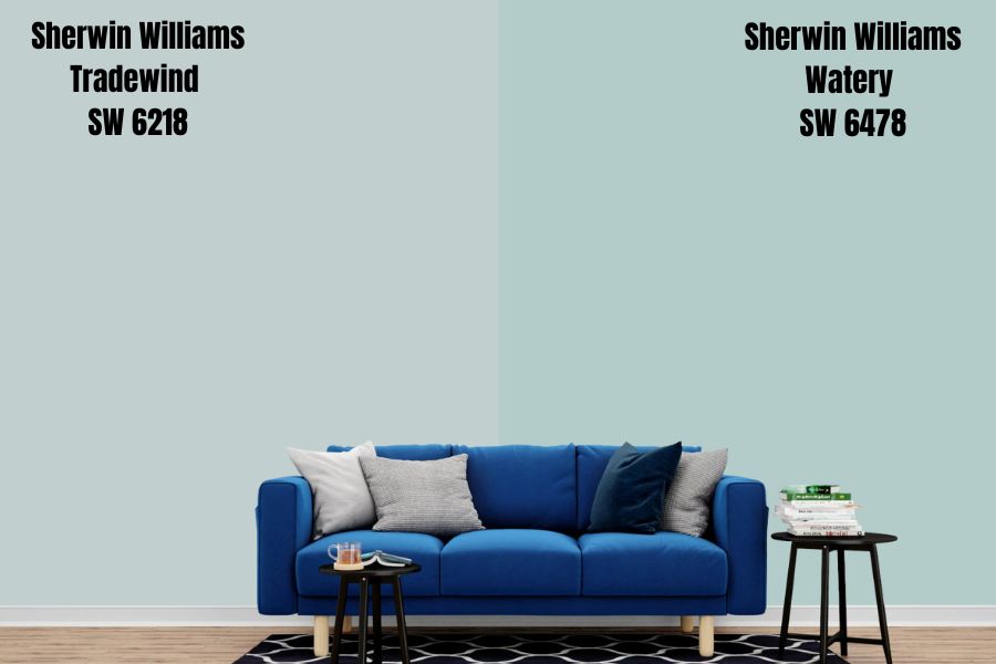
Like Sherwin Williams Tradewind, Watery SW 6478 is another perfect color for homeowners planning to implement a coastal vibe in their rooms. Both Watery and Tradewind boast a calming and soothing hue that creates a feeling of serenity.
Both Tradewind and Watery have blue as their primary tone. However, they have green and gray undertones, with green dominating the gray in the undertones department. These undertones essentially mean that Watery and Tradewind are both cool colors.
You will want to use these colors in a well-lit room. Tradewind reflects more light with an LRV of 61, while Watery reflects 57% light. While both colors reflect sufficient light, they may lose their character in a dim room, becoming too dull. In a bright room, however, the colors will absorb enough light, meaning they will not get washed out.
Sherwin Williams Tradewind vs. Copen Blue (SW 0068)
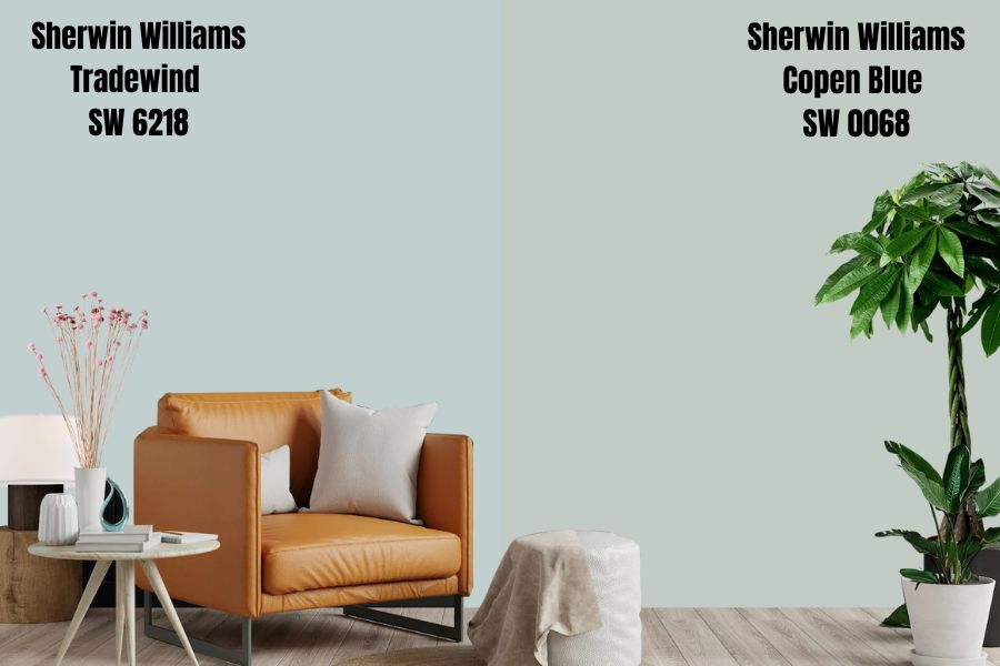
Sherwin Williams Copen Blue has the blue shade as the primary tone. Like Tradewind, Copen Blue also boasts green and gray undertones, with green being the dominant tone. The lighting conditions affect both Tradewind and Copen Blue similarly—for example, the green undertone shows to the party when you view the colors in warm lighting conditions.
Sherwin Williams Copen Blue boasts an LRV of 59, reflecting 2% less light than Tradewind, which has an LRV of 61. Both colors will hold their ground in highly bright rooms, absorbing the excess light to maintain their character. However, in a dull room, the paint colors may appear tedious.
Sherwin Williams Copen Blue, just like Tradewind, is a cool paint color. The cool side becomes even more dominant if you place the two colors in north-facing rooms. Using the two colors in a south-facing room allows you to balance out the warmth resulting from the southern light.
Sherwin Williams Tradewind vs. Moonlit Path (HGSW3347)
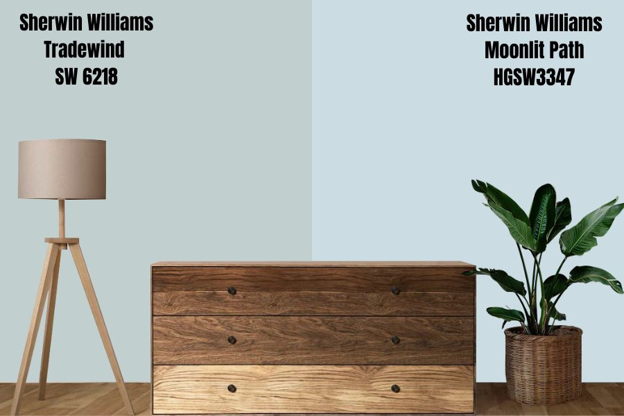
Moonlit Path is a blue color with the same undertones as Tradewind. The leading undertone in Moonlit Path is a cool green, followed closely by a cool gray that takes the backseat.
Like Tradewind, Moonlit Path is also a cool color. In a south-facing room, both Tradewind and Moonlit Path will deliver excellent results balancing out the warmth in the southern light and keeping it from overwhelming the space. In a north-facing room, the northern light can make the two colors seem cooler than they are in real life.
Sherwin Williams Moonlit Path reflects more light than Sherwin Williams Tradewind SW 6218. Moonlit Path boasts an LRV of 69.72, sitting a few steps outside the off-white range. Tradewind, on the other hand, has an LRV of 61. While Sherwin Williams Moonlit Path may look attractive in a dim room, Tradewind may look dull and bland in a dim room.
Sherwin Williams Tradewind Color Palette
Coordinating Colors for Tradewind SW 6218
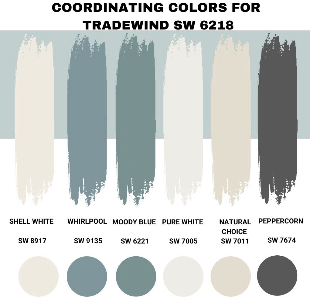
Tradewind is an easygoing, flexible color that works well with many paint colors. In my experience working with Sherwin Williams Tradewind SW 6218, the following pairing colors have produced the best results:
Sherwin Williams Shell White (SW 8917)
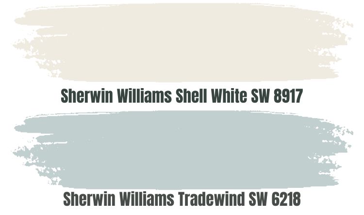
For a good reason, Shell White was Sherwin William’s color of the month in 2018. The paint color adds a clean look without looking bland or too stark. While Sherwin Williams Tradewind is a cool color, Shell White works well as a pairing color as it brings warmth, balancing the coolness and keeping the room from becoming icy.
Just as you would expect with a warm paint color, Sherwin Williams Shell White boasts beige and yellow undertones, both contributing to its impressive warmth. If you are worried about using Sherwin Williams Tradewind SW 6218 in a dim room, pairing it with Shell White should eliminate the worry.
Sherwin Williams Shell White SW 8917 sits in the higher end of the off-white range with an LRV of 83. In a dimly lit room, Shell White will reflect enough light, keeping your Tradewind from looking bland or dull.
Sherwin Williams Whirlpool (SW 9135)
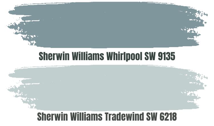
The Sherwin-Williams Whirlpool might be a good option for implementing a monochromatic view in your room. Like Tradewind, Whirlpool is a serene blue paint color that brings a beachy vibe to your space.
However, do not worry that combining two similar colors will create a dull look. Whirlpool is a darker shade of blue, meaning that you will see a clear distinction between Tradewind and Whirlpool.
However, use the two colors in a room with enough light. Whirlpool has an LRV of 29, while Tradewind has an LRV of 61. The two colors will look bland in a room with minimal light. However, put them in a bright room, and their full character will show.
Both Tradewind and Whirlpool are cool colors. Therefore, using them in a north-facing room could create an icy feeling. However, use the two colors in your south-facing rooms, and you will create an impressive balancing effect that will keep the southern light from warming the house too much.
Sherwin Williams Moody Blue (SW 6221)
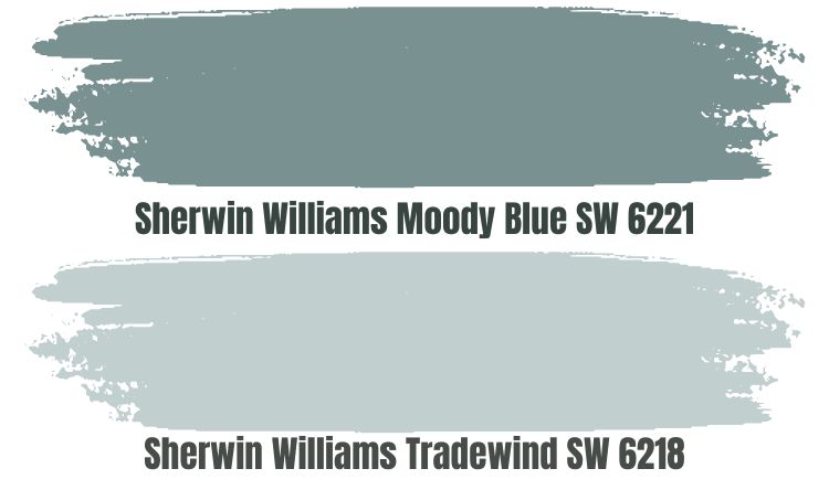
Sherwin Williams Moody Blue is another attractive paint color for homeowners planning to implement a monochromatic design. It is a dark to mid-tone color that boasts a mix of green and blue shades.
Moody Blue has an LRV of 27, meaning that you will see a clear distinction between Moody Blue and your Tradewind in a room. However, you should use the two colors in a well-lit room—their LRV values make them more susceptible to losing their character in rooms with minimal light.
Also, consider using these two colors in a room welcoming southern light. The coolness in the two colors will help you balance the warmth in south-facing rooms. North-facing rooms, however, can turn icy if you add the coolness provided by Moody Blue and Tradewind combo.
Sherwin Williams Pure White (SW 7005)
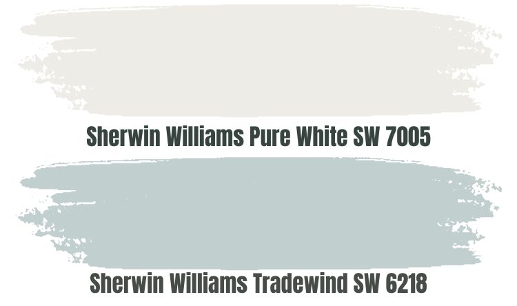
Sherwin Williams Pure White is another excellent option for a contrasting palette. Sherwin Williams Pure White is a flexible and versatile paint color that boasts passive warmth that can help balance out the coolness in Tradewind.
Sherwin Williams Pure White comes with an LRV of 84. The paint color can reflect enough light to create enough interest in a dim room.
Pure White is not True White—Pure White reflects 16% less light than True White. Therefore, you should expect Pure White to have a dose of undertones—the paint color has a yellow undertone that provides warmth and a drop of black that softens it.
Sherwin Williams Natural Choice (SW 7011)
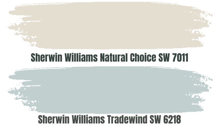
When working with Sherwin Williams Tradewind SW 6218, it is impossible to run out of options regarding pairing colors. Sherwin Williams Natural Choice SW 7011 is another option for contrasting looks.
Natural Choice is an attractive light, neutral paint that sits in the off-white range with an LRV of 73. Although Natural Choice LRV is not as high as Pure White, the paint color will definitely add interest when used in a dim room with Sherwin Williams Tradewind.
Natural Choice is a warm white paint color. It comes from the yellow hue family, so you can be sure that it brings a lot of warmth to any room. Therefore, pairing Tradewind and Natural Choice means that you can balance out the cool in Tradewind, creating a friendly, relaxing environment.
Sherwin Williams Peppercorn (SW 7674)
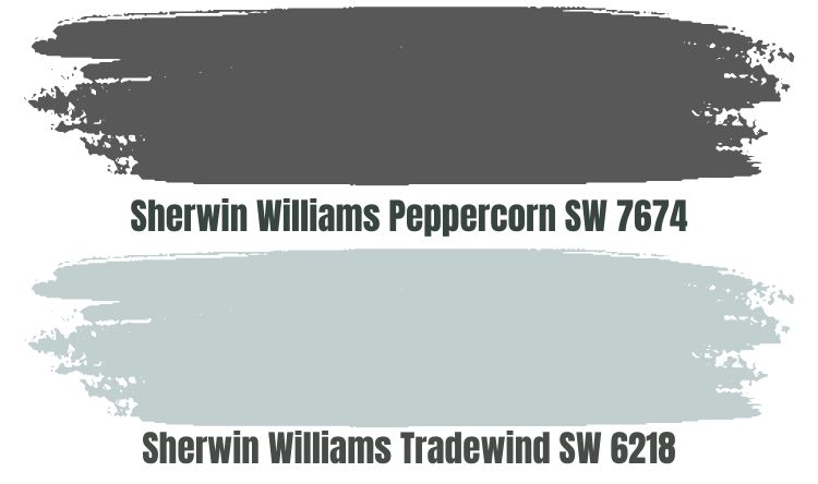
One of the undertones in Sherwin Williams Tradewind is gray—while the gray takes a backseat, it helps Tradewind blend in well with other gray colors. One of the best-selling gray colors from Sherwin Williams is the Peppercorn SW 7674.
Peppercorn is versatile and boasts full depth, which brings a full range of character to any room. The downside to Peppercorn SW 7674 having depth is that it has a low LRV, reflecting only 10% of light and absorbing 90%. For this reason, you may want to pair Peppercorn with Tradewind in a room with enough light to avoid creating a bland look.
Peppercorn boasts two prominent undertones: a flash of purple and slight Blue. Blue and gray tones will definitely blend in with your Tradewind walls without taking away all the attention. Peppercorn is a cool-toned paint color—therefore, you may want to pair Tradewind and Peppercorn in a south-facing room to lower the warmth that comes with southern light.
Sherwin Williams Tradewind Complementary Color
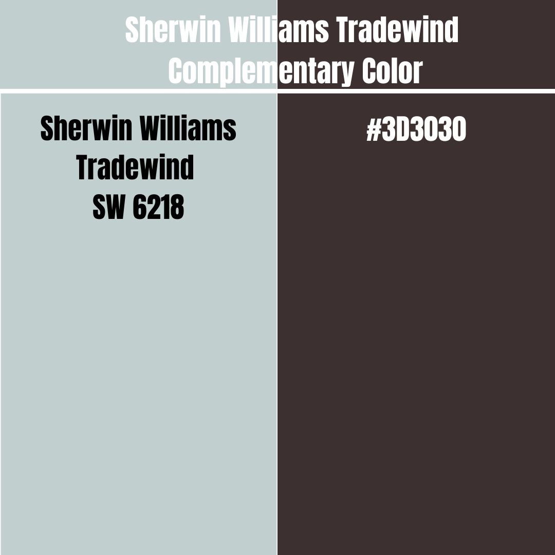
Complementary colors are two colors that, when you mix them, lose their hue (cancel each other), generating a grayscale color like black or White. The two paint colors will create the most substantial contrast when you paint them side by side. These colors sit on opposite sides of the color wheel.
The complementary color for Tradewind has a hex value #3D3030. Currently, this paint color does not have an official name. However, Old Burgundy is the closest color to the hex value #3D3030.
What Trim Colors Go with Sherwin Williams Tradewind SW 6218?
Finding trimming colors can get confusing—especially when you do not know where to start. Tradewind, however, is a welcoming color that works with different décor and trim colors—some that I have used successfully include:
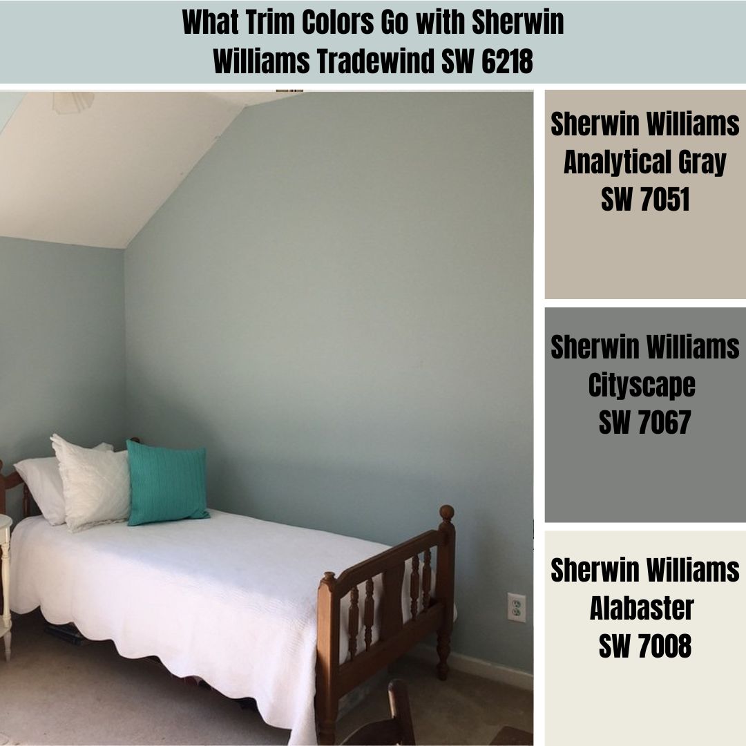
Sherwin Williams Analytical Gray (SW 7051)
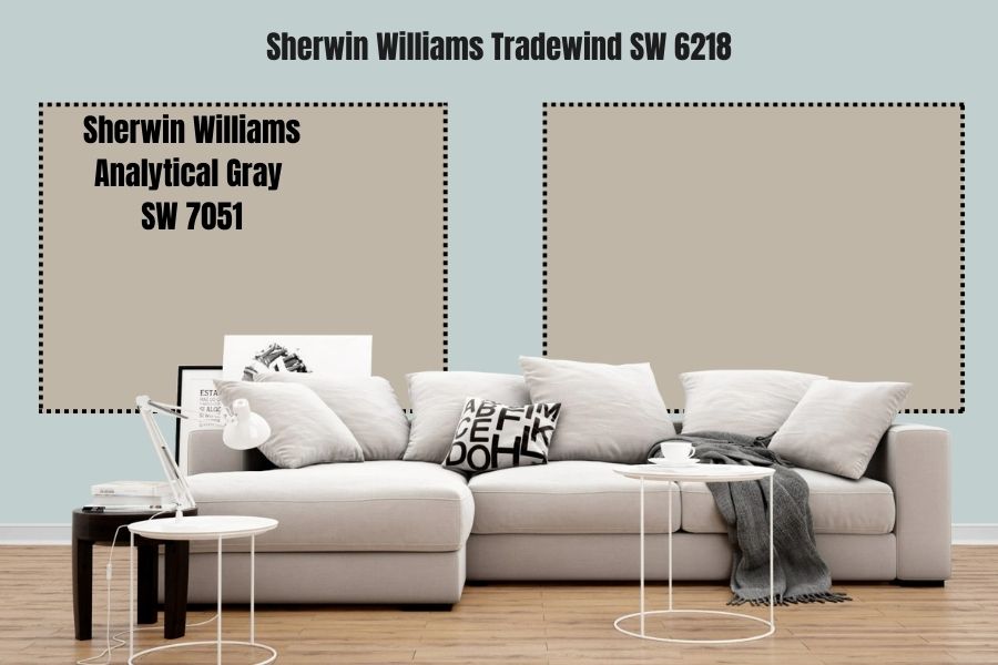
Analytical Gray Produces excellent results when used on trims for several reasons. The paint color boasts a yellow undertone that gives it warmth—it balances out the cool in Tradewind SW 6218.
Secondly, the paint color combines beige and gray to create a greige look. While the gray in Tradewind takes the backseat to allow green and blue to shine, the gray in the two colors enables them to blend in perfectly, creating an appeal where none of the colors takes away from the other.
It is, however, worth noting that Analytical Gray reflects 47% of light. Therefore, use it on trims if your room has enough light—otherwise, you may create a bland look.
Sherwin Williams Cityscape (SW 7067)
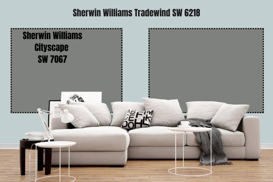
Sherwin Williams Cityscape SW 7067 is another cool gray paint color that can work on trims in a room painted with Tradewind. Cityscape creates an attractive moody appearance on your frames, making noticeable interest without taking away from Tradewind.
It is, however, worth noting that Cityscape comes with an extremely low LRV of 22. Therefore, if you are going to trim your room with Cityscape, ensure sufficient light. Otherwise, you could create a look where the Cityscape ends up dull and bland.
Sherwin Williams Alabaster (SW 7008)
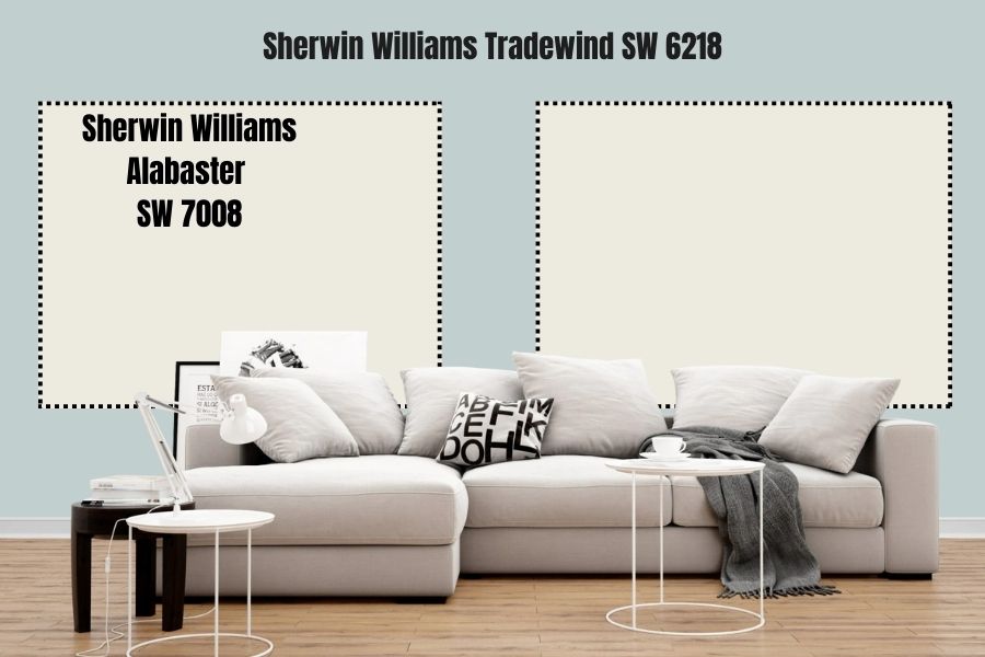
If you want your trims to pop more and attract more attention, how about using an off-white color? In this case, Alabaster would be an excellent choice.
Alabaster is a soft, off-white color with beige undertones and some creaminess that gives it warmth. The paint color boasts an LRV of 82, ensuring your trims are shining and visible. Its warmth, however, will balance the coolness in Tradewind, keeping the color from making your room icy.
Sherwin Williams Tradewind Benjamin Moore Version
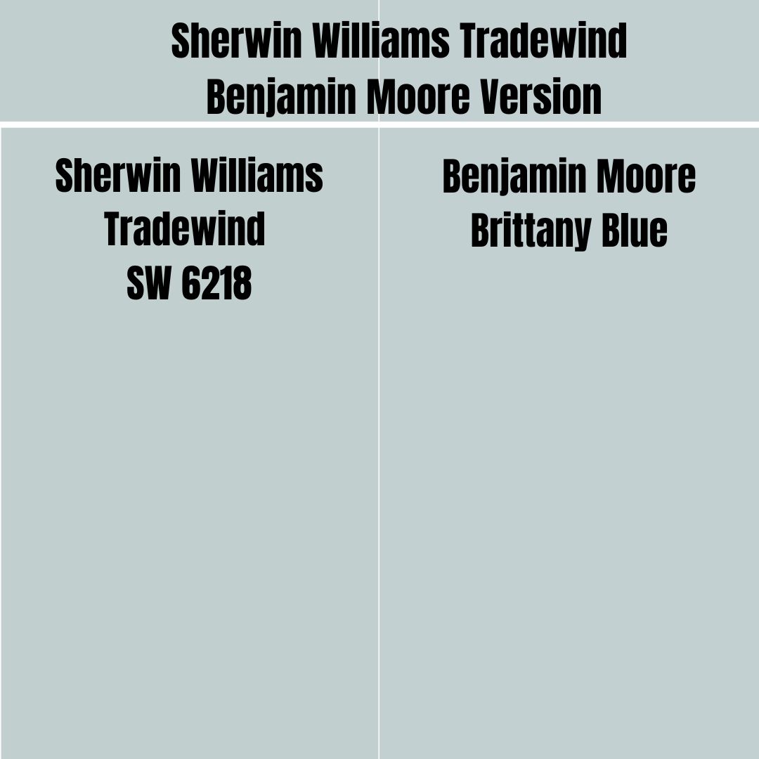
If you plan to try the Benjamin Moore brand while maintaining the look offered by Sherwin Williams Tradewind, the color you are looking for is Benjamin Moore Brittany Blue. Brittany Blue combines red: 195, green: 208, and blue: 210. The paint color has an LRV of 61, the same as Sherwin Williams Tradewind.
How Does Light Affect Sherwin Williams Tradewind?
Sherwin Williams Tradewind is a cool blue color. However, when placed in a room with northern light, it can get extra cold, bordering on the side of iciness. However, when placed in a room with southern light, the paint color works exceptionally well to balance out the warmth in the light.
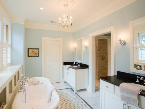
Best Rooms to Paint Sherwin Williams Tradewind SW 6218
Sherwin Williams Tradewind in Bedroom
View this post on Instagram
View this post on Instagram
View this post on Instagram
View this post on Instagram
Sherwin Williams Trade Wind in Bathroom
View this post on Instagram
View this post on Instagram
View this post on Instagram
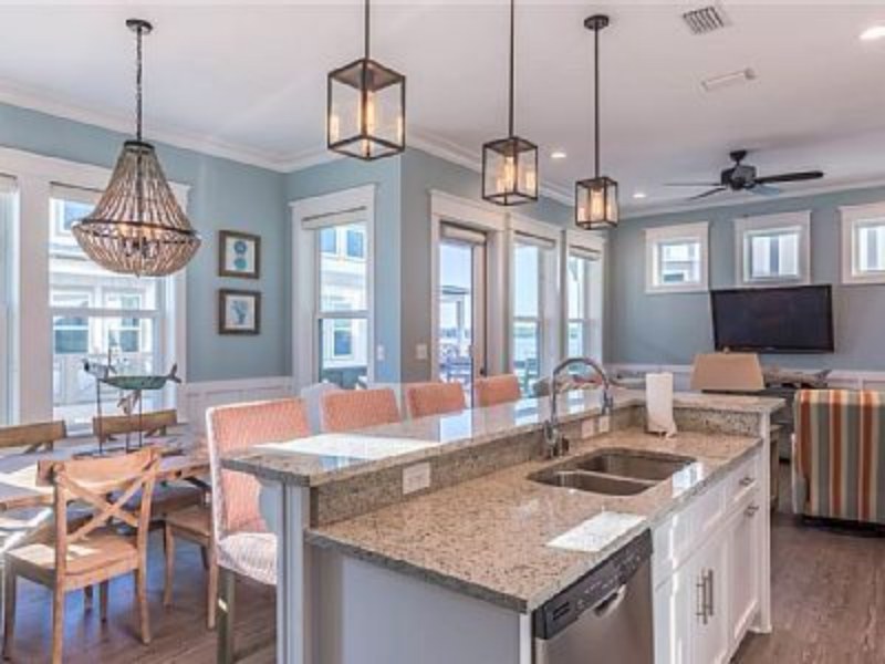
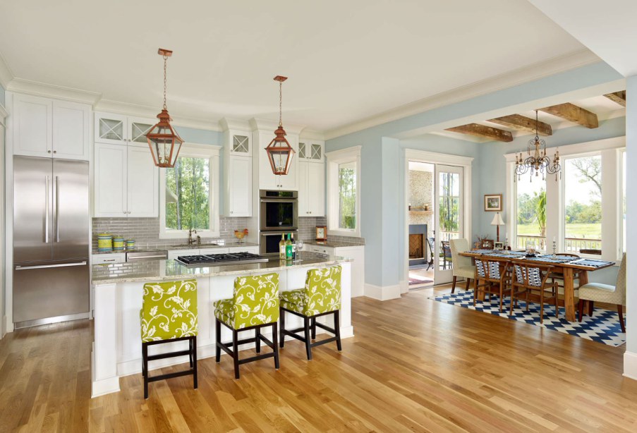
Sherwin Williams Tradewind Kitchen
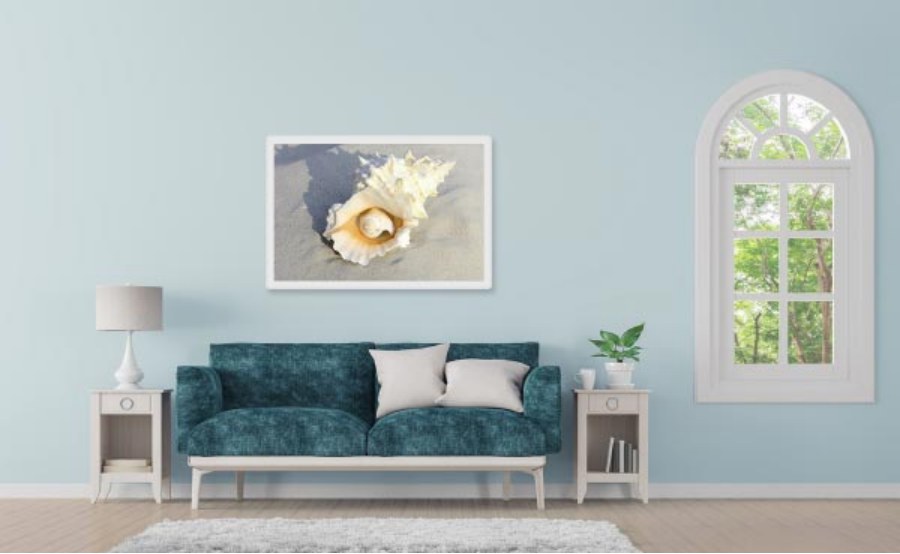
Sherwin Williams Tradewind in Living Room
Overview
Sherwin Williams Tradewind SW 6218 is a unique paint color for any homeowner planning to implement the beach vibe on their walls. The cool, laid-back blue color carries green and gray undertones and creates a serene, calm vibe, generating a relaxing feeling.
While most interior designers will recommend Tradewind for rooms closest to the coast region, if you love the beach vibe, you can use Tradewind SW 6218, irrespective of location. What you will love about the color is that it pairs nicely with a wide range of paint colors—therefore, you will never run out of paint colors to create that unique look.
This guide analyzes the LRV, RGB, undertones, and other interesting details about Sherwin Williams Tradewind. I have also shown you the best coordinating and trim colors. However, if there is something I have missed, be sure to let me know in the comments. I will respond as soon as possible.
 Sherwin Williams Drift of Mist (Palette, Coordinating & Inspirations)
 Sherwin Williams City Loft (Palette, Coordinating & Inspirations)
 Sherwin Williams Acacia Haze (Palette, Coordinating & Inspirations)
 Sherwin-Williams Dovetail (Palette, Coordinating & Inspirations)
 Sherwin Williams Evergreen Fog (Palette, Coordinating & Inspirations)
 Sherwin Williams Greenblack (Palette, Coordinating & Inspirations)
