Some gray paint colors are more popular than others, but that doesn’t mean the others are less beautiful. Benjamin Moore’s Horizon is not as well-known as a few others, but I can tell you it’s a beautiful color.
While some grays are less ready to show their undertones, others reveal their undertones at just a glance. Where does Horizon fall and how ideal is it in a room with bright or low light, whether warm or cool? Come along with me to see what I love about this paint color.
Table of Contents
When to Choose Benjamin Moore Horizon
Deciding when to choose Horizon can feel a little overwhelming, but it doesn’t have to be. I want to show you where the paint color works best to get you started.
Not a fan of bland grays?
Horizon is a gentle color but is far from being bland. If you want a neutral gray with only a whisper of color, try Horizon.
Want to use a coastal theme in your bedroom?
You may want a themed room, and coastal is not a bad choice. You can try a coastal theme in your bedroom using Horizon and white or blend it with light beige for a striking effect.
Thinking of redoing your bathroom?
This gentle and light gray paint color is one of the best for bathrooms as it brings a soft vibe. And if your bathroom doesn’t have a lot of natural light, Horizon is ideal for it.
If you don’t fancy grays that have blue or purple undertones, you may not like Horizon, so this is a heads-up. But you never know how beautifully the color will turn out before trying it. So, let me show you more about this paint color, especially its undertone and LRV.
What Color Is Horizon?
As the name suggests, this paint color looks almost the same as the horizon, but only when the sky is bright. Bright skies can brighten your mood, just like Horizoon, and this may be just the reason behind the name. What else could it be?
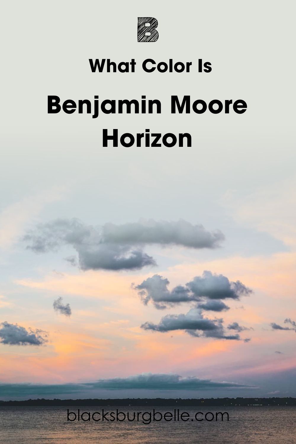
Benjamin Moore’s Horizon OC-53 is a light gray paint color that brings freshness and reminds you of new beginnings. It’s a sweet color if you know how to use it. Fortunately, this guide shows you how to do that.
A Snapshot of the Specifications of Benjamin Moore Horizon
This chart contains the basic characteristics of Horizon, such as its undertone and LRV. These characteristics are common with every paint color, but they also differentiate one from the other, especially when it comes to similar colors.
| Benjamin Moore Horizon | |
| RGB | 223, 225, 219 |
| LRV | 72.82 |
| Undertone | Blue |
| HEX Code | #DFE1DB |
The LRV of Benjamin Moore Horizon
Before I go on about the LRV of this paint color, let me explain what it means. LRV means the light reflectance value of color, referring to how much light the color throws back into a room on a scale of 0 to 100.
Black doesn’t throw light back, which makes its LRV 0. White, on the other hand, throws a lot of light back, which makes its LRV 100. However, paint colors use a scale of 2.5 to 94 because there are no true whites or blacks.
Benjamin Moore’s Horizon has an LRV of 72.82, almost 73. This value is pretty high for a gray paint color, but it only means the color reflects a lot of light. That makes it work for bright and low-lit rooms.
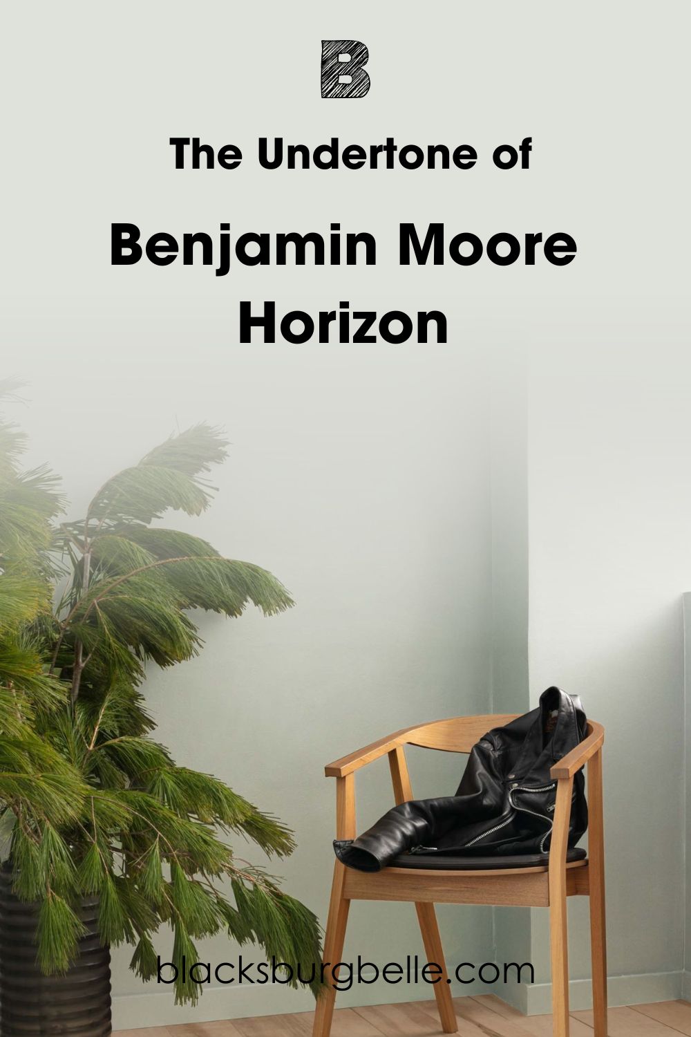
The Undertone of Benjamin Moore Horizon
The undertone of a paint color plays a crucial role in how the color turns out when dry. Many don’t know that grays have different undertones and are usually surprised at the outcome. So, it’s right not to go in blind with this paint color.
Horizon has a blue undertone, which gives the paint color an overall appearance of slate. Now, the color is not steely or icy, but you can’t mistake it for a warm color. However, let’s look at some photos to see what it looks like.
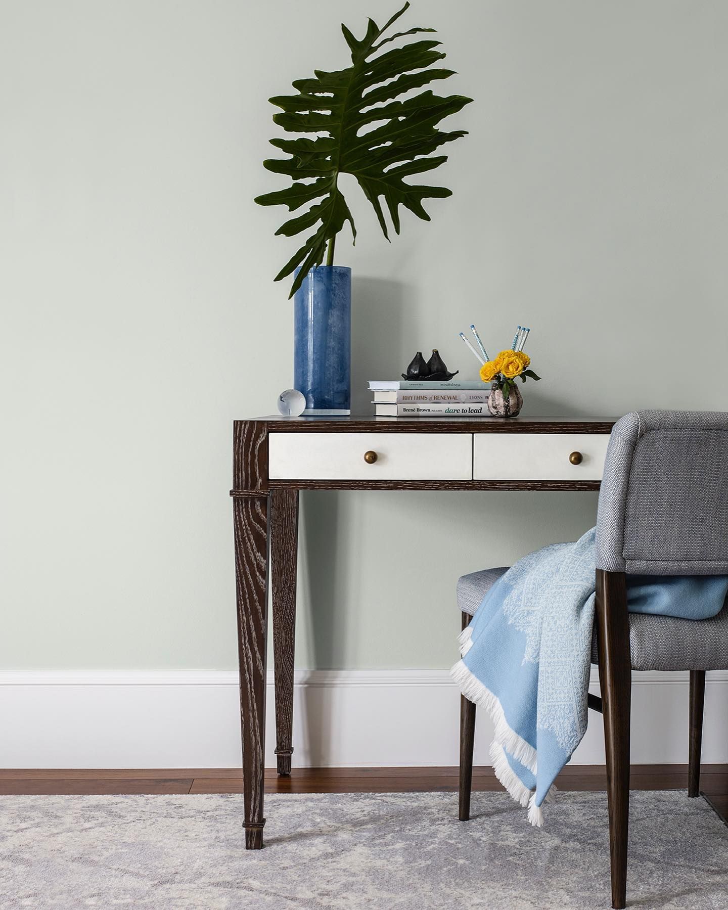
This is Horizon looking calm and laid-back.
You can see a little more green than blue, right? This may be because of the potted plant, as some paint colors pick up hues from vibrant colors. But this next picture shows Horizon looking like a solid gray, without visible undertones.
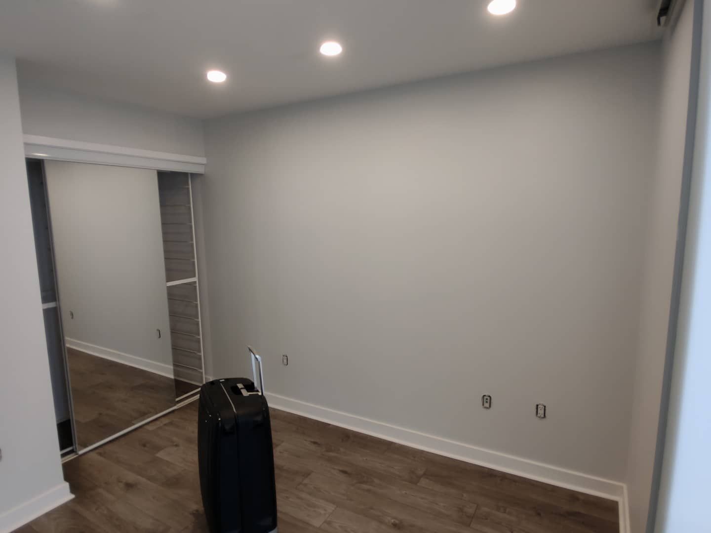
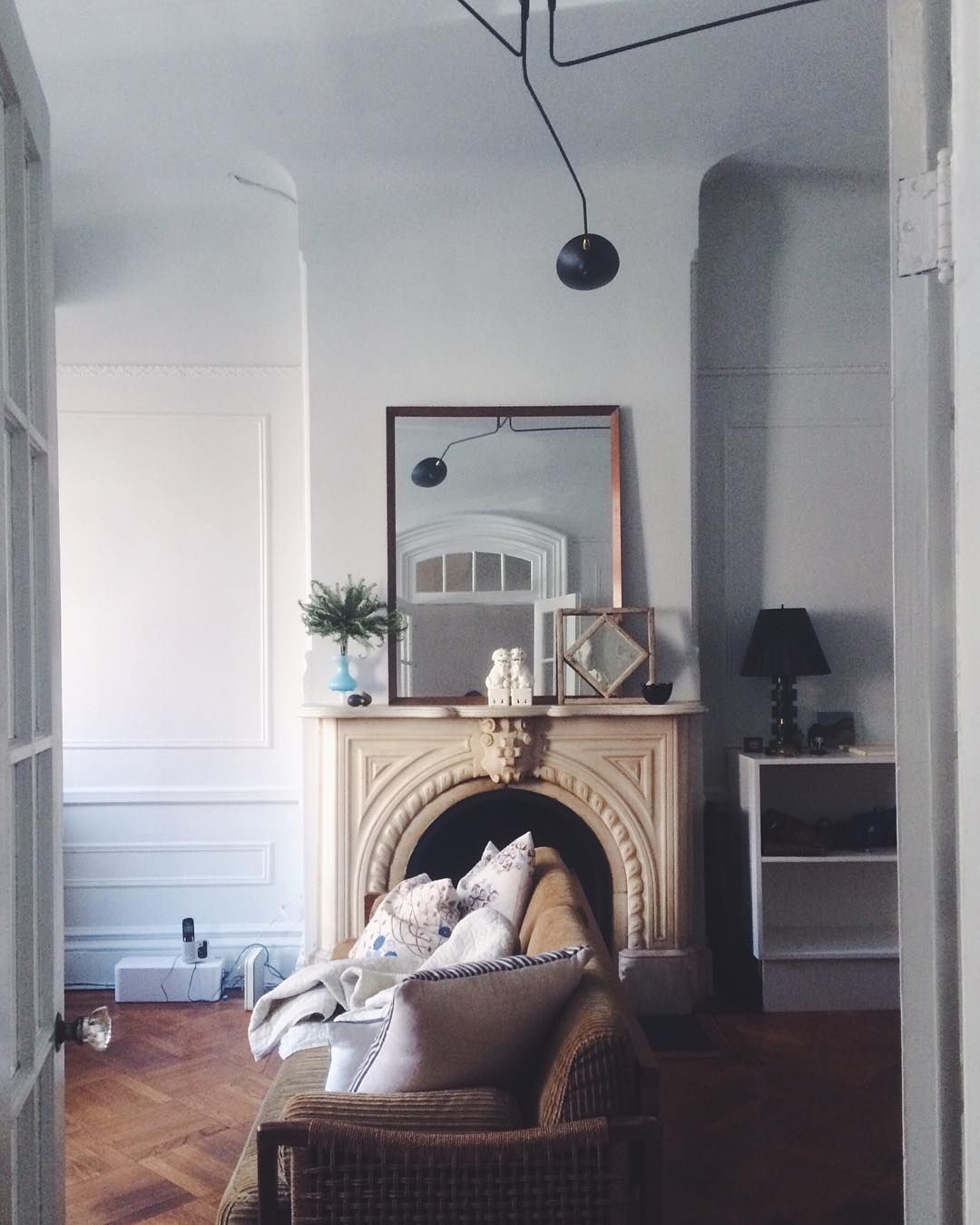
Now, you can clearly see the undertone in this next picture, contrasting with the white trim.
Does Light Affect Benjamin Moore Horizon?
Every paint color reacts to light in different ways, but the bottom line is that all of them react to it. So, how does light affect Horizon? It can make it look like an off-white color or show more of its gray side.
In low artificial light, Horizn, although bright, can look muted but not outrightly drab or dull.
In brighter lighting, the paint color turns a little creamy and lovely.
In cold light, Horizon may show more of its blue undertone, but it doesn’t look dull.
How Does Benjamin Moore Horizon Feel in a Room?
Horizon feels calming and gentle in a room, and that is part of its charm. It works excellently in a bathroom because of its calming vibe and in a bedroom because it helps you relax. You can also use it in the living room, kitchen, cabinets, and other places, including exterior walls.
Benjamin Moore Horizon: Warm or Cool?
Horizon is a cool gray color, and not primarily because of its shade. Its coolness comes from its blue undertone since blue is typically a cool color.
However, it’s not cold or icy and can throw up a slightly warm look if the lighting is right. Nevertheless, pair it with cool colors to get the best out of it.
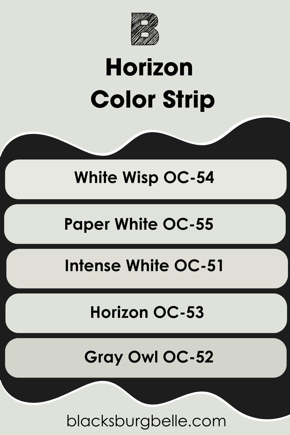
Benjamin Moore Horizon Color Strip: Lighter to Darker Exploration
If you find that Horizon doesn’t hit the exact color spot you want, don’t worry because I’ve picked other colors from the same color strip as Horizon. I’ve arranged them from light to dark shades to give you options.
- Benjamin Moore White Wisp OC-54
- Benjamin Moore Paper White OC-55
- Benjamin Moore Intense White OC-51
- Benjamin Moore Horizon OC-53
- Benjamin Moore Gray Owl OC-52
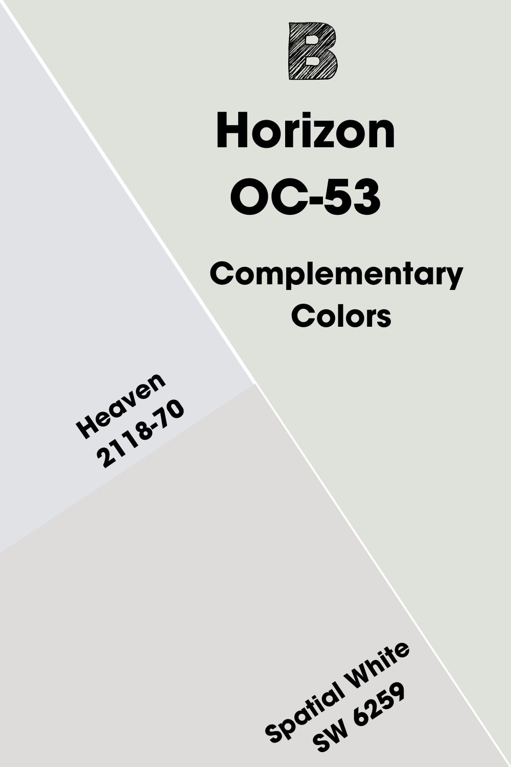
Benjamin Moore Horizon Complementary Color
Colors face each other on the color and not by accident. They are carefully arranged based on their relationship with each other. Complementary colors face each other on the color wheel, which means they are 180 degrees separated from each other.
Horizon is gray but not your typical gray because of its undertone. So, it’s not a challenge to find its complementary color, which is a light lavender color. Benjamin Moore’s Heaven 2118-70 is close to this color. But you can also try Sherwin Williams Spatial White SW 6259 if you want to pick from a different brand.
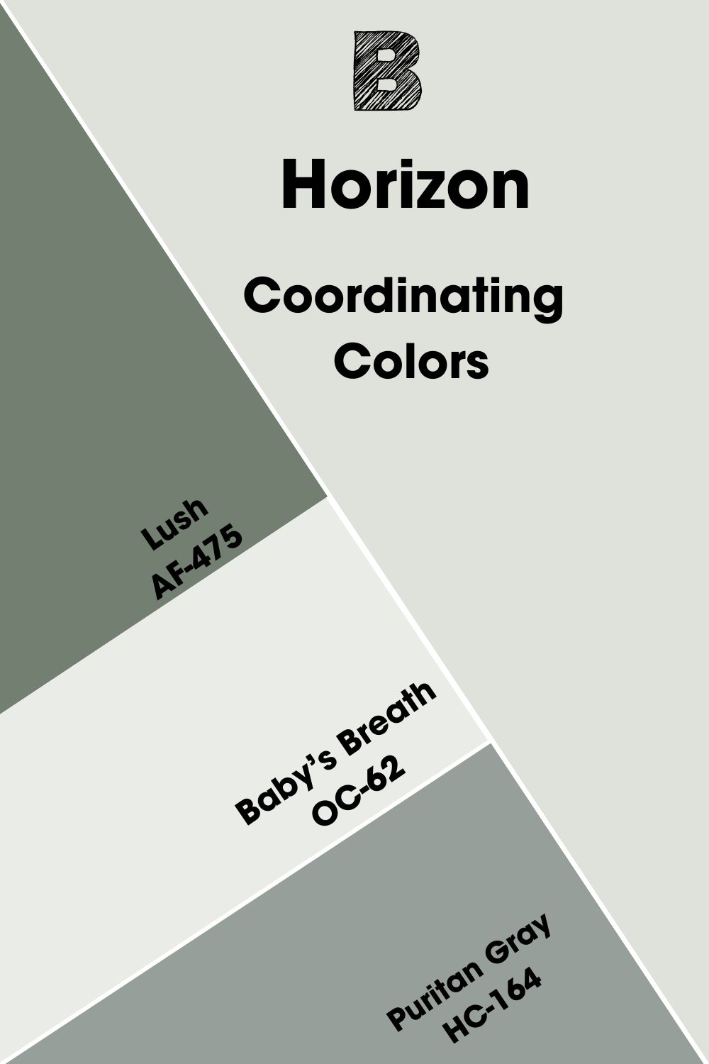
Benjamin Moore Horizon Coordinating Colors
What are the best-coordinating colors for Horizon? This paint color works well with a variety of colors because of its neutral shade. But Lush, Baby’s Breath, and Puritan Gray are three picked by the brand.
- Benjamin Moore Lush AF-475: A saturated green paint color made deeper by its blue undertone that perfectly matches that of Horizon.
- Benjamin Moore Baby’s Breath OC-62: A bright white with a blue undertone that fits Horizon, especially as a trim color.
- Benjamin Moore Puritan Gray HC-164: A medium gray with a cool undertone that pairs well with the light Horizon.
Benjamin Moore Horizon Color Palettes
Preparing a suitable color palette for any decor is not a walk in the park. But I’ve made it easy by picking three possible ones to get you started. You can add or remove colors as they fit your decor.
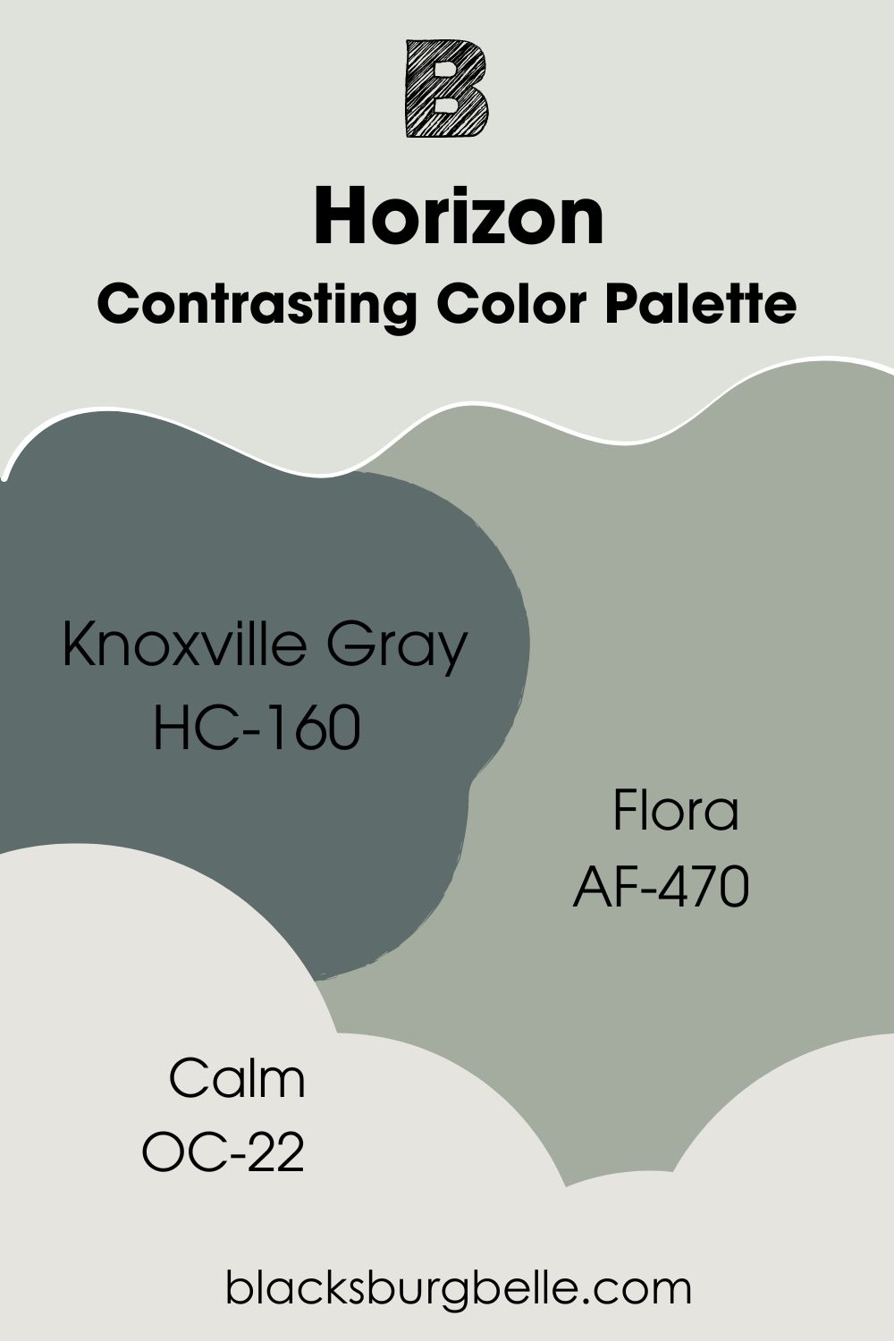
Contrasting Color Palette
- Knoxville Gray HC-160: A blue-green paint color with gray undertones, but the color contrasts with the lighter Horizon.
- Flora AF-470: A beautiful shade of blue-green that complements the much-lighter blue-gray of Horizon.
- Calm OC-22: With lavender-gray undertones, this light paint color brings something different to the decor.
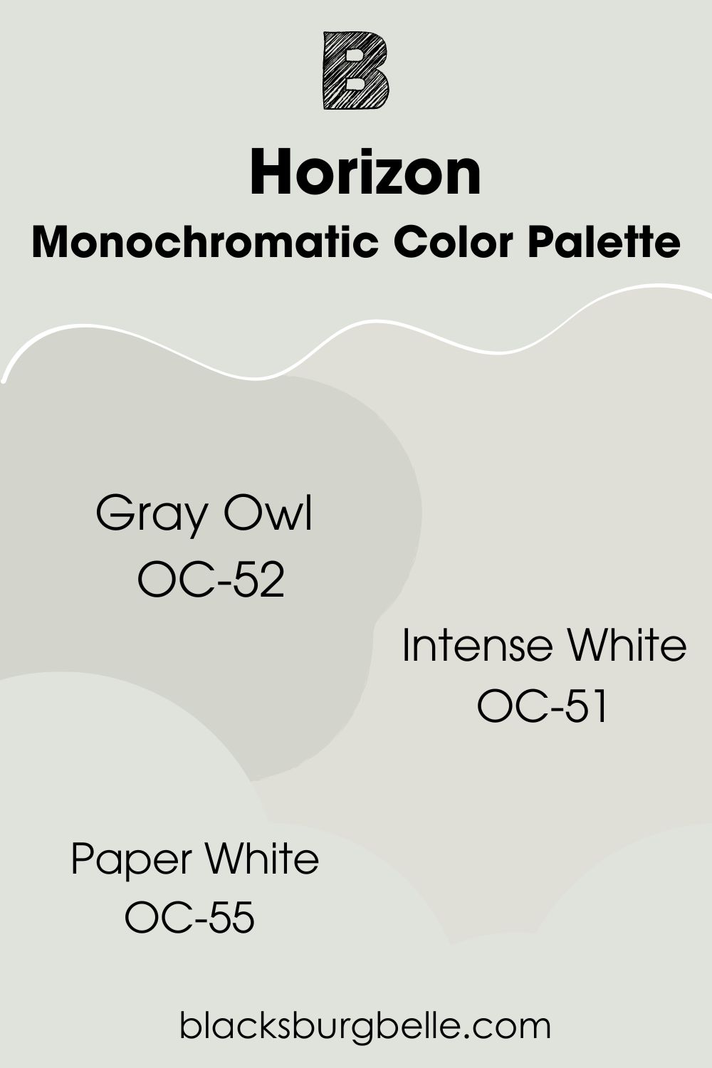
Monochromatic Color Palette
- Gray Owl OC-52: The coolness of this paint color matches the cool cast of Horizon, including its gray color.
- Intense White OC-51: You can compare this paint color with Horizon, especially because of its blue-gray undertones.
- Paper White OC-55: A lighter shade of Horizon that complements it in so many ways, including when used as the ceiling or trim color.
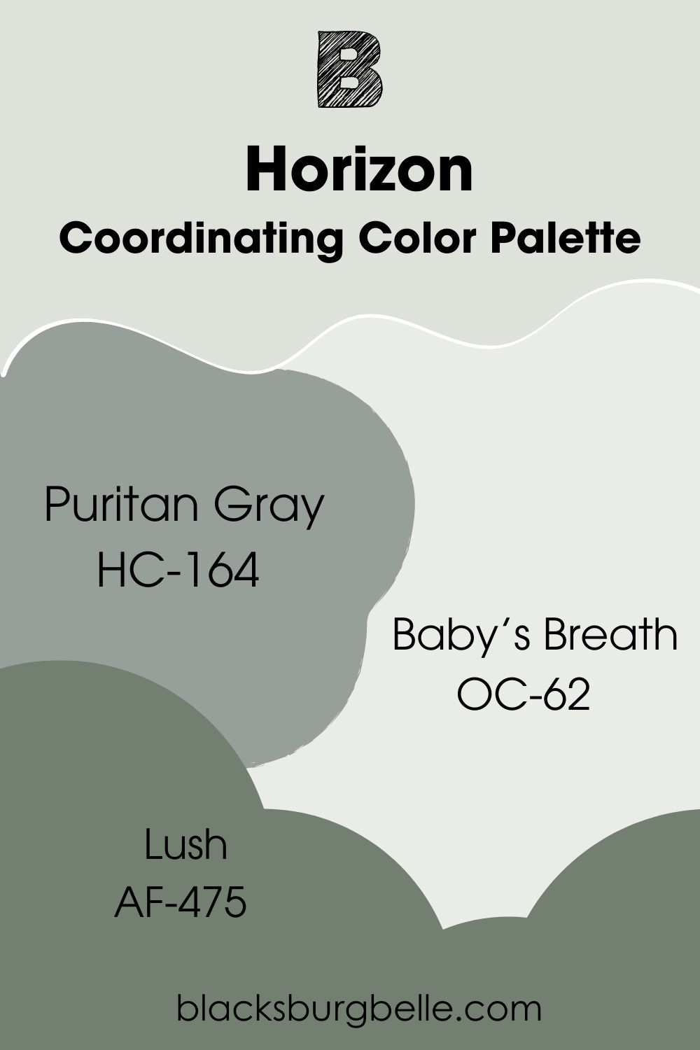
Coordinating Color Palette
- Puritan Gray HC-164: A medium gray with a cool undertone that pairs well with the light Horizon.
- Baby’s Breath OC-62: A bright white with a blue undertone that fits Horizon, especially as a trim color.
- Lush AF-475: A saturated green paint color made deeper by its blue undertone that perfectly matches that of Horizon.
Benjamin Moore Horizon vs Similar Colors
The following are colors similar to Horizon and how they compare to the main color.
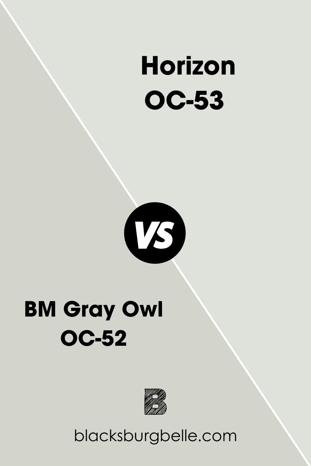
BM Gray Owl vs BM Horizon
Gray Owl has a deeper shade and can give off less cool vibes than Horizon. While it has the same blue undertone as Horizon, it also has some green in it, making it less cool.
BM Paper White vs BM Horizon
Paper White has a higher LRV, making it brighter than Horizon. Also, it has more green and blue in it, so it’s not as cool as Horizon.
BM Moonshine vs BM Horizon
Moonshine is noticeably darker than Horizon but looks less cool. It has blue and green in it like Horizon but can lean more toward green than blue.
Sherwin Williams Paint Color Equivalent to Benjamin Moore Horizon
There is no paint color from Sherwin Williams that exactly matches Horizon. All paint colors have a certain uniqueness that sets them apart from others. But Rhinestone SW 7656 is pretty close to the shade of Horison if I must pick a color. You can also compare it to Glacier Bay SW 9626.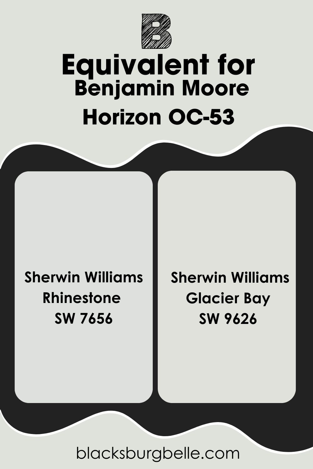
Where Can You Use Benjamin Moore Horizon?
As a light gray paint color, Horizon mimics off-white. So, you can use it in any room, especially bathrooms and bedrooms. Let’s see some examples.
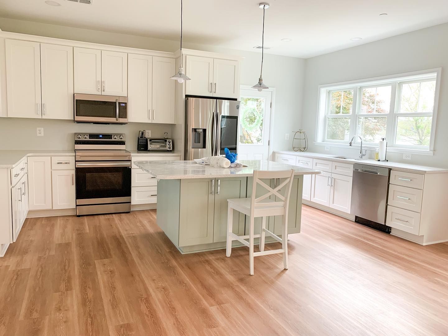
Benjamin Moore Horizon on Kitchen Walls
The cabinets are an off-white color, while the island is mint-colored. The colors all come together because of the neutral Horizon on the walls.
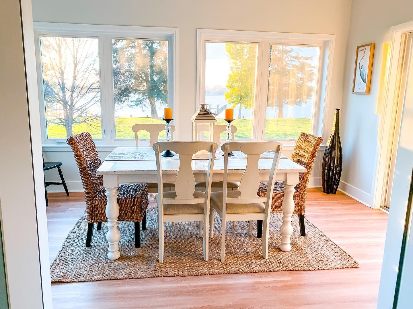
Benjamin Moore Horizon in a Dining Nook
There’s a reason the owner called the sunroom; look at all the beautiful and warm light streaming in through the window!
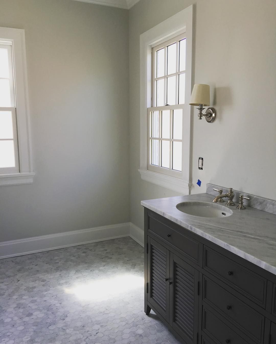
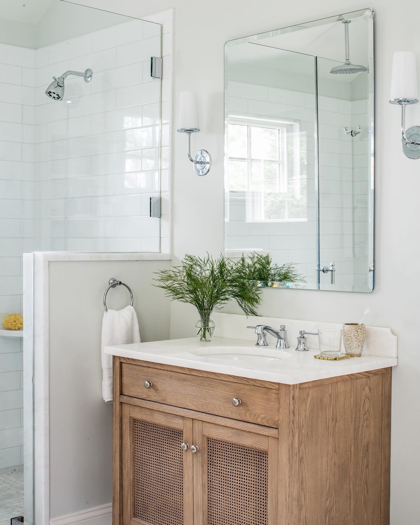
Benjamin Moore Horizon in a Bathroom
Remember how I said bathrooms love Horizon? This is proof of it.
Best Trim Color for Benjamin Moore Horizon Walls
White is your best bet, and a cool white is what works. You can go for Super White or Chantilly Lace, both by Benjamin Moore.
Best Ceiling Color for Benjamin Moore Horizon Walls
Again, I recommend a cool white like the trim unless you are adventurous and want to try something different.
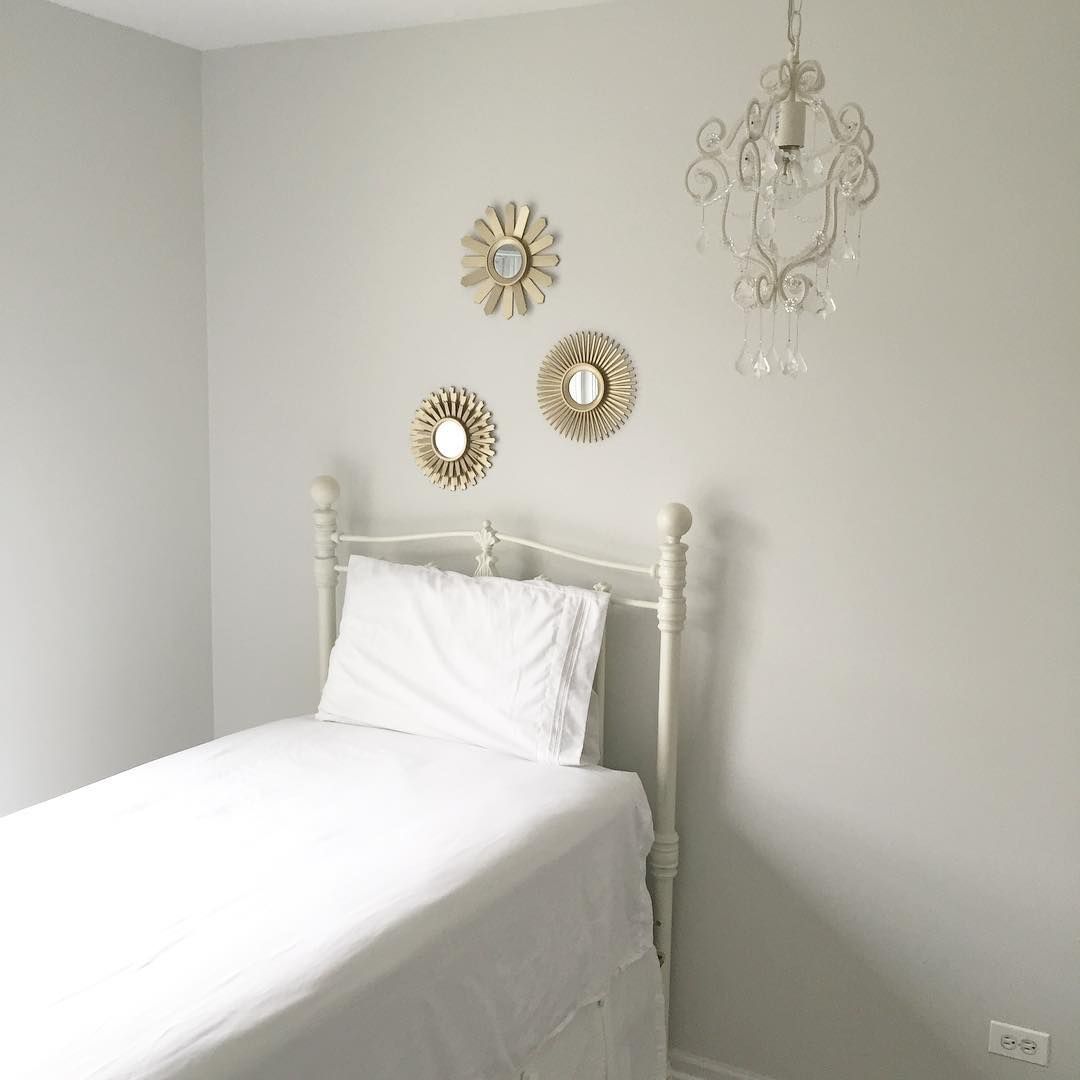
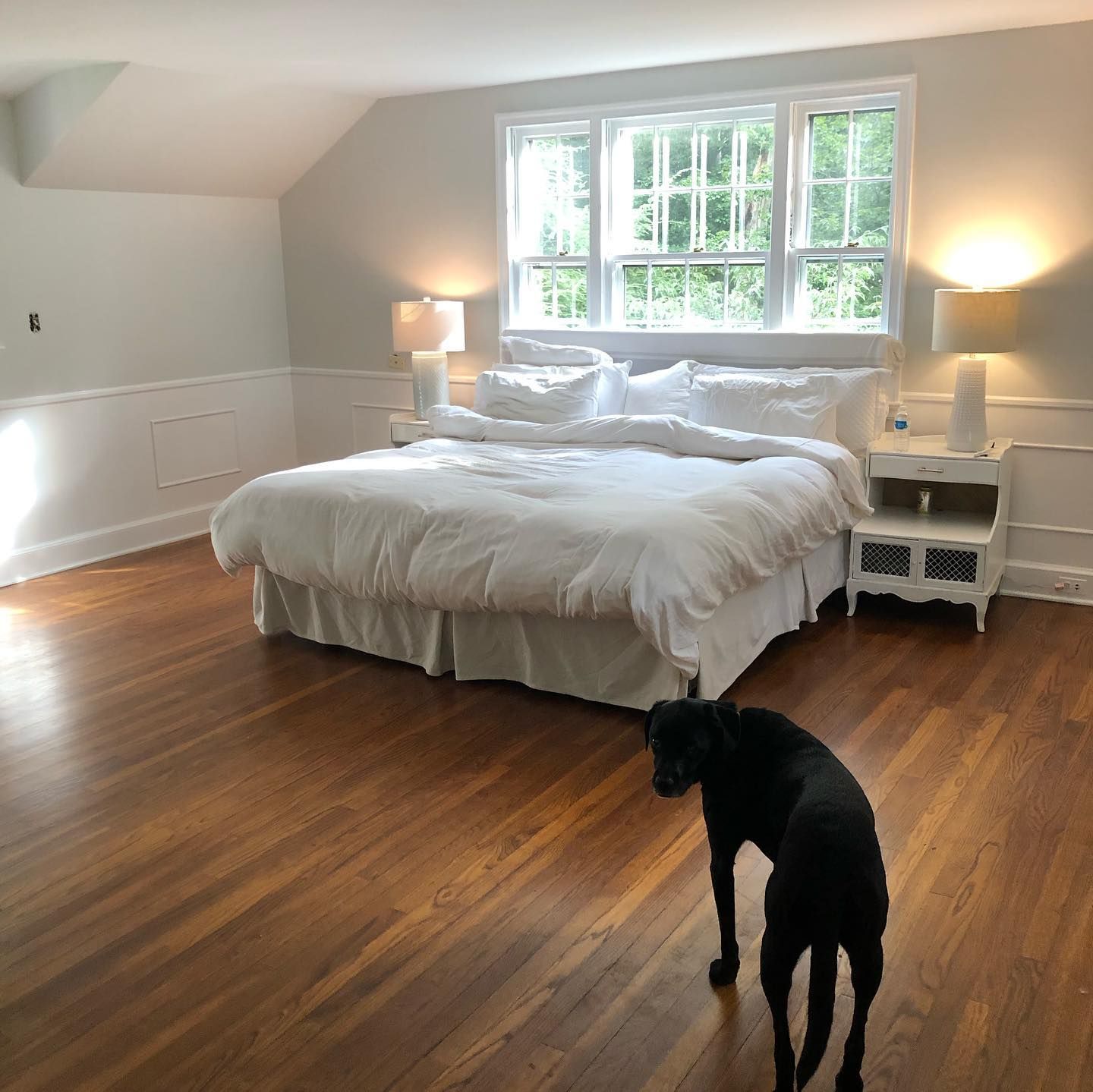
Benjamin Moore Horizon in a Bedroom
The trim is BM Super White, while the rest is Horizon. This is a great example of how the two colors work together.
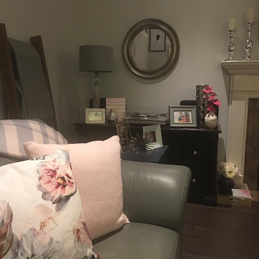
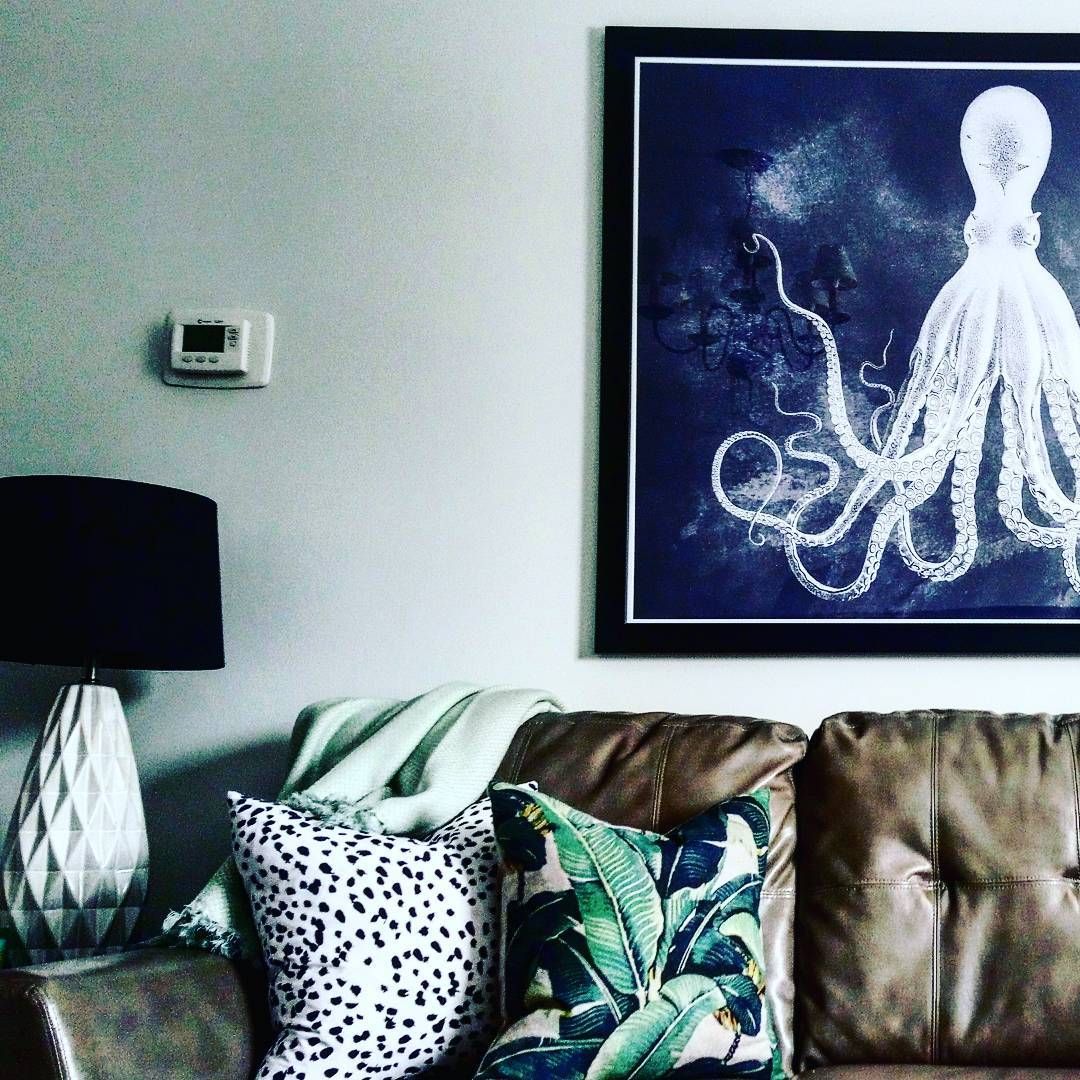
Benjamin Moore Horizon in a Family Room
The lighting, filter, and other elements in the room bring out the blue undertone of Horizon. Check out this family room to see it.
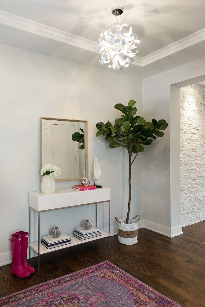
Benjamin Moore Horizon in an Entryway
Try this paint color in your entryway to see how it works.
Conclusion
If you want a paint color that gives you a soothing feeling and calm freshness, Benjamin Moore’s Horizon is one color to try. It has slightly a blue undertone that may lean a little green and an LRV of 72.82. The paint color doesn’t shy away in a low-lit room and looks great in bright light.
Find the perfect guide for creating color palettes for this paint color and carefully pick those that work best in your decor. However, test the color using samples on your walls before deciding whether or not to go with it.
I’m rooting for you, so share your thoughts and questions with me in the comments section. I’m waiting to see your creativity at work.