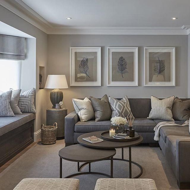
With the onset of neutral paint colors like taupe, gray has been losing its place, especially in the interior design space.
What used to be the go-to color to coordinate well with other colors or have in your space for a modern twist is now the replaced color. However, how different is it from taupe, anyway? Aren’t they the same?
Taupe and gray paint colors are similar. You cannot get Taupe without gray in the first place, so there are bound to be similarities but there are also differences.
One of which is the fact that the other prominent half of the taupe mix is brown. This makes it a color with shades midway between gray and brown.
Many people still confuse Taupe for gray (especially some more grayish shades). Are you one of them? Let’s end the confusion once and for all as we examine Taupe Vs gray to see how different they are and how you can work with them.
Table of Contents
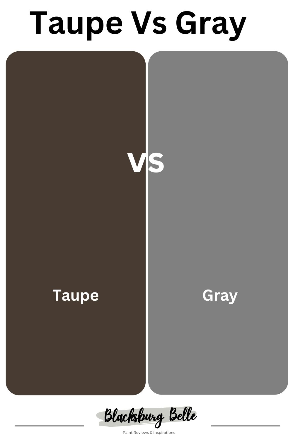
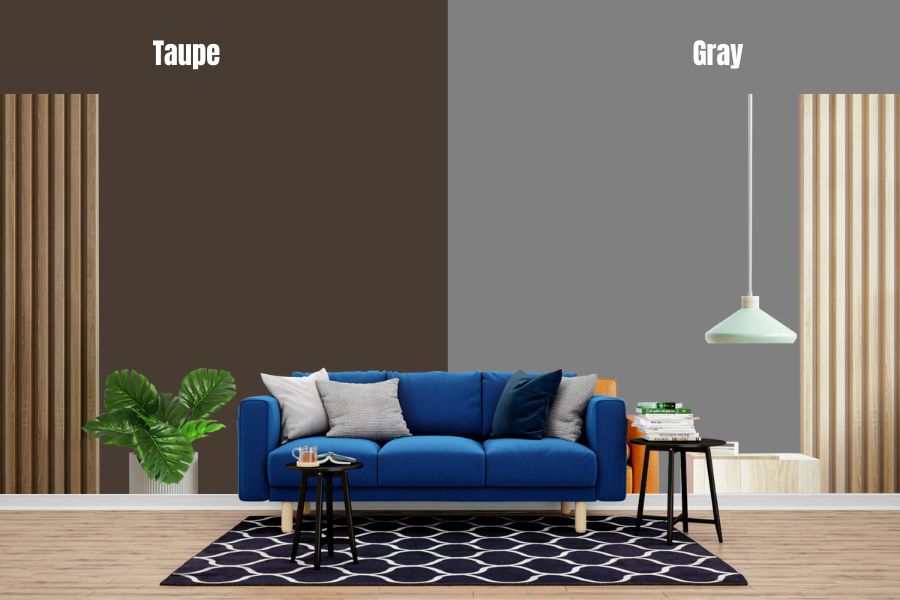
Taupe Vs Gray
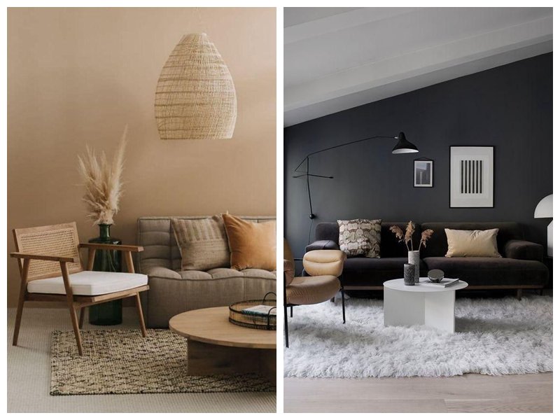
Taupe and gray are neutral colors and are both known for their versatility. They can both be really light or really dark, depending on their LRVs. Many shades of each run in between and can look amazing almost everywhere.
What Color is Taupe?
Taupe is a neutral colour that strikes a balance between two different hues, brown and gray, and has various shades in between. It is a hard-to-define color and is usually confused for gray, beige, or even greige.
This color is incredibly versatile. It looks good with many other hues and has plenty of shades that make it hard to fail in any room. However, unlike greige, Taupe has warm purple/pink undertones.
Greige is another gray derivative. It is a combination of beige and gray, a top choice for homeowners and interior designers because of its versatility, neutrality and ease with which it is used in any room. It also has blue/green undertones.
Having taupe in a room is like having greige but with a hint of warm pink to add a pop of color to the neutral space.
Recently, designers have begun to appreciate warm colors, and with their ever-present love for gray/greige shades, taupe fits right in.
While Taupe has been at the top of the game since 2017, when Poised Taupe was Sherwin Williams’ Color of the Year, it has only become a favourite for homeowners lately. Furthermore, the various shades of taupe are fun to work with.
|
Taupe Overview |
|
| Color Family | Mixture of brown and gray |
| Complementary colors | Blue |
| Pairs well with | All colors, especially warm colors like olive, soft pink, lavender, sky blue, etc,. |
| Mood | Content, earthy, sophisticated, romantic |
| Where to use | Walls, trim, and cabinets and in every room. |
What Color is Gray?
Gray is what we call Timeless because it is. It is a mixture of black and white, the two extremes of light spectrum, making it highly versatile and indispensable.
Almost every color and shade of color get a chance in the limelight once in a while, but then they give way to the next one and the next. However, gray is one of the few colours that always stay in style. It is always present in design in one shape or form.
The pure version of gray may ebb and flow with the tide and times, but a shade or variation of gray is always a constant. It is a great partner to a wide range of colors and shades of colors and as such is always a great choice.
It may not conjure up the thought of sunshine and rainbows, but it sure does not always bring cloudy and sad days to mind. When used in a room, it creates an atmosphere of sophistication, modernity, and artistry.
|
Gray Overview |
|
| Color Family | Gray |
| Complementary colors | Blue, black and white |
| Pairs well with | Cool grays: blue, green, and light purple.
Warm grays: reds, oranges, and yellows. |
| Mood | Neutrality, balance, solemnity, elegance, wisdom, and strength |
| Where to use | Looks good in every room. |
What are the Similarities Between Taupe and Gray?
Taupe and gray are both neutrals. Both of them can pair with almost every color beautifully. Taupe is a mixture of gray and brown, which means it has a gray side that is sometimes more prominent than brown.
Taupe can be seen as a grayish-brown, brownish-gray, or warm gray. It depends on the amount of brown and gray in the formation of Taupe for it to lean one way or another.
Quick Comparison Between Taupe Vs Gray Paint Colors
| Taupe | Gray | |
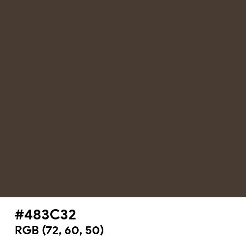
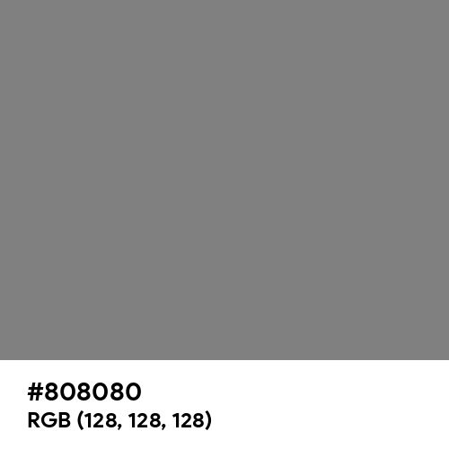
| RGB | 72,60,50 | 128,128,128 |
| Hex Value | #483c32 | #808080 |
| LRV | 18-23 | 10-90 |
| Undertones | Purple/pink and green(sometimes) | None |
| Blend | Brown and Gray | White and black |
Taupe Vs Gray Paint Colors Examples
Taupe and gray are neutral colors with lots of shades in-between that accurately comparing them will only be possible if one of each color is used. Hence, Peppercorn SW 7674 will represent the Gray family, while Taupe of The Morning SW 9590 will stand for Taupe.
Taupe of the Morning SW 9590
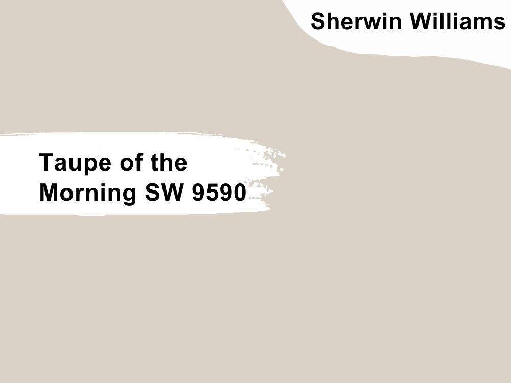
Unlike some Taupe shades that allow their purple undertones to shine through, Taupe of The Morning is very subtle, light, and versatile. It is a relatively warm (not too cold or warm) color often associated with the color of mushrooms.
Taupe Undertones
Taupe of the Morning has pink/purple undertones, making it feel energetic and calm. Its undertones may not be as loud as other taupe shades, but they can get sneaky under different lighting conditions, showing a tinge of warmth in natural light and flat in minimal light.
In the north-facing rooms, SW Taupe of the Morning will show a bit of warmth like a cool beige shade. This makes it a solid substitute if warm beiges are too intense for you while adding coziness to the room.
Rooms with southern exposure can feel very hot, especially if painted with a warm paint color. Taupe of the Morning can help you if you want to avoid that level of warmth and do not want gray in your space.
For rooms with eastern or western sun exposure, it depends on how bright the room is. Sometimes the sun shining into eastern rooms in the afternoon and western rooms in the morning is quite flat, and this will cause the paint to look dull as well.
Taupe Light Reflectance Value (LRV)
The LRV for Taupe if the morning is 65, which makes it a pretty light color. At 65, it has enough depth to contrast nicely against a white trim without looking too dark, dull, or dingy. It also means that it reflects a good amount of light.
In a bright room, it is most likely to wash out like any color in this range. On the contrary, in a darker room, it can look boring if not curated expertly with interior lighting and complementary colors.
Red, Green, Blue (RGB)
RGB for Taupe of the Morning is 218, 210, 198. All three colors are within the range of 198 – 218, a close call that gives its neutral shade. The amount of red, green, and blue to make Taupe has to stay within this range, or it becomes a shade of a solid color.
Peppercorn SW 7674
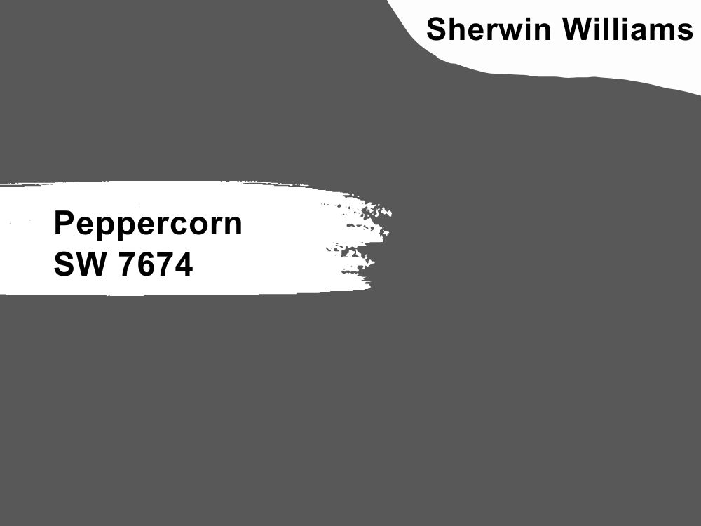
Peppercorn is a rich dark shade of gray that is almost black and shares some similarities with classic charcoal. Homeowners and designers around the world highly recommend it. This highly pigmented shade of gray adds the drama you desire without the finality of black.
Undertones
It is considered a true gray because it lacks any obvious undertones. This makes it the perfect shade for a minimalistic space because a glaring undertone will not take you unawares. However, you can see some blue or purple under certain light.
In north-facing rooms, the gray light with slight blue hue streams in, which is a cold light. Peppercorn, a cool gray, may be a good choice if you don’t mind having a cool-looking room
Light Reflectance Value
The LRV of Peppercorn is only 10. It is a very dark-toned color. Therefore, it would make a space with inadequate lighting look dull if it’s not adequately outfitted to make it up. Under sufficient lighting, though, it will appear softer and warmer.
Red, Green, and Blue (RGB)
The RGB values of Peppercorn, like a true gray, are 88, 88, 88. The fact that the values of RGB are the same shows that peppercorn will not favour one color over the other. It is equilibrium.
What Color Do Taupe Vs Gray Go with?
Taupe and gray are stunning neutrals that have good relationships with a lot of colors and so will not give you a hard time when pairing. They both have blue, green and purple as their complementary colors.
Other bold and pastel colours also work with taupe and gray, like yellows, pinks, reds, burnt orange, gold, black, fuchsia, brass, browns, navy, whites, creams etc.
Do Taupe and Gray Look Good?
Taupe and gray look beautiful together as neutrals do not clash with each other and even find a balance between their warm and cool tones to create a layered look in a room.
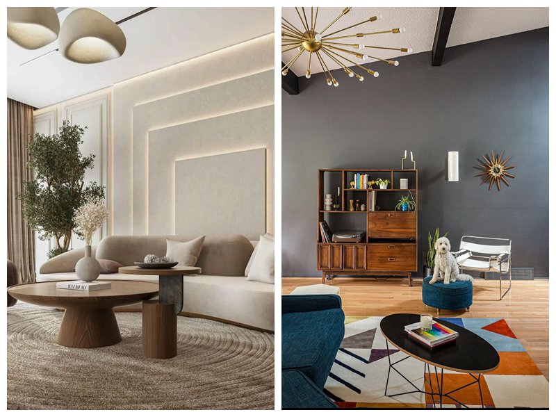
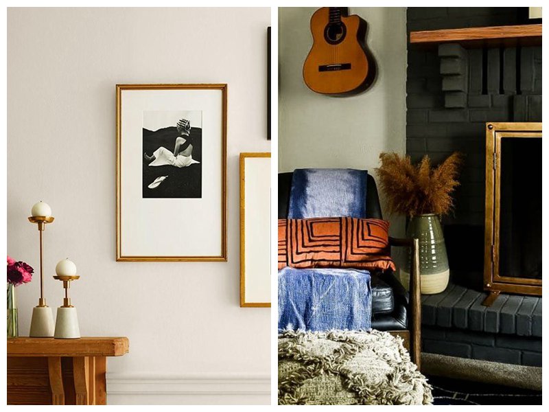
Taupe Vs Gray with Yellow/Gold
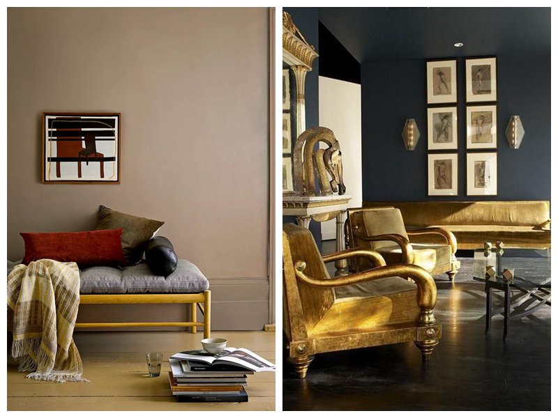
In the above pictures, we see gold paired with a dark shade of taupe and a dark shade of gray. Taupe appears to take the backseat while the other colors in the room shine. In comparison, gray meets its match head-to-head on the right side.
Gold on taupe merges meets on a levelled group as they draw warmth from each other. Whereas gold on gray stand side-by-side, pushing the other forward, strengthening the search other.
Taupe Vs Gray with Green
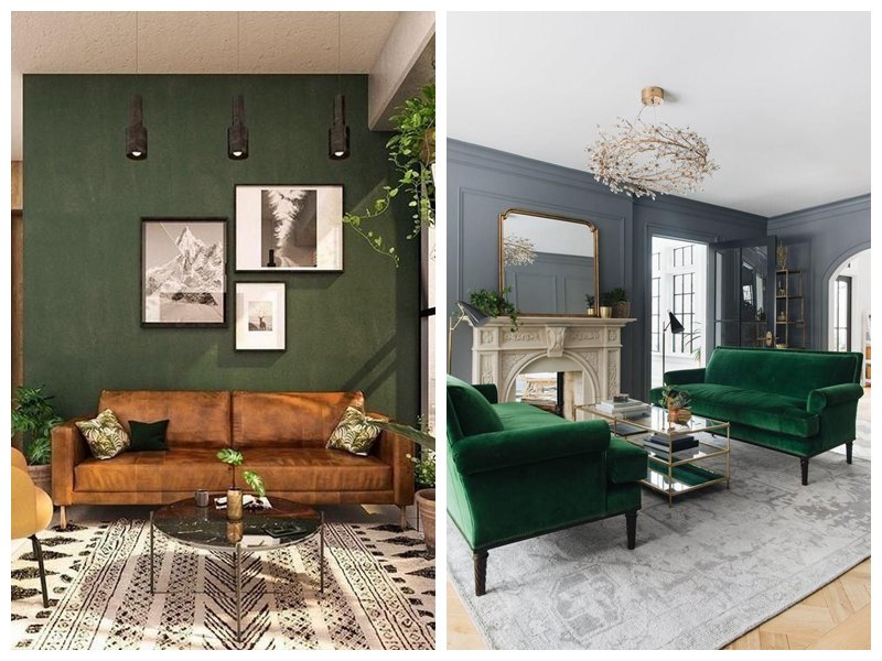
Green and taupe are definitely not a boring pair. This minimalist combination looks modern, fresh, airy, and clean. gray and green create a refreshing palette with versatile hues. This splash of color combines with gray to bring life into the room.
Taupe Vs Gray with Navy
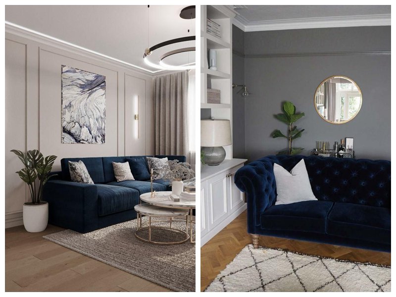
As a complementary color for both taupe and gray, blue is a classic and sophisticated choice for dark or light shades of both. With taupe, there is an airy and soft atmosphere despite how dark the blue is. With gray, the vibe is cool and chill, relaxed without being languid.
Taupe Vs Gray with Brown
Neutrals on neutrals are undeniably beautiful. This is the foundation of minimalism and carries with it a timeless elegance.
Taupe and brown give more of a layered look; you can’t tell where one ends and the other begins. Gray and brown is the definition of class. They both blend without mixing into one another.
Taupe Vs Gray with Purple
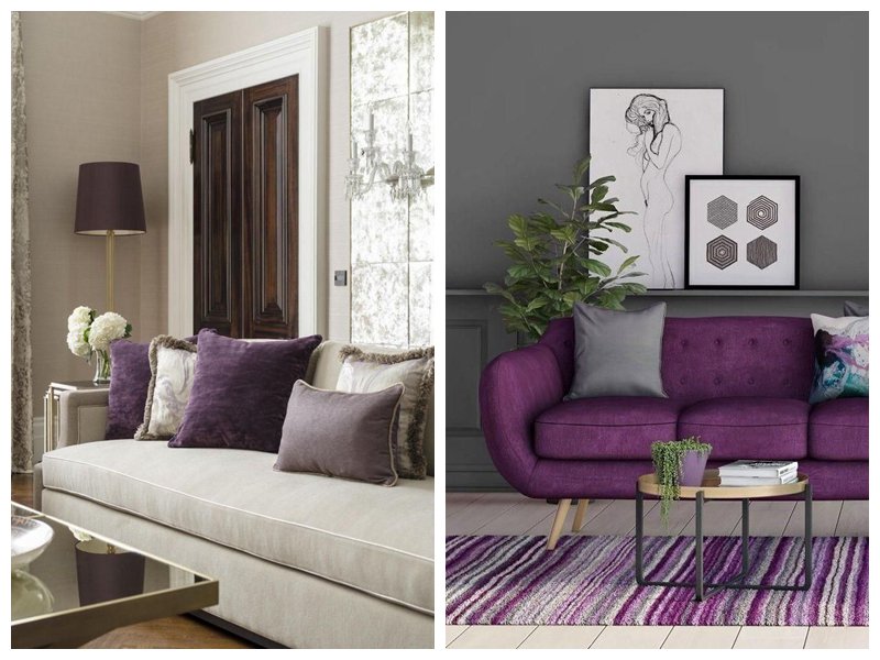
Taupe brightens the deep shade of the purple throw pillows on the left. On the right, gray and purple look surprisingly stunning together, even though they are dark colors. However, gray and purple have a warm tone instead of a cool one in the picture above.
Where to Use Taupe Vs Gray
You can use Taupe and Gray anywhere, bathrooms, kitchen cabinets, walls, and trim. They look good both on interior and exterior surfaces. They will look either darker or washed out in places with minimal and bright natural light, like bathroom and exterior walls.
Taupe Vs Gray Bathroom
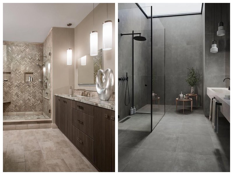
Taupe and gray are great choices for bathrooms. Their neutral tones and artificial lighting give the room a relaxed and comfortable vibe. You’d want to stay longer under the showers to soak up the calm ambience.
Taupe Vs Gray on Kitchen Cabinets
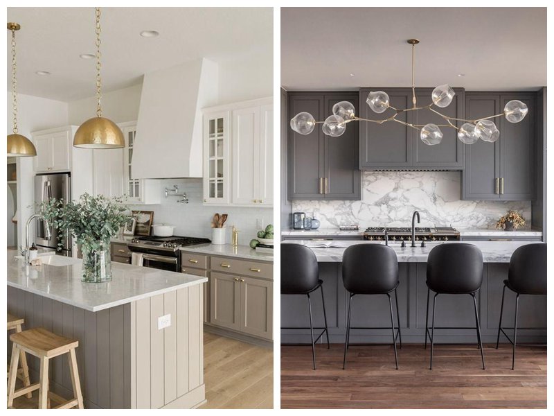
Taupe in a kitchen is bright without being too bright, a balance between warm and cool tones and airy. Gray in the kitchen is stately and calm. It is not too cool or dark either.
Taupe Vs Gray Exterior
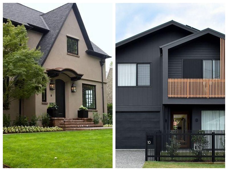
On exterior walls, Taupe and gray can be lighter or darker depending on the time of day and the environment’s climate. They both look good on exterior walls. Taupe looks inviting and homely, while gray looks imposing and modern.
Final Words
Taupe and gray are very similar yet different colors. Their differences start and stop with their hues, and while gray can be cool and dark, Taupe brings warmth and light into a room. However, you can use them as substitutes for each other.
To make your choice, you can sample both to see which one suits your tastes and works with your room better. If you have any questions or concerns, do not hesitate to drop them in the comments section below, we’re happy to help.