
Choosing between two beautiful shades of paint color that look alike can be brain-tasking and believe me, I completely understand that. That is why I have taken up the task of making your life a lot easier by putting together this article and enlisting the difference between Mindful Gray and Repose Gray to help you select which one works best for you.
“Mindful Gray VS Repose Gray: Which Is Better?” Is a very popular question among homeowners and decorators, and today, I will be helping you with the answers to that.
Before we go further, let’s briefly get a general idea of each painting.
Mindful Gray 7015 is a neutral light gray paint that strikes a very beautiful pose between light to medium gray. It doesn’t have any strong undertones that tend to take dominance in any kind of lightning.
Repose Gray 7016 is a light-medium gray paint with violet undertones. The most interesting thing about this paint shade is how it balances quite well between warm and cool. Moving to either side in the presence of certain lighting conditions.
Table of Contents
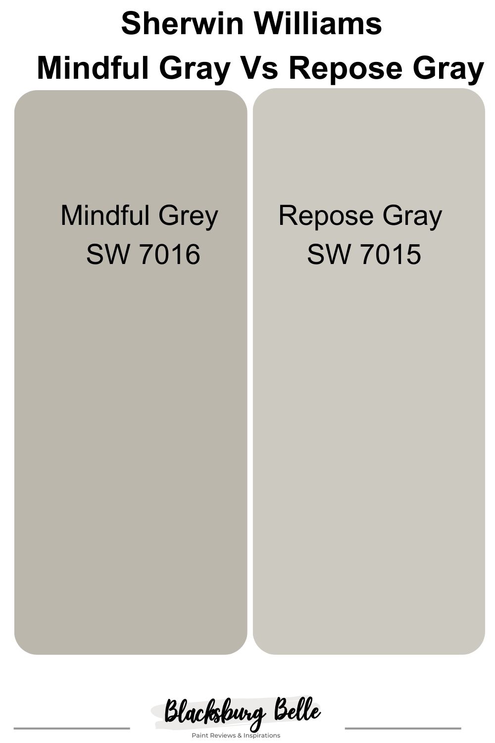
Visual Comparison of Mindful Gray VS Repose Gray.
If you look closely at the pictures provided below, you will notice that Repose Gray is a lighter shade of gray compared to Mindful Gray.
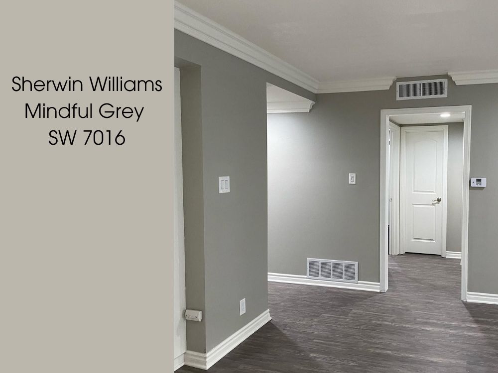
Below is an image of Mindful Gray used on an interior wall.
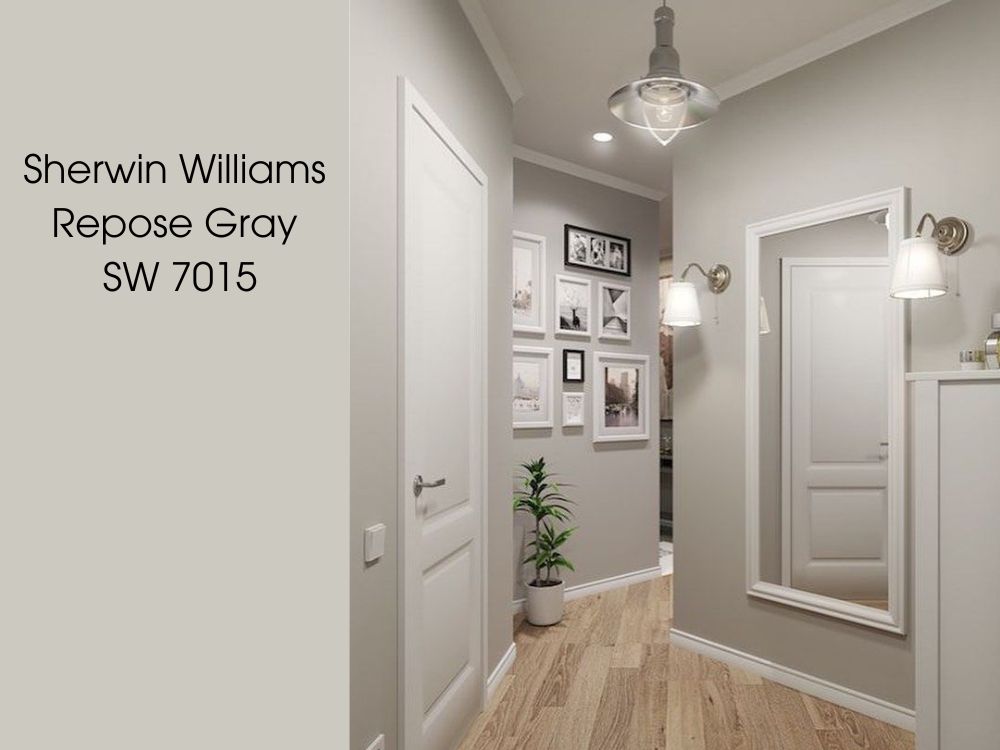
Below is an image of Repose Gray used on an interior wall.
At first glance you can see a strong difference between both paints, Mindful Gray appears to be darker than Repose Gray.
While both of them belong to the gray family, the shades differ with each color giving off a unique signature in any room or setting.
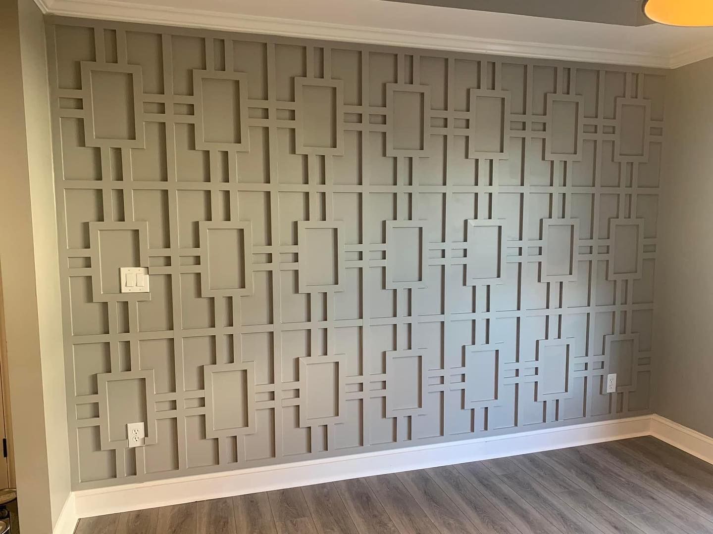
Here’s another example, it’s an accent wall painted in Mindful Gray, the lighting of a room significantly affects the appearance of this color.
Have a look at this two-toned wall below, the upper part was painted in Repose Gray, you can see this color is more vibrant and lively than Mindful Gray.
Emotional Effects: Mindful Gray VS Repose Gray
Most people just see paint as a beautification piece for your walls and surface only, but it goes deeper than that. Paints carry emotions that they share with us. We in turn share these emotions with the rest of the world knowingly or unknowingly.
Grays in general are mostly associated with neutrality and calmness. The aura from this shade also encourages a feeling of authority and strength.
Let’s talk about Mindful Gray’s powerful emotions; The combination of Mindful Gray’s base tone and its undertones endow this color with an emotion that enforces a feeling of restoration and neutrality. When you surround yourself with Mindful Gray, This helps to balance your mind and mood, manifesting a sensation of well-being and peacefulness.
On the other hand, Repose Gray manifests a very contagious state of equilibrium that releases a sensation of stillness. This stillness encourages a feeling of authority and self-strength. This is the kind of energy you need around you when you are passing through anxiety, depression, and even stress. It can give you the strength you need when you are feeling down.
When To Choose Mindful Gray Vs Repose Gray
You should use Mindful Gray if:
- You have a space with lots of exposure to natural light.
- You want a gray that doesn’t reflect too much light.
- You want a darker shade of gray.
You should use Repose Gray if:
- You are looking for an equal or close to equal balance of warmth and coolness.
- You have spaces with white finishes and furniture.
- You want a gray with a faint green undertone.
Detailed Comparing Mindful Gray And Repose Gray.
The table below carefully highlights the basic parameters of each paint, helping you view the key differences between each paint color. Understanding the differences between these colors can help you in making the right choice of color.
| Mindful Gray | Repose Gray | |
| LRV | 48 | 60 |
| RGB | 188 183 173 | 204 201 192 |
| HEX VALUE | #BCB7AD | #CCC9CO |
| UNDERTONES | Greige, Green | Blue, Violet |
Mindful Gray VS Repose Gray: Their LRV
In simple terms, LRV means Light Reflectance Value, and it is a measurement that shows the percentage of light reflected from a surface. LRV’s scale is from 0-100, with 0 being absolute black and 100 being pure white.
When it comes to neutral colors, LRV is one of the things to be taken into serious consideration, because it holds a very core part of how a paint color will appear on our walls.
Mindful Gray has a light Reflectance Value Of 48: This means it is the darker color of the duo and will reflect less light. This is a good choice for people who want to create a cozy environment. This paint also works well for bedrooms and hallways.
Repose Gray has a light Reflectance Value Of 60: This means that of the duo, it will reflect the least, just as it absorbs the most. This color is capable of making the entire surrounding look bright and energetic.
Mindful Gray VS Repose Gray: Their Undertones
Let’s talk about undertones!!!
In paints, undertones are a result of combining more than one color. For example, when blue is combined with a tint of black, an indigo undertone surfaces. The undertone is the color your eyes don’t meet at the first glance while the dominant color is the color your eyes meet at first glance.
When picking out a neutral color for your space, the undertones of the color are another thing you need to pay very close attention to.
Mindful Gray has greige and green undertones, the undertones essentially keep mindful gray from becoming too warm, without sticking out its head or making itself the center of attraction.
The undertones of Repose Gray are a mixture of blue and very faint purple. It also has a kiss of green undertones that give off cool energy when the lighting situation favors it.
The primary purpose of the green undertones is to give the color an overall feeling of irresistible freshness. The purple undertones act as the vibe in this painting, keeping the gray from being too flat or dull. The blue undertone in Repose Gray is probably responsible for the coolness this color releases, while the brown finally is the reason for the warm tone of Repose Gray.
A Closer Look At Mindful Gray’s Undertones
Below is a living room painted with Mindful Gray.
In the image above, Mindful Gray makes two different appearances while on the same wall. On the left-hand side where Mindful Gray seems to be getting the least exposure to natural light, you can see the greige undertones being exposed and its warmth emphasized. While the right side of the wall shows off more of the green undertone and slight blue undertones.
Also, you can see how well these undertones maintain an enviable balance beside each other, creating a very easy appearance.
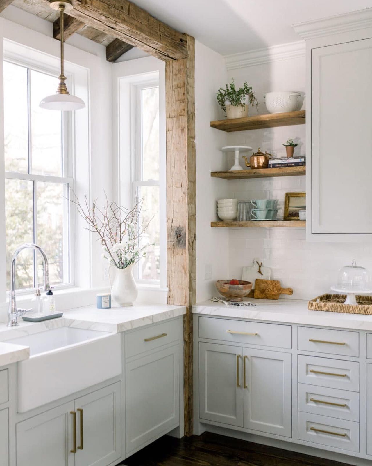
A Closer Look At Repose Gray Undertones
Below is an image of Repose Gray used on kitchen cabinets.
The image above gives us a picture of a kitchen with its cabinets all painted in Repose Gray. Here we can see that the array of cabinets has a warm appearance, and its greige undertone is quite visible here.
While the single-standing cabinet has a cool tone, with a very obvious blue undertone. The combination of these tones has created a very bright and soothing environment most gently and serenely possible.
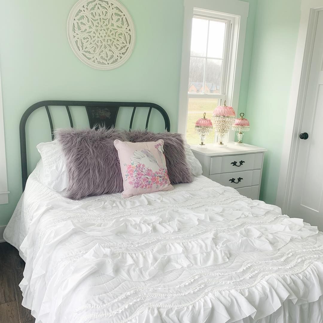
Mindful Gray Vs Repose Gray: Which Has More Green Undertones?
Looking at both paint colors, it is very obvious that Mindful Gray has more green undertones.
The green undertones come to play when Mindful Gray is exposed to a good amount of natural light.
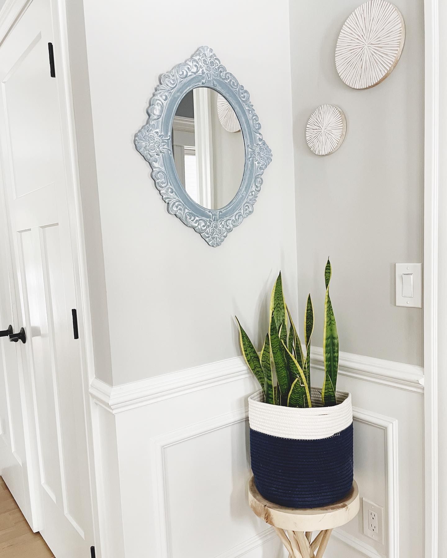
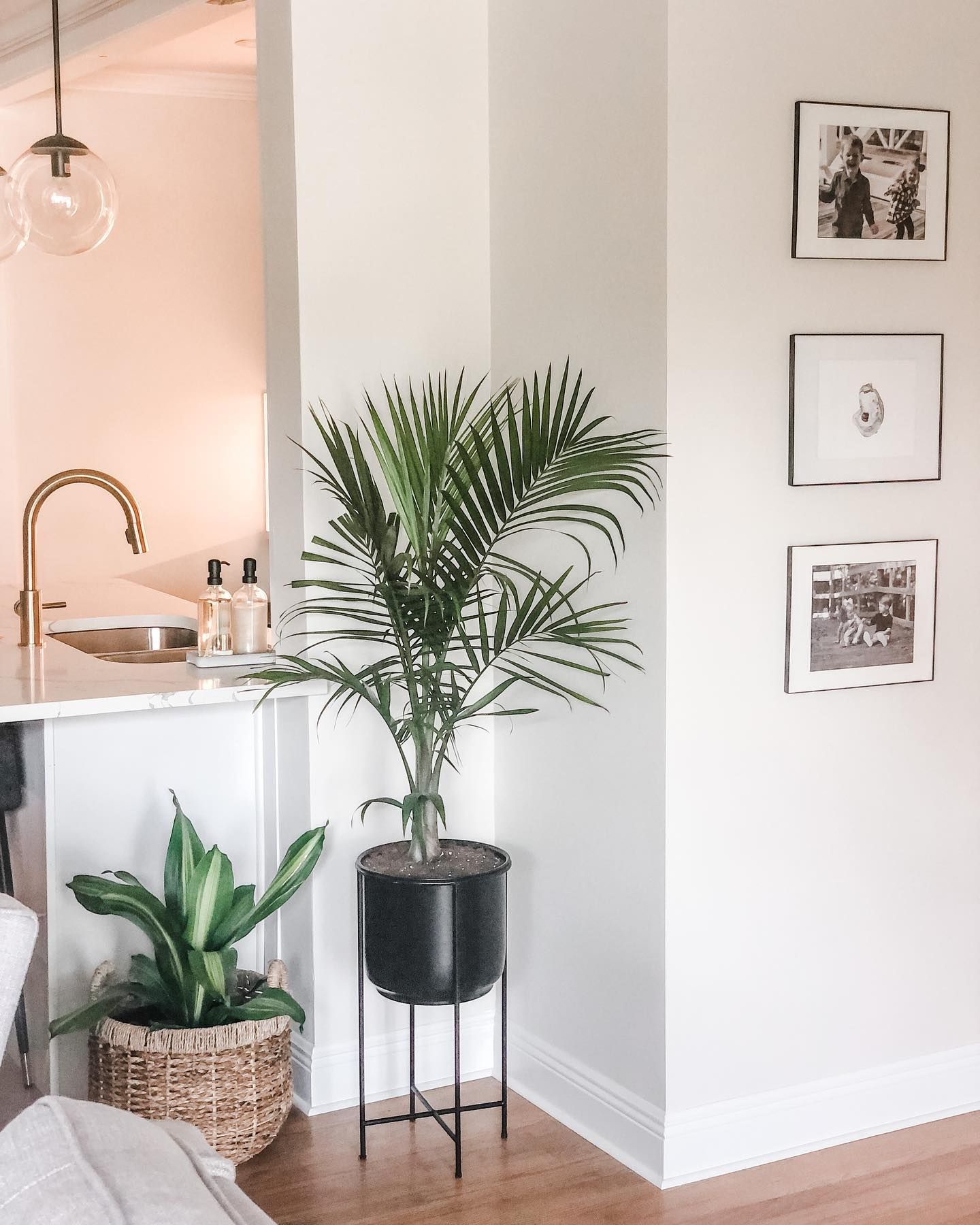
Below is an image of a Bedroom headboard that further exposes the green undertone in Mindful Gray.
Mindful Gray Vs Repose Gray: Are They Warm Or Cool?
When it comes to Mindful Gray, it is a bit difficult to decipher if it is a warm or cool color. But on a general note, Mindful Gray is a warm paint color. However, the blue-purple undertones more or less lean toward the cooler side.
When the bluish part of the Undertones is at work, it helps Mindful Gray to create the perfect balance of the cool tones that it has, this in turn finds a way to prevent it from getting too warm.
I know you are probably indications point to Mindful being a cool gray, but when it is in comparison with a cool gray the warmth becomes very obvious, even in conditions that bring out its cool side.
Its greige undertone does a very good job of keeping the color from looking too cool. All the pieces that make up this paint color work together to create the perfect neutral gray paint crush.
For Repose Gray; This color is most definitely a warm paint color with the ability to look cool in certain lighting conditions. That is the power of its balance and flexibility at work here.
Repose gray has quite an amount of blue undertones that are responsible for the coolness it gives out sometimes. If you happen to see Repose Gray in a lighting condition that favors its blue undertones, it looks nothing like a warm color. However, even in this cool-looking state, when compared with a cool gray that is exposed to half as much or the same exposure, Repose Gray looks way warmer than it.
This ability Repose Gray has to look both a cool and warm color is what has made it the ultimate sweetheart for most homeowners and decorators alike. This paint color is so far the coolest warm paint you will find anywhere.
Mindful Gray VS Repose Gray: Their Complementary Colors
We already know that both Mindful and Repose are very good neutrals, so this means that they will coordinate and blend well with a variety of paint colors quite well, ranging from white to black.
Mindful Gray Complementary Color
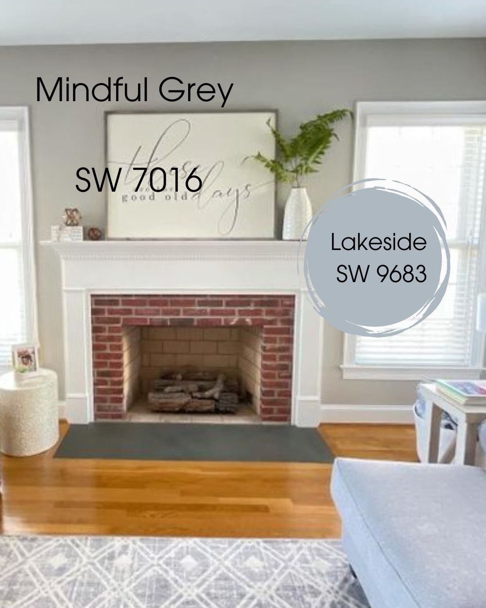
The complementary color of Mindful Gray is a shade that lies opposite it on the color wheel. Mindful Gray is a neutral gray color with warm undertones. As such, its complementary color would be a color that contrasts with it and complements its warmth.
Here’s the best complementary color for Mindful Gray.
- Lakeside SW 9683: This color is a unique light shade of blue, Lakeside is calming and refreshing.
Repose Gray Complementary Color
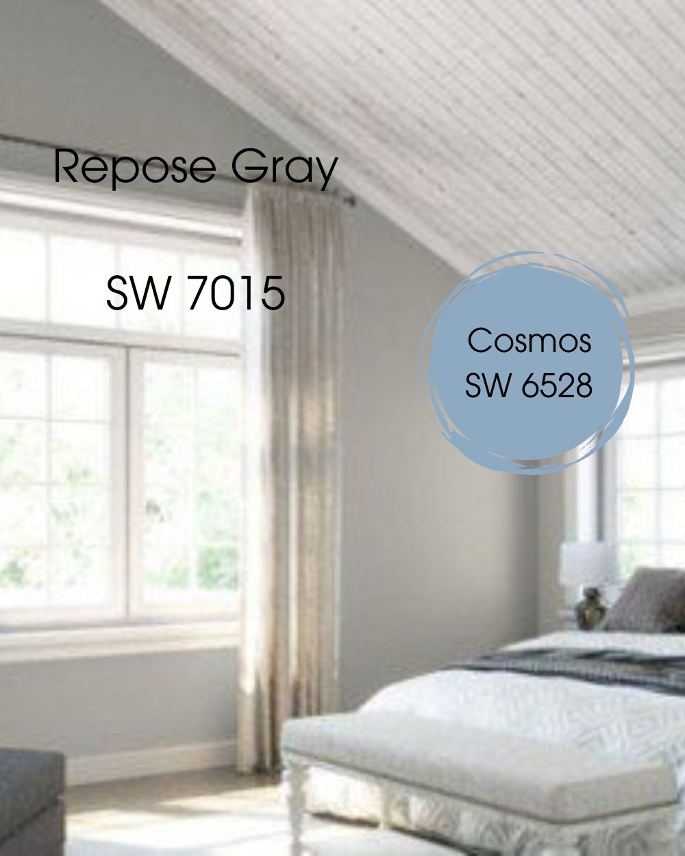
On the other hand, Repose Gray has almost the same complementary color as Mindful Gray, there’s only a slight difference in undertone.
- Cosmos SW 6528: A cool blue color with unique undertones that brings life to a space when used to complement Repose gray.
Mindful Gray VS Repose Gray Color Palette
The color palette for Mindful Gray And Repose Gray represents sophistication and neutrality. It also possesses versatility and flexibility that makes it a good match for a variety of other colors.
Color Palette For Mindful Gray
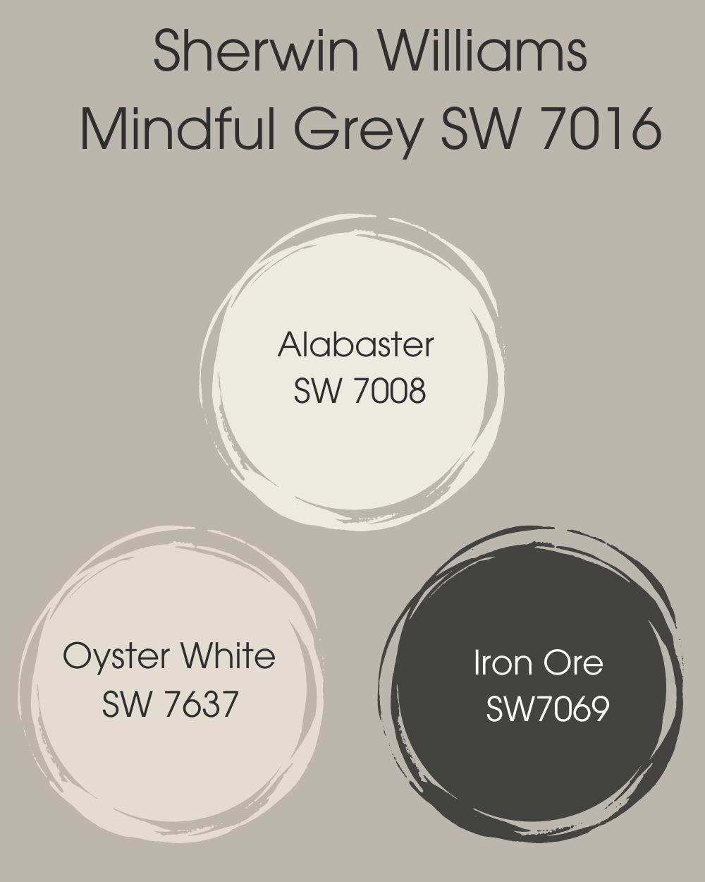
The neutral nature of Mindful Gray makes it a nice pair for a lot of colors, but we will just look at alabaster white, oyster white, and iron ore. These are muted, earthy colors that feel very warm and inviting.
- Alabaster SW 7008:This is one of Sherwin Williams’s Most loved paints and is well known for its soft and almost off-white appearance. This color creates a very pleasing appearance when complemented with mindful gray.
- Oyster White SW 7637:This is a very light greige with green undertones. It is usually substituted for a darker shade of white. Being neutral, it blends just right with the prestigious Mindful Gray.
- Iron Ore SW7069:This is a very deep, dark, and neutral paint. When paired with Mindful Gray, it creates a very sophisticated look.
Color Palette For Repose Gray
The versatile nature of Repose Gray makes it easy for the color to vibe well with other colors. Let’s look at two of my favorite color palettes for Repose Gray.
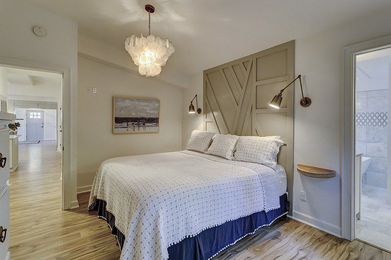
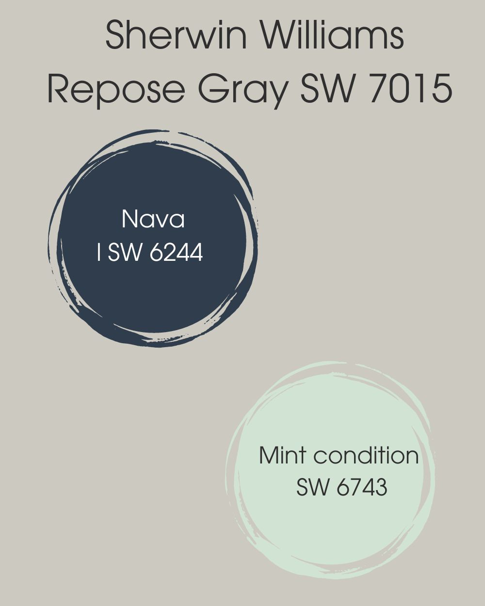
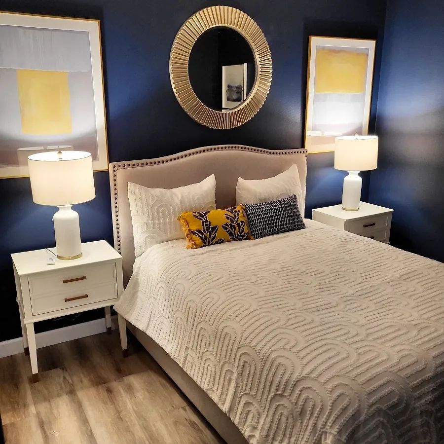
- Naval SW 6244:This is a deep blue with gray-green undertones that has a very cozy serenity and a contagious calmness.
Here’s an example of Naval SW 6244 on the walls of a Bedroom.
- Mint condition SW6743:This is a bright green color that will be ideal and perfect for cabinets against Mindful Gray walls.
In the image below you can see how Mint Condition adds live to this bedroom wall.
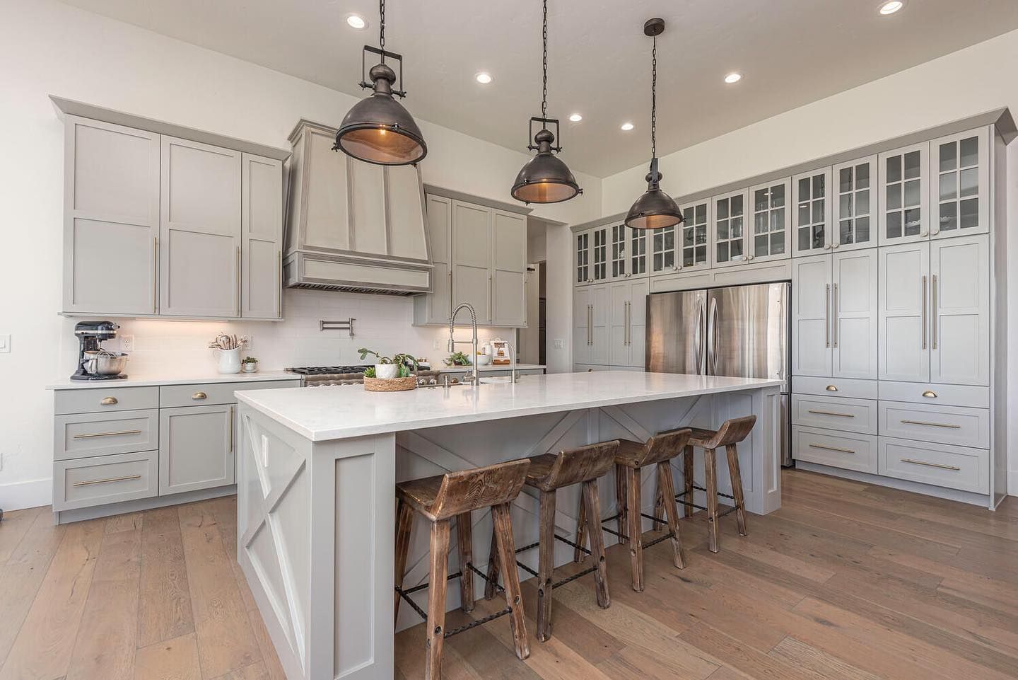
Mindful Gray VS Repose Gray on Kitchen Cabinets
When it comes to choosing between Mindful Gray and Repose Gray for kitchen cabinets, both options offer unique qualities and considerations.
Mindful Gray On Kitchen Cabinets
Let’s take a look at these beautiful cabinets in Mindful Gray.
Mindful Gray on the kitchen cabinets of this kitchen is just the pop of color this very neutral kitchen needs. It blends very beautifully into the theme of the kitchen and with the white wall, creating a very peaceful cooking space.
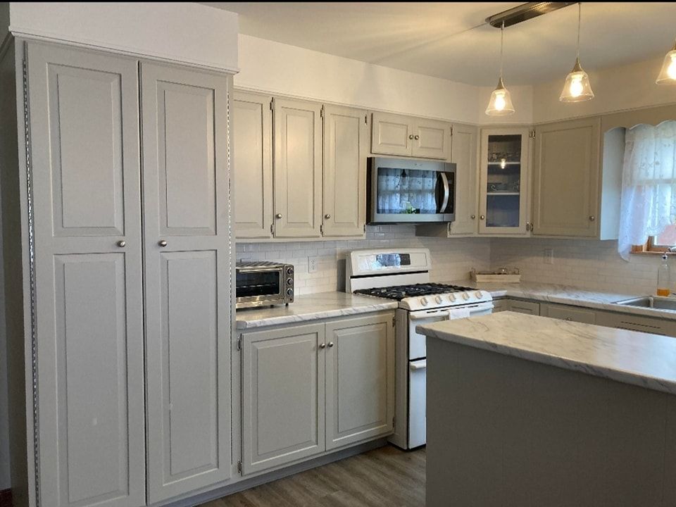
Repose Gray On Kitchen Cabinets
The magic Repose Gray performs in this kitchen space is very obvious. Apart from sitting majestically on the cabinets, it also blends in with the oak wood to make sure a very appealing appearance is created.
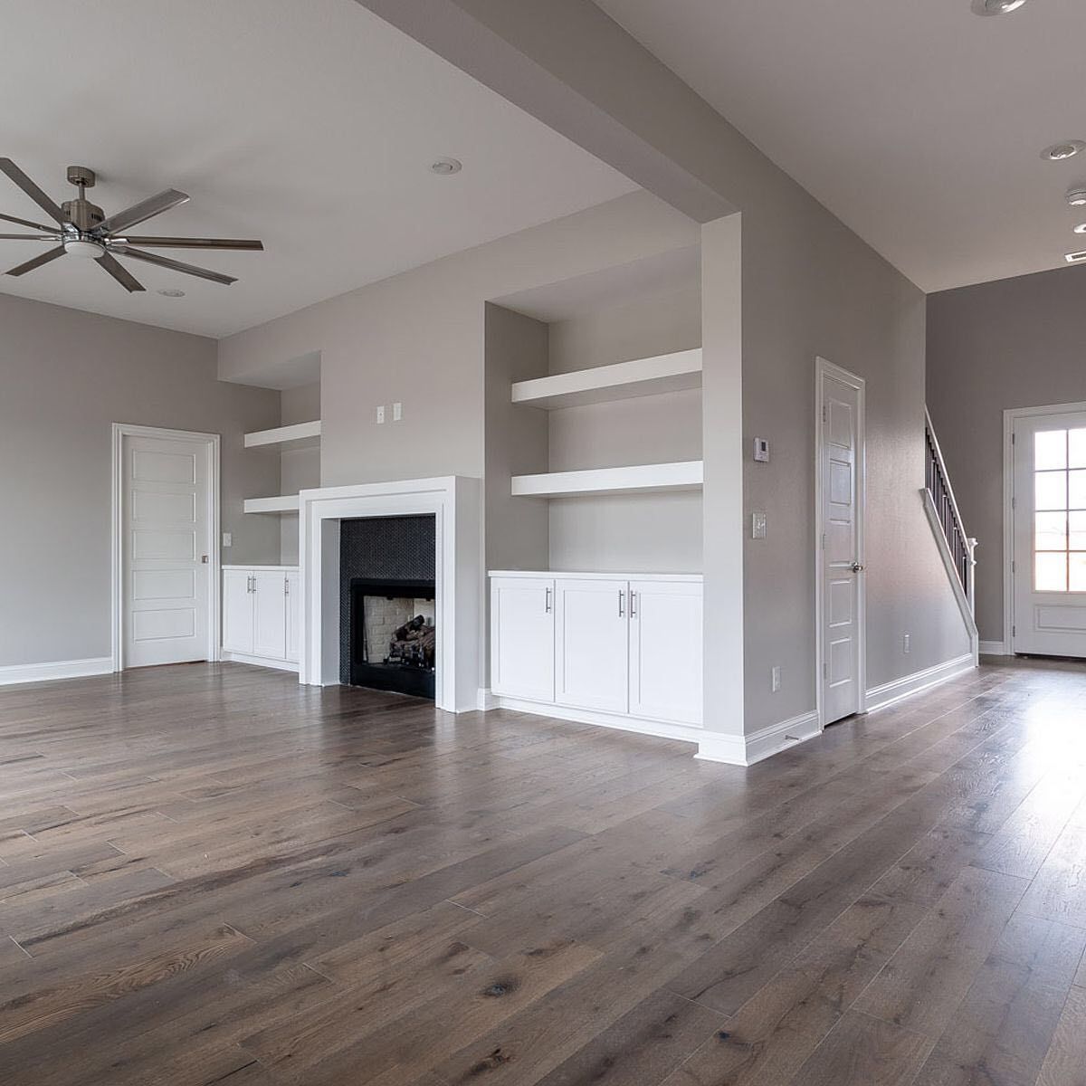
Mindful Gray VS Repose Gray On Interior Walls
Interior walls have a way of changing the overall look of these colors, can you spot the difference? Below are two crisp examples of Mindful gray and Repose Gray on Interior walls.
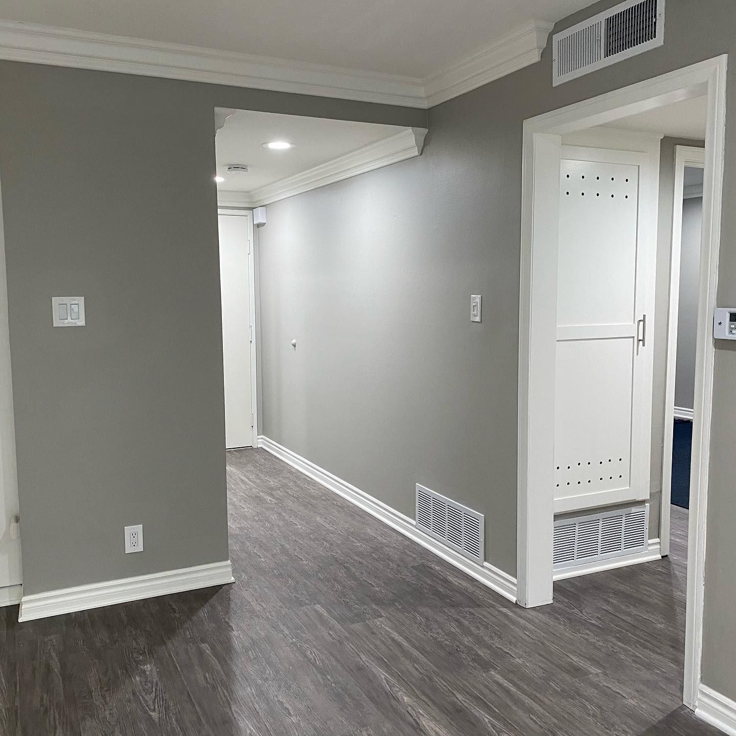
Mindful Gray On Interior walls
What Mindful Gray has done here to explain serenity and peacefulness in the simplest way possible. Apart from the beautiful cover it has given to this hallway, it also gives it a warm and cozy appearance.
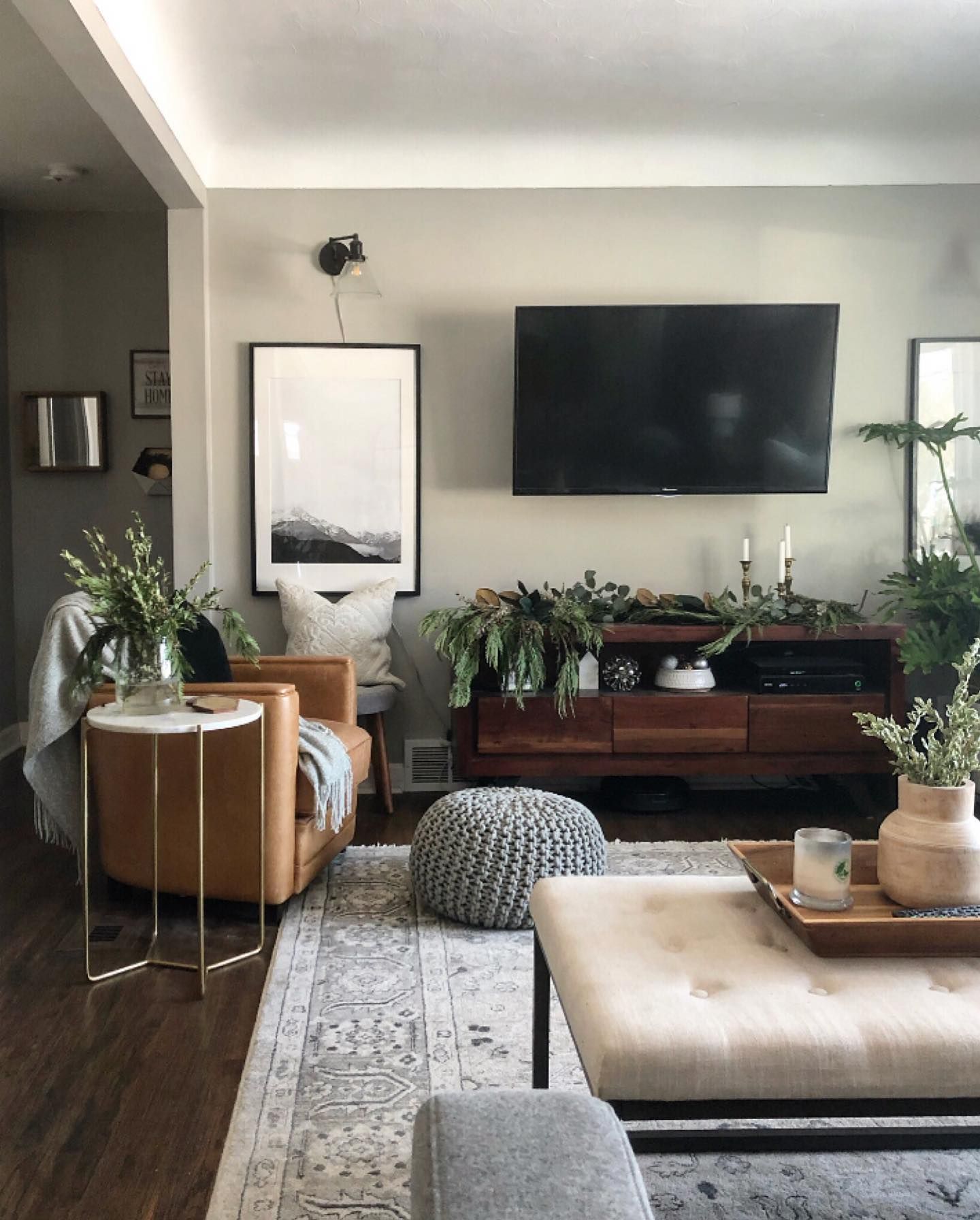
Repose Gray On Interior Walls
Look at those undertones popping in the most elegant and prestigious way possible. Repose gray is the best thing that can happen to any wall in your house. It envelopes any surface it touches with a gentle luxurious touch.
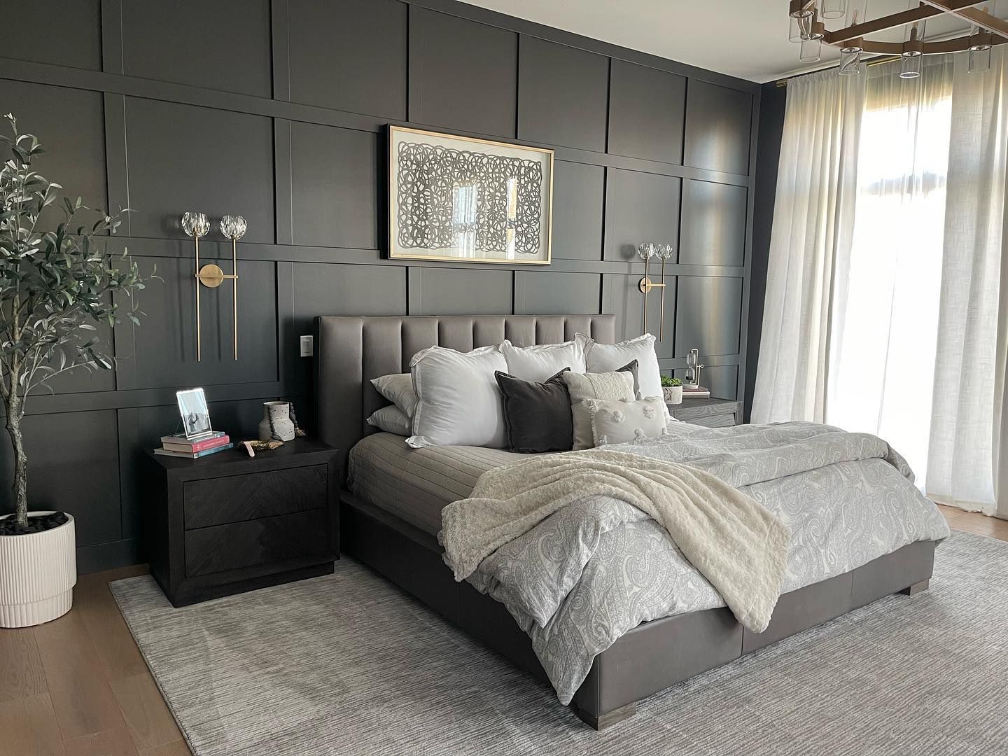
Here’s a living room area with Repose Gray used on the walls.
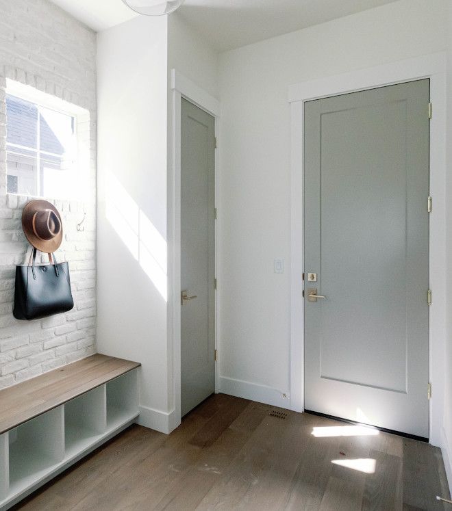
Mindful Gray VS Repose Gray on Doors
How well does Mindful Gray perform on doors? Well, you are about to find out. Below are two unique images showing both colors on doors.
Mindful Gray On Doors
The Mindful Gray on the door of this room has just transformed the whole area, giving it a more accommodating and inviting look. The availability of natural light allows it to show off its cool sides, making the color look more lighter and gorgeous.
Repose Gray on the Door
Repose Gray on your door is the bomb, this color knows just how to make you happy without trying too hard. You can see how effortlessly it sits on this door to create a smart, active, and happy little space. Repose Gray on your doors cannot be a wrong move.
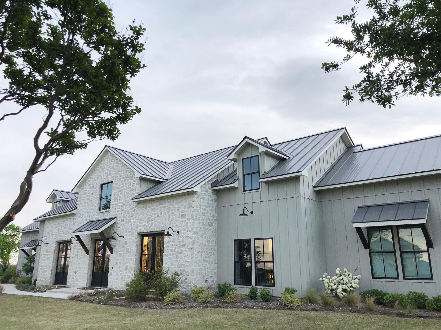
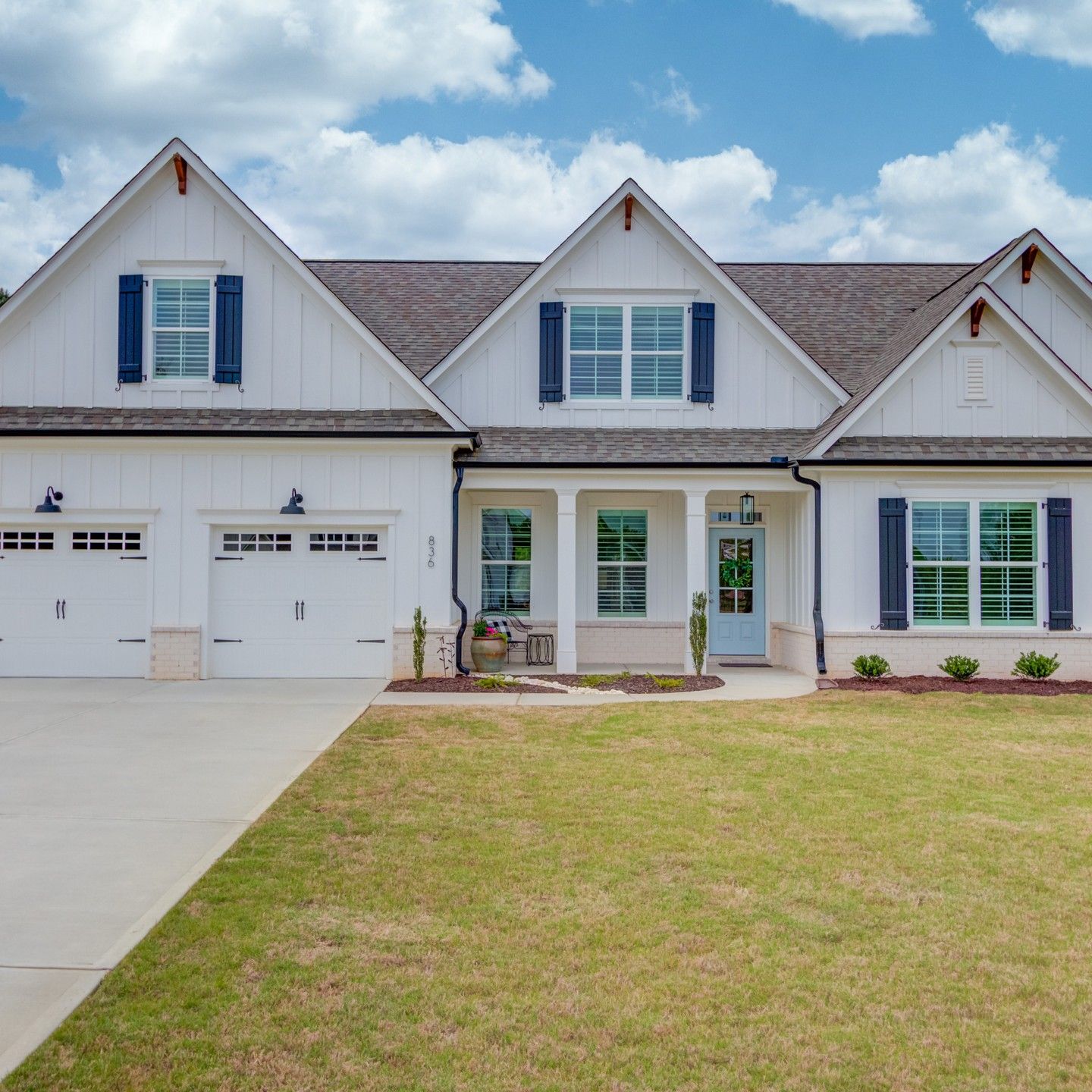
Mindful Gray VS Repose Gray On The Exterior
Outside the house isn’t left out, due to the brightness outdoors, Mindful Gray and Repose Gray both look outstanding in exteriors. The best part is they look different per the time of the day.
Mindful Gray On The Exterior Walls
Now you can call this a home, Mindful Gray has combined with Dove Tail to give out the most appealing appearance to this exterior. Mindful Gray also shared an aura that makes the house look very gentle and welcoming.
Here’s an exterior building with Mindful Gray used on the far side of the home.
Repose Gray On Exteriors
I have never seen a front porch look more sophisticated before. This front area covered with repose gray has a bright, cool look that demands attention and admiration. It blends perfectly with the trims to give out a very stable and balanced look.
Before I go further, I’d like to let you know that there is no perfect color. When it comes to Mindful Gray and Repose Gray both paint colors are very beautiful, neutral, flexible, and versatile enough to fit into any space and blend perfectly with a large variety of colors.
The power to choose which color works better than the other is completely on you.
If you want a warm color that has a bit of coolness but repose gray is too light for you, you might consider Mindful Gray and vice versa.
If you think grays are boring, Mindful Gray and Repose Gray should be a reason for you to have a change of heart. These colors work very well for your spaces and also you can play around with colors easily while they blend and coordinate everything for you. These colors are capable of giving you TLC in the most soothing way ever.
Conclusion
When comparing Mindful Gray (SW7016) and Repose Gray (SW7015), it’s important to note that “better” is subjective and depends on individual preferences and the specific context of the project. Both colors have their own unique qualities and can be excellent choices for interior design.
Ultimately, the choice between Mindful Gray and Repose Gray depends on your personal preference, the desired mood or style you want to achieve, and the lighting conditions of your space. It is recommended to obtain samples of both colors and test them in your specific environment to see how they interact with the other elements in your room.
 Accessible Beige Vs Agreeable Gray: Which is Good?
 Mindful Gray vs Agreeable Gray: What’s the Difference?
 Sherwin Williams Shoji White Vs Alabaster: How to Choose
 Sherwin Williams Tricorn Black vs Iron Ore: How to Choose?
 Benjamin Moore Ballet White vs Swiss Coffee: How to Choose
 Sherwin Williams Snowbound vs Alabaster: How to Choose?
