
Neutral doesn’t have to mean just white, gray, or beige. If you are looking for a neutral paint color that offers something a bit different then you will love the paint that I am looking at, Sherwin Williams Quietude.
This neutral green also has notes of gray and blue helping to keep it on the muted side while adding a tranquil vibe to any space.
I personally love how soft this paint color is, as well as the fact that although it is a mid-toned color it is surprisingly light!
Carry on reading as I fill you in on all of the details when it comes to Sherwin Williams Quietude SW 6212.
Table of Contents
When to Choose Sherwin Williams Quietude SW 6212?
I have been on an extensive mission to find out all about Sherwin Williams Quietude. Not only have I been all over the internet to find the very best design inspiration for you, but I also bought a sample pot or two to do my own in-person testing!
So, here’s my lowdown on some of the top ways to use Sherwin Williams Quietude.
Make a Great First Impression
A fantastic way in which to use Sherwin Williams Quietude starts right at the front door, literally! Try painting your front door in this color and watch the compliments roll in!
Pretty Pastels
If you have been wanting to use a pastel color but think it might be a bit too much, Sherwin Williams Quietude offers the perfect middle ground. In bright natural light, it gives off a real pastel vibe, but in a subtle way that still keeps things grounded.
Natural Notes
Being a gray-green, Sherwin Williams Quietude really lends itself to color schemes that use natural hues, such as stone, wood, and soft textiles. Try it out and up the zen in your space.
Shabby Chic
When used on furniture, Sherwin Williams Quietude lends itself really well to being slightly distressed, helping you to create a shabby chic aesthetic with ease.
Punchy or Peaceful
Depending upon the accent colors you choose to go with it, Sherwin Williams Quietude SW 6212 can have a different impact. Pair with bright, contrasting colors such as coral pink for a vibrant and playful feel. Alternatively, use softer, related shades in order to create a peaceful and tranquil space to relax in.
Kitchen Refresh
Sherwin Williams Quietude is a great color to use in your kitchen, whether you choose to put it on the walls or on the cabinets. It doesn’t matter what level of light you have in your kitchen, as this paint color can work with both high and low levels of natural light, with both each giving a different vibe!
Vintage Vibes
When paired with rich, dark woods and antique furniture, Sherwin Williams Quietude is perfectly at home within a design scheme that focuses on creating a vintage or historical feel.
Give Your Exterior an Edge
Sherwin Williams Quietude works perfectly with a white trim on the outside of a property. This is especially true when it is used on paneling or siding, helping you to bring some serious curb appeal.
Of course, this list is just the beginning, as there are far more things that this color is amazing for!
If you need to learn more about this color or still have unanswered questions about when to use it, then just keep on scrolling. I am sure I have you covered with this in-depth review of Sherwin Williams Quietude SW 6212!
What Color Is Sherwin Williams Quietude?
Sherwin Williams Quietude is a cool green color with notes of gray underneath. It reminds me of just being serene and still in nature, which is likely one of the reasons why Sherwin Williams gave this paint color the name “Quietude”!
I’ve found this picture, which I think reflects the contemplative and calm vibe that Sherwin Williams was going for with this paint color.
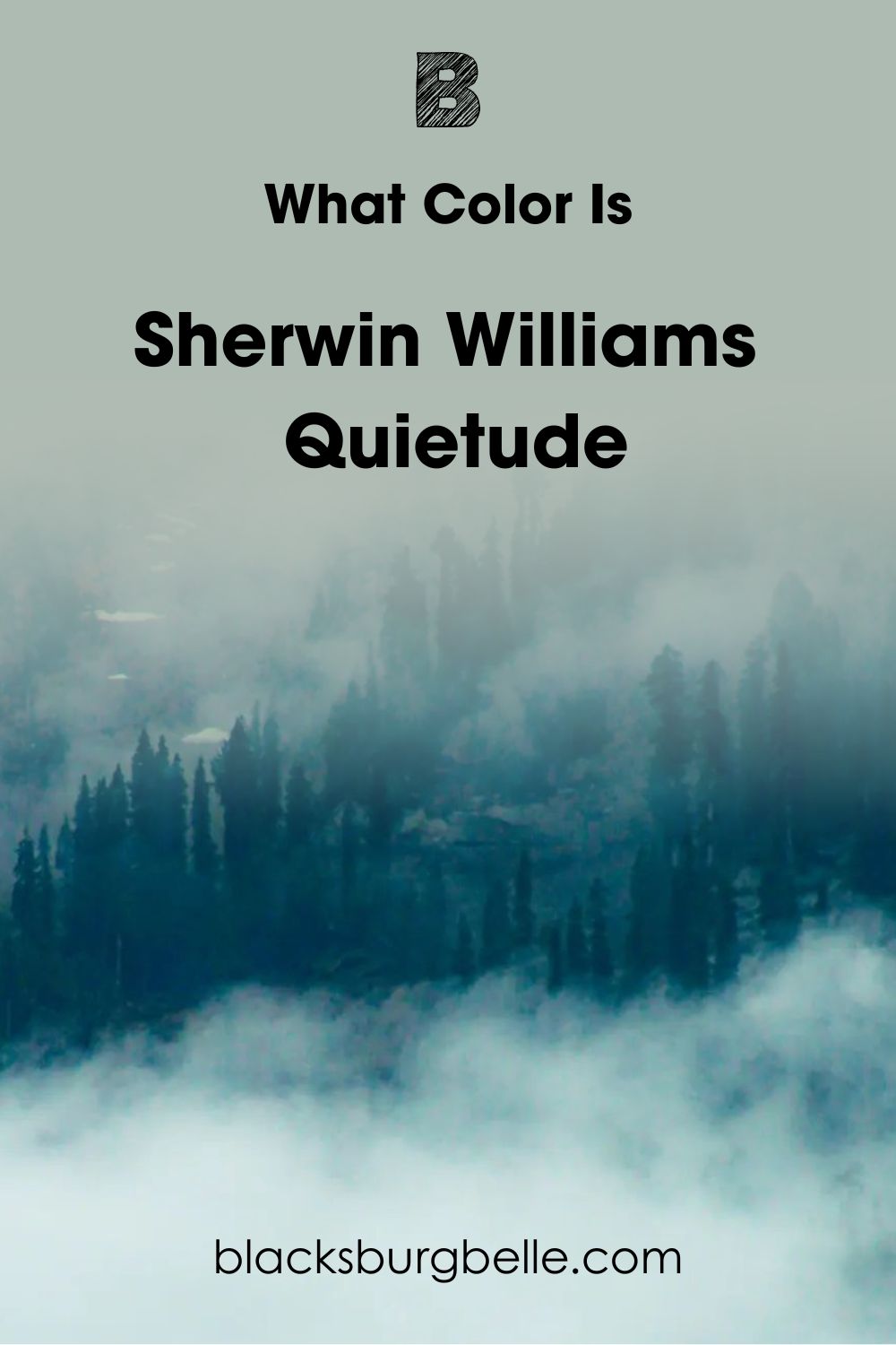
The mist rolling through the green evergreen trees in this photo perfectly encapsulates the color notes of Sherwin Williams Quietude, as well as its tranquil effect.
Snapshot of Sherwin Williams Quietude Specifications
Now that I have described what this paint color looks like, you might want more details about the actual stats of this paint. Don’t fear, as I’ve put together this table below that should have you covered!
| Sherwin Williams Quietude SW 6212 | |
| RGB | R: 173 G: 187 B: 178 |
| Hex Value | #ADBBB2 |
| LRV | 48 |
| Undertones | Gray, Blue |
The LRV of Sherwin Williams Quietude
For those unfamiliar with the term, LRV simply means Light Reflective Value. It’s used to measure how much light a color reflects. The scale goes from 0 to 100, with a true black being 0, meaning it reflects no light, and a pure white being 100 with the maximum reflectiveness.
When it comes down to it, no color is truly black, or white. There is always some sort of pigmentation due to the manufacturing process and just general everyday life! As a result of this, paint is measured using LRV values between 2.5 and 94.
The LRV of Sherwin Williams Quietude is 48. This means it is on the darker side of the scale, but you wouldn’t know it from the way the paint looks in a room!
Undertones of Sherwin Williams Quietude
The undertones that can be found in Sherwin Williams Quietude SW 6212 are gray and blue. The gray takes the prevalence of the two colors and is one of the factors that really help this paint color to be on the neutral side rather than a hyper-pigmented green.
To show you an example of what I mean, take a look at this photo below.
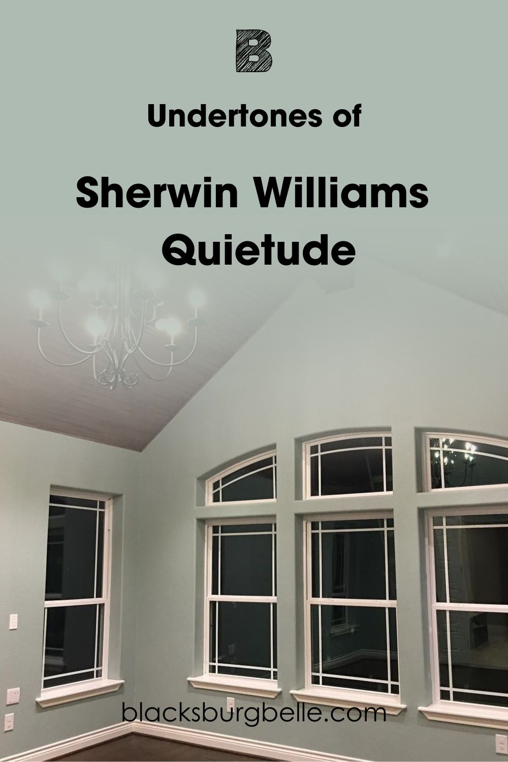
It’s super easy to see the gray notes coming through here, and the tinge of blue stops the green from becoming too bright and garish. I think it’s such a stunning combination!
Is Sherwin Williams Quietude Too Dark?
With an LRV of 48, which puts it on the lower and darker side of the scale, you might be wondering whether Sherwin Williams Quietude is too dark of a color to use.
I am here to tell you that you don’t need to worry as this paint color is strangely deceptive!
Despite its LRV, Sherwin Williams Quietude actually looks incredibly light. In fact, I know of quite a few colors that have a higher LRV that I would personally see as much darker!
For an example of what I mean, take a look at this photo.
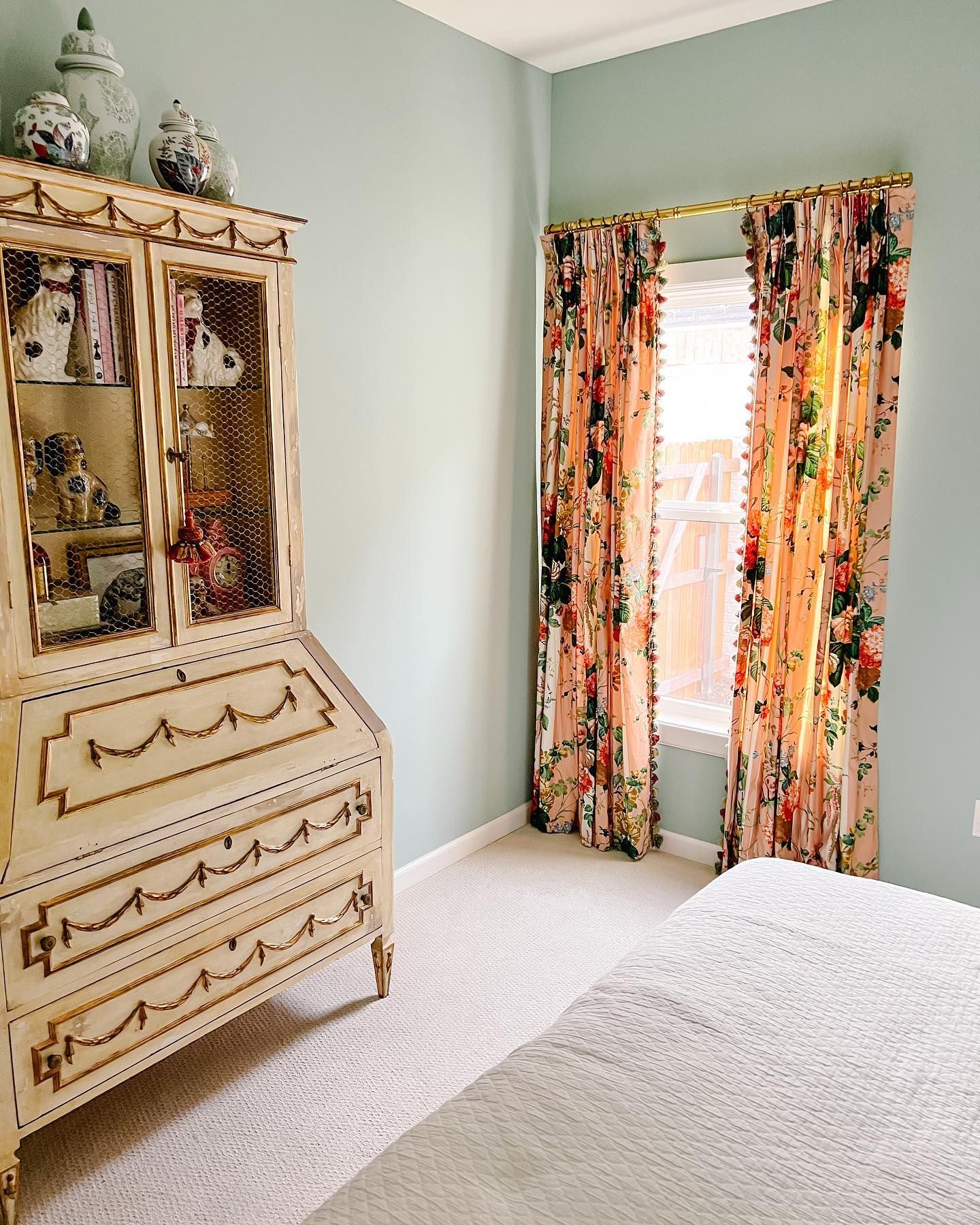
Here you’d expect to see Sherwin Williams Quietude being dark, as not only is this a corner, but there is a window and dresser that can cast a shadow. Instead, Quietude looks like a rich duck egg blue!
It is always worth remembering though that any paint will change appearance depending upon the lighting and time of day. Another factor to consider is the choice of paint finish, as a gloss will always reflect more light than matte paint.
Sherwin Williams Quietude is Warm or Cool Color?
As a green with gray and blue undertones, it’s a no-brainer that Sherwin Williams Quietude is a cool color.
This leans into its name, as cool colors often create a sense of tranquility and calm, making them perfect for rooms where you want to feel at peace and refreshed.
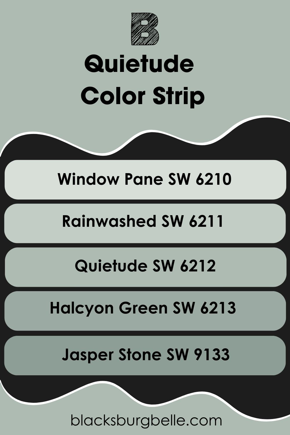
Sherwin Williams Quietude Color Strip: Lighter or Darker Exploration
It might be that you love Sherwin Williams Quietude like I do, but it’s just not quite the right shade for what you have in mind. If that is the case, then I have compiled a list of paints from Sherwin Williams that are both lighter and darker than Quietude.
The list goes from light to dark, with Sherwin Williams Quietude in the middle as a marker.
- Sherwin Williams Window Pane SW 6210
- Sherwin Williams Rainwashed SW 6211
- Sherwin Williams Quietude SW 6212
- Sherwin Williams Halcyon Green SW 6213
- Sherwin Williams Jasper Stone SW 9133
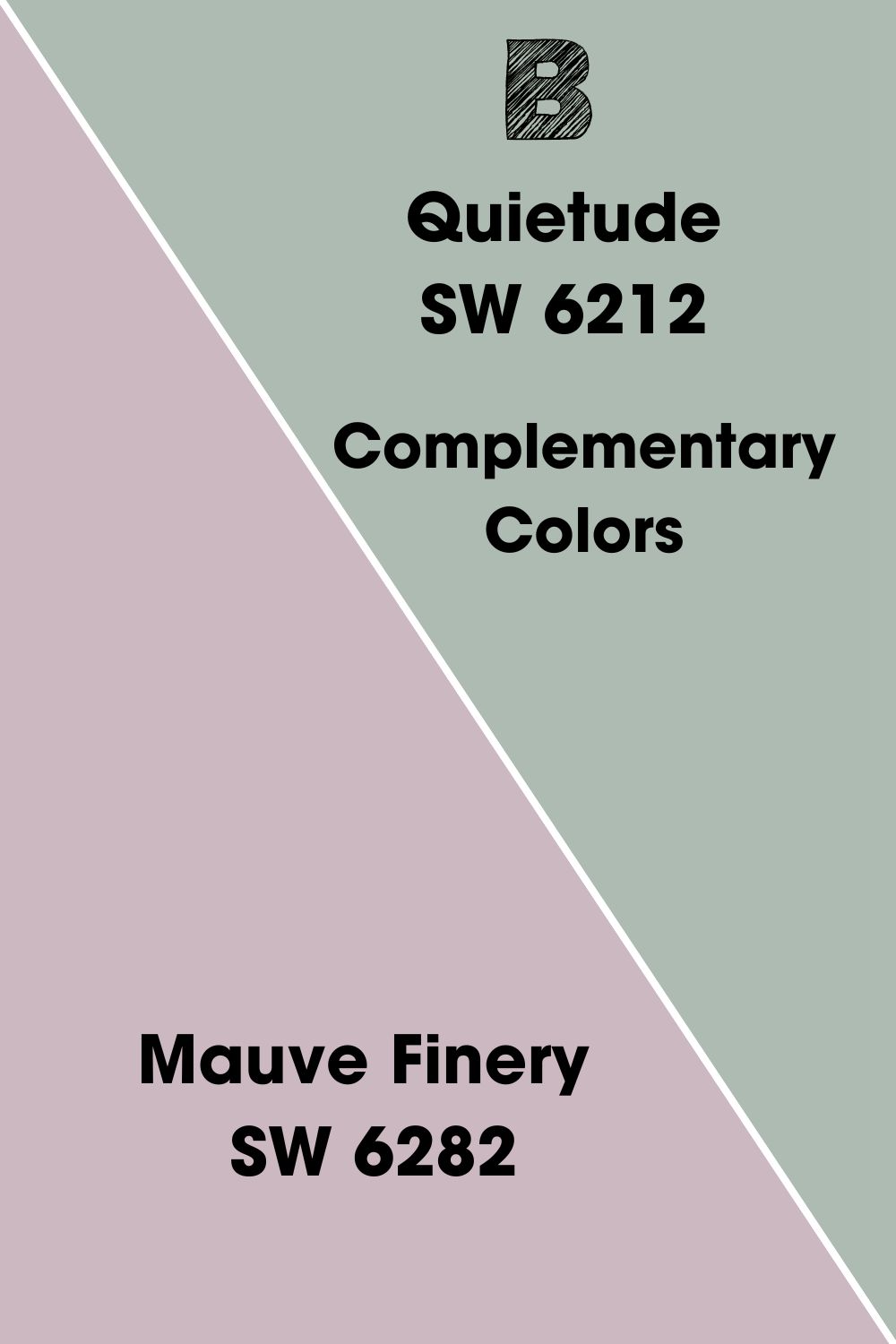
SherwinWilliamsQuietudeComplementary Colors
Now you have decided to go with Sherwin Williams Quietude, you’ll need to figure out other paint colors to go with it.
One of the best ways to start to find complementary colors for paint is to look at the color wheel. If you look opposite the original color at an equal distance across the middle of the wheel, you’ll find the complementary color!
Normally complementary colors are a contrast or opposite to the original paint color. This can help to make a room pop.
The complementary color for Sherwin Williams Quietude is a mauve color, so a mix between pink and purple. The color from Sherwin Williams that is closest to this is Mauve Finery SW 6282.
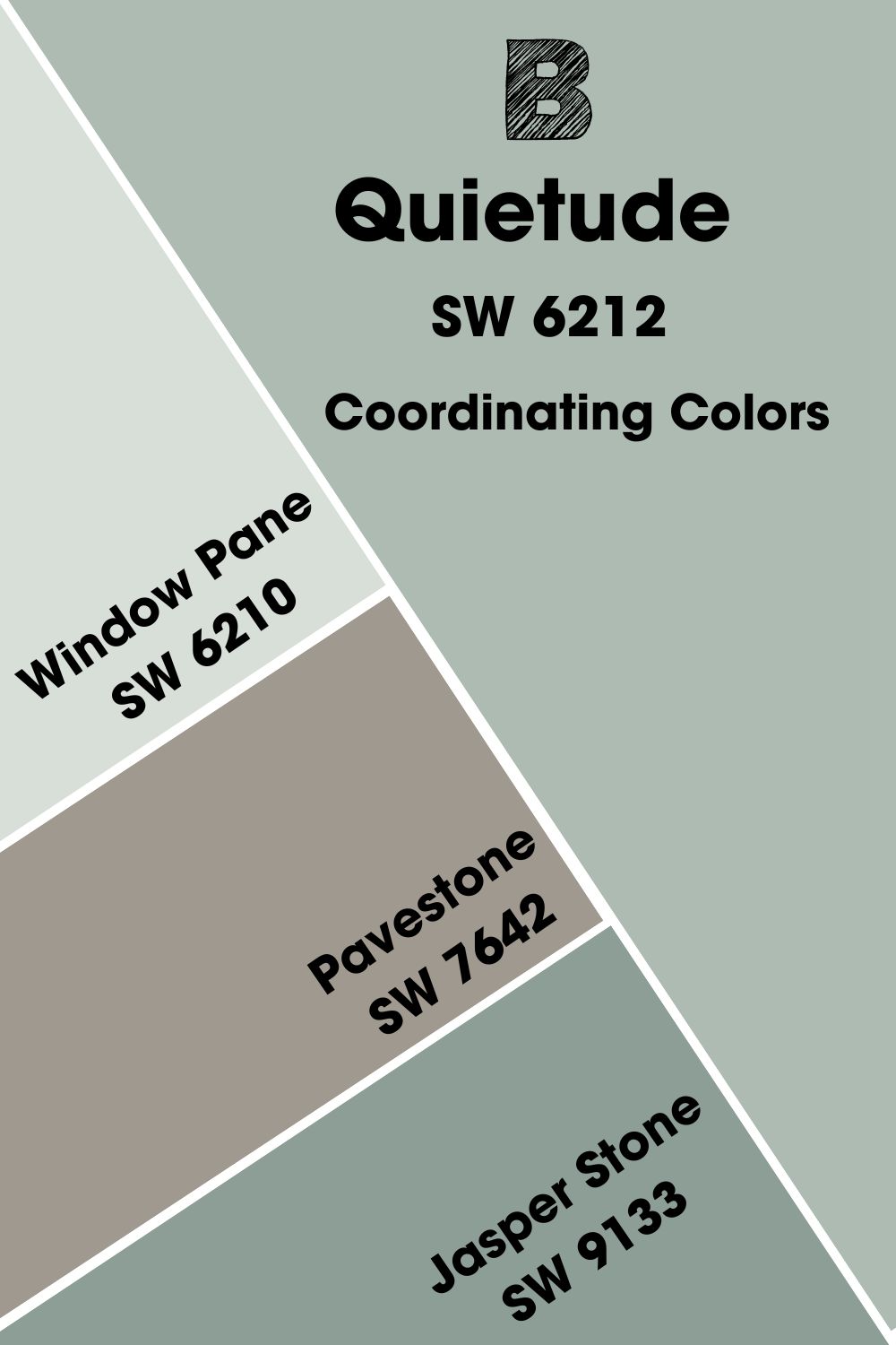
Sherwin Williams Quietude Coordinating Colors
If you’re not looking to make a bold contrast with your color scheme involving Sherwin Williams Quietude, then coordinating colors might be the best way to go!
Here I’ve listed my top 3 coordinating colors for Sherwin Williams Quietude SW 6212.
- Sherwin Williams Window Pane SW 6210: This paint color is very similar to Quietude but just a touch lighter. This makes it perfect for adding dimension to a room, brightening up dark corners, and creating a monochromatic color scheme.
- Sherwin Williams Pavestone SW 7642: This stony gray-brown is a perfect addition to a scheme with Quietude, especially when upping the natural and earthy feel of a space.
- Sherwin Williams Jasper Stone SW 9133:This paint color works similarly to Window Pane, but instead of being lighter than Quietude, it’s darker. Use it to add a moody touch as an accent wall or to add definition to furniture.
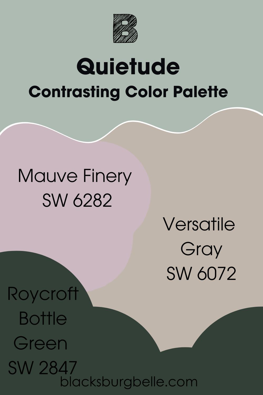
Sherwin Williams Quietude Color Palettes
To keep our color journey going, I’ve created 3 color palettes to go with Sherwin Williams Quietude. Each one has something different to offer, so I wonder which one you will like the best!
Contrasting Color Palette
- Sherwin Williams Mauve Finery SW 6282: This complementary color of Quietude adds a slightly warm contrast to a scheme. Use it in places where you want to draw the eye, such as a statement piece of furniture.
- Sherwin Williams Versatile Gray SW 6072:This warm gray has hints of red and purple undertone which help it to contrast Quietude and support Mauve Finery in the scheme.
- Sherwin Williams Roycroft Bottle Green SW 2847:From the Sherwin Williams Historic Collection, this deep black olive green helps to bring Quietude back to the fore and stop it from being lost in the other colors in the scheme.
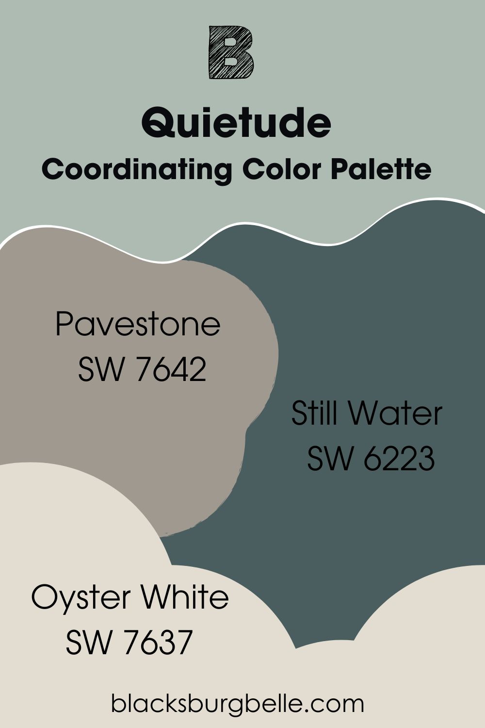
Coordinating Color Palette
- Sherwin Williams Pavestone SW 7642:This stony brown is perfect for creating a harmonious color scheme with Quietude that centers around natural tones.
- Sherwin Williams Still Water SW 6223:This blue has gray-green undertones, helping it to pick up on the main elements found in Sherwin Williams Quietude.
- Sherwin Williams Oyster White SW 7637: This soft and creamy white lifts the darker colors in this scheme, and has gray-green undertones to help bring everything together.
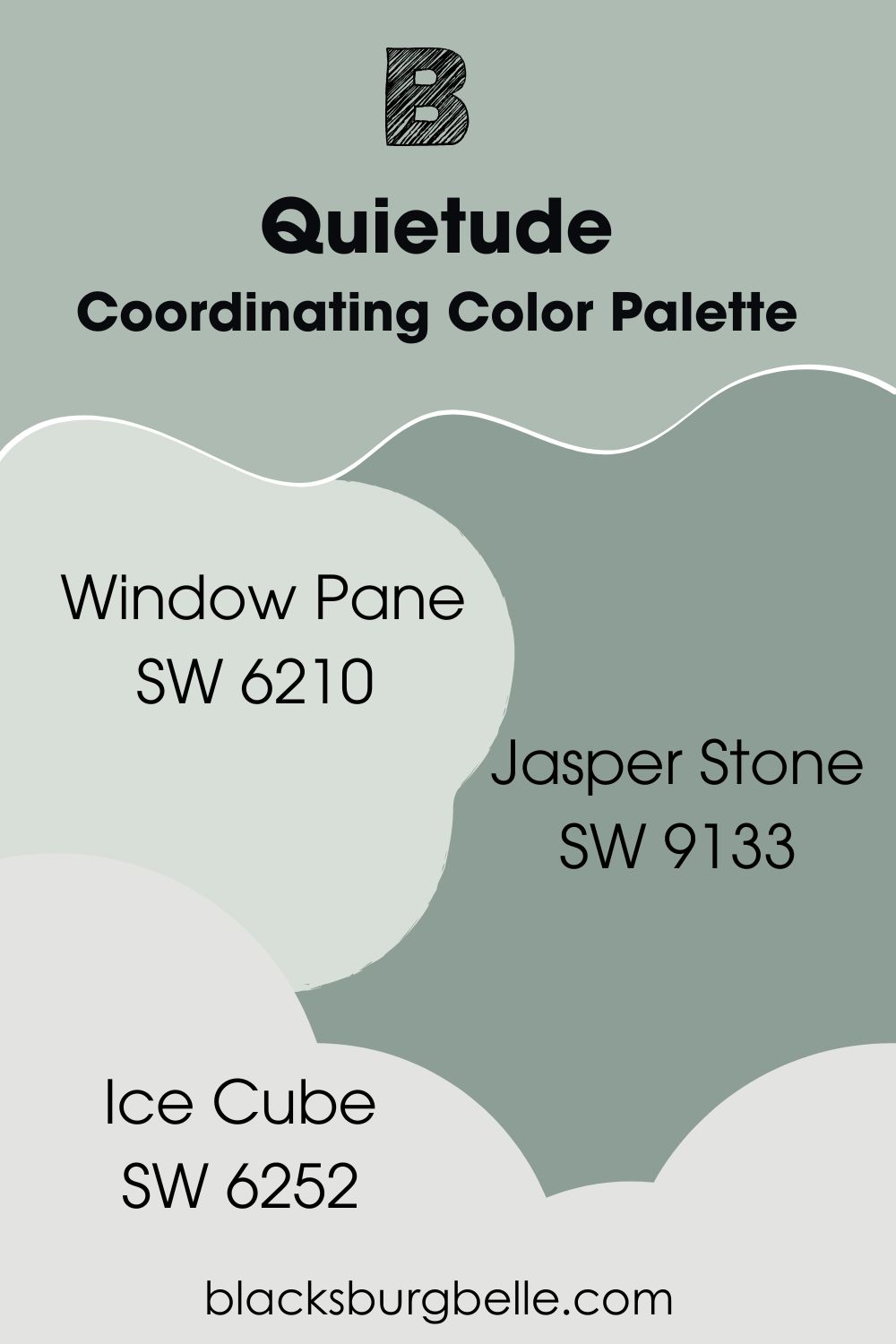
Monochromatic Color Palette
- Sherwin Williams Window Pane SW 6210:This lighter shade to Quietude helps to lift and brighten, creating freshness and light.
- Sherwin Williams Jasper Stone SW SW 9133:Conversely on the darker end of the scale, Jasper Stone adds depth and character.
- Sherwin Williams Ice Cube SW 6252:This cool white with its blue undertones makes for the perfect trim and ceiling color to bring definition and round out the palette nicely.
Sherwin Williams Quietude vs Other Paint Colors
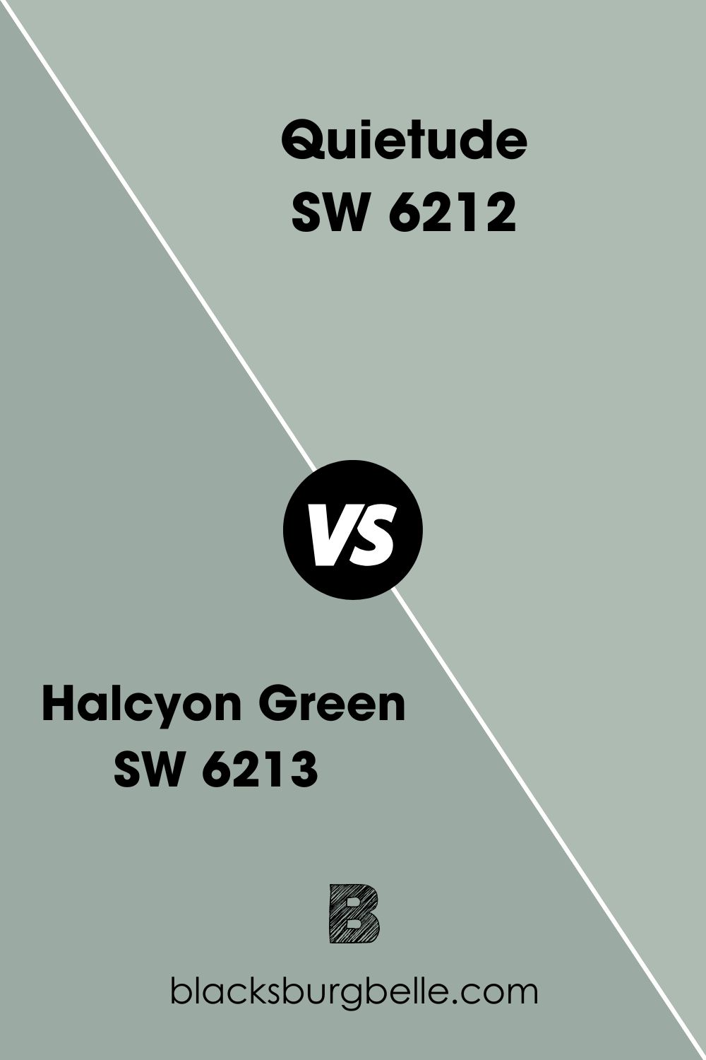
Sherwin Williams Quietude vs Halycon Green
Although both of these colors are what you would consider gray-green, Halcyon Green is not only darker with an LRV of 39 to Quietude’s 48 but also is more saturated in color. While blue and gray undertones and easily seen in Quietude, Halcyon Green is much more of a rich forest green tone.
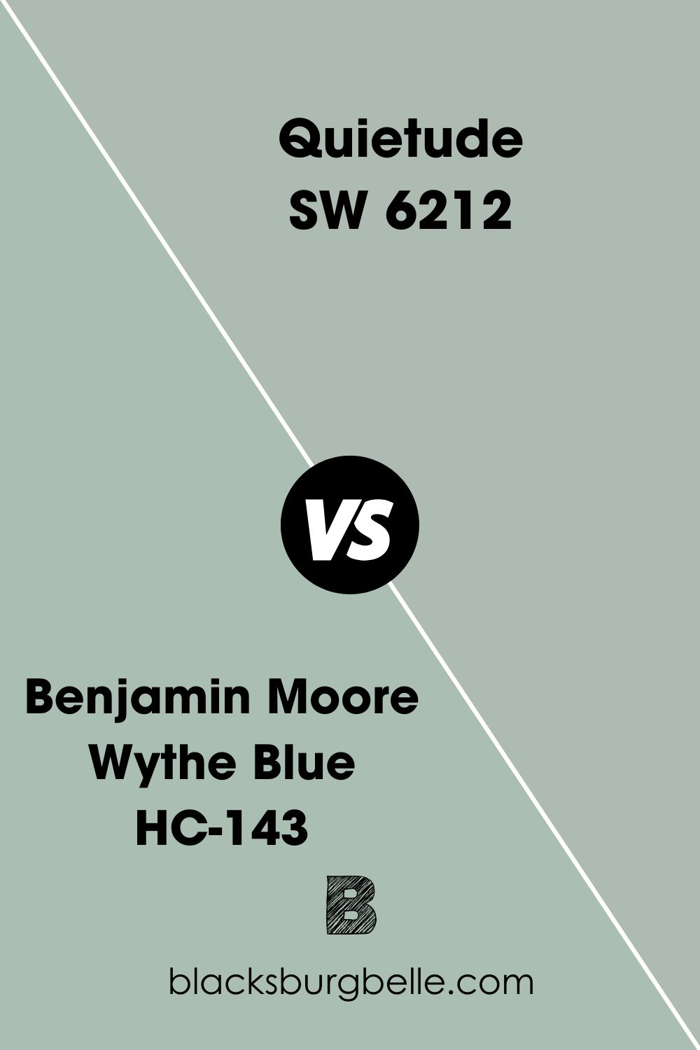
Wythe Blue vs Quietude
One immediate difference between these two paint colors is that Wythe Blue is by Benjamin Moore, and Quietude is by Sherwin Williams. Wythe Blue, as indicated by its name, also picks up more blue notes than Quietude, which definitely leans more towards green.
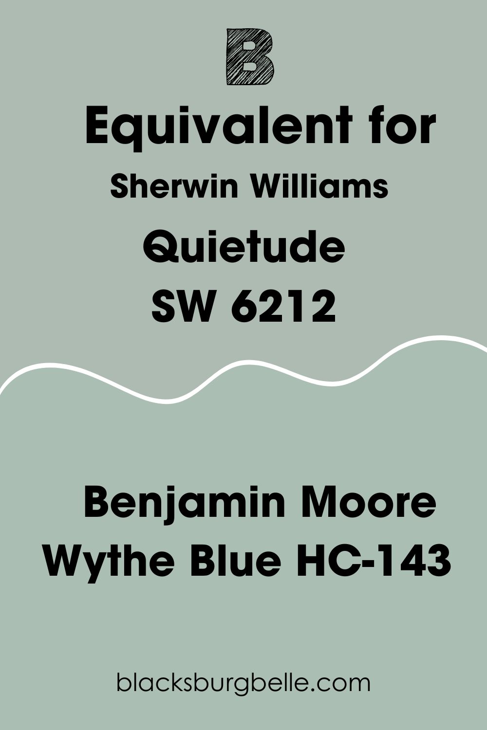
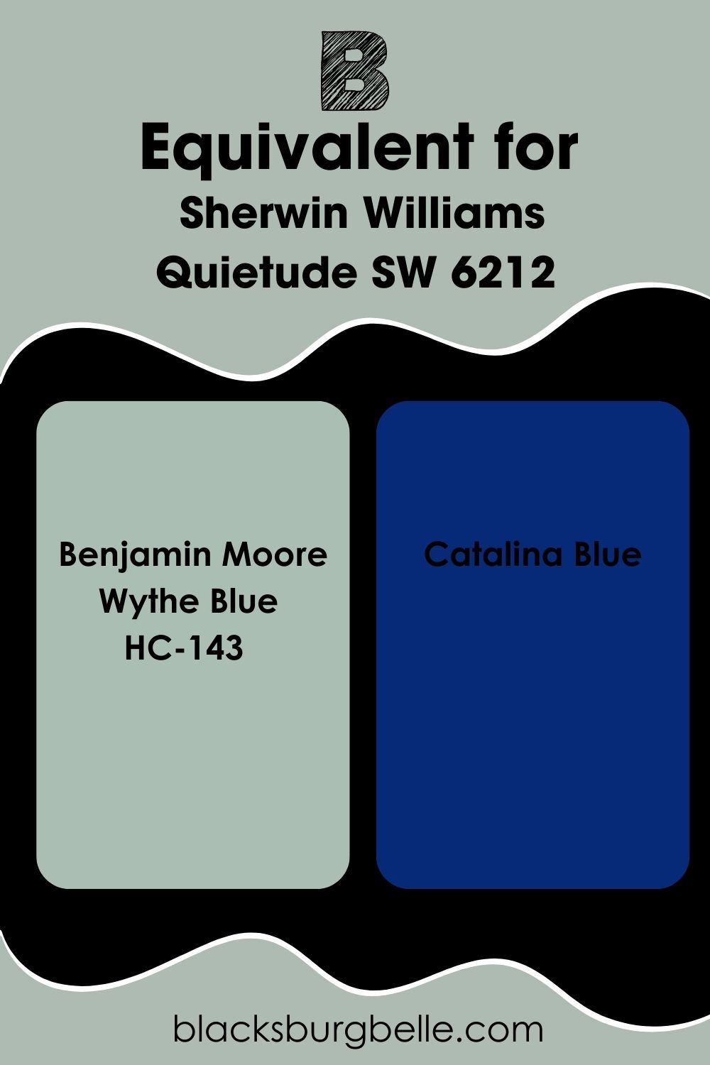
Sherwin Williams Quietude Benjamin Moore Equivalent
You might love Sherwin Williams Quietude but wonder if Benjamin Moore had a similar paint color. If that is the case, then I have you covered!
Although neither is an exact match to Sherwin Williams Quietude SW 6212 there are two paint colors in the Benjamin Moore catalog that are incredibly close.
The first of these colors is Wythe Blue, which shares a similar LRV to Quietude, but just leans more onto the blue and green tones than gray.
The second is Catalina Blue, which again, much like Wythe Blue has a similar LRV but again is just that bit more saturated of a paint color.
Where Can You Use Sherwin Williams Quietude SW 6212?
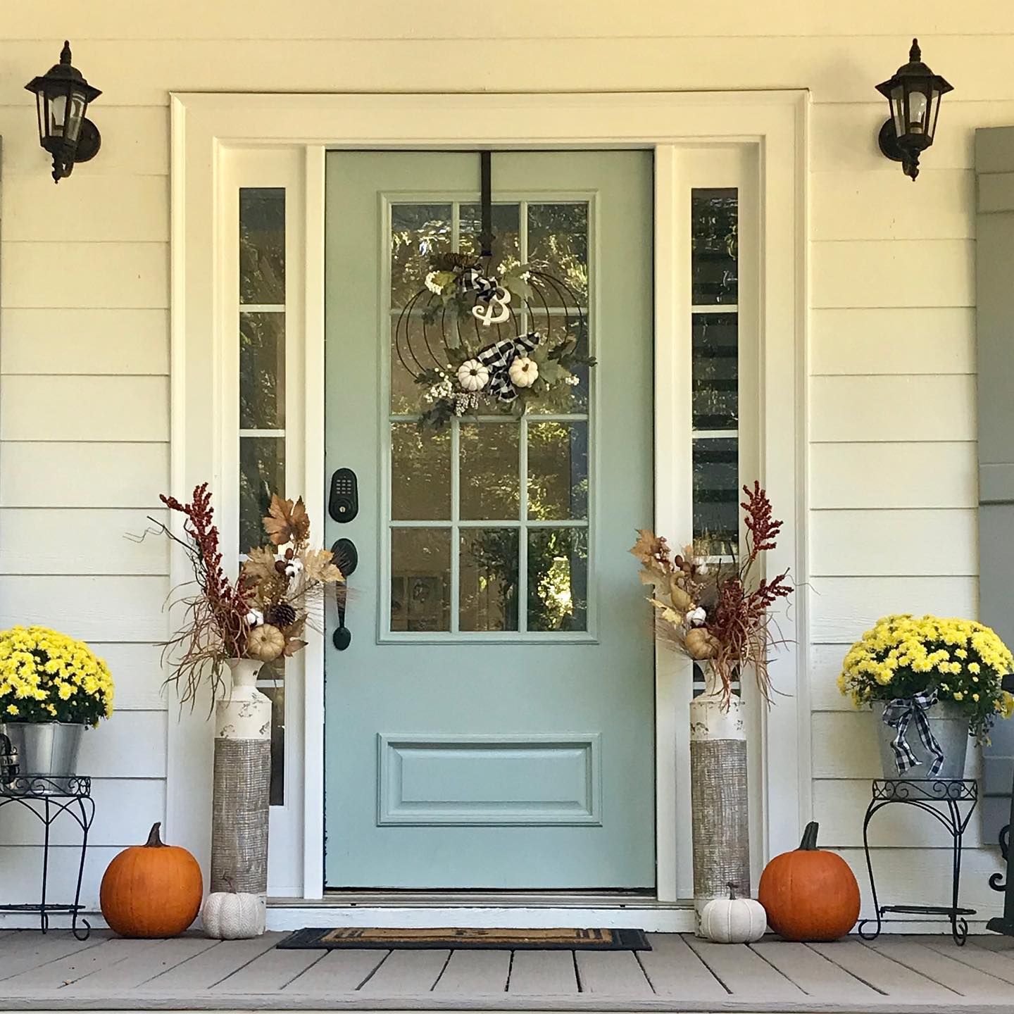
Sherwin Williams Quietude on Doors
One of the most popular ways to use Quietude by Sherwin Williams is to put it on your front door! This adds a pop of inviting color that will ensure that every guest entering your home will feel at ease.
It’s also a way to add playful curb appeal without being too loud and out there!
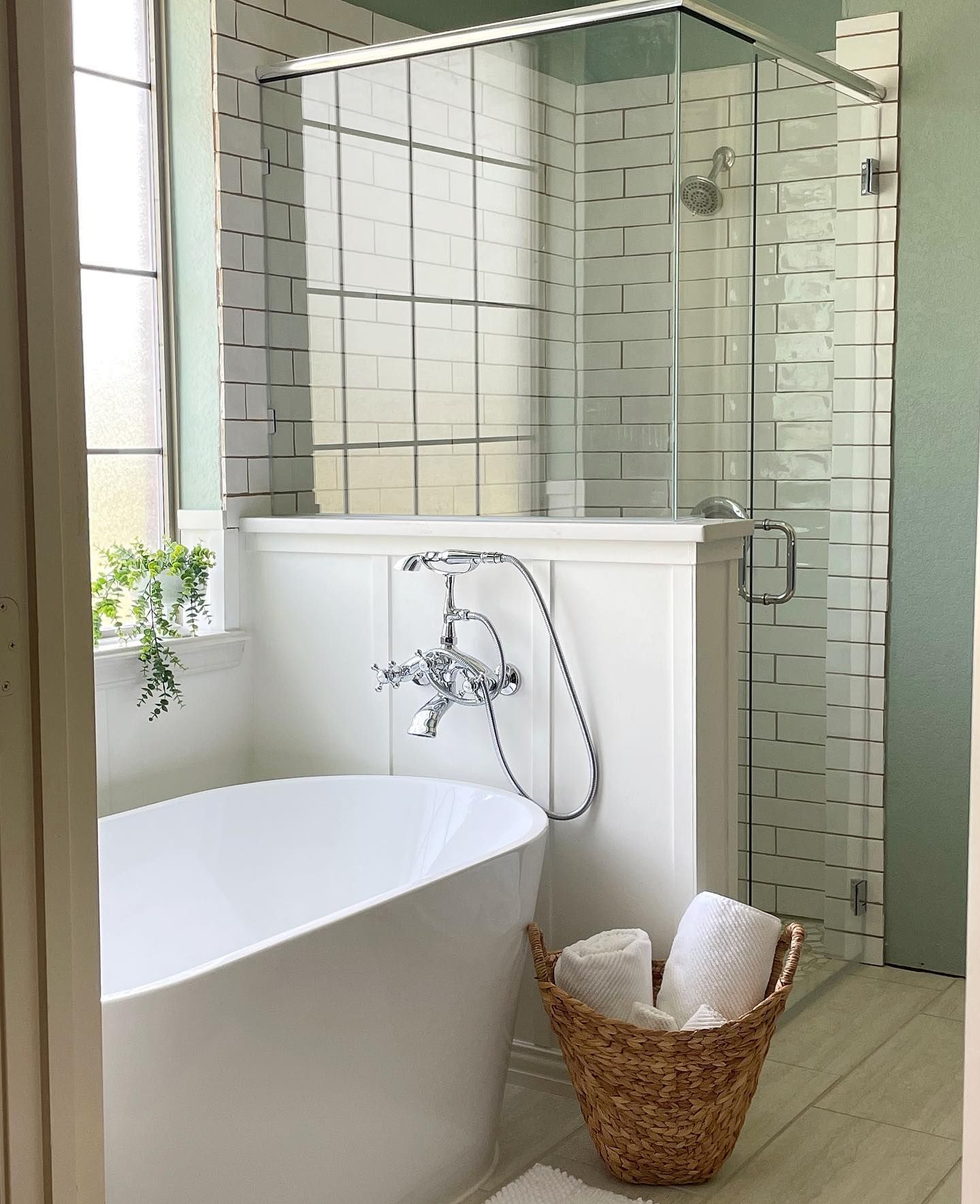
Sherwin Williams Quietude Bathroom
If you are looking for a way to add a pop of color to a white bathroom, why not paint your bathroom cabinets in Sherwin Williams Quietude? This helps to add a focal point in a room that could otherwise feel quite plain.
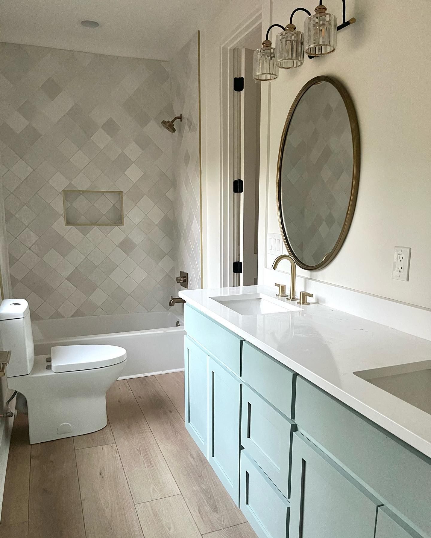
Don’t just stop at the cabinets though, as this example below shows how relaxing a bathroom Sherwin Williams Quietude can make when it’s on the walls. I also think one of the amazing things to note between these two bathrooms is how different Quietude feels as a paint color!
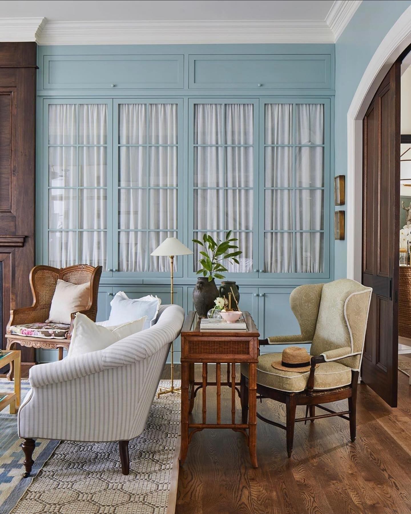
Sherwin Williams Quietude Living Room
Create a bright and inviting entertaining space such as a living room or dining room by using Sherwin Williams Quietude on the walls or on focal pieces of furniture such as this large glass-paneled cabinet.
Quietude also helps to add a vintage vibe, especially when paired with rich dark browns and antique-style furniture such as the ones in this photo below.
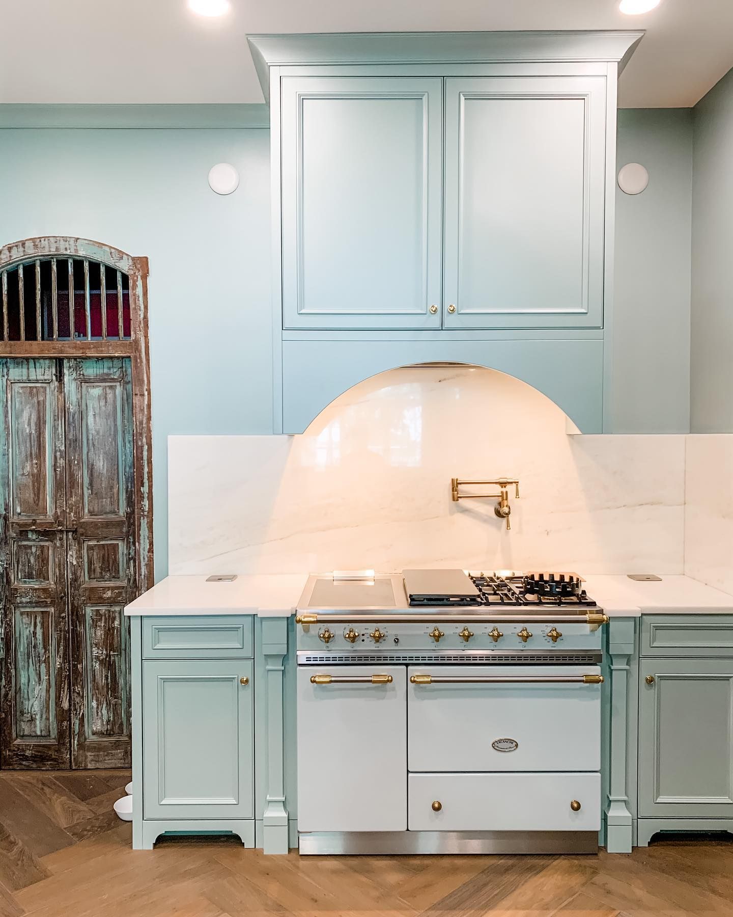
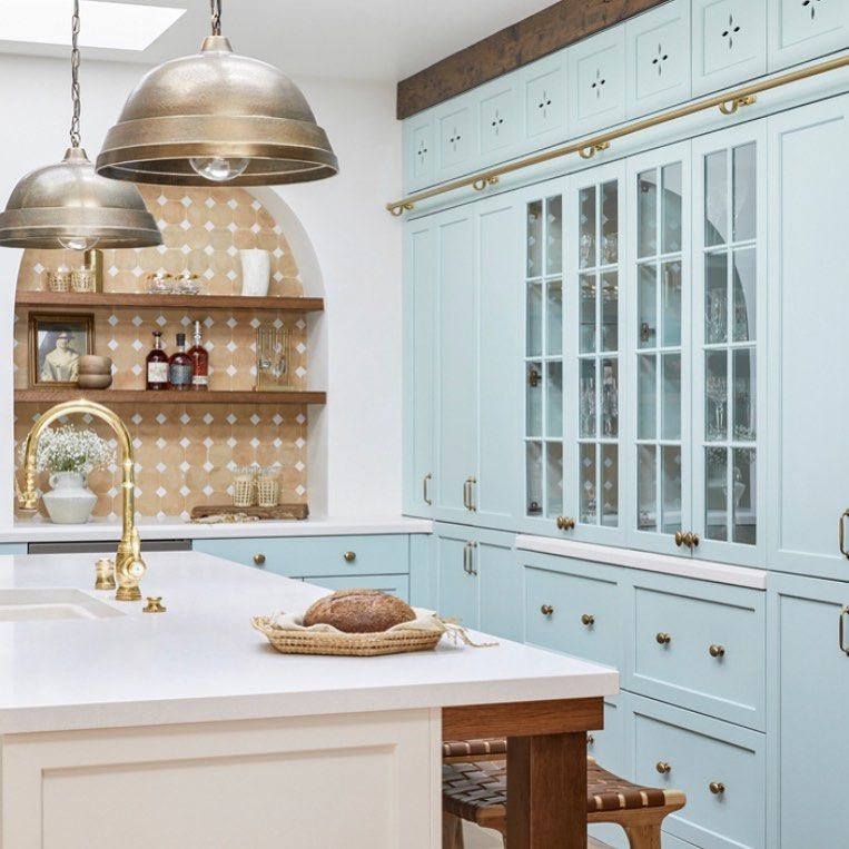
Sherwin Williams Quietude Kitchen
Isn’t this kitchen just stunning? Not only does it show off the fresh, bright, and playful side of Sherwin Williams Quietude on the walls and cabinets, but it also helps to emphasize just how light of a color it actually is when used right!
Sherwin Williams Quietude on Kitchen Cabinets
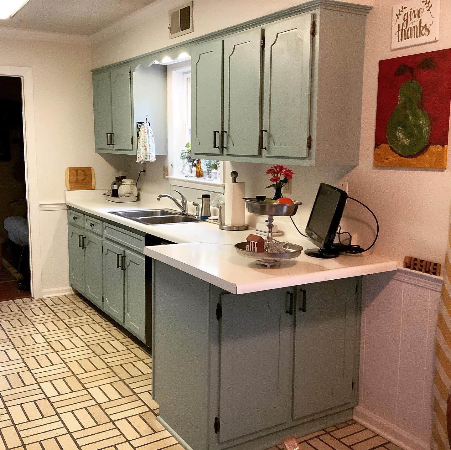
Even if your kitchen doesn’t get as much natural light, Sherwin Williams Quietude can still be a fantastic choice to paint your kitchen cabinets in.
I’ve managed to find an example of a kitchen with not so much natural light, and a kitchen which is filled with it so you can see the difference.
Do you notice how the green comes through much more in the low light, and more of a pastel blue in the bright light? Both have their merits and show why you really can’t go wrong with this color!
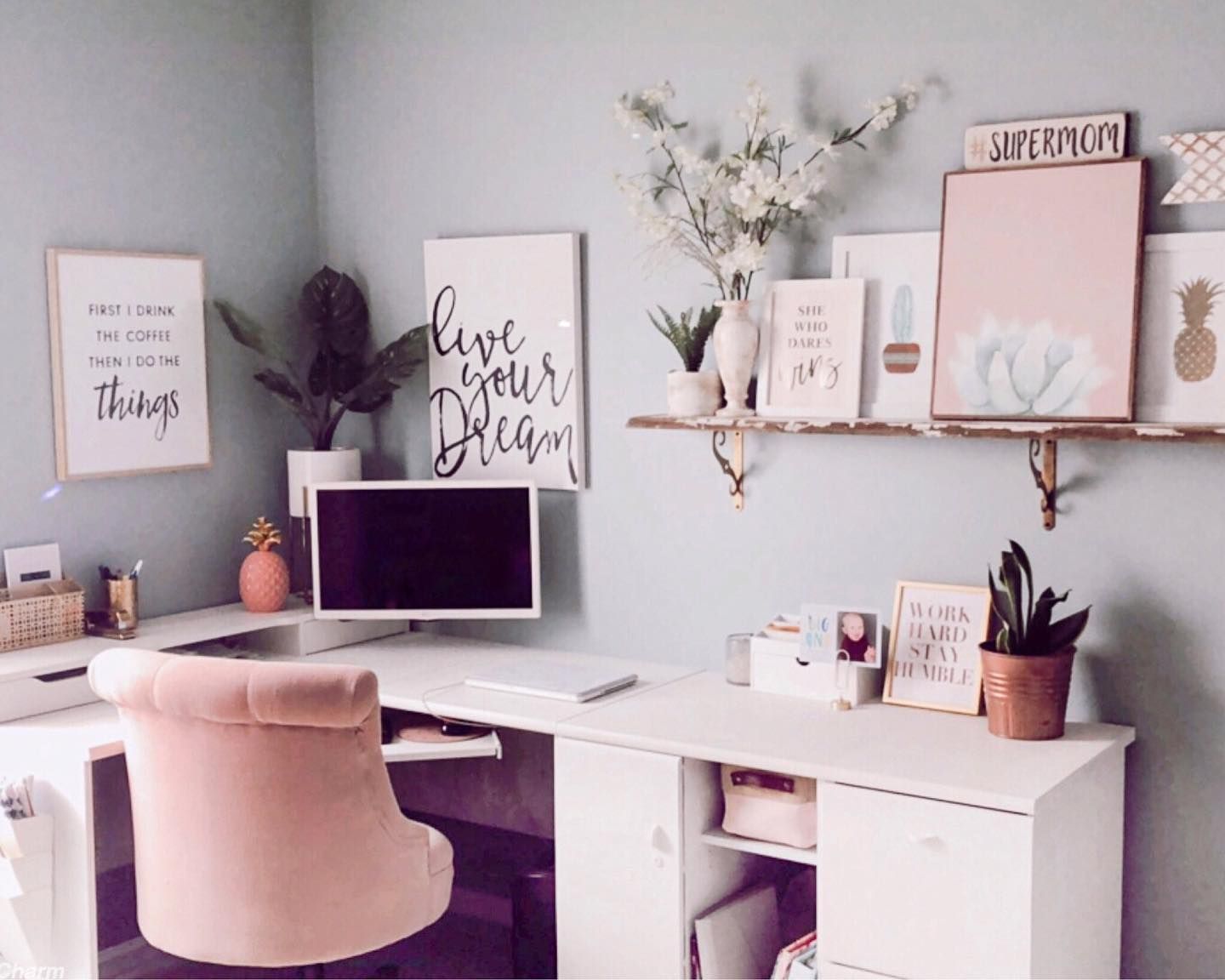
Sherwin Williams Quietude Office
If your office needs a little bit more peace and “Quietude”, then you know exactly what paint color I am going to suggest for you to use! Here with the pink and white accents, it makes for a very feminine office, but switch things up for some darker blues or grays and you’ll have a functional multipurpose space.
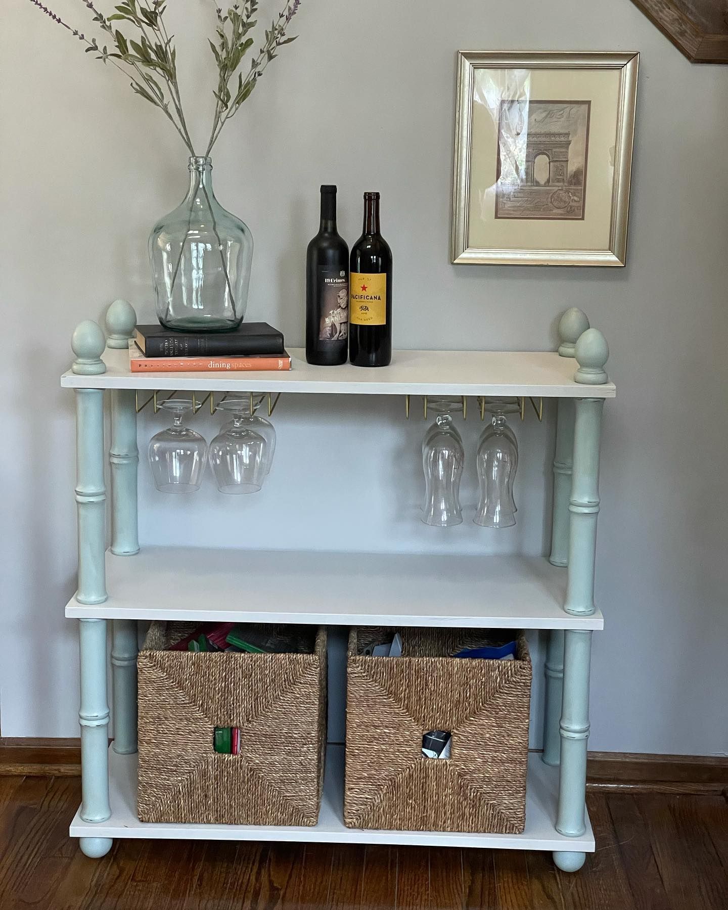
Sherwin Williams Quietude on Furniture
It’s not just walls that appreciate a coat of Sherwin Williams Quietude SW 6212. Try giving some of your furniture a touch-up with this color, either as an accent like in the example I’ve found below, or over the whole thing!
Sherwin Williams Quietude also works really well when it is slightly distressed, easily leaning into that shabby chic vibe.
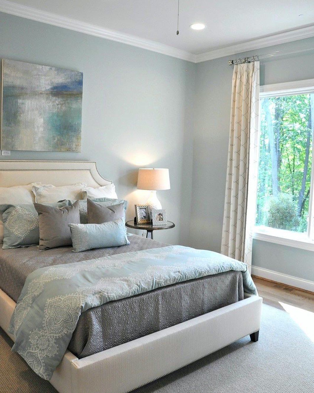
Sherwin Williams Quietude Bedroom
I’ve got 2 bedrooms here to show off to you that use Sherwin Williams Quietude. The first one is really calm and tranquil, using Quietude as the main color to create this relaxing space.
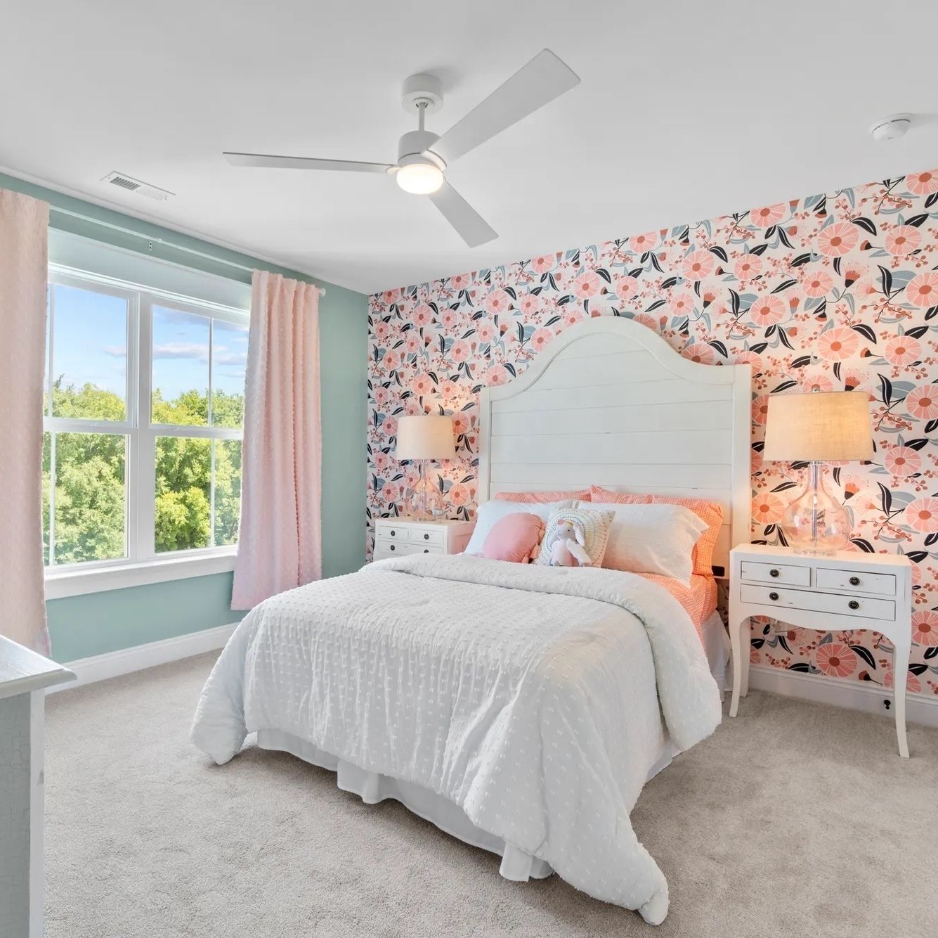
The second one uses Sherwin Williams Quietude as an accent color, allowing this vibrant pink wallpaper to shine! If you want a super girly bedroom for yourself or for a little one you can definitely take inspiration from how Quitude has been employed!
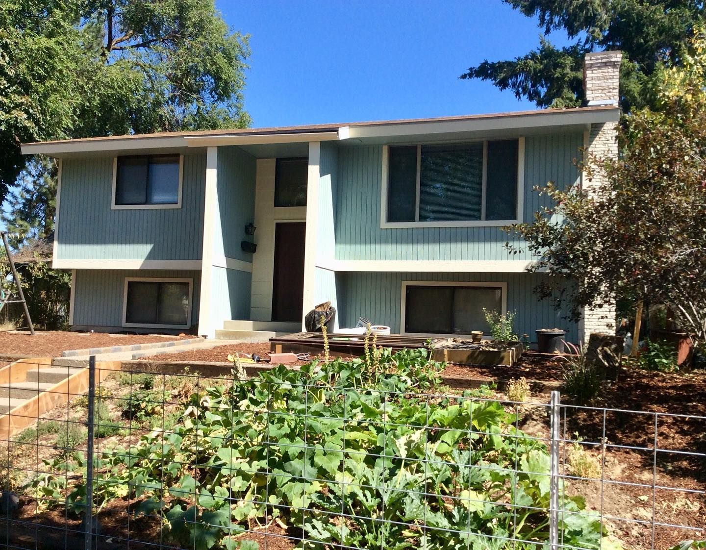
Sherwin Williams Quietude Exterior
Don’t just keep Sherwin Williams Quietude indoors, it also loves being on the outside of your property too! On this home, it’s been used as the main color on the boards, with a crisp white trim to bring everything together and brighten things up.
Conclusion
By the end of this paint color review, I hope you are as in love with Sherwin Williams Quietude SW 6212 as I am!
This gorgeous, calming green neutral has so many facets to it, either creating mystery by leaning into its gray undertones, or a bright, pastel playfulness when it picks up on the blue shades within it.
Personally, I am such a massive fan of the chameleon-like nature of Quietude. It makes me not want to whisper, but really shout out loud about the amazingness of this paint color by Sherwin Williams!
Hopefully, I have you on board the Sherwin Williams Quietude train with me, but if you are still on the fence, I seriously do recommend going out there and getting a few sample pots to try. I guarantee you’ll be pleasantly surprised!
 Sherwin Williams Eider White (Palette, Coordinating & Inspirations)
 Sherwin Williams Worldly Gray (Palette, Coordinating & Inspirations)
 Sherwin Williams Greek Villa (Palette, Coordinating & Inspirations)
 Sherwin Williams Aesthetic White (Palette, Coordinating & Inspirations)
 Sherwin Williams Egret White SW 7570: Review & Inspiration
 Sherwin Williams Escape Gray SW 6185: Review & Inspiration
