
Neutral paint colors remain one of the best options when trying to pick a color for your home. But sometimes, the right neutral for your space might not be among the most popular ones. Sherwin Williams Pediment is an example of such a case. As usual, I have gotten you all the details about the paint color.
Sherwin Williams Pediment sits comfortably on the taupe side of colors. However, the paint color offers much more than warmth and appearance. It can easily add a soothing, laid-back vibe to your space.
Well, that’s the short of it. If, like me, you prefer the long and comprehensive side of the story, keep reading. Join me as I dive into this lovely neutral. We will explore its looks, undertones, similar colors, and more in this Sherwin Williams Pediment Paint Color Review.
Table of Contents
When to Choose Sherwin Williams Pediment (SW 7634)
Most times, knowing the details of a color doesn’t equate to knowing when to use it. Fortunately for Pediment, I’ve checked countless pictures and used the paint color well enough to answer this question.
So, when is the best time to choose Sherwin Williams Pediment?
Want a moderately bright taupe?
Sherwin Williams Pediment has a medium to bright tone. This makes it fit for this requirement, especially since you have to worry less about lighting.
Working with abundant light?
Speaking of lighting, Pediment has an LRV of 61, which makes it suitable for both dim and well-lit spaces. This makes the paint color more versatile in both home and work spaces.
Note that this doesn’t mean the paint color won’t look better in areas with adequate lighting.
Want some balanced coziness?
Pediment has cozy vibes, which makes it lovely in any area, especially interior spaces. However, the paint color can sometimes display a bit of cool undertones. This gives it a sort of balanced coziness.
Do you mind some purple and pink?
Sherwin Williams Pediment has some elements of purple and pink undertones that can show up. Rock this paint color if you don’t mind having these tones in your space or walls.
Looking to style a bedroom or bathroom?
Pediment works best in bedrooms and bathrooms because of its calm, relaxing vibe. You can consider the paint color if you’re working on any of the spaces.
What Color is Sherwin Williams Pediment?
Sherwin Williams Pediment is a light taupe shade with a wonderful soft touch in any space. It has lovely undertones that give it a unique feel in homes. This is one of the reasons why the paint color excels more in areas like bathrooms and bedrooms.
While some people mistake it for a greige color, Pediment doesn’t fully fit that look. Instead, the paint color looks slightly different and offers almost as many options and flexibility.
Do you know that despite its cozy appearance, Pediment has some blue in it? These tones are largely responsible for its calm vibe. Don’t worry, they are not strong enough to overwhelm its look in any area. In fact, Pediment’s undertones make it pair nicely with both warm and cool paint colors.
Snapshot of Pediment Specifications
Let’s look at Pediment’s core details. These specifications tell a sort of summarised tale of any paint color.
| Specifications | Pediment |
| RGB | 211 / 204 / 196 |
| HEX Value | #D3CCC4 |
| LRV | 61 |
| Undertones | Pink and Purple (Undertones can sometimes look violet and blue) |
The LRV of Sherwin Williams Pediment
When it comes to understanding any paint color, you need to know its LRV. What does this term mean?
A paint color’s LRV refers to its Light Reflectance Value. Light plays an irreplaceable role in how any paint color appears. LRVs show how strongly the color reflects or absorbs light (depending on how you see it.)
LRV runs on a scale of 0 – 100. 0 represents true black, and 100 indicates true white. This means that the lower the value, the darker the color, and vice versa.
Sherwin Williams Pediment has an LRV of 61. This value puts it in the medium to light range on the LRV scale. With such a value, Pediment can do well in both bright and dim-lit spaces. This increases its versatility and makes you worry less about the paint color’s viability.
Undertones of Pediment (SW 7634)
Depending on the lighting and color pairings, Sherwin Williams Pediment can display different undertones. However, I see them as simply shades of similar tones that can sometimes lean into each other.
Sherwin Williams Pediment has mild pink and purple undertones. In some areas or depending on the time of day, these undertones can sometimes look violet or blue. Regardless, they are not strong enough to look overwhelming.
In north-facing rooms, the paint color shows more gray tones than usual. This is because of the prevalent cool look of such rooms.
On the other hand, south-facing rooms bring out more of its undertones.
Does Pediment have Cool Undertones?
Sometimes, Sherwin Williams Pediment’s purple undertones can lean into blue. While this should look cool, it does little to change the paint color’s warm vibe.
Will Pediment Look Pink on My Walls?
Although it can look pink on walls, Sherwin Williams Pediment won’t lean all the way into it. However, if you don’t want any shade of pink or purple on your walls, avoid using Pediment. The paint color will display its undertones regardless.
Is Pediment a Warm or Cool Color?
Sherwin Williams Pediment is a warm neutral. The taupe paint color reads warm in any space, regardless of color pairings and lighting. Its warmth gives it a well-grounded sense of coziness that makes the paint color soothing and welcoming.
With a well-placed LRV, Pediment’s warmth feels right in both interior and exterior spaces. The lovely neutral has impressive versatility, pairing nicely with both warm and cool colors. Do you know the paint color fits well into nature-inspired palettes and decor?
Yes, it does. And not only that but you can also Pediment for a cozy and homely feel. However, note that the paint color’s warmth will remain evident.
Sherwin Williams Pediment Color Strip: Lighter or Darker Exploration
Color strips consist of several colors with similar properties and a few differences. While they might have close appearances, members of the same color strip have different shades. Sometimes, they can also have differing undertones.
The beauty of these strips is that the colors can pair nicely with each other for a monochromatic palette. Also, you can always use it to check for a darker or brighter version of your paint color.
These are the members of Pediment’s color strip, from the brightest to the darkest:
- Sherwin Williams Pure White (SW 7005)
- Sherwin Williams Alabaster (SW 7008)
- Sherwin Williams Westhighland White (SW 7566)
- Sherwin Williams Egret White (SW 7570)
- Sherwin Williams Pediment (SW 7634)
- Sherwin Williams Crushed Ice (SW 7647)
- Sherwin Williams On The Rocks (SW 7647)
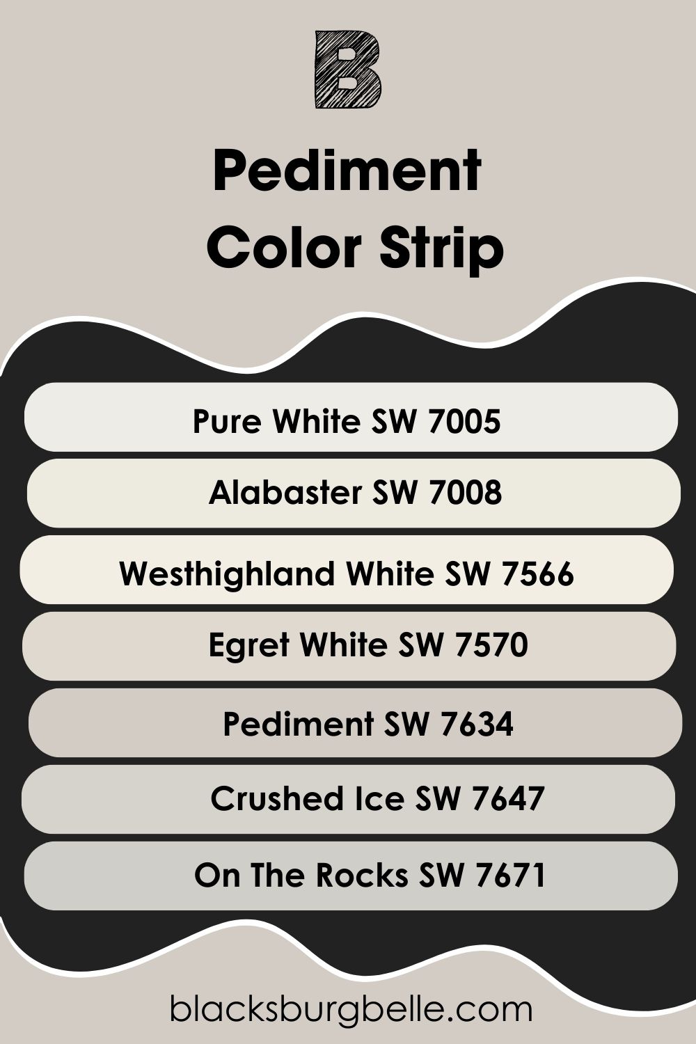
From the above list, you can see that Pediment’s color strip has some popular members. Paint colors like Pure White and Alabaster are very popular among homeowners and decor experts.
Did you know that Sherwin Williams Pediment has one of the strongest gray tones of its strip members? This makes it a more grounded neutral compared to the others.
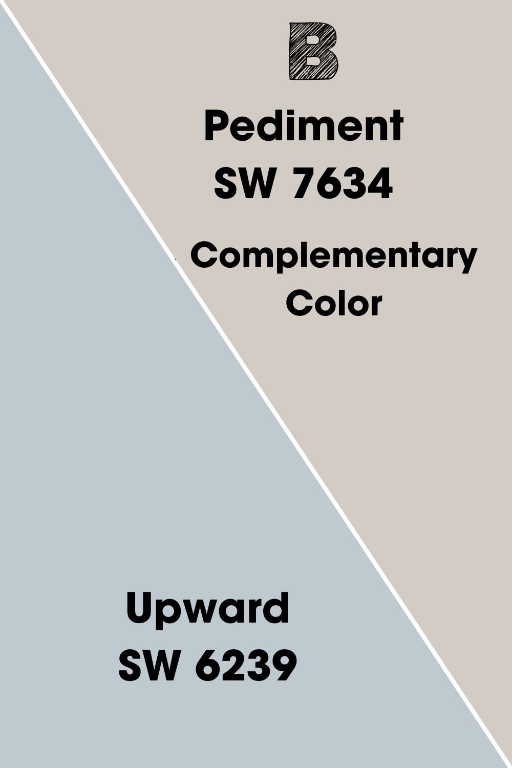
Pediment’s Complementary Color
Colors that complement each other give the best contrast when paired up. This also gives them a better overall look than using them separately. Understanding complementary colors is important to fully actualize your main color’s potential.
Examples of colors that complement each other include:
- Yellow – Purple
- Orange – Blue
- Red – Green
Pediment’s complementary color is Sherwin Williams Upward. Here’s a quick rundown of the paint color.
Sherwin Williams Upward (SW 6239)
Upward is a bright denim blue paint color, with an LRV of 57. The cool paint color brings a dreamy vibe to any space. Mild gray undertones give the Upward a relaxing feel that won’t disappear in bright light.
In case you are wondering, Sherwin Williams Upward works wonders in interior and exterior spaces. It pairs nicely with warm and cool paint colors too. I personally prefer the soothing blue on walls, regardless of the space or area.
If you are considering a cool, dreamy vibe or spa-inspired vibe, check out Sherwin Williams Upward.
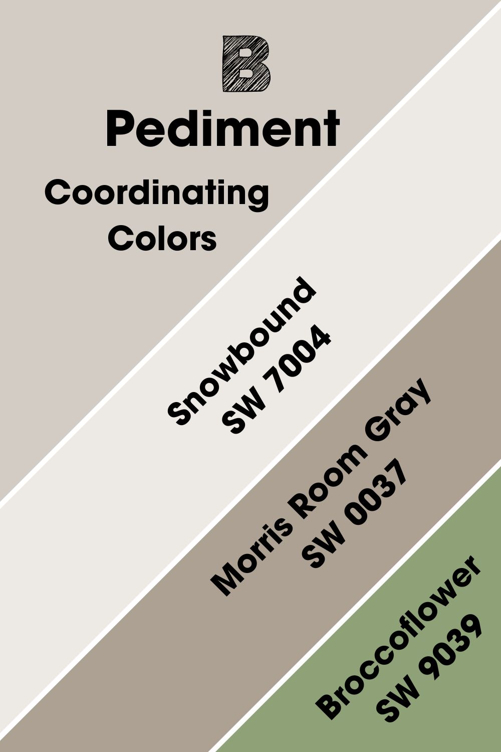
Sherwin Williams Pediment (SW 7634) Coordinating Colors
Coordinating colors help your main paint color look better than when you use it alone in a space. Not only that, but they also give a significantly more pleasing look to the area. You can perceive them as ingredients that help make your food tastier and delicious.
While you can have one hue that complements your color, you can have several coordinating colors. More often than not, you will work with around 3 – 4 coordinating colors at most. That said, here are some pretty lovely choices for Pediment:
- Sherwin Williams Snowbound (SW 7004): Snowbound is a popular, bright white that looks beautiful in any space. The cool paint color has gray undertones that prevent it from looking creamy. Instead, they give it a dreamy vibe. You can sometimes notice some pink in it, which is its source of mild warmth.
- Sherwin Williams Morris Room Gray (SW 0037): Morris Room Gray is a medium to dark gray with an LRV of 37. The lovely neutral has some warm green elements, giving it a welcoming sense of warmth.
- Sherwin Williams Broccoflower (SW 9039): Broccoflower is a beautiful shade of sage green. The paint color has an LRV of 33 and works best in interior spaces. It fits nicely into nature-inspired palettes and decor.
Sherwin Williams Pediment Color Palette
Pediment works well with several other colors and in multiple spaces. This makes it less challenging to use it in many palettes. You can work towards a colorful and cheerful vibe or something more cozy and monochromatic.
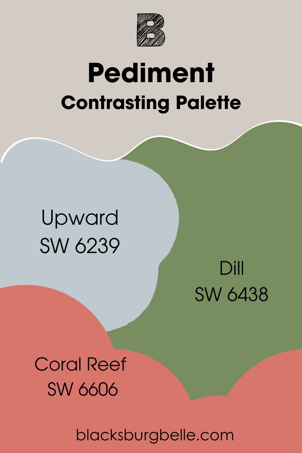
Contrasting Palette
- Upward SW 6239: Remember this paint color from the complementary section? What better way to kickstart a contrasting palette than using one of the best contrasting hues for Pediment? Sherwin Williams Pediment pairs nicely with Upward for a mildly balanced look.
- Dill SW 6438: Sherwin Williams Dill belongs to the same color strip as Broccoflower. The deep shade of green has a beautiful feel in interior spaces. You can also flex it on woodwork for some extra versatility.
- Coral Reef SW 6606: This energetic red brings some extra color to the palette. Together with the others, you can set a cheerful vibe in any space. Consider this palette for children’s rooms or spaces that need some energy infusion.
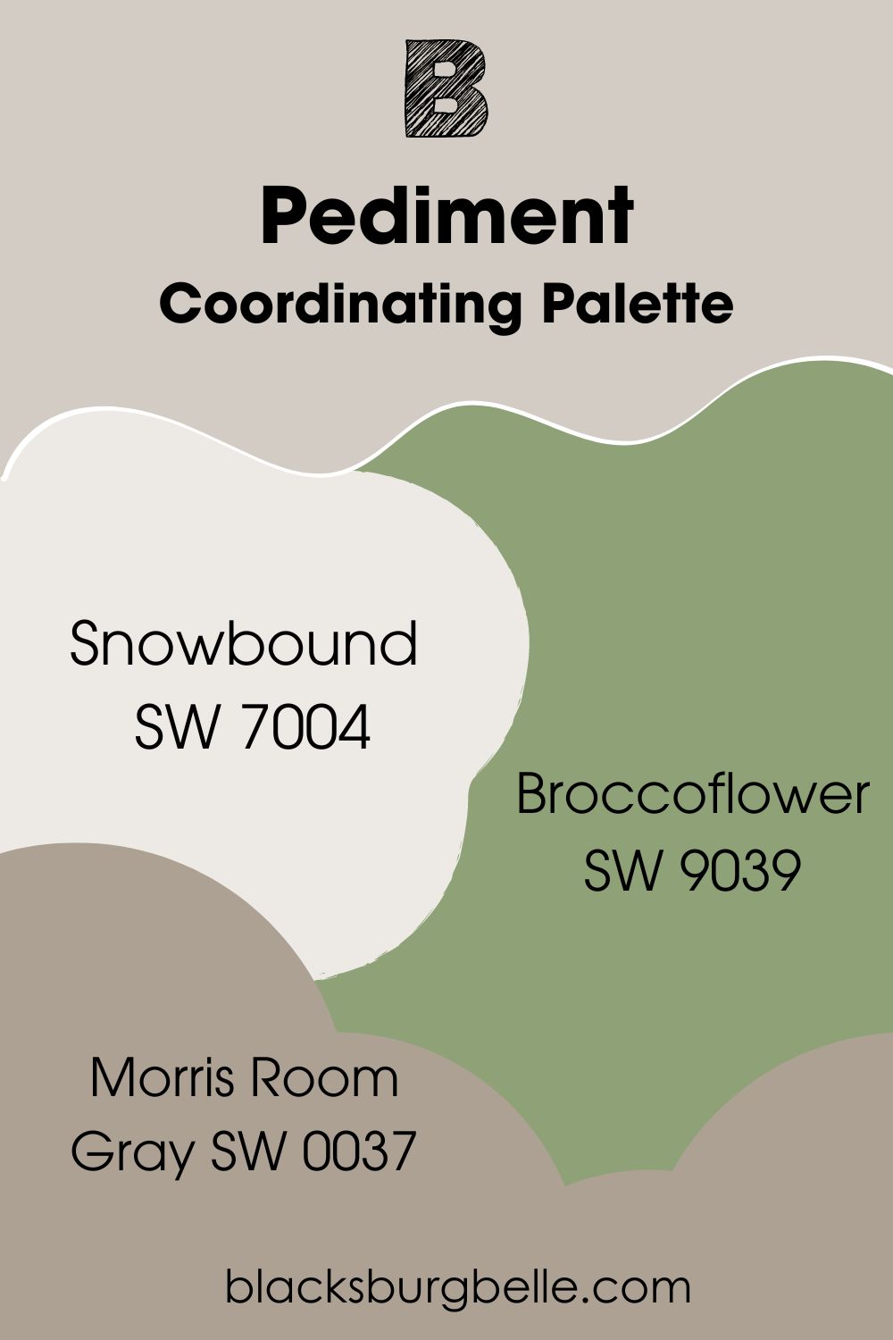
Coordinating Palette
- Snowbound SW 7004: The bright, cool white has the highest versatility of the members of this palette. Sherwin Williams Snowbound works best on the walls for this palette. You can also use it as a trim for the darker members.
- Morris Room Gray SW 0037: This warm neutral works well in interior and exterior spaces. It gives a cozy feel and an anchor of sorts to the overall look of the palette. Morris Room Gray adds an artistic touch to any space.
- Broccoflower SW 9039: This beautiful green adds some extra color to the palette and your space. It also fits well into a spa vibe or nature-inspired look. When paired with Pediment gives a cozy overall feel.
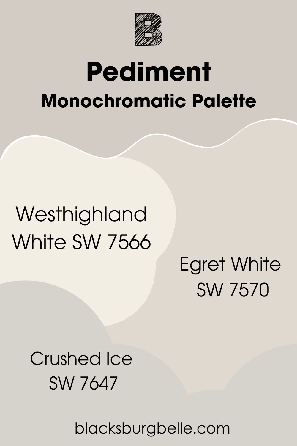
Monochromatic Palette
- Westhighland White SW 7566: With an LRV of 86, Sherwin Williams Westhighland White is the brightest member of this palette. The clear white has mildly creamy tones and pairs with almost any paint color. However, it works best as a trim instead of a main paint color.
- Egret White SW 7570: Despite its name, Sherwin Williams Egret White is a versatile off-white paint color. It has gray undertones that give it a stony look in dim-lit spaces. The paint color works in both interior and exterior spaces.
- Crushed Ice SW 7647: Sherwin Williams Crushed Ice is an off-white with an LRV of 66. It has mainly gray undertones and reads cool in any space. The paint color pairs nicely with the other members for a balanced, soothing look.
Sherwin Williams Pediments vs. Similar Paint Colors
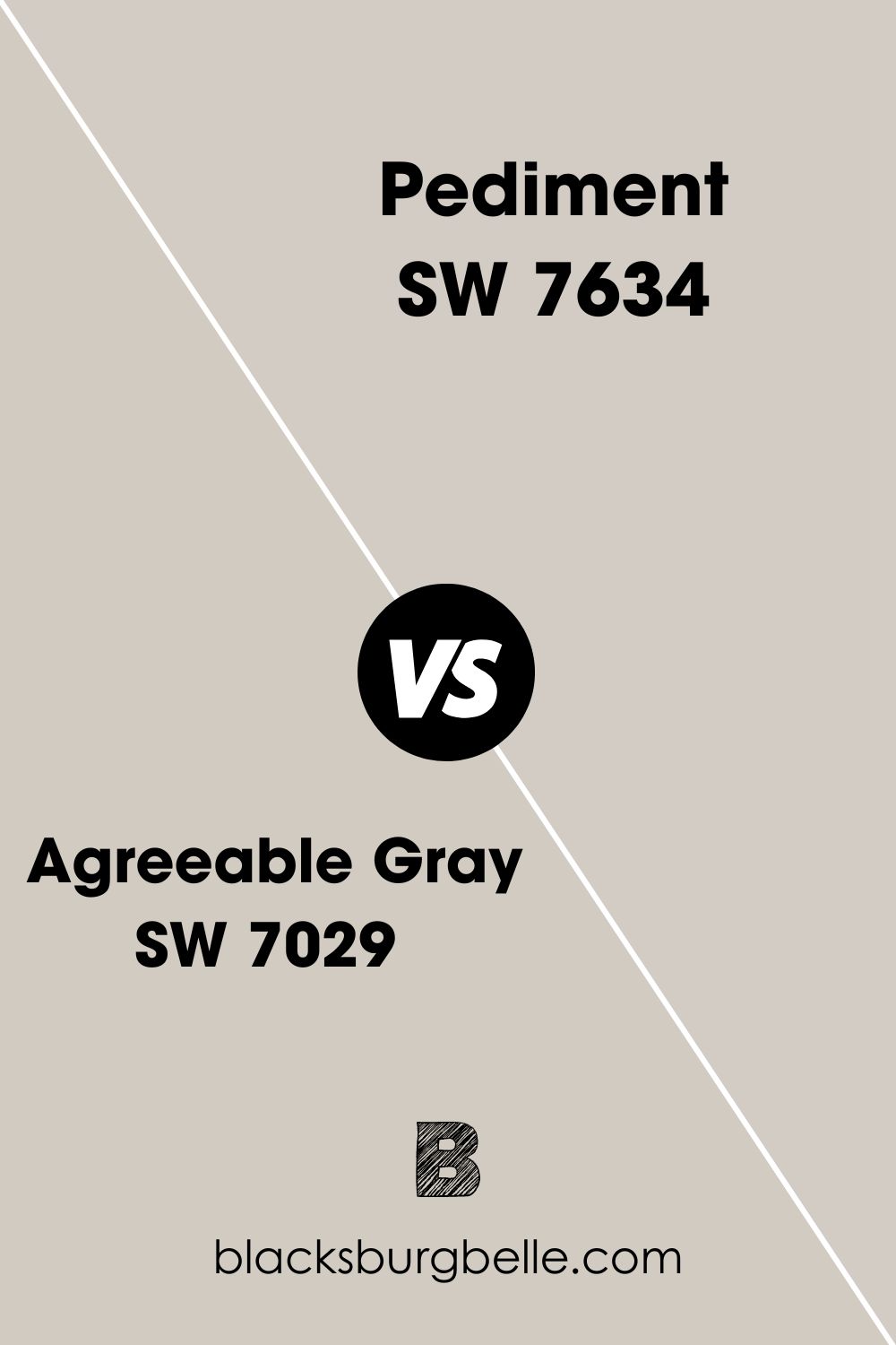
Agreeable Gray vs. Pediment
Although both paint colors have cozy vibes, Agreeable Gray has stronger warmth and coziness. Also, Sherwin Williams Agreeable Gray has beige undertones, unlike Pediment’s purple and pink. When it comes to popularity, Agreeable Gray is miles above Pediment.
Modern Gray vs. Pediment
Sherwin Williams Modern Gray sits at the perfect LRV of 62. The paint color looks good in any lighting and gives a more balanced look than Pediment. Modern Gray is the better option if you want a lovely neutral backdrop.
Colonnade Gray vs. Pediment
Sherwin Williams Pediment has a significantly higher LRV and, as such, is brighter. Colonnade Gray has more depth and stronger coziness. For use on cabinets and woodwork, Colonnade Gray does it better.

Repose Gray vs. Pediment
Despite its warmth, Repose Gray looks less cozy compared to Pediment. The paint color also has a higher percentage of gray tones. This gives it a more neutral look, making it more versatile than Pediment.
Egret White vs. Pedimen
Sherwin Williams Egret White is the brighter paint color of the two. On the other hand, this means that Pediment has more depth and coziness. Both paint colors have around the same versatility.
Sherwin Williams Pediment Benjamin Moore Equivalent
You will not find a Sherwin Williams Pediment Benjamin Moore Equivalent. However, the brand has something quite similar. Don’t worry, I checked it out for you.
Benjamin Moore Kitten Whiskers 1003
Kitten Whiskers is a bright cool gray with mildly warm undertones. The paint color generally gets its coziness from its soft pink undertones. However, lighting and color pairings can make it look warmer than usual.
Compared to Pediment, Kitten Whiskers looks brighter and significantly cooler. It works well in interior and exterior spaces too. I believe both paint colors have the same versatility since Kitten Whiskers also pairs with warm and cool colors.
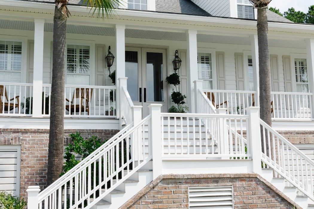
Sherwin Williams Pediment Exterior
The picture below shows Sherwin Williams Pediment looking soft and cozy on the window shutters. The paint color has a lovely effect when paired with bright white and this picture confirms it.
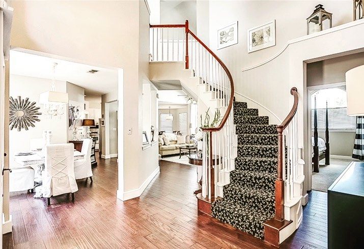
Sherwin Williams Pediment Living Room
Although it has good warmth and coziness, Pediment can look less warm in bright natural light. The picture below shows the paint color in a spacious, well-lit living room. Notice how it looks less intense but still exudes warmth subtly.
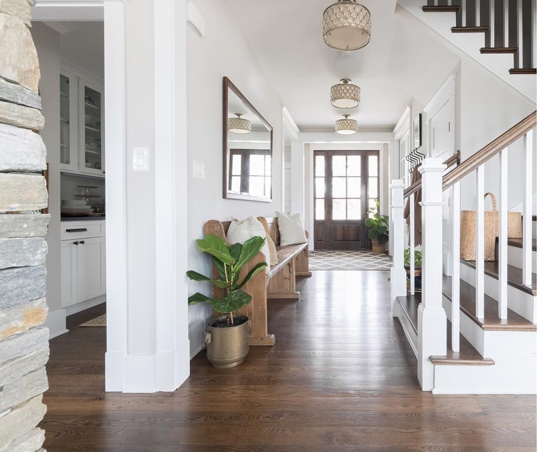
On the other hand, the second picture shows the paint color in a less-lit space. Notice how it shows its warmth and coziness strongly.
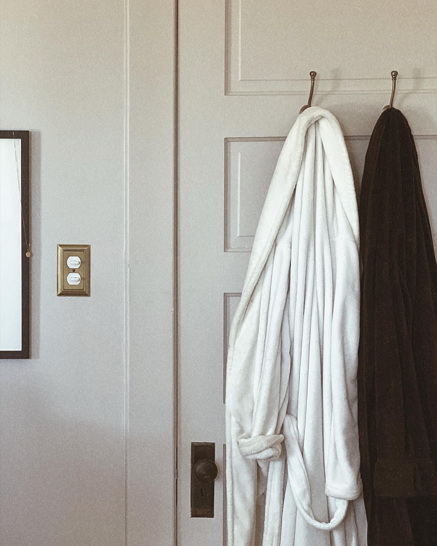
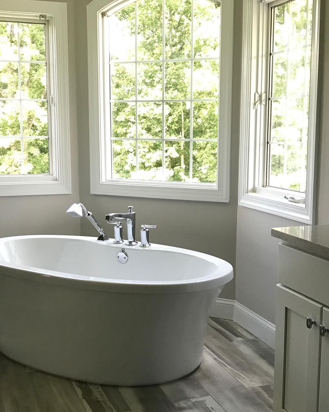
Sherwin Williams Pediment Bathroom
This paint color feels perfect for bathrooms. As you can see in the picture below, the inviting and relaxing vibe of Sherwin Williams Pediment fits right into the space.
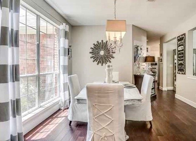
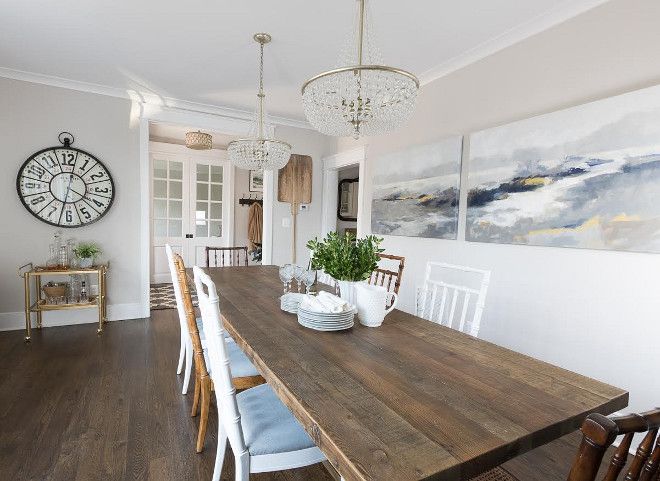
Sherwin Williams Pediment Dining Space
Despite its coziness, Sherwin Williams Pediment doesn’t overwhelm the vibe in any space. The paint color looks homely and stylish in the pictures below.
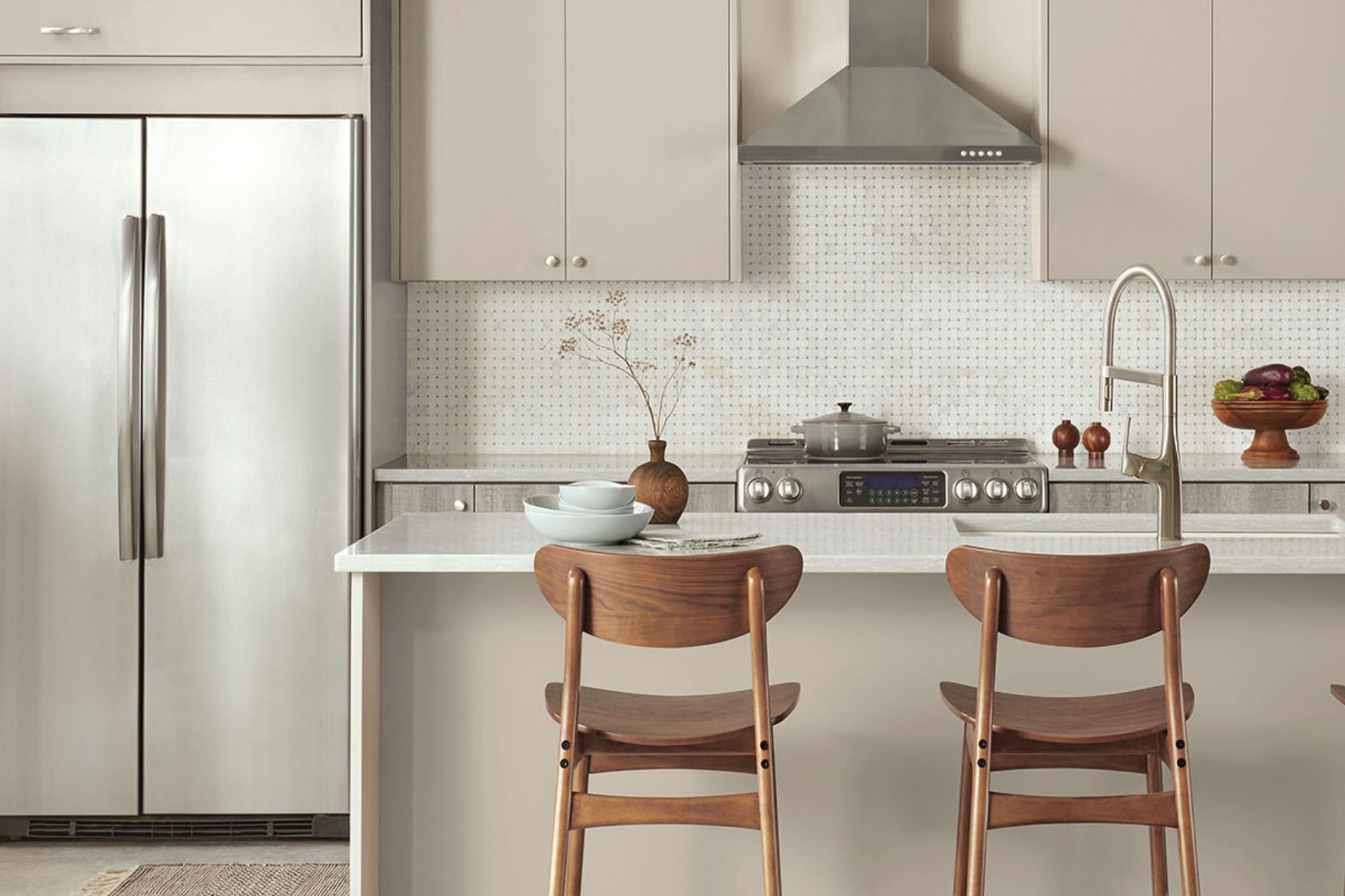
Sherwin Williams Pediment Kitchen
As the picture below shows, Sherwin Williams Pediment doesn’t look good on walls only. The paint color does well on cabinets and other woodwork in the home.
Conclusion
Sometimes you can feel like using a paint color that isn’t too popular. The reason could be as simple as personal preference. However, this doesn’t make it any less important. The good news is that Sherwin Williams Pediment isn’t the most popular taupe out there.
The paint color offers a calming vibe and coziness that fits right into almost any space. Whether you are considering it for a workspace or bedroom, you should give it a try. However, remember to sample the paint color first.
In case you’ve got any other questions for me, leave them in the comments section and I’ll answer them all.
 Sherwin Williams Sea Salt (Palette, Coordinating & Inspirations)
 Sherwin Williams City Loft (Palette, Coordinating & Inspirations)
 Sherwin-Williams Dovetail (Palette, Coordinating & Inspirations)
 Sherwin Williams Greenblack (Palette, Coordinating & Inspirations)
 Sherwin Williams Pure White SW 7005 Review
 Sherwin Williams Marshmallow SW 7001 Review & Inspiration
