
Finding a perfect neutral base for your design project can be tough. It needs to be able to pair with a multitude of complementing colors, as well as help tie the space together.
This is why Egret White SW 7570 from Sherwin Williams is such a fantastic paint choice. Although it has stony undertones, it still adds warmth and its super versatile nature means it fits perfectly in outside spaces as well as inside the home. Safe to say, I’m obsessed!
Keep reading to learn all of the ways Egret White paint from Sherwin Williams could be the white you are looking for.
Table of Contents
When to Choose Sherwin Williams Egret White?
I’m now ready to put down the paintbrush and rollers and let you know some of the best ways in which to use Egret White. After experimenting and taking a look at some creative projects, I’ve narrowed down the list below.
Earthy or Beachy: You Choose!
One of the most unique things about Egret White is the fact that its warm stony undertone makes it perfect as the backdrop for a light and beachy scheme using some blues and whites but also creates a cozy and earthy scheme too if paired with warm beiges, taupes, and terracotta.
So Cozy
With its warm, stone undertones, and slightly darker LRV of 70, Egret White can really bring those cozy vibes, being bright and inviting during daylight, and simmering down to a warm glow when the sun goes down.
Don’t Just Keep It Indoors
Egret White would love to help you with your exterior design projects too. This versatile color can work both as a main exterior paint and as an accent on fences and trims for those looking for a departure from a boring white.
It Gets On With Almost Everybody
Some colors can be incredibly hard to integrate with others in a cohesive color scheme. However, Egret White gets on super well with even the most punchy and rich of colors, giving you lots of freedom to play around!
I’m only just touching the surface here of what really makes this paint so special. Carry on scrolling for my deep dive into Egret White’s many talents!
What Color is Egret White?
To those of you who are fans of our feathered friends, you might be aware that the name for this paint color comes from a type of heron.
Egrets look incredibly majestic and elegant, with most of them having a white coloring, although some have a more buff hue to their feathers. This can be seen most when looking at the Cattle Egret, and I’ve included a picture of this beauty below.

This rings true with Sherwin Williams’ Egret White, as it encapsulates the gorgeous plumage of this bird. It’s almost as if they have taken a sample from the dark feathers, and the light ones and blended them together! The resulting paint, SW 7570 is a warm and bright off-white with a slightly stony buff/gray undertone.
Snapshot of Sherwin Williams Egret White Specifications
Although I have talked about the paint’s inspiration, it’s time to get down to the nitty-gritty when it comes to all the important color and tone information about Egret White. Take a look at the table below to see some of the most important stats about this paint.
| Sherwin Williams Egret White | |
| RGB | R: 223 G: 217 B: 207 |
| Hex Value | #DFD9CF |
| LRV | 70 |
| Undertones | Stone |
The LRV of Sherwin Williams Egret White
If you have seen the words LRV and been confused as to what they mean, don’t worry! I’m here to help you understand this acronym and understand why it is so important when choosing paint.
LRV stands for light reflective value and helps us to know how much light a color reflects. The traditional scale goes from 0, reflecting no light at all, so black, to 100, where you find white with the highest reflective value.
It’s worth noting though that no paint color is truly black or pure white, as there is always a level of pigment in the manufacturing process. This means that when looking at paint, the darkest color you can get comes in at 2.4, and the brightest at 94.
The LRV for Egret White SW 7570 is 70. This puts it darker than a lot of whites out there, and some may not even consider it a white at all given its ranking.
However, I still love it! To me, the color merges together an earthy, natural tone with all of the characteristics and versatility of a good white paint.
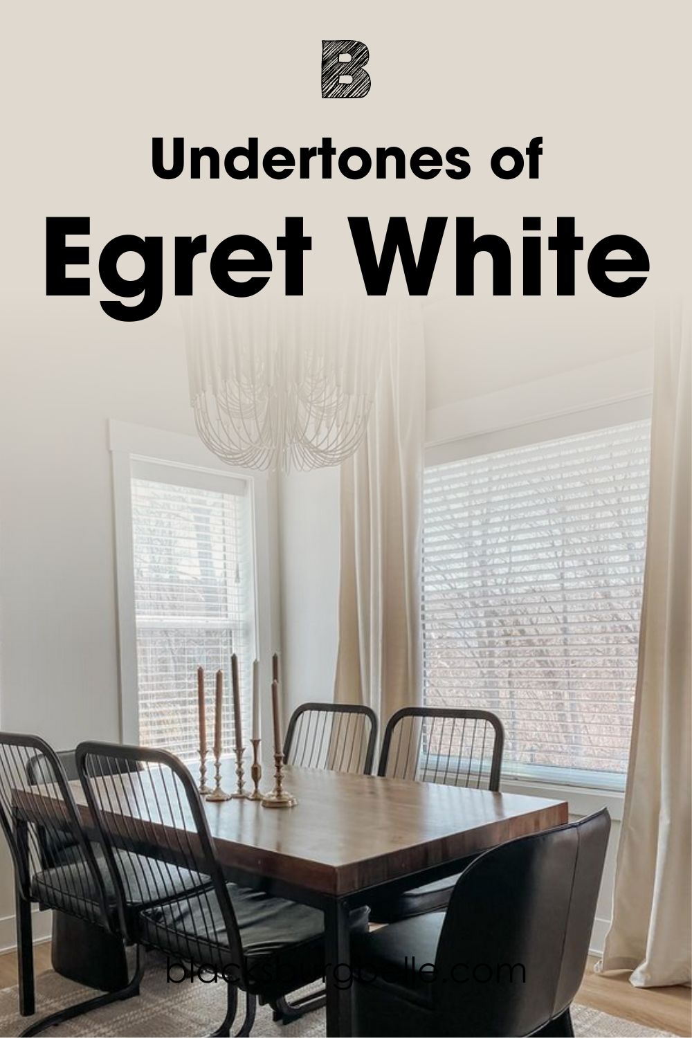
Undertones of Sherwin Williams Egret White
Sherwin Williams Egret White is in no way a crisp and pure white, and as a result its undertones truly are the star of the show.
The official undertone given by Sherwin Williams for this paint is “stone”, and I can definitely see that. However, I would argue that there are some other colors going on here too.
There are also some warm beige sandy tones to be seen in this paint, as well as fawn undertones that can be detected. Some people can also see hints of pink in the right lighting!
Don’t just take my word for it though: take a look at this picture below so that you can see these rich undertones for yourself.
Does Sherwin Williams Egret White Look Dark?
With an LRV of 70, you may be wondering whether Egret White looks dark. Hopefully, from the sample pictures I have shown you, you can see that despite its LRV value it is actually a pretty bright color!
This is thanks to its warmer undertones, which help it to lend light to a space. Because it is also a natural hue, this also helps it not to feel too dark.
But, it is always worth keeping in mind that color will always look different depending upon a number of factors.
These include the type of lighting, such as natural light or lightbulbs, as well as the space that has been painted. Smaller spaces with lots of nooks and crannies tend to typically appear darker than those that are wide and open! Additionally, the type of paint also affects brightness, such as when contrasting a matt or gloss finish.
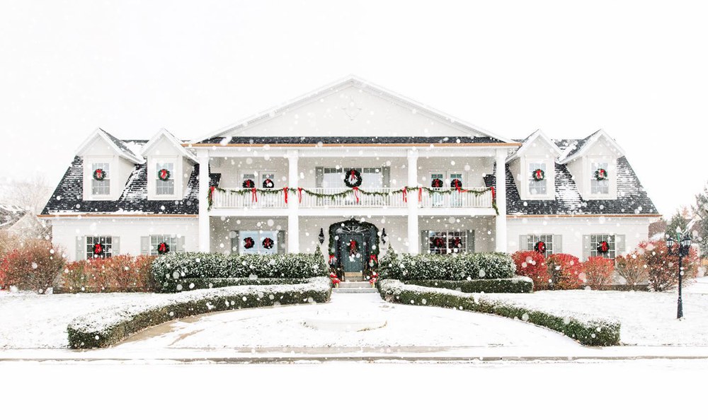
See here on the exterior of this home how warm and light Egret White truly is, especially when you contrast it to the brickwork foundations below!

You can see a whole host of bright tones, ranging from cream all the way to a stony white. Even the shadows from the building itself and the trees around don’t make this color feel too dark and dingy.
With a pop of bright color on the door, I think this would make for quite a light and airy exterior!
Sherwin Williams Egret White is a Warm or Cool Color?
As you might have already guessed from my review, Egret White SW 7570 is a warm color. Officially, it would be classed as a warm neutral, but let’s talk about the benefits of a warm color like this in a space.
Egret White helps to create a cozy feel and brightens up the surroundings. In strong sunlight, the beige and taupe tones start to come through, really picking up on other natural tones in the room, such as wood and some stone flooring.
However, even when shaded, as the gray tones start to come through more, the warmth does not go away. This evolving nature means that Egret White can really help to bring a dynamic effect to the home.
Egret White Color Strip: Light or Dark Exploration
You might find that, in actuality, Sherwin Williams Egret White is just a bit too dark, or even too light for the project that you have in mind. If this is the case, don’t worry! Thankfully, Sherwin Williams has a range of whites that have lighter and darker tones that may suit your needs.
Check out my list below to find similar colors to Egret White. I’ve put them in order from light to dark, with Egret White in the middle as a comparison piece.
- Sherwin Williams Pure White SW 7005
- Sherwin Williams Alabaster SW 7008
- Sherwin Williams Westhighland White SW 7566
- Sherwin Williams Egret White SW 7570
- Sherwin Williams Pediment SW 7634
- Sherwin Williams Crushed Ice SW 7647
- Sherwin Williams On The Rocks SW 7671
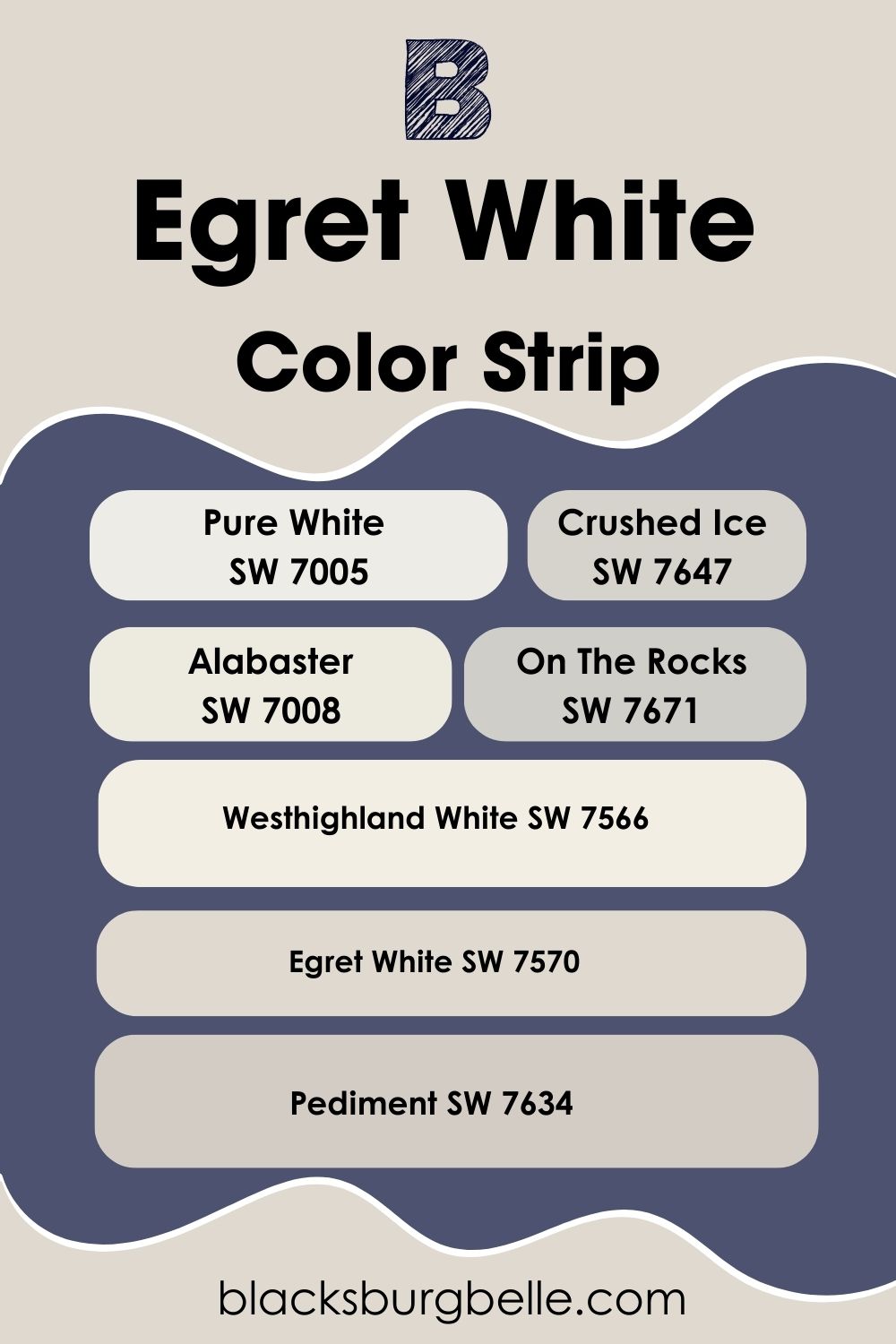
Within this color list, although they run from light to dark, there are also some cooler tones too for those of you who might find Egret White a little too warm for your liking. These are On the Rocks and Crushed Ice.
Sherwin Williams Egret White Complementary Colors
When you’ve decided that Egret White is the right paint for you, it’s time to start looking for some complementary colors to go with it.
Complementary colors might sound a little tricky to pick out, but I have a top tip for you: they’re usually on the opposite side of the color wheel in a straight line.
For example, opposite to purple on the color wheel is yellow, and red is opposite to green.
Don’t worry this time though, because I’ve done all the hard work for you in finding the perfect complementary paint color from Sherwin Williams.
For Egret White, the complementary color is a muted shade of blue/violet, and the perfect representation of this is Sherwin Williams Icelandic SW 6526.
This color creates a tasteful contrast with Egret White and with its cool, violet undertones it helps to bring out the warm tones in the paint to bring together a truly calming atmosphere.

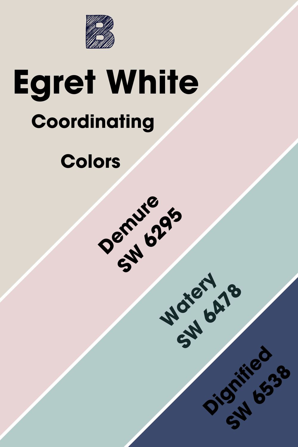
Sherwin Williams Egret White Coordinating Colors
Egret White SW 7570 is so versatile that there are plenty of other colors besides Sherwin Williams Icelandic that it makes a perfect painting with.
I’ve placed my top 3 below, with a little bit of detail on how they work alongside Egret White.
- Demure SW 6295: This warm and bright pink works beautifully with Egret White, helping to pull out that pink undertone to its full glory. Using Demure as an accent to Egret White, such as within furniture panels or on wooden pieces within the home helps to create a calming and natural feel.
- Watery SW 6478: This bright blue-green color helps to add a subtle contrast to Egret White, while also helping it to brighten a space. Use together in a bathroom, or in a well-lit living room to create a subdued but beachy feel.
- Dignified SW 6538: Those looking for a bold color to pair with Egret White should look no further than Dignified. This deep blue-purple adds a decadent richness, helping to enhance the natural, earthy tones of Egret White while also adding a wow factor on its own. Consider using it s an accent wall or on a statement piece of furniture.
Sherwin Williams Egret White Color Palette
Although I’ve given you a whole host of coordinating colors, it can take more than one paint or color to truly bring a room together. So, I’ve put together 3 of my top color palettes that work seamlessly with Sherwin Williams Egret White.
Palette 1: Light and Earthy
Main Color: Sherwin Williams Egret White SW 7570
Secondary Color: Sherwin Williams Hushed Auburn SW 9080
Accent Color 1: Sherwin Williams Heron Plume SW 6070
Accent Color 2: Sherwin Williams Expressive Plum SW 6271
Accent Color 3: Sherwin Williams Jalapeno SW 6629
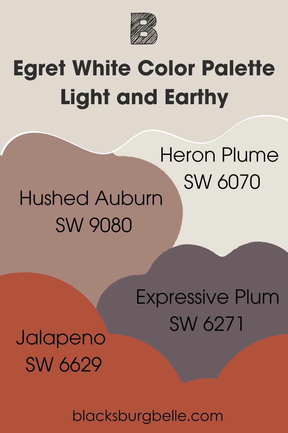
This palette pairs together some light and earthy tones to create an understated but natural look for a space.
Hushed Auburn helps to pick up the earthy tones in Egret White, helping to lend an almost terracotta undertone. The accent colors both help to brighten in the case of Heron Plume, and the bolder colors Expressive Plum and Jalapeno help to add depth while picking up and complementing the undertones of the other colors in this scheme.
Palette 2: Beachy
Main Color: Sherwin Williams Egret White SW 7570
Secondary Color: Sherwin Williams Reddened Earth 6053
Accent Color 1: Sherwin Williams Watery SW 6478
Accent Color 2: Sherwin Williams Icelandic SW 6526
Accent Color 3: Sherwin Williams Glittery Yellow SW 7125
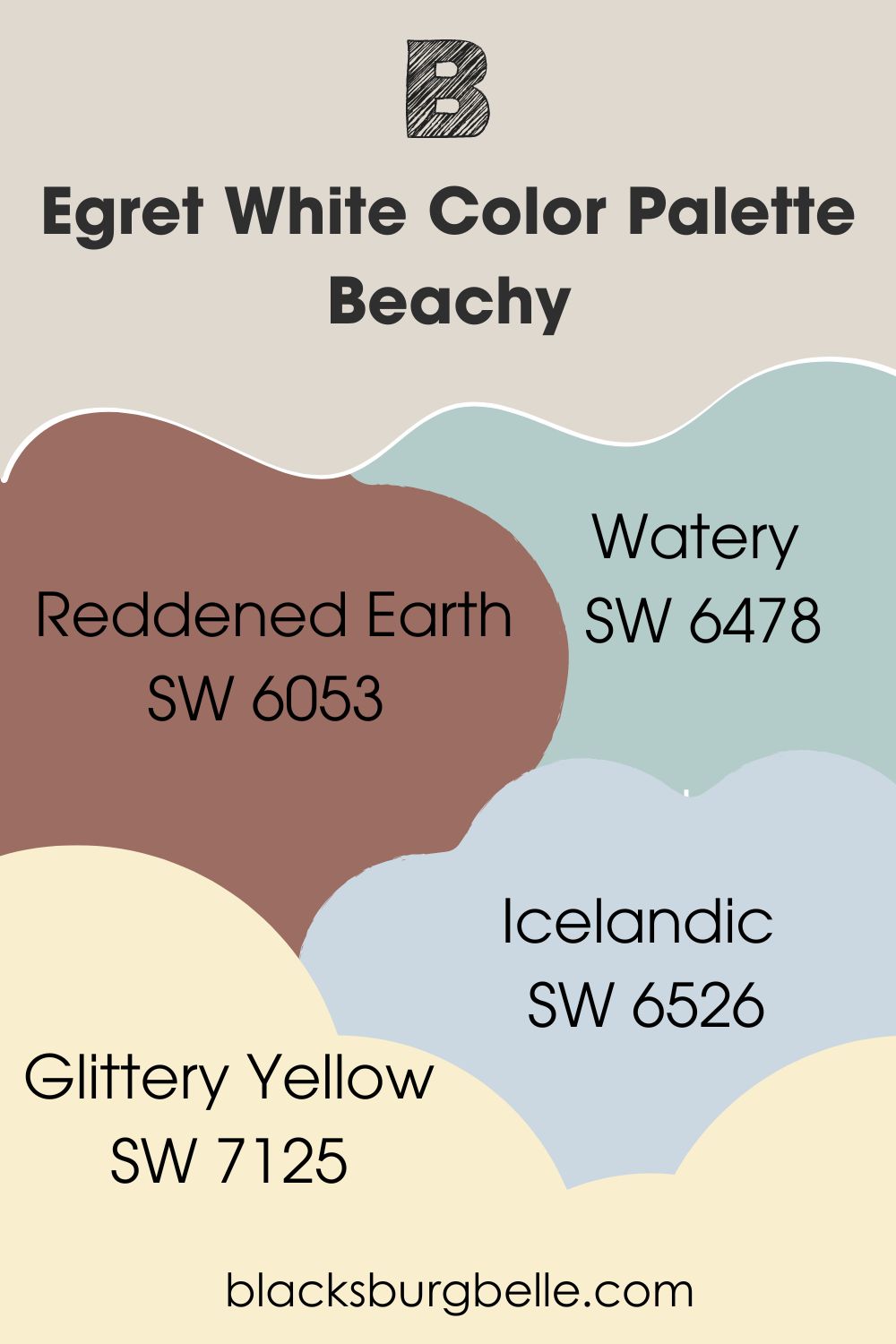
This palette builds on an earthy and sandy base using Egret White and Reddened Earth while adding in bright shades of blue, green, and yellow as accent shades to create a beachy feel. This light and airy scheme would work well in any coastal property, or a room with a lot of natural light such as a bedroom or dining space.
Palette 3: Rich and Regal
Main Color: Sherwin Williams Egret White SW 7570
Secondary Color: Sherwin Williams Dignified SW 6538
Accent Color 1: Sherwin Williams Polished Mahogany SW 2838
Accent Color 2: Sherwin Williams Quite Coral SW 6614
Accent Color 3: Sherwin Williams Awesome Violet SW 6815
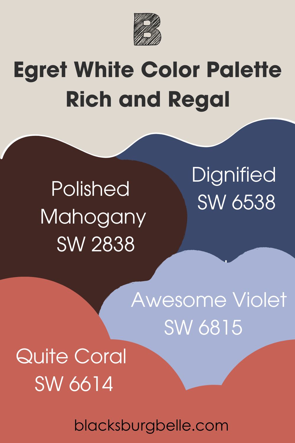
Pairing Egret White with the rich tones of Dignified helps to start off our rich and regal color palette. Polished mahogany adds a deepness, while Quite Coral and Awesome Violet pick up on the undertones of the main and secondary colors while adding brightness and eye-catching detail.
Sherwin Williams Egret White vs Other Paint Colors
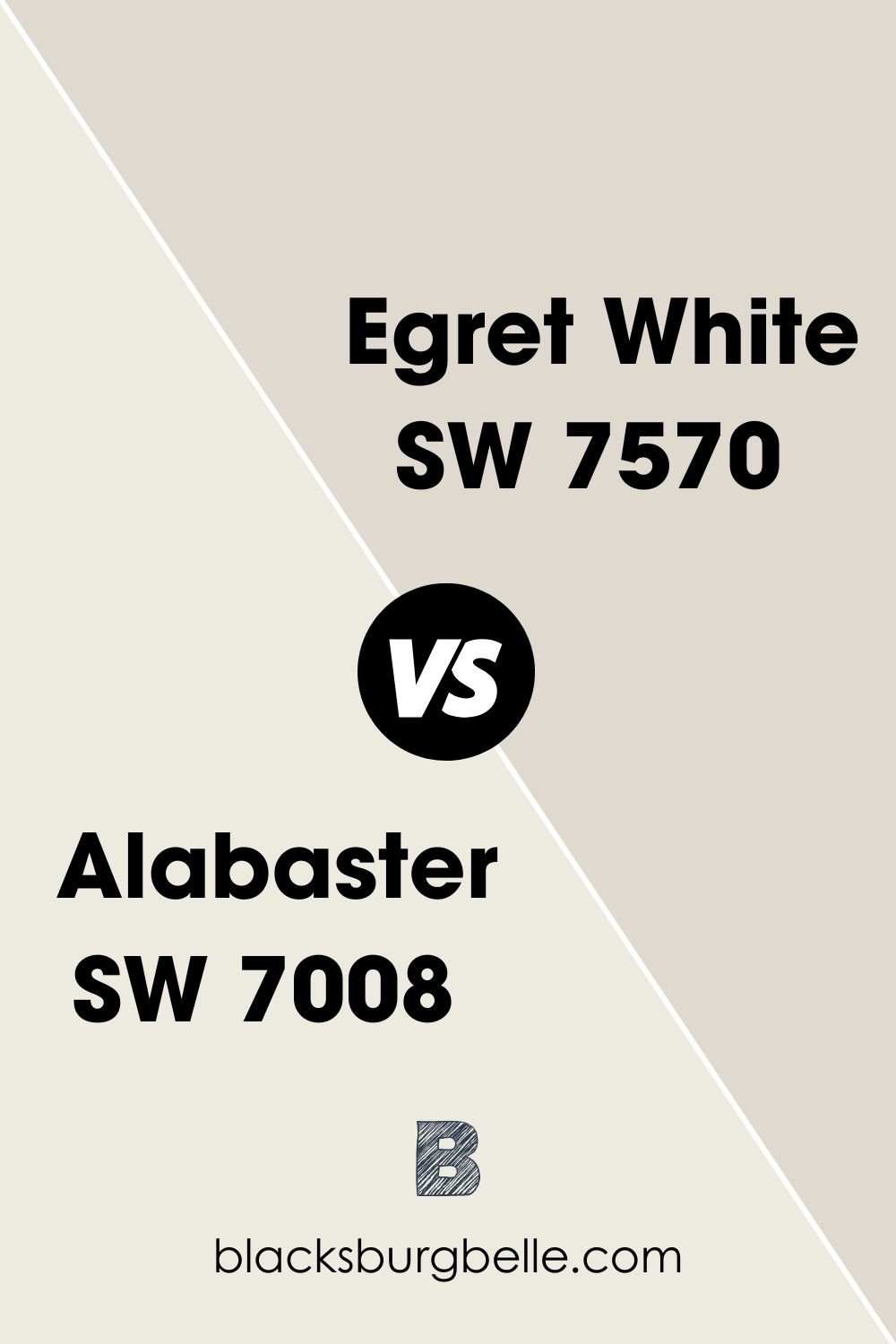
Sherwin Williams Egret White vs Alabaster
When it comes to comparing Egret White vs Alabaster, Egret White is the darker color with an LRV of 70 compared to Alabaster’s 82. However, despite both being warm colors, Egret White has more depth and levels of an undertone than Alabaster, with stone, pink, and tan, while Alabaster focuses on yellow and cream.
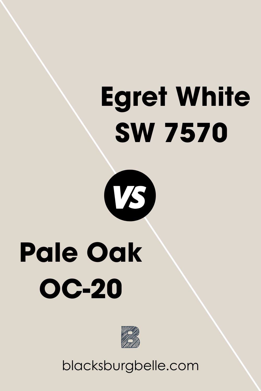
Sherwin Williams Egret White vs Pale Oak
In the battle of Egret White vs Pale Oak, it’s clear that both paints have similarities as warm off-whites with stony undertones. However, when you look at the nature of the stone undertone, Egret White comes out more of a brown stone, and Pale Oak leans more on the gray side.
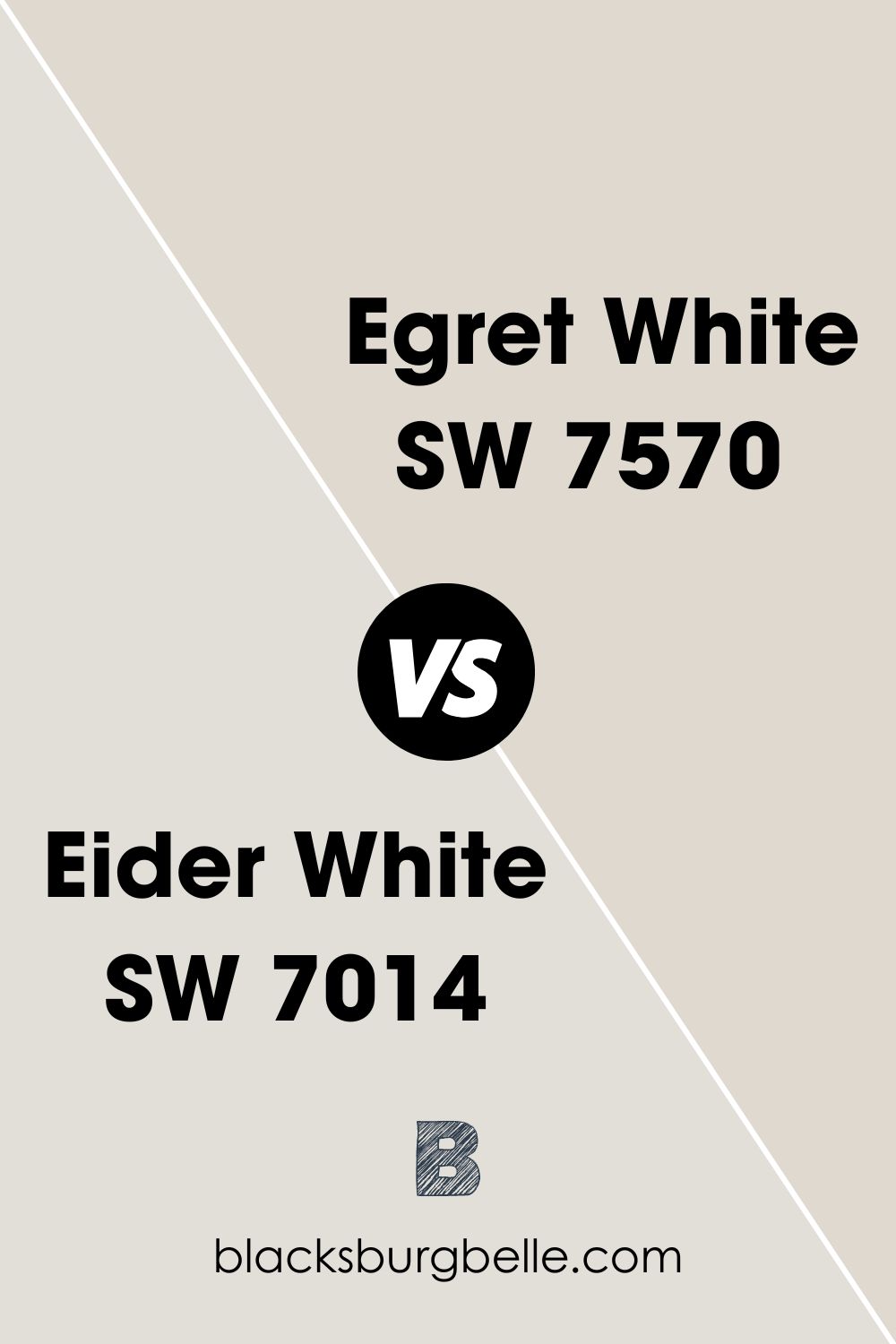
Sherwin Williams Egret White vs Eider White
Egret White as I’ve already established is a warm-toned paint, and in contrast, Eider White is a cool-toned color. As a result, Egret White lends itself more to richer, warmer tones, while Eider White can help cooler and more muted colors to be able to sing.
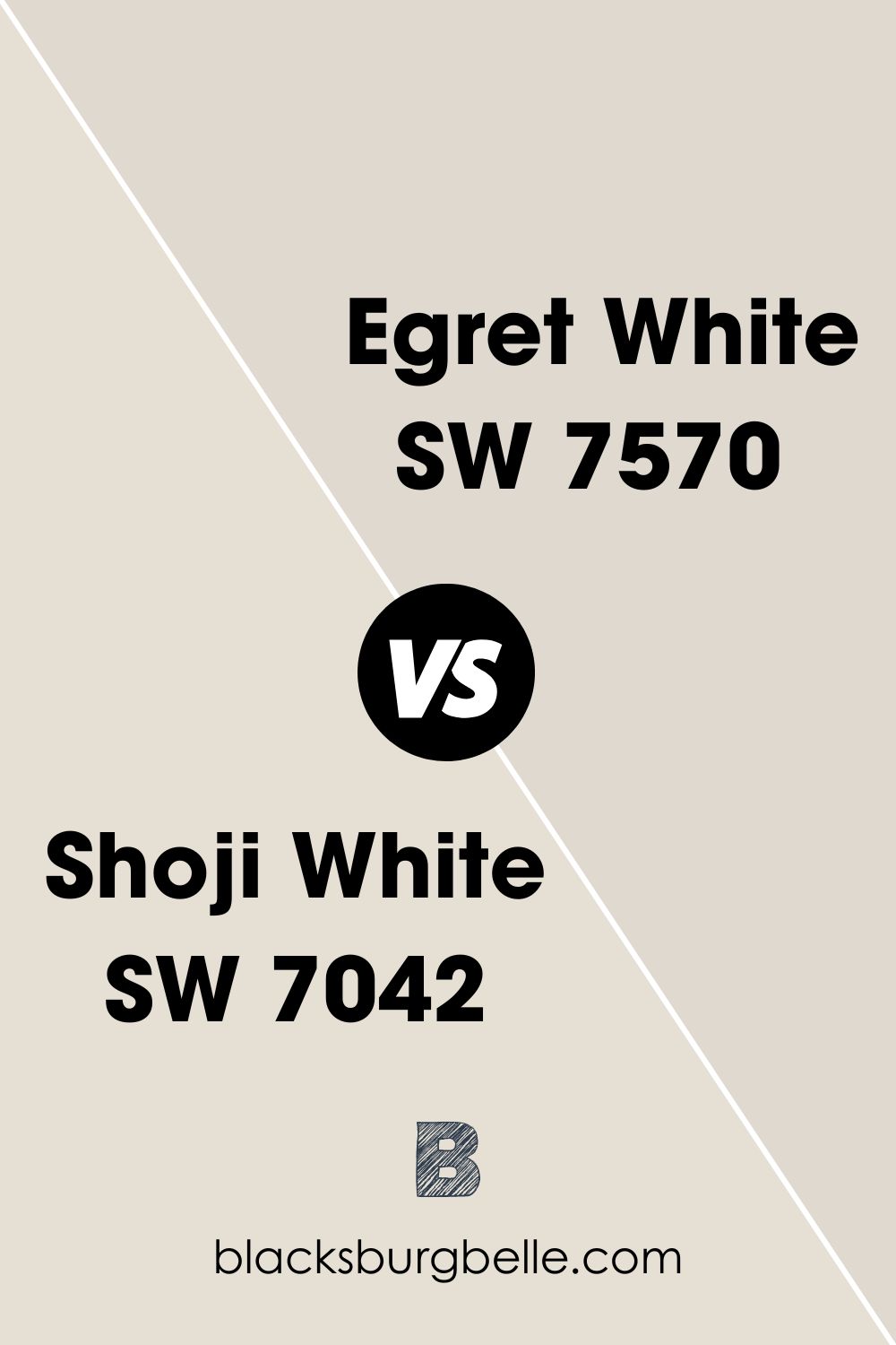
Sherwin Williams Egret White vs Shoji White
Being classed more as a “greige”, Shoji White differs from Egret White in this regard. Although Egret White has those stony undertones, its versatility compared to Shoji White shines through as it easily lends itself to multiple spaces and color schemes.
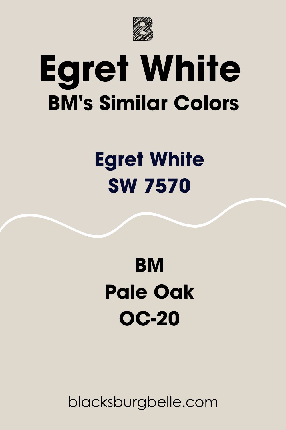
Sherwin Williams Egret White Benjamin Moore Equivalent
Although they are not the same, Egret White SW 7570 does bear a close resemblance to some Benjamin Moore paints.
I’ve mentioned it above in my color comparison, but the closest paint in the Benjamin Moore catalog to Sherwin Williams’s Egret White is Pale Oak. Both are very close together on the color wheel, and their LRVs only differ by 2, with Pale Oak sitting 2 points darker, at 68.64.
Pale Oak is also sometimes called Athena by Benjamin Moore, but the easiest way to tell it is the right paint is to look for the identifiers OC-20 or 858 as the paint numbers.
Other similar Benjamin Moore colors to Egret White include Balboa Mist and Olympic Mountains.
Where Can You Use Sherwin Williams Egret White SW 7570
When I said before that Egret White is an incredibly versatile paint, I really meant it! Take a look below at some situations and spaces that really work well with this color.
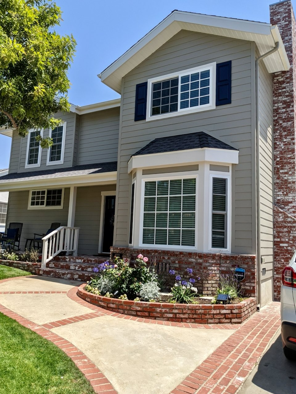
Sherwin Williams Egret White Exterior Paint
It’s not just inside the home where Egret White shines. You can also get Sherwin Williams Egret White exterior paint for the outside of your property.
Egret White looks great on fences thanks to its natural, earthy tones, and is suitable for both exterior brick and paneling. I’ve already shown you a picture of the paint being used on wood exterior paneling, so here’s an example of Sherwin Williams Egret White exterior brick.
As you can see from this image, despite the stark white of the winter scene, Egret White still holds its own with its stony undertones helping to lend warmth.
A Sherwin Williams Egret White trim on a property also helps to brighten things up, while helping to carry and complement other darker colors. For an example of what I mean, check out this image.
Sherwin Williams Egret White Living Room
A Sherwin Williams Egret White living room is one of the best ways to use this paint. I know I have been praising the way that Egret White SW 7570 can add a beachy or coastal feel to a room, and this living room shows that idea off wonderfully!

It works super harmoniously with the blue and wicker accents, while adding a light, sandy feel to the walls without (excuse the pun) going overboard!
Sherwin Williams Egret White Bathroom
Bathrooms with a lot of light can also benefit from Egret White to create a muted and relaxing space.
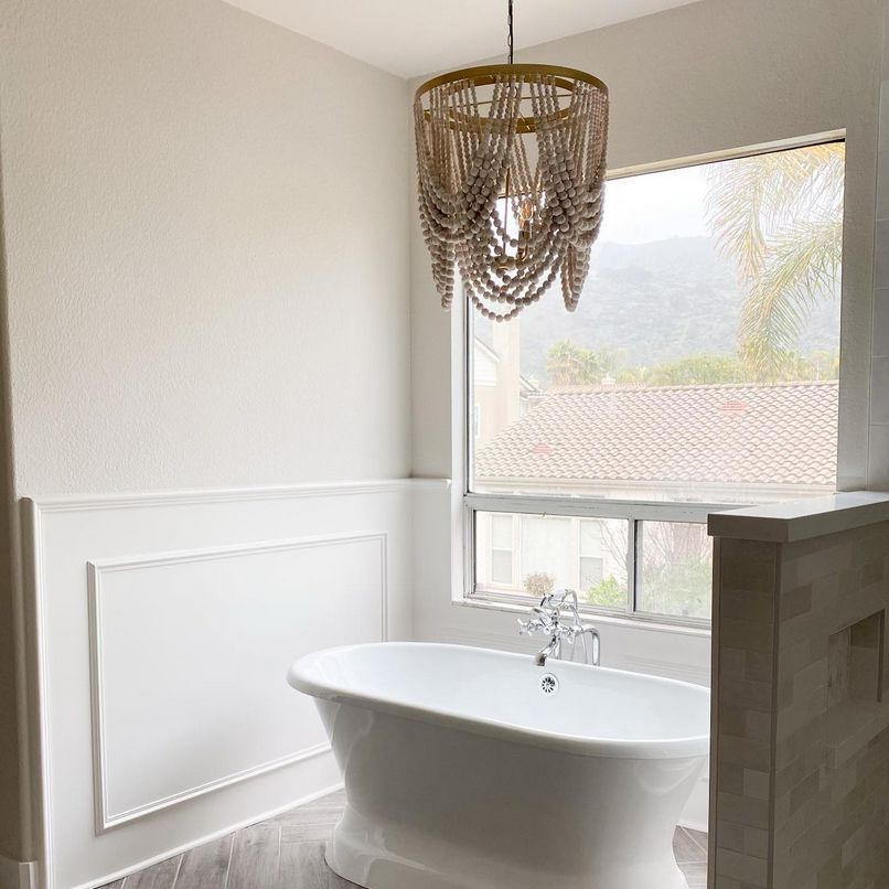
I love the example of this bathroom, showing the contrast of Sherwin Williams Egret White bathroom paint and the white enamel bath and side paneling. It also shows how well it picks up the stony accents of the gray tiling and floor without turning cold!
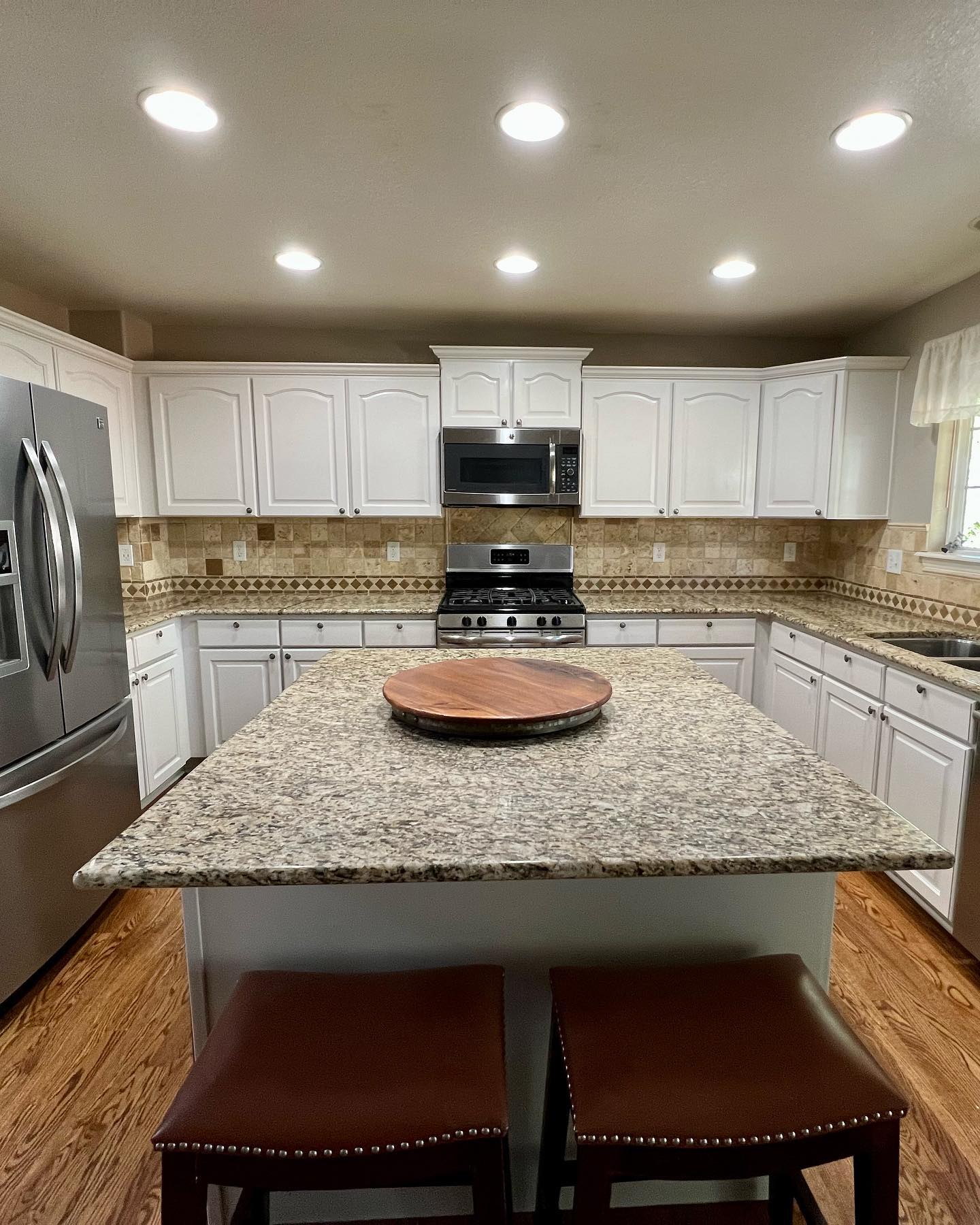
Sherwin Williams Egret White Kitchen Cabinets
Egret White can give a great refresh to kitchen cabinets. Not as harsh as pure white, but still light and airy, the stone undertones help to complement different worktops brilliantly.
Sherwin Williams Egret White Lighting Conditions
Although some paints can vary drastically according to the light conditions, Egret White SW 7570 actually remains quite stable. The starkest difference occurs at night time when the tan hues of the paint start to come through.
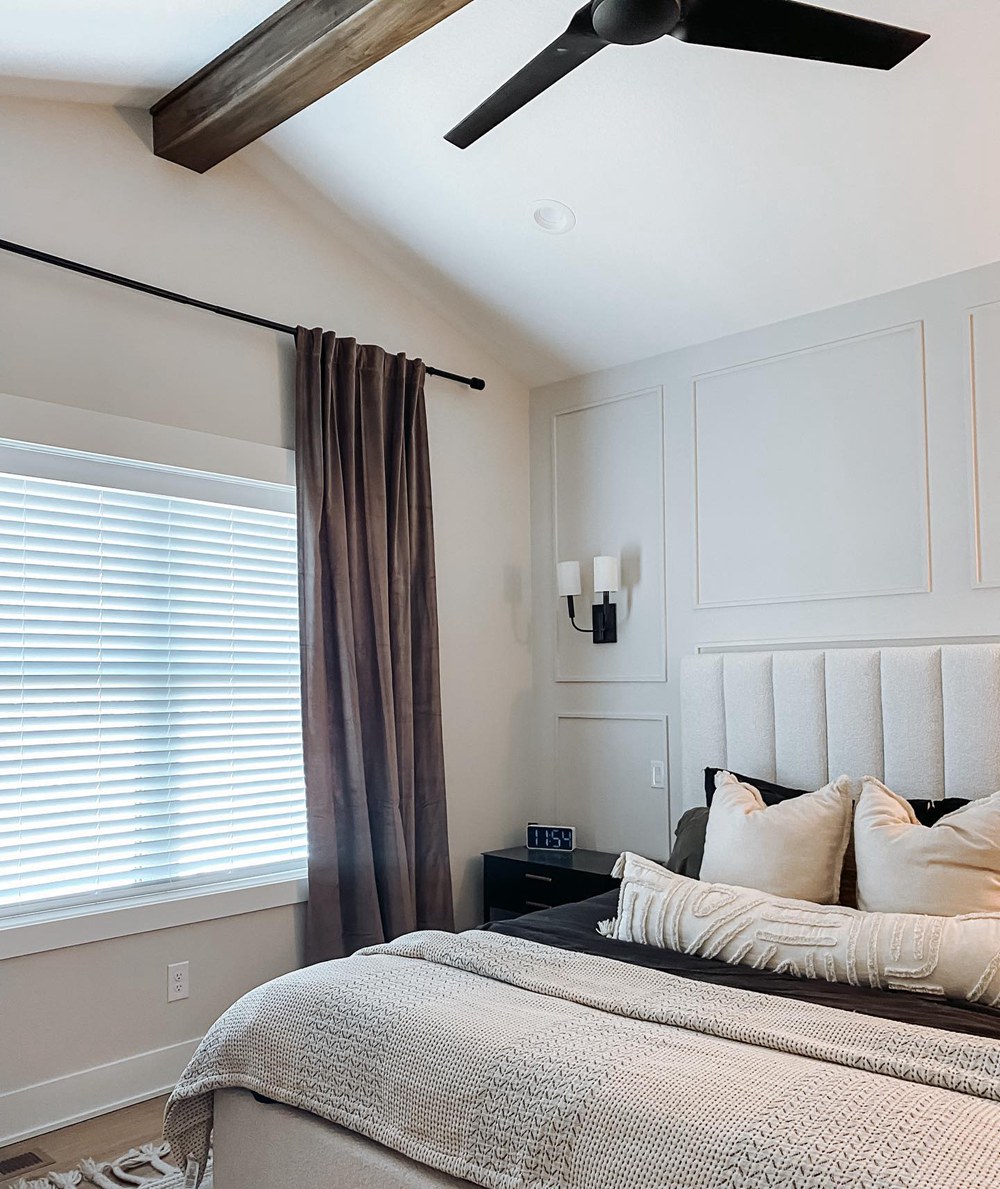
This isn’t a bad thing though, as it actually makes the room in question incredibly cozy, making it a great choice for a bedroom where you really want to get some hygge vibes.
Conclusion
So, in summary, if you are looking for a warm, versatile white with a really soothing character, look no further than Sherwin Williams Egret White!
Sometimes you don’t need to shout from the rooftops to make yourself heard, and that is exactly the case with Egret White. If you are looking to breathe freshness into a space either inside or out, I can strongly recommend picking up a pot or two of this paint.
 Sherwin Williams Silverpointe (Palette, Coordinating & Inspirations)
 Sherwin Williams Ivory Lace (Palette, Coordinating & Inspirations)
 Sherwin Williams Rock Candy (Palette, Coordinating & Inspirations)
 Sherwin-Williams Blue Peacock (Palette, Coordinating & Inspirations)
 Sherwin Williams Ivoire (Palette, Coordinating & Inspirations)
 Sherwin Williams Peppercorn (Palette, Coordinating & Inspirations)
