
Do you find it quite hard to pinpoint the color of Sherwin Williams Sea Salt? Or maybe you just can’t seem to get a solid review of the paint color? Well, you are not alone because I have once experienced these, and after examining the paint closely, have written a comprehensive review.
Sherwin Williams Sea Salt has a soft homely tone that, although gray green, can appear gray blue in certain lighting. This attribute, added to its versatility, can sometimes make it challenging for you to decide on where to use it.
Table of Contents
What Color is Sherwin Williams Sea Salt (SW 6204)?
Sherwin Williams Sea Salt (SW 6204) color is gray green. However, our eyes will sometimes discern gray blue, but that is due to the lighting of the area the paint was used.
When used in certain areas, Sea Salt can appear more blue than green, hence the popular question about its real color. Despite various opinions, the manufacturers describe the paint as green.
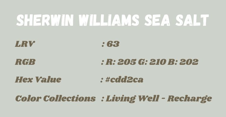
| Sherwin Williams Sea Salt | |
| LRV | 63 |
| RGB | R: 205 G: 210 B: 202 |
| Hex Value | #cdd2ca |
| Color Collections | Living Well – Recharge |
RGB of Sherwin Williams Sea Salt
According to Encycolorpedia, the RGB values for Sherwin Williams Sea Salt SW 6204 are Red 205, Green 210, and Blue 202. The values in percentages are 80.39% red, 82.35% green, and 79.22% blue.
LRV of Sherwin Williams Sea Salt
The LRV of Sherwin Williams Sea Salt is 63%, making it feel bright in spaces.
This term means Light Reflective Value in full, and it indicates the extent to which a paint color reflects light. Graded on a scale of 0% – 100%, lower values refer to dark colors that reflect little, while higher values are lighter colors that reflect more.
However, there is no paint with a perfect 0% or 100% LRV because no paint color is completely black or white.
Is It a Warm or Cool Color?
While its formula suggests warmth, Sherwin Williams Sea Salt is a cool color. You might find this a little surprising because its coolness becomes obvious in real life instead of swatches.
This attribute also amplifies the color’s softness, yielding lovely results when used in the right areas, like rooms and even the kitchen.
What Are The Undertones?
The undertone of Sea Salt is a blue-green that largely depends on the lighting in your home. Depending on what you put the color with, it can flash either blue or green. Also, its gray component remains constant regardless of whether the color flashes blue or green
However, Sea Salt is well known to flash blue more than green, especially in well-lit areas.
Sherwin Williams Sea Salt Color Strip
The following list examines all the colors with the same formula as Sea Salt but with different variations.
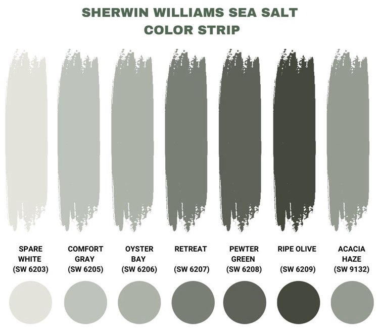
Sherwin Williams Spare White (SW 6203)
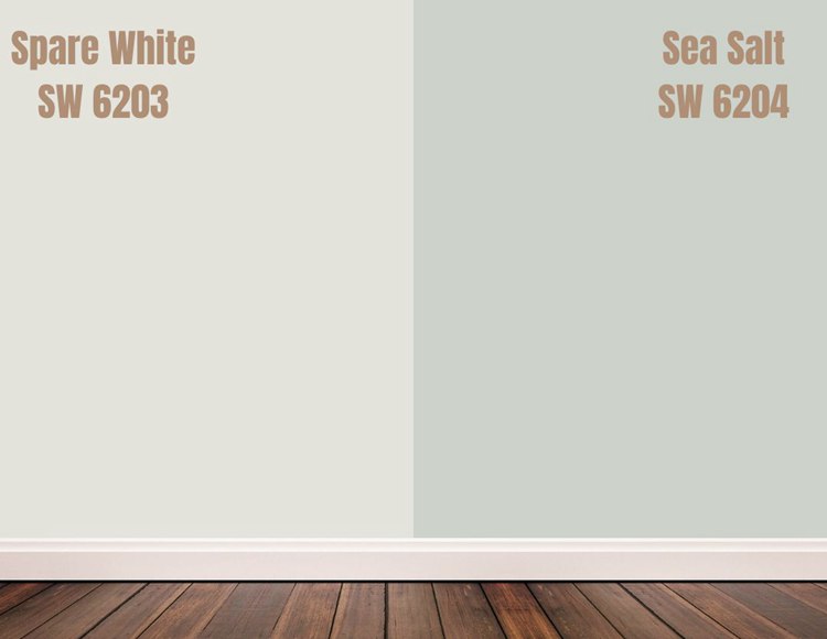
Spare White has more gray than Sea Salt, making it a shade lighter and a better choice for areas that need something a little brighter.
This color is quite neutral with a light gray undertone that makes it qualify for both a warm and cool color.
It has an LRV of 77, with an RGB value of 228 Red, 228 Green, and 221 Blue.
Sherwin Williams Sea Salt vs Comfort Gray (SW 6205)
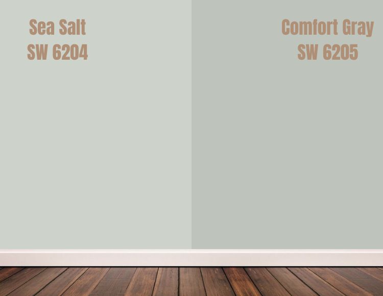
Comfort Gray has less gray than Sea Salt, giving it a darker shade than the latter. Despite this attribute, the color also leans more into blue than in certain areas.
The reason is that Comfort Gray is actually blue-green with a gray undertone. It has an LRV of 54, further emphasizing its darker nature. However, it falls under light paint colors and has an RGB value of Red 190, Green 195, and Blue 187.
Sherwin Williams Sea Salt vs Oyster Bay (SW 6206)
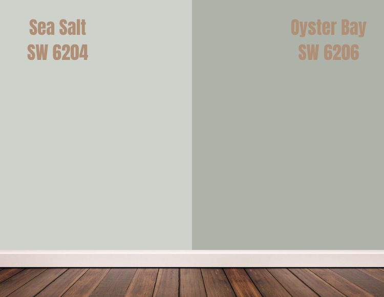
Sherwin Williams Oyster Bay is a cool gray-green color with a blue undertone. Its darker shade makes it go well with warm colors, especially in cabinets.
The color has an LRV of 44, and its RGB value is 174 Red, 179 Green, and 169 Blue.
Sherwin Williams Sea Salt vs Retreat (SW 6207)
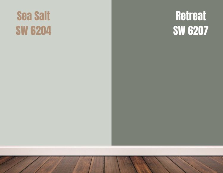
Although still gray-green, Sherwin Williams Retreat is darker-toned compared to Sea Salt. The paint has a deeper shade of green than the latter, making it ideal for anyone looking for an indoor touch of nature.
With a deeper green undertone, the color is more muted than brighter shades of green.
It has an LRV of 21 and an RGB value of 122 Red, 128 Green, and 118 Blue.
Sherwin Williams Sea Salt vs Pewter Green (SW 6208)
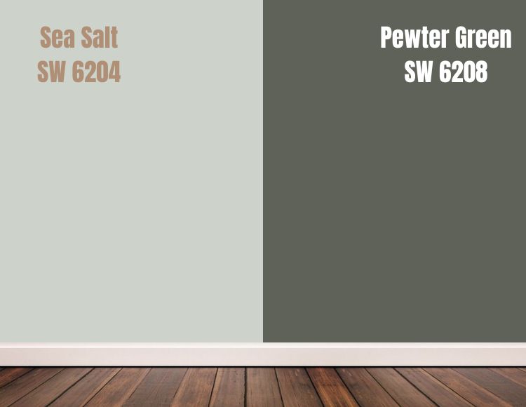
With an LRV of 12, Pewter Green is significantly darker than Sea Salt. Despite its dark accent, the paint can fit in several areas in a home because of the cool and muted attribute that gives it a soft appearance.
This paint won’t be ideal for every room because of its limited neutral attribute and moderate gray undertones.
Pewter Green has an RGB value of 94 Red, 98 Green, and 89 Blue.
Sherwin Williams Sea Salt vs Ripe Olive (SW 6209)

Ripe Olive has a warm gray undertone and is several shades darker than Sea Salt. It works best on furniture because it reflects little light, with an LRV of 6.
To use it on interior walls, you will need either plenty of natural light or mix things up with brighter colors.
It has an RGB value of 68 Red, 72 Green, and 61 Blue.
Sherwin Williams Sea Salt vs Acacia Haze(SW 9132)
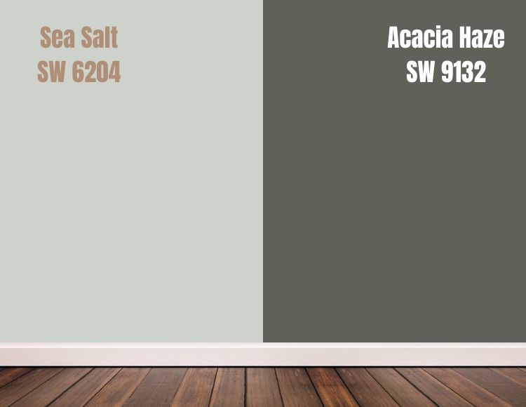
Even though Acacia Haze is darker than Sea Salt, it can be cool or warm, depending on the natural light in the area. It is a gray-green color with a gray undertone that makes it neutral enough for spacious areas like a living room.
Acacia Haze has an LRV of 32 and an RGB value of 150 Red, 156 Green, and 146 Blue.
Sherwin Williams Sea Salt Color Palette
In case you don’t have a color palette for Sea Salt, here is a beachy coastal one that works great!
Coordinating Colors for Sea Salt
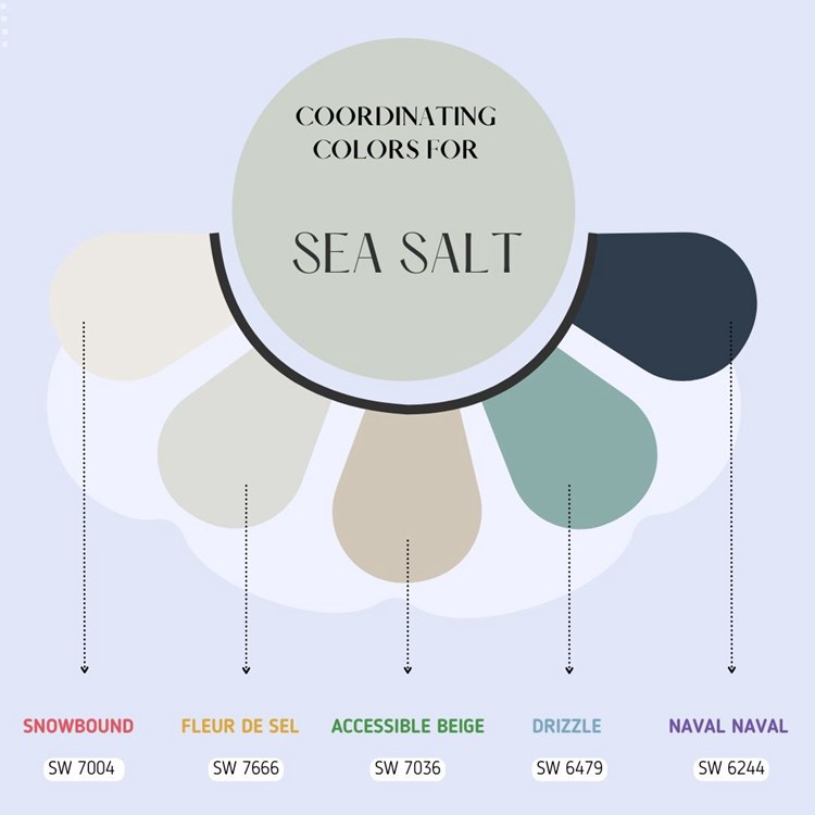
What colors coordinate well with Sea Salt? Well, we’ve got you covered.
Sherwin Williams Snowbound
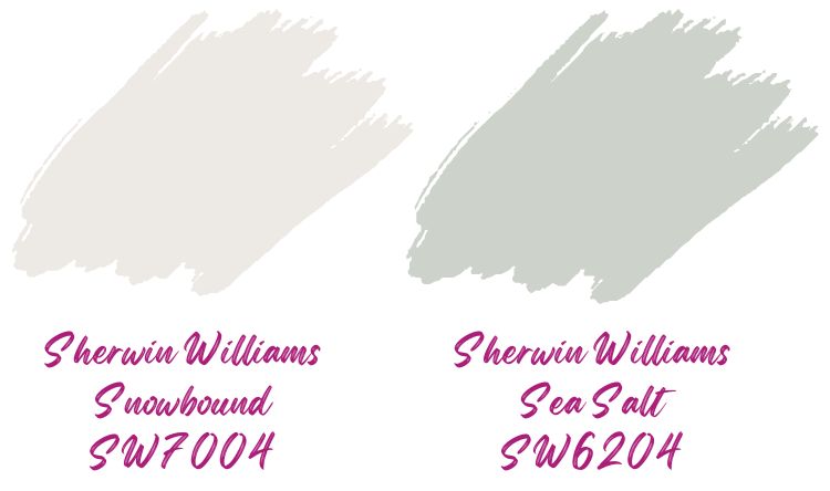
Although it has a high LRV of 83, Snowbound is not far into the white range. The soft warm color can help out in places where true white and creamy white won’t fit.
Sherwin Williams Fleur de Sel
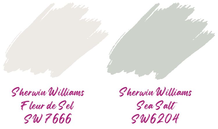
Fleur de Sel is another off-white color that goes well with Sea Salt, especially in areas that need a lighter shade with blue-green undertones.
Although it translates to French sea salt, the colors aren’t the same. Fleur de Sel has an LRV 72, making it significantly lighter and suitable for getting a pale sandy beach color.
Sherwin Williams Accessible Beige
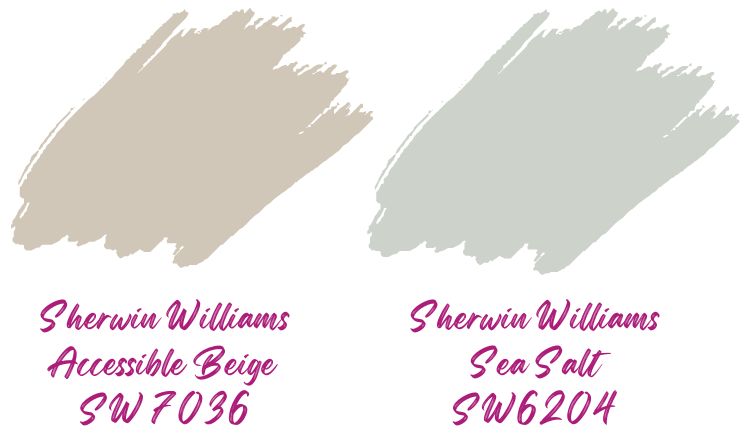
Accessible Beige has a lower LRV of 58 and mostly projects warmth. The color works well in spacious areas that receive plenty of natural light.
Several people consider Accessible Beige the perfect neutral because it is flexible enough to work with varying lighting.
It goes well with Sea Salt.
Sherwin Williams Drizzle
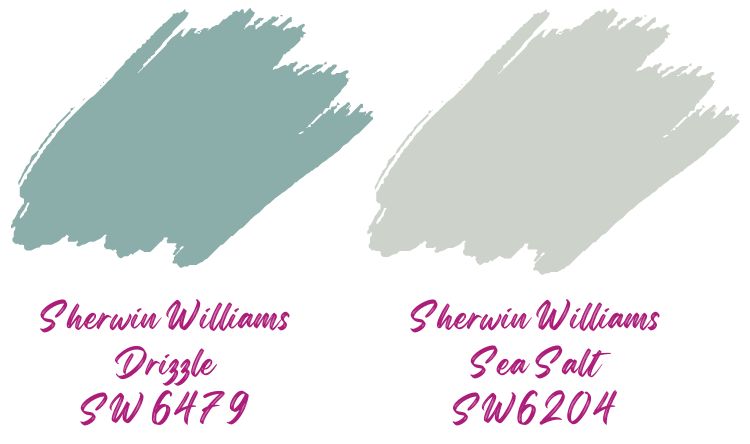
With a lower LRV of 39, Drizzle works best in areas that can take saturated colors. You can, however, apply it in large areas to make it appear stronger.
The pretty gray-blue color coordinates well with lighter paint, and what better option than Sea Salt?
Sherwin Williams Naval
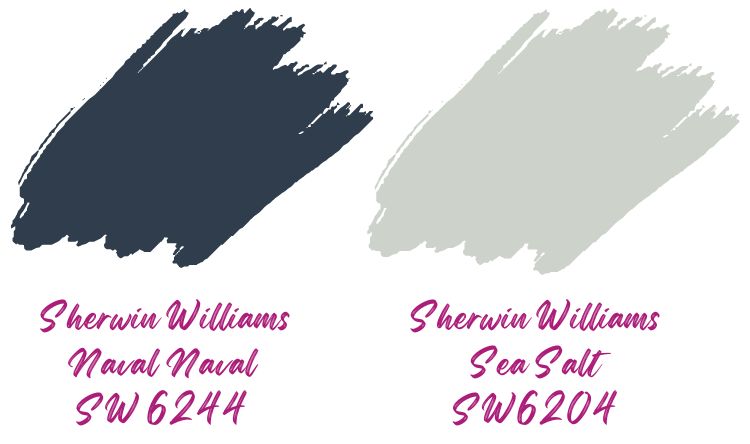
Naval gives a timeless navy blue appearance that Sherwin Williams describes as akin to the night sky.
With an LRV of just 4, you want to pair it with something several shades lighter like Sea Salt. This should yield the perfect blend of boldness and muteness for suitable areas.
Benjamin Moore Hale Navy
In case you need an alternative to Sherwin Williams Naval, Benjamin Moore Hale Navy is an excellent choice. It pairs well with Sea Salt, especially when used on furniture or interior walls in the bedroom.
Sea Salt Complementary Color
Sprucecrafts explains complementary colors as two colors that are on opposite sides of the color wheel.
When trying to pick complementary colors, you always want to go for the ones on either side of whichever color lies opposite the one you are using. In that regard, soft purple will be the right place to start for picking Sea Salt Complementaries.
Other wonderful choices include the following combinations.
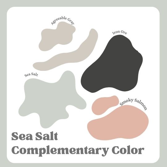
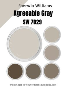
Sherwin Williams Agreeable Gray
This color gives a soft warm gray-beige appearance but can flash differently depending on natural light. With an LRV of 60, you can use it with Sea Salt to get a cozy feel in well-lit rooms.
Sherwin Williams Iron Ore
Iron Ore works great in areas that need something dark but more gentle than black. It complements Sea Salt in exquiste ways that include accent walls and cabinets.
The color is dark gray but can look different when paired with other colors because of its undertones.
Sherwin Williams Smoky Salmon
When paired with Sea Salt, Smoky Salmon adds a lively vibe to a room. The reason is that oceany blue and green colors generally go well with corals and pinks.
Also, Smoky Salmon successfully tempers flair with some degrees of muteness.
What Trim Colors Go With Sherwin Williams Sea Salt?
As with several other paints, white and its varieties remain the best choice for a trim color. While you can always opt for a darker color to trim Sea Salt, white trims will yield the best results.
Sea Salt and Pure White
Sherwin Williams Pure White has a mild gray tone that makes it an excellent choice if you need something not truly white or creamy.
Sea Salt and High Reflective White
Brighter varieties of white will give you a wonderful crisp look when used as trim colors. In this case, Sherwin William’s High Reflective White is the brightest they have, and it makes an excellent choice.
Sea Salt and Snowbound
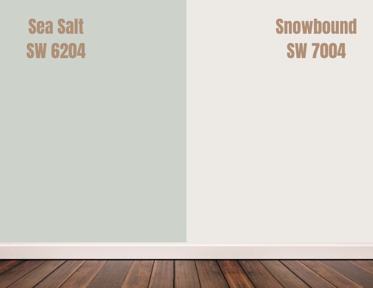
Snowbound can add a bit of warmth to the area when used as a trim color for Sea Salt. It is ideal for when you need something white with the right level of softness to make the area look less harsh.
Sea Salt and Alabaster
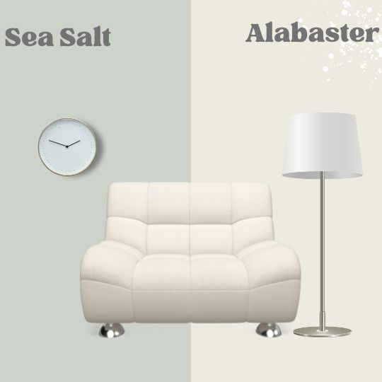
If you want a popular and well-tested white trim color, go for Sherwin Williams Alabaster. The fan favorite is used in several homes and yields a cozy, low-contrast look.
Sherwin Williams Sea Salt Color Comparisons
Let’s check out several Sea Salt color comparisons. I have made quite a lot for your convenience.
Sherwin Williams Rainwashed vs Sea Salt
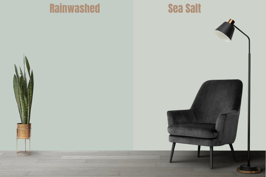
Sherwin Williams Rainwashed adds a relaxing feel, especially when you use it in a bedroom or reading room. It is a cool color that is significantly darker than Sea Salt.
The color is one of the most serene ones from Sherwin Williams but how does it compare to Sea Salt?
| Sherwin Williams Color | LRV | RGB | Hex Value |
| Sea Salt | 63 | R: 205 G: 210 B: 202 | #cdd2ca |
| Rainwashed | 59 | R: 194 G: 205 B: 197 | #c2cdc5 |
Sherwin Williams Silver Strand vs Sea Salt
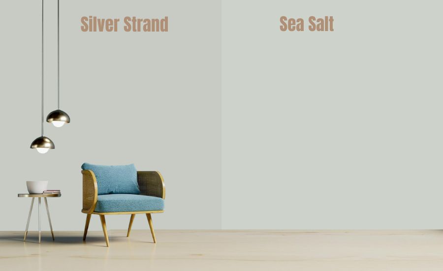
Although Sherwin Williams Silver Strand is a popular color for getting an exciting bedroom appearance, it has a major limitation. The color has limited flexibility because of its undertone and compared to Sea Salt, it might reduce your options for decor.
| Sherwin Williams Color | LRV | RGB | Hex Value |
| Sea Salt | 63 | R: 205 G: 210 B: 202 | #cdd2ca |
| Silver Strand | 59 | R: 200 G: 203 B: 196 | #c8cbc4 |
Sherwin Williams Comfort Gray vs Sea Salt
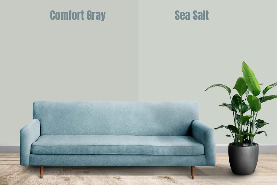
Comfort Gray is a shade darker than Sea Salt and as its name implies adds a relaxing feel to spaces. Like Sea Salt, it has a way of leaning into blue in certain lighting but does not bring as much liveliness and the other one.
| Sherwin Williams Color | LRV | RGB | Hex Value |
| Sea Salt | 63 | R: 205 G: 210 B: 202 | #cdd2ca |
| Comfort Gray | 54 | R: 190 G: 195 B: 187 | #bec3bb |
Sherwin Williams Tidewater vs Sea Salt
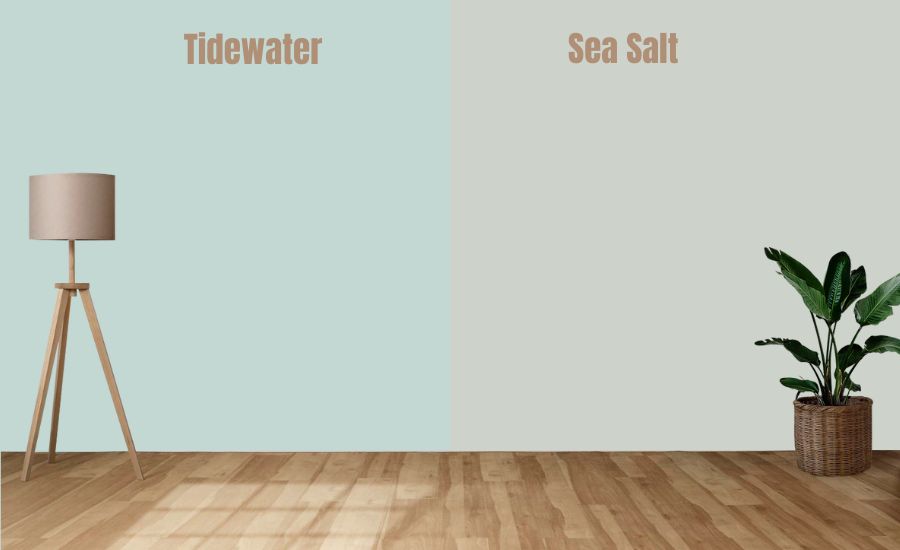
Where Sea Salt is gray-green with undertones that can lean into blue, Tidewater is grayish blue with green and gray undertones. It is a better choice if you want a soft blue color that isn’t too bright, thanks to the gray.
| Sherwin Williams Color | LRV | RGB | Hex Value |
| Sea Salt | 63 | R: 205 G: 210 B: 202 | #cdd2ca |
| Tidewater | 65 | R: 195 G: 215 B: 211 | #c3d7d3 |
Sherwin Williams Topsail vs Sea Salt
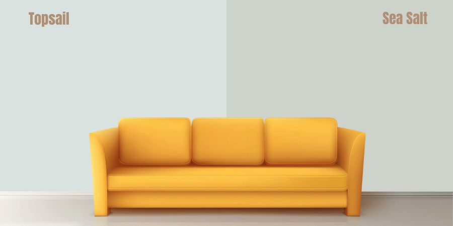
Topsail is significantly lighter than Sea Salt and despite its green undertone, leans more into blue. It adds a sense of calmness to rooms with plenty of natural lighting.
However, the color can also feel airy because of its high LRV.
| Sherwin Williams Color | LRV | RGB | Hex Value |
| Sea Salt | 63 | R: 205 G: 210 B: 202 | #cdd2ca |
| Topsail | 75 | R: 218 G: 226 B: 224 | #dae2e0 |
Sherwin Williams Mountain Air vs Sea Salt
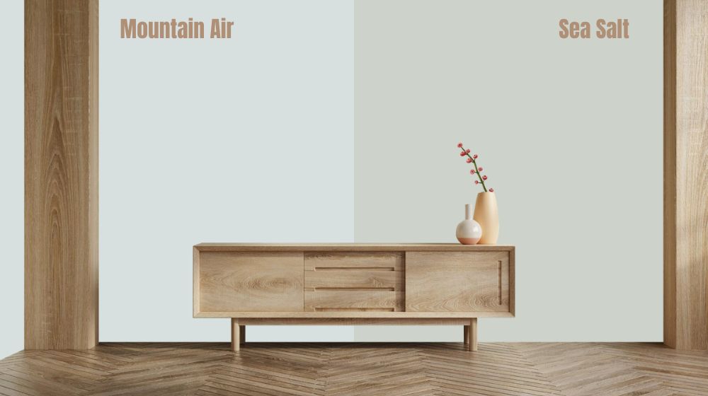
Although it has a grayish blue appearance, Sherwin Williams Mountain Air falls under White & Pastel paint colors. It is lighter and brighter than Sea Salt and has a crispier feel.
| Sherwin Williams Color | LRV | RGB | Hex Value |
| Sea Salt | 63 | R: 205 G: 210 B: 202 | #cdd2ca |
| Mountain Air | 73 | R: 216 G: 224 B: 223 | #d8e0df |
Sherwin Williams Window Pane vs Sea Salt
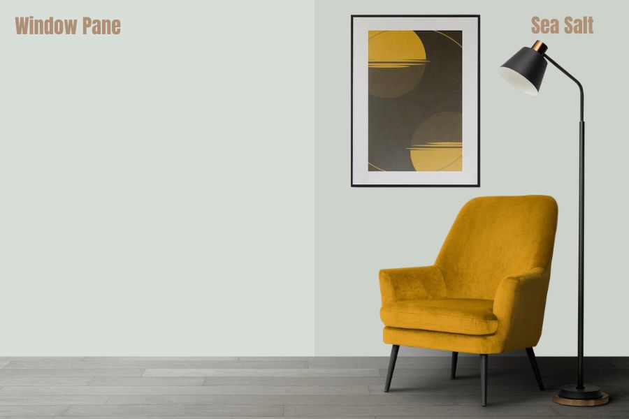
Window Pane is another White & Pastel paint color. However, it is a light bluish-green with a significant flexibility. The paint mostly looks pale green-gray but lighting can make it appear a different color.
| Sherwin Williams Color | LRV | RGB | Hex Value |
| Sea Salt | 63 | R: 205 G: 210 B: 202 | #cdd2ca |
| Window Pane | 72 | R: 215 G: 223 B: 216 | #d7dfd8 |
Sherwin Williams Tradewind vs Sea Salt
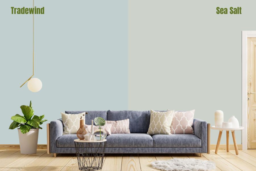
With a blue and gray undertone, you can apply Tradewind to several areas in a house. Like Sea Salt, it is also a cool color but doesn’t have as much green.
| Sherwin Williams Color | LRV | RGB | Hex Value |
| Sea Salt | 63 | R: 205 G: 210 B: 202 | #cdd2ca |
| Tradewind | 61 | R: 194 G: 207 B: 207 | #c2cfcf |
Sherwin Williams Agreeable Gray and Sea Salt
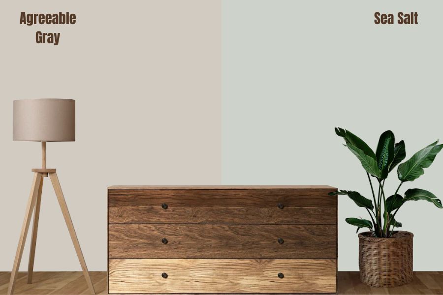
With a great blend of greige and gray, Agreeable Gray is sometimes referred to as the perfect gray. The good news is that you can pair it with Sea Salt and not have to choose one of the two, especially for interior walls.
| Sherwin Williams Color | LRV | RGB | Hex Value |
| Sea Salt | 63 | R: 205 G: 210 B: 202 | #cdd2ca |
| Agreeable Gray | 60 | R: 209 G: 203 B: 193 | #d1cbc1 |
Sherwin Williams Silvermist vs Sea Salt
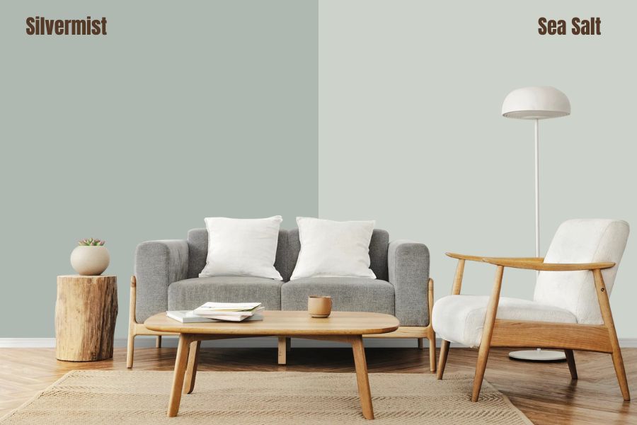
Silvermist is a blend of blue, green, and gray and instead of gray being dominant, you will observer more of the blue-green. Depending on lighting, it can add more color to spaces because of its gray undertone.
| Sherwin Williams Color | LRV | RGB | Hex Value |
| Sea Salt | 63 | R: 205 G: 210 B: 202 | #cdd2ca |
| Silvermist | 47 | R: 176 G: 184 B: 178 | #b0b8b2 |
Sherwin Williams Filmy Green vs Sea Salt
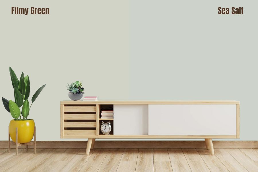
Filmy Green and Sea Salt have some similar attributes that makes them appear as variations of each other. However, the former displays more green and has a slightly higher LRV.
You can apply both colors to several places in a house and even experiment in exteriors.
| Sherwin Williams Color | LRV | RGB | Hex Value |
| Sea Salt | 63 | R: 205 G: 210 B: 202 | #cdd2ca |
| Filmy Green | 64 | R: 209 G: 211 B: 199 | #d1d3c7 |
Sherwin Williams Summit Gray and Sea Salt
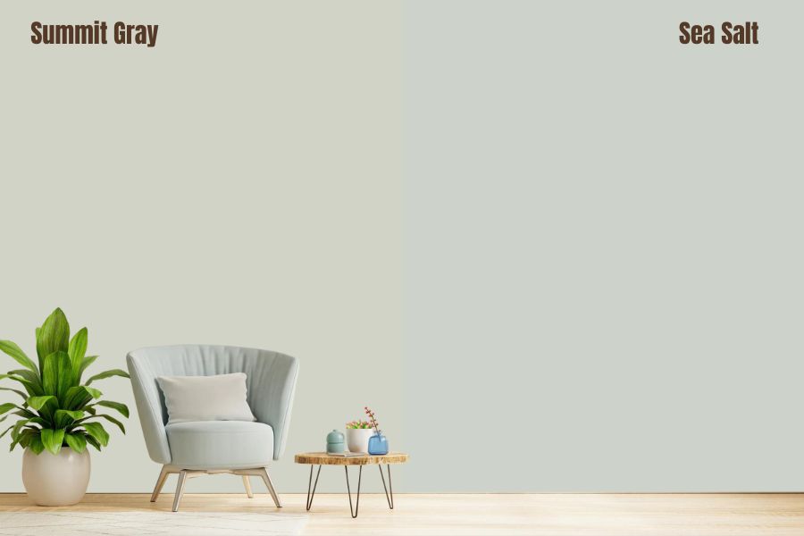
If you are looking the most neutral gray, Summit Gray is an excellent choice. The reason is that it has no blue or green undertone, making it suitable for exteriors.
Summit Gray performs better outside while Sea Salt rules the interior.
| Sherwin Williams Color | LRV | RGB | Hex Value |
| Sea Salt | 63 | R: 205 G: 210 B: 202 | #cdd2ca |
| Summit Gray | 30 | R: 149 G: 148 B: 145 | #959491 |
Sherwin Williams Wool Skein and Sea Salt
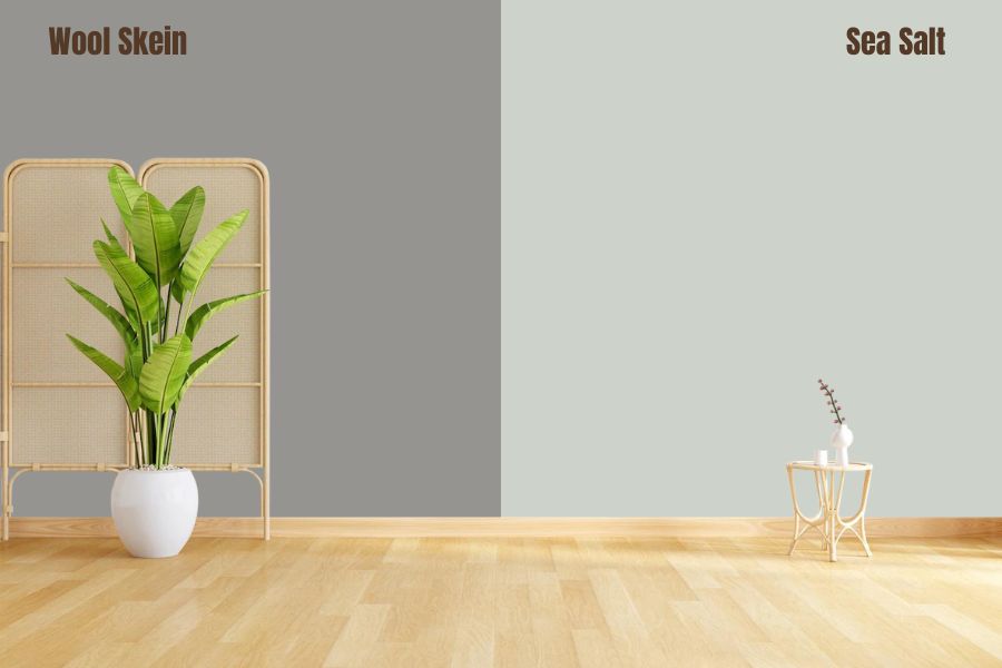
Wool Skein sits somewhere between less yellow and less neutral compared to other tan paint colors. However, it is not as muted as Sea Salt and will not readily go unnoticed in large spaces.
| Sherwin Williams Color | LRV | RGB | Hex Value |
| Sea Salt | 63 | R: 205 G: 210 B: 202 | #cdd2ca |
| Wool Skein | 63 | R: 217 G: 207 B: 186 | #959491 |
Benjamin Moore Healing Aloe vs Sea Salt
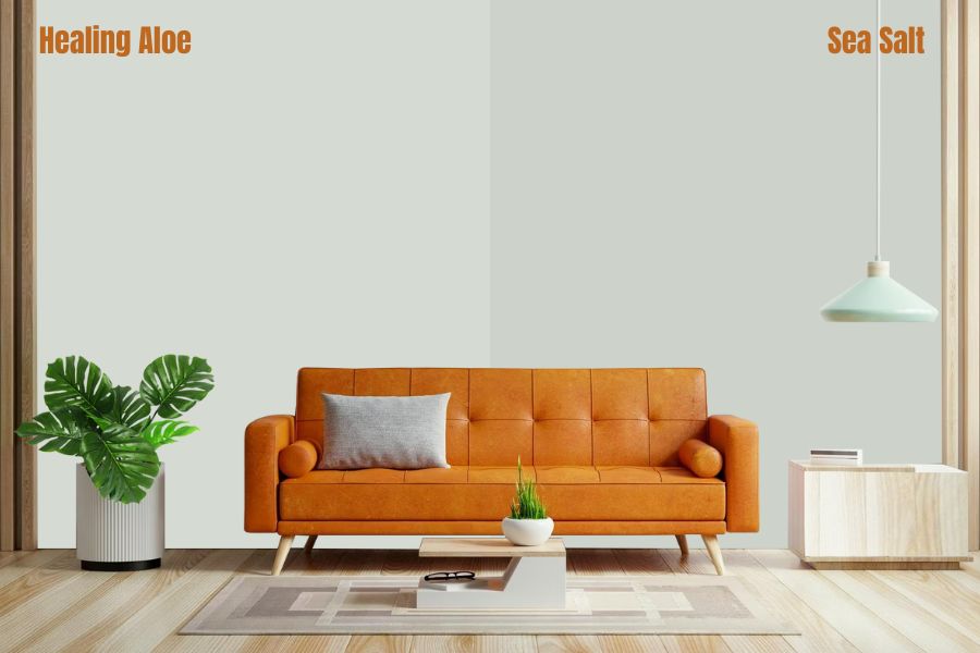
Although light blue, Benjamin Moore Healing Aloe flashes green in a way similar to Sea Salt. The cool color has a gray undertone and an overall lighter look.
| Color | LRV | RGB | Hex Value |
| Sherwin Williams Sea Salt | 63 | R: 205 G: 210 B: 202 | #cdd2ca |
| Benjamin Moore Healing Aloe | 69.66 | R: 213 G: 219 B: 210 | #d5dbd2 |
Benjamin Moore Gray Cashmere vs Sea Salt
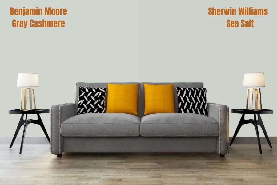
Gray Cashmere is predominantly gray with hints of green and blue. However, using it a room that gets less natural light and more warm artificial light can make it appear more blue than it should.
| Color | LRV | RGB | Hex Value |
| Sherwin Williams Sea Salt | 63 | R: 205 G: 210 B: 202 | #cdd2ca |
| Benjamin Moore Gray Cashmere | 65.57 | R: 208 G: 214 B: 206 | #d0d6ce |
Benjamin Moore Quiet Moments vs Sea Salt
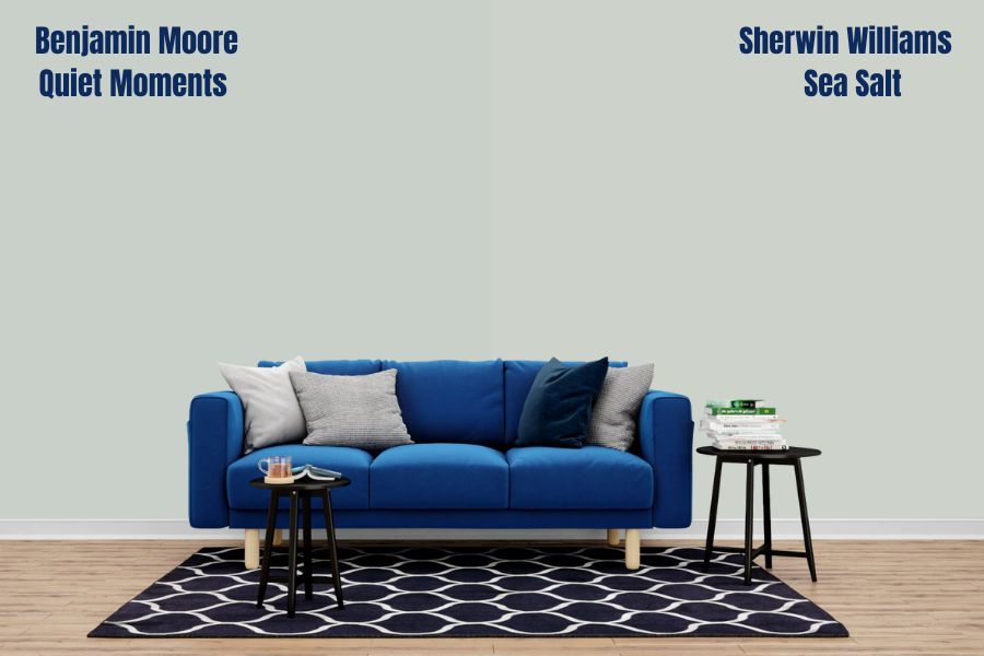
Quiet Moments is a warm blue-gray color that can lean into green in some areas. Its soft appearance makes it ideal for bedrooms.
| Color | LRV | RGB | Hex Value |
| Sherwin Williams Sea Salt | 63 | R: 205 G: 210 B: 202 | #cdd2ca |
| Benjamin Moore Quiet Moments | 61.87 | R: 200 G:208 B: 201 | #c8d0c9 |
Sea Salt Benjamin Moore Version
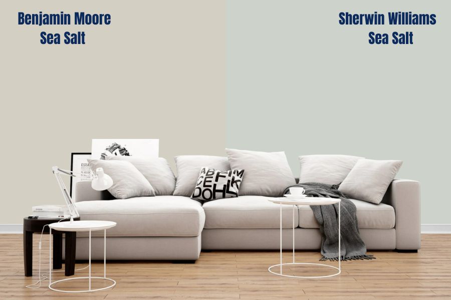
Even though bearing the same name, Benjamin Moore Sea Salt and Sherwin Williams Sea Salt are different in formula and appearance.
Firstly, BM Sea Salt is more neutral because of its modern gray/greige color. Depending on lighting, it can flash one of either, giving it an earthly and soothing feel. With an LRV of 62.93 and RGB of 212 Red, 207 Green, and 195 Blue, it is darker than the SW version, making it a suitable neutral for bedrooms and the kitchen.
Also, the color has warm undertones of beige and brown, allowing it to appear different depending on the weather and even the time of the day. This attribute also makes it excellent for situations where you need a neutral that isn’t too limiting.
Colors like Hale Navy, Linen White, and Venetian Portico go really well with it.
However, unlike its Sherwin Williams counterpart, Benjamin Moore Sea Salt is not suitable for the exterior and outdoors. You will enjoy its brilliance when applied in rooms and even large interior spaces.
How Does Light Affect the Color?
Due to its slightly high LRV, SW Sea Salt tends to wash out moderately in the presence of plenty of direct natural light. However, the color will not completely loose itself and is sure to regain its normal appearance once the sunlight is gone.
In the presence of warm artificial light at night, you can observe it looking more green than blue. That is because of the undertones that can make it alternate between gray-green and gray-blue depending on the lighting.
However, if you apply it to the exterior of the house, the color largely appears the same regardless of the time of the day.
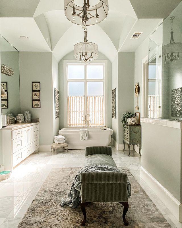
Best Rooms to Paint Sea Salt
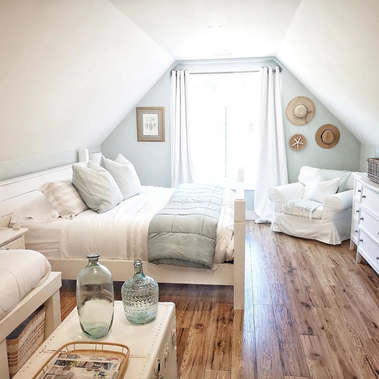
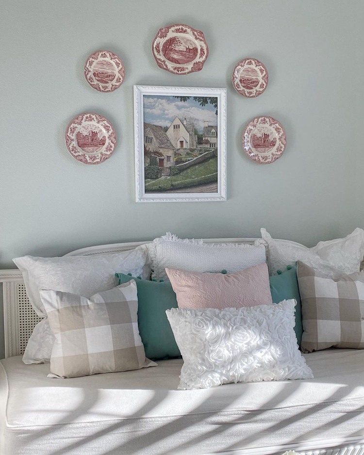
Sea Salt Bedroom
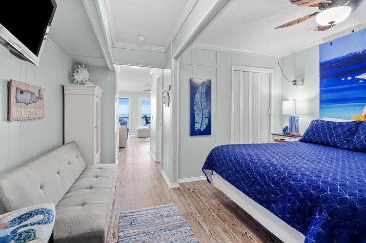
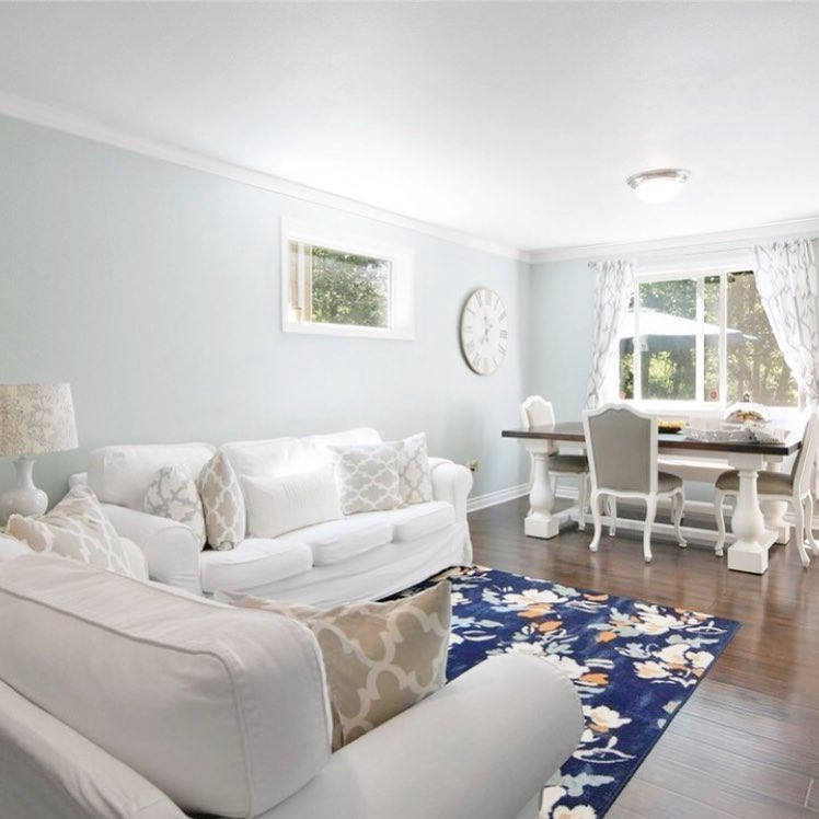
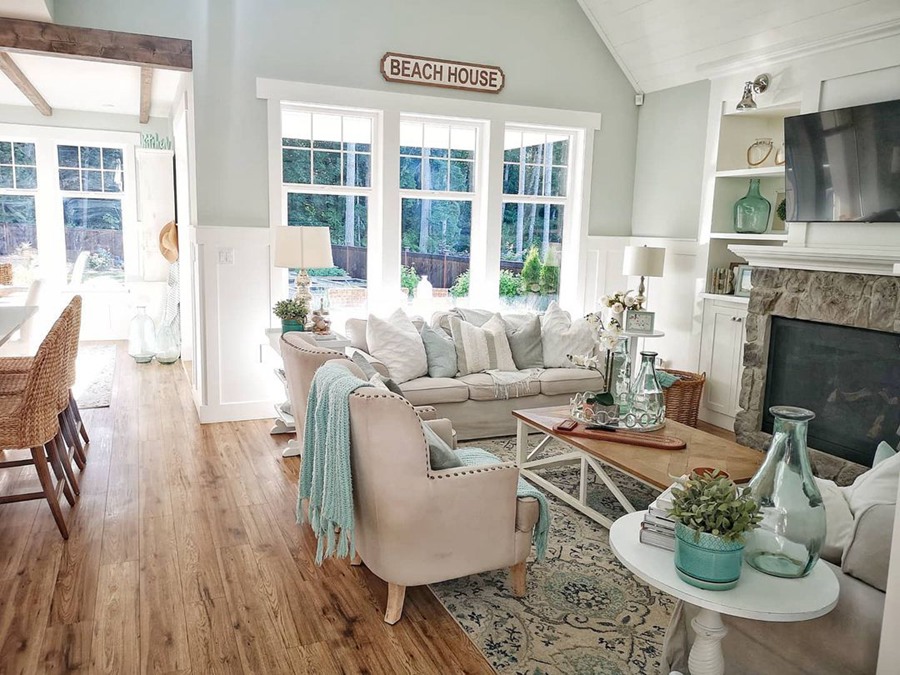
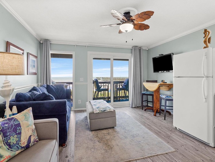
Sea Salt Living Room
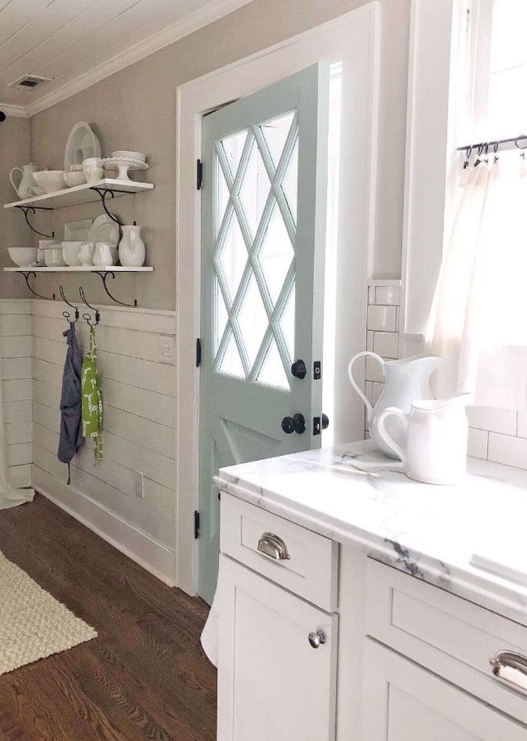
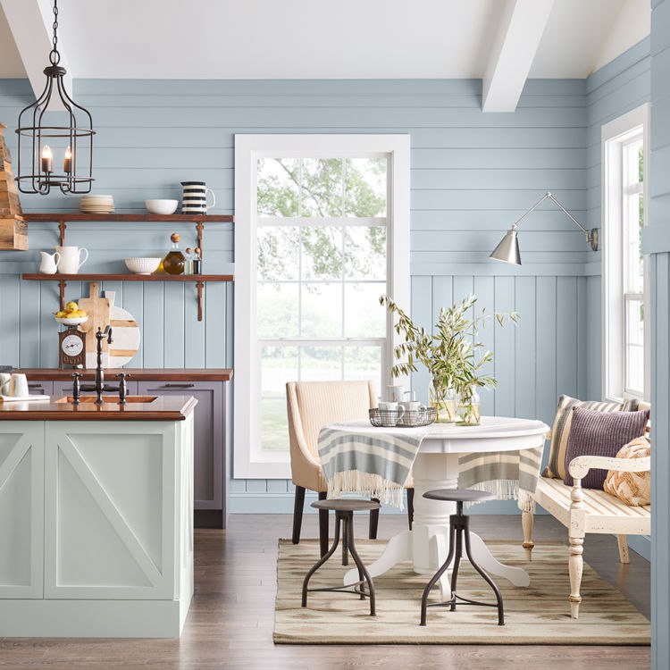
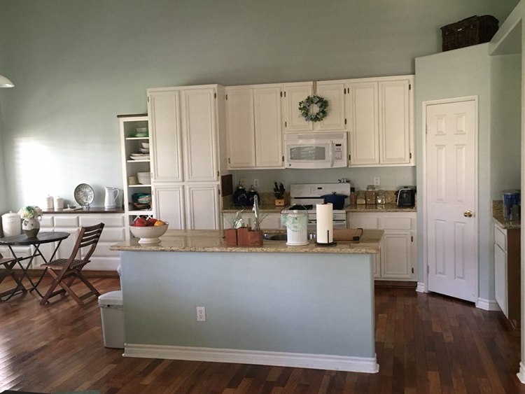
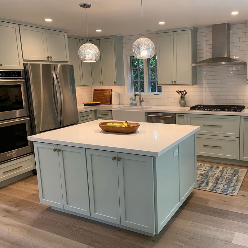
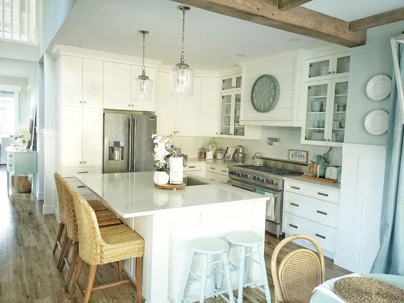
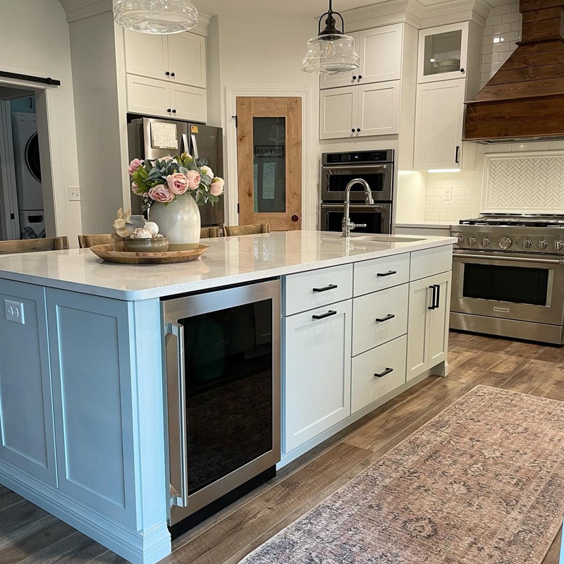
Sea Salt Kitchen
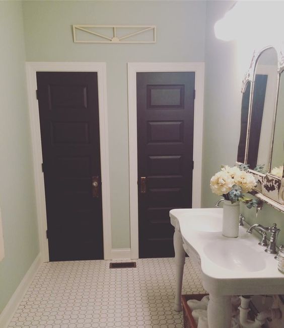
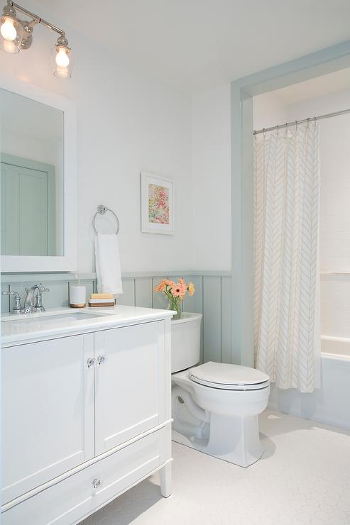
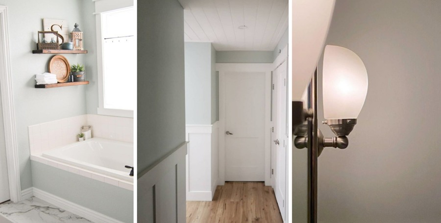
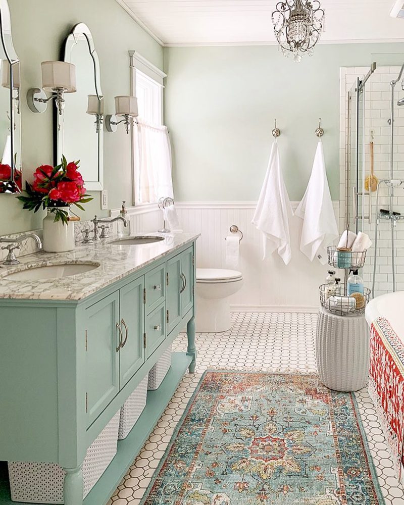
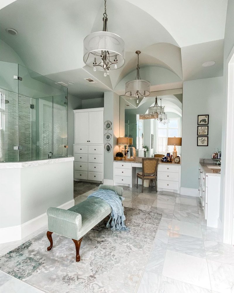
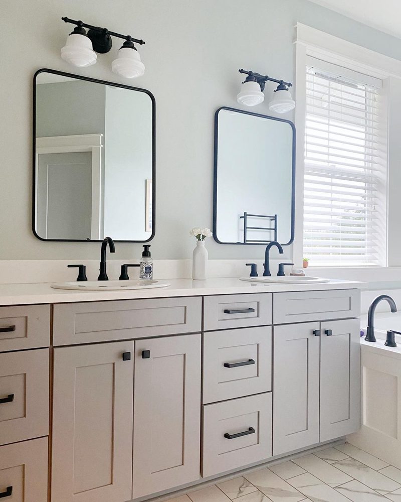
Sea Salt Bathrooms
Final Thoughts
Sherwin Williams Sea Salt adds a sense of comfort and homeliness whether you use it in interior or exterior spaces. Its flexibility allows you to mix things up without limiting your options.
Also, its soft cool appearance can form the basis for several exciting decor ideas. Remember that you have to get the paint right to pull off wonderful decor. Sea Salt opens up your options, especially indoors.
Finally, the color’s tendency to lean into blue or green depending on lighting sounds like getting two colors for the price of one!
 Sherwin Williams Agreeable Gray (Palette, Coordinating & Inspirations)
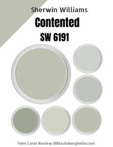 Sherwin Williams Contented (Palette, Coordinating & Inspirations)
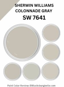 Sherwin Williams Colonnade Gray (Palette, Coordinating & Inspirations)
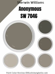 Sherwin-Williams Anonymous (Palette, Coordinating & Inspirations)
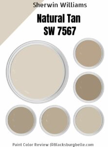 Sherwin Williams Natural Tan (Palette, Coordinating & Inspirations)
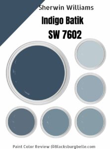 Sherwin Williams Indigo Batik (Palette, Coordinating & Inspirations)
