
Undoubtedly, greens have some magic in them. They bring the magic of nature, tranquility, and calmness into any room. But, with the numerous greens on the Sherwin Williams color palette, which green should you choose?
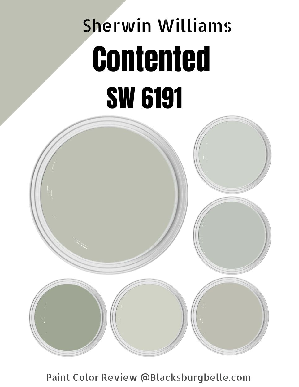
Well, you should consider trying Sherwin Williams Contented. A natural beauty, the Contented SW 6191 adds a relaxing vibe to your home, giving you a reason to spend more time in it.
Sherwin Williams Contented SW 6191 is a medium-toned, balanced paint color that is neither too light that it washes out in bright light nor too dark that it becomes boring in dim lights. It is one of those unique paint colors that work in all rooms, from your living room to your bedroom and kitchen.
This detailed guide will take a deeper look at SW 6191. I will help you explore this paint color to the fullest, answering all your questions about the paint color, including perfect coordinating and trimming paints. Read on to learn more.
Table of Contents
What Color is Sherwin Williams Contented?
| Manufacturer | Sherwin Williams |
| LRV | 52 |
| RGB | R: 189 G: 192 B: 179 |
| Hex Value | #BDC0B3 |
| Color Collections | Living Well (Balance) |
At heart, Sherwin Williams Contented is a green color. However, it is more of a balanced green shade that is neither loud nor soft. It is the kind of green that can soothe the tension you have going on in any space.
RGB of Sherwin Williams Contented
The RGB scale shows the amount of red, green, and blue in a specific paint color. The scale runs from 0 to 255.
Sherwin Williams Contented combines red: 189, green: 192, and blue: 179. As you would expect for a green color, green in Sherwin Williams Contented is more than blue on the RGB scale.
LRV of Sherwin Williams Contented
LRV stands for Light Reflectance Value. This scale runs from 0 to 100 and shows the amount of light a specific paint color can reflect. Pure black sits at zero, reflecting zero percent light. Pure White, on the other hand, sits at 100, reflecting 100% light.
Sherwin Williams Contented sits near the middle of the LRV scale, with an LRV of 52. The paint color reflects 52% of light and absorbs 48%.
Is Sherwin Williams Contented a Warm or Cool Color?
Sherwin Williams Contented is a cool, calm color. It is often a perfect option for homeowners in warmer and tropical states. The color helps balance the warmth in these houses, resulting in a more balanced feel and keeping the rooms from feeling too hot.
Sherwin Williams Contented Undertones
Sitting behind the subtle primary green in Sherwin Williams Contented are two undertones—blue and gray. Gray, however, seems to take the more dominant position, with blue coming in second.
Therefore, you are likely to see more gray than blue when you look at Contented in most lighting conditions. However, do not forget the blue undertone makes Sherwin Williams Contented a cool green.
Sherwin Williams Contented Color Strip: Sherwin Williams Contented Color Comparisons
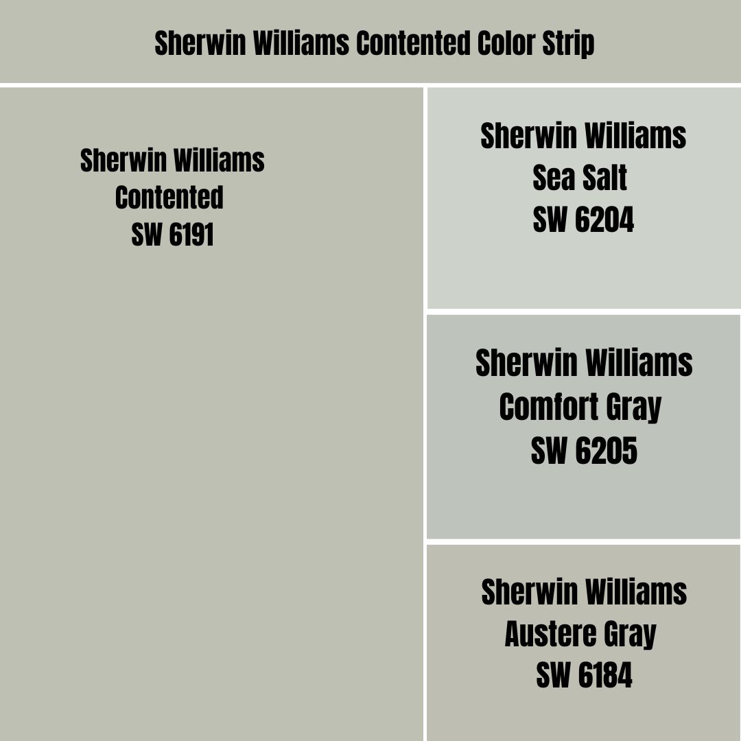
Sherwin Williams Contented vs. Sea Salt (SW 6204)
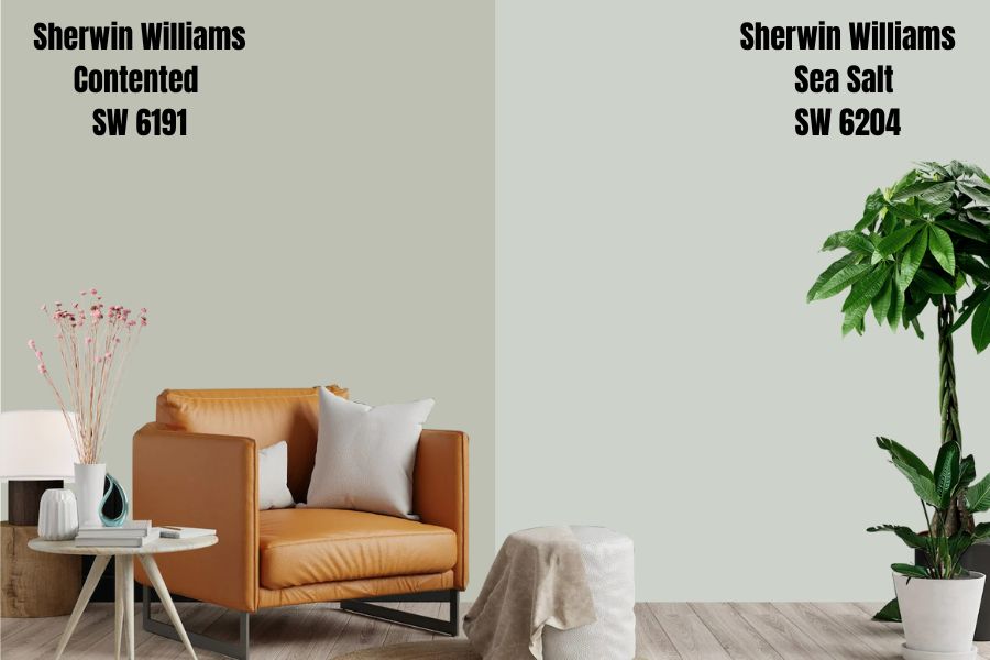
Sherwin Williams Sea Salt is a beachy-themed paint that combines green and gray as its primary tones. The paint color also does have blue, which takes a back seat, letting gray and green take the lead.
Sea Salt boasts the same color combination as Contented. On the warm-cool scale, Sherwin Williams Sea Salt sits on the cooler side—a cool green, combining green and blue (the cool shade, in this case).
Sea Salt is more reflective than Sherwin William Contented. The high reflectivity can be seen in Sea Salt’s higher LRV value—Sea Salt has an LRV of 64. The higher LRV in Sea Salt suggests that SW 6204 may be ideal for dimmer rooms—that is, some of the rooms that could make the Contented paint color lose its personality could work with Sea Salt.
Sherwin Williams Contented vs. Comfort Gray (SW 6205)
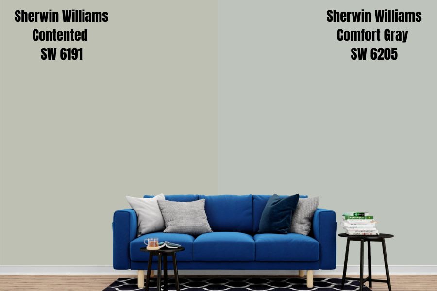
When I think of muted tones and soothing pastels, Sherwin Williams Comfort Gray is one of the first colors that come to my head. Like Sherwin Williams Contented, Comfort Gray is not too light, but at the same time, it is bold and charming, boasting a relaxing and stress-free vibe.
While the name could make you think that Comfort Gray is full Gray, it is not. Comfort Gray, more like Contented, is a Gray Green paint color with a dose of blue. However, the blue undertone is more muted, and the chances of viewing it are minimal.
You will be surprised to learn that Comfort Gray and Contented sit highly close on the LRV scale. While Sherwin Williams Contented reflects 52% of light, Comfort Gray reflects just 2% more light with its LRV of 54.
Both colors are solid and deep enough to add character to rooms with bright light. However, they are also low on their reflective ability so they may become bland in a room with dim light—they work well in rooms with enough light.
Sherwin Williams Contented vs. Austere Gray (SW 6184)
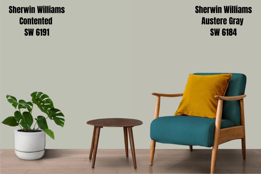
Sherwin Williams Austere is another green color featuring deep gray undertones. Like Sherwin Williams Contented, Austere Gray is an attractive paint color that is delightful and has a calm-down feel. However, Austere Gray is slightly deeper than Contented and falls on the darker side.
The two colors, however, are not that different regarding their ability to reflect light. Sherwin Williams Contented reflects just 1% more light with an LRV of 52 compared to Austere Gray, which has an LRV of 51.
Regarding the tones in Austere Gray and Contented, the two colors are pretty similar. While Austere Gray’s light and airy-green appearance can fool anyone, the paint color comes with a hidden blue undertone—just like Contented. The blue undertone quickly turns Austere Gray into a cool green color, ideal for balancing the heat in hot southern-facing rooms.
Sherwin Williams Contented Palette
Sherwin Williams Contented Coordinating Colors
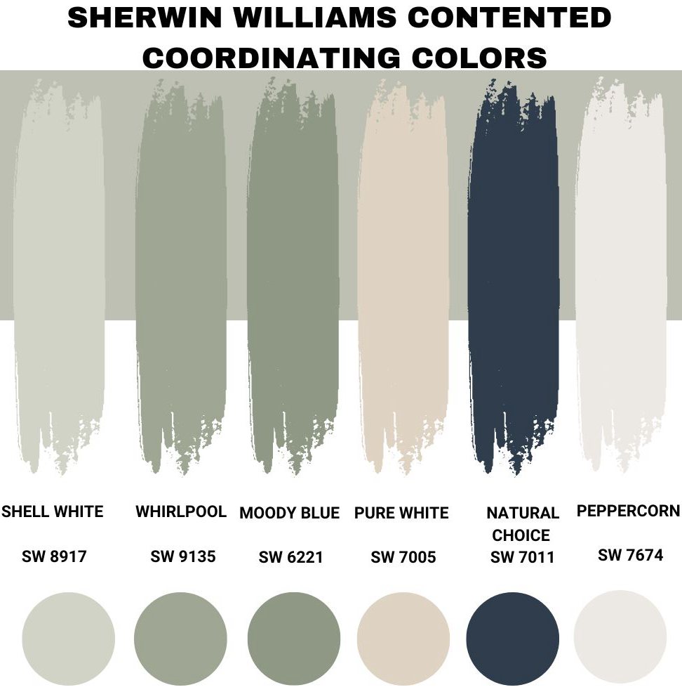
When looking for coordinating colors for Sherwin Williams Contented, you can choose between monochromatic and contrasting color palettes. The choice you make, however, will depend on the interior design style you are going after.
In the case of contrasting looks, you can go after cool and crips whites, mustards, darker and lighter grays, blacks, and mid-toned to lighter beiges. For a monochromatic appeal, you must choose colors that closely resemble Sherwin Williams Contented.
Below, I will give you several options that have worked great for me in the past:
Sherwin Williams Filmy Green (SW 6190)
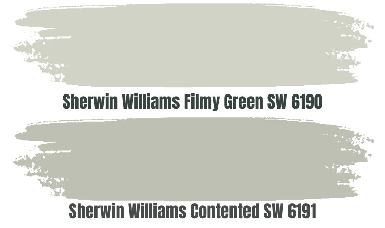
Sherwin Williams Filmy Green (SW 6190) is a cool light green color that boasts a nature-inspired vibe. Pair it with your Sherwin Williams Contented, and you will be impressed with the tranquility the two colors bring to your living room.
Sherwin Williams Filmy Green, like Contented, combines green and gray and may also feature a dose of blue, bringing in the cool appeal. However, do not be afraid that the two colors look similar that you won’t be able to tell them apart in a room.
One thing that separates Filmy Green from Contented is the LRV. While Contented reflects only 52% of light, Sherwin Williams Filmy Green reflects 64% of light. While the two colors will need a well-lit room to show their true character and to keep them from becoming boring, the eyes can quickly identify that they are two different colors in your interior design project.
Sherwin Williams Coastal Plain (SW 6192)
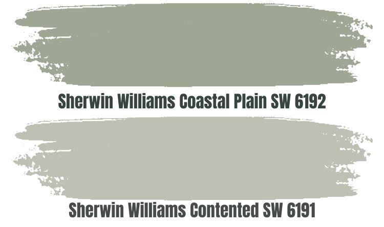
Sherwin Williams Coastal Plain (SW 6192) is a cool and calm green that is a typical paint in bedrooms because of its relaxed elegance. Like Sherwin Williams Contented, Coastal Plain paint color boasts blue, green, and gray tones. The green and gray tones are more visible, but the blue brings a sense of cool to the Coastal Plain.
Sherwin Williams Coastal Plain is a darker shade, especially when you compare it to Contented based on its ability to reflect light. On the LRV scale, Sherwin Williams Coastal Plain reflects 37% of light while Contented reflects 15% more with its LRV of 52.
The two colors will work well in a bright room. Putting them in a dim room could be a recipe for disaster as they will lose their personality and become dull. The two colors, however, will always blend well in any room, given they boast the exact color shades.
Sherwin Williams Jade Dragon (SW 9129)
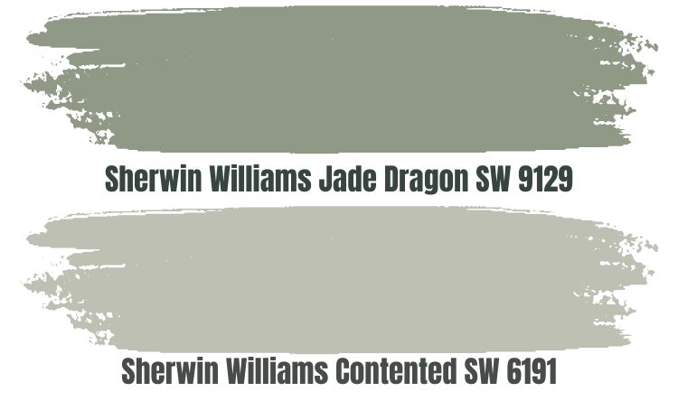
Sherwin Williams Jade Dragon (SW 9129) is a cool green paint color. However, just like Sherwin Williams Contented, it also boasts blue and gray undertones—this explains why it is a perfect option for you if you go after a monochromatic look in your design.
Sherwin Williams Jade Dragon is what you would consider a deeper version of Sherwin Williams Contented. Jade Dragon boasts an LRV of 30, reflecting 22% less light than Contented. For this reason, if you combine these two colors in one of your spaces, I recommend ensuring the entire space has enough light to keep the two colors from blurring.
It is also worth noting that both Contented and Jade Dragon are cool colors. Therefore, using them in spaces that are not cold by default would be a good idea. While a warm southern-facing room would be ideal for the colors, a north-facing cold room becomes icy with the two paint colors.
Sherwin Williams Natural Linen (SW 9109)
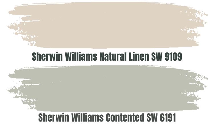
Up to this point, we have discussed the options you should consider using when creating a monochromatic view. Don’t worry; I have not forgotten about the contrasting look. Natural Linen SW 9109 is one of the best options to create a contrasting look with Sherwin Williams Contented.
Sherwin Williams Natural Linen is a beige paint color that fits numerous styles and does not seem to alter much regarding the room’s appearance. Natural Linen is a warm-toned neutral color that may feel slightly pinkish in some lighting conditions. The color allows you to balance the cool in Contented, bringing its warmth to your room.
Natural Linen is more reflective than Sherwin Williams Contented. Natural Linen boasts an LRV of 66, while Content has an LRV of 52. Therefore, Natural Linen may be a good color that creates some interest in slightly dim rooms. However, since Natural Linen is not in the off-white range, you may want to ensure it sits in a bright room to avoid a bland look.
Sherwin Williams Naval (SW 6244)
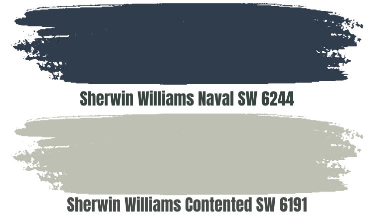
Naval is another impressive paint color you can use to create a contrasting look with Contented. Naval is a luxe color that is both attractive and full of splendor. The paint color brings the feeling of utmost luxury and richness to any room.
Unlike Sherwin Williams Contented, which has blue as an undertone, Sherwin Williams Naval is a bold, dark blue color. While the paint is pretty, it creates a profoundly bold and eye-catching backdrop that seamlessly enriches areas in your home with flowing positivity.
However, when planning where to put Naval, you may want to consider the amount of lighting in your rooms. Remember, Contented does not reflect much light with its LRV of 52. Naval has an even lower LRV, with a value of 4. Therefore, ensure the space is bright enough for both colors to maintain their personality and avoid creating a bland look.
Also, remember that the Naval is a blue color. Therefore, the Naval is cold, like Sherwin Williams Contented. For this reason, a warm room would be ideal—the two colors could make a cold room icy. Use the two colors in a southern-facing room with warm southern light while steering clear of north-facing rooms. Otherwise, you could make your space too icy.
Sherwin Williams Snowbound (SW 7004)
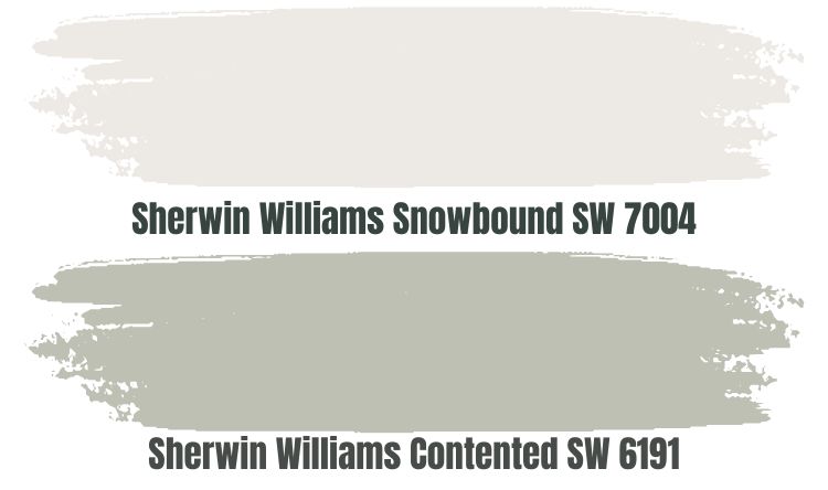
Off-whites create a nice look when you pair them with cool greens like Contented. The impact is even more visible when the off-white is cool, like Sherwin Williams Snowbound.
Snowbound defines the concept of greige—a combo of beige and grey. When looking at Snowbound at a distance, you may wonder whether it is a warmer or a cooler shade. A closer inspection, however, reveals that this is a cool color. For this reason, when pairing Snowbound with another cool color—in this case, Sherwin Williams Contented—you will want to do that in a warm room, for example, a south-facing room.
Most of the colors we have mentioned here have a low LRV and require you to ensure the room has enough light. Well, this is not the case for Snowbound. Snowbound has an LRV of 83. Even in a dim room, the paint color will reflect enough light onto the Contented, bringing its personality back to life.
Sherwin Williams Contented Complementary Color
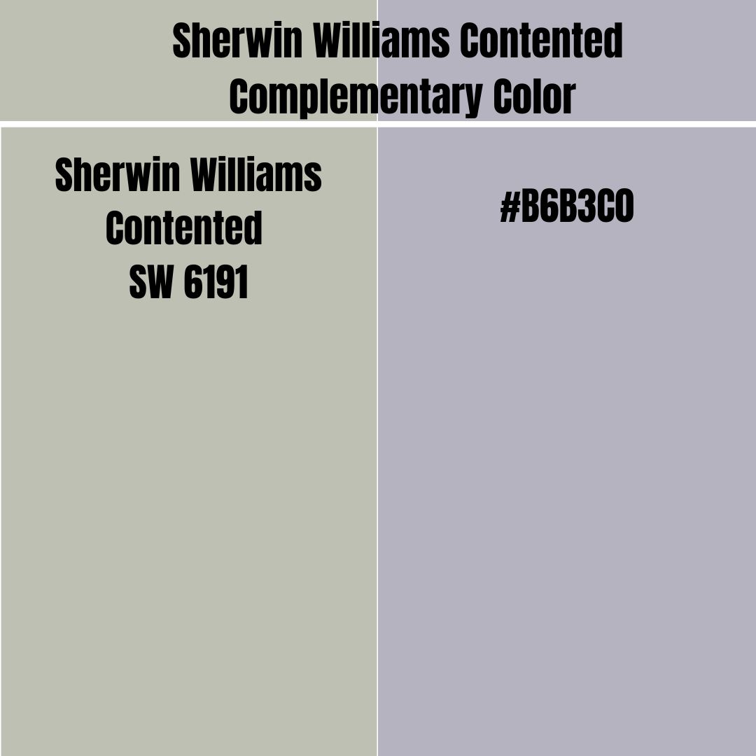
Sometimes you may want to take the contrasting look a notch higher. You may want to use a color opposite of Sherwin Williams Contented. In that case, you will need a complementary color that sits on the opposite side of the color wheel.
The complementary color for Sherwin Williams Contented has the hex value #B6B3C0. This paint color is a medium blue shade and features some black hints. Currently, the paint color does not have an official name.
What Trim Colors Go with Sherwin Williams Contented?
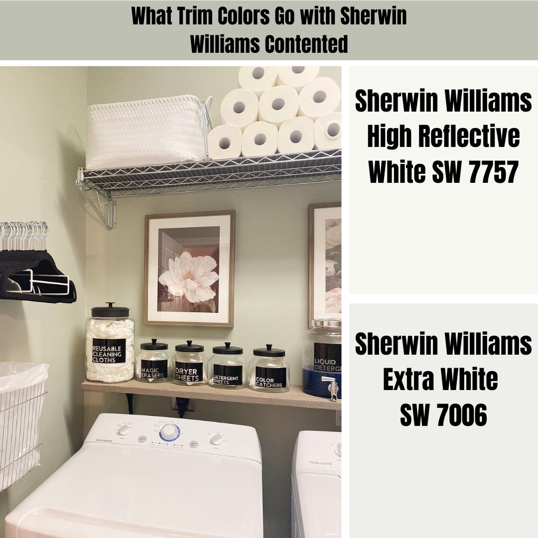
For greens like Sherwin Williams Contented, I have noticed that whites tend to create an exceptionally appealing look when they are on the trims. Therefore, you can consider these options if you are still wondering about the colors to use on your trims when working with Sherwin Williams Contented.
Sherwin Williams High Reflective White (SW 7757)
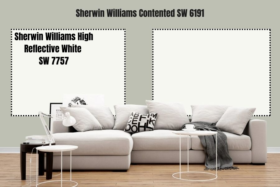
This is probably the whitest color you will find on the Sherwin-Williams Color palette. While true White is supposed to have an LRV of 100, none of the colors on the Sherwin-Williams catalog has hit this magic figure—High Reflective White, however, has the highest LRV of 93.
High Reflective White is a unique color that is neither cold nor warm. It is also a neutral white that does not feature any noticeable hue. However, one thing you can be sure of is that this paint color will add interest to any room, irrespective of how dimly lit it is. The paint color will reflect enough light, ensuring Contented does not become bland.
Sherwin Williams Extra White (SW 7006)
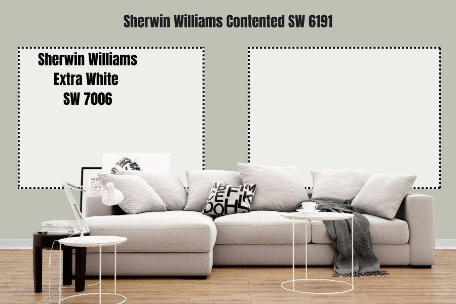
Sherwin Williams Extra White gives your trims a clean and crisp appearance. While it is not as reflective as High Reflective White, it still does hold its ground in the reflectivity department with an LRV of 86.
Extra White is neutral and does not feature any hints of yellow or warm undertones. The paint color is slightly cool, although it’s not as cool as Sherwin Williams Contented. However, if you are to use this paint color in trims with Contented, the excellent idea would be to use a warm pairing color or use them in a warm south-facing room.
Sherwin Williams Contented Benjamin Moore Version
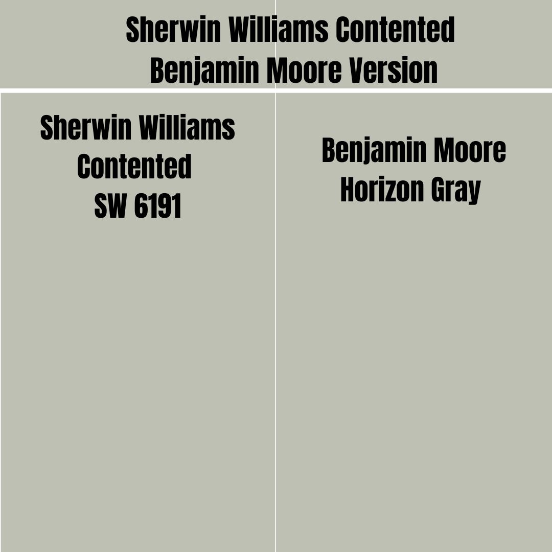
If you are planning to try the Benjamin Moore brand while hoping to maintain the same look offered by Sherwin Williams Contented, your best bet is to take advantage of Benjamin Moore Horizon Gray.
On the RGB scale, Horizon Gray combines red: 191, green: 192, and blue: 177. This is close to Sherwin Williams Contented, which combines red: 189, green: 192, and blue: 179. Benjamin Moore Horizon Gray and Sherwin Williams Contented are incredibly close on the LRV scale, with Contented boasting an LRV of 52 while Horizon Gray has an LRV of 50.68.
How Does Light Affect Sherwin Williams Contented?
Southern-facing light tends to be warm. It is also bright enough and brings out Sherwin Williams Contented’s complete personality. As an added benefit, in south-facing rooms, Contented is more balanced, with the warmth in these rooms keeping the color from getting too cold.
Light getting in northern-facing rooms tends to be softer. It can give Sherwin Williams Contented its whole personality if it is bright enough. Light in northern-facing rooms also tends to be cool. When combined with the coolness in Sherwin Williams Contented, the coolness in this light can make the room feel too icy.
Best Rooms for Sherwin Williams Contented SW 6191
Sherwin Williams Contented is very flexible and versatile in its use. You can use the paint color in various settings. Below, I will show you real-life pictures of places where Sherwin Williams Contented has been used:
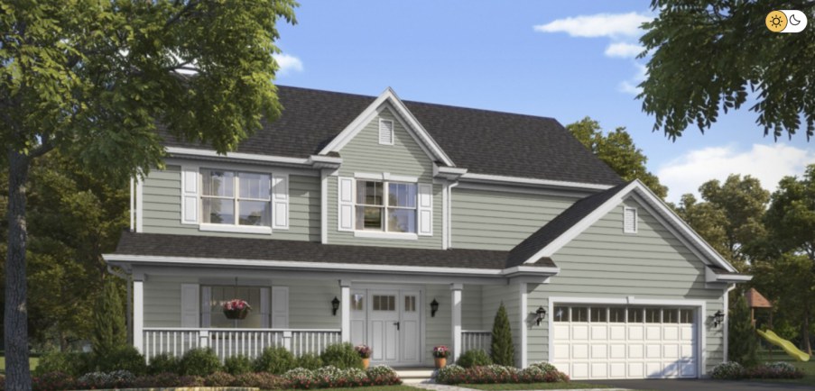
Contented Sherwin Williams Exterior
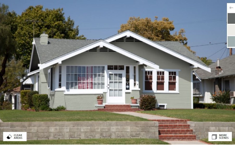
Sherwin Williams Contented is an impressive color because it boasts a balanced lightness. When used outdoors—for example, in the house above—the paint holds its ground, displaying a perfect balance of green and gray.
As noted earlier, Contented works exceptionally well when trimmed with white colors. The above house uses this exact approach, creating a work of art.
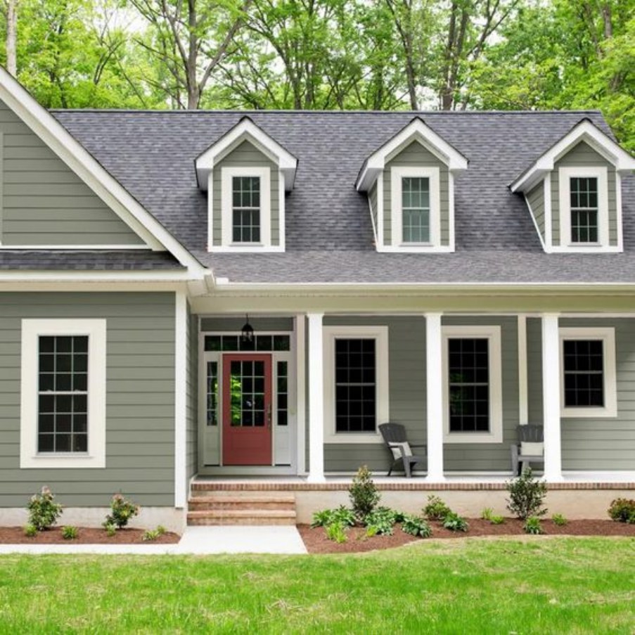
This is another impressive use of Sherwin Williams Contented outdoors. Like the earlier house, this homeowner also pairs Contented with white trims to create an appealing look. In this case, the light seems slightly lower, making the color appear darker than it is typically.
This house presents a perfect opportunity for us to compare the extent to which Sherwin Williams Contented makes the house resemble something from nature. The green provided by the trees makes the house feel like part of this environment. The Contented paint color is impressively trimmed with White and has a dark gray on the roof, making it stand out.
Sherwin Williams Contented Cabinets
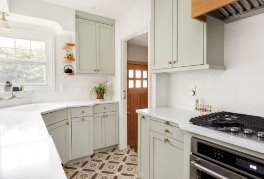
Sherwin Williams Contented stands out on cabinets. This is especially the case when whites or off-whites surround the paint color. In the above cabinets, Contented breaks the monotony that would have resulted if the cabinets were also white or off-white.
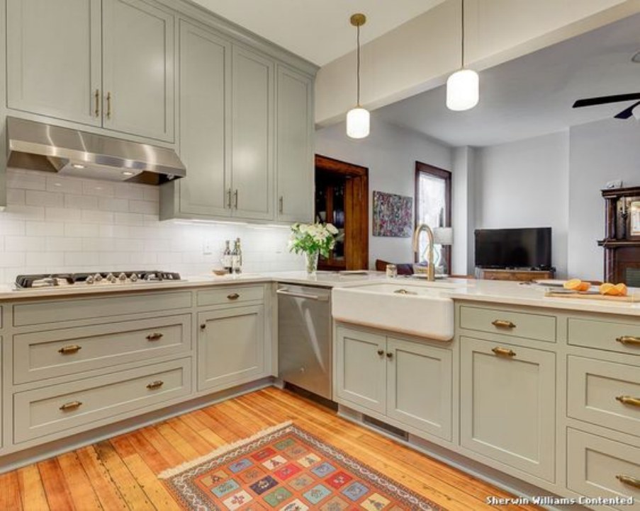
This is another perfect case of pairing Contented perfectly with off-whites and whites: the off-white and white colors blend perfectly with Contented on the cabinets. While the Contented SW 6191 does not create a significant difference, it ensures the Sherwin Williams Contented kitchen cabinets look the part.
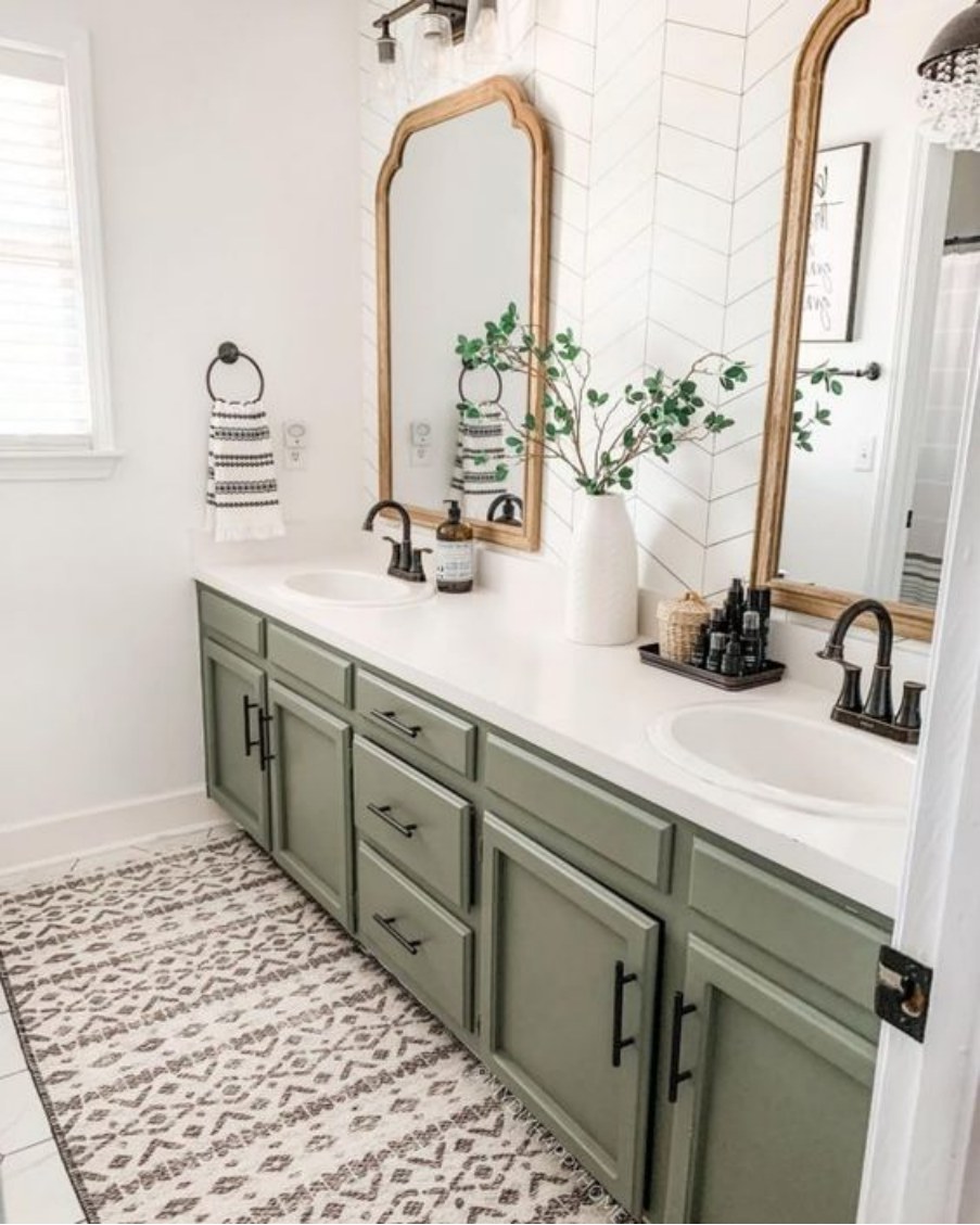
The previous pictures have looked at Sherwin Williams Contented kitchen cabinets. The above image takes a different direction, with these cabinets sitting in the bathroom.
The cabinets blend in well with the whites in the room and the cream tiles in the ground. While the creamy tiles add some warmth, Contented brings a cool feeling ensuring the bathroom does not get too hot.
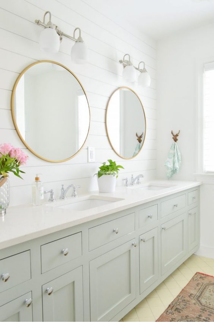
Sherwin Williams Contented Bathroom
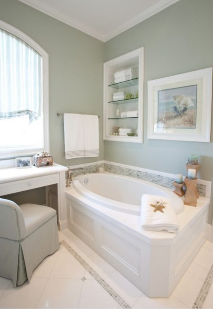
Sherwin Williams Contented always pairs nicely with whites and off-whites in bathrooms, as evidenced by the picture above. While Contented sits pretty on the walls, the whites occupy every other part of the room, reflecting enough light into Contented, ensuring that the color has enough personality despite its low LRV.
Unlike the previous bathroom, which uses Contented on the walls and White on other decors, the roles are reversed in this bathroom. White sits on the walls while Sherwin Williams Contented sits on the cabinets. Still, the look is impressive enough and catches your eye at first look.
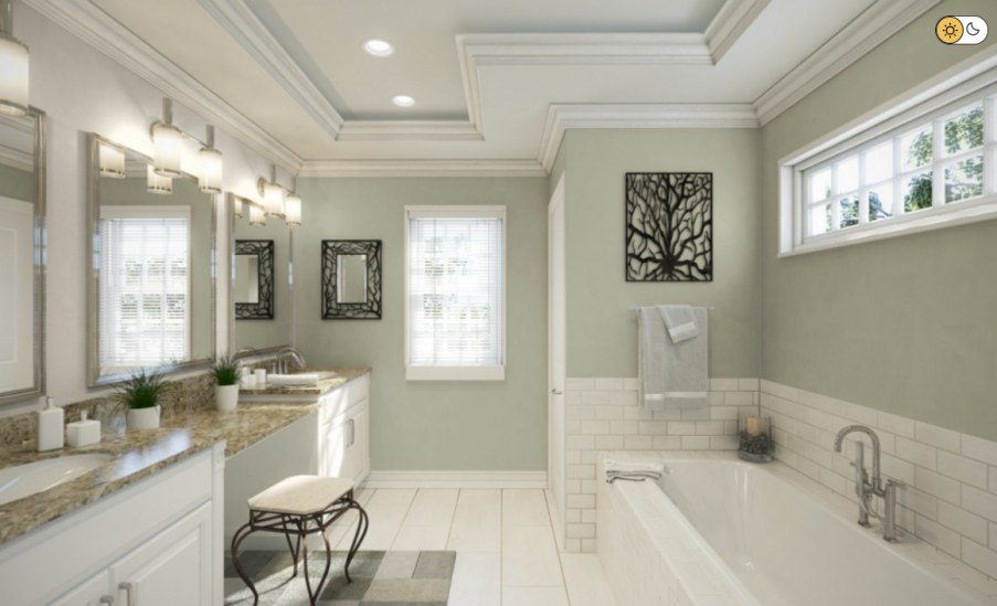
This bathroom clearly shows how Contented would look when used in the walls in a spacious bathroom. The bathroom above is not just big; it is also well-lit and seems to allow warm southern light. The light in the room makes Sherwin Williams lean more on the gray-green side, hiding the cool blue in it—it makes the paint color look less warm.
Interestingly, however, Sherwin Williams Contented, in this room, has been paired nicely with whites and off-whites. The room has a balanced feel that is extremely comfy.
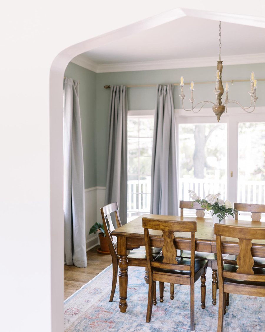
Sherwin Williams Contented Living Room
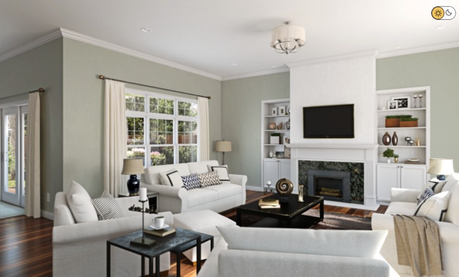
In this living room, light is enough, allowing the beauty hidden in Sherwin Williams Contented to shine through. Moreover, Contented is paired with off-whites and whites—these highly reflective colors allow light to bounce off them onto Sherwin Williams Contented, making it even more interesting.
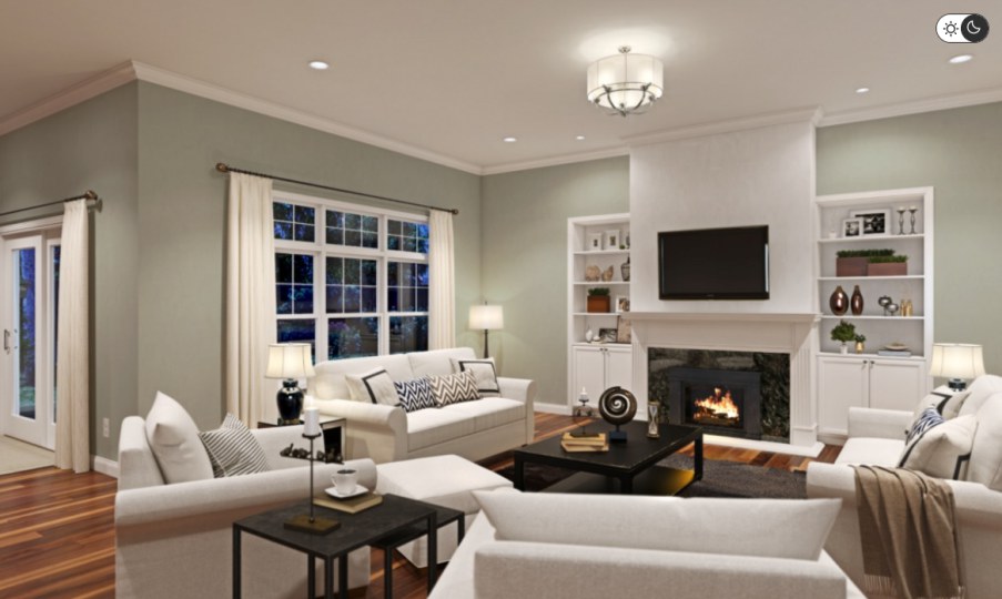
As noted earlier, Sherwin Williams Contented sits in the middle on the light reflectivity value scale. Therefore, ensure the room is well-lit if you do not want it to lose its hue and become dull.
The above room displays the appearance of Sherwin Williams Contented at night but in a well-lit room. Because of enough lighting, the paint color retains the same attractive look it had during the daytime.
This room demonstrates what happens when you put Sherwin Williams Contented in a softer light. While the paint color is gray-green by default, it seems to have taken a bluish appearance in this room. The softer light brings out the paint color’s cool blue tone. Regardless, the room has an excellent interior design where Contented is trimmed nicely with whites and off-whites.
Overview
Sherwin Williams Contented sits in the green paint color category. However, it differs significantly from generic greens, boasting a combination of gray and blue undertones.
Sherwin Williams Contented is quite versatile. You can use this paint color in all your rooms, from your living room and bedrooms to the kitchen and the outdoors. Also, when looking for pairing colors, you do not have to search for too long—Sherwin Williams Contented works well with numerous paint colors.
I hope this article has answered your questions about Sherwin Williams Contented. However, if you have additional questions about the paint color, please let me know in the comments.
 Sherwin Williams White Duck (Palette, Coordinating & Inspirations)
 Sherwin Williams Steamed Milk (Palette, Coordinating & Inspirations)
 Sherwin-Williams Rosemary (Palette, Coordinating & Inspirations)
 Sherwin-Williams Grayish (Palette, Coordinating & Inspirations)
 Sherwin Williams Dark Night (Palette, Coordinating & Inspirations)
 Sherwin Williams Oyster Bay (Palette, Coordinating & Inspirations)
