
Gray paint colors are usually trendy and always in demand because of how they hold everything together. However, not all gray colors are versatile or usable in every space, and you must find one that has just the right amount of neutrality. One such gray is Sherwin Williams Silverplate.
With so many options to choose from, it can be overwhelming. Popular ones may get thrown at your face, but if you want something softly elegant and laid-back, Silverplate should be on your list.
But don’t take my word for it; this guide will show you all there is to know about this paint color, including its LRV and undertones. You’ll also see the color at work in real homes, so you can easily decide if it’s the right choice. Ready to go? Let’s get right to it.
Table of Contents
When to Choose Sherwin Williams Silverplate
There are many uses for which you can put gray paint colors, whether it’s in the interior or exterior. So, why should Silverplate be your first choice when there are many other popular options? Here are some ideas to consider:
Want a laid-back wall color?
Silverplate is an elegant color that is subtle enough to work on walls without overwhelming the rest of the decor. It brings color without being loud or in your face.
Thinking of painting a shiplap?
We all love a beautiful shiplap, and while you can paint it any color, it usually looks amazing in gray. It will look even better in a subtle gray like Silverplate if you want to hang decorations on it.
Looking for a universal neutral?
Silverplate is a great neutral that accommodates many other colors. While it’s not as neutral as some you can name, it performs pretty well with vibrant colors and soft pastels.
Need a gray color that’s not overly crisp?
While it is a cool color, Silverplate is not crisp or icy, and it doesn’t have any hint of your traditional warmth.
You don’t have to try the gray paint colors everyone else is using. How about going on a different path and discovering the beauty of other options, making you a trendsetter? If you’ve picked Silverplate, I know there’s a reason, and I’ll help you make an informed decision. Let’s what else this color has for us, shall we?
What Color Is Silverplate?
The name already tells you what the color could be, and you’re not wrong. While there is nothing to point to the fact that Sherwin Williams picked this name for the paint color for this reason, I believe it may have something to do with how laid-back a typical silver plate can be.
The color also hints at silver, although the latter color is brighter and shinier. In certain conditions, Silverplate may look a little shiny, but it is not common. Its color is also similar to that of a silver plate, although it has none of the blandness.
Sherwin Williams Silverplate SW 7649 is a cool gray paint color that brings color without taking over everything. It works well as a backdrop so you can add splashes of color, whether it is other neutrals, bold colors, vibrant hues, or soft pastels.
A Snapshot of the Specifications of Sherwin Williams Silverplate
A summary of the basic characteristics of this paint color will give you a better understanding of what makes it up. At just a glance, you can see details such as undertone and LRV, which are the most important aspect. So, here’s a chart for that purpose.
| Sherwin Williams Silverplate | |
| RGB | 194, 192, 186 |
| LRV | 53 |
| Undertone | Blue-green |
| HEX Code | #C2C0BA |
The LRV of Sherwin Williams Silverplate
You may have seen this term when searching for good paint color but have never found out what it means. LRV is the light reflectance value of color and is one of the most important characteristics of any paint color.
It refers to the amount of light that color can reflect based on a scale of 0 to 100. The more light the color can reflect, the higher it goes on the scale, and the less light it reflects, the lower down the scale it goes.
That means white is closer to 100, while black is closer to 0. However, paint colors don’t have absolutes, so the scale is from 2.5 to 94.
Sherwin Williams Silverplate has an LRV of 53, which makes it a mid-tone gray. It reflects a fair amount of light, but not too much. It will require a good amount of natural light to work.
The Undertones of Sherwin Williams Silverplate
Since every color is derived from a mixture of other colors, there’s always an undertone. It may be minimal, but it’s there, and that’s why there are no pure blacks or pure whites.
Silverplate is a gray paint color, which means it’s neutral, but it favors an undertone of blue that may lean a little green in certain lighting. The good news is that this undertone is pretty minimal and doesn’t overwhelm the main color. In many cases, you will not notice it.
This is Silverplate as it should be, showing no undertones:
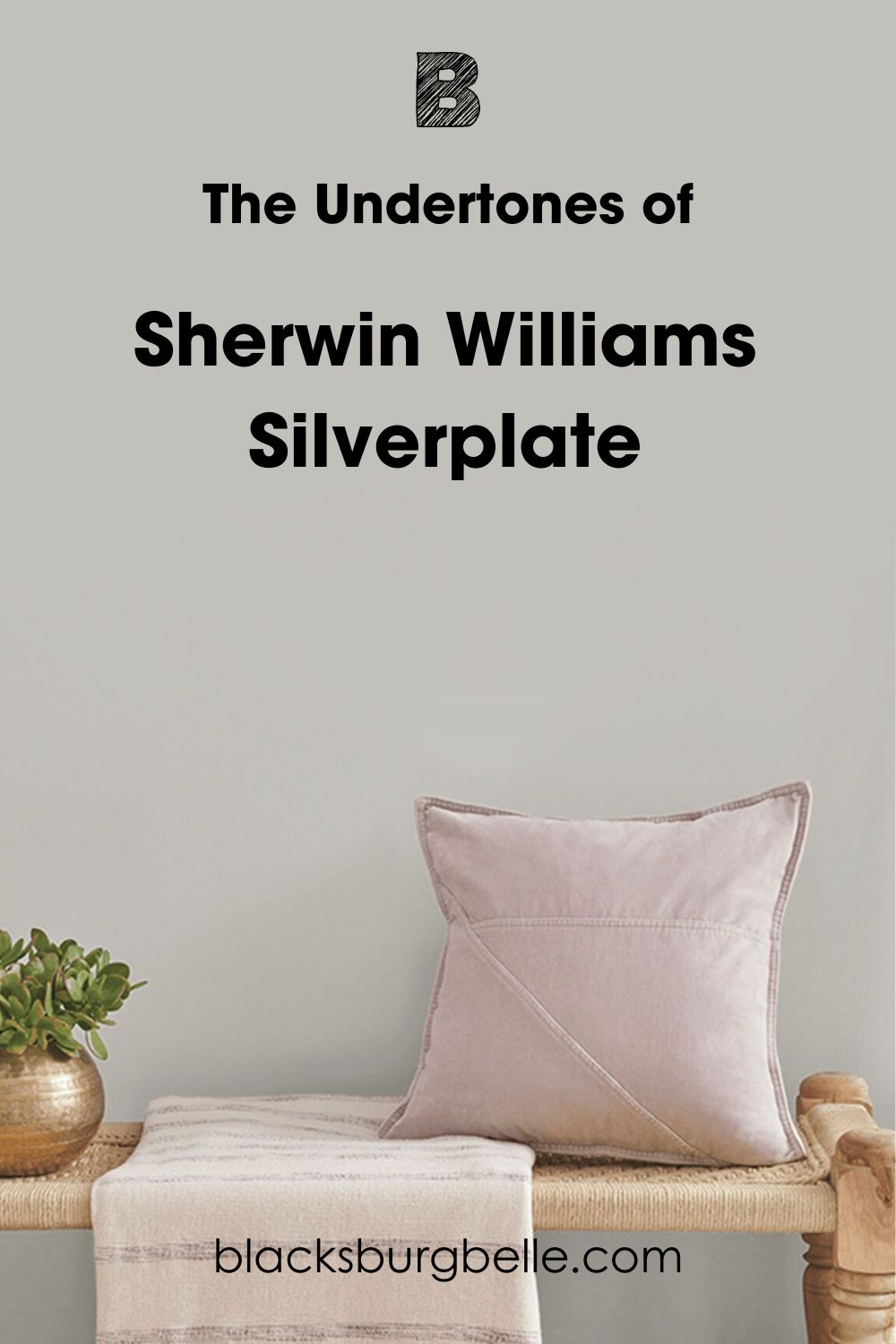
Now, here is the same paint color showing a hint of blue-green in this bedroom:
How Does Lighting Affect Sherwin Williams Silverplate?
Lighting is the biggest factor that affects how you see or perceive a paint color. While Silverplate is a mid-tone gray color, it may look drab or dull if the light is too low. It may also show more of its cool undertones than usual. That’s why I earlier said it loves light.
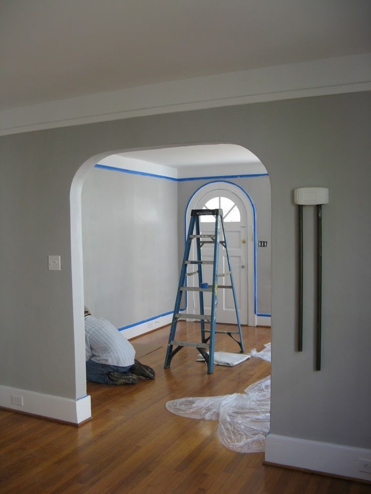
In the inner part of the picture above, Silverplate doesn’t look muted but appears a solid gray. But the outer part looks muted, and you can notice a hint of blue in some areas.
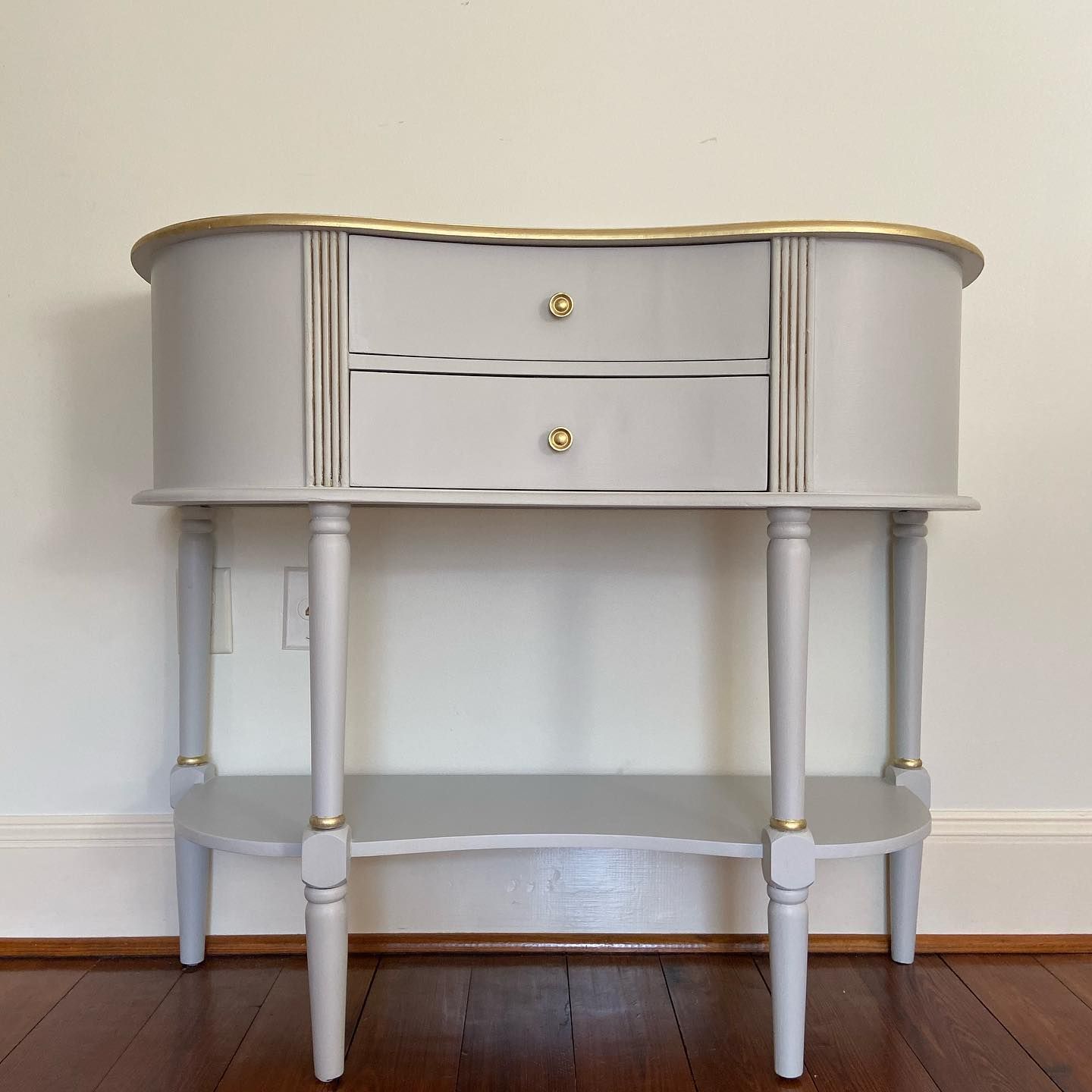
This next picture is a beautiful representation of Silverplate on an armoire. The bright natural light adds to the beauty and gives you a striking picture of the color if the setting is right.
Apart from natural lighting, artificial lighting can also play a role in how the final result of this paint color appears. Yellow artificial light may transform Silverplate, making it appear different from what you envision. Fortunately, it’s a cool color, so the transformation is usually not ugly.
How Does SW Silverplate Feel in a Room?
Silverplate is a fresh and airy color when done right. It brings this quiet elegance that not every color has. If the room is small, it can make it appear bigger. And if the room is already big, it may look palatial. Use it with other neutrals, soft colors, and plenty of light for the best results.
Sherwin Williams Silverplate: Warm or Cool?
By now, you may already know this, but Sherwin Williams Silverplate is a cool color. This has something to do with its natural color of gray, but the undertone of blue contributes to its cool tone. However, the hint of green in it stops it from being crisp or icy, although it’s not at all warm.
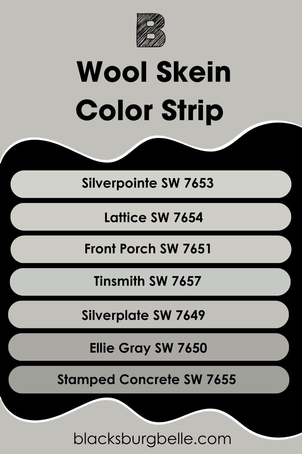
Sherwin Williams Silverplate Color Strip: Lighter to Darker Exploration
If you find Silverplate too light or too dark for your taste, you have nothing to worry about. There are other color options from the same collection, ranging from light to dark, to give you a broad selection. Check out the list below for inspiration:
- Sherwin Williams Silverpointe SW 7653
- Sherwin Williams Lattice SW 7654
- Sherwin Williams Front Porch SW 7651
- Sherwin Williams Tinsmith SW 7657
- Sherwin Williams Silverplate SW 7649
- Sherwin Williams Ellie Gray SW 7650
- Sherwin Williams Stamped Concrete SW 7655
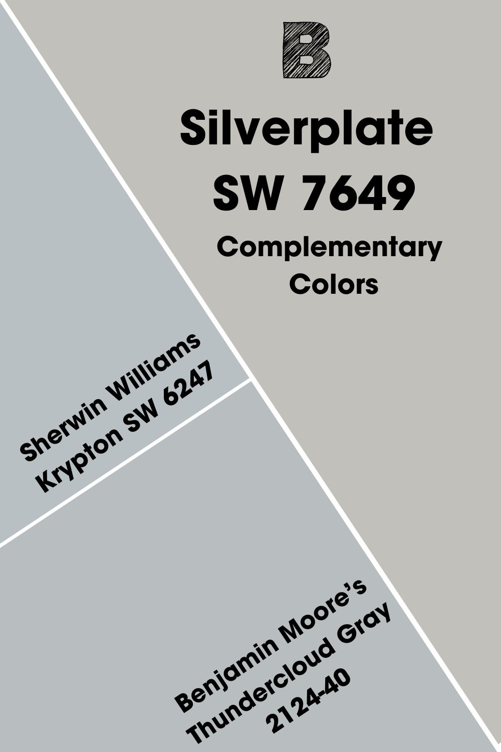
Sherwin Williams Silverplate Complementary Colors
If you look at a color wheel, you will notice that every color faces another color. Red faces green, yellow faces purple, orange faces blue, and so on. These are complementary colors; they are opposite each other on the color wheel. They cancel each other when mixed to create a grayscale color like black or white.
Silverplate is a gray color, and gray doesn’t appear on the color wheel because it’s neutral. However, it is not your traditional gray because of the hint of color in it. Therefore, it has a complementary color, which is light blue-gray.
Sherwin Williams Krypton SW 6247 is a pretty close match to this color. But Benjamin Moore’s Thundercloud Gray 2124-40 is also close to this color. It is a good alternative if you don’t find the Sherwin-Williams color.
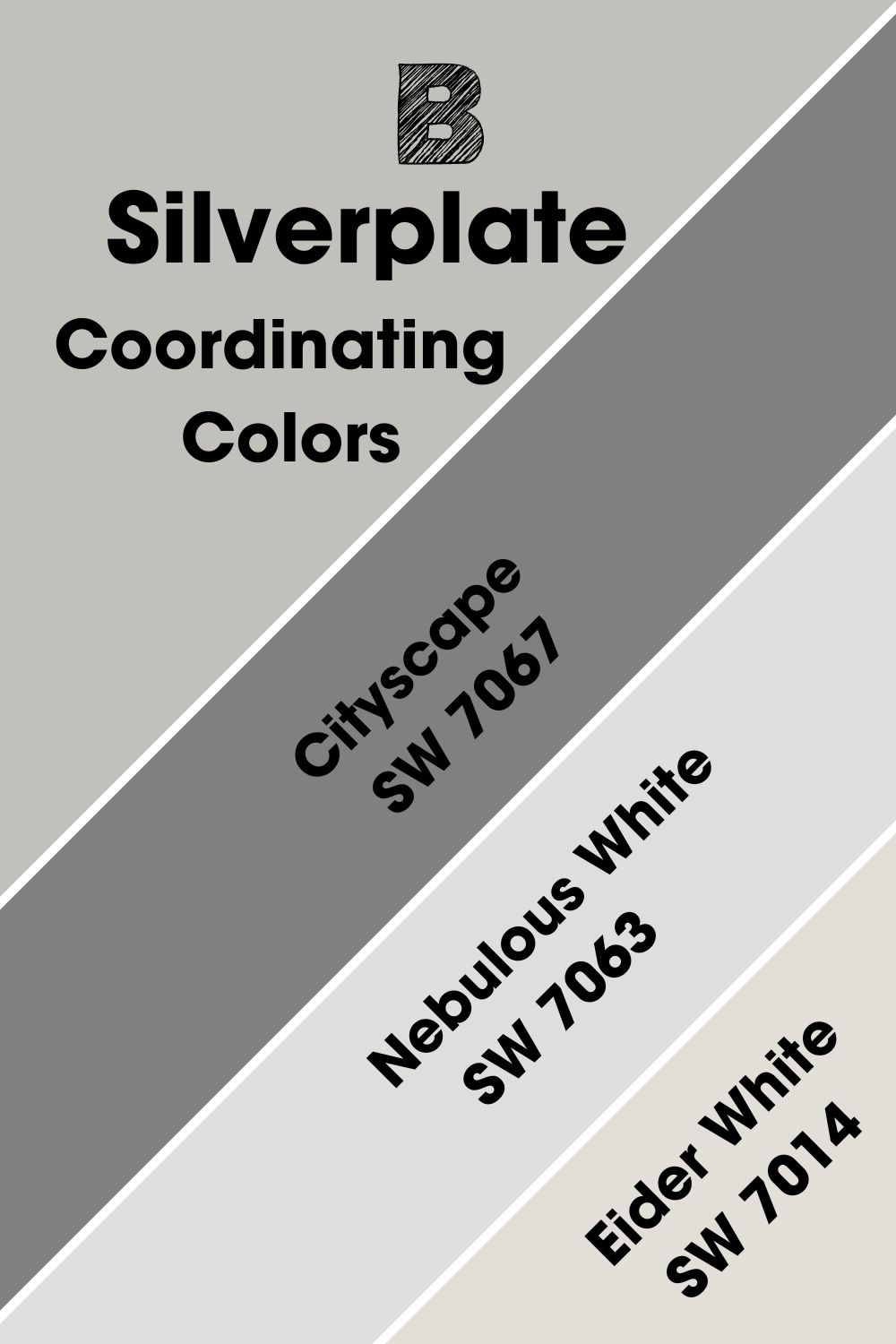
Sherwin Williams Silverplate Coordinating Colors
These are colors that work well with the central hue, regardless of their color. Coordinating colors typically have some similarities that make them flow seamlessly in any color scheme. When used together, they present a pleasing appearance.
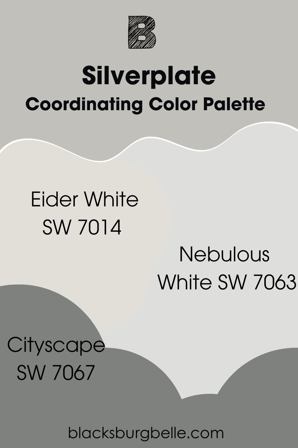
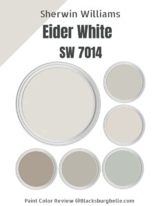
The coordinating colors for Silverplate are Cityscape, Nebulous White, and Eider White.
- Sherwin Wiliams Cityscape SW 7067: A saturated dark neutral color, this gray brings out the light airiness in Silverplate.
- Sherwin Williams Nebulous White SW 7063: With its blue undertone, this cool bright white is the perfect trim color for Silverplate walls.
- Sherwin Williams Eider White SW 7014: Like Nebulous White, this cool white pairs well with Silverplate because of its gray undertone.
Sherwin Williams Silverplate Color Palettes
As part of decorating your home, it is important to find the right color scheme that matches the decor. You can create a color palette to incorporate the colors you want and get a beautiful flow of shades from room to room. So, here’s a guide to get you started:
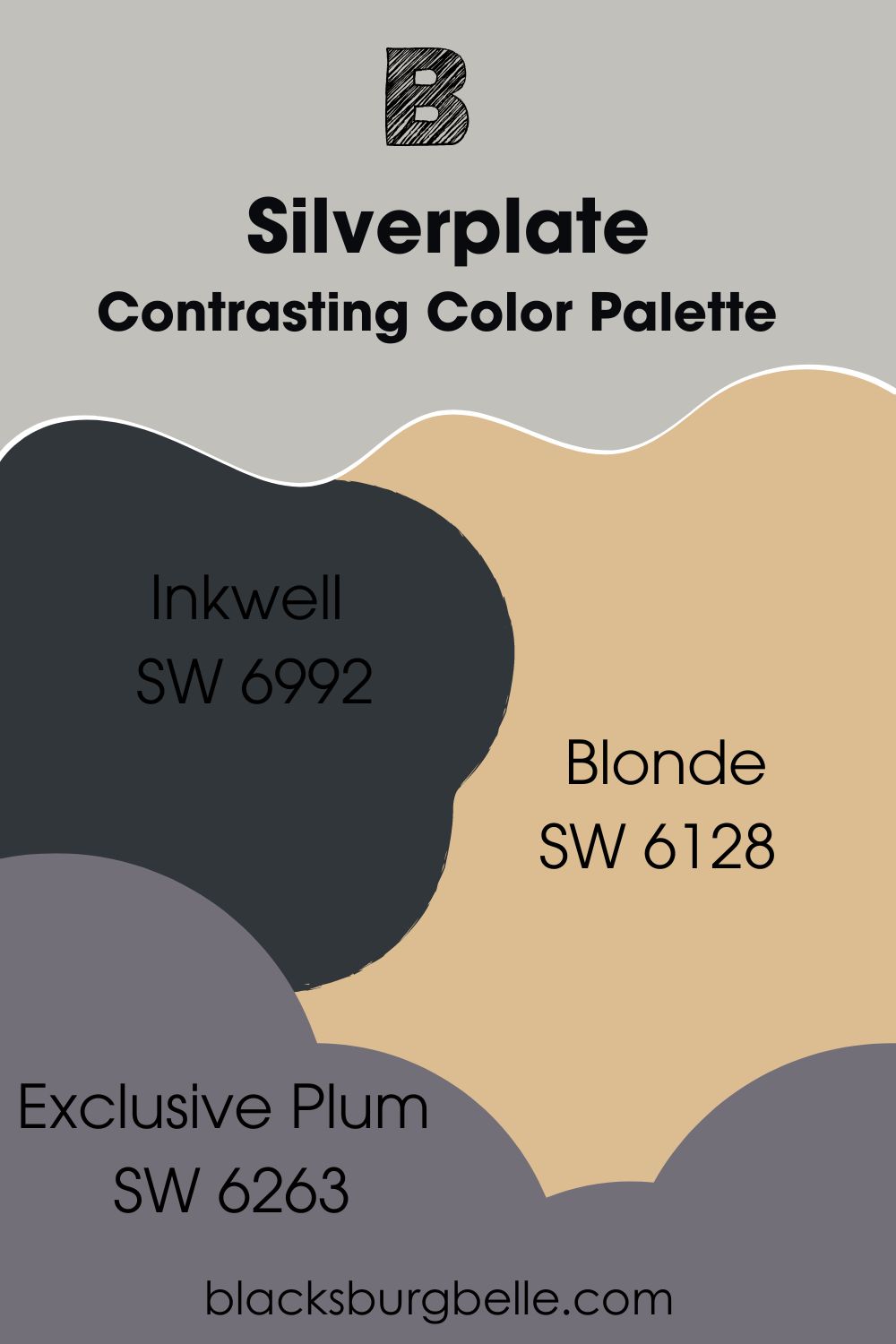
Contrasting Color Palette
- Inkwell SW 6992: A black paint color made deeper by the hint of blue in it, making it ideal for decor with Silverplate.
- Blonde SW 6128: A mid-tone yellow paint color with enough warmth to bring something uniquely different to any decor with the cool Silverpointe. Consider using it as an accessories color.
- Exclusive Plum SW 6263: As the name suggests, this paint color is plum and shows a little gray to match the tone of Silverplate.
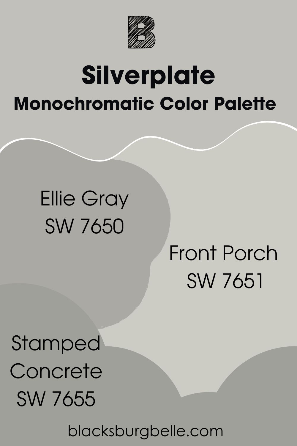
Monochromatic Color Palette
- Ellie Gray SW 7650: A darker shade of Silverplate, this paint color introduces a pop of color to complement the lighter Silverplate.
- Front Porch SW 7651: This is another shade o Silverplate but a lighter version with a cyan undertone for a lighter feel.
- Stamped Concrete SW 7655: A dark and cool shade of gray with a cyan undertone that pairs well with neutrals like Silverplate.
Coordinating Color Palette
- Eider White SW 7014: Like Nebulous White, this cool white pairs well with Silverplate because of its gray undertone.
- Nebulous White SW 7063: With its blue undertone, this cool bright white is the perfect trim color for Silverplate walls.
- Cityscape SW 7067: A saturated dark neutral color, this gray brings out the light airiness in Silverplate.
Sherwin Williams Silverplate vs Similar Colors
Are there colors that are similar to Sherwin William Silverplate? Of course, there are! The good news is that, while they are interchangeable, Silverplate remains unique from every other color. Let’s see how they compare.
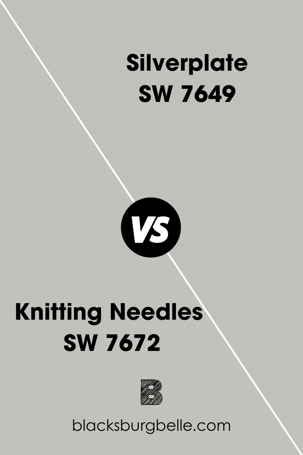
SW Knitting Needles vs SW Silverplate
Both colors have cool undertones; Knitting Needles has a purple undertone, while Silverplate has a blue undertone. And with LRVs of 53, both colors are pretty similar.
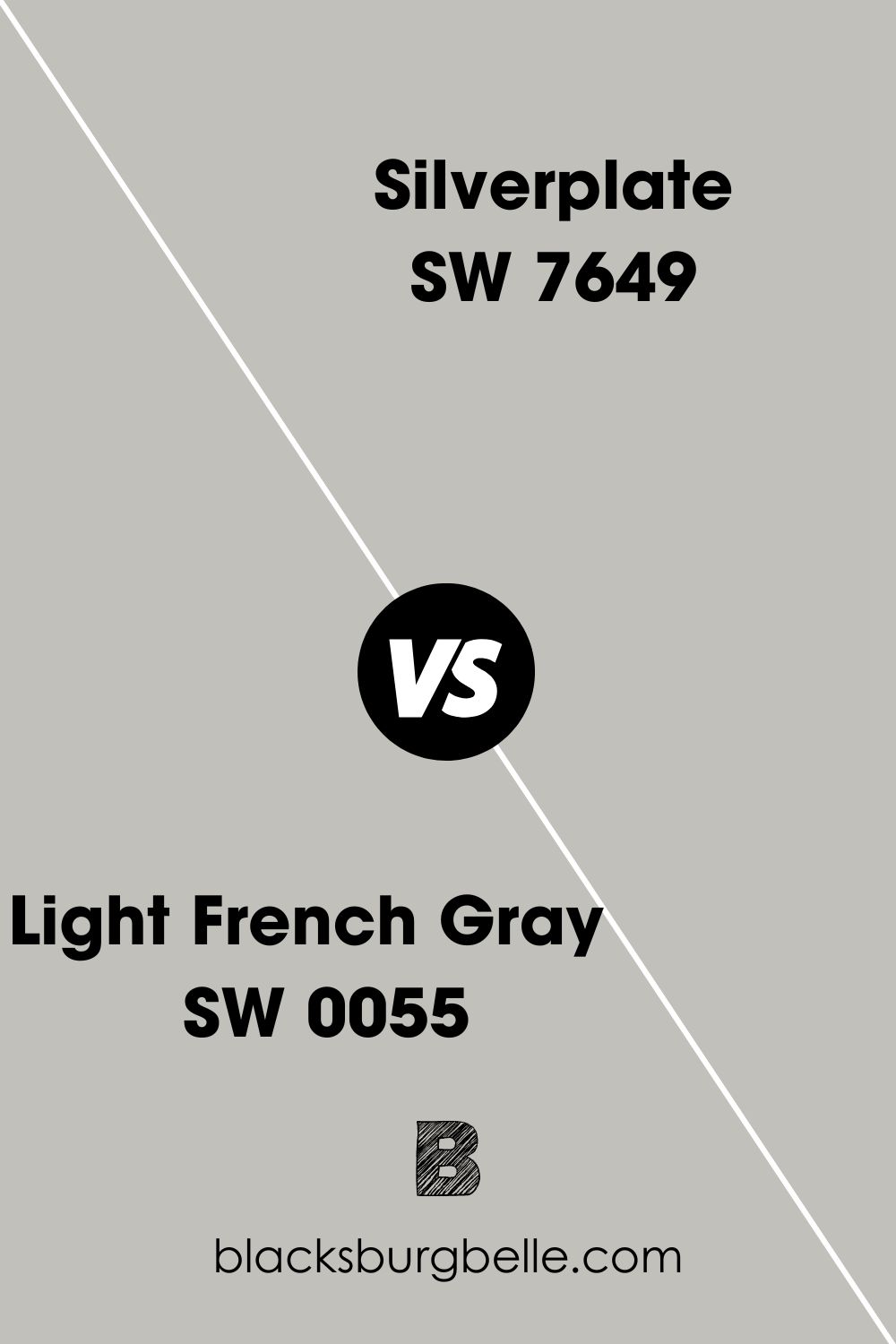
SW Light French Gray vs SW Silverplate
Light French Gray is more neutral than Silverplate, balancing between cool and warm tones. But they have the same LRV of 53 and almost the same shade.
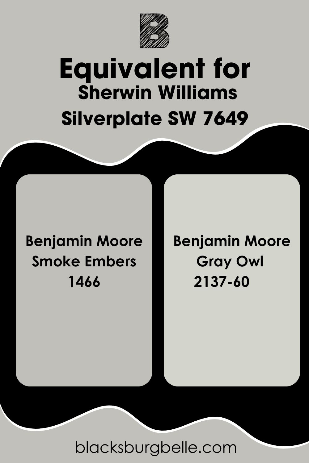
Benjamin Moore Paint Color Equivalent to Sherwin Williams Silverplate
If you are looking for an exact equivalent Benjamin Moore paint color match for Sherwin Williams Silverplate, you are not likely to find it. This is because there’s always a difference between colors, regardless of how alike they may be.
So, Silverplate has no equivalent color from Benjamin Moore. But Smoke Embers 1466 bears such a striking similarity to Silverplate that an untrained eye cannot tell the difference.
Their red, green, and blue (RGB) codes are almost the same, save for the difference of 1 in the value of blue in both colors. You can also compare Silverplate to Benjamin Moore’s Gray Owl 2137-60.
Where Can You Use Sherwin Williams Silverplate?
As a well-performing neutral, you can use Silverplate anywhere you choose. It looks amazing wherever there is a lot of light, so it looks good in your living room, kitchen, dining area, bedroom, and exterior.
You can also use it in a bathroom, laundry room, and anywhere else you like. Ready to see real pictures? Let’s go!
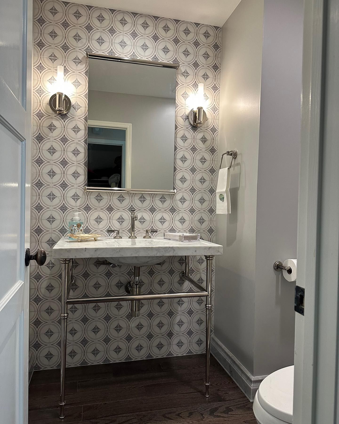
Sherwin Williams Silverplate in a Bathroom
Although bathrooms don’t usually have a lot of natural light, you can combine artificial and natural to brighten this color. Check out this bathroom for some ideas:
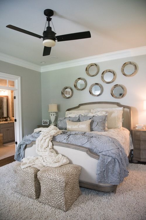
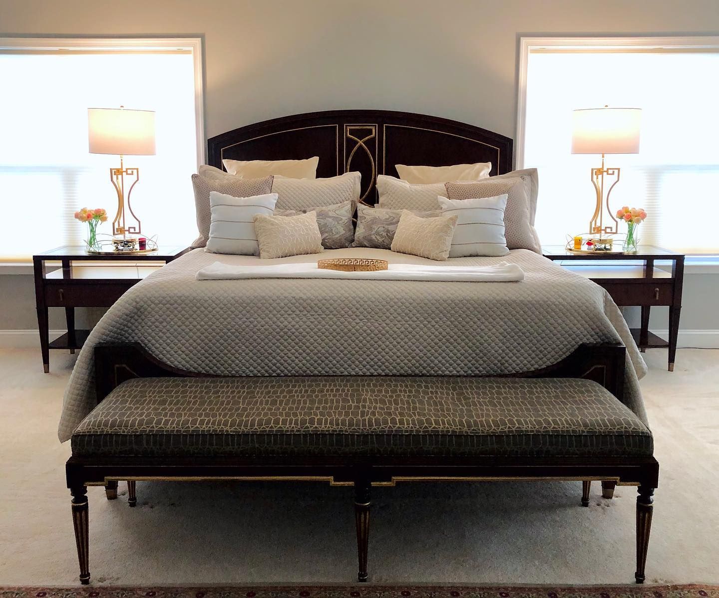
Sherwin Williams Silverplate in a Bedroom
This bedroom combines natural and artificial lighting to create a beautiful representation of Silverplate. You just want to come home to this every day.
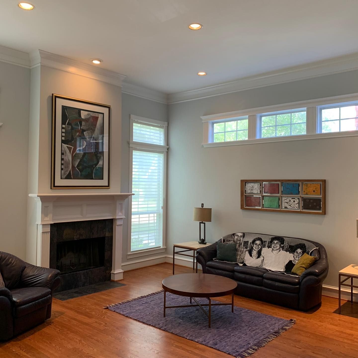
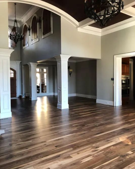
Sherwin Williams Silverplate in a Living Room
Silverplate pairs well with the wood flooring and other dark colors in this living room. It allows these other colors to blend well without getting in the way.
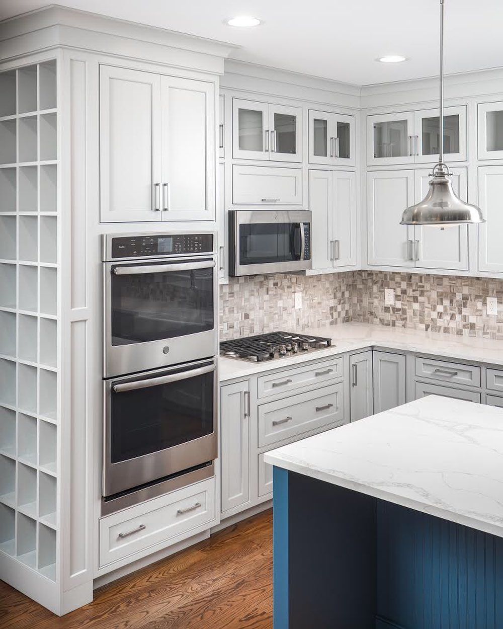
Sherwin Williams Silverplate on Kitchen Cabinets
This kitchen looks amazing with the bright white artificial light, making Silverplate look soft and creamy.
Best Ceiling Color for Sherwin Williams Silverplate Walls
This living room is yet to be decorated, but the walls are Silverplate and SW Storm Cloud. The ceiling is white, which is the best color to match these shades. Try the cool SW Extra White or SW Ceiling Bright White in such a room.
Best Trim Color for Sherwin Williams Silverplate Walls
A cool white is your best shot for a trim color when you use Silverplate on the walls. It is safe and makes the gray color pop.
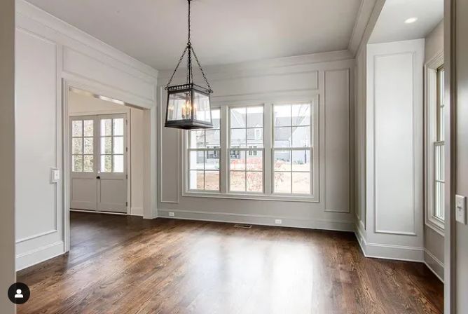
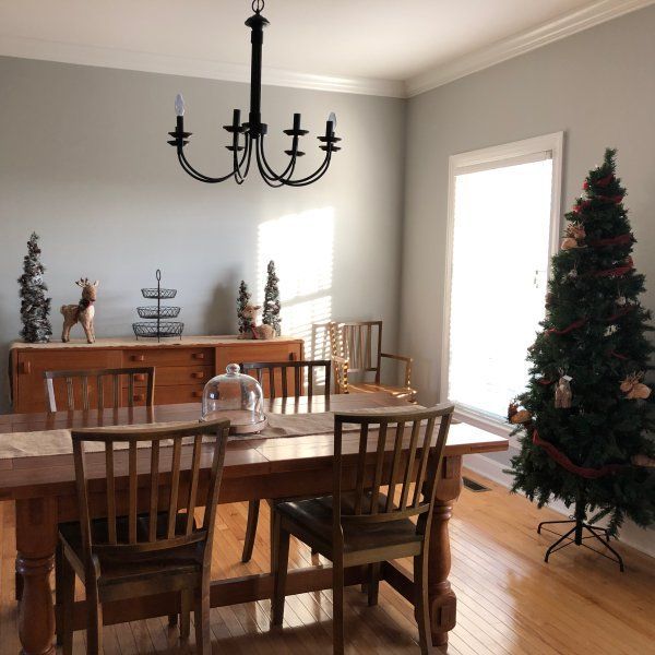
Sherwin Williams Silverplate in a Dining Area
You may already have this color flowing from your family room into the dining nook. But if you are hunting for a new dining room color, Silverplate is one to try.
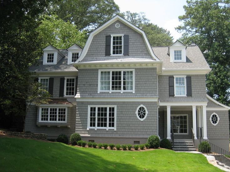
Sherwin Williams Silverplate on Exterior Walls
Siverplate looks spectacular on exterior walls, especially if you pair it with white or black. This next picture is proof of that.
Best Trim Color for Sherwin Williams Silverplate Exterior
I would suggest white, although black or wood tones also look great with Silverplate exteriors. It depends on the look you want, but nothing says you can’t try something new.

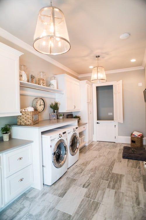
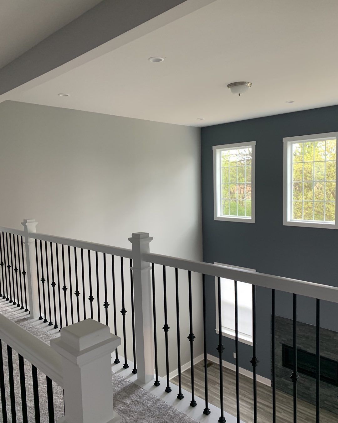
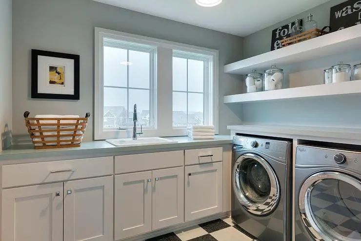
Sherwin Williams Silverplate in a Laundry Room
In this laundry room, Silverplate reveals a bit of its blue undertone because of the type of lighting. However, there is artificial lighting to supplement the natural one, and the room looks light, beautiful, and fresh.
Conclusion
You don’t have to look far to find the perfect gray with just so much coolness. Sherwin Williams Silverplate is a mid-tone gray with a blue undertone that can lean a little green in certain lighting. With an LRV of 53, Silverplate can reflect a fair amount of light
However, it looks its best when you use it in a room with a lot of lighting or outside the house. Pair it with other neutrals, blues, greens, and wood tones, whether dark or light. You can also try bold colors and slightly warm hues, especially when creating a color palette.
Get ready to be creative, and turn your home into that stunning vision you have, beginning with Silverplate. I can’t wait to see what you’ve done with the color because I’m rooting for you. Let me know your thoughts and experience with this color in the comments section.
 Sherwin Williams Eider White (Palette, Coordinating & Inspirations)
 Sherwin Williams Worldly Gray (Palette, Coordinating & Inspirations)
 Sherwin Williams Greek Villa (Palette, Coordinating & Inspirations)
 Sherwin Williams Aesthetic White (Palette, Coordinating & Inspirations)
 Sherwin Williams Egret White SW 7570: Review & Inspiration
 Sherwin Williams Escape Gray SW 6185: Review & Inspiration
