

Are you looking for the best blue paint for your whole house? Let’s see if Sherwin-Williams Windy Blue (SW 6240) can get the job done.
Although Windy Blue does not belong to any special collection or expert pick, this color surprised me!
It’s a soft powder blue with an almost neutral reflective capacity and a versatile color palette. I love that it’s a laid back cool tone rather than a chilly cold vibe.
Would WIndy Blue look good in my living room?” “Where can I use Sherwin-Williams WIndy Blue?” Well, at the end of this article, you’ll have the answers and more, including full details about Sherwin-Williams Windy Blue.
Table of Contents
When to Choose Sherwin-Williams Windy Blue?
Without a doubt, I’ll say choose Sherwin-Williams Windy Blue when you need to relax and step away from a hectic life. Your home should be a haven, and with this muted blue-gray paint, you can transform it into your everyday getaway spot.
Let’s see what Windy Blue has to offer.
Prepare to be Chilled
Windy Blue shouldn’t be in your office unless you’re in the business of getting people relaxed. I’m talking about spas, hospitals, and receptions.
Looking for Steady Light?
Sherwin-Williams Windy Blue provides adequate lighting for your space. There’s no question of it being too dark or too light.
Feeling Blue?
Everybody loves blue, but using Windy Blue, which has a gray undertone, takes the coolness to another level.
Need a Full House Color?
Windy Blue suits every room in your house from inside to outside.
Pool Party Host?
Windy Blue walls set a scenic backdrop for pools. So get ready to throw the best pool parties.
What Color is Sherwin-Williams Windy Blue?
You can take a wild guess and know why this mid-toned color is called “Windy Blue.” It’s a breezy tone that sometimes takes the color of a cloudy sky on a windy day.
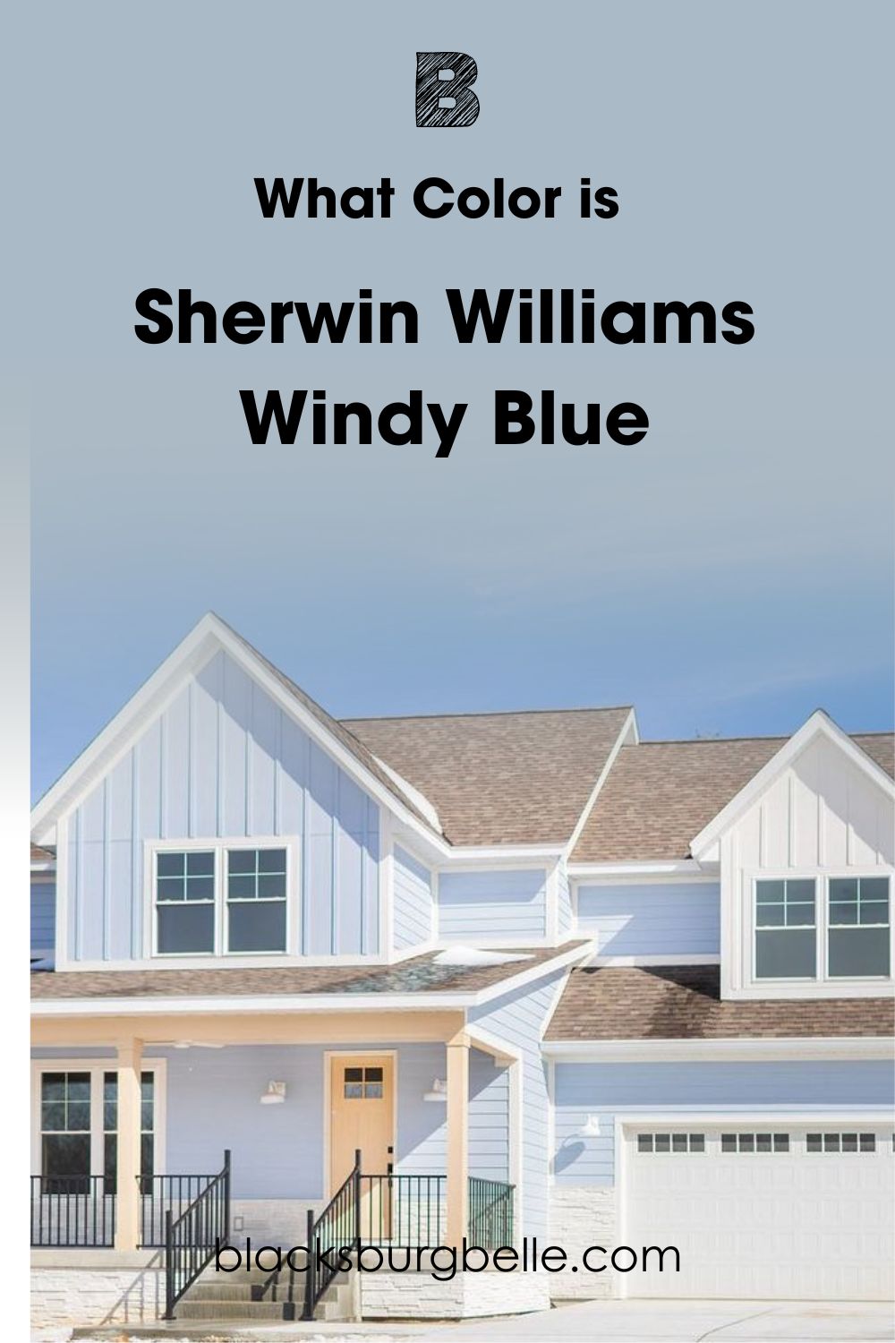
Windy Blue is relaxing and comforting, like a pool day after a stressful work week. Even the review process of this Sherwin-Williams paint was soothing. And I expect that’s how it’ll feel having it around you in real time.
It’s time to dig deeper into the details of Windy Blue.
Snapshot of Sherwin-Williams Windy Blue Specification
One look at this table and you can tell from a scientific point if Windy Blue is for you. It contains the RGB, Hex Value, Light Reflectance Value (LRV), and Undertones.
| Name | Windy Blue (SW 6240) |
| RGB | Red 170 | Green 186 | Blue 198 |
| Hex Value | #AABAC6 |
| LRV | 48 |
| Undertones | Gray |
What is the LRV of Sherwin-Williams Windy Blue (SW 6240)?
Designers measure the LRV of any paint on a scale of 3 – 97. Pure Black is 0 and bright white is 100 but you can’t get that purity level with paints because undertones take 2-3% off.
50 is a perfect neutral, 3-30 is dark, 31-45 is medium-dark, 46-55 is mid-toned, 56-75 is medium-light, and 76-97 is light.
Sherwin-Williams Windy Blue’s LRV is 48.
Following the scale, you can see Sherwin-Williams Windy Blue is close to the perfect median spot. So, for the most part, it’ll remain a soft and playful powdery blue paint. But under certain lighting conditions, you’ll get a muted gray tone.
Here’s how it works.
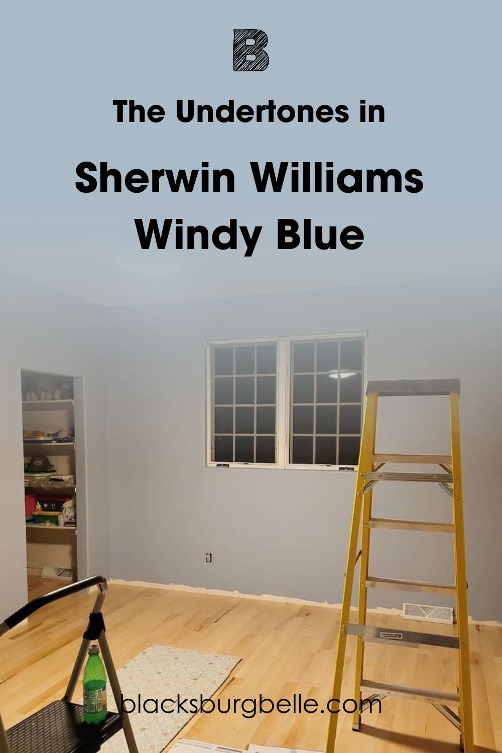
The Undertones in Sherwin-Williams Windy Blue
If you wonder why Sherwin-Williams Windy Blue sometimes looks like a silvery gray paint, it’s because of undertones. When you create paint from its RGB, the amount of each pigment determines what colors show up on the surface and which ones hide beneath.
All the undertone needs is lighting to reveal its alternate color(s).
See the example below.
Lighting and Windy Blue
You can only use lighting to your advantage when you know what you’re dealing with, and that’s why I’m here. I learned long ago that there’s more to illuminating a space than relying on sunlight. You can also use alternate paint colors and artificial lighting.
The technique for using natural sunlight and artificial lighting is different. With the sun, you must tap into your elementary knowledge of geography. So, here’s a brief refresher.
The sun rises in the East and sets in the West.
Use a compass to find each cardinal point in your rooms. But if you don’t have one, don’t worry. Stand outside your house and point to the sun with your right hand. For an accurate reading, ensure it’s at sunset or sunrise because you’re assured of the sun’s position.
Your right hand would face the East at sunrise so that the left hand in the opposite direction points West. Your front looks toward the North, and your back is to the South.
Once you’ve noted each cardinal point, mark it discreetly with a pencil and paper tape for reference once you start painting.
Now read this carefully:
South-facing rooms receive the most sunlight, especially in the morning from 8:00 am – 11:30 am. By noon, East-facing rooms heat up until 4:30 pm. Then, the West-facing rooms receive the dwindling sunlight’s glow until it sets minutes before 7:00 pm.
“What about the North-facing light?” It shines throughout the day but in a steady, minimal glow. That’s why it’s the best option for maintaining the two-toned beauty of Windy Blue.
With artificial lighting, you’ll need white light to get a muted glow and yellow light for a more intense blue tone.
Let’s get to the fun part!
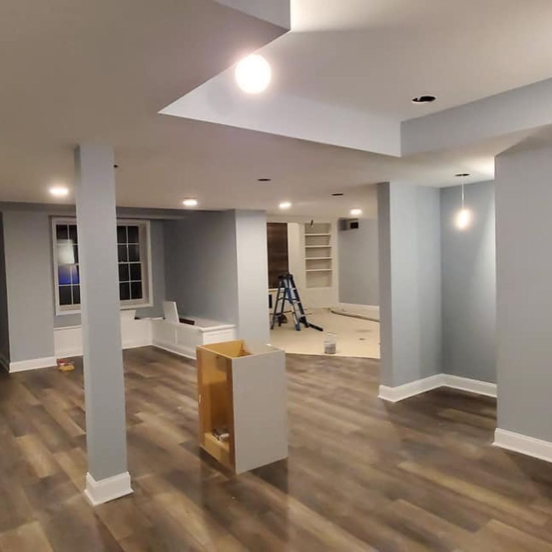
Does Windy Blue look Gray?
You’ll get a grayish-blue color if you use Sherwin-Williams Windy Blue in a South-facing or East-facing room. The same applies when using a white bulb or fluorescent light in the room.
See this large space, for example. You can barely notice the powdery blue tone buried under the breezy silvery gray.
Even though there’s barely any lighting coming from the window, and it’s visibly dark, there are enough white lights in the ceiling to create an illusion of brightness.
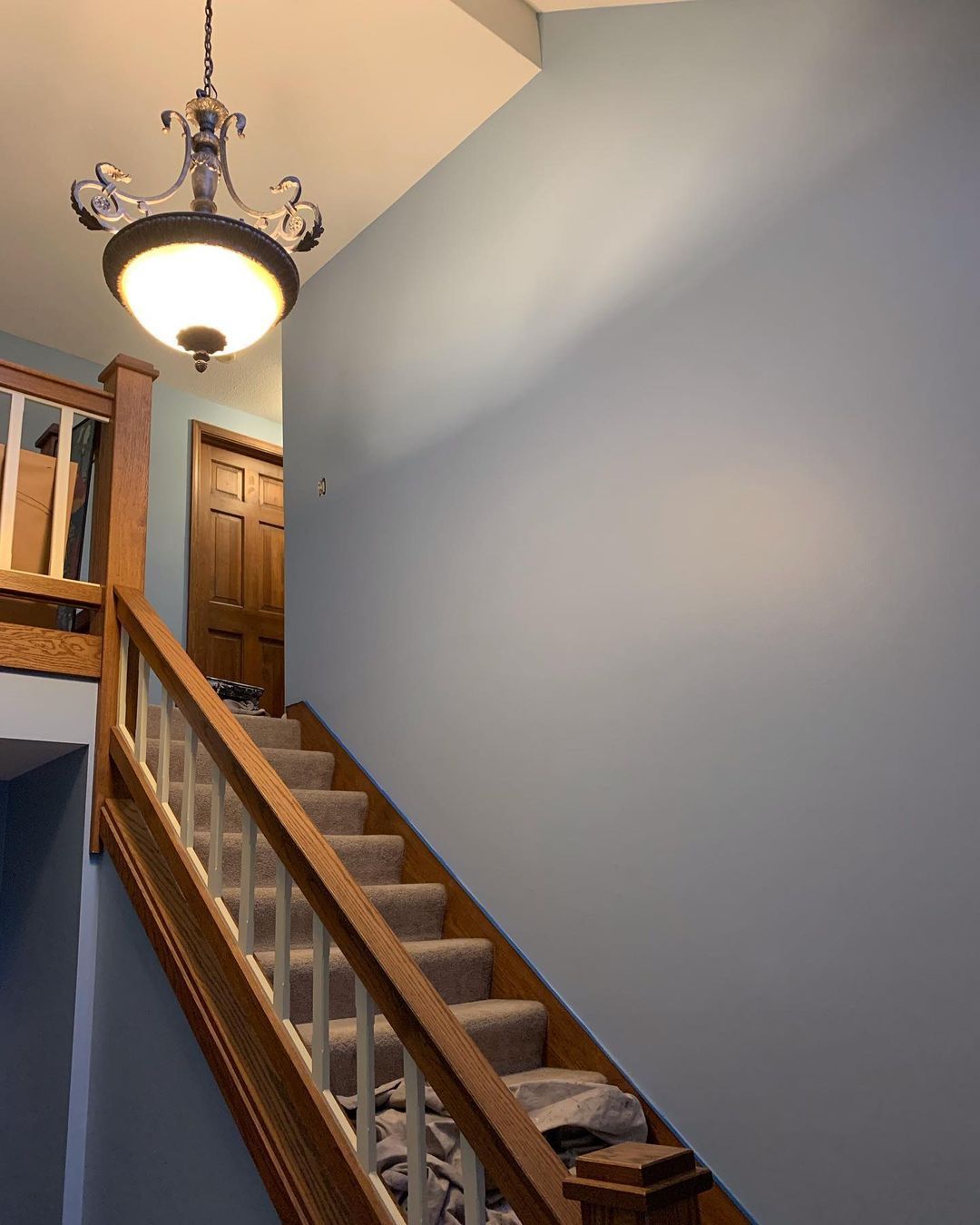
Compare that first picture with this one that has a yellow light and dark brown staircase. You can see the powdery blue reflection of Windy Blue in this enclosed space. So, you see how different lighting can bring out different sides of the color.
I prefer this darker version, but which tone is your favorite?
Is Sherwin-Williams Windy Blue a Warm or Cool Color?
Sherwin-Williams Windy Blue is cool and relaxed. It almost feels like the color speaks for itself regarding its aura and emotions.
It took a while to complete this review because whenever I picked up Windy Blue, it made me “lazy.” Little wonder many designers recommend using it in gender-neutral nurseries.
If you’re looking for energetic blue paint, WIndy Blue isn’t the one. But if you need cool paint to ease your stress and anxiety at first glance, you’ve hit the jackpot.
Even if you don’t need a nursery, Sherwin-Williams Windy Blue suits bedrooms, bathrooms, exteriors, and sometimes living rooms. I’ll share some inspirations with you, but first, let’s talk about color coordination.
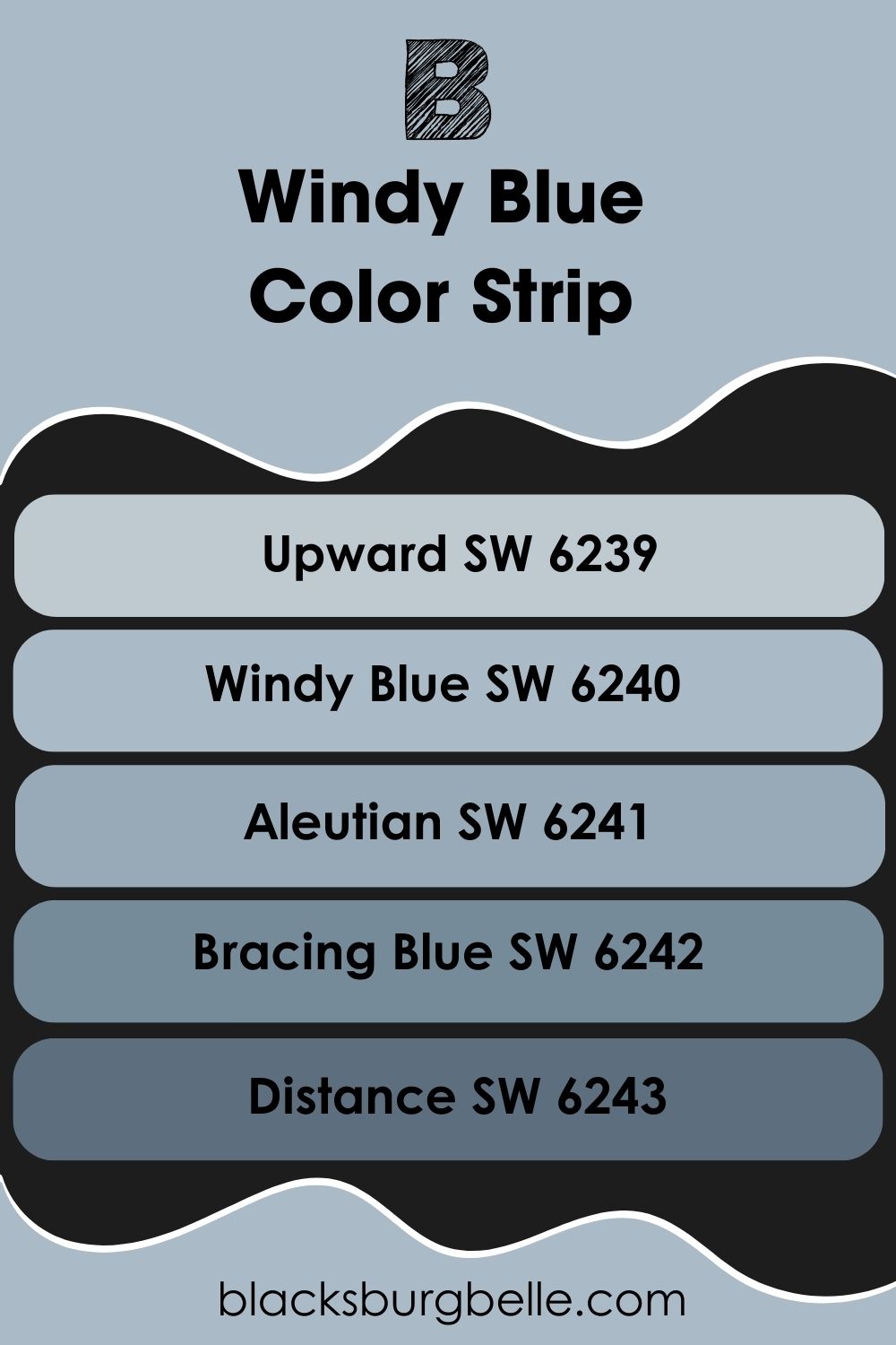
Lighter and Darker Version of Sherwin-Williams Windy Blue (The Color Strip)
In case you feel like Sherwin-Williams WIndy Blue isn’t dark or light enough for your taste. Try out these alternatives:
- Sherwin-Williams Upward (SW 6239)
- Sherwin-Williams Windy Blue (SW 6240)
- Sherwin-Williams Aleutian (SW 6241)
- Sherwin-Williams Bracing Blue (SW 6242)
- Sherwin-Williams Distance (SW 6243)
Sherwin-Williams Upward is medium-light with a brighter gray undertone, Aleutian is a medium-dark tone with a dusky look, Bracing Blue is dark with a playful air, and Distance is the darkest in the strip with a hazy gray undertone.
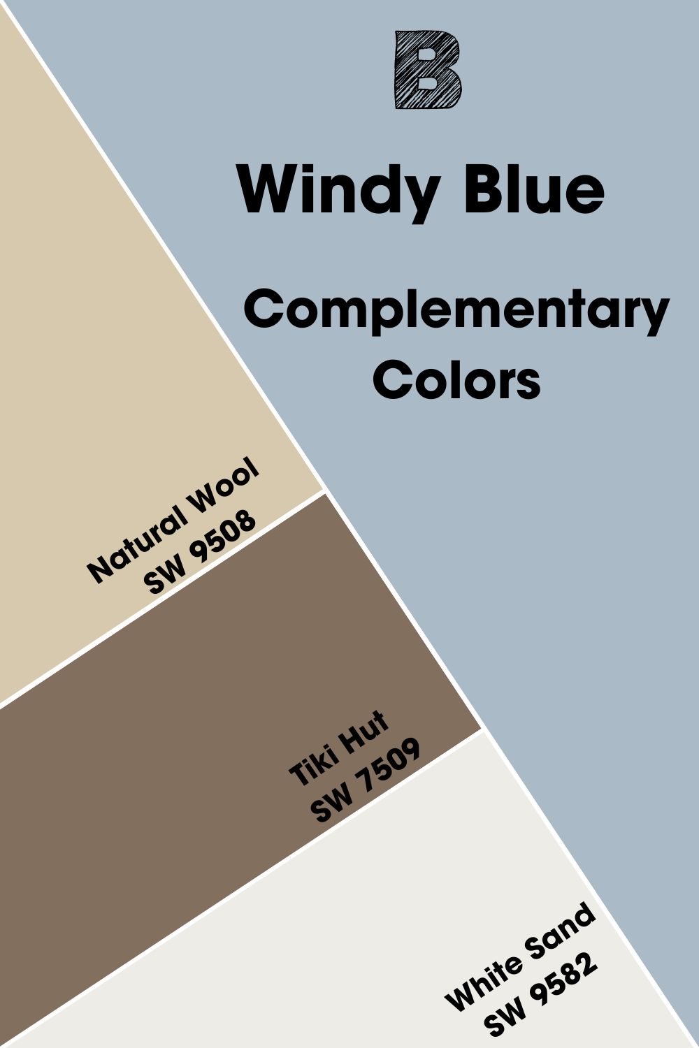
Sherwin-Williams Windy Blue Complementary Colors
Have you ever wondered why certain color combos are common despite having contrasting tones? That’s because they’re complementary colors. These colors are made for each other simply because they sit on opposite ends of the color wheel.
Complementary colors make a bold statement because they perfectly balance heat and coolness. You’ve seen them everywhere but may not recognize them. I’ll remind you:
- Red – Green
- Blue – Orange
- Yellow – Purple
Notice that each primary color has a corresponding secondary tone. Since Sherwin-Williams Windy Blue is a blue color, the complementary tone is a shade of orange. Because it has a neutral gray undertone, the perfect match is a beige-tinted orange to maintain neutrality.
So, Sherwin-Williams Natural Wool (SW 9508) complements Windy Blue. It’s a medium-light tan color with a bright orange undertone to add warmth to Windy Blue’s coolness.
Other suitable orange paints for a complementary palette include:
- Sherwin-Williams Tiki Hut (SW 7509): A dark and warm grayish-brown color to add an earthy charm to the palette.
- Sherwin-Williams White Sand (SW 9582): This bright white is a clean trim to bind the other colors.
Make Tiki Hut and Natural Wool your accents while Windy Blue remains the star of the show.
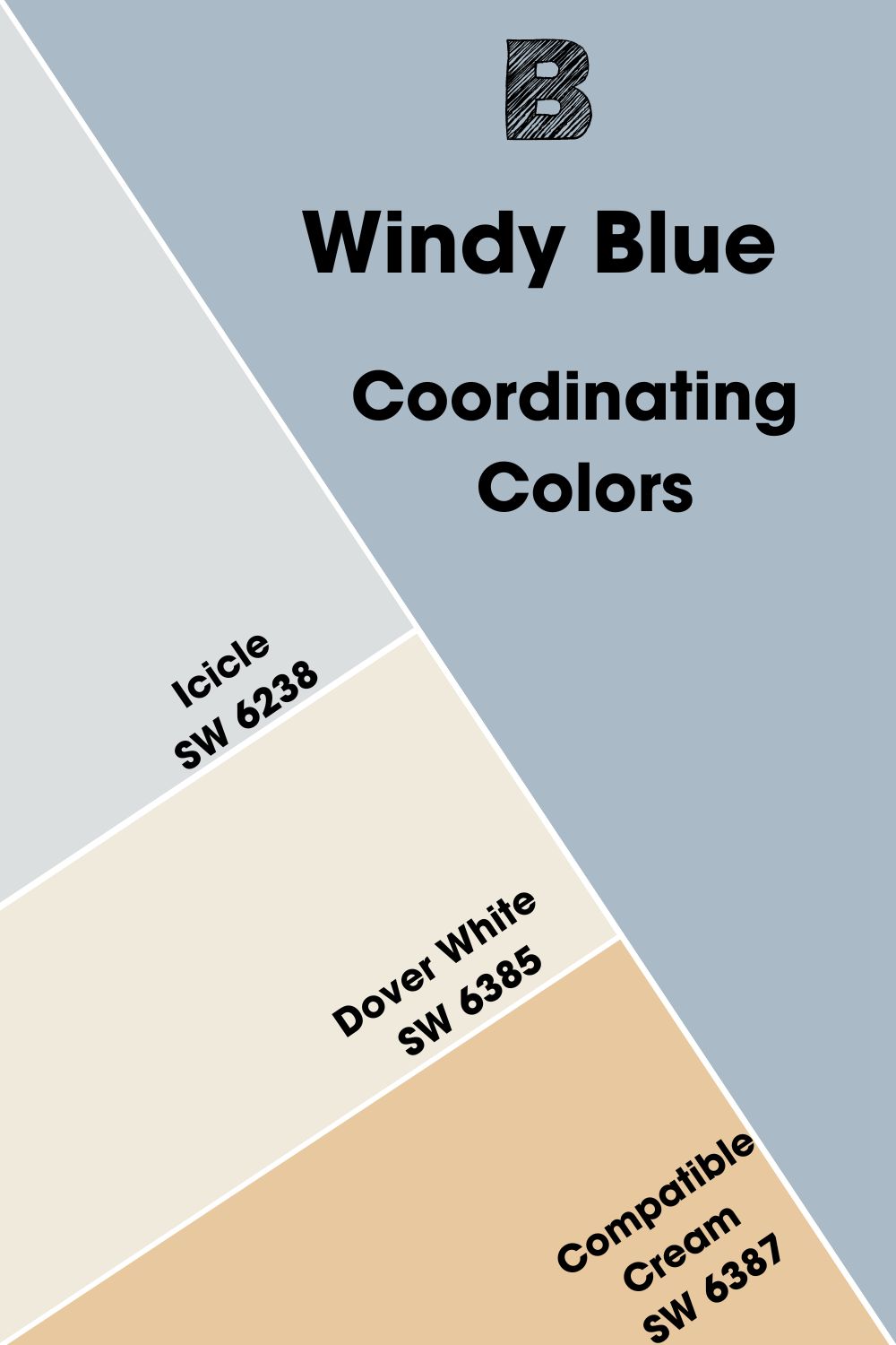
Coordinating Colors for Sherwin-Williams Windy Blue
Before I show you my favorite color combinations for Windy Blue, check out these popular palettes and how to pick them.
- Analogous Theme: I call this combo the triplets. Pick three colors sitting beside each other on the color wheel. For Windy Blue, you can pick a teal and purple combo.
- Complementary Theme:Use contrasting colors that sit opposite each other on the color wheel for a bold combo. For blue, that’s orange.
- Triadic Theme: Draw a triangle on the color wheel and pair equally spaced hues in one palette. For Windy Blue, the other two colors are red and yellow variations.
- Split Complementary: Instead of using opposite colors, choose the two hues beside the contrasting tone. So, for Windy Blue, which is a blue-gray, don’t use orange. Instead, use orange-red and orange-yellow.
- Monochromatic Theme: Use one color as your anchor, then add white and black for lighter and darker versions.
Monochromatic and Complementary palettes are the most popular and easiest to recreate. But if you want your space to stand out, choose bolder palettes like Split Complementary, Triadic, and Analogous. I selected some for you below, so check them out.
Coordinating Colors for Sherwin-Williams WIndy Blue
- Sherwin-Williams Icicle (SW 6238):An icy light blue paint with a soft violet undertone.
- Sherwin-Williams Dover White (SW 6385): This sunny white paint has a breezy and cozy vibe.
- Sherwin-Williams Compatible Cream (SW 6387):A medium-light yellow-orange paint for a cheerful aura.
Best Color Palettes for Sherwin-Williams Windy Blue
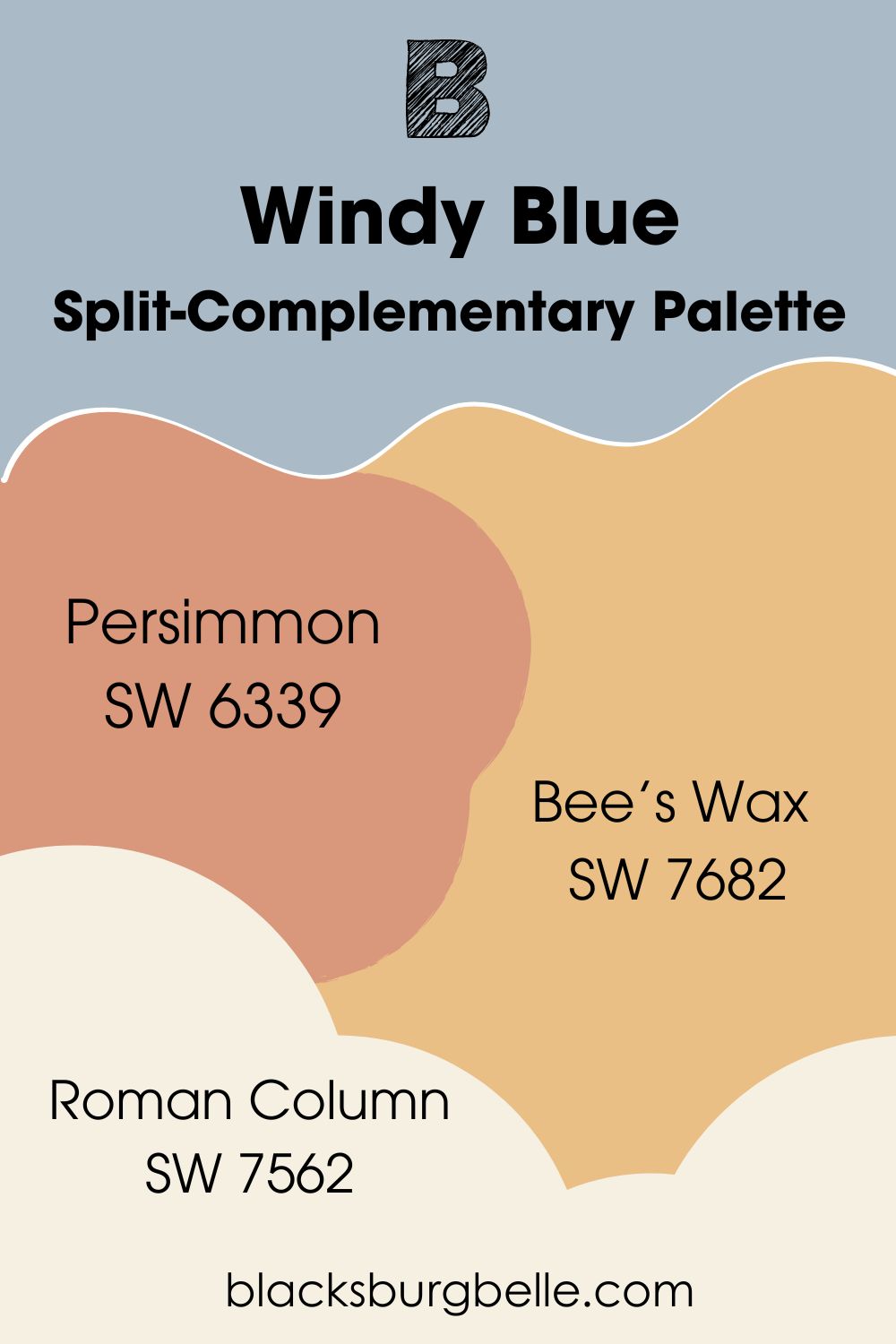
Now, you can see more of my top picks. A quick note before you continue, I added a Split Complementary palette because it’s not popular, and I love how it allowed me to play with colors.
Split-Complementary Palette
- Sherwin-Williams Persimmon (SW 6339):An earthy red paint with a peach undertone that makes it look like clay.
- Sherwin-Williams Bee’s Wax (SW 7682):A rich yellow-orange medium-light color.
- Sherwin-Williams Roman Column (SW 7562):This creamy white paint with a subtle yellow undertone brightens up a space no matter how little you use it.
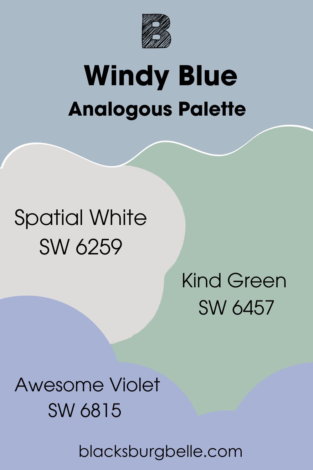
Analogous Palette
Analogous Palettes can go one of two ways. Depending on your taste, you could pick three colors to the left or right. If you choose colors to the left of Sherwin-Williams Windy Blue, you’re moving toward green, while the right moves toward purple.
I chose Windy Blue as the center and picked a color from either side for a balanced palette. Here are my top picks:
- Sherwin-Williams Spatial White (SW 6259):This medium-light white paint with a cool violet undertone is on another level.
- Sherwin-Williams Kind Green (SW 6457):A mid-tone oceanic green with a soft cyan undertone.
- Sherwin-Williams Awesome Violet (SW 6815):An inky violet with a rich blue undertone to add a cold tone to the space.
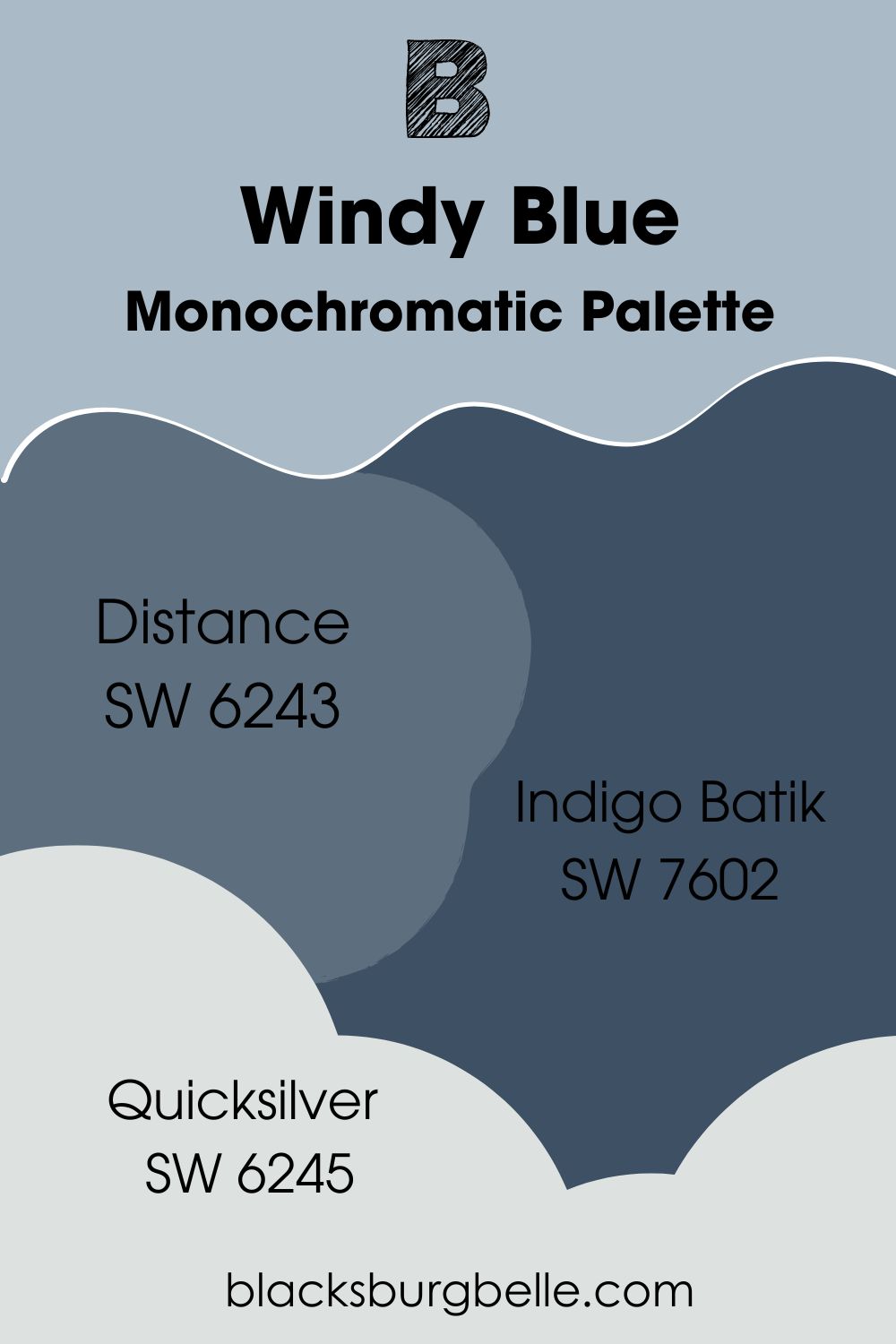
Monochromatic Palette
- Sherwin-Williams Distance (SW 6243):A deep, hazy, dim blue-gray with a faded denim look.
- Sherwin-Williams Indigo Batik (SW 7602):Swap black for this dark denim to add a moody shadow to your palette.
- Sherwin-Williams Quicksilver (SW 6245):This three-in-one white paint with violet, blue, and green undertones adds a playful vibe to your space.
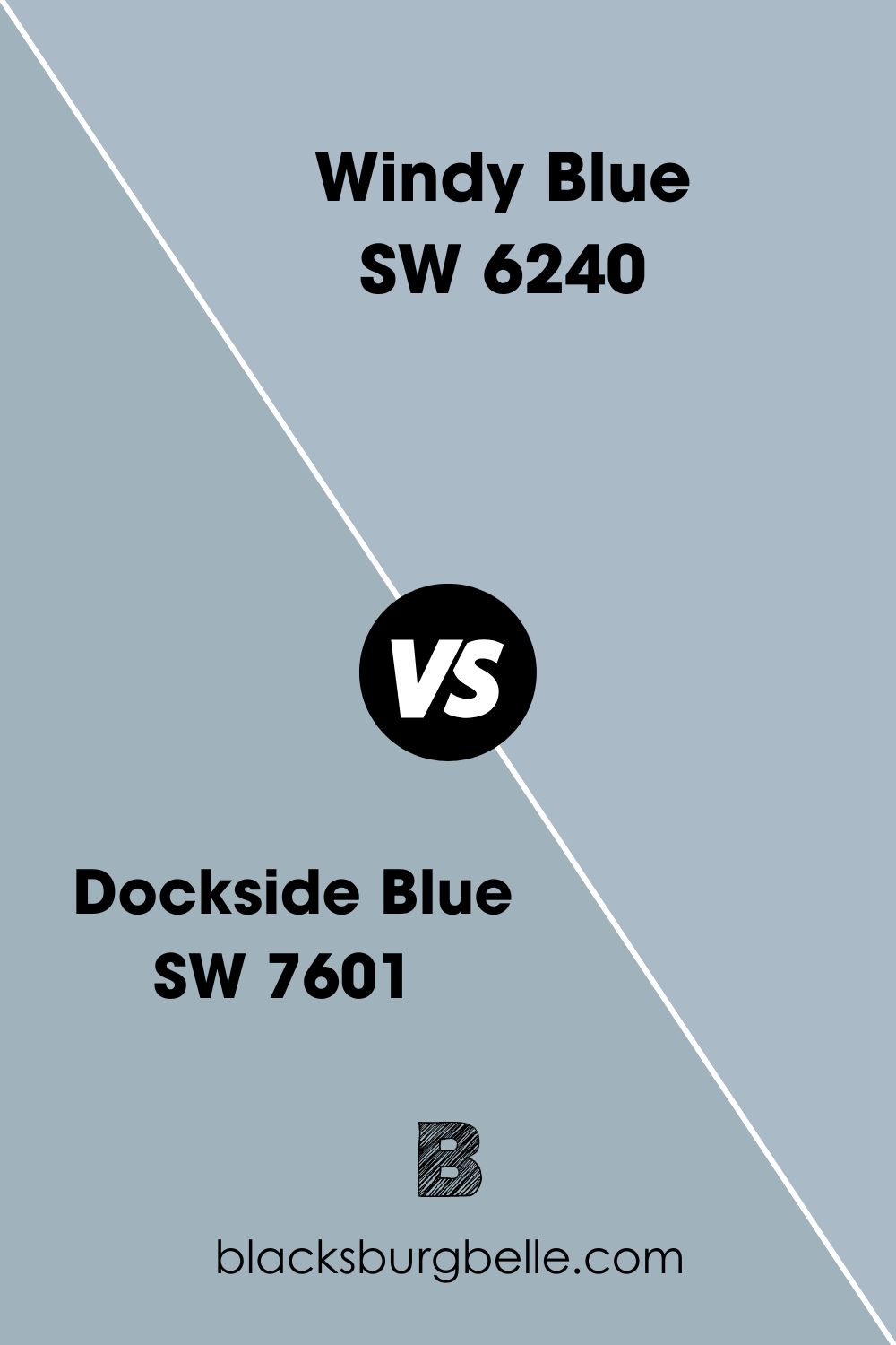
Sherwin-Williams Windy Blue vs. Dockside Blue (SW 7601)
Sherwin-Williams Dockside Blue is a darker blue-gray paint than Windy Blue and it has a green undertone.
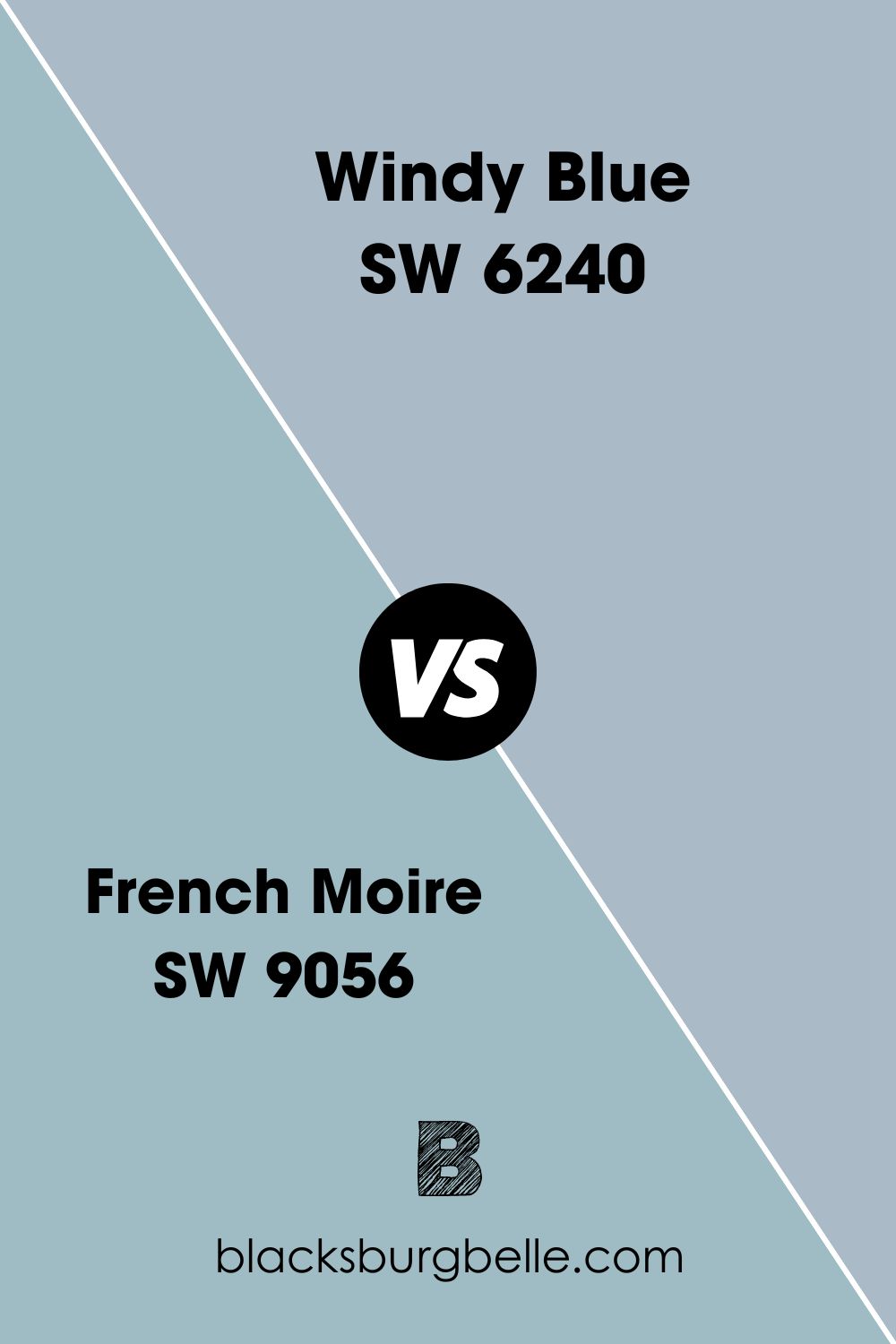
Sherwin-Williams Windy Blue vs. Sherwin-Williams French Moire (SW 9056)
Sherwin-Williams French Moire is a mid-toned blue paint with a violet undertone.
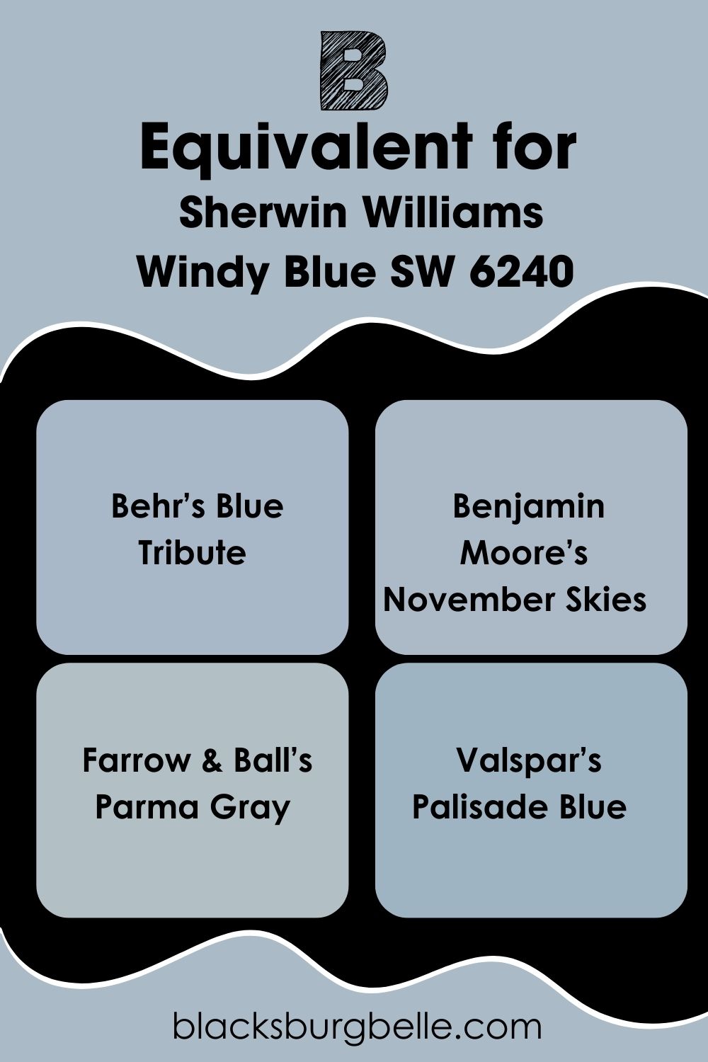
Sherwin-Williams Windy Blue Equivalent From Behr
Behr’s Windy Blue (3B50-2) is lighter than Sherwin-Williams’ version. Its LRV is 65.17, with a bold green undertone, unlike SW 6240. The hex code is #CBD5D8, formed from Red 203, Green 213, and Blue 216.
Sherwin-Williams Windy Blue Equivalent with Other Brands
Apart from Behr, no other brand shares the color name “Windy Blue” with Sherwin-Williams. But if you’re scouting for similar neutral blue-gray paints, check out these brands:
Behr’s Blue Tribute, Benjamin Moore’s November Skies, Farrow & Ball’s Parma Gray, and Valspar’s Palisade Blue. They’re not exact matches, but that’s as close to Sherwin-Williams Windy Blue as you’ll get. Unless you custom order your paint with the hex value #AABA6C.
Best Places to Use Sherwin-Williams Windy Blue
Earlier in this review, I told you Sherwin-Williams Windy Blue best suits relaxing spaces like the bedroom and bathroom. But I also promised to share inspirations on using the color in other parts of the house. Now is the time.
Before continuing, you must remember that Windy Blue is soothing. So, a perfect combination shouldn’t be your only motivation for choosing it. Consider what you want to use the room for and if a sleepy color will benefit you.
Let’s get to it.
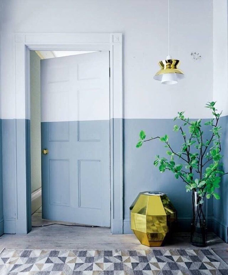
Sherwin-Williams Windy Blue on Walls
You can use Sherwin-Williams Windy Blue as a full or half-wall painting, as you’ll see in this picture. However, I don’t like how the designer combined Windy Blue and white here. I recommend using wainscoting for the lower wall if you want this two-in-one style.
Also, I noticed they didn’t pay attention to the details in the white paint for the upper wall. To make this combo work, you’ll need blue-tinted white paint for a monochrome palette.
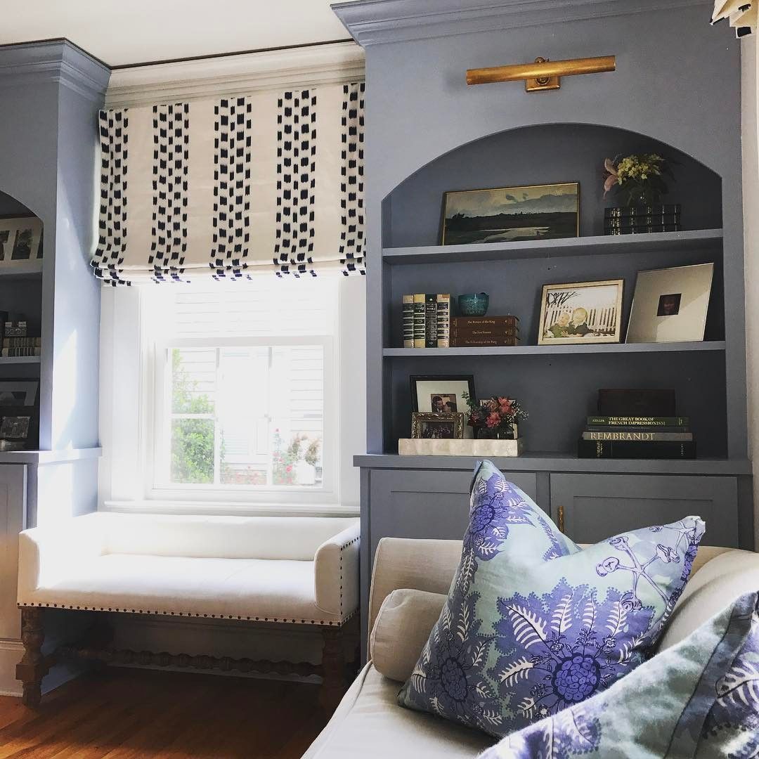
Sherwin-Williams Windy Blue in the Living Room
A chilled vibe in the living room isn’t very family-friendly but you can make it work if you use a complementary palette. Barring that, you can brighten the space with a summery white paint like this designer did and balance it with a nice analogous theme.
Peep the green and purple embroidery on the throw pillows.
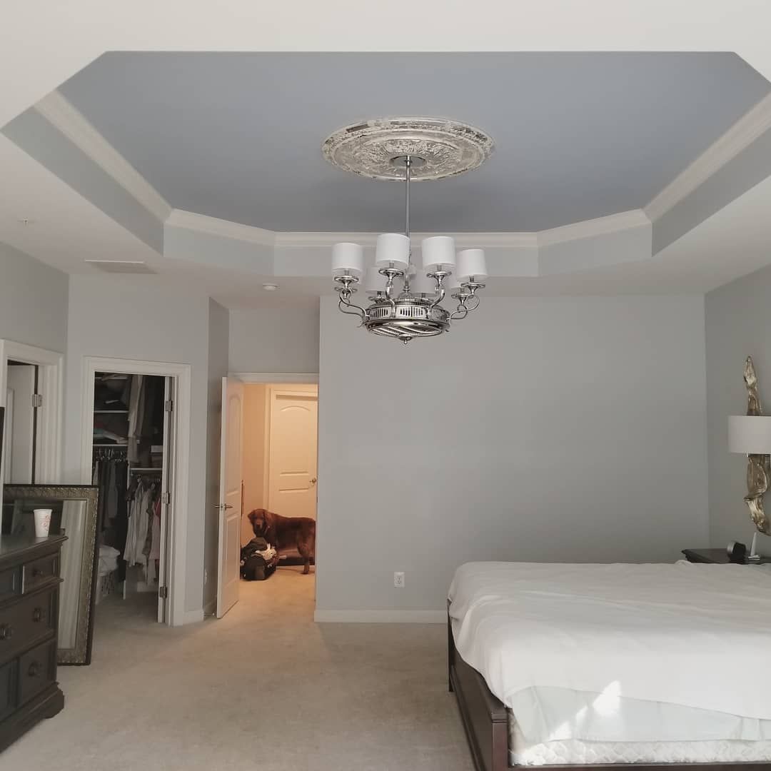
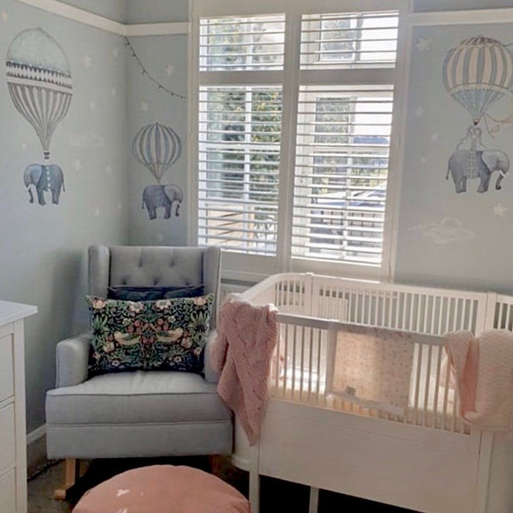
Sherwin-Williams Windy Blue in the Bedroom
Windy Blue in the bedroom is always a yes for me. So imagine my excitement seeing a different way to incorporate it in a large room. Painting the ceiling with Windy Blue to highlight the light bluish-white walls.
It’s a nice way of acknowledging Windy Blue’s soothing aura but not letting it overwhelm you.
I can’t talk about Windy Blue in the bedroom and not give a nod to the modernized nursery. Depending on your taste, it’s a beautiful backdrop for wall art and wallpapers.
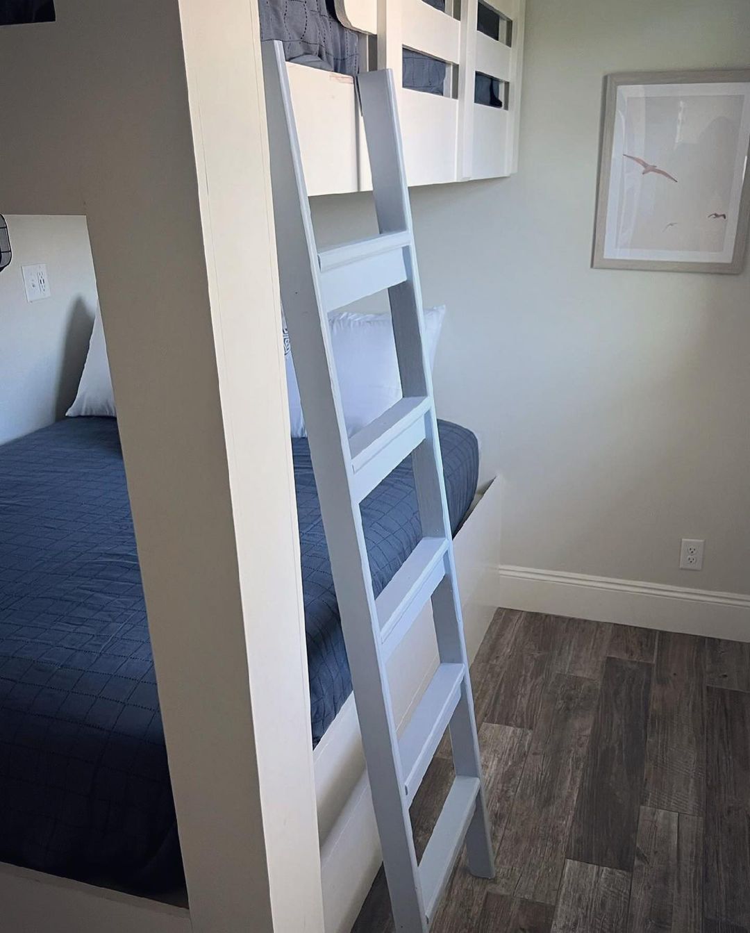
Sherwin-Williams Windy Blue as an Accent
Even though it’s an almost perfect neutral tone, Windy Blue stands out as an accent. I’ve seen the color on cabinets, shelves, and regular furniture, but this bunk bed ladder was a nice twist. It shows that you can add color to a neutral wall in the subtlest ways.
Sherwin-Williams Windy Blue as a Trim
I never thought Windy Blue would make sense as a trim until I saw this combo. It’s not my first choice, but I can see the sentiment. If I had to choose, I’d prefer to invert the combo and make Windy Blue the full exterior coloring while the white paint becomes the trim.
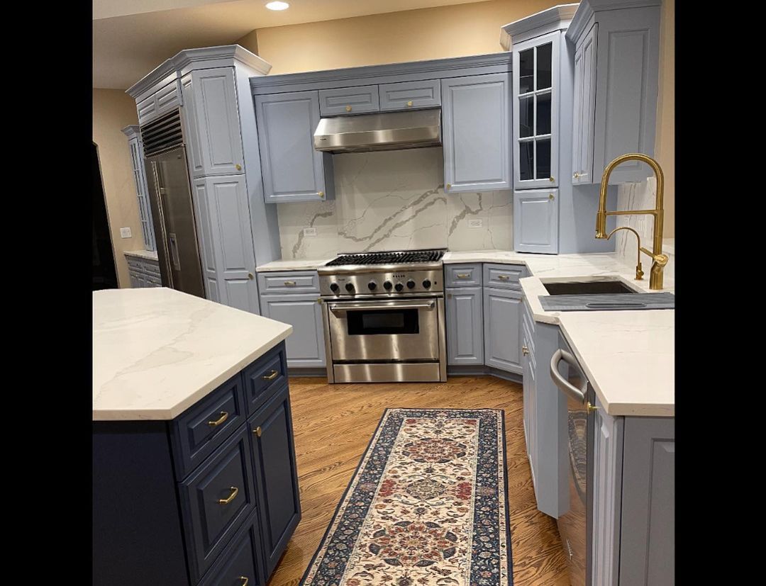
Sherwin-Williams Windy Blue on Cabinets
Here’s where lighting becomes relevant again. Windy Blue on cabinets is always an easy sell. The tough part is deciding whether to highlight the gray undertone or the powdery blue surface.
See what warm lighting will do to Windy Blue cabinets.
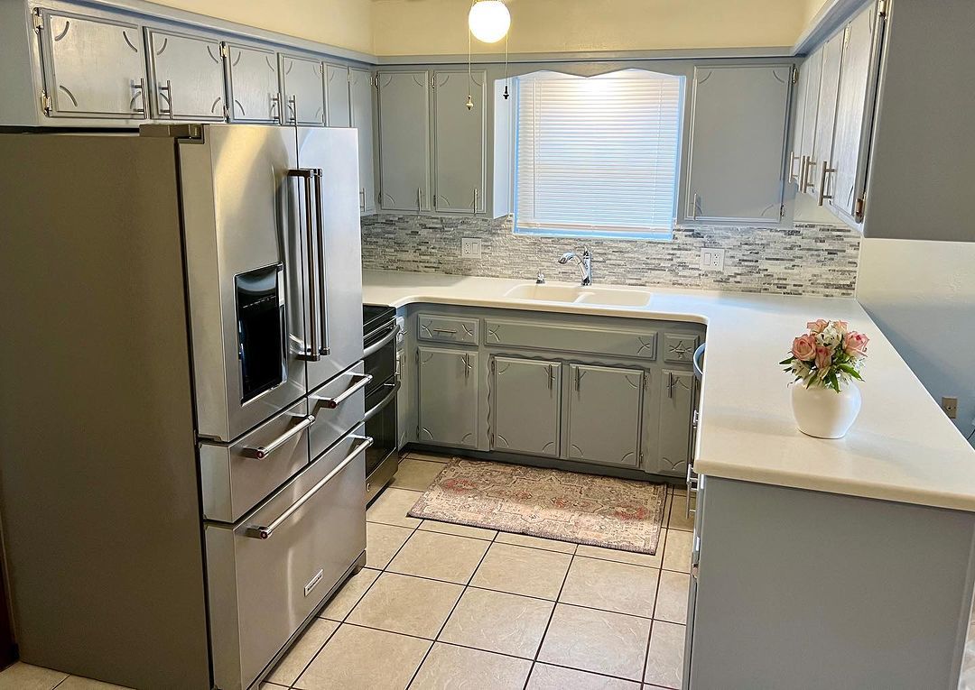
Here’s what the powdery blue cabinet looks like in a kitchen.
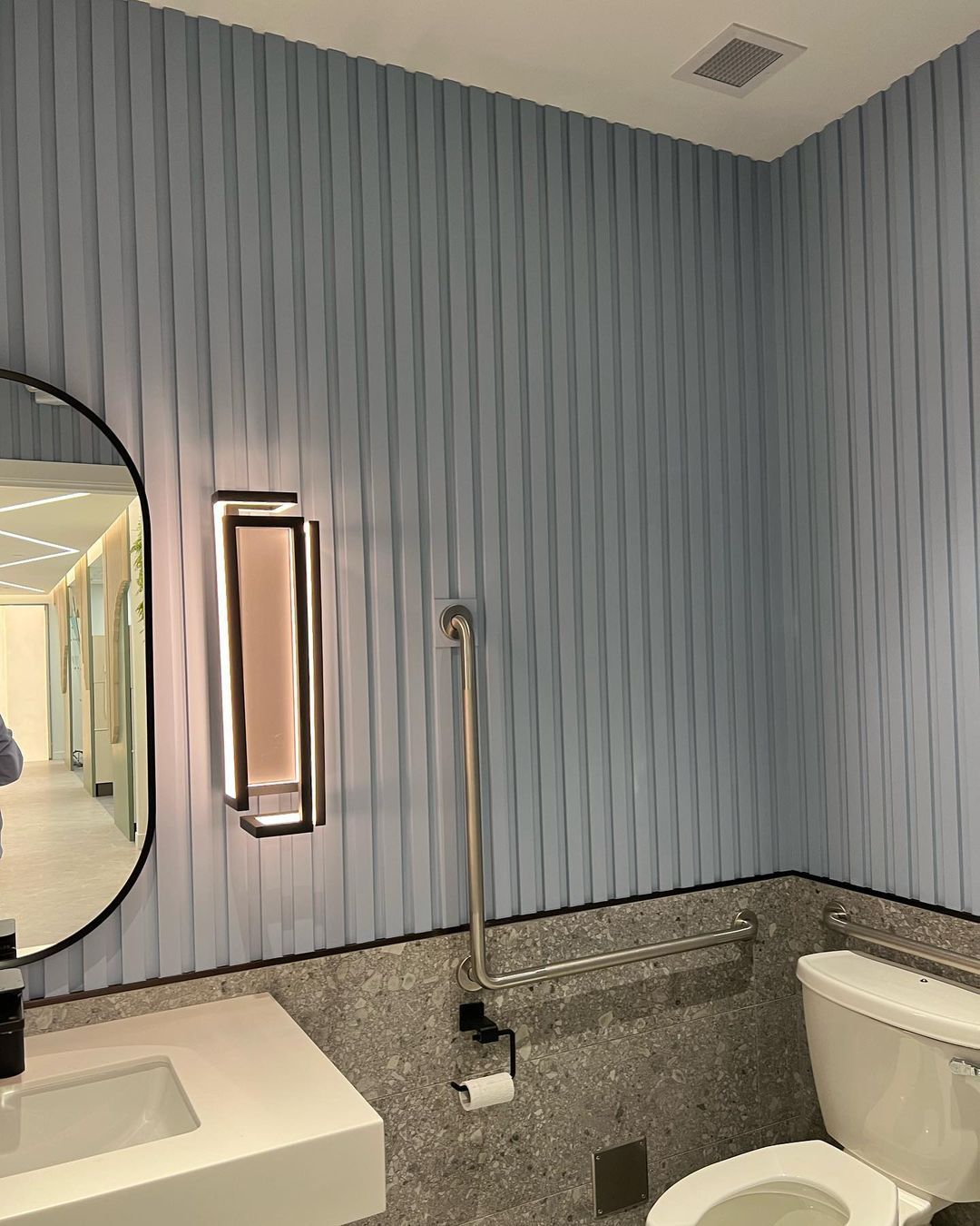
Sherwin-Williams Windy Blue in the Bathroom
Another no-brainer space for Windy Blue is the bathroom. Instead of the typical blue cabinets against white walls and tiles, let’s switch it up. I found this neo-classic bathroom design with gray granite marble half-walls and an upper Windy Blue lining.
It’s different and gives the space a personal touch instead of the commercial tiled design. You can try it out too.
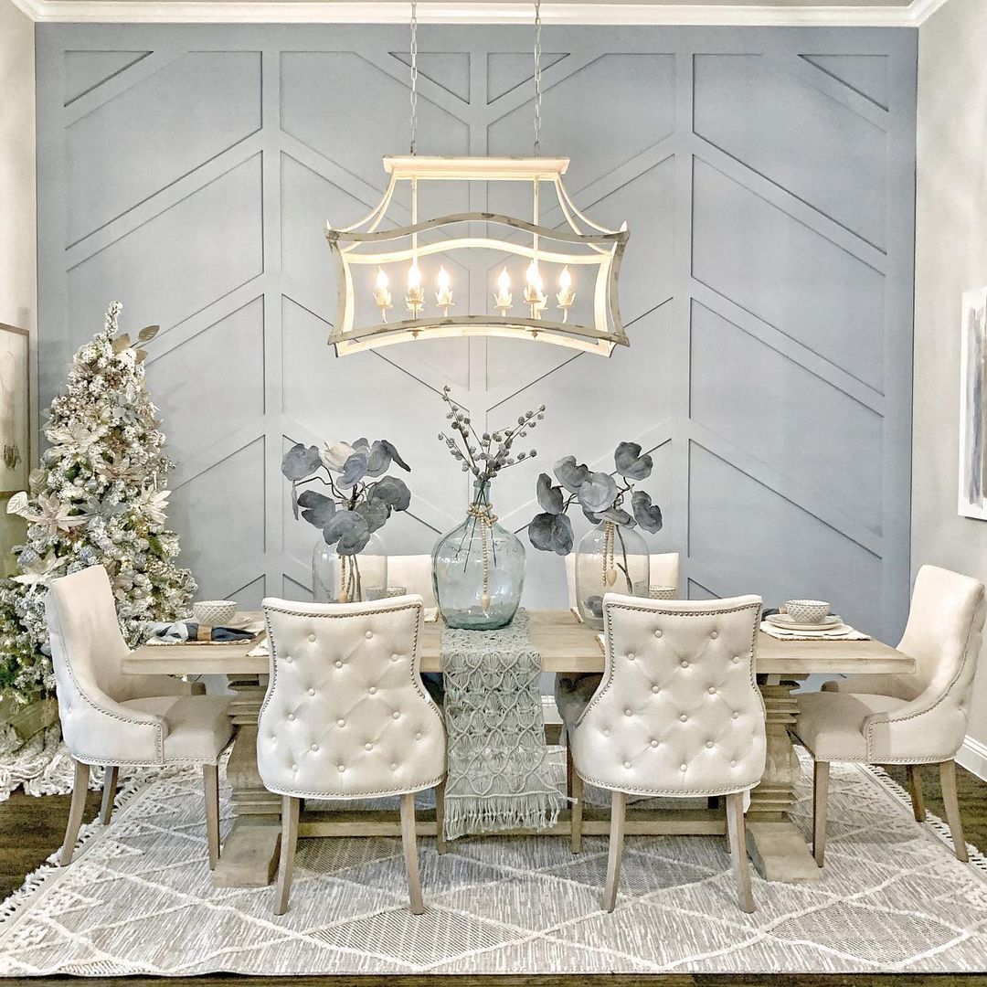
Sherwin-Williams Windy Blue in the Dining
If you want family and holiday meals to become a relaxed and fun event, then invest in Windy Blue dining rooms. This designer used every trick in the book to create the perfect space.
There’s a low-hanging chandelier with warm lighting to give the walls a gray tone once night falls. The Windy Blue paint is also on an accent wall flanked by lighter grays and blues. It’s the perfect use of a monochrome palette if you ask me.
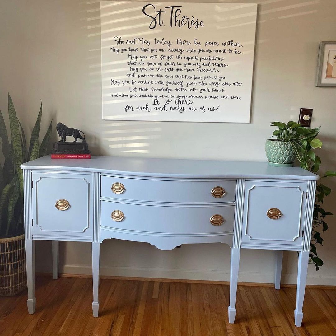
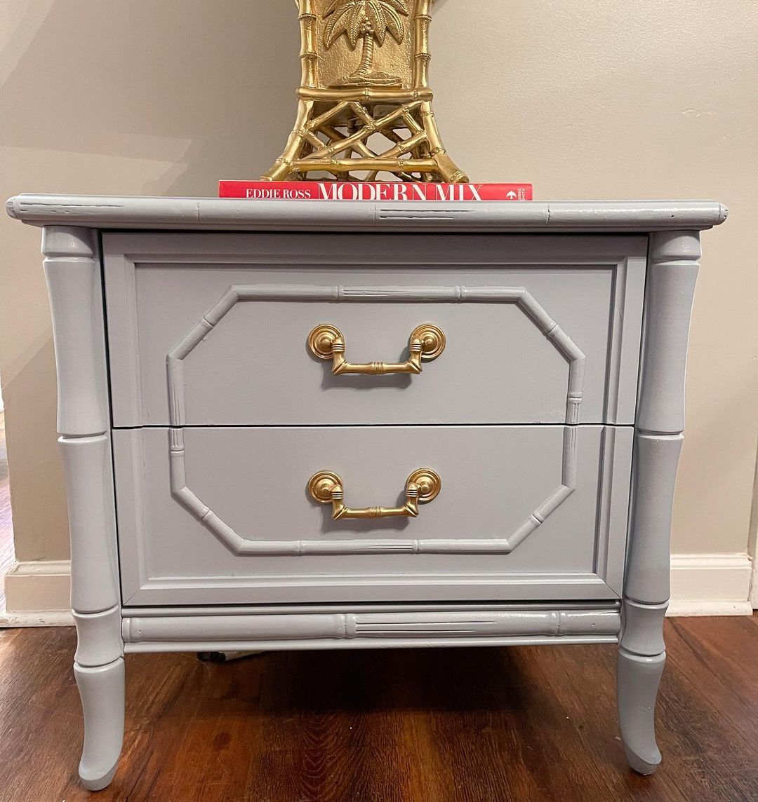
Sherwin-Williams Windy Blue on Furniture
I briefly hinted at Windy Blue furniture when discussing accents, but let’s talk about it now. You can hardly tell this desk is an antique piece from this Windy Blue makeover.
Now, see the color on a new drawer. The effect is the same. Clearly, Windy Blue paint jobs for furniture aren’t restricted to redos and makeovers. It can also be an original creation.
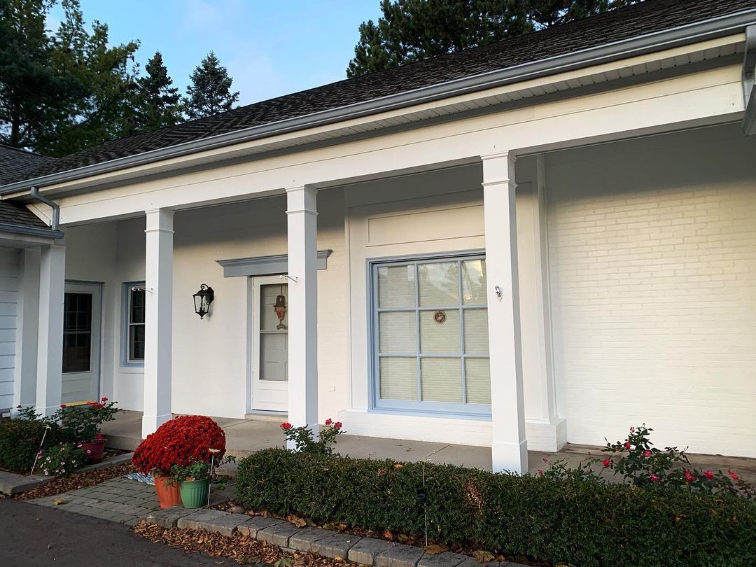
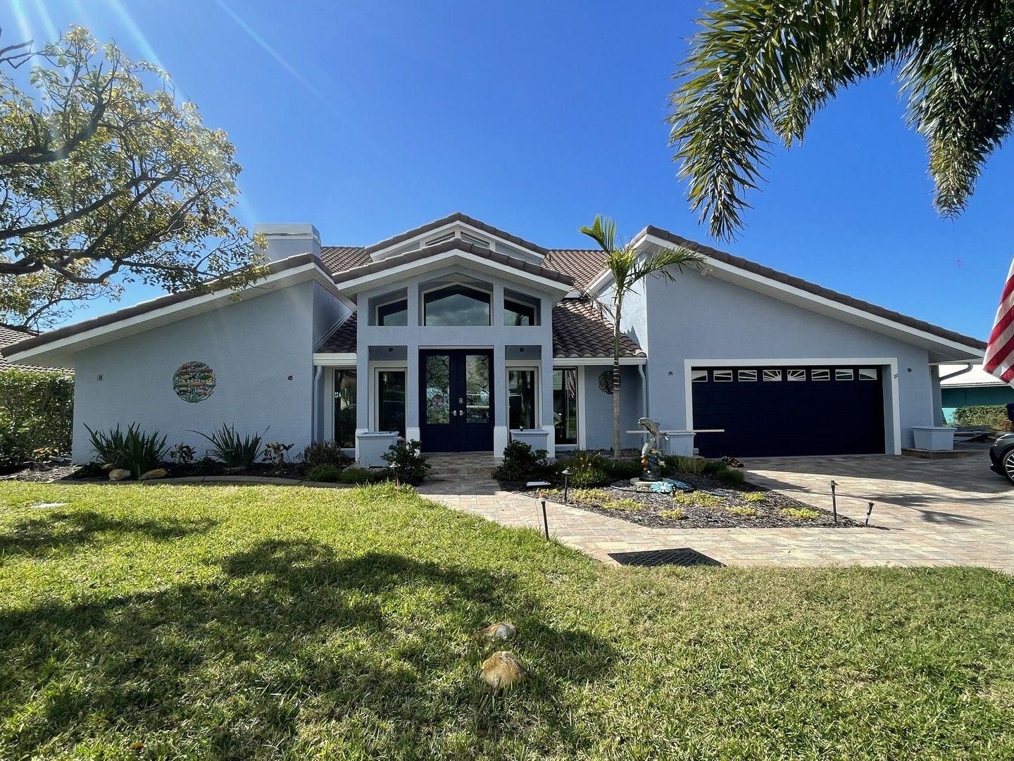
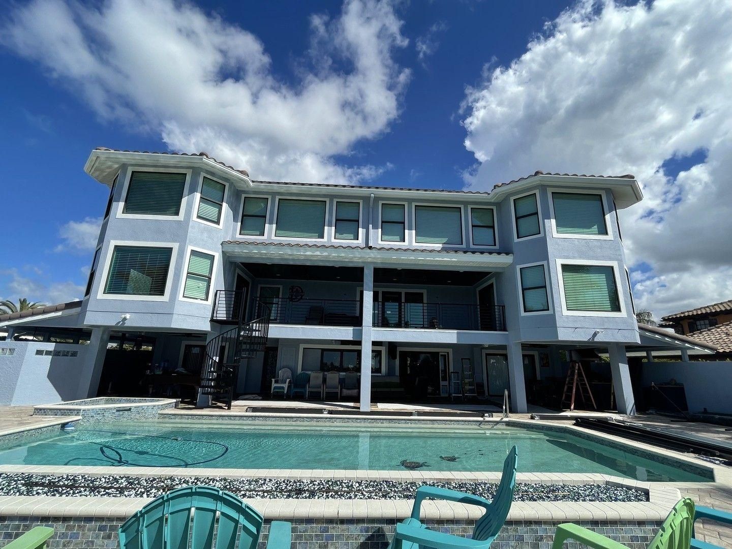
Sherwin-Williams Windy Blue on Exteriors
Sold!
I love how this modern house with a backyard pool used Windy Blue. It’s as if the designer chose to run with the pool theme, and they nailed it! Windy Blue exteriors can look comforting on all-American buildings and affluent on beachside and suburban homes.
Now see the backyard. You can’t say it isn’t a 10/10 design from the pool to the furniture and the actual wall paints.
Conclusion
It’s time for the verdict. “Is Sherwin-Williams Windy Blue (SW 6240) worth a try?” YES! You’ll love this color for its soothing and relaxed vibe, whether it’s inside or outside. I recommend choosing bold palettes with colors that can highlight the best parts of Windy Blue.
But if you prefer all-around chilled vibes, there’s no problem. Remember to sample the product against your preferred surface before purchase.
You can use Color-to-Go, Color Chips, or Peel & Stick strips. Also share your final looks and thoughts with me. Have fun styling.
 Sherwin Williams Eider White (Palette, Coordinating & Inspirations)
 Sherwin Williams Worldly Gray (Palette, Coordinating & Inspirations)
 Sherwin Williams Greek Villa (Palette, Coordinating & Inspirations)
 Sherwin Williams Aesthetic White (Palette, Coordinating & Inspirations)
 Sherwin Williams Egret White SW 7570: Review & Inspiration
 Sherwin Williams Escape Gray SW 6185: Review & Inspiration
