
Are you torn between two neutral paint colors, unsure of which will do a better job in your decor? You may want to try one that’s tested and trusted over the years: Benjamin Moore’s Wind’s Breath.
You may have difficulty selecting a neutral paint color that isn’t a stickler to a particular shade. If that is what you want, you don’t have to look any further. Let’s review Wind’s Breath to see its various aspects, including LRV, undertone, and other colors that work best with it.
Table of Contents
When to Choose Benjamin Moore Wind’s Breath
Although neutral paint colors typically blend well with colors, sometimes, you may find that they lean toward some shades in certain lighting conditions. This may make it hard to pair it with color schemes. So, is Wind’s Breath a better option in such a situation? Let’s find out.
Need a flexible neutral paint color?
Wind’s Breath does a fine of accommodating different colors and working with various finishes. The reason is that it doesn’t stick with a particular shade of neutral but tends to shift. As scary as this may sound, it is actually an advantage for difficult finishes and color schemes.
Not a fan of stark whites?
Wind’s Breath is not a white paint color but can look very bright in a well-lit room. If stark or crisp whites put you off, try Wind’s Breath for a bit of color without sacrificing brightness.
Have a north-facing room?
North-facing rooms typically have cool light because there’s no direct sunlight. As a result, they need warm colors. Wind’s Breath can bring color and brightness into such a room because of its LRV.
Looking for a new living room color?
I picked a living room in this case because neutrals look amazing in it. But it is also easy to get the color wrong unless you pick a solid neutral like Wind’s Breath. It’s a color living love because of how it ties everything together and creates a cozy family room.
It may not be the most popular neutral paint color, but Wind’ Breath has a lot to offer. Before you use the paint color, let’s look at other crucial aspects and how the color looks in real life.
What Color Is Wind’s Breath?
It’s such a strange name to give to paint color, isn’t it? I’m not sure there’s any story behind this name, but we can all imagine how light, fresh, and gentle a wind’s breath can be. It’s a poetic and beautiful name, and I can see why this color got it.
Benjamin Moore’s Wind’s Breath OC-24 is a complex neutral paint color, soft, gentle, and laid-back in any decor. It balances between taupe and beige with a touch of cream. This is why I said it works well with difficult finishes and in various color schemes.
A Snapshot of the Specifications of Benjamin Moore Wind’s Breath
There are a few details about Wind’s Breath that make it a unique color. These include its undertone and LRV. Let’s look at them in a chart for easy reference.
| Benjamin Moore Wind’s Breath | |
| RGB | 223, 219, 205 |
| LRV | 69.59 |
| Undertone | Cream, pink-violet, gray |
| HEX Code | #DFDBCD |
The LRV of Benjamin Moore Wind’s Breath
Are you wondering what LRV means? I’ve mentioned it a couple of times in this guide. It is the light reflectance value of color and refers to the amount of light the color reflects on a scale of 0 to 100. Black is 0, while white is 100.
Paint colors are a little different; they don’t have pure black or white. Because of this, the LRV scale is 2.5 to 94. So, you won’t find any paint color with an LRV of 0 or 100.
Benjamin Moore’s Wind’s Breath has an LRV of 69.59, almost 70. The value takes it close to the bright end of the scale, although it is not bright enough to be called an ff-white.
The Undertones of Benjamin Moore Wind’s Breath
Undertones are, sometimes, difficult to read. That is the case with Wind’s Breath; it has complex undertones. The brand says it has warm gray undertones, but you may notice a hint of pink-purple in certain lighting. At other times, the undertones read cream or beige.
In other words, there’s no specific undertone to this neutral paint color. That is the main reason I said it is an excellent bridge between different color schemes and tones.
Wind’s Breath looks neutral in this photo, showing almost no undertone but looking beautiful.
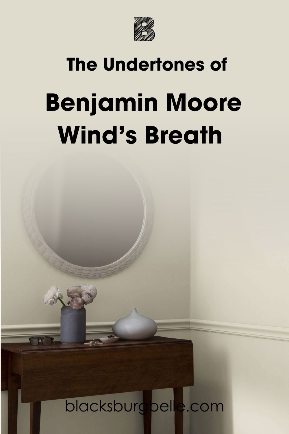
But in this next photo, the color shows a bit of its gray undertone, especially when contrasted against the white trim color.
And here, you can see how bright and creamy it looks on the wall, different from the one above.
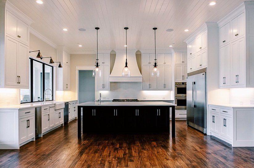
Wind’s Breath is used on the walls in this kitchen, and it looks like a beige paint color because of the obvious warmth when compared to Sherwin Williams Pure White on the cabinets.
Now, you may see a smidge of the pink-purple I talked about. Fortunately, it’s barely there, so you can comfortably use Wind’s Breath without worrying about the taupe undertone.
Color is usually a matter of perception. Many times, undertones are not very obvious, as in the case of Wind’s Breath. That makes it easy to work with different colors without worrying about how it clashes with other colors.
However, using professional interior designers or decor advice makes a lot of positive difference in how your decor comes out. That said, Wind’s Breath is easy to use because it’s flexible with other colors.
How Does Lighting Affect Benjamin Moore Wind’s Breath?
Lighting has a lot of effect on this paint color; the same is true with almost every paint color, regardless of how neutral. Wind’s Breath looks its best with adequate lighting, and it can hold its own in a room without good lighting conditions.
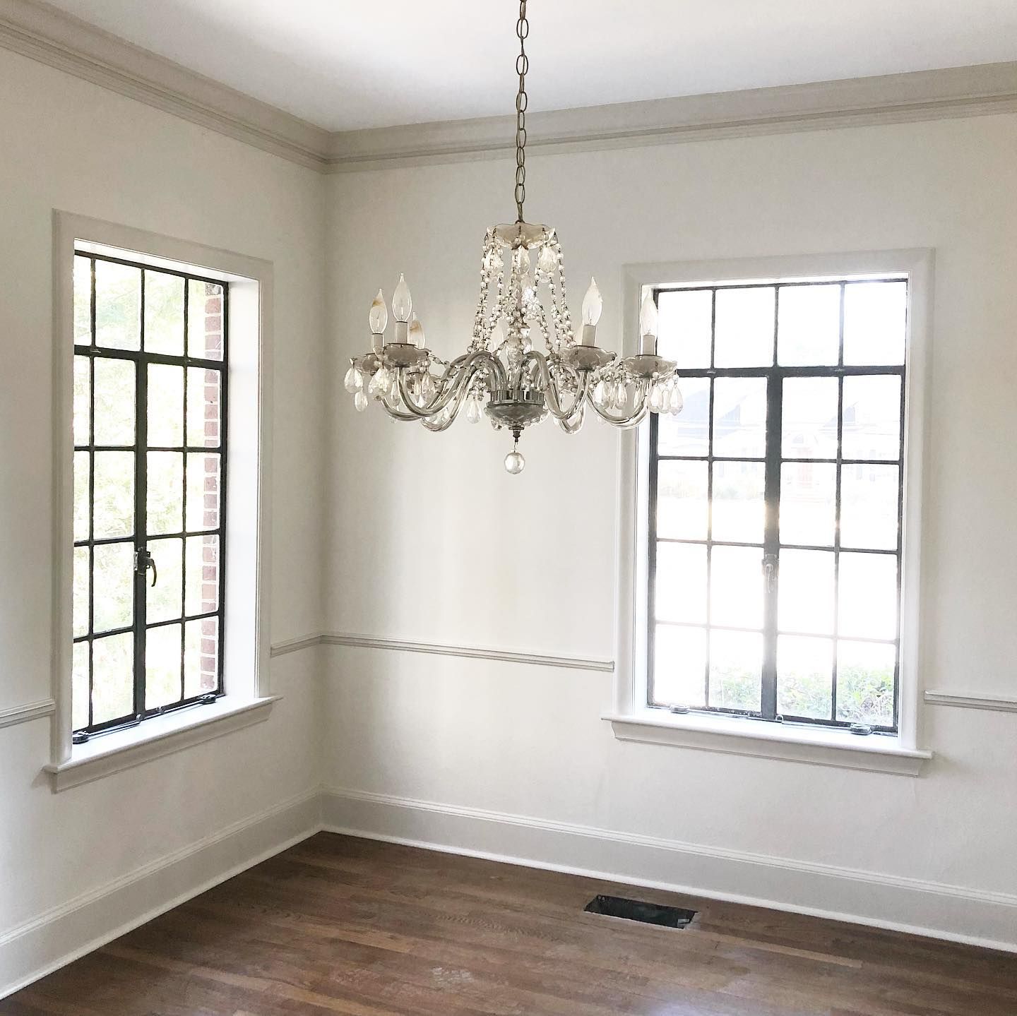
In this entryway, Wind’s Breath looks bright and creamy because of the amount of natural and artificial lighting accentuating it.
The same paint color shows a little of its gray undertone in this bedroom because of the angle of the lighting. It’s not as direct as in the previous photo. But the color looks almost white and washed out.
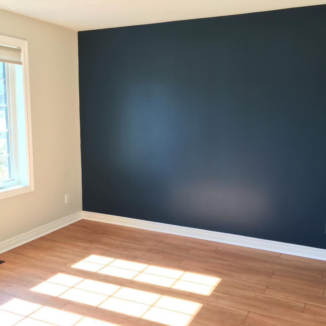
In warm lighting, the paint color takes on the look and feel of beige, and in this picture, it looks amazing with the blue wall and white trim.
How Does Benjamin Moore’s Wind’s Breath Feel in a Room?
Wind’s Breath feels welcoming and cozy in a room because of its color. It is also one of the best neutrals to pair with different wood tones. The paint color always makes a house feel like home, whether you use vibrant hues or stick with neutrals in your decor.
Benjamin Moore Wind’s Breath: Warm or Cool?
Wind’s Breath is a warm neutral paint color because of its peculiar undertones. You can already see its warmth in some of the photos I used above. However, as a chameleon color, you can try it with different shades and finishes, including some cool colors that don’t appear crisp or icy.
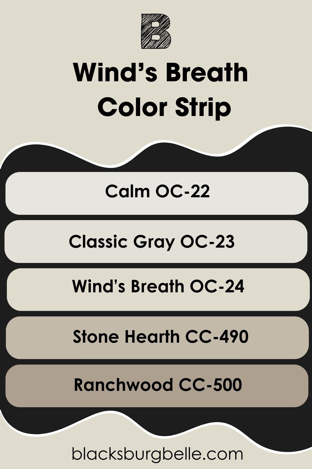
Benjamin Moore Wind’s Breath Color Strip: Lighter to Darker Exploration
If Wind’s Breath is not the exact shade you want, or you’re looking for lighter or darker options, look no further than this section. I’ve carefully picked colors from the same strip to give you navigating room and suitable alternatives.
- Benjamin Moore Calm OC-22
- Benjamin Moore Classic Gray OC-23
- Benjamin Moore Wind’s Breath OC-24
- Benjamin Moore Stone Hearth CC-490
- Benjamin Moore Ranchwood CC-500
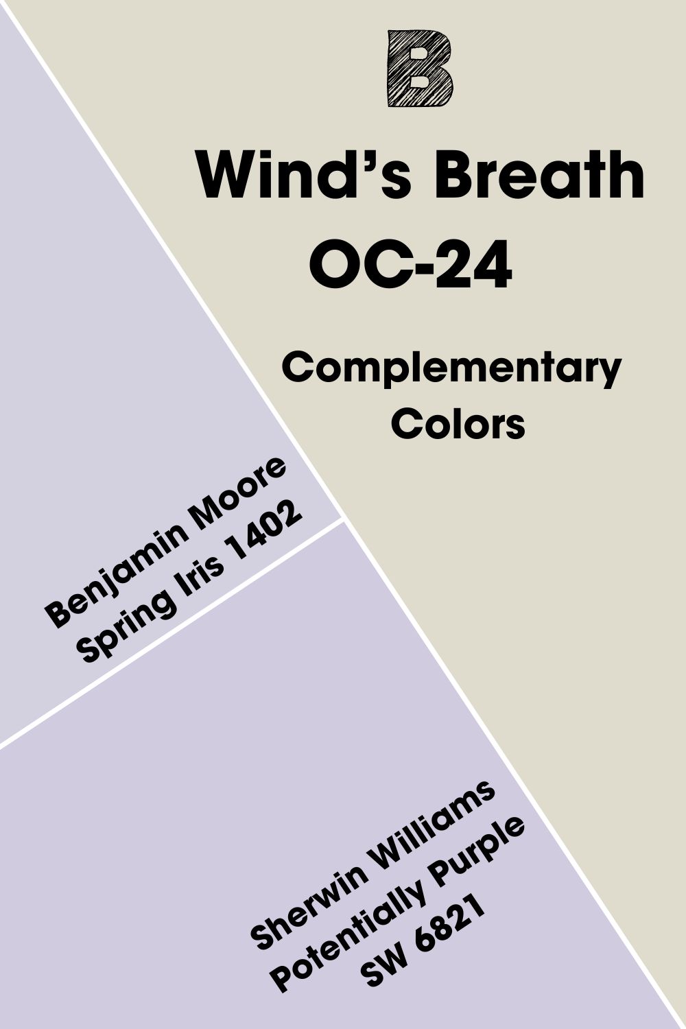
Benjamin Moore Wind’s Breath Complementary Colors
Pick any color on the color wheel and check the color directly opposite it; that’s the complementary color. These colors cancel each other to create a grayscale color like black, gray, or white. Examples include blue and orange or yellow and purple.
Neutrals are typically not on the color wheel, but every neutral is not the same. The infusion of other colors makes it possible to find their complementary colors, as with Wind’s Breath. The complementary color for Wind’s Breath is a light shade of blue-purple.
The closest color to this shade from Benjamin Moore is Spring Iris 1402, but you can also try Sherwin Williams Potentially Purple SW 6821 for something different.
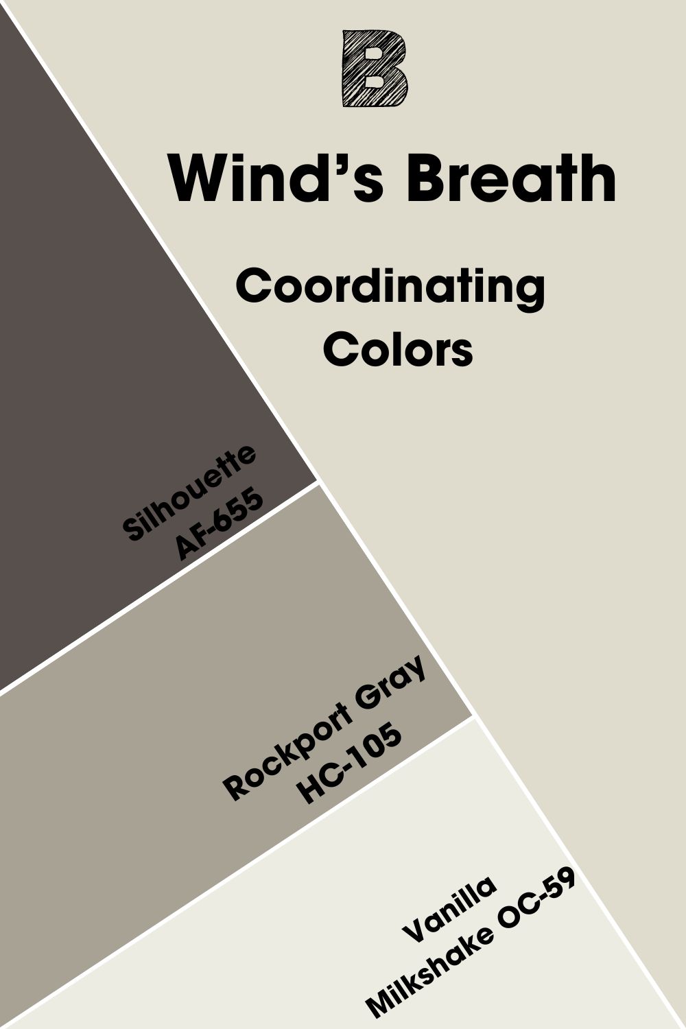
Benjamin Moore Wind’s Breath Coordinating Colors
These colors pair well with each other, creating a pleasing look with their seamless flow. They may look like they have nothing alike, but when you use them in your decor, the similarities appear, and you can better appreciate them.
Wind’s Breath has Silhouette, Rockport Gray, and Vanilla Milkshake as some of its coordinating colors.
- Benjamin Moore Silhouette AF-655: This paint color combines chocolate and charcoal to produce an alluring and unique color.
- Benjamin Moore Rockport Gray HC-105: A wink of violet in this mid-tone gray makes it pair well with the slight pink-purple in Wind’s Breath.
- Benjamin Moore Vanilla Milkshake OC-59: Like the popular vanilla, this paint color fits with almost every color, especially with its gray undertone.
Benjamin Moore Wind’s Breath Color Palettes
These palettes allow you to play with colors. You can create any palette you want, as long as the colors have similarities with the central color, in this case, Wind’s Breath. Let’s look at some palettes to get you started.
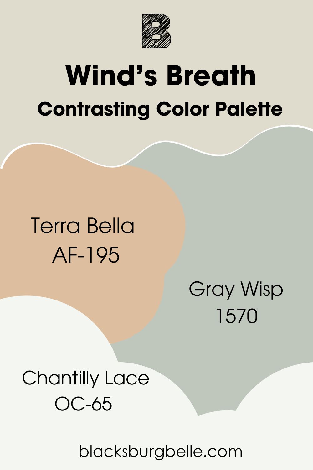
Contrasting Color Palette
- Terra Bella AF-195: A mid-tone neutral paint color with an orange undertone that completely contrasts with Wind’s Breath without looking out of place.
- Gray Wisp 1570: A sweet shade of gray-green that softens the decor and holds its place among vibrant or neutral shades.
- Chantilly Lace OC-65: A bright white paint color with almost no undertones, fitting well with Wind’s Breath as a trim color.
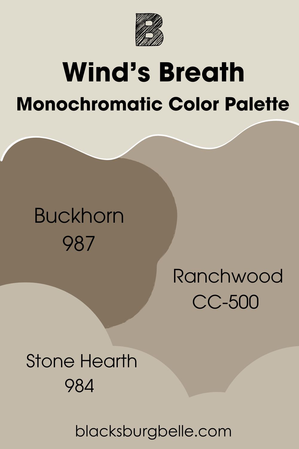
Monochromatic Color Palette
- Buckhorn 987: A deep shade of brown that adds depth to the decor, especially when you use Wind’s Breath as the trim color.
- Ranchwood CC-500: A neutral taupe color that acts as a bridge for warm and cool colors, brightening colors like Wind’s Breath.
- Stone Hearth 984: A mid-tone stony gray that looks creamy and texturized in any decor. Use it as a backdrop for lighter colors like Wind’s Breath.
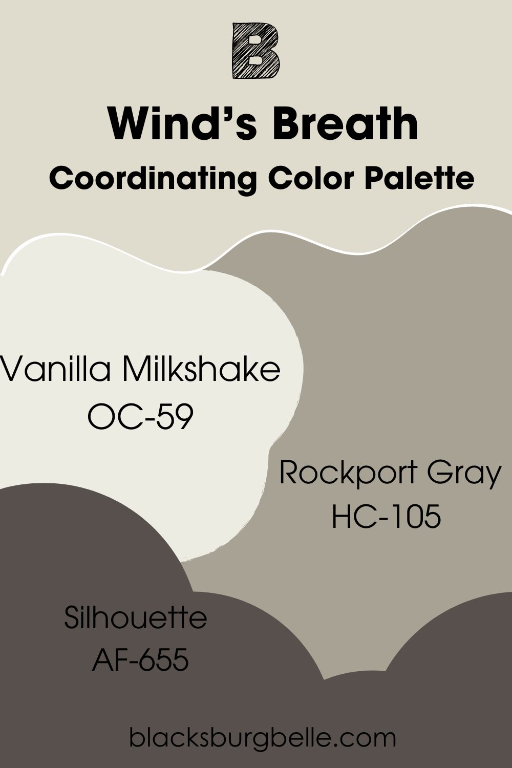
Coordinating Color Palette
- Vanilla Milkshake OC-59: Like the popular vanilla, this paint color fits with almost every color, especially with its gray undertone.
- Rockport Gray HC-105: A wink of violet in this mid-tone gray makes it pair well with the slight pink-purple in Wind’s Breath.
- Silhouette AF-655: This paint color combines chocolate and charcoal to produce an alluring and unique color.
Benjamin Moore Wind’s Breath vs Similar Colors
I want to compare Wind’s Breath side by side with similar colors to see how each performs. You may find an amazing color you’ve never considered before on this list.
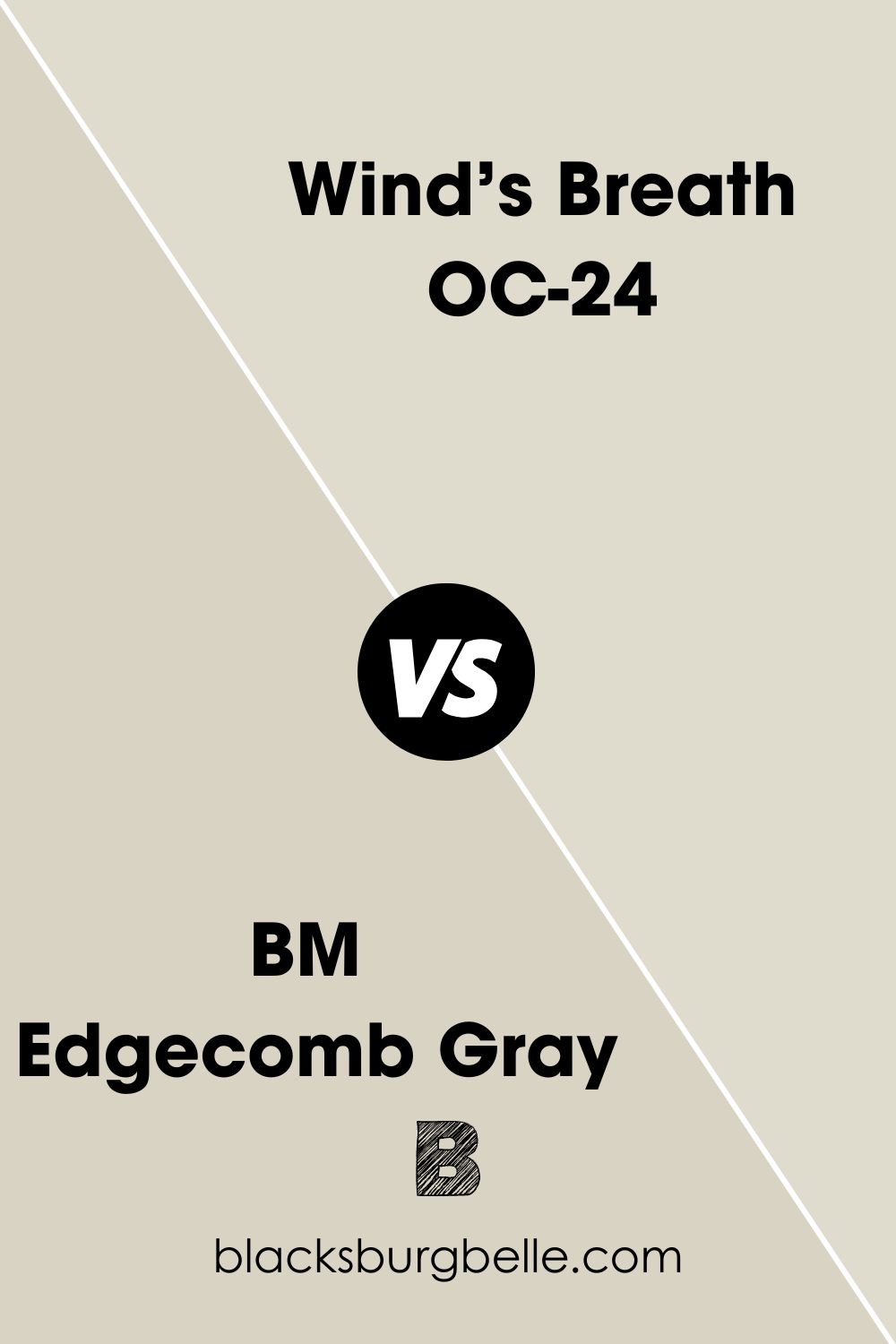
BM Edgecomb Gray vs BM Wind’s Breath
Edgecomb Gray has an LRV of 63.88, which makes it darker than Wind’s Breath. Apart from that, both colors are similar in their undertones.
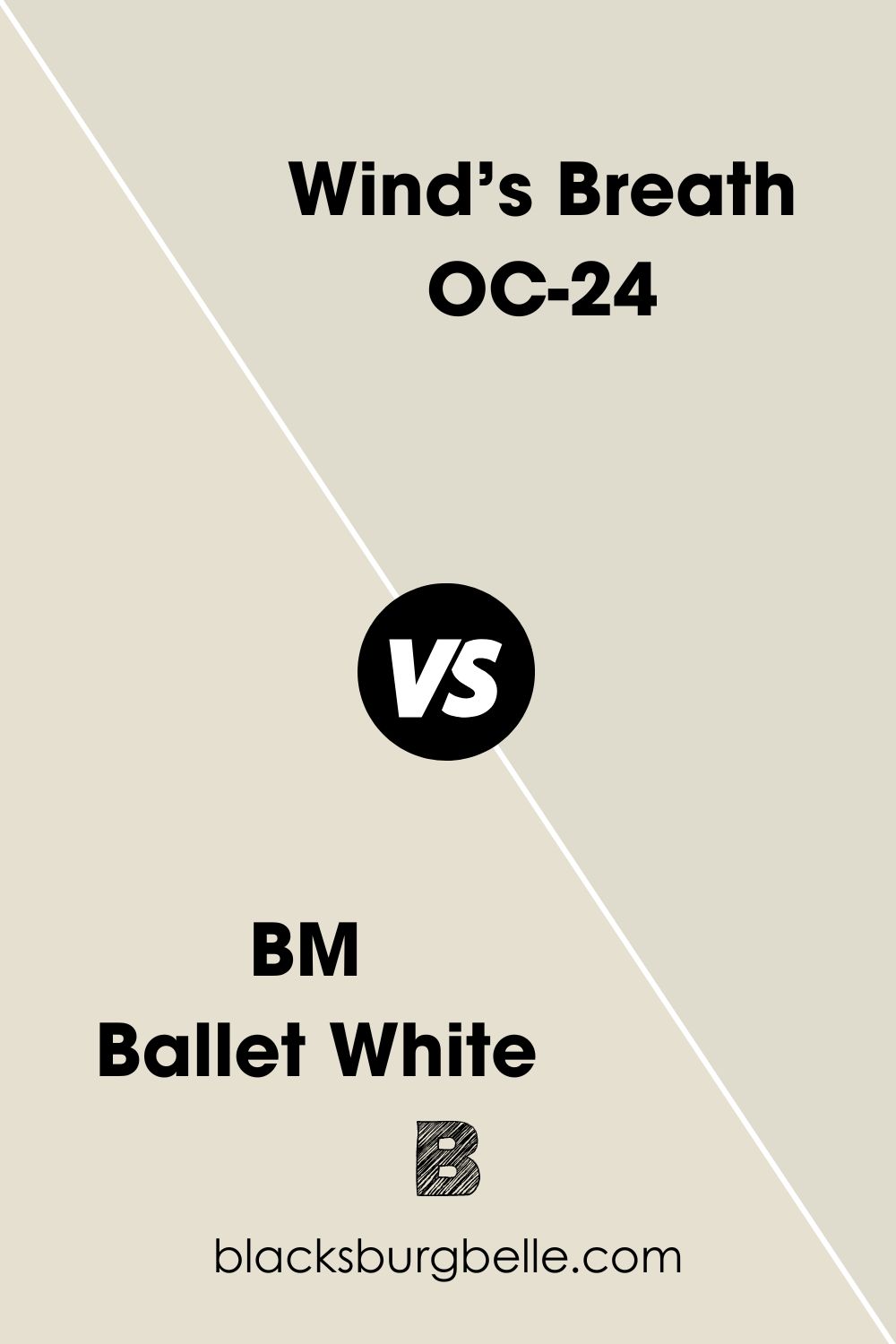
BM Ballet White vs BM Wind’s Breath
Ballet White is an off-white paint color with a pretty high LRV of 71.97. This value makes it considerably lighter than Wind’s Breath, although it has the same creamy undertone.
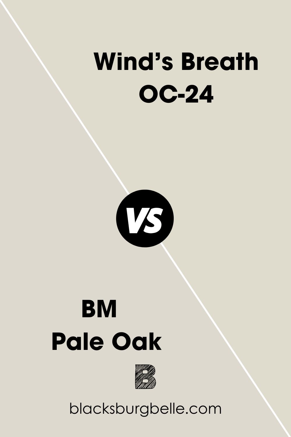
BM Pale Oak vs BM Wind’s Breath
Pale Oak is slightly darker than Wind’s Breath, with an LRV of 68.64. But it has pink-purple undertones, similar to those of Wind’s Breath.
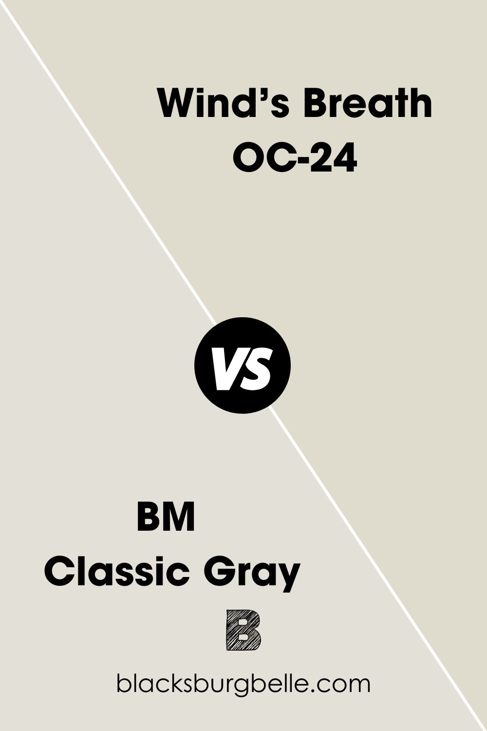
BM Classic Gray vs BM Wind’s Breath
Classic Gray is noticeably lighter than Wind’s Breath, with an LRV of 73.67. It also has warm green undertones, compared to the cream/beige/gray undertones of Wind’s Breath.
BM Swiss Coffee vs BM Wind’s Breath
Swiss Coffee is a warm off-white paint color with a high LRV of 81.91. This makes it much brighter than Wind’s Breath, although both colors have similar cream and gray undertones. However, Swiss Coffee can read a little yellow that leans toward green.
Sherwin Williams Paint Color Equivalent for Benjamin Moore Wind’s Breath
You may not find an exact equivalent paint color from Sherwin Williams to match Benjamin Moore’s Wind’s Breath. The reason is simple: every paint color is unique. Although each contains a certain percentage of red, green, and blue (RGB), the difference is still there.
However, Sherwin Williams’ Oat Milk SW 9501 is almost a spitting equivalent to Wind’s Breath. Both colors have almost the same RGB, so they are excellent alternatives.
Where Can You Use Benjamin Moore Wind’s Breath?
Since it is a neutral color, Wind’s Breath works in any room, including the bathroom, bedroom, kitchen, and living room. Let’s see some examples.
Best Cabinet Color for Benjamin Moore Wind’s Breath Walls
You can pick a neutral White like BM Chantilly Lace or a warm white like Vanilla Milkshake. Cool and crisp whites may make the walls look slightly yellow. Alternatively, use black or deep brown for a striking contrast.
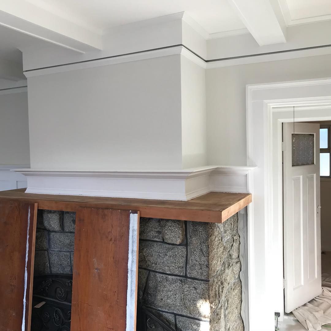
Benjamin Moore Wind’s Breath on a Fireplace
Brick or stone is the go-to for fireplaces. These materials have undertones, so you must use colors that have similar undertones.
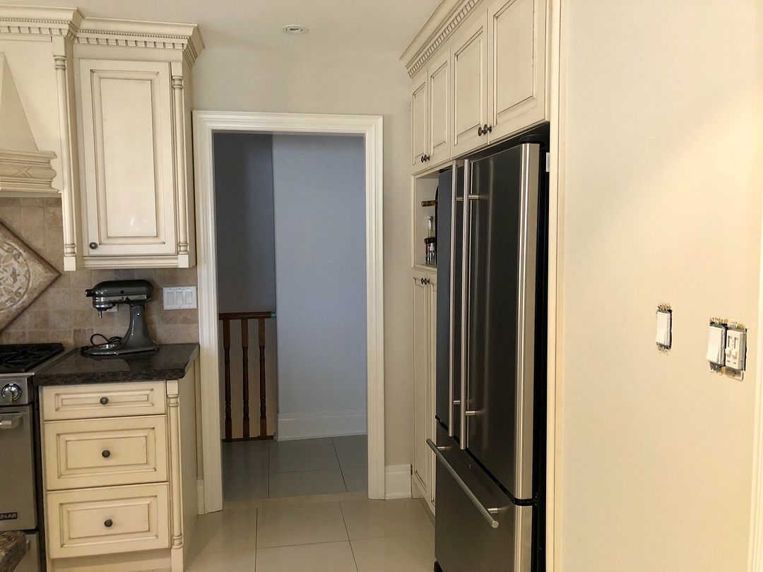
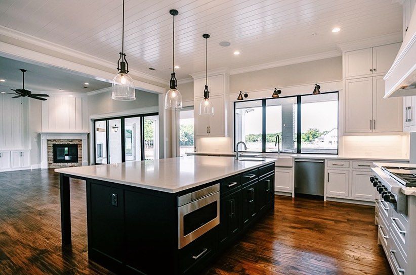
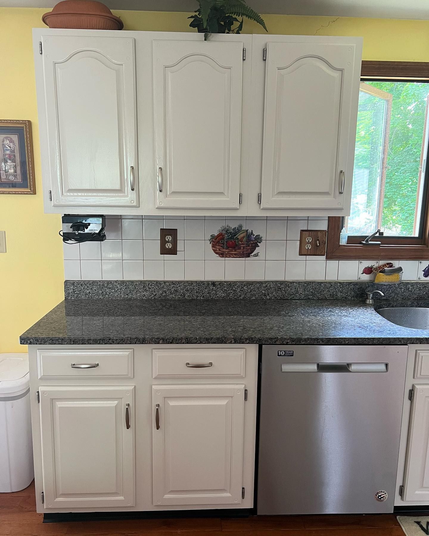
Benjamin Moore Wind’s Breath on Kitchen Cabinets
Although I’m not a fan of pairing this color with yellow, I’m more focused on the cabinet color. Wind’s Breath looks milky and bright in this kitchen, looking great with the stainless steel appliances.
Benjamin Moore Wind’s Breath on Trim
This paint color works as a trim color when you use a darker neutral or light color as the wall color. The walls are done in BM Dove Wing, while the trim is Wind’s Breath.
Best Ceiling Color for Benjamin Moore Wind’s Breath Walls
It is best to use white for a great result. White, such as Chantilly Lace, reveals the depth of Wind’s Breath, giving it more color.
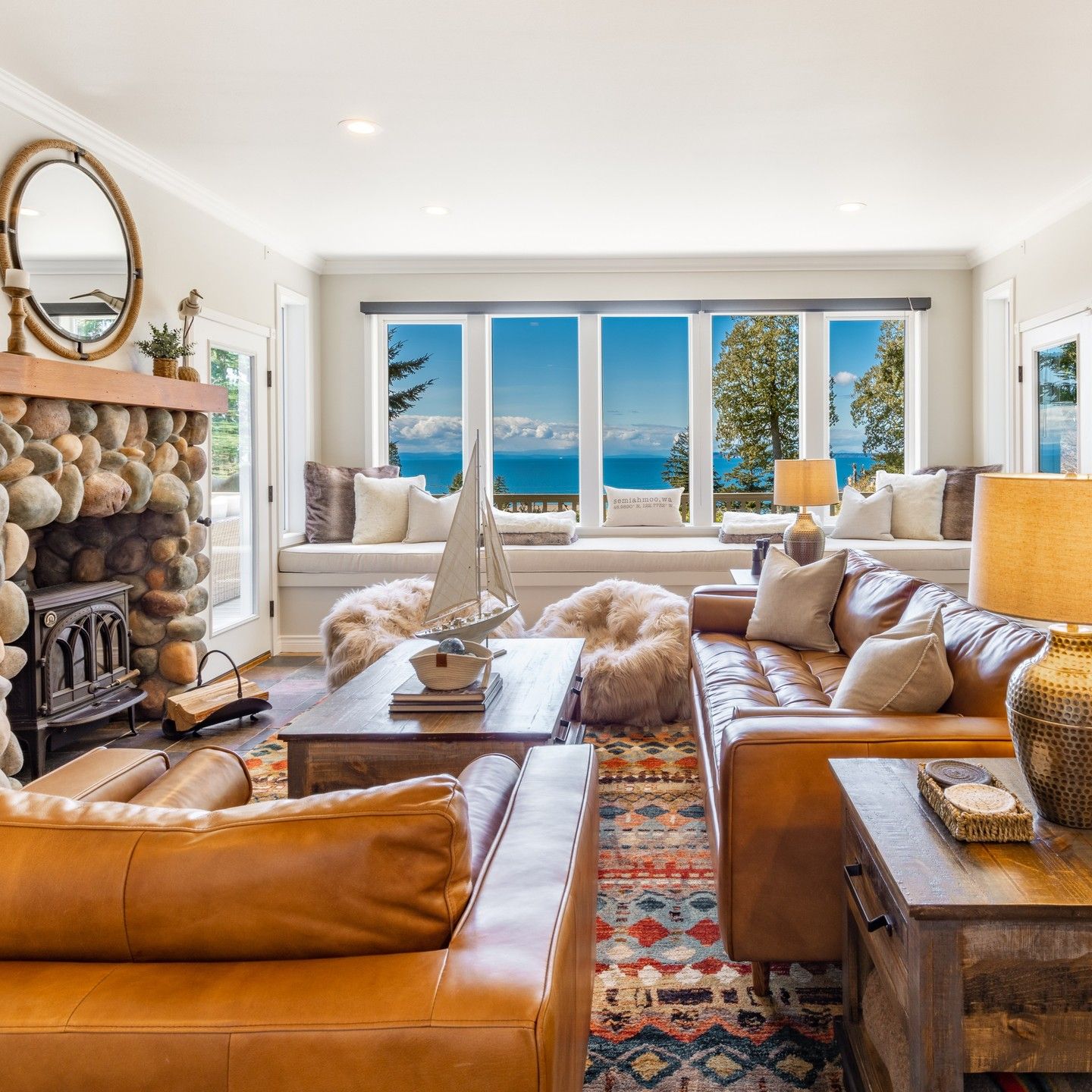
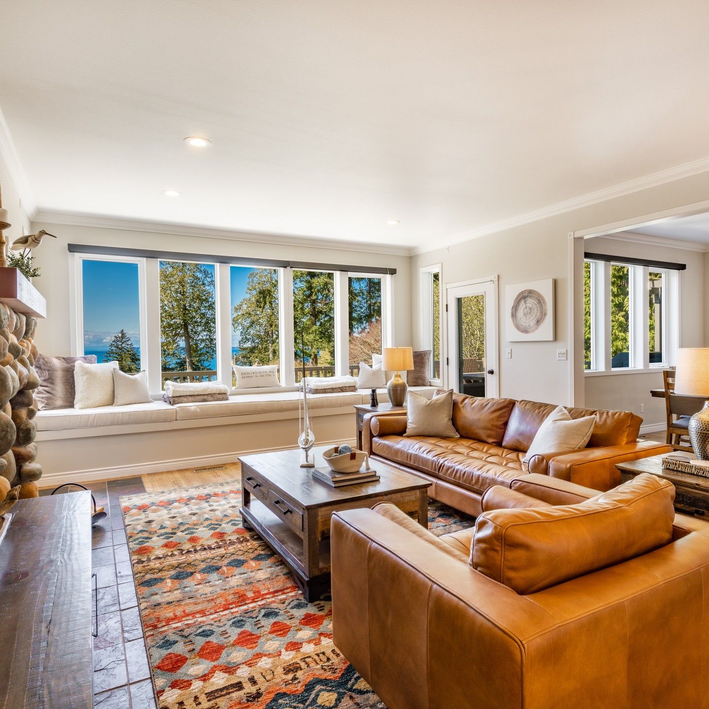
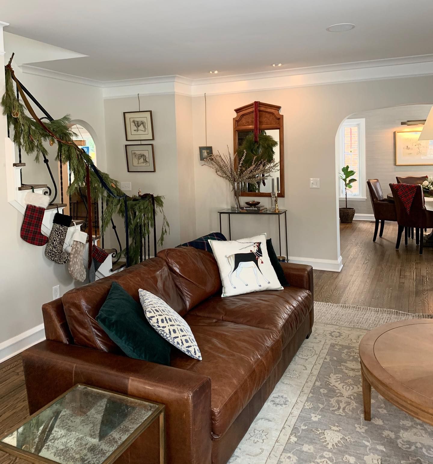
Benjamin Moore Wind’s Breath in a Living Room
Consider using this paint color if you want that homey vibe that comes with family rooms. Another advantage is that it works with different shades and tones.
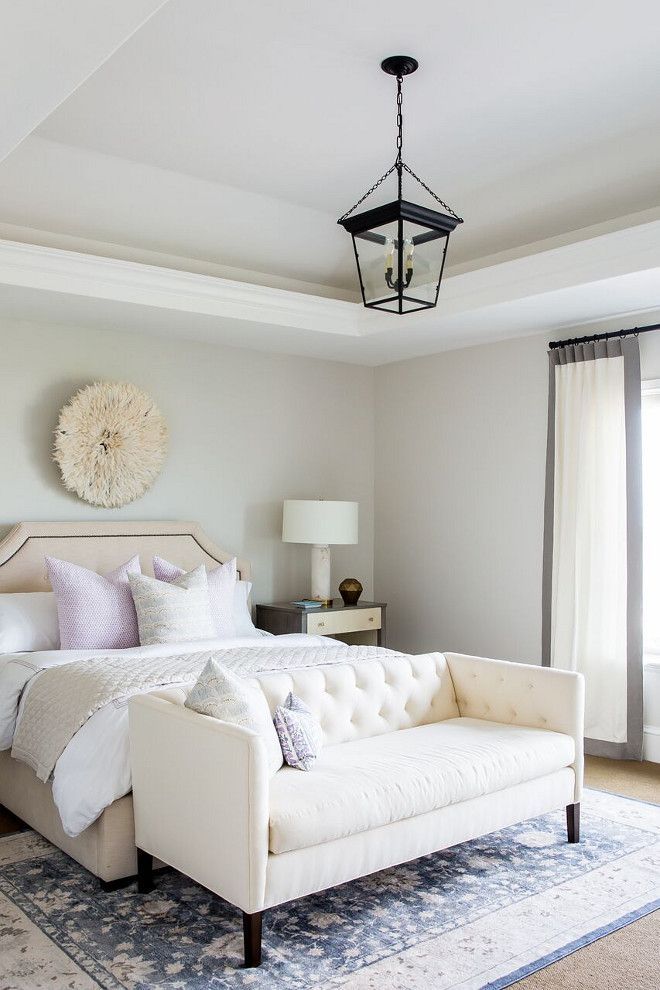
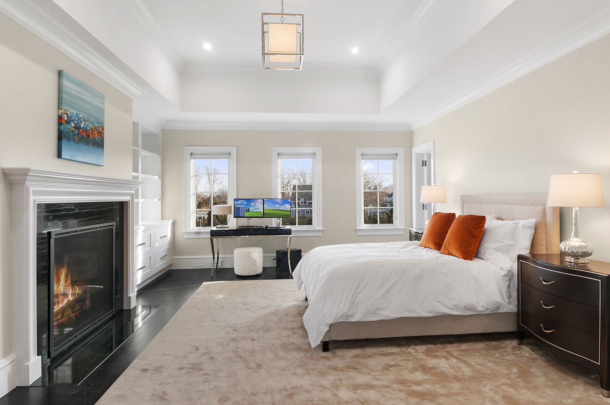
Benjamin Moore Wind’s Breath in a Bedroom
Bedrooms deserve that bright, airy, and fresh vibe, and Wind’s Breath can deliver it. Check out this bedroom for some ideas.
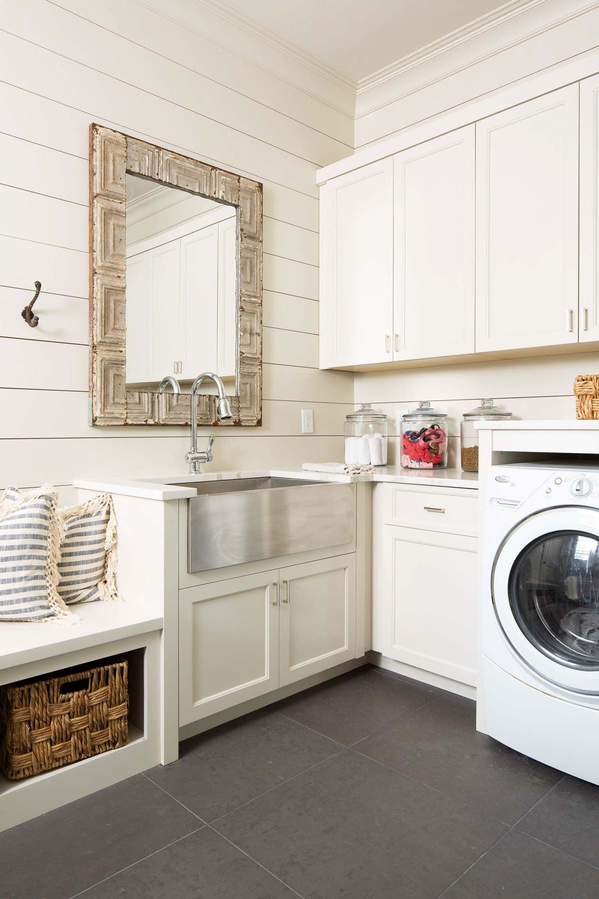
Benjamin Moore Wind’s Breath in a Laundry Room
Rooms that don’t have a lot of natural light need bright colors to keep them from looking glum. Wind’s Breath is a color to consider, even if you plan to use artificial lighting to make up for the gap in natural lighting.
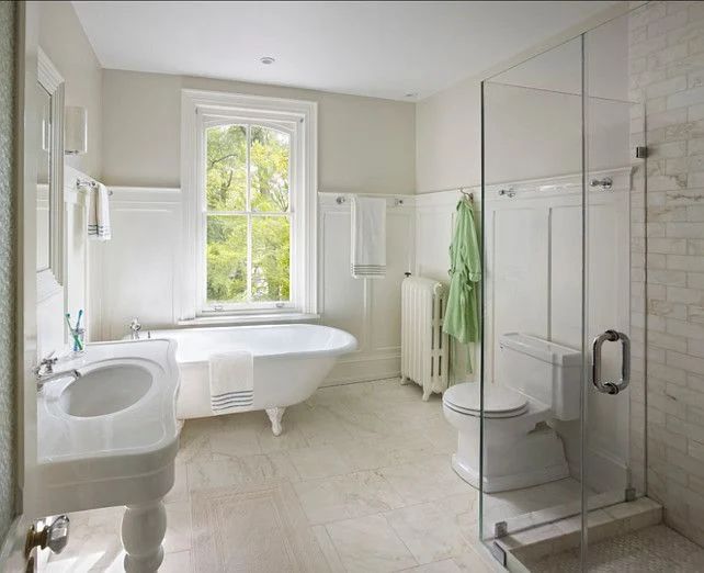
Benjamin Moore Wind’s Breath in a Bathroom
This next photo is what I call ‘bathroom love.” It makes me want to have a bathroom redo, and I’m sure you can get one or two decor ideas from it.
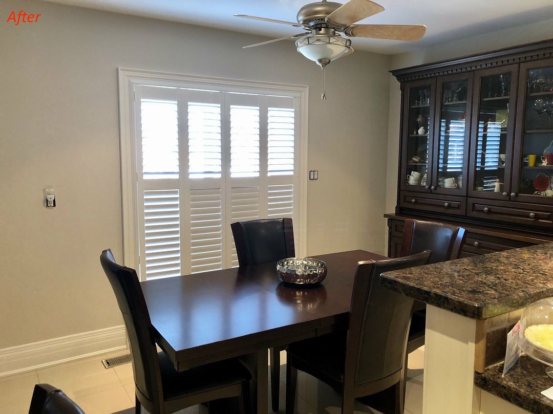
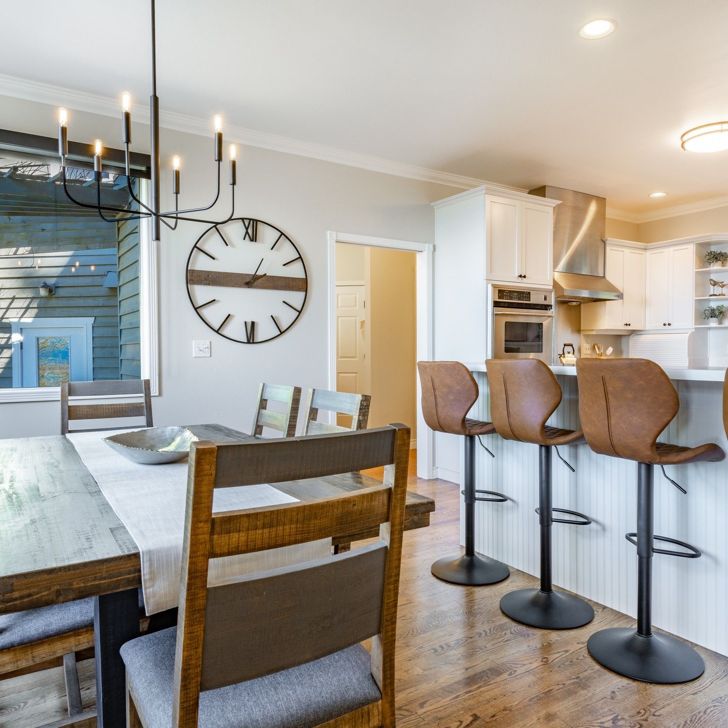
Best Trim Color for Benjamin Moore Wind’s Breath Walls
Are you hungry? Check out this open-floor dining area that opens up into a kitchen. The cozy room has Wind’s Breath on the walls but uses white trim color all over the place. The result is that Wind’s Breath looks more bodied than usual.
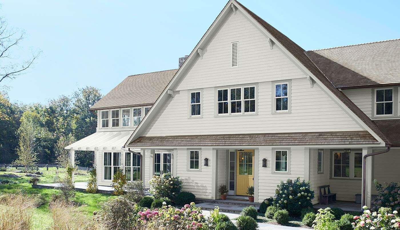
Benjamin Moore Wind’s Breath on Exterior Walls
It may be a light color, but Wind’s Breath looks warm with a little color, making it ideal for a house’s exterior.
Conclusion
Benjamin Moore’s Wind’s Breath is one of the best go-to neutral paint colors for interiors and exteriors. If you are stuck trying to find a suitable color to bring different shades together, Wind’s Breath may be your best bet.
It has an LRV of 69.59 and a melange of undertones, including cream, beige, gray, and pink-purple. Use it in your kitchen, on cabinets, in your bathroom, bedroom, living room, and other rooms.
You can also follow this guide to create a suitable color palette to make the color work and have stunning decor in your home. There’s so much you can do with Wind’s Breath, so let me know if you have any questions, and share your thoughts with me in the comments section.
 Sherwin Williams Watery (Palette, Coordinating & Inspirations)
 Sherwin-Williams Canvas Tan (Palette, Coordinating & Inspirations)
 Sherwin Williams First Star ((Palette, Coordinating & Inspirations)
 Sherwin Williams Agreeable Gray SW 7029 Review
 Sherwin Williams Cotton White SW 7104 Review
 Sherwin Williams White Flour SW 7102: Paint Color Review
