
There are many shades of gray with varying undertones and effects. But in the world of neutrals, some are more equal than others, and Agreeable Gray SW 7029 is at the top of the ladder on the scale of preference.
This medium gray paint color from Sherwin Williams is probably the most popular in the market. While there are similar colors and shades, Agreeable Gray has caught and retained the attention of many, including designers and homeowners.
So today, we are going on an exciting ride to review Agreeable Gray and find out why it is so popular. Is it the best color for you now, or should you look for another? Let’s find out!
Table of Contents
When to Choose Agreeable Gray SW 7029
As mentioned, this paint color looks like the usual gray, nothing spectacular about it. But this may be your thought if you have never used it. It is a neutral paint color that ties everything in your decor. When is the best time to choose it? The following scenarios should guide you.
1. Looking for a balance between gray and beige?
Agreeable Gray is a perfect balance between gray and beige because of its undertones. If your decor requires a neutral that is not entirely gray, greige, or taupe, go for this option.
2. Have an abundance of light or little of it?
Many gray paint colors usually turn dull or bland in low or cold light. But Agreeable Gray remains striking in bright warm light or cold northern light. The only difference is the tone it presents: warm or cool, depending on the light.
3. Need to sell your house?
Agreeable Gray is one of the best paint colors to use for a house you’re putting up for sale. It is not a dull color but is exciting enough to draw attention because of its warmth.
4. Don’t have the right backdrop yet?
You don’t have to rely on the usual white paint color to bring other colors together in your decor. Since it is a wonderful neutral that can read warm many times but also cool when needed, Agreeable Gray may be just that touch of color you need.
By now, you should be getting the idea that this paint is more than meets the eye. And because of its many sides, you’ll find that its uses are almost inexhaustible. Let’s go further, shall we?
What Color Is Agreeable Gray?
Paint colors don’t just have names coined from nothing. There is usually a reason behind the specific names given to them by manufacturers, and this also applies to Agreeable Gray.
Its name already tells you the goal behind its design. The paint color was designed to fit well into any decor, regardless of the color scheme you prefer. It is an excellent alternative to other neutrals but doesn’t compromise warmth or color. The demand for something different drove its production.
Agreeable Gray is a subtly warm gray paint color that sometimes leans toward greige and taupe. It typically has beige undertones, but these can change under different lighting conditions. Sometimes, you may read green, and other times, you may see a slightly violet hue.
However, in a general sense, Agreeable Gray has neutral undertones. What does this mean? You can hardly detect the paint color favoring a particular color, although its beige undertones are pretty obvious. If it were not so neutral, the paint color would not be such a huge favorite.
I’ll talk more about its undertones later. For now, let’s look at some of the basic characteristics of the paint color and other aspects that make it unique.
A Snapshot of the Specifications of Sherwin Williams Agreeable Gray
No two paint colors are the same, regardless of how alike they look to the naked eye. If you are unsure, there are attributes to check to enable you to tell one from another. And these attributes for Agreeable Gray are what I want to show you in this section.
| Agreeable Gray SW 7029 | |
| RGB | 209, 203, 193 |
| LRV | 60 |
| Undertone | Beige |
| HEX Value | #D1CBC1 |
Sherwin Williams Agreeable Gray: Explaining at the LRV
What is LRV? It is not a complex term but means the light reflectance value of color. Every color has an LRv, and experts use this value to determine how much light the color reflects. Some colors reflect more light than others.
The LRV of color uses a scale of 0 to 100, 0 being complete absorption of light and 100 being a complete reflection of light. In other words, true blacks have an LRV of 0, while pure whites have an LRV of 100. But paint colors use a scale of 2.5 to 94 since none is completely white or black.
Agreeable Gray has an LRV of 60. Following the explanation above, you can tell that the paint color is medium gray. It can reflect some light but not enough to qualify as a bright color. Its value is only a little above the middle point of 50.
Sherwin Williams Agreeable Gray: Examining the Undertones
The undertones you find in a color can make or mar it. They determine how the color interacts with light and other colors, and this also applies to Agreeable Gray. The paint color has clear beige undertones, but it can also show a bit of green or violet, depending on the lighting.
The lighting conditions in any room where you use Agreeable Gray are vital to the result you get. While it is a fantastic neutral color for every decor, warm and cold lighting can change the visible hues. It performs best under warm lighting because it looks like a warm greige.
But in cold lighting, it may show a little green or turn slightly violet. Also, the elements around it may influence the color you see. This is especially true for the green undertones. Additionally, color perception is subjective. The shade per time may depend on who is looking at it.
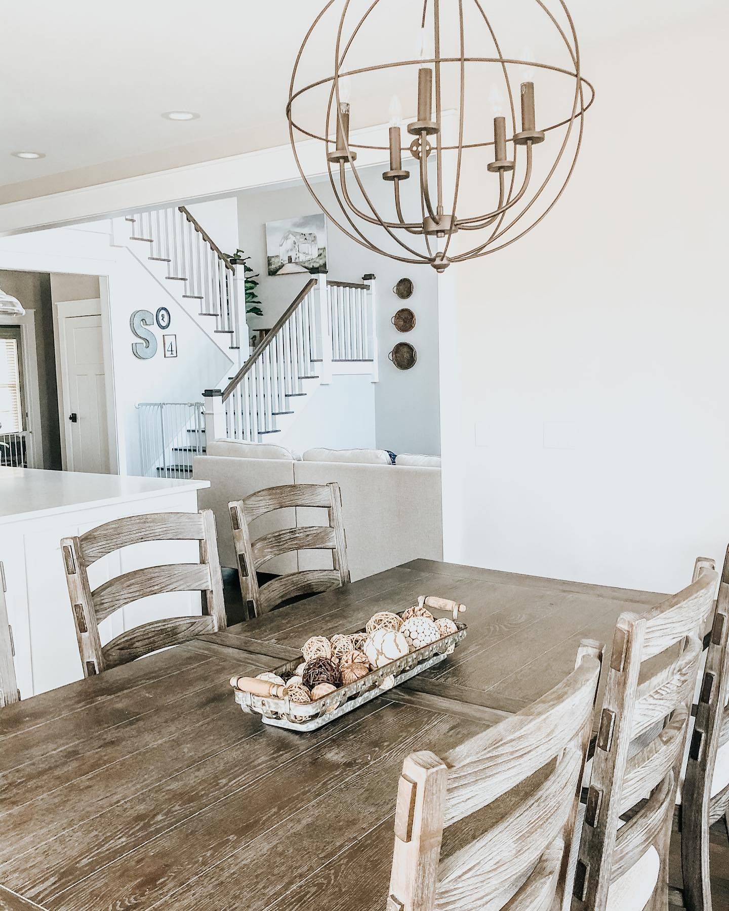
This picture displays the beige undertones with a slight warmth to it. The lighting is bright and excellent, and there are other elements around it. But it does not quickly pick up hues from the other colors because of the bright light.
Does Agreeable Gray Change in Different Rooms?
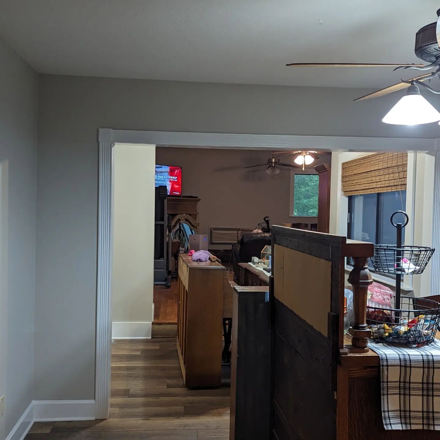
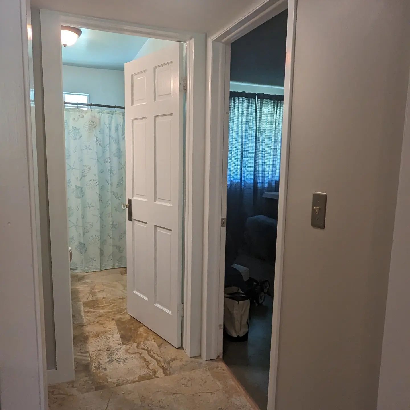
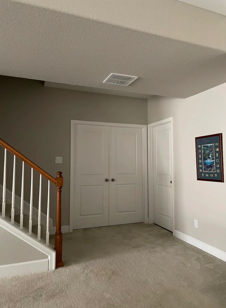
The room’s exposure can make Agreeable Gray change and look different. For example, it looks like solid gray with the slightest wink of violet in this next picture. The lighting is not great and there are many accessories vying for the light’s attention.
However, Agreeable Gray looks completely different in the next picture. It looks more like an off-white paint color with just a touch of gray than an actual gray or greige.
How Vital Is Lighting?
Different rooms can have different exposures based on the four cardinal directions. So, a room can face north, south, east, or west. It can also face a combination of the main directions, and each exposure has unique lighting conditions.
You must take the room’s exposure into consideration when choosing any paint color, regardless of how bright or neutral. This is especially true for colors that tend to reveal different hues. Also, remember that natural and artificial lighting can transform the color.
In this next picture, you can see how muted and violet it looks because of the lighting:
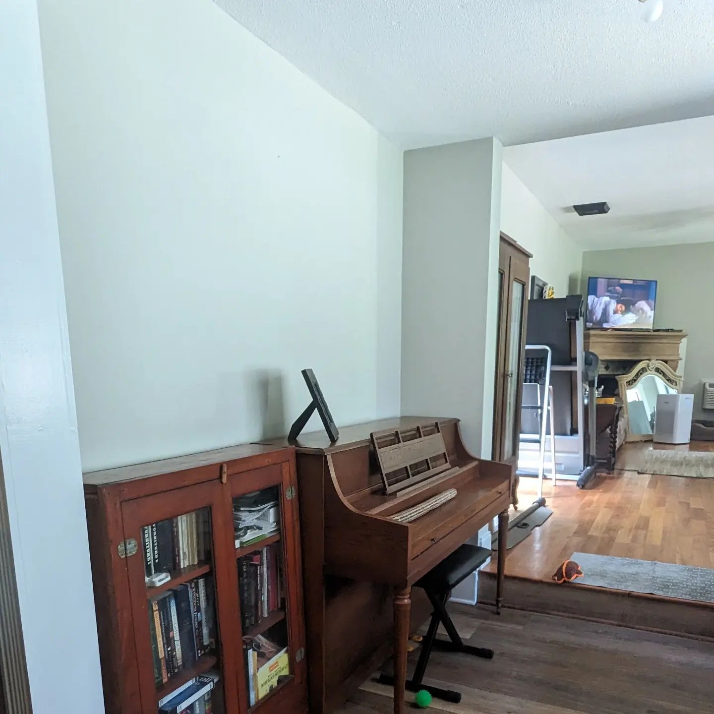
And here, it looks like a light green paint color, despite the bright light:
Is Sherwin Williams Agreeable Gray Warm or Cool?
Agreeable Gray is a subtly warm gray paint color but serves as a neutral color in most cases. That means it fits well with different color schemes and works well as a backdrop for other colors.
But since it has a bit of warmth, its first suitability may be warm color schemes. Try it with warm colors like Mega Greige or Iron Ore to see how it blends without fuss. It is not too warm or too cool.
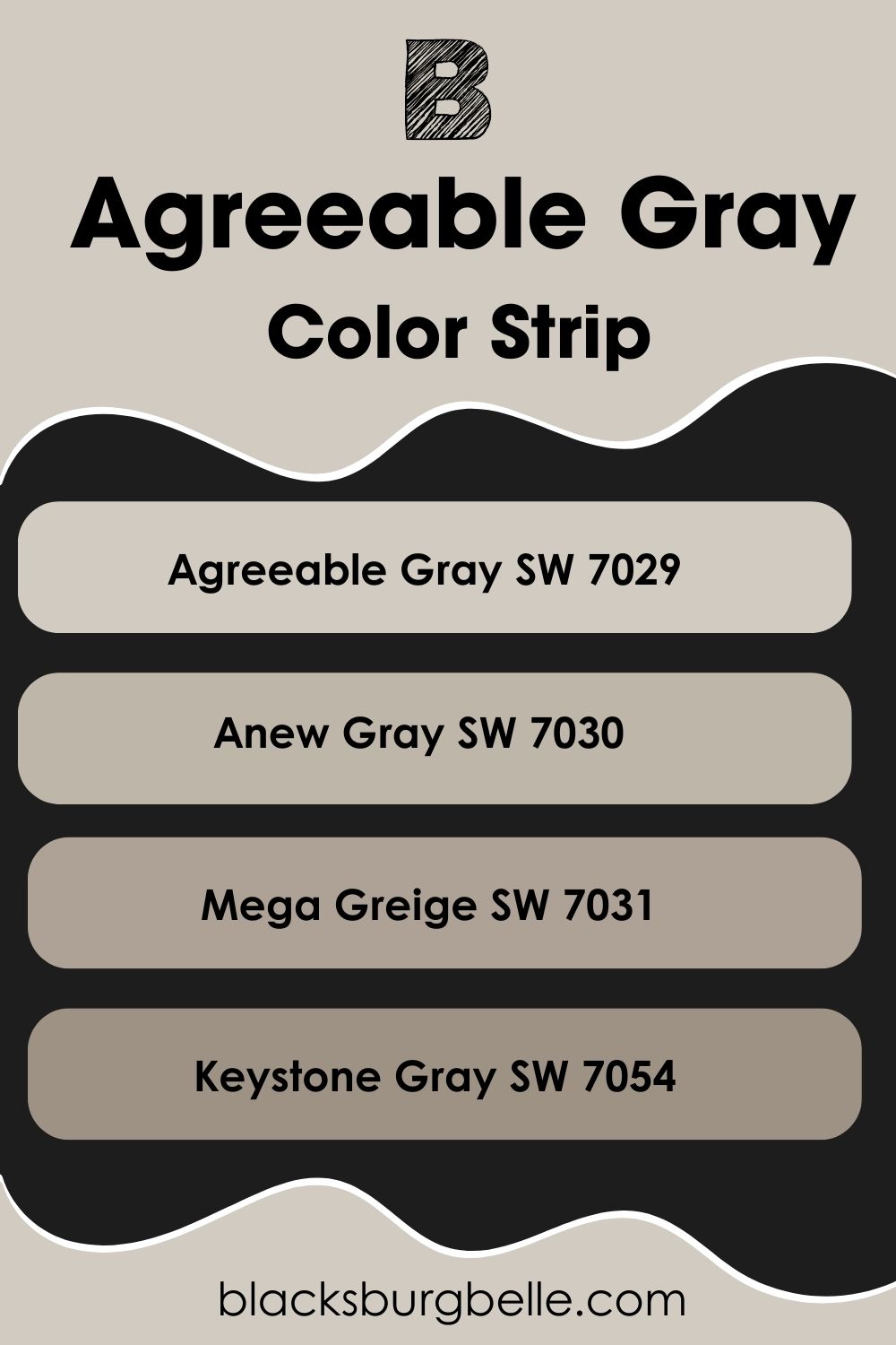
Sherwin Williams Agreeable Gray Color Strip: Lighter or Darker Exploration
As amazing as Agreeable Gray may be, you may find that it is not quite the gray or greige paint color you want. You may be leaning lighter or darker, so what options do you have? Let me help you out a little in this aspect; I’ve selected some colors from Sherwin Williams from light to dark.
- Sherwin Williams Agreeable Gray SW 7029
- Sherwin Williams Anew Gray SW 7030
- Sherwin Williams Mega Greige SW 7031
- Sherwin Williams Keystone Gray SW 7054
Sherwin Williams Agreeable Gray Complementary Colors
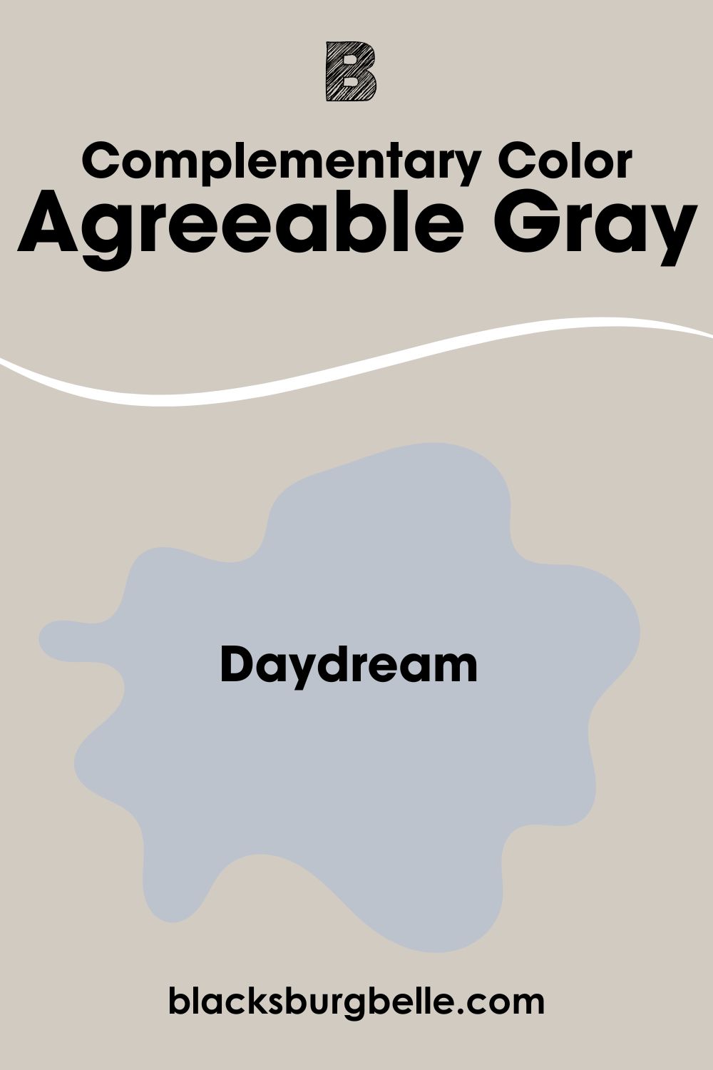
These colors refer to shades that sit opposite each other on the color wheel. If you pick a color and are unsure of the corresponding complementary color, simply check the color 180 degrees away from the chosen color. Both should cancel each other to create a grayscale color.
For Agreeable Gray, which is a medium gray paint color, the best color that complements it is Sherwin Williams’ Daydream SW 6541. It is a light cyan blue, which is the best complementary color for the main color.
Sherwin Williams Agreeable Gray Coordinating Colors
If you want to create some versatility in colors in your decor, you can use coordinating colors. They can be any number of colors as long as they agree in tone or shade with the main color. The following are the colors that best coordinate with Agreeable Gray:
- Sherwin Williams Mega Greige SW 7031: This dark greige paint color remains warm, regardless of the lighting. Its neutrality makes it suitable for all colors, especially light neutrals, and shades like Agreeable Gray.
- Sherwin Williams Extra White SW 7006: A crisp and bright white with slightly blue and green undertones that work on trim when pairing it with Agreeable Gray.
- Sherwin Williams Coral Rose SW 9004: A dark shade of rose that brings a lot of color and versatility to the decor when you use it with Agreeable Gray and other colors.
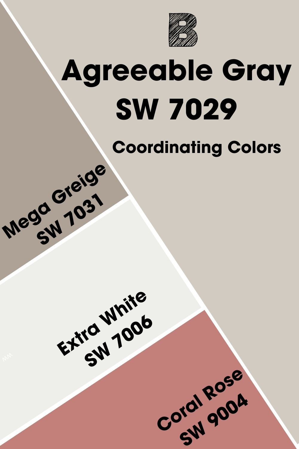
What works in your decor will depend on your style, the colors you prefer, and other factors. But this can serve as a guide to picking coordinating colors according to your specific needs.
Sherwin Williams Agreeable Gray Color Palettes
As a neutral color, Agreeable Gray can work well with many different shades and hues. With this in mind, you can create different color palettes and not get it wrong. Let me guide you with a few.
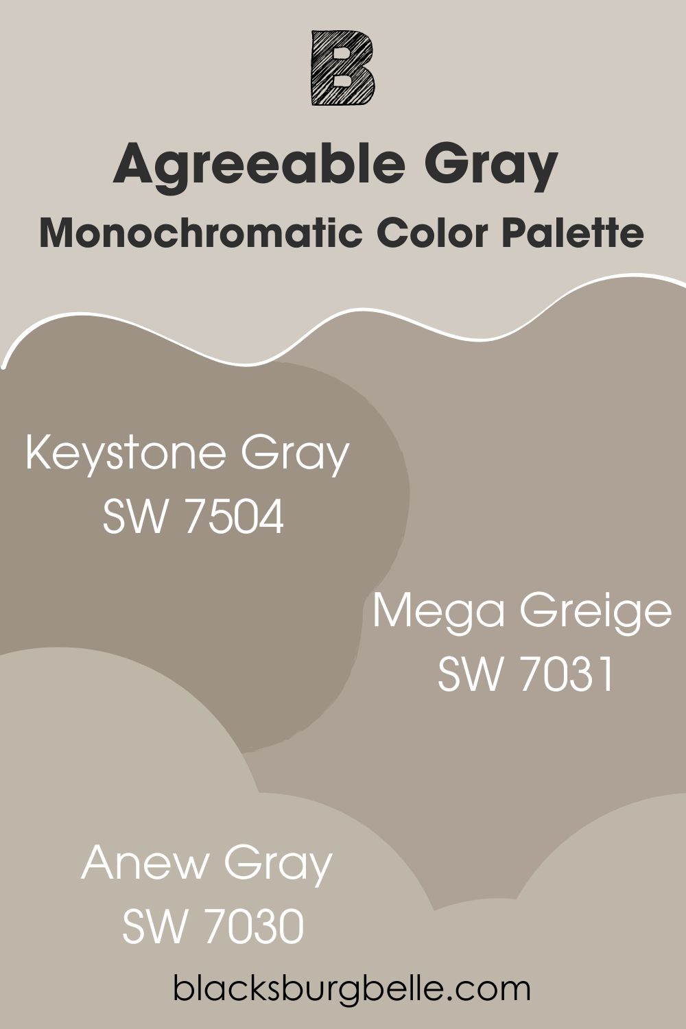
Monochromatic Color Palette
- Keystone Gray SW 7504: A slightly darker shade than Agreeable Gray that adds some depth to the decor
- Mega Greige SW 7031: A shade lighter than Keystone Gray and softens the color if you’re not a fan of the Keystone Gray shade
- Anew Gray SW 7030: It is still in the trajectory as the rest and looks amazing because of the slightly more obvious color in it than in Agreeable Gray
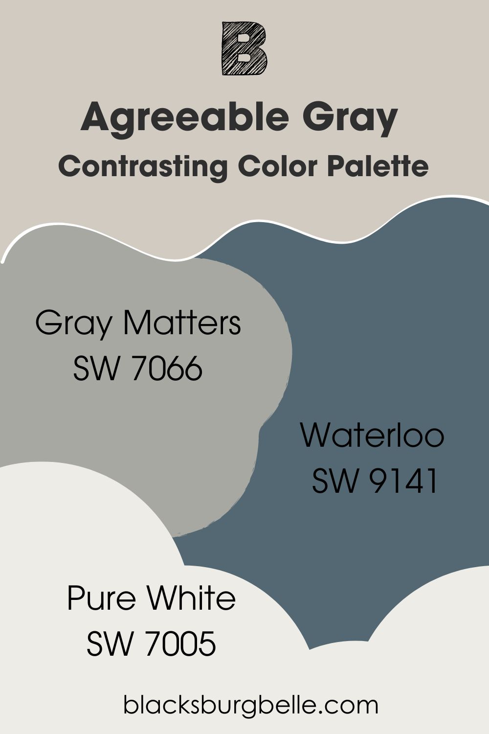
Contrasting Color Palette
- Gray Matters SW 7066: A medium gray paint color with enough neutrality to complement Agreeable Gray and enough depth to make it shine
- Waterloo SW 9141: A deep blue paint color with gray hints that take it to the opposite side of the spectrum from Agreeable Gray and brings a strong contrast
- Pure White SW 7005: With a hint of yellow, this bright white can change the room and make Agreeable Gray even warmer if used on trim
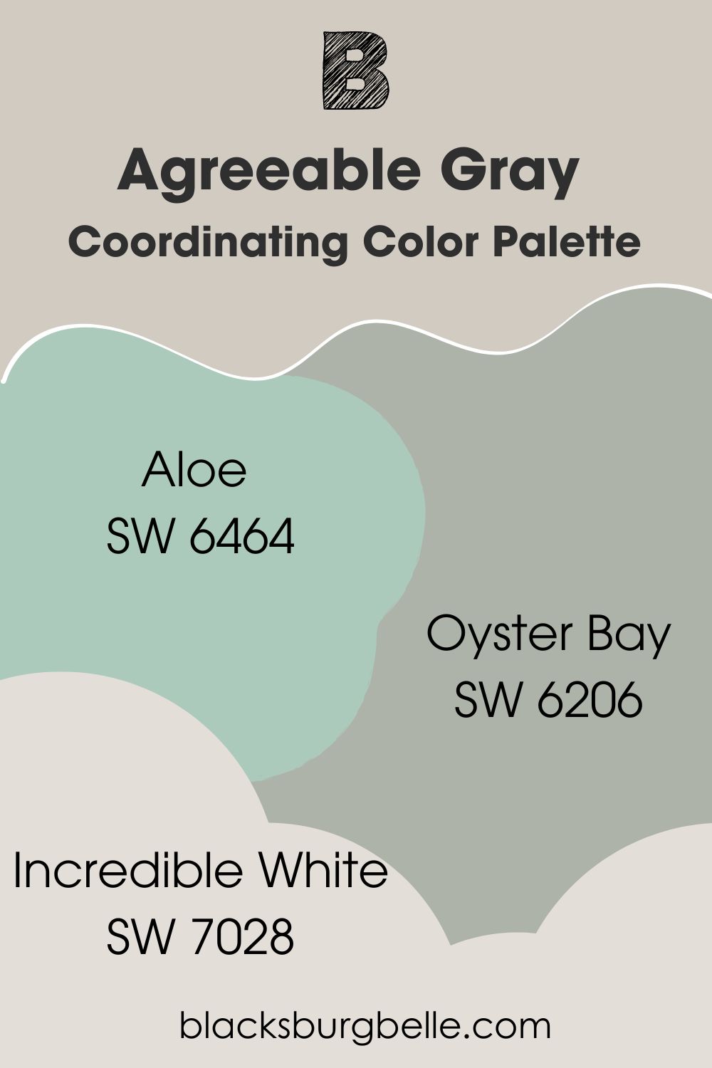
Coordinating Color Palette
- Aloe SW 6464: A light shade of green, called aloe, that brings some color and softness to the decor
- Oyster Bay SW 6206: A gray-green paint color with enough depth and pigmentation to make Agreeable Gray appear light and neutral
- Incredible White SW 7028: With its gray undertones, this cool white pairs well with the neutral Agreeable Gray
Sherwin Williams Agreeable Gray vs Similar Colors
Have you considered colors similar to Agreeable Gray and whether or not they are suitable alternatives? Let’s look at some of them for context.
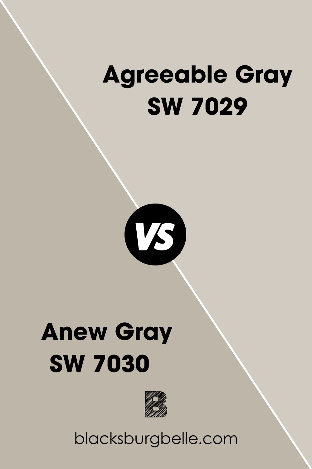
SW Anew Gray vs SW Agreeable Gray
With an LRV of 47, Anew Gray is noticeably darker than Agreeable Gray. That means the latter reflects more light than the former and may also perform better as a neutral paint color.
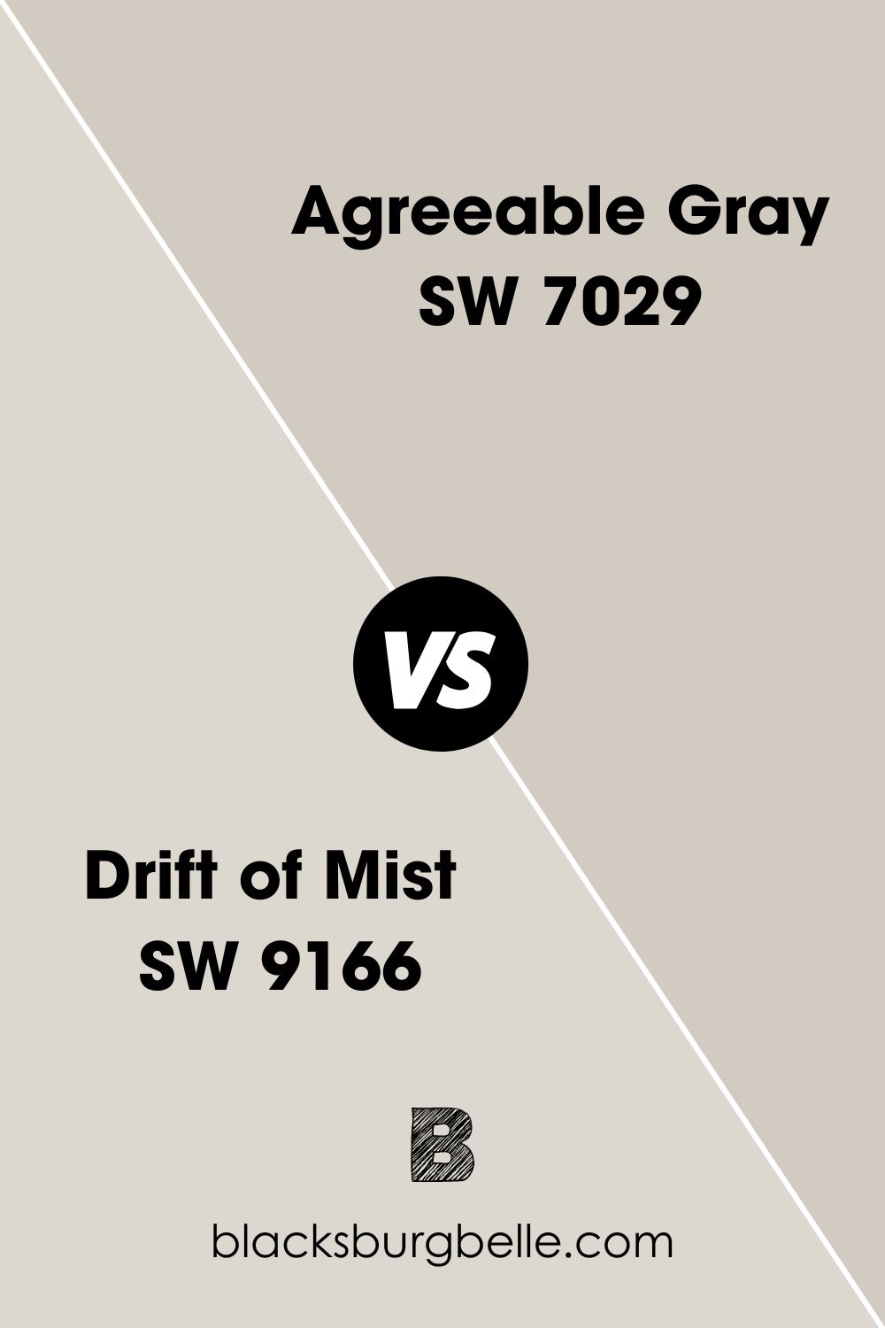
SW Drift of Mist vs SW Agreeable Gray
Drift of Mist is a much lighter color than Agreeable Gray, although they are both in the gray color family. Also, their undertones are different, so they may clash if used together.
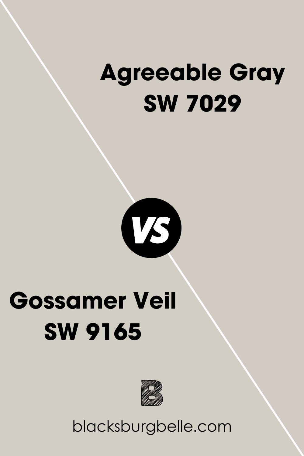
SW Gossamer Veil vs SW Agreeable Gray
Gossamer Veil is creamy and warm with an LRV of 62. This means it is slightly brighter than Agreeable Gray but also plays neutral to fit different colors.
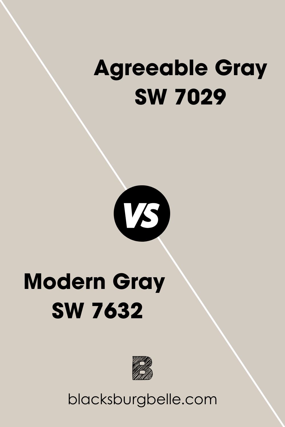
SW Modern Gray vs SW Agreeable Gray
It is a color that is pretty similar to Agreeable Gray but has a higher LRV and different undertones. As a brighter color, Modern Gray reads pink-purple, while Agreeable Gray reads green-beige.
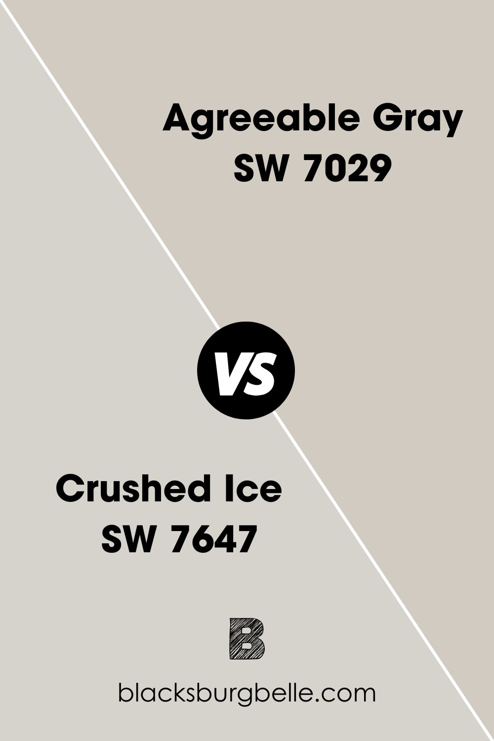
SW Crushed Ice vs SW Agreeable Gray
Crushed Ice is a little grayer than Agreeable Gray. Also, it appears lighter and cooler because of its purple undertones.
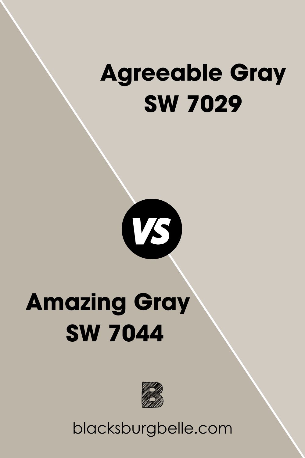
SW Amazing Gray vs SW Agreeable Gray
Amazing Gray has an LRV of 62, so it can reflect more light. Plus, it has more depth and warmth than Agreeable Gray because of more beige in it.
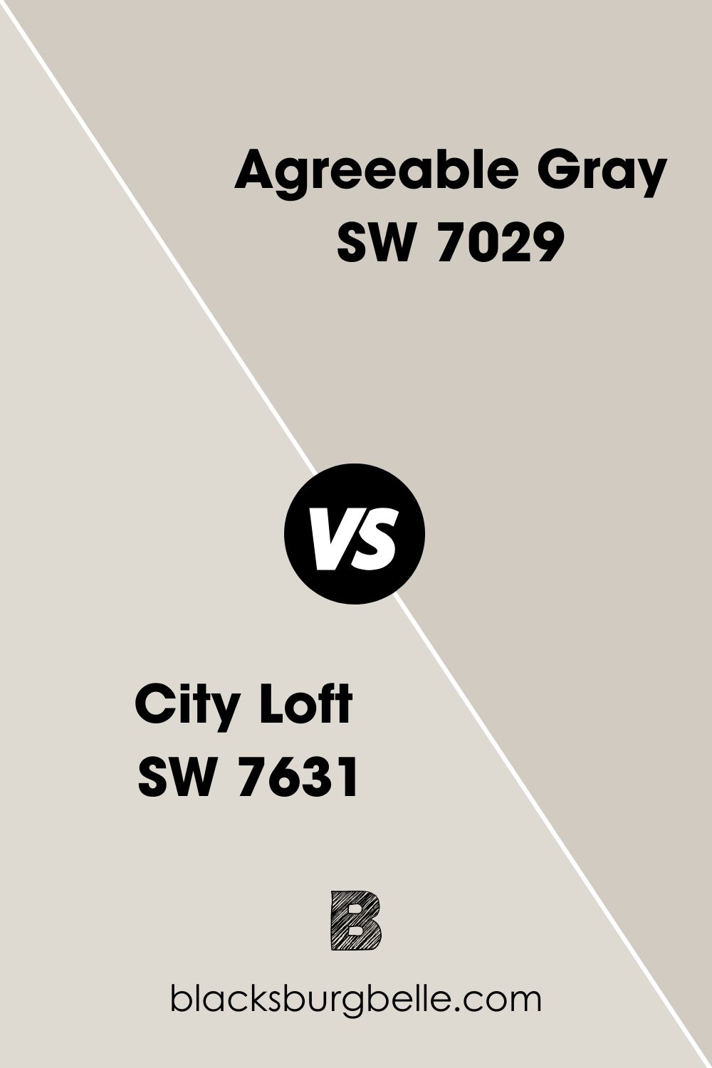
SW City Loft vs SW Agreeable Gray
In this case, Agreeable Gray has more depth and looks darker than City Loft, although they are similar. Moreover, City Loft has a higher LRV of 70, considerably higher than the 60 of Agreeable Gray.
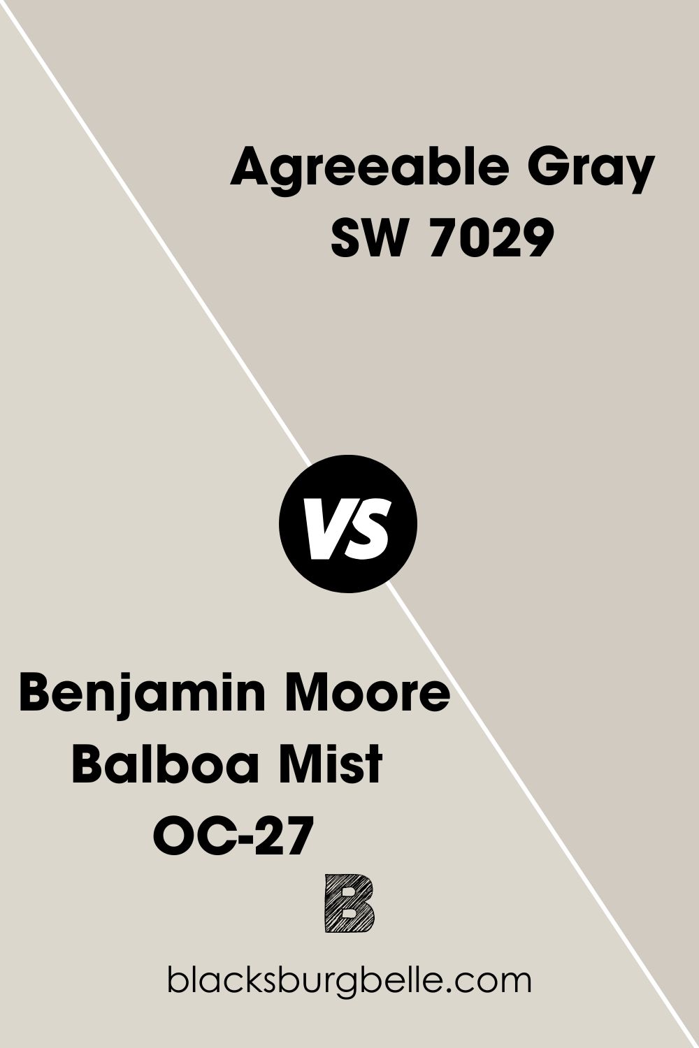
B M Balboa Mist vs SW Agreeable Gray
Balboa Mist may be a cleaner and crisper alternative to Agreeable Gray. The paint color is also brighter than Agreeable Gray with an LRv of 67.
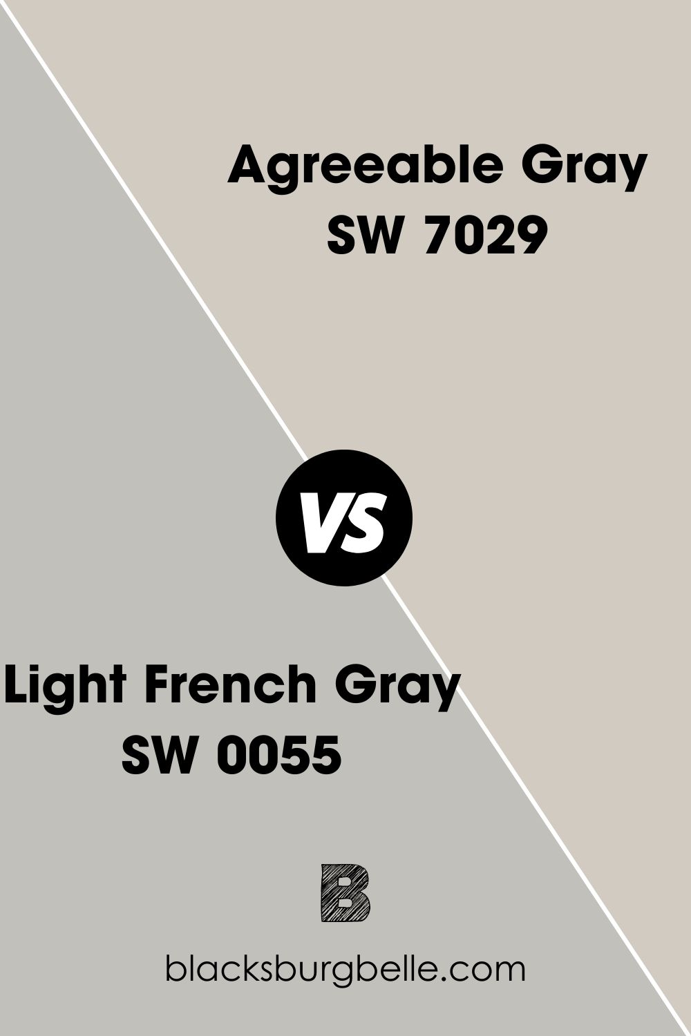
SW Light French Gray vs SW Agreeable Gray
Light French Gray is a cooler version of gray and has purple undertones. However, it has a lower LRV of 53, whereas Agreeable Gray has an LRV of 60.
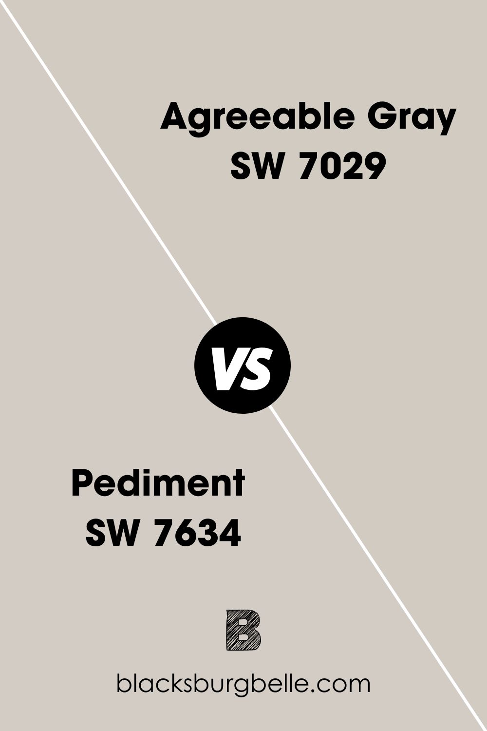
SW Pediment vs SW Agreeable Gray
Pediment favors red undertones and looks slightly warmer than Agreeable Gray. It also has an LRV of 61, just a smidge higher than that of Agreeable Gray.
Benjamin Moore Paint Color Equivalent for SW Agreeable Gray
As you can see above, there are many similar colors to Agreeable Gray. But when it comes to colors from Benjamin Moore, Collingwood OC-28 is close to Agreeable Gray. The shades are practically the same, but the undertones and LRVs are different.
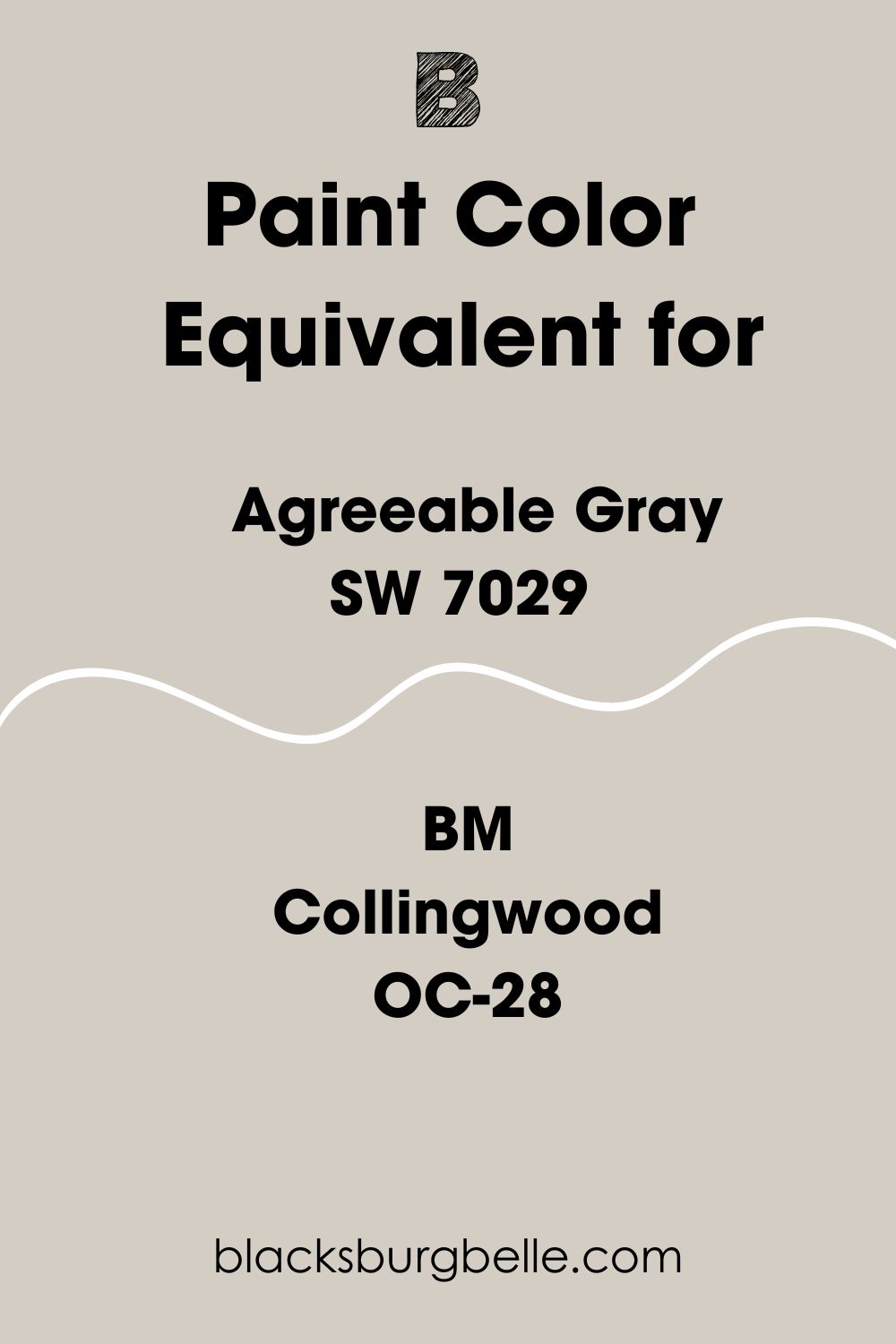
Collingwood has purple undertones and an LRV of 61.52. This makes it brighter and cooler than Agreeable Gray. Another similar color from Benjamin Moore is Revere Pewter. But while they look almost the same, Revere Pewter is slightly darker and deeper than Agreeable Gray.
Where Can You Use Sherwin Williams Agreeable Gray?
I think the question should be: where can’t you use Agreeable Gray? It is so versatile that it works for interiors and exteriors. It can even work on trim if you know how to combine it properly. So, let’s go to town and see where you can use this paint color.
Best Trim Paint Color for SW Agreeable Gray Walls
If you paint your walls Agreeable Gray, the best trim paint color is Extra White SW 7006. You can also try Pure White SW 7005, which is very close to Extra White. Their shades pair well with the undertones of Agreeable Gray and bring out the color’s true tone without making it look washed out.
What Ceiling Color Goes with SW Agreeable Gray Walls?
You can keep the decor uniform if you are not open to versatility. That means using the same paint color on the walls and ceiling. The result is better than you imagine, especially if you use the correct lighting.
However, white ceilings pair well with Agreeable Gray walls. So, use Extra White or Pure White for the walls if you want a beautiful result.
What Color Goes Well with SW Agreeable Gray Exterior?
Agreeable Gray is a popular paint color to increase the selling point of any house. It exudes warmth, doesn’t look bland, and doesn’t compromise color.
To increase its warmth and subtle color, pair it with white trim, especially bright whites like Pure White. You can use a darker gray for the windows for some dramatic effect.
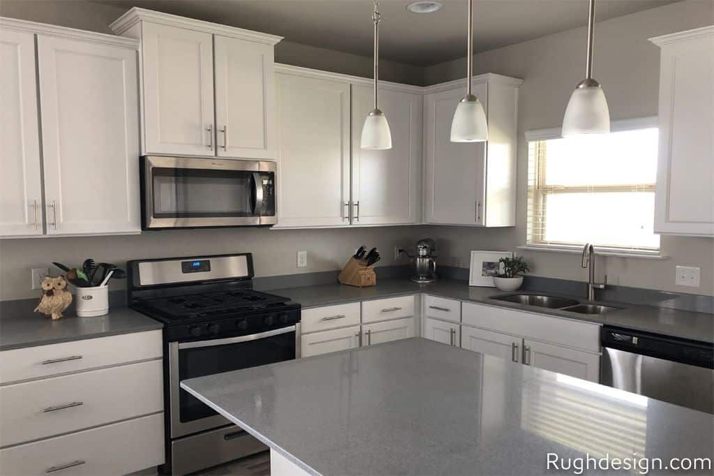
Sherwin Williams Agreeable Gray on Kitchen Cabinets
If you are doubtful about how Agreeable Gray performs on kitchen cabinets, I have good news for you. It looks amazing, but only if you use a complementary white paint color on the walls.
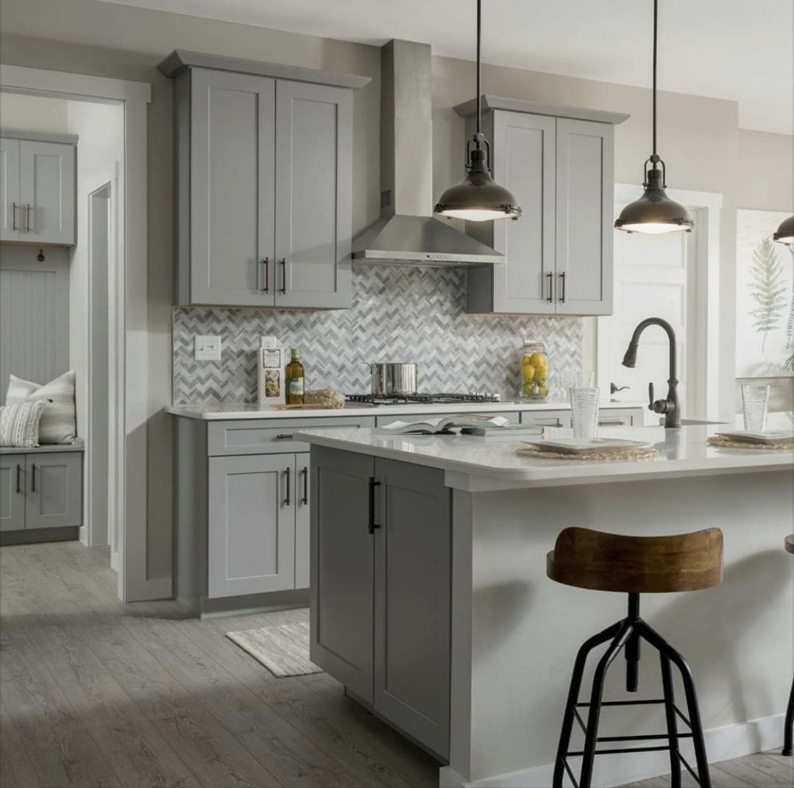
What Color of Cabinets Go with Agreeable Gray Walls?
White oak or white painted cabinets go well with Agreeable Gray walls. Both colors blend well when used in this manner. But if white cabinets are not to your taste, try dark wood cabinets to contrast with Agreeable Gray.
Sherwin Williams Agreeable Gray on Exterior Brick
What is the effect of Agreeable Gray on bricks outside the house? Should you go for it? You decide for yourself with this next picture. You can always tweak the colors around it for a better result.
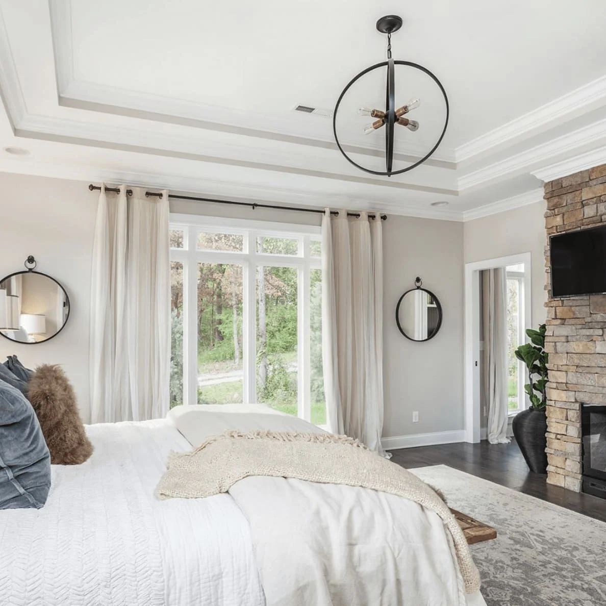
Sherwin Williams Agreeable Gray in Bedrooms
You can use Agreeable Gray in a bedroom if you want a classic clean look without using all-white decor. Use white trim to complete the look.
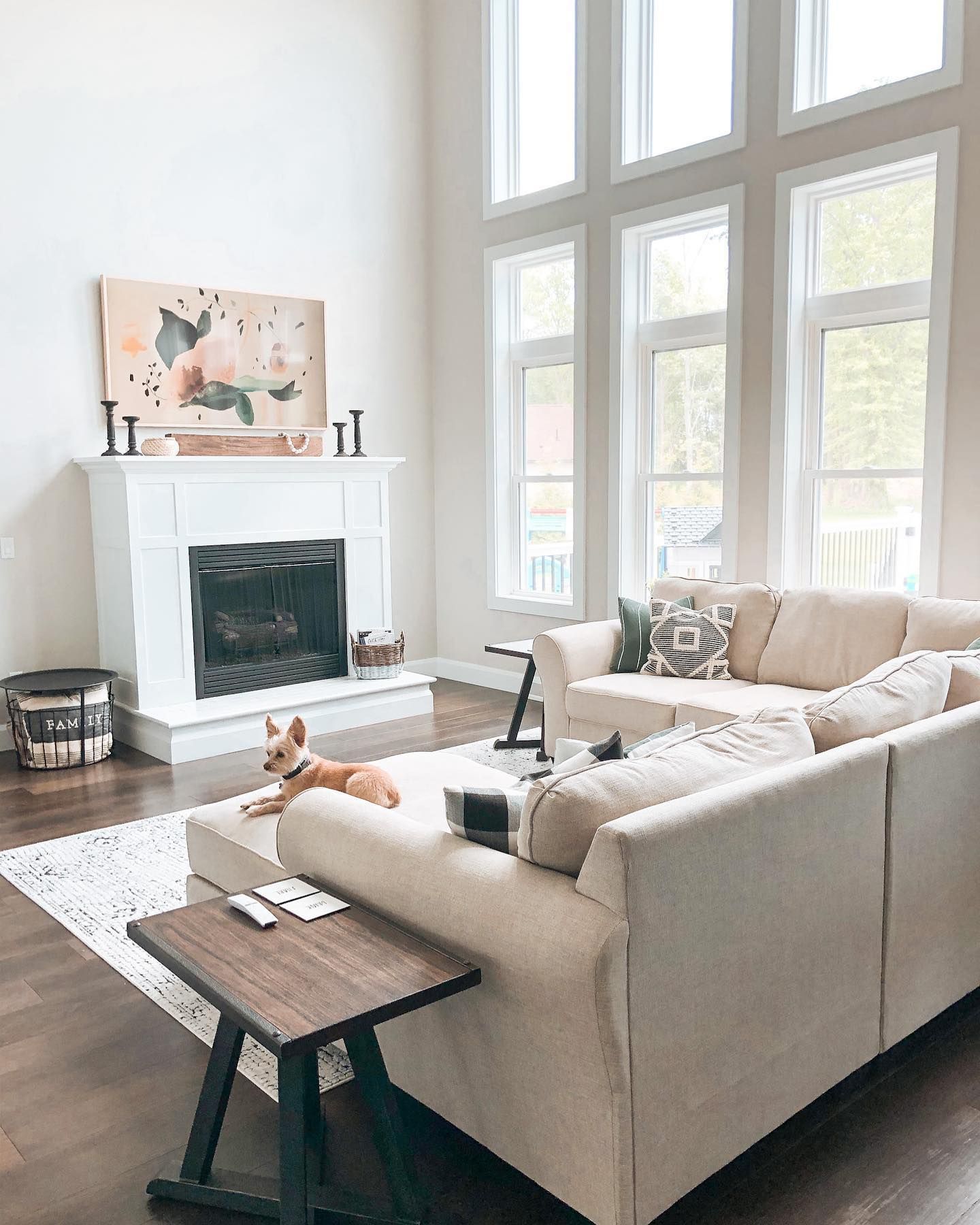
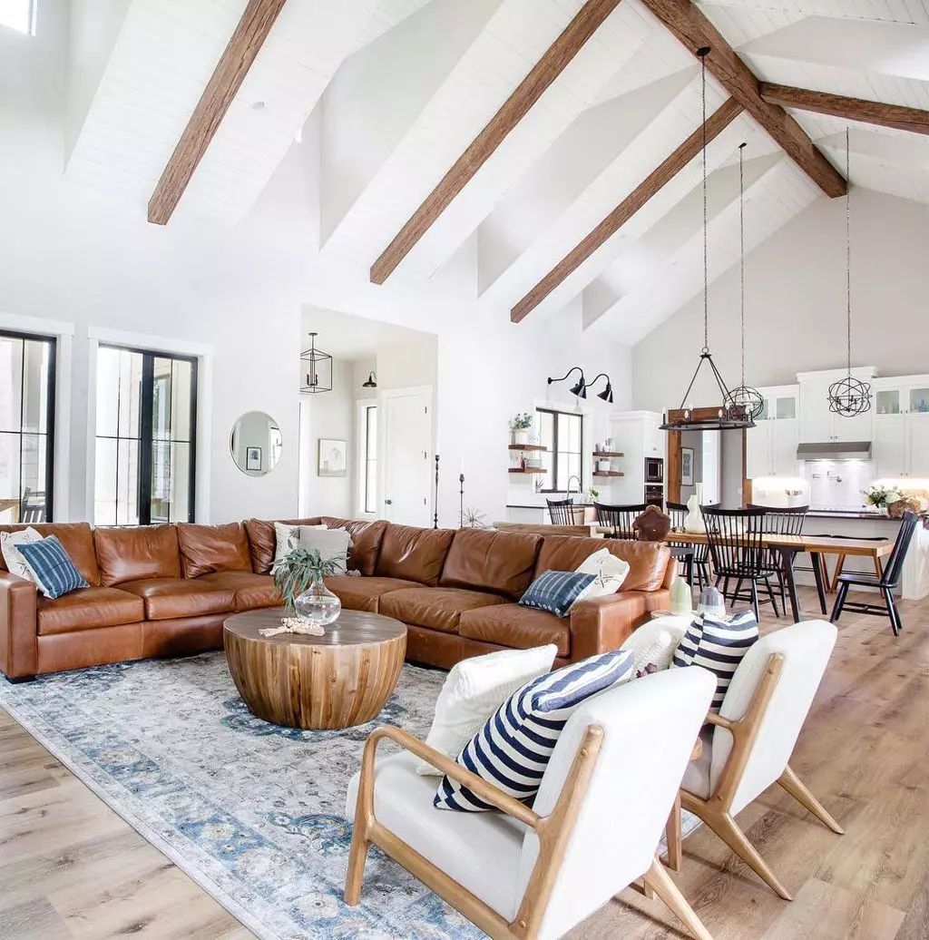
Sherwin Williams Agreeable Gray in Living Rooms
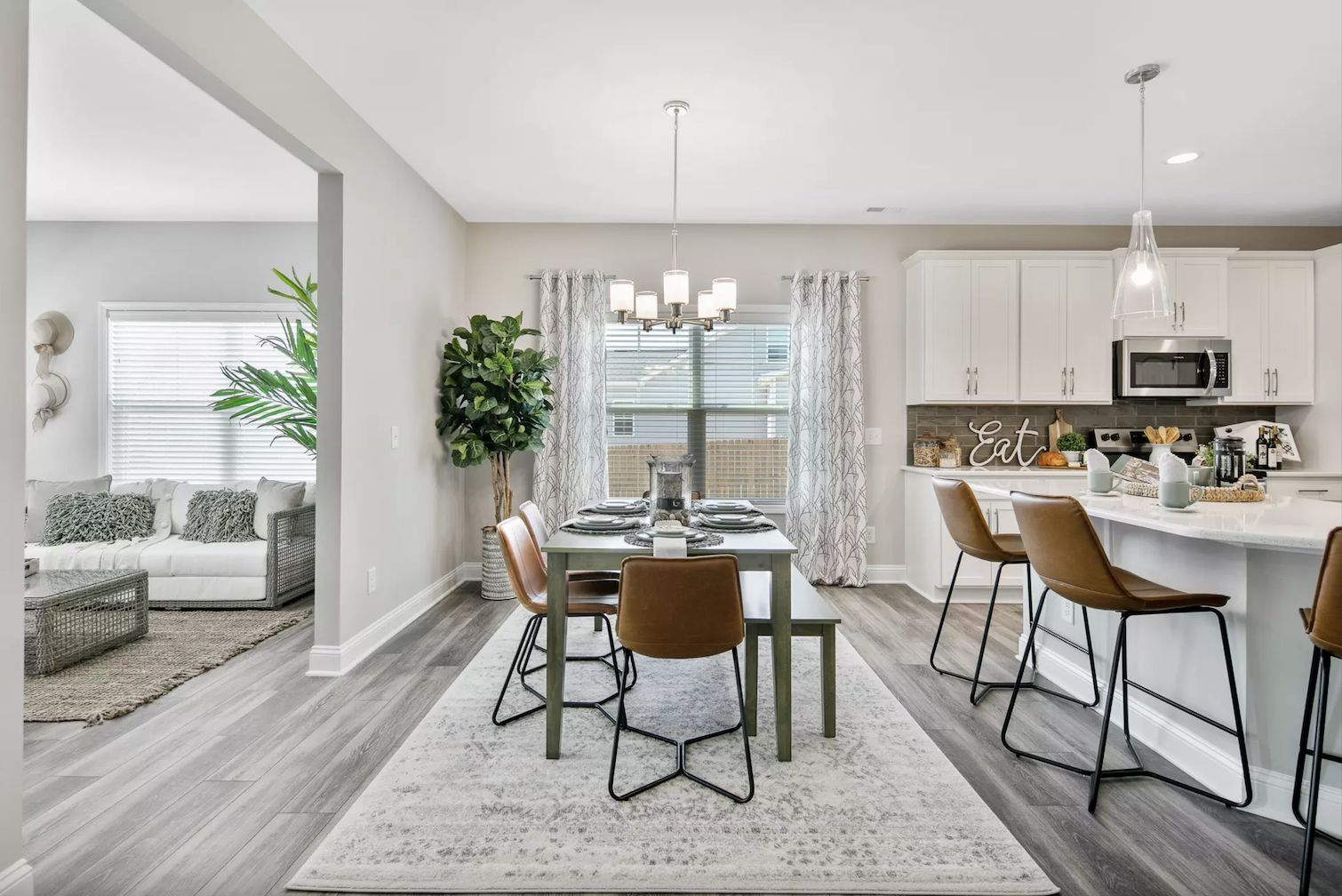
It doesn’t look like it, but this living room looks like it has an off-white paint color on the walls. Paired with all the neutrals in the room, it looks brighter than usual. This is also heightened by the bright natural light.
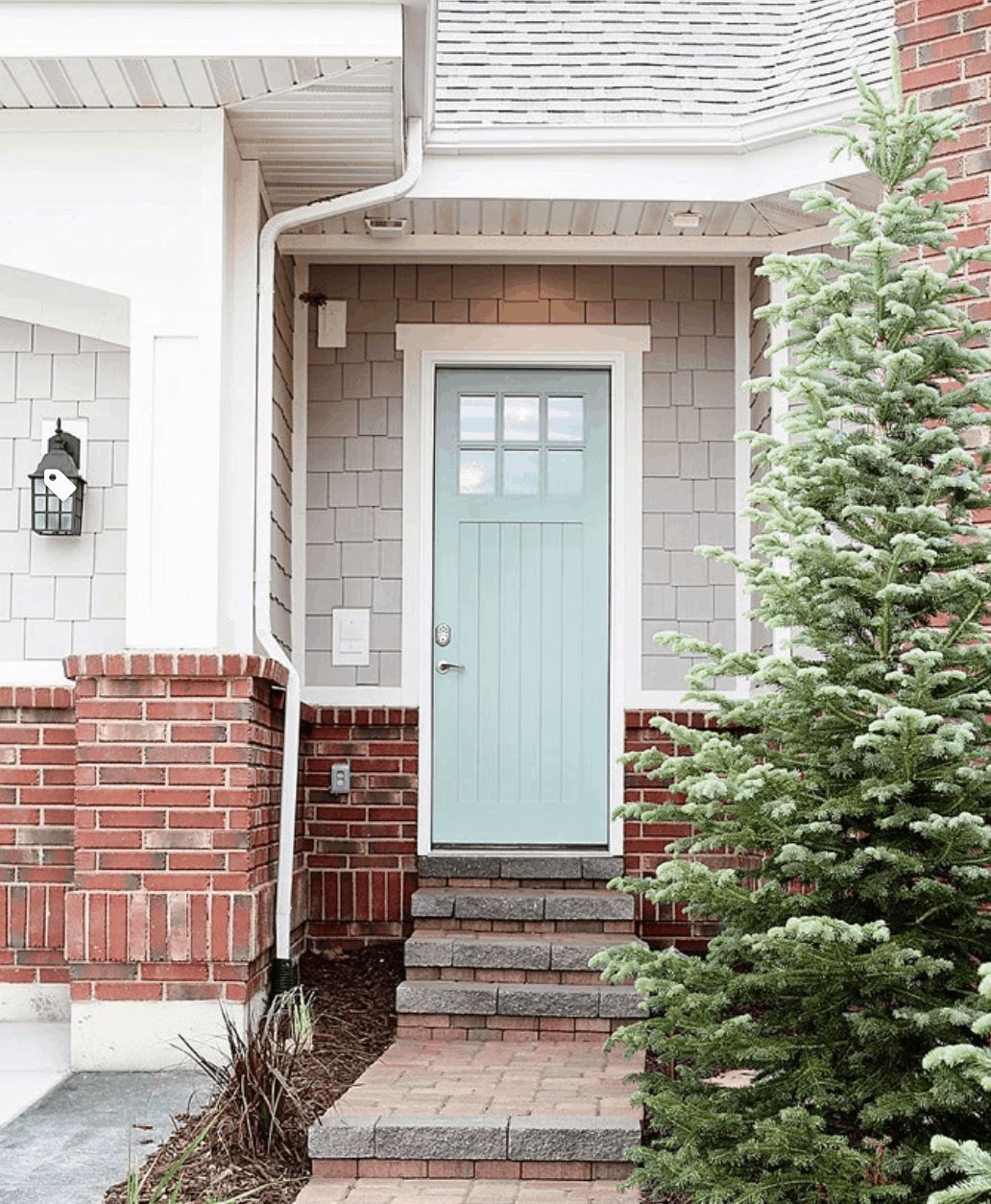
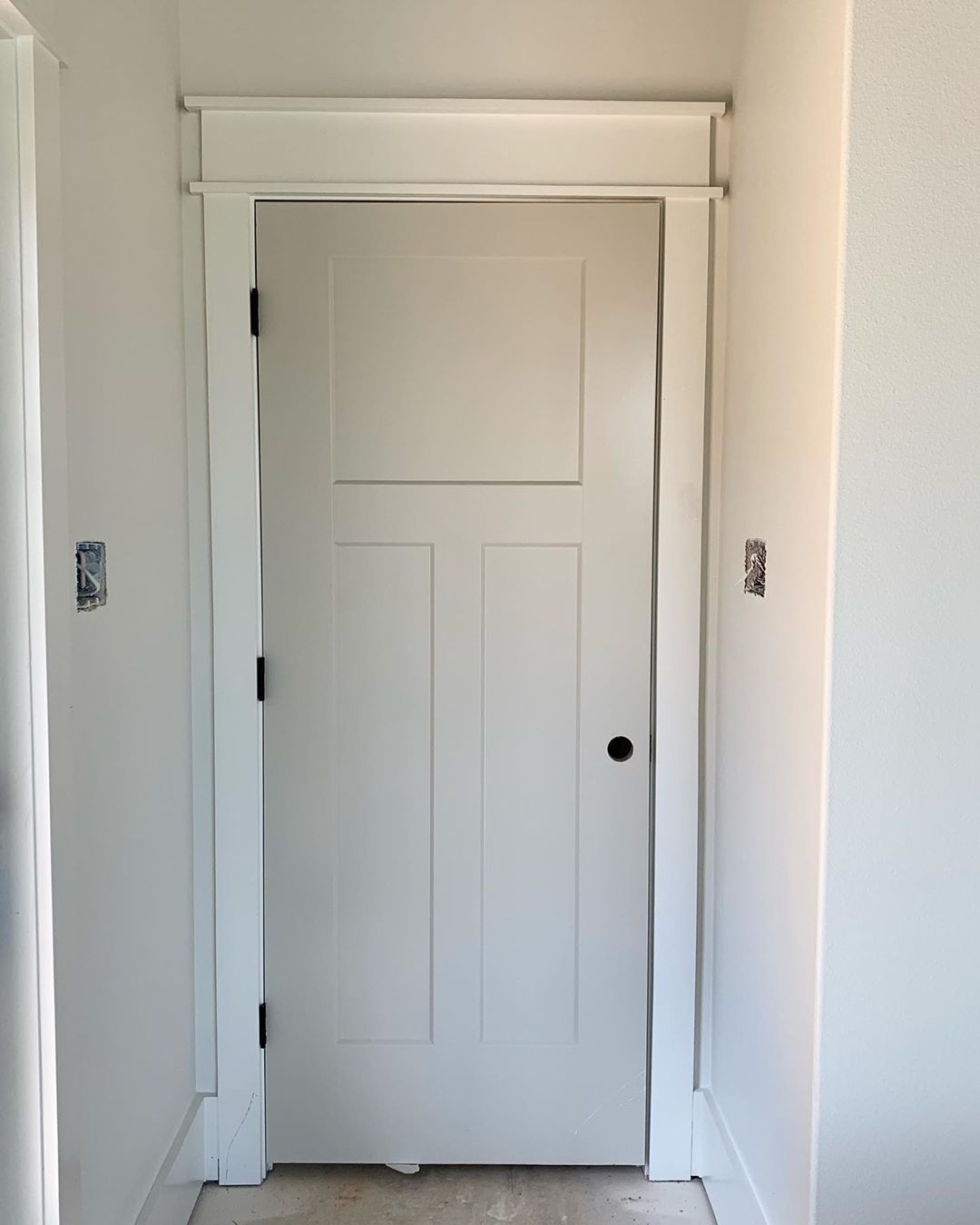
Sherwin Williams Agreeable Gray on Doors
If you have white walls and trim, you can use Agreeable Gray on the door. It can create a great effect, as the next picture shows.
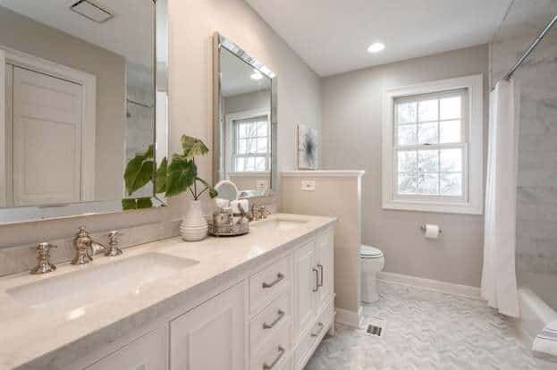
Sherwin Williams Agreeable Gray in Bathrooms
Is Agreeable Gray ideal for bathrooms? Gray walls may appear too dull, but Agreeable Gray is not dull because of its warm undertones. If you pair it with white, the result will be better than you imagine.
Sherwin Williams Agreeable Gray Paired with Various Colors
As mentioned, some colors reflect the hues from vibrant colors around them. As a result, they take on a different color from what they usually are. Is it the same with Agreeable Gray? This next picture will help you decide that.
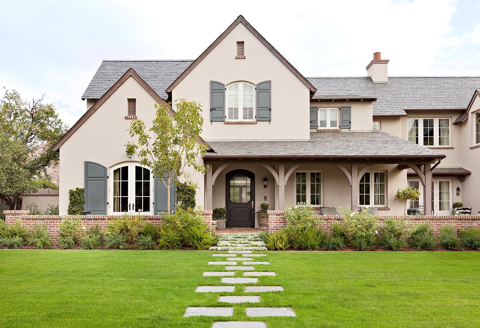
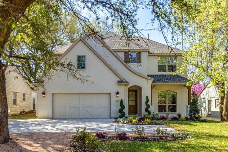
Sherwin Williams Agreeable Gray on Exterior Walls
Apart from brick, Agreeable Gray is an excellent paint color of choice for the exterior of a house. It is a perfect balance between beige and gray, with a subtle warmth that does not fade in the bright outside light.
Conclusion
If you are in the market for a neutral paint color that compromises no warmth but does not overdo it, Agreeable Gray is your best bet. It is not a full gray but acts as a warm greige. Its beige undertones keep it from being cool, but the color has enough neutrality to fit different color schemes.
Because of its immense success as a neutral paint color and popularity among users, this guide is to show you when using Agreeable Gray is ideal and what makes it perfect for any decor. You will find the undertones, LRV, and colors that go well with it in palettes.
You can get creative with the color by pairing it with a range of bold, vibrant, soft, and neutral colors. However, try not to overdo it if you want a positively memorable result.
Let me know your thoughts or send me your questions in the comments section. I look forward to hearing from you. Have a fabulous time decorating!
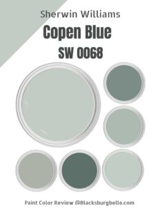 Sherwin Williams Copen Blue (Palette, Coordinating & Inspirations)
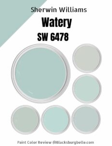 Sherwin Williams Watery (Palette, Coordinating & Inspirations)
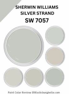 Sherwin Williams Silver Strand (Palette, Coordinating & Inspirations)
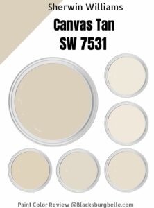 Sherwin-Williams Canvas Tan (Palette, Coordinating & Inspirations)
 Sherwin-Williams Natural Choice (Palette, Coordinating & Inspirations)
 Sherwin Williams First Star ((Palette, Coordinating & Inspirations)
