
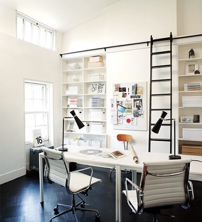
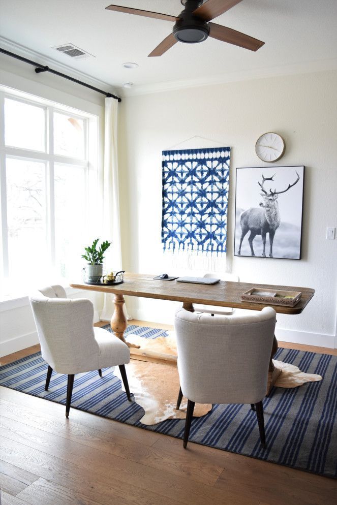
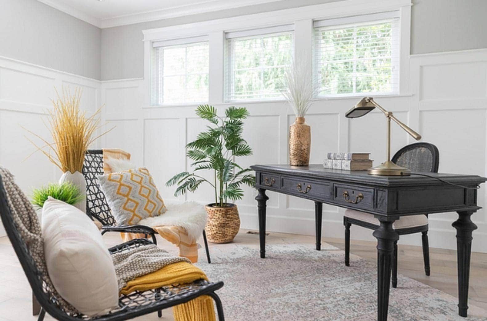
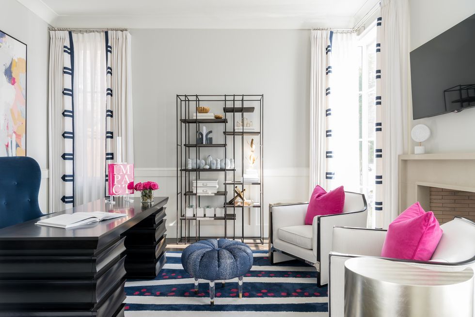
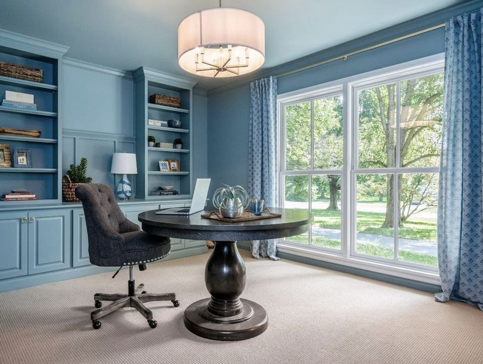
With the growing number of people choosing to work from home, a home office is no longer a luxury but more of a necessity at this point. A great home office should be a place where you can set the mood and be as productive as possible and if psychology of colors has shown us one thing, it’s that your choice of paint color matters.
What paint color you choose can determine whether or not you’ll be a force to reckon with on your computer or whether you’ll feel tired and drowsy the entire zoom meeting. That’s why you should be meticulous on your color choice for your home office.
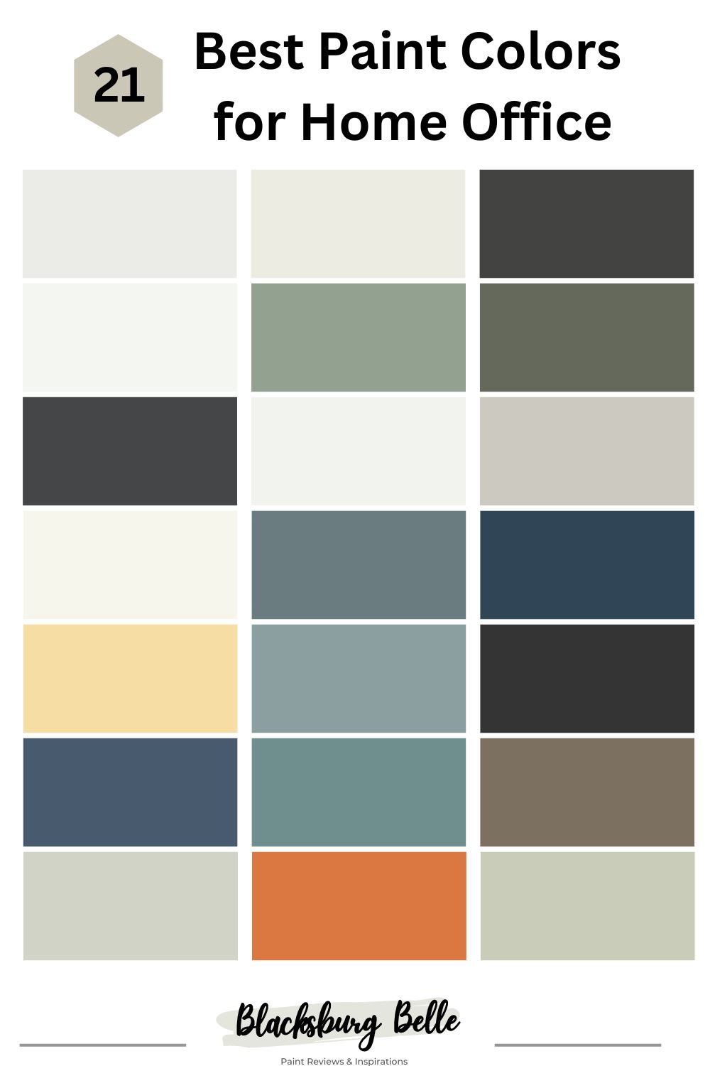
In this article, we compiled a list of the 21 best paint colors for home offices.
Table of Contents
Best Paint Colors for Home Office
Sherwin Williams White Sails
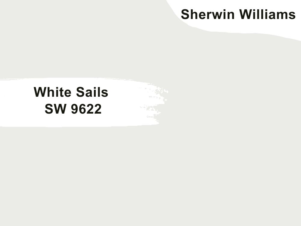
Sherwin Williams White Sails is a soft cool white. Unlike most cool whites that can be frigid, dull and icy , White Sails is more of a cooler and cleaner white.
It doesn’t have any overly crisp edges and it’s not so sharp that it might dull down any other associating colors. It has a little bit of gray in its undertones which is responsible for its coolness.
White Sail has an LRV of 83, which is a relatively rather low LRV for a bright white paint color. That’s why it’s not harsh but it’s more of a soft white and while not being an off-white, it’s not as bright as a pure white paint color either.
This color will look breathtaking when paired with other cool colors that aren’t too intense.
You can pair it with some earthy tones but not strong earthy tones.
Basically, it’s a clean white and works best with other clean, cool and soft colors especially if they have more of a blue violet undertone. So let’s say you wanted to add a bold pop of color then you can choose colors with soft hints of blue or green hues.
| Paint Color | LRV | RGB | Undertone(s) | Reading |
| SW White Sails | 83 | 235 / 235 / 231 | Subtle Gray | Cool |
Benjamin Moore Vanilla Milkshake
Benjamin Moore Vanilla Milkshake is a crisp white but with some hint of warmth to it. It’s often compared to Benjamin Moore’s White Dove but more of a softer and grayish white.
A great way to picture this color is to think of a vanilla milkshake. It’s milky white and has just the ever so slight hint of gray to it.
When you think of an office color, you’d probably imagine something calming and soothing, well this is exactly how this color feels with softness that can put you in a very relaxed mood.
You can use Benjamin Moore Vanilla Milkshake all over your home office or you can use it in built in units like your cabinets to brighten up the living space.
Benjamin Moore Vanilla Milkshake has an LRV of 80.97 and it pairs well with other soft colors like soft grays and other neutrals.
| Paint Color | LRV | RGB | Undertone(s) | Reading |
| BM Vanilla Milkshake | 80.97 | 237, 235, 226 | Subtle Gray | Cool |
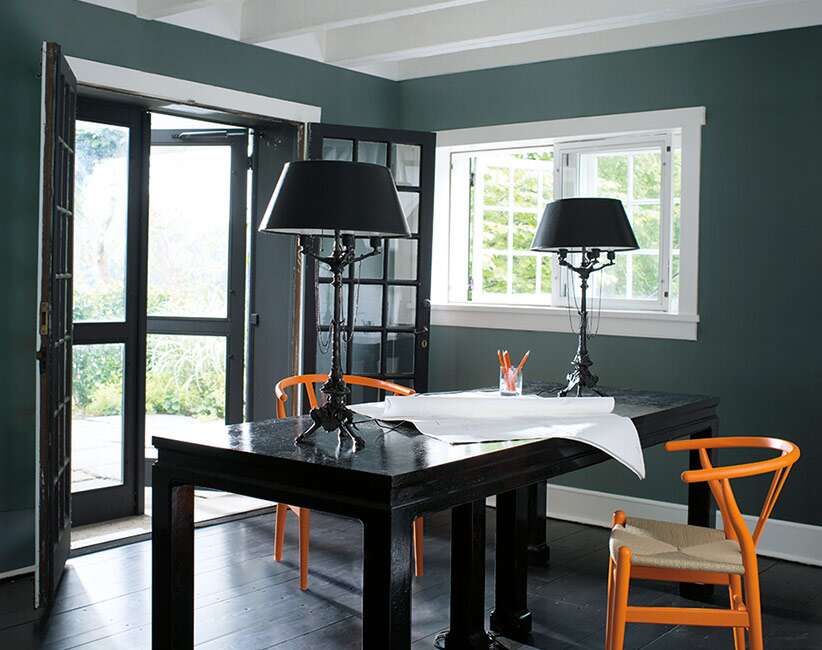
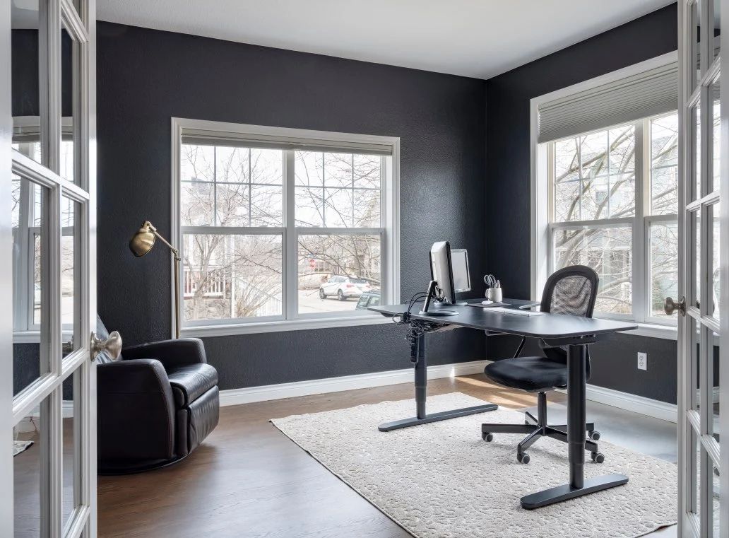
Sherwin Williams Iron Ore
Sherwin Williams Iron Ore is a soft black color. On the official website, it’s described as a cool, deep and mysterious charcoal. This rich paint color has invisible green undertones to it giving it this air of sophistication and like the description suggests, mystery to it.
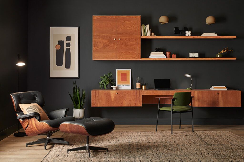
Sherwin Williams Iron Ore is often used as an accent color but you can still use it as a main paint color. And since it’s such a daring color you’d want to balance out it’s deep darkness with a white trim.
This color is perfect in a room that gets enough light. So if your office space gets enough light, then you should consider this color for a proper luxury experience.
With this paint color in your home office, your office space will feel elegant, and sophisticated.
Iron Ore has an LRV of 6.
| LRV | RGB | Undertone(s) | Reading | |
| SW Iron Ore | 6 | 67 / 67 / 65 | Invisible Green | Soft |
Benjamin Moore Chantilly Lace
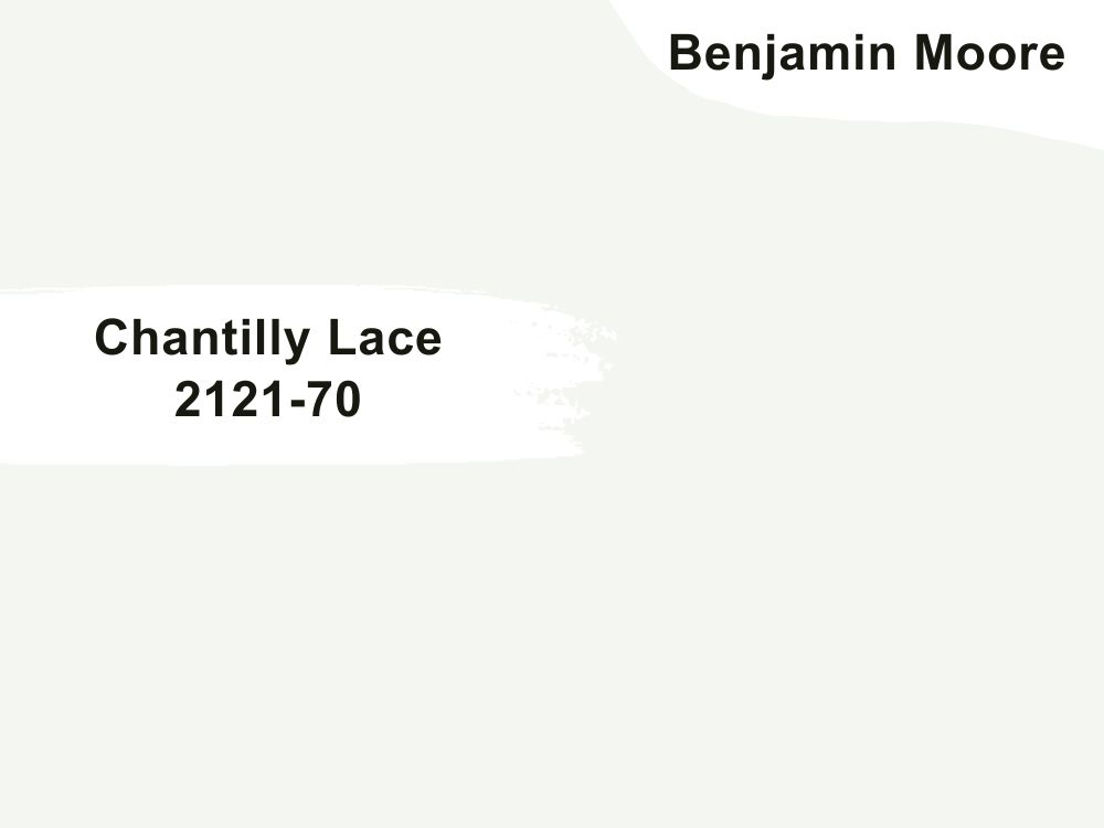
Benjamin Moore Chantilly Lace is one of the brand’s most popular white paint colors. It’s highly regarded for its brightness. Unlike many paint colors that tend to have a hint of an undertone to it e.g green, purple etc, Chantilly Lace is almost close to a pure white. However, it has a soft mute blue undertone that makes the color look fresh and crisp, not stark and dull.
In your home office, you wouldn’t want a color that has a murky or dull appearance, that’s why Chantilly Lace makes a great paint color idea for your home office. People even go as far as describing Chantilly Lace as the perfect white because it’s neither too warm nor too cool, meaning it can be paired with many other colors regardless of their warmth or coolness.
BM Chantilly Lace is delicate and refined and pairs well with neutral tones. You can use Chantilly Lace on your trims, as an accent color, or as the main interior color.
Chantilly Lace has an LRV of 90.04.
| Paint Color | LRV | RGB | Undertone(s) | Reading |
| BM Chantilly Lace | 90.04 | 245, 245, 239 | Mute Blue | Neutral |
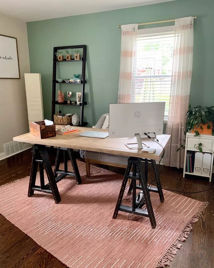
Behr Forest Path
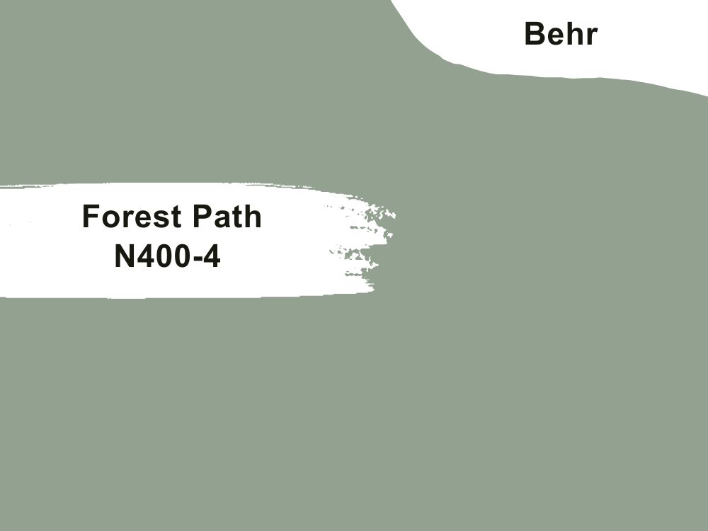
If you like to bring the outdoors into your office space, then Behr Forest Path can do the trick.
This soft green paint color evokes the feel of the forest and nature. And if you’re stuck on your computer all day and you haven’t seen the sun in a hot minute, then what better paint color to surround yourself in than this perfect green?
Behr has an LRV of 34 which means it’s not too dark and it can be paired on its own or with other matching colors like neutrals, soft earthy tones, etc. If you want something a bit more bold, then you can even pair Forest Path with soft pinks and light neutrals.
Depending on how you pair it, Behr Forest Path can either feel cozy or quirky.
| Paint Color | LRV | RGB | Undertone(s) | Reading |
| Behr Forest Path | 34 | 147/161/144 | Soft blue | Neutral |
Sherwin Williams Rosemary
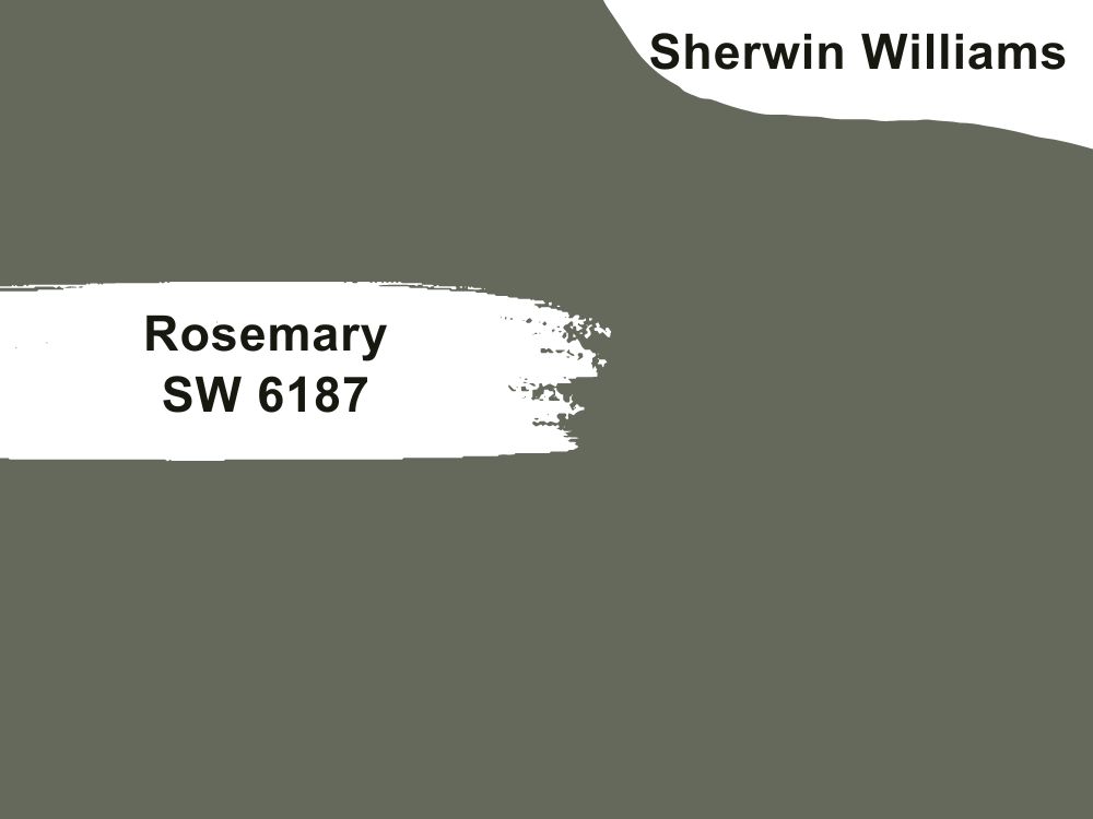
Another green paint color you can use in your home office is this beautiful Sherwin Williams Rosemary. SW Rosemary is a rich green color that soothes the senses. It gives the feeling of calmness and a strong connection to the outdoors.
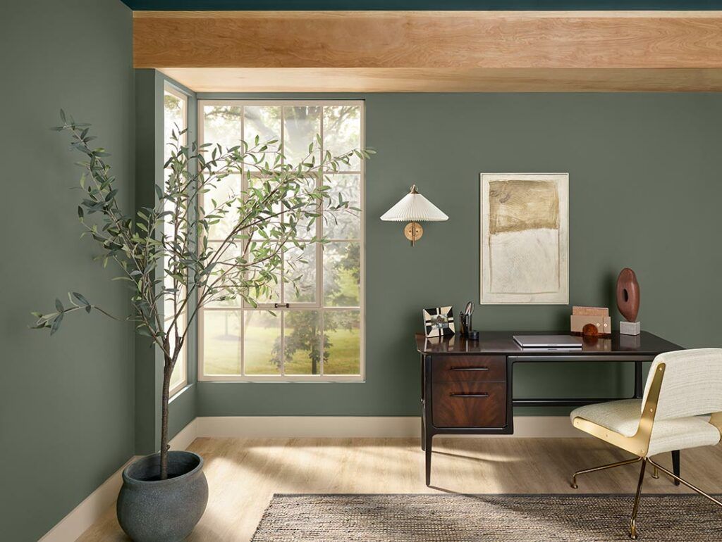
It’s a very fresh and gorgeous paint color that can look good as an accent color, a built-in unit color, or a main color.
Rosemary is an aesthetically pleasing color, and it can be paired accordingly with earthy tones or more neutral colors.
Its soft gray undertones make it perfect for soft neutrals.
| Paint Color | LRV | RGB | Undertone(s) | Reading |
| Sherwin Williams Rosemary | 14 | 100 / 105 / 92 | Cool Gray | Cool |
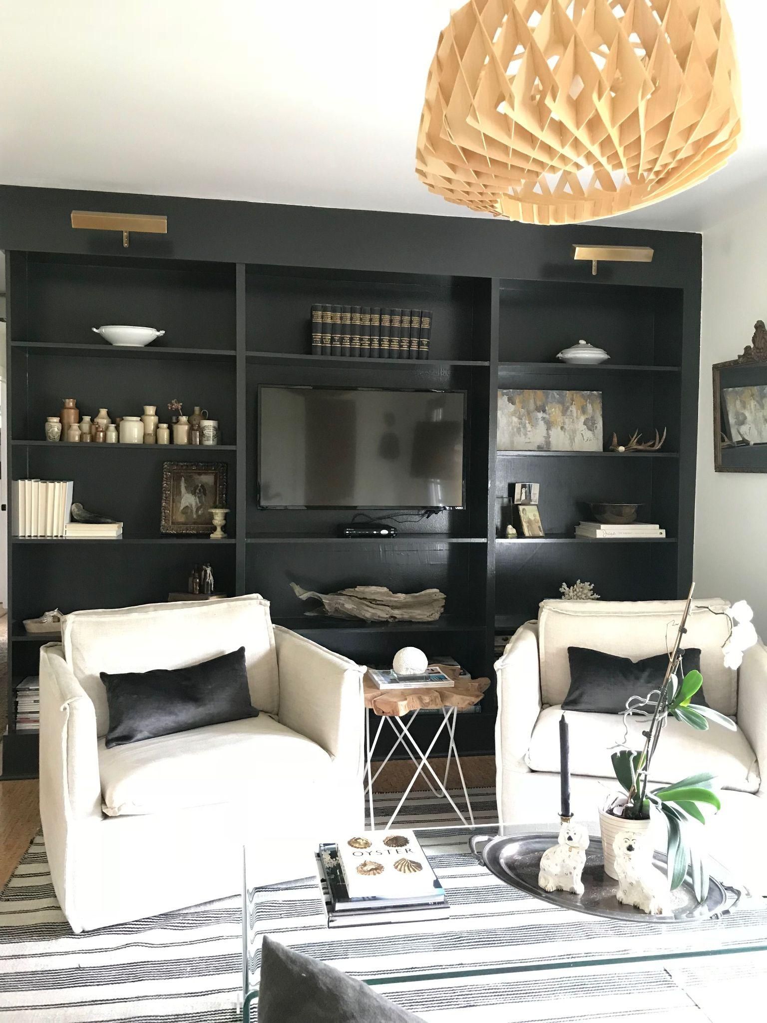
Benjamin Moore Graphite
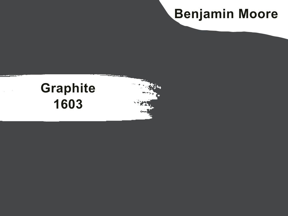
Benjamin Moore Graphite is a true charcoal. Although it’s a deep dark color, you might not necessarily describe it as black.
Graphite is an easily adaptable color and it goes well with almost every other paint color, on different textures and different design aesthetics.
You can create contrast with this paint color by pairing it with lighter colors like whites, off-whites, etc.
Benjamin Moore Graphite is bold and daring without being overwhelming. Its dark nature means it might not reflect much light but pair with a lighter shade and you’ll barely notice that.
BM Graphite is used on the cabinets and the bright light brings out its gray undertones.
You can create optical illusions by using it to create dimensions in your work area or you can make it an accent color.
| Paint Color | LRV | RGB | Undertone(s) | Reading |
| Benjamin Moore Graphite | 7.59 | 68/ 70/ 71 | Gray | Neutral |
Benjamin Moore Super White

Benjamin Moore Super White is a radiant and slightly cool shade of white. It’s very white but not extremely white to the point of it appearing stark. The bright paint color has some slight blue and gray undertones that add to its softness. Soft White gives off the feeling of simplicity and clarity.
Depending on the lighting, you might notice the natural coolness of Super White but it might also appear warmer and softer in the afternoon sun.
Colors you pair it with can also affect how this color will appear. This is because Super White has a high LRV of 87.36.

Benjamin Moore Super White works perfectly for both large rooms and smaller intimate rooms like your office space as it brightens and invigorates. You can pair it with marble, or quartz, and because of its clean nature, it works well with almost everything.
| Paint Color | LRV | RGB | Undertone(s) | Reading |
| Benjamin Moore Super White | 87.36 | 94.9/95.29/93.73 | Slight blue and gray | Cool |
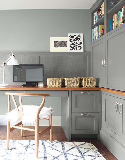
Sherwin Williams Repose Gray
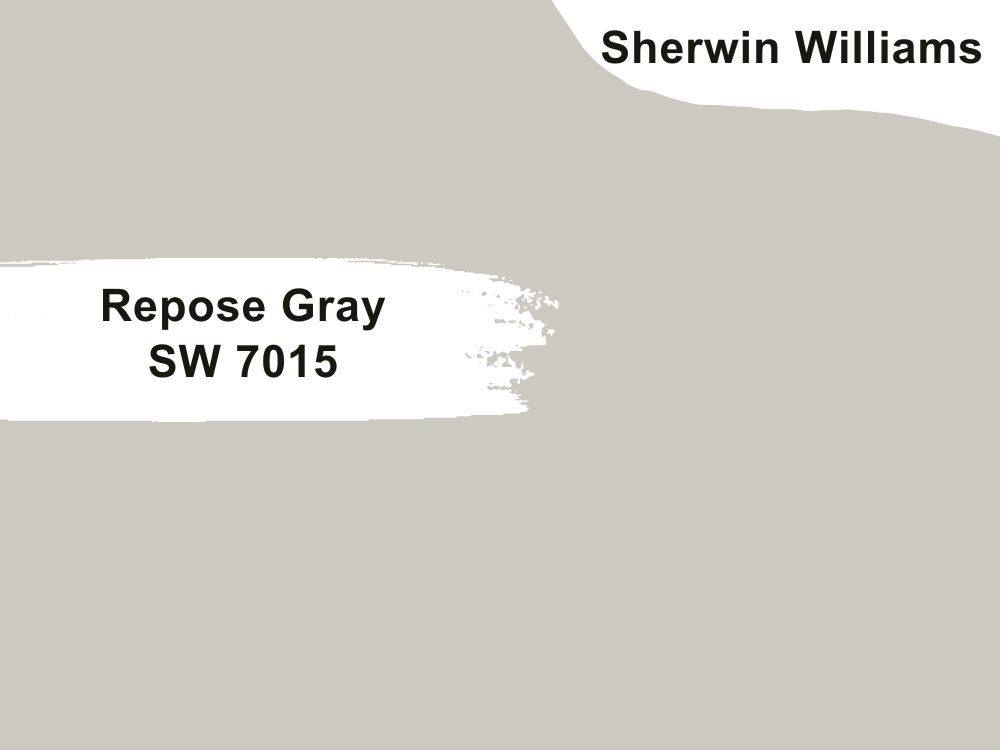
Sherwin Williams Repose Gray is described as a versatile neutral. It’s a warm gray with warm and cool undertones to it. It’s a great neutral option to use in different rooms in your house including your home office.
Its warm undertones make it a bit of a chameleon in the sense that depending on its lighting, it can either go from a neutral to more of a greige paint color. It gives off this feeling of peace and tranquility and it’s surprisingly bright for a gray color.
In its undertones, you might observe a hint of purple or green and sometimes even greige depending on the amount of light the color receives. But you can be rest assured that even on a gloomy day, this color will always look bright and cheerful.
You can pair Repose Gray with an even darker shade of gray like Sherwin Williams Iron Ore or you can pair it with other soft neutrals. For a clean, crisp trim, you can pair it with Sherwin Williams Eider White.
Note that Sherwin Williams Repose Gray has an LRV of 58.
| Paint Color | LRV | RGB | Undertone(s) | Reading |
| Sherwin Williams Repose Gray | 58 | 204 / 201 / 192. | Hints of purple or green | Neutral |
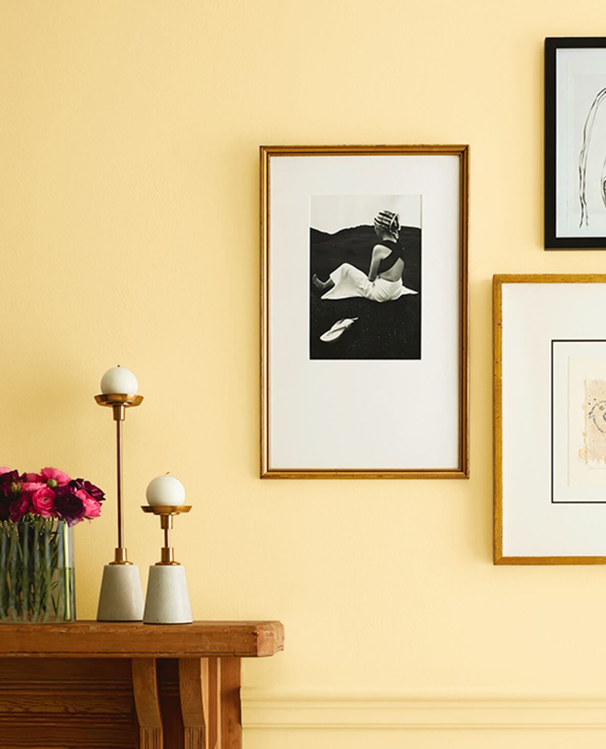
Benjamin Moore Simply White
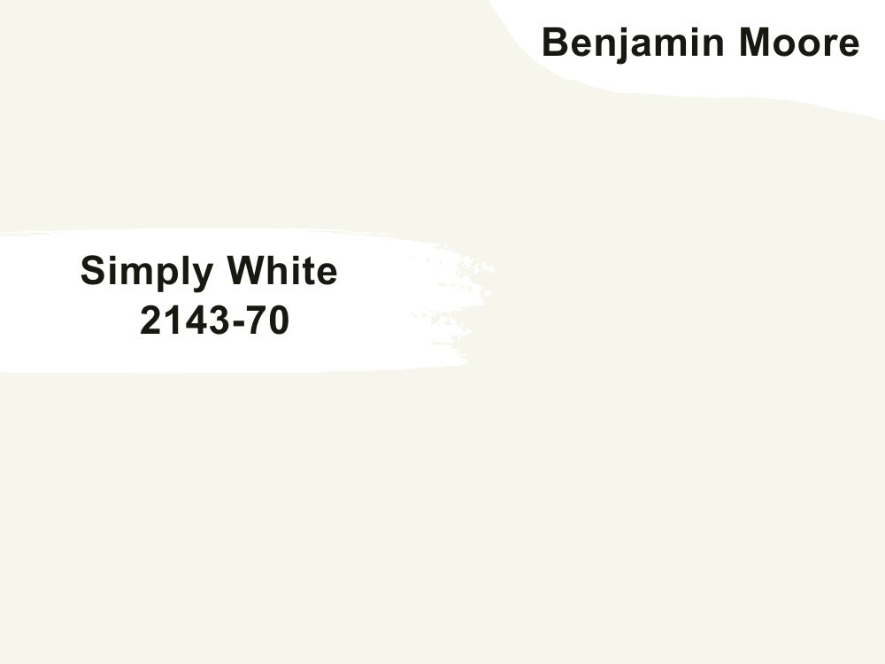
Benjamin Moore Simply White is described by the official website as a clean crisp white. It makes a space feel airy, light, and fresh. It has the slightest hint of warmth to it and this is because of its strong yellow undertones.
Some people complain of Simply White being too yellow but we don’t agree. Unlike other white paint colors that in dark spaces they might appear flat or dingy, the yellow undertones work in such a way that in a very bright room, they completely vanish and in a dark room they show up and brighten the space you might even say it glows on the walls.
Imagine how lovely that would look in your office space when you have to work late.
 You can pair it with off-whites and darker whites to create contrast. You can also pair it with deeper colors and warm beiges.
| Paint Color | LRV | RGB | Undertone(s) | Reading |
| Benjamin Moore Simply White | 89.52 | 247, 244, 235 | Yellow | Warm |
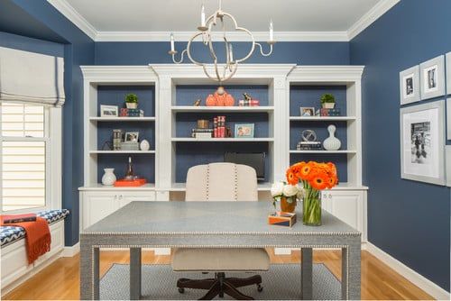
Farrow & Ball De Nimes
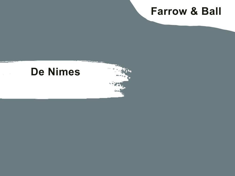
Farrow & Ball De Nimes is a gray blue shade. The inspiration behind it is the everyday work-wear made in the French city of Nîmes. And just like a well-loved pair of jeans, De Nîmes looks a little bit faded but still very stylish.

The manufacturer describes De Nimes as a down-to-earth and grounding blue. Its blue hue means that it would never go out of style. This color feels rich and bold but not overwhelming.
Using this Farrow & Ball De Nimes in your office might make you feel confident.
This lovely paint color has some soft cool grays in its undertones and it pairs well with off-whites, clean whites, and neutral tones.
| Paint Color | LRV | RGB | Undertone(s) | Reading |
| Farrows & Ball De Nimes | 21 | 118; 130; 132. | Soft grays | Cool |
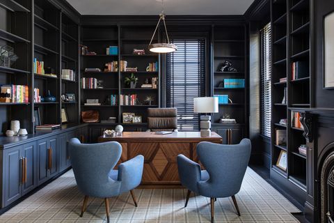
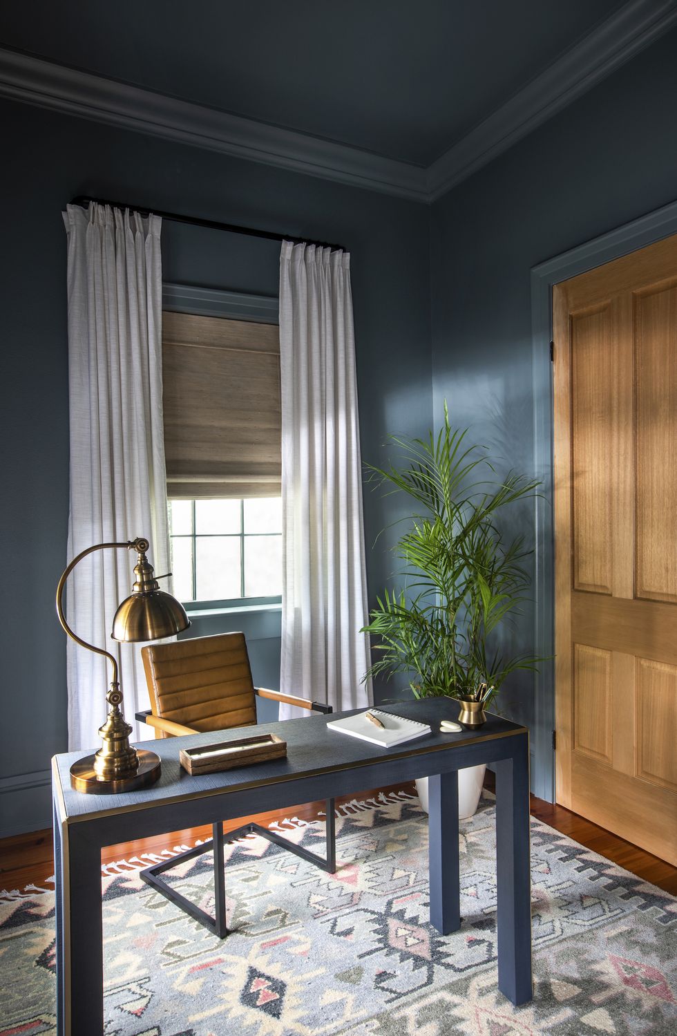
Benjamin Moore Gentleman’s Gray
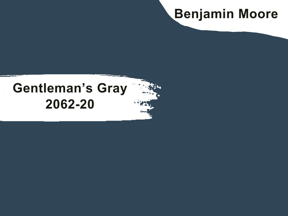
Benjamin Moore Gentleman’s Gray is described as a blackened teal blue but many people call it a navy blue. It is a rich and luxurious navy blue paint color. With bold brilliant hues, this paint color will make any space look and feel elegant.
Gentleman’s Gray is a true navy because it has no green undertones but instead a soft cool gray that makes it very versatile.
In a room that has ample light, you’ll get to enjoy this paint color in all its richness and splendor.
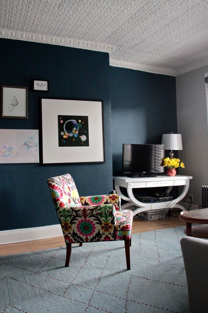
For a monochromatic look, you can combine this color with other soft blues or you can pair it with pinks and neutral colors. Benjamin Moore Gentleman’s Gray has an RGB value of Red = 48 Green = 70 Blue = 86 and an LRV of 7.26.
| Paint Color | LRV | RGB | Undertones | Reading |
| Benjamin Moore Gentleman’s Gray | 7.26 | 48/70/86 | Soft gray | Cool |
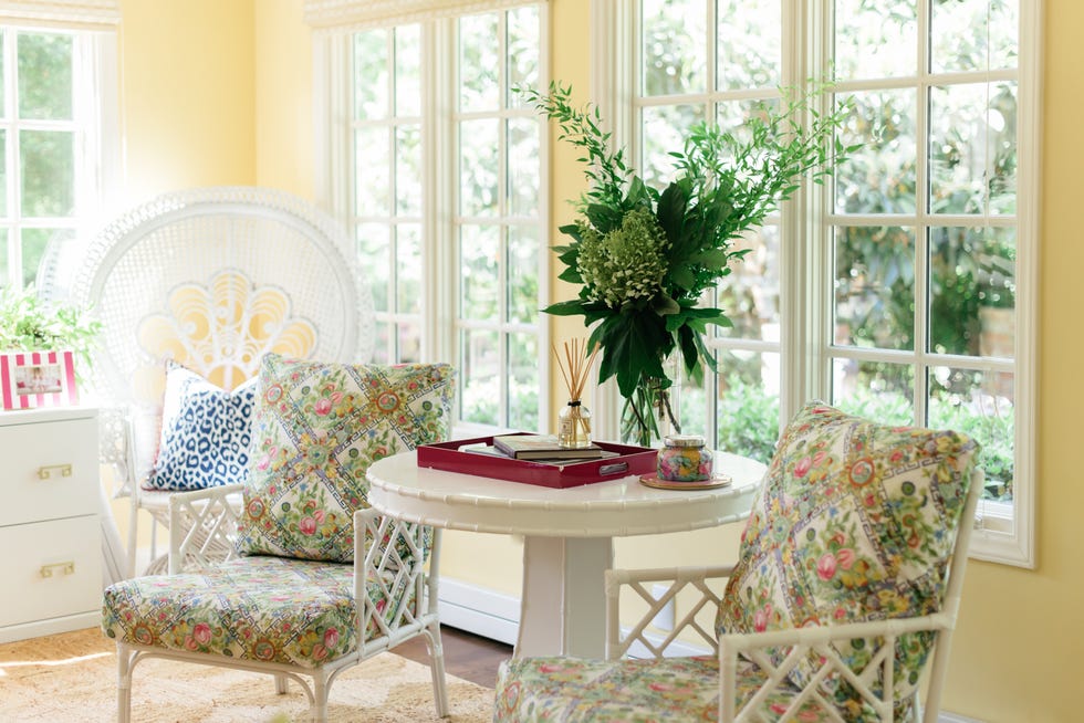
Sherwin Williams Butter Up
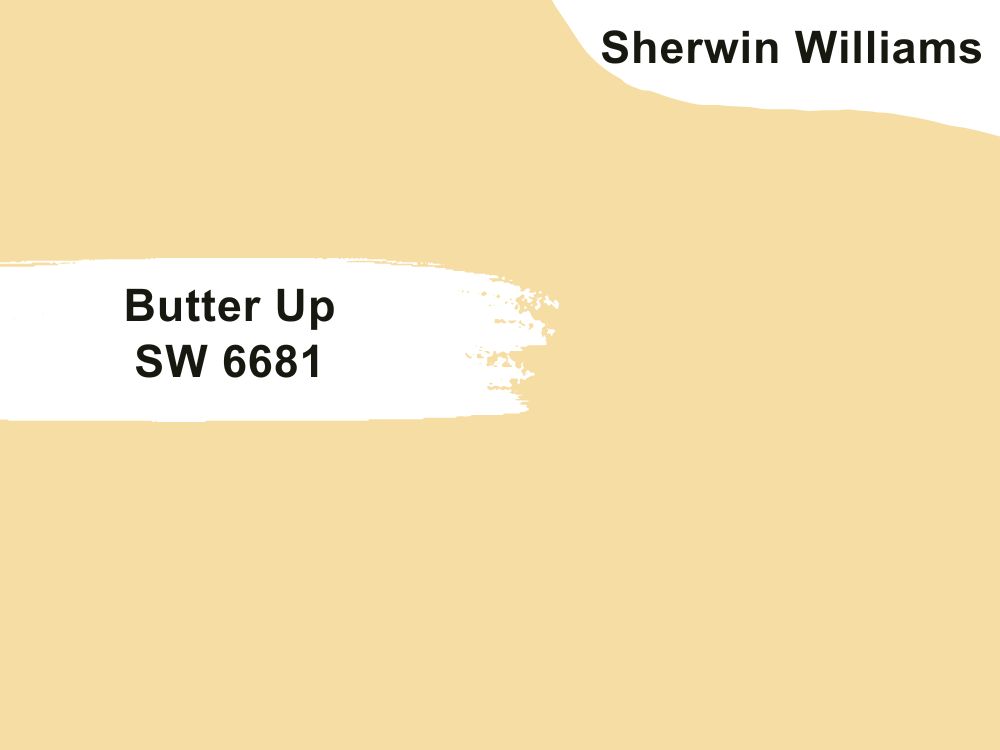
Sherwin Williams Butter Up is a rich and creamy yellow. This is for the homeowners who would prefer something a bit more bright and cheerful in their office space. This color can warm up any space and make it feel very cozy and inviting and who wouldn’t want that when they’re stuck in a stressful work call for hours?
Just like butter, Butter Up feels smooth and has a lovely soft texture to it and its cheerful appearance can instantly brighten up your mood. You can pair this color with a crisp white trim.

It has an LRV of 74 and an RGB value of RGB: 246 / 221 / 163.
| Paint Color | LRV | RGB | Undertones | Reading |
| Sherwin Williams Butter Up | 74 | 246 / 221 / 163. | Yellow | Warm |
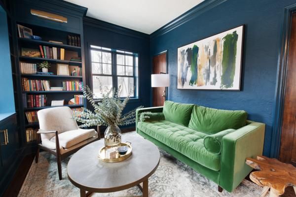
Sherwin Williams Delft
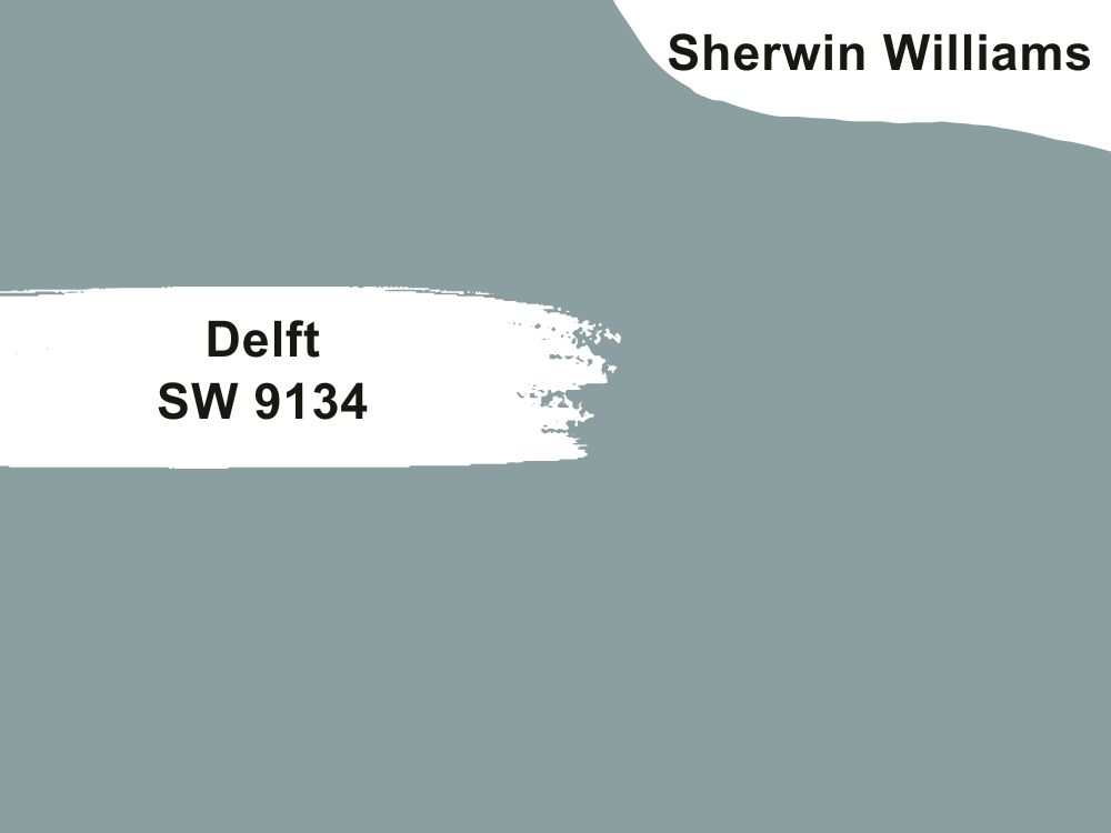
Sherwin Williams Delft is a deep saturated blue paint color. This color can create a simple yet very sophisticated home office space. Its bright cool undertones of slate gray and green add depth and a serene effect to this paint color.
You can use it as the main color and pair it with a clean crisp white trim or you can pair it with dark neutrals or other cool soft neutrals for maximum effect. Sherwin Williams Delft can also serve as an accent color. In a room that gets enough light, you just might catch a glimpse of its green undertones but not so much though.
Delft has an LRV of 33 and an RGB value of 139 / 159 / 160.
| Paint Color | LRV | RGB | Undertones | Reading |
| Sherwin Williams Delft | 33 | 139 / 159 / 160 | Green, slate gray | Cool |
Benjamin Moore Onyx
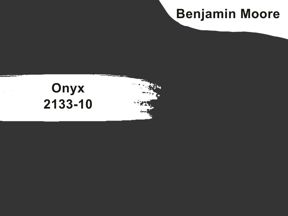
Benjamin Moore Onyx is a dark black and that might sound like tautology but it’s not as some blacks can have cool and warm undertones. But in the case of Onyx, it has little to no undertones.
Benjamin Moore Onyx makes a great cabinet color, accent color, or a great color for a dramatic home office space. This color will provide the perfect backdrop for all your Zoom meetings. To really get the most out of this bold color, you’ll need to use it in a room that gets enough light.
It pairs beautifully with crisp whites, earthy times, and wood furniture.
Or if this color is a little too much for you then you can stick to using it as a trim color or an accent color.
| Paint Color | LRV | RGB | Undertones | Reading |
| Benjamin Moore Onyx | 4.99 | 53, 51, 51 | Blue, gray | Cool and Warm |
Benjamin Moore Van Deusen Blue
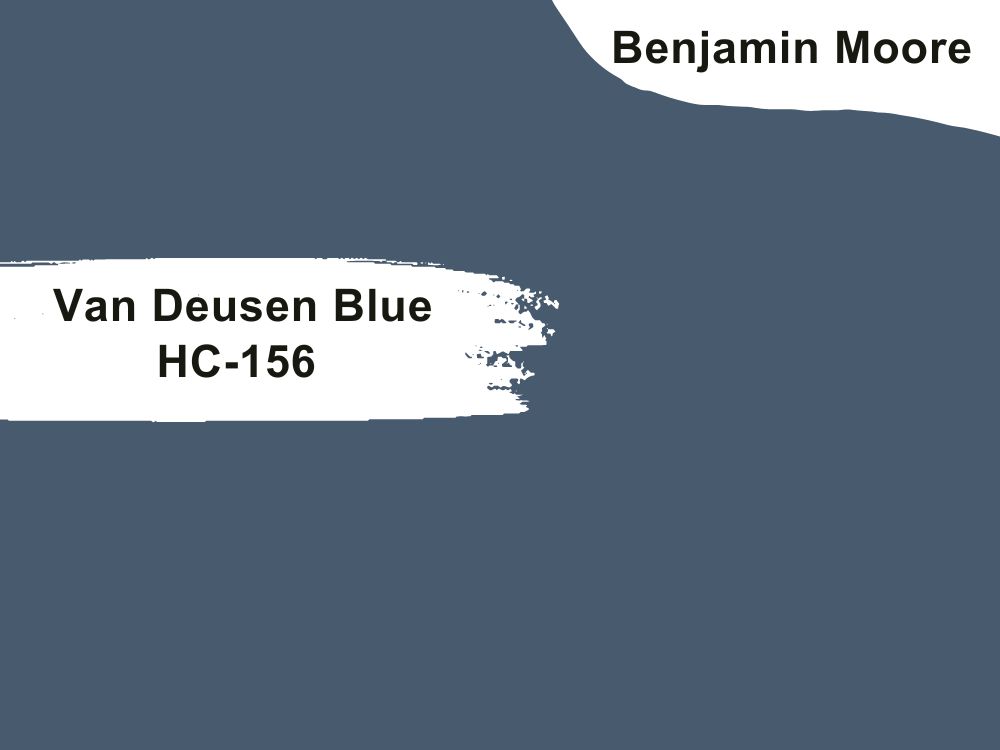
Benjamin Moore Van Deusen Blue is described by the official website as a foundational blue but we like to describe it as a cool blue. This paint color looks good in either traditional decor or modern decor.
Van Deusen Blue has a little bit of cool gray-green in its undertones and that’s why it’s so soothing to look at. This color exudes class and elegance and there’s just something mature about it.
You can use it as an accent color. It’s a very versatile paint color and you have lots of pairing options. If you want to pair Van Deusen Blue, you can do so with paler blues, deeper blues, and various shades of greens, creamy colors, neutrals and taupes.
| Paint Color | LRV | RGB | Undertones | Reading |
| Benjamin Moore Van Deusen | 11.97 | 70, 93, 110 | Cool gray-green | Cool |
Benjamin Moore Fort Pierce Green
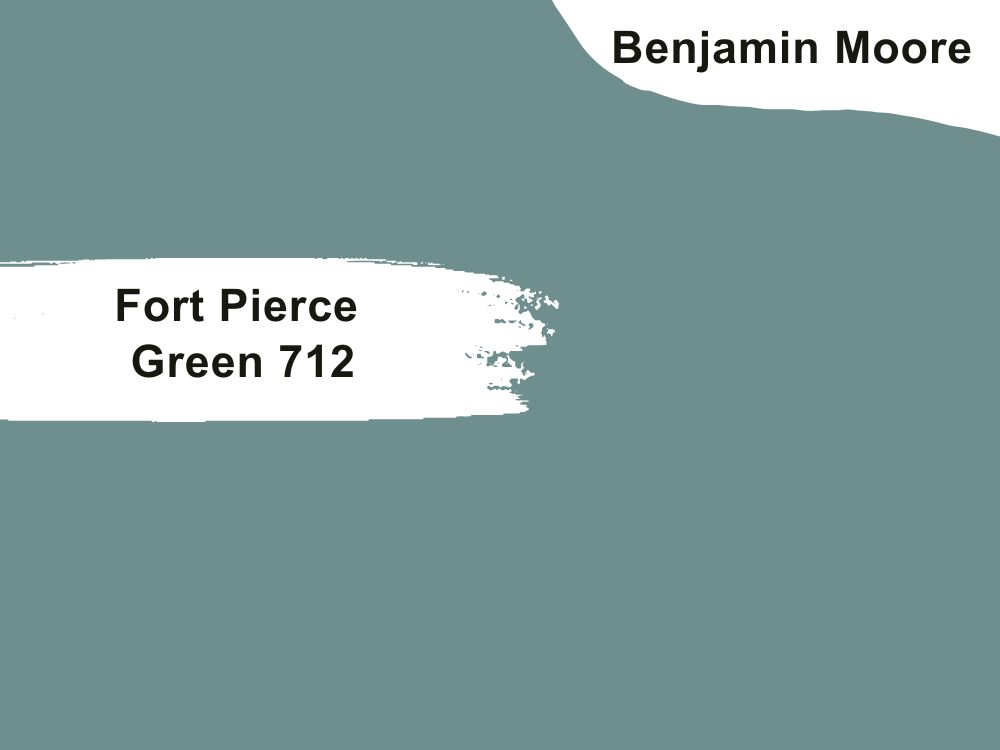
Benjamin Moore Fort Pierce Green is a blue-green paint color. Its color scheme is said to help with feelings of anxiety by relaxing you so of course this is a great color to have in the home office.
Fort Pierce Green has gray undertones that lend a certain air of mystery and luxury to it.
You can describe this color as a soft teal. Its cool undertones make this color so well-loved not to mention it’s versatile.
You can incorporate it on the walls, your furniture, or as an accent color. It can be paired with soft neutrals and soft earthy tones.
| Paint Color | LRV | RGB | Undertones | Reading |
| Benjamin Moore Fort Pierce Green | 26.39 | 111, 143, 142 | Green, Blue | Cool |
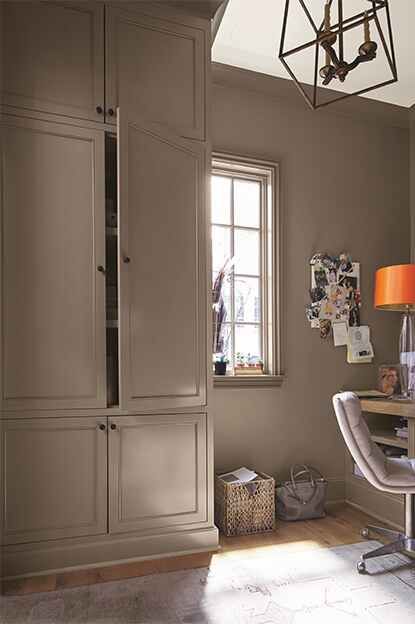
Benjamin Moore Fairview Taupe
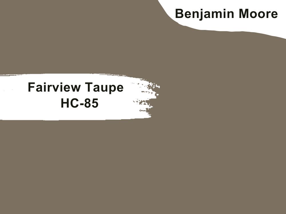
Benjamin Moore Fairview Taupe is a neutral deep brown paint color. It’s the kind of color that looks beautiful on its own but when paired with other paint colors, gives room for others to shine.
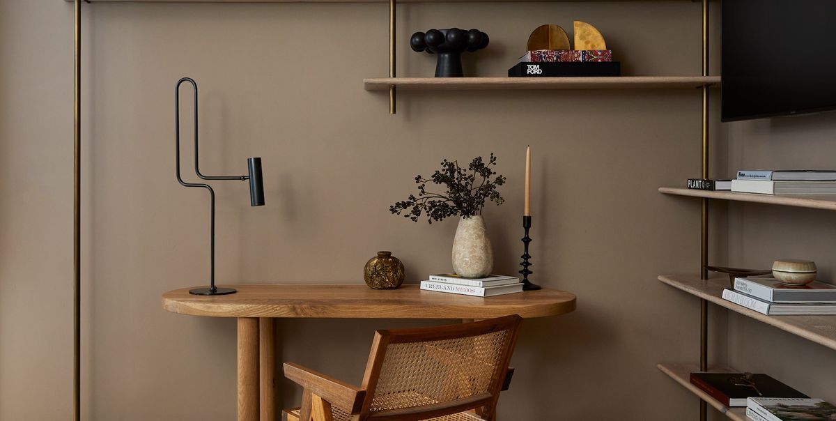
Fairview Taupe is a very versatile brown paint color and as such, it works really well when paired with other neutrals and blues (if you want a pop-up color or you want something more interesting.
This color gives a rich and cozy experience that you’d absolutely love. It gives enough and doesn’t take too much. In the sense that it’s not overwhelming but it’s not underwhelming either.
Benjamin Moore Fairview Taupe has a slight hint of cool green to its undertone.
| Paint Color | LRV | RGB | Undertones | Reading |
| Benjamin Moore Fairview Taupe | 17.98 | 125, 112, 97 | Cool green | Neutral |
Sherwin Williams Filmy Green
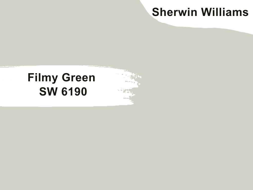
Sherwin Williams Filmy Green is a fresh green paint color that’s often used for interior design. This color brings a dose of nature and tranquility to any space with its soft light green appearance. SW Filmy Green is a perfect blend of green with soft grays that make it look dreamy and cool. Looking closely, you might even describe Filmy Green as a jade-like color.
Filmy Green can be paired with neutrals of course but also deep rich browns like dark brown or even darker greens to really solidify that nature-like vibe about it. You can use it as an accent color and pair it accordingly.
| Paint Color | LRV | RGB | Undertones | Reading |
| Sherwin Williams Filmy Green | 64 | 209/ 211/ 199 | Soft grays | Cool |
Behr Japanese Koi
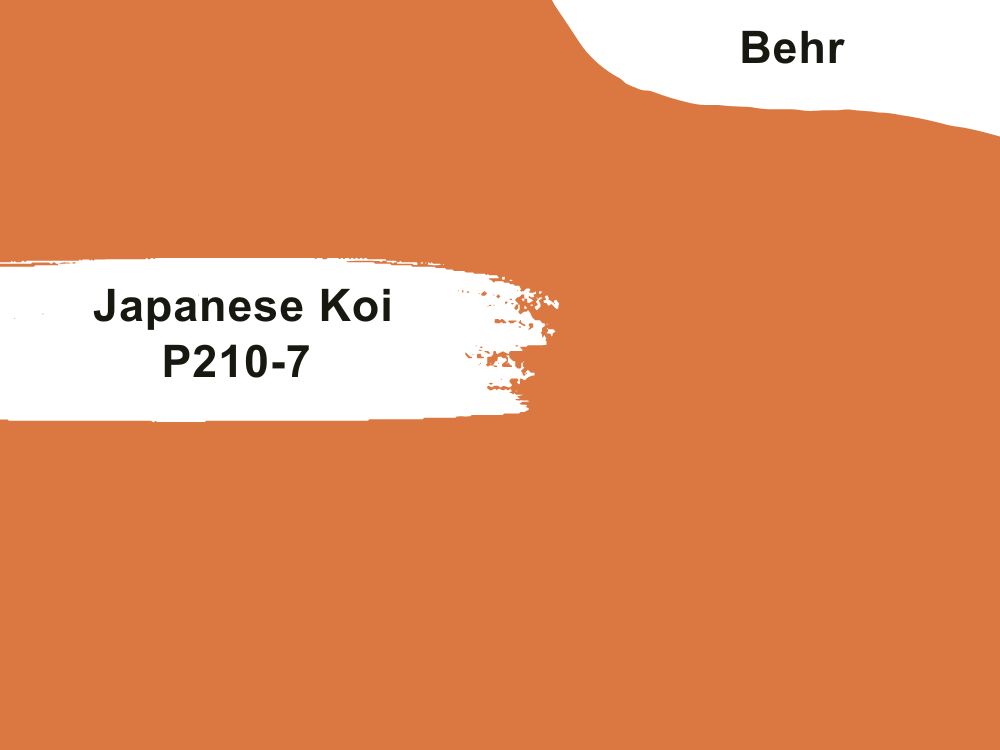
If you’re tired of neutrals and you want a pop of color added to your home office, then consider this vibrant orange from Behr. Japanese Koi is a bold orange hue that sparks energy and enthusiasm.
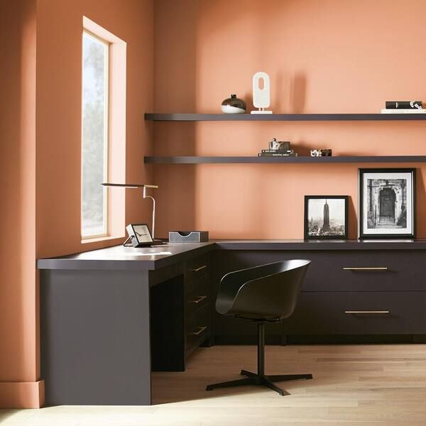
It’s a nice pop of color when used as an accent color or even on your furniture. You can even use this color to delineate a space for work or relaxation. Behr Japanese Koi is warm and has yellow and red undertones. You can pair it with softer colors to avoid overwhelming the space.
| Paint Color | LRV | RGB | Undertones | Reading |
| Behr Japanese Koi | 29 | 219/ 120/ 66 | Red, yellow | Warm |
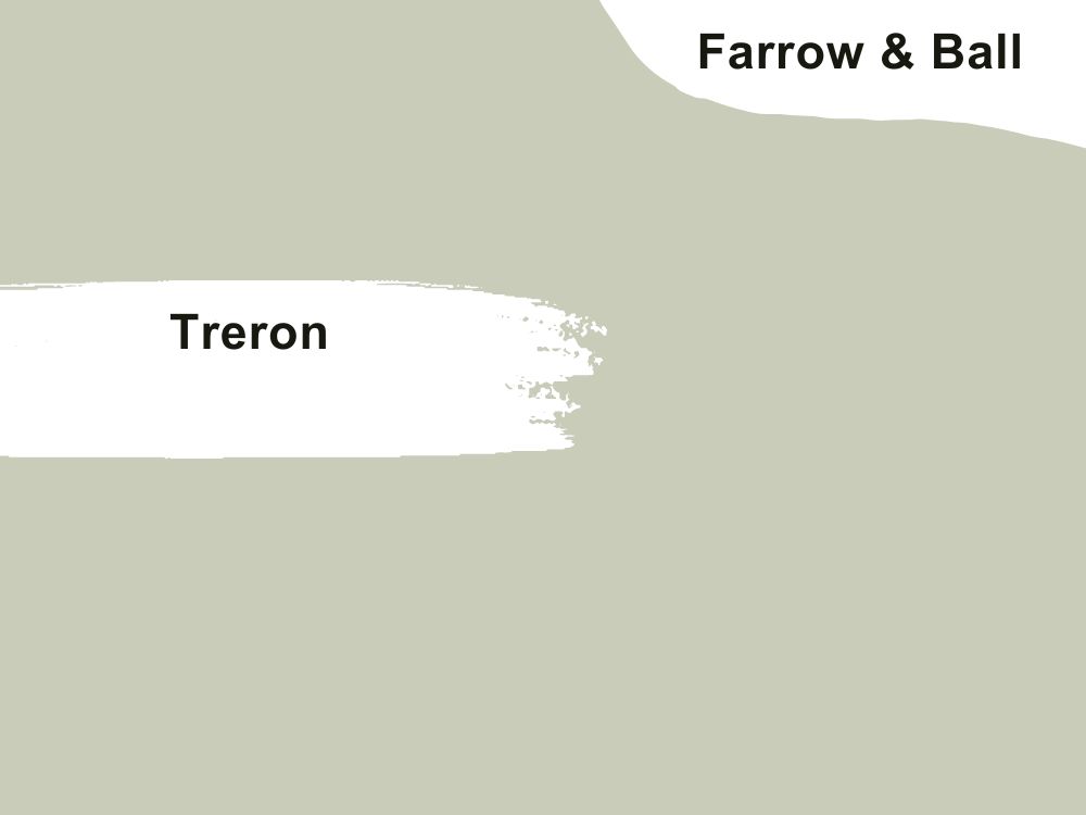
Farrow & Ball Treron
 Farrow & Ball introduced this dark green alternative to their classic pigeon.
Treron is a dark green paint color with some soft grays in its undertone. This color feels mild and mellow when used in any space. It might not necessarily brighten up any space it’s used in but it does add a bit of tranquility and calmness when used appropriately.
Treron works really well when paired with neutrals, dull whites, and deeper shades of green.
| Paint Color | LRV | RGB | Undertones | Reading |
| Farrow & Ball | 26 | 139, 138, 119 | Soft grays | Cool |
Conclusion
You should feel invigorated, motivated, and ready to take up any challenge in your office space. And believe it or not, not just the decor alone but also your choice of paint can alter this.
No matter your decor style or aesthetic, there’s a color palette for you to choose from. So if you’re choosing any color from the list, be sure to pair it accordingly and of course, perform a swatch test before you commit.
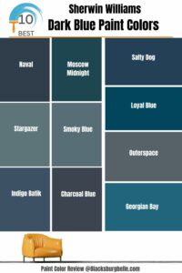 10 Best Sherwin Williams Dark Blue Paint Colors (Trend 2023)
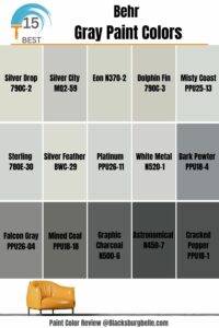 15 Most Popular Behr Gray Paint Colors: From Light to Dark
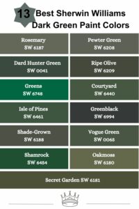 13 Best Sherwin Williams Dark Green Paint Colors
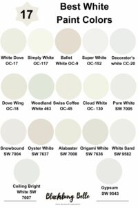 17 Best White Paint Colors For Interior Walls
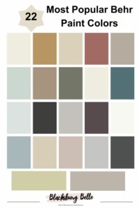 22 Most Popular Behr Paint Colors
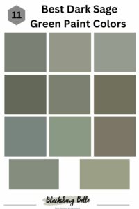 11 Best Dark Sage Green Paint Colors for Interiors and Exteriors

:max_bytes(150000):strip_icc():format(webp)/108138893_276042473676557_4677304885979885291_n-8b19755acfbe485685763ccc9f4efd3b.jpg)
:max_bytes(150000):strip_icc():format(webp)/119123141_174408607546847_2504226092073551911_n-fc05181b09514200bc00c90134881992.jpg)