
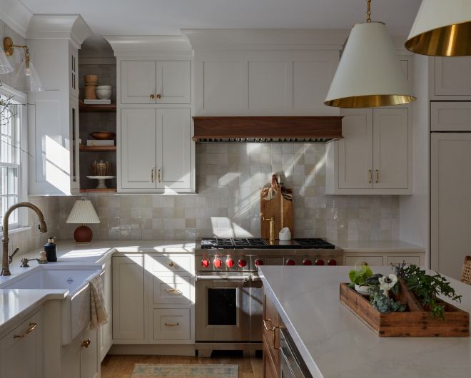
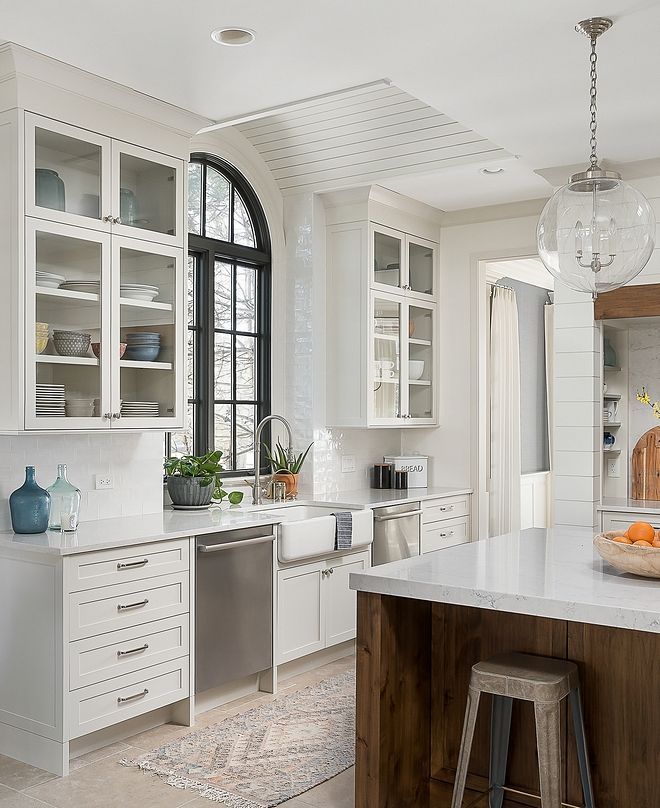
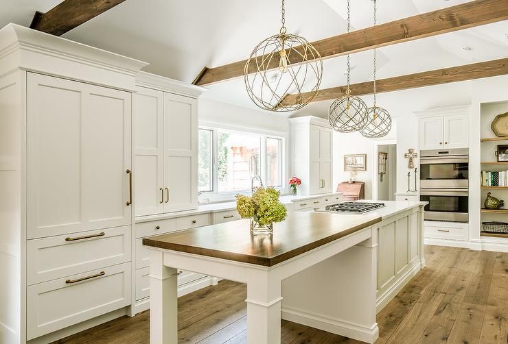
Are you looking for the best off-white and neutral paint colors for your kitchen cabinets? We have all been there, searching for the perfect light color to complement the kitchen decor. However, we all get to the point where we realize it is not as easy as it seems.
The first problem is usually with the number of available options. Even if you want to pick colors from only two top brands like Benjamin Moore and Sherwin Williams, you still have to go through many colors to find that suitable one. So, how do you narrow your options? We have done most of the work and picked the 13 best of them to guide you along the way.
Table of Contents
Are Off-White and Neutral Paint Colors Warm or Cool?
These paint colors can be cool or warm, depending on the undertones. Because there is a vast number of paint colors and hues within the bracket of off-white and neutral, there are many undertones you will find with them. Therefore, you must know the undertone of a specific off-white or neutral paint color before deciding whether it is warm or cool.
We must note that off-whites are neutrals with warm or cool tones. So, talking about off-white and neutral paint colors suitable for kitchen cabinets does not mean some are neutral while others are not.
Warm off-whites can have undertones that include gold, peach, yellow, and red. Cool off-whites typically have neutral undertones, which means they pair beautifully with any design or decor. A perfect example is Benjamin Moore’s Chantilly Lace.
What to Consider When Picking a Paint Color for Your Kitchen Cabinets
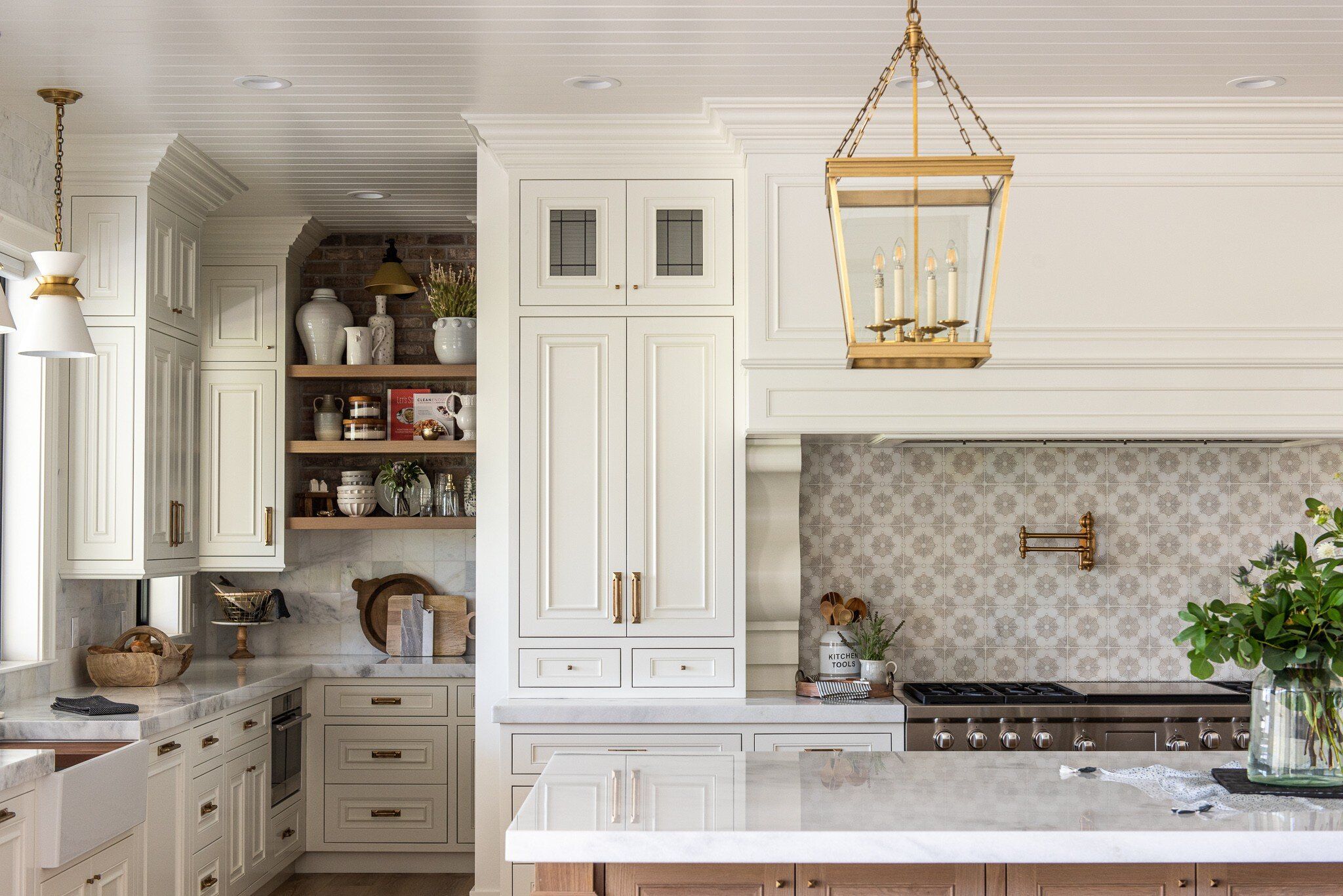
Before you gush over different amazing colors on display, you must consider the elements in your kitchen. These are vital to how well the paint color of choice will blend into the decor. You do not want colors clashing after the paint dries due to undertones and lighting. It is always best to use stick-and-peel samples or paint pot samples on the cabinets before deciding.
The first thing to consider is the color and type of the countertop. While neutrals are excellent at complementing other colors – and that is why we recommend them – they may work better in some color schemes and deco than in others. Consequently, pick neutrals and off-whites based on the color of the countertop.
Next, check the lighting and how it affects the surrounding walls. If your kitchen has a warm color scheme, you may want to use a warm off-white or neutral for the cabinets to maintain a balance. This is because the undertones or nuances in warm colors usually clash with those in cool colors.
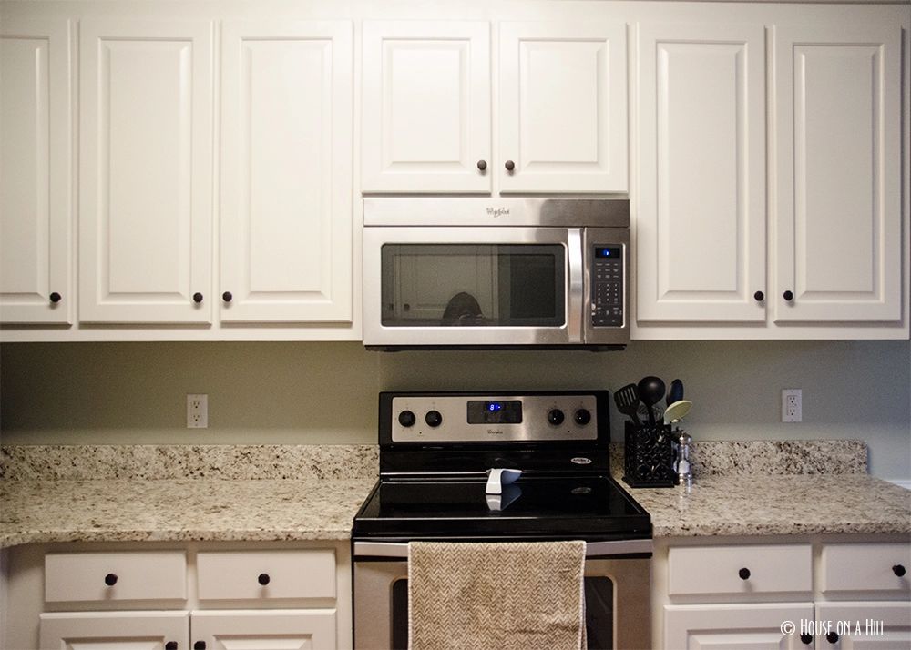
There are also appliances to consider. Many ignore this important aspect and regret the result after the paint dries. Keep the color of the appliances in mind when picking any color for cabinetry in the kitchen. This is particularly applicable if there are numerous cabinets, and the paint color cannot be ignored.
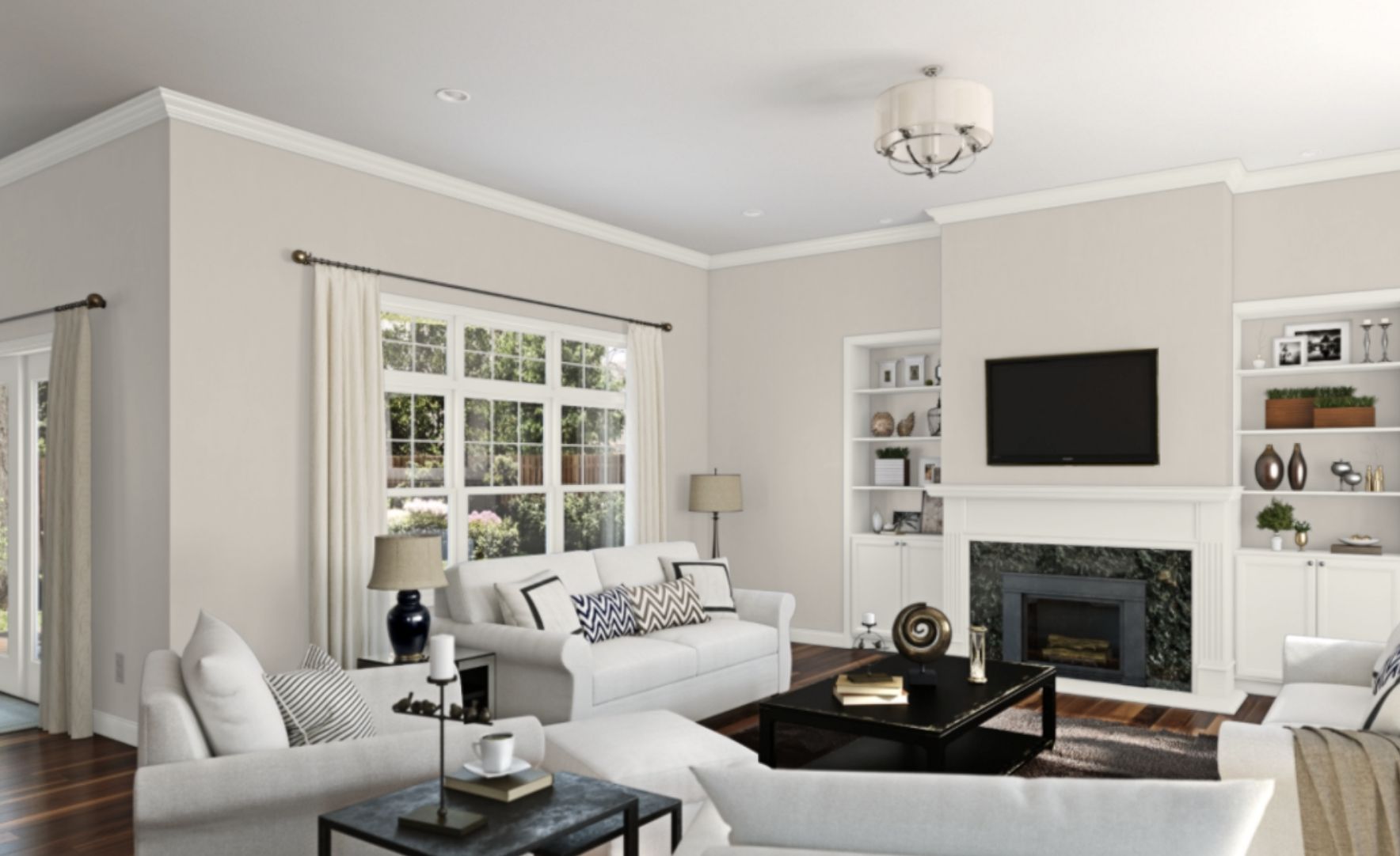
Additionally, keep in mind the flooring, backsplash, and general style of the kitchen decor. All neutral and off-white paint colors are not the same, and some will turn out better in your kitchen than others.
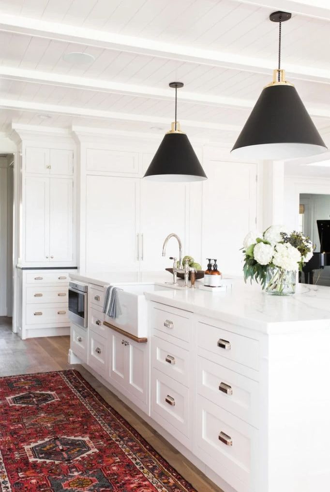
What Colors Pair Best with Neutral and Off-White Paint Colors?
Almost every color pairs well with off-whites and neutrals because of their color lightness and typically subtle tones. However, off-whites look amazing when paired with wood tones or other shades of brown, especially because of the warmth they create.
Also, the decor does not become too stark or too white. Other colors that work well with off-whites include gold, dusty rose, navy blue, and maroon. You can also use other neutrals with off-whites for an airy and fresh finish.
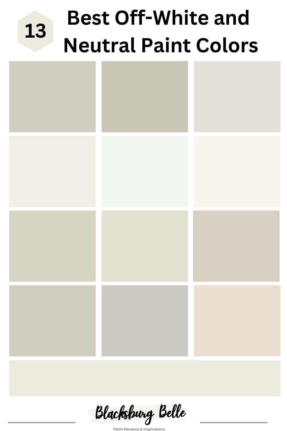
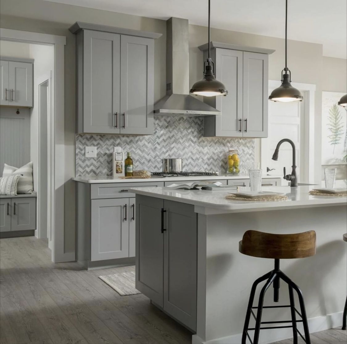
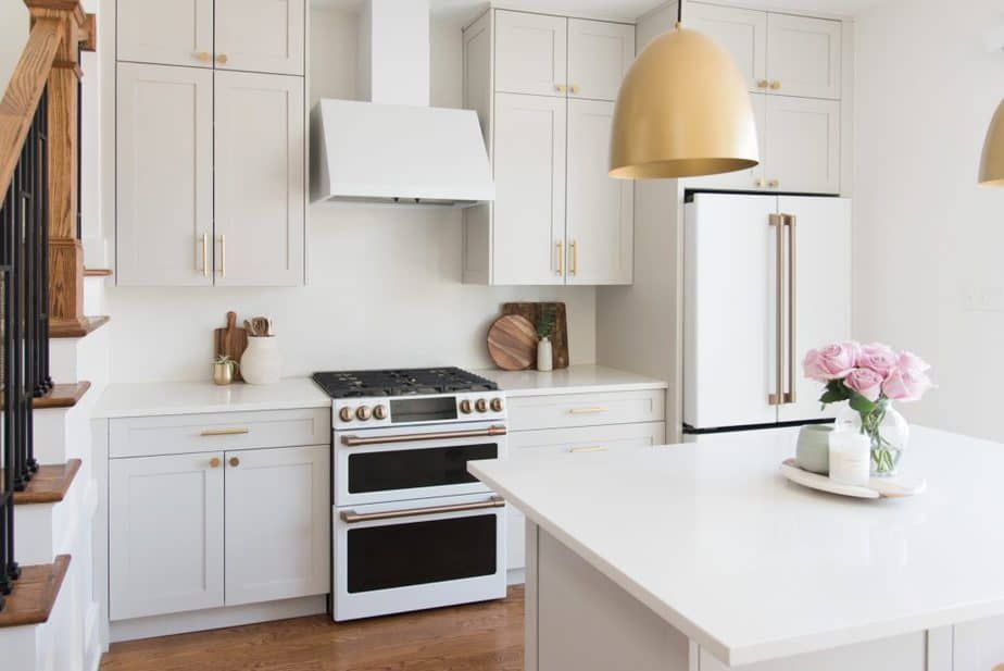
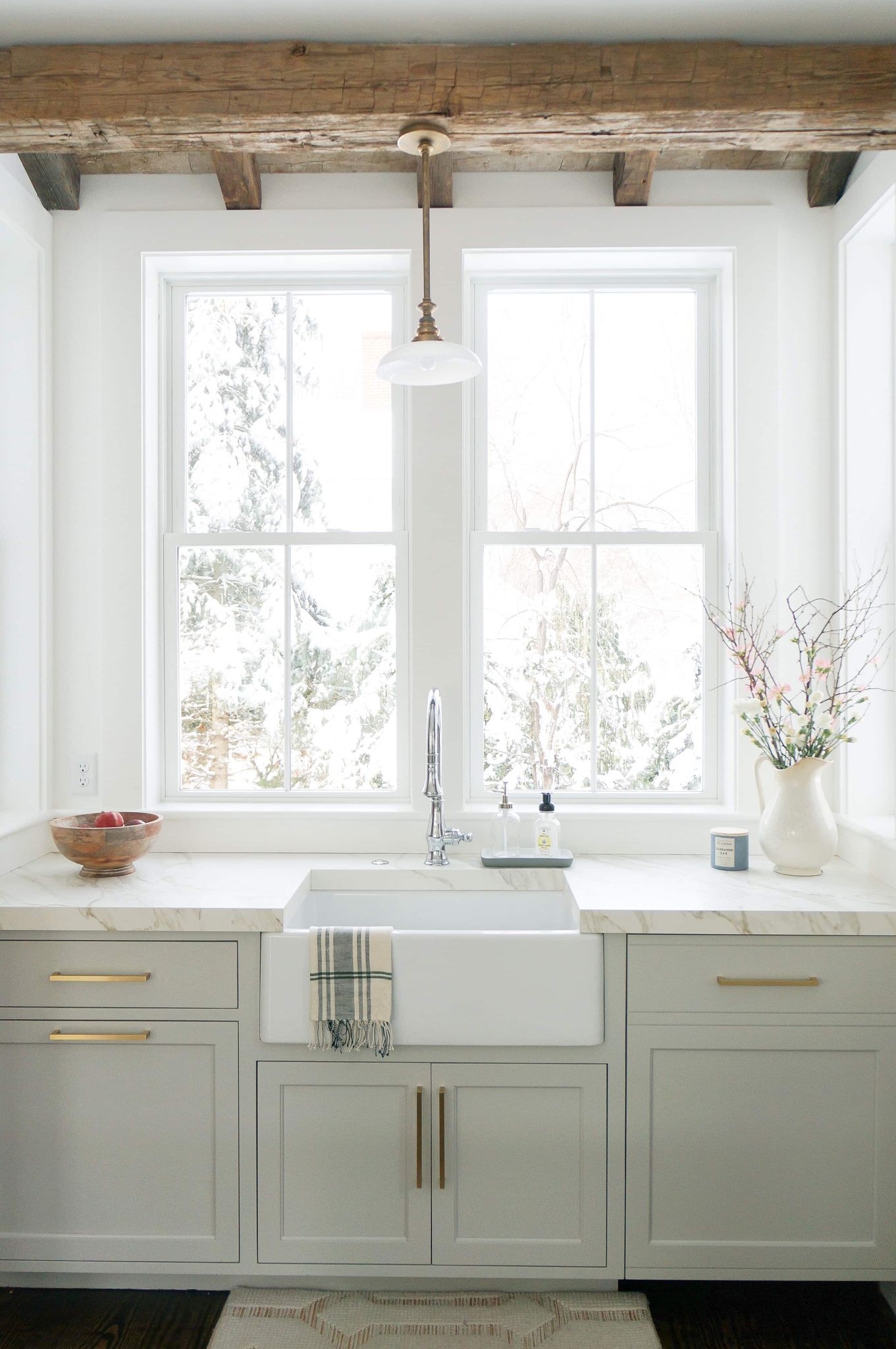
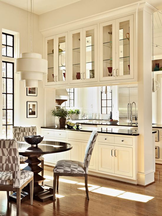
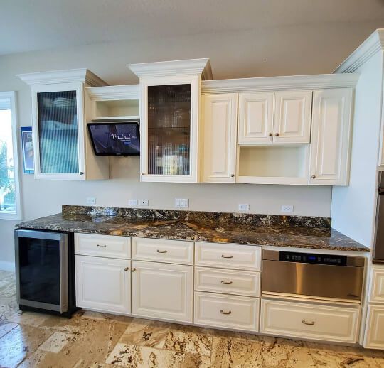
13 Best Off-White and Neutral Paint Colors for Kitchen Cabinets
The following are the best neutrals and off-white paint colors from Benjamin Moore and Sherwin Williams to use on your kitchen cabinets.
7 Best Off-White and Neutral Paint Colors from Benjamin Moore
1. Rodeo 1534
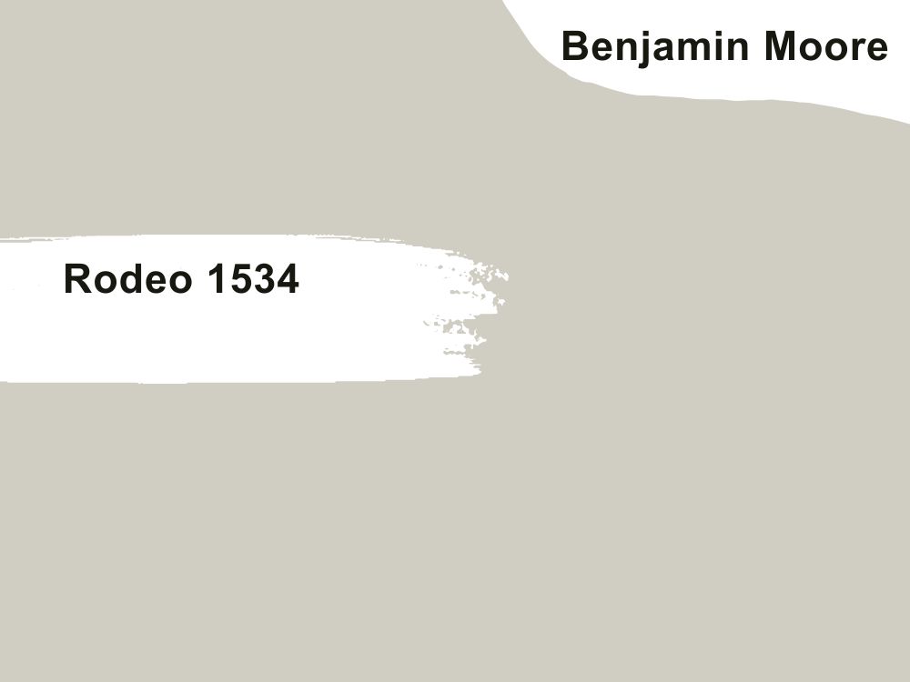
Light neutral with hints of gray
Rodeo is not the most popular neutral paint color from Benjamin Moore, but you cannot deny how perfect it is for kitchen cabinets. It is a light neutral paint color that features some hints of gray. The gray color makes it muted so that it does not appear too bright or stark.
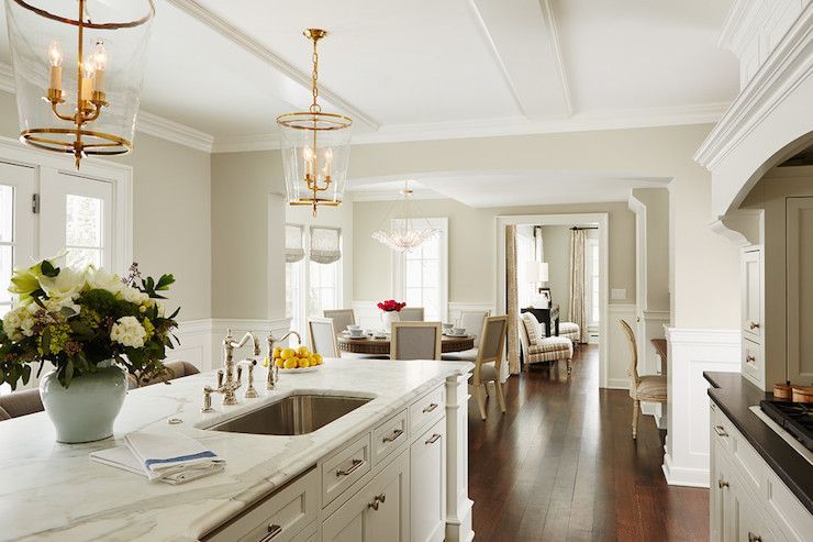
Rodeo has an LRV of 59.84 and an RGB color code of 208, 205, and 194 respectively. You can use it with many other colors because of its neutrality. However, it matches best with Glacier White and Bachelor Blue or Chantilly Lace and Dove Wing.
2. Revere Pewter HC-172
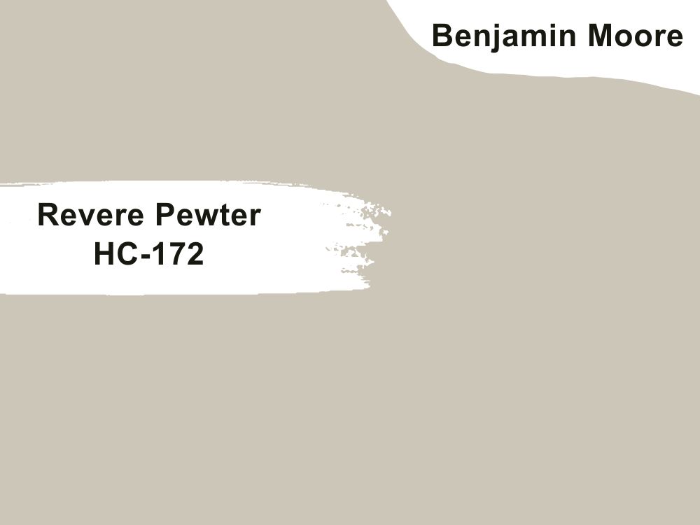
Mid-tone neutral paint color
Revere Pewter is one of the most popular neutral paint colors you will find in the market. It is not that the color has any special hue. But it is such a lush and calm color, providing a much-needed balance between cool and warm tones. As a result, it is versatile and suitable for different color schemes.
To get the best out of the color, match it with colors such as Chelsea Gray and White Dove or Sparrow and Fog Mist. Revere Pewter has an LRV of 55.05 and an RGB color code of 203, 198, and 184 respectively.
3. Classic Gray 1548
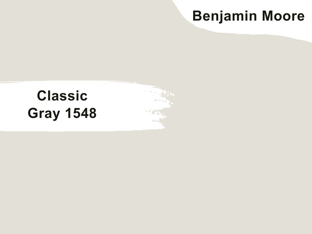
Light gray paint color with slightly pink/purple undertones
The truth about this color is that it is so soft and neutral that the undertones are not readily visible. It takes a keen eye to see the subtle purple or pink tones, depending on the lighting. In other words, Classic Gray is a light neutral with warm undertones.
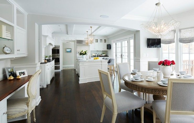
With an LRV of 73.67, Classic Gray has a high reflectivity. That means it can throw light back into a room and make it bright. It can also function as an off-white paint color because of its hue. And with an RGB color code 227, 224, and 215 respectively, match it with Simply White and Indian River or Stone Harbor and Stone Brown.
4. White Dove OC-17
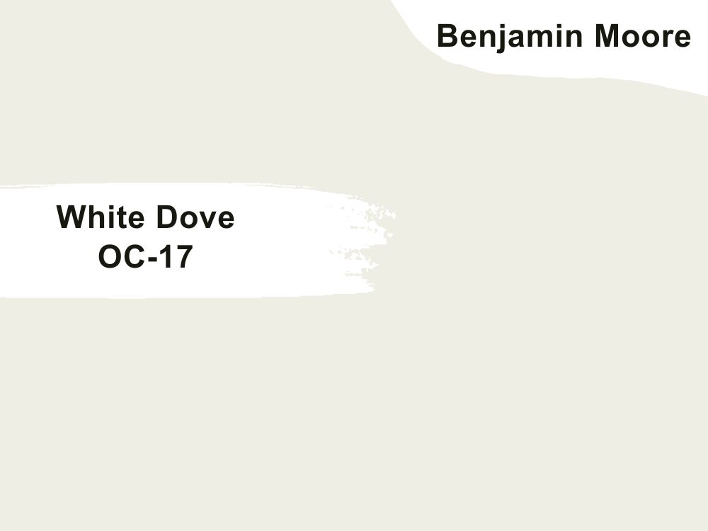
Off-white paint color with a hint of yellow and gray
The combination of yellow and gray undertones in this color makes it a soft and creamy color. That is why we usually find it as one of the coordinating colors for many hues. Moreover, it is a mid-tone color, balancing cool and warm tones to fit into any color scheme as a perfect neutral.
So, spice up your kitchen decor with White Dove to keep it soft, airy, and fresh without compromising on color. It has an LRV of 83.16, a pretty high reflectivity value, and an RGB color code of 239, 238, and 229 respectively. Match it with Balboa Mist and Kendall Charcoal or Revere Pewter and Country Redwood.
5. Chantilly Lace 2121-70
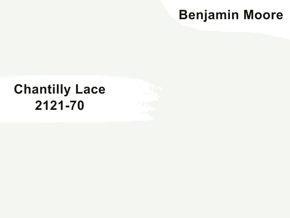
Neutral white paint color
Chantilly Lace is one of the brightest white paint colors and has almost no undertones. There are no other hues perceptible from the color, regardless of the lighting or surrounding elements. It remains a true color, making it highly versatile and sought after for many purposes.
With an extremely high LRV of 90.04, Chantilly Lace throws a lot of light into a room. Its matching colors include White and Horizon or Seapearl and Edgecomb Gray. Chantilly Lace has an RGB color code of 244, 246, and 241 respectively.
6. Simply White OC-117
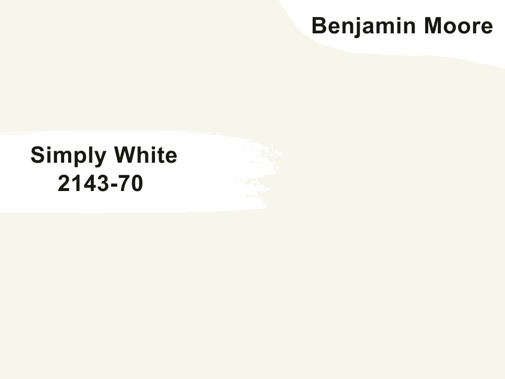
Warm white paint color with yellow undertones
Simply White, while it is a bright white color, can turn off-white or cream in most lighting, especially if warm. But while it has an obvious yellow nuance, Simply White is not too creamy or yellowish even under the harshest light. That is why we love it on kitchen cabinets and trims.
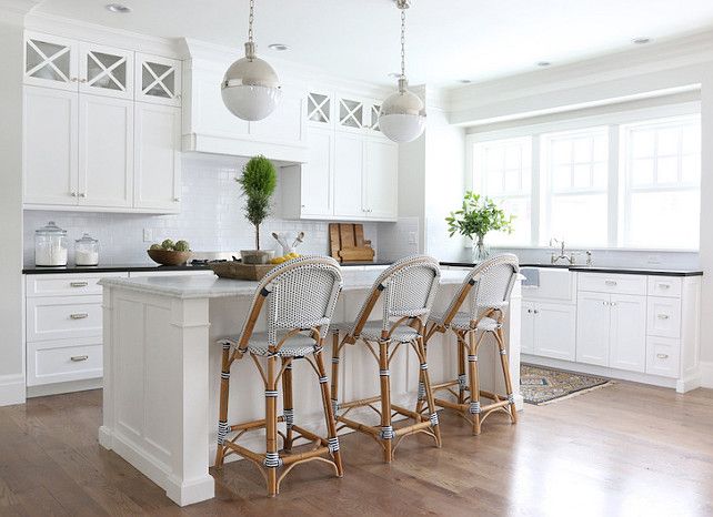
With an LRV of 89.52, Simply White is also one of the brightest colors from Benjamin Moore. It also has an RGB color code of 246, 246, and 237 respectively. It is best to match this paint color with other Benjamin Moore colors such as Dove Wing and Somerville Red or Silver Satin and Casco Bay.
7. Edgecomb Gray HC-173
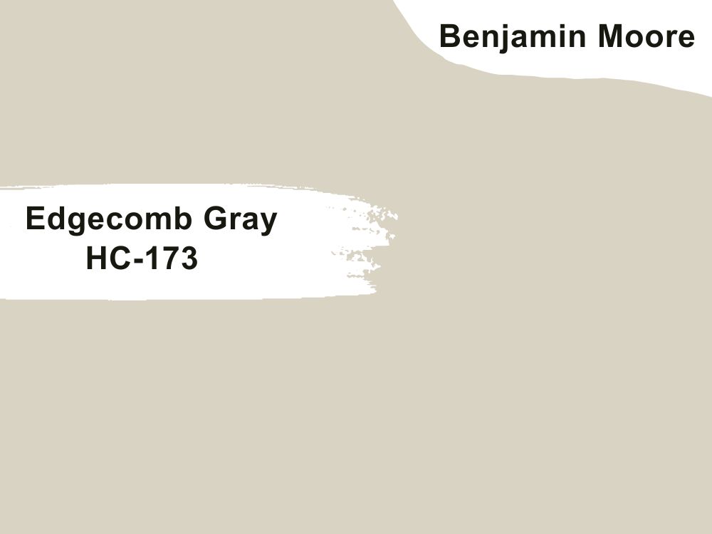
Warm neutral paint color with subtle green undertones
The green in this paint color is not readily obvious because it is so subtle. However, you may a tint in Edgecomb Gray when viewed under certain lighting. It is a versatile neutral that can fit into any decor, whether it is in the living room, bedroom, dining area, or kitchen.
With an LRV of 63.09, Edgecomb Gray has enough light reflectivity to create brightness in a room. In other words, it does not absorb light. And with an RGB color value of 217, 211, and 196 respectively, it is best to match it with Boothbay Gray and White Heron or Pashmina and Dove Wing.
6 Best Off-White and Neutral Paint Colors from Sherwin Williams
1. White Duck SW 7010
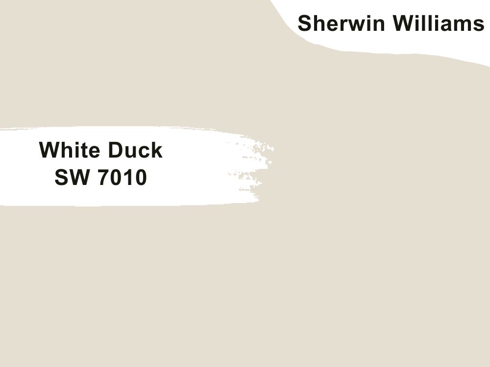
Cool white paint color with neutral undertones
There are hints of yellow and gray in this paint color, which appear when exposed to some lighting. These hints change the color from stark white to a soft and creamy color. The result you get when you use White Duck is a creamy or off-white shade.
It has an RGB color code of 229, 223, and 210 respectively, with an LRV of 74. So, coordinate it with other Sherwin Williams colors such as Portico and Resort Tan to get the best out of it. White Duck is versatile enough to work with any countertop color and stainless steel appliances.
2. Modern Gray SW 7632

Warm gray paint color with subtle purple/pink undertones
The undertones in this color are too subtle to cloud its overall beauty. Modern Gray is a softly warm color that fits any decor, performing well as a backdrop for other colors, whether vibrant colors, neutral colors, or soft pastels.
Modern Gray has an LRV of 62 with an RGB color code of 214, 206, and 195 respectively. As mentioned, the color is perfect for different purposes. But if you want to get the best out of it, you may want to coordinate it with Plum Dandy, Taupe Tone, or Snowbound.
3. Agreeable Gray SW 7029
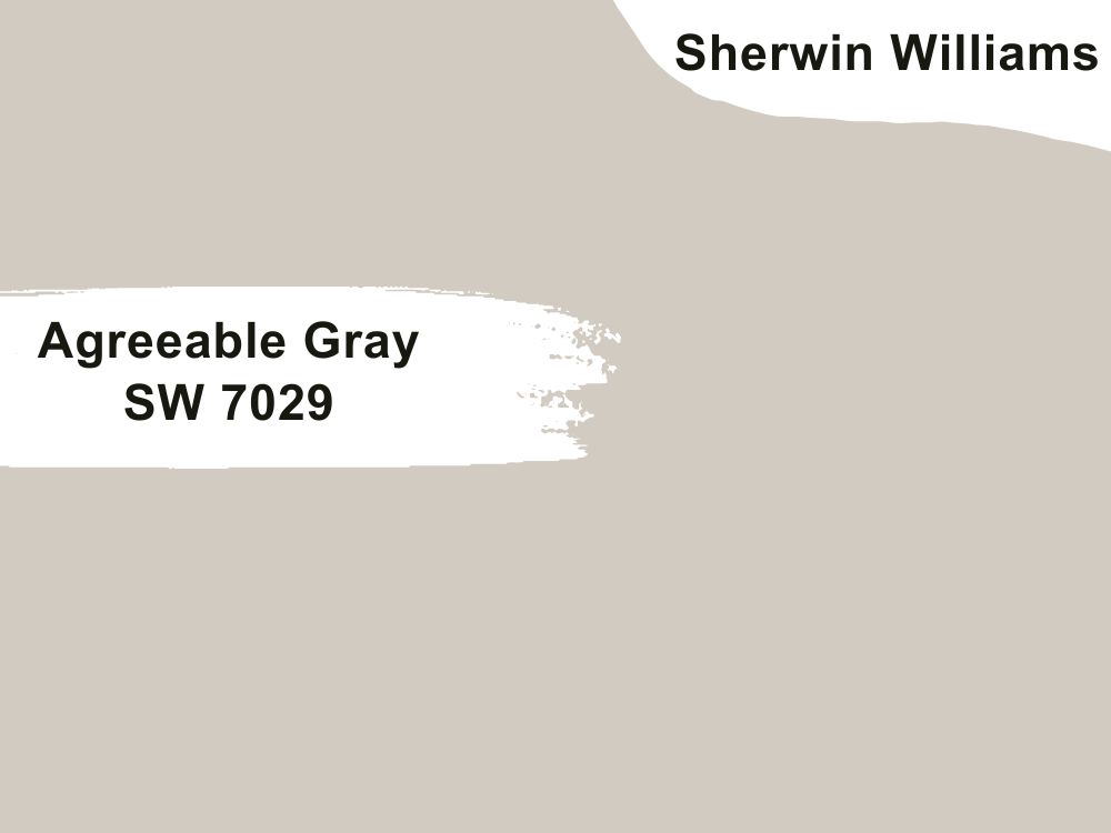
Warm gray paint color with beige undertones
Our list is incomplete without Agreeable Gray. It is not only a beautiful neutral color but also the best-selling paint color from Sherwin Williams. Because of how well it works with every, and we mean every, decor, Agreeable Gray looks amazing in your kitchen, especially on the cabinets.
The paint color does not look moody even in the faintest of lights. That is why it is a go-to color for rooms with different orientations and lighting. Agreeable Gray has an LRV of 60 and an RGB color balance of 209, 203, and 193 respectively. Coordinate it with Coral Rose, Extra White, and Incredible White.
4. Repose Gray SW 7015
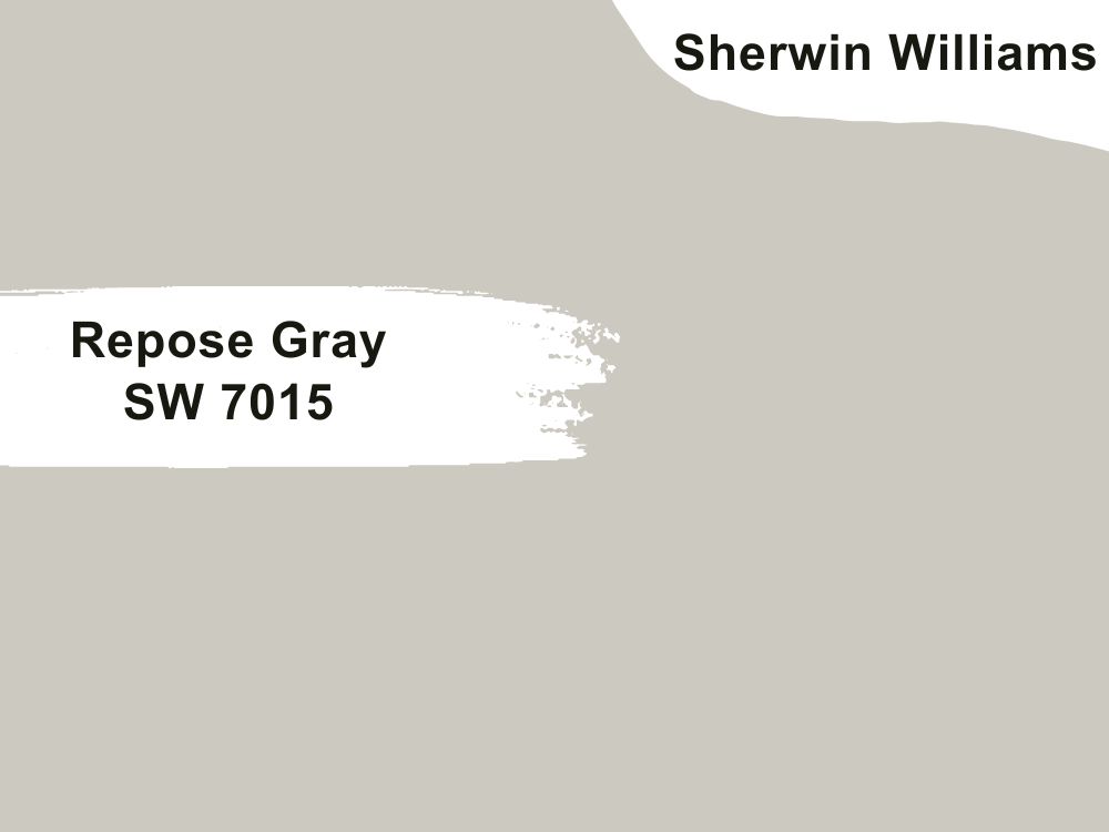
Light gray paint color with purple undertones
There is a wink of green in Repose Gray, although the paint color favors slightly purple hues. If you want an excellent and sophisticated color on your kitchen cabinet without clashing with other colors, Repose Gray should be one of your top choices.
With an LRV of 58, Repose Gray is not the brightest or sharpest gray on our list but still has good light reflectivity. It has an RGB color code of 204, 201, and 192 respectively. Coordinate it with Coral Clay, Pavestone, or Eider White.
5. Moderate White SW 6140
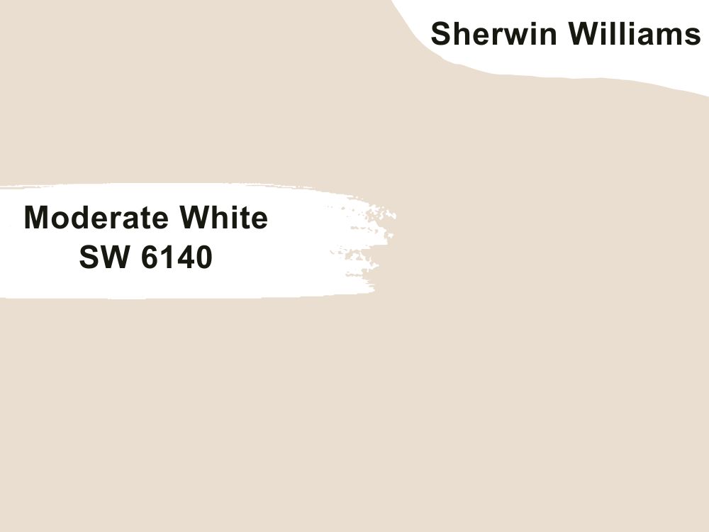
Warm white paint color with pink undertones
Gone are the days when entire kitchens were painted all white. While white will always be a classic and reliable color for your kitchen, you can try to mix and take things up a notch by using other colors. You do not even have to go too far off of white. Try colors like Moderate White on your kitchen cabinets and see the difference.
Moderate White has an LRV of 74, which is relatively high, and an RGB color code of 233, 222, and 207 respectively. Similar colors like Creamy work as coordinating colors, but you can also try Enigma and Macadamia. Add other neutrals to the kitchen decor to create a light ambiance.
6. Alabaster SW 7008
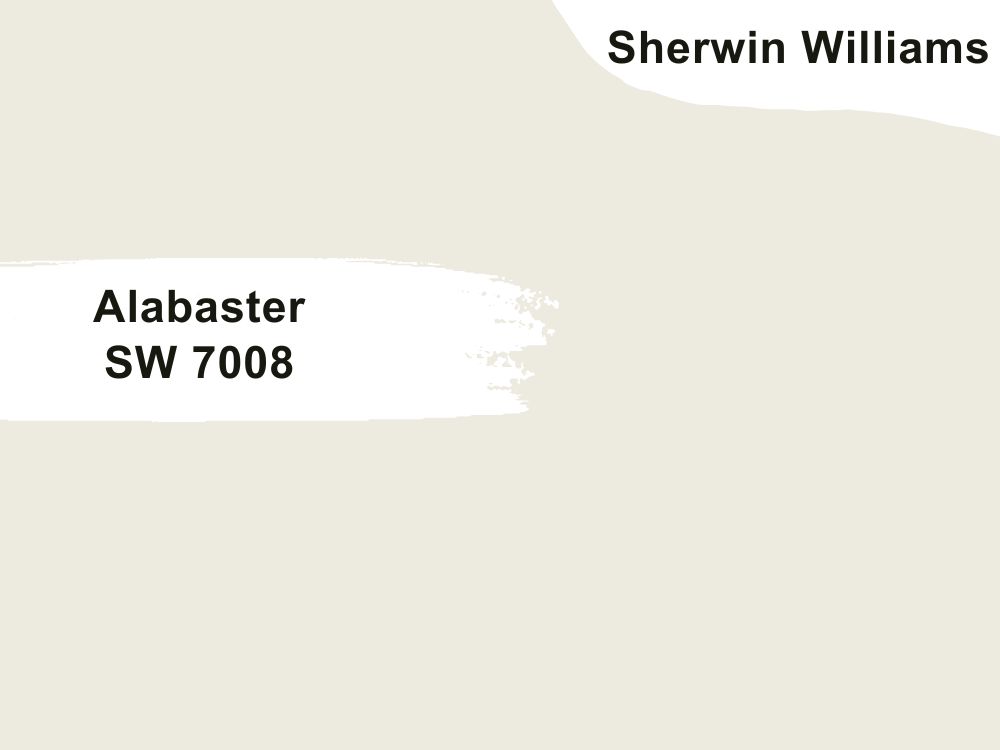
Warm white paint color with beige undertones
Because it has a neutral base, Alabaster has very subtle undertones. Nevertheless, it works more as an off-white color than any other because it is not as clean and crisp as others. However, it is one of the best neutral colors for kitchen cabinets because it is warm and light.
As an almost perfect neutral paint color, Alabaster has an RGB color code of 237, 234, and 224 respectively, with an LRV of 82. Although it is a truly warm color, Alabaster can reflect a lot of light in a room. Coordinate it with Dakota Wheat and Townhall Tan for the best results.
Conclusion
As a major fixture in our kitchens, cabinets should get all the attention they deserve. And while white paint colors look great on them, off-whites and other neutrals are also exceptional. In many cases, they perform better than white colors because of the warmth and slight color they add.
That is why we have picked the top off-white and neutral paint colors from Benjamin Moore and Sherwin Williams to narrow down the available choices. Why do you have to sift through hundreds of choices when we can do it for you?
Let us know your thoughts and share your experience with us in the comments section. We would love to hear from you.
 17 Best Sherwin Williams Green Paints (Trend 2023)
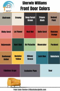 23 Perfect Sherwin-Williams Front Door Colors (2023 Trends)
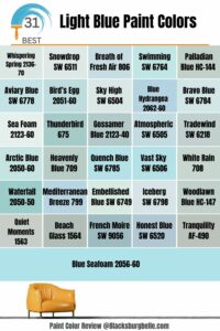 31 Best Light Blue Paint Colors: Review and Inspiration
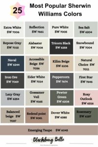 25 Most Popular Sherwin Williams Colors in 2023
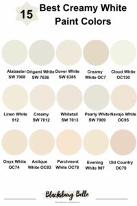 15 Best Creamy White Paint Colors For 2023
 15 Best Light Paint Colors For Dark Rooms In 2023
